#256 pixels
Text
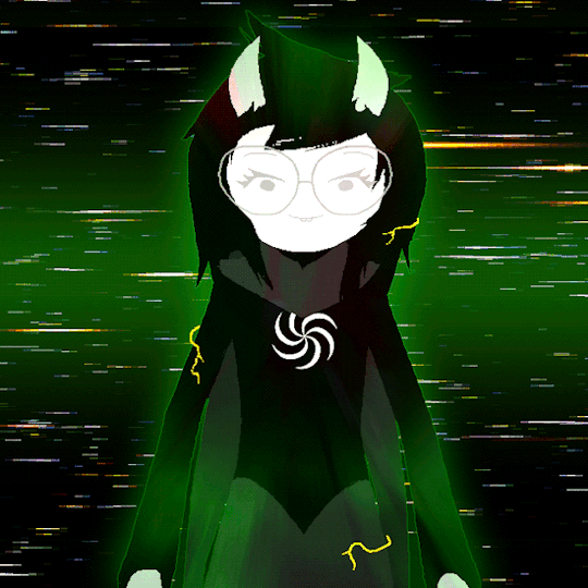
Merry (slightly late?) Vriskmas
#homestuck#vriska serket#vriska#doodled on printer paper - colored in firealpaca#and squished down to 256 sq pixels
37 notes
·
View notes
Text
Even the light of hope shine black.
9 notes
·
View notes
Text
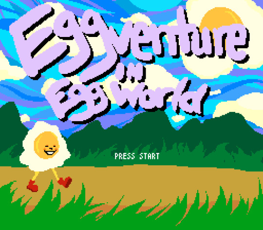
Did a Title Screen markup for Eggtober! Thought it could be fun to make a retro game inspired thing for World Egg Day set in a world of Egg peeps.
#eggtober2022#eggtober#pixel art#my art#wanted to try doing something with the contraints of the Sega Genesis#I've never used 9-bit color before but it was pretty fun to mess around with#tho 512 colors ends up feeling like not a lot to choose from sometimes#256×224 pixels btw#might animate this later this month if I have time#or add some extra texture to the foreground
52 notes
·
View notes
Text
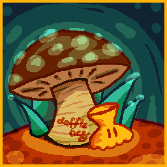
From the archives: Mushrooms 2020, a redraw of a piece I made because a friend of mine loves fungi. This edition was a candidate for replacing the "Bust" Minecraft painting in my resource pack, before I scaled almost everything down to native resolution and made it tiny.
It took me so long to post this here because the little guy sitting under the mushroom is an alien OC I made up many years ago with a mildly absurd name, and after much internal debate about how to introduce him here, I've decided I just Won't. This draft has been sitting for over half a year. Be free.
#daffleart#illustration#id in alt text#pixel art#yes i guess it's stretching the definition but the canvas is a 256 pixel wide square.#mushrooms#2020 work
7 notes
·
View notes
Text
Falling through time
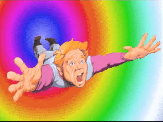
#Space Quest#gif#rainbow#trippy#pixel#roger wilco#VGA#256 bit#space quest IV#falling#screaming#silent scream
2 notes
·
View notes
Text
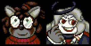
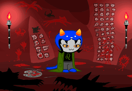
What's black and white, and red all over? My friends @heavenlysphere and @str4wb3rrycr3p3c00k13. No news to me!
Original Size:

#my art#sprite art#pixel art#friend oc#heavenlysphere#str4wb3rrycr3p3c00k13#Maverick#Natas Liah#256-color#These sprites are the right resolution and format to use in RPGmaker 2003.
10 notes
·
View notes
Text
its day 2 of teaching myself how to use rpg maker (2003) and i want to eat a chair
#avpswjy#ITS SO HAAAAAAAAAARRRRDDD#what do you MEAN i need to use 256 color#theres no way for my art program to export it like that!#and if i use paint to export it it makes my pixels look like dogshit!#not to mention even when i do that it wont accept the file anyway bc of size limitations#BUT IT DOESNT TELL ME WHAT IT SHOULD BE INSTEAD#im so full of agonies. i just want to learn this program so i can make a lil game#also since the program is so old like. there are basically no tutorials for it#and the one i did find is just abt making stuff playable and not like. importing art#which is still helpful! but i want to make assets dammit#id get a newer version of rpg maker but theyre all soooo expensive#i only got this one bc it was on sale for a few bucks one time#ill still try figuring it out but also i might try gb studio bc ive heard good things abt that one too
2 notes
·
View notes
Text
i still always think about the time my artist teacher was talking about the jump from ps2 to ps3 i thiiiiiink and just the relief of 'oh yess we can use file sizes (for textures) larger than 256 pixels'
#for some slight contex pretty much every texture will be a ratio of pixels that are to the power of 2#it's how mipmapping works (the maths gets funky otherwise) which is essentially a type of texture LOD#so 256x256 or 256 x 124 etc#512 is huge space if you're used to working smaller and/or working low poly
0 notes
Text
IMPORTANT POST FOR ALL ARTISTS
IF YOURE IN NEED OF A WEBSITE WITH A FUCKTON OF GOOD COLOR PALETTES. GO HERE.
it's mostly a website used for pixel artists to share their palettes for free download, BUT from my experience as someone who does pixel art from time to time, using it as a resource for my regular drawings also works very good. theres big and small color schemes on this website
pixel artists are very very good at making color palettes and MANY of these are far more versatile than the regular coolors 5-color color schemes youll see floating around on art resource compilations. you can search up any tag to find the palettes youre looking for (the maximum amount of colors you can upload on a palette here is 256 so the sky really is the limit), and you can even search by the number of colors you want. theres literally thousands of free palettes put up by artists there for free downloadable use.
this is a really precious service and i always siphon people looking for color schemes here when i can. go check it out
6K notes
·
View notes
Text
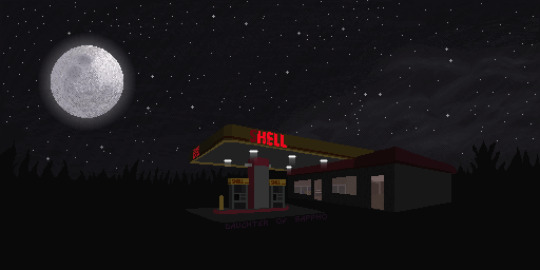
Like The Wind
tribute to myhouse.wad
512*256 pixel art canvas made in Pixel Studio
#dostxt#like the wind#the most mysterious song on the internet#myhouse.wad#doom#house of leaves#gas station#pixel art#night sky#happiness has to be fought for#dospics
1K notes
·
View notes
Text
Tidbit: The “Posterization” Effect of Panels Due to the Consequences of GIF Color Quantization (and Increased Contrast (And Also The Tangential Matter of Dithering))
There’s this misconception that the color banding and patterned dithering found in panels is an entirely deliberate, calculated effect Hussie manipulated the image into looking with some specific filter, but this isn’t the case, exactly. It wasn’t so much a conscious decision he took but rather an unavoidable consequence of the medium he partook in: digital art in an age where bandwidth and storage was at a premium.
Not to delve too deeply into the history and technicalities of it, but the long and the short of it is back in the early nineties to late aughts (and even a bit further into the 10s), transferring and storing data over the web was not as fast, plentiful, and affordable as it is now. Filesize was a much more important consideration than the fidelity of an image when displaying it on the web. Especially so when you’re a hobbyist on a budget and paying for your own webhosting, or using a free service with a modest upload limit (even per file!). Besides, what good would it be to post your images online if it takes ages to load them over people's dial-up Internet? Don't even get me STARTED on the meager memory and power the average iGPU had to work with, too.

The original comic strip's resolution was a little more than halved and saved as a GIF rather than a large PNG. That's about an 82.13% reduction in filesize!
So in the early days it was very common for people to take their scans, photographs, and digital drawings and scale them down and publish them as smaller lossily compressed JPEGs or lossless GIFs, the latter of which came at the cost of color range. But it had a wider range of browser support and the feature to be used for animations compared to its successor format, PNG ("PNG's not GIF").
You'd've been hard-pressed to find Hussie use any PNGs himself then. In fact, I think literally the only times he's ever personally employed them and not delegate the artwork to a member of the art team were some of the tiny shrunken down text of a character talking far in the distance and a few select little icons.
PNGs support semi-transparency unlike GIFs, which is why Hussie used them to preserve the anti-aliasing on the text without having to add an opaque background color.
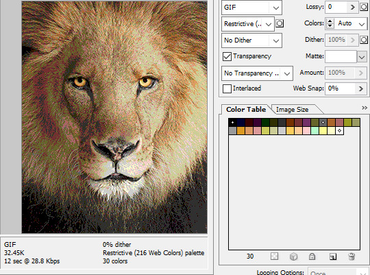
While PNGs can utilize over 16 million colors in a single image, GIFs have a hard limit of 256 colors per frame. For reference, this small image alone has 604 colors:

For those who can't do the math, 256 is a pretty damn small number.
Smaller still were the palettes in a great deal of MSPA's panels early on in its run. Amazingly, a GIF such as this only uses 7 colors (8 if you count the alpha (which it is)).

Not that they were always strictly so low; occasionally some in the later acts of Homestuck had pretty high counts. This panel uses all 256 spots available, in fact.
If he had lowered the number any smaller, the quality would have been god-awful.
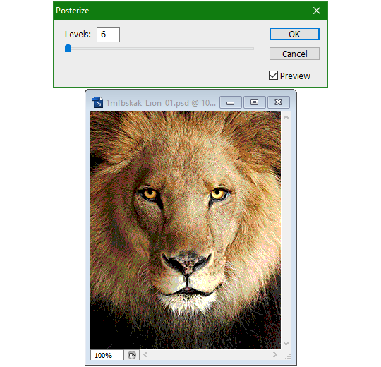
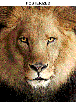
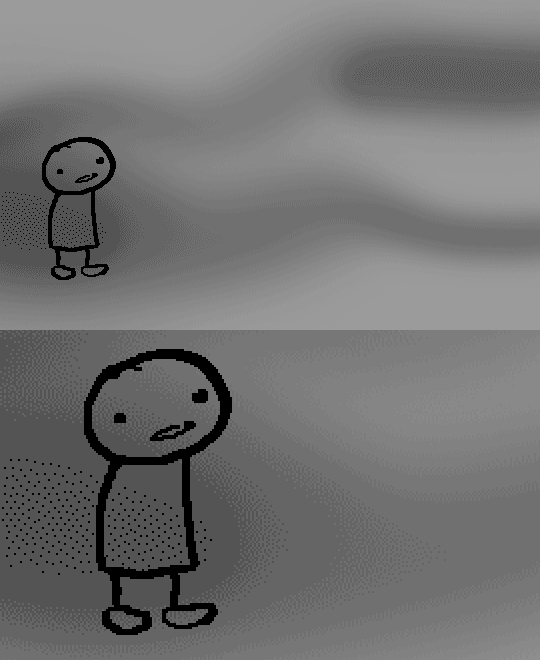
To the untrained eye, these bands of color below may seem to be the result of a posterization filter (an effect that reduces smooth areas of color into fewer harsh solid regions), but it's really because the image was exported as a GIF with no dithering applied.

Dithering, to the uninitiated, is how these colors are arranged together to compensate for the paltry palette, producing illusory additional colors. There are three algorithms in Photoshop for this: Diffusion, Pattern, and Noise.

Above is the original image and below is the image reduced to a completely binary 1-bit black and white color palette, to make the effect of each dithering algorithm more obvious.

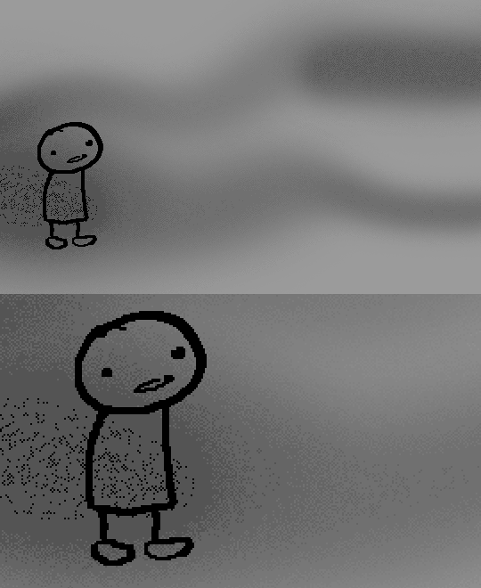
Diffusion seemingly displaces the pixels around randomly, but it uses error diffusion to calculate what color each pixel should be. In other words, math bullshit. The Floyd-Steinberg algorithm is one such implementation of it, and is usually what this type of error diffusion dithering is called in other software, or some misnomer-ed variation thereof.
The usage of Pattern may hearken back to retro video game graphics for you, as older consoles also suffered from color palette limitations. Sometimes called Ordered dithering because of the orderly patterns it produces. At least, I assumed so. Its etymological roots probably stem from more math bullshit again.
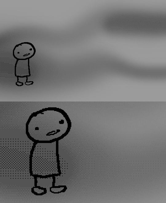
True to its name, Noise is noisy. It’s visually similar to Diffusion dithering, except much more random looking. At least, when binarized like this. Truth be told, I can’t tell the difference between the two at all when using a fuller color table on an image with a lot of detail. It was mainly intended to be used when exporting individual slices of an image that was to be “stitched” back together on a webpage, to mitigate visible seams in the dithering around the edges.
To sate your curiosity, here's how the image looks with no dithering at all:
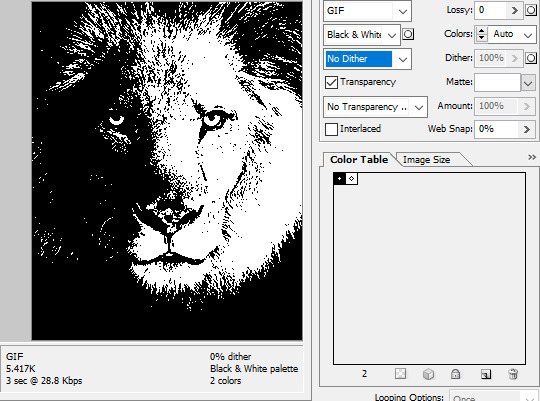
People easily confuse an undithered gif as being the result of posterization, and you couldn't fault them for thinking so. They look almost entirely the same!
Although I was already aware of this fact when I was much younger, I'm guilty of posterizing myself while editing images back then. Figured I may as well reduce the color count beforehand to help keep the exported GIF looking as intended. I view this as a complete waste of time now, though, and amateurish. Takes away a bit of the authenticity of MSPA art, how the colors and details are so variable between panels. As for WHY they were so variable to begin with, choosing the settings to save the image as requires a judicious examination on a case-by-case basis. In other words, just playing around with the settings until it looks decent.
It's the process of striking a fine balance between an acceptable file size and a "meh, good enough" visual quality that I mentioned earlier. How many colors can you take away until it starts to look shit? Which dithering algorithm helps make it look not as shit while not totally ruining the compression efficacy?
Take, for example, this panel from Problem Sleuth. It has 16 colors, an average amount for the comic, and uses Diffusion dithering. Filesize: 34.5 KB.

Then there's this panel right afterwards. It has 8 colors (again, technically 7 + alpha channel since it's an animated gif), and uses Noise dithering this time. Filesize: 34.0 KB.
The more colors and animation frames there are, and the more complicated dithering there is, the bigger the file size is going to be. Despite the second panel having half the color count of the first, the heavily noisy dithering alone was enough to inflate the file size back up. On top of that, there's extra image information layered in for the animation, leaving only a mere 0.5 kilobyte difference between the two panels.
So why would Hussie pick the algorithm that compresses worse than the other? The answer: diffusion causes the dithering to jitter around between frames of animation. Recall its description from before, how it functions on nerd shit like math calculations. The way it calculates what each pixel's color will be is decided by the pixels' colors surrounding it, to put it simply. Any difference in the placement of pixels will cause these cascading changes in the dithering like the butterfly effect.
Diffusion dithering, 16 colors. Filesize: 25.2 KB
This isn't the case with Noise or Pattern dithering, since their algorithms use either a texture or a definite array of numbers (more boring nerd shit).
Noise dithering, 16 colors. Filesize: 31.9 KB
Pattern dithering, 16 colors. Filesize: 23.1 KB
There's a lot more I'd like to talk about, like the different color reduction algorithms, which dither algorithms generally compress better in what cases, and the upward and downward trends of each one’s use over the course of a comic, but since this isn’t a deep dive on GIF optimization, I might save that for another time. This post is already reaching further past the original scope it was meant to cover, and less than 10 images can be uploaded before hitting the limit, which is NOWHERE near enough for me. I should really reevaluate my definition of the word “tidbit”… Anyway, just know that this post suffers from sample selection bias, so while the panels above came from an early section of Problem Sleuth that generally had static panels with diffusion dithering and animated panels with noise dithering, there certainly were animated panels with diffusion later on despite the dither-jittering.
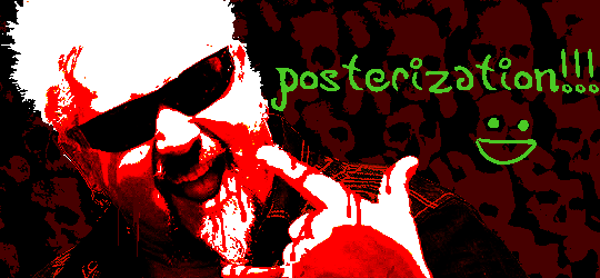
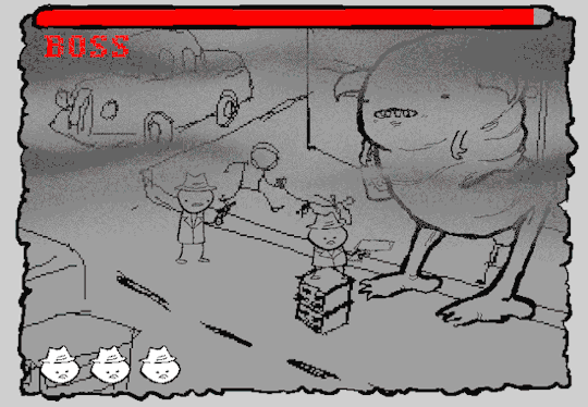
Alright, time to shotgun through the rest of this post, screw segueing. Increasing the contrast almost entirely with “Use Legacy” enabled spreads the tones of the image out evenly, causing the shadows and highlights to clip into pure black and white. The midtones become purely saturated colors. Using the Levels adjustment filter instead, moving both shadow and highlight input level sliders towards the middle also accomplishes the same thing, because, you know, linear readjustment. I'm really resisting the urge to go off on another tangent about color channels and the RGB additive color model.
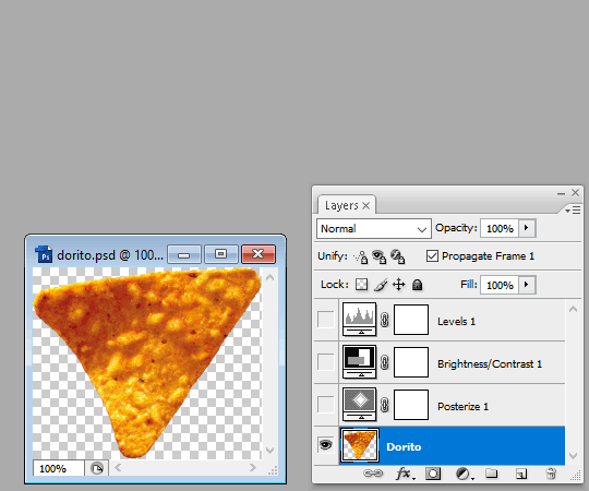
Anyway, there aren't any examples in MSPA that are quite this extreme (at least in color, but I'll save that for a later post), but an image sufficiently high in contrast can be mistaken for being posterized at a glance. Hence the Guy Fieri banner. In preparation for this post, I was attempting to make a pixel-perfect recreation of that panel but hit a wall trying to figure out which and how many filters were used and what each one's settings were, so I sought the wisdom of those in the official Photoshop Discord server. The very first suggestion I got was a posterization filter, by someone who was a supposed senior professional and server moderator, no less. Fucking dipshit, there's too much detail preserved for it to be posterization. Dude totally dissed me and my efforts too, so fuck that moron. I spit on his name and curse his children, and his children's children. The philistines I have to put up with...
In the end, the bloody Guy Fieri recreation proved to be too much for me to get right. I got sort of close at times, but no cigar. These were some of the closest I could manage:

You might be left befuddled after all this, struggling to remember what the point of the blogpost even was. I had meant for it to be a clarification of GIFs and an argument against using the posterization filter, thinking it was never used in MSPA, but while gathering reference images, I found a panel from the Felt intermission that actually WAS posterized! So I’ll eat crow on this one... Whatever, it’s literally the ONE TIME ever.
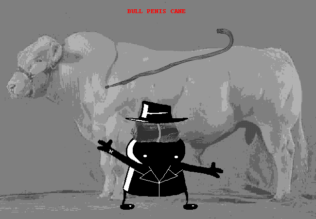
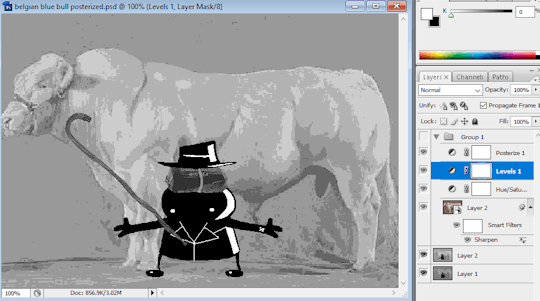
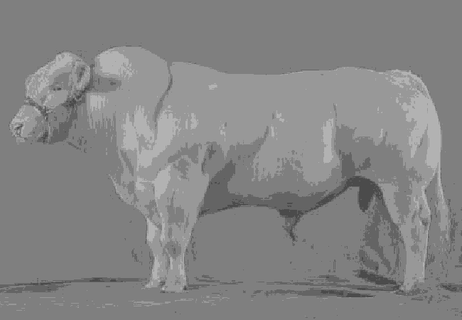
I can tell it's posterization and not gif color quantization because of the pattern dithering and decently preserved details on the bomb and bull penis cane. There would have had to have been no dithering and way fewer colors than the 32, most of which were allotted to the bomb and cane. You can't really selectively choose what gets dithered or more colors like this otherwise.
Thank you for reading if you've gotten this far. That all might have been a lot to take in at once, so if you're still unclear about something, please don't hesitate to leave a question! And as always, here are the PSDs used in this post that are free to peruse.
326 notes
·
View notes
Text

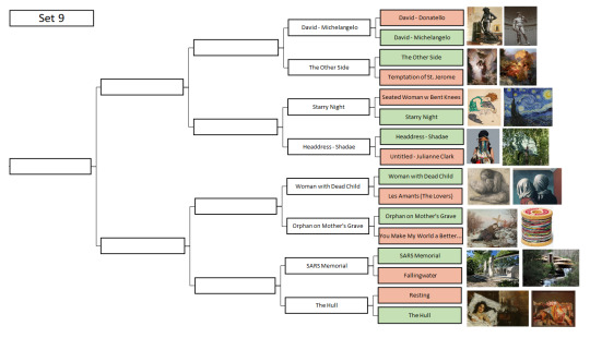

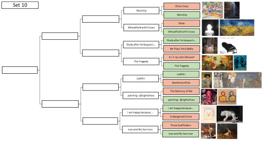
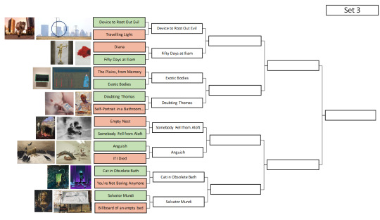


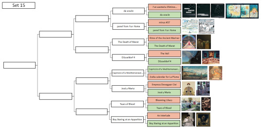
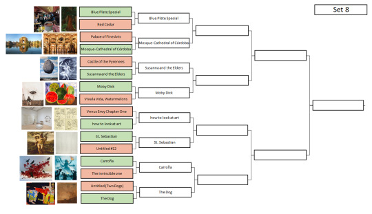

Behold, a bracket!
Text form below the cut because trying to copy all the 256 into the alt text sounded.... horrifying. Warning for 128 matchups, seriously, this list is long, and so I've avoided adding the artists until the polls.
a note: the pinned post has started misbehaving, so only open polls will be directly linked. closed polls instead have the results page linked in the set header, all the polls are linked from there
Set 1
The Lament for Icarus (Miao He) vs The Lament for Icarus (Herbert Draper)
The angel came to me in a fever hallucination, perched upon my bed as I returned from the bathroom. vs Sweet Brown Snail
Figures vs A Philosopher Lecturing on the Orrery
Happy Shoppers vs Hubble Deep Field
Lovers Painting vs Bath Curtain
Dr. Helen Taussig vs Une Martyre
Orangoutang étranglant un sauvage de Bornéo (Orangutan strangling a Borneo savage) vs Can’t Help Myself
Rape vs Technicolor Hiroshima
Set 2
A Walk at Dusk vs Based on “Autoportrait with the Model” by Maria-Rayevska Ivanova
Diary Page vs Les Jours Gigantesques (The Titanic Days)
Dead of Night vs You Won't
Christina's World vs Bobby
Untitled (I’m Turning Into A Specter Before Your Very Eyes And I’m Going To Haunt You) vs Two Sisters (On the Terrace)
Sharecropper vs Lustmord
The Parca and the Angel of Death vs Untitled (Zdzisław Beksiński)
Stress vs The Fallen Angel
Set 3
Device to Root Out Evil vs Travelling Light
Diana vs Fifty Days at Iliam: The Fire that Consumes All before It
The Plains, from Memory vs Exotic Bodies
Doubting Thomas vs Self-Portrait in the Bathroom Mirror
Empty Nest vs Somebody Fell From Aloft
Anguish vs If I Died
Cat in Obsolete Bath vs You're Not Boring Anymore
Salvator Mundi (Savior of the World) vs Untitled (billboard of an empty unmade bed)
Set 4
There Will Be No Miracles Here vs Symphony of the Sixth Blast Furnace
Fox Hunt vs Tarpaulin
Khajuraho Group of Monuments vs Ranakpur Jain Temple
ปราสาทสัจธรรม (The Sanctuary of Truth) vs Grande Panorama de Lisboa
Heroic Head of Pierre de Wissant, One of the Burghers of Calais vs The Weather
The Daughters of Edward Darley Boit vs If this is art
Statue of Vincent and Theo van Gogh vs Jeanne d’Arc écoutant les voix (Joan of Arc listening to the Voices)
Fountain vs Judith Slaying Holofernes
Set 5
Cueva de las Manos (Cave of Hands) vs Cave of El Castillo
Chauvet Cave Bear vs Uffington White Horse
Laocoön and His Sons vs Winged Victory of Samothrace
Crouching Aphrodite vs Statue of Taweret
Guardian Figure vs Kūya-Shonin (Saint Kuya)
Ancient Greek doll vs Arena #7 (Bears)
Enbu (炎舞) (Dancing in the Flames) vs Yearning Shadows
Belfast to Byzantium vs Freedom
Set 6
The Kama Sutra of Vatsyayan vs Portraits
The Blood Mirror vs Nighthawks
Electric Fan (Feel it Motherfuckers): Only Unclaimed Item from the Stephen Earabino Estate vs "Untitled" (Portrait of Ross in L.A.)
Lady Agnew of Lochnaw vs Forgotten Dreams
Saint Bride vs Pixeles (a group of 9 works)
War Pieta vs The Sunset
The Handmaidens of Sivawara Preparing the Sacred Bull at Tanjore for a Festival vs Ajax and Cassandra
Nāve (Death) vs Abstraction
Set 7
Yes vs Meeting on the Turret Stair
Hacked to Death II vs Stańczyk
Closeness Lines Over Time vs Voice of Fire
The Maple Trees at Mama, the Tekona Shrine and Tsugihashi Bridge vs Portrait of Sir Thomas More
Survival Series: In a Dream You Saw a Way vs Takiyasha the Witch and the Skeleton Spectre
Death blowing bubbles vs The Kitchen Table Series
Painting 1946 vs In the Grip of Winter
Untitled (Black and Gray) vs NAMES Project AIDS Memorial Quilt
Set 8
Blue Plate Special vs Red Cedar
Palace of Fine Arts vs Mosque–Cathedral of Córdoba
Le Château des Pyrénées (The Castle of the Pyrenees) vs Susanna and the Elders, Restored - X-Ray
Moby Dick vs Viva la Vida, Watermelons
Venus Envy Chapter One (Of the First Holy Communion Moments Before the End) vs how to look at art
St. Sebastian vs Untitled #12
Carroña vs The invincible one
Untitled (Two Dogs) vs The Dog
SECOND HALF
Set 9
David (Donatello) vs David (Michelangelo)
The Other Side vs The Temptation of St. Jerome
Seated Woman with Bent Knees vs Starry Night
Headdress - Shadae vs Untitled for the Image Flow's Queer Conscience exhibit
Woman with Dead Child (Frau mit totem Kind) vs Les Amants (The Lovers)
Siroče na majčinom grobu (Orphan on Mother's Grave) vs You Make My World a Better Place to Find
Fighting Against SARS Memorial Architectural Scene (弘揚抗疫精神建築景觀) vs Fallingwater
Resting vs The Hull
Set 10
Olive Trees vs Worship
Glow vs Wheatfield with Crows
Study after Velázquez's Portrait of Pope Innocent X vs Untitled (He Plays Very Badly)
D.I.Y. by John Wiswell vs The Tragedy
Judith and the Head of Holofernes vs Beethovenfries (Beethoven Frieze)
The Memory of Me (How Could I Forget) vs oh god i had a really big epiphany about love and personhood but i’m too drunk for words
I am happy because everyone loves me vs 瀕危形態 (Endangered Forms)
Three Scaffolders vs Ivan the Terrible and His Son Ivan
Set 11
San Giorgio Maggiore at Dusk vs Water-Lilies, Reflection of a Weeping Willow
The Grief of the Pasha vs Monolith in Vigeland Sculpture Park
Passion vs Space Diner
Hamlet and Ophelia vs Two Earthlings
Ellen Terry as Lady Macbeth vs Seer Bonnets
Photograph from "SNAP OSAKA" Collection vs Clytemnestra after the Murder
“Untitled” (Perfect Lovers) vs The Lovers (TIE)
Kedai Ubat Jenun vs Orange Store Front
Set 12
The Apotheosis of War vs Portrait of the Dancer Aleksandr Sakharov
Julie Manet vs Mouth
The Icebergs vs Kaleidoscope Cats III
Maman vs Caza Nocturna (Night Hunt)
The Book of Kells Folio 188r: Luke carpet page vs Ardagh Chalice
Yusuf and Zulaikha vs Dome of the Rock mosaics
Rowan Leaves and Hole vs Untitled (prisonhannibal)
Le Désespéré (The Desperate Man) vs The Dedication
Set 13
Deimos vs Dog and Bridge
The Mocking of Christ vs Prudence
The Broken Column vs Siberian Ice Maiden shoulder tattoo
Transi de René de Chalon (Cadaver Tomb of René of Chalon) vs Head of Christ
The Day vs Spirit of Haida Gwaii
Eleanor Boathouse at Park 571 vs Jatiya Sangsad Bhaban জাতীয় সংসদ ভবন (National Parliament House)
Juventud de Baco (Bacchus Youth) vs Barges on the Seine
Oath of the Horattii closeup vs Visit hos Excentrisk Dam (Visit to an eccentric lady)
Set 14
Christ Crucified (With Donor) vs St. Francis
Thunder Raining Poison vs Piazza d'Italia
The Grove vs Among the Waves
Pintura Mural de Alarcón vs Sagrada Família stained-glass windows
Noonday Heat vs La Dame à la licorne (The Lady and The Unicorn)
Matroser i Gröna Lund (Sailors in Gröna Lund) vs Gielda Plakatu
Reply of the Zaporozhian Cossacks vs The Garden of Earthly Delights
Kuoleman puutarha (The Garden of Death) vs Haavoittunut enkeli (The Wounded Angel)
Set 15
i've wasted a lifetime pretending to be me vs da oracle
minus #37 vs Panel from Fun Home
Excerpt from illustrated edition of The Rime of the Ancient Mariner vs La Mort de Marat (The Death of Marat)
The Veil vs Düsseldorf 4 (Museum Kunst Palast)
Capriccio vs Zodiac calendar for La Plume
The official imperial portrait of empress dowager Cixi vs José y Maria
Blooming Lilacs vs Lágrimas De Sangre (Tears of Blood)
An Interlude vs Boy Staring at an Apparition
Set 16
Mermer Waiskeder: Stories of the Moving Tide vs The Gran Hotel Ciudad de México Art Nouveau interior
Unfinished Painting vs To Arms!
Memorial to a Marriage vs The Island
Dropping a Han Dynasty Urn vs A Few Small Nips
Saturn Devouring His Son vs Guernica
Fairy Princesses vs Lamentation over the Dead Christ
Mummy with An Inserted Panel Portrait of a Youth vs Little Girl Looking Downstairs at Christmas Party
Agnus vs The Cup Of His Murders Is Flowing Over And In His Coat Shall Be Many Curses
244 notes
·
View notes
Note
Hey I love your art very much! Just wanted to ask you if you have any ressources/tutorials to recommend for learning Blender?
Hey, thanks for the kind words!
Honestly most of my Blender learning has been just messing around with it and looking stuff up as I need it, but here's a couple tutorials that got me started:
MortMort's "Blender Zero 2 Hero" tutorials
These were very useful in understanding Blender's UI, and come with some tips for pixel art textures in Blender that will be helpful for low poly stuff specifically.
Cherylynn Lima's Low Poly Modeling tutorials
These use an older version of Blender, so the UI and some shortcuts will be different, but they're great for getting an understanding of the box modeling process used in low poly models.
Imphenzia's Low Poly Character Modeling tutorials
This is a link to the newer version of his tutorial videos, which goes over the same kinda stuff as the older ones that I used. These were particularly great for getting a quick grasp on rigging low poly characters for animation.
Besides those tutorial videos, an additional resource I used was The Models Resource, which collects video game models for viewing in Blender and other 3D art applications. I used this site to study lots of low poly models from stuff like PlayStation 1, Nintendo 64 and Nintendo DS games.
I also participated in challenges like #256FES very early on, because I strongly believe that having limitations or challenge goals makes it much easier to learn how a program works. Especially limitations (like 256FES' "use only 256 tris and a 256x256 texture") really force you to learn and puzzle solve to get the most out of your model.
My last tip would be: if making your own art is the ultimate goal, then don't feel like you have to learn everything about a program before you start doing your own art. Just get started, then problem solve as you go! It can be fun and gratifying to follow along with tutorials because they produce pretty results in the end, but for me personally I vastly prefer just being creative with a program and figuring out what I need to do as I stumble upon problems.
Hope this helps! Good luck on your Blender journey! :)
134 notes
·
View notes
Video
Vamp girl 256tris 256^2 pixel texture resolution
posting stufff here since blood’s on tumblr now ;;
685 notes
·
View notes
Text
Various Early 1990s PC Wallpapers
With all my digital hoarding, I've been sorting through things to share now and then from the dawn of the internet.
Here's a collection of 18 of the hottest wallpapers from back in the day. Having the coolest desktop background (and screensaver, too) was a serious symbol of how cool you were. When company came over, you would show that shit off like a trophy.
We would often wait for forever to download each one from a BBS (and eventually websites) even though they were usually 640x480 pixels in size or smaller with 256 or less colors...
When 3D computer-generated graphics started becoming a thing, hooooooo, the bandwidth it would eat...
Each one of these below were pretty popular (yes, even the Bart one) and I had applied every one of them to my PC at some point in the past. I remember them fondly!
I've enlarged each one to make them display on modern devices, but I have kept them pixel-sharp to give you the most authentic view. Enjoy!


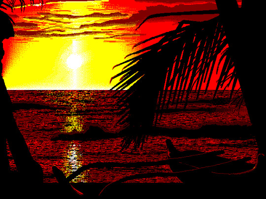
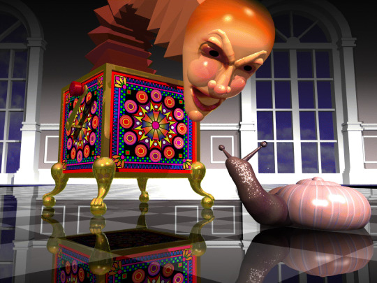


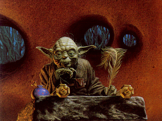
#digital hoarder#digital hoarding#wallpaper#wallpapers#background#backgrounds#retro#retro computing#retro computer#retro pc#windows#classic#pixel art#3d render#computer history#yoda#rare#budweiser#budweiser girls#bart simpson
289 notes
·
View notes
Last Seen Blogs

trinkerichi
I care like a bear

pratiwirmdhny
Pratiwi Ramadhany

amegafuru
Amegafuru

ao3feed-xicheng
ao3 xicheng fics