#50fps
Text
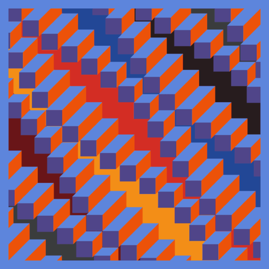
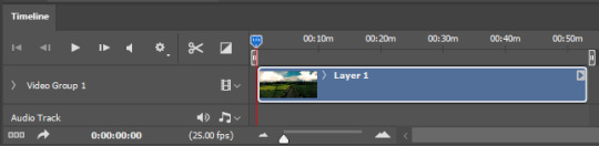
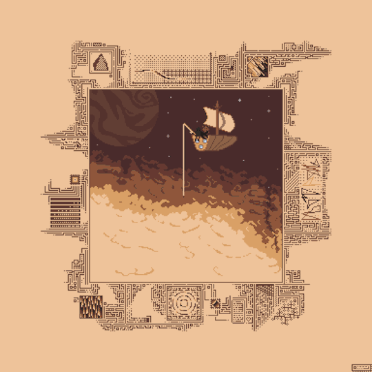
Elongated Flat Cube Waves // 100 frames \\ 50FPS
study of Jean-Pierre Yvaral op art works, second exploration first iteration
#op art#opart#Jean-Pierre Yvaral#Yvaral#geometry#loop#visuals#animation#motion#illusion#2d#3d#waves#sine wave#50fps#gif art#moodboard#70s#60s#sixties#pattern#seventies#retro#vintage
77 notes
·
View notes
Link
#2012#2016#3D#3DDepthEffect#3DProjection#50fps#Abstract#AdobePremiere#Advertising#AfterEffects#Animation#Arkaos#Arts#Background#Black#Bricks#Building#Central#Church#Collapsing#Collision#Coolux#Cost#Cubes#D3#Debris#Destroy#Displace#Displacement#Distortion
0 notes
Text
btw!!! if you're using footage that's a higher fps than you're used to, your gifs might look slower/choppier than usual! I'm used to using ~25-30fps footage, but for a new project I'm working on, I used footage that was 50fps. FPS = frames per second, so if you're using a higher fps, that means you're getting more frames per second of screentime. So a gif that previously might have been around 40 or 50 frames will now be closer to 80 frames. And while this can produce a really smooth gif, it will have a larger file size and will also need to be sped up so that it looks fluid.
So while my usual speed for gifs is 0.06 (per frame), if I used that with footage that's 50fps, it would look like this:
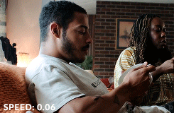
That's because it has more frames and needs to move faster to look natural.
This is the same gif at 0.03s instead.

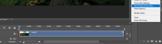
So if you notice that your gifs are slower or choppy like the gif above, try just speeding up your frames a little! Alternatively, you can also change your footage from 50fps back down to 25fps in photoshop with the directions below!
Go to the Timeline, click on the hamburger menu on the top right of the panel, and select "Set Timeline Frame Rate"
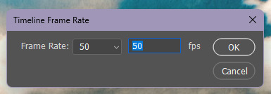
A little window will pop up and you can change the fps there!
It should look like this afterwards, while paused.
Do not pay attention to the number when it's red! That just shows you how fast photoshop is displaying the footage to you!

The length of the animation timeline will also shrink a bit after you change the fps. This method will save some space in your gifs for coloring!
#basically i found this out the other day and I'm like oh my god who else didn't know this#i remember when I gave the same footage to someone else I was like 'one is 25fps and the other one is 50fps if that matters?'#AND NOW I KNOW IT DOES MATTER!!!#gif tutorial#kinda#mytutorial#yes this is okay to rb! spread the good word bahaha
21 notes
·
View notes
Text
oh pillars of eternity 2: deadfire memory leak we're really in it now
2 notes
·
View notes
Text
unrestrained summer fun

#mgs#and before anyone asks yes that is a 3ds#retroarch actually runs really well (40-50fps and very few ausio glitches) on the new versions
7 notes
·
View notes
Text

More animation practice! part 1
#animation#gif#60fps#well gifs only go up to 50fps but the original file is 60#so that's close enough in my books#drawing#sketch#art
0 notes
Text
Tubbo: I just don't want Em to feel left out.
Phil: Toby! You actually– Toby, you did like, the biggest like, Gigachad move by the way, and I wanna thank you personally.
Tubbo: Yeah? What happened?
Phil: You dove in front of the Workers to save Tallulah, 'cuz Tallulah got downed–
Tubbo: Oh, to be fair, I was just like "I'm just gonna block the hit box" [Laughs] But it's fun!
Phil: Yeah, Tallulah- Tallulah got downed, and like, she was going to lose a life, and then Toby just went "NOPE!" and just jumped in front of them.
Tubbo: Hey guys, it's what I'm here for! Bullet-sponge, reporting for duty! Hey!
[Phil laughs]
Tubbo: I may have 4,000 ping, and 50fps, but I'm here to help! And no armor.
[Etoiles and Phil laugh]
330 notes
·
View notes
Text

Rewatching Classic Doctor Who, some episodes I haven't seen in years, some of the animated reconstructions I haven't seen at all.
And some episodes I haven't seen since last week.
The Daleks (now in glorious Dalekolour™)
I'll warn you up front, I'm generally not a fan of colorizations/special editions/re-edits so expect a bit of a grumpy post. But I'll try to be fair, I promise.
The episode starts with some extremely dodgy animation instead of the original linking material. It also starts with the intro in color, switches to black and white (apart from the credits which are in color) and then fades in the color and... why? An unnecessary and distracting flourish. The Wizard of Oz did this better nearly 90 years ago.
The colorization itself is quite good, I assume they were working off production documents (the Daleks are in their original colors, of course) but regardless the whole palette is a good match for SciFi film and TV of the era, as opposed to something more muted, moody, or modern. Compare and contrast with Forbidden Planet (1956), Queen of Outer Space (1958), or Star Trek (1966). The upconversion to HD video (and 50FPS?) went as well as it could, some parts of the episode are soft focus with lots of film grain but so was the original.
The music and sound design however is terribly distracting. Not an improvement on the original in any way, it's wildly out of place both stylistically and technically, at points directly in competition with the dialogue. Also, the Daleks received extensive re-writes and in some cases were re-voiced by Nick Briggs which is.. odd. I do have to admit enjoying the inclusion of the cloister bell in the initial fluid link sabotage scene, however, even if was a retcon.
Some of the re-editing was ok, some was intrusive. Constant cutaways to b-roll as if you were likely to forget something that happened 5 to 10 minutes earlier (or just might get bored watching a take longer than a minute) were a major distraction. Some of the digital additions, for instance adding footage to the Daleks' screens, worked well. Others, like William Hartnell "dodging" a Dalek beam that hadn't been there 60 years ago were forced. The digitally animated TARDIS dematerialization is actually worse than the original analog video mix effect. The pace is extremely quick now, much of the tension and suspense of the original story is lost along with the "Dals" origin of the Daleks, for better or for worse. But all in all, it's all right I suppose. I wonder if I would have been easier on it if I hadn't just watched the original.
The "And then the story continues.. for 60 years" teaser was nicely done. A great mix of moments from the First Doctor's stories including some tidbits from missing or rarely seen stories. Hat's off to whoever got the clip of the Beatles from The Chase in there.
Next up: The Sensorites, for real this time.
#doctor who#classic doctor who#first doctor#ian chesterton#barbara wright#william hartnell#carole ann ford#jacqueline hill#susan foreman#william russell#doctor who rewatch#the daleks#serial B#Ted Turner must pay for his crimes#colourized#colorized
29 notes
·
View notes
Text
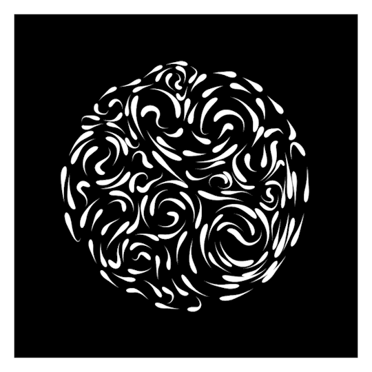
wip // circular based custom path droplets
540² 45 frames - 50FPS (1.5MB)
#loop#trapcode#tao#droplets#monochrome#moodboard#b&w#black and white#mesmerizing#animation#gif art#seamless#visuals#circle#flow#paths#animated#custom#abstract#after effects#motion#design
228 notes
·
View notes
Link
#2012#2016#3D#3DAnimation#3DProjection#50fps#Abstract#AdobePremiere#AfterEffects#AlphaChannel#Animation#Arcades#Arcs#Arkaos#Arts#Background#Baroque#Best#Black#Bricks#Building#Church#Circle#Collision#Colonial#Columns#Coolux#Cornice#Cost#D3
1 note
·
View note
Text

Beginner Blender Tutorial
Basic Render: Part Three (Adjusting Render Settings, Adding Lights, and Rendering!)
(Continuing from Part Two)
Step 1: Adjusting Render Settings
I exclusively render in Cycles, and though I'll be doing some Eevee runs for the sake of tutorials, I'm going to share what I know today and show you how to set up a Cycles render the way I do
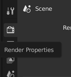
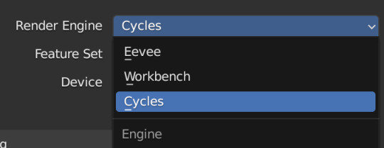
Navigate to Render Properties and select "Cycles" in the Render Engine dropdown

If you have an older system, leave CPU selected
If you have a newer or beefier computer, select GPU complete
I render on a MacBook Pro, so I'll select GPU
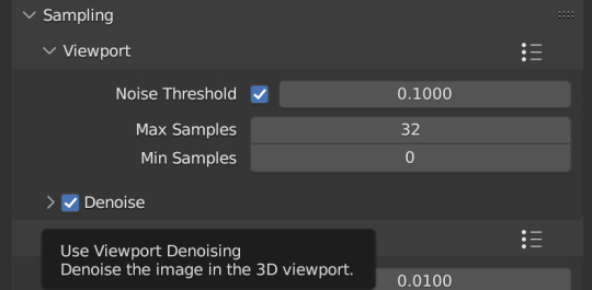
Under Sampling -> Viewport, make sure you click on the Denoise, this will clean up our render preview so we can more easily see what the final result will look like
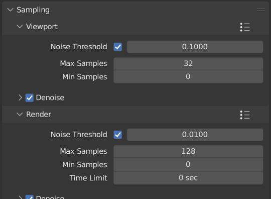
Under the same Sampling tab, adjust your Max Samples to match mine (32 in the viewport and 128 in the render window, this will speed up your render time)
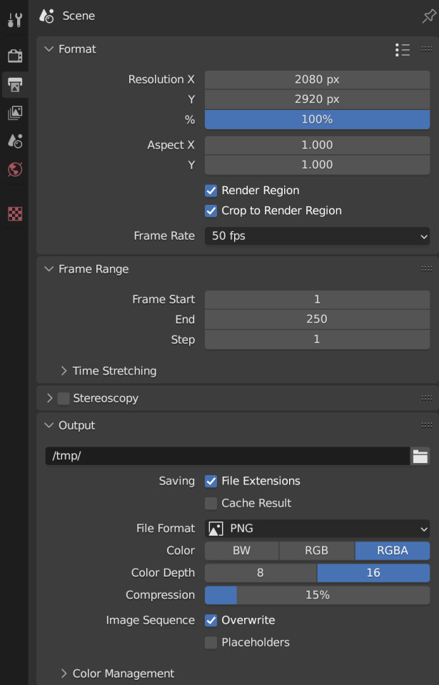
Click into Output Properties and select "Render Region" and "Crop to Render Region", and change the frame rate to 50fps
In the Output tab, change the Color Depth to 16
Nothing will change in our 3D Viewport, but the settings are ready to go
Step 2: Adding Lights
Right now, if we were to change our mode to Rendered, we'd have nothing but a black box. This is because our sim is in a cube with no light source
Let's add some lights!
For portraits, I like to use a combination of Spot and Point lights
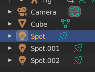
You add in lights the same way you add in the camera and the cube, either by clicking "Add" in the top menu or with Shift+A on your keyboard and selecting Light -> Spot or Point
I'm going to add a Spotlight first
I like to add in lights in Rendered view, but be careful using rendered view as it ups the chances that your Blender will crash

I added in a spotlight but it appears that nothing happened
Objects are added into Blender at the Cursor point. I never adjusted mine so it's at the center of the axis, meaning below my sim's feet and outside of the box
Using G and X,Y,Z, I'm going to move my spotlight up
Now the light is above her, but I want it shining on her, so I'm going to rotate it forward
Rotate objects using the R key and X,Y,Z directions on your keyboard
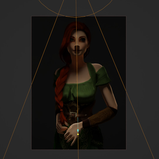
That's not bad, but I want more dynamic light.
I'm going to add two more spotlights for 3 point lighting
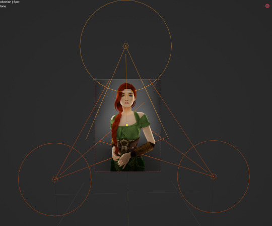
This is looking better, and you can see where my lights are and how they're oriented
Now let's adjust the background
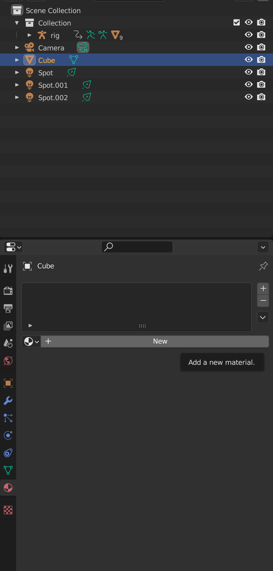
Select your cube in the Outliner panel and navigate to Material Properties
Click "new" in the bar
Then navigate to your Shader Editor window and you'll see a Principled BSDF Node is here
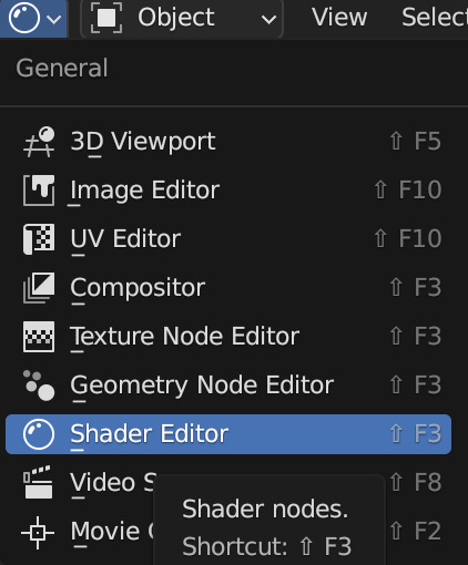
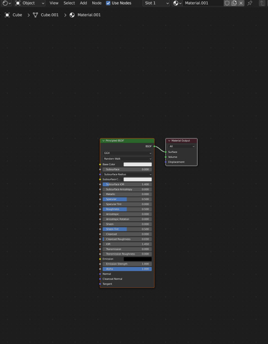
We're not going to do anything too fancy here, just change the color of the cube and some aspects of how it looks
Change the color of your box using the color wheel then adjust your nodes to everything is set to zero except roughness
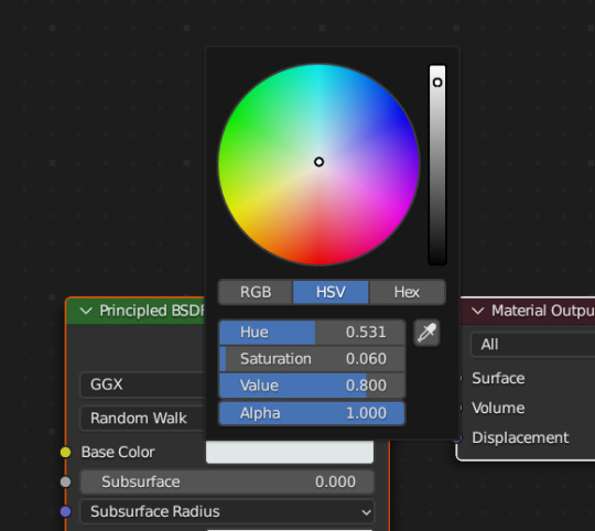
You should have something like this (of course use whatever color compliments your sim best)
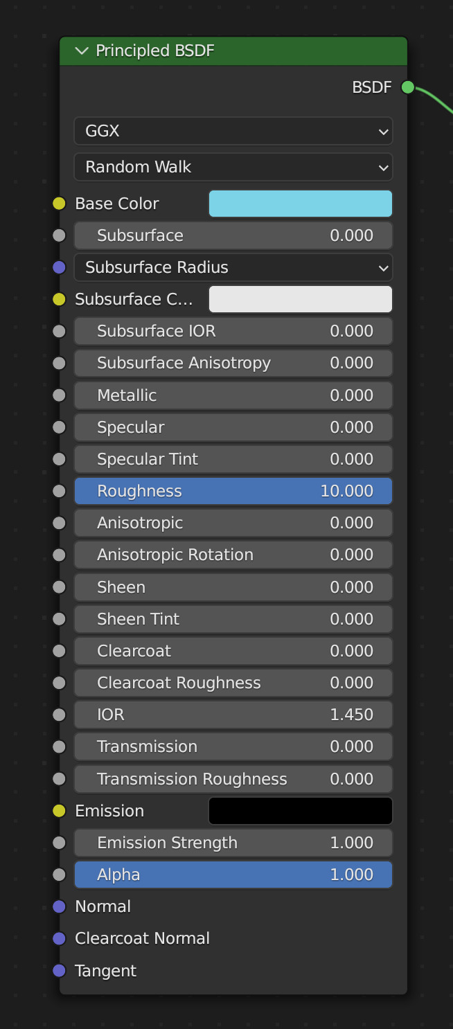
I don't want the background to be super flat, so I'm going to adjust the Metallic value on mine
Now I have this:
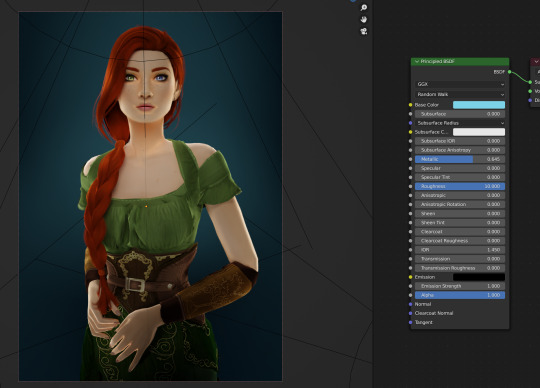
I like the lighting but I think it might be a little too bright
Let's adjust it a little
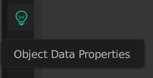
In your Outliner panel, select one of the spotlights then go to "Object Data Properties" (the little lightbulb)
I'm going to adjust the Power to 5 and click off multiple importance and click on shadow caustics, like this:
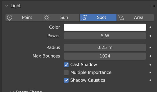
Do the same for all three spotlights and you should have something like this:
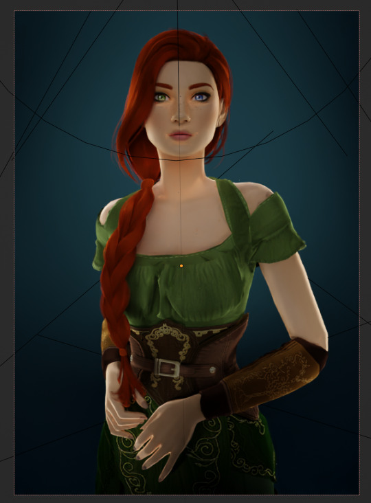
That's better, but let's draw attention to her face with a Point light
Add in a point light the same way as a spot (shift+A, light -> point) or Add in the top bar) and move it in front of her face
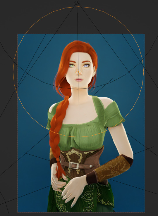
This is obviously way too bright, so let's adjust it like we did for the spotlights
I've changed the radius and adjusted the power to 8, as shown here:
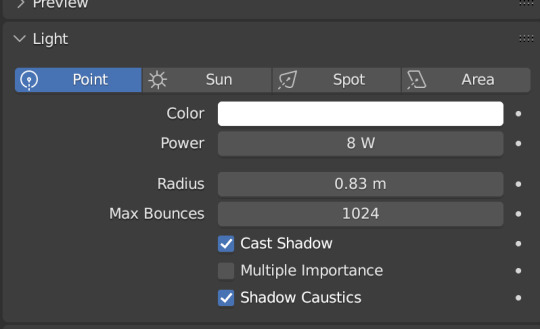
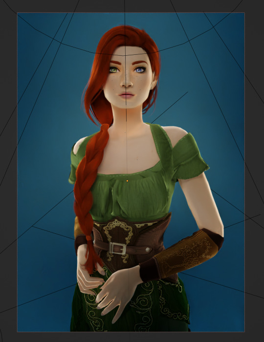
Here's the result:
That's much better!
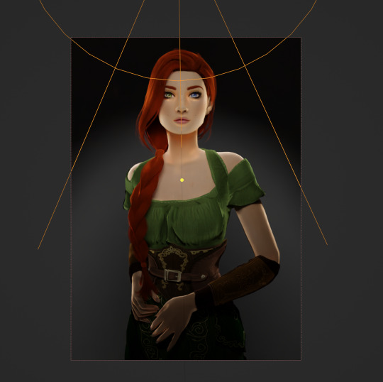
Normally at this point I would probably change her hair and add in jewelry and make minor adjustments to this and that, but for the sake of this super simple beginner render, we're ready to go!
Before you run your render, save this file somewhere easy to find. I'll be using the same file for future tutorials!
Step 3: Rendering!
Once you've done all the setup, rendering is actually super easy
Make sure you switch your 3D viewport back to Material Preview (rendering while in rendered mode has a tendency to make blender crash)
Then go up to the navigation bar and select Render -> Render Image
A new window will pop up, and your render will begin!
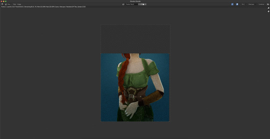
Rendering time will depend on how complex your scene is and how many assets you've added in. Ours is very simple so mine says it'll take about 6 minutes
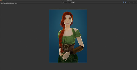
And it's done! Save your render and either post it or edit it in your favorite photo editor!
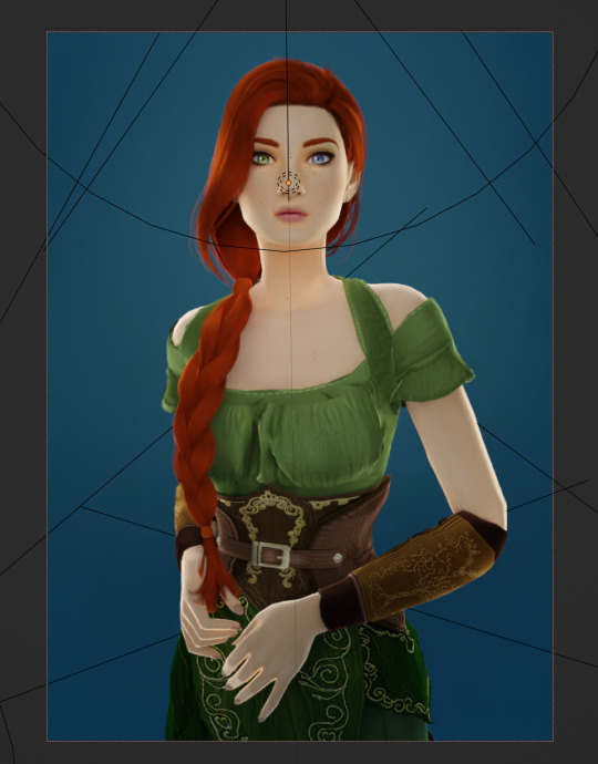
UPDATE 7/17/23
As you can see, my render was looking very glowy. I didn't know why (there was no glare node in the compositing settings or anything that would cause this, or so I thought), until I adjusted the roughness values on my sim.
Now it looks like this:
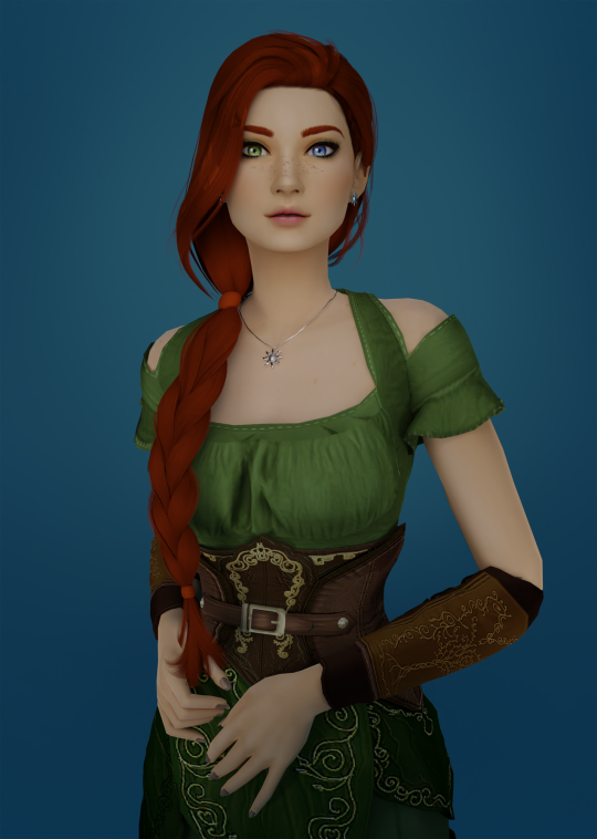
So if yours is looking glowy, adjust the roughness to 0, then back up to 10 and that should fix it!
Homework:
Your Render School homework is to create a simple portrait render using these tutorials and tag me in it!
I can't wait to see what yall make!
Please leave any questions in the comments below or send an ask and I'll help as best I can!
Happy Rendering!
#salemsims tutorial#render school tutorial#sims 4 render#tutorial#sims 4 blender tutorial#blender#render tutorial#sims render tutorial
44 notes
·
View notes
Text
https://mega.nz/file/03cgkRrR#R-fn9wSOO7WKgCN-FCHVPj23XDLZ6ZevB6UDm4xIFo4
downloaded the bbc 6 festival stream yesterday (720p 50fps)... i will never give the bbc my money. Gatekeeping bastards
7 notes
·
View notes
Note
i cant believe corpse eyes is going to end with a 50 fps 300 frame dragon yuri kiss scene with fully painted backgrounds each frame /SILLY
50fps 300 frames implies it's only 6 seconds long! this scene would EASILY last at least 30 seconds with an epic zoom out showcasing the world blow up beautifully as Dragon Lesbianism wins
25 notes
·
View notes
Note
wait does cave story+ really just run faster???? wtf????
yep, the original game ran at 50fps and all the nicalis ports up it to 60fps without adjusting any of the game logic. this applies to literally every single version nicalis has officially put out
5 notes
·
View notes
Text
Sooo... is this thing on? *poke* Oh, hello!
("Solitude Reimagined" pictured above. Click on it if the gif lags, it should be 50fps)
69 notes
·
View notes
Note
hi !!
sorry if you've already answered this question, but why does my gif always end up being choppy when i export it? i've noticed it always happens to me even when i do every step right.
hi, anon!! the choppiness may come from two things:
skipping frames in your gif. i'm not sure how you make gifs, but i'd recommend following one of these tutorials (or this one, if you're on mac!) to see if they can help you with another method if you need it because i've used both of them and didn't have this issue
the speed of your gif, which you can change on the export popup with the "speed" slider. i personally put my gifs at 200% speed, but you may need to play around with yours depending on your style of giffing!
alternatively to the previous bullet point, you could manually change each individual frame of your gif to be named something like "_a_frm0,50" — the ",50" makes the gif run at 50fps, which is the average frame rate for gifs on tumblr and should make your gifs not look choppy
these are the only real solutions i personally have to your problem, but if anyone else has another solution i haven't listed here, please reply to this post or reblog with your solution!
4 notes
·
View notes
Last Seen Blogs

mellypea77
here for the shits and giggles
unprecedenteddpxdchyperfixation
My Unprecedented DPxDC Hyperfixation

snyunho
Snyunho

svd-v1b3zz
svd-v1b3zz

couragefail
burned.