#Bodoni type
Photo


Fine Press Friday!
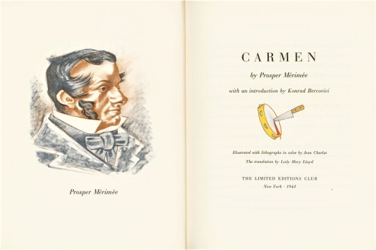
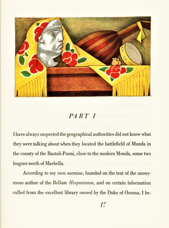
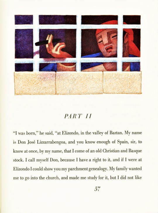
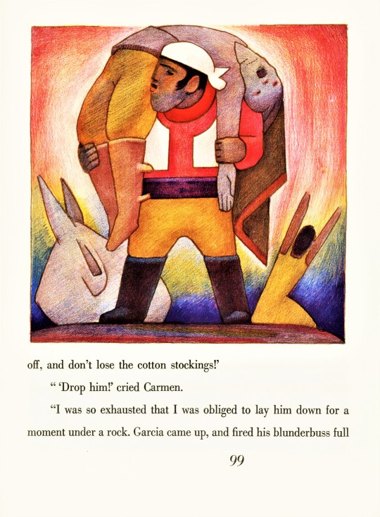
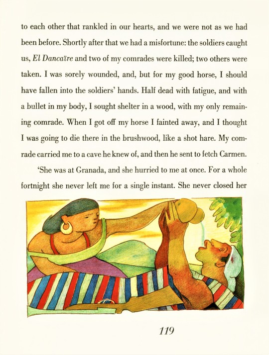
Our Limited Editions Club Shakespeare series keeps giving us more artists to look for in our collection! This week we found Carmen, by Prosper Mérimée (1803-1870) illustrated by French-born American painter and illustrator, Jean Charlot (1898-1979), published by the Limited Editions Club, New York, in 1941 in an unstated limited edition of 1500 copies signed by the artist. We learned about this edition because of the post we did a couple of weeks ago on Charlot’s illustrated edition of Shakespeare’s Henry VI, Part 3.
Mérimée’s 1846 novel about the eponymous Romani beauty, is most popularly well known from Georges Bizet’s famous opera of the same name, which is based on Part III of Mérimée’s story. The action is set in 1830s Andalusia, but Jean Charlot’s illustrations gives the story a Mexican flavor. Charlot worked mainly in Mexico and was a member of the Mexican Muralist Movement, sharing a studio with Fernando Leal who is considered to be one of the first Mexican Muralists. It was after the Mexican Revolution (1910-1917) that the new government sought to use murals to educate the public on social justice issues. From a young age, Charlot was fascinated by Mexican art and pre-Columbian artefacts and his mature work reflects this fascination, including in these illustrations.
The thirty-seven multi-layered color lithographs, which Charlot drew directly on the printing matrix, feel like miniature frescoes. Charlot laid down quick marks to color large areas of the image, which layer in overlapping color to give the image a lively energy. One could easily imagine one of the illustrations used as a page header as a mural above a doorway, signaling a transition. Or, one of the larger full-page illustrations as a mural on a large wall. I am taken by how these illustrations function well in both architectural and book spaces. The book is architecture.
The lithographs were printed by Charlot’s friend Albert Carman in New York and the type is 18-point Linotype Bodoni printed by Aldus Printers in New York. . The paper was made by the Worthy Paper Company, was watermarked with the name of the book and the covers are wrapped in a vibrant hand-blocked color silk.
View more Limited Edition Club posts.
View more Fine Press Friday posts.
– Teddy, Special Collections Graduate Intern
#Fine Press Friday#Jean Charlot#Carmen#Prosper Merimee#Lithographs#color lithographs#Lithography#Limited Editions Club#LEC#Mexican Muralists#Murals#Mexican artists#American Artists#French Artists#Lady Mary Lloyd#Albert Carman#Aldus Printers#Fine press books#Linotype Bodoni#Bodoni type#Worthy Paper Company
59 notes
·
View notes
Photo

Lil’Louis - French Kiss
Tribute Poster
Design by Attico36
#graphic#design#designer#layout#editorial#visual#grafik#poster#minimal#graphics#graphicdesign#artwork#print#posters#type#typo#typography#typeface#helvetica#bodoni#sans#serif#art#fineart#font#fonts#web#webdesign#music#dj
303 notes
·
View notes
Text

HARRY LESTER IN DA HOUSE
0 notes
Text
it was this or "blurghhhhhhhh" for the thousandth time
0 notes
Note
what's your type?
oh good question!
Helvetica.
Garamond.
Futura.
Bodoni.
Arial.
Times New Roman.
Verdana.
Rockwell.
157 notes
·
View notes
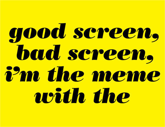
Note
Font anon again! Thanks for indulging me. Yes it is the fic where SF!Papyrus is Palatino. It’s one of my favs. I agree with Serif as a last name because it’s funny.
I’m going mostly off vibes. You completely nailed what I was going for with UF! Papyrus (you are definitely the right person to brainstorm with and have great insight.) My original font search prioritized fonts people complained about, sticking to the theme of Comic Sans and Papyrus being “annoying fonts.” If you can think of any other ones I’m down to hear them.
Here is my list of names:
Courier
Helvetica
Trajan
Bradley Hand
Gentona, Avenir
Calibri
Verveine
Corsiva
Frutiger
Bodoni
Vivaldi
Zapfino
Rockwell
Amadeus
Clarendon
Arvo
Avenir
Casion
Cooper
Didot
Carrington
Anviers
Fontin
Fertigo
Harrington

*waves hand at you* nOOOOO WORRIESSS and thank you for the clarification ;D!! I'm always here for indulgence owu!! And thank you! I'm glad you like my take on things haha! (ANNOYING FONTS LETS GO!!!!)
This is a fantastic list :o!! I pulled up all the fonts in your list in another window for maximum ponderance lol.
I stuck my thoughts under the cut because as usual it got long (and for some of them I'm spitballing more than anything) but hopefully it's of some help ^^!
Swap!Papyrus: Hands down (haha), he suits Bradley Hand visually- the font is like Papyrus (font) but more loose and scribbled- it has more curves and thus has a more laidback kind of vibe, which is why I think it'd suit him... but also I'm losing my mind at the idea of calling him Bradley (derogatory) (/lh).
(I'm also biased though. I used to use this font for writing when I was younger LMAO. You know how people say to write with Comic Sans? I did that with Bradley Hand.)
Swap!Sans: I reckon he'd fit Cooper.
Round, bold, a little bit 'childish' when compared to other fonts, but infinitely more put together than Comic Sans. It also makes me think about comics like Archie or Garfield, which used similar rounded fonts for their titles! Cooper (font) feels so... cartoony to me, y'know? Also it makes me think of Sly Cooper just namewise lmaooooo
Underfell!Sans: Ok. OK. Listen I don't think this font suits him BUT!!! Fontin would be REALLY FUNNY just purely because I think he'd have the time of his life making jokes about "Fonting". Like: "ey! i'm fontin' here!" type of jokes which would get old so so so quickly. Do you see my vision.
If Carrington was less... curly-cursive I'd say it'd suit him purely for the potential visual association with like. the typeface you might see at a stereotypical tattoo parlour or something. IDK it makes me think about tattoos and motorcycles.
SAYING ALL THAT THOUGH: I think he could suit Rockwell! It makes me think of titles and bold headers, also cowboy westerns and Very Masculine and Cool products lol. Except... Rockwell is usually used with Uppercase, Title case or Sentence case. Purely lowercase Rockwell feels inherently cursed to me. (Like truly, what are you doing if you're using Rockwell in lowercase. That's committing a violence.)
Swapfell!Papyrus: Weirdly enough, I reckon I could see him with Corsiva or Fertigo? (Which... looks strikingly similar to Fontin. Huh!)

(Fertigo on the LEFT, Fontin on the RIGHT)
IMO, Fertigo feels more laidback due to the curling tips (which still come to sharp points). The way that the ends of "strokes" get flicked gives it a sort of lazier vibe.
BUT the font choice here also depends on your interpretation of SF!Pap!!
If you want to have a font that's underrated and everywhere?? GO Calibri. It's used as the default font for Microsoft, and is designed to be very easy to read. This is particularly befitting of the interpretations of SF!Pap where he's well versed in computers/electronics and/or doing spywork. His presence is not actively noticed, but he's always there! Alternatively, if you wanted to name him after a serif'd font, similar to Calibri, one of the fonts from your list, Caslon, has a somewhat ubiquitous presence, and also feels a little rougher/crunchier than stuff like Calibri or Fertigo.
Other notes:
I know you already decided on a name for him, but Trajan is also a really good alternative option for UF!Papyrus imo. Similar Roman-Commander vibes except even more explicit LMAO. Plus, it's a solely uppercase font, which is even more fitting.
Didot... if you swap the 'i' for a 'd' and vice versa, you get 'idiot' which is simply ripe for the teasing, but I don't think it fits any of the skeletons lol.
I would have suggested Arial as an option due to it's former prevalence, but honestly that name (+Verdana) have like… cemented themselves in my brain as 'fan-made skeleton' fonts ajbhjsmhjmdh (no shade whatsoever to anyone who uses them ofc, but MAN are they used a LOT.)
#i considered the fells having serifs and the non-fells having no serifs but mmm i think that puts a lot of restrictions on the options#additionally i feel like sf!gold bross fit script/cursive font names for some reason#zapfino and vivaldi for wine and coffee maybe...#velwy.txt#inbox#anon#i feel like i need a tag for these sortsa posts at this point lol#mindmortar#get it? because. headcano- *the mindmortar goes off and i m shot offscreen*
22 notes
·
View notes
Note
Identify this font?

This turned out to be pretty challenging as it's one of many, many variants of Bodoni. It's the same reason why looking up the font in this meme turned out to be challenging (just like with Helvetica, if a typeface existed before personal computers and is mildly popular, then by now it has a ton of variants and derivative fonts)
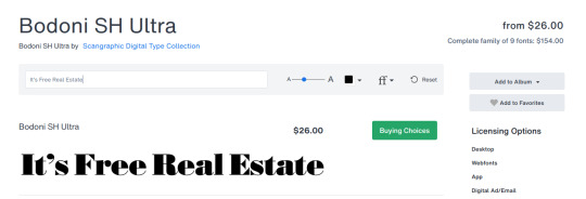
Bodoni SH Ultra by Scangraphic Digital Type Collection is a possible candidate due to specific shapes of letters "e" and "R", but the width of individual characters doesn't seem to fit (though it could be squashed by the creators of the show this frame comes from)
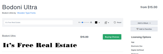
But it could also be Bodoni Ultra by Wooden Type Fonts

or Bodoni No. 2 Std Ultra (D) by URW Type Foundry, and I think it's this one, by attempting to overlay the text on top after resizing it.

3 notes
·
View notes
Text

I have made a small start on extracting some type from an ancient, filthy, horrible old typecase. This appears to be Bodoni Poster, now that I've gotten it out from under the layers of dust, fossilized mouse droppings, and desiccated spiders.
#letterpress#metal type#even with a dust mask I kept having sneezing fits#and there is so much more of this to do#hopefully it will be worth it
10 notes
·
View notes
Text
Typography Exercise
------------------------------------------------
We were each given three cards with different type written on them.
The game was we picked one to Date, to Friend and to Ditch.

These were the ones I got, in order of Date, Friend and Ditch. It was a cute and quick little exercise that made us look at the different typography and make decisions of the ones we liked most.
------------------------------------------------
On the back of the card, we read out the name and short personality description.
Bodoni Poster being my chosen one.


------------------------------------------------
5 notes
·
View notes
Photo

Open Houses are back this week!
Theme: TypographyWed 2/22/2023-Thu 2/23/2023 10am-4pm each day. Free and open to all!
On February 22, 1991, “A Few Basic Typefaces” exhibition opened at the School of Visual Arts (SVA) in NYC. Massimo Vignelli was awarded their annual Master Series award which included an exhibition. He chose to highlight work in only a few typefaces: Bodoni, Century, Garamond and Helvetica. This week marks the 32nd anniversary of this exhibition.
SVA’s Masters Series began in 1988 as “an annual award exhibition to honor great visual communicators—designers, illustrators, art directors and photographers—of our time.” Massimo Vignelli was the 3rd person to receive this honor.
“It was a polemical exhibition to protest the inflation of meaningless typefaces polluting our world.“ Vignelli: From A to Z, p. 187
For our Open Houses this week, we will be revisiting this exhibition and invite you to think about designing type and designing with type. You will be able to view many of the artifacts from this 1991 exhibition plus some designs done after 1991 that includes these 5 typefaces.
From the exhibition records, we found that the exhibition plan originally included designs using Times New Roman as well. You will be able to see these works too. Along with images of the original exhibition, the original exhibition checklist, and other documentation. Plus numerous OTHER typefaces, many custom, that appear in the Vignellis’ work. Futura. Optima. Didi. Bloomingtype. Our Bodoni. Our Futura.
Plus numerous custom alphabets for architectural graphics, logotypes, etc. And we’ll have examples of designs using type that might seem very “un-Vignelli.”
More details about Open Houses can be found on our website: https://www.rit.edu/vignellicenter/events
#vignelli#design archives#design history#Typography#1990s#bodoni#century#garamond#helvetica#times new roman#graphic design#corporate identity#Packaging#exhibition design#architectural graphics#open houses#archives for all
21 notes
·
View notes
Text

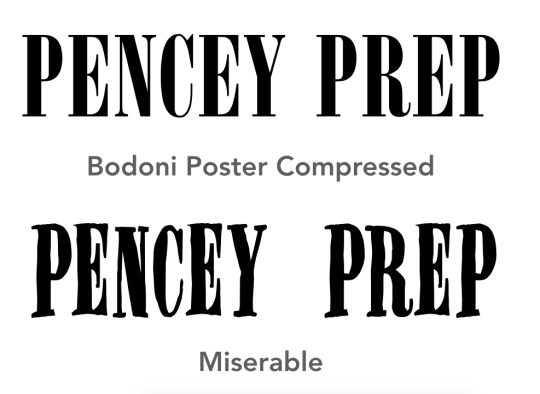
well, here's the thing about Miserable:

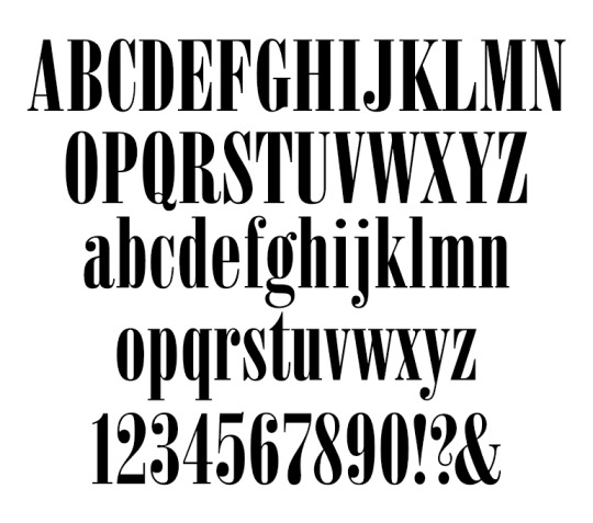
[Left: Miserable by Jakob Fischer; Right: Bodoni Poster Compressed by Chauncey H. Griffith]
they're basically the same typography, miserable is meant to look like a rougher version of the bodoni poster. another fun fact it's that it's a free font and the creator has been publishing free to use typographies for a long time, since the 90s at least.
anyway, going back to the original point, miserable might be the font used in the pencey poster that's not untrue (they even have the same kerning distance, gerard didn't bother to adjust it help 😭):

but like, there are tons of new types that are based and/or very similar in style to another (Bodoni Poster has a lot of doppelgängers, check out: Grischel, Onyx, Arsis)
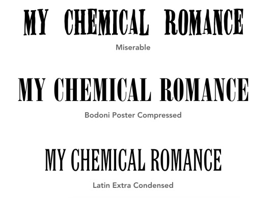
but miserable is nawtt the bullets font sorry 😭 no matter how you slice it she's just not #that girl

[Bullets cover source]
#sorry for caring this much about type. im not crazy#also i mean this lightheartedly btw#in many ways one font is a re-creation of another !#miserable has a very distinct 90s look to it imo. i like it#also i think onyx is used in the nirvana logo. not sure tho#design#bullets
5 notes
·
View notes
Text


It's Fine Press Friday!
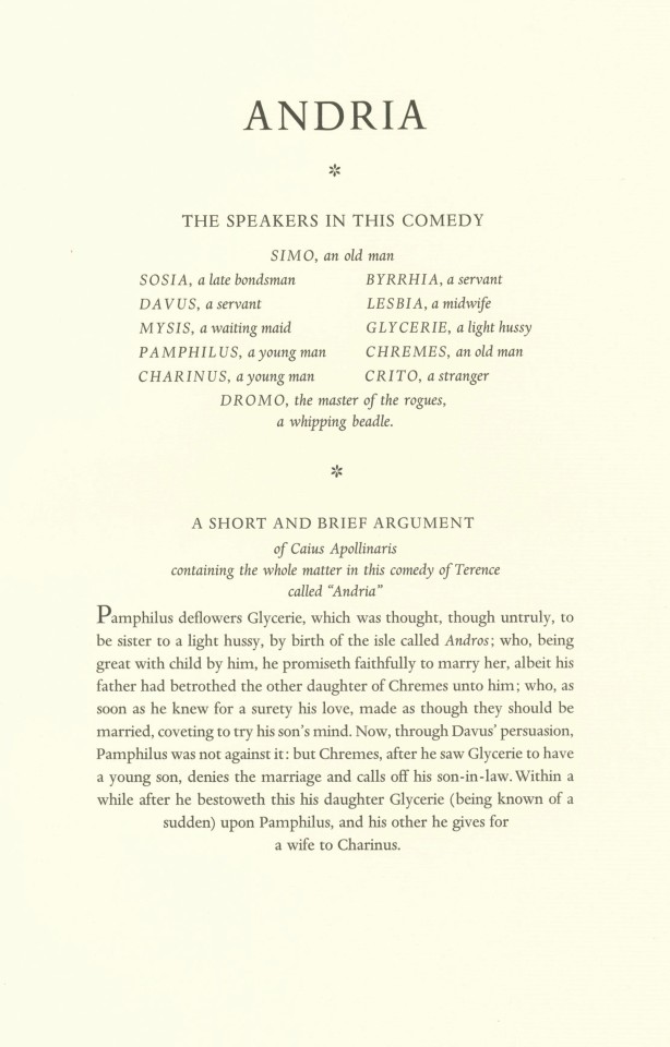
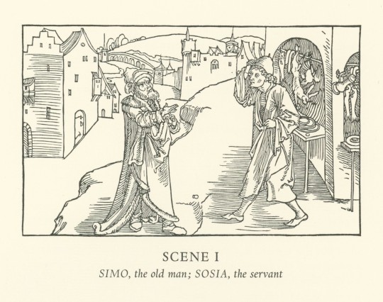
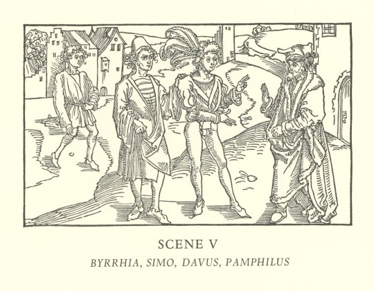
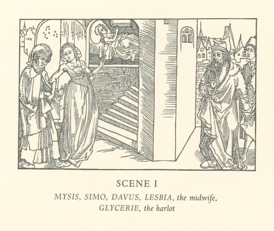
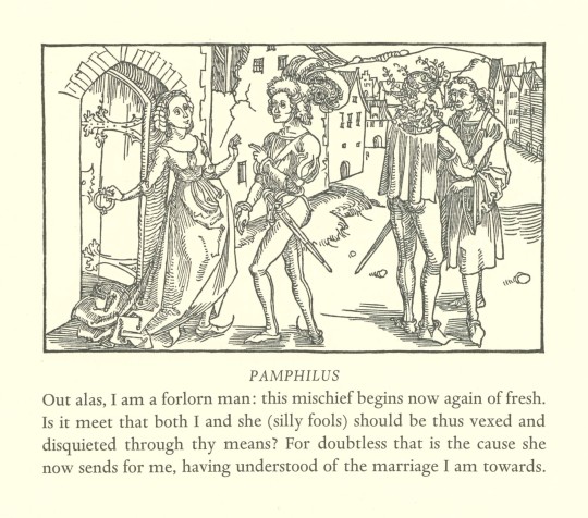
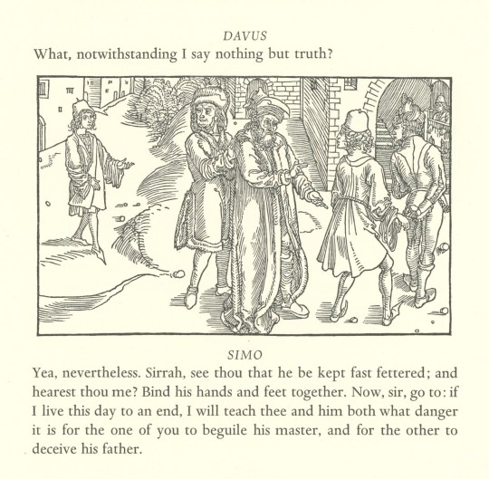
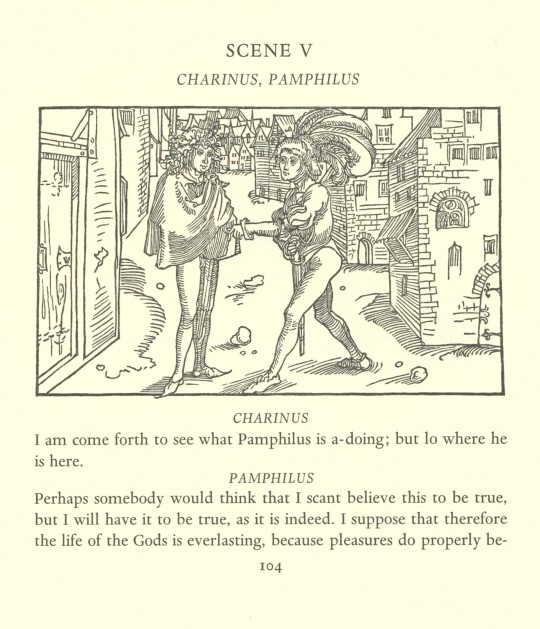
Today’s fine press book is an English translation of ancient Roman playwright Terence's romantic comedy of errors Andria, hand-printed in Verona in an edition of 170 copies by Giovanni Mardersteig (1892-1977) at his Officina Bodoni in 1971. The book uses Richard Bernard’s 1598 translation of the play from the Italian, with revisions and edits by Betty Radice.
In 1492, legendary German artist Albrecht Dürer (1471-1528) drew illustrations on wood blocks for a planned edition of Andria, but they were never cut. The blocks have been preserved, however, in the Kupferstichkabinett of the Kunstmuseum Basel. For this edition, those drawings were copied onto 25 new blocks and cut for the first time by noted German American artist and graphic designer Fritz Kredel (1900-1973).
The text was handset in Dante type, designed by Mardersteig, and printed on handmade Magnani paper, with the edition signed by Fritz Kredel. The edition maintains all the qualities Mardersteig established for his press when he founded it in 1922: "The book in its noblest kind should always be a work of art. And the instrument with which this end can be achieved most fully is the press.”
View more posts relating to Albrecht Dürer.
View more posts on books by Officina Bodoni.
View more Fine Press Friday Posts.
– Sarah S., Special Collections Graduate Intern
#Fine Press Friday#fine press fridays#fine press printing#fine press books#terence#Andria#richard bernard#betty radice#fritz kredel#woodcuts#Dante type#magnani#Giovanni Mardersteig#Officina Bodoni#Sarah S.
11 notes
·
View notes

Text
ARTS 245 Blog Post 1
As someone who studied a bit of calligraphy and worked with it earlier in my career as an artist, I found this chapter interesting in a couple of different ways. Learning about calligraphy was so important to how I became who I am as an artist because without learning that form of artistry, I would have never created my passion for graphic design and typography. I first started learning calligraphy from a friend in middle school and then I continued to learn and grow from there. While reading Chapter 1, I found it interesting to read how Bodoni and Didot, both famous calligraphers of the 19th century, incorporated their classical calligraphy styles with new typographic designs that would create a new and untraditional look to letters at the time. I was also compelled by how they advanced from lead to wood-type manufacturing and how they revolutionized letters in a way. Furthermore, I find similarities within this reading because it discussed how the new mechanized design approach divorced the traditional calligraphic ways. This reminded me of how I had once practiced calligraphy, however as I continued to practice I changed to different mediums. Rather than a pen I used my Apple pencil and switched to using my iPad. I now use Procreate, and while I still hand-write, I use technology more. In conclusion, I found this part of the chapter the most intriguing because it explored and analyzed how type had transformed and dove into the advancements that were made to get where we are in modern times. It also reminds me how everything is constantly changing and we are approaching different ways to progress in our craft every day.
3 notes
·
View notes
Text
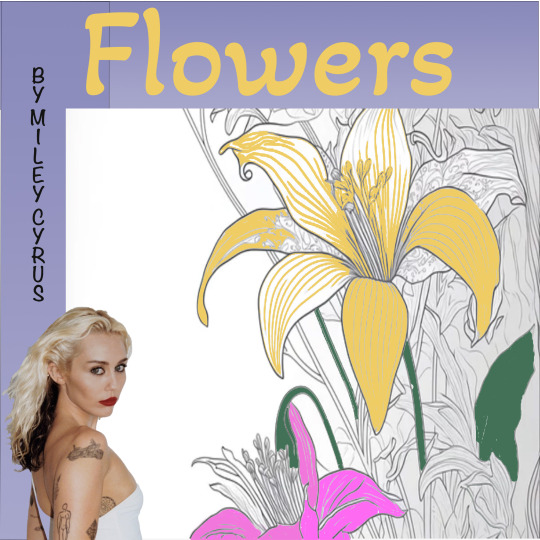
Graphic Design-with Eva Shortt
Type & Image- Introduction to Photoshop Album cover Design
I really enjoyed this workshop. It was great to get the chance to explore Photoshop and try out different things.
ALBUM 1 -I placed a photograph that I had taken as primary research at the start of semester 2. I experimented with fonts and shapes and used the text path tool to shape the text in curve direction in Illustrator and imported it after.
ALBUM 2- I experimented with colouring in the image. I wanted the cover to look like a colouring book that still isn't finished. Like the saying "Art is never finished , just Abandoned"
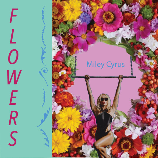
Album 3 - In this Album I imported pictures, added text Using the Object selection tool I shaped the picture of Miley to place on the Flower background. I also experiemented with colours and fonts to suit the style of the Album Cover. The decoration in blue on the left is actually a font style called "Bodoni Ornaments" and it spells out flowers also.I think it adds to it. Overall I feel I learned a lot by expermenting and trying out new things and it was very enjoyable.
4 notes
·
View notes
Text
Week 3.2 - Typographic systems
what we did in class
the exercise of creating words digitally or analog
playing with ink
creating our typography alphabet
In today's studio class, we discussed Typographic systems. We covered type as a system, how to measure type, type anatomy, type classifications and their classes, within their families. We then moved on to looking at how type can be a voice, through its message or the way it is displayed.
Point size comparison
Oldstyle (Goudy)
Modern (Bodoni)
Slab serif ( ITC Lubalin Graph)
Sans serif (Univers)
Script ( Kuenstler Script)
Decorative ( Rosewood)
Characters in a family
Roman
Bold
Italic
Small Capitals (drawn)
Small Capitals (manufactured)
Condensed
Stretched
What are experimental typefaces?
They are generally of the display family and have an unexpected look or interaction, such as animation, different x-heights, or a general disregard for the rules and spacing of letterforms. These text styles include quirky lines, colours and letterforms. Which provides flair and personality. It's a balance between typography as art and typography to convey a message.
We were then shown the evolution of a Typeface, created for 100% New Zealand. They had made their typeface from wood-carved letters, to highlight NZ's fresh and natural reputation.
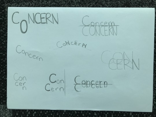
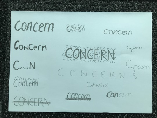
For the next session of our class, were asked to redesign a word (fitting to our campaign) to play around with the typography. I choose the word concerned, I have included photos of my work below. We were given the option to work digitally or analog and I found that using paper and pencil helped me to produce work quicker. We had to think about the content and tone, readabilities, emotions or meanings and if it fits our message.
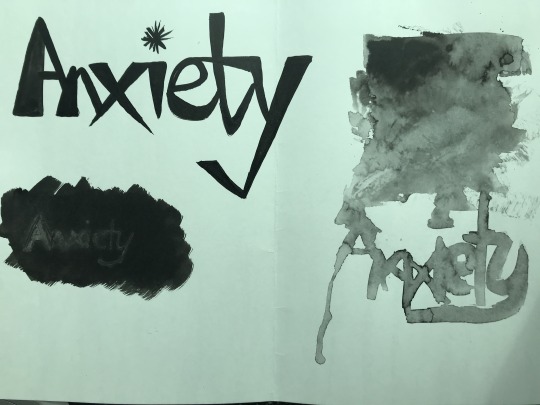
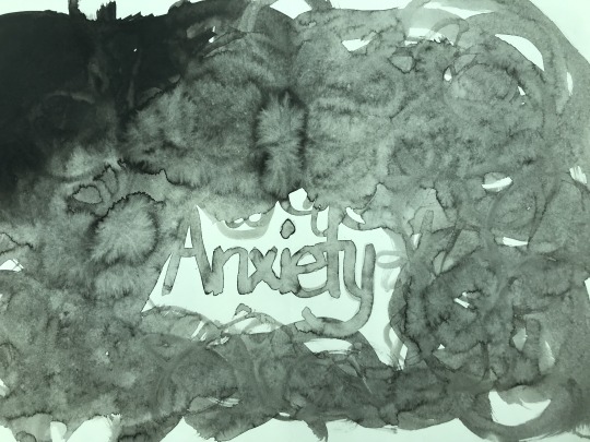
After this exercise, we were to repeat the same process but instead use Indian ink and brushes to explore different ways to express our words. I chose to change the word I focused on to Anxiety, as I think it is more fitting to my topic. I have included images of my work below, some of my ideas didn't turn out quite as well as I thought, but it did help me to get a better visual understanding of 'anxiety' and how that can be expressed further than just plain typography.
For the last section of our class, we began to take the skills we have just been working with to then create our own typeface that reflects our campaign. As I am not hugely confident with typography, I decided to look through the mood boards that I have created, and I found to base my type on Frito Vandito. I wasn't able to complete this all in class, so it will flow over into my SDL for the week.
8 notes
·
View notes
Last Seen Blogs

telltalehrt
starclan help me

aleontiverosg
𝚃𝚘𝚘 𝚠𝚎𝚒𝚛𝚍 𝚏𝚘𝚛 𝚢𝚘𝚞

sweetharm
Sweet Harm

lofi-cult-youtube
Lofi Cult (from YouTube)

agency-degree
Untitled