#Camille Norton
Text
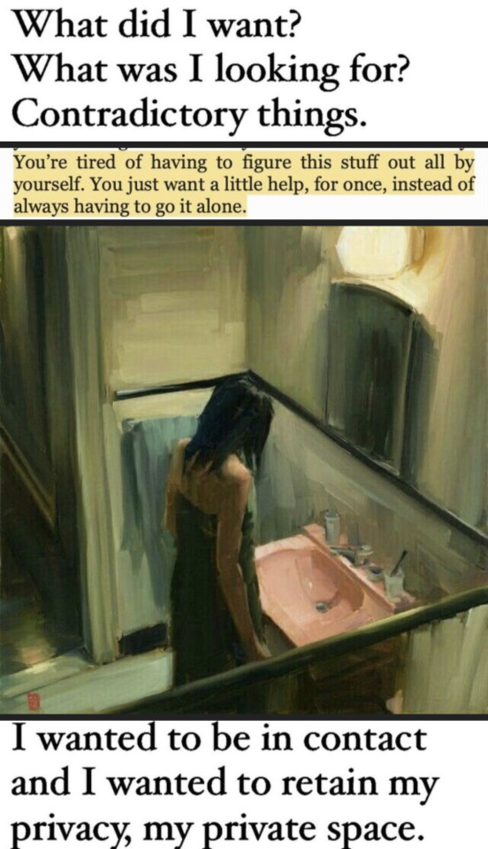
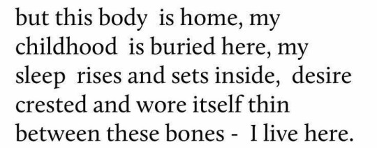
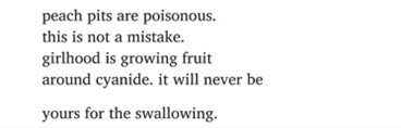
In the name of healing I bite chunks of myself daily, spit them out in my hand with the intention to wash it away later
Eventually, i end up over analyzing them, like everything else in my life
grafts of all the causes I’m still here, glued together by my mother’s fears
be the Alpha female, she said. “feed on your most beloved, a cup of the moon’s blood every night before bed for you to run alone forever, run wild, never slip”
I Shower myself with self-loathing, lick my own wounds close Keep me sane, keep me safe
loneliness to me is just another insecurity that is dangling from my prefrontal cortex, dangling right in front of my eyes… for me to see the world through it.
I spend hours looking at the bloody chunks in my hand, thinking where did i go wrong ? how much can I hold on to this heartache ?
I've been running around it all my life, running around red lines, red lines circle me, i run in circles around myself I’m all that I’ve ever knew, yet, I only know myself in fading
A distant memory, a deja vu…
All I really know, is that the only stable in my life is the fact that I exist, and that it’s a temporary state.
jamais vu.
will the lines fade if i eat what i bit off of myself again ? if i chew and chew and chew… If i teach myself to stomach it will i be whole again?
is holding on to those pieces enough to satisfy my desire to be held ?
Or does it make me a feral rogue ?
Schizophrenic delusions ticking in my head…
Sometimes I wonder if it’s my fault that I’m this alone…
then again I wasn’t the one feeding myself all the insecurities as a young child.
I wasn’t the one playing pretend.
It was never my fault, my mother thought faking happiness is the way to protect me, it was never my fault father wasn’t interested in the details, as long as I was his perfect girl…

Now, I can’t hold on to anything the way i hold on to the lunatic turmoil that makes me sway and laugh on my own personal misery.
Call it history.
Hide behind defensive humor, get my inner demons drunk on caffeine, mistake that high for happiness cause mama did too…
And wait for caffeine withdrawal to wake us up, both of us…
I’ve never been hangover, but I imagine this is how it’ll feel
The aura ? The migraine?
The urge to throw myself up to be reborn clean.
•••
•Quotes: Olivia Laing/Heather Havrilesky/ Olivia Laing/ Marya Hornbacher/Anaïs Nin/Camille Norton/ Alice Oseman/ eduardo C. Corral/anne carson/ Joanne Harris/ Hannah Green/Hannah Green/Lisel Mueller
•Original context: sinligh
•Art reference:
1. Sasha Hartslief, Late Night Shower, 2021. 2. Getting Up by Vincent Giarrano. 3.illustration by Owen Gent. 4. The Lovers on the Bridge, 1991. 5. "Beverly Edmier 1967' Keith Edmier, 1998
•song recommendation:
P.s: the whole album is a masterpiece ! Give it a try, thank me later.
#sinligh poem#personal writing#quotes#olivia laing#heather havrilesky#marya hornbacher#anaïs nin#camille norton#alice oseman#Eduardo C. Corral#anne carson#joanne harris#hannah green#lisel mueller#web weaving#word weaving#blotched words#compilation#parallels#art parallels#paintings#feminsm#feminine rage#feminist#fuck the patriarchy#dark academia#poetry#louis tomlinson#faith in the future#Spotify
2K notes
·
View notes
Photo


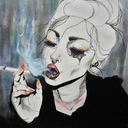
hatching / pahanhautoja (2022) - “a girl in the shape of a monster, a monster in the shape of a girl”
jenny zhang // hatching // aria aber // unknown // hatching // lisa marie basile // camille norton // hatching // unknown // sophokles // hatching
#webweaving#webweave#poetry#fragments#hatching#quotes#pahanhautoja#jenny zhang#aria aber#lisa marie basile#camille norton#sophokles#mine <3#i love this film sm
220 notes
·
View notes
Text
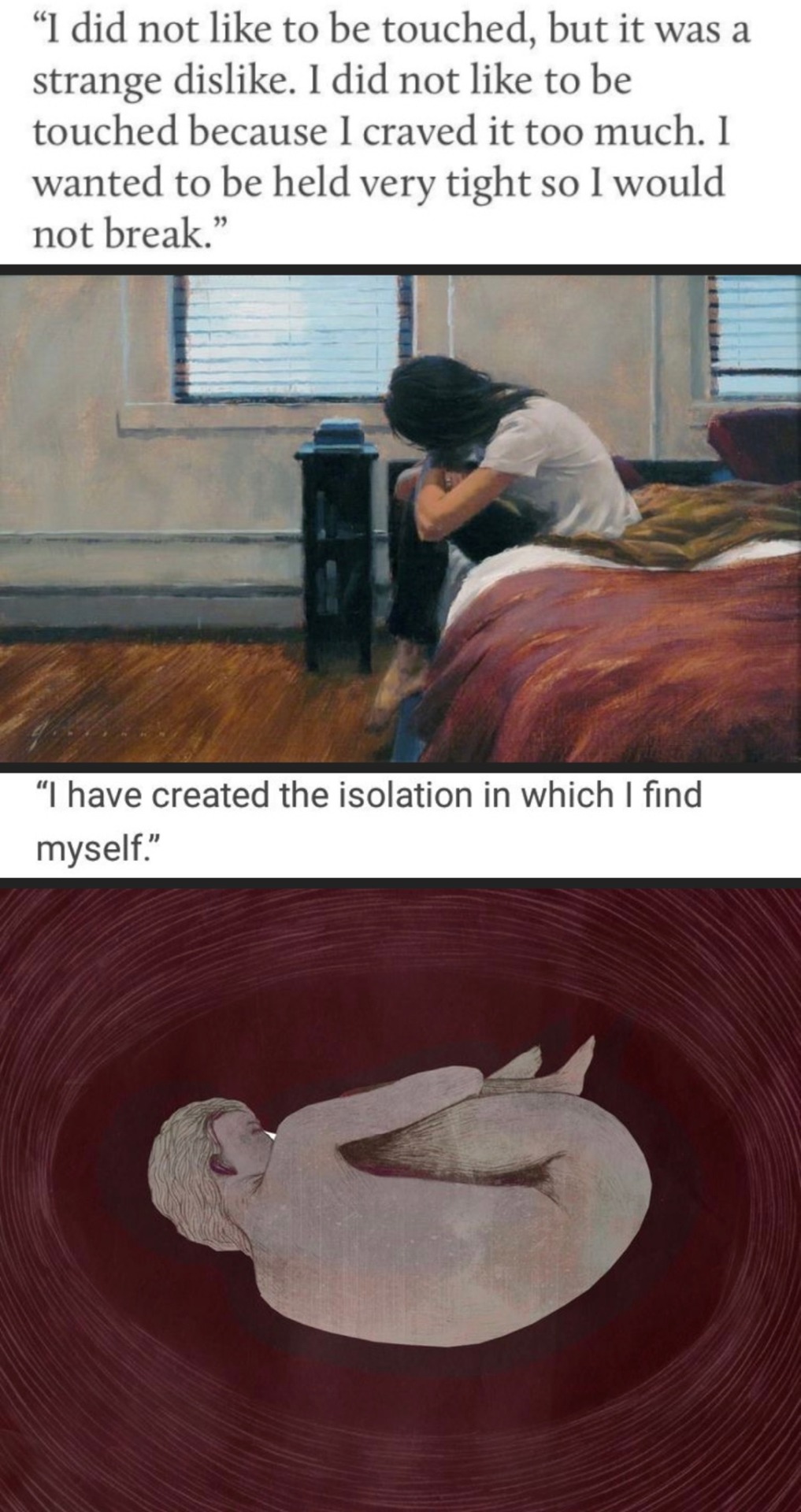
Camille Norton, Corruption: Poems
#I'm on a sappy mood and stealing quotes#byler#will byers#mike wheeler#they have the same expression ❤️#Camille Norton#Corruption: Poems
138 notes
·
View notes
Text

And in that silence, what grace.
~Camille Norton
146 notes
·
View notes
Text

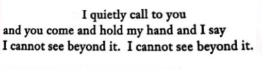
Corruption: Poems, Camille Norton//True Love, Sharon Olds//First Kill (2022)
#camille norton#web weaving#love#calliette#first kill#juliette fairmont#calliope burns#imani lewis#sarah catherine hook#wlw#lesbian#sapphic#queer#lgbt+#mine#sharon olds#see#quotes#words#poetry#parallels#being seen
68 notes
·
View notes
Text
when Camille Norton said "what is love if not a waiting to be seen?" and when Salvador Plascencia said "I don't know what they are called, the spaces between seconds- but I think of you in those intervals" and when Taylor Swift said "I wait patiently, he's gonna notice me"
#themes: unrequited#unrequited quotes#love is waiting#taylor swift#salvador plascencia#camille norton#im not ok
3 notes
·
View notes
Text
NORTON SIMON MUSEUM EXPERIENCE
written: 1 july, 2022 - 13 august 2022
museum visit: 27 june, 2022
i live in the los angeles county, and it was my first time visiting the norton simon museum located in pasadena, california.
why did it have to take my years to visit a museum that is nearby?
i could have had the opportunity to visit in high school, but i never really found the time and chance to. i do not want this museum visit to be "now that i am an art history major" i will visit. the primary reason for this visit is to get a feel of what it is like walking and being fully immersed in art. with that being said, wanting to work at a museum is something i want to do for the rest of my life (and possibly teach at the end of my career.) getting to choose art being on display or personally picking up the art from another museum is something that will bring me joy.
i will briefly talk about my museum experience before i fully submerge myself in the art. here are a couple of reasons to visit the norton simon museum.
the staff is super friendly, and they will talk to you about art.
they have more van gogh paintings than the getty.
even though they are smaller than other museums, this will give you a chance to become more intimate with the art. it makes them more enjoyable as you walk through and get to know them (the art work) more.
you can take your time to sit down and listen to the mini lectures posted on their website about the artwork. (of course, i took advantage of this.)
people are fully immersed in art. (although, there were some people who took a lot of pictures. i was one of those people because i was trying to capture the immense details of the painting(s).)
although i went on a super hot day, i did peak outside the garden area. (i believe that it is their garden area, fact check me if i am wrong.) they had many sculptures on display; however, i did not get a chance to view the info.
it is a given that you would look at the paintings and read the description that goes along with it (because that is what i did.) however, i started noticing the little details that some people might look over.
let me present the main question.
why did i take a picture of some of the artwork and its fine details?
there are some things that captivated me at first glance, and i needed to talk about it. i found a lot of interesting things that other people should see. i know that some people who have a difficult time traveling or cannot necessarily come to california will not be able to view the art work displayed at the norton simon museum. hopefully, through this entry, it will be a way to read about some of the artwork displayed (as well as my thoughts, opinions, and experiences.)
with that being said, let's take a walk with the paintings.
--------------
i don't want to pull the "as an art history major," but i do not quite wrap my head around this specific artist and era. "as an art history major," i learned about van gogh. however, the question i have is whether or not is an impressionist, expressionist, post-impressionist painter, or what era of art did he fit in.
(google is a great search engine to find out about van gogh's past.) let me just tell you a little bit to start talking about one of his paintings. he was a famous painter during his time, but i am glad to know that he had personal issues and got help, entering an asylum where he continued to paint his surroundings.
while he was a patient in the saint-paul-de-mausole asylum, he painted
the mulberry tree in october of 1889.

my first initial thought about the painting was its brushwork. when you look at the painting as a whole, you are able to depict the tree and its background. (the asylum must have had a beautiful scenery for van gogh to paint something simple but with great intentions of beauty and detail.) the tree is the focal point; with multiple shades of yellow as it corresponds with the field and blue sky. the way you would be able to separate the sections apart is by the brush strokes. van gogh's brush strokes give the painting so much texture. if i had the opportunity to hold the paintings, i would be amazed that i am able to feel the painting's texture. the paint on the canvas is thick, and i would imagine it would take weeks to dry. although, van gogh was able to blend the colors on the canvas while it was still wet, creating the different shades and colors.

i took a close up shot of the painting to focus on the brush strokes. this part of the close up shot is in the middle of the tree, where the tree bark starts creating branches and producing leaves.
as you can see in the painting, van gogh's brush strokes are short and provide texture while his longer strokes blend with the other colors on the canvas. one great example of his long brush stroke is the blending of blue, orange, and black. in this specific part of the painting, i would assume that he painted the yellow leaves first before adding the black tree branch. when you follow the black brush stoke, it follows the orange leaves. he does something similar with the blue. (pointing out the obvious, the background is blue,) but during this (i would assume) he globs a good amount of paint on his brush, and then adds it to the canvas. this is why this section has more prominent blue blending in well with the black and orange.
--------------
IMPRESSIONISM! the norton simon has a variety of impressionist paintings. what a coincidence to talk about impressionism because my last entry was on impressionism.
at least i know this painting was done by impressionist artist.
the view of berneval by camille pissarro

just by looking at it, it is a landscape painting filled with many greens, mini houses, and white clouds. by reading the description of the painting, we can get a feel of where or what berneval actually is. berneval consists of a hotel and many houses throughout the landscape where people will come for food and such. however, there are people who habit the area in chalets. at first glance, i would say the painting is comfortable. it feels familiar and something i would hang in my office (if i had one.)
as i mentioned earlier, this painting feels familiar because of what pissarro saw in his everyday life. i would say this painting emphasizes impressionism because of the short, thin brush strokes that pissarro creates, and the landscape being the main composition of the painting. (click here to see my breakdown of what impressionism is in my last entry.)

now, i just want to talk about his signature on the painting. it is on the bottom right corner, and you can clearly see it with black ink. it doesn't seem like anything special but adding the year this was produced gives the art historian an easier way to find out when this was painted. either way, even if we did not get the year this was produced, art historians would probably connect the pieces together and found out when this was painted.
--------------
oh god, here is the next painting (and artist) i will be talking about.
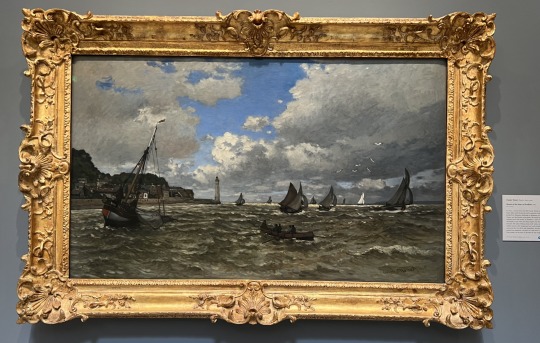
i really did not want to talk about claude monet, but he has many pieces at the norton simon, and you cannot seem to get rid of him. (technically, not technically, claude monet is one of the founding fathers of impressionism.)
let's propose a question.
why did i choose to talk about this specific painting and not any of his other paintings?
simple. the first thing that attracted me to this painting is the boar located on the left side of the painting.
monet drew the boat beautifully, and he included writing on the boat as well. could this be the boat's name or number? not only that, but the tiny figures in the boat stand out as well. although we cannot see the shadows, we can definitely see what each figure is doing on the boat.
immediately to the right of the boat, we can see a gray colored object. i could assume that this is a fish or maybe a shark the human figures are trying to reel in. unless the gray object is a large net string with ropes on the end to catch the fish.
there is another boat located in the middle of the painting with four figures rowing. this boat also has a tag.
i noticed that both boats start with HOI, but they have different numbers for the endings. let's propose another question.
is there any significant meaning with the tags on the boat?
since i refuse to look anything up for this painting, i am not completely sure if there is any significant meaning with the tags; however, people do name their boats, and i would justify that as the name. unless, monet was trying to do something fancy and wrote whatever he wanted.
i guess we can focus on this painting as a whole. even though it is casted off to the side, the white pigeons are still prominent figures just as the people on the boat. they clearly contrast the gray clouds.
looking at this painting, i immediately think that these people are going sailing or boating before it rains. (although i am not familiar with the history during this time, i would like to come up with a story for this painting.) these people are not far off the shore, but just enough where they know that they will be able to catch fish or any seafood. it is like when you go to the beach, you will see boats far off in the distance (that is what i think monet was trying to capture.)
another interpretation of this could be the leisure time of the people. boating and rowing is a hobby, but as for the men fishing, i would assume that they will sell what they caught at the market.
my review and interpretation for the painting is short, because i feel like i talk about monet too much.
--------------
the next painting i am about to reference is by a women. this is also an impressionist painting that i always learn about. she also has another painting i like as well, but it is not located at the norton simon.
this painting was produced in 1874 and majority of the painters were male. i will give you a great example, and i actually talked about their paintings. claude monet (whom i can never seem to get rid of), camille pissaro, and edgar degas.
BUT. we cannot forget about berthe morisot.
one of her paintings located at the norton simon is....
in the villa at the seaside, painted in 1874.
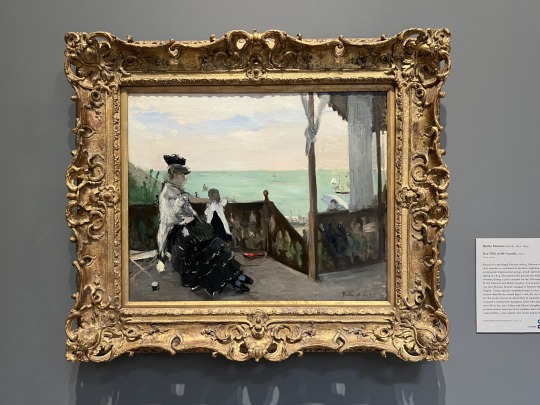
this painting has three prominent figures, the mom, her child, and another figure ascending the stairs. the description of the painting did mention that these three figures are at the beach. more so, they are in a villa which identifies their middle-class position.
i appreciate the color in the painting. the first color i notice is the beautiful and "clear" ocean. (keeping in mind that this is the year 1874, there is not a lot of pollution; therefore, the ocean is clean and clear.) normally when we think about the ocean color, we would say it is blue. however, morisot did not use a blue color. instead she used a middle blue-green color, and its shades that changes the atmosphere of the painting.
what do i mean by this?
i think that the reason why she uses the middle blue-green color is because of the clouds. (there is a little science? allow me to explain.) the ocean is blue because the ocean would absorb and scatter the red part of the light spectrum. although, we would usually say the ocean is blue because is it the reflection of the sky. in the painting, the clouds cover up most of the painting only leaving a small part of the sky to shine through; that is why i think the ocean is a middle blue-green color.
(i could be wrong because i am not provided with a month, but i think it was painted during the fall or winter.)

here is one thing i did not know about the painting. the description states, "it was during this trip that morisot became engaged to manet's brother.." this fragment sentence led me to look at the painting once more to see the mother's figure's head shaded. the description also states that the women has a veil. (i did not notice this throughout the times i learned about this painting, but i can always learn something new everyday.)

now let's talk about the figure ascending up the stairs. although she is not painted in detail, we can see her holding an umbrella and wearing a long gown. there is only so much i can say about her, but one of my inferences is that she is most likely the mother / grandmother.
--------------
daumier. daumier. daumier. his name sounds very familiar. when i looked him up on google, i immediately know why his name sounds familiar. he is the artist of rue transnonain (one of the first works of art that i learned by him.)
BUT! i am not going to be talking about that artwork. i will be talking about...
saltimbanques resting (top) (1870) and study of saltimbanques resting (bottom) (1865-66).
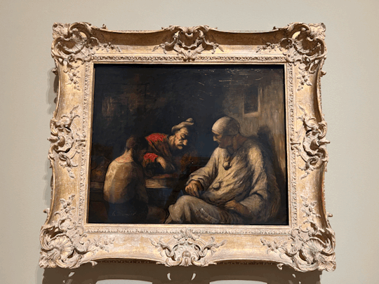
to me, saltimbanques resting is an example of a family struggling to survive in france. there are a couple of things i noticed in this painting. i would assume that it is three generations, the grandfather, father, and son. another thing i noticed is the feeling of despair that radiates off the painting. i feel sorry, and i wish i can do something to help them.
little history lesson. i think daumier is presenting a message to us. although i am unsure what it is. before i even looked up anything about this painting. i felt like something must be happening during this year. low and behold, it is the franco-prussian war.
this painting makes more sense, and people usually struggle the most. the economy is down, and everything goes into a depressive and distressful state.
now back to the painting. reading the painting from left to right, let's talk a little about the light source and the son.
daumier purposely did not show where the light source is coming from; however, he did show how the light cast through the room and onto the figures. i will only say this much about the light source and slowly incorporate it to the next parts as i talk about the son, father, grandfather, and the painting as a whole.
the son is in a white shirt; however, it is not the whitest nor the cleanest, and this may be because they do not have the sufficient funds.
the mysterious light source is hitting the son't back and hiding his face. we cannot see what his emotions are or how he feels, but his body language is telling me this much. he is looking down at the end of the table, slightly crouching his back so that he focal point is not really on him. there could be numerous reasons why his body is presented that way. the lack of food on the table suggests that his grandfather and father are conversing with him, and his father must be pointing something on the table.
we have to keep in mind that daumier painted this during the 1870s, and men are still the breadwinner of families. the son is there to listen and understand what is happening, and how things should be done.
it is a deep red color that daumier uses for the father. he is in the center, which can mean a couple of things. the first one is his importance to the painting. (still keeping in mind that this is the 1870s,) he could be the sole provider of the family, and he is talking about his plans with his son and father. but due to his expression, i think that he may be telling them some bad news.
i am getting off topic. let's propose an open-ended question.
why did daumier choose to black out half of the father's face.
(i am excited to talk about the next part.) the mysterious light source does it once again. we can only see half of his face, while the other half is completely dark. he looks cery similar to the man in another one of daumier's paintings (rue transnonian). (i can talk about this in another entry.)
(could this possibly be an addition or story sequence that we may or may not know about? and do these two paintings go together?)
i cannot specifically answer the question, because i do not know what daumier was thinking while painting this.
lastly (but not the last thing we will be talking about) is the grandfather. he seems to be the only one that is the "brightest" in the room. what i mean by this is the color of his clothes. it is gray but seems to be the cleanest, and the light source hits him well that we can see him and his facial expressions clearly.
i possibly think that he is the focal point because of the way the light source hits him, the color of his clothing, and how he fits in the painting. the enigmatic light source hits him and completely displays his body. daumier did not do this with the other two figures. however, similar to the father, only half of his face is shown.
i do not want to say this because some people might get the wrong impression, but i think there is a triangle. a better term or phrase for this would be "the golden rule of three."it is not that noticeable like some paintings during the renaissance, but i think it is there.
just to try and prove my point, i will be adding it.
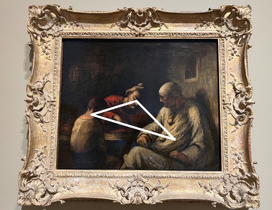
if you think about it, these three figures can represent the holy trinity. the father, the son, and the holy spirit.
why do i think of this to be the holy trinity?
the first obvious answer is the father and the son. they are both clearly shown in the painting. ALTHOUGH, i did mention the grandfather. this is where i start to question about the holy trinity. i mentioned that the grandfather is in gray / white, and usually when i think of the holy spirit, i would think of a literal white spirit.
i also did mention that the grandfather is the brightest one in the room SINCE the unknown light source is clearly shining on him. this could possibly be another reasoning i have towards this painting to be a figure or (hidden meaning) of the holy trinity.
i will let your mind wander now and if you want to debate, that's fine as well.
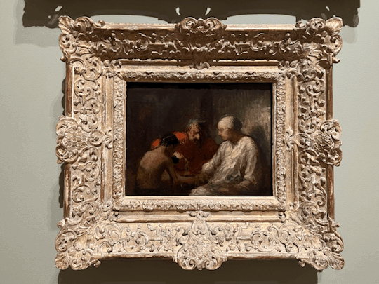
i described a lot of details in the painting. i am going to cut to the chase with the study of saltimbanques resting.
it is not as detailed as saltimbanques resting; however, i would assume that this was a quick "sketch" of what he actually wanted to paint. the study of painting lacks a lot of details but it does get to the point of the painting across.
--------------
it is out of curiosity why i talk about the next artist. born in illinois, richard hunit (i would say) is an interesting man.
back in the 1950s, he used "direct-metal" sculpting. (this is the first time i have ever heard something like that.) to give a brief definition, it is a manipulation of material rather than carving or casting.
not only did this intrigue me, but he also had lithographs. i've only studied a couple of lithographs during my time, but to see this type of lithograph fascinated me.
when i think of lithographs, i think of the crystal palace in london, england. (i donot know if there is a black and white lithograph of the crystal palace because in my text book it was shown in color.)
in the description, it states how lithographs complimented him as a sculptor.
what peaked my interest is how his lithographs are named "untitled" or "details." however, when it came to details, each detail had a roman numeral. i would suggest that the roman numerals on the "details" would be in a specific order.
richard hunt's lithographs are very unique. i have never seen anything like it before, and i feel like it changes the way of art.
i do not want to get anything wrong, so i will be proposing a question.
lithographs were created in 1965, what would his exact era be?
i will not be pinpointing anything though. however, i do not want to think this fits with abstract expressionism nor pop part. i think it would fit (please note i use the term could loosely) in arte povera. however, the only problem with that is the type of material he used to compose the lithographs.
when you stare at the lithographs, pay attention to all of the fine details. the lines on his lithographs are very sharp and concentrated. before i even read the description of richard hunt, i honestly thought they were mere sketches and drawings.
--------------
let me propose a personal question.
does spanish baroque art come in second place in my life?
i believe in my last entry, i briefly spoke about italian baroque (of course, this is the focus i want to get into.) in a way, spanish baroque does come close; however, i don't find it as attractive as italian baroque.
is it because of the paintings or what?
there is a feeling i got when i started to learn about italian baroque art that made me know "this is the focus and specialty i want to get into."
but nevertheless, i will bring up spanish baroque because the noron simon does have a good amount of spanish baroque paintings on display.
painted in 1633: still life with lemons, oranges, and a rose by francisco de zurbaran
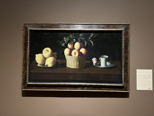
(this painting reminds me of still life with game fowl by juan sánchez cotán.)
everything about this painting screams spanish baroque.
[a little flashback. in my intro to world art class, i met a person who specializes in capturing the spanish baroque art. yes, i did say capturing. instead of painting it, he does it all with a camera. he is currently a professor or for a better term, a faculty member at the school a currently attend.]
anyways, back to the painting.
of course i took close up shots, who would i be without them?
i do want to get into this one detail of the painting: the cracks. i am not sure what the correct terminology, but for better explanation i am talking about the wear and tear of the painting. if you were to zoom into the photo, you can see the cracks which i believe makes it a timeless painting.
back to the bigger picture. in classic spanish baroque, the colors of the lemon, orange, and rose are enhance an bright behind ab black background. saying that makes it sound like i am stereotyping this painting as spanish baroque, but that is not what i am trying to convery (even though this is a spanish baroque painting.)
we have to keep in mind that even though this is a spanish baroque painting, it is right after the renaissance era. the golden rule of three is prevalent in the painting. you have three things to focus on.
(i like to call it the golden rule of three.)
i do want to talk about the orange because i believe they are freshly picked. i believe this because the leaves and branches are present and attached to the orange.
it is interesting to note the title of this painting is with lemons, oranges, and a rose rather than the tea cup.
after quickly skimming through the description of the painting. it did mention that the three objects in this painting do represent the holy trinity, (once again, the golden rule of three.)
the cup is bigger than the rose yet the title of the painting is with lemon, orange, and rose. i do heavily question that.
the whole painting itself feels so realistic.
i don't know what more to say, so i am cutting it short.
--------------
i have never seen a painting like this before. it is a spanish baroque or at least i think it is (fact check me if i am wrong, i still refuse to look anything up.) but i think i am right because artemisia gentileschi (an italian baroque painter) also painted her version of this.
painted in 1655 by bartolomé esteban murillo, the birth of st. john the baptist.

there are so many things happening in the painting. let's take a walk.
on the right corner of the painting, there is a dog. this is pretty much a known thing in art history, but when a dog is painted, it is a sign of loyalty.
i still refuse to google anything about this painting, so from here on, i will be making major inferences.
i will start in the back, where the lady is on the bed being treated by a servant. i am not sure if i am seeing things, but there could be another figure to the servant. it looks like a ghost or a shadow? (i could be wrong or right, although i am not quite sure.) the female on the bed looks very concerning because she could be very sick or on her death bed.
now that we are slowly getting to the focus of the painting, there is something important that i have to bring up. this goes for both spanish and italian baroque. the major contrast between light and dark, also known as chiaroscuro. this technique was used throughout the renaissance and baroque period.
how does chiaroscuro apply to this painting?
chiaroscuro is a well known in baroque style art. (my favorite painter, carravaggio uses this technique, and i praise him for it.) as you can see, the painting clearly depicts st. john being surrounded by the light source while everything else is dark; a very present contrast/
the picture shown above (i did take it at the museum) seems to be bright, but in reality, there are dark parts in the painting.
as i continue to talk a little more about chiaroscuro, i will slowly shift to talk ing about the painting as a whole.
st. john is in the hands of the midwife, and we can clearly see that it is st. john because of the name of the painting, and the yellow halo on his head. he is being cared for by multiple midwives while some of them talk to a male.
i will make a vague but educated guess that this man is from the church, and that he is there because he heard a calling from jesus.
i shall call forth the angels whoa re located on the upper part of the painting. they are there to welcome st. john into the world. they are also another light source that is presented in the painting.
i just want to pay attention to the details of the midwives' clothing. it looks very realistic, and that we are seeing this scene happen.
there could be more things about this painting, but since i refuse to look anything up; i will settle with these thoughts.
--------------
as i finish this entry off, i want to talk about one more painting. it is very detailed, and it has something to tell me.
painted in 1735, interior of st. peters, rome by giovanni paolo pannini
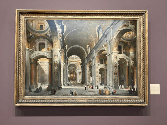
it is actually quite difficult where to start because there is just so much going on in the painting (details and stuff.) although i do not know the main reason why this was painted, i can make inferences and educational guesses.
although there is something i want to talk about first.
there is the one thing i looked up, but i did not google it. instead, i looked it up in my past notes. i learned about this specific piece in the painting when i took intro to world art II. before i get off topic, dead center in the middle is this beautiful bronze (yes, i said bronze) baldacchino.
how did i know what the painting was, or more specifically, where this painting is located?
the magic (or for better term, understanding) of context clues.
although i have never visited st. peter's (i would like to someday), there is also so much information that i can get from the year of the painting, the name of the painting, and the clothes that the figures are wearing.
(if you do not know anything about the painting, it is best to look at the description next to the painting.)
from the description, i gained the information of who the commissioner is (cardinal melchior de polignac of france,) and where he is in the painting.
considering the painting (with the amount of figures it has) it is no surprise that the commissioner (or patron? is that a synonym for commissioner) is painted in the painting. (a lot of patrons like to do this.) not only that, but the description states that the commissioner is in red. there is (i believe) two figures in red; however, my suggestion is the commissioner is surrounded by a cluster of people.
(i have never been inside st. peters, but i have seen numerous photos when i studied it.)
the details in this painting are preciser and intricate. if you were to zoom into the painting (picture provided above) you will see all of the sculptures cared on top of the arches. i am not sure if they are attached or carved into the walls.
(i would suggest that the columns attached to the walls have corinthian style columns.) normally when you see corinthian, they are located outside. however, i think the reason why they are inside is because they are use as a decorative purpose, since they is attached to the walls.
these sculptures remind me of the greek and / or roman era. (although, even to this day; there is always some sort of reference to the greek and roman era.)
they remind me of michelangelo, more precisely the figures that he paints and sculpts. to me, i would say that these figures carved into the walls are renaissance. i just remembered that st. peters is a renaissance architecture piece.
please forgive me as i am not familiar with architecture terms. although, i was briefly taught how to read a (plan?), is that the correct terminology to use? i apologize once more.
as i mentioned earlier, i will be using context clues to talk about the painting.
the renaissance era was during the 15th and 16th century (1400s-1500s.) this painting was produced in 1735, by an italian painter.
(i am thinking about this on the top of my head. i won't say that this painting is baroque because of the nature of the painting. (it just does not fit into the baroque style era, although, who am i to judge? i am still learning.)
[context clues] let's propose a question,
the era that follows after the baroque is rococo, could this be part of the rococo era?
i haven't fully studied the rococo period in depth, but from what i can remember, it was a period of the rich. they spent their money lavishly and did not really care. the artists during this time did not really appreciate nature; while everyone else primarily focused on wealth and being in an artificial world. (this is what i literally remember from the rococo period.)
--------------
although i did not talk about all of the paintings, i talked about the ones that stood out to me the most.
they also had a lot of abstract and expressionism paintings (and a version of the annunciation painting; however, i always seem to study it from a variety of it from different artists.)
anyways if you do have the time and opportunity, go visit the norton simon museum.
signing of: jhanella mae
all photos were taken by me and are located at the norton simon museum in pasadena, california.
#van gogh#monet#impressionism#baroque#spanish baroque#museum#rococo#1400s#1500s#1600s#art history#art#history#abstract#expressionism#lithographs#berthe morisot#camille pissarro#claude monet#norton simon museum#honoré daumier#art exhibit#paintings#paint#color
1 note
·
View note
Text
BAYREUTH 2023: PARSIFAL (Schager, Zeppenfeld, Welton, Shanahan, Garanča, Kehrer; Scheib, Heras-Casado)
L’estrena de la nova producció de Parsifal que ha inaugurat fa tres dies el Festival de Bayreuth 2023 anava envoltada del misteri i l’expectació per la proposta escènica de Jay Scheib (això no és gens original) i pel sorprenent encàrrec d’atorgar la direcció musical de la inauguració i d’una òpera tan bayreuthiana, al director granadí Pablo Heras-Casado, una aposta arriscada i la segona vegada…
View On WordPress
#Andreas Schager#Betsy Horne#Camille Schnoor#Chor und Orchester der Bayreuther Festspiele#Derek Welton#Eberhard Friedrich#Elina Garanča#Evelin Novak#Garrie Davislim#Georg Zeppenfeld#Jay Scheib#Jens-Erik Aasbø#Jordan Shanahan#Julia Grüter#Margaret Plummer#Marie Henriette Reinhold#orge Rodríguez-Norton#Pablo Heras-Casado#Parsifal#Richard Wagner#Siyabonga Maqungo#Tobias Kehrer
0 notes
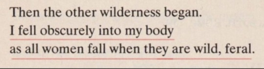
Text


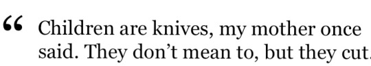
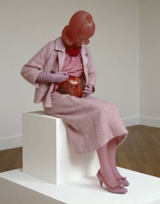
—female rage
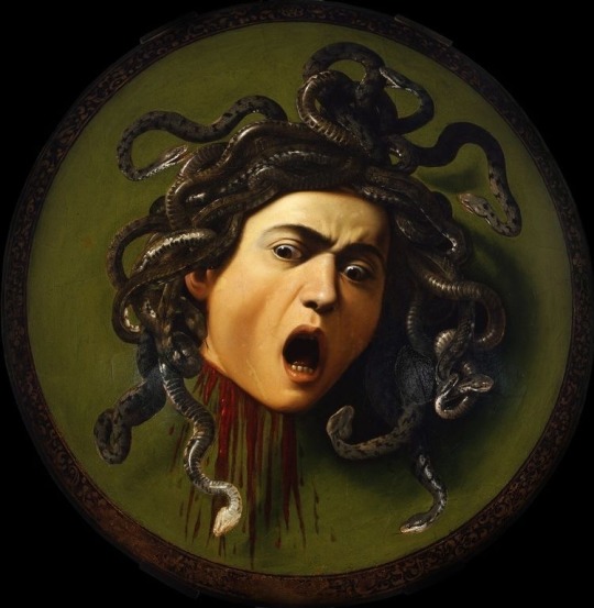
? // medusa by caravaggio // gregory radionov // artemisia gentileschi // monstrous flesh: on women’s bodies in horror by rebecca harknis-cross // carrie (1976) // corruption by camille norton // midsommar (2019) // helen of troy does countertop dancing by margaret atwood // medusa in her throne by reza sedhi
#words#art#web weave#medusa#girlhood#female rage#feminine rage#womanhood#caravaggio#artemisia gentileschi#midsommar#florence pugh#ari aster#margaret atwood#reza sedhi#web weaving#prose#poetry#comparatives#carrie 1976#carrie#rebecca harkins cross#camille norton
4K notes
·
View notes
Text
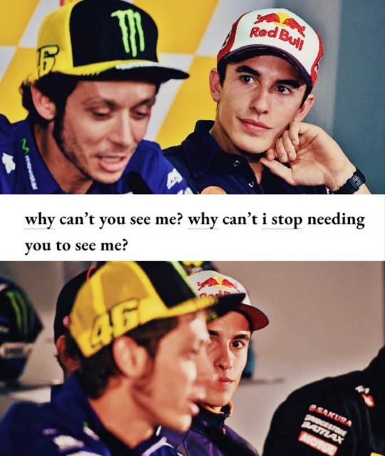

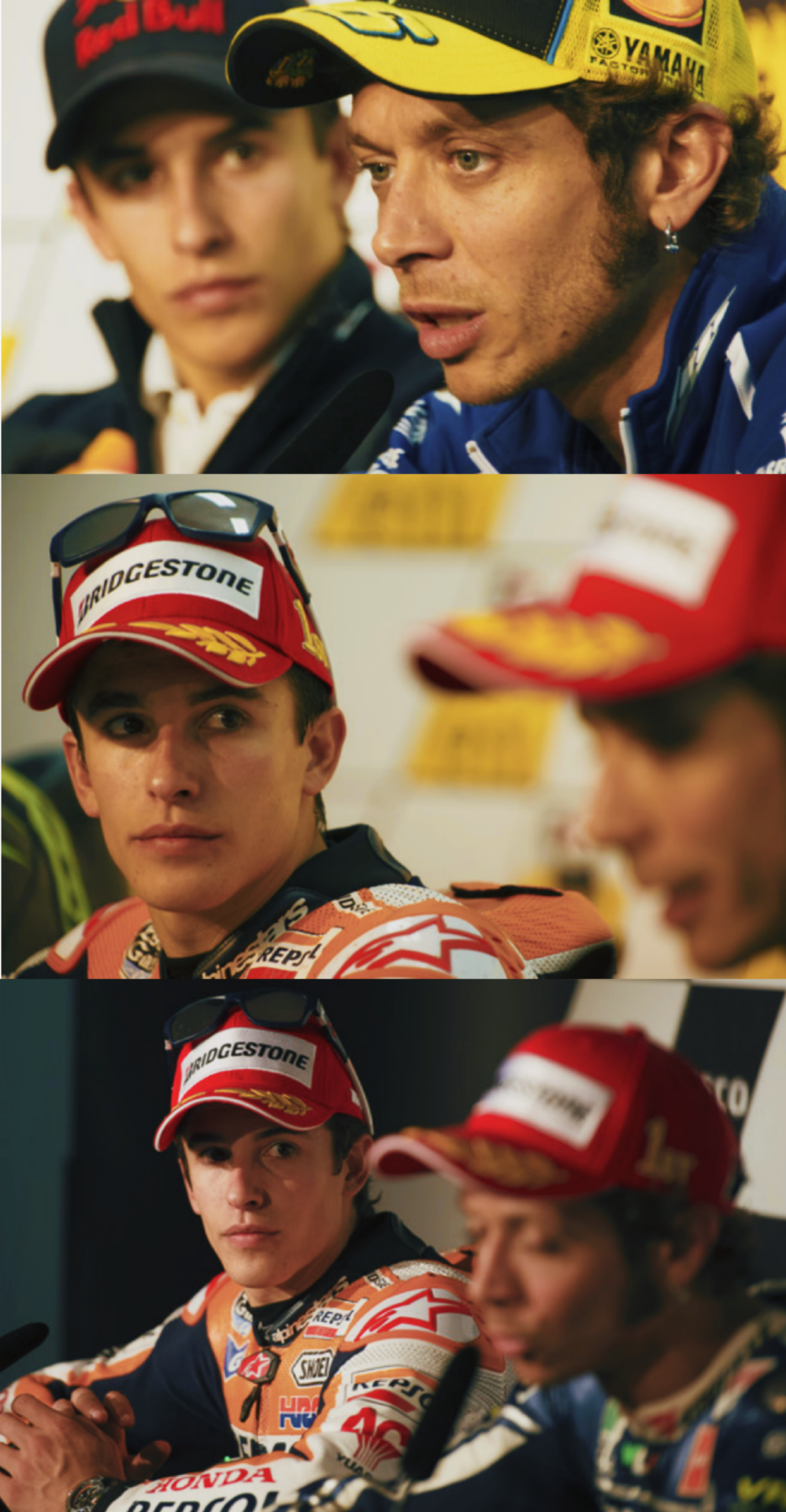


Rosquez x looking
Chen Chen, nature poem in ‘when i grow up i want to be a list of further possibilities’ / Camille Norton, Corruption Poems / Frank Iero and The Future Violents, Basement Eyes / George R. R. Martin, The Game of Thrones
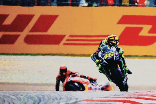
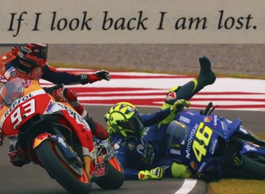
#um. yeah.#makes no sense but i am insane#marc marquez#valentino rossi#rosquez#og#motogp#myedit#mywebweave
64 notes
·
View notes
Note
Hiiii ty for such a great uquiz!! Would it be possible to see the description of all the books you could get matched to? I’m curious what the vibes are for the rest!!
hi 🌷 here you go:
White Teeth by Zadie Smith: Excessive, maximalist and very ambitious multigenerational and multicultural epic novel that starts with the unlikely friendship between Archie Jones and Samad Iqbal. It explores themes of race, identity and the intersections of culture, heritage, and modernity. Clever and hilarious dialogue, very creative when it comes to language and style, unique and bold when it comes to narrative. Perhaps a flawed novel due to its ambition, but excellent nonetheless.
Despair by Vladimir Nabokov: Excellent writing; very ambitious and stylish. It is somewhat a twisted novel but you will find a lot of humor despite. The narrator speaks directly to the reader as he writes what he regards as his perfect crime. This novel is one of Nabokov's earliest works in which one can easily identify themes and literary devices that the author explored later in his most known works.
The Savage Detectives by Roberto Bolaño: Brilliant and stunning novel about poets and poetry! Very dense and challenging; it requires patience from the reader. This novel is so infinitely dear to me that i can't even explain its brilliance, but i have to give you at least an idea of the plot so: The story is arranged in three parts and told from multiple points of view. It starts in Mexico City, in the 70s, and continues across decades and continents. It follows the adventures and misadventures of Arturo Belano and Ulises Lima—poets, drug dealers, wanderes, criminals. Now, about the themes, the writing, the style, the narration? Just absolutely perfect even at its most tedious, difficult and anticlimactic parts.
The Hearing Trumpet by Leonora Carrington: Unconventional, absurd, imaginative and exuberantly surreal apocalyptic fairytale quest. It follows 92 year old Marian who is sent off to a peculiar old-age home. If you aren't familiar with Leanora Carrington's art you should look at some of her paintings because this wonderful novel feels just like her surrealist paintings!
Mrs. Caliban by Rachel Ingalls: This novella tells the story of a love affair between a depressed suburban housewife and an amphibian creature who escaped a scientific research center. It might sound like a quirky fiction story but it actually deals with the most mundane and banal aspects of life and human relationships. Brilliantly written; neat and precise prose, wonderful storytelling. The author knew what she was doing and not a single word she wrote was wasted.
The Borrowers by Mary Norton: Delicately written little adventure about tiny people who live in the secret places of houses. I am enamored (obsessed!!) with miniatures—dollhouses, dioramas, fairies—so imagine how dear this book is to me.
Sharp Objects by Gillian Flynn: The murders of two girls bring reporter Camille Preaker back to her hometown. As she works to uncover the truth about those crimes, Camille finds herself forced to unravel the psychological puzzle of her own past. Very entertaining read. It has best seller written all over it (which might not be the biggest compliment lol but i mean for this genre so it is a compliment).
Rage by Sergio Bizzio: Claustrophobic, anxiety inducing, fast-paced psychological thriller that made me think of Bong Joon-ho's Parasite the whole 4 hours it took me to read it. I read it in it's original language, Spanish, and i particularly loved the dialogue; its idiosyncrasies and authenticity (tqm Argentina!)
High Fidelity by Nick Hornby: Rob, an obsessive music fan, reminisces his top five worst break ups to understand his most recent heartbreak. He is a very arrogant and cynical guy who defines his entire life through records, and because he is constantly interacting with music that almost exclusively deals with love—and a very idealistic version of it—he finds himself unsatisfied with the way his life has turned out.
#so sorry it took me so long to reply!!#idk if you meant of ALL the quizzes... 👀 anyone these are 2023's only 🫣#💌#anyway* lol not anyone
44 notes
·
View notes
Text
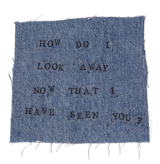
when camille norton wrote " what's love if not a waiting to be seen ? " / when richard siken wrote " i tell you these things because i love you . " and when lemony snicket wrote " i will love you if i never see you again , and i will love you if i see you everyday .
#love poetry#ask to tag#roses#anais nin#kafka#letters to milena#ocean vuong#urduadab#beautiful words
86 notes
·
View notes
Text
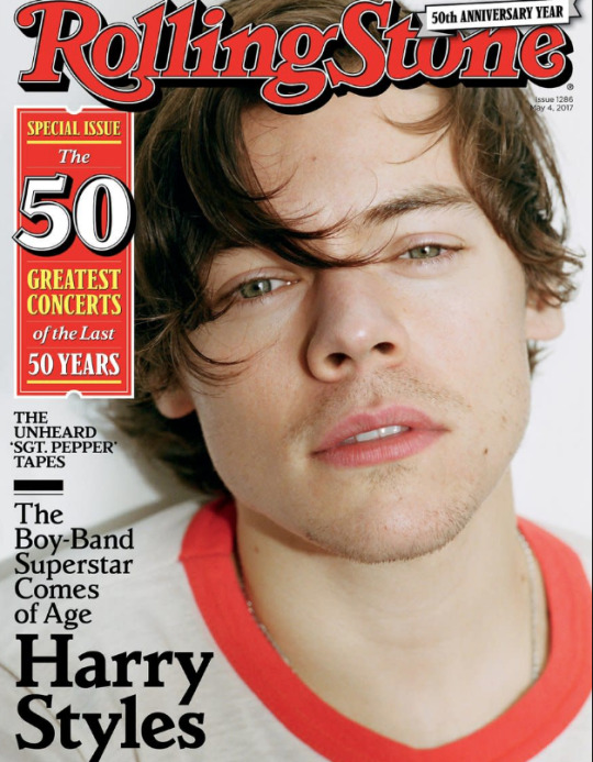
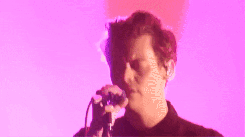
2017 Haylor Timeline
Timeline Tag, or years 2011, 2012, 2013, 2014, 2015, 2016, 2017, 2018, 2019, 2020, 2021, 2022, 2023 and 2024.
3 January - Taylor "based in London" (end of Cornelia St period)
5 January - date of Harry’s leak “lately” recorded. Anniversary of clear blue water/rain on window posts which may be their last break up anniversary. He was pictured in London
13 January - Taylor was in LA papped at the the gym in LA. The scenario she told secret session fans she wrote DWOHT
21 January - Harry goes to LA
22 January Joe in Paris
28 January - Harry in LA
1 February - Harry's Rose Ring maybe at his birthday in Malibu 1 February 2017. Taylor posts a video of her and Gigi singing along to "I Don't wanna live forever" for the first time on the radio, which ‘happens’ to be on Harry's birthday.
youtube
5 March - Rose Ring seen clearly at Studio in London.
15 March - Harry at JFK
Late March. Behind Album performances likely recorded at Abbey Road, they appear in the documentary in May and Harry was holding Ben’s daughter who looks about 3-4 months. Harry’s hair is also shorter than it was 5 March, a similar cut April 21.
4 April- Taylor recording Rep in Nashville 'to avoid paparazzi'‘. Joe in London
7 April - Sign of the Times released
18 April - Harry’s rolling stone interview where he leaves the table over her name and tips his hat and ex because it’s all for them
21 April - Harry on Graham Norton, performs sign of the times and writes Spanish girl that later leaks backstage.
26 April - Harry in Paris for nrj

29 April - Harry is papped wearing the same St Laurent shirt Calvin copied for the Ole music video, on the date Taylor later identified in High Infidelity.

8 May - harry driving in London using phone behind wheel wearing packers hat with Tess ward
9 May - Harry today show with the pink suit when he performs Stockholm. Xander and Jeff there. Harry dating Tess Ward
11 May Tess ward posts a photo of Harry’s kitchen with his cap in and is never seen again
12 May - Harry styles debut released, behind the album released just after. Cute Nick Grimshaw interview with 2 ghosts question
15 May - behind the album released, includes parts of performances.
16 May - Joe and Taylor rumored dating. Harry went on Carpool Karaoke
17 May - Tess ward wore a shirt Harry wore in an interview
19 May - Harry at troubadour ONO. James, Jeff and Xander there carpool karaoke, Harry sang IKYWT in broadcast not you tube.
youtube
20 May - Haylor anniversary. Debut one night gig, Stevie Nicks comes, Harry emotional on stage in Landslide with Stevie Nicks. Harry lists LA house, reported on the 22nd, sold in 2019.
5 June - first Joe mention in blinds
15 June - Harry follows Camille on IG, fans abuse her.
20 June - HS stepdad passed away :( H Tess BUA
July - Harry NY in bar with Xander
4 July - Karlie Kloss posts a photo with Kendall in Paris, the internet realises KK is out
14 July - End Game written. Kendall came to Harry's show.
21 July - Harry and Camille seen together, Nick mentions her and she is in the background of a fan photo.
19 July - Dunkirk released
27 August - LAWYMMD video, Karlie not on junior jewels shirt, Kendall tea time reenactment, Katy car crash and she eats a lobster in a cage.
28 August - Taylor deletes instagram
31 August HS releases two ghosts re riding from BTA performances
3 September - Taylor at Abigail's wedding Martha's vineyard.
Sept 2017 – 14 July 2018 - Harry Styles Live on Tour
September - Watermelon Sugar written


20 September - Harry LA, Greek Theater, wears same custom Gucci suit as Kiwi Music Video, with roses. Shania Twain comes and posts a photo of them together. Plays 'Still the One' on Kazoo in Grammy Museum interview. Taylor at Cara's London for month
27 September - Harry released Two Ghosts and Girl Crush as a Spotify Single recorded in Metropolis London, and photos of him recording it. Two days before he performed it in Nashville
28 September - Harry wears red in the Radio City music hall, NY plays Story of My Life in full and has an aborted heart kiss.
29 September - Taylor releases Spotify playlist of 70 songs. Anniversary of Harry’s “we don’t need no piece of paper tweet” and Harry’s another man mixtape. Song 7 is Boys, 20 is Liam Gallagher "for what's worth", followed by "miss you". 27 is We don't deserve love, Niall Horan is at 37 "Too much to ask", it also features Ariana Grande, Kesha, Kings of Leon, Bon Iver, 57 is Perfect by Ed Sheeran, the same name as the 1D song. It ends with #70 'She's casual' about a guy falling in love with a fling.

14 October - Phoenix - During Meet me in the Hallway (1:39). After “I walked the streets all day” before “running with the thieves”. This was Harry's last US show
October - Liam said he saw Harry at the Bowery Hotel
25 October - Harry performs in Paris, he cries on 'even my phone misses your call' twice in FTDT (1:53 and again 3:30). Taylor was in Nashville for Rep Secret Sessions.
8 November - kiwi video released with Taylor looking kid
11 November - Taylor in NYC


10 November - Reputation released end game radio single on 14th
13 November - blind item that This Is What You Came For was about Harry
17 November - the HS behind the album performances released, first seen in BTA
28 November - Harry performs VS Show, Taylor cancels. New Years Day released as a single 27 November.
10 December - Taylor performs then watches Ed's show with Joe at Jingle Bell Ball London
12 December - Taylor and Joe in NYC
Continue in 2018
27 notes
·
View notes
Text


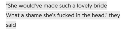

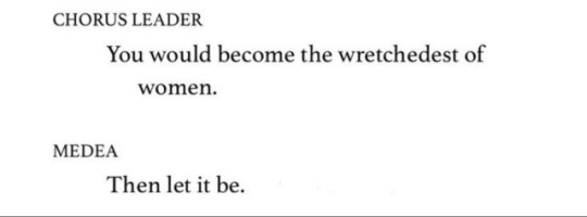

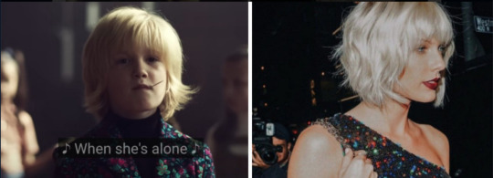
NO ONE LIKES A MAD WOMAN
hang em' high, my chemical romance / mad woman, taylor swift / champagne problems, taylor swift / britney spears 2007 / girl anachronism, the dresden dolls / euripides, medea, line 790 / corruption, camille norton / girl, interrupted / sinister wisdom 36: surviving psychiatric assault & cmy reating emotional well-being in our communities, elana dykewomon / artemisia gentileschi
#i made this on a ferry over the course of two hours and got so frustrated i wanted to chuck my phone overboard#no one read too deeply into the fact that im quoting a psychiatric assault book#web weaving#my chemical romance#taylor swift#britney spears#girl interrupted#topic suggested by my friend ada shoutout to ada
261 notes
·
View notes
Text
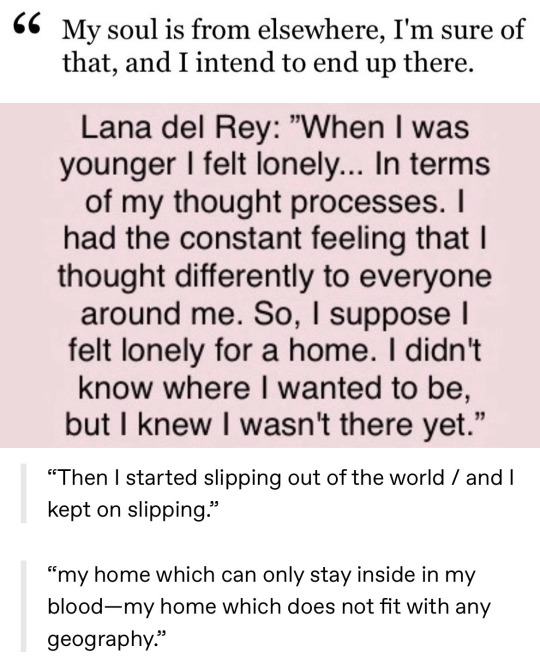

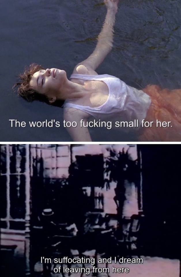
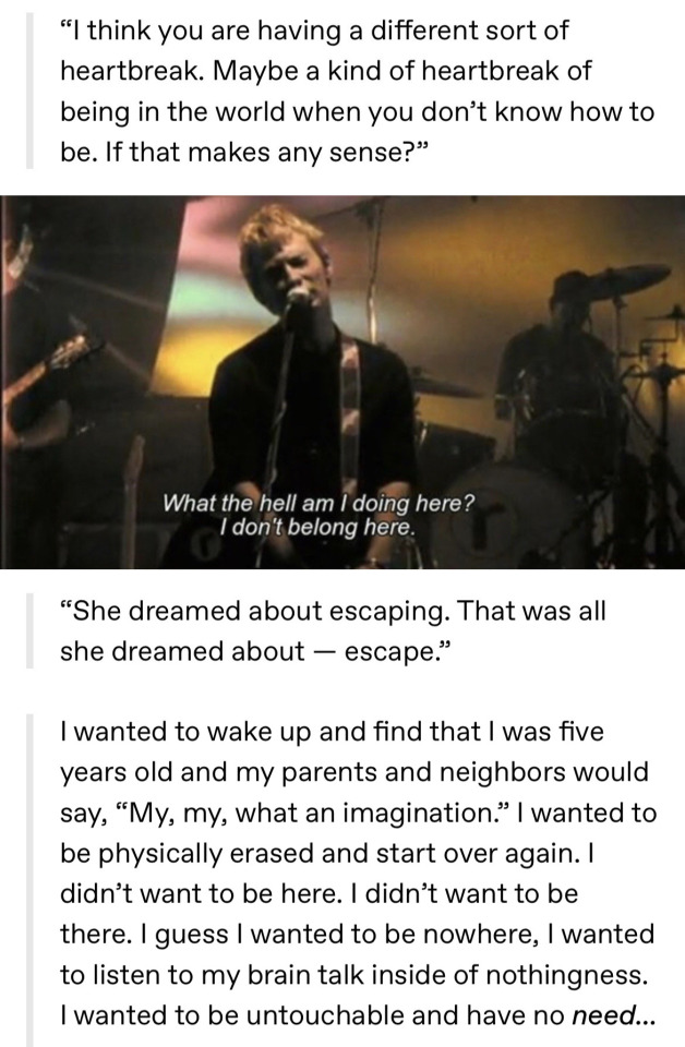
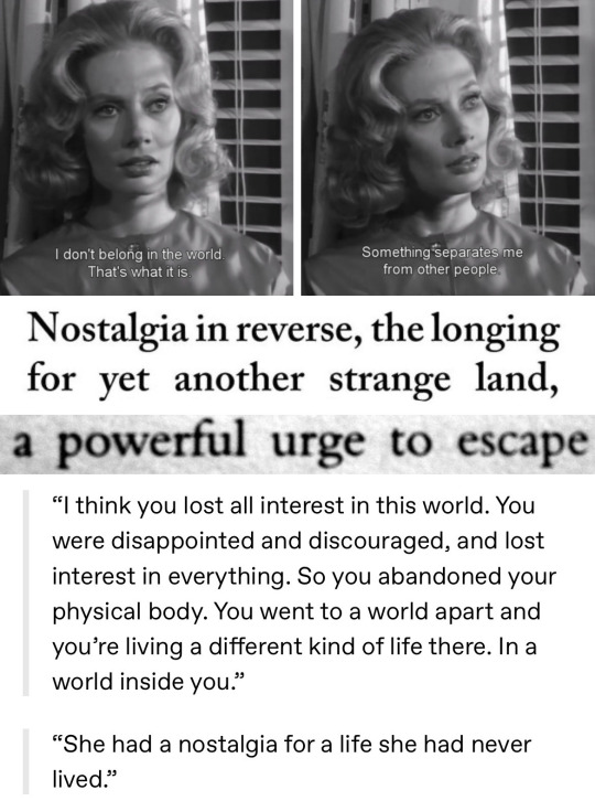
The Woman Destroyed - Simone de Beauvoir / unknown / The Man Who Fell To Earth / The Diary of Anaïs Nin, 1944–1947 / My Soul is from Elsewhere - Rumi / Original Sin: An Interview With Lana Del Rey / Corruption: Poems; “The Bardo of the Mind in Contemplation” - Camille Norton / "The One Who Always Goes Away", The Stinking Rose - Sujata Bhatt / Tokyo Decadence / 4.48 Psychosis - Sarah Kane / 37°2 le matin (Betty Blue) / Ein Lebe - Anton Chekhov / Girl in Pieces - Kathleen Glasgow / Creep - Radiohead / Paris, Texas / Close to the Knives: A Memoir of Disintegration - David Wojnarowicz / Carnival of Souls / Mary - Vladimir Nabokov / The Island - Victoria Hislop / 1Q84 - Haruki Murakami / The Fiery Pantheon - Nancy Lemann
#parallels#web weaving#comparatives#simone de beauvoir#david bowie#anaïs nin#rumi#lana del rey#sujata bhatt#tokyo decadence#sarah kane#betty blue#anton chekhov#kathleen glasgow#radiohead#paris texas#david wojnarowicz#carnival of souls#vladimir nabokov#haruki murakami
385 notes
·
View notes
Text
A collection of quotes I originally shared on my blog the first month and year I began: October 2019–
I love you as the friend and intimate sharer of all my thoughts, in whose ear I can think aloud and upon whose bosom, in the day of trial and trouble, I will have a right to confide and to ask sympathy. – Nathaniel Dawson in a letter to Elodie Todd, 19th century
So the lesson was: stay away from bodies. Maybe find someone you could talk to.– Susan Sontag, from a journal entry
And in that silence, what grace. – Camille Norton, from Corruption: Poems; “Savonarola’s Cape”
everything inside me came bruising to the surface. – Rachel McKibbens
How shall I hold back my soul from touching yours? – Rainer Maria Rilke, excerpt of “Love Song [Liebeslied]” Wie soll ich meine Seele halten, daß
sie nicht an deine rührt?
My heart is with your heart at home; – Emily Brontë, Poems of Emily Brontë
The pain is what you make of it. You have to find something in it that yields. I understood my guiding imperative as: keep bleeding, but love. – Leslie Jamison
12 notes
·
View notes
Last Seen Blogs

mykyacrush
kya crush

manishsinghji78
Untitled
thestylishlemon
THE STYLISH LEMON.
rptv1
RPTV

skyler-ngl
delulu