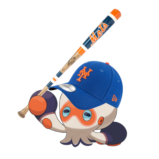
#Clobbopus
Text
#clobbopus#good ol' clobby. octopus with punching gloves on its tentacles. it's a cute concept‚ i think‚ if simple#weirdly unlike everything else i forgot that this thing was actually gen 8. normally i think everything is gen 8 until proven otherwise#but this thing. i have backwards in my head. for some reason
74 notes
·
View notes
Text
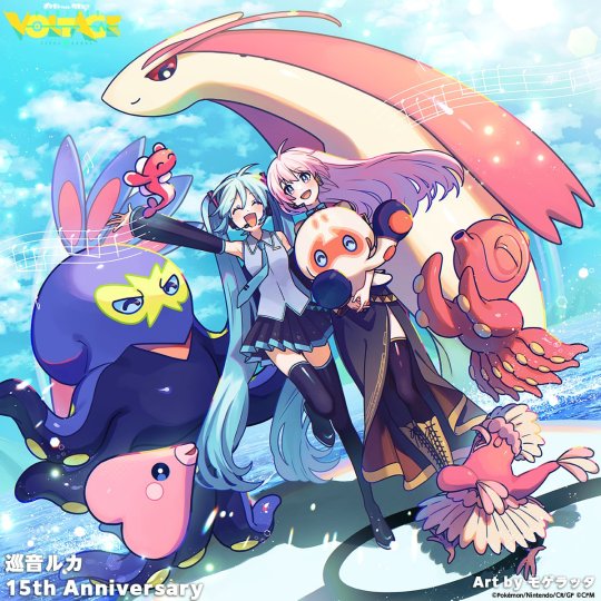
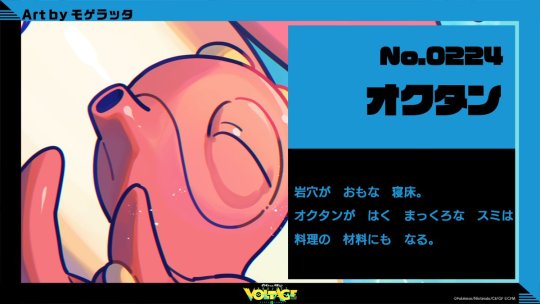
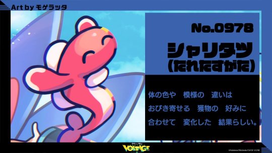

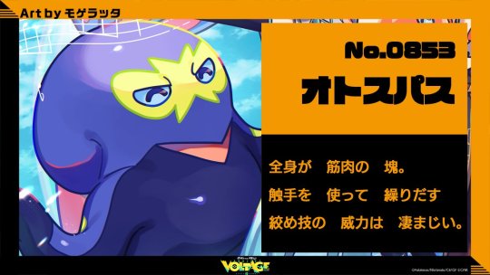
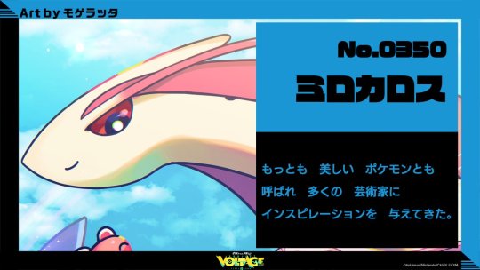
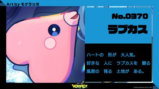

Our Project Voltage illustration today is for the anniversary of Megurine Luka's release! It's been 15yrs!
The art is by Mogelatte!
#project voltage#hatsune miku#vocaloid#luka megurine#megurine luka#milotic#clobbopus#grapploct#tatsugiri#luvdisc#oricorio#octillery#pokemon art
641 notes
·
View notes
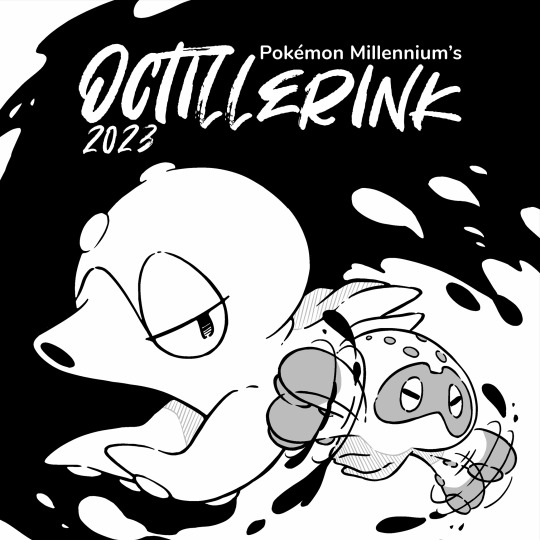
Text

Octillerink 2023
Day 3: Fighting Type
#bonk#pokemon#inktober#fanart#pokemon fanart#clobbopus#octillerink#OctillerinkPM2023#illustration#digital art#procreate#my art
580 notes
·
View notes
Text

I hope you are not sick of Round Little Guys yet,,,
#cg draws#pkmnart#falinks#mankey#clobbopus#rowlet#woobat#natu#togedemaru#alolan sandshrew#bronzor#chinchou#pincurchin#voltorb#Mini prints available on my shop this april !!
237 notes
·
View notes
Text

Clobbopus -- Misa Tsutsui
237 notes
·
View notes
Text
169 notes
·
View notes
Text
✨ Shiny Gourgeist Glamour Shot ✨
#gourgeist#shiny gourgeist#shiny#clobbopus#games#mine#pokémon#pokemon#pokémon shield#pokemon shield#sword and shield#pokémon sword and shield#pokemon sword and shield#pokémon swsh#pokemon swsh#pkmn#pkmn swsh#shiny pokémon#shiny pokemon#shinies#pokémon gif#pokemon gif#pokémon gifs#pokemon gifs#my gifs#gif#gifs#nintendo#switch#nintendo switch
161 notes
·
View notes
Text
Clobbopus my baby my child why do you look so like that
85 notes
·
View notes
Note
if you could redesign a pokemon or digimon to your own style what would it be and why?
I'm not really sure if you mean redesigning them in a way I would like them more or which Pokemon would fit my pre-existing style of drawing/world?
I feel pretty visually connected to a bunch of the ultra-beasts. Some creepy mons and some very cute ones like Clobbopus, Reuniclus, and Joltik, Tarountula... while Blaziken is my starter.
so here's a clobbopus who isn't an octopus and has only one fist

I redesigned him just because I love this little guy! I have a plush of him.
And here's a redesign of a Pokemon I was very disappointed with. He deserves his long butt!!! - Spidops

This is not probably what you meant with your ask but these were fun!
#art#pokemon#creature design#pokemon redesign#clobbopus#spidops#ask#answers#not worldbuilding#artists on tumblr
144 notes
·
View notes
Photo
curious marshadow and giggly clobbopus suggested by my younger siblings
#art mine#2023 art mine#digital art#shapeshiftinterest#pokemong#marshadow#clobbopus#friends#what is this???#my younger siblings
160 notes
·
View notes
Text
Ultimate Pokemon Tournament!
Generation 8 - Round 1 - Match 21
★ This poll is part of a project to determine Tumblr's favorite Pokemon! ★
Our Contestants:


★ Follow if you want to see new polls as they're made! ★
★ Go here for more info about the project! ★
★ Consider reblogging so that others can vote too! ★
★ Don't forget to have fun, be kind, and have a wonderful day! ★
177 notes
·
View notes
Text
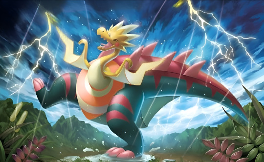

Pokémon TCG SWSH Darkness Ablaze (2020) & Vivid Voltage (2020) illustrations by Misa Tsutsui 🤩🤩
#pokémon#official art#card art#pokémon trading card game#tcg#pokemon#misa tsutsui#pokémon sword and shield#darkness ablaze#vivid voltage#clobbopus#darmanitan#galarian darmanitan#mr. mime#galarian mr. mime#dracozolt#shiinotic#nickit
64 notes
·
View notes
Text


I’ll try my best to complete this challenge this year as well, let’s begin!
#pokemon#fanart#inktober#prompt list#octillery#clobbopus#octillerink#OctillerinkPM2023#digital art#procreate#my art
107 notes
·
View notes
Note
Have you reviewed the Grapploct line? Thanks as always for your thoughts!

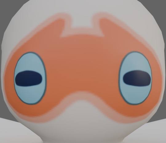
I actually really like Clobbopus here. I feel like a fighting-type octopus that uses its tentacles for punching, while a fairly obvious concept, is a good one, and Clobbopus does a good job of representing that with its dark-colored "boxing gloves" and markings that make a wrestling mask of sorts.
I also just like the general aesthetics here. The off-white and orange are a lovely combo, and the blue eyes work well with it. The "gloves" being a dark gray helps them pop out against the rest of the design, with just a small fringe of the same color at the bottom to carry it through without distracting from the tentacles. The blue eyes and their rectangular shape are also super cute.
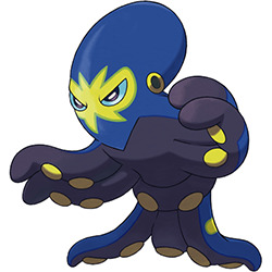
However, I'm not really that big on Grapploct. It's one of those evos that looses most of the best attributes of the first stage.
To start, I really don't care for the sudden color change. There's no actual reason it couldn't be the off-white with orange, and making the entire body dark gray means you lose any emphasis on the tentacles that the original had. Using navy on this dark color also means that the design blurs together, making it hard to read save for the yellow mask and suckers. Ironically, the shiny keeps a closer palette to Clobbopus (not exact, but closer), and frankly I think it's much better:

On top of that, they also changed the eye shape again for no reason, and it seems to have completely lost the boxing theme. It still has a wrestling motif with the mask, and I guess it's gone from boxing to jujutsu given the "belt" around its waist, but I don't think that reads very clearly conceptually compared to the simplicity of the boxing gloves, thus making the design feel less coherent.
On the plus side, it is at least identifiable as belonging to the same line, and I do think it standing up on two tentacles is interesting, but otherwise it's just pretty "eh".

Overall, Clobbopus is great. Grapploct isn't terrible, but it's not half as good as Clobbopus either due to a muddled color palette and less identifiable theme.
43 notes
·
View notes
Photo
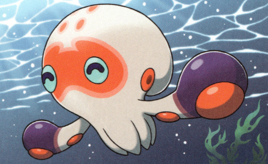
Clobbopus -- Akira Komayama
419 notes
·
View notes
Last Seen Blogs

bensolcs
moved

ewkarl
the pendletons → 👨👨👦
kyeomyuyu
yuyu
indysmumsmerch
Indys Mums Merch

memphisbred
Henry