#Danny Vozzo
Text


The Sandman #46
by Neil Gaiman; Jill Thompson; Vince Locke; Danny Vozzo and Todd Klein
DC/Vertigo
1K notes
·
View notes
Text
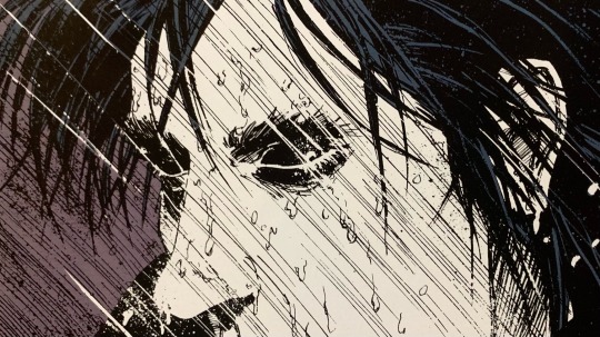
Sandy Sunday🖤
The Sandman: Brief Lives
Writer: Neil Gaiman
Penciller: Jill Thompson
Inker: Vince Locke
Colourist: Danny Vozzo
Letterer: Todd Klein
9 notes
·
View notes
Text
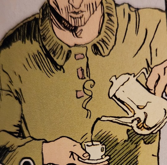
Coffee and Destruction
Drawn by Jill Thompson, inked by Vince Locke, colored by Danny Vozzo
Neil Gaiman, The Sandman: Brief Lives, Vol. 7
2 notes
·
View notes
Video
youtube
Ed Piskor and Jim Rugg looking at Kelley Jones’ Batman art in black and white. I have my problems with the Cartoonist Kayfabe approach -- the desire for viewers leads to talking about work that doesn’t really merit discussion, and they frequently discuss work they don’t have much in the way of insight about -- but talking about a mainstream artist whose work as cartoonists is built around interesting choices, like Kelley Jones or Klaus Janson, they really shine. (They are also frequently very strong interviewers, as the amount of content they’ve produced has led extremely talented people, who work alone in studios, to treat them as friends.)
Anyway, this Gallery Edition also includes a few pages of color guides by Gregory Wright, which look great. (The initial four comics represented in this gallery edition were colored by Adrienne Roy, but the process then switched to computer-separated color, which Wright handled by doing up pages with Doc Martin’s Dyes.) Rugg and Piskor say they would be interested in going through issues of the printed comics, but let me give a spoiler -- the actual printed comics look pretty bad, far inferior to Jones’ work as colored by Danny Vozzo or Les Dorscheid you can find elsewhere. Looking at the color guides one realizes this isn’t really Wright’s fault. My understanding is, the computer separation process scanned the art and then broke down the choices in color on the board into CMYK percentages. This evaluation would then assign a K value to the color choices, which previously would have not been included, being reserved for the line art. As a result, the pages as printed are muddy in their color, and you can’t make out the line art nearly as well as you could with comics where color separations would be done in the traditional way.
The reason I’m posting this is because I just now realized that this finds a funny parallel in movies, like 2022′s The Batman, that you watch and can’t make out what the hell is happening, because the digital cinematography is too dark. Everyone talks about how these comic book movies are washed out and grey and not colorful and therefore don’t look like comic books, but I would like them to start saying (and attributing to me as the originator of this take) that they do look like comic books, specifically comic books from the nineties that look like shit because the production teams hadn’t worked out the nuances of the digital color process.
The point of this video is that Kelley Jones’ line art is phenomenal, really amazing stuff; that’s a thesis I agree with.
1 note
·
View note
Note
Hi, I am a french reader, I just discovered Sandman, which I love, and I have a question about the colors in the restored publication of the serie. In the original publications, the colors were flashy and psychedelic but in the new ones, they are more "realistic", less wild in a sense. Is there a reason for this change ? Were you unsatisfied with the coloring of the first publications ?

It was a combination of things:
The biggest one was the very white glossy paper in the books was very different to the newsprint that the colouring was designed for. The original colouring was a lot more restrained, because it sank into and was absorbed into newsprint. It became "flashy, psychedelic and wild" because it wasn't meant to look like that.
Part of it was that the early colouring, especially in the Sam Kieth issues, especially once it was printed much heavier than intended, hid art details.
Part of it was consistency. We were going to have to recolour the early issues from scratch, to make the colour suitable for modern printing, and to create digital versions of the art. (Basically Sandman colouring was pre-digital until issue 49. I'm fairly sure that Worlds' End on were done on computers, although Danny Vozzo was still colouring by hand, with "Android Images" doing the color separations, and they were done for whiter paper, so they weren't going to need to be recoloured.) So it seemed wiser to let Danny Vozzo go in and just... colour it. He'd coloured over 50 issues of Sandman, and he knew what he was doing.
In my blog in 2006, I was asked:
Dear Neil,
the new coloring for the new Absolute Sandman looks great.
I have a couple of questions regarding it:
1) Who's supervising the new coloring, and who's doing the coloring?
2) Were the new reproductions made from the orignal inks/art?
3) Do you feel that the new coloring better represents your original vision, the artist's original vision? is it a matter of technology?
4) will the Absulote Sandman be your "Artist's definitive version" in terms of coloring?
and I replied:
1) Danny Vozzo is doing Sandmans 1-8, 17 and 18. Lee Loughridge is doing The Doll's House (9-16). It's being supervised by Karen Berger, Absolute editor Scott Nybakken, and me. And I'm signing off on every panel.
2) No. Most of that stuff was sold 17 years ago. We got a few pages, although the most useful thing was a cache we found in my attic of photocopies I was sent for proofing purposes, and some of the artists had clean photocopies of some pages. There are only a couple of pages now, in Sandman 16, where the black line leaves something to be desired. I bet the originals will surface as soon as Absolute Sandman Volume 1 comes out.
3) Yes, to all three. The original technology means that with every new printing on cleaner paper with sharper inks, it looks worse. There was never the time or the money to fix anything in the old days, and stuff simply went out as it was, sometimes to the detriment of the story. As things went on, we got to computerise the colour, and the technology gradually made things better. Compare Preludes and Nocturnes to The Kindly Ones, just from a standpoint of colour and you'll see what I mean.
4) I very much hope so. Maybe in 30 years the technology will have advanced to the point where we have to do it again, but probably it won't.
....
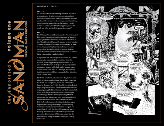
I hope that helps. If you want to see the artwork uncoloured, it's in The Annotated Sandman...
2K notes
·
View notes
Photo
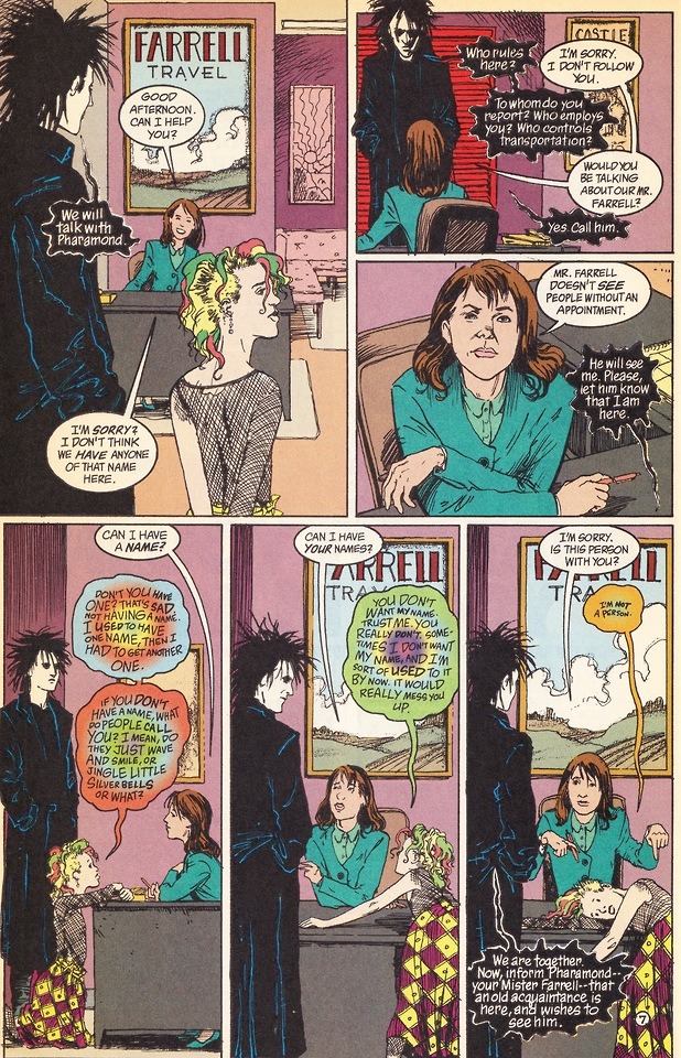
“I’m Not A Person”
Sandman #43 (November 1992)
Neil Gaiman, Jill Thompson, Vince Locke and Danny Vozzo
Vertigo / DC Comics
#Sandman#Neil Gaiman#Jill Thompson#Vince Locke#Danny Vozzo#Vertigo Comics#DC Comics#Great Comics#Great Comic Art#Dollar Bin Finds#I'm Not A Person
33 notes
·
View notes
Text
Graphic Novel Thoughts: The Sandman Vol 5 - A Game of You
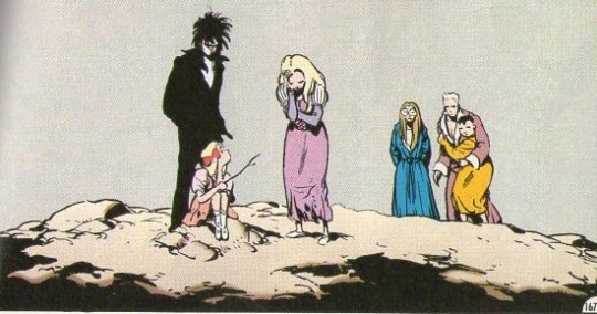
“Everybody has a secret world inside of them. I mean everybody. All of the people in the whole world - no matter how dull and boring they are on the outside. Inside them they’ve all got unimaginable, magnificent, wonderful, stupid, amazing worlds...Not just one world. Hundreds of them. Thousands, maybe. Isn’t that a weird thought?” - Barbie, The Sandman Vol. 5: A Game Of You by Neil Gaiman
The Sandman, a comic book series written by the storytelling genius Neil Gaiman, has always been a strange series for me to read. The main character, Morpheus also known as dream, barely appears in certain volumes. Each collected trade paperback (or at least the ones I’ve read so far which counting this one are the first five) contains a self-contained story that doesn’t necessarily have an impact on the other volumes. This took some getting used to for me, but once I realized that they were connected by overarching themes and general tone, I became more engrossed in the new worlds that Gaiman develops in each new volume.
A Game of You focuses on its main character, Barbie, whose childhood dreams have become reality and are interfering with her life in an attempt to bring her back to the dreamworld that she created. It plays on the idea of how idyllic concepts of how your fantasy world would be can be corrupted and how you can’t stay in childhood fantasies forever. It also delves into how dreams and fears (illustrated by nightmares) can consume people. Gaiman also weaves in cultural mythology which permeates the collective consciousness that he has such finesse in. (The main character is named Barbie and she dreams of being a princess. Her ex-husband is named Ken.)
The book is weird. There’s a scene where someone’s skinned face is nailed to a wall, yet continues to talk and insult others. But it’s okay for comic books to be weird as long as they’re good. And Sandman is very good, especially this volume.
photo credit: Sandman Vol 5: A Dream of You written by Neil Gaiman, illustrated by Shawn McManus, Colleen Doran, Bryan Talbot, George Pratt, Stan Woch, Dick Giordano, colored by Danny Vozzo.
3 notes
·
View notes
Text
Kalifornia (1993) by Duncan Fegredo & Chuck Dixon (Comic Book Adaptation)
Kalifornia (1993) by Duncan Fegredo & Chuck Dixon (Comic Book Adaptation)
Following the completion of the film, DC Comics commissioned a comic book adaptation from writer Chuck Dixon and artist Duncan Fegredo. Fegredo recalled the 32-page adaptation was planned to be released as a supplementary for the film’s video release. The adaptation was never completed beyond some coloring work done by Danny Vozzo. Fegredo has speculated this was due to the demise of Gramercy…
View On WordPress
0 notes
Text


"Well..sometimes I'm her sister."
The Sandman #41
by Neil Gaiman; Jill Thompson; Vince Lockr; Danny Vozzo and Todd Klein
DV/Vertigo
#dc comics#vertigo comics#jill thompson#neil gaiman#the sandman#delirium of the endless#desire of the endless#great job by todd klein
85 notes
·
View notes
Text
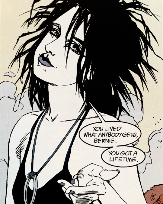
Sandy Sunday🖤
The Sandman: Brief Lives
Writer: Neil Gaiman
Penciller: Jill Thompson
Inker: Vince Locke
Colourist: Danny Vozzo
Letterer: Todd Klein
Editor: Karen Berger
2 notes
·
View notes
Text
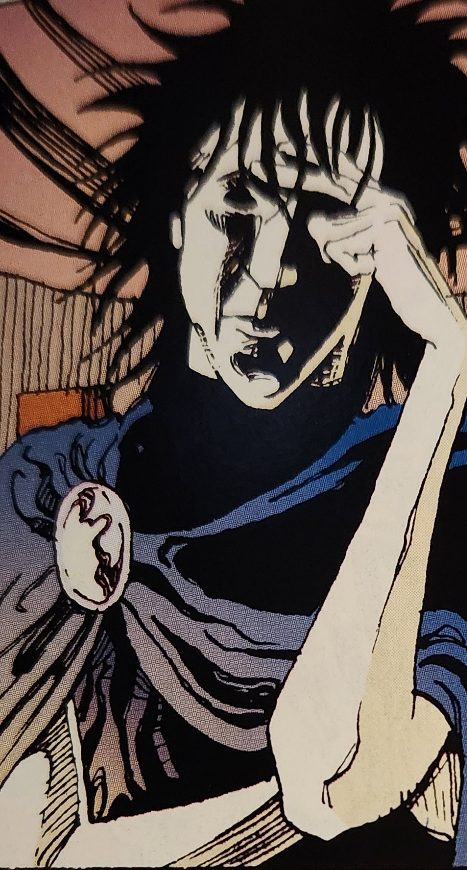
Drawn by Jill Thompson, inked by Vince Locke, colored by Danny Vozzo
Neil Gaiman, The Sandman: Brief Lives, Vol. 7
0 notes
Text
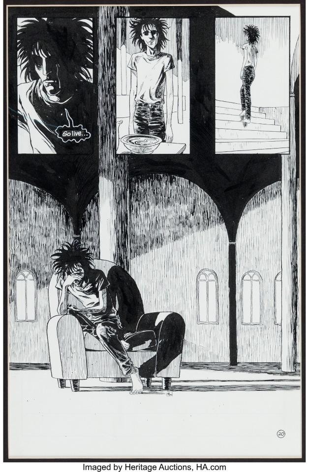
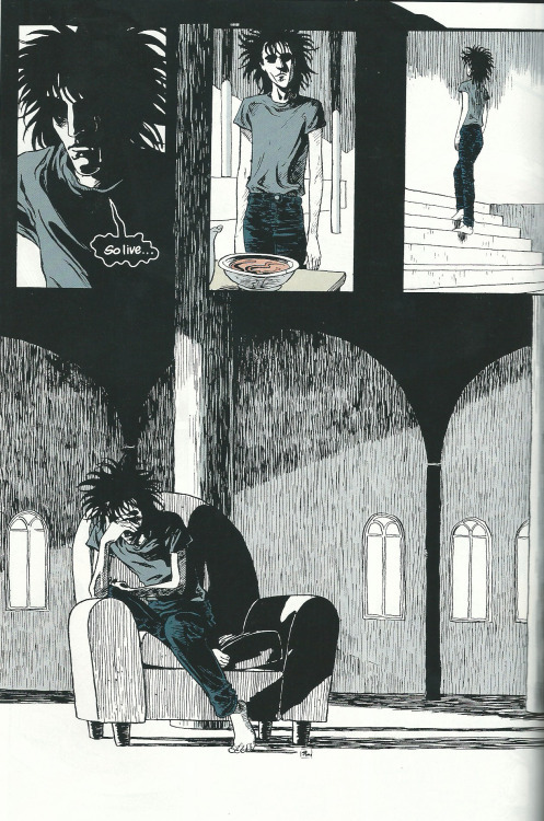

The Sandman #49: Brief Lives
by Neil Gaiman; Jill Thompson; Vince Locke; Danny Vozzo and Todd Klein
DC/Vertigo
#dc comics#vertigo comics#the sandman#jill thompson#neil gaiman#comic book#morpheus#dream of the endless
23 notes
·
View notes
Photo

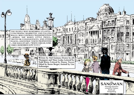
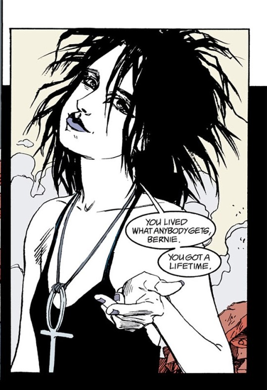
From The Sandman #43 by Neil Gaiman; Jill Thompson,Vince Locke,Danny Vozzo and Todd Klein
DC/Vertigo
40 notes
·
View notes
Text
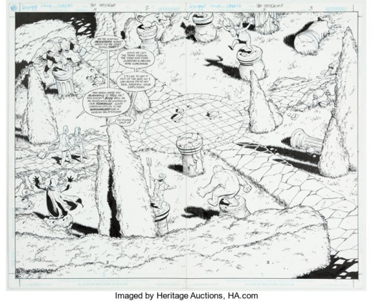

The Sandman Presents: The Thessaliad
by Bill Willingham;Shawn McManus;Andrew Pepoy;Danny Vozzo and John Costanza
DC/Vertigo
4 notes
·
View notes
Text
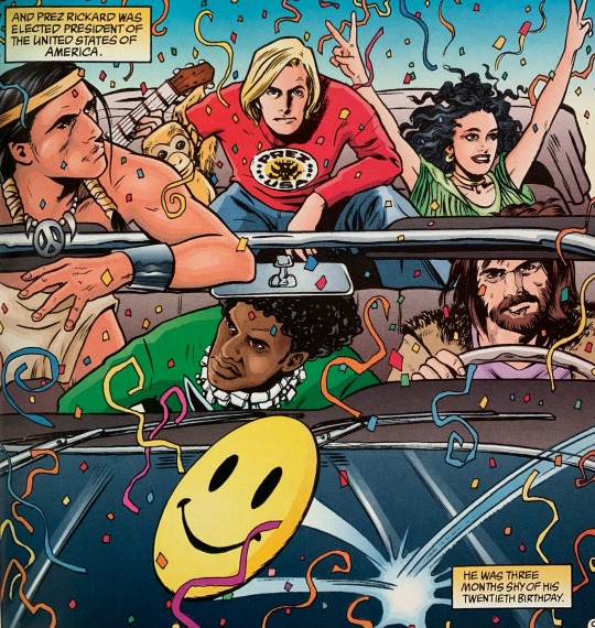
Sandy Sunday🖤
The Sandman: Worlds’ End
Writer: Neil Gaiman
Artist: Michael Allred
Colourist: Danny Vozzo
Letterer: Todd Klein
#comics#comicbooks#comicart#graphicnovel#sandman#the sandman#neil gaiman#michael allred#vertigo comics#read more comics
1 note
·
View note
Photo
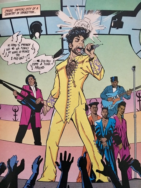


Prince and the New Power Generation: Three Chains of Gold by Dwayne McDuffie and David Williams (pages 1-22); Steve Carr (pages 23-48); Deryl Skelton (pages 23-48), cover by Steven Parke
#dc comics#piranha music#comic book#cover#steven parke#Dwayne McDuffie#david williams#steve carr#deryl skelton#josef rubinstein#danny vozzo#Robert Lappan
109 notes
·
View notes