#Emily Birz
Photo


Fashion Friday
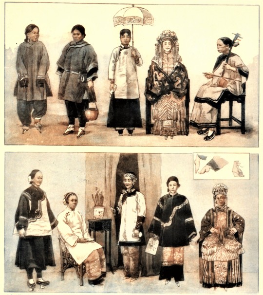
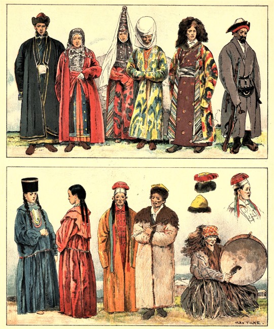
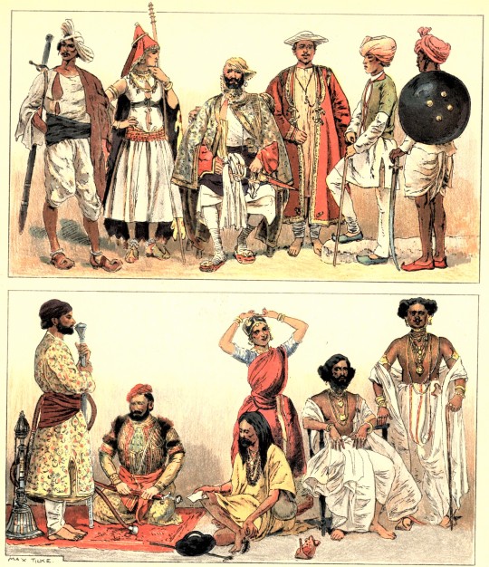
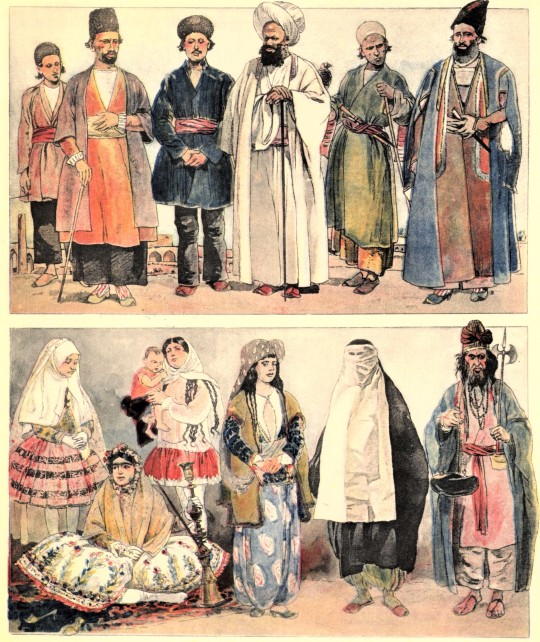
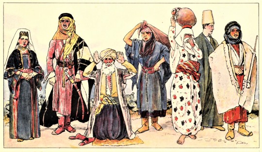
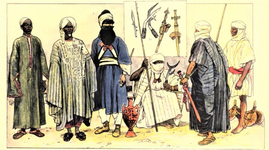
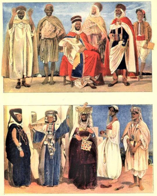
Today we conclude the epic saga of Geschichte des Kostums, the five-volume catalog of world fashion from Adolf Rosenberg published in 1905. As from east to west, clothing silhouettes become more relaxed in different color palettes that stray from the deeper, darker options we saw last week. Once again, head coverings are the biggest difference to spot between cloth wrappings similar to hi-jabs and larger headdresses that almost resemble the pillbox hat popularized in the 1950s and 60s in the United States. Flowing trousers and bare feet replace the men’s breeches and tights combination from the European countries, while women embraced relaxed dress styles accompanied by waist-defining belts. Of course, there are many differences between the fashions from Japan (image 1) and China (image 2) versus Persian fashion (image 5) as pictured, but the one unifier between all pictured examples is the commitment to looser, less restrictive silhouettes. Interesting details to note are the inset of East African weapons in image 6 and the inset of Chinese foot-binding in image 2.
Although we managed to feature this collection in three separate #Fashion Friday posts, there is so much more to explore. Make an appointment with Special Collections here to view the rest of this collection!
Shown here in order are:
1.) Japan
2.) China
3.) Asiatic Russia
4.) India
5.) Persia
6.) Palestine
7.) East Africa
8.) West Africa
9.) Algeria
View more Fashion Friday posts here.
-Emily, Special Collections Writing Intern
#fashion friday#adolf rosenberg#Geshichte des Kostums#Eduard Heyck#fashion history#world fashion#japanese fashion#chinese fashion#indian fashion#persian fashion#middle-eastern fashion#african fashion#Costumes of the World#historical fashion#Emily Birz
413 notes
·
View notes
Photo
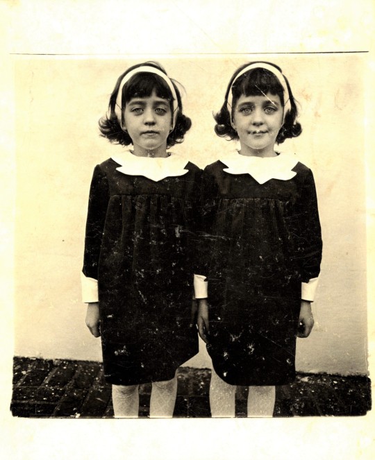
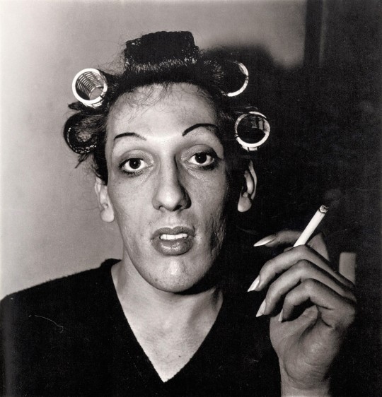

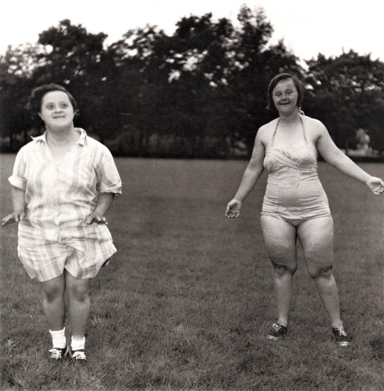
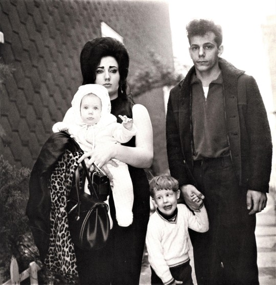
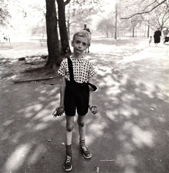


Magnificent Women Monday
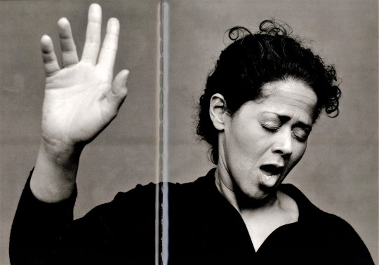
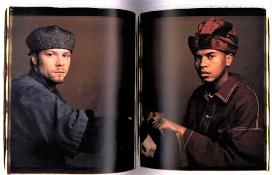
DIANE ARBUS
American photographer Diane Arbus was a pioneer in the humanizing portraits of those of the margins of society. Shown above are images selected from her first book of photographs Diane Arbus, published by Aperture in 1972 with design and editing by her long-time friend and companion Marvin Israel and her eldest daughter Doon Arbus to accompany an exhibition of her at Museum of Modern Art, New York, a year after her death by suicide at age 49.
Diane Arbus’s career began in commercial photography, although she quickly realized her talents were better suited to taking photos rather than working as a creative director on her husband Allan’s shoots. She worked to normalize marginalized groups and demonstrate the importance of representation by photographing carnival workers, strippers, nudists, drag queens as well as mothers, couples, and middle-class families. These unflinchingly empathetic photos depict subjects in familiar settings, often taken in their homes, on their streets, or within their workplaces.
New York Times journalist and author of Diane Arbus: Portrait of a Photographer Arthur Lubow wrote that she had a fascination with people who were “visibly creating their own identities... and by those who were trapped in a uniform that no longer provided any security or comfort.” She is considered among the most influential artists of the last century and is even credited with inspiring the twin characters in The Shining with the first image above. Although her life tragically ended before her accomplishments were acknowledged widely, her work has since been featured in 28 solo exhibitions and is permanently held in collections around the world.
Some interesting associations: her brother Howard Nemerov was twice U.S. Poet Laureate from 1963 to 1964 and again from 1988 to 1990; her husband, photographer and actor Allan Arbus, is popularly known for his role as Dr. Sidney Freedman on the television show M*A*S*H, and their youngest daughter Amy Arbus is also a noted photographer and educator.
View posts about other women photographers.
View more Magnificent Women Monday posts.
--Emily, Special Collections Writing Intern
#Magnificent Women Monday#Diane Arbus#Aperture#photography#historic women#Marvin Israel#Doon Arbus#Arthur Lubow#museum of modern art#MOMA#women photographers#american photographers#photography books#Emily Birz
354 notes
·
View notes
Photo

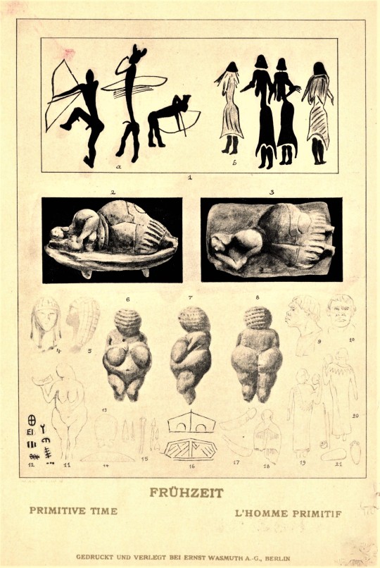
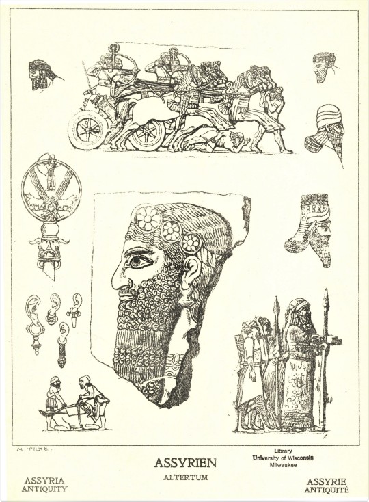
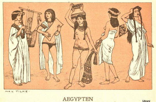


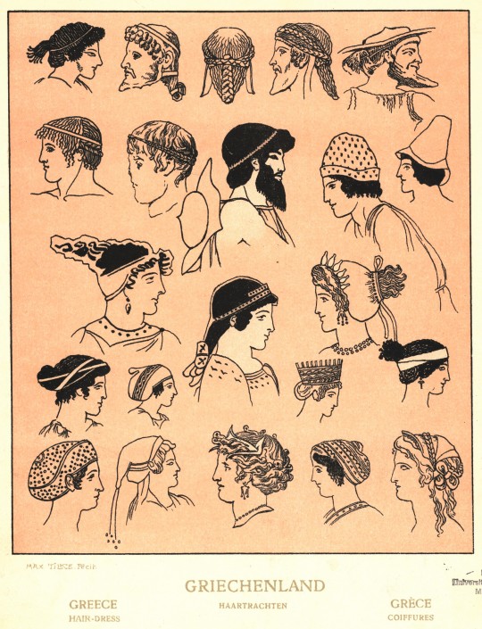

Fashion Friday
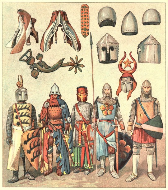
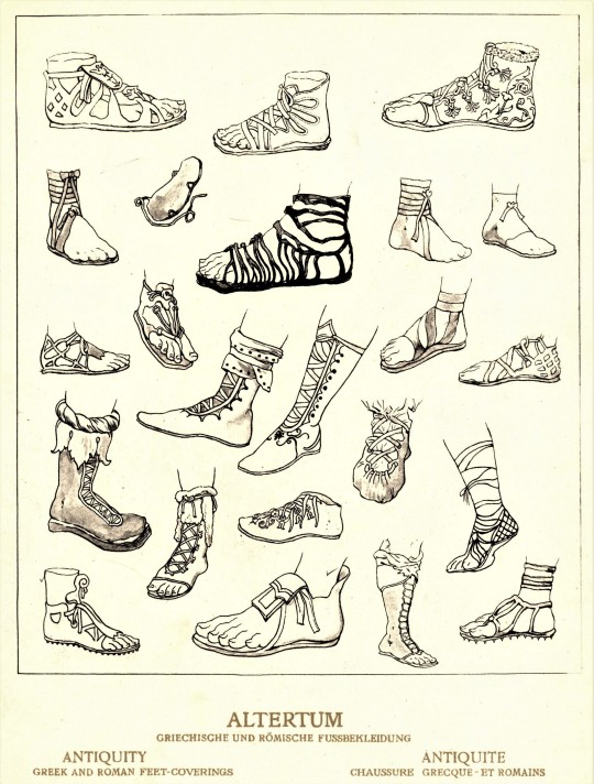
For #Fashion Friday, we present German art historian Adolf Rosenberg’s Geschichte des Kostums, a gargantuan, 5-volume collection of historical fashion accompanied by descriptions in German by Eduard Heyck. Published in New York by Weyhe Galleries in 1923. The work includes detailed illustrations of fashion from around the world and across the centuries. Beginning with images of primitive dress and working up to colorful depictions of Roman and medieval German battle armor in volume 1, there is an impressive level of detail in each illustration. Who knew there were so many variations on the gladiator sandal? I may not be able to pronounce “Geschichte des Kostums”, but it would definitely come in handy for all of my Halloween and Purim costume needs.
View more Fashion Friday posts here.
-Emily, Special Collections Writing Intern
#fashion friday#Geschichte des Kostums#adolf rosenberg#Eduard Heyck#fashion history#world fashion#roman fashion#greek fashion#Costumes of the World#Weyhe Galleries#Emily Birz
257 notes
·
View notes
Photo


Magnificent Women Monday
ANNIE LEIBOVITZ
Legendary photographer Annie Leibovitz is best known for capturing intimate celebrity portraits and was the first woman to have a feature exhibition at Washington’s National Portrait Gallery in 1991. She was declared a Living Legend by the Library of Congress and is credited with helping to define the classic Rolling Stone photography style throughout her thirteen years with the magazine, ten of which she served as their chief photographer.
One of her most famous photos, featuring John Lennon and Yoko Ono, was taken several hours before Lennon’s death in 1980 and was published as the cover for Rolling Stone’s Lennon commemorative issue a month later. In 2005, this cover photograph was named the best magazine cover in forty years by the American Society of Magazine Editors, with her 1991 cover depicting a nude and pregnant Demi Moore coming in second place. She has created a signature style with bold colors and innovative lighting that is still in demand among celebrities today, nearly 51 years after her career began.
We think her photography book entitled Women, published in 1999 by Random House in New York and accompanied by an essay by her lifelong friend Susan Sontag, is a perfect fit for #Magnificent Women Monday. From top to bottom:
1.) Anna Deavere Smith. Playwright, performer, New York City.
2.) Dust Jacket cover for Women.
3.) Gwyneth Paltrow and Blythe Danner. Actors. Vancouver, British Columbia.
4.) Yoko Ono. Multimedia artist. New York City.
5.) Eudora Welty. Writer. Jackson, Mississippi.
6.) Maya Lin. Architect. New York City.
7.) Dorothy A. Richman. Rabbinical student. Jewish Theological Seminary, New York City.
8.) Martina Navratilova. Tennis player. Dallas, Texas.
9.) Tammy Kelly. Bull rider. Alamosa All-Girl Rodeo. Alamosa, Colorado.
10.)Josephine Barlow. Hotel worker. Golden Nugget, Las Vegas, Nevada.
View posts about other women photographers.
View more Magnificent Women Monday posts.
–Emily, Special Collections Writing Intern

Oseola McCarty. Washerwomen, philanthropist. Hattiesburg, Mississippi.
#Magnificent Women Monday#Annie Leibovitz#Susan Sontag#Women#Rolling Stone#photography#portrait photography#women photographers#american photography#celebrity photography#photography books#Emily Birz
166 notes
·
View notes
Photo


Staff Pick of the Week
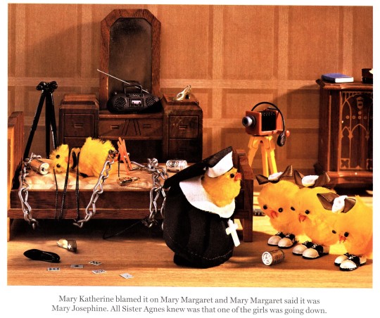
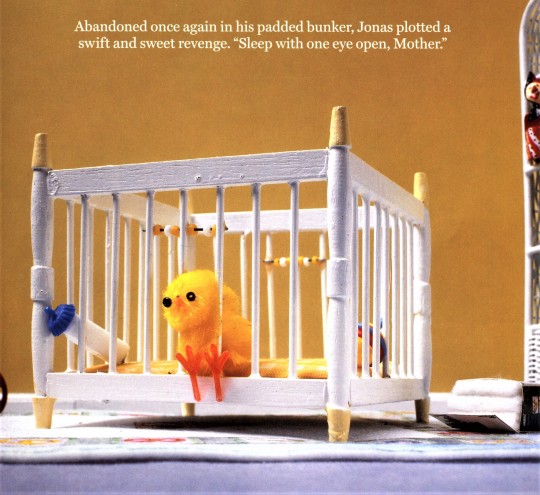
Throughout my time with Special Collections, I have made it a habit to wander the stacks in pursuit of posting material whenever I can. Time and time again, I find myself drawn to Bitter With Baggage Seeks Same: The Life and Times of Some Chickens, written by Sloane Tanen with photographs by Stefan Hagan. Published in New York by Bloomsbury in 2003 and declared a bestseller in the same year, the book pairs eccentric photographs of baby chicks with supremely witty captions that highlight just how ridiculous the images are.
Besides her adult satires, Tanen also writes for young adult audiences, for which she is perhaps genetically predisposed, as her father Ned Tanen was the producer for such teen cult hits as "Sixteen Candles," "The Breakfast Club," and "St. Elmo's Fire."
Sloane Tanen’s writing incorporates a dark satirical humor that pokes fun at fairytales and “first world problems” alike. I think Tanen and Hagan’s combined whimsical portrayals of life through a chick’s eyes are the perfect palette cleanser to begin a new week.
View more of our Staff Picks.
--Emily, Special Collections Writing Intern
#staff pick of the week#Bitter With Baggage Seeks Same#Sloane Tanen#Stefan Hagan#whimsy#satire#dark humor#photographs#chicks#chickens#Emily Birz
165 notes
·
View notes
Photo

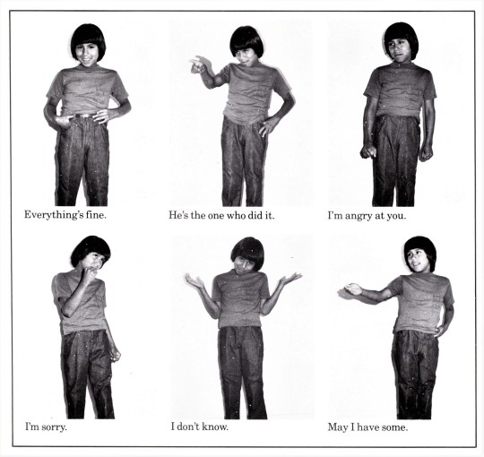
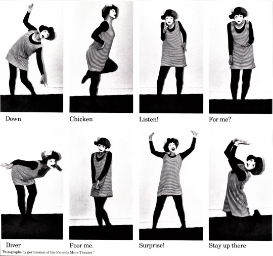


Morse Code Anniversary
On May 24, 1844, Samuel F.B. Morse dispatched the first electronic telegraphic message using Morse Code over an experimental line from Washington D.C. to Baltimore. The message read, “What hath God wrought?” taken from the Bible (Numbers 23.23) and was recorded on a paper tape. This occasion marks the initial use of a code that became the primary language of telegraphy in the world and remains today the standard for rhythmic transmission of data.
To celebrate this triumphant achievement, we present the children’s book Sending Messages, written by UW-Milwaukee's own John Warren Stewig with photographs by Richard D. Bradley. It demonstrates many possible ways to send messages, including but not limited to language, music, mime, referee signals, and Morse code with different examples on each page. Given that the book was published in 1978, it is understandably old-fashioned, but imagining the possibilities that this book has if updated is entertaining nonetheless!
Picture this: one page reads, “Even during times of extreme separation, we found new ways to communicate. When visiting the grocery store, a subtle adjustment of a mask reminds other shoppers to fix theirs,” accompanied by explanatory pictures on the next page. Or “Zoom calls became a regular fixture in many homes during the COVID-19 pandemic, resulting in new body language indicators. For example, several repeated glances offscreen during a work call might communicate that a child is screaming for yogurt while their parent is on mute.” What a perfect way to depict the COVID world!
--Emily, Special Collections Writing Intern
#Morse Code Anniversary#Morse Code#Samuel Morse#Sending Messages#john warren stewig#Richard Bradley#communication#Emily Birz#anniversaries#telegraph#telegraphy#Historical Curriculum Collection
58 notes
·
View notes
Photo


Magnificent Women Monday
During Black History Month, we featured Bronzeville Boys and Girls written by legendary American poet Gwendolyn Brooks. One post was simply not enough to convey the range of Brooks’s work, so we’ve chosen to dedicate this #Magnificent Women Monday to her.
Born in Chicago in 1917, Brooks rose to fame through the portrayals of ordinary life in her community and had published 75 poems in literary magazines by the age of 16. Among her long list of honors is her position as the first African American recipient of the Pulitzer Prize in 1950 for Annie Allen, and serving as Poet Laurate Consultant in Poetry for the Library of Congress from 1985 to 1986 and Poet Laurate of Illinois from 1968 until her death in 2000. Her poetry reflects an authentic, textured viewpoint of African American life. Toni Morrison crediting her with creating space for young Black writers and artists to exist in freely.
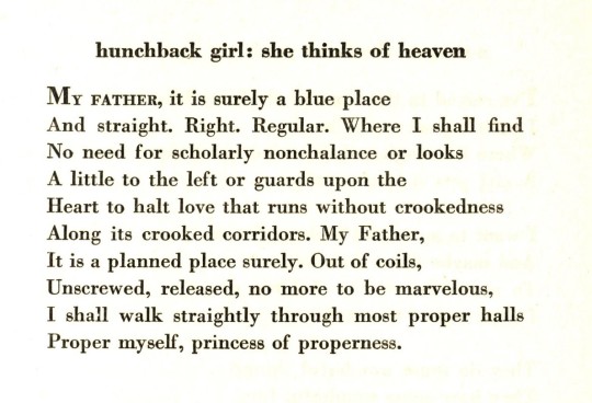
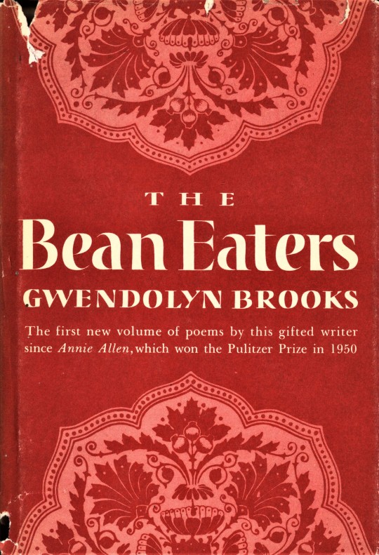
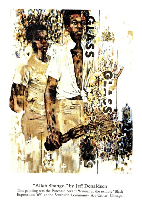
Her activism in promoting African American literature led her to leave her influential publisher Harper and Row in 1970 for Dudley Randall’s Broadside Press, and she would continue to work mainly with African American publishers for the rest of her life. Part of the widespread interest in her work lies in her ability to bridge the gap between the academic poetry stylings of the 1940s and Black militant writings of the 1960s as described by George E. Kent in A Life of Gwendolyn Brooks, allowing a political consciousness to inform her writing without allowing it to become the lone message of her work. We hold 11 titles by Gwendolyn Brooks. Shown here in order are:
1.) Portrait of Gwendolyn Brooks by Roy Lewis from Riot, Broadside Press. 1970.
2-4.) Title page and poems from the first edition of A Street in Bronzeville, Brooks's first published collection, Harper & Brothers, 1945.
5.) Dust jacket designed by Shirley Smith from the first edition of The Bean Eaters, a collection of poems that follows the slow rhythm of an elderly couple’s daily life, published by Harper & Brothers in 1960.
6 & 7.) Cover and frontispiece from a painting by Jeff Donaldson from the second printing of Riot, Broadside Press, Detroit, 1970.
8 & 9.) Title page and poem from the first printing of Family Pictures, Broadside Press, 1971.
10.) Cover from the first printing of Aloneness, a children's picture book illustrated by Leroy Foster, Broadside Press, 1971.
View more Magnificent Women Monday posts.
--Emily, Special Collections Writing Intern
#Magnificent Women Monday#Gwendolyn Brooks#poetry#women poets#African American poets#African American women#Dudley Randall#Broadside Press#Roy Lewis#A Street in Bronzeville#The Bean Eaters#Shirley Smith#Jeff Donaldson#Riot#Family Pictures#Aloneness#Leroy Foster#Emily Birz
70 notes
·
View notes
Photo
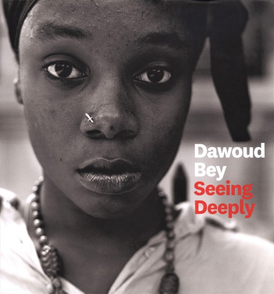


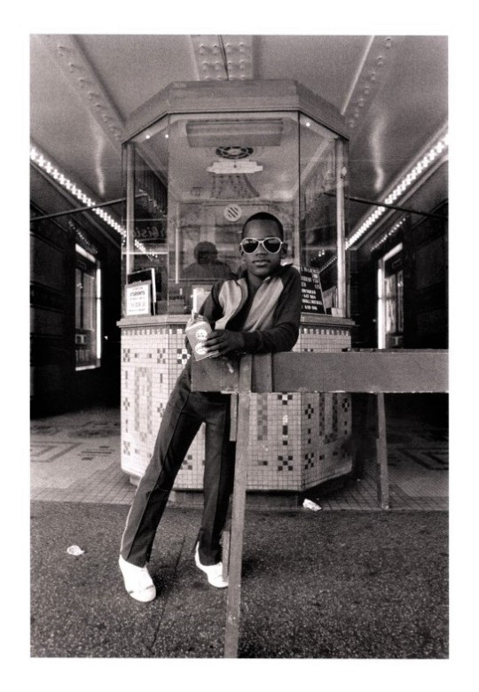


Black History Month: Dawoud Bey
American photographer Dawoud Bey’s Seeing Deeply is a 40-year retrospective of Bey’s career, including photographs from 1975 through the last several years, published by the University of Texas Press in 2018. Bey has been heralded as inheriting the legacy of Harlem Renaissance artists and leaders like Langston Hughes and Roy DeCarava, especially through his commitment to photographing American adolescents in marginalized communities with an empathetic lens.
My interest in young people has to do with the fact that they are the arbiters of style in the community; their appearance speaks most strongly of how a community of people defines themselves at a particular historical moment.
Beyond this is a continuous commitment to put Harlem front and center through street photography, portraits, and large-scale art photography, honoring the community’s physical environment as well as its’ citizens, earning him the MacArthur Fellowship “genius” grant in 2017. Bey’s efforts, like artists before him such as DeCarava and James Van Derzee, labor under the time-honored tradition of creating space for the next generation to build upon their achievements. In short, they walk so others can run. We see this impact next week with I Can Make You Feel Good by Tyler Mitchell, an extraordinarily unique depiction of a Black Utopia!
Learn more about Dawoud Bey and his impact.
View more Black History Month posts.
-Emily, Special Collections Writing Intern
#Black History Month#African Americans#Dawoud Bey#Seeing Deeply#African American artists#photographers#photography#Black artists#Black photographers#University of Texas Press#MacArthur Fellowship#MacArthur genius#photography books#Emily Birz
103 notes
·
View notes
Photo

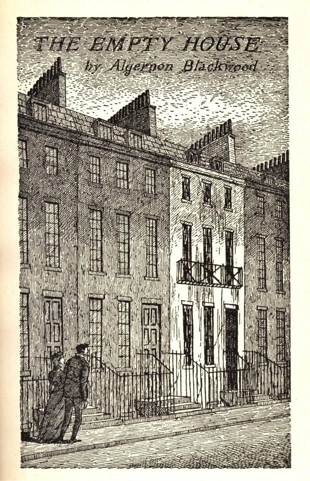


Macabre Monday
It’s no secret that Edward Gorey is a bit of a fan favorite here at UWM Special Collections. Therefore, it seems only fitting that we highlight the gor(e)y images from Haunted Looking Glass, a collection of spooky short stories he assembled and illustrated, for this week’s #Macabre Monday post. His chosen authors run the gamut of heavyweight horror, including Bram Stoker, Charles Dickens, Wilkie Collins, Edith Nesbit, and Algernon Blackwood, among others. It was published by Avenel Publishing in New York in 1984 and distributed by Crown Publishing. With twelve illustrations for the twelve different short stories, the pen-and-ink drawings were created with a level of intricately-detailed line work that express foreboding and sinister implications.
View more posts about Edward Gorey.
In the mood for more spooky imagery? See more here.
-- Emily, Special Collections Writing Intern
#Edward Gorey#bram stoker#charles dickens#Wilkie Collins#Edith Nesbit#algernon blackwood#avenel#crown publishing#Avendel Publishing#ghost stories#macabre monday#pagefrights#Emily Birz
264 notes
·
View notes
Photo


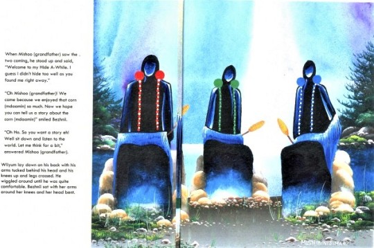
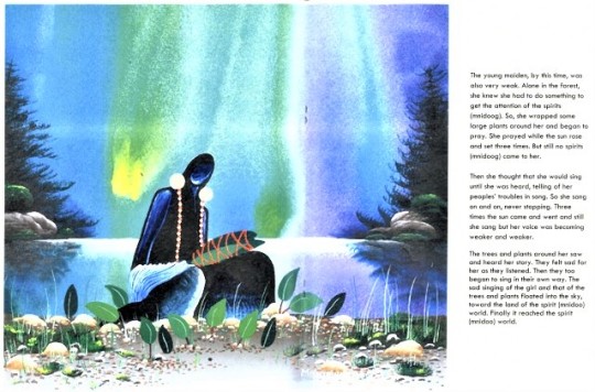
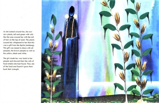


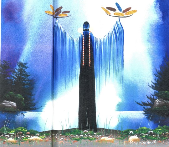
Mandaamin, the Spirit of Corn
In the spirit of recognizing the importance of Thanksgiving leftovers, we present Corn, written by Ojibwe language specialist Melvina Corbiere and illustrated by Canadian artist James Mishibinijima, that explores an Ojibwe legend about the first time corn was harvested in a Native American community. Published by Kenjgewin Teg Educational Institute in Ontario in 2007, this book evokes a childlike wonder through Corbiere’s narrative and the colorful paintings that Mishibinijima calls “Woodland art.” Mishibinijima’s style is meant to promote healing and understanding, particularly through its use of color, and utilizes a “portfolio of symbols derived from ancient pictographs found on the natural landscape that conveys sacred teachings distilled over thousands of years.” Many of Mishibinijima’s paintings are directly inspired by his childhood home on Manitoulin Island in Lake Huron, combining the landscape with the legends of the Ojibwe tribes that inhabit it. The images in Corn have deeply vibrant shades of blue and purple running through the background of each page, suggesting an other-worldly presence, with characters depicted as faceless individuals only identifiable by colorful jewelry.
Messages of peace, healing, and gratitude are embodied in the narrative, with Ojibwe culture linking human bodies and the land through the spirit of the corn, called Mandaamin. In some stories, Mandaamin is the spirit send by Chief Sky Spirit to deliver the corn; in others, he is the father of the Ojibwe people, married to the First Mother, demonstrating the importance of corn to the beginning and survival of the tribe. It played an integral role in establishing introductory relationships with French explorers, akin to the traditional Thanksgiving stories we hear today.
View more posts in honor of Native American Heritage Month.
View more posts from our Native American Literature Collection!
-- Emily, Special Collections Writing Intern
#Native Americans#native american heritage month#james mishibinijima#melvina corbiere#woodland art#ojibwe#corn#Mandaamin#Kenjgewin Teg Educational Institute#Native American Literature Collection#Native American legends#Ojibwe legends#illustrations#illustrated books#emily birz
179 notes
·
View notes
Photo


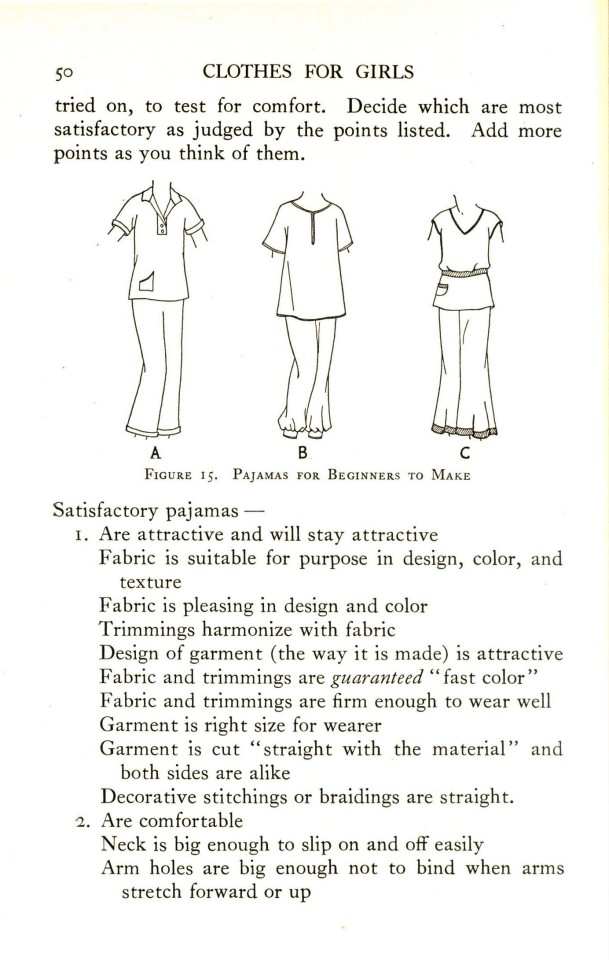

Fashion Friday
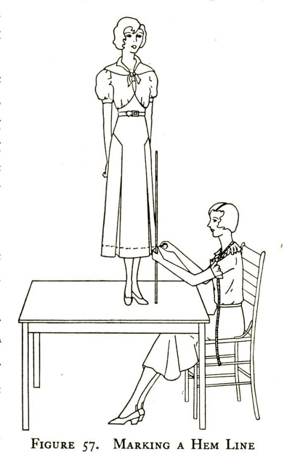
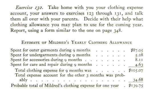
According to Elizabeth Todd in her incredibly detailed copy of Clothes for Girls, the first two things that middle school age girls must understand about their clothing issues are the tools they will need and how to open an expense account. The 1937 volume published by Little, Brown, and Company covers everything from how to dress appropriately to fully creating patterns for sewing new objects of clothing alongside illustrations by Margaret Chynoweth and Helen McCullough. Perhaps the most interesting piece of information contained within this book are spreadsheets detailing how to break down a budget for clothing, a skill that is often not developed until adulthood today, that include oddly specific breakdowns of how involved these young women should be with their families’ finances, including excerpts like:
“Clothing allowance for mother: $90
Needs more than I do because some of her street clothes are silk and cost more than mine. She needs more for dry cleaning than I do.”
Estimates surrounding the family’s yearly income were not exactly what I expected from a book meant to educate young girls about fashion, but instilling the importance of financial literacy for women was a nice surprise! 218 illustrations provide beautiful peeks into fashions of the time, like the depictions of “satisfactory pajamas” with tunic style tops and slightly flared bottoms and dresses styled in different ways according to the occasion. As this book is meant to be a supplementary teaching tool, directions for the simplest actions of creating clothing are provided, like step-by-step instructions for threading a needle and it is even dedicated to “Junior High School Girls, Girls in 4-H Clothing Clubs, Girl Scouts”.
View more Fashion Friday posts.
-Emily, Special Collections Writing Intern
#fashion friday#elizabeth todd#1930s fashion#Little Brown and Company#Clothes for Girls#Margaret Chynoweth#Helen McCullough#home economics#Emily birz
122 notes
·
View notes
Photo


Macabre Monday
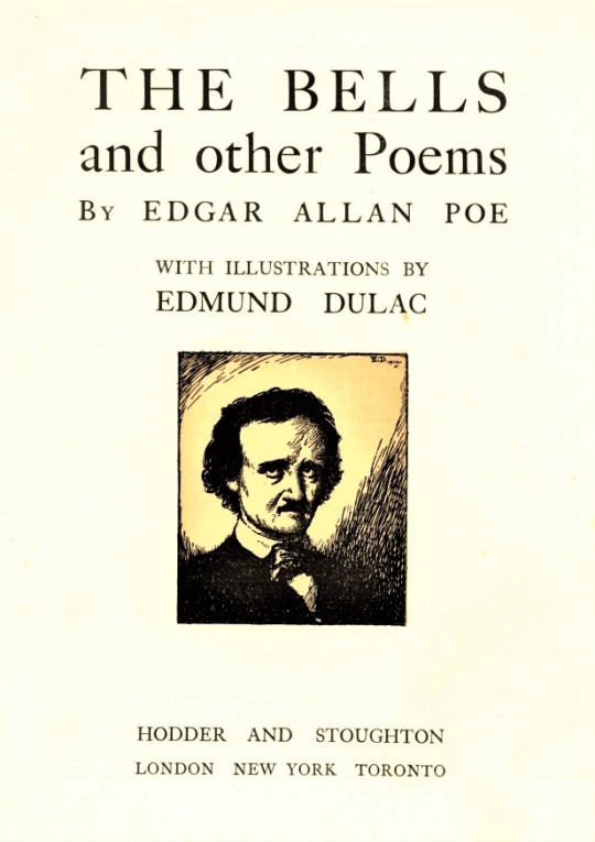
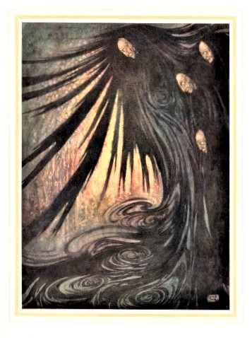
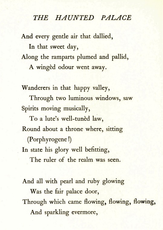
Kicking off the month of October, we present an eerie Macabre Monday post with Edgar Allen Poe(ms). Our copy of The Bells and Other Poems is a first-edition collection of Poe’s poems published in 1912 by Hodder and Stoughton in London, and printed by Henry Stone and Son Ltd. in Banbury, England. The book is adorned with 28 full-page color illustrations, originally done in watercolor, by the French-English illustrator Edmund Dulac, accompanied by guard sheets with descriptive letterpress. The gold-stamped Art Nouveau covers and endsheets of ringing bells is by the American designer, illustrator, poster artist Frank Hazen (Hazenplug before 1911).
Dulac’s illustrations for Poe’s poems range from otherworldly beauty to unearthly horror in a significant departure from the illustrations Dulac produced for ten of the Brontë Sisters publications that began his career in 1905. He later formed an arrangement with both Leicester Galleries and Hodder and Stoughton Publishing, with the gallery commissioning illustrations to be sold in an annual exhibition and the publishing rights owned by Hodder and Stoughton to reproduce as illustrated gift books once a year. Our copy of The Bells and Other Poems was produced under this arrangement. The colorful illustrations bring Poe’s stories to life with little to no regard for readers’ potential nightmares.
This macabre holding is yet another donation from our good friend Jerry Buff.
View more posts of the creepy and macabre.
View more posts on Edgar Allan Poe.
-- Emily, Special Collections Writing Intern
#macabre monday#edgar allen poe#edmund dulac#The Bells and Other Poems#Hodder and Stoughton#macabre#halloween#october#leicester galleries#Henry Stone and Son#Frank Hazen#Emily Birz#pagefrights#Jerry Buff
109 notes
·
View notes
Photo


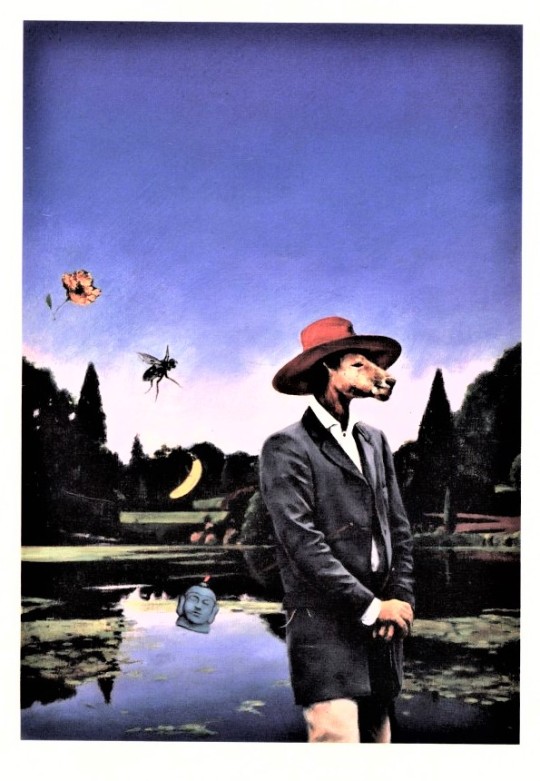
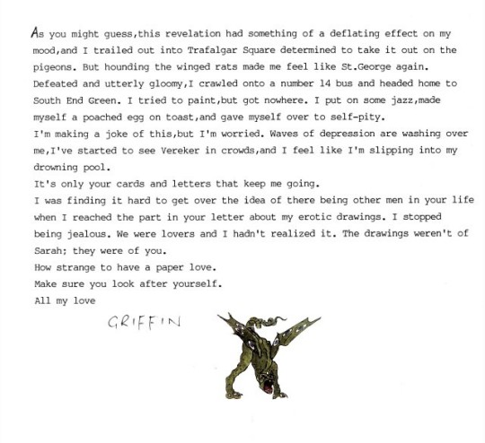
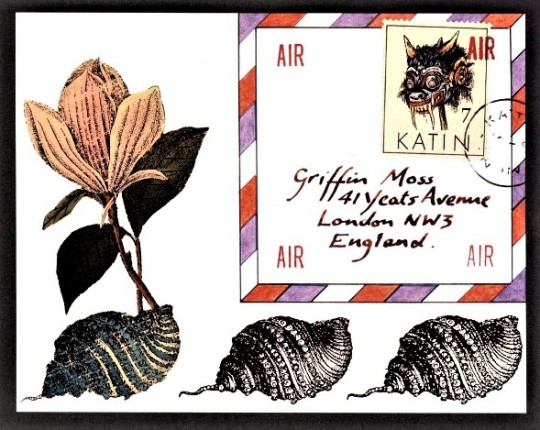


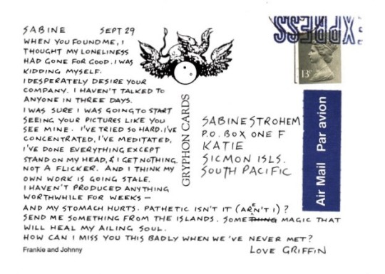


Griffin and Sabine: An Extraordinary Correspondence
As the end of 2020 grows nearer, reflection upon the many ways this year has changed how we communicate with each other feels necessary. With this in mind, we present Griffin and Sabine: An Extraordinary Correspondence, written and illustrated by British artist and author Nick Bantock. Published by Chronicle Books in San Francisco, the 1991 bestseller is the first in a trilogy of novels told through literal postcards and letters centered around the character of Griffin Moss, an isolated postcard artist, who receives a cryptic letter from a woman named Sabine, a postage-stamp illustrator from an island in the South Pacific, claiming to see visions of his artwork as he creates it. Readers of this epistolary love-story/mystery series experience Griffin struggling to make sense of his loneliness and wonder whether Sabine could possibly be a figment of his imagination as he grows more attached to the idea of her as his soulmate. For Chronicle Books, the trilogy became one of the company’s most successful titles; the first three books alone spent more than 100 weeks on The New York Times bestseller list and sold more than three million copies.
While living through the loneliness that Griffin endures might have been a stretch for some readers prior to months of quarantines and lockdowns, it now looms in our collective rear-view mirror as the pandemic drags on. Griffin describes days without human interaction, demonstrating his need for connection through an eager willingness to bind himself to a stranger and contributing an almost painful vulnerability through his letters, while Sabine remains a tempting daydream just out of reach.
Between physically opening a letter addressed to someone else and being confronted with the overwhelming honesty of its content, readers are enveloped by an inescapable sense of manufactured intimacy, a phenomenon not unlike the feeling of stumbling upon a Facebook post that completely and unexpectedly aligns with your perspective. Creating this sensation of togetherness has been integral to trends in communication throughout 2020, while periods of extreme separation from loved ones continue and technological communication remains essential. Our methods of communication are different, but the core feelings expressed in Griffin and Sabine’s correspondence is echoed in magnified scale, rendering one line from Griffin’s correspondence achingly applicable: “Make sure you look after yourself.”
-- Emily, Special Collections Writing Intern
#griffin and sabine#nick bantock#Sptolight#Chronicle Books#epistolary novels#letters#postcards#mysteries#love stories#illustrations#illustrated books#coronavirus pandemic#emily birz
59 notes
·
View notes
Photo


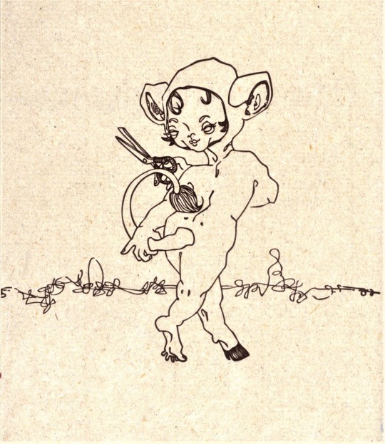
Happy Macabre Monday!
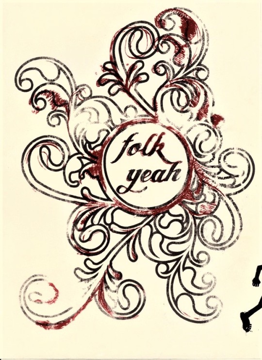
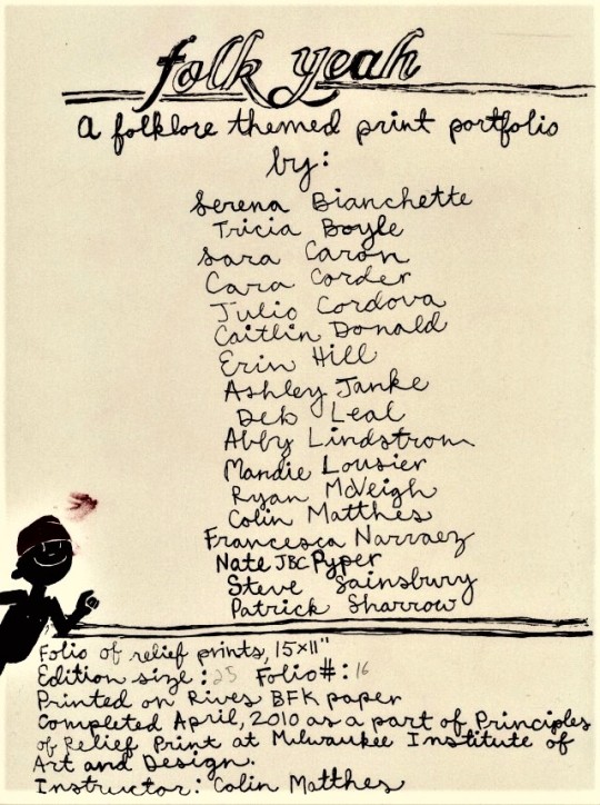
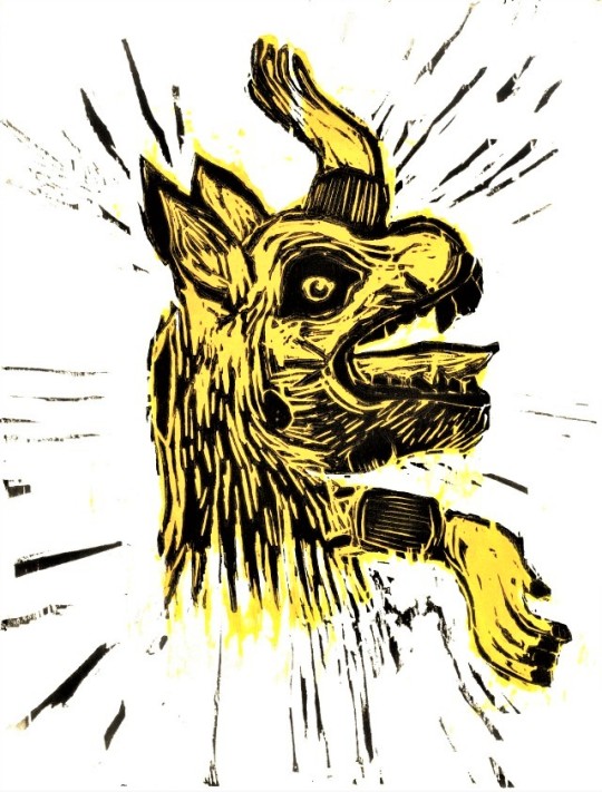
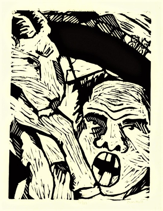
In the final edition of Macabre Monday for 2020, we present Folk Yeah, a print portfolio arranged by Milwaukee artist and member of the Justseeds cooperative Colin Matthes for his 2010 “Principles of Relief Print” course at Milwaukee Institute of Art and Design. The prints selected for this post were created by Matthes’s students Sara Caron, Tricia Boyle, Julio Cordova, Caitlin Donald, Erin Hill, Steve Sainsbury, and Patrick Sharrow, respectively. The collection is comprised of 17 relief prints printed on BFK Rives Paper in an edition of 25 copies. Each print is a response to a folklore theme, with colors ranging from shades of yellow, black, and maroon on cream, beige, or white colored paper, casting the collection in a light that matches the tales they are based on. All manner of scary beings inhabit the pages of this collection, including ghouls, goblins, ghosts, a man-goat creature, and the downright frightening woman with a fire iron watching me type this post. Although we may not be able to identify the exact folk tales these images are based on, we can confirm that there will be nightmares tonight!
We hope you have enjoyed our Macabre Monday posts and have a happy (socially-distanced) Halloween!
View more posts of the creepy and macabre!
-- Emily, Special Collections Writing Intern
#macabre monday#colin matthes#Folk Yeah#MIAD#art students#milwaukee institute of art and design#pagefrights#bfkrives#relief prints#Emily Birz
62 notes
·
View notes
Photo

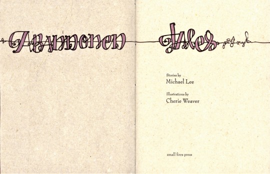

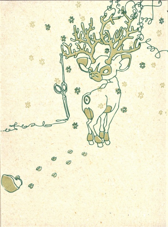
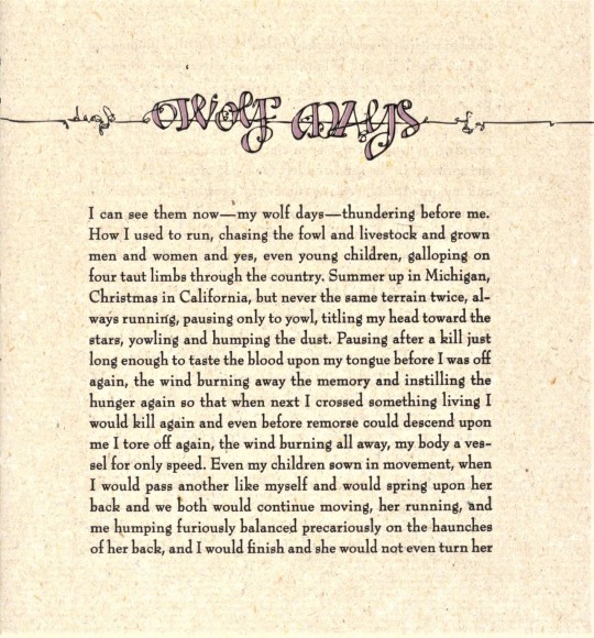

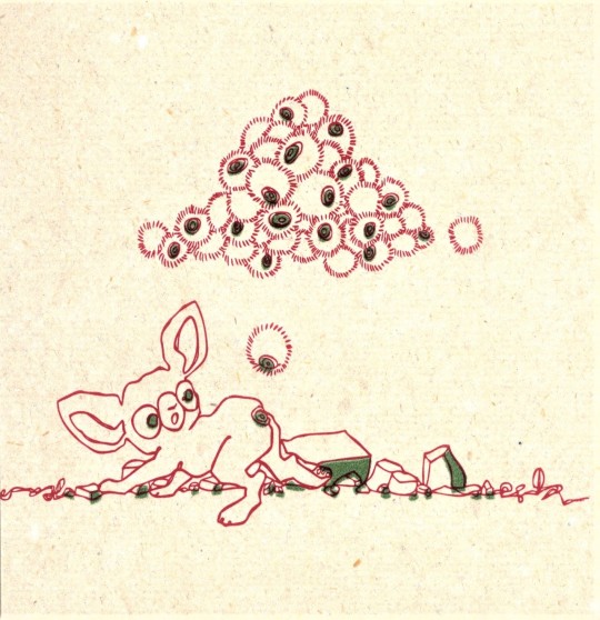

It’s Fine Press Friday!
Every once in a while, examples of not-quite-safe-for-work pieces are wholly necessary to remember that unrefined viewpoints are valuable additions that can round out any collection. Keeping this idea in mind, we present Abandoned Tales, written by Michael Lee with illustrations and titling by Cherie Weaver. This masterclass in fine press printing was designed and printed in 2009 by Friedrich Kerksieck in Tuscaloosa, Alabama for his Small Fires Press in an edition of 65 copies. Weaver’s images, along with the Bernhard Modern and Rosewood types, were reproduced as photopolymer plates and printed with a Vandercook 4 at the University of Alabama on handmade cotton/flax paper, with handmade linen/hemp end sheets. The cover was also handmade with wool, linen, cotton, mule dung, and modal, pulled by Kerksieck with help from L. G. Trimm in the Lost Arch Papermill at the University of Alabama. Although the pages are small, they are mightily filled with semi-pervy folk tales that match the darkly whimsical illustrations perfectly. Together, the writing and illustrations elevate this collection of at-times crude storytelling to a beautiful questioning of the world as it stands.
View our other posts on the Small Fires Press.
View more Fine Press Friday posts.
--Emily, Special Collections Writing Intern
#Fine Press Friday#Fine Press Fridays#Small Fires Press#Michael Lee#Abandoned Tales#Cherie Weaver#Friedrich Kerksieck#Bernhard Modern#Rosewood type#handmade paper#Lost Arch Papermill#letterpress printing#photopolymer plates#semi-pervy folk tales#illustrations#Emily Birz
28 notes
·
View notes
Photo


It’s Fine Press Friday!
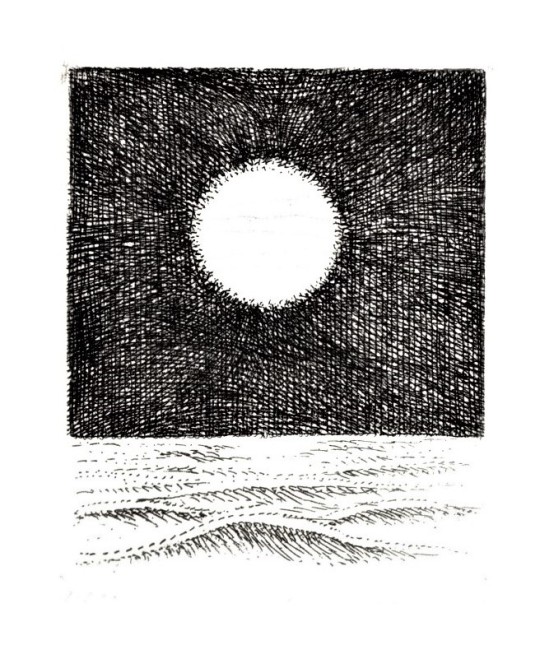
Seven Poems pairs poetry by Carl Sandburg and original copperplate etchings by American artist Gregory Masurovsky, designed by the then-director of Associated American Artists, Sylvan Cole Jr., in New York in 1970. It was printed in Paris in a series of unbound gatherings by Pierre Jean Mathan in Times New Roman (designed by Stanley Morison and Victor Lardent) in an edition of 190 copies, with our copy being one of 150 copies on Rives BFK paper. The etchings were printed at Atelier Georges LeBlanc.
Three-time Pulitzer Prize winner Carl Sandburg was a prolific voice in American poetry from the early to mid-20th century and enjoyed a level of fame usually associated with Hall of Fame athletes and entertainers due to the popularity of his straightforward, layperson-appropriate poetry. This collection is a compilation of poetry from throughout Sandburg’s career, and Masurovsky’s etchings mirror these sentiments. The images are deceptively simple and uncomplicated, matching their accompanying poetry with surreal imagery, while the unbound nature of the collection invites readers to rearrange the order of the poetry. Readers can gather different meanings by reordering the poetry to their hearts’ delight.
View more Fine Press Friday posts.
-Emily, Special Collections Writing Intern
#Fine Press Friday#Fine Press Fridays#carl sandburg#george masurovsky#sylvan cole jr#Associated American Artists#Pierre Jean Mathan#Atelier Georges LeBlanc#Rives BFK#Times New Roman#fine press books#poetry#etcings#copperplate etchings#Emily Birz
59 notes
·
View notes
Last Seen Blogs

wheelsofwhisky
A Perfect Place for Whisky Lovers

sakunade-cosplay
Random Musings of Sakunade

lesbiansforboromir
Denethor and Finduilas are t4t

oumaimamsallmi
Oumaima Msallmi

charliesicons
charlie icons