#GUYS THE TRANSPARENCY TRICK IS WORKING FOR DARK MODE!
Text
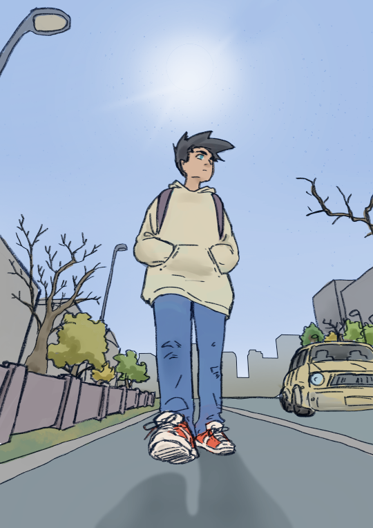
Ectober Day 20 – Full Moon/New Moon
Click on it!! look!! There's a trick!
the non-transparent versions:
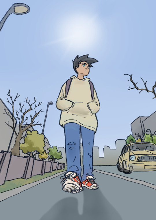

#danny phantom#danny fenton#ectober month#ectober month 2021#ectoberhaunt 2021#ectoberhaunt trick#phanart#suretterim#transparency trick#transparent#GUYS THE TRANSPARENCY TRICK IS WORKING FOR DARK MODE!??
950 notes
·
View notes
Text
PS5 Game Reveal Thoughts
Below the cut I’m gonna write a brief paragraph or sentence or whatever about each of the 25ish games that were revealed last night at the PS5 thing.

Don’t have much to say about this one; I never played GTAV, the series has never really been my thing, but I think it came out in 2013ish? I think the time has been and gone for re-releases and they should be working on the next game. Too much more and this’ll quickly become the new Skyrim/Todd Howard meme.

Okay so I never played Spiderman, but I did watch the cutscenes because I never thought I’d go out and buy it (before I later got it free with a ps4 pro). This is one of those games where, like, I’m not invested but I can both see the appeal and am happy for those who were waiting on it.

I think there’s diminishing returns on realistic racing games. Stuff was coming out on current gen that looked near enough realistic, so it gets excessively hard to tell the difference.
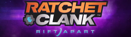
The first one that caught my eye. Despite the last entry being a bastardized, hollow remake that encapsulated everything the original stood against while missing two thirds of the content, R&C has a place in my heart and I hope they can actually get back to standard now they don’t have to work around a terrible movie.
My hot take here is that Ratchet has a wrench and his name is Ratchet. Girl Ratchet has a hammer, ergo her name is Chisel or something. I just wonder if this is a look at the future and Ratchet’s kid, or if it’s an alternate, gender-flipped dimension. In which case Clank would probably be the same because he’s a robot, but I fear for the possibility of Captain Qwark.

Legitimately can’t remember a gosh darned thing about this one.

I feel like the trailer proved that Stray works better as a short film than a game, but I guess we never saw any gameplay to prove that assumption. I like the art direction and you get to be a little kitty cat.

Ellen Degeneres goes to space and the mind fucky wucky happens. I got some Prometheus vibes for this, but the only thing that really left a mark was the aforementioned Ellen jokes we were making on discord.

Fuckin love me some Littlebigplanet, so this was a welcome surprise. Odd to see that they’re not implementing a create mode (as far as we know) but I can see how impossible it is to both make a fully 3d create mode (see: LittleBigPlanetKarting) and also go up against Dreams which was made by Sackboy’s original home studio.
I have a soft spot for LittleBigPlanet’s story modes, though, especially the second game’s - so this will be a welcome addition for me. I just hope they reference the previous stories and don’t act like a plot is something new to the series.

This game feels born out of the hangover of games like Fortnite and Apex Legends, leaving it feeling at least one year outdated. But if it’s your sort of thing, more power to you.
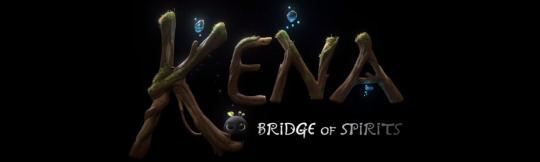
So Kena was another of the more subdued, new IPs that I think a lot of people will have forgotten but I actually quite liked the look of it, or at least some aspects. I’ll always have a soft spot for ‘young girl with bow and arrow’ games but I also liked the art direction and the little puff ball fellas, as well as the bad guy seeming like a legitimate threat in a world that tricks you into thinking it’s all cute. The contrast serves the narrative in that regard.

So following a game I’m interested in is a game I could not be less interested in. Horrendous character design, pseudo-deep narrative that are a dime a dozen for indie tumblr bait visual novels. The logo and the fact they’re [barely recognisable as] dinosaurs presumably suggests this will end in a meteor destroying everything and, frankly, I have never rooted for an inanimate rock more in my life.

This 2d platformer took itself very seriously. I never understood Oddworld nor saw the appeal because its protagonist is very... not nice to look at. But more power to those who wanted a new Oddworld game.

I found this one kind of interesting, then the First Person gameplay kicked in and that very quickly faded. It’s a shame, really; the visuals were really good.

All I got from this is that it’s called Jeff, and it’s a low concept blend of the movie Gravity and Katamari. It’s one of those deep, arty games I’m just honestly too dumb to appreciate. Or maybe it’s false depth.

This is a weird one. I find it intriguing how a game can have so much going on on-screen, and yet none of it stand out. It really does feel like this game pulled inspiration from several places, but failed to embellish or add any value on top of it.
This is another one of those arty games I’m too thick to understand. I’d say it has slight hints of Journey in it, but I never played that so I can’t be certain.

Hitman reminds me of the Community Paul Rudd quote: “I see the appeal, and I wouldn’t take it away from anyone, but I’d also never stand in line for it.”

As much as a corporate Mario Odyssey knockoff as this game may seem, I’m honestly interested as I’m gagging for any Odyssey-adjacent content in my life. It looks like it could be mindless fun, at the very least.

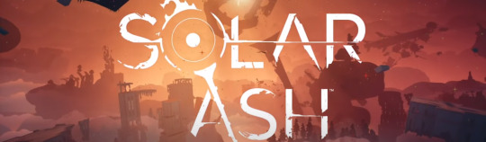
Like JEFF and Solar Ash before it, I don’t know what this game is and I don’t think the trailer did enough to make me want to bother finding out. I liked the big cat dude, though.

Would the world suffer if it didn’t have the same set of games reskinned and rereleased each year, with a single number in the title changed? I never understood the appeal of sportsball games. Is it for the people too unhealthy or too lazy to actually play a sport? Why do they have to make one every year when there’s nothing new? It’s not like the sport has fundamentally changed in a year’s time.

So they had me in the first half expecting a Crash game reveal, I’ll be honest.
But this is, oddly enough, the game I find most interesting of everything we saw here. I have no idea what the fuck it is, but I’m determined to believe there’s hidden meaning - that it’s a satire on Pokemon, that it’s a commentary on the phrase ‘you are what you eat’, that it’s a game that lulls you into a false sense of security and drops you in a horror game like Doki Doki Literature Club. Prove me right, Bugsnax.

I never played the original Demon’s Souls, so I can’t say much on the remake. I don’t even know if Demon’s Souls and Dark Souls are part of the same series.

Are we going to ignore that, fundamentally, this game’s unique selling point is that it has checkpoints?

Full transparency here, I had this game pegged as a Resident Evil game as soon as there was an old man in the trailer, and I’ve never played a Resident Evil game. I just associate old men in video games with horror, and Resident Evil is one of the first horror games that come to mind.

Looks like someone saw Death Stranding and thought “I can do that, too!”
Yeah, well, you can’t.

Given the hype I saw surrounding this game, I feel like I should probably play the first one. I’m just concerned it might not be my sort of thing. It’s one of those things I want to like, but I’m not sure I want to put my money where my mouth is before being sure - so we’re stuck in stalemate.
6 notes
·
View notes
Text
Basic Instinct: A Ducati Monster 797 from Hong Kong
The Ducati Monster is one of motorcycling’s greatest success stories. Miguel Galluzzi’s brainchild first rolled out of the factory in 1993, and has remained part of the Bologna line-up ever since.
Even 26 years on, the DNA of the original M900 is still very visible in the Monster range—and it’s especially clear in the entry level Monster 797, the most basic yet traditional Monster in the set.
Instead of using the liquid-cooled Testastretta motor employed by its bigger siblings, it has the simpler 803 cc air-cooled mill used in the Ducati Scrambler. And its stripped-back design makes it ripe for customization.
When an almost new Monster 797 rolled through Angry Lane’s Hong Kong workshop, French brothers Ben and Guillaume Barras immediately saw the connection to the Monster’s legacy. They’d worked on a 94-model M900 a few months prior, and fell in love with its simplicity.
“In 2017 Ducati went to basics with the Monster 797,” the guys tell us. “803 cc L-twin motor, 72 hp, 67 Nm, no traction control, no riding modes, air-cooled, just ABS, making it accessible to basically any rider. The spirit of the original Monster was back: easy to ride and not a sports bike.”
Angry Lane’s client wanted a more aggressive vibe, and to retain the Monster’s pillion accommodations … but left the Barras bros. to figure the rest out themselves. So they decided to build a “tribute to the original Ducati Monster, and the millions of smiles it puts on riders’ faces.”
Angry Lane wanted to slim the Monster 797 down even further, so they started by reworking the rear. They called in their friend Tom, a local go-to welder, to fabricate a single aluminum unit to cover the bottom of the subframe and cap off the tail.
It’s a trick design that incorporates the original tail light while simultaneously tightening up the lines.
Tom also made a new battery box, which now houses both the original components and a Lithium-ion battery. The seat was shortened, and reupholstered in two different Pittards leathers by Ben. The top has an especially unique finish—it’s the same anti-slip ‘digital’ leather that’s used on the palm of most MotoGP race gloves.
The 797’s a pretty decent performer out the box, so Angry Lane left the suspension alone. But they swapped the alloy wheels out for for a stunning set of spoked tubeless items from Alpina, to give the modern Monster an extra classic hit. And Brembo Italy sent over some new brakes and master cylinders.
Ben and Guillaume also fitted a slew of upgrades that would make any Ducatista jealous. They started with a transparent oil-in-bath clutch cover from Ducabike—visually similar to an open dry clutch, but without the rattle. That meant upgrading the clutch to a hydraulic system, which they did with a CNC Racing slave cylinder.
CNC Racing also supplied a set of see-through belt covers, adjustable rear sets and new wheel axle nuts. The air filter was upgraded to a high performance one from DNA Filters, and the air box removed.
Angry Lane chromed the original exhaust headers, then capped them off with a titanium muffler from Spark. There’s also a gas cap and swing-arm mounted license plate bracket from Rizoma.
Up in the cockpit, Ben and Guillaume had OTR Performance in Germany machine up a new top triple clamp, so they could fit a set of LSL clip-ons. They specifically picked a set that was raised, for a more aggressive stance without too much discomfort. Other updates include Motogadget bar-end turn signals and mirrors, and a KOSO LED headlight.
There are also a bunch of parts you can’t order from a catalog—namely the carbon fiber fenders, side panels, exhaust shield, and a couple of smaller trim bits. “You can find a lot of aftermarket carbon parts,” Guillaume explains, “but we wanted similar carbon as some supercars: twill full carbon glossy weave, like you can find on some Aston Martins and McLarens.”
They designed the parts in-house, then sent the designs to a firm abroad to produce. Given the complicated request, it took a full three months to get the parts back—but it was certainly worth it.
For the final finishes, Angry Lane’s client originally requested a lot of black. But he also trusted the brothers to throw their own ideas in—which they did, with spectacular results.
The frame was treated to a burnt bronze Cerakote coating, and the swing arm sand blasted, then vapor blasted for a smooth aluminum finish. The tank was done in Porsche colors from 1996—a combo of black and dark grey, with bronze highlights to match the frame.
The Monster looks a whole lot tighter and more aggressive now, and it’s reportedly more precise on the road now too. But Guillaume tells us that the cherry on the cake was the message they received after the client’s first ride:
“Il Monstro just had its first ride to Shek-O and back. Rides like a katana blade and makes a noise like a belly full of lions roars. I was laughing most of the ride.”
“Thank you guys. Love it.”
Angry Lane | Facebook | Instagram | Images by Maxime Champigneulle
0 notes
Text
Creating a good lyric video for less than $10
How to make a lyric video for your song (without using Motion or After Effects)
Lyric video: a video that shows your song lyrics while the music plays. [Pretty self-explanatory.]
Not only are lyric videos a great and manageable way to keep your video content coming in between bigger projects that involve more complicated production, but I’ve found they can actually be a lot of fun to make.
Below I’m going to talk about how I created six different lyric videos along with info on some of the FREE tools I used.
A few things to keep in mind:
I’m not a video guy. Every time I make one of my own lyric videos it’s a process of trial and error. A pro could probably create something twice as good in half the time, but I enjoy playing around to find solutions on my own. Plus, video budget? (Pshaw).
You can make really cool lyric videos with programs like Motion and After Effects. I didn’t. For one, those programs cost money (see pshaw above). But diving into one of those programs would mean I have yet another learning curve to climb. I’m interested in exploring Motion at some point, but in between family, work, and everything else, I’d rather use what time is leftover to make music and bang out some videos, not hunker down in the lab for days on end. Maybe those programs are easier to use than I’m imagining, and I’m missing out (let me know in the comments), but for the sake of this article, let’s just refer back to the zero-budget appeal of making lyric videos WITHOUT Motion or After Effects.
That leaves you with free video editing software like iMovie or Windows Movie Maker. Pros might scoff at these intro-level video production tools, but when you combine them with a few other tricks, plus some creativity, I think you can create compelling lyric videos with little more than what comes loaded on most desktops, tablets, or smartphones. [Full disclosure: I used Final Cut Pro X on three out of the four videos below, but I’d worked in iMovie for long enough before that to know most of the things I’m doing in FCPX can be done in iMovie.]
Beginner tips for making lyric videos
Open your movie-making software and set your new project’s aspect ratio to 16:9.
Import your song and any other media (like video clips, still images, logos, etc.) that you plan to use.
Move your first clip or background image to the project pane. If you plan to use one static background image the whole time, you can click and drag to adjust the duration that it appears so it’s long enough to display during your whole song.
Place your song into the project pane. If you want it to start playing right away, drag it all the way to the left. If you have a title page or some other introductory elements, you can leave a little room before the song starts.
Use “titles” to place the lyrics on the video at the appropriate time during the song, matching with the vocals.
Use a font size and style that’s readable (or that looks cool at the very least).
Position your titles on the video (again, by dragging) so they appear in a place that’s legible. For instance, if you’re using a still image of a sandy beach below a light gray sky, you don’t want white font to appear over that sky. Better to drag it down so it appears with starker contrast over the dark sand.
Make adjustments to the length of the titles (you can do this by clicking and dragging) to smooth out the transition from line to line.
Watch your whole video a few times through and make any needed fixes.
Export your video file and upload it to YouTube, Facebook, Vimeo, etc.
Some tricks to spice up your lyric videos
youtube
This is the lyric video to my song “Irretrievable Beauty.” To create it I followed all the basic steps mentioned above, but here are a few of the bonus elements I added for (hopefully) extra impact:
Additional text — No one ever said a lyric video should contain ONLY your lyrics. So I wrote a bunch of other text (a letter from the 22nd-Century) and placed my lyrics within it. Check out the video and what I’m describing will make more sense.
Color contrast of text — The actual lyrics of the song needed to be easily readable, so they’re all in black against a lighter background. The rest of the words are white, and it’s fine if they roll by without anyone being able to read them all. I intended to create the feeling of being flooded by text, so lots of it is supposed to wash over you.
Public domain image — I found a super hi-res image from 1905 to use for the background of the video (and my cover artwork too), and slowly zoomed in throughout the whole video.
youtube
Above is the lyric video for my song “1+1+1=3.” Some of the things I did to make this video:
Slow fade between different versions of the same photo — The background image for this video is the same as the cover artwork, a photo I took of arithmetic on a chalkboard. I then applied different filters to the photo to create three separate versions. While editing the video, I started by laying the three images out in a repeating pattern and then cross fading them all so it looks like there’s some kind of slow transformation happening.
More extra text — The additional text in this video is nowhere near as crazy as in “Irretrievable Beauty,” but I wanted to add a few bits here and there. You’ll spot ’em.
Directly reference the subject matter — The song is called “1+1+1=3.” Yes, it’s about love, but the math element was a fun visual reference point. Arithmetic on a chalkboard. Strange equations in the text. Etc. What’s the visual reference in your song?
youtube
Above is the lyric video for my song “Silently.” Some things I did to create this one:
Hyperlapse sunset — One afternoon when I was visiting Oregon, I ran up to the top of Mt. Tabor (an extinct volcano in the heart of Southeast Portland) and found a good spot to film the changing sky as dusk fell. I made sure to be out of the way of anyone who might walk in front of the camera and ruin the looooooong time-lapse shot. Hyperlapse is a free app from Instagram, and it makes it easy to shoot long videos and then speed them up at various rates. I think my 4-minute music video required about 45 minutes of footage.
Intro titles from Word Swag — If you read this blog frequently, you probably know I love Word Swag, a free app that lets you add cool fonts to images. I used Word Swag to create both the circle logo at the beginning with my name in it, and also the “Silently” title. You could use this app to create text for every single lyric, but that’d get time consuming so I just ended up using it for those two elements at the beginning. For this purpose, within Word Swag you’ll usually want to lay the font over a transparent background so you can fly it into whatever video you’re creating without disrupting the moving footage. [Note: I used Word Swag to create the intro text for all the lyric videos below.]
Sketch effect — I then added some built-in effects, including a color saturation effect and two doses of a sketch illustration effect, to make the video look grainy and lo-fi. Like I said above, this wasn’t premeditated. Just playing around with effects to see what looked promising. On that note…
Earthquake wobble effect — I used the earthquake effect because I thought it kind of made the text look like it was on a transparent slide overlay that was out of focus for a second.
Alternating pacing of lyric appearances — Sometimes the lyrics appear and disappear with the vocal. Sometimes certain lines linger. I just went by feel, and payed more attention to how the titles looked laid out across the screen than anything particularly musical.
Alternating the color of the text — This is another obvious way to add some variation if you feel like your lyric video is too much of the same thing: change the colors of the lyrics!
youtube
Here’s a video for a song called “Morning Edition” which I posted right before the election in 2016. The recording is actually just a super lo-fi Garageband demo, but I only had two weeks until election day, and I figured if I’m going to make some kind of statement, there’s no time to wait to get my band into a proper studio. So, a few notes about this lyric video:
A lyric video can still have live action — I’ve never really liked the distinction between “music video” and “lyric video,” as if one is more legit and exciting than the other. As someone who listens to lyrics just as much as the music, I love good lyric videos, and I think there can be an interesting hybrid between these two approaches. For “Morning Edition” I lip-synced to my song, 10 seconds at a time, while using the Face-Swap tool in Snapchat to graft a certain someone’s mug onto mine. Then I edited all those takes together and applied a sharp contrast filter to blend the background of the Snapchat clips with the large black borders on both sides of the clips.
Did I say the lyrics have to be legible? — Well sure, it’s good to have legible lyrics, but I don’t think they need to be HUGE if that means you’re ruining the aesthetic of the video. For this one I figured I’d keep the text in a thin minimalist font at the top of the screen, out of the way of my face, and anyone who really wanted to read along could watch the video in full-screen mode.
youtube
Here’s the lyric video for my song “Veterans Day.” By complete accident — again, lots of playing around with built-in options — it ended up with a kind of Zen art aesthetic. Here’s how:
Stock video — I looked through tons of stock video sites to find an affordable, hi-res clip that could be used as the background for the whole video. I ended up buying (for less than $10) a short video of milk being poured into a clear glass of water with a black background. But 6 seconds of video wasn’t going to cut it for a 5 minute song, so I…
Slowed the clip WAY down — I stretched the clip as long as it could go and still only had about 2.5 minutes’ worth. So then I…
Reversed the clip — By duplicating the clip I had 2.5 minutes of forward motion, and 2.5 minutes of backwards motion. So the result is like a palindrome, or like that famous bass solo on “Call Me Al.” Halfway through, the whole thing turns around and the milk goes back into the bottle by the end. Another accident that I ended up enjoying.
Color inversion — I used the built-in tools to invert the colors so the white milk became like black ink, and the black background turned to a light gray.
B&W — I then took that video and turned it to black and white, which ended up darkening the whole thing in a nice way.
Scrolling text — One of the built-in title options on many video software programs allows you to scroll text vertically, like the end credits of a film. I used this effect separately for each verse and chorus of the song. Then I did another layer of scrolling text with just a bunch of randomly spaced letters and symbols, with a high transparency on the font so it appears as a graphic element, and I think it gives the whole video a kind a translucent papery feel.
youtube
Here’s a few things you might be able to learn from the lyric video to my song “Premiere:”
Still photos are your friend — Check out royalty-free photo sites such as Unsplash. I made the entire video for “Premiere” using photos I found on that site. The one risk you run is that other artists use the same photos in their work, but you can always tweak the images so they’re barely recognizable as I did with the milk video in “Veterans Day.”
Don’t be afraid of Ken Burns — He has a built-in video effect named after him for a reason; that technique of zooming in and out on still photos can be really effective for creating mood. Dynamics! Don’t go crazy or anything with the motion, but a little Ken Burns here and there can make flat photos come to life.
Mix and match fonts — I used a bunch of different kinds of fonts on “Premiere,” giving each section of the song its own feel.
Apply effects and transitions to the titles (text) too — Don’t forget that many of the same effects you can use on pictures and video will work to give your lyrics an interesting look as well.
Don’t publish your video until you’ve proofread it a dozen times! — If you watched my lyric video for “Premiere” you might’ve found a typo. Whoops. I didn’t catch it until it’d been posted for over a week, and by then… oh well. Staring at text while you’re editing gets tiring. Your brain tricks you. While you’re in the process of creating, you might not catch something that seems glaringly incorrect later on. So get some bandmates and friends to watch the video a few times to make sure you don’t have any spelling or grammar issues on your lyrics (I mean, besides the usual grammar or syntactical issues that ALL lyrics have). Another way to limit errors is to…
Write your lyrics out in Word and then paste them into your titles — When you type your lyrics in Word first, you get the benefit of the program’s spellcheck system. Some of the popular video editing software doesn’t have spellcheck, so paste those lyrics in after you’ve vetted them in the external doc.
Okay, those are some of the tricks I’ve used to make my lyric videos more interesting than just white font on a black background, all without paying for extra software or expensive stock footage and images. Hopefully they’re helpful as you create your next video.
Do you have any advice to add? I’d love to hear it. Holler in the comments below and be sure to post a link to your best lyric videos on YouTube!
The post Creating a good lyric video for less than $10 appeared first on DIY Musician Blog.
0 notes
Last Seen Blogs

kaiju-enjoyer
Hello 😀

lunamillz
Angelic Penelope

jasaberries
jasaberries

outtamyleague1490
The League Of Gentlemen

omaiiee
ღ maiღ