#GlasgowSchoolOfArt
Text
Design Domain 01: Survey
MATERIALITY
Colour & Emotion
Interested in the train of thought between emotions applied to colours, I carried out a small survey on a mixed group of 11 individuals of mixed ages, backgrounds and job roles. The survey was simple, participants were given 10 colours to look at and were asked to write how the colour made them feel in one word where possible. The responses are below:
1. Yellow
Happy x3, happiness x3, cheerful, anxious, uneasy, bright, optimistic, sunny, springtime, hopeful, optimistic
2. Green
Calm x3, earthy, sick, positive/correct, relaxed, grounded, off-putting, calm, peaceful, intuitive, focus, connected to nature
3. Light Blue
Cold, calm x3, fresh, comfortable & clean, peaceful, relaxed, sorrow, ecstatic, cute blue skies (sunny feels)
4. Pink
Happy x2, youthful, uncomfortable/synthetic, excited, exotic, outgoing, fun x3, eye-catching, feminine x2, playful, romantic
5. Red
Sinister, love x2, creative, bold x2, sexy, nervous, romantic, warm, hot fun, anger, passion, fiery
6. Purple
Youthful, horny, unorganised, scatty, neutral/nothing x2, tired, majestic, nice & calming, loyalty, trust, moody, mysterious, luxurious, confident, contentment
7. Black
Cold, calm, organised, clean, motivated, neutral/nothing x2, comfortable, eye-catching, mysterious, political (Black Lives Matter), depressed x2, low, stylish
8. Orange
Warmth x2, sad, commercial, fake happiness, on-edge, mellow, uncomfortable, harsh (after looking at black), impulsive, playful, comforted, want to be seen, excited
9. White
Nothing/neutral x5, cold, collected, zen, purity, bored, heavenly, safe, innocent, focused
10. Dark Blue
Cold & dreary, relaxed, cool, traditional, lonely, serious, calm x2, proud, bold, vibrant, inspired, formal, moody, strong
The results were not as expected, every answer was so different in each question although some had similar connotations person-to-person.
This leads my line of thought down the route of how many feelings different people can feel looking at the same colour.
Can we alter how people feel by exposing them to colour or are their feelings on colours already predetermined?
Would participants feelings change based on the order of the colours?
Which feelings would be opposite each other on a feelings colour wheel if one were to be created similar to a colour wheel?
Could the negative colours be balanced by the positive colours?
8 notes
·
View notes
Photo
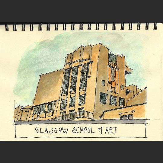
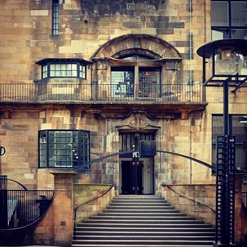
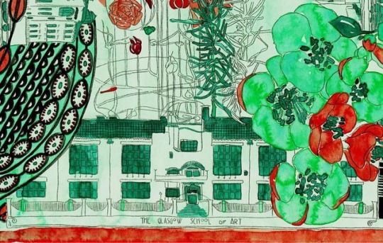
“GLASGOW SCHOOL OF ART” Famous Art Nouveau structure (pre-fire) by architect Charles Rennie Mackintosh. Done from an Internet photo, so it’s a VIrtual Sketchwalk! Drawn to the weekly sketch challenge of the VirtualsketchLeiceister FB group. Thanks pete_sketches for the program. Sketched with a CROSS Bailey fountain pen with watercolor added with CHEEP (brand) and PRINCETON BRUSHES in a 7” x 10” watercolor sketchbook of uncertain provenance.. #LobstArtstudios @tom.brudzinski #dessinateur #artist #dessin #sketch #drawing #quicksketch #RanDOODLINGdom #croquisrapide #croquis #szkic #virtualsketchwalk #virtualsketchleicester #crossbailey #platinumcarbonink #WATERCOLOR #watercolour #akwarele #akwarela #aquarelle #glasgow #glasgowschoolofart #renniemackintosh #charlesrenniemackintosh (at The Glasgow School of Art) https://www.instagram.com/p/CgEbGOOO4uJ/?igshid=NGJjMDIxMWI=
#lobstartstudios#dessinateur#artist#dessin#sketch#drawing#quicksketch#randoodlingdom#croquisrapide#croquis#szkic#virtualsketchwalk#virtualsketchleicester#crossbailey#platinumcarbonink#watercolor#watercolour#akwarele#akwarela#aquarelle#glasgow#glasgowschoolofart#renniemackintosh#charlesrenniemackintosh
2 notes
·
View notes
Text
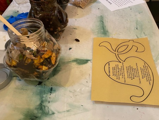
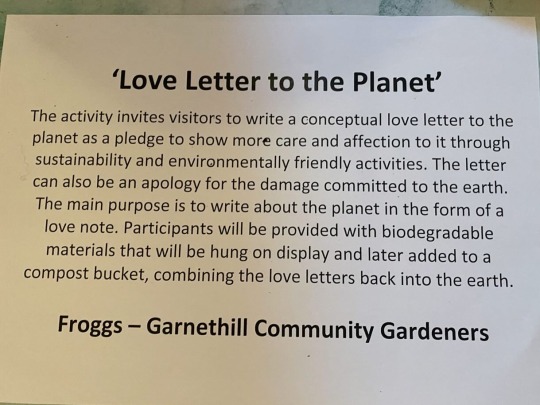


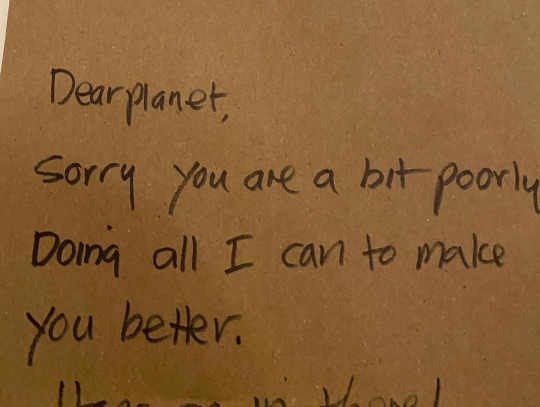
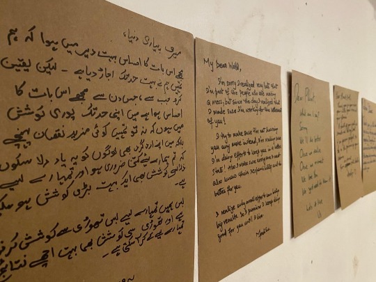


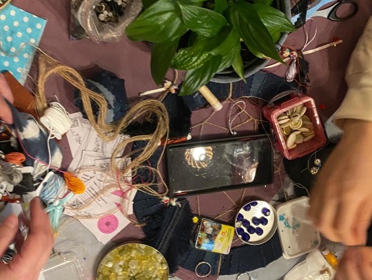
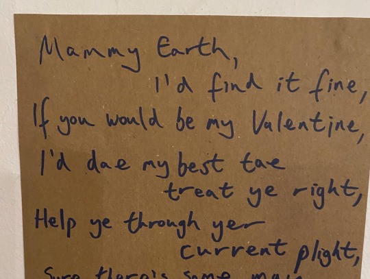
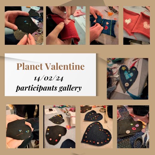
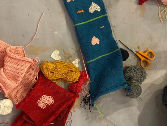
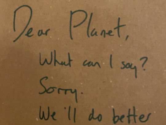
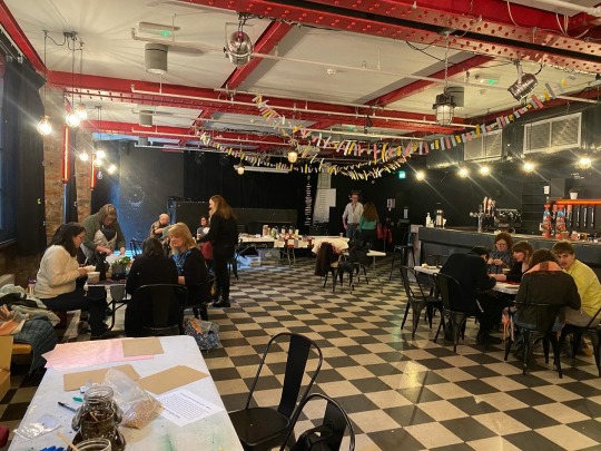
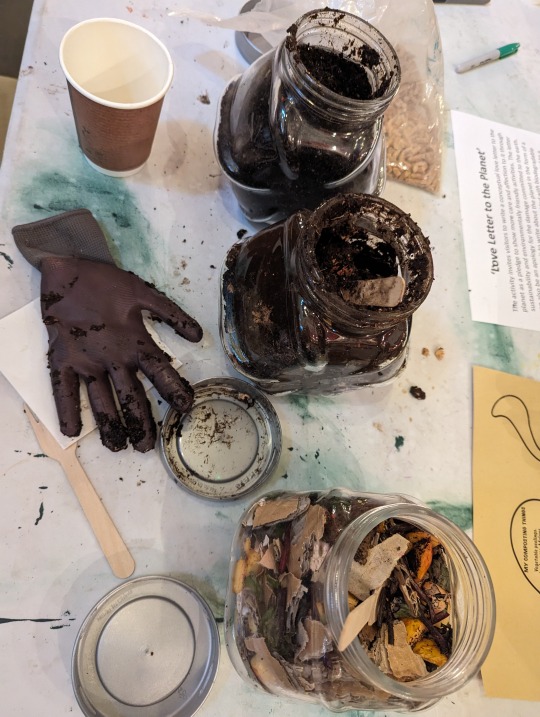


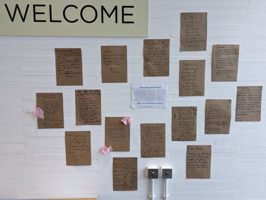


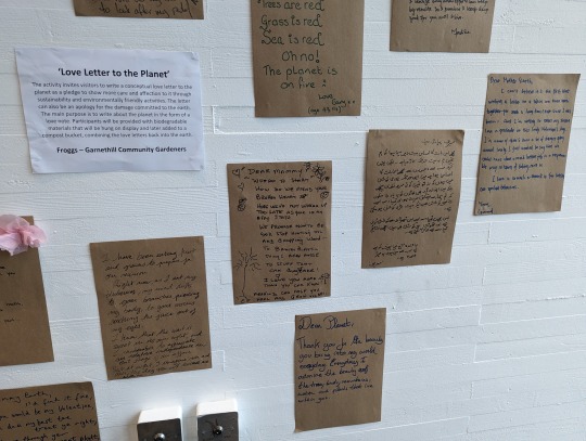
On Valentine's Day we showed the Planet some love and teamed up with GSA Crafty Collective, Friends of Garnethill Green Spaces and GSA Community Engagement and GSA Student Support to create some fantastic art and mending. Along with more than a few Love Letters to Planet Earth, now displayed in GSA's Reid Café.
#crafting #mending #garnethill #glasgow #glasgowschoolofart
0 notes
Photo
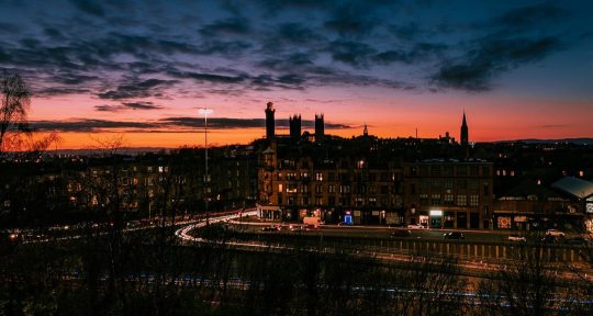
Glasgow sunset last night. 📸 Nikon Z fc #nikonfc #mirrorless #glasgow #peoplemakeglasgow #glasgowlives #scotland #scotlandtravel #visitscotland #scotlandexplore #scotlandlove #scotlandphotography #glasgowlife #travelscotland #beautifulscotland#sunsetphotography #sunset_pics #sunsetlovers #sunsetsky #sunsetlandscape #sunsetsky #glasgowsunset #garnethill #gsa #glasgowschoolofart #lightroom #adobephotoshop #drkarts #landscapephotography #cityscape #cityscapes #picoftheday (at Charing Cross, Glasgow) https://www.instagram.com/p/CpKPhQPo5z4/?igshid=NGJjMDIxMWI=
#nikonfc#mirrorless#glasgow#peoplemakeglasgow#glasgowlives#scotland#scotlandtravel#visitscotland#scotlandexplore#scotlandlove#scotlandphotography#glasgowlife#travelscotland#beautifulscotland#sunsetphotography#sunset_pics#sunsetlovers#sunsetsky#sunsetlandscape#glasgowsunset#garnethill#gsa#glasgowschoolofart#lightroom#adobephotoshop#drkarts#landscapephotography#cityscape#cityscapes#picoftheday
0 notes
Photo
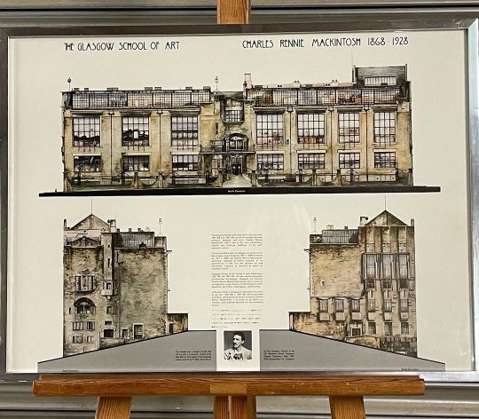
The Glasgow School Of Art, Charles Rennie Macintosh 1868-1928 Framed and Glazed Poster Print eBay item number 224460590958 #glasgowschoolofart #dugaldcameron #charlesrenniemackintosh #renniemackintosh #poster #posterprint #interiordesign #designers #scottishdesign #scottishdesigner #glasgow #glasgowart #glasgowartist #glasgowdesigner #macintosh #art #artforsale https://www.instagram.com/p/CO0zpUinRgK/?igshid=e290lxfkd8u7
#glasgowschoolofart#dugaldcameron#charlesrenniemackintosh#renniemackintosh#poster#posterprint#interiordesign#designers#scottishdesign#scottishdesigner#glasgow#glasgowart#glasgowartist#glasgowdesigner#macintosh#art#artforsale
2 notes
·
View notes
Photo
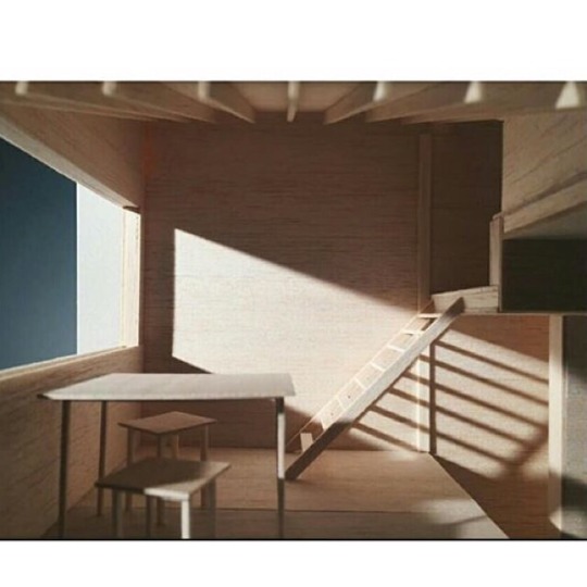
Interior by Charles Dunn, Glasgow School of Art, Y2. Via MacMag #scotportfolio #scotland #architecturescotland #architecture #architecturestudent #archi #archiplus #archicity #archidesign #architectural #architektura #architettura #architecturelover #architekture #critday #itscritday #architectureonpaper #macmag43 #ipreview @preview.app
1 note
·
View note
Photo
Working on some new ideas. This is actually a piece that I started while I was studying at the Glasgow School of Art in 2010. It made it all the way to Munich. #janinaroider #workinprogress #studio #art #munich #glasgowschoolofart #uk #painting #artsy #cloud #sun #scenery #munich (hier: Munich, Germany) https://www.instagram.com/p/BoepLTrlkrz/?utm_source=ig_tumblr_share&igshid=1iu7f38nage0o
#janinaroider#workinprogress#studio#art#munich#glasgowschoolofart#uk#painting#artsy#cloud#sun#scenery
1 note
·
View note
Photo
My beloved Art School up in flames again :((( Hope it can be saved! Not only one of my favourite buildings in Scotland but also the entire world 😪 #charlesrenniemackintosh #glasgowschoolofart #glasgow #weegee #city #glasgowstyle #artnouveau #artsandcrafts #symbolism
#charlesrenniemackintosh#artsandcrafts#symbolism#weegee#city#glasgow#glasgowschoolofart#artnouveau#glasgowstyle
4 notes
·
View notes
Photo
#CharlesRennieMackintosh #GlasgowSchoolOfArt #SeatAtTheTable #Photography #Architecture #Art #Design #Painting #Imagination thought #patterns تشارلز ريني ماكينتوش https://www.instagram.com/p/CRd0XQHlbiS/?utm_medium=tumblr
#charlesrenniemackintosh#glasgowschoolofart#seatatthetable#photography#architecture#art#design#painting#imagination#patterns
0 notes
Photo
I can't pretend to be anything but English, I spent 100% of my childhood up a tree in Hertfordshire but the solo adventures I've taken to Scotland over the last few years have been the best of my life. Scottish art, architecture, literature, human beings.. have been a massive explosion of influence to me. It's so so sad and such a massive loss to us all 💔 . #glasgowschoolofart #glasgow #illustration #watercolour #silkscarf
1 note
·
View note
Video
Macintosh Building, 16/06/18 I’m heartbroken, the fire started when we were celebrating our graduation, a beautiful ceremony with speeches about a new start and reopening mac in February. Last night felt like deja vu but the fire was much stronger. We were watching it in silence, with shaky legs caused by the sounds of the fire and collapsing structures. Later I couldn't sleep as the smell of the fire took over our room... We still can’t believe. #tinderboxcity #glasgowschoolofart #mackintoshbuilding #gsofa #glasgowfire #glasgow (at The Glasgow School of Art)
1 note
·
View note
Text
Design Domain 01: Experiment 3
MATERIALITY
Colour Exploration
This time I wanted to go more ‘primal’ with the colour and used markers to create colours on the bulbs to see how this affected the light.

Using a green pen, I marked a line on the bulb to see how it would work with the light. Looking at it straight forward, you can see through the line and onto the strong filament of the bulb. As you move the line around you can clearly see the green projected onto the white background, including the pen marks. The glow is light and adds a fun element.

The red line had the same affect on the background as the green, projecting orange and red tones onto the stark white.
After having so many strong, warm results I wanted to look into creating a cool effect - could I make the space feel colder through colour?
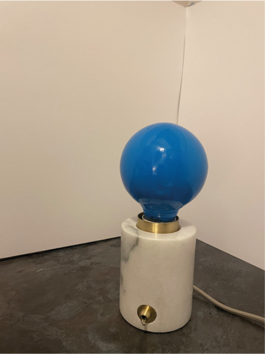
Blue was the obvious option for a cooler hue so I painted the bulb. At this point I thought how easy it was to affect the colour of the light by using a simple paint on the glass - this could mean it would be easy to affect the colours emitted from a light.
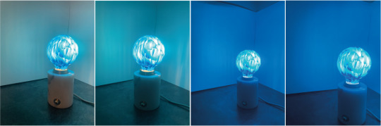
The effect of the blue on the bulb was exactly what I had wanted! The blue paint gave off a lovely, strong glow throughout the room. The space instantly felt cold. The paint job looked smooth before the bulb was turned on so it’s interesting to see the brush marks shine through the bulb and against the wall in the lighter pictures.
From these experiments it seems changing the tone of a light through the use of colour could be a good way to affect the mood of the room. If colours could be applied to feelings, these feelings could be communicated through the use of coloured lighting.
0 notes
Photo
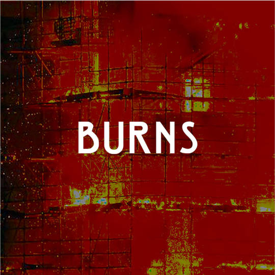
[MOFATEOAGD C4 Harpo Marxist Dogmas_bonus dogma_Burns Night]
#MountainsOfFlame#HarpoMarx#Marxism#dogma#Burns#BurnsNight#RobertBurns#RabbieBurns#bard#fire#Glasgow#GlasgowSchoolOfArt#ArtSchool#Mackintosh#CharlesRennieMackintosh#GlasgowFire#GSA#GSAfire#Scotland#BonnieScotland#HootsMon#HealthAndSafety#PoeticJustice#crow#CathedralInFlames#BurnItDown
0 notes
Photo
Portrait of painter Gwen Hardie by Sandy Moffat. Collection of #scottishnationalportraitgallery Tomorrow Friday 20th April 6pm AN AUDIENCE AND BOOK LAUNCH WITH SANDY MOFFAT OBE RSA in conversation with Alison Harper at The Essential School of Painting London E2 0PT. All welcome. In his new book #FacingtheNation author and art historian #BillHare makes a first survey on Sandy's fifty years as an artist, going so far as to describe him as 'the most important portrait painter since (David) Wilkie in the first half of the 19th century'. Pictured is Poet’s Pub a homage to seven Scottish poets, who Sandy painted individually from life and in this imaginary composition. The series including this painting lives in the Scottish National Portrait Gallery. #SandyMoffat #portraiture #legend #contemporaryportrait #contemporaryportraiture #painting #contemporarypainting #Britishpainting #figurativepainting #sevenpoets #portraitsofpoets #poet #poetry #glasgowschoolofart #GwenHardie (at The Essential School Of Painting)
#portraiture#legend#sevenpoets#sandymoffat#poetry#contemporaryportrait#portraitsofpoets#contemporaryportraiture#scottishnationalportraitgallery#painting#britishpainting#gwenhardie#glasgowschoolofart#billhare#contemporarypainting#figurativepainting#facingthenation#poet
1 note
·
View note
Photo

Nike Sb Dunk奶牛 36-47.5 #glasgow #glasgowlife #glasgowfood #glasgowcity #glasgownails #glasgowsgreenandwhite #glasgowtattoo #glasgowrangers #glasgowceltic #glasgowfoodie #glasgowwestend #glasgowmakeupartist #glasgowblogger #glasgow2018 #glasgowcannabisclub #glasgowuniversity #glasgowtattooartist #glasgowartist #glasgowschoolofart #glasgowmakeup #glasgowgraffiti #glasgowart #glasgowdogs #glasgowvegan #glasgowwedding #glasgowmua #glasgowphotographer #glasgowairport https://www.instagram.com/p/CFhIkYTAGzq/?igshid=1wfpf0pf1dhg4
#glasgow#glasgowlife#glasgowfood#glasgowcity#glasgownails#glasgowsgreenandwhite#glasgowtattoo#glasgowrangers#glasgowceltic#glasgowfoodie#glasgowwestend#glasgowmakeupartist#glasgowblogger#glasgow2018#glasgowcannabisclub#glasgowuniversity#glasgowtattooartist#glasgowartist#glasgowschoolofart#glasgowmakeup#glasgowgraffiti#glasgowart#glasgowdogs#glasgowvegan#glasgowwedding#glasgowmua#glasgowphotographer#glasgowairport
0 notes
Photo

Section by Anna Margrèt Sigmundsd, @chegopuffs Glasgow School of Art, Y5. Via @themacmag #drawing #architecture #Glasgow2018 #scotportfolio #scotland #architecturescotland #architecture School #architecturestudent #archi #archiplus #archicity #archidesign #architecture #architectural #architektura #architettura #architecturelover #architekture #critday
2 notes
·
View notes
Last Seen Blogs