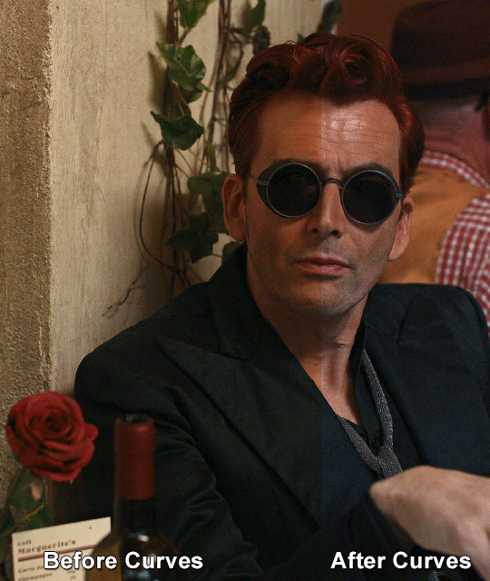
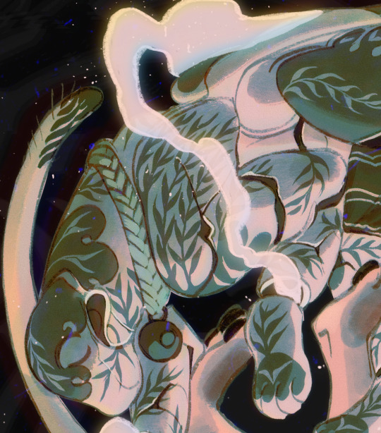
#I made the colours more blue green and yellow
Text
An alternative review of GMMTV Live 2024 part 2
A list of the shared items of clothing that appeared in the trailers, ranked according to the amount I squealed when I spotted it.
6. getricheasy sports shirt
The first of four from Sweet Tooth, Good Dentist, this had its first appearance in Only Friends and was used in the promotional material for The Outing but I didn't spot it in the show, so I'm happy to see it again. Who knows if it will be used in the actual show...that goes for any of these items incidentally.


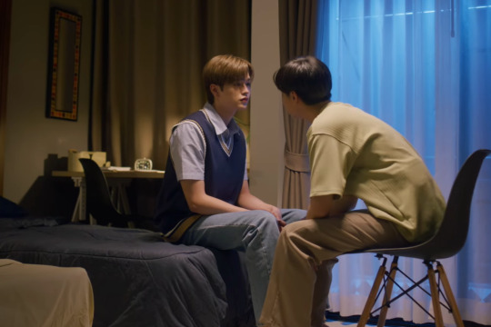
5. Blue with yellow detail knitted vest
I've had a screenshot of this vest worn by Thor since I saw it as Wednesday Club aired. I swear I've seen it somewhere else before but can't remember. But hence why it immediately jumped out to me in Perfect 10 Liners.
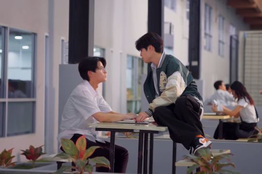
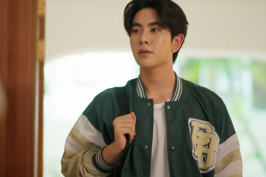
4. Green sports jacket
On to the second of the four from Sweet Tooth, Good Dentist, and oh to be Poon and be able to wear the jacket that our King and Queen have worn -> first by Namtan in UMG and then Mix in his glorious cameo at the end of Only Friends. I predict we'll see this again a few more times.

3. Blue with brown edging shirt
I was happy to see this one, another in Sweet Tooth, Good Dentist, because I had kept it in my mind since seeing it in Only Friends - as another potential that might get worn again. It's subtle yet quite distinct...and very much in a similar vibe as many other shirts worn by Force (and shared with Sea, Ngern, and New amongst others).

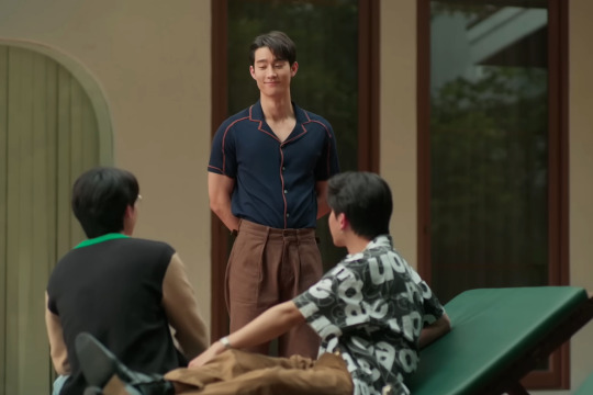
2. Red, blue, and green striped t-shirt
I'm impressed with my brain for spotting this one, the last from Sweet Tooth, Good Dentist, because at first it just felt familiar, and I immediately thought of UMG but I thought it might just be because it's similar to a few stripy colour shirts that Nanon wore. But I had a look through my screenshots of the series and eventually found it all the way at the end...

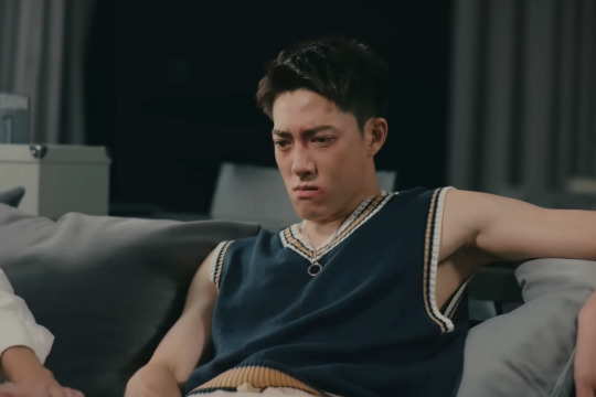
1. Ink's mustard knitted vest!
This one I could not believe. Never in my wildest dreams did I think we would see this iconic vest from Bad Buddy again. But here we are, on Mix no less in Ossan's Love. It's not something you'd expect to see on Mix...but then again I thought the costuming of the trailer looked a lot more 'quirky' than usual and very much fitting the kooky/slapstick vibe of the series. But honestly, this made my day.


#INK'S VEST!!#to be honest I was a little disappointed there weren't more clothes from the communal wardrobe#but I'm still happy to see all these being used#we'll see which ones make it to the actual filming#gmmtv 2024#sweet tooth good dentist#perfect 10 liners#ossans love thailand#only friends the series#ofts#the outing#wednesday club#UMG#unidentified mysterious girlfriend#bad buddy#bad buddy series#I suppose I should look into who does the clothes/styling for these shows#because it might be the same person...which would therefore make sense that the clothes get used again#or it could be that there is just one central 'store' where all the designers dip into to get some items#who knows...#the thai communal wardrobe
27 notes
·
View notes
Text
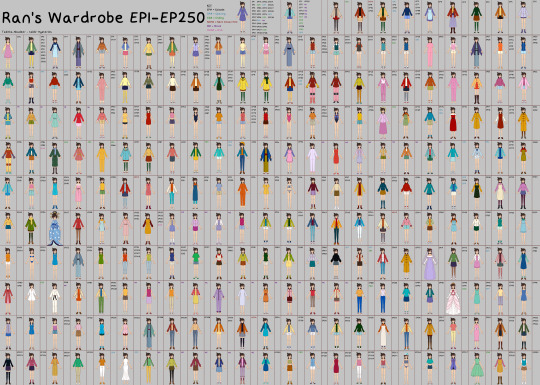
Episodes 1-250 Mouri Ran's Wardrobe
+ Films 1-5 & OVA1
Thanks for all the support! I wasn't expecting this project to get so popular. For this update I've made things much neater, they're organised by date first shown (hopefully) to see how her wardrobe has changed over time. There's also a key to show if the outfit was from an episode, opening, ending, film, next Conan's hint or OVA! Lemme know if you have any other organisation suggestions for future updates! And as before if you spot any mistakes or any outfits I missed pls let me know!
#dcmk#detective conan#mouri ran#ran#my art#by episode 250 there's 241 outfits XD#disclaimer regarding colours/shoes/part of outfits that can't always be seen applies here too#my best guess has been made in those cases#she starts wearing trousers a lot more in this update was probably the main thing I notice#also more blues#new fav outfit is her ep114 swimsuit it's super cute#least fav is film 5's green jumper/yellow trousers/white heels combo. I don't understand it.
147 notes
·
View notes
Photo

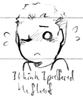


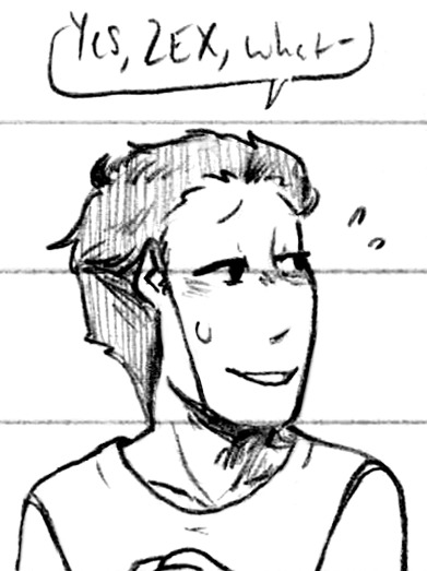
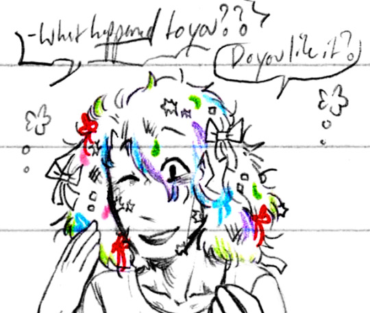
Looking his very best, as much as he can anyhow (Patreon)
#Doodles#SCII#Helix#ZEX#The Captain#The theme of this set is ZEX's hair! So I guess Max's hair really lol#But double really it's ZEX's hair because Max would never let this happen to his hair lol poor abused hair haha#Cute floofy ZEX is cute and floofy <3#He can't control the hair - no hair bones here unfortunately lol - but at least there's something around his head eh?#Max with a buzz cut! Ah!!! The problem is I love him no matter what so I think he looks cute literally anyhow haha#S'cold! As if ZEX wasn't already sensitive haha - he gets a buzz cut and is just ''?????'' the whole time#And then someone pets his hair and it upgrades to ''?!?!?!?!?!'' haha#Weird to not have anything in his peripherals too :0 Always /some/thing to the sides of his head!#I think he looks quite silly in the third one lol - I would say I drew his hair too short but it's actually more accurate isn't it#Max's hair is like chin/shoulder-length! I just can't help myself haha long flowing hair is so fun and pretty <3#No he's beautiful however I stand by it#ZEX with slightly damp but not actually clean hair haha of course it feels strange! Not just water in there!#Actually drawing his green ends for a change haha ♪ And the grey in his hair! ;; ZEEEX weh#You can just barely see I tried to use one of my skin-tone pencils from the Crayola set but it doesn't scan the best :P#Or apply the best honestly lol they're quite hard pencils - I'm used to a softer formula like the yellow and green there! Very soft and nice#Yaaay Captain hehe <3 This is what you get for trusting someone untrustworthy ZEX lol#Okay but the way I reacted to reading there was Yarn tied in his hair I had a Normal reaction and I'm Fine about it lol#I made it red for Funsies and no other reason lol - really it's just the pen I (still) always have on hand haha#There's some in my blue as well! Just not as obviously lol - no wait that's one of his colours too just ignore that <3#ZEX is adorable ♪ The alien not understanding human traditions and culture trope is so lovely on him#And honestly the Captain is a very good sport hehe <3 He takes a lot in stride! Good for him
8 notes
·
View notes
Text
the maister system and the new 'find vocations out in the world' system is...ok, but I prefer the old colour system
#saint plays dd2#like coming in as someone who knows nothing abt how DD:O worked DD2's vocation system feels like a major step back#95% of the augments are useless and aren't worth using so there's no real build variety anymore#nor is there any real weight to choosing what to run in terms of combat effectiveness and QoL stuff like carry weight anymore#bc there's only like 5-8 augments worth taking bc the stat bonus are insultingly low for the effort of leveling the vocation#and the colours feel arbitrary bc it's not a tree system anymore. thief is green bc it's green and there's no hybrid green#whereas in DD1 every base vocation had a hybrid colour mix and it made logical sense#strider (yellow) and mage (blue) became a magick archer. strider and fighter (red) doubled down on the melee and became assassin.#while keeping the bow as a sidearm.#pure red became warrior and dumped the shield for 2h colossal but slow attacks. pure blue sacrificed utility for highest tier damage spells#and so on. it just felt so much more intuitive and felt like actual growth when you could 'upgrade' to a hybrid vocation bc#you actually needed to have X number of ranks in both colours before you could take it whereas in 2 they're all just standalone classes#and the meister skill systems are....ok. I don't know how I feel abt all of them being connected to optional sidequests you can fuck up#or straight up just miss bc this game still has the weird design flaw of having points of no return where quests autofail#also like I feel to get the meister skill either you or your pawn should actually have like. maxed the vocation out.#like it feels weird when I get magick archer and then immediately unlock the meister skill at the same time#when I haven't even bought the vocation yet.
2 notes
·
View notes
Text
hav used my birthday money 2 buy clothig :)
#+ leftover christmas money#i have bought a nice long maxi dress in a burnt orange that i will be able to wear in winter and summer :D!!#last one in my size as well i thought i was gonna have 2 pay full price but then it turned out it was half off#and then i got 2 long sleeve knits/tops one is ribbed and cream coloured the other is a turtleneck and dark green#which will look great with the dress#and then finally i got this super cute pale blue thick knit becuse ive needed more now autumn/winter is here#and i want to branch out into light blues/pinks more i look pretty in those colours#dark greens all oranges all browns warm yellows and light pink + blue are my colours#unfortunately reds are very much NOT i look blotchy in them. and any purples are a no go as well + lots of jewel tones#ironically the colours i dont look good in/styles i like but dont suit as much are the ones my best friend looks great in#i.e the black friday stuff at dangerfield the dark gothy stuff the punk stuff etc#i look good in blouses tho just wish they were better suited to having massive tits. because that is a burden that makes them less viable#rip that pretty white frilly button up i almost got my bust was too strong#OH i also used that makeup giftcard to get some new powder for my face and i STILL HAVE MONEY LEFTOVER ON IT#plus i got a bday gift no idea what it is but it looks perfume shaped (?)#im just so glad that with every 3-4 months i go out to get clothes i get a better grip on my style#lets me go back through my other stuff which i like but werent exactly me/never made me look the way i wanted#now i can either sell/donate them to someone who will enjoy them#like that holographic purple shirt i got and those overalls#that i got before i realise if i ever want to wear overalls/dungarees#i will have to make them myself because they are NOT made for hourglass figure tall ppl#they are made for sticks and they WILL bunch around your crotch and be annoying as hell
3 notes
·
View notes
Text
Scientists are very serious.
This is a post about science. And soup.
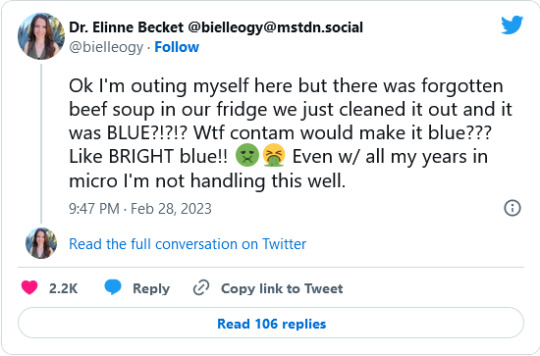
Dr. Elinne Becket, a microbiologist from Cal State University, is in the middle of one of those Fridge Experiments that happens to us all - except in this case, she is uniquely placed to unravel the science down to the microbial level.
While cleaning out her fridge, Dr. Becket found that a tub of family-recipe beef vegetable soup had turned bright blue. “Ok I'm outing myself here,” she tweeted, “but there was forgotten beef soup in our fridge we just cleaned it out and it was BLUE?!?!? Wtf contam would make it blue??? Like BRIGHT blue!! Even w/ all my years in micro I'm not handling this well.“
Read on for a breathless and ongoing saga of Soup and Science, and the wonderful international community that is Academic Twitter.
Academic Twitter quickly reminded her of her Responsibilities to Scientific Inquiry. (Cue the chanting from around the world of “CLONE THE SOUP! CLONE THE SOUP!”)
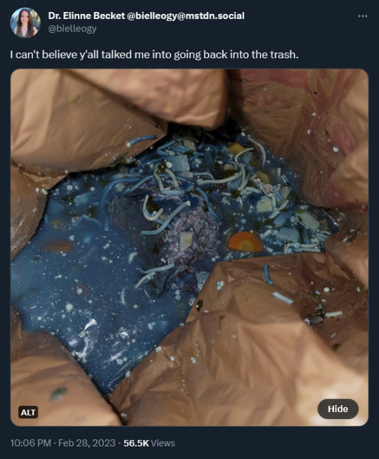
“I can’t believe y’all talked me into going back into the trash.” she tweeted in response, over a photo of a puddle of beautiful Mediterranean-sea blue soup in the trash bin, with bits of veg and noodles arising from the depths.
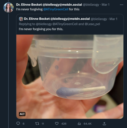
Scientists being scientists, Dr. Becket agreed to take a sample and send it to colleagues for cloning and microbial analysis.This involved getting arms-deep into the trash bin of Old Soup. “I’m never forviging @ATinyGreenCell (genomic biologist Sebastian Cocioba) for this.” Dr. Becket tweeted, with a photo of a properly dipped and snipped and VERY blue q-tip in a small clear plastic tub.
Diving into decomposing soup was not the only hazard. She writes: “My mom (who made the soup for my birthday) came across this thread and now 1) I have to answer for letting her soup spoil and 2) she's worried @ATinyGreenCell will figure out her secret recipe.“
Dr. Becket and Sebastian were able to culture the Blue Goo!
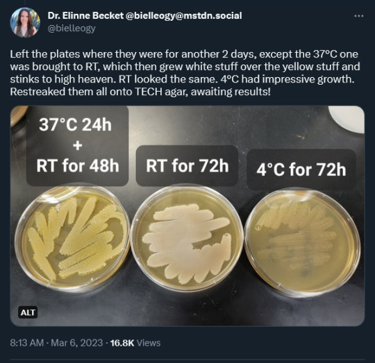
Becket posted a photo of three petri plates of streaked beef bouillon agar at 72 hours incubation, at 37C, room temp and 4C. She writes: “Left the plates where they were for another 2 days, except the 37°C one was brought to RT, which then grew white stuff over the yellow stuff and stinks to high heaven. RT looked the same. 4°C had impressive growth. Restreaked them all onto TECH agar, awaiting results!”
Sebastian, from his lab, tweeted a photo of three more covered petri dishes, with early results: “Great progress on isolating the glowy microbe from our #BlueSoup! It's so fluorescent the streak is GREEN. Still needs another restreak as it seems there is a straggler but should clear up in the next plate. Exciting!”
Then yesterday, Sebastian tweeted out an updated photo of his plates under daylight and blacklight. “Whatever grew on the #BlueSoup colony plates overnight glows under UV, but only on King's Agar B! That particular media is used to tease out fluorescein expression in pseudomonads. What are the chances that the same cell line expresses fluorescent AND blue pigments?“

“Looking closer, there definitely is a handful of different microbes showing distinct phenotypes. Could be that the blue producer and the fluorescent microbes are totally different microbes!”
At which point, Professor Cynthia Whitchurch of Norwich, England, responded: “Consistent with P. fluorescens being at least part of the #BlueSoup community. The fluorescence is due to production of the siderophore pyoverdine which is up-regulated when iron availability is limited. P. aeruginosa produced this too but my guess is you have blue Pf.”
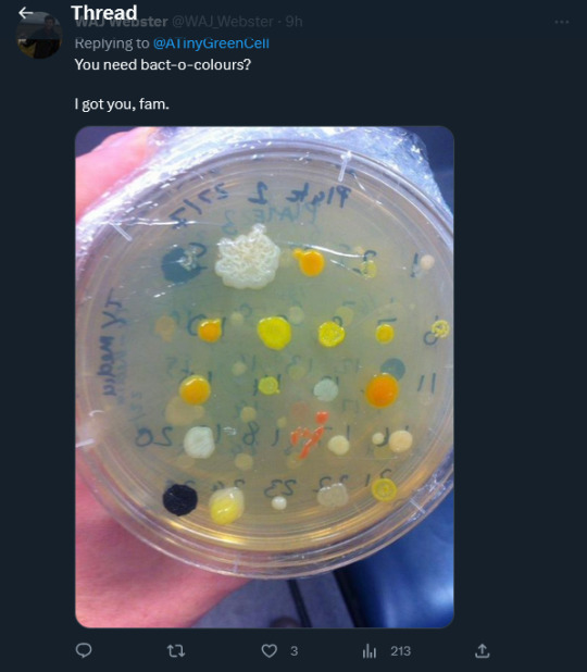
And Australian agricultural researcher @WAJWebster helpfully tweeted a petri dish of ALL KINDS of colourful bacterial colonies from white to yellow to orange to stark black, with a cheerful: “You need bact-o--colours? I got you, fam.”
The best part is that as of today, March 9, 2023, THE BLUE SOUP MYSTERY CONTINUES. WE ARE WATCHING SCIENCE HAPPENING!
A paper is being written. And Dr. Becket’s mum is getting an author credit as the proprietary owner of the #BlueSoup recipe.

Dr. Becket’s Twitter is here: https://twitter.com/bielleogy
Sebastian Cocioba’s Twitter is here: https://twitter.com/ATinyGreenCell
Fun IFLS story is here: https://www.iflscience.com/microbiologist-investigates-after-her-beef-soup-turned-blue-in-the-freezer-67894?fbclid=IwAR0H27KqVZhzzrosnjzzKkxuKASZ-0L0Lt6hGwCRDJK8xvFbbSlyS4JvwlM
15K notes
·
View notes
Note
If you could make a new color what would you name it and how does it sound more real than magenta.
oh oh oh!! I have a really cool fact as part of my answer!!
Okay, so you know how colour is a spectrum, right? Your eyes only REALLY perceive blends of three base colours- red, blue, and green. (Yes, green.) All other colours are blends of these three primaries- red and green make yellow, red and blue make magenta, and blue and green make cyan.
As you mentioned, magenta is a ""fake"" color- this is because colours are made of waves! The waves on the red end of the spectrum are Low Frequency and the waves on the blue end are High Frequency. You'd *think" halfway between both wavelengths would be the result, but that's green, and we already have a colour for green! So to fix this paradox, the line from red to blue becomes a circle and we see magenta instead!
Now again, this spectrum- it looks like this:

And most of the world recognizes the six listed colours as distinct. Which means that we take this blended gradient and add hard lines, like this, to clearly separate them from each other:
BUT, not all societies do this!! There are some whose languages don't *have* different words for "blue" or "green", and as a result, people raised speaking these languages have a REALLY HARD TIME distinguishing between what we recognize as "obviously" either green OR blue.
THEIR colour spectrum looks like this:

Which is correct and valid and makes COMPLETE sense, because we argue about differences in colour all the fucling time- "is this dark blue or dark purple", "is this neon yellow or neon green", and "is this orange or red" are some common examples. Any of those in-betweens could be treated as whole and distinct blocks with distinct boundaries.
And so, I propose this:
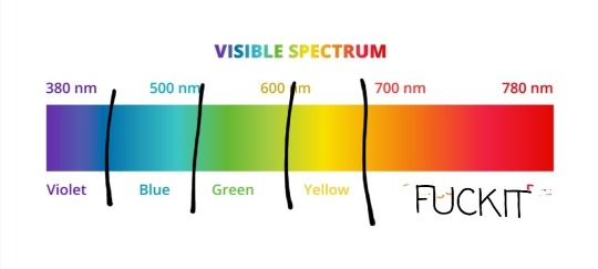
We merge orange and red cause i can't be fucking arsed
2K notes
·
View notes
Text
genuinely baffled at my grade 11 electronics teacher who taught us the resistor mnemonic as “bad boys take our young girls but violet goes willingly” like.... what the hell was going on there, like FIRST OF ALL it was the year of our lord 2016 we HAD a whole list of effective and less horribly sexist versions listed together on a convenient wikipedia page SECOND OF ALL why did he censor it as “take“ did he not think we would be curious as to why Red is shortened as a T word and not an R word in this mnemoinc THIRD OF ALL what the fuck man
#at least he didnt use any of the racist variations but man..... what the fuck#maybe he made the non functioning censored version in a panic and didnt think it through? we had a lot of girls in the class like i think 4#maybe that was more than he expected and didn't think about it until it was too late? still like...what the fuck man#although on my second point. now that i think about it. okay. okay it did go over my head#not because i was too young i was 17 of course i knew what words start with r that would fit there to create a very gross mnemonic#it was because i wasnt paying attention because ive got a learning disability and i cant do mnemonics at all kfdlsJFKLDSHJFKS#the way i remembered it was like#okay black brown gray white is like a gradient from darkest value to lightest#and red orange yellow green blue violet is just the rainbow#so like you just slot roygbiv in the middle of the gradient#so i just remembered black brown the rainbow gray white#and then at the beginning of every test id write that and the corresponding numbers so i could remember. this is a normal way of thinking#anyway just use like. bat brained resistor order you gotta be very good with#i think that ones hilarious and i think it would be funny and cute enough for teens to remember#edit: now that i think about it i distinctly remember one day coming home from school and casually mentioning that i learned about resistors#and their colour bands and my dad (worked in electronics since the 80s) immediately was like#okay dara i wanna let you know theres a lot of really cruel and rude memorization tools out there and i just wanna give you some nicer ones#i still wasnt paying attention cause i already had my black brown the rainbow gray white system but that was very nice of him#i guess he saw a lot of women in his time in the industry getting pushed out because of the bro-y culture that created that mnemonic#and knew it wasnt just an offensive phrase but a symptom of a cruel and misogynistic mindset#thank u dad. didnt appreciate it at the time because i was too busy with my incomprehensible gradient hue memorization system#edit 2: also sorry if this makes no sense. things are heating up in the resistor band colours fandom
0 notes
Note
hi i'm sorry to bother you but do you have any tips on giffing dark indoor scenes? yours always look so good!
hi there! not a bother at all :) i can definitely try to explain the steps i usually take under the cut!
this tutorial will assume that you already know the basic steps of gif-making — if you don't, there are lots of great tutorials floating around on this site that can help you out! :)
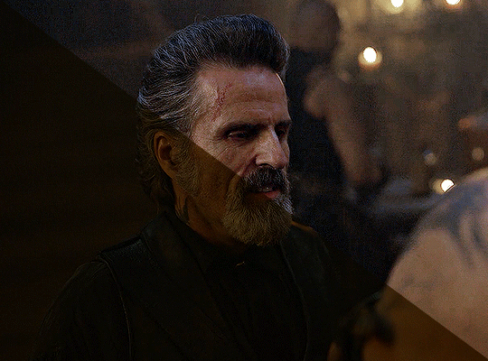
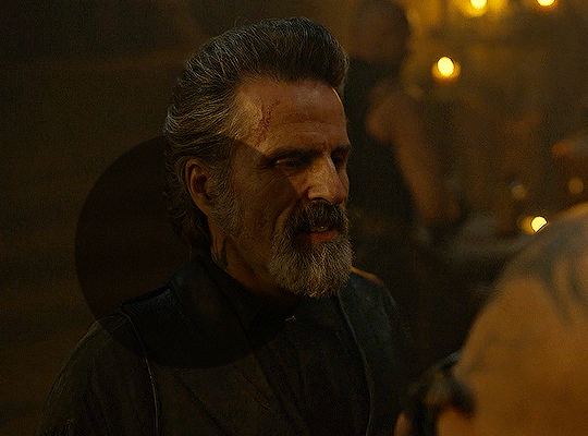
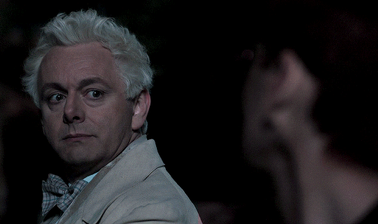
here's the gif i'll work with to explain my steps, the bottom being the original and the top being the coloured/brightened version.
before we start, a general tip i recommend keeping in mind: if you want to brighten a dark scene, you'll want to get your hands on the highest quality download you can find. 1080p is decent, but if your laptop can handle 2160p 4k hdr files* without sounding like it's about to explode, that'll get you even better results!
(*colouring hdr 4k files requires a different set of steps — the scene will appear washed-out on photoshop, so you need to make sure that you don't end up whitewashing anyone if you do choose to work with this type of file.)
since most of my downloads are 1080p, i'll use this type of file in this tutorial.
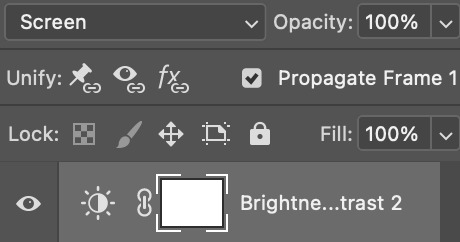
the first step of my gifmaking process with 1080p files is almost always the same no matter what scene i'm giffing. i make a brightness/contrast layer and set the blending mode to screen:
now my gif looks like this:
depending on the scene and how washed out it looks after this layer, i'll play around with the opacity. for this gif, i didn't touch the opacity at all. use your best judgement for this, because every scene is different!
i find that dark indoor scenes are usually tinted in yellow or green. one of my first goals is to try to fix the undertone of this scene before focusing on brightening it any further. i go to colour balance for this, and play around with the midtones, shadows, and highlights.
again, every scene is different, so the amount to which you use colour balance will differ, but for this specific scene, my goal was to neutralize the yellow. i focused particularly on the midtones and shadows of the colour balance layer, moving the scales to the opposite of the reds.
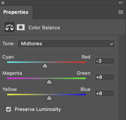
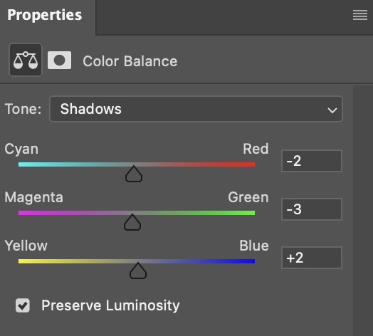
doing so will help with neutralizing the yellow. the only reason i moved the scales towards magenta and blue (therefore making it a bit more red than less) rather than green and yellow in shadows was because i wanted a darker contrast in the blacks. moving them to green and yellow made the overall scene more yellow since there were so many dark spots that shadows affected. (you'll see what i mean when you start experimenting with your own gif — this part of the process really just depends on your preferences!)
our gif might not look that much better yet, but it will soon! our best friend channel mixer is gonna help us out. for an in-depth post about how to use this adjustment layer, i recommend checking out this tutorial.
i'm someone who prefers to make more than one layer for the same adjustment layer for a reason i can't even explain (i just find that it helps me stay more organized). so don't think of this process like i can only use this layer once so i MUST fix it NOW. you can create multiple layers of the same adjustment layer, because every layer on top will affect the ones underneath it.
since my priority is getting rid of the yellow tint, i went to the Blue section of the channel mixer and increased it in all of the scales:
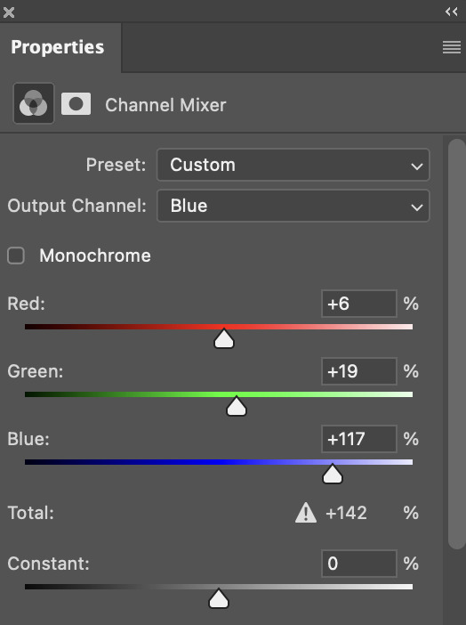
this step alone has helped us out so much, because look at our gif now!
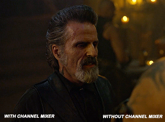
not only does the background look less yellow, but so does izzy's skintone.
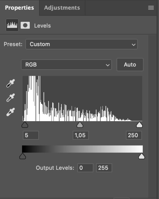
now i'm going to focus on trying to brighten the scene even more without destroying the quality. the levels layer can actually help out a lot with this.
the amount to which i move each toggle differs per scene, and i think experimenting depending on your gif works best for this layer.
side note: i prefer not to use the ink droppers on the side because the contrast in the result usually ends up feeling too strong for my preferences, but if you find that this works better for you, then go for it! basically, the first dropper with the black ink should be clicked before you select the darkest part of the scene that you can find, and vice versa for the third dropper with the white ink — click it, and then select the brightest part of your scene.
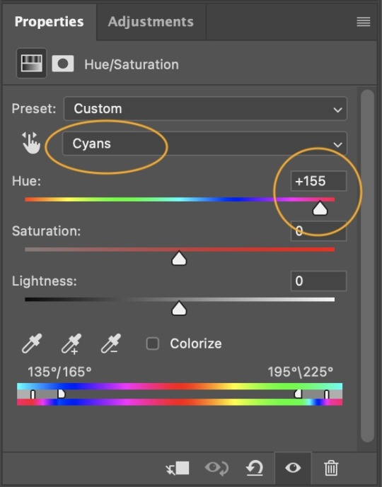
curves is the next layer that does fantastic work! unlike the levels layer, i do actually use the ink droppers for this. it's the same concept, with the first dropper being used on the darkest part of the scene, and the third dropper on the brightest.
try to think of curves as something that not only further brightens your scene, but also helps with the colour neutralizing process.
i grab the first dropper, then click the darkest parts of the gif that i can see. depending on the undertone of the blacks that you're clicking on, the tint of your gif might actually change significantly. this is why i prefer to click once, then undo the action if i don't like what it gives me. izzy's leather jacket was the sweet spot for this gif.
when i'm satisfied, i make another curves layer and use the third dropper to click the bright/white parts of the scene. for this gif in particular, the lights in the background were a good fit because they carried a yellow undertone — this meant that my curves layer actually helped to further neutralize the yellows in the scene as a whole!
(i manually dragged the curves graph upwards for the third dropper to make it brighter. i don't need to do this if the dropper does this for me automatically, but since the lights were pretty bright, it only changed the tone of the scene and didn't increase the brightness — hence the manual step.)
pat yourself on the back, because this is what our gif looks like now!
this is good, but it's not great — there's still just a bit too much yellow in the scene for my liking (sorry, i'm picky! :P)
i created another channel mixer layer and played with the toggles until i was satisfied:
ta-da! the gif as a whole is much less red/yellow now:
this is when i start fixing the colouring now — namely, his skin tone. selective colour will be your best friend here. i wanted to make his face just a tad brighter and less of a yellow-ish magenta shade, so i focused on the reds and yellows.
then, out of habit, i created another selective colour layer and took out more of the "yellow" in the whites to make them whiter, and increased the black (just by +1, since the contrast is pretty good enough already).
note: i switched to "absolute" for these two colours. basically, relative = less vibrant colour manipulation, and absolute = more vibrant/stronger colour manipulation. i prefer to stick to "relative" for fixing skin-tone since "absolute" can be a bit too strong for that.
our gif looks like this now!

his face looks brighter and much less yellow, so i'm satisfied!
this next step is not mandatory at all — again, i'm just picky and despise yellow-tinted scenes. i personally believe that indoor scenes that are yellow/green tinted make them look more dark than they actually are, so i do my best to get rid of these colours.
i also don't always do this, but for this gif, i just simply went to hue/saturation, selected the yellows from the drop-down menu and decreased its saturation.
be careful not to do this too much. depending on the quality of your download, this can significantly decrease your gif quality. i tend to worry less about this when i'm working with 2160p files, but again, those files require an entirely different set of steps when it comes to brightening/colouring.
since this was a 1080p file download (and one that was actually less than 1GB, oops, don't do that), i played it safe and decreased it by -39 only.
note: you also want to be cautious of colour-washing skintone when it comes to this step. i find that another selective colour layer can help perfect the skintone in case the yellow drains out of it too much, but skip the hue/saturation step if it's too difficult to work with — better to be safe than sorry.
anyway, this is the final gif!
that's usually what i do when it comes to colouring dark indoor scenes! i hope this tutorial makes sense, and if you have any further questions, don't hesitate to reach out! :)
#tutorial#gif tutorial#resources#completeresources#coloring tutorial#allresources#dailyresources#userraffa#userdean#uservivaldi#alielook#usercats#usermoonchild#usernaureen#userbarrow#userabs#useraish#useralison#userisaiah#*mytutorials#i am so sorry if this is incoherent#it’s so hard to explain things coherently 😫
611 notes
·
View notes
Text
My coworkers and I being pressed at people when they tell us some (predesigned, from the freezers) cake decorations are "too feminine" or "too masculine" and want us to change them. We've started saying "gender reassignment" when one of us has to change them lmao.
#had this woman ask to remove tiny DARK CHOCOLATE (THEY WERE BLACK OK) from her husband's cake because she said he wouldn't like it#because stars arent really for men. and she wanted blue decorations. on a pistachios cake. which is gre#lady stars are genderless theyre literally chocolate on your cake.#also this one family made my coworker change yellow decorations on a cake for a four year old boy because#'theyre too girly we dont want to give the wrong idea'#BRO WHATS THE WRONG IDEA WHAT#IS YOUR CHILD NOT ALLOWED TO LIKE YELLOW BECAUSE IT'S 'A GIRL COLOUR'????#also ive had to remove ALL the decorations from a cake because the mother of this boy wanted something 'more boyish' and asked for ALL Blue#decorations. which cool i love blue and redecorating but damn the decorations were literally dark chocolate#what's up with people gendering colours#the ones we hate the most tho are the ones who want everything pink because it's a girl or all blue because it's a boy#when their kids ask for different colours like let the child have what they want if your little girl wants a green cake let her have it wtf#misc#theres more but my wrist hurts when i type
1 note
·
View note
Text

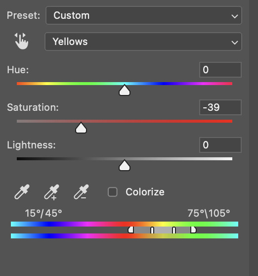
Thank you @cobbbvanth for asking me for this; I’ve never been more flattered! ☺️ I’ve only been making gifs for a little more than 2 years, so I’m really still only figuring Photoshop out, and my colouring owes everything to other people’s tutorials (some of which can be found here). To be honest, I was only asked some tips, but I have no clue what to include and what to leave out; so, here’s my complete (if random) colouring process.
NOTE: This is a colouring tutorial, not a gif-making one. The tutorial that taught me everything I know about that (and to which I am eternally grateful) is this one by @hayaosmiyazaki.
I. SHARPENING
My standard sharpening settings are:
One Smart Sharpen filter set to Amount: 500 | Radius: 0,4
A second Smart Sharpen filter set to Amount: 10 | Radius: 10
One Gaussian Blur filter set to Radius: 1,0 and Opacity: 30%
One Add Noise filter set to Amount 0,5 | Distribution: Gaussian
II. BASIC COLOURING
This is the part where I add most of the adjustment layers available and just play around with them. Obviously different settings work for different scenes, but I do have some standard ones.
Brightness/Contrast
I usually up the Brightness to +10-30, and the Contrast to about +10.
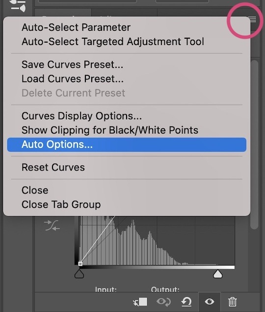
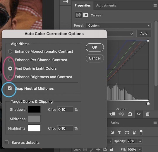
Curves
For the first Curves layer I go to Auto Options > Enhance Brightness and Contrast, and then adjust the opacity until I’m happy.
I might repeat the above step if the gif still looks too dark to me.
I add another Curves layer, I go to Auto Options and this time I pick either Find Dark & Light Colors or Enhance Per Channel Contrast, and check or uncheck the Snap Neutral Midtones option, until I see something I like. I will then adjust the opacity.
Levels
I add a Levels layer that usually looks something like this:
Exposure
I add an Exposure layer, where I usually set the Offset to around -0,0010.
Selective Color
To make the faces look okay, I create a Selective Color layer, select the Reds and usually add some Cyan (+10-20%) and play around a little (±5%) with Magenta and Yellow too. I might also add another layer, select the Yellows and make slight tweaks there too.
III. FUN COLOURING
About colour manipulation: PiXimperfect just uploaded a tutorial that explains everything so much better than I ever could, so I highly recommend you go watch it. It’s made for static images though, and things are more complicated with moving images, so I also recommend @elizascarlets’s tutorial.
The reason I usually go for a softer colouring is that a more vivid one requires a lot of patience and precision, and I honestly can’t be bothered. Instead, I try to tweak the colous only a little, so that the edges can be a little rough without it looking too wrong.
One thing to remember is that each gif is different, and there isn’t one foolproof way to do this, so you will need to use a different technique depending on the gif you’re working with.
Okay, so, after I’ve decided what colour I want my background to be:
1. I create a Hue/Saturation layer and change the greens, cyans, blues and magentas to that colour. That’s easy enough, since it doesn’t mess with the face colour. I then set the blending mode to Color. If your background doesn’t include any yellow or red, you might be done here, like in the case bellow:
2. To change the yellows and reds, I create a new Hue/Saturation layer, select the yellows/reds, move Saturation to 100 (temporarily) and then play around with the sliders until the face colour isn’t affected. I then change it to whatever I’ve chosen and change the blending mode to Color.
3. If for whatever reason step 3 doesn’t work (the background is white or black for example, or just too red), I might create a Solid Color layer set to whatever colour I want, set the blending mode to Color and then select the layer mask and carefully paint with a soft, black brush over the people’s faces/bodies. I will then lower the Opacity, to whatever looks smooth enough. If there’s a lot of movement in your gif, you might have to use keyframes (see elizascarlets’s tutorial linked above). However, my main goal is to avoid using those; that’s why I try my hardest to tweak around as many Hue/Saturation layers as needed and not have to create a solid color layer.
4. Once my background looks the colour I want it, I might add a Selective Color layer that matches my background color and then try to make it look more vibrant. For this Aziraphale gif below for example, I’ve selected the Cyans and then set Cyan to +100%, Yellow to -100% and Black to +60, then created another one, selected the Cyans again and then set Cyan to +20 and Black to +20.
5. If the gif has a white area, I create a Solid Color layer with a colour that matches the rest of the background and then set the Opacity low. I might also create a Selective Color layer, increase the Black and then play around with the colours.
IV. FINISHING TOUCHES
I create a Vibrance layer and set the Vibrance to around +30 and the Saturation to about +5.
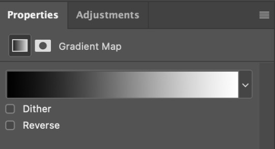
I create a black and white Gradient Map layer (with black on the left end of the spectrum and white on the right), set the blending to Luminosity and the Opacity to about 20-30%.
AAAND that’s about it I think! This ended up way too long and perhaps a little incoherent. I tried to make it as general as possible, so you might have to mix and match for best results. Feel free to ask me for further explanations about any one of these steps, and please tell me if you want me to go through the colouring of a specific gifset (although, as I said, I'm by no means an expert). Happy gifmaking!
#gif tutorial#allresources#completeresources#dailyresources#photoshop tutorial#chaoticresources#uservivaldi#userdanahscott#usersanshou#userfanni#userbuckleys#userrobin#tuserjen#userdavid#userzaynab#tusermimi#thingschanged#tuserju#usertj#userhallie#tutorial#minee
268 notes
·
View notes
Text
— you took my breath so now i can't suck in my stomach around you anymore
⁺ 𓂋 𓈒 ✦ :: han jisung | 4k follower event
genre: smut, fluff
pairing: jisung x fem!reader
req

Comfort. If there was a feeling you had to name, to pinpoint whenever around him, it would be simple and utter comfort — though you haven't felt that way always.
There was a time something close to agony filled your entire being the moment Jisung lowered himself to be face to face with your core, his eyes so anticipating, his hold on you so tender, so longing though none of his excitement infected you - you'd found yourself shy, embarrassed, overthinking. You'd felt all too real with him, hyperly aware of yourself and your body, your appearance, imperfections. And Jisung's been gentle, reassuring, never too quick in his own pleasure, in his own anticipation; and then you grew to love him around your whole because he made you love it, loved his eagerness to please, to love. Enjoyed whenever he lay between your legs, eyes big and blown out, mouth never tired, always wanting; wanting you, your body, your appearance and imperfections.
Rays of sun painted the entirety of your room into hues of gold, yellow light reflecting on green leaves outside and blue sky above, laying the world into colours of summer, of joy. You barely took in the rustling of wind against bushes and grass sounding from your window, all and every sound, every sensation except Jisung shut off to you entirely, as though you on your bed and him between your thighs were the only lives left to walk the planet, bound to be united for a lifetime. He was restless, though soft, eager, though loving - he was forever lost in his own pleasure while providing yours, tasting you on his tongue and licking you off his lips all to his liking.
Your fingers were tangled into his hair, pulling only enough to make the man sigh out, to make him scrunch his nose in stinging content, to make him bite into your skin, into the plush of your thighs or the softness of your tummy to draw marks and bites of love. He'd gawk at them for days to come before accompanying new ones, never growing tired of it, never not leaving you littered in his doting. Kitten licks against your clit, featherly light and slow, nearly torturingly so and you whined out, frustration and sweetest pleasure mixing to ooze outside your lips in sounds most alluring. Jisung wasn't one to miss it, to miss littlest hints your body threw at him and to comply to them, momentarily and unconditionally. Keeping you in his gaze, focusing on your every twitch and expression, sucking with a bit more vigour, with a bit more love, tongue drawing circles, fingers caressing skin, digging into flesh.
And your body was so very relaxed. So carelessly against him, against your mattress, so absent of second thoughts that a sting of pride, or something similar to it shot right through Jisung's heart. That it was with him you felt most content with, comfortable enough so as to utterly forget yourself, forget everything around you except him. Moaning his name in anticipation, sweetest sound rippling through the otherwise silent room and a second later only your thighs shook against him, your back arching into his just an inch more, to be closer, to chase awaited high, to feel it everywhere and all around you. Fingers against his scalp bore pain though Jisung didn't mind it - would never mind it i the sight before him, your taste against him, your feeling around him was the ever-living reward.
@es-kay-zee @jeyelleohe @angelwonie @yvniek4ng @ppiri-bahng @bintificreads @svintsandghosts @llunapastell @sensitiveandhungry @minniesvenus @junebug032 @noellllslut @a-cute-french-fry @felixinameadowandthesuniswarm @unexceptional-h @tangylemonade
#han jisung smut#skz smut#stray kids smut#han jisung imagines#han jisung scenarios#han jisung x reader#skz scenarios#skz imagines#skz x reader#stray kids scenarios#stray kids x reader#stray kids imagines
459 notes
·
View notes
Text


idk if anyone has done this yet but I just wanted to share close-ups of each of the custom signs Richas, Pomme and Bad made, with individual alt-text descriptions (the descriptions are a bit subjective but I wanted to make them as vivid as I could because I feel like these designs deserve that)
I might include my own feedback in a reblog, to get extra subjective, but the main gist of it would be that these are super cute and much much easier to read.
Note that these are not the final designs! Richas, Pomme and Bad said they're still working on them and asking for feedback, especially in regards to the accessibility aspect.
The same descriptions under a cut, just in case the alt-text doesn't work for some reason:
1:
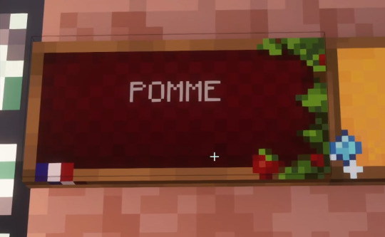
Pomme's custom canvas sign on a wall. This will be the most detailed description since it's the first: The sign has a wooden frame that surrounds a red canvas. The canvas has a very subtle patchwork like texture and is slightly darker on the edges than in the middle. The text is a slightly transparent white (effectively beige) and reads Pomme in all caps.
The custom texture pack version is a much darker shade of red, which makes the contrast between the text and the background much bigger and thus the text much more readable. The frame is also decorated with a little French flag in the bottom left corner and tree branches with green leaves and apples on the right. The leaves and apples overlap the canvas portion slightly. The overall vibe is very classy and makes you think of a roadsign advertising a French vineyard. Or I guess more like an orchard in this case.
2:
Sunny's custom sign: The colour is a much softer and lighter orange than before, almost more like a warm yellow. The text is black like in all the lighter coloured signs. The frame is decorated with sparkly blue diamonds, a small diamond shaped one in the lower left corner with sparkles almost as big as itself, and one big one in the lower right corner which is in the princess cut shape. The general vibe is like a pre-teen girl's notebook decorated with glittery stickers.
3:
Chayanne's custom sign: The colour is a very soft and pale lemon yellow. The frame is covered in subtle vines on the top and the bottom. In the lower left corner there's a small orange pumpkin among the vines, and in the lower right corner there's a little yellow rubber duckie, also partially covered in vines, which does blend into the background a little bit where it overlaps the yellow canvas. The vibe is very cottagecore but also very childlike, this could be a sign for some kind of family vacation location with cabins and gardens.
4:
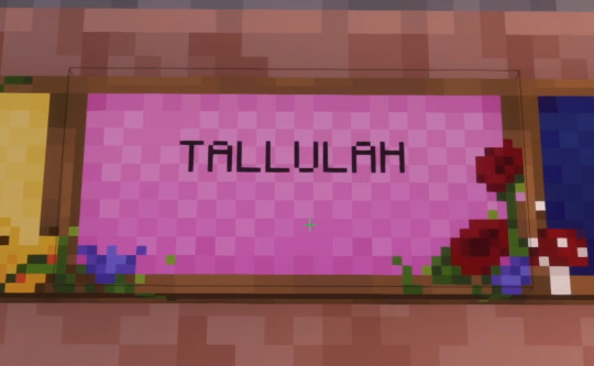
Tallulah's custom sign: The colour is medium pink, somewhere between her original pink signs (now used by Pepito) and her current magenta signs. Clearly lighter than the latter, but darker than the former. The frame is decorated with poppies in the lower right corner, and some kind of blue flower, maybe a blue lily, on the lower left corner. One of the blue flowers also sort of peeks into the frame on the right between the poppies, right in the corner. The flowers are of course framed by their leaves, which reach out towards the middle around them. This definitely has the vibe of a sign for a flower garden, probably one maintained by a little old lady who loves pink.
5:
Richarlyson's custom sign: The colour is a deeper indigo blue than his original signs, like deep blue denim. The text colour is the same light beige as Pomme's signs and as all the darker coloured signs. The frame is decorated with a tiny Brazilian flag in the lower right corner, and red-cap mushrooms in the lower left corner. The mushrooms seem to be releasing little white spores into the air, some of which can be seen in the top right corner as well. I can't quite pin down the vibe. There's something a bit fairy tale like, like a storybook maybe. You half expect a little troll creature to show up. But also… random Brazilian flag I guess lol
6:
Empanada's custom sign: The colour seems to be the same soft beige as before, I can't tell if it has changed at all. The frame is covered in golden syrup in the top left corner, which spreads out all over that side of the sign, dripping down in big goopy clumps. It looks delicious and I don't even care that much for syrup. The lower right corner across from it is decorated with white flowers, maybe white cherry blossoms? The flowers are stemless and leafless, just the flower floating over the frame and the canvas. One big one and one small one. There seem to also be small petals floating in the other two corners of the sign, over the canvas. One petal is even floating on the syrup where it drips down on the left. This would definitely be a sign for a small independent bakery.
7:
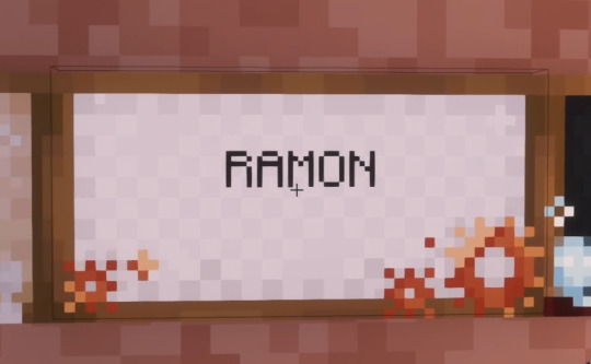
Ramón's custom sign: The colour is the same white as always, I don't think it has changed at all. The frame is very simply decorated with copper-coloured gears in the lower left and lower right corners, with one particularly big gear on the right side. It doesn't bring any particular vibes to mind but it is cute. The gears look very shiny and it fits Ramón very well. I guess the thing that it most reminds me of is actually Ramón's elevator shaft with its white walls and coppery create machinery.
8:
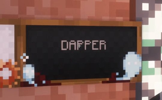
Dapper's custom sign: The colour is a darker grey than usual, I would honestly call it black rather than grey. The lower edge of the frame is decorated with what looks like darkened blotches of blood, with white ghostly spirits rising out of them towards the left and right edges of the sign, framing the canvas and partially overlapping it. The ghosts are similar to the souls that rise from soulsand in Minecraft but whiter, with only a hint of blue. The vibe is very Halloweeny of course.
9:
Leonarda's custom sign: The colour is a much deeper purple than before, you could even say a more royal purple. In the lower right corner there's a beautiful sparkly cluster of amethysts which are a lighter pinkish lilac colour and which look absolutely gorgeous, just masterful pixel art crystals. There is an amazing sense of depth and transparency in such a minimal resolution. There are also some pinkish sparkles in the lower left corner to balance out the composition a little bit. I don't know how to describe the vibes but it's beautiful. It's like a much classier version of Sunny's sign (not an insult to Sunny's sign, just a neutral description. It's like the cliché of the nouveau riche versus old money. Sunny's gems make you think of glitter stickers, Leo's look like she just happened to place the sign next to an actual cluster of amethysts with perfect artistic composition. Or maybe like she hired a professional painter to decorate each sign.)
(Okay sorry for the rambling, I just can't get over how pretty these amethysts are. Sunny's diamonds are also very pretty but they do look more like stickers to me)
10:
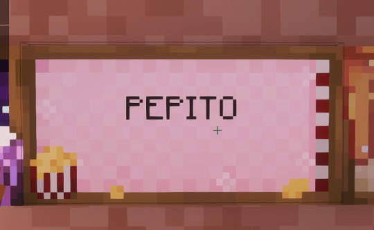
Pepito's custom sign: I think the colour is a softer and lighter pink than the original, it looks like freshly washed baby clothes. The sign is decorated with a tub of popcorn in the lower right corner, with the classic red-and-white design, which sits partly on the frame but mostly overlaps the canvas. Some popcorn seems to have fallen out and is scattered across the lower edge of the sign. There's also a stripe of alternating red and white on the right (over the edge of the canvas rather than on top of the frame itself) which vaguely makes me think of film reel, probably because of the popcorn. I should note that the white and red on both the tub and the "film" are a bit desaturated and dark, technically the white is more like light grey, which gives an effect of shadow and contrast compared to the very light pink canvas which looks very cool. There's also some subtle white flakes across the sides of the canvas; I'm not sure what they're meant to represent. They're very similar to Empanada's petals. The overall effect of the sign is very retro to me. It makes me think of the sixties.
11:
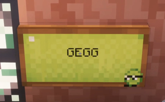
Gegg's custom sign: The colour is a softer version of the lime green of the original sign, and slightly lighter. The canvas is decorated with a little Gegg pixel art sitting in the lower right corner. Otherwise the sign is undecorated, but there's a subtle effect on the canvas itself that makes it look a bit goopier, like there's a thin film of slime over it. And there's a tiny reflection of light in the upper left corner which adds to the wet look. It's very subtle though, it could very easily be missed if you didn't look at the sign closely. The overall vibe is: Gegg
194 notes
·
View notes
Text
Trans Flags
I made a post with 4 striped trans flags a while ago, but I wanted to revisit it with some new edits/flags.
(Not all of these are mine, I just like having everything together as a set. I'll also be splitting them into sections, since there are a lot of flags.)
──────────✦──────────


transmasculine/transmasc ★ transfeminine/transfem ★ transnonbine/transenbine/transnbine/transnonbinarine
(Note: nonbine, enbine, nbine, and nonbinarine are words for nonbinary gender quality, nonbinary versions of masculine, feminine, etc. The first 3 I came up with, and nonbinarine comes from here.)
✦ All these flags follow these trans flag formats. The white and grey black stripes are the same for all of them, and the only thing that changes are the center 2 stripes, for the respective gender qualities.
The transmasc and transfem flags are the same as their originals.
Transnonbine was made by me. I used the yellow and purple stripes from the nonbinary flag.
──────────✦──────────


transandrogynous ★ transgenderless ★ transneutral/transneu
Transandrogynous is just a slight colour edit of the original. (I changed the bottom stripe to grey and adjusted the purples.)
Transgenderless is the same as the original.
For transneutral I chose green, as that's a common colour for neutrality. So it's like this variant of transneu.
──────────✦──────────


transmaverine/transmav ★ transxenine/transxen ★ transbine/transbinarine
(Note: bine/binarine is binary gender quality. Binarine comes from here, but I came up with bine follow the same naming convention as nbine.)
Transmav is pretty much the same as the original, though I changed the yellow and orange to be slightly darker, for more contrast.
Transxenine is quite different from the original. Instead of copper colours, I used a light purple blue colour scheme, just because I felt those colours were fitting.
Transbine uses the colours from this binarine flag.
(I chose the lighter colours so it wouldn't look too similar to the transmascfem flag.)
──────────✦──────────

transmidbine/transmidbinarine ★ transabine/transabinarine ★ transatrine/transatrinarine
(Note: midbine/midbinarine is midbinary gender quality, abine/abinarine is abinary gender quality, and atrine/atrinarine is atrinary gender quality. I came up with midbine/abine/atrine following the naming format of nbine, and derived atrinarine from midbinarine and abinarine (which weren't made by me).)
Transmidbine, transabine, and transatrine all use the colours from my alt midbinary/abinary/atrinary flags.
Besides this transabinarine flag, which uses a different format, I don't think flags for these exist, so they're pretty much new designs.
──────────✦──────────

transaporine ★ transoutherine
Transaporine is fairly different from its original. Instead of using bright red orange, I used the colours from this aporine flag.
Transoutherine is also kind of different from its original, mainly it's the colour configuration. I used this outherine flag as reference.
──────────✦──────────
From here on are combos of the above flags/terms :D


transnbinemasc ★ transandrogynousmasc ★ transgenderlessmasc
(Note: transandrogynousmasc is also called transandromasc. The wiki page lists transandromasc as both transandrogynous and transmasculine, so I assume andro is supposed to be a shortening of androgynous. However shortening it like that just means masculine, so I use androgynous instead so it's clearer.)
Transnbinemasc is a mix of the blues, yellow, and purple from the transmasc and transnbine flags.
Transandrogynousmasc is bluish purple, as a combo of the blues of transmasc and purples of transandrogynous. Same idea as the original, though I used slightly different colours.
Transgenderlessmasc is just greyish blue, as a combo of the grey from transgenderless and blue from transmasc.
(I don't think transnbinemasc and transgenderlessmasc have been made before, so those are new flags.)
──────────✦──────────


transneumasc ★ transmavmasc ★ transxenmasc
Transneumasc is just a edit of the original flag.
(The colours are slightly lighter.)
Transmavmasc uses orange yellow from the transmav flag, and a adjusted blue from the transmasc flag.
Transxenmasc uses the purple from transxen, and the light blue from transmasc.
(I haven't found transmavmasc and transxenmasc before, so these are new flags too.)
──────────✦──────────


transnbinefem ★ transandrogynousfem ★ transgenderlessfem
(Note: same as the one about transandromasc, this one is also called transandrofem.)
For transnbinefem is a mix of the pinks, yellow, and purple from the transfem and transnbine flags.
Transandrogynousfem is a lot like the original, I just used slightly different colours.
Transgenderlessfem just uses a greyish pink, as a combo of the greys of transgenderless and pinks of transfem.
(Transnbinefem and transgenderlessfem are also new flags, as far as I'm aware, I wouldn't be surprised if similar flags have been made before, though perhaps just not in this format.)
──────────✦──────────

transneufem ★ transmavfem ★ transxenfem
Transneufem is based off of my transneumasc flag, I chose a light peachy colour for it. The original is pretty different, it uses a bright red instead.
Transmavfem uses the same orange yellow from transmav, and the dark pink from transfem (which I adjusted the hue of, so it would match better with the orange).
Transxenfem uses the same light purple from transxen, and the light pink from transfem.
(Last note about this, but I transmavfem and transxenfem should be new too.)
──────────✦──────────

transmascfem/transfemasc
Transmascfem flags have been made before, but not in this 4 stripe format (that I know of). I chose the dark pink from transfem, and the light blue from transmasc.
──────────✦──────────
There's also transoutherinemasc and transoutherinefem flags in the same 4 stripe style.
I didn't make any though, since I couldn't figure out how to make it look. It's the same reason why I skipped out on making combos with transbine, transmidbine, transabine, transatrine, and transaporine, I just couldn't figure out a good design.
──────────✦──────────
I'll also note about the names, there's a lot of possible names for these terms, I didn't list all of them because there's a lot.
So feel free to use these flags for alt terms, or come up with your own terms (as long as they mean the same thing).
✦
Haha I typed a lot, I guess it's a kind of a masterpost / compilation post with all these links, I think it's nice to have everything together in a matching set like this anyways.
#trans#transmasc#transfem#transnonbine#transenbine#transnbine#transnonbinarine#transandrogynous#transgenderless#transneu#transtransmaverine#transmav#transxenine#transbine#transbinarine#transmidbine#transmidbinarine#transabine#transabinarine#transatrine#transatrinarine#transaporine#transotherine#transmascfem#pride flag#new flag#alt flag#edited flag#high res
159 notes
·
View notes
Note
I was wondering how achieve such a wonderful textured finish on your pieces? They are wonderful and I love their resemblance to aged photographs and the speckles of colors in the backgrounds. Your art is mesmerizing :)
you can see some of the texture brush sets i use in my #info_asks tag but i have some more (procreate) tips aside from just brushes
also hi i made this whole thing and then stupidly hit ctrl z to erase ONE word and i lost the entire bottom half of the post and all my image descriptions so fuck you tumblr i had to make this twice
to get a faded photo or old digital screen look, consider duplicating the canvas (once all the layers are merged) and using a gaussian blur tool on the new duplicated layer. then set that to low opacity to add a misty sort of look. looks nice in combination with some chromatic abberation and a small bloom effect. then a subtle noise filter on top:
for faded print effects, it's really worthwhile to learn how to use layer masks. you can use a layer mask to non-destructively 'weather' blocks of colour or lineart, without erasing the layer itself. the weathered ink/block print effect here was made using layer masks which means that if i just hide the mask, the lineart becomes solid black again and easy to alter or colour in:

for old paper effects you can just set a paper texture on multiply over the art sure, but you can also combine it with the blur & bloom thing, a really subtle drop shadow and canvas tilt, and highlights to make it look like an aged photograph of a card. this originally had a transparent bg but i'll post it here with a white bg so that the drop shadow is more obvious. the scuffed edges of the card (left) were hand drawn, simple white stucco brush. the bigger patch of scuffed ink (top right) was a texture stamp.

for block print looks you can move the colour layer out of alignment by a few pixels - but only after you're absolutely sure you're done with it, otherwise you'll get something like this -

i forgot to erase out her eye before i moved the red layer so now her eye defeats the 'look' of a misaligned print. the black lineart and red layer were also given the same layer mask treatment as described above to make them look faded or like the ink didn't stick down right to the paper
you can do this with multiple colour layers too. if the colour layers are separated and set to multiply (as in this cmyk example), it'll leave halos and edges around each shape which mimic old comic book print
just to show what you can do WITHOUT any special brushes, here's a piece of one of my mez tarot cards from before i got any extra brushsets at all. for this one, i added a green tint over everything to mimic a sun-bleached or faded print (my actual goal wasn't 'medieval illustration' but actually 'trading card from the 60s that got left on someone's windowsill for decades'). the background texture is the procreate noise brush. the texture under the green lion drawing is the procreate concrete brush (to make it look painted onto a wall). the lettering and lineart is procreate's 6B pencil. but to properly aim for The Look of it being a printed physical object, i also used a perspective blur so that the edges are out of focus, and metallic gold highlights which don't match the lighting of the actual illustration and appear to be catching some other external light. that texture was made from the procreate noise brush
it's pretty simple compared to my later stuff but i still really like the effect
in terms of colours, you need to keep them unified so that they all appear to be acting under the same external light source, like if someone is holding up a torch to a painting then the painting colours will be glazed with firelight even if there's no painted fire. a really easy way to do this is to slap a multiply layer over everything in one shade - grey-yellow for a weathered paper look, or greenish blue for sunbleached photos. this unifies all the colours of the drawing. or you can apply a gradient map at a low opacity so that there's only a subtle change. or just do it by hand - if you want everything to be slightly tinted yellow, just pick the colours you normally would, but move the colour wheel towards yellow to get a yellowfied version of the base colour. easy
it's really important to consider how fading and weathering can affect printed colour. white paper yellows, black fades. you will rarely see pure black or pure white. which means you can use pure black or pure white to add external effects like the white scuff marks on the hierophant card. if the whole drawing is yellowed from age but there's some white somewhere, it's an easy shorthand to show that the scuff mark or whatever was not originally part of the drawing (great way to add some nasty stains lol)
#info asks#i don't have like a specific set of steps i follow i kind of freestyle it every time#obviously i have favourites i like to use but like that sphinx drawing? don't ask me how i did it because i don't remember#i just played with it until it looked nice. the blue dots are ... some sort of effect layer i don't remember which
637 notes
·
View notes
Text
Complete contradiction
Spencer Reid x BAU!Reader
Warnings; none I'm pretty sure
A/N; Longest fic so far, not very long by others standards but its 2 and a small paragraph pages so a lot compared to my normal one page fic. I really really like this one so any reblogs & comments would be especially appreciated on this one! (this also isnt proof read srry) also for additional context reader is also a classified genius and I do plan on making this a series :)
Taglist; @reidstheyfriend
SR Masterlist
Masterlist
You peeled off your coat and dropped your bag at the door, not bothering to hang them up for now, solely focused on getting to your sofa so you could sit down. You had just gotten back from two cases in a row, meaning you were bone achingly exhausted. you had a case in Arizona followed by an emergency case involving a child in Texas then back to Virginia where you had given pretty much all the team a curt goodbye, texting Spencer a simple I love you and throwing him a smile before getting in your car. You had been with the BAU for a year now but were still yet to let your guard down around them all. You only trusted Spencer fully given he was your boyfriend and you had known him before coming to the BAU, you met when he was doing his third PHD and you were on your second.
Spencer had spent a lot of time with you while you did your PHD, you were working on your criminal psychology doctorate after finishing your first one in Philosophy while he did his in chemistry. You bonded well, at first spending time in the library or lab together but soon enough you decided to start working together at your apartment, where Spencer had learnt you were very different at home compared to how you were outside.
You dressed like a typical academic, dark tones with some purples and greens thrown in, your makeup was light but you often had on dark eyeliner and lipstick, you came off as cold and intimidating to everyone in looks and you weren't very friendly in tone, you just had a soft spot for the boy genius. Many would think your house would be the same, covered in books, dark colours throughout too but it was nearly the opposite. Once you walked through the door there was colour near enough everywhere, not migraine inducing neon but there were shades of light greys purples and greens covering the walls with mandala tapestries and other art pieces joining them. A striped rug with shades of pink, yellow and orange covered the floor of the living room underneath a dark coffee table in between two large patchwork sofas, a pink lamp stood in the corner on top of a small green table . Your kitchen was also brushed with colour, bright blue cabinets with light wooden countertops with a rainbow variety of cutlery, kitchen utensils, bowls and plates, your book cases throughout the apartment had books with custom dust jackets on so they were in theme with the rest of the house, you had picked up making them during highschool out of boredom. Your house was the opposite of you, and also the opposite of Spencer, who preferred the darker themes all around.
You also had divided your wardrobe up into your working outfits and your not working outfits. Whenever you were going to set foot at work or when you met spencer, university, you wore your darker more academic and professional outfits and once you were home you wore colourful outfits. It helped you to compartmentalise the job so you didn't burn out or stress as much. When you were off work you lived in sweaters, dungarees and dresses in colours and styles that made you happy. When you and Spencer were together off work you looked like the complete contradiction of one another for people who worked so well and were identical in many other ways.
You picked yourself up from the couch and trudged over to your bedroom to go and change into your choice of clothes for the evening. When you look through your closet you decide on a white turtleneck and pastel pink dungarees, putting on some fuzzy socks and leaving your hair down for now so you can settle in for the night making some new jackets for Spencer's books. His books were beaten up from all the travelling he did with them and they were starting to fall apart, especially the older ones, so you were making them in hopes that it would slow down the damage.
You were so focused on your project that you didn't hear the door unlocking, you were used to Spencer letting himself in so it didn't put you on alert, not until you heard a voice who definitely wasn't supposed to be at your door, let alone inside your apartment. “Oh my god, are we in the right place?” Penelope squealed from your doorway. “I don’t think we should be here, she's private and this is certainly something she doesn't want us to know.” You hear Rossi suggest. “Guys it'll be fine, what's the worst that could happen?” Morgan assures, you're now almost certain that at least JJ and Emily are here, possibly Hotch given aside from Spencer he was the only one with a spare key for safety purposes. Spencer wasn't with them you guessed, he was coming home after he finished up some paperwork at the university he had been requested to do last minute on a friday so he was coming over around eight PM.
“You can come in instead of letting my heating out.” You may not look as intimidating but you can sound as cold as ever given you just had six people show up on your door and let themselves in. They all come in, awkwardly standing in the doorway as Hotch closes the door behind him. “Sorry for barging in y/n, I wanted to stop by and drop off your bag as you had left it behind at the office and Reid was gone and then the others, insisted on following me, I apologise again for the intrusion.” Hotch is nearly as formal with you as he is with strangers, you knew it was because the only things he knew about you were the things he was told by Strauss and your file, maybe also your favourite books if he managed to take a look at your open kindle on your desk sometimes. “Go make yourselves at home, leave two seats free on the sofa, also go snoop if you want, just stay out of the last room on the right, that's my bedroom.” you nod towards Garcia who practically lights up, both at your lighter tone and at the prospect of being let in to your personality. The girls and Morgan all go off to explore your apartment while Rossi and Hotch head over to the couches.
After a while the others are done exploring your home meaning you were all now sat together, you had passed around some hot chocolates and teas, you didn't drink coffee and over time had transitioned spencer to do the same so he didn't dump half a bag of sugar into his coffee just to make it drinkable for him. You weren't entirely relaxed but you were more so in your own home compared to in the bureau. You explained your way of separating work and home through your different ways of dressing, you also opened up on some of your history with Spencer, not quite yet letting on the fact you were together. You both had places of your own for safety reasons alongside not wanting to make your ever snooping coworkers suspicious. You thought you would be safe in hiding your relationship until you lost track of time and Spencer walked through the door and called to you automatically. “I'm home sweetheart!” pausing when he heard the chatter in the living room die down, when he turned around after hanging his coat and bag up on the hooks he looked nervously at you as you nodded at him, signalling you were okay if he was. With that he visibly relaxed as the screeching began from the girls once again while Hotch and Rossi just smiled at you, Hotch having already knew as you had to declare your relationship when you started at the bureau some years after spencer, opting to do some more teaching work and get your third PHD in linguistics before taking up a role in the BAU with him.
It was several hours later when the team eventually left with you promising you would join them on the next team gathering. You then got to curl up on the sofa in Spencer's arms watching nature documentaries and reading French novels, the way you normally would, with the thought of maybe you could wear something colourful on Monday, maybe a burnt orange to ease into it.
#greyswritings#spencer reid fluff#criminal minds#criminal minds x reader#spencer reid x reader#spencer reid#spencer reid x you
106 notes
·
View notes
Last Seen Blogs

lilhunnyp0t
U CANT FAKE REAL !
virrbak-blog
Les billets de Virrbak

galxa
Galxa
butscrewmefirst
RIGHT ON THE EDGE.