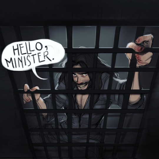
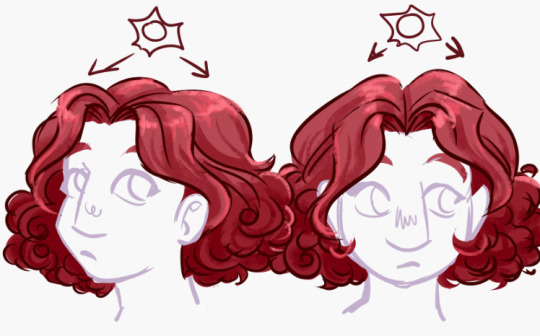
#I really need to simplify my style again lol
Text
Another much overdue ask compilation!
Some short-ish lore asks (Gale, Gort, DU drow relationships and pet-companion preferences) and a couple of art/advice ones sprinkled in. THIS IS BY NO MEANS ALL OF MY ASKS so as usual I appreciate everyone's patience!
I actually think he'd give them a pass entirely as soon as he noticed. Correct me if I'm mistaken but half-drow get No love from underdark drow and are usually surface babies right? So that fruit is miles away from the tree lol.
I think he generally has a bit of a soft spot for mixed kinds since he himself feels like an amalgamation of sorts.
Thank you! They're kind of a pain in the ass to draw at times for that very reason but man I do like the look 😩if other people like it too then that makes it all worth it!
THAT'S TRICKY TO ANSWER BECAUSE OFTEN TIMES I'M NOT... REALLY TRYING. I've draw a ton of horror comics for mine and my partner's series' SAD SACK and SORTIE, so I think it just comes naturally to me 😅 also I do genuinely find expressive and, uh, rugged faces more attractive? (I think they look rugged, again that's what people tell me at least.)
I think the secret might be adding bits of realism in there. I get a lot of comments about the wrinkles and eyelashes I add to my art, as well as the way I draw individual teeth (though I've lately been making an effort to simplify my style in favor of drawing faster, so I haven't done that as much or in as much detail.)
Both symmetry and the lack of it can also add to that effect. I have employed both facial unevenness and almost point-perfect symmetry to achieve something a little frightening or otherworldly in my work.
[MORE UNDER THE CUT]
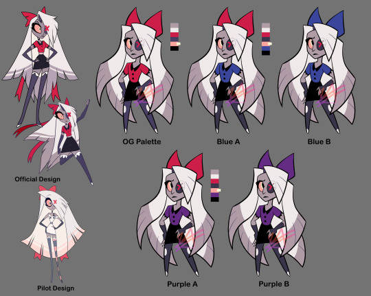
Thank you so much!!! The contrast is very much intentional, that's what DU drow's character is all about ;)
Hahah well I somewhat doubt Bhaal would care that his spawn gets named, but either way he stripped himself of his name as soon as he killed his foster parents and abandoned the Underdark. He had a drow name that I jotted down somewhere but it's completely irrelevant because nobody has used it since he was a child, and he doesn't remember it (even pre-tadpole/having his brain scrambled.)
Here's a little write up about his origins that might shed some more light on that:
https://meanbossart.tumblr.com/post/739688837431836672/did-drow-ever-have-a-childhood-before-the-temple
And about his original drow-given name and the reason behind it: https://meanbossart.tumblr.com/post/741350986692591616/drow-had-to-have-been-given-a-name-by-his-adoptive
Everyone just referred to him as his supposed race, or as Bhaalspawn or Bhaal's child, and any other similar titles. Orin called him "kin" and "brother" and Gortash likely called him his associate. Post-tadpole the camp grows entirely used to calling him "the drow" and he has no desire to change that or to choose a proper name.
THANK YOU BOTH SO MUCH😭 no reason to be intimidated, I'm just some rando drawing BG3 fan art LOL
I've been drawing since I was a child, and started taking it semi-seriously when I was 16 years old, so twelve years ago! That's around the time where I got my first non-display tabled and used that well into my twenties, prior to that I only did stuff on paper and liked to do inks color with pencils. I never really ventured into traditional painting at all except for a little bit of water-coloring in college.
Traditional and Digital art are very much different beasts. Which one you want to start with is, in my opinion, just dependent on what you want to do. Digital art gives you a lot of tools that makes learning easier, but you might find yourself having much steeper of a learning curve if you ever decide to do traditional art instead. If you want to be good at both, you need to practice both, since the skill doesn't entirely translate from one medium to the other.
Naturally you will be able to draw well on either, it's just... Different. I will say though, that I think if you're still learning you should use whatever allows you to look directly at what your hand is doing, so either traditional or display tablet/Ipad. I have no idea what a non-display tablet would do to a beginner, but remembering my experience with it I feel like it might be a huge detriment to developing the skill (feel free to share your experiences in the replies if you disagree, as I would definitely be curious to read them!)

YOU KNOW ME BABY IT WAS MESSY AND COMPLICATED the tldr.: is that they were "buddies", absolutely no romance intended there on either mine or DU drow's part, but due to his nature the friendship was extremely weird.
Here's a couple of replies where I go into more detail about it:
https://meanbossart.tumblr.com/post/739191190871818240/i-dont-have-a-particular-question-in-mind-sorry
https://meanbossart.tumblr.com/post/744952815768764416/so-not-sure-if-youve-covered-this-but-i-thought
That's definitely reserved for the vamp LOL DU drow very much enjoys when Astarion teases and fusses over him, and while Astarion probably got a kick out of acting that way around such a big and scary looking guy at first, I think by "now" (later and post-game) he's pretty much immune to DU drow's looks and just enjoys doing it in earnest.
He's not at all averse to being touched (even rather intimately) by close friends, but he wouldn't be quite THAT vulnerable with anyone else.
HE REALLY DISLIKED GALE... He irked him out by seemingly fostering a rather persistent romantic interest in him for at least half the time they spent together (very much based on my interpretation of their in-game interactions at the time, though my Gale might have been a little bugged.)
But also they had a... Fairly in depth relationship still? Gale was a staple in my party, and even though I antagonized him constantly by the end of the game it still felt like they had so much weight in each other's lives, if that makes sense. I might need to do a bit of an "update" on the DU Drow/Gale lore sometime, I feel like I've had some thoughts since that warrant more exploration of their dynamic (you can find a lot of old asks about it if you just search the Gale Dekarios tag in my blog though).
The gist of it is that DU drow found him arrogant and duplicitous, his constant optimist irritated him to no end and felt like it veiled a stream of self-pity (two things DU drow despises) Gale's attempts to get through to him only added insult to injury. By the end of the game he decided to pursue the crown of Karsus and this only lost him even more respect in Drow's eyes, seeing as he doesn't value godly power at all.
I was pretty overwhelmed by the game at the start so I actually missed a lot LOL including Scratch. I did get the owlbear cub though, which DU drow gladly welcomed into camp since it was injured - but I think he would have wished for it to remain a wild animal and to return back to it's home after it had grown up a bit. He didn't really make a "pet" out of it more than he just looked after the little guy in the way it's mother might have, probably with Shadowheart's help.
He wouldn't be opposed to proper pets though if one were to stumble into his life. He'd definitely be more of a cat guy because of their independence and strong little attitudes.
It is very hard to build proper rapport with him. He will be "friendly" to most people who have a good sense of humor about them, but friendSHIP is another thing entirely.
I think it's kind of circumstantial. He's very economical in his relationships and doesn't really seek them out at all - so a situation where he's forced to be in someone's company might be the only way to develop a bond with him, as he doesn't appreciate insistence either and that's more likely to push him away. He doesn't value status or titles either (kind of looks down on them really) so that won't help.
I think he just likes people who are true to themselves and their nature, sometimes even if the nature is one he disagrees with at it's core. This is why he liked Gortash, why he and Shadowheart got along so well, and why him and Astarion fit together so seamlessly despite seeming so different. Likewise I think it's why he didn't jive with people like Gale or Wyll, because they seemed to be rather... Dishonest with themselves and their own end-goals.
124 notes
·
View notes
Text
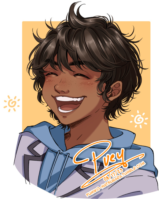
"I think Puey deserves to experience this kind of normal again, at the very least."
Chiba wore a bittersweet smile when he saw Puey freely laughing at whatever Okajima did, completely different to the Puey from days ago who was too cautious to even react to most things.
"He's still a kid, after all."
- Normalcy (Puey stays AU)
#i like how the book needed to specify that puey has really white teeth as if there's actually anything to do with that information lol#assassination classroom#ansatsu kyoushitsu#assclass#puey#puey santiago#my art#digital art#my doodle#puey stays au#i have a horrible habit of gradually adding more details the longer i draw the same thing#to the point that it slowly becomes my least fav thing to draw#and it's the hair shading#i wanna re simplify my shading style so i could have fun with it again
39 notes
·
View notes
Text


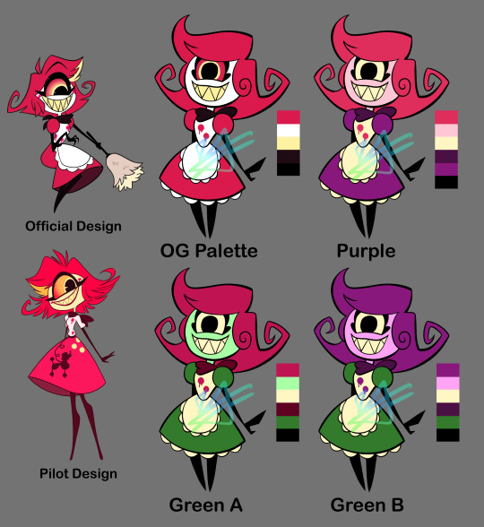
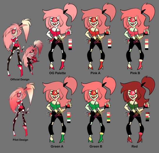

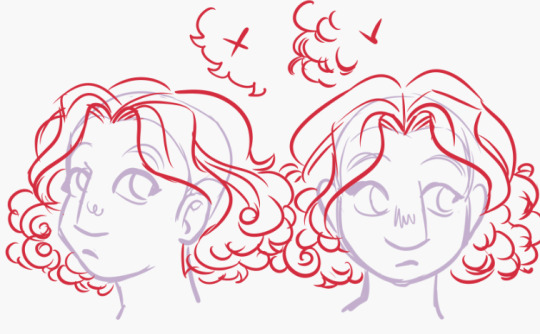
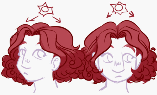
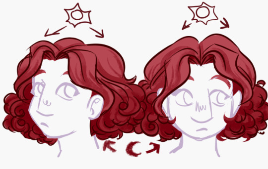
As a "fun" design exercise I decided to mess with the Hazbin characters' designs... Not really "redesigns," but more so "refined-designs"-- Keeping their overall look or "essence" while trying to simplify them and clean up their colour palettes, as well as making sure they all look distinct from one another.
I tried to stick close to the original's style but I couldn't help using thick lines, lol. Along with the simplified shapes, it gives them an early 2000s cartoon vibe I think.
For the colours I tried giving them more unique palettes, as well as making sure that they had enough contrast (the colour value of this show tends to be... not great). Also the lineup at the bottom isn't my final selection, it's just a selection to get a better idea of how they all might look together side-by-side.
Eh, tell me what you think. I could keep editing these but like, I'm tired of looking at them lol. More info on each design (plus a speedpaint) under the cut. It gets wordy, sorry.
Charlie: Not much to say besides she needs more contrast in her colours. I changed her shirt to the same colour as her corneas (yellow) so it doesn't blend in with her skin. I wish her eyes were still black (not only does it bring better attention to her face, but it works better with the idea that she's a doll-- yknow, painted on eyes? Does that make sense lol). In retrospect, maybe it would've been good to try some browns with her colours? Idk. I kept her red since she's the princess of Hell, and Hell's main colour seems to be red. Oh also, I gave her some lines on her face and hands just to make her look more like a puppet/doll. The rest of her body would have the same kind of joints/segments.
Vaggie: Ok I know her hair technically looks more moth-like in her og redesign but... it just seems like too much? Yknow? It's kind of outrageous. Idk how well my solution works but I tried simplifying it. I simplified her bow as well and made her stockings more like leggings. Her X-eye now hides behind her hair. Her gloves are shorter. Also I took away that thing around her waist that.... seems to be a different colour than everything else??? Idk what's up with that. Sorry I took away her feet. I tried out some blue and purple with her, I think it looks nice. Only thought about keeping the red bow because I thought maybe it'll match her with Charlie. Also sorry I took away her boobs 💀💀💀
Angel Dust: So unsure about how I drew him... Specifically, his 2nd set of arms looks so floppy and tacked on, and his legs... Idk I'm not great at digitigrade legs but I'm pretty sure that's officially what kind of legs he has. His head is weird. I think I got the idea of giving him big feet from Meppity's redesign video (her redesigns are some of my faves). I took away his bowtie because... too many of these guys have bowties, and he already has a choker too. Also I had the funny idea of all the Hotel employees wearing bowties/bows of some sort, and Angel is a patron but not an employee... Anyway. Kept his gold tooth to link him to Val (who also has a gold tooth), and kept the dots under his eyes since I THINK they're supposed to be representative of his spider eyes? They can be taken away if need be, though. His gloves don't go all the way up and kind of look like dish-washing gloves again but, the way his gloves go all the way up and his sleeves go into them... it just looks so weird to me. Idk, maybe I should've just given him shorter sleeves, or even no sleeves at all 🤔 And honestly I still have no idea what's going on with his pants. Are they short-shorts? Underwear? Didn't change them anyway. For the colours, I made sure all his gloves were the same colour (still don't know WHY they decided to make his 2nd set not only a different colour, but the SAME colour as his skin/fur????). Turned down the saturation on his hot-pink, and gave his right eye the light pink instead of that almost-black colour (still kept his eyes different colours because I remember seeing a really old sketch page of Angel that insinuated that there was a reason for his eye being black). Made some of the darker parts straight-black just because I've been using that in all the other character's palettes, but this can be changed to his almost-black colour. Also tried a more purple palette to get away from all the pink, kinda really like it.
Alastor: I originally tried his coat with coattails, but wasn't sure about it and made it the original shape. Took away his monocle because fuck that it's unnecessary and clutters his face. Made his antlers bigger. Swapped out his shirt collar to be like the one Charlie's og redesign has, because the way it goes all the way up like that gets on my nerves? Idk maybe I just don't know anything about fashion design but it doesn't scream 30's-suit to me. You could probably take away the collar, though. I wanted to try a lot of darker colours for his palette since he's like... kinda the bad guy. Dark colours would work well for him. I'm worried about his arms getting lost in the black of his coat, but that's why his cuffs and hands are a different colour. Really wanted to give him more than just red so I spread out the yellow of his teeth; I like how it looks for his shirt, it also works well with his eyes to draw you towards his face. I also tried to (again) lessen the saturation of his reds and pushed them more towards orange to better match the yellow. Kept all the brighter colours to his upper body to keep your eyes there, too.
Husk: I think Husk was one of my least favorite designs when the pilot came out because he's a real mess of detail. His wings are the worst. His redesign isn't much better (like dawg why's he got these random-ass hearts everywhere). Simplified his wings to just have some circles and rounded shapes. Kept some heart shapes (like his nose, bowtie, and paws) but added a couple diamond shapes, too (mainly his suspender buttons and the shape of his white chest-fur). Really wanted to have more blatant club and spade shapes too (to add to the poker theme), but didn't want it to get crowed and decided the rest of the rounded and heart shapes worked well enough. Made his eyebrows shorter and more square-shaped. Didn't have many ideas for colours but knew that I wanted to try some oranges and yellows. Made his eyebrows a darker colour, and changed his eyes to yellow corneas with black pupils. Stands out more that way, I think.
Niffty: Did you know her name is spelled with two Fs? I didn't. I don't like it... Anywayyyy. Swirled her hair a little more, and took the yellow streak out. Added some fluff under her dress just to match her apron. Kept the dots on her shirt (though there are only two now instead of three) because I'm assuming it'll make sense later (like idk maybe she was shot to death and that's what they represent), but I wonder if you can take those away for a cleaner design? Gave her more rounded shapes. I said before that all the Hotel employees would have bows/bowties of some sort for these designs: Niffty's would be her handkerchief (yknow, it's tied into a bow in the back? That works right...? Eh.) I took away her cheekmarks 1) to clear up her face and 2) to make Charlie's cheek marks seem more unique and doll-like. For Niffty's colours, I (again) turned down the saturation on her pink. I wanted to try using some green and purple on her, since her inspirations include B-movie aliens and the song One-Eyed, One-Horned, Flying Purple People Eater. Tried using different colours for her skin, since a lot of characters in Hazbin have white skin, and for Niffty specifically I think the white skin along with her white apron dries-out her look (if that makes sense?) Though I do agree her having yellow skin is NOT good if she really does end up being Japanese. I think pink skin works well for her, though. Oh! And again, it helps make Charlie's design more unique with her white skin, making her seem more porcelain. I made Niffty's eyes yellow like her teeth, and then used the same colour for her apron to unify the palette.
Cherri: Ok Cherri's design was my ABSOLUTE least favorite from the pilot, too many senseless details I HATE her ripped pants. So hard to look at. Idk if you noticed in the time lapse but I had to re-sketch Cherri because 1) her pose was too similar to Niffty's (I was making their poses similar to their official art) and 2) her hair was giving me trouble... I kinda hate how her hair hovers to the side like that? Tried re-shaping her hair and now it looks like she uses a TON of hairspray or something, lol. Took away her tattoo but kept her freckles. Took away the skirt thing(?) she's got on her pants. Took the symbol off her shirt, but added an X to her pants (can be taken away, though). Simplified the rips on her pants to just be ripped knees. put a heel on her left shoe so she doesn't look unbalanced/uncomfortable. Made her gloves shorter. For colours, I again took away her white skin for the same reason I took away Niffty's white skin (less "dried out" palette and makes Charlie look more unique/porcelain). Afaik Cherri's not Asian so yellow skin could work for her, though I also tried green skin. Since one of her themes is cherries I wanted to use reds, pinks, greens, and blacks. I tried some green for her clothes (and again her skin), and also turned some of her pinks more red. Made her hair darker for more contrast, and tried using some red for her hair instead of pink (I like the pink hair, but again... red like cherries). In general her colour palette was the hardest to figure out but I think I found some interesting things.
Sir Pentious: Sir Pent was my 2nd least-favorite pilot design by only a little 🤏. It's all his eyes. He's very hard to look at. I took away all the eyes on his tail, and turned down the saturation on the rest of the eyes EXCEPT the ones on his face (maybe I should have just made those reds much different colours, but it still looks a lot better with just the saturation down). Took away his stupid-ass goggles and made the face on his hat a lot simpler (combined the mouth with the hat band; it can still emote btw). Replaced his bowtie with... *quick google search* A jabot? It's supposed to be a jabot I think. I think that's what it's called. More 1700s than 1800s, but eh. Maybe I should've given him *quick google search* a cravat maybe??? Eh, eh, not a fashion expert but anyway. I thickened his mid-section so it eases into his tail better because, the way it is in the official design it always made him look like a slug to me? I looks too... squishy. Banana-slug-lookin' ass Also took away his red-tipped claws and made them straight black. For his colours, I think the grey and yellow works for him already, though I do wanna see how he'd look with more green or blue. Most of what I did colour-wise was the eyes, but also his suit; still grey, but trying both darker colours and pushing it more towards blue and purple. I wonder if I made his skin a little too dark? Is it kinda hard to see his features? Idk. Idk how I feel about these colours. Bleh.
#illustration#character design#hazbin hotel#hazbin critical#redesign#csp#clip studio paint#fanart#fan art#veez art
75 notes
·
View notes
Note
Hiii I really love your art! I'm always impressed how ppl like you are able to simplify drawings like this and still get the emotion across! I'd like to ask how long you've been drawing/how long you've been drawing cartoons and how you learned designing your own characters/style and drawing all those face expressions?
🙏🏼🧡
Hi! Thank you so much!!!
Lately, I've been really frustrated with my art and style and technical abilities, so honestly, thank you for giving me a minute to reflect on where I've been! I'm annoyed at the obvious mistakes I am noticing in the things I've posted over the last few weeks but I realized during this that it's always a process and growth is forever.
This got longer than I intended, so I'll put the rest under the cut.
I've been drawing for a very long time, probably for most of my life. And for most of it, I have not been very "good" at it. I had friends who were very serious about drawing in middle school and high school, and in college, I used drawing and fandom to deal with depression and anxiety. Then I started dating late in college which took up all of my spare time for drawing, and then I had a really nasty breakup with my first (emotionally manipulative) partner. I was really depressed (not because of being single but because I didn't know who I was anymore), so I didn't draw or write for yearssssss (I did somewhat but not seriously and loathed everything I was creating).
Then Covid hit and I felt like drawing again.
This was four years ago that I made this comparison of my art. I genuinely like what I was doing in 2012 more than what I put out in 2020. So it's not a matter of how long you've been drawing but consistency and a willingness to take risks (and learn from failures).
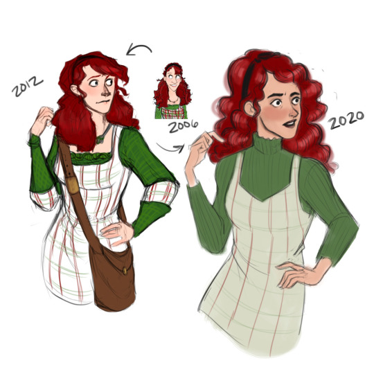
You can see I wasn't thinking as 3-dimensionally in 2020 when I started to draw again. The character's expression is really bland and you can see I was focused more on aesthetics than character. I think I even recognized it at the time, and I was really pissed about it.
I guess it's been four years since Covid started, and four years since I really jumped back into drawing regularly. I won't pretend that I know a lot--I very much do not, but here's what has helped me in the last few years.
Think in terms of volume and shape. I always warm up with perspective exercises. I often use posemaniacs' 30 second drawing practice for about 10-15 minutes, or I draw a ton of 3D boxes and spheres and triangles. I like to draw stacked boxes at various angles just so I can get my brain to wake up and see 3-dimensionally.
Know what you want to draw and draw with intention. This sounds obvious, but sometimes, I pick up my pen and just. Draw. Like I'll draw a face or a body but it's just completely soulless and boring because I don't know what I want. Draw with emotion, and have a purpose. Otherwise, your drawing will be lifeless and boring.
Ditch "aesthetics." Seriously. Focus on character. Draw that person ugly. If it's a sexy character and you're focusing on their emotions rather than how attractive they are, it will turn out sexy regardless. For example:
This was supposed to be scary, but people got horny for it anyway.
Anyway.
Your character will determine "aesthetics." Your character wears ripped tights because THEY think it's cool (or they trip a lot and scrape their knees), not because YOU like ripped tights. This is not a hard and fast rule, it's just what works for me.
For example, I don't draw Sirius wearing band t-shirts because I don't think he'd care about Muggle bands (at least, I don't think he'd care enough to advertise that he did). Consider why YOU wear band t-shirts. My partner wears his death metal shirts because he wants to support small bands and talk to strangers who like the same, obscure music (I hate those fucking shirts but he needs to live his truth lol. Some are ok and have beautiful art, but others are gross and weird).
Point is, focus on character.
Side note: If you want to draw a hot character (or if you want to BE a sexy real person honestly lol), you need to internalize this: Sexiness is a state of mind. If you are a sexy, confident person, it doesn't really matter what you look like--people will want to be you or fuck you. This applies to characters as much as it does to real people. It's about being you, focusing on your strengths, recognizing your own worth, keeping boundaries, and giving people your full attention when they speak to you. Seriously. That's basically it. Ask me how I know.
4. Make faces while you draw. I use photo references to understand how the face works, but what helps me the most is when I physically make the same face while I'm drawing. That way, I can feel which muscles are moving in my own face. Plus, I love acting and playing pretend, so I get to "be" that character while I'm drawing. I'm a naturally expressive person and communicate with my eyebrows way too much, and I think you can see that in my drawings.
5. Study other artists. Do this all the time. I particularly love to watch process videos and observe sketches. Here are some videos, books, and artists that I regularly visit or study:
TBChoi -- this person is my favorite artist stylistically. Just search their name + expressions and study. They just understand the way muscles work in the face so well.
Aaron Blaise -- okay, full disclaimer, I've heard some weird things about this artist, so I don't purchase their materials. However, I have practiced with his videos for years and found them exceptionally helpful.
Artists on Instagram I tend to look at: sleepy_kc, krosrios, starbite, rhiwynter
And artists who have influenced me since I was a kid are Tealin, Rufftoon, Shoomlah, Makani, and so many more.
6. Oh. And also, draw things other than people. Draw animals, draw landscapes, draw that weird building. Play with shape and perspective.
And look, I'm not a professional. I am an underpaid English teacher with ADHD, an Intuos Pro, and a horniness for a particular fictional character. Take this with a grain of salt and just do what works for you.
#asks#art process#and a small bit of advice for becoming sexy#lol i am not a professional artist so don't take me too seriously
12 notes
·
View notes
Note
Hello!
Any tips for drawing the twin's hair please ? Whenever i draw them, i always draw Sah's as like a spiky mountain with a curtain since i dunno how to draw tall hair yet
And Mekh...um-
Yeah
Dw Sah's hair has been evolved from mountain to Kagamine Len. Not sure if that's an improvement tho lmao-
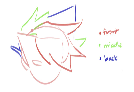
hello! and hey for what it's worth, i also have my moments where i'm drawing their hair and i go "what.. is going on here" LMAO but also len's hair isn't all that different from spiky twin's so i'd say that's improvement! but here are some things i try to keep in mind when drawing their hair

ignore me emoting at the bottom. i would simplify their hair as a tear drop for sah and a half circle for mekh, but i also do not want them to appear Too flat. hence, the shape is a base to build off of. it helps us determine the direction of the hair, how we layer it, and the space it occupies. but sol, why a tear drop and not a triangle? to which i say We must consider that sah has hair at the Back of their head that also extends from the nape of their neck so it must be considered when drawing the hair as a whole

determining a point where the hair parts/where the bangs start from also helps us better understand how the hair flows from that point

mekh has a bang in the middle of their hair and some face-framing bangs along their jaw. you can still see the basic half-circle/dome shape of their hair, and you can see how the sections of hair logically appear to flow from the marked point on their head. the top of their head is round, the bottom of their hair is basically Flat and straight across (it's just a bob that's very flared out at the bottom) which is why the back isnt really visible from the front unless you're looking at them from a lower angle. case in point:
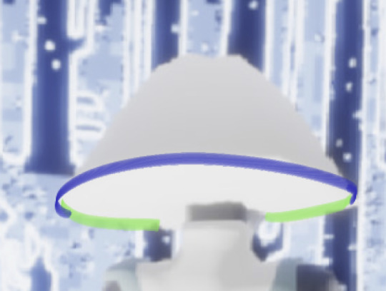
mekh as viewed from the back and slightly below. the traced line shows that the bottom of their hair is basically a circle lol
now sah is..... Certainly Something..... ngl im not so sure how to describe them but i will try. their bangs sweep right and i try to keep their hair in Big triangular sections to resemble the model more closely. the back of their hair Also sweeps right. id say the spikes of their hair run along the curve of the aforementioned teardrop, and you can basically use a differently-angled teardrop for the front bang as well. But Sol, you may ask again, why are some of the spikes labeled as being the Back of their hair?
ok this pic quality sucks but you get the idea. when viewed from the side, you will see that their hair also flows Back. you can also see the hair coming from the nape of the neck. sah's hair is actually like.. sorta shaggy and longer, pretty multi-layered in the hypothetical scenario that it isn't styled up which is where all those spikes come from. (i'd even say it'd extend lower than mekh's if unstyled since mekh's is so bluntly cut across.)
this got kinda long but some ending notes: honestly don't be afraid to stylize and you don't need to be perfectly on-model with their hair. there's nothing wrong with using references either, i have a bunch of screenshots of the elders from different angles and if you/a friend has the hair you can also just screenshot that to give you a guideline. and also don't be hard on yourself if it looks kinda off or anything because i have drawn a lot of spiky haired characters in my time and i still sometimes look at stuff i deemed Fit To Post and go "hm. i would have drawn that differently if i redrew it today."
but uh i mostly just hope this was helpful LOL. good luck drawing the twins!
30 notes
·
View notes
Note
Salutations! I adore the way you draw hair. Could you give a detailed explanation of your process?
sure ! FIRST AND FOREMOST THOUGH!
note that the way i do hair , can vary extremely in process depending on what style im choosing, hair type or even just like, the purpose of a picture, its gonna be different every way, i CANT give an indepth explanation of every single type , i do always reccomend to search up hairstyles and do your own studies and practice with good refs, also SEARCH UP BLACK HAIRSTYLE ART TUTORIALS even if you THINK you wouldnt be able to draw really curly hair or locs or protective hairstyles, learning is valuable, give yourself time.

lets take subject M for a spin , i think one of the basics here is to treat hair as a structure, depending on how its supported , draped, whatever, it looks awkward if you just draw it on its own without much rhyme or reason to how its coming out the head, SKETCH out a hairline , remeber to not make it too low (the eyebrows need their own space) or way too high ( i mean. unless your character is balding then you should search up how that looks lol)
im a big fan of hair having its own gravity of sorts, the puffier the better if we talking about wavy to big curls, i like spiral shapes a lot that pile onto eachother when im rendering hair this way, rather than a repetition of curl-spike, google curled up ribbons because thats easier to copy structurally than hair head on . but you make your own rules.
in terms of coloring, PUT a general big shadow of where the lighting hits before even rendering, its better to start simple than get caught up on detailing each strand head on and realizing it looks like you pasted a clip art of high rendered fur onto a piece of paper. it makes things already look less flat.
i think what really makes hair feel like HAIR is a second shadow color, this should go in only the darkest parts , giving depth to strands, redefine parts like the bangs or fringe by bringing the base color again to erase some of the general shading, follow the form , if you have to lower stabilization to have your lines be less straight then do so, not even the straightest hair is actually a full on straight line.
highlights are dependant on the intensity/distance of your light source, the more overhead and close to the hair they tend to form a "halo" shape as a highlight where the parting starts, IT ALSO DEPENDS ON HAIR TEXTURE , if the hair isnt smooth it reflects less and light dissipates more, this is why you should search refs to more hair textures.

last but not least, i think the beauty of hair comes from how , no matter what you do, itll do whatever it wants to do at the end of the day, unless youre wearing the most glued down structured wig in the world, hair frizzes, loosens up, puffs out ,sticks out , i think adding up detail loose strands adds a very naturalistic feel to things , it makes it feel more like the character is a living person who actually moves and not just like a statue. overall , this is the most simplified version of how i currently render hair in my more detailed style, this isnt a tutorial, just a showcase.
also i keep repeating this but i mean it, search up and practice, Every texture of hair , not just straight to wavy or loose curl, do Not box yourself , there is a limitless potential with hair in design and illustration, hair is art.
42 notes
·
View notes
Note
hi uh feengoid im a big fan of like your art you r so cool..,,.. but uh I wanted to ask, what are your tips on making fankids/trolls? thanks
ahh thank you!! it means a lot <:)
as for the tipss, im gonna say what i said innn maybe the 2-3 other asks about advice on art and stuff and tell you that im not good at all at giving tips lol. but! i do know a bit on my own process of making my stuff at least.
for both i say to follow an archetype or a personality type and follow that up with aspects and pieces of the character that fit into said archetype but making them distinct. like how rose was brooding, john was nerdy, and so on and so on. stylewise i always simplify things a lot though, trying to keep things that can be seem as memorable. (this is the part where im runnining out of things to say, bear with me)
one way i do make distinctions between the two was that trolls are a LOT more exaggerated than humans. you can see on how vriska is supposed to be a stereotypical mean girl, but taken to the level where shes HURTING hurting people, and even killing trolls to feed off her lusus, and how terezi is a literal embodiment of blind justice. so from personality to design theres always something you could try to make stand out a bit more (say, a cowardly troll turned into a complete paranoid shut-in) while still keeping those first points from the first paragraph about sticking to a theme and prioritizing key aspects about your character
and one more thing that i might be able to add is to just, experiment a lot? there are boundaries to stuff of course, and its great to be reminded of those and on how you can work your magic within them to make something really good that, without them, would kind of fall flat. but i moreso mean in the sense of like, a lot of "weird" stuff people like to stick to a lot, at least when making trolls in specific. your goldblood doesnt need psiionics, your purpleblood doesnt need to be a juggalo. but other characters can! or even have something completely different. and its fun to think of stuff like that and how you can work it out.
actually, last thing, receiving critiques on stuff is also really, really good, specially when you talk to people that know their stuff. on the MSPFA server there is a channel for getting the hussie style (that includes designing fankids and fantrolls) just right and i comment on that area from time to time, giving personal advice that can maybe work a bit better than just general stuff like this. if youre not in there (or theres someone else reading this who isnt there) youre always free to join and ask for critique on your stuff there!
hopefully this helps a bit, and thank you again ^^''
6 notes
·
View notes
Text
happy one year to my hypnospace comic!
(and one day, just pretend i had this up yesterday shhhhh)
here's a little series of fun facts about making it
- started as a poem. i wanted to make a Millenium Anthem animatic and/or write a fic (i ended up doing the latter) but this came to me in the meantime and, being hyperfixated and eager to make something about it, it developed into a comic.
- that said, i was deep in the throes of an art burnout. i tend to make a lot of art around the new year, usually due to being in multiple gift exchanges, as well as working on my own things during winter break since i don't usually have the time to during school, and that wears me out. both this year and last i struggled with having energy to draw. however, i'd just recently found out a style that was pretty easy to work in even in that state: polygonal! so the comic is pixel polygons.
- the comic actually sort of ties into (and is directly quoted in the summary of) the aforementioned fic i wrote—which is called "do(n't) be afraid"—as evidenced by the focus on the HSPD badge as well as the Enforcer being almost a self-insert
- the typography is done by hand. i looked at the game's font file for the standard font and copied it. to this day i can pretty reliably just. handwrite in hypnospace font with the pixel pen. and i do! it's very space efficient!
- the dithering is also done by hand, because i'm a madlad. well, for each pattern i did like a portion by hand and then copy-pasted it until i covered as much area as i needed to, because i'm a madlad but i'm not a masochist. and then when i needed it again i just copied and pasted the layer and used a clipping mask to change its color. now though i have that big pixel brush pack on clip studio paint. so i won't be needing to do that again anytime soon.
- in panel 3 we see the Enforcer's face as well as glasses on their desk. like i said. pretty much a self insert. we also see their computer and hypnospace headband; i studied that intro video for this but between not seeing it a whole lot and the artstyle i was using being really simplified, i'm probably missing something lol
- in panel 4 we see dylan merchant at his desk. there's a calendar behind him. i actually looked up what day of the week was december 31, 1999 so i could circle it. it was a friday.
- the girl in panel 5 is supposed to be rebekah, the girl who likes squisherz and won the fan art contest but didn't get to find out because her dad took away her hypnospace headband. there's only one small picture of her to go off of, though.
- panels 7 and 8, which can also go together as one tall panel, were fucking FUN. what i did for the glitchy static bits was i made various clusters of black rectangles, each cluster on a different layer so i could copy and rotate them to fill more space. then on a clipping mask i used airbrush without antialiasing in white, RGB, and CMY. boom, static pattern. the elements from the game (the error message window, the cursors, the car) i had to copy by hand. see, the wiki doesn't have many screenshots, and if you try to screenshot the game or a video of it then it scrungles your image clarity. so i had to take those screenshots, eyedrop the colors from there, and then do such riveting and time efficient (that's a joke, it took forever) tasks as Count Pixels So Everything Is The Right Size. which for the shiny new HypnOS 2000 look was painstaking. look at those gradients. gradients everywhere. it was worth the work because it looks fantastic but man. and then to scrungle those elements i just used the rectangular selection tool, grabbed arbitrary bits and pieces of the things and Moved Them Elsewhere.
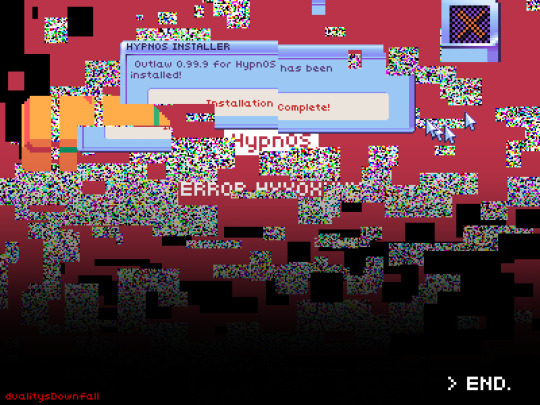
oh yeah babey
12 notes
·
View notes
Text
Probably a hot take???
People are probably going to hate this and disagree with this, but this is just a random thought that came to mind I've had for a while.
This is probably a hot take in this fandom, but I really think that the Michael Bay Transformers designs and their design philosophies (from 2007 - ROTF and maybe DOTM, at least) really aren't bad. I think they're pretty solid designs. BUT-
One of the most common complaints about them is being "too complicated"/"overdesigned". That is kind of fair ima be real, I can see where they're coming from.
I've been hearing criticism like this a lot recently too. And I've been thinking on it as well. And that made me realize that the Bayverse designs are solid designs (in my opinion, at least), but the over complicatedness is what holds them back, according to mixed opinions from what I've seen in the fanbase, and that the Bay designs work a LOT better when more simplified and stylized looking, but still keeping the original idea and charm the Bay designs have.
I think Bumblebee's design in Bumblebee movie and Rise of The Beasts is a VERY great example of this which I'll be using
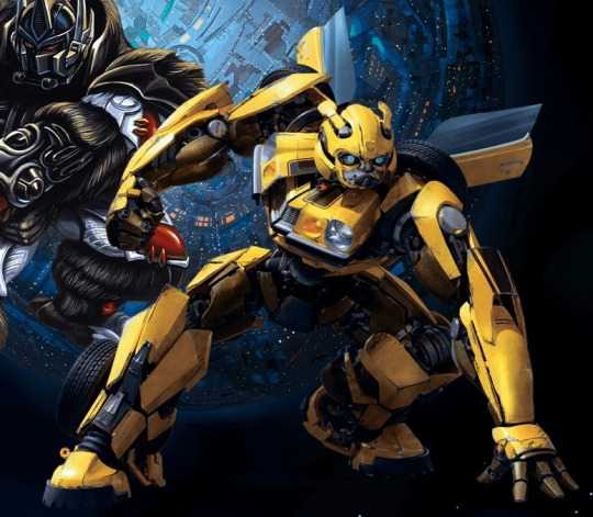


It's very obvious that Bayverse Bee is the blueprint for his Bumblebee movie design. And his ROTB design is literally just his 1977 Camaro design from the 2007 movie (from when Bumblebee was possibly going to be a prequel to the Bay films???)
Not sure if anyone else share these feelings with me, but I honestly love the Rise of The Beasts Bee design. It really does show my point of the ideas and design philosophies behind the Bayverse designs are solid, but again just need to be simplified and stylized a bit, but still keep the realism and believability and general charm the Bay designs have to be even more solid.
Heck, 2D/cartoony art styles seen in fanart even proves my point further as well. Y'all see what I'm getting at here?
It honestly makes me curious how any other Bayformers design would look in the style of the Bumblebee movie. I honestly really wanna see how Bayverse Optimus would look like this. I think his design could gain and improve the most being "Bumblebee-ified" in this fashion honestly.

Now, this could start discussions about the designs. It could start up the whole generic "g1 vs movies" debate and the designs "not being g1" or whatever. It could start up a lot more things that are even more subjective and opinionated than what I'm saying here. But, that is not what this post is about. And I'd rather keep that away from here, because that is not the point of what I'm saying.
My point is about the Bayverse designs themselves and how the designs themselves are IMO good, but can be improved and just need as I keep saying to just be simplified and stylized a bit but still keep the realism and believability the designs have, which is exactly what Rise of The Beasts Bumblebee does compared to Bayverse Bumblebee as an example I've shown here.
But you know what, all I am saying is (very obviously) subjective and my opinion as I keep stating. Maybe I'm just the only one who has these thoughts and notice these things? Like the designs or not? good for you. Like the designs they way they are already? Good for you again, I do too as well. Like the more G1/G1-esque designs better? Good for you as well. We all have our opinions and preferences when it comes to stuff like this lol. All I ask is for this fandom to acknowledge that and be more civil when discussing things like this. But, I digress.
These are just thoughts I've had for a while that I thought would be interesting to share lol
#transformers#maccadam#bumblebee#transformers bayverse#bayverse#bayformers#if this somehow turns into a g1 vs movie argument I swear Ima be mad#this is basically just random thoughts I wanted to share for a bit
21 notes
·
View notes
Note
quick aside for my moment of befuddlement because ive always misunderstood the idiom "like a house on fire" LOL. i always thought it was a passive aggressive way of saying "dude, we would destroy each other lets not talk" so when i first read that I was like ??? context??? doesnt match??? did they misunderstand the idiom? DID I? then i googled it and you're right lol its a nice thing. (tho now i wanna put that in a fic bc i think that would be a delightful misunderstanding for characters to have). IM SO GLAD I MADE UR FUNK SLIGHTLY LESS FUNKY THO. you're great and you're super sweet ;w; if i had more self-confidence, i would definitely jump at the opportunity to befriend. maybe when i get more gutsy
BACK TO THE SONG LAN HATE THO. im sorry, im still in shock. just HOW. also..... how is my interpretation of them not the common one??? again, i stay so strictly to my lane i didnt know other lanes existed and i definitely dont want to hear about it bc i think song lan hate would hurt my heart. it already hurts my heart sometimes when i see xue yang hate and XUE YANG DESERVES IT. literally i despair at media literacy sometimes. i absolutely cannot understand how anyone consumed the same content as we did and decided to be mean to song lan.
YOU ARE ABSOLUTELY A FAVORITE ARTIST, DUDE. have you fucking SEEN your stuff?!? like, are you as blind as xiao xingchen? (my sweetie, may he forever regain his sight). your art is GORGEOUS. absolutely worthy of being a fav artist and i am sure im not the only one. for starters, your pieces always have a depth to them that sets them in a scene so freaking beautifully EVEN WHEN THERES NO BG or even in your more simplified styles. when you come out with a "silly phone doodle of xue yang", i see the freaking SKILL needed to make THAT adorable lil gremlin as just a 'silly doodle'. like BRO, youre so skilled that i think youve lost depth of how good an artist you really are. i wish i was smarter with art words so i could tell you in color theory exactly why your colors are so beautiful but im dumb and all i know is "color pretty" BUT SINCE I CAN PORTRAY STUFF WITH WORDS SOMETIMES i'll try to just express how your colors alone can evoke emotion and tell a story, how you use the contrast to make your art pop off the page, the way that the colors caress a scene and show so much more inside. its beautiful, your art is beautiful, i can look at a piece for such a long time and still find interesting details that make me smile. oki i'll stop beng weird now but like NEVER DOUBT YOU'RE FREAKING SKILL BRO. (shit i didnt even get to how your animations just break my brain oeuihgo i love)
lolololol dw abt telling me about the cannibalisms piece, i look Specifically disrespectfully at that one. not big into cannibalism but damn dude, there is a Mood to that piece and frankly, something that messed up sort of suits them on their worst days euorhgioeurh i like me a fluff au or a fix-it fic but damn those two can get Dark.
My otps are often rarepairs ;A; i never do it on purpose, im normally jumping headfirst into a more popular ship but then i just See the potential in two other lil guys and im like.... holdup, wait is no one else seeing those two??? AM I THE ONLY ONE WITNESSING THIS? (yes, yes i am). And the hyperfixation begins and its just me alone at a bar with no bartenders so i make my own food. but im a weird lil guy so my cocktails are always strange and im alone at the bar lol. tbh songxue is one of my LESS rarepair rarepairs. like... theres actually fics that i didnt write for them LOL. (there was one fandom where there were 40 fics for a ship and i wrote all 40. i am a sad and lonely lil loser lol)
(scuse me one of my fav artists said they think i'd write my otp well, i can die happy oaierhgoeirh i actually do write ff for songxue but hahaha im still just a silly anon but its rlly good to know that the person i think characterizes them best in the fandom (that ive seen) thinks i would do a good job with them aoeghuihr thankyou for the high praise, i guarantee i dont deserve it)
(sometimes i've wondered if the reason you draw/write them so well is bc you dont ship them? weird take but like, shippers have shipping goggles right? we see what we wanna see a lot of the time. but since you just think they'd be neat standing next to each other (much agree), you actually put thought into their characterizations and personality instead of just "this is how they'd F*CK" or smth similar. and bc the personalities and stuff mean way more to me than sexy stuff (thats the whole reason i ship them! their personalities!) the fact that even your crack stuff has such a good basis in who they are as people makes your content just so good. whereas sometimes i see content by shippers (no disrespect meant, everyone ships in their own way), its very actively ooc, usually for a kink fill, and im just... but what abt their personalities? what abt the whole reason i think they'd be good together if given the chance?! WHAT ABOUT THEM? and then u come around drawing them like that and i just wish more people portrayed them the way you do. this isnt meant as like an anti-smut thing, i like smut, its just that sometimes pwp is just two strangers who happen to have the character names of my blorbos and literally nothing else in common and theyre my BLORBOS. more power to people who like that stuff, i will stay in my lane and bother this poor lovely person who doesnt even like the ship but is kind enough to see their potential to be pals cuz damn im in it for the emotions)
heh heh yeah it means we'd get along well but i like that interpretation too and think it would make a great story!! here's to you becoming more gutsy! (though again you're very free to use an alt or something!)
genuinely why i don't go looking lmao... song lan fans are so fucking strong to have to deal with the shit people have said BUT nowadays the climate seems to be a lot better :D i see lots of thirst for him at least KFHKDJ and my appreciation post of him has 800 notes so that's hopeful at least! but same i don't get it at all (though honestly i will say a lot of character hate stems from shipping. legit.) but yeah regarding xy hate for me it's gotta be for the "right" reasons LMAO
LJHLFHFD ALL THE COMPLIMENTS MY BRAIN CANT TAKE EM!!!! genuinely!!! THANK YOU!!!! i do often tell myself 'your stuff doesn't have to be perfect it just has to spark joy' to feel better about not rendering a piece to hell and back and mostly taking the lazy route, though this year i really wanna branch out and try more! but all of this has shot me in the heart... emotion to me is the most important part of art, and one of my favorite responses to get is laughter, and you don't need a 4K HD piece for that haha BUT LISTEN YOURE NOT WEIRD EVERY ARTIST I KNOW WOULD KILL TO HEAR THIS im gonna frame it. but after ive printed and eaten another copy like wow you think i set the scene ;_; will cry (agsjdhf sorry i really do read everything im just. PROCESSING!!!)
ahaha yeah for sure! i do love me some cannibalism (i am the cannibal friend) but absolutely that was just intended as a very dark place. song lan has Had it (the premise was xy thinking hey, he likes me, let me remove the nails i am sure everything will be fineOHNOOO)
oh dude i have chronic rarepair disease. most of what i ship is stuff i've come up with myself so any content is me + 2 souls maximum who i have managed to drag with me and make content KSGKFJ (case in point, xuechao) i just have this compulsion to do what nobody else has done
(you do deserve it! and dont go looking i wanna keep being the one who portrays them best :p)
and hey maybe because YES!!!! my work almost exclusively stems from personality oh my god thank you for acknowledging that i think that is the highest praise of all... how their personalities gel together is SUPER important for me, shipping or otherwise!! i'm telling you you and i would get along really well since we agree on the fundamentals i think! like yeah there's nothing wrong with some good old self indulgence but ooc takes me out of stuff a fair bit, and trust me i feel like most people would think MY stuff is ooc! but the thing about the strangers with blorbo names made me laugh so hard lhKDHJAfhsg i am so guilty of that in the past, i've read my old stuff and i'm just like damn. i just projected onto these dudes. NO MORE (it is bound to still happen privately but hey, ultimately, write what you want to read)
song lan and xue yang, in the 'if given the chance' realm, have exactly my favorite type of duo dynamism which is why i cannot stop drawing them lol like some funky spin on boke/tsukkomi... generally speaking ">:D -_-" is visually my favorite thing to draw haha and again! i wanna say it's not an all-out global dislike, i just a) understand most people are NOT coming at it from where i am so it doesn't interest me/makes me sad, and B) understand WHY people wouldn't be into it. because wow. um. ouch. that sure is some shit
i am gonna take a moment to plug an author i think you might really enjoy, pomegranites on ao3 (@pometogo on here!) ! i can't speak for Every flavor in there being to your tastes but there are definitely a fair few fics that made me bonkers, namely not easily let go, written for song lan love week :D
#long post#shin dont look#jic#who AM I i never do fic recs LOL#the fic i linked i treat it as a twin soul to your hands and mine#<- if you havent read this one pls. anyone seeing this. your hands and mine gotnocents ao3 thank yuo
4 notes
·
View notes
Text
Hey I was thinking about making the fnafhspr au into a comic again now that what I needed before having to be made into a video isn't necessary anymore I still have no knowledge how to make these but I'm going to try ;v; with every new fnaf drop I end up trying to adjust my au to fit in the new details and I thought that maybe once I am so sure that what I have later down the line with to be locked in place I'll be able to go back to video and fix any errors I had or changes I made when it's "finally ready". this is also for an art style problem of mine which doesn't matter rn I don't think I have to say cuz I'm sure you guys already know
Official fnaf stuff (movie, games, books, and merchandise, ect.) will be heavy inspiration but also some theories I hear online will most likely be the reason I end up doing stuff in the story
The main characters will be the animatronics (freddy, bonnie, chica, foxy, gold and) so when it "shifts(?)" to another characters story it's not like what edo kept doing with her mistake in forgetting freddy is the main character but it's that the whole 5 missing kids is what started all this they were the main reason for the whole story to start so the animatronics will be the main characters with their own mc story while still being in their little friend group but to also let in other characters come in even for a moment but also because I'm terrible at story writing I've never actually written publicly cuz I get nervous and I get horribly side tracked and so far the writing process has bounced around from character to character
I'm still going to try making it horror maybe not so much gore like I had originally planned now that the villains motive for the au has changed. they'll still be violent tho because I really want it to be what I vision for fnaf but you know- it's high school lol
The whole art problem I have is I really want to actually try drawing backgrounds properly I still need to practice buildings and furniture design for rooms I have to teach myself how to do everything so I hope you forgive me for some of the wonky drawings. I'm going to try simplifying a lot of stuff not for shortcut purposes but skill issue reasons as I unfortunately do not have resources to help me
Last thing I want to clarify is some stuff will be nonfiction I don't want to offend anyone so a lot of health issues with a certain character is not going to be real it will be made up because story purposes so when a character has a real health issue I will try my best to make it as close to the real thing since I am no doctor obviously and I don't trust doctors here as they lie or gaslight you into thinking you're actually fine so anything I find will be online and if the source I use lies to me I am very sorry for being stupid 💀
______
The comic will have no schedule as you guys know I go from one drawing to another and then back because my brain doesn't know how to function on one task all the way through and people ask me for art stuff and idk how to say no plus I like to enter into art contest stuff from time to time c: aND I'M SLOW AT ART
OK BAI :D
#don't mind me#I don't know when first page will drop#i doubt anyone will read the comic bUT IF YOU DO#the story is still in progress as now I am my own proof reader and audience because critique is non existent for me#why am i cursed to have everything be this way? idk#if you read all the way to even here- hello! and congratulations as you get a lollipop 🍭 c:#will i have translations? no idk who would help me with that#har har har har har#fnaf movie animatronics behind the scenes hint hint wink wink nudge#never gonna give you up never gonna
3 notes
·
View notes
Text
Kingohger 25 misc theories / reaction to Big Announcement
EDIT: Erica IG live confrimed Kingoh S2 is happening together with Gotchard i.e. ep27/Sept 3
wait a minute... they have not confirmed 27 would immediately be the time skip, but if so, God's fury is still unsolved. Takamina said he wrote 25 "as if" the series finale, but that does not contradict 30 being a chapter finale. but if time skip only happens in 31 it's a bit early?? why else would they need to announce it at the mid-way point?
Yeah no, "September" is 27. Yuzuki cut her hair ~1/8 which fits with the broadcast schedule.
---
Racules is dead for 2 years????? He's not coming back the same day Yano-san host a baseball opening?
Then again, we never knew what Racules and Deathnarok discussed in their "negotiations" in ep16 🤔
but pessimistically what if 26 is Racules last appearance!? Yuzuki mentioned Yano-san is on set in the madigi trio interview, so that's, by the latest, late July. 🤔
---
the latest TTFC extras call is for an original Sakamoto work. I didn't think it was KO because usually they are more specific with costume details. Now the "Big Announcement" is out is more for sure this is not kingohger-related. still praying for kagu spinpff ToT
---
my first thought was, they simplified everyone's costume so it's easier to move around in ?? but that's not quite true. Himeno and Rita's skirts are, but Kagu is still in that getup and Gira heavier costume so ease for action is not the priority here.
Does "Space" means there'll be more on-location filming? Not that I'm against it of course, just that it doesn't make sense for Toei to spend the time and money they saved by using virtual production, and when the CG is a selling point of the show. For now, the door is open, the question is whether new planets would be shown in CG or kyu-style locations. I lean towards the former in consistence with the fantasy style of the show, but at least they left a backdoor for interacting with previous teams.
To think they'd travel planet-to-planet kyuranger style is probably not what's happening, it's more a general term for the second season phase's boss coming from space and being who caused the divide between humans and buganroks 2000 years ago.
But I'm so down for a kyuranger crossover though 🤣 if this is Sakamoto's new work...
---
Costumes
I didn't notice Gira wearing Racules's clothes the forth, the fifth time. Gotta admit I was very distracted by his hair that makes him look even more like a local comedian XD I like his braids and was waiting for Taisei to cut his hair lol. conspriacy zenkai with that Racules charm being long hair too/jk
Blond Yanma needs some time getting used to. I couldn't be sure at the beginning of the week but I rationalize it as Aoto himself turning blond for a day or two, but that color is really saturate on Yanma haha. I think in general Aoto's hair look darker on-screen? oh wait... that's why his hair on 24/7 is brown instad of black... he's already bleaching it... anyway, 金髪ヤンマ総長めっちゃヤンキーぽい!looks older too. kinda want to throw an ikura-loving daughter with superpowers onto him haha.
Himeno-sama!! I love Himeno's look??! I LOOOOVE the new shoes! I love her dress. You can see her dress more clearly on Erica's twitter. The new dress compensated for where I felt v1 is under-designed/too Belle like. the construction looks like it can do better but it's unfair to say so from just one pic :p the poster ver. looks like a petticost is still included so maybe that was just an offshot. Hair: i wonder if it's Erica's own. It'd be less hot to wear a wig (circles back to location filming speculation). The colour matches and the volume sure is more tamed than before.
Ah. Rita-sama. what can i say. they barely changed. i mean toei wouldn't show us a proper angle of their face huh (or be grateful for their mercy because the fandom would collectively become the avatar foaming mouth guy - wait we already were with the ritamoru scene). i'll tell you what, my knees were on the floor and i was hammeraing it murmuring 'GENDER' at 10 in the morning when i saw they had the guts to cut Rita's hair AND SKIRT short. 💔RIP Rita's coat.
Then I asked if Rita's having a lighter oufit becaus they go out too much/don't stay in Gokkan as often anymore lol.
Kaguragi 😳 I said Kaku-san isn't my type but I appreciate him as a specimen. The long hair startled me. Just when I thought everyone is going in the 'simplified' direction he looks 'more'?, which, very Kaguragi style. He looks like a chinese period drama character!! He looks like the kings in MY history books??!?
Jera... I didn't noticed what happened with Jera before and frankly there's not much visible. He got short sleeves/more exposed forearm + sideswept hair. (and that bug arm glove is looks kinda bare upper the arm) I would be more curious if more of his age is showing…
If Gira is sticking with the crown is it the first sentai without a "red"...
3 notes
·
View notes
Text
i dont intend to say this like im putting myself down but when im burnt out or in an extended art block i do often look to what i have done in the past- maybe as a "was i doing something back then that i miss doing now?"
my art has shifted a lot over the years. im sure anyone whos followed for a long time would say so. ive gone through phases and styles and vibes of many kinds and theyre all very different. and theyre all times that sometimes i look back and think "maybe i should do that again". of course i need to avoid getting overwhelmed with the "i want to do this- no this- maybe that-".
But the hardest "change" in my art was probably a year ago when all that stuff happened with wcrp. which i wont reiterate- but it was forced. that was the big thing. and i think its whats hurt now that i have this burn out settling and i am looking at old art. I did hit a burn out last year after wcrp when i quickly dove into other fandoms like half life- i did what i often did, where i overexerted myself from hype and quickly burned out. but then i picked up mcyt which has been going strong for a year after leaving it for many years back.
when i look at whats changed about my art from then to now, i notice one big things, which i felt was obvious (and i deliberately did this)- i was going into that fandom simple. first it was a lot of lineart, no color. then i started adding some one flat color to bodies and sometimes minor effects done with the help of gradient maps. then i started using thicker brushes where i could, knocking out the need for clean details. then i started using the binary pen. i had a few detailed drawings in between but really so much of what i have done has been so simple.
and as i said, i did this on purpose. i got into this right after half life and i knew i was burnt out but i really wanted to draw anyways, so my plan was to do it like that! i wasnt very good with humans either so i didnt want to focus too hard on it anyways. and i certainly have liked this method. i enjoyed finding a way to draw that IS simple and doesnt put a lot of strain on me... it helps me no longer be a perfectionist as much as i used to
but at the same time its taken away some aspects that i liked about my art from 2020-early 2022. which was that i was so much more detailed than ever. my warriors art was very detailed, the designs were intricate, i drew a number of scenes just for the rps i loved, etc. i experimented quite a bit with coloring and shading and i still love a number of looks i tried, and i keep wanting that back. (ex 1, ex 2, ex 3)
interestingly i actually started to simplify that style too, esp as i got deeper into my own rp, and i know full well it was because i was also getting tired. used a lasso tool for markings, used less layers, dropped the texture and using a thin pen brush to make sketchier lines. (from this -> to this)
THE problem with these notes about simplifying stuff is that like. i rush things. i rush them SO much. and this has always been my biggest struggle, and what leads to annoyance with my current art and also to burn out.
Burn out, caused by how much i am drawing, because im fast. drawing fast because i want to make content for the fandom i am focused on. art block because im not happy with my art, but im also too impatient to slow down and take my time and REALLY remember and realize what it is i want out of my art!
its a never ending cycle and sorry we're at the end of the post because i dont have a solution lol
1 note
·
View note
Note
16 & 19 💜
(16) where is your favorite place to write?
in theory it is at a nice cafe or library but i gotta be honest...... the majority of my writing is done in bed it's where i'm most comfortable sahfjknsdfds I Like Lying Down. on my side or on my stomach. my back hurty. i can only work at a table/desk for like 2 hours max before needing some horiztonal time. bed would be my favorite place to write overall but i consider it dangerous territory... i am more easily distracted in private + get sleepy easier. but i can only last so long being aesthetic at a cafe with a drinky so i really do the most writing manic as hell at 4am on my beloved futon
(19) what are some books or authors that influenced your style the most?
this sounds so edgy but stephen king and edgar allen poe were really big influences lol. my mom is a big King fan and i started grabbing books off her shelf when i was like 12, and since i was a lil hot topic Goth at the same time i bought a Complete Works of Poe 2 be edgy but ended up loving the descriptions and the language. King especially, i remember it was the first time i'd read something stylistically distinct from the ya fiction i'd been reading, that played with language rules (stream-of-consciousness thought narrations, throwing words together to make new ones like dream-machine [I Still Do That. lots of em in folie]) it was cool to realize u can break the rules once u know them + go tf off describing things like Poe did
when i did my first lil attempts at writing a few years later (which was all horror lol) i consciously decided to emulate parts of those styles. for a long time anything of mine i plugged into iwritelike gave me King lmao (p much everything after 2019 says agatha christie though! around then i decided to try and be slightly less incomprehensible, and simplify things for Fanfic) (heads up, i might be about to get worse again though, writing folie reminded me how much i love going batshit on prose 🥴)
honorable mentions: A Wrinkle in Time by madeleine l'engle, all of narnia but especially The Last Battle + The Magician's Nephew by cs lewis (that one got referenced in fucking 'ignite the stars' i am so annoying), Coraline by neil gaiman, and a series of unfortunate events by lemony snicket all left Impacts!!!! i reread those first three last year and i want to reread a series of unfortunate events soon, i think i'd appreciate it even more now
i really like when authors get a little lost in the sauce and flex their grasp of language and make things borderline poetic. and play with grammar rules and alliteration. things that are fun to read aloud bc they sound like an enchantment if that makes sense. not Purple Prose, but just..... spellbinding lil passages that use words that Sound like what they are. like viscera and shattered and ragged and enchanting. those all sound like what they are to me and are fun to say. or when authors have really succinct little turns of phrase that feel unique like lemony snicket and hit their target right on their head. idk!!!! God i am allergic to making sense + shutting up huh
1 note
·
View note
Text
weird flex but ok i guess pt.23
22
War… Hold up, do we really need a warning for this one? Dunno, but however, watch out for slightly disturbing and kinda…disgusting imagery, trypophobic patterns, as well as ‘necrotic’ (and dark themed) designs I made while having funky fever bc o h m y g o d do I get a little crazier every new quarantine day (and at this point it’s coming to be an usual thing for me, big sad). However, most are made no other than for the sole sake of satire, so y’know, no need to get your underwear in a twist

Friday Night Funkin’ BoyFriend’s Hood – AU fanconcept sketches [XX]
EDIT 16/11/2023: Updated the drawing with a rescanned, more clean version
1.- Miss Luzbell
Daddy Dearest’s ex-wife in BF’sH, as well as Stephano and Bruce’s biological mother
If y’all couldn’t tell my burning passion for making strange, very detailed character designs, this shall b enough to convince you about it
She’s supposed to be a goth gospel singer by the way…and she’s a gargoyle
Her design, however, was real fun to make, especially her moon scythe (just noticed afterwards that I snuck a low-key Zardy reference, woo)
2.- Bruce
Stephano’s brother, and GF’s half-brother
And when I say ‘obscure’, I’m not saying he’s the edgiest of all characters (after his mom of course), but that he’s the least lore-wise appearing character; technically I just did his design out of spite lol
However, unlike his mild brother, he has no ill feelings against GF; heck, he himself knows their mother was the one that peaced out with no care and just left them at their luck with their dad…he still messes around with GF every so and then though.
3.- Shape!BoyFriend/Major B (BlueFriend) and Shape!Lil B/Minor B (Light BlueFriend)
Funny rhythm game mashup go bzzz
Beyond this point all I did was filler stuff…just for fun c:
Used the symbol on BF’s jacket for this one, both for the big and the small boi
Light BluF do be looking cute tho
4.- Shape!Stephano (Octephano)
Close to me but the Godfather walked in
Way to say Stephano’s design was indirectly/slightly inspired in my AU fandesign of Cube, don’tcha think-
5.- Shape!GirlFriend/High G (PinkFriend) and Shape!Miss G/Low G (Light PinkFriend)
Demon hoe and demon child
Before you ask, I went with my fancanon for this one (pink shapes can be with paradise shapes as long as they’re ‘purified’ with any light-source magic –aka triangles), hence why she’s wearing a triangle –BluF also has one by the way, basically it’s his mic
6.- Shape!Pico (HexaPico)
go pico ye ye
Idk what colour he’d be exactly, maybe a mix between orange and green (orange being the predominant color since y’know)
Also his hands can shapeshift into guns as long as he has the weapons’ config stored in his database (in this case, his right arm being the assault rifle, and the left one being his uzi)
7.- Nostalgic BoyFriend
Sad boi
Basically happening after the GF-got-stolen event
8.- Simplified Style! Stephano
This is a FNF ‘artstyle’ concept I though of not too long that’s basically like combining but bad with Minus and taking away all color paletes, having the lineart to be the only colorful part of the sprite (mostly being the color of the icon the character has)
Also, finally got to draw his revolver thing, even if it was low-key
9.- Heart thing…?
Was meant to be Stephano’s signature symbol or something, but I don’t know at this point
10.- Simplified Style! BoyFriend
Back at it again with the simplifications
And yeah in my interpretation, simplify!BF has a transparent cap, don’t ask
11.- Blood Moon
Random sketch
Looks like a fusion between Whore of Babylon and Spirit of the Night (TBOI) but that might be just me
12.- Shape!Arzeus (TriArzeus)
Inverted triangle bad
I can’t help but think that, in order to possess Broddy, he would have had to do it blixer style (headstab)
24
#fnfau#alternate universe#au#alternative timeline#alt universe#friday night funkin'#bfsh#jsab#jpsab#jsab au#zzzzzzzzzzzzzz#go pico ye ye
1 note
·
View note
Text

Dannymay2021 - Day 3: Portal
“You know what? You’re right. Who knows what kind of awesome, super-cool things exist on the other side of that Portal?”
#Danny Phantom#dannymay#dannymay2021#art#digital art#my art#secret art#fanart#phanart#Danny Fenton#Sam Manson#Tucker Foley#yo so listen let’s not talk about how this is 4 days late#I really need to simplify my style again lol#I’ve been too caught up in making fully painted pictures#hehe#I finally had to post this cuz I kept doing tiny tweaks#but I had fun!
236 notes
·
View notes
Last Seen Blogs
0ne-way-ticket-t0-hell
Wellcome To My Secret Whump Blog
jkjeonkookie
requests are open
jumpofbunny
only draws once in a blue moon :) dangit
wilburs-kinhelp
Moved to Wilburs-kin-garden
judo-98
TShirt Feminina