#I wanted to keep the colours consistent throughout which is why each image has the exact same colours!!!!
Photo
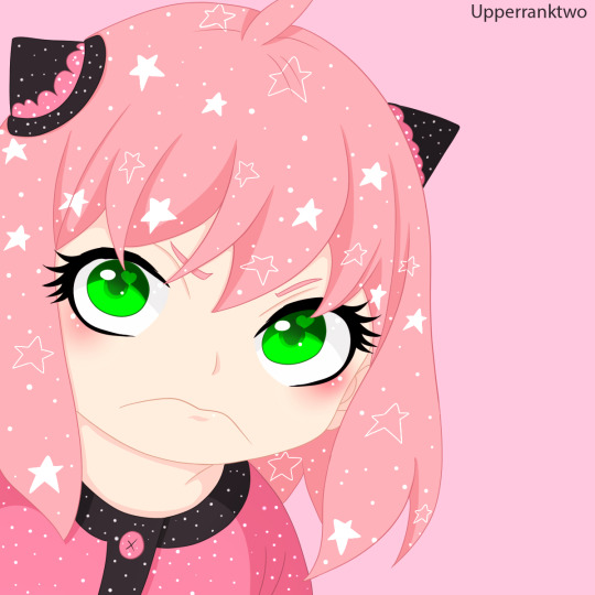
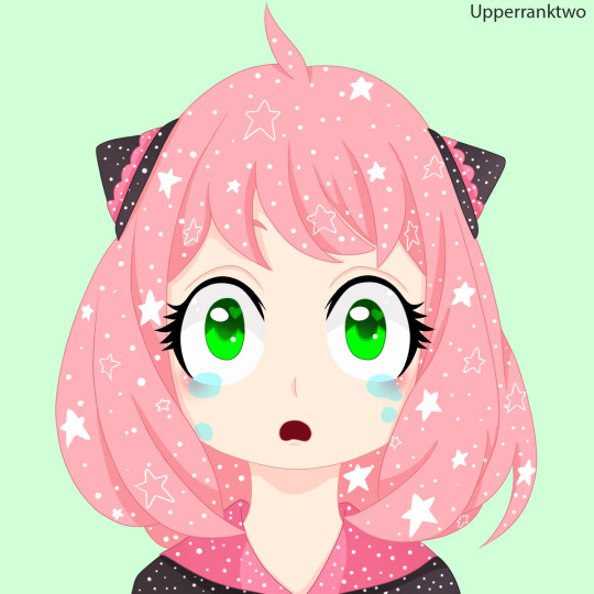
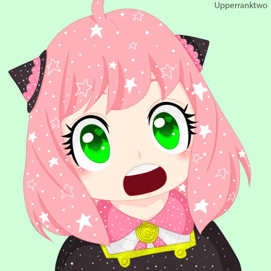
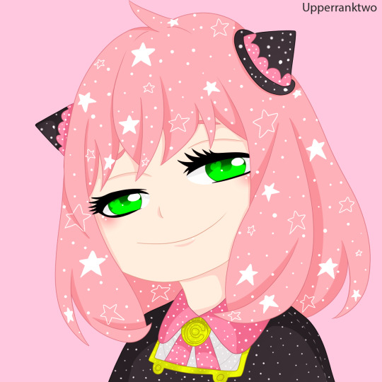
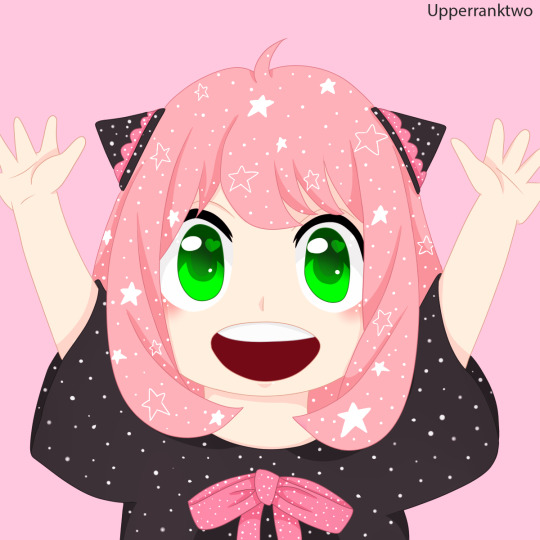
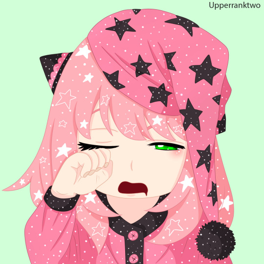
☆Anya Forger | Telepath☆
#sxfedit#sxfsource#dailyanime#anisource#Spy X Family#sxf#anya forger#sky colours#i'm sorrryyyy if these look messsyyyy!!! I'm not sure if I really love them but they took soooooo long to do!!!#I was gonna do yor first but I got distracted with this one but that one is half done so I'll have it up sooonnn!!!!#she is very cute I hope I at least did her a little justice <3#so much pink!!!!#I wanted to keep the colours consistent throughout which is why each image has the exact same colours!!!!#shading black is always so difficult sometimes it shows and sometime it doesn't !!!!!!!!! smh!!!#also her lashes are hard to line lmao!!!!#sorry for posting like 1 colouring a month they just take me so long to do :( but I'm working on them#anyway I hope these look semi okay#shading on the skin looks extra pink but it's okay when it's her <3333
639 notes
·
View notes
Text
Feedback review and refinement since formative hand-in
I was unable to get all the changes i wanted, done before formative hand-in, which was disappointing as i really wanted to get the most out of the feedback we will get from it. This was mainly because i got confused with the deadline (mix-up with my other class) and submitted at 5pm instead of midnight 🤦🏼♀️. But i have been working on completing my booklet since and making further refinements beyond the feedback i received last week in class.
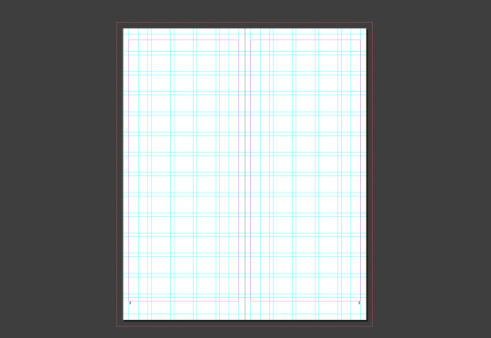
Just to mention it, I have tweeked my grid quite a bit since i started my earlier drafts. With streamlining elements on each page i added/removed parts of my grid and also changed my margins accordingly. Below is my current working grid.
I worked quite stricly to the grid i made, making sure that all the elements in my type specimen were consistant with the execeptions being intentional to "break the mold" so to speak.
The following are changes and refinements i've made to all my spreads - i also reordered the whole booklet. All of the change i made will be checked once i print it to see whether the changes look okay on paper and once the booklet has been folded. I'll do this this week so that i can finish it up for my presentation.
I removed the halftone effect on the images - will try this during printing to see which i like the look of better.
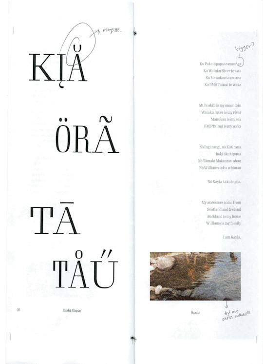
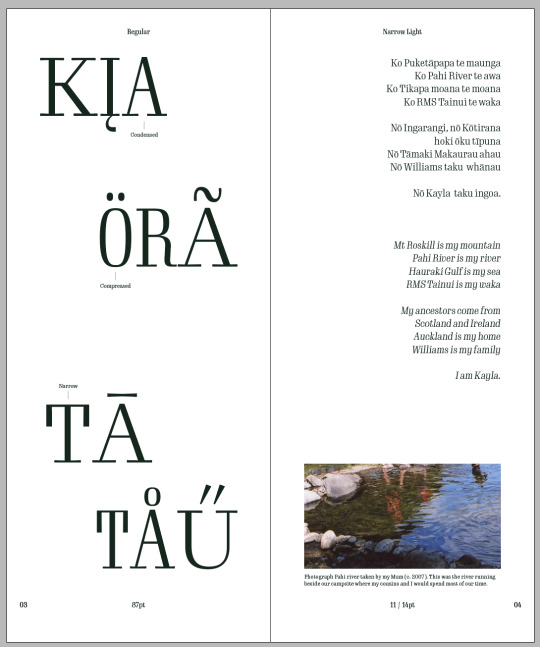
I amde my pepeha bigger - grouping the Māori version and english version rather than skipping between paragraphs.
After deciding on the header/footer elements and their placement i ended up removing the diacritic on the 'a' in 'kia' as it got in the way. I tried other diacritics to see if they would work but they were all on the top of the character and thus interferred with the header.
I also increased the width of the left spread and narrow the 't' on 'tā'.

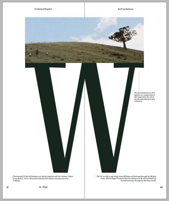
This spread got quite a dramatic change. I wasn't happy with any variations of the vowels and considering i have varying weights throughout my pages I though a page dedicated to showcasing the unique serif feature this typeface has would be a better use of space.
I am yet to see whether this spread will work or if its proportions work okay but so far i'm happy with it.

This double page spread underwent some minor changes in comparison to the rest but i made the text larger. Mostly because i had a lot of smaller text on other pages and this felt too much - it also shows the typeface at a scale i haven't got anywhere else in the booklet.
I did try just increasing the width to medium but at the smaller scale the text just didn't seem right.
I also removed the titles and to distinguish between the two piece of text i made one in italics and the other remained regular. Instead i put the titles and an explanation at the bottom of the page. I tried many variations of putting the titles in differen sizes etc. but none seemed to work.

I made a few more pages in my booklet fully coloured to add more contrast.
I also changed the page title to diacritics and ligatures which i think is more concise and reflects the contents of the page better.
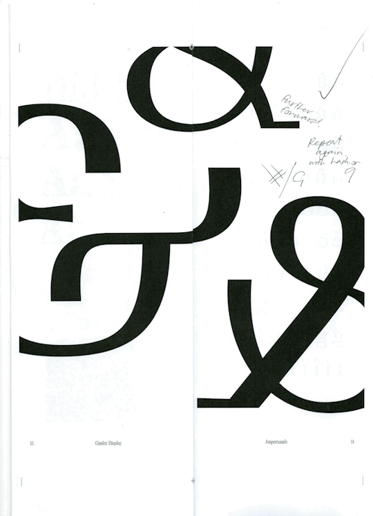

This spread had only minor changes, Emil said he really likes the layout so the only thing i added were the names of the different ampersands (as named by the DJR).
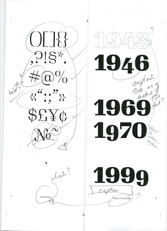
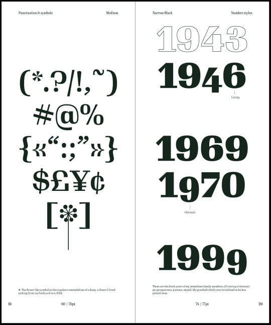
I decided to keep the outlined year on the right spread and added a caption to explain why i left it that way (as there is a reason). I also added labels to signify that the old style numbers were in fact a feature of the typeface and i didn't do it manually myself.
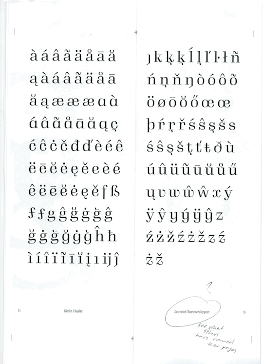
I made the symbols and puntuation page more balanced by playing with the idea of the symmetry i made in the third line. Also making use of the brackets rather than having them on a separate line.
I made a feature of the flower symbol that this typeface has - initially i had no purpose in adding it (originally on my cover design), however, being a unique symbol in the typeface i decided to make it into a flower (simply by adding a line) which made something that reminded me of a daisy (the significance of which is mentioned in the caption on that page).


I have kept the info page to the back as they will be points already covered in the booklet (history or rationale page) but just repeated for easy access.
The original idea i had for this spread just seemed like a bit of a waste of space and had too much white space for the booklet. The new design also brings in the block colour as well.
The biggest thing was Emil mentioned that he really liked the octathorpe in my typeface, it was quite unique and thought it would be a great idea to make a feature of it like i did the ampersands. I will have to see how it's placement is like once i print the spread but i like how it came out.
0 notes
Text
Matt Lowe Design - Graphic designer
Matt Lowe is a graphic designer based in south Yorkshire. I have decided to look at his website because I would like to explore how he conveys his personality and style. I will also look at how this is different from design agency's and illustrators.

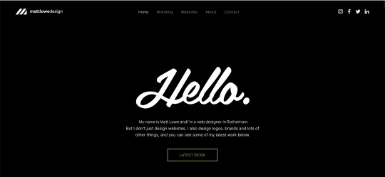
The layout of his home page is quite simple and uses negative space to frame the text. Lowe has used the same greeting as Wetdog but has used a script font which gives the greeting a more friendly and personal tone. The brief description he uses is brief and straightforward which hints at who he is as a creative. This is different from Wet dog who uses a more detailed description on their home page. Lowe includes details of his recent works when you scroll down. I like how he includes the name and a brief description with images which gives the images context. I think this is more successful than the style Matt Miller and Wet dog use which focuses solely on using images on their home page.
I would like to explore how I could use a coloured background to emphasise the images of my work. I think this method has worked well because the black contrasts with his colourful style.
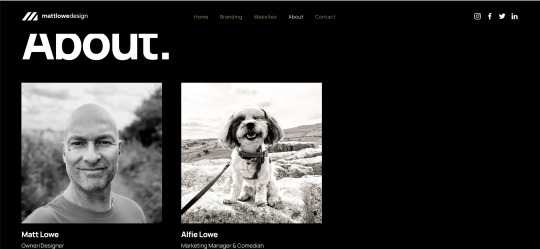

I like how Lowe has included a photograph of himself before describing who he is and how he works because it introduces him first. This gives the description context and makes the website feel more personal. I like how Lowe has used sections to break up his about page. This stops the text from becoming overwhelming and allows the audience to understand what he is describing in each section. It also gives the audience the option of only reading certain part which makes it easier to find the information they are looking for.
For my website I like the method of breaking it down into sections. However, I will use a layout that is more similar to wetdogs and Jenny Jinya because I would like to keep by bio straightforward and not too long.

Lowe has kept his contact page quite simple by only including a contact form. Although this is useful in keeping communication simple and straightforward, I dislike how he has not included an alternative method. This may cause problems because some people do not like using contact forms and their is a chance you miss mesages sent.

I like how Lowe has kept his footnote consistent throughout his website. The bold phrase of 'Let's design something great together' shows his personality and makes people want to find out about his work. I like how the phrase draws the audiences attention, making the footnote appear interesting. However, I dislike how he has made his email and address small and hard to find.
Following this research, I will explore how I can use a different coloured background for my website to make the images stand out. I will also explore how I can introduce elements of my personality in the text by including why I work the way I do and what motivates me.
Lowe, M. (2023). Home. [Online]. Available from: https://www.mattlowedesign.co.uk/. [Accessed 1 March 2023]
0 notes
Text
Reasons you should be watching Craig of the Creek
Not enough people are watching this wonderful show, so I thought I’d do my best to introduce people to it. It’s made by former Steven Universe crew Ben Levin and Matt Burnett, so if you’re missing Steven Universe while it’s on hiatus this is a great way to keep away the hiatus blues, or if you just enjoy in cartoons. It’s great for a whole list of reasons, which broadly fall into the two categories of great representation and great storytelling:
Canonical queer representation
- The witches premiere in the episode The Curse. If you aren’t sure if you want to watch this whole show definitely watch this one at least! It’s my absolute favourite not least of all because it’s about teen goth girls in love. It has a sequel The Last Kid in The Creek which is also wonderful, and the witches cameo throughout the series. I don’t want to spoil too much but The Curse is essentially about the two not wanting to be separated and struggling to admit their feelings for each other. (Spoilers: they do and walk off alone, blushing, staring at each other lovingly, while the kids aww at them)
- Bernard and his girlfriend watch a cooking show hosted by a gay couple.
- Other cameos, hints and coded queer kids such as JP’s sister (who has fancy dinner reservations with Kat, a woman with a shaved head who compliments Kelsey’s fake sword). There’s also Raj and Shaun (two very close friends), as well as several very boyish tomboys, including Handlebarb and Turner.
- All public bathrooms I’ve spotted in the show have gender neutral signs on them which is nice.
POC representation
- Craig, the main character, is black and has a loving family explored in depth, including an activist grandmother working for the council, a wise and fun grandfather, a supportive fun dad who loves his amazing wife, an adorable assertive little sister, and an angsty overachieving older brother who just wants to be a good grownup who loves his family and girlfriend.
- There are MANY characters of colour. There are black and brown characters, Raj is Indian, Stacks is Hispanic (and it’s implied she is an immigrant), there are several Asian characters, Kelsey is Hungarian and Jewish, a persistent background character wears a hijab (I’m pretty sure she was named at some point but I can’t find her name anywhere. She definitely has lines at one point). I’m sure there are others I have missed. No one is a stereotype as far as I am aware.
Subtle neurodivergent representation
- JP is possibly on the autism spectrum. I’d love neurodivergent people’s opinions on this, but while the representation isn’t canonical or obvious I think it’s good that while JP is represented as having different thought processes from his friends, he isn’t made fun of for it, at least not by them. It’s noteworthy I think that he’s the eldest of the core trio, probably because he finds it easier to relate to younger people who still share his imagination and care less about his unique way of thinking. His neurodivergence is explored most explicitly in the episode Jextra Perrestrial, so if you’re interested in this kind of representation definitely check that episode out.
Non-nuclear family representation
- While the main character is a member of the typical nuclear family you see on TV (except black, and actually interesting) most of the other families we see are not.
- JP is raised by his mother and older sister. His father is never mentioned and their house is definitely in worse condition than the others we see. His family works hard to take care of each other. His sister is a nurse and both her and her mother are away a lot of the time, but they both love JP very much. JP’s sister also happens to be really openly body positive. I love them a lot.
- Kelsey’s father is an only parent. There’s still a lot of mystery surrounding how Kelsey’s mother passed away. It’s a very subtle but important part of Kelsey’s character and comes through in really bittersweet adorable ways (not limited to Kelsey using her “half-orphan”ness to guilt trip a man into giving her money)
- Other kinds of families are scattered throughout the show, including families that move around a lot, a home-school kid with a strict mother, and more.
Unique approach to fantasy and sci-fi
- You know how most kids show will take a kid’s fantasy and bring it to reality? Well Craig of the Creek keeps the fantastical and nostalgic element of that line of thinking but never confirms or denies whether the kids fantasies are real or in their heads. And not in a Scooby Doo way where the fantastical elements are explained away, but are hinted as a possibility right at the very end. Instead, two perspectives (the fantastical perspective and the realistic perspective) are woven into every episode.
- This means there are two ways to interpret every episode. You can view the witches as real witches, or as goth teenagers. You can view Helen as a kid from another dimension, or a home-school kid who is never at the creek at the same time as the other kids. You can view Deltron as a cyborg from the future, or as an imaginative kid from a big city.
- This is super unique and fun to watch. They come up with so many new ideas and its always fun to figure out what’s actually happening, while still getting to relive childhood fantastical nostalgia.
- Almost all of these episodes use this to talk about an issue, but these issues can get quite complex and are definitely not shoved down your throat.
Overarching mystery plot about a colonialist kingdom / cult
- Love the slow burn storytelling of Steven Universe’s Diamond Authority? Love putting together the mysteries of Gravity Falls? Then you’ll love this plot about colonialism, classism, bullying, peer pressure and more and its mysterious build up including cryptic graffiti art and flower symbolism.
- Even before this arc properly begins, Craig of The Creek primarily centers around the microcosm of the Creek. Many of the episodes have a lot of commentary on society, politics and how different factions of people form and interact.
- The show is over 50 episodes in and this arc is only just starting to kick off so now is the time to catch up and watch.
- Fun complex villain(s)
Complex relatable characters
- Want commentary and nostalgia about horse girls, children’s tea parties, weird kids, angsty teens, young weebs, dweebs and more!? Every childhood obsession is represented in this show.
- Adults! All the parents and older teens in this show are just as rich and complex as the kids. They are all so interesting and fun.
- Want characters with arcs, aims, fun relationships and complexity!? Look no further! Redemption arcs! Revelations! Found family! It’s all here!
Great art and soundtrack
- Cute background and character designs that make you nostalgic as hell and are also beautiful and well thought out.
- Sometimes the art design is changed up for a particular episode to portray a certain fantastical / sci fi element. It’s very fun and engaging.
- An opening song that’s fun to sing along to, bittersweet ending song that makes me want to cry, a couple of musical episodes including a super fun rap musical episode, and a great OST
Queer headcanons
- There are tons of ways to interpret the show but here’s some of my head canons just to get an idea.
- (Note that despite my headcanons I use the pronouns for the kids that they use in the show cause I’m not certain about any of it and they’re kids who haven’t come out yet and also for clarity and consistency’s sake – I’m not saying trans people are not their genders. Don’t worry I’m nonbinary)
- I headcanon that all the main trio grow up to realise they are queer. They strike me as that weird group of friends that doesn’t fit in with the other kids and aren’t quite sure how they all came to be friends, only to later realise they all showed early signs of breaking gender roles and that’s why they stuck together.
- Craig definitely grows up to realise he’s gay, bisexual or queer. His admiration for characters like Deltron and Green Poncho are definitely crushes that he mistakes for a strong sudden and eager desire for friendship.
- Kelsey probably grows up to realise she is nonbinary, a trans boy or a WLW. I mostly headcanon this because I relate to her a lot and I’m nonbinary and queer so I said so. She reminds me a lot of myself as a kid. She throws herself into books, mostly fantasy for escapism. She fantasises and writes a lot for the same reasons. She dresses like a tomboy (She always wears her hair up in the same bun which strongly reminds me of my own childhood hair dysphoria) and she hangs out solely with male friends.
- JP gives me strong trans lesbian vibes, or to a lesser extent nonbinary vibes. (I know his sister is WLW coded but take it from me there can be more than one queer in a family). He is interested in girls, specifically Maney the horse girl (he even joined the horse girls for one episode). He wears a long V-neck shirt that is essentially a dress ALL the time. He’s aware that he’s different and while self conscious sometimes, mostly just wants to express himself the way he wants to. He also chooses to go by initials JP over his very gendered name Johnathan Paul (In a recent episode he names a ship after himself, calling it “The SS Johnathon Paulina”).
- (Sidenote if you do start watching this show and I see any nasty shipping of these characters in non puppy-love fashion so help me god)
Other reasons
- The show is at times very intertextual and references Princess Mononoke, Super Smash Brothers, Sailor Moon, Lord of the Rings, and a billion other things. It also has some fun cameos, including background images of the Tres Horny Boys from The Adventure Zone, a TARDIS from Doctor Who, and a Cookie Cat from Steven Universe.
- Honestly, this post hasn’t done the best job explaining why I love this show so much. You honestly just have to watch an episode to understand fully what I’m talking about, so give it a go! Watch The Curse at least, it only goes for 10 minutes.
#craig of the creek#gravity falls#steven universe#ok ko#cartoons#reccommended#recommendations#recommendation#hiatus#cartoon network#star vs the forces of evil#svtfoe#su#cotc#representation#show#watch#adventure time#bravest warriors#analysis#headcanon#shera#spop#we bare bears#clarence#avatar#atla#tlok#disney#the amazing world of gumball
2K notes
·
View notes
Text
18.03.2021 – Thursday Art History Lecture – Abstract Expressionism
This week’s Thursday lecture was about abstract expressionism. Julie started off this lecture by talking about Surrealism and its links to abstract expressionism as surrealism is about tapping into the unconscious mind, which is something, I explored in more detail in a previous blog entry.
Julie then went to social historical theory which explored what the social and political standpoints were at the time. She then went to talk about feminism and critical race theory in which it explores the erasure of people of colour and women throughout the history of abstract expressionism. Juliet then went to talk about Swiss Psychiatrist Carl Jung and how he had three separations of the psyche: the conscious mind, the personal unconscious mind and the collective unconscious. All three of these play the role of determining human behaviour. The conscious mind is our perceptions, memories and contact with reality which allows us to interact with the environment around us – the centre of this being the ego; being how you define yourself. Although Jung didn’t put much emphasis on the conscious mind as he believes this area was explored far too frequently and so decided to go into the study of the unconscious mind. In Jung’s opinion the unconscious mind influenced behaviour more than both the conscious and ego. There is then the collective unconscious that further influences human behaviour. The collective unconscious is engraved in the mind of all people through racial ancestral memory. You know things automatically from the collective subconscious, such as a fear of the dark or a fear of snakes, its something no one had to tell you, its just automatically known throughout your own subconscious. Jung further argues that completely new ideas can present themselves from the unconscious, thoughts and ideas we haven’t even thought about before. He then argues an expression that They grow in the dark depths of the mind like a lotus and form the most important part of our subliminal and unconscious mind. Something that was then further explained by Juliet was how the fear of the dark is relevant to the collective unconscious mind wherein she questions why there would need to be a fear of the dark in the first place and where does it come from? It comes from the collective unconscious, the automatic fear and precaution of the possibility of someone lurking in the dark. No one had to tell you or warn you, its just something automatic you understand to avoid in order to keep yourself safer.
Action Painters
There are two main types of artwork within abstract expressionism: Action Painting and Colour Field Painting. The first to be talked about was Action Painting// Painters. Within these paintings there would always be a sense of flatness of the canvas, without any depth such as with the work of Jackson Pollock – a well-known Abstract Expressionist Action Painter. Action painting is; as the name suggests; all about the action behind the painter, there is no focal point when it comes to action painting, its all about the statement and action behind both the paint itself and the artist. An art movement that’s very opposing to this is the work of the Renaissance, in which there would be endless amounts of depth within the artworks, whether it be the depth of a building or landscape as the focal point or the perspective of people being situated in a room, where he focal point would be the people and there’s an overwhelming sense of depth and detail in each piece to the point it feels you can step into them – they aren’t flat at all; but it of course doesn’t make them any better or higher standard, art is art! whereas with renaissance where there is a lot of depth as if you can step into the painting.
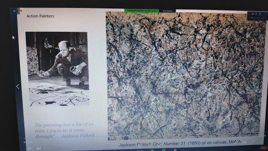
Another artist well-known for their work around action painting is the work of Lee Kranser. Her piece shattered light is all about expressing a breath of emotion, colour and form. Her work was often excluded as she worked in several styles, but furthermore because she was the wife of Jackson Pollock and as a result her work as an artist suffered as a result of the underlying sexism of the art establishment at the time.

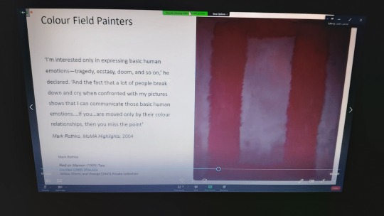
Colour Field Painters
The other side of Abstract Expressionism is the work of Colour Field Painters such as Mark Rothko where he stated: “I’m interested only in expressing basic human emotions – tragedy, ecstasy, doom and so on,’ he declared. ‘And the fact that a lot of people break down and cry when confronted with my pictures shows that I can communicate those basic human emotions… if you… are moved only by their colour relationships, then you miss the point.” Just from this quite alone its clear to see the motives behind each of his pieces. He is looking at the spiritual experience rather than realism or ego, all he wants to express is basic human emotions rather than just showing a relationship of colour. Although, he would spend days just thinking about the colours he would use for each painting and to him, painting was his way of communication. His work as furthermore expressing his own struggles with mental health in this way and he sadly ended up committing suicide. I felt inspired by the work of Rothko and I had the idea of painting my own colour field piece based on my own human emotion of dread, fear and trauma through blocked colours and shapes such as with his piece Red on Maroon painted in 1959. I have a constant repeating image in my head of the door of my living room being cracked open slightly when its night, so all of the surroundings would be dark and the only light source would be coming from the living room. This has been an image and consistent memory that I link to my own emotional abuse and I think it would be the perfect imagery to explore through the idea of colour field painting and being inspired by the work of Rothko.
Another colour field painter was Helen Frankenthaler who would use watered down acrylics to give her paintings more movement and to allow the paint to be absorbed into the material of the canvas. She would additionally tilt the canvas in order to experiment with the fluidity of the paint to get the effects she wanted out of her paintings.

How have artists depicted women throughout the history of Abstract Expressionism?
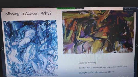
The last segment of this lecture was exploring how women have been depicted throughout the history of abstract expressionism. There was a book created as a result of the erasure of women throughout abstract expressionism by Joan Marter called Missing in action! Which explored and showed in detail all the women of abstract expressionism. There was also a quote by Marter about women being excluded, “Although artists have been writing about abstract expressionism for more than 60 years, most of the women continue to be marginalised. Why is this?”
Women were excluded from the narratives and spaces of abstract expressionism. They wouldn’t be allowed into bars, spaces that discuss, express and present artworks. They would have less access to selling their artwork compared to men so they would have less of a chance to have their work be known and they wouldn’t be allowed spaces in exhibitions, and if there were any offerings they would be very minimal. Even within photography this would be very clear such as with photos of Jackson Pollock with his artwork. Pollock and his artwork is the focal point of the photo taking up at least half of the photographs composition. His wife Kranser is seen sat in the back on a chair, shown as being submissive and still despite being a action painter and abstract expressionist herself. This isn’t shown or represented in this piece, she isn’t shown as an artist here, she isn’t shown having movement or action such as with her husband Pollock who is much more assertive here, she is simply part of the static background.

The last segment of this lecture was about the comparison of two artworks depicting women and how they have been represented and depicted throughout the paintings. The two paintings were Woman 1 by Willem De Kooning painted in 1952 with oil and metallic paint. The other by Grace Hartigan called The Persian Jacket, painted in 1952 with oil on canvas. Both paintings were created within the same year using similar materials and a similar confronting composition. Hartigan’s feels more authoritive and has a much stronger semblance of colour and contrast. There seems to be a sense of dominance and power with her piece, even the title of The Persian Jacket gives the piece an overall sense of royalty and power. This is further shown by her composition being authoritive and powerful as she is seemingly sat on a throne to be visually higher than the viewer and she holds her pose with confidence stating she knows her place, she knows her power and she’s proud of it. Meanwhile, with Kooning’s piece there is barely any colour and application and texture wise it appears very scratchy. Overall it feels very much as if it’s been created with the idea of the male gaze in mind; something created for men to look at and to agree with such as with her large breasts which are clearly showing as her clothing is open. The woman depicted here feels more submissive, like she’s selling herself to get the attention of others. Additionally, the colour within this piece is washed out and doesn’t add anything to the piece overall, if anything the lack of colour takes away from the piece and leaves her looking sad and lost as she fades into the background. This is a stark contrast with Hartigan’s piece where the use of colour and contrast is almost shouting out to the viewer as if to say look at me, I’m a woman, and I’m proud to be seen.


Overall, I feel like I have learnt a lot as a result of this lecture as I previously had no past knowledge of the depth of abstract expressionism or even that there are two main aspects of it. I found it interesting to learn more on this subject and overall expand my knowledge around art history.
2 notes
·
View notes
Text
52)Presentation Slides
OPENING SLIDE

To begin our presentation, Charlotte is going to introduce our brand; create a warm welcome and set the pace of the presentation.
Charlotte – “Good Morning, we are group one, and throughout this presentation we will be introducing you to our new brand Gaia.”
INTRODUCTION SLIDE

Charlotte will continued on to the next slide to communicate what our overall brand story is.
The brand story is something that we have been working on as a group pretty much since the beginning. I like our story as I think it clearly reflects our brands message and mission statement. I love the layout of this slide as its simplistic and elegant and I think it really reflects are target demographic. The slide is overused by text but goes into enough detail. The font choice is also good because it is clear, concise and eligible for the audience to read- its also a nice contrast from the Amalfi Coast font used for the brand name.
Charlotte
– “Our brand story is, here at Gaia, we want you to feel like the true Earth Goddess you are. With our size inclusive, stylish and elegant designs made both ethically and sustainably. We aim for our loungewear to leave you looking great and feeling empowered. We are diving deep into clean production that is not only beneficial to you but for the earth as well.”
VISION AND PURPOSE SLIDE

Heather will then pick up from where Charlotte left off and will go into detail about what our brands overall vision and purpose is and explains each point and what they mean for us as a brand. Again the information on this slide is kept to a minimum and focuses on the 3 main key components of our vision and purpose, which will allowHeather to go into more detail without overwhelming the audience.
Sustainability, responsibility and inclusivity have been the main focus of our brand since the very beginning, so I am glad that they are highlighted as our main focus points and support our brands message.
Heather
– “Sustainability-
All of our fabrics, yarns, trimmings and finishings are either organic and sustainably sourced or are made from 100% post consumer recycled material. This means we never deplete our planets natural resources faster than we can produce them.
Responsibility-
Everybody who works at Gaia are insured a competitive wage and our places of work are regularly inspected to guarantee safe working conditions.
Inclusivity-
We want all women to feel comfortable and confident when they shop with us. Our sizing ranges from a UK size 4-24 with hopes to increase this in the future.”
CUSTOMER PROFILE SLIDE

Following up from the vision and purpose slide, Narnia will begin to talk about our customer profile.
I love the layout of this slide as I think the collage of images on the side really bring it together and communicates our customer/demographic of 25-40 year old, professional women. I think it adds a contemporary feel as Narnia pointed out that our customer is an ‘Art lover’.
I think Narnia did really well at pinpointing exactly who our demographic is by exploring their hobbies, interests, psychological make up and consumer habits as this was something we were told is important to explore and communicate.
Narnia – “Although at GAIA we pride ourselves in our inclusivity we do find our main customer audience to be a woman between the ages of 25 to 40 years old who are at a middle-class economic level. Demographically, we at GAIA want our customers to be economically aware, professional women earning a sufficient wage of 30k a year and above, who while wanting comfort also seek fashionable and classy loungewear that can be dressed up and worn out as well as dressed down.
The psychological makeup of our customer is an art lover who is fashion conscious, a discriminating buyer, university educated with occupational accomplishment and an economic activist.
The habits of our customer include shopping, reading, walking, yoga, watching movies and spending time with family.
In terms of their consumer habits, our customers enjoy shopping around once every month or two months at middle to high profile retail establishments, fashionable good quality products, consciously seeks out sustainable and economically friendly brands.”
BRAND IDENTITY SLIDE
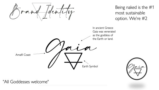
Following on from the feedback we received in our previous group meeting, the brand identity slide and to be altered. The colour palette has since been replaced by what the logo would look like as a social media icon and a little bit of information on the font used for the logo is highlighted as well as the origins of the name to add some context. During the presentation Me and Narnia will discuss why we decided to call our brand Gaia and how the logo was formed and how it fits into our overall identity.
I think that this slide clearly explains our brand and logo and how the colour palette used for our logo reflects the elegant and refined look of not only the presentation but our demographic as well. We felt that it looked more professional along with the script font used for the logo.
Narnia - “For our brand we decided to call ourselves Gaia. Gaia was venerated as the goddess of earth or land in ancient Greece. We think the name clearly reflects our goals of being sustainable and inclusive- supporting women empowerment through the use of a goddess accompanied with our ‘all goddesses welcome’ tagline.”
Zhanté - “The logo is formed with Amalfi coasts cursive text that projects a feminine tone overall. Partnered with that is the alchemical symbol for the earth element, which further helps us to be identified as a sustainable brand. Both elements are identifiable to our brand and can be separated and used as standalone logos across our collection and promotional front.
We decided to keep the colour palette quite simple as the black and white creates a more refined, elegant and professional look as it reflects our target audience of professional women aged 25-40 and we also want our collection to speak for itself.”
TREND SLIDE
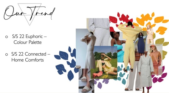
Charlotte and Molly worked on the trend slide together. We decided as a group to look into two S/S 22 WGSN trends and blend them together. Charlotte will discus the Home Comforts trend and created a moodpboard to showcase this and Molly looked into our colour palette which is inspired by WGSN’S Euphoric trend.
I love the overall look of this slide as the mood-board really adds a pop of colour and contrasts well with the black and white theme we’ve been consistent with. It just further highlights the bright and bold colour palette of our products.
Charlotte - “Our trend is a combination of the colour palette from the spring summer 22 euphoric and the concept of home comforts from spring summer 22 connected, both from WGSN.
The concept of home comforts is based around comfy, loungewear home styles lasting long after lockdown. Loungewear isn’t just about comfort anymore it also needs to look into wellbeing with health being a consumer priority. Home comforts is relevant for loungewear and sets with cocooning adaptable silhouettes and adjustable features including elasticated closures and button-down finishes. The recommended materials for home comforts are organic fabrics including hemp, linen and cotton with hypoallergenic, rejuvenating and deodorising benefits. We have taken away aspects of home comforts for our brand including the loungewear home styles, organic materials and adaptable and adjustable silhouettes with elasticated features and tie-waist closures. With a future plan to look into smart fabrics.”
Molly- “The reason why we decided not to keep the home comforts colour palette is because we wanted something bolder and brighter. We went with the forecasted trend euphoric and the colour palette is inspired by the trend board colour me happy. The colour palette consists of lavender Silk, Fresh Ginger, Nectar, Daylight Blue, Turquoise Tonic, Orchard Flower and Red Glow.”
PRODUCT SLIDE
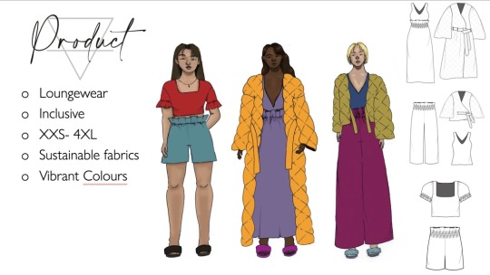
Both Lisa and Charlotte worked on this slide, discussing our collection and the type of products/ styles we’ll selling as well as the materials that will be used. Charlotte will begin explaining the garment shapes and design details of our first range and then Lisa will discuss the colours and fabrics.
Charlotte - “The first loungewear collection for Gaia consists of three outfits designed for release in the spring of 2022. We’d like to consider ourselves as an inclusive brand to all and offer all of our products in sizes XXS to 4XL.
The first outfit in our range is a plunge V neck sleeveless full-length dress, with an elasticated ruffled waist. The dress is paired with a collarless full length quilted coat with wide sleeves, complete with a long sash belt. The second outfit consists of three items including elasticated paper bag style lounge pants, a sleeveless tank in the same style as the dress, these are paired with a quilted wide sleeved crop jacket with a tie waste. The third outfit is a pair of elasticated paper bag shorts with a cropped square neck t-shirt with ruffled sleeve detailing matching that of the bottoms and dress. All of the outerwear and bottoms from this collection have seam pockets and there is a paper bag style detail running across all three looks of the collection.”
Lisa - “Looking at the garments we create, we plan to use recycled polyester and organic cotton. Which would be coloured through a natural dye process and use of sublimation for the polyester fibres which wouldn’t be as harmful or wasteful. And with the jackets and coat we would use cotton batting.”
PRICE SLIDE
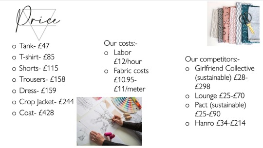
After getting feedback from our initial slide, Natalie pointed out a pricing issue and miscalculations as it was initially too inexpensive. Heather worked really hard to correct this issue in such a short amount of time and has made sure to cover all the points including; labour costs, fabric costs and price comparisons with our competitors and taking into account the sustainability factors.
Heather
– “Our first clothing line is priced from £47 - £428. Being a sustainable and ethically inspired brand it is expected that our products may cost more than less ethical companies on the market. As an example we pay all of our employees an average wage of £12 an hour including everyone involved with the production of our garments. Compared to one of our main ethical competitors girlfriend collective, who pay the living wage for seamstresses in Vietnam, our employees earn over 10x the amount they do. We believe that this will not deter our customer base as they care far more about the impact they have than how much things cost. Our pricing is based on a direct to customer market. We hope to operate a circular economy in the future so at this time we are not taking on wholesale options to keep things simple.”
PRICE SLIDE

Molly and Pranil worked together on this slide. I think they were really clear with their research. Molly focused mainly on the online stores and was able to bring reference to the pandemic and how this will affect consumer habits and what this would mean for us and our brand. Pranil then went onto talking about our idea of a pop-up store and went into detail on the costing of the pop-up shop location that we had decided on as a group.
Molly- “Our clothing will be predominately sold online and you can purchase the items through our website or through our Instagram shop. We decided to open an Instagram shop as well as just our website because Instagram is a massive social media platform where we can gain a large following, we will also be able to reach a bigger target market of customers. One other reason why we wanted to promote and sell through Instagram is due to the current pandemic, as more and more people are now shopping online and turning to Instagram to pass the time so we hope our brand reaches a wider range of customers through our posts and advertisements. we also plan to set up a pop-up shop in the bull ring in Birmingham city Centre, where we will also sell our products.”
Pranil – “As for our pop-up store, we had scouted out a location that we had deemed perfect for our brand, and we had found an open and well-lit store for hire in the heart of the Birmingham, within the Bullring. This store is ideal for our brand as the Bullring is a highly populated area, and we feel customers going in and out the building will be inclined to help local businesses in the area, and our demographic will surely be around the building. The price for this renting out this store totals out to £132/day and we all agreed that having the store up for a month would be enough time for people to notice us, which come to final cost of £5,160, for 31 days.”
PROMOTION SLIDE

The promotion slide was my responsibility to create and I really wanted to ensure that I had tangible promotional ideas that were relevant to our brand; taking into consideration the sustainability factors and our target demographic of 25-40 year olds. I looked into every aspect; from giveaways, to collaborations, catwalks, possible magazine features and even created a mock up billboard to help promote our brand more publicly. I then went on to create a separate influencers slide as I thought that was an important way to help get our brand more publicity on the social media front.
Zhante
– “Looking at the ways in which we can get Gaia as brand out there and create a sense of validity around us, we will be using such means as reaching out to sustainable fashion bloggers like the sustainable edit and magazines such as KeiSei and more commercial magazines like vogue for featured interviews so our consumers can get to know Gaia as a brand better and to answer any unanswered questions as well as write and review our products spreading our message across a wider audience. We will also be looking at future collaborations with other sustainable brands which support our ideals, such as girlfriend collective as an example to help gain international recognition. We will also be hiring out billboard spots across the UK to visually promote our collection and to create further interest eventually moving this worldwide. In addition to this, we will also be working with the fashion of nature exhibition to display our collection within a live event as well as taking part in the first ever sustainable fashion week, sporting our collection on the runway later this year in autumn 2021. In the near future we will be looking into partnering with campaigns and charities surrounding the idea of sustainability and slow fashion and hopefully create our own campaigns and produce panel talks that support and help spread our message even further.”
INFLUENCERS SLIDE
Narnia will take over from me on this slide as it will give me time to prepare for the packaging slide. This slide showcases the influencers that we would like to promote our products. Each influencer has a good reputation and online following and are all focused on sustainable fashion. Its important to note that these influencers will more than likely be in our long term goals as we have to think about how much it would cost.
Narnia – “As Instagram is a big platform to promote brands and is the easiest way to garner attention, we will be reaching out to instagrammers, sending PR so they can review and promote our collection through Instagram stories and reels to their audience which will create more traffic to both our website and Instagram page. Through this we can then run giveaways and competitions.
And as Gaia gains more and more attention we will be looking into eventually expanding our group of influencers which can eventually lead us into celebrity brand endorsements and possible collaborations.”
PACKAGING SLIDE

The packaging was again, my responsibility with the help of Narnia.
I tried to cover everything from bags, to box packaging, clothing tags, thank you notes with promotional codes that will be inside the packaging as well as gift cards. I had to do extensive research as I wanted to make sure that the packaging reflected our brands goals of sustainability. The only thing that I couldn't find details on, was the pricing of the packaging as a lot the sustainable packaging manufacturers haven't publicly stated their prices as its based on quotations.
Zhante – “We tried to be as thoughtful about the materials we use for our packaging as we are with our collection and are constantly looking for innovative ways to minimise the use of single-use packaging.
We recognise that single-use packaging exerts an impact on ecosystems at their extraction point, during production and in disposal.
Therefore, we have worked with companies like TIPA and Iggesund who are manufacturers known for their bio based, fully compostable, flexible and sustainable packaging solutions to create the perfect blend.
Our BPI certified packaging is 100% sustainable, 100% eco-friendly and is 100% good for the planet; made from a selection of paperboard box packaging which can either be recycled or composted. Our garments will be protected and wrapped in clear TIPA plastic made from vegetables, which is designed to breakdown into compost, replacing the overuse of industrial cast film packaging.
This is great as it allows us to be consistent with our sustainability without compromising on the aesthetics.
Our thank you notes that will be inside every packaged delivery will be made from 100% recycled and plantable flower seed paper as well as our tags for both our bags and clothing.
The bags will then be a combination of sustainable paperboard and again coated with a plastic film wrap-created using things such as cellulose and compostable gloss.
And our Gift cards will be plastic free and made from a similar material called invercote paperboard.
We have consciously decided not to include any unnecessary extras within the packaging such as tissue paper as we believe this will just create more unnecessary waste and recycling in the long run.
We recognise that this is a more costly approach than typical packaging and would likely have to bump up the delivery prices to help compensate for this, but we believe that the cost of this is cheaper than the cost of damaging the planet.”
THE FUTURE SLIDE

Our future slide focuses on the future goals of the brand. The slide has been split into short/mid-term solutions and what the brand hopes to be doing in the long term, which will be discussed in further detail by Lisa during the presentation.
We were initially planning on wholesaling our products, but because we wanted to be circular in the future we thought that that might be difficult to achieve and counterintuitive, is we decided ti scrap that idea completely.
Lisa – “After establishing our brand, in the short midterm we plan to open a physical store including the expansion of our range for a more inclusive collection through sizing which we plan to use CLO3D technology which would allow us to reduce the waste in pattern making and thus being more sustainable.
In the long-term we aim to use self-healing fabric as it would reduce the damage on the garment and less waste as well as encouraging customers to return the clothing that we would then recycle into new clothing so that this creates a more circular ecosystem.”
CLOSING SLIDE

For the closing slide we kept it simple and directed it at the audience so that they can ask us any questions. We, as a group tried to anticipate what questions might be asked at the end of our presentation. As pricing was something that was brought up in our feedback tutorial, I decided to look into the prices of such things as how much a billboard would cost, and how much influencers tend to charge- which was pretty elusive as it depends on the individual.
Overall, I am very pleased with our presentation. I think everyone did extensive amounts of research and worked really well on creating their individual slides.
4 notes
·
View notes
Text
EVALUATION (WITHOUT IMAGES DUE TO WORDCOUNT)
LEVEL 3 EVALUATION
NAME : Abbie Harper-Rowe
PATHWAY: Fine Art
PROJECT TITLE: Behind Our Eyes
My FMP concept is ‘MANIFESTATION’. After a long while considering my various choices I ended up concluding that this theme had the most potential in terms of what exactly I wanted to produce. As it’s my final project I wanted it to be special, a truly experimental and fun project, and a concept such as manifestation is limitless. Such an open theme attracts many thought processes and ideas, and I was instantly swamped with idea after idea and was struggling to settle on what I should make this concept into. I began researching what exactly manifestation is, what it feels like, when it happens, who experiences it. Eventually I decided that it would be interesting to play with the visuals that manifestation can bring, the blurring of reality within a daydream, the hum of lights behind closed eyes on the edge of a dream – and how I could present these ideas visually within my art. Upon this conclusion, I wrote the aim for my project :
“My aim for this project is to create a series of work that achieves the mystical feeling of manifestation - a collision of conscious and subconscious, reality and fantasy, the concrete and the abstract.”
And so, my journey began, and I started focussing on what this aim would mean to people, and who the audience of my work could be. As I addressed before, manifestation is such an open concept that evolves as you judge each person’s experience – there is no set shape it settles in. I concluded that the audience of my work is as limitless as manifestation is, the open concept would allow me to produce work that the audience can interpret for themselves – allowing my artworks message to differ from person to person. Ironically, my artwork would spark a manifestation all of its own, as each individual thinks up their own reality within my art. Of course, with such freedom there is room for error, and it was tricky when I encountered problems with creating work that reflected my concept. I overcame these issues by looking back at my aim and referring to it consistently throughout the project. Due to this, my concept and purpose of my work has remained consistent throughout the entirety of my project.
In terms of practical work, this project has been my most experimental since beginning at college. In the first workshops I reflected back on familiar techniques such as collage and fine liner drawing – refining techniques and playing around with the effects I could produce. In the first few weeks we had workshops that covered new techniques, such as cyanotypes inspired by Catherine Jansesn, photo/chemigrams, and layering with acrylic paints inspired by Jean Michel Basquiat. While exploring these new media I was constantly wondering what ones would allow me to reflect my concept as efficiently as possible, and what I would enjoy creating. I particularly enjoyed the photogram workshop, and I loved watching my collages develop into these beautiful, almost eerie pieces of work. The dark areas became light, while the light areas loomed into shadows that peered around the edges of clashing details that both embraced and repelled. I loved how bold they were, the fact they were originally collages meant the crisp details of the paper I had carefully carved were still intact and made for perfectly sharp pieces of work. But I wasn’t satisfied, I wanted to dive deeper. I decided to experiment in the next session by photocopying one of my paint experiments onto acetate and repeating the process with a softer piece of work, one that was carefully blended and layered rather than having sharp details. The results paid off, and they worked in the opposite way to the previous photograms. These almost dreamlike scenes of dark mist that rolled across the page, dotted with stencilled letters and waltzed with a spray of pale paint that had once stained my hands black. I decided that I adored the artwork this method produced, and that I would focus on this throughout my project.
The way in which I would link this back to my concept was my next obstacle, how exactly could I create these pieces and label them as manifestation? I pondered on this for a while, and researched deeper into artists like Niki Hare (paint artist), lászló moholy-nagy(photogram artist), and Hannah Höch(collage artist). I decided why not combine the three methods, create abstract collages and then photocopy them onto canvas – giving me a way in which I can layer with paint to achieve a display of both the bold and the dreamlike – which I can then produce photograms out of. This way, I can create mixed media outcomes that blur a crisp scene of reality with imagery from the collages and add layers of acrylic in order to achieve that effect of mist, rolling across the page. Add the photogram process that inverts the colours into to a black and white fuzz of art, that both emphasises and distorts the details into a surreal visual experience. Similar to a daydream, the moments before you sleep, manifestation.
Throughout this thought process I documented all of my research, thought processes and experiments onto my blog – which I believe has been effective in aiding the progression of my artistic journey within this project.
When I began my final outcomes, my experimental pieces had really paved the way for a successful process. It all ran smoothly, creating 20 collages which I then photocopied onto canvas and layered with paint and fine liner. I was progressing quickly, and the outcomes were looking strong at their final stages before I made them into photograms. However, it was when I began my photograms that I encountered problems. The number of layers – while effective in portraying my concept – were difficult to enhance on the photograms. The original collages were obscured due to the amount of texture added onto and around them. I applied my problem-solving skills here, experimenting with exposure times and changing the contrast levels on the photocopier. While my outcomes weren’t as clear as I may have hoped, they were miles better and I had overcome the obstacle – which in turn lead to me having more ideas on how to exhibit my work, which I have documented on my blog.
My practical work has been effective in achieving the purpose of my proposal and theme, the research I applied within this project has visibly allowed me to progress, and my experimental practical pieces show clear development from the very beginning of my project. The work itself speaks the aim of my project, and portrays what manifestation feels like to me and to others – which is all I hoped to achieve going into this project.
Evaluating my work throughout this project has played a role in allowing me to progress. I had kept up with weekly evaluations on my blog, as well as smaller daily posts on what I achieved on college days. I refer back to the plan for my FMP regularly, focussing on my aim as well as how I can move forward to my next steps. I regularly had conversations with all of the lecturers on how my work is going, what I’m planning for the day and what I could do to improve. I took all of their advice and applied it throughout, and I saw improvements. On my blog you can clearly see my development as I’ve progressed towards my final outcomes – through self-evaluation, research, practical development and discussion. The visible strengths of this project have been the practical work I’ve produced – as its been consistent and it documents a clear journey to my final outcomes. The weaknesses have been keeping up to date with my blog, which in places feels slightly vague – although it still does its job in presenting my thought process throughout this project. Overall, I’ve enjoyed how experimental this project has been, I’ve learnt a bunch of new processes and have applied them in a way that has allowed me to develop as an artist. I have also learnt the importance of self-evaluation, as it has played a huge role in pushing me forward this project – I’ve overcome obstacles and problem solved based on advice given to me by my peers and I achieved this by breaking down my journey into smaller pieces that I evaluate regularly – rather than reaching the end and realising that all of my problems are waiting unsolved. I think that my work both practical and written has been effective over this whole project and I’m proud of the strengths I can see in my work – of course there are weaknesses but I am pleased with how I have worked and overcome obstacles overall – which has made for a successful and enjoyable final project.
1 note
·
View note
Text
Cryolipolysis Anti
Cryolipolysis Asserts To Kill Fat Cells Through The Skin
Content
Dealing With Fat Pockets.
Treatment Day.
After Your Treatment.
The results of Cryolipolysiss ought to begin within a few weeks with the full effects taking 2-3 months. Each location will certainly last 50 minutes, however with our most current sophisticated equipments that includes 2 heads as opposed to one, unlike our rivals, we can deal with 2 locations at the very same time. LED COLOUR TREATMENT promotes collagen production, blood circulation as well as Citochromes, healthy proteins that reply to light and also colour to produce natural biochemical response in the skin. The majority of reports about CLL consisted of in this testimonial did not have strenuous clinical methodology in research style or in end result measurement.
CoolSculpting vs. Kybella: Doctors Explain the Differences - NewBeauty Magazine
CoolSculpting vs. >> more information of la-lipo.uk Cryolipolysis results plus : Doctors Explain the Differences.
Posted: Fri, 23 Aug 2019 07:00:00 GMT [source]
It is necessary you feel great that you have picked a treatment that is right for you. Some wounding of the treatment area that can last for as much as 5 days. Fat cells ice up from -1 level so a reduced temperature level is not needed. Remember we can additionally tie courses with each other to conserve you money and time.
Dealing With Fat Pockets.
We find that it is very important to take images so you can see for yourself the distinction in order to fully appreciate the distinction in appearance. Skin appearance and look is as vital to customers as the real inch loss. Our photos do not include your face, so you can never ever be recognized. However we will only ever before share your photographs on our social media sites or in our clinic if we have acquired your consent to do so. No, the excellent feature of the Cryolipolysis service is that you can go about your day as typical. We do recommend you to raise your water consumption by 2 litres to assist with the fat removal.
Our programs are for individuals that already hold a minimal charm certification of NVQ Degree 2/3 or comparable and also want to broaden their treatment offering. Cryolipolysis is finest put on shallow fat pockets and finest called sculpting and also refinement for customers wishing to target persistent locations of worry. For additional information as well as to reserve an appointment to discuss cryolipolysis at the Hilton Skin Center in Reviewing pleasecontact ustoday. To start with you will certainly really feel a sensation of pulling as the applicator pulls in the area, this comes to be less apparent after a couple of mins. My individuals are then quite happy to sit and also review, pay attention to songs or play with mobile phones while the therapy session continues. This more recent way of targeting and minimizing areas of undesirable fat, without the demand for medical incisions, appropriates for both men and women to tame their 'shaky little bits'.
Treatment Day.
To book why not look here or this therapy, please call our pleasant team now. For real-life prior to as well as after instances revealing the effectiveness of this therapy and our various other remedies view our outcomes web page. You can expect to be able to resume your routine life immediately, making it the ideal lunch break treatment. There's no demand for anaesthetic with Fat Freezing and the skin's obstacle is not compromised, leaving you to proceed with your typical everyday regular understanding that you'll be left with risk-free and also natural results. This will be redeemed versus the price of a Cryolipoysis treatment if scheduled on the day of the consultation.
Everyone, both men and women, have locations of persistent fat, or 'unsteady little bits' as I such as to call them, that we want to see gone, and diet regimen and workout isn't constantly the very easy answer. Clinicbe ® has a holistic technique to skin care, exceeding the prompt worry of its individual to comprehend as well as treat the individual all at once.
After Your Treatment.
Take photographs every 2 weeks and also contrast them against each other. Unlike our rivals, our treatment cup covers 360 degrees of the mug area-- not just the sides. As it's a procedure done by an expert, it can precisely target anywhere, such as stomach, thighs, or arms, so that the client can select their bothersome locations. Your specialist will certainly take some before images and mark up the area you desire to deal with.

More research must be urged to prove with methodological rigour positive results of this therapy modality as well as to figure out groups of clients in whom most good end results may be expected. A retrospective cohort research study in between April 2016 and also August 2018 was executed. Thirty-five people undertook a solitary 45-minute cycle of cryolipolysis to the submental area utilizing the Coolsculpting System. This research aims to examine the quantity loss using a three-dimensional evaluation following submental cryolipolysis. None of the researcher's individuals showed any recurrences of their initial complication for which they were dealt with. Take girth measurements of dealt with areas such as arms, midsection and also upper legs.
You need to wait a minimum of 3 months after normal birth of your baby or a minimum of one year after a C section. It is best to obtain GP authorization message giving birth before starting with treatment. You might see outcomes after 2-4 weeks however the complete outcomes will be seen after 8-12 weeks. We do demand that you come back at week 6 for an acting adhere to up and then again at week 12 for a last procedure and photo if ideal. These comply with ups are totally free of charge so there are no service charges for this service. Ought to you have any type of problems or questions either prior to or after your treatment after that you are more than welcome to stand out right into the beauty parlor for a conversation or offer us a call on If you would certainly such as a complimentary consultation to review therapy in London you can also set up that on this site too.
Should I wear Spanx after CoolSculpting?
We recommend wearing compression garments (Ex: Spanx, or Under Armour ) for 1-2 days after treatment, especially if the abdomen or flanks are treated. This may help alleviate pain and decrease swelling. Following the procedure, a gradual reduction in the thickness of the fat layer will take place.
She will position you on the therapy table as well as make you comfortable. A protective gel membrane is placed onto the location and the tool is attached. Throughout the treatment you can unwind and also view TELEVISION or utilize our cost-free WI-FI. No specific care is required after treatment, so you can resume your regular activity promptly afterwards, including job and also sporting activity. Comply with a healthy balanced diet to keep or decrease your weight as desired.
Dr Barbara Kubicka has united a distinct team of specialists to supply individual a broad series of medical care services. Cryolipolysis is entirely non-invasive, so there are no scalpels or needles entailed as well as there is no demand for anesthetic or sedative. Individuals normally describe treatment as 'weird however tolerable' and as the chilly starts, the feeling is normally lowered. Some really find it quite loosening up, as they have the ability to rest, read, chat or search their phones while treatment is occurring. It is exceptional for clients who have persistent areas of fat which are standing up to the results of diet plan or exercise.
#cryolipolysis cost uk#cryolipolysis treatment near me#cryolipolysis at home#cryolipolysis before and after#cryolipolysis near me#cryolipolysis reviews#fat freezing reviews#fat freezing at home#fat freezing treatment#fat freeze near me#does fat freezing work#fat freezing before and after#fat freeze review#coolsculpting near me#coolsculpting reviews#coolsculpting before and after#coolsculpting at home#does coolsculpting work#coolsculpting stomach
1 note
·
View note
Text
Reflection
From last week tutorial, I gathered that I was being too scattered and kept on changing directions too many times. This very relevant observation was difficult to realise. I wasn’t happy with the <<progress>> of the work I had made, and lost track of where I was going and what I was doing.
This week I deeply reflected on what truly interested me and what I really wanted.
My work directed towards “form over content” wasn’t made intentionally; I took that direction because of my incapacity to find a “content” that I would feel truly invested or interested in. I felt insecure towards a more personal approach to my work as opposed to something more academic.
“What is the use of creating emotion-based work?”, was a recurrent question that came to my mind.
The constant switch between visual styles was also a struggle of mine as I was paradoxically trying to “please others”, in the sense that I wanted to create something that would be liked by a bigger audience.
I felt confused by the terms “position”, “practice” and “critical position”. Do I really need to define them this soon, is there even a need to define them? Is it wrong to be or feel lost?
Maybe the sense of loss or the loss of self could be a position?
I have always been quite precious with my work and value quality over quantity, and this entire project has been difficult for me so far as the whole point of it is to produce at a high volume (which I haven’t been successful with, at all).
The reason why last tutorial didn’t go well in my opinion (in terms of what I had done), is that I tried to change direction again, out of indecisiveness and my fear of making “meaningless work”. I tried to switch the direction towards something I thought would be more lighthearted but also something that would be more accepted.
I realised this week that I had to find a way to ground myself, and after writing my essay and doing research, I realised that I was clearly more interested in personal and intimate work.
I remember being particularly confused after reading “the death of the author” and it really made me question my own position: am I an author? Is authorship really dead? Is it really impossible to be an author at all?
These questions aside, I was also wondering if it was “wrong” to create around oneself, and if it was really an egotistical and selfish act.
So instead of thinking about how people would perceive me based on the work I produce (something that holds me back a lot), I started thinking about the artists I like and the art they make or made.
I have also been significantly drawn to my Moroccan and French heritage and how I could potentially implement elements of my heritage into my work in subtle ways, and maybe merge them together.
I have been researching around Moroccan female artists specifically.
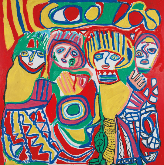
One of them is Chaibia Talal, one of the most influential Moroccan artists of the 20th century. Her story is especially extraordinary and touching. She was born in 1929 in a small village and married at age 13; her husband died when she was 15 years old. As a young widow and mother, she had no choice but to work as a cleaner in order to sustain herself and her son. She was illiterate.
She began painting in 1963 after having a “prophetic” dream that encouraged her to start painting. Her son had a painting studio, and that is where the art curator Pierre Gaudibert discovered her art work for the first time.
Chaibia Talal was a self-taught artist and she was exhibited all around the world. Although her work wasn’t well received in her time, she is now considered as a pioneer figure of Modern Moroccan Art.
The reason why it is important for me to talk about this artist comes from a need to discover more other Moroccan female artists that I can look up to.
Her work is extremely colourful; she was influenced by the “COBRA” avant-garde European art movement, but also pulled a lot of her themes from moroccan culture, depicting moroccan women in traditional costumes. There is an evident play with figuration and abstraction, and the very consistent use of patterns is also an echo to moroccan culture and craft.
Pattern making and symbols are an inherent part of Moroccan culture, even before it was a country. The west part of North Africa was actually constituted of nomadic Berbers.
These nomadic group of people would worship different divinities and symbols would be used both as protection, directly on the skin in the form of tattoos, or on the fabric they made and wore. Clothing was especially important as it was an indication not only of social status, class and wealth but also an indication of the nomadic group they belonged to.
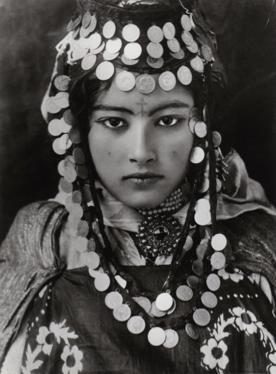
Symbols had associated meaning with different purposes.

Pattern making became even richer after Islamic influences arrived in North Africa. Indeed, it is prohibited in the religion to depict God or any divine figure to Man’s image. Subsequently, symbols and patterns were used to palliate to this. Calligraphy was, and still is, a highly valued form of art; Koranic texts would be embellished and treated as images as opposed to just writing.

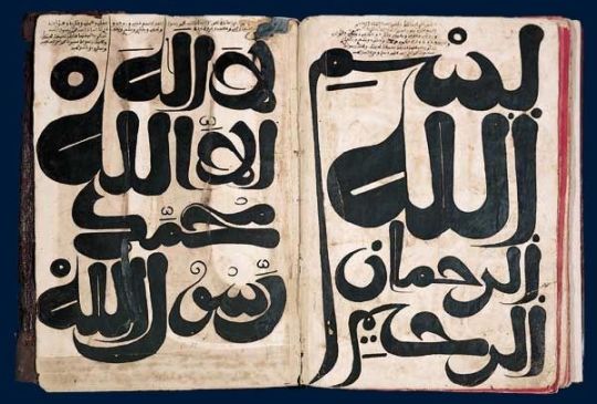
Geometry and symmetry was seen as a high form of art as well; there is an element of repetition, interlacing shapes, texts, and symbols that is prevalent throughout Moroccan Art, and craft History.

Symbols have always interested me whether it be part of my heritage, or other new found interests, such as the occult. I have always been fascinated by how different meanings and interpretations can be pulled out of one image or symbol. How visuals can be transformed and used as a new form of language.
There is also a very superficial reason to this as well. There is something about looking at an accumulation of symbols on one images that is, to me, pleasing to the eye. Even if I can’t necessarily fully comprehend the artist’s intention behind every details of their work, I naturally associate a meaning to it based on my own experience and subjectivity.
A good example of this would be Hieronymus Bosch’s “The Garden of Earthly Delights”.

I am aware of its religious ties, and there are extended interpretations made of this triptych oil painting. Yet, I much prefer look at it and create my own narratives out of the images and symbols I can observe from it. I enjoy the fact that there are a multitude of narratives enfolding on one big image.
In tarot as well, each card is illustrated with specific visuals that aid in the interpretation of its messages. The cards, put side by side, form a narrative that is enriched by a diversity of symbols.
Folklore too, have consistently used symbols and metaphorical analogies to express a deeper meaning.
The French fabulist Jean de la Fontaine is well known for using animals, insects and plants to convey more sensitive messages, at a time where criticising the King and his court was a real offence and a punishable crime.

After listing down all of the things that I loved, I realised that they weren’t so impossible to connect. At a first glance, they seemed impossible to link, but they all share a similarity: they all use symbols and images to attach personal meanings to them or convey certain messages or narratives.
In conclusion, I would like to develop my own “Visual Dictionary/Library”, or at least start this process.
Through this project, my aim refocused on its intended purpose, which was the expression of self through a diverse set of symbols and images.
By doing so, I go back to my very early iterations from Elaborate, where my work was more emotion-based; I intend on keeping the idea of self-reflection through making and researching, in order to develop my own visual language.
10 notes
·
View notes
Text
Personal Project:Evaluation
In my original plan and workbook, I discussed how I realised that throughout the first year of HND I enjoyed and was most comfortable with was taking portraits. I also like to say something and tell a story with my images, so for my Graded Unit I wanted to create conceptual portraits. My original idea was to create studio portraits that tells a story of sexual abuse, more precisely the aftermaths of it. The emotional and mental stages that one would go through after a horrible incident like that. As I wasn’t able to shoot in the studio and I didn’t have the equipment nor the models to create the images I had in mind, I had to alter my original plan.
My alternative plan was to take self-portraits that shows my perception of the lockdown and the self-isolation. I was going to take images of myself that would have showed the effects this situation has on my own (and possibly on others’) mental health. Francesca Woodman was a big inspiration for me as she took some incredibly expressive self-portraits without any professional equipment. After doing further research, the other great photographers whose work I found very inspiring were Cindy Sherman and Diane Arbus. They both took portraits and self-portraits that told stories that were full of emotion. I thought creating something similar could have suited this alternative plan I had in mind. Comparing the two plans, I think they are very similar in terms of theme. They both focus on mental health represented through expressive and conceptual images and with these plans I was able to tell a story.
When I first started shooting, I didn’t have a precise plan, I started by experimenting. I used different coloured light sources, I took self-portraits as well as portraits of my boyfriend and I was experimenting with shadows. After this first attempt, I sat down and tried to go through each and one of the images I had taken, and I wrote down why and what I liked or disliked. What I realised after my first shoot was that I wasn’t feeling comfortable in front of the camera (and it showed) and I certainly wasn’t comfortable posting them for the Tumblr workbook. Moreover, the different coloured light didn’t add anything to the images, not for my plan’s theme, nor for the aesthetics’ of the images, so I eliminated the idea of using it. On the other hand, what I did enjoy, and thought was pretty successful was the “blinds” image with the two hands almost touching (the first image in the layout). I thought it was very expressive, emotional and reflects just how I feel. This image became my starting point for my Graded Unit. As I changed my main idea (from self-portraits to portraits) I did an alternative research to help me give some more inspirations. Duane Michals’ work had a huge impact on the rest of my images. I decided to tell my feelings, experiences and the situation’s effect on my mental health through my model.
My biggest obstacle during this project in lockdown was the planning for an image and executing it. I found it very difficult to find the motivation to just sit down and think about the next step and the next shoot. I started putting these feelings (lack of motivation, numbness, feeling of being trapped, boredom, loneliness…) into my work which really helped me temporarily overcome this laziness. However, if I was to go back, I’d definitely try harder and come up with a more consistent workflow. I would try come up with a time schedule for shooting for my alternative plan as I did for my original plan. I think this is something have to improve on in the future: come up with a schedule for myself and stick to it.
For the post- production of the images, I was advised to try and match the contrast of the first two images to the rest. I experimented with using Lightroom, Silver Efex Pro but what I found the easiest and the best was Photoshop. Possibly because I have the most experience using that one out of the three. But experimenting with the two others gave me more experience using different software. I was experimenting with the curves and the levels to get the most out of my images. I think editing all 10 of my images really improved on my Photoshop skills and I really enjoyed the process. I did a quick retouch on my images usually right after taking them. For my final edit I left approximately a week.
For my layout, I initially wanted to lay them out aesthetically, meaning in a way that it was symmetrical with landscapes on each side and one in the middle and portraits in between. After getting feedbacks, I realised it was more important to lay them out in order to make sense to the story I’m trying to tell. My new and final layout of the ten images starts with the ‘hands-touching’ image that stands for the people we are missing and the lack of social interactions, followed by the image that to me represents boredom and missing the outside world. Third one which is the confusion mixed with anger and sadness. The fourth that stands for the loss of perspective and reality which is followed by this ‘dream’ setting where we wish to be reunited with partners, friends and family. Fifth, the lack of a routine, the loss of the will to get up because of the lack of motivation. Next is the feeling of being stuck and feeling more and more isolated and imprisoned day by day. The last three images are a kind of conclusion. The ways I’m trying to keep my positive attitude and optimism. I think this is a much better, meaningful layout and it became a stronger photographic series than before. As for the size of my images, if I was to put them up in a gallery, I’d print every one of them in A3 and the first one in A2. As it was the starting point of my project, it sums up this series but also it is my favourite image out of them all and I think it is the most successful one.
In conclusion, I really enjoyed this project and I think I improved upon and gained a lot of useful skills. I definitely improved on my Photoshop skills, my problem-solving skills and my ability to think outside of the box. I gained some experience in working independently, although that is something I’m going to work on in the future. Coming up with and sticking to a schedule, deciding on final images without too much outside help are all things I have to improve on. Moreover, I also need to get more experience and have to improve on thinking of a project as a whole and come up with images that work well together and not just thinking about the individual images. I found this project very helpful to keep me busy and it allowed me to express my feelings during these difficult times. For that reason, I’m very happy I did this project and I think I did the best I could have done under these circumstances.
1 note
·
View note
Text
2019 Bullet Journal Setup
January has rolled around sooner than expected and I was quick to realise I was well behind on my bujo setup 😂. This year is my 2nd year of doing a Bullet Journal which means I have experimented slightly with some new layouts to try and find something that works better for me.
Again, I am using a Leuchtturm 1917 Journal because I love how many pages it has. Giving me more room to document memories around my daily/monthly spreads.

The first page after the already printed index pages is my key page. I have kept my key the same as last year. It’s simple and concise and worked really well for me last year.

Similar to last year I created a ‘Hello 2019’ page. I chose this loading bar image because I thought it was creative yet not over complicated and didn’t take long to create.

Each year I like to make a few goals to try and stick to through the year. I have used the same layout as last year to display my 8 goals for 2019.
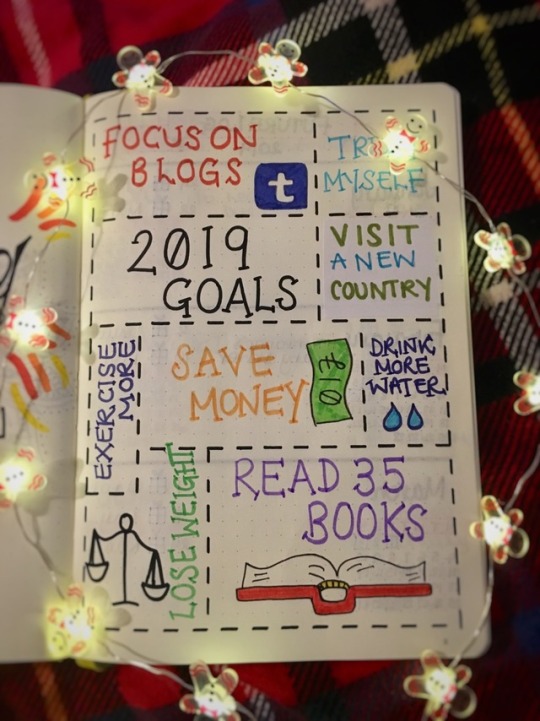
A Future Log in a bullet Journal, I think, is rather important. It keeps all your important dates for the year ahead in one place. I like to make sure that mine includes a birthdays section so I don’t miss anyone throughout the year.
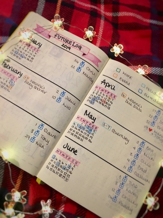
Every year myself and Claire set ourselves a reading goal. The last two years we’ve set the target at 50 and neither of us have managed it for one reason or another. But, the main one being that by the end of the year our motivation for reading almost disappears.
In order to avoid the struggle of choosing books we’ve both decided to select 10 books each that we both have to read within 2019 and the rest of the target can be made up of our own choices. Hopefully this will prevent us from getting into our annual rut. We have also chosen 5 mini challenges to try and achieve.

My next two pages are copies of ones I used last year. They’re both simple and easy to use which is why I’ve chosen to use them again for 2019. On the left we have a bookshelf where I can add all the books I read this year. And the same for the right page which is for new movies I have seen.
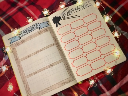
This year I decided to simplify my tv tracker. Simple seems to be a reoccurring theme this year. I just want to make this year’s bujo as easy to use as possible. So, my tracker will consist of very simple graphs so I can keep track of series/episodes I have watched.
My monthly setup will be similar to last year, however, I have adapted some elements to be more convenient. Each month will have a colour theme, the same as last year, which I will correlate with my washi tapes and pen choices.
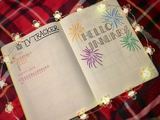
My next two pages are my monthly calendar and my weekly spread. Both have changed in ways to make sure I’m fulfilling every potential that my bullet Journal has to offer.

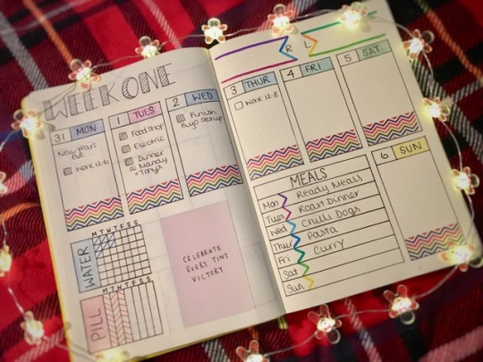
So, that is my bujo setup for 2019. I’m am really looking forward to journaling my way through this year and always documenting it along the way.
I wish anyone reading this a Happy 2019!
M 🌵
#bullet journal#bullet journal 2019#bujo#bujo 2019#bullet journal setup#bujo setup#bullet journal setup 2019#bujo setup 2019#setup 2019#bujo inspo#bujo inspiration#bullet journal inspo#bullet journal inspiration#my bullet journal#weekly spread#monthly spread#organisation#organising#new year#new year new journal#2019#happy new year
454 notes
·
View notes
Note
hey you, i only followed you recently and I really like your hinny fanfics and your poetry. Would you mind telling me about your process when you write? I really wanna learn how to write properly and you seem to take your craft so seriously. How do you built a story, how often do you edit, how much time do you spent on your work, what do you try to go for,...? Thanks xxx
Anon, this is the coolest ask I’ve EVER received, and I’m hanging it on my wall next to all the colour-coded flashcards with poems on them. This is going to be LONG, and by no means exhaustive - I’m gonna jump around and ramble a bit and if there’s anything specific you wanna hear more about, please ask! I fucking love talking about writing!
I’m gonna put most of this under a cut, but before we dive in: yes, I tAkE mY wRiTiNg sErIoUsLy in the sense that I’d like to publish some original bodies of work in my life and to have physical copies of them exist on a bookshelf that’s not my own. I don’t need it to pay the bills, but if you googled my full name I’d like for, like, a poetry collection to show up and not, I don’t know, the two poems I got published in a regional newspaper when I was eight.
(And please let the record show that they’re fine poems for a primary schooler. The cringe years came way after that, kids.)
So, even having some ambitions in the industry, the reality is that I’m a 19-year-old kid with a keyboard and a dodgy internet connection who discovered fanfiction when she was twelve and got hooked for life. We’re going to retire the idea of “writing properly” for now, because writing is supposed to be fun and I haven’t actually gotten accepted into that Creative Writing Bachelor’s degree I so desperately want to do. YET. Don’t let the fancy writing blog (@jessicagluch) fool you into thinking I know what the heck I’m doing. But, okay, with that out of the way, let’s get into what I’m personally doing right now, yeah?
Fanfiction
You asked about process, and the truth is, I don’t … really have one. For the Muggle/FWB AU called “Let Me love” I just published, I actually wrote a pretty detailed outline that I then filled in, which was fun, but it’s not a habit exactly. I’d written a lot of assorted scenes and pieces of dialogue for that one, too, so I had a lot of material and just had to put all the scraps and pieces in order and stitch it all together. After the brainstorming, word-vomity part of writing Let Me love, my #1 task was figuring out where everything went, and making sure it’s all there.
As soon as I’d written a full first draft, no gaps, and the anatomy of the whole thing had somewhat clicked into place, I moved away from it for a while. Wrote something else. Came back maybe a week or two later, polished up the prose a bit very late at night.
Figure out when your creative hours are, if you can pinpoint it at all. Mine are precisely “I was supposed to be asleep two hours ago and I’ve got an important thing tomorrow” o’ clock. Sigh.
Just - leave it alone for a bit, come back with fresh eyes. I love writing Let Me love - I’m working on part 2 right now - but after you’ve fucked around with the same sentence fifty times, you get sick of it. And I did. At some point you have to decide to put down the pen and let it be.
Especially because fanfiction isn’t something you’re writing for a publisher - hopefully, you’re writing it mostly for you - no one is holding a gun to your head to get rid of every last adverb or stuff like that. I can do what I want, MOM. I am allowed to make the thing I’m writing as tropey and campy as I want and hold up a big old middle finger to the rules, if that’s what I want to do.
Fanfiction, to me, is this grand, batshit writing playground. That’s why I fell for it in the first place - it’s inherently self-indulgent and hedonistic and that you can write everything EXACTLY as you please is the primary purpose it serves as a genre. So go wild.
(Process-wise, the one thing I do very consistently is making moodboards and playlists. I like having some inspiration material to swim around in, which helps me figure out what the story looks and feels and sounds like in my head.
Every fic has a soundtrack. SOUNDTRACKS ARE IMPORTANT, PEOPLE.
Like, Let Me love is all coloured lights and night-time London and texts left on read. It’s neon signs and wearing somebody else’s t-shirt, messy bedsheets and hangover breakfasts and quarter-life crises.
This is the Pinterest board.)
What I pay most attention to is the stuff that gives the text depth beyond the surface. I look for metaphors - and I personally prefer the ones that carry through the whole thing, ideas we explore throughout the story and revisit at the end. I look for themes that hold a story together beyond the plot. I look for subtext and imagery and I want symbolism, goddamnit.
(That’s the poet kicking in.)
And of course, I’m a product of my generation, so I love referencing other bodies of work and subverting tropes and stuff like that. Hey kids, intertextuality is fun!
(Like, do you see what I did there? See how the phrase “hey kids x is fun” in itself is a reference to something? See??? I’m a fucking genius.)
I think we need some examples. Allow me to toot my own horn for a minute.
In the Halloween 2018 oneshot I wrote, which is about Harry grappling with the anniversary of his parents’ death when he’s a little older, he visits the graveyard with Ginny and Lily Luna. Ginny comments that “it’s freezing”, to which Harry responds with the titular, “you’re warm”. And yes, it’s October, it’s probably cold. They’re keeping each other warm. And yes, it’s maybe about comfort in harsh situations in general, a more metaphorical warmth, if you will. I get it.
But when you remember this exchange is taking place on a graveyard, you might start to wonder about warm, living bodies as opposed to cold, deceased ones. And then you think about how this whole story is about the living remembering - in a sense, living with - the dead. And how it’s about death as a part of Harry’s life. And you can probably guess by now that all my literature teachers fucking adored me.
(But he’s also choosing a side here, maybe. But I’m merely the author, you don’t have to listen to me at all. My words beyond the words don’t mean shit unless you decide they do and even then you’re going to find yourself knees-deep in a debate around authorial intent in record-time. In the age of “Nagini was a cursed human woman all along”, I’m not sure I want that.)
I also reference other pieces of work a lot. Often poems, and even more frequently, songs. The songs in Let Me love are VERY IMPORTANT and I can’t show you the full playlist right now because SPOILERS. But the chapters are split into sub-sections via song lyrics. Those are part of the playlist. There’s also a lot of referencing songs in general because Harry is a big music fan in this one, but that’s just indulgence on my part. If I want to make a 21st century Harry a Mitski stan, then I will. And I did!
(AND Let Me love has a Friends reference. For funsies, but also, for much more than funsies.)
“I love you / please do not use it” was inspired by a poem by Savannah Brown called “organs”. (It’s linked in the author’s notes at the beginning.)
“It’s two sugars, right?” borrows and/or references a ton of lines and phrases from T. S. Eliot’s The Hollow Men. Most noticeably:
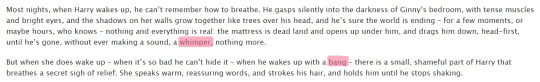

Sublety isn’t my middle name, exactly. (The forget-me-not-blue sky in The Bride On The Train, anyone?)
In short: I like when my fanfictions are worth rereading. I like when you can come out the second read having found a little more than you did the first. I like when you can wander around a little, and, like a treasure hunter, make some strange new discoveries.
Lastly: of course, writing from your own experience helps. Spy on your own life. Collect all the ways in makes you feel, like a thief, write it down, memorise it, put it in the story. Reuse! Recycle! ✊🏻
I fortunately don’t relate to Harry’s childhood trauma, but the feeling at the beginning of “We’ll figure it out” - which is a story set shortly after him and Ginny find out she’s pregnant and he’s struggling to connect with everybody else’s simple bliss, because he’s terrified, and he’s terrified of admitting he’s terrified - that was real. That “wait a minute, this moment is amazing. I’m supposed to be the happiest person on the planet right now. Why am I not feeling it? What is this emptiness? Am I not happy right now? Why am I having doubts? I’m not supposed to have any doubts! What the fuck is wrong with me?”, that was lifted from a specific experience.
Side note, I’m really proud of that one.
Okay, poetry!
Where there is even less rules and more fucking around ensues!
I read and promptly lost a quote recently about how explaining a song sort of defeats the purpose. (I’ll link it here if I ever find it again.) In some ways, poems and songs work really similarly, and I think it applies here as well: if you could really explain the whole poem in one sentence, or a few sentences, if you could accurately and concisely summarise exactly how it feels, then you wouldn’t really need the poem. My favourite poems (or songs) tend to be the ones that outline a really specific emotion via a few powerful images, but I couldn’t precisely tell you what the emotion is. Like, I know exactly what this thing is saying, I know this exact feeling, I GET-GET it, but don’t ask me to explain the thing, just READ the THING, and you’ll KNOW.
Mitski does this really well. Like, I couldn’t explain to you what Last Words Of A Shooting Star makes me feel, but it does. I can tell you that “I am relieved that I left my room tidy, they’ll think of me kindly when they come for my things” cuts through me like a hot blade but I can’t pinpoint exactly why and I don’t want to. All I know is she Gets It, and that I want her writing chops, goddamnit.
Or, like, look at Laura Gilpin’s Two-Headed Calf. Yeah, I’ve read that poem a hundred times and thought a lot about all the themes it’s presenting me with. But I have zero desire to explain those themes to you, because I’d kind of be robbing it of its magic. I don’t want to tell you what it’s about. I want you to read it and I want to simply sit with the knowledge that we know, we Get It, that “twice as many stars as usual” kicked you in the shins, emotionally speaking, as much as it did me.
Few words, max impact, is key.
In Mary Oliver’s words, we want something inexplicable made plain, not unlike a suddenly harmonic passage in an otherwise difficult and sometimes dissonantsymphony - even if it is only for the moment of hearing it.
I’m realising right now that leading with these shining examples and then following them up with my own thing is nerve-wracking. But I like to think that I accomplished something like that with a little poem I wrote called Basements.
It’s is based on the prompt “back to nature” and follows that, uhm, somewhat loosely, a little subverted. I think it’s about impermanence and nostalgia and the fact that the places we lived in continue to exist even when our lives in them don’t anymore. It’s about that and a lot of other things. Maybe. The truth is, I don’t want to explain it to you: I just want you to read it, and then I hope that it made you feel something, and I’m going to trust that you Get It. Maybe you don’t get the same things I did, but that’s great. I’d love nothing more.
Before it was all those things, it was a poem about my life. The neighbourhood with the yellow house across the graveyard that I spent nine mostly happy years in. (The house, not the graveyard.) Every single thing in there is true: my sister really bust her lip and we both cried; wild lilac really grew there; we did spend most of our summers catching tadpoles, and yes, that neighbourhood was a construction site from the first day we lived there to the very last.
And I really sat in the driver’s seat of the family car about a year ago and watched it from afar. I didn’t come up with that - it’s my life. I only went on a scavenger hunt through my own memories, through the places and records and mementos of my life, and arranged a few specific anecdotes in a way that would give them meaning.
It’s kind of what I’m proudest of when it comes to my poetry - that I get to just live my life and see the metaphor and the meaning and symbolism as I’m experiencing it. I sat in the car and I thought, huh, that’s definitely making me Feel A Thing right now, that I’m sitting in the driver’s seat looking at this place I haven’t really been to in years, my childhood home, where I don’t live anymore. That I drove here myself.
I think that, when done right, specific makes universal. If you arrange a kaleidoscope of memories in just the right way, what it’s making you feel will speak for itself, and you won’t have to explain it. Most people who’ve read “basements” probably didn’t spend countless summers playing in literal holes, originally dug out for basements that were never built because no one wanted to move there. Holes that then grew full of weeds and wild lilac and felt like miniature jungles right outside our parents’ houses. It was perfect, it was specifically mine, but the feeling behind it is universal, I think.
Like, that’s how half of Taylor Swift’s RED works. That’s how most good Taylor Swift songs work. That’s why the bridge in Out of the Woods is so good and why I love New Year’s Day so much and it’s EXACTLY why All Too Well is considered her best song by so many people. Because she zoomed in on the details of her life and let the world take a look. Because “we dance around the kitchen in the refrigerator light” is a line in that song. THAT’s why it MAKES YOU FEEL THE THING.
Back to poems? This:
So we tell them all about the dayWe planned revolutions on my bedroom floor, or how we onceSpent an entire Monday lunch break making life plans over ice creamAnd most of our parties talking politics over beerWe both paid for ourselves.About the days you drive me to school. In your carI am the girl, front-seat passenger of our lives,Who does not need reach for the steering wheel –The road is alright.
isn’t fiction. These are my memories, carefully selected and re-arranged for Politics at Parties Boy.
I didn’t make up these film stills of a non-romantic relationship that never became anything other than non-romantic because neither party ever made a move. What I did is look at my own life like it’s a piece of fiction. If these memories were a movie, you could pluck them apart and say, see, the screenwriters put this scene here to communicate that.
The truth is, I am the screenwriter and the protagonist and the actress and the director and the camerawoman. I looked at a teenage girl who refused to let her friend buy her a beer at a school party and decided “huh, I guess that tells us everything we need to know” because I was that girl.
And I did pay for the beer, so we’d never move into “let me buy you a drink” territory. He was already driving me to school.
That’s my best lesson on poetry, really. I look at my life like it’s a piece of fiction and then I make it one. I put personal memories in poems meant to be read by other people, I overinterpret everything that happens to me, am literally constantly thinking about how to work every knock-back and struggle into my narrative arc and look for symbolism in anything from the date, the weather, and the colour of my front door. I watch myself in third person all the time and thus become my own muse. I’m the painter and the painting.
It’s a somewhat narcissistic and masturbatory approach to poetry, but as far as writing about your own life goes, it’s what works for me.
As far as writing about not yourself goes - well, I’m a narcissist and I’m bad at that, but I wrote a poem about the Mars rover Opportunity that shut down this February called Spirit shuts down and Opportunity feels no tremble, no ache. For stuff like that, if you don’t happen to be Struck TM by a lightning bolt of inspiration (which is the exception, not the rule), a good old-fashioned mind-map helps. I just let my robot grief go wild on the page for a bit and what I ended up writing about was death and the human condition and being a teenage girl, maybe.
I really enjoy taking two concepts/ideas and juxtaposing them, watching a theme unfold in the overlap. Like, it’s a poem about a robot AND about being a teenage girl and in between those two lies a poem about the futile attempts to teach a robot human emotion. Maybe.
It’s a poem about how my mum always cries at the airport and about me making my own happiness my priority and it kind of ends up being about my intense guilt of making my parents watch me change and grow and leave.
It’s about the night I wandered through a quiet street in Central London at 1 a.m. and realised that the city of my dreams sleeps like any other place, that people wake up early and make coffee and go to work and have bad days here. That it’s not all dream. It’s some people’s lives. But it’s also about watching another person sleep - the way someone’s face changes when they do.
In the middle lay a poem about finding a friend in a lover. Not the daydream, but my life.
Lastly, I can’t talk about my own poetry without talking about my darling poem 5 disasters. It’s my pride and joy. Like, you could kill me write now and I’d be like, it’s okay, I’ve written the poem I want to be remembered for and it’s this one. I wrote it in less than a day and every time I think about the fact that I wrote
I cravedsomething more violent than death, somethingviolent enough to bea beginningand for my life to be thousands of themI wantednothingto remainexcept the girl that sentthe disastersand survived -may this wasteland bewhere I find her.
… I lose my shit a little bit.
(5 disasters was a rarity in how quickly I wrote it. It often takes me weeks. Sometimes months. There’s poems I’ve been meaning to write for years now and I still haven’t found the words. Take your time.)
5 disasters is a lot of things, but within the context of the poetry collection it’s hopefully going to exist in one day, it serves as almost an instruction manual for metaphors: here, the floods and rainfalls are always change and the forest fires are always my highschool demons and my friends and how they look the same. The colour yellow is always referencing the same love. Basically, I like pinpointing my symbolisms and then crafting a poem around them. You end up creating something like an in-poem universe that you get to navigate like a fantasy novel. Like you’re telling a story about a natural disaster, but it’s all a metaphor, Hazel Grace.
But I’m getting ahead of myself. As I do.
I hope this serves as a starting point of sorts, anon. Most importantly, have fun, don’t concern yourself with all the rules too much. Experiment, be bold, read lots.
Again, if you’ve got any questions, I’d be thrilled to help. Thanks for the opportunity to toot my own horn to this outrageous degree, it’s been a blast.
7 notes
·
View notes
Photo
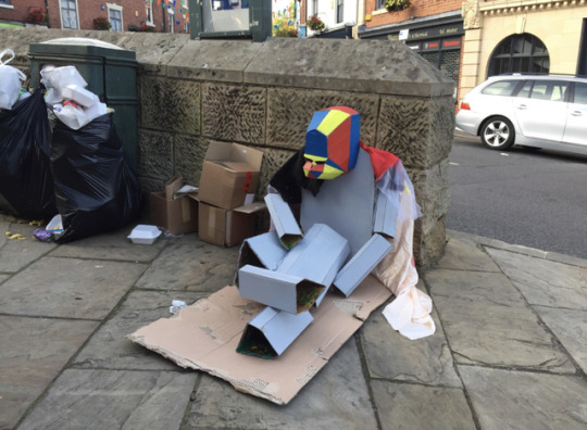
Guerrilla Art for Melbourne Art Festival
Derby College was asked to present a number of pieces of artwork and sculptures in the style of guerrilla/street. This was the first brief we were given, we had two weeks to execute our idea. This meant that any issues we came across throughout the making process we needed to resolve and move on immediately. As this was a live brief, the pressure was higher and collectively we felt that there was no room for error.
As a starting point, I researched the different types of guerrilla art and some examples in my sketchbook to refer back to. Although I had some knowledge of street art, I was not aware that sculptures can be perceived as street art. Techniques such as yarn bombing and low poly structures were also unknown to me. My research was sufficient enough to teach me how to execute a low poly sculpture.
In our group of 3, we discussed many initial ideas ranging from small animals made for the mere entertainment of passing children to current political leaders to evoke a reaction and therefore action. We wanted our piece to have a meaningful message yet allow room for many interpretations depending on the observers' preferences and style.
The brief was met through the sculpture being a gorilla, the main theme was ‘rumble in the jungle’. We managed to incorporate more definitions into it. The idea was to make people more aware of the impact climate change has on habitats and their animals. The gorilla is homeless because it is being hunted and its forests are being burned down. One of the other meanings was a note on homelessness in our society, as a group we were familiar with the village of Melbourne. We knew that its residence were groups of people who didn’t understand homelessness or why someone may be made homeless. The village is fairly small and most people know eachother, there were no homeless people in it.
Seeing a homeless person often provokes thought on why that person may be homeless, whether we should help them or not in that time and place. The people of Melbourne weren’t exposed to that therefore they rarely though about this societal issue and most likely misunderstood it.
The reason we were happy enough to present our gorilla without hands and feet is because we found out from research done during the making that gorillas are often hunted using traps placed in their living spaces. These traps would often grab hold of their hand or foot to keep them in place, giving the hunter time to shoot them. We decided to include an interpreting in the painting too, we wanted everything done to have a purpose and effect. The cool tones grey exterior shows how a homeless person may appear or feel like but on the inside they still had hope, shown by the many colours.
If we had more time we could've added hands and feet. As the designer of the sculpture, I understood my own interpretation but most likely, the average people who will see this will not spend enough time interpreting it, therefore, I will not achieve the same understanding. It is likely that people thought we were too lazy or not creative enough to make the hands and feet.
Most passers-by understood that this was a homeless gorilla and probably had a sufficient understanding to figure out why it was homeless. However, they probably wouldn’t conclude the many other interpretations we came to. Making the gorilla look obviously out of place ensured that the major idea was translated correctly.
As a group we worked fairly sufficiently, when deciding what our sculpture will be we took a vote to make sure that a decision was made fairly. We split the work between us, giving each person a certain task to focus on, it made us much more time efficient. I would say that each day of the task was used very well, as this was a making brief there was a general sense of enthusiasm from everyone. Once we had cut out and glued the cardboard pieces, sewed the blanket, and assembled the head, we all painted it together as it was the last job to be done.
We included as many aspects that have distinctive meanings as possible in the hopes that every single person who looks at it will inderstand at least one thing and think about how they may be contributing or ignoring the issue.
I think the bright, primary coloured head sits very well against the dull grey of the body, it makes the piece as a whole more attractive to the passer’s-by eyes. The use of cardboard was very important as it was readily available, familiar to work with and gave us the qucikest results. We decided to make it low poly rather than organic to enhance the fact that it is an art piece trying to get people to think about the environmental impact they may be having.
Practical skills; Cutting out the different shapes from the cardboard and keeping them organised were tasks that took longer than expected. Due to the cardboard having a corrugated centre the cutting process was laborious. We took it in turns to cut the pieces out, we had to go over the same line a few times to make sure it is fully cut, our knives skills were less than basic. I was holding the knife in a way that left marks on my hand and applied pressure on the wrong spots.
Research; Considering this was the first project given to us and it started on the first day, I think my research was sufficient to both educate me and give me inspiration. I knew what the research should be, I knew it had to be analysed and used for inspiration. Based on feedback, in the future I need to make analysis in greater detail and use a wider range of research images and tools. Rather than relying solely on Google Images, I should use books, magazines, blogs, museum websites etc.
Context; As a group we reminded eachother of the brief and the different aspects attached to the festival and venue. This ensured that we remained focused and our ideas were aimed specifically to meet our client’s request.
Problem solving; The only issue with the gorilla we had was the head, we resolved the size by folding cardboard around a teammates head to get an approximate idea. The facial features were the hardest to execute. I was asking for a second opinion on the size of the face piece and my teammate had a scrap piece that was intended to be the mouth but turned out too small. She layered her piece on top of the face to see if she could use it in the final sculpture and it looked the best we could make it.
Planning and production; We had virtually no plan which made it difficult and gave us a few set backs. We discussed number of sides for each limb and made lines on the flat cardboard. We tried to take measurements but weren’t very consistant.
Presentation; Although we had minor issues throughout, we managed to produce a sculpture that met the brief, gave a very important message and looked very well thought out.
#design#innovative#guerrillaart#street style#streetart#graffiti#art#festival#melbourne#yarn bombing#lowpoly#jungle#animals#sculpture#statue
1 note
·
View note
Text
-17.11.2020- Tuesday Lecture – Painting is dead painting is alive painting is dead painting is alive.
This week's Tuesday lecture was about painting and how its importance within the arts has changed over the years as referenced by the name “painting is dead, painting is alive, painting is dead, painting is alive etc.” And how painting has come over threat and how it’s no longer relevant. Adam then went on to talk about how painting is always under threat and how the medium and idea of painting is forever changing as different art movements and eras get involved. Ever since photography was discovered, painting has been consistently been challenged as many people would rather take a picture of a landscape rather than see a painting of it.
One artist Adam mentioned was Gerhard Richter and how he wants to keep preserving the vitality of painting. As an artist he is very self-reflective about painting to a point where he makes panting a painting about painting. He went through a variety of styles such as pop art which became a turning point for him. He adapted his work to each art style and movement// location such as eastern Europe and the West. When Adam was talking about his work I found it very interesting that he changed his art style a range of times just based on the places he was visiting and the art movements that were around him. I felt like, in a rather abstract way, I do the same and relate my practice to him in how I do the same. Throughout the years I have changed my art style a wide range of times and I change it for a wide range of reasons. I change it because I see another art style or art movement that inspires me such as Renaissance art and artists like Bwusagi who replicated this art movement through one of their favorite pieces of mine:
RIKA (2020) Bwusagi [Instagram] Available at: https://www.instagram.com/bwusagi/ [Accessed: 19th October,2020]
Rika (2020) “Have Mercy” [Digital Art] Available at: https://www.instagram.com/p/B-pQPNVjTPT/ [Accessed: 19th October, 2020]
This then changed my art style to drawing more classical things such as going to the Walker art Gallery and drawing the marble statues there, and finding inspiration in old Greek statues and mythology as a subject for drawing. Here is an example of a sketch I did of Michelangelo’s David:

Robin (2018) “INKTOBER - DAY #8 // SKETCH #11 Michelangelo's "David" 29.10.18”


I also did these sketches above last year when visiting the Walker Art Gallery.
I still find a lot of inspiration from art movements like this even now. I also find inspiration from other Contemporary Artists and movements who have a completely different style and source of inspiration such as Junji Ito. I have collected some of his Manga Horror collections as I’m a massive fan of his tyle of not only drawing but also writing. As a result, I have also drawn things in my own style based on one of his stories “Red Turtleneck” which can be seen below.

Robin (2020) “Day One: Stained” [Digital Art] Available at: https://www.instagram.com/robin_damien_tinman/ [Accessed: 24th November, 2020]
Going back to Richters work and process, an artist// art movement he was inspired by was Roy Lichtenstein and his work on Pop Art. He was attracted to Roy Lichtenstein’s work as it was anti-artistic as it was opposed to “peinture” the culture of painting. He enjoyed his work going against the norms of art and this was certainly reflected in how he consistently changes his art style with different art movements he finds and enjoys; personally, I think this makes his work feel very organic and even alive in a sense. To me it makes it feels as if his art has a kind of heartbeat and living timeline as just with people, we change with time and different eras such as with the 1900’s and changes in political stances such as Womens Suffrage and recently in 1969 with the change of LGBTQ+ rights with Stonewall. Although it isn't explicitly said, it feels like his work incorporates changing societal norms in art. He doesn’t want to stick to one movement or style, which I feel not only relates to my art style but also my personal life and how I never want to be stuck in one place. This goes the same for my gender identity. I know I will always identify as a man and nothing will change that; but I don’t want to be pinned down by that either. For example, Ive recently been experimenting with making myself a skirt to wear to go against the societal norms of skirts being for women only and break down that barrier. Although Richters work isn't about politics in this sense, I still feel his work relates to politics and society in how he chooses to show and express his way of working.
This is why I found myself really connecting with Richters work; even though I don’t relate to it visually. When seeing his work, I don’t feel it connecting to my own; but when going deeper into how and why he creates the work he makes, I found myself finding more and more reasons to love his artwork and his process. So, overall, I really enjoyed learning more about Richters work and I find him inspiring as an artist myself.
When film and camera was invented and created, a lot of artists and critics saw this as the end of painting. Such as Paul Delaroche who said “From today painting is dead”. It is clear to see that Photography as an art form was seen as an attack on painting by many artists such as Delaroche as it was seen as the end of painting. This was because many artists began to replace the form of painting with the form of photography for their use of capturing subject such as landscapes and portraits which before the development of cameras; could only be captured by a painter's eye through their paintings.
One artist who transforms the art of Photography and Painting into one is Louisa Gagliardi. She uses an I pad to create a digital initial sketch, and then goes into more detail with colour and shading once she's happy with her idea. After completing a sketch// digital painting, Gagliardi will then transform the painting by printing it onto PVC material to look paint like. The texture of the PVC looks similar to that of a canvas and as a result changes her piece from a flat digital painting to a tangible large-scale painting transferred to canvas. Her pieces feel like a relation to digital art while having a commentary on ‘physical’ painting by how she presents it. She also brings in the aspect of traditional painting by sometimes adding gloss or varnishes over certain parts of the canvas; such as with the highlights; to show some kind of ‘3D’ aspect and physical texture. She is additionally forced to draw when she's in transit such as in a plane without any internet as it feels more fulfilling to her to have an image come from her rather than an amalgamation of too many images she saw online. She would sketch her drawings and take a picture of it and transfer it to her laptop in order to draw and trace them digitally in order to go into more detail before printing.
Louisiana Channel (2017) Louisa Gagliardi Interview: Longing for Something Else [online video] Available at: https://www.youtube.com/watch?v=fWXW4sPhRPc [Accessed: 24th November, 2020]
I feel this relates a lot to my practice as when I create images and drawings without using any reference or without looking at any images it feels this different kind of satisfying to me. As much as I love using references and how I don’t see any issue in artists using them, it feels so much more gratifying to me as an artist when I create a piece I genuinely enjoy just from my head// memory as it feels like I've learnt something from years of drawing. An example of this is when I draw dragons or wolves or portraits. Especially when it comes to portraits with their proportions, I will always use a reference to solidify the base rules of a face's proportions in my head; so, when I create a sketch of a portrait from memory it feels so fulfilling to see how Ive retained the information I've taught myself and applied it on my own. An example of this is this sketch I did from memory using my Switch:
Twitter (2020) Shaded Man [digital art] Available at: https://twitter.com/AmyTinman/status/1324134821866532864 [Accessed: 24th November, 2020]
Along with these sketches of a snake-dragon I did from memory:


Twitter (2020) Dragon Snake [digital art] Available at: https://twitter.com/AmyTinman/status/1331266365437579264 [Accessed: 24th November, 2020]
Overall, I feel as if I really gained a lot from this lecture such as discovering new artists who relate to my work along with learning more about how they fit into different art movements and how they break social norms of art.
1 note
·
View note
Text
Vampire crab care sheet!
Alright fellas, I’ve researched these crabs SO MUCH, and have been keeping them successfully for a while now, so I feel confident in writing a care sheet for you all. But before we begin, there’s the usual disclaimer to do your own research before purchasing any crabs, and that I in particular only have experience with Geosesarma hagen (also known as the Red Devil crab), so care may be different for other species. NOW LET’S GO!

(image source)
Latin name: Geosesarma sp. (this care sheet is focused on hagen, but care is pretty much the same for all species)
Size: 2.5 cm in shell width is maximum for the commonly kept species. My male is only about 1.5 cm in shell width. So very smol.
Indigenous region: Geosesarma hagen lives wild on Java in Indonesia. Vampire crabs in general are found throughout most of the tropical regions in Asia, and Hawaii.
Indigenous environment: Vampire crabs spend their days hiding in the mud and various foliage you find besides creeks in the tropical regions of Asia. Here they hunt and eat tiny bugs, insects, and whatever else they can get their tiny claws on.
Set up: The best vampire crab set up is one that as close as possible resemble their natural environment, while also checking of the various boxes a vampire crab needs to be healthy. The most important aspects in having happy and healthy vampire crabs, are having a moist environment, a water source, and lots of hiding places. To keep their environment moist, an aquarium or glass (non wire-top) terrarium is the best. They do fine when kept at room temperature, but you may need a heating source, like a small UTH, if you’re planning on keeping the crabs in a cool area of your home. They can survive relatively low temperatures, but become less active and their metabolism slows the lower the temperature, which can be fatal over a longer period of time.
Enclosure size: A good starting point for a vampire crab enclosure is at least 5 gallons worth of floor space per 2 crabs in the enclosure, but more space is always better. That means that you can have at most, 2 crabs in a 5 gallon, 4 in a 10 gallon, 8 in a 20 gallon, and so on. If your tank is a long model, you can add one or two extra crabs per 5 gallons over 20 gallons. So a 20 gallon long tank can hold 9-10 crabs. But remember to design your tank, so that there is a place for each crab to hide, without having to share with the others.
Substrate: I recommend coco mulch as a substrate, as it’s great at holding in moisture (like sphagnum moss/peat) but is a realistically renewable ressource (unlike sphagnum moss/peat). 80-90% of your enclosure should be substrate, and your substrate should be pretty wet.
Water source: 10-20% of your enclosure should consist of at least one water source. Several smaller water sources are fine, the water just has to be deep enough for the crabs to completely submerge themselves. The easiest way to do this is to add a bowl or box into your substrate and fill it with water. I’ve used a Tupperware box. Make sure that the crabs can get in and out of your water source, I’ve done this by adding branches that connect my substrate and the bottom of the pool. You don’t generally need a filter, as crabs in a moist enough enclosure only really use the water source when they are stressed or before/after moulting. I just change out the water once a week. Be careful when you change it though, as both grown up and potential baby crabs like to hide in the water! Besides the water source, regular manual misting (about once a day) is recommended. Either that, or an automatic mister. Probably not needed if you keep the enclosure somewhere really moist.
Hiding places: As vampire crabs are very smol, you can imagine that many animals prey on them, they therefore need lots of hiding spots to feel secure from predators, and from other crabs when they are moulting. The best and easiest way to create hiding spots for your crabs is by copying from their natural environment. What do you usually find besides creeks? Leaf litter, various moisture loving plants, old branches and bark pieces, rocks and moss all help in creating lovely little nooks and crannies that the crabs can hide in. And a lot of the stuff can be bought cheaply at a plant nursery (miniature peace lilies, orchids, ferns and bromeliads are examples of plants you can find most places. Beware that some of these will outgrow your tank), and the rest of the stuff can be harvested from pieces of nature that you trust to be pesticide free. I’ve collected moss from my backyard lawn, and went to a nearby forest to collect small pieces of bark and branches for my crabs. You don’t need to disinfect the stuff you collect, just make sure there aren’t any venomous or poisonous creatures that might hurt your crabs. Small creatures like wood lice and ants are fine - the crabs will probably just eat them. Besides the natural elements, you can use whatever hides you would use in other aquariums or terrariums. For example, I have a mini dragon skull, and a coconut hide, found in the aquarium part of a pet store.
Gender ratio: Male vampire crabs are territorial, and can fight. They very rarely fight to the death, but they can be so stressed from fighting that they die. I therefore recommend more females than males, if you have the maximum amount of crabs for your tank size, so that males can get breaks from territory fights. If you’re keeping two crabs in a 5 gallon, they should either be two females, or one male and one female.
Sexual dimorphism: Male vampire crabs are more colourful than the females, and have bigger claws. They also tend to be slightly bigger when fully grown. It can be really difficult to tell if the crabs aren’t fully grown, as young crabs all look like females.

(Not G. hagen, but you get the idea)
Diet: Vampire crabs are opportunistic carnivores, and a big part of their diet in the wild consist of small bugs and insects that they catch. When live prey is unavailable, they scavenge and eat whatever they can find, including dead animals and algae. In captivity they can therefore be fed what you would feed a fish with the same eating habits. I feed my crabs with a varied diet of crushed high quality Betta pellets, frozen and thawed food like blood worms and cyclops, and flightless fruit flies once I get a colony going. I’ve tried with a small plate for their food, but they didn’t use it, so I just spread their food nearby them, and they find it. If you are keeping a bio active enclosure, you can take a bit of your CUC (like springtails or small isopods) and feed your crabs with them once in a while. They will love it. I also have a little lump of Java moss in their pool, so they can eat the algae from that if they want. They do once in a while!
Behaviour: Vampire crabs are more active at dawn and dusk, so a regular light cycle is needed, with either a timed light or natural light is needed. They are little fxckers that can stay out of view for so long (I’m talking weeks) that you are sure that they are dead, but then suddenly there they are! So don’t panic if you haven’t seen them for a while. One way they like to hide is to dig little caves into the substrate, which is why it’s important to have some open substrate for them to dig through.
(I’ll edit this later so it’s better, but for now I just want it out of my drafts lol)
#vampire crab#geosesarma#red devil crab#fishblr#invertblr#crablr#care sheet#vampire crab caresheet#geosesarma care sheet
9 notes
·
View notes
Text


I wanted to take a look at a few logos that have been used or are being used for game franchises as this heavily affected the design for my own logo which I have used in my final Major project.
First of all, there are a few attributes that all of these logos share and every effective logo also shares these attributes. I will of course go into more detail for the individual logos, but all of these designs are rather simple and have a close link to what they are representing.
First of all, the Witcher 3 Wild Hunt logo is deceptively simple, firstly all of the entire within the witcher franchise have shared the "Witcher" title with the same font, this is clearly to create consistency within the franchise as well as make the title itself more recognisable as the font itself is rather distinct. The more eye catching part of the logo is the three that is designed to look like claw marks, this small section has quite a few details that tie into the game; the claw mark is meant to represent that character you're playing considering you play a monster hunter, the claw marks are also subtly designed to resemble the helmet worn by antagonist of the game, which is the leader of the titular wild hunt and finally, the claw mark is coloured red to make sure it stands out from the black and white of the rest of the title. All of these small details help link the title and logo to the product while being very simplistic and recognisable.
Secondly, we have the assassins creed logo; this logo in fact changes quite often with each new installment of the franchise whilst keeping the overall shape, this is done in yet another effort to make sure the logo links in with what it represents. The game shares its logo with the emblem of the titular creed of assassins that each installment of the franchise focuses on. Finding a concrete answer as to why this specific logo was chosen for the franchise is very difficult, I've read that it was create from the lower part of a bird skull (the assassins are heavily associated with eagles.) with some influence from the freemasons emblem, while other believe it is designed to look like the hoods that are worn by the in game assassins and other think it is just designed to look like an A. Despite all of this, the Assassins creed logo is undeniably recognisable and eye catching.
Thirdly, we have the Dungeons and Dragons logo, this example is actually so simplistic that there isn't much yo actually talk about. The logo in its entirety is a stylised ampersand that is designed to look like a dragon breathing fire, this is clearly taken from the games title as well as it abrievation as the game is commonly referred to as D&D.
Finally we have The Elder Scrolls V: Skyrim's logo, this example holds a couple of in depth meanings. To a person who didn't know much about the in game world of the Elser Scrolls, the logo would simply represent the returning if the dragons which takes place with the game's story. However, this logo is in fact the insignia of the Septim Empire and the logo in its entirety represents the civil war that is taking place throughout the story. At first glance the logo seems pretty solid, being made out of metal and all, but look closer and you see that the logo is in fact scratched and chipped; this is supposed allude to the condition of the empire, it shows a strong face, but this is just to hide the fact that it is slowly starting to fall apart as all of the countries that are apart of the Empire start to remove themselves.
My favourite part of a logo isn't being able to instantly recognise the image (even though that is its purpose,) my favourite part is figuring out just how it connects to the franchise that owns it; of course you get simple designs like the D&D example, but then you get those like Skyrim and the Witcher, it simply shows how much thought has been put into its design and its intent, sometimes a logo is just created so you'll remember it and sometimes they're designed to tell a story.
2 notes
·
View notes
Last Seen Blogs
jujianjes
Jes

chercherin
Cheri

anastacioss
Mercure bleu

bah-non
@panlyra

whatwhatjpg
welcome to the overwhelming question