#I'm very tired
Text
Fantasy Guide to Interiors

As a followup to the very popular post on architecture, I decided to add onto it by exploring the interior of each movement and the different design techniques and tastes of each era. This post at be helpful for historical fiction, fantasy or just a long read when you're bored.
Interior Design Terms
Reeding and fluting: Fluting is a technique that consists a continuous pattern of concave grooves in a flat surface across a surface. Reeding is it's opposite.
Embossing: stamping, carving or moulding a symbol to make it stand out on a surface.
Paneling: Panels of carved wood or fabric a fixed to a wall in a continuous pattern.
Gilding: the use of gold to highlight features.
Glazed Tile: Ceramic or porcelain tiles coated with liquid coloured glass or enamel.
Column: A column is a pillar of stone or wood built to support a ceiling. We will see more of columns later on.
Bay Window: The Bay Window is a window projecting outward from a building.
Frescos: A design element of painting images upon wet plaster.
Mosaic: Mosaics are a design element that involves using pieces of coloured glass and fitted them together upon the floor or wall to form images.
Mouldings: ornate strips of carved wood along the top of a wall.
Wainscoting: paneling along the lower portion of a wall.
Chinoiserie: A European take on East Asian art. Usually seen in wallpaper.
Clerestory: A series of eye-level windows.
Sconces: A light fixture supported on a wall.
Niche: A sunken area within a wall.
Monochromatic: Focusing on a single colour within a scheme.
Ceiling rose: A moulding fashioned on the ceiling in the shape of a rose usually supporting a light fixture.
Baluster: the vertical bars of a railing.
Façade: front portion of a building
Lintel: Top of a door or window.
Portico: a covered structure over a door supported by columns
Eaves: the part of the roof overhanging from the building
Skirting: border around lower length of a wall
Ancient Greece
Houses were made of either sun-dried clay bricks or stone which were painted when they dried. Ground floors were decorated with coloured stones and tiles called Mosaics. Upper level floors were made from wood. Homes were furnished with tapestries and furniture, and in grand homes statues and grand altars would be found. Furniture was very skillfully crafted in Ancient Greece, much attention was paid to the carving and decoration of such things. Of course, Ancient Greece is ancient so I won't be going through all the movements but I will talk a little about columns.
Doric: Doric is the oldest of the orders and some argue it is the simplest. The columns of this style are set close together, without bases and carved with concave curves called flutes. The capitals (the top of the column) are plain often built with a curve at the base called an echinus and are topped by a square at the apex called an abacus. The entablature is marked by frieze of vertical channels/triglyphs. In between the channels would be detail of carved marble. The Parthenon in Athens is your best example of Doric architecture.
Ionic: The Ionic style was used for smaller buildings and the interiors. The columns had twin volutes, scroll-like designs on its capital. Between these scrolls, there was a carved curve known as an egg and in this style the entablature is much narrower and the frieze is thick with carvings. The example of Ionic Architecture is the Temple to Athena Nike at the Athens Acropolis.
Corinthian: The Corinthian style has some similarities with the Ionic order, the bases, entablature and columns almost the same but the capital is more ornate its base, column, and entablature, but its capital is far more ornate, commonly carved with depictions of acanthus leaves. The style was more slender than the others on this list, used less for bearing weight but more for decoration. Corinthian style can be found along the top levels of the Colosseum in Rome.
Tuscan: The Tuscan order shares much with the Doric order, but the columns are un-fluted and smooth. The entablature is far simpler, formed without triglyphs or guttae. The columns are capped with round capitals.
Composite: This style is mixed. It features the volutes of the Ionic order and the capitals of the Corinthian order. The volutes are larger in these columns and often more ornate. The column's capital is rather plain. for the capital, with no consistent differences to that above or below the capital.
Ancient Rome
Rome is well known for its outward architectural styles. However the Romans did know how to add that rizz to the interior. Ceilings were either vaulted or made from exploded beams that could be painted. The Romans were big into design. Moasics were a common interior sight, the use of little pieces of coloured glass or stone to create a larger image. Frescoes were used to add colour to the home, depicting mythical figures and beasts and also different textures such as stonework or brick. The Romans loved their furniture. Dining tables were low and the Romans ate on couches. Weaving was a popular pastime so there would be tapestries and wall hangings in the house. Rich households could even afford to import fine rugs from across the Empire. Glass was also a feature in Roman interior but windows were usually not paned as large panes were hard to make. Doors were usually treated with panels that were carved or in lain with bronze.
Ancient Egypt
Egypt was one of the first great civilisations, known for its immense and grand structures. Wealthy Egyptians had grand homes. The walls were painted or plastered usually with bright colours and hues. The Egyptians are cool because they mapped out their buildings in such a way to adhere to astrological movements meaning on special days if the calendar the temple or monuments were in the right place always. The columns of Egyptian where thicker, more bulbous and often had capitals shaped like bundles of papyrus reeds. Woven mats and tapestries were popular decor. Motifs from the river such as palms, papyrus and reeds were popular symbols used.
Ancient Africa
African Architecture is a very mixed bag and more structurally different and impressive than Hollywood would have you believe. Far beyond the common depictions of primitive buildings, the African nations were among the giants of their time in architecture, no style quite the same as the last but just as breathtaking.
Rwandan Architecture: The Rwandans commonly built of hardened clay with thatched roofs of dried grass or reeds. Mats of woven reeds carpeted the floors of royal abodes. These residences folded about a large public area known as a karubanda and were often so large that they became almost like a maze, connecting different chambers/huts of all kinds of uses be they residential or for other purposes.
Ashanti Architecture: The Ashanti style can be found in present day Ghana. The style incorporates walls of plaster formed of mud and designed with bright paint and buildings with a courtyard at the heart, not unlike another examples on this post. The Ashanti also formed their buildings of the favourite method of wattle and daub.
Nubian Architecture: Nubia, in modern day Ethiopia, was home to the Nubians who were one of the world's most impressive architects at the beginning of the architecture world and probably would be more talked about if it weren't for the Egyptians building monuments only up the road. The Nubians were famous for building the speos, tall tower-like spires carved of stone. The Nubians used a variety of materials and skills to build, for example wattle and daub and mudbrick. The Kingdom of Kush, the people who took over the Nubian Empire was a fan of Egyptian works even if they didn't like them very much. The Kushites began building pyramid-like structures such at the sight of Gebel Barkal
Japanese Interiors
Japenese interior design rests upon 7 principles. Kanso (簡素)- Simplicity, Fukinsei (不均整)- Asymmetry, Shizen (自然)- Natural, Shibumi (渋味) – Simple beauty, Yugen (幽玄)- subtle grace, Datsuzoku (脱俗) – freedom from habitual behaviour, Seijaku (静寂)- tranquillity.
Common features of Japanese Interior Design:
Shoji walls: these are the screens you think of when you think of the traditional Japanese homes. They are made of wooden frames, rice paper and used to partition
Tatami: Tatami mats are used within Japanese households to blanket the floors. They were made of rice straw and rush straw, laid down to cushion the floor.
Genkan: The Genkan was a sunken space between the front door and the rest of the house. This area is meant to separate the home from the outside and is where shoes are discarded before entering.
Japanese furniture: often lowest, close to the ground. These include tables and chairs but often tanked are replaced by zabuton, large cushions. Furniture is usually carved of wood in a minimalist design.
Nature: As both the Shinto and Buddhist beliefs are great influences upon architecture, there is a strong presence of nature with the architecture. Wood is used for this reason and natural light is prevalent with in the home. The orientation is meant to reflect the best view of the world.
Islamic World Interior
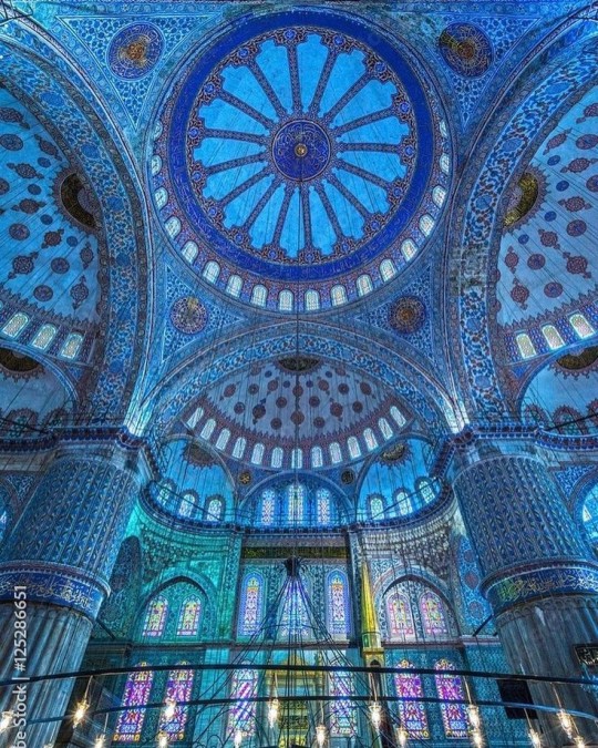
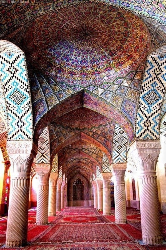
The Islamic world has one of the most beautiful and impressive interior design styles across the world. Colour and detail are absolute staples in the movement. Windows are usually not paned with glass but covered in ornate lattices known as jali. The jali give ventilation, light and privacy to the home. Islamic Interiors are ornate and colourful, using coloured ceramic tiles. The upper parts of walls and ceilings are usually flat decorated with arabesques (foliate ornamentation), while the lower wall areas were usually tiled. Features such as honeycombed ceilings, horseshoe arches, stalactite-fringed arches and stalactite vaults (Muqarnas) are prevalent among many famous Islamic buildings such as the Alhambra and the Blue Mosque.
Byzantine (330/395–1453 A. D)
The Byzantine Empire or Eastern Roman Empire was where eat met west, leading to a melting pot of different interior designs based on early Christian styles and Persian influences. Mosaics are probably what you think of when you think of the Byzantine Empire. Ivory was also a popular feature in the Interiors, with carved ivory or the use of it in inlay. The use of gold as a decorative feature usually by way of repoussé (decorating metals by hammering in the design from the backside of the metal). Fabrics from Persia, heavily embroidered and intricately woven along with silks from afar a field as China, would also be used to upholster furniture or be used as wall hangings. The Byzantines favoured natural light, usually from the use of copolas.
Indian Interiors
India is of course, the font of all intricate designs. India's history is sectioned into many eras but we will focus on a few to give you an idea of prevalent techniques and tastes.
The Gupta Empire (320 – 650 CE): The Gupta era was a time of stone carving. As impressive as the outside of these buildings are, the Interiors are just as amazing. Gupta era buildings featured many details such as ogee (circular or horseshoe arch), gavaksha/chandrashala (the motif centred these arches), ashlar masonry (built of squared stone blocks) with ceilings of plain, flat slabs of stone.
Delhi Sultanate (1206–1526): Another period of beautifully carved stone. The Delhi sultanate had influence from the Islamic world, with heavy uses of mosaics, brackets, intricate mouldings, columns and and hypostyle halls.
Mughal Empire (1526–1857): Stonework was also important on the Mughal Empire. Intricately carved stonework was seen in the pillars, low relief panels depicting nature images and jalis (marble screens). Stonework was also decorated in a stye known as pietra dura/parchin kari with inscriptions and geometric designs using colored stones to create images. Tilework was also popular during this period. Moasic tiles were cut and fitted together to create larger patters while cuerda seca tiles were coloured tiles outlined with black.
Chinese Interiors
Common features of Chinese Interiors
Use of Colours: Colour in Chinese Interior is usually vibrant and bold. Red and Black are are traditional colours, meant to bring luck, happiness, power, knowledge and stability to the household.
Latticework: Lattices are a staple in Chinese interiors most often seen on shutters, screens, doors of cabinets snf even traditional beds.
Lacquer: Multiple coats of lacquer are applied to furniture or cabinets (now walls) and then carved. The skill is called Diaoqi (雕漆).
Decorative Screens: Screens are used to partition off part of a room. They are usually of carved wood, pained with very intricate murals.
Shrines: Spaces were reserved on the home to honour ancestors, usually consisting of an altar where offerings could be made.
Of course, Chinese Interiors are not all the same through the different eras. While some details and techniques were interchangeable through different dynasties, usually a dynasty had a notable style or deviation. These aren't all the dynasties of course but a few interesting examples.
Song Dynasty (960–1279): The Song Dynasty is known for its stonework. Sculpture was an important part of Song Dynasty interior. It was in this period than brick and stone work became the most used material. The Song Dynasty was also known for its very intricate attention to detail, paintings, and used tiles.
Ming Dynasty(1368–1644): Ceilings were adorned with cloisons usually featuring yellow reed work. The floors would be of flagstones usually of deep tones, mostly black. The Ming Dynasty favoured richly coloured silk hangings, tapestries and furnishings. Furniture was usually carved of darker woods, arrayed in a certain way to bring peace to the dwelling.
Han Dynasty (206 BC-220 AD): Interior walls were plastered and painted to show important figures and scenes. Lacquer, though it was discovered earlier, came into greater prominence with better skill in this era.
Tang Dynasty (618–907) : The colour palette is restrained, reserved. But the Tang dynasty is not without it's beauty. Earthenware reached it's peak in this era, many homes would display fine examples as well. The Tang dynasty is famous for its upturned eaves, the ceilings supported by timber columns mounted with metal or stone bases. Glazed tiles were popular in this era, either a fixed to the roof or decorating a screen wall.
Romanesque (6th -11th century/12th)
Romanesque Architecture is a span between the end of Roman Empire to the Gothic style. Taking inspiration from the Roman and Byzantine Empires, the Romanesque period incorporates many of the styles. The most common details are carved floral and foliage symbols with the stonework of the Romanesque buildings. Cable mouldings or twisted rope-like carvings would have framed doorways. As per the name, Romansque Interiors relied heavily on its love and admiration for Rome. The Romanesque style uses geometric shapes as statements using curves, circles snf arches. The colours would be clean and warm, focusing on minimal ornamentation.
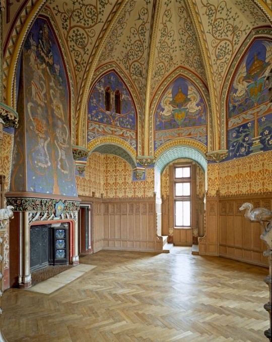
Gothic Architecture (12th Century - 16th Century)
The Gothic style is what you think of when you think of old European cathedrals and probably one of the beautiful of the styles on this list and one of most recognisable. The Gothic style is a dramatic, opposing sight and one of the easiest to describe. Decoration in this era became more ornate, stonework began to sport carving and modelling in a way it did not before. The ceilings moved away from barreled vaults to quadripartite and sexpartite vaulting. Columns slimmed as other supportive structures were invented. Intricate stained glass windows began their popularity here. In Gothic structures, everything is very symmetrical and even.
Mediaeval (500 AD to 1500)
Interiors of mediaeval homes are not quite as drab as Hollywood likes to make out. Building materials may be hidden by plaster in rich homes, sometimes even painted. Floors were either dirt strewn with rushes or flagstones in larger homes. Stonework was popular, especially around fireplaces. Grand homes would be decorated with intricate woodwork, carved heraldic beasts and wall hangings of fine fabrics.
Renaissance (late 1300s-1600s)
The Renaissance was a period of great artistry and splendor. The revival of old styles injected symmetry and colour into the homes. Frescoes were back. Painted mouldings adorned the ceilings and walls. Furniture became more ornate, fixed with luxurious upholstery and fine carvings. Caryatids (pillars in the shape of women), grotesques, Roman and Greek images were used to spruce up the place. Floors began to become more intricate, with coloured stone and marble. Modelled stucco, sgraffiti arabesques (made by cutting lines through a layer of plaster or stucco to reveal an underlayer), and fine wall painting were used in brilliant combinations in the early part of the 16th century.
Tudor Interior (1485-1603)
The Tudor period is a starkly unique style within England and very recognisable. Windows were fixed with lattice work, usually casement. Stained glass was also in in this period, usually depicting figures and heraldic beasts. Rooms would be panelled with wood or plastered. Walls would be adorned with tapestries or embroidered hangings. Windows and furniture would be furnished with fine fabrics such as brocade. Floors would typically be of wood, sometimes strewn with rush matting mixed with fresh herbs and flowers to freshen the room.
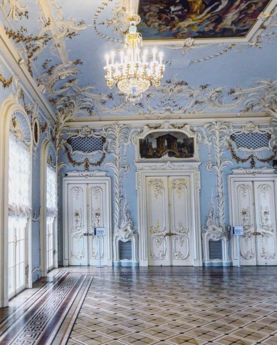
Baroque (1600 to 1750)
The Baroque period was a time for splendor and for splashing the cash. The interior of a baroque room was usually intricate, usually of a light palette, featuring a very high ceiling heavy with detail. Furniture would choke the room, ornately carved and stitched with very high quality fabrics. The rooms would be full of art not limited to just paintings but also sculptures of marble or bronze, large intricate mirrors, moldings along the walls which may be heavily gilded, chandeliers and detailed paneling.
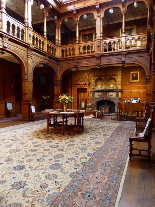
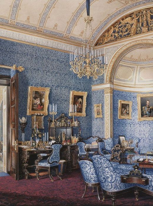
Victorian (1837-1901)
We think of the interiors of Victorian homes as dowdy and dark but that isn't true. The Victorians favoured tapestries, intricate rugs, decorated wallpaper, exquisitely furniture, and surprisingly, bright colour. Dyes were more widely available to people of all stations and the Victorians did not want for colour. Patterns and details were usually nature inspired, usually floral or vines. Walls could also be painted to mimic a building material such as wood or marble and most likely painted in rich tones. The Victorians were suckers for furniture, preferring them grandly carved with fine fabric usually embroidered or buttoned. And they did not believe in minimalism. If you could fit another piece of furniture in a room, it was going in there. Floors were almost eclusively wood laid with the previously mentioned rugs. But the Victorians did enjoy tiled floors but restricted them to entrances. The Victorians were quite in touch with their green thumbs so expect a lot of flowers and greenery inside. with various elaborately decorated patterned rugs. And remember, the Victorians loved to display as much wealth as they could. Every shelf, cabinet, case and ledge would be chocked full of ornaments and antiques.
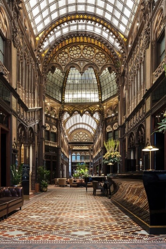
Edwardian/The Gilded Age/Belle Epoque (1880s-1914)
This period (I've lumped them together for simplicity) began to move away from the deep tones and ornate patterns of the Victorian period. Colour became more neutral. Nature still had a place in design. Stained glass began to become popular, especially on lampshades and light fixtures. Embossing started to gain popularity and tile work began to expand from the entrance halls to other parts of the house. Furniture began to move away from dark wood, some families favouring breathable woods like wicker. The rooms would be less cluttered.
Art Deco (1920s-1930s)
The 1920s was a time of buzz and change. Gone were the refined tastes of the pre-war era and now the wow factor was in. Walls were smoother, buildings were sharper and more jagged, doorways and windows were decorated with reeding and fluting. Pastels were in, as was the heavy use of black and white, along with gold. Mirrors and glass were in, injecting light into rooms. Gold, silver, steel and chrome were used in furnishings and decor. Geometric shapes were a favourite design choice. Again, high quality and bold fabrics were used such as animal skins or colourful velvet. It was all a rejection of the Art Noveau movement, away from nature focusing on the man made.
Modernism (1930 - 1965)
Modernism came after the Art Deco movement. Fuss and feathers were out the door and now, practicality was in. Materials used are shown as they are, wood is not painted, metal is not coated. Bright colours were acceptable but neutral palettes were favoured. Interiors were open and favoured large windows. Furniture was practical, for use rather than the ornamentation, featuring plain details of any and geometric shapes. Away from Art Deco, everything is straight, linear and streamlined.
#This took forever#I'm very tired#But enjoy#I covered as much as I could find#Fantasy Guide to interiors#interior design#Architecture#writings#writing resources#Writing reference#Writing advice#Writer's research#writing research#Writer's rescources#Writing help#Mediaeval#Renaissance#Chinese Interiors#Japanese Interiors#Indian interiors#writing#writeblr#writing reference#writing advice#writer#spilled words#writers
3K notes
·
View notes
Text
When I'm angry at the world I let my monsters be extra mad for me. It helps.
Here, have this wip (that I don't know if I'll finish) before I go to bed

#he's great for getting emotions out#his teeth are everything#i'm very tired#art#my art#vent art#sketch#wip#orca!eclipse#apex polarity
386 notes
·
View notes
Text
#kirby#daily kirby#my art#digital#hal laboratory#nintendo#got most of the furniture assembled and placed#I'm very tired
496 notes
·
View notes
Text
something about reading that scene where Kaz pulls out Oomens eye is oddly therapeutic to me
#idk man#i'm very tired#and very gay#I know he's insane that just makes him hotter stfu#kaz brekker#six of crows#Kaz brekker my beloved
107 notes
·
View notes
Text
Raphael: I am very cool and normal about everything actually. Look how very cool and suave I am. /beats Astarion in a tantrum five seconds later/
Raphael: I bet you didn't know a theatre arts kid could do this /puts a significant stake into a theatre so he can have his own theatre performances where he's the only one in the audience whenever he wants/
Raphael: I'm very normal about my dad. Idk why you want me to talk about him. I'm sorry? No I don't know Mephistopheles. Who is she?
Raphael: Lolololol torture
Raphael: Don't ask where all the fresh fruit comes from or how much energy or effort I put into constantly procuring it, no it's not a thing I have.
Raphael: Fhaeleb scares me and I don't know why.
Raphael: I feel like if I tortured her she'd scream with that e.e look on her face and I think that would be fun for about five seconds and then frankly somewhat annoying also she has radiant power and that gives me the heebie jeebies.
Raphael: Astarion's looking more fashionable these days. In my clothing. I am completely normal about this.
Raphael: Hey who do I remind you of *sips red wine on the House of Hope balcony* a very cool person, right? Haha. Yes.
Raphael: You know that game 'gotcha nose!' - It's that, but with your soul.
Raphael: This bitch /slaps himself/ can fit so many nursery rhymes in him.
Raphael: /reading the dictionary again/ I really should use the word tenebrous and dubiety more often.
Raphael: Did you know I can sing? Oh. Just normal things. I just sing about totally normal things.
104 notes
·
View notes
Text
As a few others have noted, this scene just hits different in the manga versus in the '98 anime. But I wanna talk about it, too, so here we go.

In the manga, the pages preceding this scene feel like some well-meaning townsfolk overstepping their bounds a bit, but in '98, the narrative had already built Vash up as a womanizer by this point, so this scene felt more like the townsfolk playing into that aspect of his reputation than anything else. That reputation does add an element of surprise that he'd bother to reject their advances when he was looking up a young girl's skirt, peeping in windows at a lady's bathtub, and completely entranced by a woman's cleavage in the previous episodes. But it still didn't exactly endear me to him.
I don't remember if he said all that stuff in that center panel at all in '98 (and I'm too tired to look it up right now), but if he did, it ABSOLUTELY didn't stick, drowned out in the sudden rejection he has for a pair of skirts that seem to enthusiastically want him for his body. Which is a real miss for '98, because LOOK AT THE LAYOUT OF THIS PAGE.

Part 1 is a continuation of the previous page, with the sudden revelation that Vash isn't even slightly asleep right now, but instead is listening in on the conversation. All it would take for him to stop them is for him to ask. Instead, he lies there in silence until he's alone.
Part 2 is him reflecting on them leaving, on their words, on all that he's leaving behind and all he's done and things that we just don't know about yet in the manga. In spite of not getting any internal monologue from him, it's clear that there, alone in the dark, he's rejecting the idea that all of this--the women, the party, everything--is something he's worthy of. Clearly, the townsfolk think he deserves it, and I'd guess that's the only reason he bothers to tack that "maybe" on there. The pause before his other statements makes them seem too well thought out.
But then you have Parts 3 and 4. And they are... nothing. Nightow doesn't spread the previous three bits of dialog from Vash over three panels. He doesn't add inserts pulling us closer to Vash or to items in the room, or longer shots of the setting easing the transition into the morning of the next day. Instead, he gives us pitch blackness followed by deliberate emptiness with the faintest of clouds.
That's not a transition. That's a punctuation.
When we leave this scene, the thing we're supposed to remember from it isn't that Vash turned down sex. The thing we're supposed to remember is that Vash felt he didn't deserve everything the townsfolk did for him in that evening, and that he felt this so strongly that he deliberately (and sneakily) taps out early to hide in the darkness of his room all by himself to wait for morning.
And that makes this scene FAR more lonely than '98 having the local wandering lecher suddenly turn down an opportunity to get some.
#apologies for spelling errors#i'm very tired#but it's rare that i'm too tired to analyze stories#trigunbookclub#trigun manga#vash the stampede#manga analysis
195 notes
·
View notes
Text

First, suffer my Projmoon Arbiter colored Qorvex, second-- note how all the concrete ridges either float off of or splay open on Qorvex's 4 while firing off the death beam? Well.....
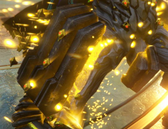
There is no vent or open space to intensify the beams under the codpiece. Instead there is schmeat. So.
Albrecht designed Qorvex to be packing a magnum down there on purpose.
WHY.
#Warframe#aside from the obvious old man yaoi trope of course#what is the practical reason for the Wallfuck killer frame to be packing down there?#freaking BONE Wally into submission???#If so there's still one hell of a size difference in play there!#Warframe Tag#I'm going INSANE trying to figure out a reason for it existing other than aesthetics#and if it is aesthetics why THOSE aesthetics#I'm very tired
59 notes
·
View notes
Text
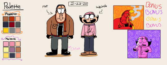
by the way this is what i drew yesterday when my hands weren't cooperating with my brain and my art style had a mind of its own

most serious thing ive ever drawn ever <3
#consistency???#barely know her#my family made me go to the gym to work out today#I'm very tired#anyways#wttt#wttsh#welcome to the table#welcome to the statehouse#wttt fanart#wttt california#wttsh california#wttt florida#wttsh florida#ben brainard#yetiarttag#my art
59 notes
·
View notes
Text
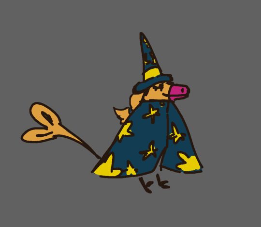
BOOM, finally art with both of them WITH COLORS this time
It's freaking 2:14 AM as I'm typing this what the heck D:
I NEED TO GO TO SLEEP!!!!!
#pizza tower#pizza tower au#zombie apocalypse au#peppino spaghetti#pizza tower noisette#microsoft paint#random art#i'm very tired#the sillies
35 notes
·
View notes
Text

Dinovember 2023 Day 22 -Velociraptor
toothpaste BLAST
#Velociraptor#paleoart#dinovember#dinovember 2023#dinovember2023#their name is toothpaste :)#I'm very tired
50 notes
·
View notes
Text
I've got a dumb question for all you.
#this poll came to me in a vision#which is to say i had a long day after a night of not enough sleep and I'm very tired and silly atm#and if you saw this post just a moment ago no you didn't cuz I forgot to change the poll run time#fairy's tales#I'm very tired
35 notes
·
View notes
Text
I think we should be allowed 2 learn anatomy the davinci way,, dissect a man
133 notes
·
View notes
Text

My face never hides how I feel 🤷♀️ And this is how I feel about today. . .
#personal#I'm very tired#and sore#and i don't like that i have to rest cuz i have things to do#myface
63 notes
·
View notes
Text
❅Jotun Loki Design❅
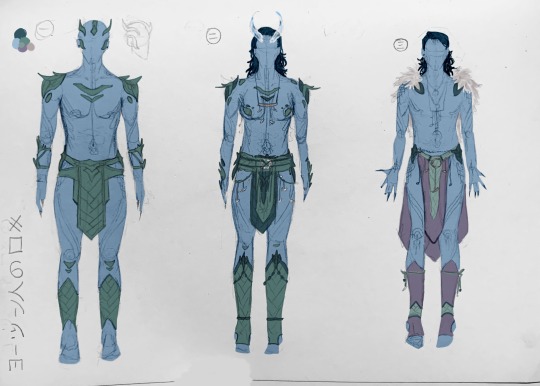


my submissions for @jotun-design-party, though i don't know if it's too late (deadline was december 17th, and it it still dec 17 for me {by less than an hour} but idk if it is for it). If i missed the deadline, i'm sorry.
I had been looking forward to this for several months (and even started a separate jotun loki design months ago in preparation/excitement), but i just haven't been able to do much as of late. Which is sad. And while i had been planning to enter the contest for months, as it drew nearer i realized i probably wouldn't be able to. Which was very sad, because this is one of the only things i've actually looked forward to in forever :(.
As such, though, i really didn't want this oppurtunity to go to waste, like so many others i've had to, and especially in light of magpiemurder going to leave its account soon, i just decided i'd have to push though and do it. I spent pretty much all of today just drawing drawing drawing. Traditional sketched, and then "quickly" added colour digitally (it took several hours as well).
also. all the designs are supposed to be symmetrical (save design 四 and the nails in designs 三&四), so if you see any mistakes... sshhh
More on designs:
一: average battle outfit made from thick, rubbery frost beast leather
二: ceremonial battle armour, used in head shaving ceremony and first battle of a war. Made from thick and (some) thin leather, as well as some mercury metal rings, beads, and bone
三: average every-day wear (inside the city). made of fur, cloth woven from fur, thin leather mercury and bone.
四: average every-day wear (inside city). Likely for around-city wear, not relaxing indoors, due to the uncomfortableness of the beads. Made of fur fabric, fur, thin leather, beads, some bone.
五: average everyday wear (inside city). By far my favourite. For the loincloth, i tried making it look like celtic knots that start right at the top, then sort of get looser and "fade-out" at the end. Thin leather, fur fabric, bone, beads, possibly mercury metal rings.
六: everyday travel wear (outside of city). Not made for warmth, but for protection agains the elements (sharp stone, cutting blizzards, etc). Thick leather, mercury rings. Since loki is royalty, the under layer on theirs is made of black fish scale (the rarest) (also it's supposed to be slightly iridescent but i couldn't do that). For less lavish options, under layers could be made of simply thinner leather, fabric, or a nothing. The nothing option has the jotun wearing it craft an under layer out of ice, and allows for more skin avaliable to make ice for other uses. Also notice how lokis gloves leave the palm bear; this is to allow for the ability to still make ice.
also wanted to say pretty much any of these outfits could be worn with cloaks (save design 一) but i didn't draw them
also: i wanted to do another outfit, a traditional wedding attire. I imagine the jotnar wouldn't actually wear clothes for a wedding, but rather make their own covering out of their own ice. Being their own design, it shows their partner "who they are", and the transparency of the ice represents vulnerability and transparency (in communication; honesty).
jotun headcanons
#sorry if any of this didn't make sense i'm tired and not rereading that#there is currently 18 minutes left of December 17th where i am#i think#i can't do math. it's 11:42pm.#i'm very tired#and i worked on this for hours#okay#bye#loki#jotun loki#concept art#loki fanart#fanart#art#artwork#mcu loki#og loki#2011 loki#jotunheim#unityrain.txt#unityrain.fanart#unityrain.art#magpiemurder#oh look now it's 11:47#no image id#no image description#no id#also i know the feet look wierd but that's bc i hate feet and do not want to spend any time learning how to draw them. yucky yucky#genderfluid loki#fem loki
32 notes
·
View notes
Text
Heyo Happy(very late) new Year's. I've been working on comms so I've been quite MIA.
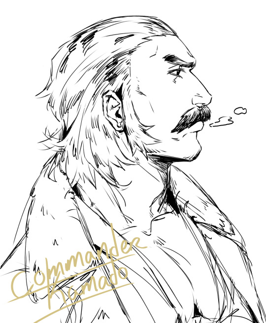
While taking a break I decided to play Legends Arceus again so here's my obligatory Kamado doodle 🧘🏽♂️
#pokemon legends arceus#legends arceus#commander kamado#pokemon#pokemon kamado#yada yada#i'm very tired
25 notes
·
View notes
Photo
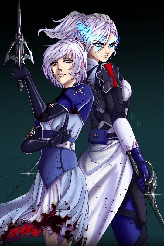
Possible part 2 (???) to this doodle from last year
#rwby#weiss schnee#winter schnee#schneesters#rwby fanart#my art#I'm very tired#short haired ice queen ft. grizzly bear big sis#who hurt me so bad in 2021 that I was inspired to draw that linked picture aksskakajs#family angst is my weakness
236 notes
·
View notes
Last Seen Blogs

veganbloodorange
blorange

rvsomi
run the world
rvsomi
run the world

popijcp
Cascaríta de Naranja

wonderful-creation
Yellow