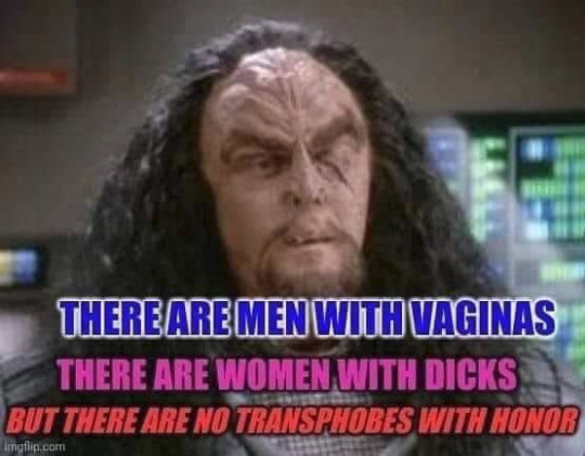
#IDK I HAVE NO MORE THOUGHTS OK
Photo
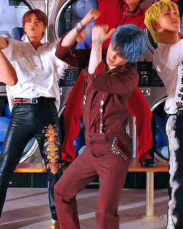

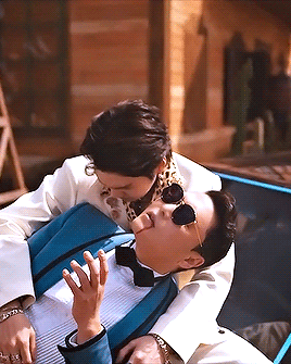
‘ptd yoongi walked so that that yoongi could run’ - @userhobi
#cyphernet#trackofthesoul#dailybts#dailybangtan#btsgif#yoonkookclub#dailydaegu#purplearmynet#armysource#tuserjay#shirleytothesea#usersky#heyryen#usersugajimin#GREETINGS EVERYONE I HAD TO COME OUT OF MY GIF BREAK[?] TO MAKE THIS#THAT THAT YOONGI IS SOOOO#IDK I HAVE NO MORE THOUGHTS OK#HE COMPELLED ME TO DO THIS#IDEK WHAT THIS COLORING IS EVERYTHING IS INCONSIDENT AND GRAINY#BUT THIS IS HISTORY IN THE MAKING I AM SUFFERING AND THRIVING#mygifs#yoongi gifs#that that
2K notes
·
View notes
Text

obsessive
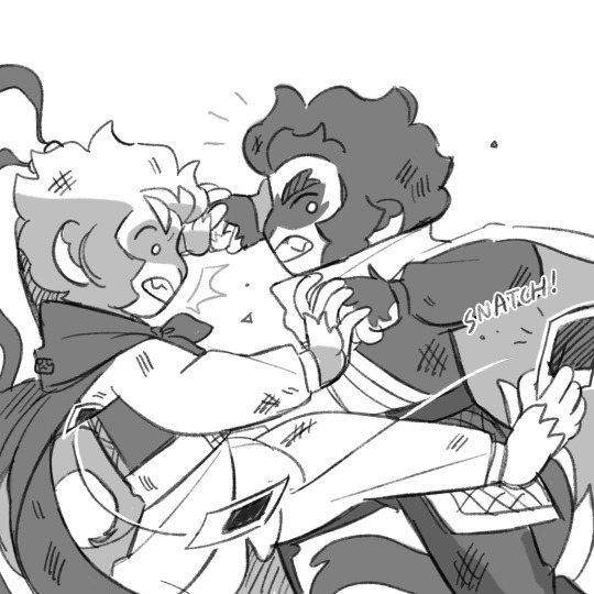
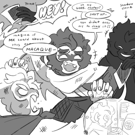
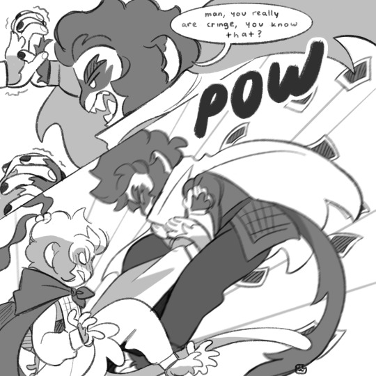
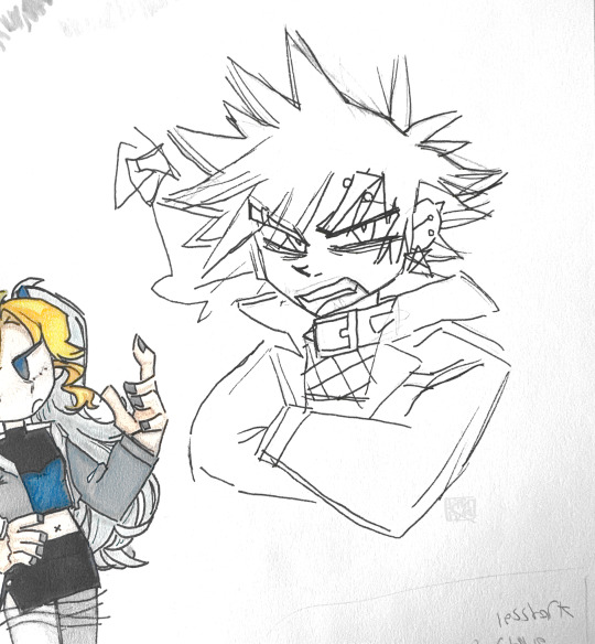
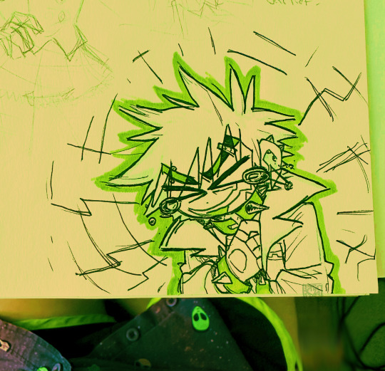
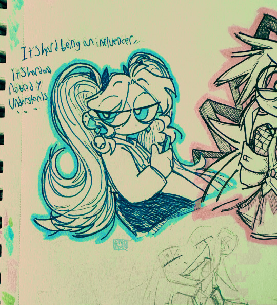
#did i put more effort into this than i needed to? yes. did i put myself through unnecessary pain drawing fighting scenes? yes#but i learned how to outline my strokes so maybe i won after all#i thought about it and i think it turned out ok drawing the eyes differently. like the way i usually draw em#although i dont know if that says much since i change my art style every couple weeks but eh#had fun playing with grayscale and limited palette. i want to do that more often dhghdg#although idk whens the next time i will have enough energy to commit to the bit and do.. this#theyre fucking stupid your honor. for every art we get of them acting dramatic and yearning (/pos) i make dumb shit like this#equivalent exchange girlies!#lego monkie kid#lmk#monkie kid#lmk shadowpeach#shadowpeach#lmk sun wukong#lmk swk#sun wukong#lmk macaque#lmk six eared macaque#six eared macaque#liu er mihou#my art#myart#doodles#comic#lmk monkey king#lmk fanart
5K notes
·
View notes
Text
why Aurora's art is genius
It's break for me, and I've been meaning to sit down and read the Aurora webcomic (https://comicaurora.com/, @comicaurora on Tumblr) for quite a bit. So I did that over the last few days.
And… y'know. I can't actually say "I should've read this earlier," because otherwise I would've been up at 2:30-3am when I had responsibilities in the morning and I couldn't have properly enjoyed it, but. Holy shit guys THIS COMIC.
I intended to just do a generalized "hello this is all the things I love about this story," and I wrote a paragraph or two about art style. …and then another. And another. And I realized I needed to actually reference things so I would stop being too vague. I was reading the comic on my tablet or phone, because I wanted to stay curled up in my chair, but I type at a big monitor and so I saw more details… aaaaaand it turned into its own giant-ass post.
SO. Enjoy a few thousand words of me nerding out about this insanely cool art style and how fucking gorgeous this comic is? (There are screenshots, I promise it isn't just a wall of text.) In my defense, I just spent two semesters in graphic design classes focusing on the Adobe Suite, so… I get to be a nerd about pretty things…???
All positive feedback btw! No downers here. <3
---
I cannot emphasize enough how much I love the beautiful, simple stylistic method of drawing characters and figures. It is absolutely stunning and effortless and utterly graceful—it is so hard to capture the sheer beauty and fluidity of the human form in such a fashion. Even a simple outline of a character feels dynamic! It's gorgeous!
Though I do have a love-hate relationship with this, because my artistic side looks at that lovely simplicity, goes "I CAN DO THAT!" and then I sit down and go to the paper and realize that no, in fact, I cannot do that yet, because that simplicity is born of a hell of a lot of practice and understanding of bodies and actually is really hard to do. It's a very developed style that only looks simple because the artist knows what they're doing. The human body is hard to pull off, and this comic does so beautifully and makes it look effortless.
Also: line weight line weight line weight. It's especially important in simplified shapes and figures like this, and hoo boy is it used excellently. It's especially apparent the newer the pages get—I love watching that improvement over time—but with simpler figures and lines, you get nice light lines to emphasize both smaller details, like in the draping of clothing and the curls of hair—which, hello, yes—and thicker lines to emphasize bigger and more important details and silhouettes. It's the sort of thing that's essential to most illustrations, but I wanted to make a note of it because it's so vital to this art style.
THE USE OF LAYER BLENDING MODES OH MY GODS. (...uhhh, apologies to the people who don't know what that means, it's a digital art program thing? This article explains it for beginners.)
Bear with me, I just finished my second Photoshop course, I spent months and months working on projects with this shit so I see the genius use of Screen and/or its siblings (of which there are many—if I say "Screen" here, assume I mean the entire umbrella of Screen blending modes and possibly Overlay) and go nuts, but seriously it's so clever and also fucking gorgeous:
Firstly: the use of screened-on sound effect words over an action? A "CRACK" written over a branch and then put on Screen in glowy green so that it's subtle enough that it doesn't disrupt the visual flow, but still sticks out enough to make itself heard? Little "scritches" that are transparent where they're laid on without outlines to emphasize the sound without disrupting the underlying image? FUCK YES. I haven't seen this done literally anywhere else—granted, I haven't read a massive amount of comics, but I've read enough—and it is so clever and I adore it. Examples:


Secondly: The beautiful lighting effects. The curling leaves, all the magic, the various glowing eyes, the fog, the way it's all so vividly colored but doesn't burn your eyeballs out—a balance that's way harder to achieve than you'd think—and the soft glows around them, eeeee it's so pretty so pretty SO PRETTY. Not sure if some of these are Outer/Inner Glow/Shadow layer effects or if it's entirely hand-drawn, but major kudos either way; I can see the beautiful use of blending modes and I SALUTE YOUR GENIUS.
I keep looking at some of this stuff and go "is that a layer effect or is it done by hand?" Because you can make some similar things with the Satin layer effect in Photoshop (I don't know if other programs have this? I'm gonna have to find out since I won't have access to PS for much longer ;-;) that resembles some of the swirly inner bits on some of the lit effects, but I'm not sure if it is that or not. Or you could mask over textures? There's... many ways to do it.
If done by hand: oh my gods the patience, how. If done with layer effects: really clever work that knows how to stop said effects from looking wonky, because ugh those things get temperamental. If done with a layer of texture that's been masked over: very, very good masking work. No matter the method, pretty shimmers and swirly bits inside the bigger pretty swirls!
Next: The way color contrast is used! I will never be over the glowy green-on-black Primordial Life vibes when Alinua gets dropped into that… unconscious space?? with Life, for example, and the sharp contrast of vines and crack and branches and leaves against pitch black is just visually stunning. The way the roots sink into the ground and the three-dimensional sensation of it is particularly badass here:

Friggin. How does this imply depth like that. HOW. IT'S SO FREAKING COOL.
A huge point here is also color language and use! Everybody has their own particular shade, generally matching their eyes, magic, and personality, and I adore how this is used to make it clear who's talking or who's doing an action. That was especially apparent to me with Dainix and Falst in the caves—their colors are both fairly warm, but quite distinct, and I love how this clarifies who's doing what in panels with a lot of action from both of them. There is a particular bit that stuck out to me, so I dug up the panels (see this page and the following one https://comicaurora.com/aurora/1-20-30/):

(Gods it looks even prettier now that I put it against a plain background. Also, appreciation to Falst for managing a bridal-carry midair, damn.)
The way that their colors MERGE here! And the immense attention to detail in doing so—Dainix is higher up than Falst is in the first panel, so Dainix's orange fades into Falst's orange at the base. The next panel has gold up top and orange on bottom; we can't really tell in that panel where each of them are, but that's carried over to the next panel—

—where we now see that Falst's position is raised above Dainix's due to the way he's carrying him. (Points for continuity!) And, of course, we see the little "huffs" flowing from orange to yellow over their heads (where Dainix's head is higher than Falst's) to merge the sound of their breathing, which is absurdly clever because it emphasizes to the viewer how we hear two sets of huffing overlaying each other, not one. Absolutely brilliant.
(A few other notes of appreciation to that panel: beautiful glows around them, the sparks, the jagged silhouette of the spider legs, the lovely colors that have no right to make the area around a spider corpse that pretty, the excellent texturing on the cave walls plus perspective, the way Falst's movements imply Dainix's hefty weight, the natural posing of the characters, their on-point expressions that convey exactly how fuckin terrifying everything is right now, the slight glows to their eyes, and also they're just handsome boys <3)
Next up: Rain!!!! So well done! It's subtle enough that it never ever disrupts the impact of the focal point, but evident enough you can tell! And more importantly: THE MIST OFF THE CHARACTERS. Rain does this irl, it has that little vapor that comes off you and makes that little misty effect that plays with lighting, it's so cool-looking and here it's used to such pretty effect!
One of the panel captions says something about it blurring out all the injuries on the characters but like THAT AIN'T TOO BIG OF A PROBLEM when it gets across the environmental vibes, and also that'd be how it would look in real life too so like… outside viewer's angle is the same as the characters', mostly? my point is: that's the environment!!! that's the vibes, that's the feel! It gets it across and it does so in the most pretty way possible!
And another thing re: rain, the use of it to establish perspective, particularly in panels like this—

—where we can tell we're looking down at Tynan due to the perspective on the rain and where it's pointing. Excellent. (Also, kudos for looking down and emphasizing how Tynan's losing his advantage—lovely use of visual storytelling.)
Additionally, the misting here:

We see it most heavily in the leftmost panel, where it's quite foggy as you would expect in a rainstorm, especially in an environment with a lot of heat, but it's also lightly powdered on in the following two panels and tends to follow light sources, which makes complete sense given how light bounces off particles in the air.
A major point of strength in these too is a thorough understanding of lighting, like rim lighting, the various hues and shades, and an intricate understanding of how light bounces off surfaces even when they're in shadow (we'll see a faint glow in spots where characters are half in shadow, but that's how it would work in real life, because of how light bounces around).
Bringing some of these points together: the fluidity of the lines in magic, and the way simple glowing lines are used to emphasize motion and the magic itself, is deeply clever. I'm basically pulling at random from panels and there's definitely even better examples, but here's one (see this page https://comicaurora.com/aurora/1-16-33/):

First panel, listed in numbers because these build on each other:
The tension of the lines in Tess's magic here. This works on a couple levels: first, the way she's holding her fists, as if she's pulling a rope taut.
The way there's one primary line, emphasizing the rope feeling, accompanied by smaller ones.
The additional lines starbursting around her hands, to indicate the energy crackling in her hands and how she's doing a good bit more than just holding it. (That combined with the fists suggests some tension to the magic, too.) Also the variations in brightness, a feature you'll find in actual lightning. :D Additional kudos for how the lightning sparks and breaks off the metal of the sword.
A handful of miscellaneous notes on the second panel:
The reflection of the flames in Erin's typically dark blue eyes (which bears a remarkable resemblance to Dainix, incidentally—almost a thematic sort of parallel given Erin's using the same magic Dainix specializes in?)
The flowing of fabric in the wind and associated variation in the lineart
The way Erin's tattoos interact with the fire he's pulling to his hand
The way the rain overlays some of the fainter areas of fire (attention! to! detail! hell yeah!)
I could go on. I won't because this is a lot of writing already.
Third panel gets paragraphs, not bullets:
Erin's giant-ass "FWOOM" of fire there, and the way the outline of the word is puffy-edged and gradated to feel almost three-dimensional, plus once again using Screen or a variation on it so that the stars show up in the background. All this against that stunning plume of fire, which ripples and sparks so gorgeously, and the ending "om" of the onomatopoeia is emphasized incredibly brightly against that, adding to the punch of it and making the plume feel even brighter.
Also, once again, rain helping establish perspective, especially in how it's very angular in the left side of the panel and then slowly becomes more like a point to the right to indicate it's falling directly down on the viewer. Add in the bright, beautiful glow effects, fainter but no less important black lines beneath them to emphasize the sky and smoke and the like, and the stunningly beautiful lighting and gradated glows surrounding Erin plus the lightning jagging up at him from below, and you get one hell of an impactful panel right there. (And there is definitely more in there I could break down, this is just a lot already.)
And in general: The colors in this? Incredible. The blues and purples and oranges and golds compliment so well, and it's all so rich.
Like, seriously, just throughout the whole comic, the use of gradients, blending modes, color balance and hues, all the things, all the things, it makes for the most beautiful effects and glows and such a rich environment. There's a very distinct style to this comic in its simplified backgrounds (which I recognize are done partly because it's way easier and also backgrounds are so time-consuming dear gods but lemme say this) and vivid, smoothly drawn characters; the simplicity lets them come to the front and gives room for those beautiful, richly saturated focal points, letting the stylized designs of the magic and characters shine. The use of distinct silhouettes is insanely good. Honestly, complex backgrounds might run the risk of making everything too visually busy in this case. It's just, augh, so GORGEOUS.
Another bit, take a look at this page (https://comicaurora.com/aurora/1-15-28/):

It's not quite as evident here as it is in the next page, but this one does some other fun things so I'm grabbing it. Points:
Once again, using different colors to represent different character actions. The "WHAM" of Kendal hitting the ground is caused by Dainix's force, so it's orange (and kudos for doubling the word over to add a shake effect). But we see blue layered underneath, which could be an environmental choice, but might also be because it's Kendal, whose color is blue.
And speaking off, take a look at the right-most panel on top, where Kendal grabs the spear: his motion is, again, illustrated in bright blue, versus the atmospheric screened-on orange lines that point toward him around the whole panel (I'm sure these have a name, I think they might be more of a manga thing though and the only experience I have in manga is reading a bit of Fullmetal Alchemist). Those lines emphasize the weight of the spear being shoved at him, and their color tells us Dainix is responsible for it.
One of my all-time favorite effects in this comic is the way cracks manifest across Dainix's body to represent when he starts to lose control; it is utterly gorgeous and wonderfully thematic. These are more evident in the page before and after this one, but you get a decent idea here. I love the way they glow softly, the way the fire juuuust flickers through at the start and then becomes more evident over time, and the cracks feel so realistic, like his skin is made of pottery. Additional points for how fire begins to creep into his hair.
A small detail that's generally consistent across the comic, but which I want to make note of here because you can see it pretty well: Kendal's eyes glow about the same as the jewel in his sword, mirroring his connection to said sword and calling back to how the jewel became Vash's eye temporarily and thus was once Kendal's eye. You can always see this connection (though there might be some spots where this also changes in a symbolic manner; I went through it quickly on the first time around, so I'll pay more attention when I inevitably reread this), where Kendal's always got that little shine of blue in his eyes the same as the jewel. It's a beautiful visual parallel that encourages the reader to subconsciously link them together, especially since the lines used to illustrate character movements typically mirror their eye color. It's an extension of Kendal.
Did I mention how ABSOLUTELY BEAUTIFUL the colors in this are?
Also, the mythological/legend-type scenes are illustrated in familiar style often used for that type of story, a simple and heavily symbolic two-dimensional cave-painting-like look. They are absolutely beautiful on many levels, employing simple, lovely gradients, slightly rougher and thicker lineart that is nonetheless smoothly beautiful, and working with clear silhouettes (a major strength of this art style, but also a strength in the comic overall). But in particular, I wanted to call attention to a particular thing (see this page https://comicaurora.com/aurora/1-12-4/):

The flowing symbolic lineart surrounding each character. This is actually quite consistent across characters—see also Life's typical lines and how they curl:

What's particularly interesting here is how these symbols are often similar, but not the same. Vash's lines are always smooth, clean curls, often playing off each other and echoing one another like ripples in a pond. You'd think they'd look too similar to Life's—but they don't. Life's curl like vines, and they remain connected; where one curve might echo another but exist entirely detached from each other in Vash's, Life's lines still remain wound together, because vines are continuous and don't float around. :P
Tahraim's are less continuous, often breaking up with significantly smaller bits and pieces floating around like—of course—sparks, and come to sharper points. These are also constants: we see the vines repeated over and over in Alinua's dreams of Life, and the echoing ripples of Vash are consistent wherever we encounter him. Kendal's dream of the ghost citizens of the city of Vash in the last few chapters is filled with these rippling, echoing patterns, to beautiful effect (https://comicaurora.com/aurora/1-20-14/):

They ripple and spiral, often in long, sinuous curves, with smooth elegance. It reminds me a great deal of images of space and sine waves and the like. This establishes a definite feel to these different characters and their magic. And the thing is, that's not something that had to be done—the colors are good at emphasizing who's who. But it was done, and it adds a whole other dimension to the story. Whenever you're in a deity's domain, you know whose it is no matter the color.
Regarding that shape language, I wanted to make another note, too—Vash is sometimes described as chaotic and doing what he likes, which is interesting to me, because smooth, elegant curves and the color blue aren't generally associated with chaos. So while Vash might behave like that on the surface, I'm guessing he's got a lot more going on underneath; he's probably much more intentional in his actions than you'd think at a glance, and he is certainly quite caring with his city. The other thing is that this suits Kendal perfectly. He's a paragon character; he is kind, virtuous, and self-sacrificing, and often we see him aiming to calm others and keep them safe. Blue is such a good color for him. There is… probably more to this, but I'm not deep enough in yet to say.
And here's the thing: I'm only scratching the surface. There is so much more here I'm not covering (color palettes! outfits! character design! environment! the deities! so much more!) and a lot more I can't cover, because I don't have the experience; this is me as a hobbyist artist who happened to take a couple design classes because I wanted to. The art style to this comic is so clever and creative and beautiful, though, I just had to go off about it. <3
...brownie points for getting all the way down here? Have a cookie.
#aurora comic#aurora webcomic#comicaurora#art analysis#...I hope those are the right tags???#new fandom new tagging practices to learn ig#much thanks for something to read while I try to rest my wrists. carpal tunnel BAD. (ignore that I wrote this I've got braces ok it's fine)#anyway! I HAVE. MANY MORE THOUGHTS. ON THE STORY ITSELF. THIS LOVELY STORY#also a collection of reactions to a chunk of the comic before I hit the point where I was too busy reading to write anything down#idk how to format those tho#...yeet them into one post...???#eh I usually don't go off this much these days but this seems like a smaller tight-knit fandom so... might as well help build it?#and I have a little more time thanks to break so#oh yes also shoutout to my insanely awesome professor for teaching me all the technical stuff from this he is LOVELY#made an incredibly complex program into something comprehensible <3#synapse talks
743 notes
·
View notes
Text
look at this pic i found on twitter
#mine#hi heres my star trek take for today#does anyone else feel a little teeny bit weird when peeople talk abou t#wait ok hold on spoilers for s7 of ds9. dont read ahead ok#does anyone feel weird when peopeple joke about how kai winn and dukat were such a good couple when he like. raped her#like i know why they do but did no one think about that whole story arc hard enoigh to realize what he did to her#explicitly stated on screen. like thats verbatim unconcensual sex what happened and everyones liek its funny because dukats funny#and kai winn is a bitch which she is but also idk. does this make sense#ok thats my thought this have nothing to do with the abive image#i just didnt want to make this into a text post :| anyohe else get scared when dukat is on the scren#okay goodbye. im rewatching viyager btw not fr im just putting it on for comfort whenever i feel sick which is often LOL! but like on n off#can we make the doctor more popular than data =. keep going warriors
9K notes
·
View notes
Text
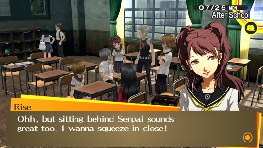
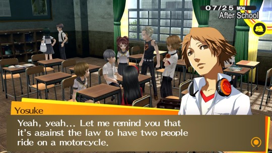
#persona 4#p4#persona 4 golden#p4g#hanamura yosuke#yosuke hanamura#souyo#ok ok listen this scene is so goddamn funny because UP CLOSE AND PERSONAL WAS YOSUKES PLAN ALL ALONG#THIS WAS HOW HE WAS SELLING IT TO YU WHEN HE WAS TRYING TO CONVINCE YU TO GET HIS MOTORCYCLE LICENSE#so when rise says this yosuke of all people should have gotten really excited because hey at least the plan is kind of working out ???#also HELLO its THE risette??? except no he goes straight towards shooting her down#doesnt even play along do not pass go do not collect $200 just dismisses it handily without thought#why some may even argue that yosuke is a bit sensitive about yu being squeezed by someone#its me im some#also yosuke has offered go give yu a ride on his bicycle before so yknow isnt that inchresting#his bicycle definitely only has one seat so doesn't that make it even more up close and personal and romantic#yosuke: we can get up close and personal with others!#also yosuke: no not like that not with other people#I GUESS idk poor boy's just very confused and a disaster issokay#he's good with his queue
594 notes
·
View notes
Text
thinking about john n davesprite n dave
what happens when he finds out its not just a bird dave thing but a dave thing.....
the idea hes built up of The Real Dave comes crashing down
like things were def made worse by being stuck together for 3 years with noone else n all of the extra issues davesprite has On top of all the normal dave bs
but like, fuuuckkkkkkk
#and like#i havent touched hs2 in ages but just thinking about any post canon thats based on the canon end be it hs2 or not#john interacting with dave#davesprite was the dave he was with for 3 years#the First dave he met...#do you think he thinks about him?#sees davesprites mannerisms in dave#n realizing what a pedestal hed put dave on compared 2 davesprite cus he hadnt seen daves issues up close n personal#years later looking back#after maybe even learning about some of the details of daves fucked up home situation#having the context for some of ds behavior#he was just a kid....#he was the only beta kid not to make it....#i just remembered jasprose n was like.. hmm idk if id count her since she shows up so late BUT#SHE DID MAKE IT#ok now im even more upset..... he truly was the only one of them... the one who gave up his identity....... TWICE(counting davepeta as 1#N THEY DIDNT EVEN MAKE IT SO LIKE)#i am going insane#i am thinking violent thoughts#davesprite#rambles
153 notes
·
View notes
Text
*im using "dating" to refer to any kind of romantic relationship, it just fits neater in the boxes! interpret as u see fit
pls leave your thoughts in the tags im genuinely very curious
#look ok yknow how a lot of ace people tend to be sexually active for whatever reason#im kinda wondering if the same principle applies here#my GUESS is that it does but also the two are very different#i feel like most people are more likely to compromise/want to branch out with sex rather than dating#like...sleeping with a partner even tho youre ace? makes sense#dating someone for months even when youre aro? makes less sense#idk im having Thoughts#reblog pls!!!!#aromantic#aromantism#aroace#lgbtqia#polls
141 notes
·
View notes
Text
Yall imagine Danny getting help from Batman and tells him about how hes on the run (it was a joke in passing smh) and how he has no home (it was ment to be funny man) then all of a sudden Bruce way shows up on a totally casual stroll in his neighbourhood. “Oh look a child who is in need laaa dee daa let me help you poor random child who I have no idea who you are.” As if Danny is an idiot. He isnt fooled in the slightest. He knows when something is up. Batman clearly is using Bruce Wayne to help kids off the street.
Danny is staying at Wayne manner and notices how no one really talks about the bats. Or tif they do Bruce gets this look then quickly changes the subject. Hes putting so much effort into it too. And at first Danny hardly noticed. Now it’s obvious theres a connection. At first he thought Bruce Wayne hated batman with how often he refused to comment or gave his kids a glare when they mentioned the big bad bat. But now it’s clearly something else. Danny got a chance to talk to the commissioner alone and then it clicked. Danny had asked whats Mr.Waynes beef with Batman and the commissioner seemed so confused. Quickly telling Danny about how the two have worked together. How Bruce has even helped the bat with information or a distraction from time to time. Why would Danny think that he hated him???
And BAM Danny had it. Bruce Wayne is dating THE Batman!!! Holy shit it makes so much sense. Danny would often find batgear around the house. Bruce probably got targeted a bunch and thats probably how they met.
Now hes trying so hard to be supported of his clearly closeted father figure. He also gets why it’s not public info too. Paints a huge target on Bruce. Plus his many many kids. Must be hard for them. What a crazy life they live. Jason would probably be so jealous of their literal fairytale romance.
Danny tells Bruce that he is supported by him and that his secret is safe until hes ready to tell anyone else. Bruce niw thinking Danny knows hes batman shows up no mask and Danny goes nuts. “You can’t out yourself in danger to protect him bruce!!! You are just some himbo man!!! He wouldnt want this!!!” Thinking Bruce is going to try and fight in Batmans place.
Then Danny walks up and places a hand on bruces should (he has to reach lmao shorty). “I will go. I will keep everyone safe. You can count in me” transforms snd flys off to defeat the big bad. Leaving a fully stunned and confused bruce.
#danny phantom#dp x dc#dpxdc#yall have seen the batman lego movie right?#I mean the jokerxbatman stuff was fantastic but I loved how ribin thought he got two dads#then he lost them both at the same time#beautiful#I was gonna have more to this and I might later#I have so mich stuff to fo and im standing here soaking my pgone in the shower to write this shit#thats why I have so many typos now a days byw cause my phone is sopping#also im missing a bit ig my goot cause I guess I just moonley brain and ripped it off???#idk why I did that but it started bleeding and it hurts all the time and I kist want it to stop#but also I started to do it a third time#yes I did it twice#lord help me im stupid#ok im a go dye my hair white. unrelated ti dp
164 notes
·
View notes
Text
btw until getting on snzblr i just assumed sneezing more than a couple times from a cold was like. idk. a media troupe. like. made up for dramatic affect i just didnt think it was real. i am recently finding out, no, people do catch colds and just sneeze throughout the day from them. what!!!!! !!!!! how does it feel to be the hottest on earth Huh.
#i thoufht it was made up by the media!!! idk!!!!!!#i dont think ive ever sneezed more than once from getting sick#and i figure oh ok maybe if your nose runs you do then. from that#no?? some people just do?? like have spread out fits?? ??? what.#genuinely mind blown#i also. thought the same thing about non-rapid fits . so i think#i have to reevaluate my ideas.#like i just didnt think it hapened. i jusr didnr. didnt sound real to me#bc im always like ‘oh i cant write that its not realistic!’#No it is. it is. it jusr doesnt happen to me. but its real#LOL.#text
86 notes
·
View notes
Text
tumblr user magowolor posts magolor art (CHEERING AND CLAPPIN) yup yuup mhm thats right
#once he claws his way ouy of hell after definantly learning his lesson(not true) He and i will have a summer wedding#lol idk. maybe he did learn smthn but not necessarily the lesson he should have#like to him it was probably just ok MAYBE he shouldnt try n bite off more than he can chew n get carried away#and then he finds some other way to garner attention and make his impression on othars#esp w kirby hes reeely trying to overcompensate for his past misdeeds like hehe yah im suuuuuperr nice now trust ^-^#but maybe just MAYBE theres a slight shift were hes like ok well what if i didnt want to be good just to be convincing#only Bc his past motivation and actions were all built off one lie after another. he cant even tell if these thoughts are genuine#sooo maybe his curiosity gets th better of him and he figures the only way to find out and also maybe possibly b able to form actual bonds#this time around is by commiting to actually intentionally being good and stuff#like hes not suddenly gonna try an be a complete goody two shoes and be perfect bc hes still a mischevious guy yknow but uhm. yeah. yknow#^^^oh BROTHER we got a real yapper over here -_-#kirby#magolor#krtdldx#myart
223 notes
·
View notes
Photo
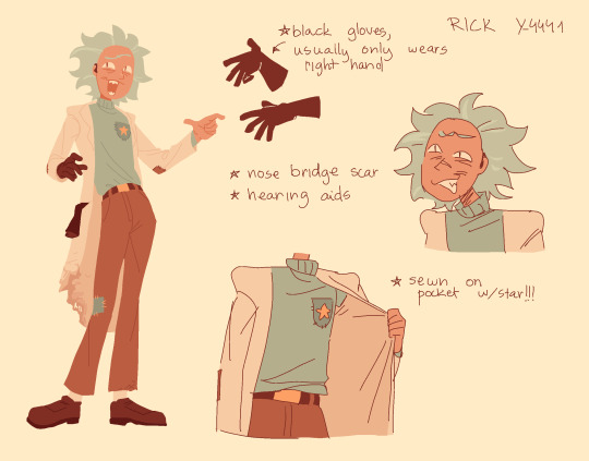
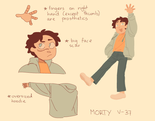
proper refs for my new r&m ocs :-) more info BELOW
morty v-37 - basically gets used as a human shield and then promptly left for dead by his previous rick(which is why hes got the scar and prosthetics), y-4441 finds him and fixes him up + erases his memories of the whole nearly dying thing. he’s pretty chillaxed and a bit more cynical than an average morty, more “rickish” i guess idk. tends to be skeptical, likes poking holes in rick’s arguments/inventions etc etc but like in a teasing way
rick y-4441 - very peppy, upbeat and emotional. he kind of reeaalllyyy dislikes the cfc and stays away from it as much as possible, especially after finding and unofficially adopting v-37. he’s not as tech savvy as most rick’s, his abilities are more akin to s1 rick’s skill level? as in, he lives off of scraps of materials and creative solutions, less god-like and more “old man in garage who happens to know physics and chemistry”. loves to ramble about basically anything and happily indulges in morty’s hypotheticals/questions whatever. EXCEPT! for why morty doesnt have his fingers he shuts that topic down immediately just does not want to deal with that can of worms at allll
#rick and morty#rick sanchez#morty smith#ocs#idk#theres no name or real story for this au#except for like their backstories i mea#like they have no direction they're just chilling#but i like drawing them#theyre kind of? role swapped versions? buuutt like okay.#i usually hate roleswap aus bcs the way most ppl do them is by just tweaking designs AND ALSO switching the personalities#like ok this is just me rambling abt a pet peeve now but listen to me#it is much more interesting to take the characters and Keep Them The Same while putting them in a different position#that is a neat au in my opinion#but just ugh.#like ok if u just wanna draw alternative versions of the charas thats fine OBVIOUSLY#but i wish there was a biiittt more thought in there. like just a shred of idea#'scientist morty but he's still empathetic and loves his family' + 'regular grandpa rick who is just such an ass for no reason at all'#ok im over it. tell me my ocs r cool
535 notes
·
View notes
Text
anyway
#i dont think the little braid in the back is canon i just thought itd be cute if he had a Hair Ring back there too#a doodley#its okayyy if im improving insanely slow i wont get better if i dont make art that sucks ass <3#need to keep drawing humans again so i can get back to my skills frm couple yrs ago. admittedly still shitty#also ok listen. idk how ppl stylize faces turned further than just to the side bc like...#like it was ok here bc talon has visible face folds always#i know all faces have landmarks but how do u draw a face like this w.o the folds...ykwim...#i need to go look at more art#and stylization.....ughhhh#its gonna take me like 10 years to get to a point where all my skilled peers were when they were 16. lol
164 notes
·
View notes
Text
Imagine if you will... Ray with a tongue piercing ʕ ꈍᴥꈍʔ 💭
A more "messy" version under the cut bc I wanted to practice tears and stuff.. 👀

#Ok I may have put way more effort into this than I should've but I literally couodnt stop thinking about this#I used this as an excuse to practice rendering so technically its productive ( ꈍᴗꈍ)#I really enjoy drawing tears and idk what that says about me as a person#I just love the idea that hes just talkin away and suddenly you see a little glint in his mouth and oh my god is that what i think it is?#and hes such a bottom that he would just let you open and pkay with his mouth to see for yourself#he's just my lil sopping wet meow meow I can't help but put him thru situations#I think often about his different sides clashing and being very gap moe#like Ray with a tongue piercing? please someone hold me back bc I'm going AT HIM#I want EVERY version of this man I cannot even explain how deeply the brain rot goes#the day I stop thinking about Saeran Choi is the day I drop dead actually#I wont fill the tags with any more salacious comments about how sl\/tty this man is but just know the thoughts are plentiful#anyways enjoy the food#more art to come as I'm getting back into my artistic groove lately#my art#mystic messenger#mysme#saeran choi#mysme saeran#mysme ray#mystic messenger unknown#unknown mysme#ray mystic messenger#mystic messenger fanart#mystic messenger mc#mysme mc
101 notes
·
View notes
Text
hey guys am i allowed to say on main that i dont like metadad . am i gonna get beaten up for saying this.
guys i think we all took the term found family too literally and now everythings flattened into a boring nuclear family. guys can we stop. hello . is anybody there
#text#it was kinda charming at first but it feels like everytime i try to look at the mk tag its always the same shit . guys. guys.#we can do so much more w/ their dynamics than just dad and son ugh its so . ughhh.#every since i realized i was like . really really aroace. ive started to grow a bit of a distaste for shipping culture#this is relavant i swear. iwanna talk about metadede#like ok in fandoms right. theres often#the enforcement of specific roles onto characters for a simplified understanding of them for memes and drawing ideas#we want gay rep but we dont quite have it canonically so we make our queer headcanons seem more legit#by giving a char a same sex partner. ok easy we did it. gay people are real now#and we get awesome art and its wonderful bc people are wonderful#but its like . the relationships themselves feel flat a lot of the times.#metadede never seems to be about dedede. its about mk having a boyfriend. bc we need him to date someone.#and im not like . mad at anyone about this. i participated in it back in the day. but like.#ok so. gay hcs are the most popular in most fandom things bc its easy; hot; and sweet#but things like aro or ace hcs? its just. they. how can you depict that in a single framed drawing of a char?so theres none at all.#its not even that i actively hc chars aroace its jsut this is my world view; how i default to reading chars#maybe this rant in the tags is unrelated after all.#but idk. ive got lots of thoughts about things.#anyways as ceo of meta knigth im right about everything#i can talk more about metadad stuff specifically if people want
140 notes
·
View notes
Text
You know even if L and Light were both extremely heterosexual men, I still don't get how either one of them wouldn't find it alarmingly sexy that the other one was secretly trying THAT hard to constantly impress them and read their mind and personally entertain them and trip them specifically and ONLY them up
#like im sorry but#cant get much more romantic than that?#would somebody try that hard simply because they wanted to be your bro or because they did not care for you in any personal way at all?#no#idk why im making so many posts these days btw#i just keep getting hit with lawlight thoughts about the lawlight thots#like the steps of planning light went through to make the entire yotsuba arc happen??#this is why he is the gone girl / amazing amy of the pair#it's like ok that's definitely scary and very insane of you but also maybe kinda hot hahahaha#and this is exactly what Alessandro Juliani meant when he said he thinks they have a real affinity for each other im sure#like he's probably a straight dude but even he was like dang they r in love#light yagami#l lawliet#lawlight#p
442 notes
·
View notes
Text


More powerpunk girls art!!!! Cuz they are just. Fun to draw ghgh- this time trying to get a better design for brat! Cuz even tho I liked the old one I had.. I wanted to try and give her a lil bit more edge… so! Here were some experiments w that! I didn’t succeed in. Solidifying anything, as u can probably notice. Considering her outfit is slightly different in every picture ghgh- but! Idk! Maybe that’s ok lol. She’s the sorta character who would have a bunch of different outfits it’s fine lol
#powerpuff girls#the powerpuff girls#ppg#powerpunk girls#ppnkg#ppg brat#ppg brute#ppg berserk#doodles#also featuring! I think the first picture I’ve drawn of brute smiling lol!#anyway yeah… been workin on these all day my brains mush… have some powerpunks I hope u enjoy them ghgh-#actually. more thoughts rlly quick.#why I wanted to give brat a lil more edge: there called the power PUNK girls… and I felt like brat was having a severe punk deficiency ghg#like. I don’t think she needs to actually BE punk. but just… needed a lil more edge.. a lil more a teensy bit#i am also thinking about this in regards to berserk. which is why I gave her lil fishnet gloves here lol. but idk!#I have some ideas for her but… I do like the design I already have for her too.. so idk. I’m thinking about it tho#ok now I’m done w thoughts lol
165 notes
·
View notes
Last Seen Blogs

taisuke-fujigaya
profile
theshonkyartshop
Featuring Shonky Cats, Shonky Flowers and more...
amukmuk
mukmuk