#Jiro Konami
Photo
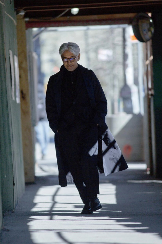
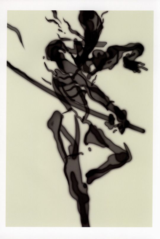
Ryuichi Sakamoto
photographed by Jiro Konami
235 notes
·
View notes
Photo
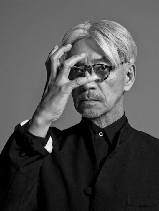
Ryūichi Sakamoto (坂本龍一) (1952-2023)
♥
(image: Jiro Konami (photograph), Ryūichi Sakamoto, «THE NEW ORDER», Vol. 19, July 2018)
193 notes
·
View notes
Text
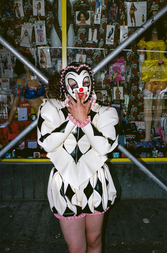
BINGO for Sukeban New York
Photographed by Jiro Konami
#jiro konami#sukeban#sukeban new york#sukeban world#bingo#joshi wrestling#them posing her in front of a sex shop. THEY MUST KNOW what theyre doing
22 notes
·
View notes

Text
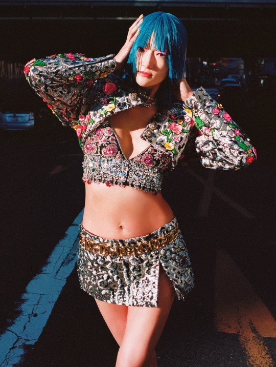
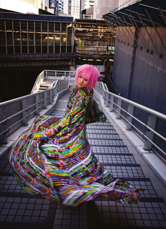

”The Eternals” by Jiro Konami for Vogue Japan May 2022
11 notes
·
View notes
Text
One of my friends asked me by what criteria I choose games. I said there should be a pretty male character. He continued: "Of course, but what else besides a handsome man can you be captivated by the game?" No, my friend, you don't understand. A handsome character is often the only reason I pick up a game. I'm not saying that this is the only thing that defines for me such a complex work as a video game. But it is futile to deny the fact that we are living beings who like beautiful things and especially attractive bodies. Yoji Shinkawa understands this too. As well as the fact that the player spends most of his time looking at the protagonist's back. So why not make that back as attractive as possible?

At around the age of 19, Yoji Shinkawa entered Seika University in Kyoto. It is a private university known for its manga and anime departments, often taught by mangakas. Young Shinkawa's passion for art blossomed as he got acquainted with the books of his compatriots, illustrators Hikozo Ito (1904 - 2004) and Kashō Takabatake (1888 - 1966). Both graphics, the theme of a warrior is present in the works of both. As a technique, Shinkawa first chose gel pens. According to him, the reason he started using his brush pens was because of the influence of Yoshikazu Yasuhiko. In junior high school Shinkawa read a book on how to draw manga and tried using a dip pen, which turned out to be a failed attempt.
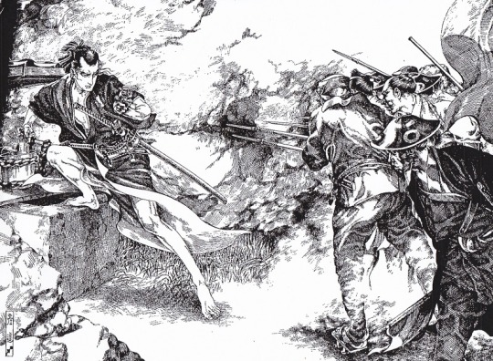
Kakubei Jishi (written by Jiro Osaragi). Illustration for a Shonen Club serialized novel. Hikozo Ito, 1927
His desire can be understood. Drawing with a dip pen allows to create things of incredible sophistication and detail. Just look at drawings of another Shinkawa's inspirator Hikozo Ito. How detailed his works are, how accurately he conveys the mood and characters of the heroes on his works. No wonder they made an impression on Shinkawa. In further practice, he began to use a brush pen, which brought the future designer closer to the technique of his teachers Yoshitaka Amano and already mentioned Yasuhiko, who drew with brushes. Already at a young age, Shinkawa began creating his own illustrations for anime magazines.

After graduating from university in 1994, Shinkawa began working at Konami, one of the leading video game developers and publishers. Here he meets the game designer Hideo Kojima, whose brilliant star has yet to shine on the gaming industry. Maybe it wouldn't shine so brightly if it weren't for Shinkawa. The person who gave birth to a brilliant idea met the person who breathed life into this idea with his brush. One of the first projects that Shinkawa worked on was the game Policenauts, created by Kojima. In this work, one feels that he is still on the way to developing his style - his drawing is similar to anime and manga and lacks any personalized features.
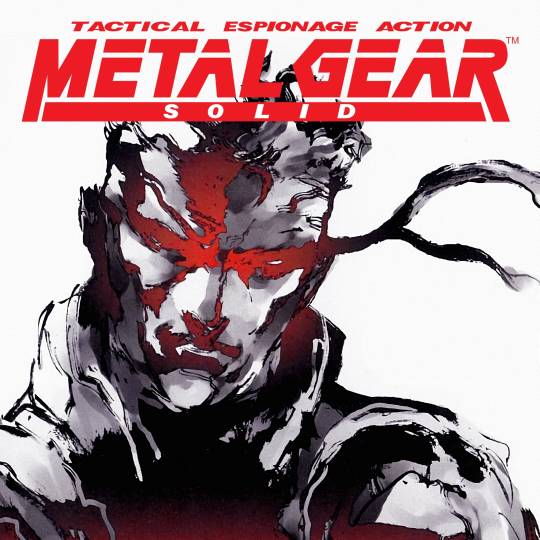
At the same time, in 1995, under the direction of Kojima, Shinkawa began working on his Metal Gear Solid project. Significant changes in Shinkava's style are felt in the work on this project. Almost not a trace remains of the bright anime drawing from Policenauts. The design feels more grim, the characters themselves look more "western" than most Japanese games of the time. As Shinkawa himself noted, Kojima has provided complete creative freedom. The designer only described the intended characters to him in general terms, often indicating only the gender itself. This approach took more time to develop, but at the same time, freed Shinkawa's hands both as an artist and as a designer.
Design, no matter how many beautiful things it creates, is a utilitarian thing. It is not enough to draw 'pretty'. Your work should have practical significance. In the case of video games, character design is about creating an image that is easily remembered in the player's imagination and makes the hero unique. This uniqueness comes from the features of the character itself: his occupation, character, role in the game, relationships with other characters, etc. With space for imagination, Shinkawa tells their story directly on paper, conveying it in poses, clothes, facial expressions and the way their bodies are composed. In the world of Metal Gear, the player is constantly on the battlefield. The main activity of the characters is focused on their confrontation, so they must be in good physical shape. And Shinkawa emphasizes this in every possible way.
The figure of young Solid Snake, the protagonist of Metal Gear Solid, is very stable and tense, but not without flexibility. Shinkawa's line breaks like waves, drawing the relief of the body under the baggy suit. By adding colors on the computer, Shinkawa creates three-dimensional shapes that convey the roundness of muscles. Snake's entire body is covered. But even under the folds of a tight suit, you can see a well-built body.
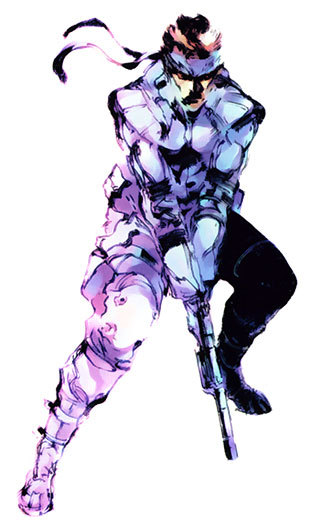
Notice that Snake's figure is heavily shaded: you cannot see his face. In the first works, Shinkawa did not draw faces and eyes in detail, because the graphics power of the PlayStation did not allow to reproduce the textures in detail. Shinkawa smooths out the facial features, but you can definitely understand Snake's emotion and character.
Much more interesting and artistically opposite to Snake is the figure of Gray Fox. Shinkawa's vision of a character goes beyond just a form designed to perform a certain function. For Shinkawa, the body is another way to tell a character's story, to reveal his essence before the player discovers more information about the character. This is how the means of artistic expression in art work. Looking at a picture, you subconsciously note the things that the creator put into it. You can't always explain exactly what you see, but you always accurately identify the emotion that excites your mind in the very first second of contemplation.
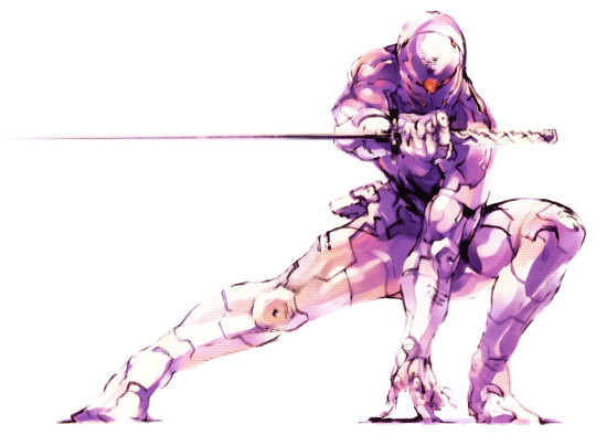
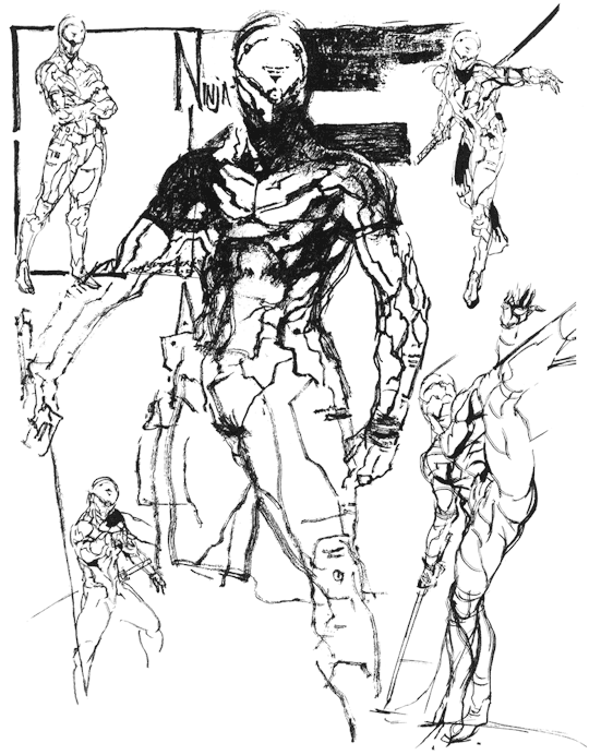
Shinkawa plays with the player's imagination. Gray Fox is a cyborg, but in his image there is not the slightest hint of the artificial nature of his body. It is sculpted by the muscles that transmit the plastic to its exoskeleton. It seems to be pieced together from scraps and feels lighter and more flexible compared to Snake's living body. The designer goes deeper than just trying to convey the image of a ninja literally. He depicts a slender solid silhouette - only a shadow of a mercenary, in which the embedded image of a ninja can be clearly read. A victim of horrific experiments, he hides his mutilated flesh behind a cold cyborg body made in the colors of steel and human flesh. The gaze of the eyes disappears behind the mask with an eerie glint of a red sensor that resembles an eye. Shinkawa does not resort to excessive or even any careful detailing. The designer moves away from unambiguous and finished images. All superfluous and unnecessary details are cut out, leaving the content embodied in a fragile, fleeting form.
As Shinkawa noted, one of his inspirations is the French artist and author of comics Jean Giraud, better known as Moebius. Giraud is closely related to cinematography. He worked with Ridley Scott on the films Alien (1979) and Blade Runner (1982), created costume design for the cyberpunk film Tron (1982), was involved in the creation of The Fifth Element and many other projects. Although this fact may seem insignificant, it is still quite symbolic in Shinkawa's work. Kojima, with whom the artist created images for games, opened another means of artistic expression for the game industry, including elements of cinematic art in the game, namely cutscenes. Prior to this, narrative was part of the gameplay, presented in the form of long notes or short notes. Cutscenes made it possible to directly connect the gameplay with the story, making the work a single whole.
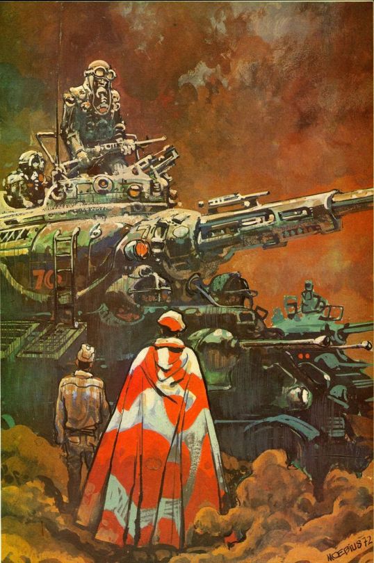
Illustration to Gordon R. Dickson's work Pour quelle guerre. Jean Giraud, 1972.
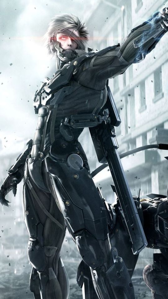
The large number of cutscenes typical of Kojima's games deliberately create an opportunity to examine the characters from every possible angle, revealing Shinkawa's genius. For the designer, this is a kind of art camera, where his creations are presented in various poses and lit up like curiosities, playing with the player's imagination. When I started playing Metal Gear Rising: Revengeance again recently, this became more apparent than I thought. Alongside cinematic scenes, there are plenty of close-ups with unexpected angles. The characters are not just pleasant to watch. You want to interact with them.
My favorite work of Shinkawa. Stylistically, it is very similar to the works of Yoshitaka Amano: a smooth silhouette that practically melts on the plane of the sheet. The composition is minimalistic, but very meaningful. With one sketch, Shinkawa conveys the character's name (in Japanese mythology, Raiden is the god of lightning), the plasticity of his young body, and the killer's concentrated gaze.
Raiden's design is probably my favorite. He appeared in the franchise with the release of Metal Gear Solid 2: Sons of Liberty in 2001, via a fan letter to Hideo Kojima. Its author complained about the old characters constantly repeating themselves in Metal Gear. In creating the image of Raiden, Shinkawa moved away from the image of a strong, stereotypical male figure, inspired by the popular heroes of the 90s and the American superhero comics from which he took inspiration. The designer resorted to a more Japanese view of male beauty, which was used by the same Kashō Takabatake in his works.
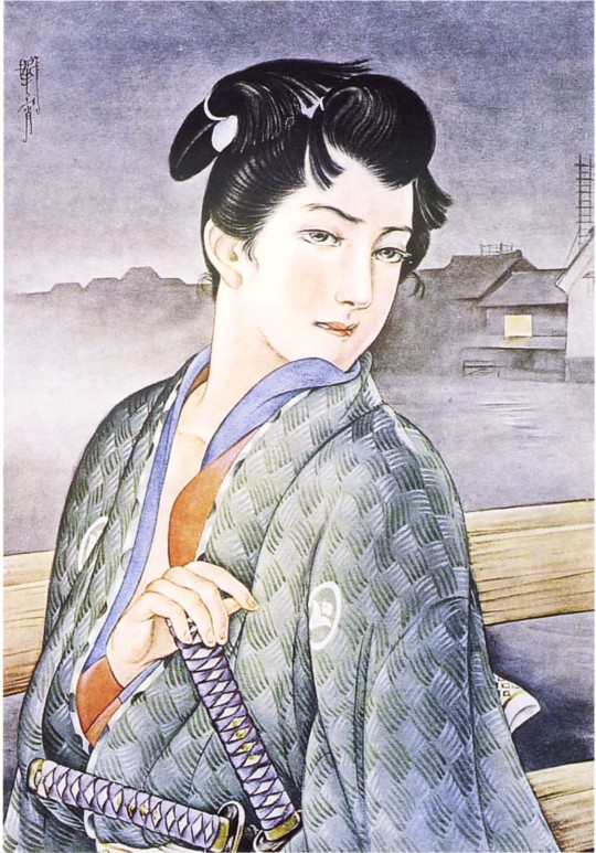
Kashō Takabatake's work on exposition in Takabatake Kasho Taisho Roman Museum. Compare Takabatake's warrior with Hikozo Ito's one. Takabatake created advertisements and illustrated magazines in which the influence of modern is noted. The faces of his soldiers are very gentle and graceful. It was his unique illustrations of beautiful boys (bishōnen) and beautiful girls (bishōjo) that took the world by storm, bringing fame to the artist.
The concept of Bishōnen, or literally from Japanese "beautiful youth (boy)" characterizes not just a man with good looks. In the Japanese view, this is an aesthetic principle that transcends gender and sexual orientation. The roots of this concept stretch back to ancient Chinese literature, the homosocial and homoerotic ideals of the medieval Chinese imperial court, which are found since the Middle Tang Dynasty (~700s). Gradually, this concept penetrated into Japanese and other Asian cultures, and we can observe its examples in the realities of today.
The introduction of such a character did not cause much excitement among fans of the series. Overly refined and too androgynous, Raiden with his silly backstory looked out of place against the muscular Snakes with complicated pasts. However, analyzing Shinkawa's subsequent works for Metal Gear and the gradual change in Raiden's design in particular, it can be assumed that Raiden's image to some extent helped Shinkawa develop more deeply the idea of glorifying physical beauty, born in the image of Gray Fox. On the character concepts for MGS 2, it is noticeable how the designer focuses on anatomy. Raiden's suit fits his body tightly, revealing his supple muscles. Shinkawa leads the line very carefully, it feels taut and elastic, revealing a sculpted form to the viewer. The volume is complemented by the play of light and shadow, which slides along the curves of the figure. To enhance the impression, Shinkawa lengthens the katana, making it more curved to enhance the sense of tension in the composition.
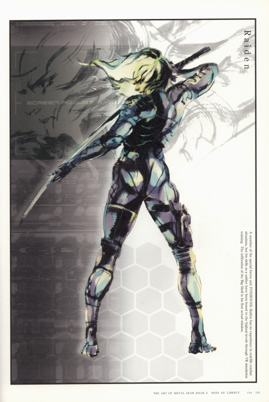
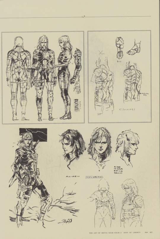
Although we mostly know Raiden today as a cyborg ninja, in the sketches for MGS 2, Shinkawa makes his suit look like samurai armor by adding shoulder and chest plates.
In the work on Metal Gear Rising: Revengeance (2013), Shinkawa continues the chosen path. During this period, the experience and acquisition of one's own style allow the designer to create incredible things according to his artistic solution, twisting the concept of aesthetics to the maximum. The image of Raiden evolves from a fragile young man to a brutal cyborg endowed with superpowers.
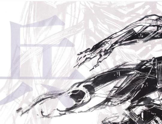
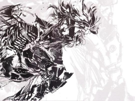
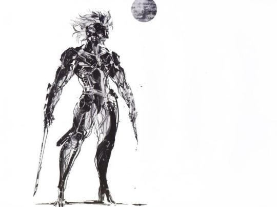
The flexibility of his human body is replaced by the monolithic heaviness of the exoskeleton. Shinkawa abandons the streamlined design used in the image of Gray Fox, which conveyed the ease of movement inherent in a ninja. He appeals to the "pure form", stripping the hero of even his skin as something unnecessary, and turning Raiden into practically a living Écorché (an educational figure showing the muscles of the body without skin). In his desire to get rid of the excess, Shinkawa goes even further. He does not depict a beautiful body, but what makes it beautiful - a skeleton and muscles - the initial form on which everything else is superimposed.
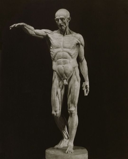
Ecorché. Jean-Antoine Houdon, 1776
Here I should explain what I mean by "pure form". Depicting a simple sketch of a character or creating a complex composition, Shinkawa draws as simply as possible. At the same time, it is important for him to depict not only the design of the character. In the figures of the heroes, attention is drawn not so much to their appearance as to their inner state expressed on their faces. Shinkawa did not specify the details. Characters in rough drawings are perceived as very conventional. Their images are personalized, but conditional.

Eva, Naked Snake, & The Boss. Art to the Metal Gear Solid 3: Snake Eater
Shinkawa avoids unnecessary trifles, preferring empty space. The artist's brush moves almost chaotically, revealing the smallest nuances of the image. With each subsequent game, his technique acquires clear features of traditional Japanese painting. In unfinished, at first glance, ink spills, Japanese artists sought to convey not the appearance of things, but to capture their spirit, to imprint their state or their own impression on the canvas. The artist lays down a minimum of lines and tones sufficient to recognize the form, texture and effects to be felt. Ink spills change in all possible shades of black, the vague outlines of the image make you feel the changeability and fleetingness of the moment.

Screen with pines and bamboo. Tohaku Hasegawa, Nanao Museum of Art, Ishikawa, 17th century
This approach to the image has advantages that could turn into disadvantages for the designer. Since the main point of Japanese painting is not the realistic accuracy of the surrounding world, its reproduction does not require a thorough knowledge of the anatomy or structure of objects. But there is one more thing that I deliberately did not mention before this. Despite the fact that Shinkawa appears as a graphic artist in his design works, he studied oil painting at Seika University. Painting, unlike graphics, is not characterized by vagueness and sketchiness. Shinkawa does not completely get rid of the influence of the acquired equipment. The volume of his figures protrudes beyond the surface of the sheet, creating the illusion of depth. But Sinkawa's best pictorial past can still be felt in his appeal to anatomy as the basis of the physical embodiment of the hero, the transmission of the story behind him. At the same time, Shinkawa's works are almost painterly, with a lot of color strokes, even if he uses only one color. This is a characteristic feature of Japanese painting, the flatness of which the artist transforms to his own needs. Thus, using the ideas of Japanese painting and removing the excess, Shinkawa exposes a pure form. And his experience in oil painting allows him to depict it accurately.
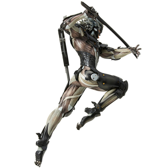
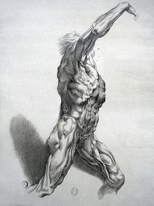
Raiden collectible figure Écorchéchisel. Paulus Pontius,
~1640. Engraving by Rubens
In the concept art for Rising, Shinkawa focused on finding the perfect representation of anatomy that would emphasize the athleticism of the character. From athleticism, in turn, comes sexuality, which Shinkawa instills in robots and cyborgs. Raiden is a killer machine. Even if his blade is an instrument of justice, he himself admits that in order to protect the weak, he kills the strong. His desire for battle, thirst for blood, and pleasure in pain - all find expression in his appearance.

Much more can be said about the work of Yoji Shinkawa. Maybe I would like to do a review on his metal gears themselves, where it's also possible to discover a lot of interesting things. Or about his concepts for Death Stranding and the game itself in general when I finally get through it. In this part, I wanted to share my thoughts on what most touches me in the designer's work.
So yes, it was review on Raiden's butt
Credits:
Metal Gear Solid galleries
The Art of Metal Gear Solid 2: Sons of Liberty
Metal Gear Solid 3: Snake Eater Art
Metal Gear Rising Revengeance Artbook
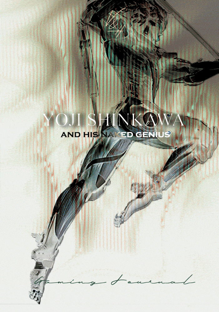
In the shadow of Kojima: Yoji Shinkawa, designer of Metal Gear Solid and Death Stranding
Gif used for cover image by Erica Anderson
#metal gear#metal gear series#mgs#mgs2#mgs2 sons of liberty#mgs raiden#raiden mgs#mgs2 raiden#mgs3#mgs3 snake eater#metal gear solid 3#mgrr#metal gear rising#metal gear rising revengeance#metal gear raiden#mgs snake#solid snake#metal gear art#yoji shinkawa#shinkawa#japanese art#hideo kojima#kojima#my articles
346 notes
·
View notes
Text

Dangerous Liaisons' Countess Saori in NYC 🖤
📸 Jiro Konami
76 notes
·
View notes
Text
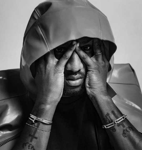
Virgil Abloh photographed by Jiro Konami
46 notes
·
View notes
Text


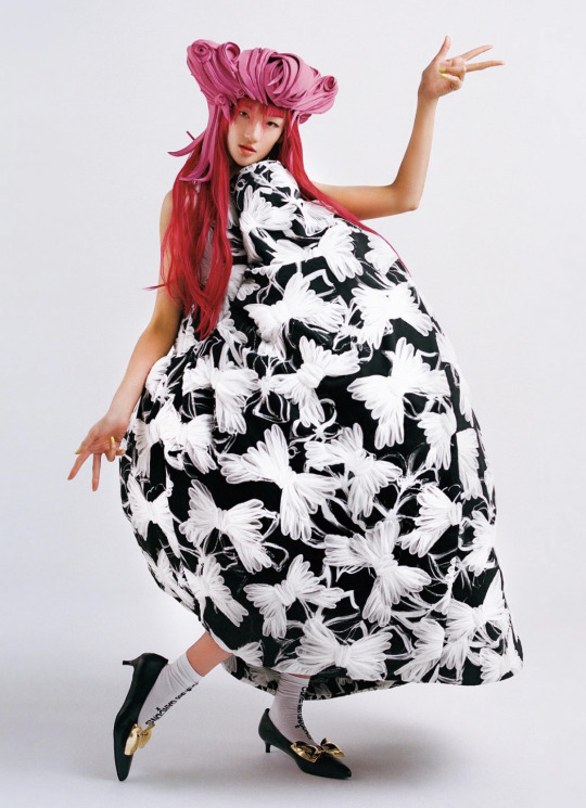

Ai Tominaga, Aran, Sunnybunny, Rikarin, Yuka Sai, Yun and Non by Jiro Konami for Vogue Japan May 2022
178 notes
·
View notes
Text
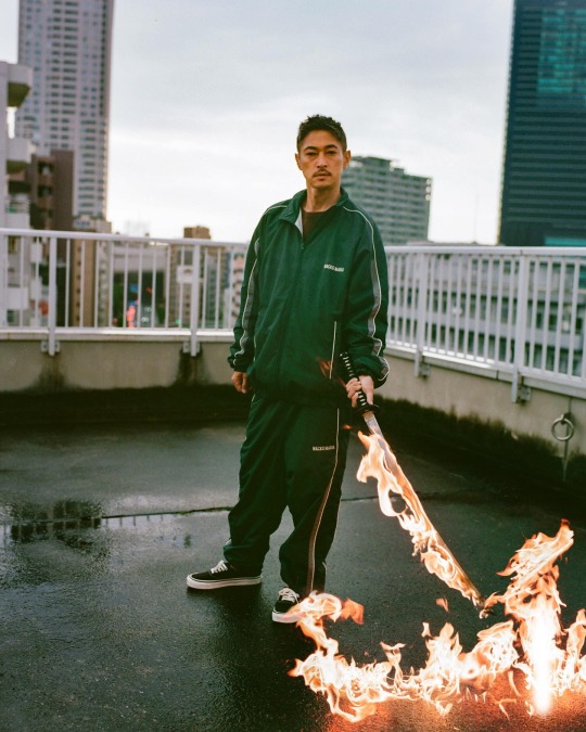
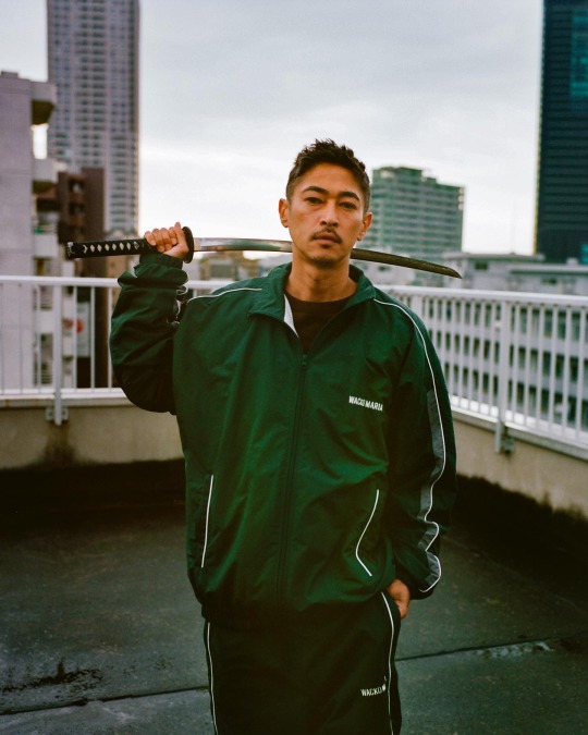
Yosuke Kubozuka by Jiro Konami for WACKO MARIA AW23
42 notes
·
View notes

Text

Ryūichi Sakamoto (Tokio, 1952-2023). Jiro Konami, 2018
19 notes
·
View notes
Text

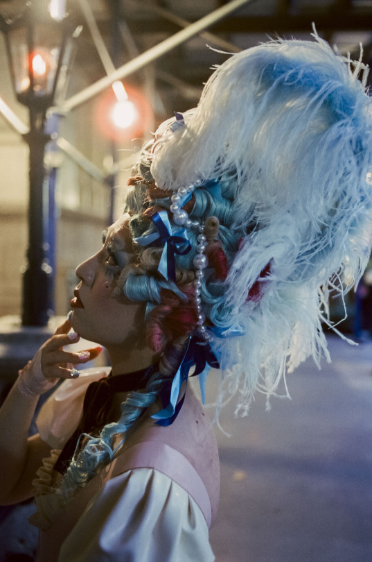
Lady Antoinette for Sukeban New York
Photographed by Jiro Konami
2 notes
·
View notes
Photo

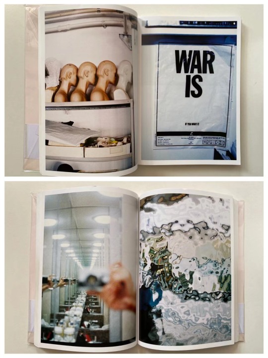
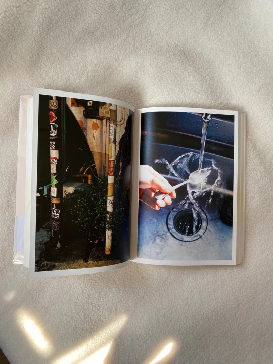
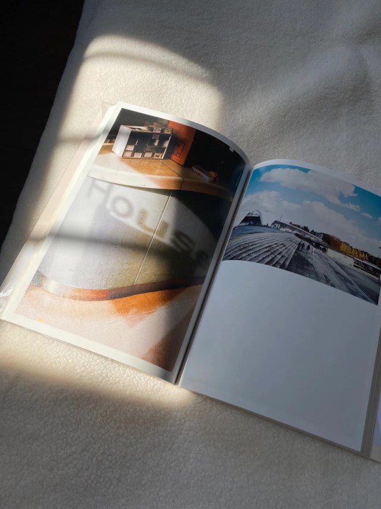
https://www.youtube.com/watch?v=zrwg568kXQM
https://made-in-wonder.com/item_detail.php?item_id=4320&lang=en
Japanese photographer Yoshiyuki Okuyama's photo book "Bacon Ice Cream (First Printing, With OBI)". Yoshiyuki Okuyama is one of the most sought after photographers in Japan, along with Jiro Konami and others.
Okuyama's illustrations are made by cutting out fragments of everyday life that tickle the sensibilities, and capture the modern atmosphere, such as the depiction of light and shadow, vivid coloring, and depictions rich in visual elements. A book that is fascinated by its outstanding sense.
The typesetting of his photo book is very interesting. He said that the arrangement of the works and the collection of their own books is the second creation of the works.
4 notes
·
View notes
Text
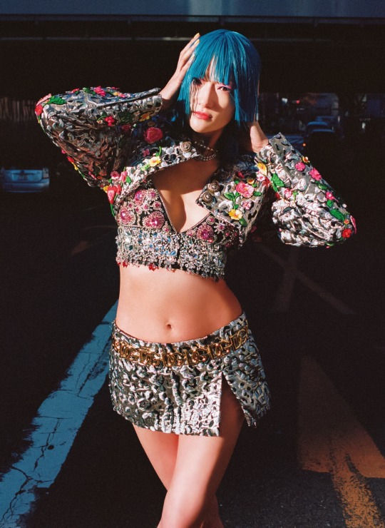

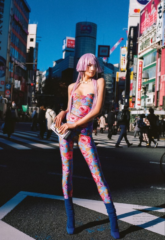

"the eternals" photographed by jiro konami for vogue japan may 2022
#vogue japan#jiro konami#ai tominaga#dolce & gabbana#chanel#saint laurent by anthony vaccarello#saint laurent#balenciaga#chanel handbag#pink hair#fashion editorial#fashion#asian models#asian beauty#woc models#vogue#vogue magazine#saori masuda
5 notes
·
View notes
Last Seen Blogs

smalldicksissybitch
Untitled

honey-bee76-blog1
Honey Bee
the7thgeneral
The Curly Haired King Of Hearts
suttlefilm
James Suttles - Filmmaker

tf2-but-incorrect
Incorrect tf2 (& hcs)