#New Orleans Hornets
Text
#talkin#tik tok#nba#jr smith#basketball#new york knicks#denver nuggets#new orleans hornets#cleveland cavaliers
58 notes
·
View notes
Text

Air Jordan 8 Chris Paul Player Exclusive “Hornets Away”
23 notes
·
View notes
Text
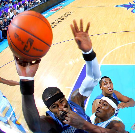
Happy Birthday Stephen Jackson who once had his nose picked by James Posey while going up for a layup 🎂
#Stephen Jackson#Happy Birthday#NBA Birthdays#James Posey#Charlotte Bobcats#New Orleans Hornets#NBA Funny#NBA#basketball#Hoops Media#Hoops Media Birthdays#sports#sport#funny
11 notes
·
View notes
Photo
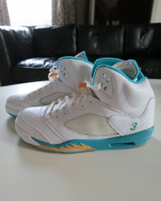
#3#cp3#chris paul#air jordan 5#player#exclusive#new orleans hornets#sneakers#basketball#shoes#footwear#nicekicks
2 notes
·
View notes
Text

#nba#nba basketball#Chris Paul#charlotte hornets#new orleans hornets#los Angeles clippers#la clippers#oklahoma city thunder#okc thunder#phoenix suns
0 notes
Text

CHRIS PAUL | New Orleans Hornets, 2010/11.
#chris paul#new orleans hornets#new orleans#usa#nba#basketball#usa basketball#nba basketball#nba player#basketball player#basketball legend#nba legend#legend#champion#american#point guard#2010s#10s#10s new orleans hornets#10s new orleans#10s hornets#10s basketball#10s nba#10s sports#sports#the goat#the g.o.a.t.#national basketball association
1 note
·
View note
Text
#denver nuggets#new orleans pelicans#portland trail blazers#oklahoma city thunder#houston rockets#charlotte hornets#washington wizards#detroit pistons#orlando magic#atlanta hawks
0 notes
Text
Willy Hernangómez, el fichaje del verano
Final ACB 2022 – 2023, salta la noticia que el Barça, que acabará a la postre siendo campeón de la competición, y Mirotic, que acabará siendo MVP de la final, separan de forma abrupta sus caminos, pintaba a notición del verano, pero poco después salta un rumor, Willy Hernangómez está negociando con los blaugranas.
Fuente: El pais Willy Hernangómez en la NBA
La verdad es que del culebrón Mirotic…
View On WordPress
#76ers#barça#CB Sevilla#charlotte#fc barcelona#fichaje del verano#Hornets#knicks#NBA#new orleans#new york#new york knicks#pelicans#philadelfia#segunda ronda del draft#Willy#willy hernangómez
0 notes
Text
NBA Power Rankings, Week 25
NBA Power Rankings, Week 25
With one week to go in the NBA’s regular season, only three postseason seeds are locked in: The Phoenix Suns will have the top seed in the Western Conference playoffs, the Memphis Grizzlies will have the second and the LA Clippers are locked into eighth.
The other 17 seeds remain up for grabs to set up what should be a frenetic race to the finish once play resumes Tuesday.
The top four teams…

View On WordPress
#Atlanta Hawks#Boston Celtics#Brooklyn Nets#Charlotte Hornets#Chicago Bulls#Cleveland Cavaliers#Dallas Mavericks#Denver Nuggets#Detroit Pistons#Golden State Warriors#Houston Rockets#Indiana Pacers#LA Clippers#Los Angeles Lakers#Memphis Grizzlies#Miami Heat#Milwaukee Bucks#Minnesota Timberwolves#NBA#New Orleans Pelicans#New York Knicks#Oklahoma City Thunder#Orlando Magic#Philadelphia 76ers#Phoenix Suns#Portland Trail Blazers#Sacramento Kings#San Antonio Spurs#Toronto Raptors#Utah Jazz
0 notes
Text

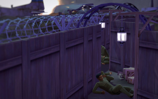

The first thing he heard was the deafening noise of explosions, followed by the hiss of what sounded like angry hornets flying through the air. Enemy fire. They had trained him for this, but he hadn’t expected it to happen so fast. Find your gun. Find it and move quickly.
He managed to shake the sleep from his head only to hear a bullet thud into the chest of a nearby man, a man who’s name he had once known. Move, Antoine. Crawl, damnit.
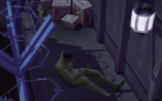

He sat up and looked around at the ramshackle wooden fences topped with barbed wire glittering in the dull lamplight. It was France, wasn’t it? The trenches of France. 1917? Maybe 1918? Antoine looked at his hands, still the unlined hands of twenty-one year old.
Yes. Real. He was real. This was real. The trenches of France, 1917, and the sky was filled with fire. Only why wouldn’t his legs move? Why couldn’t he crawl away?


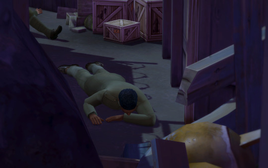
He tensed his hands in the dirt again, getting the gravel and the soil of France under his fingernails as he got on all fours. Another explosion deafened him, only this one was even nearer than the first.
Crawl, damnit crawl! But his legs wouldn’t move, he couldn’t make them move and the bullets just kept whizzing overhead. The enemy was taking over, and he couldn’t get away. So he fell into the blood-soaked soil of France to wait for them, to accept his fate. Someone take me home. I want to go home to New Orleans. Help. Someone help.
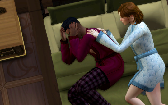
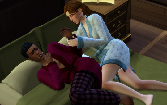
“Antoine! Antoine wake up!” Zelda insisted in a hushed, pleading voice as she shook his shoulder.
He convulsed at her touch, turning toward her in a violently disoriented stupor as he tried to take in his surroundings.
“It’s okay. It was just the dream again. You’re in New Orleans. Safe, in bed.”
He looked at her, his eyes just beginning to register her face, “And what year is it?”
“Its 1927, my love. In New Orleans. And you are safe.”
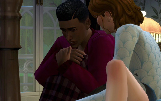
He bolted upright, his eyes wide and his fears no longer for himself, “Where’s Violette? Where is she?”
“Safe in her nursery, I can go and fetch her…” Zelda said as she moved to stand.

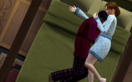
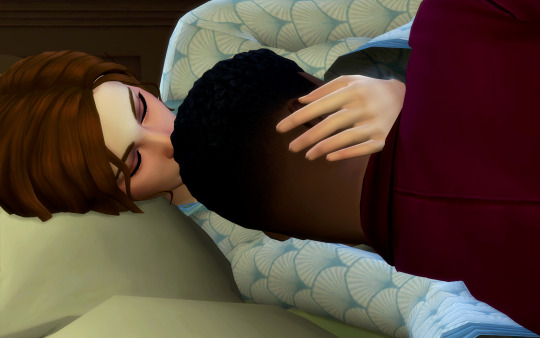

In answer, Antoine pulled Zelda closer to him, as though she were the only anchor keeping him from slipping back into the past. They fell back onto the bed together, Antoine staying as close to Zelda as he possibly could.
He had always had these dreams, dreams of the war so vivid that they woke him in the night; but recently they had grown more and more common, clearly spurred on by some sort of stress that he wouldn’t share with Zelda no matter how much she tried.
She had learned that there was no point in pushing him, that he would keep it locked away for as long as he could; so she just stroked his hair, humming gently as she tried to encourage him to go back to sleep.
#1927#sims 4 historical#ts4 historical#ts4 decades challenge#sims 4 decades challenge#sims 4 legacy#ts4 legacy#sims 4 story#ts4 story#tw death#tw war#tw ptsd#the darlingtons#1920s#antoine duplanchier#zelda darlington
113 notes
·
View notes
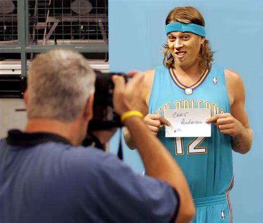
Text
Birbman! Birdman!
#talkin#tik tok#nba#chris andersen#basketball#miami heat#denver nuggets#new orleans hornets#national basketball association
23 notes
·
View notes
Text
OK OK
This is an overview of a Creep AU I have
@sp00kywrites thank u for asking me about it :)
Creepypasta Mafia (?) AU
Ok so overall idea
The world is divided into 2 smaller worlds that kinda co-exist. These worlds are the human world and the monster world. They aren’t on 2 separate plains if reality but more or less one is invisible to the other, if that makes sense
Some monsters interact with humans and some humans interact with monsters, but it’s normally all about business. Relationships are often looked down upon.
Slender owns a massive company that was given to him through the family (the other slender brothers do have stuff going on). It’s one of the largest companies in the world and has monopolies and shit. His mansion is in Alabama (where marble hornets took place) but he has warehouses and ports throughout the country.
Most of the creeps can be hired to do certain stuff. Like Jeff is a trained assassin, BEN is really good at stealing and getting info, Jack often is consulted for medical stuff, etc (I think a cool idea would be LJ owning a huge circus and being mega rich). Most of them have bases in certain areas, but they all have ventured into Slender Woods at some point.
I have 2 OC’s for this AU. One is a demon and the other is a shadow person. Lola, a shadow person, is an assassin. Not to big and they don’t charge much, but their name is known I guess. Lyssa is a demon who owns what’s called the ‘New Orleans Port’ (it’s basically just a massive port and makes her a shit load of money).
That’s all for now, but if you want a certain character in more detail lmk
#creepypasta#creepypasta headcanon#ticci toby#ben drowned#eyeless jack#jane the killer#jeff the killer#nina the killer#creepypasta x reader#creepypasta au#mafia au#AHHHHHH
49 notes
·
View notes
Text
Happy Birthday to Christopher Claus Andersen 🎂
#Happy Birthday#NBA Birthdays#Chris Andersen#Birdman#New Orleans Hornets#NBA#basketball#Hoops Media#Hoops Media Museum
5 notes
·
View notes
Photo
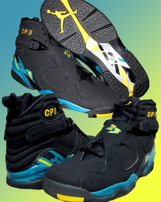
#cp3#chris paul#new orleans hornets#3#air jordan 8#pe#player#exclusive#sneakers#shoes#footwear#nicekicks
0 notes
Text
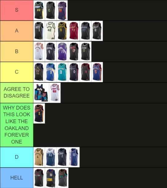
the 2023-24 NBA city edition tierlist, in collaboration w THE genius @swinginsportscutebasketball
(complete notes and insightful discussion under the cut lol)
S tier: pacers, pelicans, suns
pacers: great colors, spray paint is cool, they tried something new which is great, font is cool. 10/10
pelicans: cool font, love a magic and mystery theme. glowing lights of new orleans and a BONE PELICAN?? don't need to say any more. one of the coolest ones they've ever done.
suns: like the font, like the gradient on the side and in the number, like that it says El Valle, like the colors
A tier: hawks, celtics, warriors, cavs, mavs, pistons
hawks: like the font (serif and lower case are not common on jerseys, so it's interesting). blue is a lil weird (not a color one would associate w hawks usually) but cool overall
celtics: like the colors (green and gold are nice), letter and number font are cool, clean design, looks good on the players
warriors: like how it's shaped like a hill, like the shadow on the numbers, looks clean and I like the font
cavs: good font, good color. gold = nice, we like it. details around the arms and neck are cool, numbers font RULES
mavs: like the fonts for the text and numbers, solid design. like that leon bridges is involved because he rules
pistons: team name font is cool, also has bones (on the side), like the bad boy pistons inspo!!!
B tier: spurs, magic, jazz, blazers, grizz
spurs: viva spurs fr. like the font choices, like the orange, like that it says viva spurs. the brown details don't even look bad. solid jersey
magic: should be called gift of the magi, gothic script is cool, star as the A in orlando RULES, numbers font is cool
jazz: classic one w the mountains (top 3 design imo), not groundbreaking but a solid take on an old favorite
blazers: like the plaid, like that it says rip city because that's funny. plaid not that striking overall since it's just in the details
grizz: geta points for creativity but loses points due to weird execution (MEM is a weird choice and the lines get kinda trippy if you look at them for too long)
C tier: lakers, bucks, hornets, sixers, bulls, knicks
lakers: solid color scheme, looks like a nice lakers jersey. looks good on the players at least. triangle shape is unique
bucks: why is it blue (they literally do this every year). the dots are a solid detail but kinda meh overall
hornets: same as every other year (except for the clit jerseys last year). 0 creativity points. nice color, stingers on the buzz city are cute
sixers: solid number font. "city of brotherly love" is a good moniker but "brotherly" takes up A Lot of space here and makes it look weird. arrows on the sides are cool
bulls: Madhouse on Madison is a cool name, but it's kinda boring. a bit TOO plain. we are not fans of the vertical lettering
knicks: the double letters are a cool concept but they look weird. pinstripes are cool tho
agree to disagree tier: nets, rockets
nets: some controversy about how NeTs is written (I like the funky letters, sscb dislikes them), looks like it's trying to camouflage with a rock climbing wall (neither of us likes it)
rockets: the number and font look like a kids' t-ball team to sscb, but I like the number font and the details. Neck line detail also solid to me (fbp)
why does this look like the Oakland forever one tier: thunder
thunder: what it says on the tier title. went all in on the ugliest logo in the league, colors are nice but they don't really match the team
D tier: raptors, twolves, clips, kings
raptors: sawtooth design is cool. gold is nice for details but a full gold jersey does NOT look good. round toronto = doesn't fit, we are not fans. we the north in various languages on the sides is cool
twolves: bad font, the watercolor design is cool but the color is too plain and it doesn't look as good on the front. don't need to say "land of 10.000 lakes" up the side too
clips: boring design. not sure about the font (S and P are Weird). the dot on the I being a basketball is cool. wanted to like it but it's too boring overall.
kings: WRONG color!!! why would you go away from purple which rules as a basketball color. the anniversary of the cincinatti royals is not an excuse imo. vertical lettering also weird
HELL tier: heat, nuggets, wizards
heat: CRINGE. fuck the heat (fbp)
nuggets: every player is number 5280. why is it the same size as the player's number. mountains (the best part) should be more prominent. like the idea but the execution is just BAD
wizards: kinda messy. the colors are SO random, font is weird to me. WHY is it rusted. all over the place tbh
#cute date idea: ranking nba jerseys together for 3 hours#truly I love my gf hours I am so lucky so blessed to be with her#(disclaimer: this is just a silly ranking we do not mean any offense to any team* mentioned above please don't get mad online about it)#(*except the heat I do mean to offend the heat however I can)#*#nba
12 notes
·
View notes
Last Seen Blogs
katistry
we are destined

drunkwario
Guys Who Tickle My Nuts
jukjujada
jujada

kellyyys
Everything Happens For A Reason.

lokivariant
title