#Say0ranArts
Text
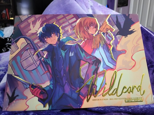
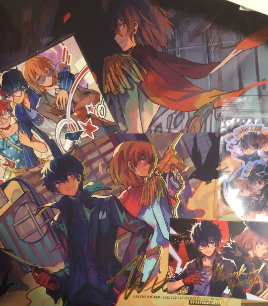
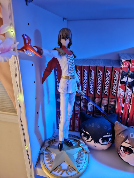
The art book came in! :D
Look at it:


BRB, while I go incorporate this into my shuake shrine
Go buy from the lovely @say0ranarts
#shuake#akeshu#fanart#say0ranarts#goro akechi#akira kurusu#ren amamiya#p5#p5r#persona 5#persona 5 royal#look at those stickers ill never use bc i cant commit on stickers
68 notes
·
View notes
Text
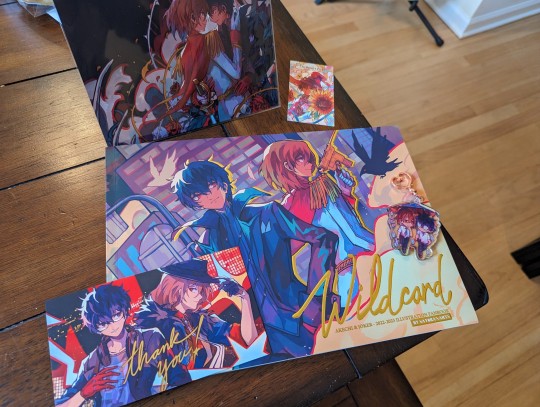
Oh my GOD, everything is SO beautiful. The quality of the artbook, the details in gold. Is perfect. I'm so happy.
Y'all should get @say0ranarts 's Akeshu artbook. Honestly, perfection 🩷💐
#say0ranarts#persona 5#akeshu#artbook#fan art#yall should get it nowwww...!!!#wont regret it#support your fav artists...!!
2 notes
·
View notes
Text

Bless @say0ranarts ❤️❤️ I love themmmm
91 notes
·
View notes
Text
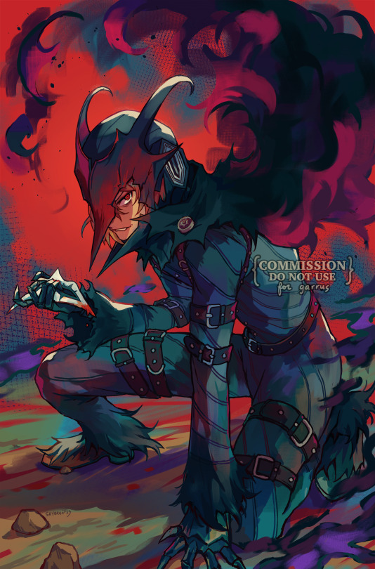
Thank you to @say0ranarts for this amazing commission of a very rage-filled, angy Black Mask Akechi! I have posted this on various socmedias but wanted to share it here as well! (I'm sure Jade is tired of seeing multiple posts lol :p )
4K notes
·
View notes
Text

My say0ranarts color/process study. It was super fun! Definitely storing some of the tricks i learned while making this in my back pocket for later.
475 notes
·
View notes
Text
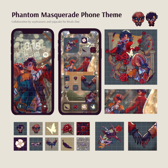
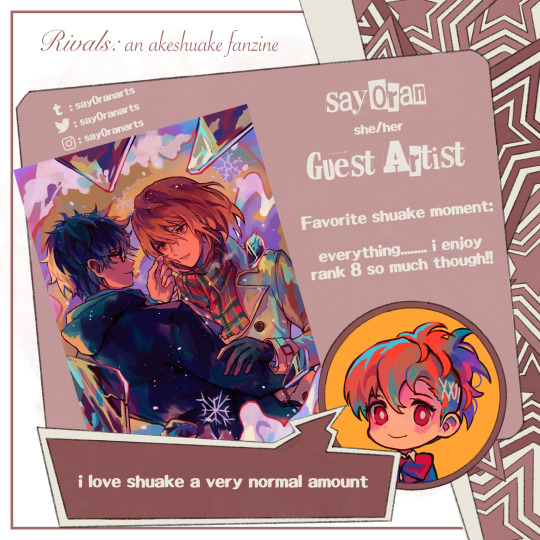
✨ Presenting the phone theme created in collaboration with @say0ranarts for Rivals Zine!! ✨
If you missed the initial distribution, it is now available on k0-fi (details under read more ⬇️)
Since Jade and I put a lot of time and energy into designing this, we hope that you understand why we have decided to not offer for free. 🥺❤️
‼️ All earnings will be split 50/50 between us, so we hope you are not discouraged from supporting!
Thank you ❤️
#shuake#akeshu#persona 5#p5#p5r#persona 5 royal#akechi goro#goro akechi#amamiya ren#ren amamiya#akira kurusu#kurusu akira#rivals zine
349 notes
·
View notes
Text


shuake layouts commissioned by @say0ranarts
#artists on tumblr#veradoodles#art#my art#illustration#shuake#akira kurusu#goro akechi#akeshu#persona 5#persona fanart#persona 5 fanart#persona 5 royal#ren amamiya
381 notes
·
View notes
Text
CONTRIBUTOR LINEUP 📺🌩️
We are proud to present the contributor lineup for I'LL FACE MYSELF! Please give everyone a warm welcome 💛
Sprite art illustrated by Technicoloriing
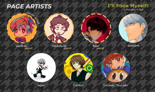
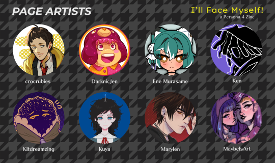
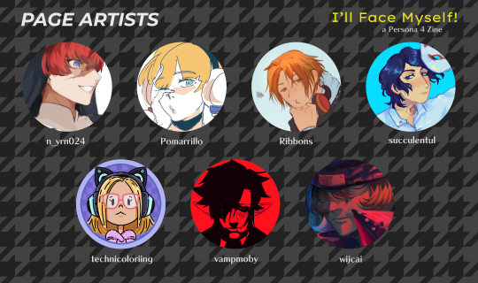
PAGE ARTISTS ⚡️
@say0ranarts | @duckdachi | @moeggoi | @anopuff | @aqxin |
@crazymecjc | Ceramic_Avocado | @crocrubies | @darknicjen | @murasamene | Ken | @kitdreamzing | @jian-yi | Marylen | @maybelsart | @n-yrn024 | @pomarrillo | Ribbons | @succulentul | @technicoloriing | @vampmoby | wijcai

MERCH ARTISTS ⚡️
@catnatch | @kuki-tan | @sparkyllama | chibihayo | @willczek-art | @crescentfool | Riori | @dankmaths
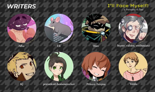
WRITERS ⚡️
@chowchiix | Eli | @0nceandfutureking | hyper_rabies_enthusiast |
@supremesanada | @president-homewrecker | @prince-tenjou | @thatlittledandere
64 notes
·
View notes
Text
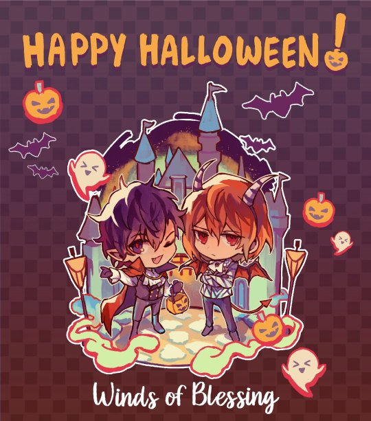
🎃 Happy Halloween! 👻
Goro and Joker are enjoying the festivities at Destinyland!🦇
Hurry! Contributor app deadline is Nov 30 - don't miss your chance to join the fun!
🎨 ARTIST
🖋️ WRITER
🛍️ MERCH
Keep reading for more info below!
See our application guidelines for important info in the links below⬇️
🗺 Info Doc
🧭 Carrd
We're excited to receive your applications!
Big thanks to our wonderful Art Intern, @say0ranarts, for bringing the shuake art to life, and our incredible Graphics Mod, @snipescythe, for crafting the eye-catching graphics! 🧡
Thanks for sharing!
@all-zine-apps @atozines @fandomzines @faneventshub @welovezines @zine-scene @zineapps @zinecenter @zinefans @zinefeed @zinefest @zineforall @shuake-official
#akeshu#shuake#persona 5#p5#goro akechi#akira kurusu#ren amamiya#persona 5 royal#p5r#shuake zine#akeshu zine#shuake travels zine#applications#zine apps open
71 notes
·
View notes
Text
Ah! My @say0ranarts shuake art book came! 😭
it’s absolutely beautiful🎶
65 notes
·
View notes
Text
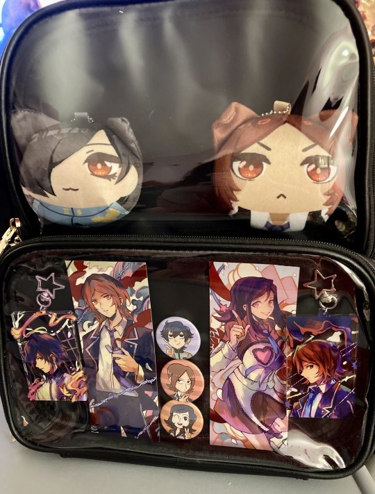
p1/p2 itabag progresssssss i'm like a lil under halfway done but waiting for a chain + accessories to come in so i can add some other stuff i already have to the top, then i'll decide what more i wanna get to fill in the blank spaces all over
top pouch will be all tatsujun and maybe more p2 characters in the future, bottom pouch is the Please Play The First Three Persona Games (Yes P1 And P2 Are Three Games) zone since i was so happy to find naoya merch from people and wanted to show p1 some love too!!!
i don't want this to be a very cluttered bag cuz i wanna keep attention on all the great artwork, like a wearable museum!! might get some filler craft stuff or somethin to fill in the corners of the bottom tho
tatsujun plushies: @kurapixel
protag pins: @mangoassassin
protag charms + p2 bookmarks i have very carefully held in place like mounted art on a wall: @say0ranarts
#persona#persona 2#everyone else: playing p3r#me: hehe 90s persona go brrrrrrrrrr#i need to make a tag or something for my itabags sometime i can feel it. god. this is just a hobby now. im Doing This
23 notes
·
View notes
Text
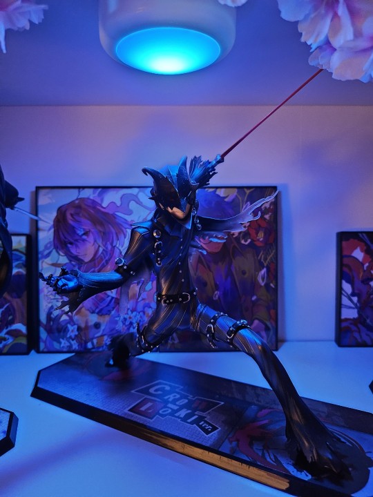
Everyone's been sharing their Goros lately so I thought I'd share mine ^_^
26 notes
·
View notes
Text

Oh my GOD, everything is SO beautiful. The quality of the artbook, the details in gold. Is perfect. I'm so happy.
Y'all should get @say0ranarts 's Akeshu artbook. Honestly, perfection 🩷💐
#say0ranarts#persona 5#akeshu#artbook#fan art#yall should get it nowwww...!!!#wont regret it#support your fav artists...!!
0 notes
Text
🃏 CONTRIBUTOR SPOTLIGHT 🃏
Next up we have our first guest contributor, @say0ranarts! Her beautiful colors and compositions capture their rivalry perfectly!
#rivals zine#contributor spotlights#akeshu#shuake#akeshuake#goro akechi#ren amamiya#akira kurusu#persona 5
26 notes
·
View notes
Video
youtube
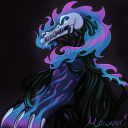
Is your god listening now?
Anyway I’m So Normal about Fate/Grand Order and I wrote a song about Jalter, my beloved. It’s streaming everywhere as well!
The incredible art is by one of my all time favorite artists @say0ranarts who I commissioned for this! Please follow and send them all the love!
#jalter#jeanne alter#fgo#Fate Grand Order#fate go#fate orleans#fate shinjuku#fate#jeanne d'arc alter#avenger jeanne#music#nerdcore#tmtkm#gio navas
91 notes
·
View notes
Note
hi can I ask about your coloring process of how you choose color or blend? I love the colors on your art so much
aaah thank you anon! <3
i actually am very inconsistent with my process, but lately i've been using this one:
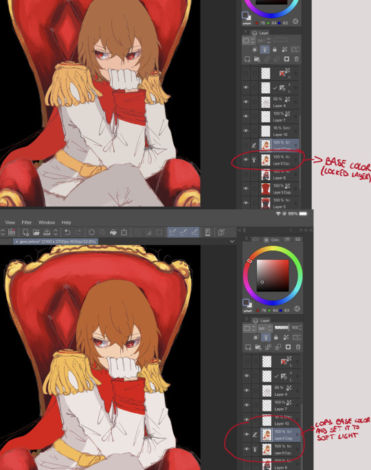
basically, after putting down a base color layer, i duplicate it and set the copy to soft light. i do this right underneath the sketch, i don't really do lineart.

then i start painting in the original base color layer. tbh, i just go with what feels right, and a lot of it is also trial and error!! my rule of thumb in most of my paintings is this though: colder and darker colors towards the bottom of the canvas, warmer and more vibrant colors for the face/hair/upper part. this isn't always applicable to every situation, but i find that it works in a lot of character-focused pieces!!
then it's just rendering, defining and giving directions to blob of colors! i play a lot with correction layers, but i have to be careful not to overdo it and end up with something super saturated akdhhdj
the layer-set-to-soft-light tecnique is actually @/say0ranarts 's idea!! i saw it around a month ago and found out that it works for me. before that i just used to have a base color layer and paint everything else on a layer over it. when choosing colors i always think about light and how every object interacts with another (you'll notice that the parts of akechi's outfit nearer to the throne are redder, in this case), so i'd say that that is the most important thing!!
thank you for the question and sorry for making such a long post, i wanted to be as clear as possible >.<
#shizu answers#persona 5#p5r#persona fanart#persona series#p5r fanart#goro akechi#akechi goro#coloring#color inspo#drawing process#painting process
31 notes
·
View notes
Last Seen Blogs

investfourmore
InvestFourMore
espaciogif
Gif
monomori3
lil creative corner
belles-endormies
à la Belle endormie

minifair-y
Jᥙ́ριtᥱr .