#Smithsonian Design Museum Collection
Note
any recommendations/personal favourites from the image collections to print out and make a wall collage out of? (extra love if it’s not artstor, my uni doesnt have a subscription to that)
I love this question! It very much depends on your personal vibe, but here's a list of every collection designated as open to get you started:
Folger Shakespeare Library
Images from the History of Medicine
Museum of New Zealand - Te Papa Tongarewa
Schomburg Center for Research in Black Culture
Science Museum Group
Smithsonian National Museum of African American History and Culture
Statens Museum for Kunst-National Gallery of Denmark
The Cleveland Museum of Art
The Metropolitan Museum of Art
Wellcome Collection
#i am partial to the metropolitan museum of art but that's just me#jstor#ask#open access#open content#image collections
221 notes
·
View notes
Text
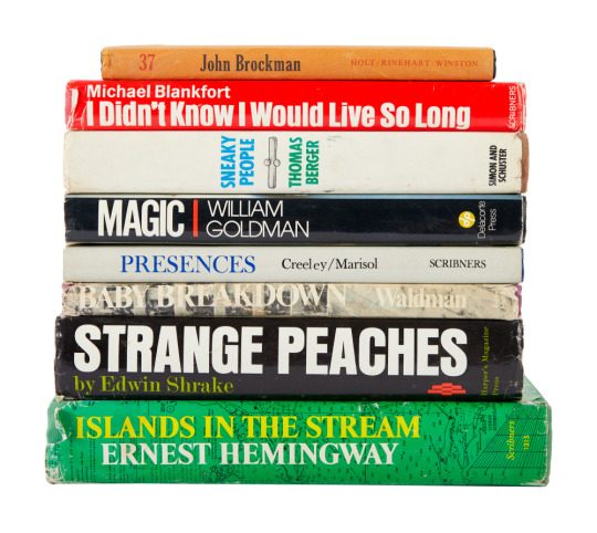
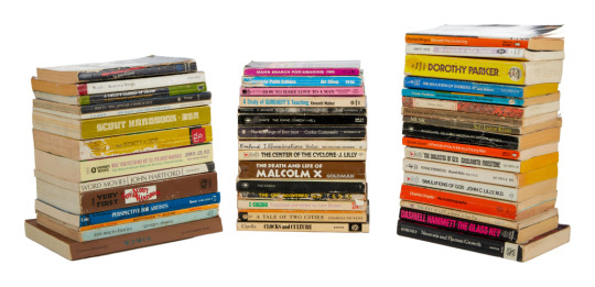


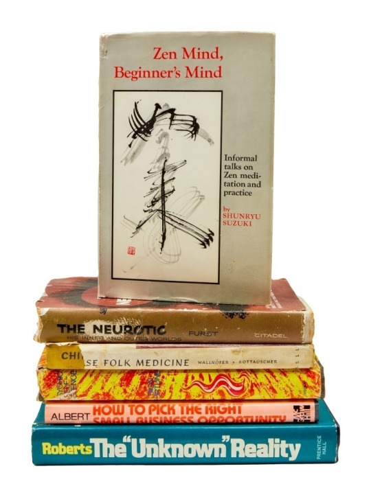
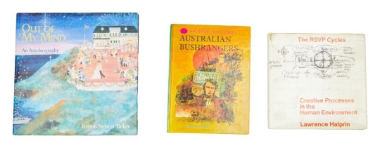
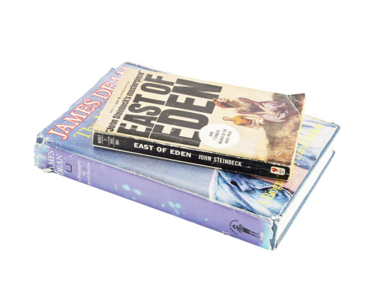


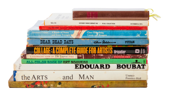
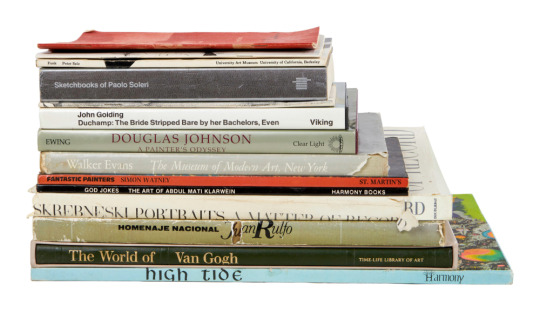
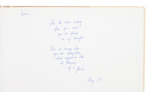
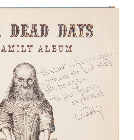
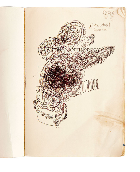
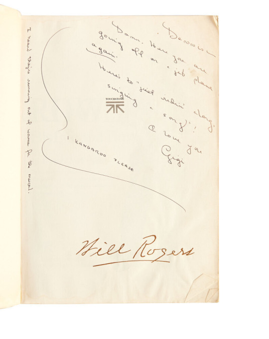
Dennis Hopper's collection of owned and gifted books
(a few are listed under the cut)
Islands in the Stream (Charles Scribner's Sons, 1970)
Magic (Delacorte Press, 1976)
Sneaky People (Simon and Schuster, 1975)
Strange Peaches (Harper's Magazine Press, 1972)
I Didn't Know I Would Live So Long (Charles Scribner's Sons, 1973)
Baby Breakdown (The Bobbs-Merrill Company, Inc., 1970)
37 (Holt, Rinehart and Winston, 1970)
Presences: A Text for Marisol (Charles Scribner's Sons, 1970)
Little Prayers for Little Lips, The Book of Tao, The Bhagavadgita or The Song Divine, and Gems and Their Occult Power.
Lolita (G.P. Putnam's Sons, 1955)
The Dramas of Kansas (John F. Higgins, 1915)
Joy of Cooking (The Bobbs-Merrill Company, 1974)
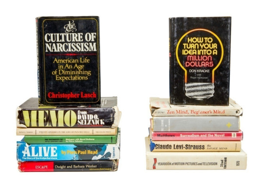
The Neurotic: His Inner and Outer Worlds (First edition, Citadel Press, 1954)
Out of My Mind: An Autobiography (Harry N. Abrams, Inc., 1997)
The Savage Mind (University of Chicago Press, 1966)
Alive: The Story of the Andes Survivors (J.B. Lippincott Company, 1974)
The Documents of 20th Century Art: Dialogues with Marcel Duchamp (Viking Press, 1971)
The Portable Dorothy Parker, A Portrait of the Artist as a Young Man, I Ching, and How to Make Love to a Man.
John Steinbeck's East of Eden (Bantam, 1962)
James Dean: The Mutant King (Straight Arrow Books, 1974) by David Dalton
The Moviegoer (The Noonday Press, 1971)
Erections, Ejaculations, Exhibitions and General Tales of Ordinary Madness (City Light Books, 1974)
Narcotics Nature's Dangerous Gifts (A Delta Book, 1973)
The Egyptian Book of the Dead (Dover Publications, 1967)
Tibetan Yoga and Secret Doctrines (Oxford University Press, 1969)
Junky (Penguin Books, 1977) by William S. Burroughs
Weed: Adventures of a Dope Smuggler (Harper & Row, 1974)
Alcoholics Anonymous (Alcoholics Anonymous World Services, 1976)
Skrebneski Portraits - A Matter of Record, Sketchbooks of Paolo Soleri, and High Tide.
Raw Notes (The Press of the Nova Scotia College of Art and Design, 2005)
Le Corbusier (Heidi Weber, 1965)
Henry Moore in America (Praeger Publishers, 1973)
Claes Oldenburg (MIT Press, 2012)
Notebooks 1959 1971 (MIT Press, 1972)
A Day in the Country (Los Angeles County Museum of Art, 1985)
Album Celine (Gallimard, 1977)
A Selection of Fifity Works From the Collection of Robert C. Scull (Sotheby Parke Bernet, Inc. 1973)
Collage A Complete Guide for Artists (Watsun-Guptill Publications, 1970)
The Fifties Aspects of Painting in New York (Smithsonian Institution Press, 1980)
A Bottle of Notes and Some Voyages (Rizzoli International Publications, 1988)
All Color Book of Art Nouveau (Octopus Books, 1974)
A Colorslide Tour of The Louvre Paris (Panorama, 1960)
Dear Dead Days (G. P. Putnam's Sons, 1959)
Woman (Aidan Ellis Publishing Limited, 1972)
The Arts and Man ( UNESCO, 1969)
Murals From the Han to the Tang (Foreign Languages Press, 1974)
A (Grove Press Inc., 1968)
Andy Warhol's Index Book (Random House, 1967)
Voices (A Big Table Book, 1969)
Another Country (A Dell Book, circa 1960s)
On The Road (Signet, circa 1980s)
56 notes
·
View notes
Text
RESOURCES FOR ARTISTS VOL 1
In the spirit of gratitude for the plethora of free resources out there for artists that I've been gleefully ransacking my entire life, I want to share some of them that I've compiled.
smithsonian open access: this is a HUGE one! lots of images that are absolutely free to use, as well as an incredible set of 3-D resources. Their collection spans the same breadth that their multiple museums do-- natural history, gems, fine art, aerospace/engineering stuff, etc. so do not sleep on this.
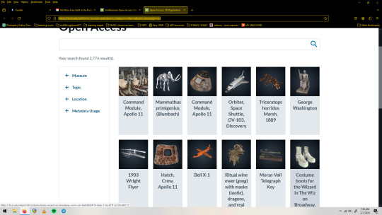
(screenshot is the 3-D digitization page, one of my fav sections)
2. The League of Moveable Type is a resource for free fonts, but not just any free fonts-- professionally designed free fonts. Some of the bigger sites can be a lot of wading through sub par stuff, but every single thing here was very carefully and lovingly designed, and is free.
3. Unsplash is full of great free to use images. Seriously, huge collection. Portraits, textures, 3-D renderings, you name it and it's probably here and free to use. ALSO cool because images will note whether their creator is for hire if you like their work. You can also submit your images to this platform. (I think it has a premium section but I haven't needed to engage with it yet)
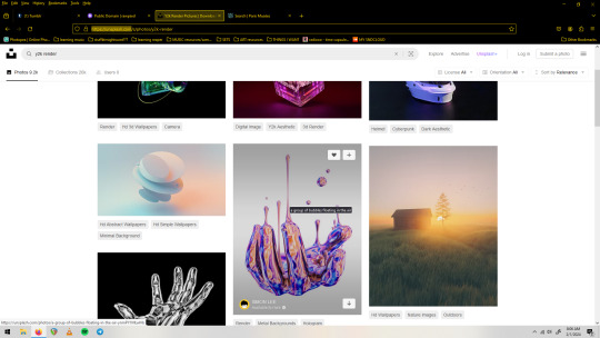
(screenshot of unsplash.com with a search for 'y2k render')
4. rawpixel's Public Domain collection. They've been high quality scanning public domain images for a while. They're free to use under a CC0 license, which is basically without restriction. They've got lots of categories, I personally love the Graphic Design and the Vintage Illustration sections.

(screenshot of the 'patterns' section of the Public Domain collection on rawpixel)
5. Photopea is a free Photoshop alternative that runs in your browser. It's got a few quirks(especially if you run a non-chromium browser, but stay strong anyway) and is ad-supported, but really powerful and robust. It also opens PSD files, supports smart objects and basically all of the Photoshop asset filetypes(.abr .grad .pat etc), as well as has filters, even a couple that Photoshop itself has gotten rid of in their more recent versions. You can use the fonts on your machine, export transparent pngs, and do generally anything that the big guy does. You can also donate a small amount to remove ads and support the singe person(!) who created and maintains it.
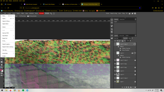
(screenshot of a .psd file with smart objects/smart filters open on photopea. The 'file' dropdown menu shows exciting options such as 'export' and 'save as psd')
6. Brusheezy.com is a great place to get free brushes, vectors, and photoshop assets in general(which can all be used in Photopea, btw).
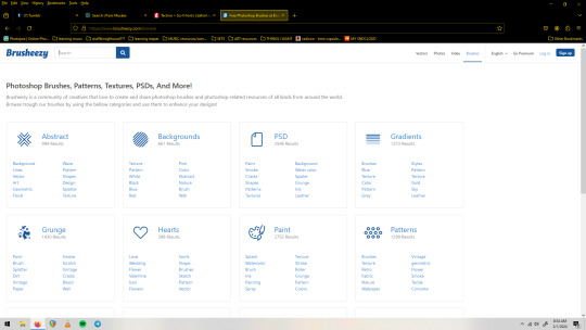
(screenshot of the 'categories' page of brusheezy.com)
7. dafont.com Last but not least, I will include this huge font site but assume most people already have it on their radar. Free fonts! No account needed to download! Tons of categories! Many are demo/limited versions, so pay attention especially if you plan to use numbers or special characters as those are often the things left out of the free to use demo versions. It's nice to have a lot of options but to the discerning eye a decent amount of the fully free fonts here will fall a bit short/feel unpolished. That's not to discourage you from it, as I have a huge collection of types from here and routinely check it when I need something specific.
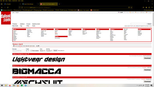
(screenshot of dafonts.com with the 'sci-fi' section pulled up)
So that's what I've got right now for visual art resources, I hope you can find something useful in here. Feel free to share this list and keep an eye out for the next one! Thanks to everyone out their with a love for sharing in their hearts, it's really inspired me to make some things with no other intention than to put them into the world as tools for others!
#free resources#resource list#art resources#free stuff#free collections#royalty free#free to use#shareware#for the people#dafont#brusheezy#smithsonian#rawpixel#unsplash#league of moveable type#public domain#cc0 license#fonts#textures#patterns#brushes#vectors
35 notes
·
View notes
Text

Silk fabric called My New York, designed in Paris by Pierre Mourgue and made for the Stehli Silk Corporation, 1926-28.
Photo: Cooper Hewitt, Smithsonian Design Museum Collection
#vintage New York#1920s#Pierre Mourgue#textile#fabric#fabric design#silk#print fabric#vintage NYC#Jazz Age
62 notes
·
View notes
Text
Art - Web Weaving Resource
To return to the main Web Weaving Resources post, click here.
Original Artists:
DAWNING CROW | Kathy Lam - Charcoal, ink, and watercolor illustrations of whimsical animals. Occasional sculpture as well!
Hannah Lock Illustration - Bright colored pencil drawings on a range of topics, from animals to people to concepts.
herearesomedrawings | Dan Huston - Abstract colored pencil pieces with a great variety in shape and color.
Peter Solarz - Photography, abstract paintings, and sculpture - a huge and very beautiful body of work.
tmantra | Gouache & Ink - Gorgeous, almost fairy-tale-like paintings and illustrations, mostly in - you guessed it - gouache and ink.
The Shitpost Calligrapher | Mia - Shitposts and other humorous nonsense written in fancy calligraphy.
Secondary Source Art Blogs
painting after painting - Painting, sculpture, craft, and graphic design from history to present day. More varied than Colossal - not every piece is a 'wow', which is sometimes what you need.
Colossal - Well-curated posts about art, photos, and culture. Very mixed-media.
Comparative Tarot - Assorted Tarot cards (often from Behance and always well-sourced/linked)
Historic Art Collections
Collections, Smithsonian Institution - The full collections of the Smithsonian and all of its sub-collections. A bit hard to navigate, but an absolutely massive collection across all imaginable topics.
Collection of Cooper Hewitt, Smithsonian Design Museum - One of those sub-collections, this website is easier to search and often has more background info. Most finds are 1950s-present, and you'll find many patterns and objects here, not just illustrative art.
American Art Museum and Renwick Gallery - Another subset of the Smithsonian collection, this has a lot of classic paintings and drawings from pre-1900 and before.
Artvee - Massive database of public-domain artwork! Great search feature, and they also have an option to view modern/ non-public-domain art in their collection.
20 notes
·
View notes
Text
Henry Dunay | Gold, Diamond and Simulated Diamond 'Lachrymosa' Mask
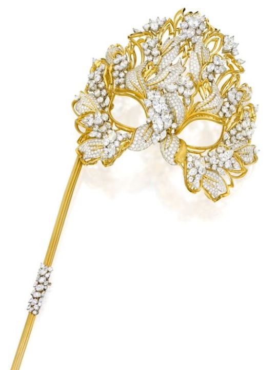
Property from the Collection of a Connoisseur
Henry Dunay
Gold, Diamond and Simulated Diamond 'Lachrymosa' Mask
Of foliate design, set with numerous round diamonds, further decorated with round, oval, pear and marquise-shaped simulated diamonds, highlighted by a gold teardrop, gross weight approximately 356 dwts, mask and handle signed Henry Dunay, numbered IA2102 and 16911; dated 1993.
In the early 1990s, New York jewelry designer Henry Dunay was tapped to design a mask that would be sold to benefit the American Foundation for AIDS Research. Well-known for his striking and dramatic creations, Dunay allowed himself eight months to craft a piece he deemed worthy of amfAR’s mission. The result is the piece offered here, aptly named The Lachrymosa in reference to the many tears shed over the global scourge of AIDS.
In 1993, Elizabeth Taylor donned the mask at an amfAR charity event. The mask reappeared in 2009 at the Antwerp Diamond Museum’s “Diamond Divas” exhibition, celebrating famous jewelry-loving women. It is believed that the mask was sold that same year, when Dunay closed his doors after over 50 years of business. Reportedly set with over 130 carats of diamonds, the mask was lauded by Dunay as something that “would be ideal…at the Smithsonian, saying what it was made for and why it was made.” At some point along its journey, the larger diamonds were replaced with simulants, but the dramatic power of Dunay’s original creation remains.
Sotheby's
#object of art#mask#masquerade mask#elizabeth taylor#henry dunay#gold#diamonds#diamond#simulated diamonds#tiara crown#tiaras crowns#tiarascrowns#tiaracrown#sotheby's
30 notes
·
View notes
Text
30 Covers, 30 Days 2023: Day 8
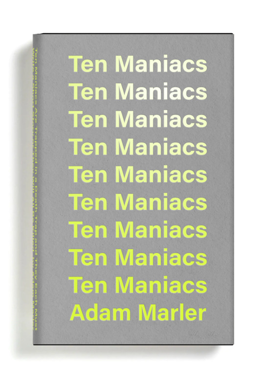
Since it's day 8 of NaNoWriMo, some of you might start wishing someone else could write your novel for you. Here's a fun novel that explores that exact idea! Today, we have 10 Maniacs are Trapped in a Death Trap and they Each Must Write a Short Story or They Will All Be Killed by Adam Marler, a Satire/Humor novel! This novel cover was designed by the amazing returning artist, Christopher Simmons!
(For those of you who don’t know, 30C30D stands for 30 Covers, 30 Days in which 17 Wrimos and 5 YWP Participants get the chance to win a professionally designed cover! The rest of the days are being filled by community features. We’ll be posting a cover a day throughout November, so make sure to check them out!)
10 Maniacs are Trapped in a Death Trap and they Each Must Write a Short Story or They Will All Be Killed
(What if the bad guy from Saw trapped people and made them write his NaNoWriMo?)
On June 15th, a brilliant creative mind met tragic fate. Dr. Bloodcastle, a literary genius, faced a fate worse than death. A horrifying collision with a bus filled with 10 total maniacs left him messed up, both physically and creatively. His life's work, a collection of short stories, lay in ruins, missing a staggering 50,000 words. His literary agent, once a faithful ally, severed their professional ties.
Years passed, and from the depths of despair, Dr. Bloodcastle emerged with a visage as chilling as his resolve. Now his face was a skull.
The 10 maniacs responsible for his ruin would soon discover that their twisted fate had taken a malevolent turn. Dr. Bloodcastle, with a thirst for retribution, kidnapped each one of them. He would force them to wield the pen and write, an agonizing task of producing 50,000 words in a mere month.
Prepare for a chilling tale of literary revenge, where the boundaries between sanity and madness blur, and the pen becomes a weapon of torment. Dr. Bloodcastle's macabre narrative unfolds, and justice will be written in the ink of vengeance.
About the Author
Adam Marler is a lifelong reader with a great appreciation for literature and the written word. Despite that, he is currently working on 10 Maniacs are Trapped in a Death Trap and they Each Must Write a Short Story or They Will All Be Killed which shouldn't be considered a reflection on any of his previous teachers, academic or otherwise.
When he isn't writing this dumb thing he's spending time with his wife, son, two dogs and house that is roughly 25% remodeled.

About the Designer
Christopher Simmons is a designer, author, artist, occasional hamburger blogger, and a former curator of NaNoWriMo’s 30 Days/30 Covers project. His work has been exhibited in museums and galleries ranging from The Hiroshima Museum of Contemporary Art to the de Young Museum in San Francisco to The Smithsonian Institution. He has written four books and designed considerably more.
Cover Design Process:
This year. we gave designers the optional prompt to explain their design process for the cover! Here's Christopher's:
The title, as I was given it, was “10 Maniacs are Trapped in a Death Trap and they Each Must Write a Short Story or They Will All Be Killed by Adam Marler.” My first instinct was to play with the absurd length of that title. Most of my early explorations were around that. But there was also something intriguing to me about the run-on between title and author; it almost read as if Adam Marler was going to do the killing. I became interested with blurring the boundary between author and title, which is how I arrived at implicating him as one of the maniacs. Since the book is a satire about the writing process it seemed apropos. The full title appears on the spine, but this is the kind of concept cover that would probably get rejected. Still, I like to lead with it to jumpstart creative discussions.
31 notes
·
View notes
Text

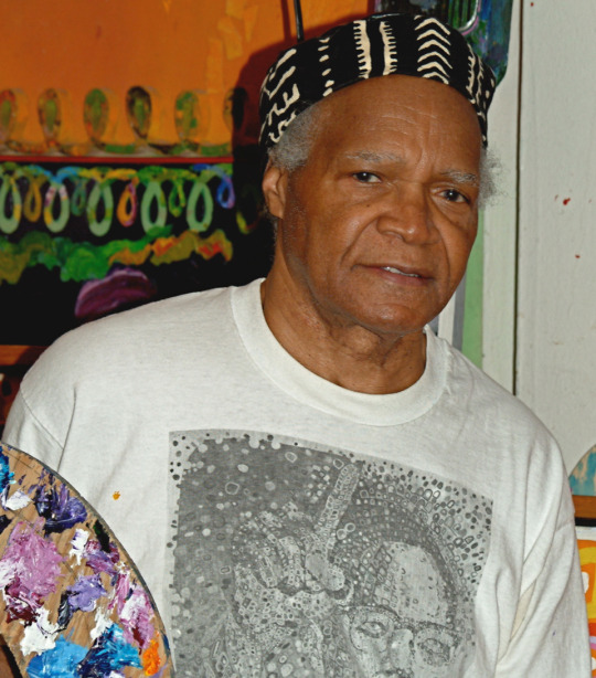
Wadsworth Jarrell | "Revolutionary" (Angela Davis), 1971, acrylic and mixed media on canvas, Brooklyn Museum
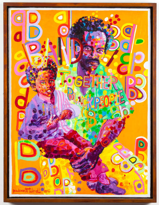
WADSWORTH JARRELL
BOSS COUPLE, 1970
Acrylic on canvas
36 x 27 1/2 in
Wadsworth Aikens Jarrell
American painter, sculptor printmaker and social artist .
Revolutionary social artist Wadsworth A. Jarrell, Sr. was born in Albany, Georgia, in 1929, the youngest of six children. Jarrell credits his father, a furniture maker, and the rest of his family for supporting his childhood interest in art. After high school, Jarrell served in Korea, and then moved to Chicago. In 1954, Jarrell enrolled in the School of the Art Institute of Chicago majoring in advertising art and graphic design. Not long afterward, Jarrell lost interest in commercial art and took more drawing and painting classes.
Jarrell joined the Organization of Black American Culture (OBAC), a group that created Chicago's Wall of Respect mural, a seminal piece in the 1960s urban mural movement. It was there that he met his future wife, Elaine Annette (Jae) Johnson, a clothing designer. With the eventual breakup of the Artists' Workshop of OBAC, Jarrell and fellow artists Jeff Donaldson and Barbara Jones-Hogu, among others, formed a collective called COBRA-Coalition of Black Revolutionary Artists, which later became AFRI-COBRA, the African Commune of Bad Relevant Artists. AFRI-COBRA took as its central tenets black pride, social responsibility and the development of a new diasporic African identity.

In 1971, Jarrell was recruited by fellow AFRI-COBRA founder, Jeff Donaldson to teach at Howard University where he pursued his Master of Fine Arts degree. He continued there until 1977, taking a position at the University of Georgia as Assistant Professor. In 1988, with the interest in his work increasing, Jarrell retired from teaching altogether. Jarrell's work has been shown at numerous places including: the Smithsonian International Gallery, the Museum of Contemporary Art in Chicago and at festivals and exhibitions in Nigeria, Germany, Sweden, France, Haiti and Martinique.
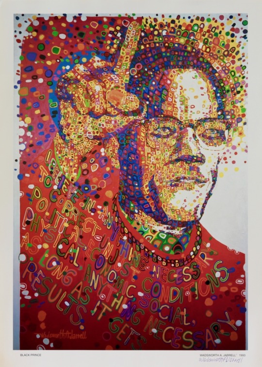
Black Prince, 1993
Artist: Wadsworth Jarrell
Offset Lithograph
22 3/4 x 16 inches
Signed by the artist lower right
47 notes
·
View notes
Text
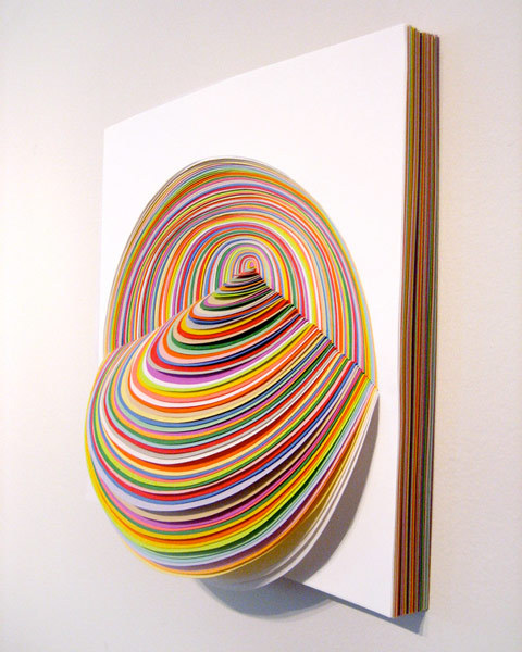
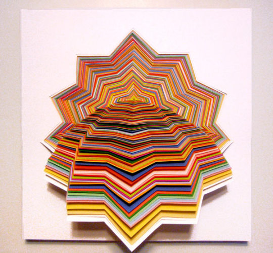

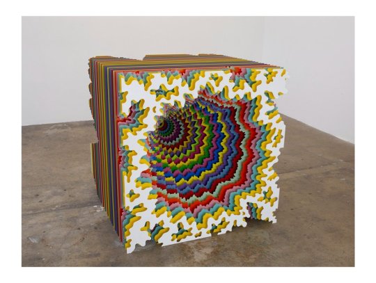


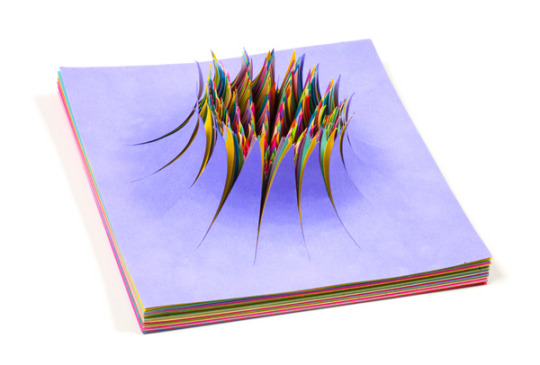
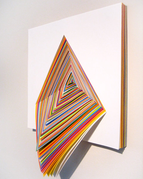
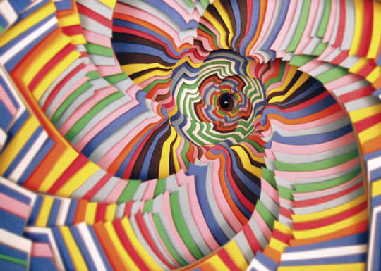
Jen Stark’s art is driven by her interest in conceptualizing visual systems to simulate plant growth, evolution, infinity, fractals, mimetic topographies, and sacred geometries. Using available materials—paper, wood, metal, paint—Stark strives to make work that balances on a razor’s edge of optical seduction and perceptual engagement. In recent years, Stark has introduced new technologies into her diverse practice, delving into the digital realm of interactive projections and distinctive NFTs.
The resulting works often resemble organic, molecular, cloud-like structures, and are imbued with kinetic, undulating effects that serve to dislocate the viewer from staid reality into an immersive ecosphere of echoing patterns and the implausible designs found in nature. Even her vivid colors are in direct conversation with the natural world; the attractant/repellent properties of flowers encouraging pollination or insects warning birds of their poisonous traits, and the luminous mystery of phosphorescent sea creatures are among Stark’s concerns.
Via these corporeal abstractions, spectators are led onto the astral plane; there’s a transcendence to Stark’s work where the vibrational phases become a sacrosanct and curative experience for the viewer. Traces of mandalas or nautili reveal themselves as sacred geometric forms in Stark’s spiritual reservoir.
Stark’s ability to create atmospheric, minimal, naturalist configurations that only reveal themselves after deep engagement align her with the artistic legacies of Yayoi Kusama, Sol Lewitt, Tara Donovan, Tom Friedman, Andy Goldsworthy, Ernst Haeckel, and the Finish Fetish artists of 1960s Los Angeles.
Not limited to the confines of museums and galleries, Stark’s diverse practice—a series of sculptural objects that rely on a commitment to process and hypnotic repetition; charismatic wall works; widely seen murals; intricately animated films; NFTs (non-fungible tokens) and interactive projections—has been exhibited throughout the world, permeating both the physical and digital realms. By adopting cutting-edge techniques to showcase her aesthetic, Stark activates her universe through constant adaptation and transformation.
Stark was born in Miami, Florida in 1983, and studied at the Maryland Institute College of Art, graduating in 2005. Since then, Stark has realized exhibitions globally, with major shows in New York, Los Angeles, Miami, Chicago, Thailand, and Canada. Recently included as one of Fortune’s “NFTy 50,” Stark made history as the first female artist to make Foundation’s top 10 highest selling NFT creatives. Her work is in the collections of the Smithsonian American Art Museum, the West Collection, Crystal Bridges Museum of American Art, NSU Art Museum and MOCA Miami, among others.
Stark lives and works in Los Angeles. Part1 Part2
#sculpture #sculptureart #sculptureartist #sculptures #sculpturelovers #sculptureoftheday #sculpturepark #sculpture_art #sculpturegallery #sculpturesofinstagram #sculpture_gallery #sculpturesurbois #contemporarysculpture #sculpturecontemporaine #sculpturephotography #sculptured #modernsculpture #abstractsculpture #handsculpture @frenchpsychiatrymuderedmycnut 🌈 #artsculpture #instasculpture #skulptur #skulpturen #skulpturer #skulpturensammlung #skulptures #skulptūra #skulpturia #skulpturenausstellung
Soundtrack: I Feel Space by Lindstrøm 🌈
#l o v e#Jen Stark#5/2023#artist of the day#Pop art#rainbow#rainbow warriors#sculptor#sculptures#female artists#female artwork#female art#newcontemporary#new contemporary#new contemporary art#x-heesy#fucking favorite#now playing#music and art#contemporaryart#🌈#symmetry#pattern
70 notes
·
View notes
Text

“The Connoisseur” by Norman Rockwell (1962)
In 1961, Rockwell's studio was temporarily transformed into an abstract expressionist's workplace as he painted The Connoisseur, a painting about the relationship between conventional and modern art. Always fascinated by modern and abstract art, Rockwell designed a cover in which he could acknowledge his appreciation of the genre. By placing his back to us, he leaves the interpretation of the museum visitor's reaction to the viewer.
During an interview with the Smithsonian American Art Museum in conjunction with the exhibition Telling Stories: Norman Rockwell from the Collections of George Lucas and Steven Spielberg, collector Steven Spielberg said:
"The Connoisseur is a fascinating painting for me. ...Rockwell actually had to do a Jackson Pollock. He had to get that drip effect on that canvas. That means he had to completely change the paradigm of his style to accomplish a Jackson Pollack and a very convincing Jackson Pollock, before going back to his sort of conventional human characters. For me that represents how an artist can suddenly change his style and be unrecognizable in one form in another medium and then return to the style that we're familiar with." - Steven Spielberg
The original oil painting is now part of a private collection.
18 notes
·
View notes
Text
For #TextileTuesday:

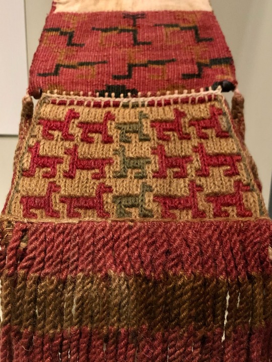
Inka cotton coca bag with llama designs, Peru south coast, c.1450-1532
Smithsonian’s National Museum of the American Indian collection
#animals in art#Smithsonian’s National Museum of the American Indian#indigenous art#Inca art#Inka art#South American art#pre conquest art#cotton#textiles#Textile Tuesday#museum visit#exhibition#bag#llama#llamas
32 notes
·
View notes
Photo
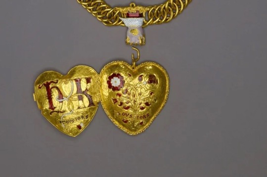
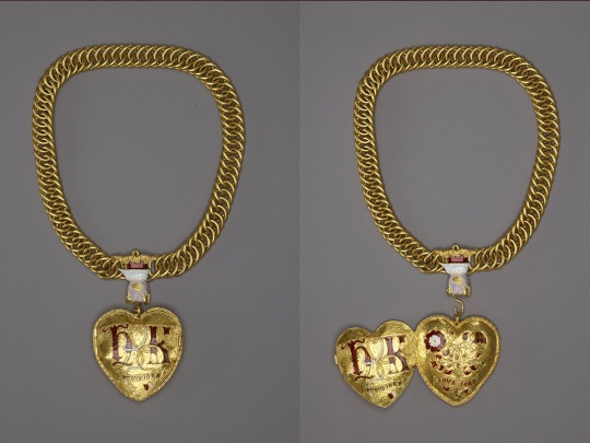
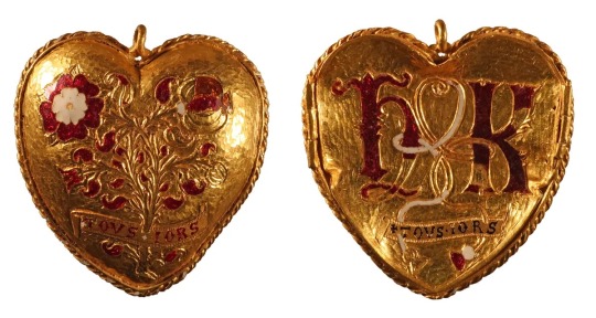
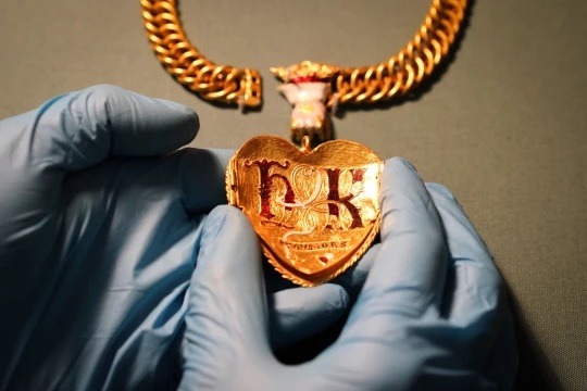
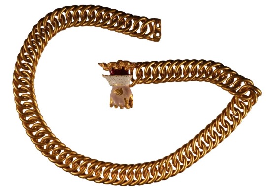
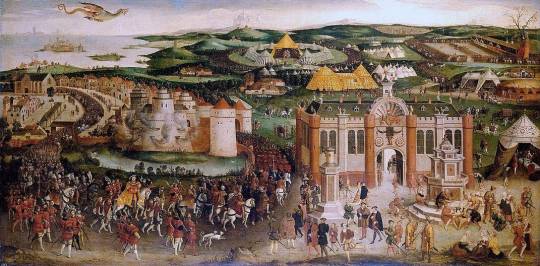
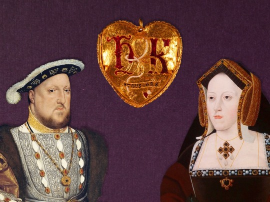
Rare Gold Pendant Celebrating Henry VIII’s First Marriage Discovered
The heart-shaped accessory features the entwined initials of the Tudor king and Catherine of Aragon.
In June 1520, the rulers of France and England declared their friendship with an over-the-top display of wealth and power. Known as the Field of Cloth of Gold, the two-and-a-half-week summit featured feasts, jousts, wrestling matches, masques and an endless stream of entertainment. Neither France’s Francis I nor England’s Henry VIII spared any expense on the celebration, which cost the equivalent of around $19 million today.
Publicly, the Field of Cloth of Gold’s goal was diplomacy, marking an alliance between the two kingdoms. But the event had an underlying purpose: allowing each monarch “to outdo the other in splendor and military prowess,” as historian Tracy Borman told Smithsonian magazine in 2020. The kings’ personal “rivalry … was so intense that it almost blinded them to the expense involved,” she said. “They were desperate to prove their superiority over each other, no matter the cost.”
Few traces of the summit survive today. Designed to be ephemeral, the traveling courts’ temporary palaces were disassembled as quickly as they’d been constructed. But a rare find recently made in England’s West Midlands may offer a glimpse into the Field of Cloth of Gold—or at least help convey the majesty on display during the event and others like it.
In 2019, Charlie Clarke, a 34-year-old café owner who had recently taken up metal detecting as a hobby, discovered a gold pendant and chain in a field in Warwickshire. The heart-shaped pendant was emblazoned with the intertwined initials “H” and “K,” as well as a red-and-white Tudor rose and pomegranate bush—imagery associated with Henry and his first wife, Catherine of Aragon (also known as Katherine). Both sides bore the inscription “toujours,” a play on the French word for “always.”
When Clarke realized that he’d literally struck gold, he screamed “like a little schoolgirl, to be honest. My voice went pretty high-pitched,” he says to the Guardian’s Esther Addley.
Curators at the British Museum, which manages archaeological finds made by the English public through the government-run Portable Antiquities Scheme (PAS), were similarly surprised, with some suggesting the pendant was a 19th-century fake rather than a genuine Tudor artifact.
“The majority of people who saw this at the museum felt it was almost too good to be true,” curator Rachel King tells the Financial Times’ James Pickford. “At the British Museum, we have the largest collection of objects in precious metal from the early Tudor period. None of them are anything like this—they tend to be smaller. Things like this haven’t really survived.” (The pendant measures almost 2 and a half inches in length, while the chain stretches to just over 17 inches.)
Careful analysis of the pendant’s iconography soon dispelled any doubts about its authenticity. According to the artifact’s record in the PAS database, it likely dates to between 1509, when Henry and Catherine married, and 1533, when their marriage was annulled. The database record offers a “reasonable” suggested date of around 1521, the year that a similar design was embroidered on equine body armor used during jousts at English court. 1521 was far from the first time Henry commissioned metalwork celebrating his marriage; ahead of a joust and banquet in July 1517, for example, artisans produced metalwork featuring “H” and “K” and other royal emblems to adorn the clothing of more than 100 guests and horses.
The 1517 record “suggests a huge amount of metalwork [was] being hastily prepared with visual impact in mind, none of which was intended to have longevity,” the database states. “[The pendant] could have been made in similar circumstances,” whether for the Field of Cloth of Gold or another extravagant event. Per a statement, it may have served as a prize won at a jousting tournament or a token worn by an attendee.
The British Museum team has found no evidence that the pendant personally belonged to either Henry or Catherine. But King tells the Guardian that “its quality is such that it was certainly either commissioned by or somehow related to a member of the higher nobility or a high-ranking courtier.” How the accessory eventually landed in a field in Warwickshire is unclear, but it will likely end up in a museum collection.
“Previously unknown potentially royal artifacts from the 16th century are very rare—and can give us important new insights into life at the top of Tudor society,” Lucy Wooding, a historian at the University of Oxford and the author of Tudor England: A History, tells the Independent’s David Keys.
Henry famously tried to divorce Catherine after becoming besotted with one of her ladies-in-waiting, Anne Boleyn, in the mid-1520s. But the queen refused to agree that the union was invalid, remaining steadfast in her belief that she was the king’s one true wife until her death in January 1536, a full three years after Henry had their marriage annulled so he could finally wed Anne. As Catherine wrote in her purported deathbed letter to Henry, “Lastly, I make this vow, that mine eyes desire you above all things.”
By Meilan Solly.
#Rare Gold Pendant Celebrating Henry VIII’s First Marriage Discovered#Catherine of Aragon#Field of Cloth of Gold#gold#gold jewelry#tudor jewelry#metal detector#metal detecting finds#ancient artifacts#archeology#archeolgst#history#history news#ancient history#ancient culture#ancient civilizations
55 notes
·
View notes
Text

Untitled (The Mary Heye Bottle)
Smithsonian American Art Museum and its Renwick Gallery
Sand bottles are made, quite literally, a grain of sand at a time. The grains are stacked and pushed around until layers and colors form a desired design, which is then pressured into place with a waxed stopper. Part painting, part sculpture, the resulting artform is unique and often quite astonishing.
Andrew Clemens lived his entire life in Iowa's Mississippi River Valley. He lost his hearing during a childhood illness and thereafter attended the Iowa State School for the Deaf in Council Bluffs. There he discovered an aptitude and affinity for handcrafts. During summers at home, he collected pieces of colored sandstone in the Pictured Rocks area of Iowa's Pikes Peak State Park then ground them into a palette of earth-toned colors. His sand bottles began as simple designs, becoming increasingly intricate over time and taking as much as a year to complete. Ultimately, Clemens shaped a profession of making customized sand bottles on commission; The Mary Heye Bottle, made at the zenith of his career, was one of these commissions. One side bears the honoree's name, the year the bottle was made, and a detailed floral arrangement. The other side has a flying eagle carrying the United States flag, and an array of precise geometric ornamentation. Clemens produced hundreds of sand bottles but only a small number survive.
58 notes
·
View notes
Text
Disney's Atlantis (2001) will have no more sequels, and Intellectual Property is why.
In short: IP law. But not the "make money by writing it off" thingy.
Epistemic status: a memory of a Q&A panel from 2002.
At length:
Atlantis was released in 2001. It had a giant mechanical lobster,

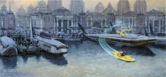
and some neat steampunk submarines,
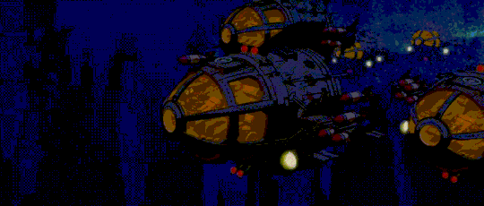

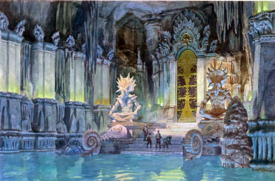
These submarines go on a neat adventure through underwater passages past shipwrecks of ages past, break through a big door, and arrive at an underground cavern filled with forgotten machines, which power up when you insert glowing crystals in them.

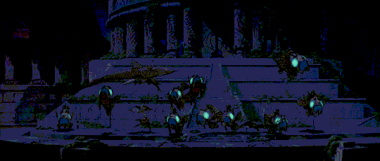
And that's the whole problem with Walt Disney Animated Series film 41: Atlantis: The Lost Empire, its sequel, and really the entire story and concept.
In 1992, renowned painter James Gurney released the picture-book Dinotopia: A Land Apart from Time, which featured a neat little steampunk submarine, the front one in this series of maquettes by Glenn Ludgate:
In 1995, Gurney published a sequel, Dinotopia: The World Beneath, where a group of intrepid explorers use a steampunk submarine to go on an underwater excursion through the remains of wrecked ships of ages past, through a door, to a cavern full of forgotten machines which power up when you insert glowing crystals in them. Including an evil lobster.


In 1999, Gurney published the prequel, Dinotopia: First Flight, which told the story of where those sunstone-powered mechanical marvels came from: the drowned city of Poseidos. The story included a chase sequence with sunstone-powered flying trilobites.

There are, shall we say, certain parallels.
In June 2001, Disney released Atlantis: The Lost Empire. The film allegedly underperformed at the box office, taking in $186.1 million against a budget of $90-120 million. In 2003, Disney released the direct-to-video sequel Atlantis: Milo's Return, which collected content previously intended for a canceled TV series. It competed with Shrek.
During his April-September 2002 exhibition at the Smithsonian National Museum of National History, an audience member asked Gurney about the parallels between the recently-released Atlantis and Gurney's designs for Dinotopia. Gurney replied that he couldn't comment, but that his lawyers had reached an agreeable settlement with Disney.
Because the lawsuit was settled out of court — if it in fact existed, which is what I here allege — it left no records. I have found nothing by search; if you find any documentation of this, you're welcome to publish it. Disney acknowledges that Atlantis drew from Jules Verne's 20,000 Leagues Under The Sea. For other plagiarism allegations, you will find much more documentation of alleged parallels between Atlantis and Nadia: Secret of Blue Water and Laputa: Castle in the Sky.
In May 2002, Hallmark Entertainment and Walt Disney TV released a three-episode, four-hour Dinotopia miniseries. A sequel series of 13 episodes was released beginning in November 2002, produced by ABC and Hallmark Entertainment. An animated film was released in 2005 by Hallmark Entertainment. There were also a series of Dinotopia video games for PC/MAC GBA, and GC/Xbox in 2002 and 2003. It's this really-tight cluster of activity, right after Atlantis came out.
In 2007, Gurney published the fourth and latest Dinotopia book, Dinotopia: Journey to Chandara. It's very beautiful.
In 2013, Disney remastered and rereleased the Atlantis films in 2013.
------
These Atlantis gifs are hand-cut with ffmpeg in 720p 15fps, straight from the movie, and the Dinotopia images are sourced from James Gurney's blog, "Gurney Journey" which I highly recommend as a source of traditional-media painting advice as well as general art advice. The Dinotopia books are a joy to read, and if you want, there is a YA novel series as well as a pair of novels by Alan Dean Foster. Gurney also wrote several guides to illustration and painting, and in general is a nice old man.
Don't blame James Gurney for stealing Atlantis. Blame Disney for stealing Dinotopia.
------
Reading Comprehension Questions:
What parallels does OP see between Atlantis and Dinotopia?
What sources does OP cite for the core allegations in this essay?
What is OP's stance towards Disney? Towards James Gurney?
Who does OP blame for Atlantis being dead IP?
How would your personal stance on copyright law affect the outcome of a lawsuit between James Gurney and Disney over stolen intellectual property?
Fanfic prompt: The Atlantis expedition wash up on the shore of Dinotopia. The expedition arrives a few years after the Dennisons do, with Will and Sylvia off on their new career, and Arthur having a bit of an empty-nest syndrome. No one knows where Lee Crabb is.
#dinotopia#atlantis#atlantis the lost empire#james gurney#disney#gifs#ffmpeg#reading comprehension questions#title edited several days after posting
53 notes
·
View notes
Text

The SR-71 Blackbird Astro-Nav System (aka R2-D2) worked by tracking the stars and was so powerful that it could see the stars even in daylight
Mounted behind the SR-71 Blackbird RSO’s cockpit, this unit, (that was affectionately dubbed “R2-D2” after the Star Wars movie came out in 1977) computed navigational fixes using stars sighted through the lens in the top of the unit.
SR-71 T-Shirts

CLICK HERE to see The Aviation Geek Club contributor Linda Sheffield’s T-shirt designs! Linda has a personal relationship with the SR-71 because her father Butch Sheffield flew the Blackbird from test flight in 1965 until 1973. Butch’s Granddaughter’s Lisa Burroughs and Susan Miller are graphic designers. They designed most of the merchandise that is for sale on Threadless. A percentage of the profits go to Flight Test Museum at Edwards Air Force Base. This nonprofit charity is personal to the Sheffield family because they are raising money to house SR-71, #955. This was the first Blackbird that Butch Sheffield flew on Oct. 4, 1965.
The SR-71, unofficially known as the “Blackbird,” was a long-range, Mach 3+, strategic reconnaissance aircraft developed from the Lockheed A-12 and YF-12A aircraft.
The first flight of an SR-71 took place on Dec. 22, 1964, and the first SR-71 to enter service was delivered to the 4200th (later 9th) Strategic Reconnaissance Wing at Beale Air Force Base, Calif., in January 1966.
The Blackbird was in a different category from anything that had come before. “Everything had to be invented. Everything,” Skunk Works legendary aircraft designer Kelly Johnson recalled in an interesting article appeared on Lockheed Martin website.
Experience gained from the A-12 program convinced the US Air Force that flying the SR-71 safely required two crew members, a pilot and a Reconnaissance Systems Officer (RSO). The RSO operated with the wide array of monitoring and defensive systems installed on the airplane. This equipment included a sophisticated Electronic Counter Measures (ECM) system that could jam most acquisition and targeting radar and the Nortronics NAS-14V2 Astroinertial Navigation System (ANS).
The SR-71 Blackbird Astro-Nav System (aka R2-D2) worked by tracking the stars and was so powerful that it could see the stars even in daylight

SR-71 Astroinertial Navigation System
According to the Smithsonian Institution website, the ANS provided rapid celestial navigation fixes for the SR-71.
Mounted behind the SR-71 RSO’s cockpit, this unit (that was affectionately dubbed “R2-D2” after the Star Wars movie came out in 1977), computed navigational fixes using stars sighted through the lens in the top of the unit. These fixes were used to update the inertial navigation system and provided course guidance with an accuracy of at least 90 meters (300 feet). Some current aircraft and missile systems use improved versions as a backup to GPS.
About the ANS RSOs were known to say, “no one can jam or shoot down the sun, the moon, the planets or the stars.”
Piloting the Blackbird was an unforgiving endeavor, demanding total concentration. But pilots were giddy with their complex, adrenaline-fueled responsibilities. “At 85,000 feet and Mach 3, it was almost a religious experience,” said Air Force Colonel Jim Watkins. “Nothing had prepared me to fly that fast… My God, even now, I get goose bumps remembering.”
The SR-71 Astroinertial Navigation System, aka R2-D2, was crucial in Blackbird mission. Here’s why.

But once the SR-71 reached cruising speed and altitude, it was time to focus on the mission, which was to collect information about hostile and potentially hostile nations using cameras and sensors. The pilot’s job was to handle the aircraft and watch over the automatic systems to make sure they were doing their jobs properly. Meanwhile, the RSO handled the cameras, sensors, and the all-important ANS. The ANS was the 1960’s version of GPS, but instead of using satellites to locate itself, the ANS used the stars. This is because before the invention of the modern satnav networks there wasn’t a way to navigate the SR-71 in the areas where it operated. The SR-71 needed to be able to fix its position within 1,885 feet (575 m) and within 300 ft (91 m) of the center of its flight path while traveling at high speeds for up to ten hours in the air.
The ANS provided specific pinpoint targets located in hostile territory. It was a Gyro compass that was able to sense the rotation of the earth, while still on the runway before the SR-71 would take off. The RSO could use his coordinates of the spot ….of one place …on the runway …then read of the ANS. They were almost always exactly the same. Not always were the same stars were used on every mission, as they used the stars depending on what part of the world they were going to fly to. If flying in the southern hemisphere* they used only the stars that were seen there.
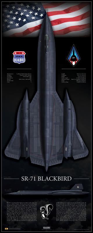
SR-71 print
This print is available in multiple sizes from AircraftProfilePrints.com – CLICK HERE TO GET YOURS. SR-71A Blackbird 61-7972 “Skunkworks”
On Jul. 2, 1967 Blackbird crew Jim Watkins and Dave Dempster flew the first international sortie in SR-71A #17972 when the ANS failed on a training mission and they accidentally flew in to Mexican airspace.
The ANS works by tracking at least two stars at a time listed in an onboard catalog, and with the aid of a chronometer, calculates a fix of the SR-71 over the ground. It was programmed before each flight and the aircraft’s primary alignment and the flight plan was recorded on a punched tape that told the aircraft where to go, when to turn, and when to turn the sensors on and off. The stars were sighted through a special quartz window (located behind the RSO cockpit) and there was a special star tracker that could see the stars even in daylight.
*It is not confirmed if the SR-71 ever flew in the southern hemisphere.
@Habubrats71 via X

15 notes
·
View notes
Text
Bessie Potter Vonnoh
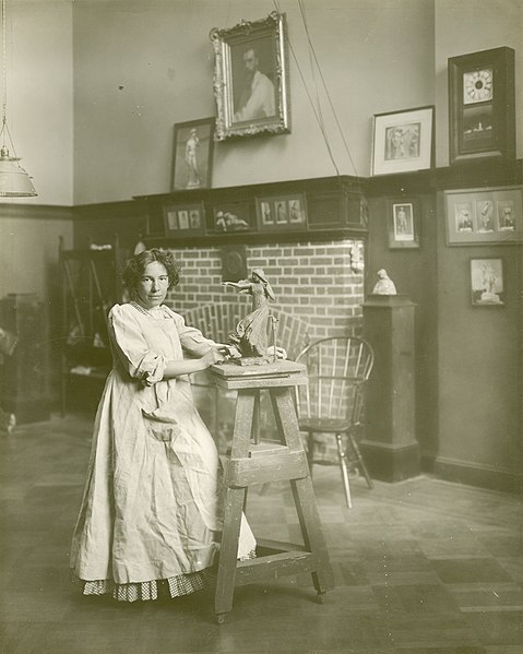
Bessie Potter Vonnoh was born in 1872 in St. Louis, Missouri. Vonnoh enjoyed a successful four-decade artistic career, and was known mainly for her sculptures of upper class women engaged in daily activities. Vonnoh was the first female sculptor to teach at the National Academy of Design. Her notable works include the 1896 sculpture Young Mother, which became highly sought-after, as well as the Burnett Fountain in New York's Central Park. Her artwork can be found in the collections of the Metropolitan Museum, the Smithsonian American Art Museum, and the National Gallery of Art.
Bessie Potter Vonnoh died in 1955 at the age of 82.
Image: Jessie Tarbox Beals, National Gallery of Art collection
15 notes
·
View notes
Last Seen Blogs

writingsfromlee
Social Anxiety Disorder
treated with Online Counseling

maturewatcher
On The Hunt For Dads

ilbedeadwhenyoureadthis-blog
Untitled

puridunia
PuriDunia
apocolypes666
Untitled