#Special Livery
Text


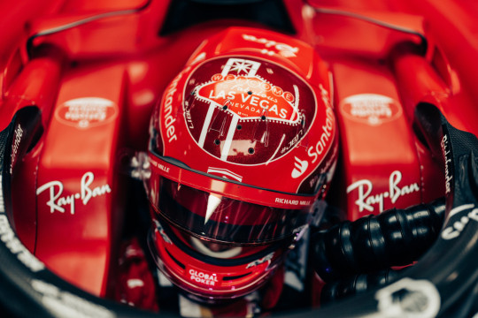
Charles working miracles in his SF-23 during Las Vegas Grand Prix Race Week | 16-18 November 2023
📸 🆑️
#special helmet#special livery#special driver#charles leclerc#las vegas gp 2023#scuderia ferrari#formula 1#f1
24 notes
·
View notes
Text
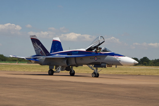
RCAF Demo Hornet at RIAT sporting a NORAD commemorative livery
#RCAF#Demo Hornet#Special livery#RIAT#airshow#Royal Canadian Air Force#Airshow photos#military aviation#fighter aircraft
35 notes
·
View notes
Text

I absolutely love this livery
16 notes
·
View notes
Text
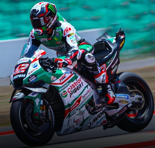
Alex Rins
LCR Honda Idemitsu [Castrol Special Livery]
Indian GP // 2023
#motorcycle#alex rins#lcr honda idemitsu#castrol#special livery#indian gp#2023#sport bike#racing#motorsports#built for speed#ride hard or go home#motogp#moto love#lifestyle
14 notes
·
View notes
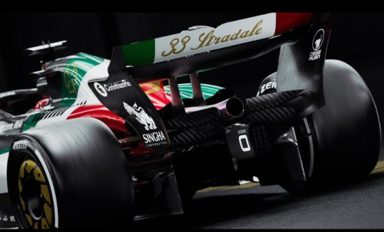
Photo
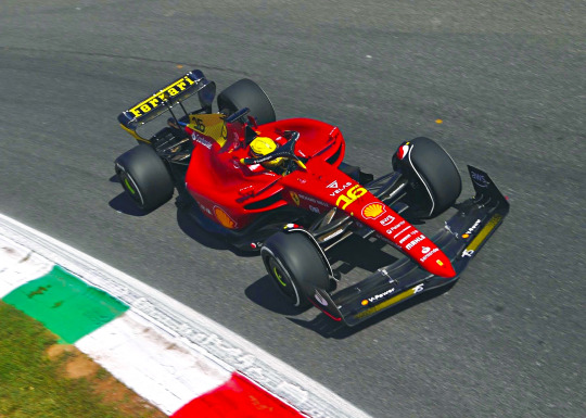
F1-75's special livery for Monza 2022.
Beautiful! 💛
#charles leclerc#f1#f1-75#scuderia ferrari#wow look at that rear wing!#too bad it's a tractor and the team is a bunch of clowns but still *manifesting* a good weekend for charles#special livery#monza 2019#italian gp 2022
60 notes
·
View notes
Text
Here it is! McLaren brings us the first special livery of the season. It's a design created by a japanese artist called "Miltz" and it's inspired by the japanese calligraphy from the Edo era and shows dragons and clowds.
#f1#formula 1#formula1#formel1#motorsport#formel 1#motorsports#motorsport news#f1 news#special livery#special liveries#mclaren formula one#mclaren f1#mclaren#mclaren formula 1#mclaren racing#oscar piastri#lando norris#gp of japan#japanese gp
6 notes
·
View notes
Text
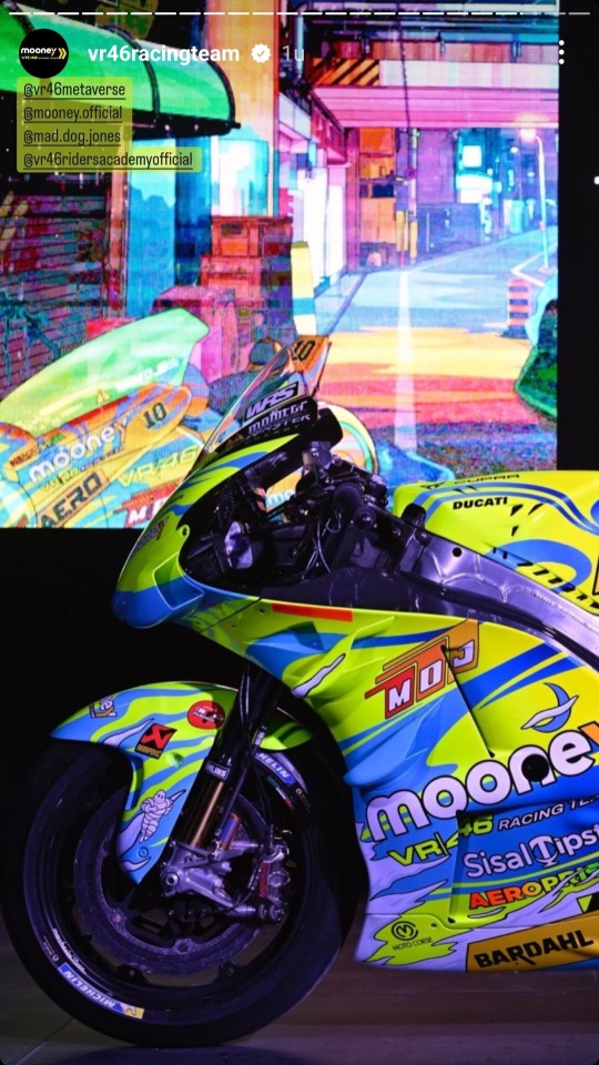

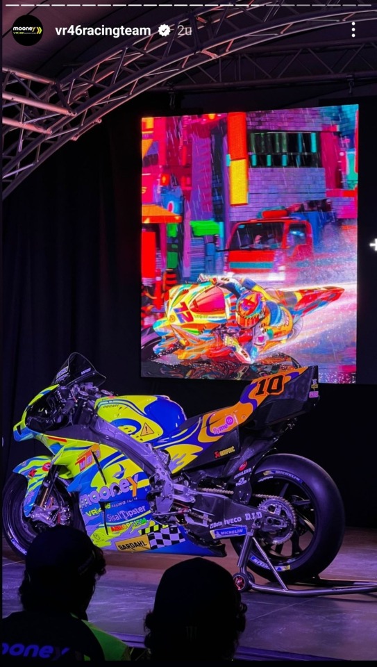
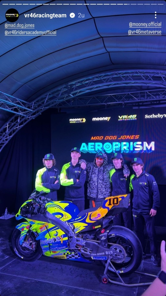
(VR46racingteam in their instagram story, 01-09-22)
#mooney vr46 racing team#vr46 racing team#italian gp#san marino gp#motogp#luca marini#marco bezzecchi#niccolò antonelli#celestino vietti#moto2#special livery#i freaking love this!#this is exactly the kind of livery I like#vibrant colours#it makes me happy#this is an awesome libery!#vr46 riders academy
42 notes
·
View notes
Text
https://concordenickartphoto.zenfolio.com/p777261691/e648ab35f

#aviation#concordenick artphoto#aircraft#airplane#concordenickartphoto.zenfolio.com#transport#flight#travel#aviation photography#Airbus#A220-300#OM-1#C-GNBN#Special livery#TCA#Trans Canada Airlines#Air Canada
5 notes
·
View notes
Text
Alaska Airlines launches new 'Salmon' Aircraft with a striking native design fit for the 21st Century.
Alaska Airlines has had a long-time relationship with the Alaskan Salmon, In fact, in 1932, the airline took its first flight between Anchorage and Bristol Bay, home of the world’s most extensive sockeye salmon run. Since then its constantly been a part of distributing salmon across the States, so celebrating this ironic Alaskan export makes perfect sense. In fact, back in 2012 the airline…

View On WordPress
#Airline#alaska#alaska airlines#aviation#branding#creative#featured#graphic design#Livery#native#news#salmon thirty salmon#special livery#usa
2 notes
·
View notes
Text
Gresini is having a special livery too?!
#MotoGP#Gran Premio Gryfyn di San Marino e della Riviera di Rimini#San Marino GP 2022#Gresini Racing#Special livery
5 notes
·
View notes
Text
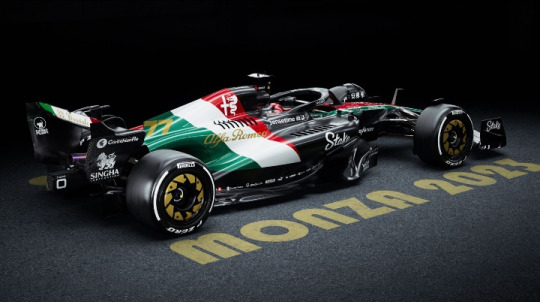
Alfa Romeo's special Monza livery ❤️🤍💚
📸 Reddit
8 notes
·
View notes
Text

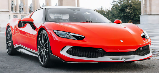
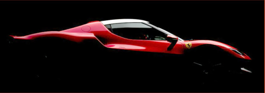

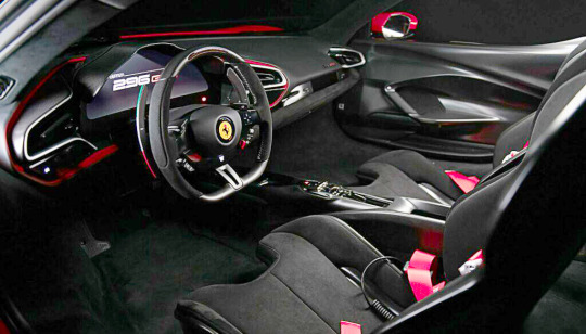
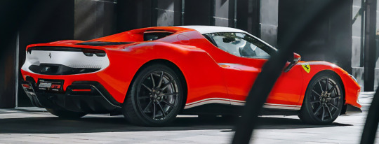

Ferrari 296 GTB Assetto Fiorano, 2024. A new special edition of 5 cars to celebrate the 20th anniversary Scuderia Ferrari’s 1-2 victory at the 2004 Hungarian Grand Prix. The car's livery references that of the F2004 that remains as one of Ferrari’s most successful F1 cars. Created by Ferrari Atelier, the cars are finished in three-layer metallic Rosso F1 shade with Bianco King White accents and come with the the race-focused Asseto Fiorano package that includes a carbon fibre splitter, Multimatic shock absorbers, carbon fibre wheels with Michelin Pilot Sport Cup 2 R tyres, and 4-point safety harnesses inside the cabin. The special edition was unveiled in the Hungarian capital Budapest, all 5 cars have been sold to Hungarian buyers
#Ferrari#Ferrari 296 GTB#Ferrari 296 GTB Assetto Fiorano#racing livery#Ferrari F2004#2024#special edition#limited edition#20th anniversary#Hungarian
222 notes
·
View notes
Text
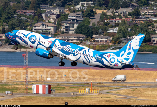
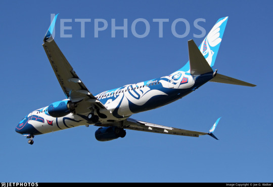
No. 52 - Alaska Airlines Xáat Kwáani and Salmon-Thirty-Salmon Liveries
Did you think I was done with Alaska Airlines?
No, this is actually my last post about them for now (though, mark my words, you will be seeing a post about the Gold Nugget Jet in the not-too-distant future - I just feel like we need a break from nothing but consecutive posts about the same airline, and I have other things I want to cover). But it's something that's both requested and which I've wanted to talk about for some time.
In my last post I discussed the identity of the man on the Alaska Airlines tailfin. It wasn't a major part of the story, only taking up a small piece, but I did touch on how ChatGPT apparently will lie when asked about the background of the livery. Not only does it falsely attribute the livery to Fred Kabotie, who I'm sure had more important things to do, but it also falsely claims Fred Kabotie, who was Hopi, to be Tlingit. As it turns out, though, Alaska Airlines does have a livery designed by a Tlingit artist.
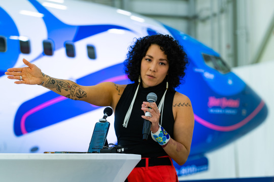
image: Brandon Farris
Crystal Kaakeeyáa Rose Demientieff Worl is a Tlingit artist known for large public artwork which heavily incorporates indigenous artistic traditions and visual motifs across many mediums. Some of her previous work includes large-scale murals in Alaska and throughout the world and guardrail panels at Juneau International Airport. She feels like the most natural choice possible to design an airliner livery, given the scale and diverse canvases she works with, and in May of this year the airplane you can see looming behind her was unveiled in a brand new livery that I, and a lot of other people, immediately fell in love with.

It's safe to say that this is one of the most ambitious and unique special liveries out there. Xáat Kwáani (which means 'salmon people' in Tlingit) is a beautiful and one-of-a-kind take on the often-noticed resemblance airplanes have to fish.
Salmon fishing is huge in Alaska, both now and historically. Today fishing is a major part of the Alaskan economy and something many people making a living off, but historically they were even more directly responsible for making the difference between life and death for those who lived beside them. A major source of food, they were literally life-bringing to indigenous societies, necessary to survival. Humans and salmon were part of the same ecosystem.
Independent of this fact, airplanes seem to lend themselves to comparisons to sea creatures. They may be called 'birds', but time and time again other people confirm that I'm not just imagining it, they do distinctly look like cetaceans and fish. Very early on in this blog the fact that 747s look like Humphead Wrasse was discussed. Amakusa Airlines, Japan Transocean Air, and Southwest Airlines have all leaned into this fish resemblance, and I'm sure over time my sea creature plane tag will continue to grow. This genre of livery will never cease to delight me.

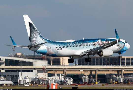
I think it's fairly predictable that I always loved N559AS, the brilliantly named salmon-thirty-salmon plane. I was devastated when I learned that the livery was going to be removed. I mean...just look at her.
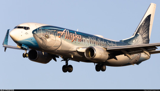
The salmon-thirty-salmon was a very unconventional take on the fish-plane, using a much more realistic drawing than any other attempt. It doesn't even try to transform the plane itself into the fish, which I think is potentially a smart way of accepting the limits of doing so. Instead, it fully displays the honestly hilarious and adorable face that salmon have while providing a nice canvas, a bit of water for the salmon to be carried on. At the same time it incorporates thoughtful details like the scales on the interior winglets, and the way the salmon's body is aligned with the empennage and nose feels very precisely done. It can create a somewhat uncanny doubling effect from a few angles, but by no means is it enough to rob the livery of its charm or elegance.
The salmon-thirty-salmon gets an A.
I've lived near the ocean my whole life. I love fish. I loved this plane. I was heartbroken when I learned the livery was going to serve its final milk run before rolling into the hangar for the very last time, coming out repainted and lost forever. It's always a bitter pill to swallow when airlines retire special liveries, particularly when it involves the plane being repainted into the standard colors. A lot of other people were sad to see this design go too.
What we didn't know was that this was not the end of the salmon-thirty-salmon. She was not lost, but transformed. When she emerged from the hangar again she was not wearing Alaska Airlines' default colors but something even more eye-catching, a livery honoring the same fish but with extra layers of meaning added by means of an intricate and beautiful new design.
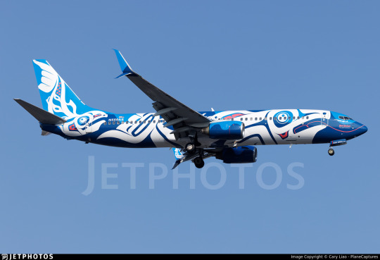
Costs, materials, and man-hours used to paint an airplane vary dramatically from case to case, livery to livery, model to model, airline to airline. The numbers in my description are somewhat conservative estimates used for comedic value. Alaska Airlines actually gave some numbers for Xáat Kwáani - twelve days, 117 gallons of paint. The colors used are Midnight Blue and Atlas Blue for the background, White for the fish themselves, and Pink for highlights, and a clear coat has been applied over the top in order to preserve the livery. Alaska Airlines has every intention of keeping it intact for as long as possible.
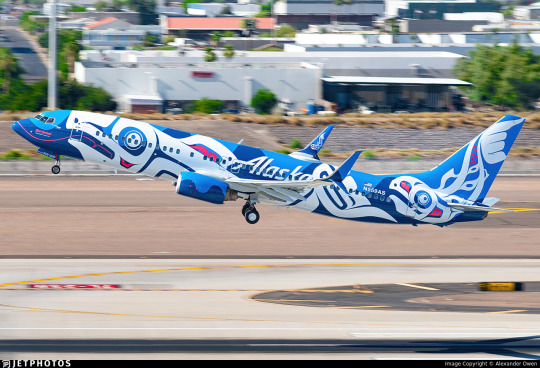
The use of colors is beautiful. The waves of darker and lighter blue keep it from ever looking too light or too dark, adjusting to the lighting in order to always remain saturated and vivid, and the irregular wave pattern keeps any part of the livery from looking static. The use of the pink as a highlight is sparing but effective. The white, though, is what makes this livery so fantastic. A central tenet of this blog is a disdain for the dominant trend of livery design in recent history, Eurowhite - that of an almost entirely white fuselage. And there is a legitimate sense of general derision for white, but it can be so powerful as a design feature. There is no contrast more powerful than a stark and complete absence, a space carved out fully from the world and color around it. It is the color of bone and snow.

The balance of each color is just perfect, the blue never overpowering the white, the white never fully blocking out the blue, the pink subtly adding depth throughout, and the shapes of the salmon are placed perfectly, not feeling cramped or confined. They are free to wander the fuselage and they have an amazing sense of movement to them, as if caught mid-leap. I've seen salmon swimming upstream to spawn, and they are so startlingly large and vivacious. The fish on this plane, though stylized, perfectly capture the way that these fish look in motion.
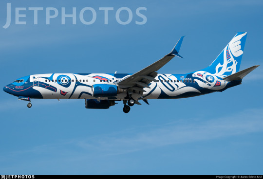
Formline is a style of art historically created by indigenous peoples of the Pacific Northwest coast of North America. It was a common and versatile visual element, present in everything from painting to carving to weaving. It is defined by its use of continuous, curving lines which may change in angle, width, and direction but do not terminate. Though it was diminished in quantity by suppression of indigenous culture by US and Canadian settlers it never went away, and from the second half of the 20th century onwards it has been surging back as more and more indigenous artists are able to produce and display their work. Worl has worked with formline many times before. She is quoted as saying:
Every time I looked at an Alaska plane, I couldn’t help but visualize the salmon being in formline [...] I can’t help but look at things and see how to Indigenize them.
And the idea has now come to life in this absolutely unforgettable livery. I wish I was within the range of the 737-800 from Alaska Airlines' hubs so that Xáat Kwáani could pay a visit to my home airport, because this is among the most beautiful planes in the world right now. And beyond just nice colors and pleasing shapes it represents something important - indigenous artists being given a 40-meter-long flying platform on which to honor fish which have provided countless centuries of life to the people who live beside them.

Worl's work is above and beyond what I would have ever expected for a custom airplane livery. Even the 'Alaska' wordmark is neatly incorporated into the formline, blending into the background to the point it's hard to notice in a good way.
Most liveries are designed by graphic designers and branding firms. Landor Associates design liveries and logo, but they aren't building monuments or putting their work in galleries. I don't mean to diminish their work - obviously I'm passionate about it, I have a blog about it - but it's just fundamentally different from what Worl does. It has different priorities, a different philosophy, and a different level of personal investment.
From my perspective Xáat Kwáani feels less like branding material and more like a piece of artwork. This isn't something designed to go on letterhead, to be put in a press kit, to be widely reproduced. It's something to be looked at, thought about, and remembered. This is a mural that flies.
I mean...A+, obviously.
There is just about nothing else in the sky which has the same visual power as Xáat Kwáani. As far as I'm concerned, every gallon of paint was worth it to give us this flying tribute to the people and wildlife of the state Alaska Airlines takes its name from.
127 notes
·
View notes
Text

Honda LCR Team [Castrol Special Livery]
Indian GP // 2023
#motorcycle#honda#lcr#team#castrol#special livery#sport bike#racing#motorsports#motogp#built for speed#ride hard or go home#indian gp#2023#moto love#lifestyle
18 notes
·
View notes
Text

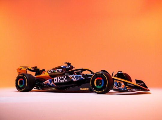
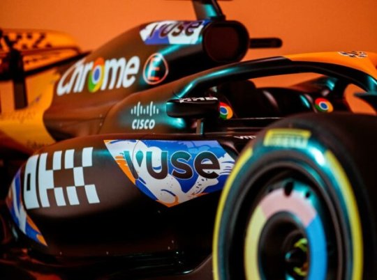
OMG!!!
#the blue is finally gone#we cheer#i love it#it looks similar to the special livery from singapore and japan#hopefully its as good as singapore and japan#but real it looks lit#lando norris#f1#mclaren#landoscar#oscar piastri#mclaren formula 1#mclaren f1#f1 2024#.x
74 notes
·
View notes
Text

The 🎀Duquette🎀 has been taking me outttt
This tweet
#coquette Ducati isnt real coquette Ducati can't hurt you#coquette duquette in question#imo its cute#they should let enea ride with this livery#and they should let him run a special hot pink livery#he deserves it#ducati corse#motogp#coquette
59 notes
·
View notes
Last Seen Blogs

swftreacherous
Sofía
alex-dontknow
The Crows

lesrosesrealestate
Les Roses Real Estate

ayamemes
ayame ^_^

atombdrockstar
atom