#United air lines
Photo

Hawaii - United Air Lines, 1960 poster
#hawaii#united air lines#hula girl#grass skirt#1960#1960s#vintage#poster#poster art#travel poster#art#illustration#painting
243 notes
·
View notes
Text
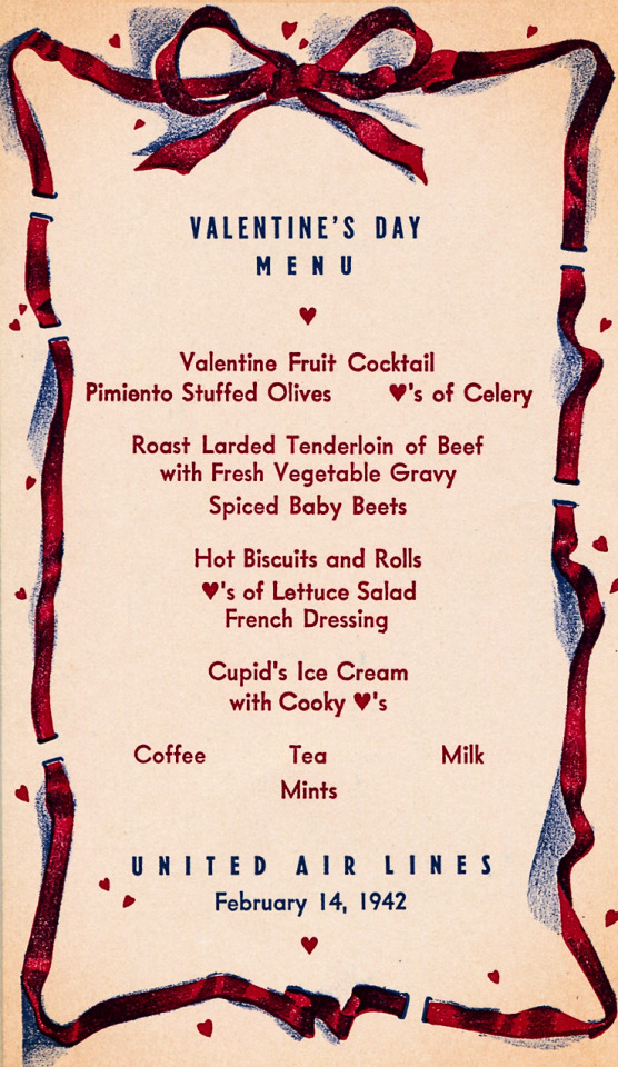
Vintage United Air Lines Valentine’s Day menu - 1942.
#vintage illustration#vintage holiday cards#vintage valentine’s day cards#st. valentine’s day cards#valentine’s day cards#vintage st. valentine’s day cards#holiday cards#valentine’s day#st. valentine’s day#saint valentine’s day#cupid#airlines#united air lines#united airlines#airplane food#vintage menus
14 notes
·
View notes
Text
38 notes
·
View notes
Text


Joseph Binder (1898-1972) United Air Lines
4 notes
·
View notes
Photo

1958 Only Coast-To-Coast All Radar Fleet. United Air Lines
Source: Time Magazine
Published at: https://propadv.com/airlines-poster-and-ad-collection/united-airlines-poster-and-ad-collection/
12 notes
·
View notes
Photo
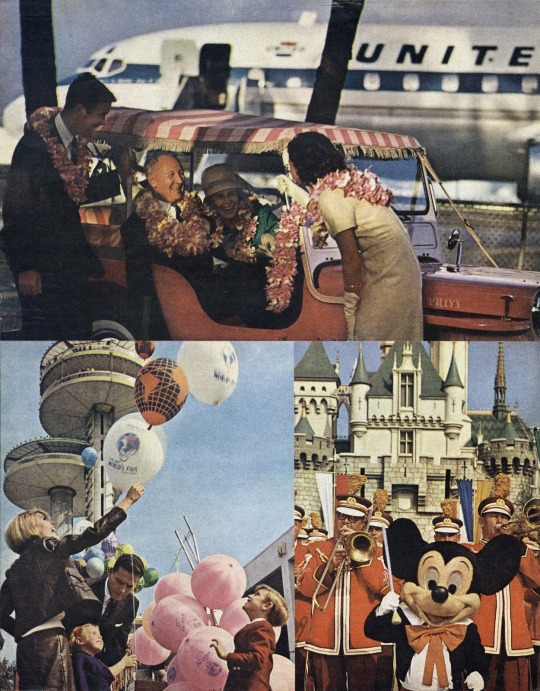

1965 United Air Lines advertisement
#united air lines#1965#1960s#vintage#ad#vintage ad#advertisement#vintage advertisement#advertising#vintage advertising#vintage disney#disney#disneyland#vintage disneyland
20 notes
·
View notes
Text
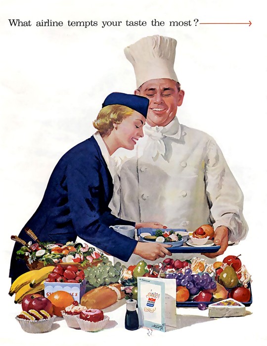
1955 What airline tempts your taste the most. United Air Lines
Source: www.flickr.com / x-ray_delta_one
Published at: https://posterhistory.com/airlines/american-airlines/
1 note
·
View note
Text
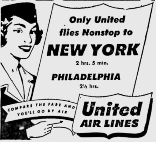
Compare the fare and you'll go by air
Youngstown Vindicator - Jan 20, 1953
1 note
·
View note
Text

United Air Lines
~ Signed
1 note
·
View note
Text
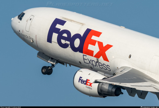
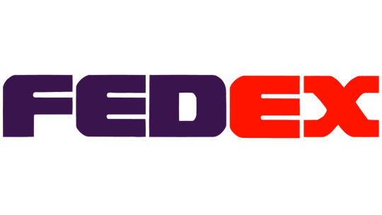
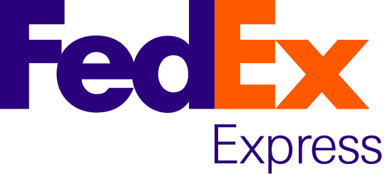
No. 44 - FedEx Express
If you have ever sent or received a package, particularly if you live in the United States, you may be familiar with FedEx, and @magic-gps requested that I discuss their airplanes!
FedEx (founded and formerly known as Federal Express) is a massive network for transportation of mail and cargo, and Federal Express Express (okay, no, I can't call it that, FedEx is legally the full name even though we all know what it's really short for) is its airborne branch, making up the largest cargo airline by fleet and freight tonnes conveyed in the entire world. Their largest customer is the US Postal Service, with whom they have an exclusive contract - any USPS air mail is carried by FedEx Express - but they also fly for countless other clients. They cover so much ground (air) that they not only have a dozen hubs but an additional SUPERHUB, located in Memphis. They're what DHL is for Europe but doing bigger numbers, and that's with UPS, Atlas Air, and Kalitta Air to compete with. Although they're based in the US, their website claims that their destinations include every US zip-code, plus "over 220" countries and territories. There are 195 internationally recognized countries at present. I don't think saying they fly everywhere is even really hyperbole at this point.
FedEx's fleet is massive and eclectic. They have the world's largest cargo fleet, with 650 planes (which are named by employees, frequently after their children). Add in FedEx Feeder, a second fleet of small propeller airplanes dry-leased to local carriers for use ferrying small loads to the full-size jets, and there's a total of 699 FedEx liveries in the skies with 88 more on order. They occupy whole swathes of tarmac. They're everywhere. Like snails after the rain.

Oh, and apparently this livery was designed by Lindon Leader (what a name) of Landor Associates, the prolific and highly regarded design firm responsible for hits like the SAS belly stripe livery and misses like JAL's two previous designs. I have higher standards for liveries that are just absolutely everywhere, so let's see if Landor was able to live up to them.
I'm going to be specifically talking about, because I presume this is what the requester meant, the livery FedEx adopted in 1994. The timeline of this is interesting, because the name of the airline stayed Federal Express until 2000, when the entire company rebranded from Federal Express to FedEx and added the redundant 'Express' to the airline's name. I've always thought that was very funny, and while that's charming to me I don't think I should be encouraging things like this. It's just sloppy and a bit weird to say.
Before they adopted the livery they did briefly trial a new logo. From 1991 to 1994 they had this!
Boy do I not like that! It's significant to the history of the company in that it shifted the colorscheme from indigo and burgundy to purple and orange, except that the difference in brightness here is really almost upsetting and the logo itself is...it looks like that. It's very TRON somehow. I don't find the tackiness pleasant. It's just ugly. The typeface they chose is bad. The wriggly X is nice but every other letter looks a unique sort of hideous, with the E in particular looking like a rake made of sponge which has been placed in water and left to soak. Thankfully they moved on quickly, replacing this logo at the same time as their livery.
The fact that there's six years between the visual rebrand and official renaming is interesting. Federal Express was already colloquially known as FedEx before the official renaming, and used it in their branding, but they weren't legally FedEx yet, so for that little span their planes bore both names.

This adolescent period in the life of modern FedEx featured the 'Federal Express' subtitle in this serif mystery font which I haven't seen mentioned at all anywhere. I couldn't find many more pictures with the full 'Federal Express', but there's a scattering of seriffed planes out there, it seems. It looks a lot better with the 'Federal' taken out just by virtue of legibility, and I have to say I'm very keen on the way the subtitle is offset to align with the start of the E. It looks nice and aerodynamic. When the first word is taken out it has the extra benefit of lining 'Express' up with the 'Ex' that stands for it.
But there it is! The FedEx logo. Adopted in 1994, considered a contender for the best logo ever made, winner of over 40 awards.
I want to disclaim for a moment. I think it's always been somewhat implicit that my opinions are just one manifestation of the infinite variability of human thought and inevitably subjective but I do need to re-stress this now: these are my own hot takes. My opinion is not legally binding. Lindon Leader is an incredibly accomplished designer and I'm not even a designer at all. There is a reason that FedEx's logo is so widely acclaimed. My criticism of it is not an attempt to contest its legacy, and is - again - just my opinion. And it is an opinion colored not only by the fact that I'm an amateur, and by the fact that my tastes are different from other people's, but by the fact that this logo is quite literally older than I am, and tastes have most certainly evolved since then.
I think the FedEx logo is...okay. I certainly do not despise it, but I would stop very short of calling it the best logo ever. I'm going to talk about why I'm so underwhelmed by it, and it's going to sound like I don't like this logo for a bit, but if you power through that you will see that my opinion about it isn't as straightforward as the sum of my opinions about its parts.
The fantastic thing about this particular logo is that it's easily the most-discussed and best-documented bit of branding I've yet covered, so it was a delight to research. I didn't even have to call in my font wizard, for example, because Leader explicitly states what it is in this interview - a proprietary typeface heavily inspired by Univers 67 Bold Condensed and Futura Bold. I actually like Futura (the Cyrillic version is one of my favorite Cyrillic typefaces) but don't love Univers 67 - it reminds me way too much of the handwriting style I was drilled in at school. US schools have truly heinous taste in the penmanship they teach, and much like how Parker cursive inherently reminds me of third grade, Univers 67 feels to me like an adult version of something I've long since outgrown. The design of the letterforms here, with the exaggerated x-height and all the lines (crossbars included) having a uniform thickness of 'very', reminds me of the posters on the walls of elementary school classrooms.

Take a look at this. The green line is hypothetically where the baseline should be, but the E and D descend slightly below it. According to my font wizard this is fairly common as an attempt to some sort of visual trick, but I don't like it. I can make it out from a distance and it significantly bothers me.
Speaking of misaligned, I've always felt like the vertical line on the E was slightly wider than that on the D, but had dismissed this line of thought as an optical illusion - the darker color and the lack of detail at the top, plus the lack of gaps at any point in the E, artificially make the D look narrower than it is. I tried lining them up, and I was right, it's an optical illusion. I still hate it. What isn't an optical illusion is that the middle line on the E is thicker than the second line on the F - again, hate it!
And I just don't like this font! It's like if they fed different fonts to a neutral network and had it invent a weight bolder than bold, like the neural-network generated upperer and lowerer cases. I'm aware of the existence of ultra bold weights, and I'm not talking about those, because those are regular ugly and clearly made by humans. This looks like an algorithm expanded the letters until they were touching.
But the touching bit is intentional. The FedEx logo is hiding a little secret, perhaps the most frequently cited reason for why it's so beloved. Between the E and X, Leader slipped in an inconspicuous arrow.
And I can't pretend this isn't really clever. It's subtle but once you see it you can never unsee it. My problem is that one feature doesn't make something good on its own, particularly when it's something you can easily miss at first. The Sneeze interview linked earlier sort of implies Leader built the font in large part around the idea of the arrow, and I find that a little problematic. Sometimes an idea is so fantastic you just can't let go of it, but when you're designing something you just can't be myopic like that. And, to be clear, I don't think Leader sacrificed the aesthetics of the wordmark to accommodate the arrow. I'm sure he personally thinks this font is beautiful. But when I evaluate it for myself, I can't allow one good feature to overpower my own dislike for the font overall, even if it is legitimately clever.
I do have some nice things to say, though. Well, mostly one nice thing. I love the color scheme. I think the purple and orange shades here are a wonderful choice, an uncommon one but one that manages to be a visually pleasing combination. If either of the shades were less saturated, or the purple were brighter, it would lose its cohesion, but Leader chose the perfect shades to bring out the best in each other. The old red and purple shades were absolutely hideous, but he transformed them into something great.
But at the end of the day my opinion of the logo on a granular scale is irrelevant. And I don't say that because I'm in the minority here or because I'm not allowed to have an opinion or anything else of the like. It doesn't matter because the FedEx logo is older than me and it is FedEx. When I see something purple and orange, I think of FedEx first. Let me use an example by invoking something better left dead.
In 2018 the Overwatch League, an esports league based around the maelstrom of poor decisions which is Blizzard's video 'game' Overwatch, played its first season. A charter member was the Florida Mayhem, a team which was in all honesty sort of a joke (though not exciting enough to live up to their name). I stopped following OWL after the first season, so I'm not sure if any of this has changed, but they finished second-to-last, made some very questionable choices on the management end, and were representing Florida. All of these facts are ontologically comedic. But above all, these were their team colors.
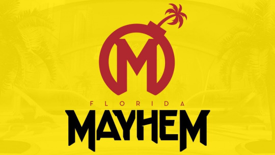

So, this creates the clear issue demonstrated above. Certain brands are so culturally entrenched that even a passing similarity in visual identity makes you immediately look like a pastiche, even if you're otherwise distinct. Mayhem's branding is, in my opinion, way better than McDonalds's, but it was still the right move when they changed to a completely unrecognizable color scheme in 2020. You just see some things and immediately recognize them.
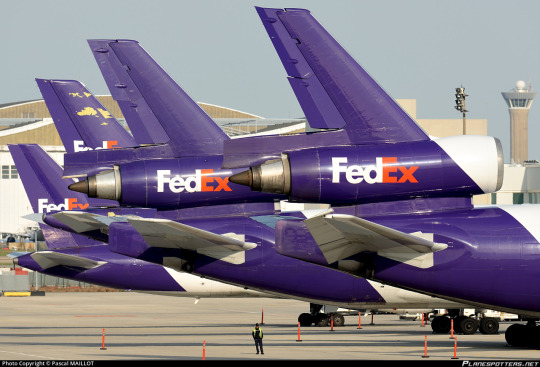
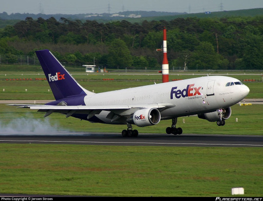
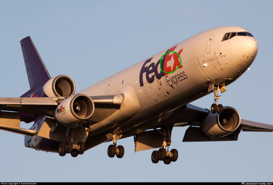
The cultural specter of the FedEx logo is very useful to the FedEx livery. As long as you do not royally mess up - which they have not - a FedEx plane will immediately resemble a FedEx package, even if it doesn't actually look like one, since they're mostly white.
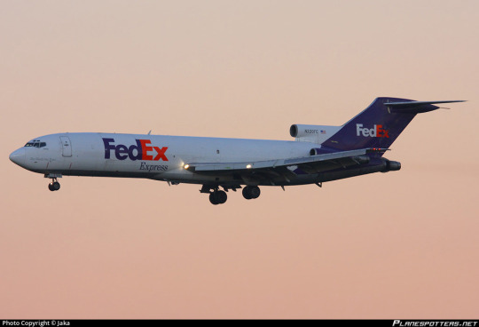
...well, okay, the planes are also mostly white. And I'll be honest, on the 727? This plane isn't half bad. The clean line of the t-tail makes this sort of straight-line-down livery look so much better, and the placement of the wordmark in front of the heavily swept wings keeps the white tube from looking quite so much like a white tube.
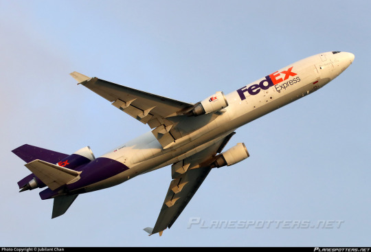
But the 727 isn't the only airframe they fly. They're the largest operator of six separate types, most of which are fully retired from passenger service, including the MD-11. Their MD-11s are literally the only trijets you'll see around in the US these days - they only started retiring their DC-10s in 2021, nearly ten years after they flew their last passenger flight. They're pretty unusual among large cargo airlines in that they flew the 747 for just over five years, and not particularly on their own initiative, having acquired a few from a merger with the Flying Tiger Line. So the way the livery looks on the 727 doesn't tell the whole story.
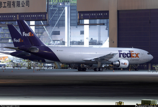
Okay. So that...is a couple of white tubes. That's somewhat unfortunate.
I want to clarify that, while this style of livery has become increasingly popular over time, culminating in its codification as an outright trend in the late 2010s and early 2020s, FedEx adopted this livery in 1994. It is wrong to say that the FedEx livery resembles TAM, Lufthansa, or Icelandair, and more correct to say that all of the above carriers are wearing a style similar to FedEx (though Qantas and MALÉV came first). Despite the fact that I've been known to call these 'Lufthansesque', Lufthansa didn't invent this style and didn't do it best. Still, doing it earlier doesn't excuse it.
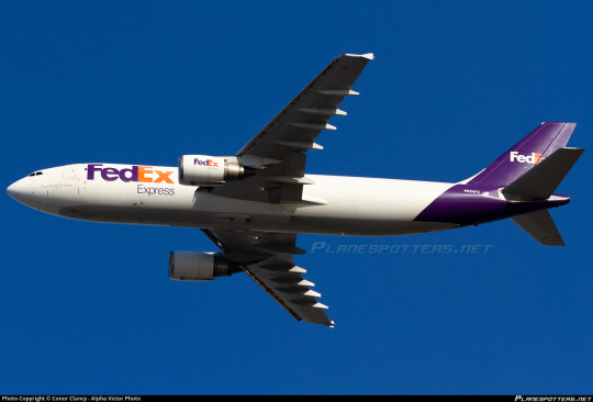
FedEx in particular suffers from the rear-heaviness issue. Though they have a larger logo which balances it out better than some (Lufthansa), it's kind of countered by the fact that FedEx exclusively operates planes I'd consider on the long and thin side. It makes the white look all the more dominant on the airframe.
FedEx does take one measure to mitigate this - the undersides are painted grey (in a style I've been calling 'Deltalike' to myself even though Delta absolutely did not do it first) instead of being the same white as the rest of the fuselage with the purple fully wrapping around. Also, they have the line remain straight on the third engine of trijets, instead of committing to one shade or the other, as older trijet liveries frequently did.

Compared to an ASL Airlines lease which keeps the underside white and the purple as a contiguous loop, this creates a much more streamlined look. But it's not enough to save this.
And I think what bothers me the most is how at odds this is with the thing people say is so brilliant about the logo - the arrow.
Arrows are, as Leader pointed out in his interview, definitely not a new phenomenon in airline liveries. Hell, we even had Arrow Air.

But there's a reason for that. Arrows represent forward movement. They're fundamentally indicative of speed, efficiency, and polish. And airplanes are more or less shaped like arrows, when you think about it.

Something being done very frequently doesn't make it somehow creatively bereft. And it's not like only painting the tail and the big of fuselage directly below it is reinventing the wheel either.
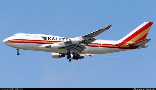
Cheatlines, and hockey sticks especially, were not a particularly new thing when my perennial example of 'boring idea, good execution', Kalitta Air, rolled out in the 1980s. In fact, they were done to death. But Kalitta Air's choice in color and shape, use of proportions, and stylish logo set it apart from every other airline to use this style.

There is a reason arrows are so common. They are speed and precision and kinetic energy. When you refuse to consider making something common your own, you often shoot yourself in the foot. With the logo constructed, with the motto 'the world on time' written on the nose of each plane, absolutely nobody would turn up their nose at FedEx having an arrow motif on its livery.

Ultimately, I'm a bit sad, because the FedEx logo, while I don't like a lot of the choices made in regards to the font, would provide a truly fantastic jumping off point for a livery that would elevate it beyond the point anyone could ever dismiss it as being part of a crowd of very similar designs, the way I have by lumping it in with Lufthansesques. Arrows, being a fundamentally long and tall shape, would also avoid the pitfalls of a livery type which I have already on multiple occasions critiqued for inherently creating a look of rear-heaviness, particularly on longer and thinner airframes, especially when the color used is a dark shade to contrast a white base.
That said, the FedEx livery gets a bit of a free pass where something like Lufthansa doesn't. FedEx's logo is so ubiquitous that unless you actively interfere with or muddle it, any plane bearing it will immediately be recognizable as a FedEx plane the same way a truck or package is. As a branding exercise it is certainly successful. It looks clean, it's by no means exceptionally ugly, it does its job...but it is so rich with potential and so impoverished in execution. Doesn't it just look like this plane isn't taking off, but being pulled by the weight of its purple slice towards the ground?

I'm giving FedEx a D+.
I don't feel good about doing this. I think this is an opinion which is not only contentious but downright unpopular. But as I've mentioned a few times my grades take into account more than just broad aesthetic appeal. Branding and environment factor in, but what also factors in is, as I said in discussing Saudia, wasted potential and a refusal to capitalize on what you have that's clearly good. When I graded Air Astra down for not reaching its potential I meant it as a kind gesture, not even a sort of tough love but an acknowledgment that I like what they have and I know they'll do better.
FedEx, however, is just disappointing. For the frequently cited best logo of all time, this is just unacceptable. This verdict brings me no joy, but the fact that this logo is so beloved doesn't mean I can go easy on it - to the contrary, it had a lot to live up to, and it just didn't.
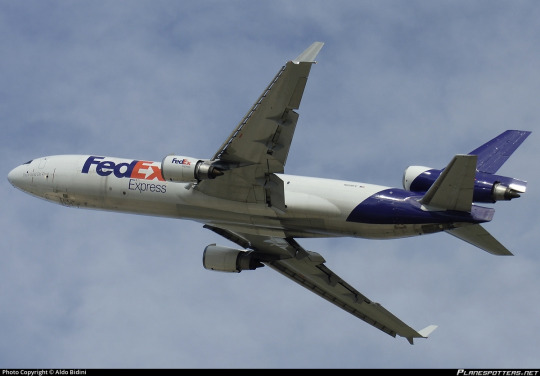
#tarmac fashion week#grade: d+#era: 1990s#era: 2020s#era: 2010s#era: 2000s#region: north america#region: united states#fedex#kalitta air#cargo carriers#requests#lufthansa line#landor portfolio#skywriting
28 notes
·
View notes
Text
In my humble opinion, the three MVPs of episode 29 are:
1. Erika’s smoky voice
2. Orym’s line, “You wouldn’t be able to hurt their daughter.”
3. And Ashton’s line, “Take your basic. ass. looks. and get the fuck out of here.“
#cr spoilers#critical role#cr3#dusk#yu#orym of the air ashari#ashton greymoore#bells hells#liam delivered that line and it hit me like a fucking train#ashton had me clapping and laughing and cheering#Love these yahoos#and I love how much closer they all are as a result of this#having their trust betrayed#feeling so shaken#they feel and sound more like a unit#even than before
344 notes
·
View notes
Text
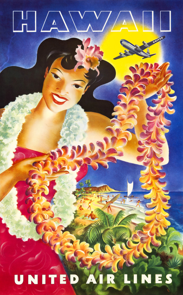
United Air Lines Hawaii poster by Feher, 1949
67 notes
·
View notes
Text
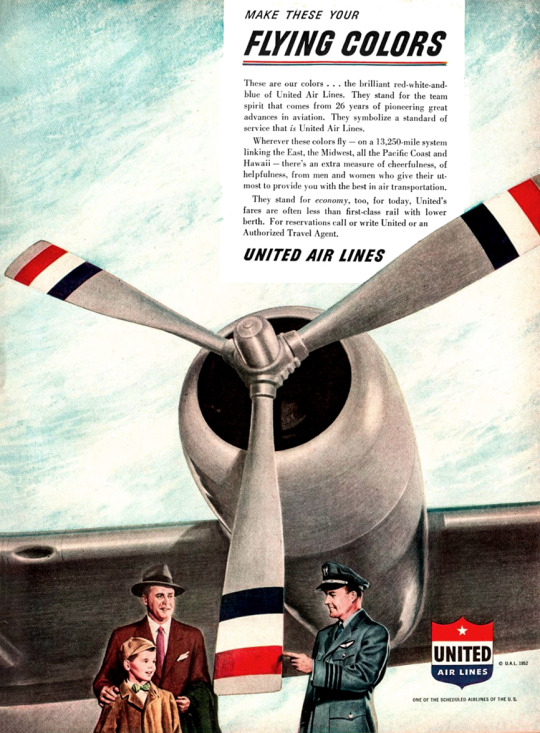
Make these your flying colors. United Air Lines - 1952.
#united airlines#united air lines#airlines#air travel#vintage advertising#vintage illustration#vintage travel ads#travel#the 50s#the 1950s#airline travel#travel ads
11 notes
·
View notes
Text
Jesus shitting Christ it is fucking hot in Osaka. I asked my wife if this was out-of-the ordinary, and she said no. Apparently, the typhoon that delayed our arrival by six hours is making it less humid here.
I found that if you drink plenty of water, where thin, loose-fitting clothes made from light, natural fiber, and just surrender to the heat and accept the fact that you’re living in Satan’s sweaty butt crack, you can endure.
#and man i gotta tell ya#the last thing you want to do is add six hours to a sixteen hour air trip#especially of a lot of that time is spent sitting on a plane that can’t unload passengers#or waiting in line trying to rebook a connecting flight that leaves in twenty minutes#and a group of six middle aged australian lesbians doesn’t have proper documentation for their flight#and the elderly couple brought their dog and didn’t tell the airline he was coming#i mean you want to blame united but even they couldn’t fuck this up worse#thank you ana airlines for making this happen and upgrading our seats#but also fuck united airlines#create a functional app you shitheads#japan#summer vacation#vacation to japan#travel#i miss you guys
3 notes
·
View notes
Photo
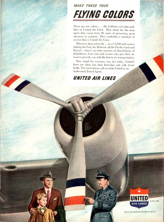
1952 Make These Your Flying Colors. United Air Lines
Source: Time Magazine
Published at: https://propadv.com/airlines-poster-and-ad-collection/united-airlines-poster-and-ad-collection/
2 notes
·
View notes
Photo
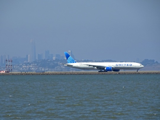
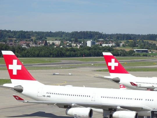
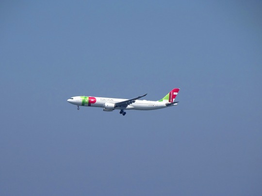


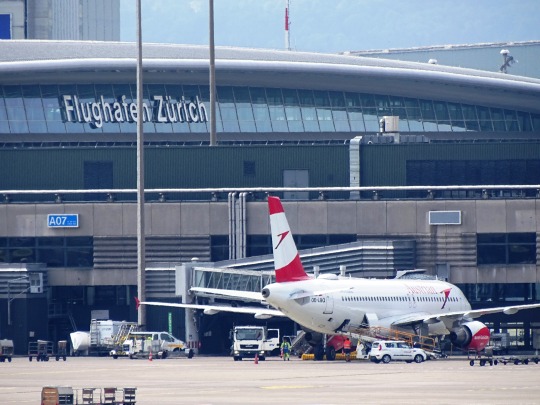
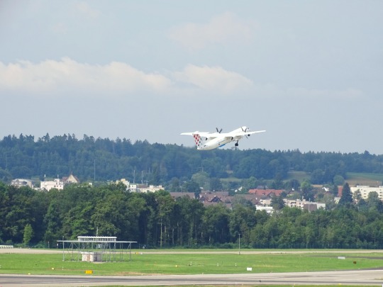

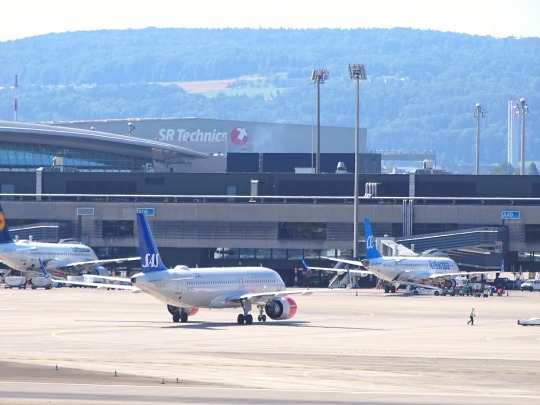

The Star Alliance, the world's largest global airline alliance, was founded on 14 May 1997.
#TAP Air Portugal#Swiss International Air Lines#United Airlines#Zurich#USA#Millbrae#California#Pacific Ocean#San Francisco International Airport#travel#Air Canada#Austrian Airlines#Scandinavian Airlines#Croatia Airlines#vacation#summer 2022#2019#Star Alliance#founded#14 May 1997#history#airplane#technology#engineering#landscape#Schweiz#Switzerland#take-off#landing#architecture
2 notes
·
View notes
Last Seen Blogs
purpleskkfosblog05
Purples-KillerKlowns-Stuff

elite-20-o
Untitled

aspec-of-dust
Sometimes you gotta yell

anightmarein3dphotography
ANightmarein3d
Photography

ahnscmopanmps
Untitled