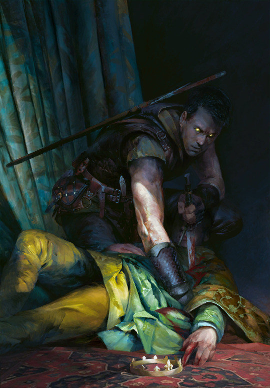
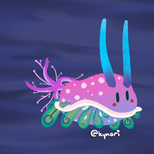
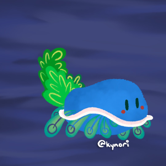
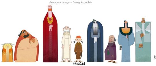
#a really beautiful unified color palette
Text
Since there won't be any more expansions (and i'm a chronic procrastinator), i updated my personal top 10 Gwent card arts into a top 20, including the few sets that came since then and shuffling things around a bit.
It's a long one, hence the cut.
Personal top 20 Gwent card arts:
20: Bone Talisman by Bogna Gawrońska
It's still the most festive looking thing i like. My beloved blue-and-bright red fidget spinner. I really can't explain my weird attachment to it any other way; i generally tend to like the item arts, maybe it's the collector brain, maybe it's because after Homecoming and most of the expansion sets since later 2019 onwards, these base set trinket adjacent arts became more prominent to me among a lot of new, more dramatic and bleak character and scenery art.
19: Ceremonial Dagger by Katarzyna Bekus
The entire set of strategem arts from Merchants of Ofir is honestly packed, but the dagger is the one i found myself putting in my in-game profile the most. Maybe it's the item hoarder brain again, maybe it's the color scheme i find relatable if that makes sense, most likely it's the premium helping a bunch to make that choice too. The background weirdly fascinates me. Does it have anything to do with The Spiral? I have never attempted to really assign any logical meaning to the strategem arts, they're clearly more symbolic than anything, but it still makes you wonder.
18: Ard Gaeth by Katarzyna Bekus
Somewhat related, here's another piece of wonky multiverse lore. And once again, it's the color that first grabs attention; the contrast of teal and this dusty red. Then one starts realizing the implied size and scope, the birds help with that, apart from being a cute composition detail. The shattery effect makes it look volatile, unstable, dangerous. Ominous. Which ultimately makes it fit with the rest of the Wild Hunt archetype in more than just lore.
17: Coup de Grâce by Lorenzo Mastroianni
There are two wolves in me, one loves bright colors, the other actually enjoys a lot of the bleaker scenes. Although to be fair, Lorenzo Mastroianni is a big contributor to that. And it's no wonder, when he casually drops stuff like this. It's almost symbolic, lot less than strategems but certainly more than other, straightforward "war sucks" Gwent art. How do you visually represent something sad in a way that makes it hard to look away not just because of the tragedy but because of the beauty put into making that image?
You ask Lorenzo Mastroianni, the modern classical artist, to do it.
16: Viper Witcher by Valeriy Vegera
I once described Valeriy's art as "where Lorenzo uses a tight color palette, he uses every pencil in the case". This one is perhaps not as obvious an example, the whole piece has a very unified atmosphere especially from afar, but still, there are so many colors especially in textiles and skin. They're harder to register sometimes but it's how Valeriy does texture and shading. And somehow, he bridges the bleak and the colorful world too. Admittedly, this card also had to be here because mr. Viper is my son, and the voicelines are done by an actor with the nicest, smoothest bass i've heard since Peter Steele.
15: Naglfar's Crew by Anton Nazarenko
I was surprised by how much i ended up liking this one. It's the implications, i think; enchanted to laboriously upkeep this monster of a ship, this 'and if you see it emerge from a breach in the sky, you know you're fucked' symbol of death and decay. It's dark in a way i find compelling, i guess.
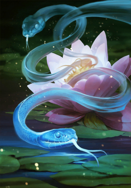
14: Serpent Trap by Marta Dettlaff
Back to the bright ones, i liked this art ever since i discovered it as Nature's Gift in post-Midwinter beta. The card saw play in Scoia'tael spell decks, and to me it became linked to Francesca Findabair for their shared spectral snake thing. But that all aside, the art is just so pretty. Vibrant, yet not oversaturated. And like the item arts, needed to balance out the cool and badass and the dramatic and tragic. Looking at it now, another point comes to mind; it's still grounded? The way Gwent art at large is grounded compared to other card games. Like it's not trying so hard (both this piece and the game's art in general). That's refreshing.
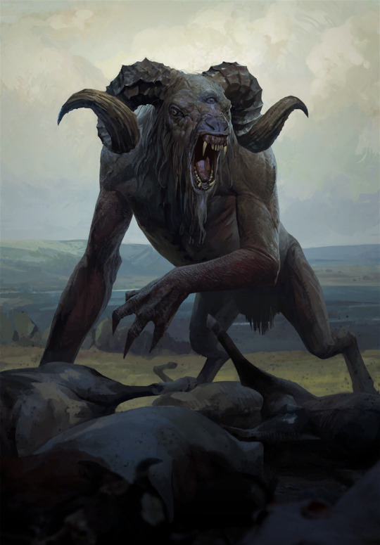
13: Chort by Bartłomiej Gaweł
It reminds me of the first game's main menu. The Witcher 1 main menu is, to me, one of the most accurate representations of this universe, its atmosphere. Even if the "you kill cows, you get ambushed by the fucking baphomet" is a meme game mechanic, something about it is...witchery. Superstition, folk legends, and ultimately, monsters. Or that's my takeaway, anyway. But the Chort art, beside being on the more rare side in-game, has always weirdly drawn me in.
12. Oneiromancy by Lorenzo Mastroianni
This was the Novigrad expansion key art before they turned it into a card, and i sure am glad they did. Lorenzo can get a bit weird, as a treat, someone said. Are they Condwiramurs and Corinne? Possibly! But i'll abstain from the schizo theories now. It's a gorgeous, well composed and executed surrealist piece. Inception if it had strong palpable atmosphere.
Denis Villeneuve > Christopher Nolan. but Lorenzo beats both
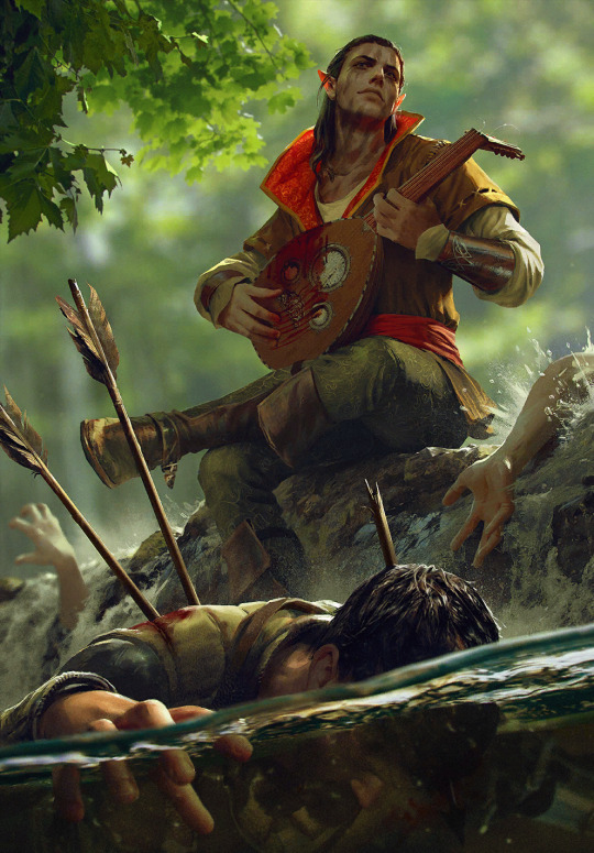
11: Funeral Boat by, you guessed it, Lorenzo Mastroianni
One final yippee for the last card set. And my god it's beautiful. Tight composition can get surprisingly hard to coordinate and make decisions for, but this is so well-balanced. The left end of the boat is closer to the frame, but right side has the most noticeable color, the character's face, and of course the bird to even it out.
As if to defend the title i gave him earlier, Lorenzo references Isle of the Dead in a way that, even if symbolic, fits into the universe perfectly. Someone stop me before i start rambling about similar concepts in different mythologies.
10: Dana Méadbh (now the token spawned by Call of Harmony) by Anna Podedworna
The most famous Gwent artist enters the list. With a piece made around two, when you think about it very bold choices. The goddess of nature and life, glowing with inhuman light in a black and barren forest. Obscured by thin, bare tree trunks. But to make her emerge and stand out, that was necessary. And it's working wonders. A lot of the Scoia'tael faction is obviously green, all kinds of green, but even a simple choice like making it pop out of black makes the card art stand out among others.
9: Circle of Life by Oleksandr Kozachenko
It has everything i usually look for in Gwent art; nature, color, atmosphere. A certain tranquility, perhaps. A little bit of story - the orange badge is the Kerack coat of arms. It's that environmental storytelling thing gamers keep talking about, complementing the character and faction drama of the rest of its card set.
There's a slightly changed, extended version, too, and somehow it's even better.
8: Gezras of Leyda by Bogdan Rezunenko
As much as i tend to dunk on Bogdan for having played Blasphemous once and making it his entire personality, Gezras is easily the best school founder card art of the set. Once again, the choice to have these prominent arts on the more symbolic side paid off, and the result is a stalking nocturnal animal out for revenge, backed by a giant image of what simultaneously did him irrepairable harm and gave him the means to defend himself. The premium doesn't disappoint either.
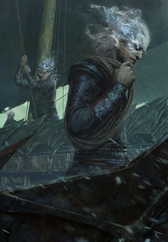
7: Rioghan the Undying by Daniel Valaisis
To nobody's surprise, the atmosphere, once again, got me hooked. I love the cold color, the dramatic flow, the big imposing silhouette of a ship in the background. Poor boy is the picture of misery. It's pure melancholy (something not that common in the Skellige faction by the way, which is a point in favor of Funeral Boat too), that i, of course, am inevitably drawn to.
he's just like me fr...
6: Witches' Sabbath by Michal Lisowski
Did i craft this card already or not? The realist's complaint towards near-greyscale card art. I share this sentiment, if only for the comedy of it, but with a few notable exceptions, and this piece is the main one. The Robert Eggers comparisons were made already i'm sure, but it really is a take on the last good Witcher 3 quest with a dramatic, more dreamy, or you could say cinematic quality ramped up to 11. Gone is the fanservice present in the game and the unnecessarily grotesque depictions of fatness of other parts of this card set, and what remains is a beautiful, ominous callback to folklore and classical art.
5: Tinboy by Valeriy Vegera
This is a baroque painting. The drama. Tinboy doesn't take that scarf off, ever. And here this poor soul is, their last will to live dragging it off him. On purpose? On accident? Probably both. The pattern marking Tinboy as a gang member staining with blood of a victim, something something symbolism. All in Valeriy's signature 'which pencil should i pick up next' style. Underrated piece.
4: Lara Dorren by Toni Muntean
They finally got our girl. And once again, despite heartbreak, it's gorgeous. Soft, sweet colors with a necessary hint of melancholy (the lighting suggests it's sunset?), and a pure, painted quality without the need for texture assets. A scene like this is better left a comparatively simple and laid back tribute. Beyond the technicalities, i also really, really applaud Toni for the outfit design. This is the Aen Elle princess, dressed well but for the weather. And the fact her mostly blue clothes with yellow sleeves mirror Cregennan's yellow jerkin with blue details, and her red brooch above the heart might, beside contrasting with the blue, very well reflect his fatal wounds... well.
As much as death on card art isn't always done the best, Lara is represented together with that which mattered to her the most. Despite being categorized among the Wild Hunt, she remains herself.
3: Lydia van Bredervoort by Igor Klymenko
The joy i felt when this was the art of Lydia they managed to get into the game. It's easily one of the best contest pieces and on par with the best Gwent has to offer - it has mood, and that ever present air of groundedness, realism, and in that, unfortunate tragedy. But similarly to Lara, it shows Lydia being her own person; doing what she loved and was good at without sight of Vilgefortz despite her being known as his ever loyal assistant. Likewise, it doesn't sensantionalize her condition, but references it in a subtle, tasteful, and even clever way. I also love her dress and the overall color palette. Igor understood.
2: Eldain by Anna Podedworna
Couldn't help it, this asshole has me in chokehold and he's enjoying it. In my defense, this piece highlights everything Anna is known for, because she's damn good at it. Incredibly sharp main subject of the piece contrasted against a blurry background, which allows for insane details like the strings extending from the top of the lute. To add more fun to it, Eldain isn't even in the absolute foreground, but the piece is still composed smart, so he remains the main focus. His silly red collar on mostly green helps. On top of all that, the art tells a little story, something Anna often does too, and in this case it delightfully sums Eldain up. It's also the best premium in the game.
look at his little red ears from sitting against the sun aww
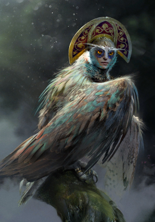
Honorable mention: Lake Guardian by Anton Nazarenko
Like the following #1, this card has sentimental value to me as my second card reveal and artwork i made my best emote of. It was a perfect match, bird gals and all. It's a Sirin, bringing in a more obscure but not unwelcome mythology reference to the universe. And I love her vibrant, marble-like eyes.
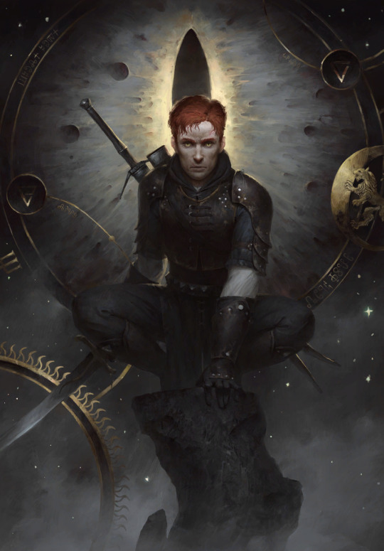
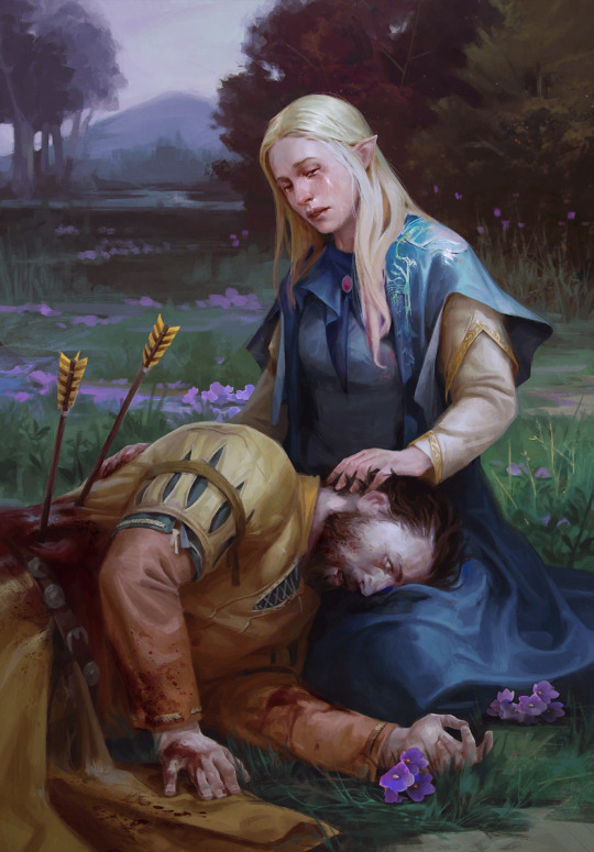
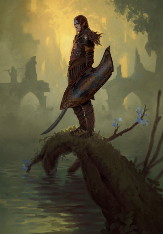
1: Dol Blathanna Sentry by Lorenzo Mastroianni
...remains my favourite card art since that fateful day sometime in January 2018.
I was just discovering what there was to know about Witcher, downloading Gwent in the first place out of need for more content as i was slowly reading through the first book. Gwent has done a lot to explore and build on this universe, and it has helped me contextualize a lot of things early on. I remember scrolling through the deckbuilder, seeing this art, and being struck by its mood, this aura of secret and wonder. "Oh, so this is what Dol Blathanna looks like..."
It's quintessential older Lorenzo. Very much admitted brush work, fog, tight color palette. The little specks of blue in flowers and face paint work just right. Maybe it's a reference to Arthurian myth and Avalon, maybe to Greek myth and Hades, or maybe, as is often the case and was the case later (or earlier in this list), both.
It spoke to me and my sense of wonder back then. It speaks to me when i search for comfort now.
now, time to tear Karol Bem to shreds in the top 20 least favourites xd
#shut up elis#the witcher#gwent: the witcher card game#fingers crossed tungle doesn't obliterate the links
24 notes
·
View notes
Text
Winter 2024 Anime Roundup
Anime of the Season – The Apothecary Diaries
I’ve been hearing about this series since Raven of the Inner Palace aired a while back, and the fans spoke so highly of it that I was dubious of anything living up to the expectations they’d set. Luckily for me, they weren’t exaggerating one bit, and the anime adaptation delivered a story that had me itching to watch the next installment as soon as the episode ended each week.
The story opens with Maomao getting abducted and sent to work in the imperial palace, where she intends to keep her head down and just quietly do her work in the inner palace, only to find a little matter involving poison she can’t resist poking her nose into, leading a powerful young man in the palace to take notice of her. Throughout the story, her desire to mind her business and not get tied up in palace affairs wars with her absolutely insatiable curiosity wherever drugs or poisons are involved, and it leads her in and out of a series of mysteries involving the residents of the palace, changing the course of her life. It was an absolute treat to watch her and Jinshi dance around each other, as Maomao wants nothing to do with the beautiful man all the women fawn over, and he finds her lack of interest in him irresistible, and seeing the way all the seemingly unrelated mysteries built towards a larger conspiracy was immensely satisfying. When you combine all this with an equally colorful supporting cast, a gorgeous color palette, excellent background art, and solid animation, you get the sort of anime you feel lucky to get to watch. 9/10
First Runner-Up – Brave Bang Bravern!
Equal parts sincere and farcical, this series takes all the tropes and homoeroticism of mecha anime and dials them to eleven. It boasts some of the best 3D mecha animation I’ve seen, a star-studded voice cast, and a story with the perfect mix of comedy and action. If you’ve ever clapped your hands and cheered for an over the top robot fight, this is the show for you. 9/10
Second Runner-Up – Frieren: Beyond Journey’s End
The entire series is beautifully drawn and animated, with a perfect soundtrack and voice cast to match, and it takes a fantastic, heartfelt story about valuing the connections you make with others and elevates it to another level. A poorly paced exam arc in the second half that takes the focus off the main trio dampened my enjoyment somewhat, but it easily would’ve been my anime of the season in most seasons. 8/10
The Dangers in My Heart S2 – Kyotarou and Anna keep getting closer and closer over the course of this season, and the way they timed the emotional high of each episode to the soundtrack and the title card has me ready to swoon the moment I see the word “karte” written in white on a black screen. A nicely produced romance about a middle school boy and girl pushing each other to be their best selves that I’m really glad I watched. 8/10
Kingdom S5 – Xin and his Fei Xin force are under the command of the ruthless general Huan Yi in this arc, and they rediscover how merciless and inhumane war is as they fight a battle in Zhao territory as part of Qin’s effort to unify China. Xin’s voice actor completely knocks it out of the park here, delivering several emotional speeches with the perfect amount of gravitas. 8/10
7th Time Loop: The Villainess Enjoys a Carefree Life Married to Her Worst Enemy! – I knew when the female lead leapt off a balcony in front of the male lead after being jilted by her fiancé and he immediately fell in love with her that I was in for a good time, and it never let me down. Rishe’s constant scheming that drew on things she learned in her six previous lives, and Prince Arnold’s mix of bewilderment and affection for his unpredictable fiancée, made this one of the best fantasy romance series in years. 8/10
Mr. Villain’s Day Off – The premise of a general in the evil organization fighting the rangers for control of Earth strictly avoiding work on his day off sounds like the setup for a sit-com, but the story it actually settles in to tell is one that quietly highlights the beauty and comfort found in the ephemeral moments of daily life. A relaxing slice of life series that was the perfect capstone to my Sunday evenings this season. 7/10
A Sign of Affection – I have some nitpicks about some adaptation decisions in the anime that made the female lead appear less disabled than she is in the manga, but, on the whole, this was a lovely shoujo romance about a group of young adults doing their best to forge their own path in the world, with some nice production values. 7/10
Cherry Magic! Thirty Years of Virginity Can Make You a Wizard?! – If you can look past the wild title and premise, and you don’t mind some inconsistent character models or animation, there’s a nice workplace romance in here centered on a group of grown men talking things out and supporting each other as they navigate their messy feelings. (It’s not as funny as the manga is, though.) 7/10
Sengoku Youko – It took me a few episodes to warm up to this historical set fantasy adventure, but once the story got going, with a solid mix of strong character development and the occasional emotional punch to the gut, I was all in. The character designs are unique and expressive, the action is nicely choreographed and animated, and the voice actors really put their backs into some of the more intense moments. 7/10
Undead Unluck – The pacing was a bit of a problem, with some incredibly long recap segments in episodes in the second half, but the chemistry between the two leads – a man who can’t die and a young woman who causes life threatening bad luck to anyone who touches her – made this action series about fighting to stop the apocalypse a really fun time. 7/10
The Witch and the Beast – If you’re like me, and you go weak in the knees for a chain smoking man with bedroom eyes in a long coat, and a messy woman who might get you both arrested when you go out drinking, then this supernatural themed noir is the show for you. Production values are inconsistent over its run, but the writing and voice acting are solid throughout. 7/10
The Wrong Way to Use Healing Magic – A boy getting isekaied by accident when his classmates are summoned to be heroes in another world could easily have been the start of yet another story about an aggrieved loner making it big as an overpowered hero in a fantasy world, but it thankfully subverted expectations and delivered an isekai adventure with a bit of heart and a cast of likeable characters. 7/10
The Foolish Angel Dances with the Devil – What appeared to be a gimmicky battle of wits love comedy in the beginning turned into a solid forbidden romance between a demon and an angel with genuinely good chemistry between them. The two leads were easy to root for as they caught feelings for each other while fighting their way through the ridiculous situations they kept landing in. 7/10
The Demon Prince of Momochi House – This is a neither good nor bad anime about a teenage girl inheriting an old house in the woods that serves as a gateway between reality and the spiritual world, and moving in with the mysterious teenage boy and his ayakashi attendants who protect it. The characters are likeable, and the romance is pleasantly cheesy like an otome game, but the rushed pace of the relationship development and the quickly resolved yokai cases just feel like they adapted more manga than the runtime supported. 6/10
Villainess Level 99: I May Be the Hidden Boss but I’m Not the Demon Lord – Deadpan, autistic-coded Yumiella is a ton of fun as the OP main character in this otome isekai, and she and her love interest make a great couple, but the level grinding wasn’t exciting enough, and the jokes weren’t funny enough to overcome the poor visuals. 6/10
Bucchigiri?! – Hiroko Utsumi directing an original anime mixing old school delinquents with Aladdin and the Lamp sounded like it could be a rollicking fun romp in the style of her previous original, Sk8, but pacing issues led to a repetitive first half, the main character was deeply unlikable, and the rushed ending felt unsatisfying. The art and animation were generally quite good, with some great fight scenes, but the writing needed to be better. 6/10
Solo Leveling – The series is very well produced, with exciting action scenes set to a lively soundtrack, but any time I started to relax and enjoy some nicely animated fights, the main character would come out with some eye-rolling, angsty teen speech about the strong preying on the weak, and it just wasn’t for me. 6/10
Shangri-La Frontier – There’s little to criticize in the production of this VR MMO themed action series. The voice actors gave great performances, the monster fights are well animated, and the art has a distinctive feel to it. Unfortunately, the story just never really grabbed me, the stalker girl really annoyed me whenever she appeared, and the extras at the beginning and end of most episodes felt like padding. 6/10
My Instant Death Ability is So Overpowered, No One in This Other World Stands a Chance Against Me! – An unusual teenage boy with the ability to instantly kill anyone by just thinking about it gets sent to another world with a bus full of his classmates, and the ensuing adventure kept me entertained the whole time, but I can’t quite call it good. The manzai comedy dynamic between the male and female lead was a fair bit of fun as they traveled across the land, poking fun at common isekai tropes. 6/10
Blue Exorcist: Shimane Illuminati Saga – I remember really enjoying the first two seasons of this series, and I still love the characters, but this season just never clicked right for me. The opening arc felt rushed through, and the main arc had a cartoonish buffoon of a villain that completely undercut the horror of the story. It wasn’t a chore to watch or anything, but it could have been better. 6/10
Metallic Rouge – Like many others, I had high hopes for this original sci-fi series Bones put out as an anniversary project, but despite the generally solid visuals, the poor writing drags the whole show down, making this one of the biggest disappointments of the season. The incoherent plot fails to come to a point, the dialog is a terrible mix of forced quirkiness and tedious monologuing, and the characters are largely one-note and undeveloped. 6/10
Sasaki and Peeps – The hour-long premiere episode suggested this story about a middle aged salaryman who discovers his new pet bird is a reincarnated wizard from another world might be a fun take on the isekai genre, but the end product felt more like someone playing with their dolls than crafting a coherent story. It continually introduced new characters and new tropes all the way through to the last minute without tying anything together. 5/10
The Fire Hunter S2 – On the one hand, I appreciate how different it is from other series, with unusual character designs and an imaginative fantasy story that isn’t an amalgamation of light novel conventions. On the other hand, though, the production is incredibly rough, and the plot got increasingly hard to follow, making this a bit of a slog by the end. 5/10
Fluffy Paradise – I was basically on board in the first half to two-thirds of the series, when it seemed like a harmless little reincarnation isekai about a girl collecting animal and monster friends, but it completely lost me when it broke out the reservation camps and dead bodies in the last arc. Just a poorly written show that misunderstood its appeal. 5/10
#anime#winter anime 2024#anime 2024#the apothecary diaries#brave bang bravern#frieren#the dangers in my heart#7th time loop#mr. villain's day off#a sign of affection#kingdom#cherry magic!#sengoku youko
6 notes
·
View notes
Text

assignment 6: making many from few
tools: ipad, procreate, picrew
description:
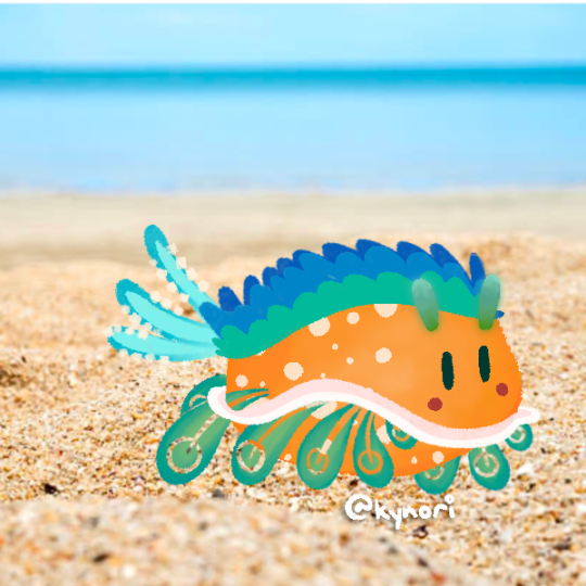
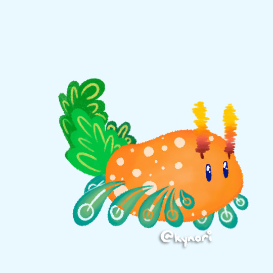
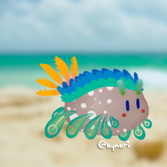
i made a sea slug picrew!!! anyone can view it here:
https://picrew.me/ja/image_maker/2317438
process:
i've never made a picrew before so this is new for me!! (also i uploaded it to picrew and configured all the settings in like an hour LOL)
also i made 25 different images originally (customizable body color, body details (big & small), tails, antennae, background, eye color)
....BUT THEN i realized i had to make thumbnail pics for the items (which usually was the same but not Always) and the categories of stuff in the Tabs so it doubled my workload help
so overall this project took like 60 images🗿
feedback/conclusion:
overall i'm really proud of how this turned out!! i wanted to capture the beauty and variety of sea slugs (see my sketch from last week [5]) and allowing people to customize it brings me so much joy. it's really simplistic but i hope it gives people a good idea!!
to improve things, i think i would stick with a more unified color palette, have more options, and potentially other body shapes! i originally planned other body shapes but it became really difficult to work with
the ten [10] generated ones:


references (yes the bottom pics are real):

#06many#artforclass#im genuinely so obsessed with sea slug rn#fave is the sheep leaf sea slug (i cant say it without getting tongue twisted)#please look up sea slugs#can we make a sea slug fandom#i realize the word slug is universally unappealing but ignorE THAT#sea slug supremacy
3 notes
·
View notes
Text
Coming Alive
“I went out for a walk and finally concluded to stay out till sundown. For going out, I found, was really going in.” ~ John Muir
Walking around my property, I am in awe of how quickly my landscape has come to life. Within just a couple of weeks, the garden has awoken from its deep sleep blanketing the hillside with lush green grasses and fantastic flowers. The frogs are croaking, the birds are chirping, and the bees are buzzing. Despite the continuing rain, nature is waking up from its soggy slumber.
My garden is a living laboratory where I design borders to include a diverse mix of plants including bulbs, perennials, annuals, shrubs, trees, and vines. Originally my color palette was strictly pinks, purples, blues, and whites, but over the years I have acknowledged the beauty of all color combinations. Daring forms and textures are welcome as I attempt to create a naturalistic style. Taking cues from Mother Nature, I encourage self-sowing specimens (thank you calendula and nigella) and I prefer my landscape to be full, a bit crowded, and wild. Rocks, stones, and gravel are incorporated into the scheme while vintage used bricks delineate the paths.
If you’d like to create a garden that respects the natural world, here are a few tips that may help.
1. Don’t be afraid to mix and match. Shrubs and trees provide structure. Bulbs pop up as surprises, especially at this time of year. Perennials are the main attraction with annuals affording the colors you desire throughout the year.
2. Always plant in swaths or groups. Repeating the groups coalesces and unifies the look.
3. Invite specimens that you like to self-sow. Allow plants to grow as they would in nature without your assistance. Don’t fret when stray flowers appear in an area where you didn’t plan to have them grow. Whimsical is fun.
4. When it comes to coordinating colors, be open to the bold and beautiful. I never thought I’d like so much orange and yellow in my landscape, but the combination of daffodils, calendula, and poppies has changed my mind.
5. Strive for balance. A clipped hedge is wonderful surrounding a formal rose garden, or outlining a driveway, yet when a garden is too heavily manicured it appears almost fake. Allow for some spillers, fillers, and thrillers. Add elements of awe.
6. Use containers for a variety of plants, including small trees. I have an Italian white peach growing in a container that boasts beautiful bright pink blossoms with fluorescent yellow oxalis underplanted. It is quite the unexpected showstopper. As a bonus, when the peaches are ripe, they are easy to harvest.
7. Orchestrate seasonal displays with plenty of colorful and textural annuals, perennials, grasses, and bulbs. Natives and carefully chosen non-natives will thrive happily together. With a plentiful variety of plants, pollinators will call your garden home and become your trusted helpers.
What’s Blooming Now?
*Bradford pear, plum, and peach trees
*Azaleas and camellias
*Daffodils
*Tulips
*Calla lilies
*Bergenia
*Calendula
*Cyclamen
*Muscari
*Iris
*Primrose
*Lilies of the Valley
*Christmas cactus
*Periwinkle
*Oxalis
*Freesia
*Viburnum
*Hellebore
*Jade
*Salvia Hot Lips
*Potato Vine
*Chinese Fringe
*Mustard
Numerous other plants are budding and will be gracing our gardens soon. Stay tuned!
The Goddess Gardener’s March Garden Guide
For more gardening advice for all seasons, check out Growing with the Goddess Gardenerat https://www.CynthiaBrian.com/books. Raised in the vineyards of Napa County, Cynthia Brian is a New York Times best-selling author, actor, radio personality, speaker, media and writing coach as well as the Founder and Executive Director of Be the Star You Are!® 501 c3, celebrating its 25th year of serving the world.
Tune into Cynthia’s StarStyle® Radio Broadcast at www.StarStyleRadio.com.
Her newest children’s picture book, Family Forever, from the series, Stella Bella’s Barnyard Adventures is available now at https://www.CynthiaBrian.com/online-store.
Check out Cynthia’s inspirational, motivational, and uplifting books. https://www.cynthiabrian.com/books
Share StarStyle® Empowerment
Hire Cynthia for writing projects, garden consults, and inspirational lectures. [email protected] https://www.CynthiaBrian.com
read on Substack:
1 note
·
View note
Text
The Art of Less: Transforming Your Space with Minimalist Design
In a world frequently characterized by the bustle and bustle of contemporary living, several people are seeking refuge in the simplicity and calmness of minimal house decoration. This style philosophy, rooted in the theory that less is more, moves beyond appearance to create areas that aren't just successfully desirable but also promote an expression of tranquility and mindfulness.Area 1: The Substance of MinimalismMinimalist house decor revolves around the core theory of simplicity. It is approximately eliminating unnecessary aspects and focusing about what really matters. In a minimal room, every item serves a purpose, adding to a clean and uncluttered environment. This intentional strategy to create not merely increases the visual attraction but in addition has a good impact on mental well-being.Area 2: Clutter-Free LivingOne of many key aspects of minimal house design is the emphasis on decluttering. A clutter-free atmosphere fosters an expression of calmness and order. This requires making innovative choices about furniture, design, and personal belongings, ensuring that each item adds value to the room without overwhelming it.Section 3: Neutral Color SchemeSmart style usually includes a natural color palette, with whites, grays, and planet sounds owning the scheme. These shades not merely develop a serene atmosphere but offer a versatile backdrop for adding refined textures and accents. The end result is really a space that thinks open, ethereal, and timeless.Section 4: Useful FurnitureMinimalist house decor encourages the use of functional and purposeful furniture. Each bit must serve a specific purpose while adding to the general aesthetic. Multi-functional furniture things, such as for instance storage ottomans or modular shelving units, are common choices for maximizing power without compromising style. dekorasi rumah minimalisSection 5: Careful DesignIn a minimalist house, design is opted for with intentionality. Thoughtful alternatives of artwork, flowers, and feature pieces become major items without overwhelming the space. Each factor is cautiously curated to check the entire design and donate to the sense of tranquility.Section 6: Conscious MaintenanceSustaining a smart home involves a commitment to mindfulness. Regular decluttering, careful company, and a conscious energy to avoid pointless buys subscribe to the longevity of the minimalist aesthetic. That intentional approach to maintenance ensures that the room stays a calm retreat.Realization:Adopting smart home decor goes beyond following design trends; it is a life style choice that encourages ease, mindfulness, and tranquility. By focusing on basics, removing mess, and adopting a simple scheme, people can make rooms that not just look beautiful but also provide a sanctuary from the complexities of the current world. In the artwork of minimalism, less truly becomes more, providing a timeless and unified way of house decor.
0 notes
Text
How to Create a Luxury Bathroom on a Budget?
Use White for Simple Elegance
A minimalist and stylish bathroom is set off by white worktops and cabinetry. To create a luxurious hotel bathroom look, use white bath towels and a light neutral paint hue. If you spend extra on high-quality white towels and carpets, a casual bathroom might appear more luxurious. To make everything look cohesive, accessorize your white linens with neutral-colored items.

Bathrooms in gray are timeless beauties.
Gray has emerged as the new standard hue for bathrooms and kitchens after decades of using white or wood-toned restrooms. There are clear benefits to choosing gray for your bathroom. Gray is calming and versatile. Warm shades of gray, like greige, may prevent a bathroom from appearing frigid. Greige is also a great option to go with brushed silver fixtures and a wood vanity or trim in the room. Complete the look of your luxurious gray bathroom with lights and accessories.
Utilize a Monochromatic Scheme to Create a Calming Bath Retreat
The most luxurious bathrooms frequently have a spa-like design. Because of their calming properties, neutral colors and materials are preferred for bathrooms with a spa-inspired theme. A straightforward monochromatic color palette can help you achieve the spa atmosphere. It's not necessary to pick a neutral hue for your monochromatic design. Another really calming paint color is a lovely shade of blue or aqua.
Make the outdoors the focal point.
The outdoors is included into the design of the most luxurious bathrooms. Look for methods to bring the outside in with new window coverings that let more light in while remodeling your bathroom. In addition to being wonderful methods to recreate an outside environment, plants and artwork including plants may also have feng shui advantages.
High-End Custom Bathroom Style Is Created by Painted Furniture
Sometimes a coat or two of paint is all that's required to turn a bathroom into a beautiful bespoke design. If you're even the slightest bit handy, you can change a dresser or chest into a vanity with the aid of some fantastic DIY projects found online. If you don't like doing DIY projects or don't have the time, you may use paint to give your plain bathroom vanity a unique look.
Colorful glass tiles may be used to create an art-inspired bathroom.
Bathroom tile does not have to be boring or neutral. Tile is used creatively in expensive art-inspired environments. Install a glass tile backsplash in lovely hues in your creative bathroom. If you want to redecorate your bathroom on a budget, check for mirrors with colorful tile frames. Towels and other items should be coordinated with your colorful tile accents for a fun new look.
With Just One Paint Color, You Can Create a High-End Vintage Bathroom Style
Are you planning to decorate a bathroom with vintage elements? This color trick may transform your outdated bathroom into a fashionable area. Don't battle the characteristics that you can't completely renovate while designing a dated bathroom with Cistern & Seat Covers that you can't replace. You may make the most of those antiquated elements by using a single paint hue to unify the area.
Conclusion
Creating a luxurious bathroom with Best Bathroom Sanitary Ware atmosphere on a budget is not only doable, but also artistically gratifying. You can change your bathroom into a haven of beauty and tranquility by following some basic yet effective design ideas. You may create a minimalist and contemporary room that oozes refinement by starting with the timeless simplicity of white. Using a monochromatic style and embracing the adaptability of gray creates a sense of serenity and timelessness in your bathroom hideaway.
0 notes
Text
Virtual Sketch Book 2

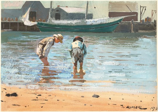
Boys Wading(Fig 7.2) by Winslow Homer, contains linear perspective, neutral-toned colors, highlights, regular scale, and emphasis of a focal point of the two boys looking into the water. Balance is achieved in the photo via the calm waters and still beach to contrast the bulky marina and boys. Unity is achieved via the color palette; the image contains many different tones of blue to help unify the image with a large amount of blue sea. The vanishing point is located in the back right of the image as the landform seems to dip further away and out of view.
Color is such a beautiful thing, and I don’t feel like enough people take the time to explore color. I love wearing bright but still vibrant hues and intense colors of clothing to express myself. I can definitely appreciate more muted and less intense colors like brown and gray and even a bold black but personally, I find much more joy in saturated hues. I also enjoy experimenting with fashion and makeup while utilizing color theory and analysis. Taking the time to investigate if a color is warm or cool toned and if it is bright or dark can really help to create an entirely beautiful or fun visual experience via cosmetics and garb. The way color interacts with each other and how it can affect our perception of color is fascinating. Contrast can create emphasis and coordination can help to create more subordination and less of a focal point. My personal color palette is included.

^^ My drawing is entitled, freeform shapes.
Discussion
Logos
HP/ Intel
Apple
Clipper
Vans
Sharp
Starbucks
Squishmallows
CeraVe
Conair
Too Faced
KimChi Chic Beauty
Bose
Nintendo
I know of most of these logos from advertisements or from them just being present in my day-to-day life for months if not years. Logos such as Too Faced and Clipper have standout design choices that help in making them catch my eye and be remembered. Brands such as CeraVe have bold blocks of coloring and help me recognize them in the store after seeing so many commercials for them, which is precisely what drove me to purchase their facewash in the first place.
The value of logos is best determined by good design, recognizability, and individuality. One of the first logos I saw was the apple logo and aside from generally being prominent in today’s society and a part of most Americans’ lives, most of the reason it stood out to me was because it is easy to quickly understand the meaning of the symbol. A literal apple is a good logo for the company Apple since it uses a commonly known symbol that correlates directly to the company name.
0 notes
Text
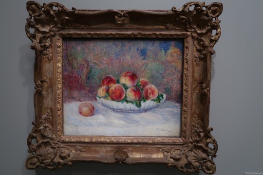
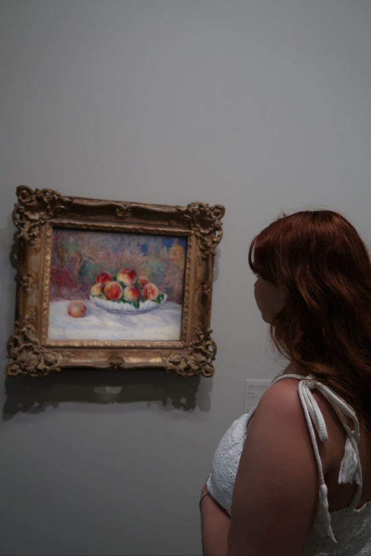
Pêches (#1)
I am an art major, but shockingly, I never have really enjoyed art museums. Before this past school year I had never actually taken an art class in my life, but I have always enjoyed creating art on my own. My experience of art museums was always the same. I would go, stare at a couple paintings or sculptures, think “Oh wow. This is so cool”, and then leave in ideally under an hour. My problem was that I did not know what I was looking at, and because I had almost no background knowledge, I just felt overwhelmed and confused.
In this class we have been talking about visual analysis and I also watched a few extra videos on my own to try to understand more. Throughout this trip we have visited a number of different museums and I tried to keep a mental list in my head of everything I had learned and apply it to the pieces we looked at to see what all I could get out of the experience that I had been unable to before. I was actually pretty amazed at how much more I appreciated my time in the museums. I know it makes sense, but I just had always tagged myself as someone who simply will not ever feel connected to those spaces. I felt like I could actually start appreciating paintings that were not mirrors of reality, which I had always felt the most impressed by. Now I am able to understand some of the choices that were made and why.
I really enjoyed all of the museums because there was not only amazing art, but also the buildings themselves were so beautiful (or more so just interesting in the case of the Pompidu), but my favorite was definitely L’Orangerie. The museum felt more approachable because it was not so grand and so much less crowded than the Louvre or D’Orsay. Looking at the collection there, I realized in typical American fashion that I really love impressionism. The use of color and movement is just stunning.
I wanted to look more specifically at Pêches by Pierre-Auguste Renoir, which is an oil painting on canvas. I found myself being very drawn to this painting. I had heard of the name Renoir before, but I did not know any of his work. I think of all the artists I saw in L’Orangerie, Renoir was my favorite, and I particularly liked this piece. It is just a bowl of peaches on a table covered in white cloth and what looks to be some sort of tapestry behind it. It is a pretty simple composition, but there is just something so compelling about the manner in which it has been painted, that it actually adds to how interesting it is because the composition really should be anything but interesting. Looking at how he has used the principles of design and elements of art, I wanted to talk about repetition, contrast, harmony, and color. The repetition is interesting to me because there was more and more repetition the longer I looked. The peaches themselves are repeated since it is a bowl of peaches and the bowl is also round, but the more I looked at the tapestry behind the bowl, the more I could see the shape of the peaches being repeated in there as well. There are two areas to the right and left of the bowl that particularly stands out on the tapestry that almost perfectly forms the shape of the peaches. The painting uses contrast as well which contributes largely to its visual interest. One is the juxtaposition of vibrant colors in the peaches against the more muted tones of the background which helps create a focal point in the painting despite how much texture and energy the background adds. The painting creates harmony through in a few ways. One aspect is the cohesive color palette. Renoir harmonizes warm shades of orange, pink, and red within the peaches, creating a unified and visually pleasing effect. The subtle variations in these colors add depth and dimension, further enhancing the overall harmony. The background has more gray mixed in, but it still uses variations of a lot of the same colors that appear both in the peaches and in the shadows of the cloth which ties all of the colors together. Additionally, he also uses a very stylized brush pattern which is seen consistently throughout the painting, despite there being a number of different textures present, which allows the viewer to enter into this altered reality and have each element fit into the world. Overall I think it is just a stunning painting and I am looking forward to learning more. (786 words)
0 notes
Text
Interior Design Company
Zee Architect is Best Interior Designing Company in Patna. Some Interior points are:
In any home, regardless of genre, style, or size, interior decorating is a significant aspect of building its unique identity. Interior decorating is not something that should be left to chance, but instead requires thoughtful consideration and planning. In order to maximize the effectiveness of your design choices, you need to have a few things in mind before you begin. These considerations include selecting colors that work well together, choosing furniture that fits your lifestyle, and finding ways to make rooms look larger. Below, we’ll take a closer look at some of the basic steps involved in interior designing, along with a few helpful tips.
Color Selection
The first step towards successful interior designing is making sure that your color selection is right. Not only does this help ensure that everything looks cohesive, but it also helps the room feel welcoming or relaxing depending on what you choose. There are many factors that go into successfully choosing a color palette, including:
• What mood do you want the room to convey? Do you want it to be lively, calming, or reflective?
• What time of year is it? Will the room be used primarily for entertaining guests or spending time with family members? If so, what kind of atmosphere do you hope to create? Are you trying to create a relaxing space, or a fun place to entertain friends?
• What is the use-case for the room? Is it going to be used as a bedroom, study, nursery, playroom, or kitchen/dining area?
As you consider these questions, think about how they relate to each other. You don’t necessarily have to stick to a single color throughout the entire room; however, it is ideal to keep things consistent whenever possible. Regardless of whether a room consists of two different shades of green or if it includes several bright primary colors, consistency is key to achieving a unified feel throughout.
Furniture Choices
A major factor in determining the success of your interior designs depends largely on your choice of furniture. While a simple dresser may be all you need to complete your office desk, adding a sofa and a couple chairs can make your living room much more comfortable. When choosing furniture, it’s best to start with the basics. A rug and table are both necessary elements of a room, but a sofa or armchair is often overlooked. Furniture can add comfort, function, and character to a room. Choose pieces that fit in with your existing décor, while staying within budget. Avoid buying pre-fabricated furniture unless you really know what you’re doing.
Design Elements
One way to turn a small room into a larger one is to focus on using the space efficiently. By maximizing floor space, you can get rid of unnecessary clutter without sacrificing functionality. One popular method is to use mirrors and windows to reflect natural light into the room. Mirrors also allow you to show off your prized possessions without being crowded out by wall art.
Larger rooms also benefit from the addition of decorative features. Artwork, lighting fixtures, and even wallpaper can add interest to a room without taking up too much space. Just remember to avoid anything that detracts from the space’s focal point: a beautiful painting or a warm fireplace.
Room Size
When working on any project, keeping in mind the goal of the final product is always a good idea. That goes double for interior design projects. The first thing you need to ask yourself is “What am I looking for in a room?” Once you figure this out, you can select furnishings and decorations based on the expected use-cases of the room.
Zee Architect (Best Interior Designing Company in Patna) website address is https://zeearchitect.in/
1 note
·
View note
Text
Blue Reality Quartet — Ella’s Island (Mahakala Music)

Ella's Island by Blue Reality Quartet
In 2021, this double-winds-and-double-percussion quartet dropped a really beautiful and introspectively rich debut. They’re following it up with an album matching that inaugural statement in color and intensity serving some sweet and swinging compositional goodness.
Two-thirds of the redoubtable and much-lamented Trio X are here again, as Joe McPhee and Jay Rosen are joined by Warren Smith and Michael Marcus. The quartet’s dynamic and timbral palette encompasses the entire sweet-to-hot spectrum, especially spicy as they tear into the brief but earth-shaking “Never-ending Worlds.” Rosen is especially fiery, his usual rhythmic acumen ablur in cymbal wash and snare snap, among other unmentionables. Go to the album’s other bookend, the elusive and spaciously impressive “Ethereal Spirits Divine.” Events unfold with serial grace, beginning with sustaining bell evocations and Warren Smith’s always gorgeous vibes before the saxophonists unfurl, separately and then in tandem, the tune’s slowly evolving melodies to Rosen’s malleted percussion.
For palate cleansers, we get some smaller group configurations, like the saxophone, flute and percussion trio of “Low and Slow” or the more swinging and somewhat dissonant “Buttercup,” a dedication to Bud Powell featuring saxophone duo and drums. Even more intriguing is “This Here Ain’t Nothin’ but the Blues,” in which McPhee provides the percussive ostinato to Marcus’ often pentatonic flute and Smith’s shimmering chordal accompaniment. Speaking of those vibes, one of the album’s standout tracks is “Wis Vibrations,” a vibraphone solo that grabs hold of single tones, dyads and more complex harmonies, juxtaposing them with the breathtaking pedal work Smith makes happen so often and with such precision.
As with the group’s debut, a major component of this new disc’s success is the production. Rosen’s bass drum booms with often quiet but definite authority. That is not to say that the rest of his kit suffers; it doesn’t, and his mallets are caught in particularly vivid technicolor. McPhee’s tenor rushes and roars its richly overtonal way through “The Beginning of Time,” a perfect complement to Marcus’ clarinet. Every instrument is captured with a clarity that provides detail without fatigue, no mean feat on the production end of things. The various smaller configurations are particularly successful, placing those radically different quartet offerings in stark relief. The album is a unified statement attesting to collaborative listening and excellent musicianship as they coexist in a less than conventional musical environment.
Marc Medwin
#blue reality#ella's island#mahakala music#marc medwin#albumreview#dusted magazine#jazz#joe mcphee#jay rosen#warren smith#michael marcus#trio x#bud powell
0 notes
Note
i forgot to add: how do design ????!?!??????
So I’m not expert but this is how I think of character design! (also sry if you were asking about clothing/outfit design thats a little different)
under the cut because this is long im so sorry

So in my opinion there are three really important aspects for character design!
AESTHETIC: obviously everybody’s aesthetic is different, but this is more about what vibe the character has, what makes them THEM design wise.
INTENTION: who is the character supposed to be? this can range from their personality, their back story, their occupation, or their role in the story, but the design need to fit that intention.
COHESION: does the design go well together? or do certain aspects clash too much? obviously you can have disjointed parts of a character design, and if those serve a purpose then thats fine, but if its so disjointed its distracting from the character as a whole you might need to tweak things.

AESTHETIC: the contrasting part of the design (white flowers in dark hair, dark trim on dress, and dark shoes) provide interest to the eye. The mixing of round and sharp shapes also keeps the design from feeling “boring” even though its relatively simple.
INTENTION: so what role would this little doodle character have? according to her design elements, shes cute and friendly with her round shapes (bouncy balls, babies, etc), but could have a sharp/fast/active or even dangerous edge to her with the triangles (arrows, knives etc). of course the design doesn’t limit her possible roles. She could be a bubbly younger sister who teases the older protagonist, or maybe she’s the villain hiding in plain sight. the shape this character design doesn’t really have is squares(think bricks and rocks), which communicates that she might not be really strong, steady, or reliable.
COHESION: repeating the curves across her whole design builds cohesion, it communicates that “yes, these are all part of the same character”, it also allows the eye to “rest” on a familiar shape or line.
NOW LETS LOOK AT SOME DESIGNS

(Boku no Hero Academia) so both of these characters are super heroes, but have vastly different design elements. so lets analyze them.
OCHAKO(the pink one) is all rounds, with a few pointed shapes in hair mostly, but a little on her costume as well. Her personality is cute, bubbly, and friendly which perfectly suits her soft and bouncy design. Howevre she also has a very slight edge to her, which is seen her determination and drive to improve herself over the course of the anime.
KIRISHIMA(the red one) at first glance, seems to be super pointy!! shapes that are usually seen on villains or really dangerous characters, but while he IS sharp(literally sometimes) and sometimes aggressive, he is also made of squares, which perfectly suits his loyal “i gotchu bro” attitude towards most of the other characters in the anime.
ISSUE AREAS: so the only problems i have with Ochako and Kirishima’s designs is that their costumes each have one area that clashes a little too much for my taste. With Ochako, the belt over the color blocking stripes down her crotch are......questionable taste wise. I think the design would be better if the pink chest ended above the belt in a shallow v. not only would this mirror the triangle aspects of her hair, it would fit the belt outline, and continue the trend her costume has of being “grounded” or “heavy”. Kirishima has those.... gears??? around his shoulders??? and while the gear teeth are technically squares, the gear shape itself is a circle, which is a shape that isn’t present anywhere else in his design. I think changing the gears to something similar to his boots or his mask/headgear would create a more cohesive design(also the gears just look hard to move in)
These two characters are presented as individuals so their costumes don’t have to match at all even though they are still seen as “connected” because of the art style for the face, hair, and body.
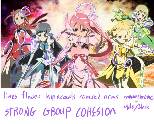
In a group giving the outfits cohesive motifs is an easy way to present a strong team image! In Yuki Yuna is a Hero, the girls all have colored lines(usually princess seam placement), armor or fabric hip accents, covered arms, and similar flower shapes in their hair. The Aesthetic of each girl is strong in a monochrome signature color, but not over whelming as the black+white connects them even in color so they aren’t out of place.
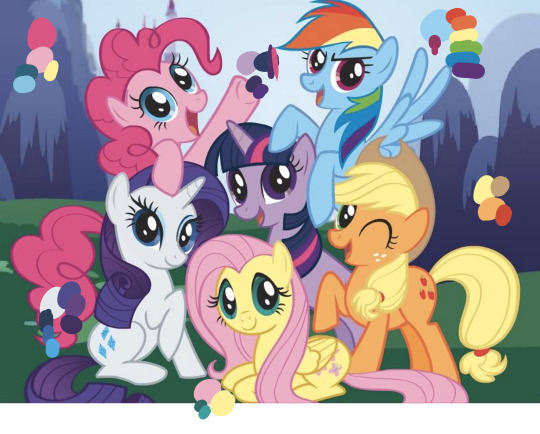
Speaking of color! if your characters are all similar looking (like same body for all of them) you can communicate their personality and aesthetic just with color! (only gonna talk about a few of the ponies) Pinkie Pie (the really pink one) is energetic and playful, so her color scheme is a variation of the primary colors(happy, child like), and have one of the more saturated colors(high energy, intense) of these characters in a large quantity. Apple Jack (the orange one) is a down to earth farm girl, and her color palette is accordingly, mostly earth tones, its also warm analogous colors, which makes her appear un-complicated and warm personality wise. the pop of red is a nice touch to add interest, but notice that its uses sparingly in her cutie mark and tail accessory. Rarity on the other hand is elegant and fussy, her high contrast scheme of white and dark blue/purples gives her more visual interest and is something that makes her appear more “complex” in addition to the gradient thats included in her hair. the colors are also all cool colors, bringing to mind cool glass or water which both have connotations of grace and beauty.
however all the characters here are unified by their colors being on the pastel side, which is also important for a cohesive cast.
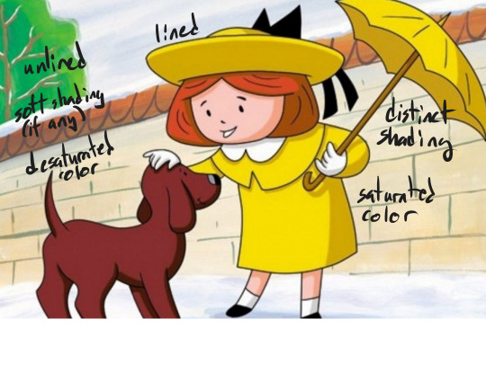
another, short, note on color; making the color/line/shading of your figure different from the background can help them stand out, this is used ESPECIALLY in children’s media, but can be applied to any illustration or animation as needed.
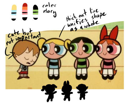
Color can also help your characters “read” quickly on screen, the powerpuff girls are a prime example, of having a distinct color blocking and silhouette. even the color blobs at the top and my crappy hand silhouettes STILL read as the characters despite being broken down into abstract elements. I also really enjoy the thick outline in the powerpuff girls, it really makes the characters pop to the foreground even though they have pretty simple designs and are often in a colorful setting.
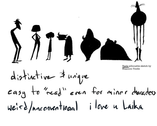
Also, for a lot of animation, silhouette is INCREDIBLY important for your characters, some designers sketch silhouettes and then design the particulars its so important to nail the shape. These examples from Coraline are some of my favorites (though Laika wins in my heart every time no matter what lmao) because the simple shapes are SO CLEAR and indicative of the character, you literally don’t need to have watched the movie to know these are each different characters with different personalities and roles.
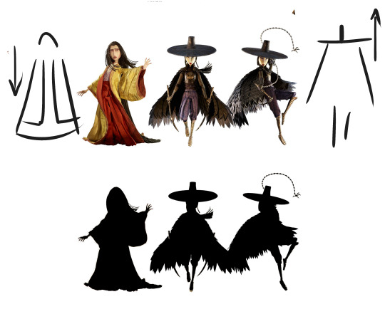
silhouette can also help tell the story. In Kubo and the two strings (another Laika film) the above three characters are sisters. One has chosen to leave her home in the heavens to live on earth, and the other two stay in their roles as “heavenly” warriors. This is even shown through their designs, the two sisters are weighted on top and their cloaks don’t even touch the ground, while the first woman has trailing, heavy sleeves, hair, and robes all grounding her and emphasizing her connection with the earth.
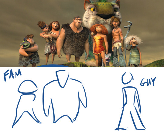
another example of shape/silhouette reflecting the story, In The Croods, the family of cavemen are for the most part very top heavy, with large torsos and arms, usually in a more hunched over position, while the newcomer, Guy, is bottom heavy with thin arms and stands more upright. In the plot, the family represents the old ways, the strength and rules that have helped them survive, they look like very stereotypical “cavemen”, while Guy resembles the modern man, and appropriately is associated with new ideas and forward thinking.

MORE SHAPES, in DC super hero girls each girl has a distinct personality emulated by her shape language. Zatana is dramatic curves and edges, Super girl is hard, straight edges against curves, giving her a solid muscular shape. Wonder Woman, though also strong, is taller and leaner, lending to a confident leader type. Green Lantern is slim, her lines all flow into each other giving her a go with the flow look. Bumble Bee is, of course, tiny, but her boots and gauntlets add weight and strength to her otherwise small frame. Batgirl is lanky and has a lot of pointed style lines, reminding the viewer of a skinny cat (ironic what with cat woman i know) or weasel which mirrors her preferred “sneaky” crime fighting style. (also yes this was just an excuse for me to gush abt how much i love the dcshg designs shut up)
so in my opinion, Cartoon Saloon’s The Secret of Kells is PERFECT in aesthetic, intention, and cohesion. Kells focuses very strongly on creating silhouette WITHIN the larger figure shape via color and line, most of the characters pictured here have no neck, the one who does, Brendan, is the main character and the use of negative space that cuts into his shape is used to draw attention to him. Kells is also very strongly inspired by Medieval Illuminated manuscripts (namely, the book of kells lmao). The characters still manage to stand out against outrageously detailed backgrounds via their simple shapes and strong color blocking.

Aisling, a secondary but very important character, is not human, and has a totally different shape language from the rest of the characters. She is thin and pointy, while most of the others are round or square. Aisling also has the most negative space making up her silhouette, compare the triangles made by her arms and legs in the above picture to the figures in the first image where everybody’s body is self contained with no negative space. She is also very different color wise, very pale and cool colored, as opposed to the warm saturated colors of the human characters. (yes this was another excuse to gush abt one of my fave pieces of media deal with it)
hopefully that wasn’t too rambley and actually helps? if yall have more specific design questions lemma know lol
#askems#a-magical-human#design#art tutorial#tutorial#Character Design#boku no hero academia#yuki yuna is a hero#yuki yuna wa yusha de aru#my little pony friendship is magic#mlpfim#madeline#powerpuff girls#ppg#coraline#laika#kubo and the two strings#the croods#dc super hero girls#dcshg#the secret of kells#cartoon saloon
840 notes
·
View notes
Note
Aarhgggfaga your COLORS are so beautiful...may I ask for even the tiniest crumb of insight into your painting process??? I'm trying to get back into drawing after a looong hiatus and am just helplessly flailing rn >.<
Hi anon!!! Thank you for the kind words 🥺💞 I’m so excited that you’re trying to get back into painting !!!! I ended up writing a fair amount so I hope it’s some good advice :^)
So I usually start with finding the Vibe for the piece and choosing a heavily saturated color to match it and I set that as the background color (pink for romance, blue for sorrow, green for growth - you know, the cliche colors). It acts as a unifying background color for all the colors you choose (plus it visually highlights colors that clash for you to avoid). Next, I take a slightly transparent brush and start laying on the base colors you need - the transparency is key. It allows the background color to come through - I find that really important personally! I’ll “mix” colors on my canvas to find ones that work with the background color :) it’ll naturally mix analogous color palettes which is super helpful at this stage!!
At the next phase I usually set up a black and white toggle option so I can monitor the values >:) then I usually shade with a triadic color from the flat colors!! I try to flip the color temperature - warm brown cape = cold blue shadows. Blue outfits might get warmer purple/red shading. Plus adding in the background colors for highlights and such !!!
Basically - unifying under color, analogous flat colors trying to stay with either warm or cool colors, shade with triadic color theme with opposite color warmth for visual emphasis (I personally love saturated shadows so go crazy with saturation !! It doesn’t need to be grey or nearly black!!) :-) Finally, highlight with what ever I find fun <3 obviously that’s a simplification and I break the rules a lot but that might help as a general jumping off point ??? Hopefully 🥺💞
If you’re having trouble picking colors to work with here’s a great list of websites that will create custom color palettes for you : HERE
I found this tutorial really helpful for visually seeing how highlights/shadows should be saturated - greys shadows can muddy paintings : LINK
Also this thread links to a ton of beautifully illustrated and helpful color theory tutorials that probably will help way more than I can : LINK
#asks#long post#tutorial#color theory#color palettes#references#i don’t have a Tag for Q’s like this so I’ll just add those four and hopefully one will pop up if anyone searches in the future#I hope that helps anon!! feel free to ask clarifying Q’s I know without visuals shits hard to understand 😔😔😔#but I’m on mobile so ahflahflshala
28 notes
·
View notes
Text
7 amazing interior design rules that every homeowner must know

If your home is already furnished all you need to do is 2 simple things one is to rearrange any furniture that you might already have and two repaint
today we will be discussing the basics that will help you with the What's and How's of decorating your new home.
We believe that everyone could be their own interior designer and stylist for their own place here!
7 amazing interior design rules that every homeowner must know
first one is the 3-3 vertical rule this concept comes from designer Mark McCauley this was brought forth from stripping down nature to colors if you've noticed the darkest colors are found in the ground like the soil, mud, the very earth while the medium tones are in the middle like plants, house buildings , the bodies of water and lastly on the top is the lightest: the sky, the clouds, and sunlight for him we can incorporate these elements to interior design and it will provide beautiful balance to the room using the darker elements on or near the floor the medium shades in the middle and the lightest on the top it is suggested to ascend from dark to light rather than light to dark in interiors
second one is the 60-30-10 rule this rule is all about creating the perfect color palette for your space 60-30-10 rule is choosing the main color a secondary color and an accent color your favorite color should just be one of them the 60% would be your walls, the paint, or wallpaper, large anchor pieces like area rugs and sometimes a sofa this is the largest color so this should be the most neutral It will serve as a backdrop to your space the 30% would fit the window treatments, accent chairs, beddings, furniture and you know an accent wall it would also be wood trim, textiles, carpets, lighting as long as you vary the tone and shade to give the room depth.
lastly the 10% will be your bold color choices it can be one or two colors 10% can be the décor, artwork, and the smaller items like throw pillows when you're not sure what accent color will look best you can take a color from an artwork or the print of a larger furniture the 10% can also be textures like wood and metallic next is the rule of odds basically this is arranging or grouping items in odd numbers surprisingly odd number groupings look more balanced and visually appealing than even numbered once
third one is the magical number but if the area is larger you can arrange in five or sevens but you have to remember one, the items that go and the grouping must be unique to create visual interest and two, if they're different they need to have a common denominator to tie them all together it can be a unifying color, texture, material and etc.

fourth rule is height variation you should never put two items of the same height next to each other try to look at your display cabinets or your console or your shelves in your homes right now and see if they look good as a whole if you're not quite sure and you can't point out why but your eyes and sense of style is telling you that there is really something not right it's the height variation with varying heights it creates separation so it does not look flat at all because your eyes bounces over each item so now you vary the heights of the objects but what do you do if one object is too short for the other? What if the variation is too wide? This happens in vertical and horizontal items.
fifth one comes in use height risers you use other objects to add height to it in this way it will make the items look more cohesive it bridges the gap rule number six is the triangle method this is about dispersing similar elements or décor evenly in a bookcase or a display cabinet to make your eyes bounce and roam last rule and most important is the flow is the way to go! A well thought out layout of your home is like wearing shoes that are the right size and the right fit for you. You won't notice them on your feet when you walk. It's like you were born with those shoes already. It feels so natural.
#interiordesign#interiordecor#house interior design#house placements#interordecor#home improvement#homedecor#home#modern house elevation design
7 notes
·
View notes
Note
My fashion queen, incredibly important question: How would one go about figuring out fashion *style* for characters? I've noticed your OCs always have a Look(TM), and I've gathered from your blog (and fics) that you've got an eye for aestethics - please, could you give me advice at least where to *start*. I'm completely unaware of fashion and, frankly, completely overwhelmed at the prospect of just starting..
Ah! Previous Anon again - forgot to add a more specific question about fashion (I’m squeezing in 2 quesiton in one xD). Do you have fashion advice for sleek/distant female character’s clothing that doesn’t hinge on formal dresses? (as is discernable, I have literally NO idea what a Grown Ass, Self Respecting Woman would wear)
wow. that’s high praise. when i got this yesterday morning, i knew i wanted to give it the answer it deserved. this is over 1500 words long, so apologies to anyone on mobile, but i wasn’t letting go until i’d really sunk my teeth into it.
unfortunately, since you’re anon, i don’t know enough about your character to suggest anything specific. instead, i want to take a step back and see if we can solve the root of the problem - “where do i start?”
when i was a teenager, an english teacher told me this: “the biggest constraint in writing is no constraint at all.” when you have the whole spectrum of something - in this case, clothes - to pick from, it is overwhelming. the natural human instinct is to freeze up. so while it may sound strange, if you’re just starting out, you might feel better if you have some constraints to work within.
with that in mind, you can treat finding a ‘signature look’ for your character like solving a murder mystery. you eliminate all the suspects that don’t fit until you know enough to narrow it down to the one that does. that’s going to involve something else you’ll recognize from murder mysteries: you’re going to have to interrogate the character. open them up and get to know them - their background, their likes and dislikes, their quirks, the role they play in the world around them. every answer will give you clues and weed other things out, and eventually, you’ll get a box small enough that you feel comfortable working in it.
now, i love fashion, and i love using clothes to send messages about a character’s personality. so as someone who’s had that interest for my whole life, i work from the other end. the constraints happen, in large part, without me thinking about them. i tend to zoom right to a certain aesthetic or item of clothing, say, “okay, what outfit can i build with this,” and go from there. but since you’ve said you’re “unaware” of fashion and it’s intimidating to you, i’ll try to ease you in through a different route and see whether that helps.
so, if we’re going to pick your character apart, let’s think about some practical questions first:
what setting does your character live in?
if you’ve narrowed your setting down to a historical decade, you’ll find most of the style questions already - firmly! - answered for you. for example, a victorian woman would, by default, wear skirts. if the character is contemporary, you’ve got a lot more wiggle room. if you want to mess with historical fashion rules for symbolic or story purposes, awesome, but i think that’s probably more advanced than you’re looking for right now.
if the setting is fantasy or sci-fi, what’s its dominant aesthetic? is it cyberpunk? sleek ~apple~ sci-fi? or is it more like star wars? is it medieval fantasy? woodsy faerie fantasy? JRPG-style fantasy? you get the idea.
what does your character do?
speaks for itself. what’s their job?
what is your character like, just in general?
this is where everything you know about their personality goes. if they’re a fussy courtier who’s worried about their reputation and appearance, they’re probably not going to be comfortable in plain, casual clothes.
what can your character afford to wear?
again, speaks for itself. do they buy designer brands? are they trying their best with what they have? or are they super strapped for cash and just have to get the job done?
does their social scene have an easily-identifiable aesthetic that you could work with?
does your character wear urban/street fashion or preppy rich-kid clothes? are they part of a subculture that dresses in a certain way, like teddy boys? do they have the desire or freedom to go all-in with that style, or do they have to play it down, like being corporate goth?
do they need to wear something they could travel, do hard work, or fight in?
goes with the job question above. do they need some kind of outerwear or accessory where they can hide weapons? do they always need to be ready, or is it situational?
basically, where does the character’s aesthetic need to sit on a chart of form vs. function?
what do other characters who are similar to your character wear?
look at your favorite movies, games, and TV shows and see what professional designers are doing with characters like yours. what colors and cuts are they using? what other elements do they choose? do you like them? if you don’t like them, what would you change? sometimes you can learn more from what you hate than what you love.
hopefully, you’ve already culled a huge swath of fashion ideas that you Know You’re Not Going To Do. you may still not know what you do want to do, either! that’s fine. let’s move onto some more artsy questions:
are there any colors your character would prefer or avoid?
it sounds silly. it’s not. a limited color palette will go a long way toward making a character’s outfits look unified and purposeful. obviously, in real life, most people don’t restrict themselves as much as fictional characters do. but if you were a costume designer, you’d want to have some guideposts to work with.
are there any motifs you associate with your character?
animals, elements, religious or cultural symbols, plants - you can sneak all these into their clothes’ details. maybe their dress has beading in the shape of a peacock, or rose earrings, or icy sparkles, or a bear pelt for a cloak.
have fun with meanings! moon motifs for mysteriousness, poisonous flowers, etc. let your inner lit major out.
do you want your character to have a certain silhouette?
this may seem odd if you’re just going to be writing your character and not drawing them, but think about it anyway. do you want to emphasize that your character is tall? is everything they wear skintight? do they have a large, unique hat?
a great example of this is maleficent. not only does she have a horn-shaped headdress, her huge, flowing robe tells us there’s a much bigger power in her than her body would suggest.
is there a certain ethos you want their clothes to project? what, in their world, would do that? what in our world would do that?
let’s say you want your character to look very powerful, to the point where people would find their looks alone intimidating. should they wear sharp, simple, severe clothes, maybe in dark colors? or should they wear very embellished clothes, like royalty? what are your setting’s ideas about beauty? modesty? does your character play by the rules, or do you want them to stand out?
what colors, shapes, and styles appeal to you personally?
for all the time i’ve spent talking about restrictions and guidelines, it’s important not to lose the fun of it, either. use your favorite color! give them clothes you’d want to wear in real life! character style is a playground where you can let wish fulfillment run wild.
at any time, feel free to turn to google or wikipedia if you’re not sure how to answer one of these questions. if you see an interesting idea, pick it up and follow it - what you’re doing here is training your eye, and that’s how you’ll learn. that said, if you’re already intimidated, i wouldn’t dive too deep into couture/aesthetic blogs until i had a more solid grip on how i wanted the character to look. it comes back to what i said earlier - there is such a thing as too much to choose from, especially when you’re not sure what you should be looking for yet.
there’s one other thing i want to mention that can help bring a character’s wardrobe together: repetition. if you’re planning several outfits for a character instead of just one, echo some of the motifs, shapes, or colors from one to the next. they don’t all have to be identical takes on the same thing, but if they have certain traits in common, they’ll feel less like separate outfits and more like a matched set. they could all be in members of the same color family or have similar patterns on them. maybe your character has a certain accessory that they wear with everything. you get the idea.
while i may not be able to plan your character’s wardrobe outright, i hope this makes the whole process seem more straightforward. or that it gives you some ideas to work with, or any other kind of help you might take away from it. this post is getting unfathomably long, so i’ll wrap it up, but i’d be happy to put any of my own characters through a “question test” like this one if you’d like to see how it works in practice.
finally, if you can find an interview with an artist or costume designer who worked on something you like, those things are worth their weight in gold. i read an interview with colleen atwood when i was in middle school, and it revolutionized the way i thought about fashion and storytelling. and when i say “revolutionized,” i mean “i owe basically everything i just told you to that article.” dig into them and see how they think and talk about their art! they’re more qualified to teach you than i ever will be.
54 notes
·
View notes
Text
chivalry is dead (20)
A/N: BIG YEEHAW HOURS TODAY Y’ALL ITS BALL TIME!!!!!!! AND WE CAN’T HAVE A BALL WITHOUT A PRINCE *stars bawling*
costumes will come in another post bc i. got really excited and then drew them all like, last month (most of them, some were finished last night y e e et)
WARNINGS: remus mention, heist details, wound descriptions, sword mention, scar descriptions, threats of violence, thoughts of dying — alright, im pretty sure that's it, but this chapter has thicc details so if i missed anything pls pls pls lmk
Words: 4550
AO3 link!
MASTERPOST! <– look here!! for the longterm warnings!! including sympathetic Deceit and cursing/swearing!
enjoy !!! <3 <3 <3 ,3 <3

Deceit really was right, Patton thought while he looked around at the town. His arm was linked around Logan’s as they walked down one of the town’s side streets, from Dr. Picani’s office, and he was taking the time to admire how intricate all of the architecture had gotten. It was intricate and worn and every building seemed unique now, something that he hadn’t realized was missing during their first pass through.
There were arch ways, bridges between doors on the third floors of buildings. There were seemingly hand-woven canvases shielding some of the streets from the sun and, if Patton squinted hard enough, he could see actual detailed stitching and some stains of age. They passed buildings that had scratches and chisel marks, and Patton could clearly see that it was made from stone bricks that had been painted over. Twice, actually. Once with a very old and faded blue, then with a lighter cream that still let the blue show through in spots where the paint was gone.
He wondered a little what had caused those spots. Was it because you weren’t supposed to layer house paint? The spots were different sizes — how many memories were made here?
Patton stumbled, tripping over his thoughts and heels, and leaned more into Logan’s side.
Logan tugged at his arm. “Don’t ponder too hard, Patton,” his voice was soft, hushed to not draw attention.
They’d figured that the best thing to do was to not think about the world around them. Thinking too much about the world and specifically the things that they would affect about it made their focus wander onto fixing those things. Logan would get a headache, Patton would space out, and Deceit would….well, okay, Deceit hadn’t disclosed how and if he’d been affected. But Patton noticed he’d been sweating like a sinner in church, and how his fist would clench every so often, so it was clear that something was happening with Deceit. He didn’t want to force him to talk; honesty wasn’t Deceit’s strong suit.
The four Romans had agreed that that was the smartest decision; none of them nor all of them together were able to limit the Imagination enough. The Playwright had argued that, had Dragon and Damsel known that it was hurting the other Sides, then they would probably all have a unified thought enough to close up the unused worlds. But that would require discussing the entire matter with them, which, as the Thief pointed out, is “pretty fucking useless where they are now.”
So the focus thing was their current strategy. Patton grinned at Logan. “Thanks for the reminder, Octo-cutie-pie,” he smiled wider as Logan blushed.
“I–I’m–Octopi is the plural for octopus and there is only one of me,” Logan bit his lip, then patted Patton’s hand gently, “Thank you.”
Patton giggled, snuggling against Logan’s side briefly as they kept walking. They hadn’t actually talked about the whole love thing, hadn’t really established boundaries, but that seemed like a problem for tomorrow.
Right now, they were all going across town, invitations in hand, to the ball. And, at the very specific right now, Patton was admiring the Playwright and the Artist’s handiwork. They’d worked together to make everyone’s outfits and he’d be a liar if he said they weren’t handsome and beautiful.
Patton himself was themed after a cat — a grey cat, but a cat nonetheless! His dress had a long train for a tail, made of shimmering silver tulle, the same as his poofy sleeves. The skirt went from his waist to the ground, with a built in flair in his corset at the waist. Like, all of it was sparkling, all three tiers of his skirt, which went from grey to black with an inner layer gradient of blue to grey. His favorite part were his gloves, though. Silver for the most part, but with soft circles on his palms and the tips of all his fingers. His own lil’ toe beans!
Logan’s outfit was one of Patton’s favorites. His was themed after an octopus (“Known for their intelligence,” the Playwright had explained, face bright red as he tied Logan’s necktie into an Eldritch knot) with a dark blue blazer and slacks. He wore a vest that shimmered royal blue, with a white button down underneath. There was a piece of coral in his lapel where a flower would usually go, and his coat tails seemed to spiral in shapes that resembled an octopus’ arms. There were even rhinestone bubble decals on his shoulders, or suckers, if you wanted to interpret it that way. The Artist and the Playwright had a small argument about that.
He was dashing, in summation. Patton leaned his head against Logan’s shoulder. “Who knew the town was so big!” he said.
“That’s actually on purpose,” the Playwright said from behind them, “It’s actually not so big as the castle is small, using the same foreshortening techniques used at the Disney theme parks to make Cinderella’s castle, or Sleeping Beauty’s castle depending on which park you’re at—”
“I think he means how far Picani’s office is from the castle, God Mod,” the Thief responded.
The Thief and Deceit were walking in front, swords drawn on the chance that they ran into any guards, and so that the Thief could critique Deceit’s sword fighting skills. Surprisingly, he’d taken to the weapon, something about it being good to have at his disposal while dealing with the Others. The Thief offered to make him one once this escapade was over.
Or maybe it was an excuse for the Thief to keep touching Deceit’s hand. Because that was happening every so often. A lot more often than would be considered normal.
It wasn’t like Deceit was complaining about the touching. It was more the other way around. The yearning for physical contact was frustrating, but neither of them were going to admit that they wanted to hold hands. Even though they’d confessed to at least caring about each other.
“Oh,” the Playwright hummed.
“Cheer up, butter cup, I love hearin’ bout the forced perspective! The Disney parks are so~o~o fun,” the Bard sang out. “When’s the next time we get to go to California? Are we making a trip down to Anaheim? Can we PLEASE take a trip down to Anaheim!”
One of his arms was looped around the Playwright’s, while the other was looped around the Artist’s. They had settled on outfits that complemented each other’s, pulling from the same red and black color palette.
The Artist was the only of the trio in a suit, though his outfit could be considered the loudest. Buttoned down the middle with a high collar, half of his shirt was a solid black, while the other half was a diamond checkered pattern. All of the accents were gold, and his pants were half solid red and half checkered as well. Tonight, the Artist would be a jester.
An improvement on his self-esteem, the Bard had thought. The Artist had said so, too, saying he’d be dressing like a joke. It...was nice to hear.
The Playwright had also gone with a more light-hearted outfit, pun completely intended. He was dressed as the queen of hearts, with an A-line skirt that skimmed the ground and was almost entirely a replica of the skirt worn by the Queen of Hearts in Disney’s Alice in Wonderland animated movie. His corset had a low scoop neckline with a long heart that stretched down from the neckline to the bottom of the waist. His sleeves were poofy, black with red stripes between.
It was a deck of cards theme between the three of them. Honestly, they took a bit of solace in their three Musketeers situation. The Bard was dressed like a harlequin in a ball-dancing dress. His entire dress was checkered, a stiff corset traded for a looser fit bodice that was sinched at the waist by a thick black belt with a heart clip. Bits of tulle were attached to his wrists, ideal for dancing in, which was perfect for the plan. He and the Playwright had matching heart chokers, too.
As he’d said earlier, “We cute.”
Neither the Artist nor the Playwright had argued, and they had yet to pull away from him holding their arms. Maybe they didn’t hate him.
They didn’t! They were moving beyond all that!
Because they had to get the Child back, and Virgil back, and save the Damsel and they had a plan. Actually, they should run through the plan again, because the Bard had already forgotten most of it.
“Thief?” he called ahead.
“Mhm?”
“Can we run through the, uh,” they had a code word for it, shoot, what was it? Oh! Oh, right, “The waltz again?”
“Great Mona Lisa, Bard, how the fuck did you forget how to waltz?” the Artist groaned. “We’re going to a ball.”
“No, no, no, THE waltz,” the Bard nudged the Artist’s side with his elbow.
The Artist shot him a small confused glare, but realization struck his face quick after. “Oh. Oh, that waltz. Yeah, uh,” he turned to the Playwright, who also seemed confused, then to the front again, “Before we get in, we should go over the waltz again.”
The Thief and Deceit both stopped as well, fingers brushing once again. The Bard saw the motion and chuckled to himself. Sweet Chopin, they needed to just hold hands already. He could envision the love birds flying around their heads.
He felt a smidge bad, though. After all, he was the lucky Roman who got to kiss Patton.
Logan and Patton both turned back to them. Patton let go of Logan, then looked around. They weren’t quite at the castle yet; a side alley, wide enough for all of them to stand in and with ample trees, barrels, and an open door beside it would provide good cover.
“Let’s go over there,” Patton grabbed Logan’s arm again and led them all into the alley.
They grouped up into a small but tight circle, the Thief pulling them together. He was in a suit, and an ironic one at that. Originally his costume was intended for Deceit, but he suggested switching them, so that the Dragon would think he were Deceit while being less suspicious. He was themed after a snake, though the theming was less noticeable than the color palette; there were yellow sequins arranged in scale patterns across his black blazer’s forearms, and his vest was black as well, undershirt yellow, and bowtie black. It looked a little like a snazzed-up version of Deceit’s lawyer suit and, though he’d tell no one, the Thief loved the look.
Deceit had said it looked nice on him, too. The bowtie, specifically, but also the entire outfit, and also the Thief simply looked good — yeah, they were both kind of messes. Gone was the ability to seamlessly flirt, apparently.
Still, it was nice to see Deceit in something other than yellow for a change, too. He was dressed as a peacock, with no blazer but a side-cape that shimmered iridescent purple and green. Part of it had blue and green rhinestones inching up the shoulder, and his vest beneath was teal, while his undershirt was mint green. There were bands on his upper arms, keeping his shirt bunched back, that were dark blue. Even his ascot was an iridescent purple and blue.
They leaned against each other in the huddle. Brown eyes trailed all around the group, meeting similar expressions of steely determination.
They could do this.
“Alright,” the Thief started, “For the first hour, we’re gonna scope out the room and surrounding rooms. Meet wherever the snacks are in pairs, alternating pairs, and spread details. Patton and I will go twice.”
“Because you and I are gonna peel off after the first hour to go get Virgil and the Child,” Patton said, meeting the Thief’s eyes.
The Thief nodded. He looked around at everyone — Deceit and the Bard had both been fairly defensive about that choice, but he argued that they needed people who were good at causing distractions on the floor. Patton would be the best at comforting both Virgil and the Child, and the Thief was the only one who had any inkling of what the inside of the castle looked like.
He continued. “Right. We’re gonna try to get out and—”
“Say, what d’ya think that’d make us?” Patton asked, a tiny grin on his face.
“Oh, no,” Logan groaned, “Not—”
“Cat burglars!” Patton exclaimed with a giggle.
The Bard immediately broke out into a fit of giggles, leaning into Deceit a little as he did so. Deceit just rolled his eyes and patted the Bard’s back, letting him cling to his side.
The Artist stifled some chuckles of his own, and the Playwright grinned. Oh. Oh, no, not the idea grin.
“I think Dragon will be hard pressed to find flaws in our purr-fect plan,” he said, eyes shining as Patton laughed as well. “We’re just gonna have to distract him with our adorable kitty-Pat.”
Logan groaned again, in good humor this time. “I thought you were supposed to be on my side, Playwright,” he grumbled.
The Playwright immediately sobered up, mouth pressing into a line. “Ah, Logan, darling, I’m sorry, I didn’t—”
“Hey, but,” the Bard raised a finger at the Playwright, smile wide and mischievous, “If he catches wind of anything, you, Artist, and I can pull a wild card and deck him.”
That got the Artist and Patton to both laugh aloud, and even Logan smiled a tiny bit at the Playwright, if only to reassure him that his frustration was not directed at him.
The Thief seemed actually annoyed, though. He snapped his fingers in the center of the circle. “C’mon, focus here. Patton and I are going to get Virgil and the Child, then we’re going to come back up to the ball room at the second hour. At that point, Deceit—”
“I’ll be dancing with Dragon and, once you’re back, I’ll be distracting him enough for you to get out,” Deceit waved his hand, also slightly exasperated. He wanted Virgil back immediately and, as the time to pull off their hest approached, he grew more nervous.
“Right. Then, Playwright will take you backstage once everyone else has filed out,” the Playwright nodded to the Thief regarding his involvement, and the Thief looked around the group once more, “All of that sound good? Everyone else, be on the look out for Damsel. We don’t know where he’s gonna be. If he’s out on the ball floor, Logan, you—”
“I will approach him and explain that we are here to get him out,” Logan grimaced, “If he is not on the ball floor….”
“Then I’ll be on standby to head into the dungeons,” the Artist said, smile deflated, brow furrowed in thought.
“Good,” the Thief patted his shoulder, gripping reassuringly, “And if Remus is there, then Bard is going into the dungeons with Patton and I’m staying in the ball room to kick his ass.”
“This all sounds like a plan, Thief,” the Bard said, smiling at him, “Logan, thoughts?”
Logan huffed, frowning at the ground. He’d rolled the details over in his mind a few times, so he’d already worked out some of the issues, such as the irrationality of the original plan’s “jump out the dungeon’s windows, really, how large are the windows, and how do we know it’s not underground.” For right now, it seemed as though the plan were efficacious, but they couldn’t be certain until it was enacted.
But at that point, it’d be too late to change the plan to any degree of impeccability. They would have to wing it. And Logan wasn’t a fan of that.
But what choice did they have?
“It is as detailed and as faultless as we can arrange for it to be currently,” he said.
The Thief’s mouth twitched into a slight grimace, but he nodded all the same. That was as optimistic as he would be. “Once this is all over, we meet at the tree as fast as we all can get there,” the Thief said, casting one more look around, “If we pull this off right, no one’ll be leaving alone. If your partner gets injured, you carry them to the tree.”
“I don’t think….” the Artist said, frowning a tiny bit as his voice trailed off.
The possibility of injury was very high, actually. Death for the Romans, at least. And they didn’t know if the Dragon had injured Virgil or the Child. To be honest, they didn’t know if the Child was alive. Oh, goodness, what if Dragon had killed him?
“It’s gonna work,” the Bard said, “It’s gonna.”
He squeezed the Artist’s arm and gave him a nod. It was going to be okay. Roman was optimistic by nature, and the Artist did crave that sort of positivity.
“It must,” Deceit affirmed none too positively.
“It will,” Patton said, smiling at them all again before clapping, “And break!”
Everyone stood up on instinct. Then, they all shared slight laughs, small smiles.
The Bard leaned over and hugged Deceit with an arm, reciprocated a little. Patton leaned against the Artist, who didn’t hug back, but also didn’t flinch finally.
They were getting somewhere. It was going to be okay.
It was going to be okay.
….Without Virgil, they all felt as though their optimism was naively placed. But that was why they were going to get him back!
Once he was back, Deceit thought, he was never letting go again. If he was back. No, no, once he was back. He was coming back soon.
“Let’s go,” the Thief pulled his mask out from his coat, a black half-face mask covered in yellow sequins arranged like scales.
Everyone shared looks, nodding to each other as they slid on their own masks. Logan, Patton, the Artist, and the Playwright all had special masks that mimicked their glasses prescriptions so they wouldn’t need contacts, too. With faces obscured, they nodded once more, squeezing arms in reassurance and patting backs and giving smiles, and hurried out of the alley.
The Playwright walked at the front of the group, the only one not paired to any Side. He looked up at the sky. A storm had grown, clouds angry and grey above the castle, which was only a few blocks away now. Perhaps it would thunder during the ball.
He wondered vaguely what had caused the sudden shift in weather. During their week alone, it was all sunny skies.
Was it….
No. No, no part of Roman was that desperate, to have gone to Remus. Right? He’d been telling himself that ever since they’d begun this game, but the darker their future seemed, the more he worried about the Duke’s involvement.
The Thief seemed to think it was very real, enough to have a back-up written into the plan. C’est la vie. Such was life, he thought, the show must go on.
They walked quietly for only a few minutes. The closer they got to the castle, the more Imagination inhabitants they saw walking around them, some in pairs, some in groups, some alone. Everyone was in costume, most intricate. Good. This would be good, for coverage. The Thief had been a little worried that the ball would be sparsely attended, but this was good.
It was going to be okay.
They approached the drawbridge. Patton leaned against the Artist, gripping his arm tighter as the wind picked up. The Thief and Deceit were stoic behind them, and Logan and the Bard were simply quiet, though their hands were interlaced tight. It was going to be okay.
A line had formed on the bridge, in front of one man in a suit, perhaps the medieval equivalent of a bouncer. The group shuffled into the line, looking around at the castle, at the moat (“I think it’s filled with alligators,” the Bard murmured to Logan, who shook his head and was about to respond that that didn’t make sense, until an alligator’s maw jumped up and snatched a low-flying bird) and at the sky.
Angry, angry clouds.
It took an excruciatingly long eleven minutes for the Playwright to finally reach the front of the line, but when he did, he immediately grinned. He had to hand it to the Dragon.
“May I see your invitation?” Zac Efron asked, dressed in a black butler’s outfit.
Bless the Imagination’s castings. The Playwright handed over his invitation, and Zac looked over a list in his other hand before handing back the invitation and checking off a name. “You may enter to the ball room,” he motioned to the door.
The Playwright curtsied and hurried in. Behind him was the Artist and Patton, both of whom gasped a little, becau se holy shit, it’s Zac Efron.
The Dragon was really out here casting Thomas’ celebrity crushes as butlers. It was the first thing that the Artist had wholly agreed with the Dragon on, actually. Once they were Roman, they were going to have to look into that as a possibility.
One by one, each entered, walking down a grand hall with a ceiling so high and so vaulted that there seemed to be a sky inside. But, then again, there probably was. This was the Imagination. It looked somewhat like the Great Hall from the Harry Potter movies, this time shining with stars and constellations.
Logan could identify Aries and Pieces. That was actually accurate for the season and hour, so he gave a mental kudos to Roman for his design, then considered if it were his knowledge that had been used to perfect the stars. Well. That was inconsequential, I guess?
The hall was also lined with suits of armor, and bannisters adorned with Roman’s full crest. Though, Deceit noticed while he walked through, the entire crest was outlined in gold and the castle in the center was colored with grey and brown and black. He thought the Dragon was only supposed to be the outer tower and walls. If the Dragon called all of the shots around here, then why was the center tower also colored?
The walk was long, heels clacking against the stone. They turned with the carpet to the left and entered through a pair of double doors that had to be at least two floors high.
Inside was life. The room was massive, stretching almost the size of a football field. There was a stage near the entrance door where there were musicians (with undetailed faces, Deceit noticed) were playing loud enough to echo across the room. The dance floor seemed to take up about half the room.
Farther away from the entrance were some circle tables, arranged around with some citizens already sitting down. Further back were some long tables, food stacked atop them, and even further….
The throne was elevated so the Dragon could see across the hall to the dance floor. The Thief’s fists clenched immediately upon seeing him wearing the Prince’s attire, white uniform a stark contrast to the black he was typically adorned with. It was a jarring difference.
He was taunting them. By Doc Holliday’s pistol, they were gonna take him down.
Beside his throne was a large Ottoman seat, where there was another figure. The Damsel, most likely, though his face was obscured by a sheer red veil and distance. He was wearing a large dress, which had a triple-tiered skirt that seemed to flare out orange, then red, then black. His corset was decorated with red and orange and yellow rhinestones, and raised behind his head. It almost looked like flames.
Burned. The Damsel’s scars were also entirely visible, scabs on his arms angry and red, clearly not fully healed. They weren’t openly bleeding, but the Playwright could tell that they would start bleeding at some point in the night.
His nose scrunched as he examined the pair. They didn’t seem to notice him, the Damsel leaning against the throne’s side and not moving, the Dragon stroking his chin and looking across the hall absently. He had a sword sheathed beside the throne, too, with its handle sticking up in an easily accessible manner.
He was waiting for them, he realized. Of course he was, this was a trap, you fool. You knew this. You’d planned. It was going to be okay.
The Playwright turned back to the group just as the last pair, Logan and the Bard, entered.
“Okay. I am going to move toward the snack table,” he nodded toward the thrones, “Octopus, would you like to join me?”
Logan let go of the Bard, who curtsied and stepped back, and then offered a hand to the Playwright. “It would be my pleasure,” he said, “How about we acquire a table, Hearts?”
The Playwright nodded, then shot the Thief a look. “Snake,” he said, a promise, a warning, “Let’s waltz.”
“Let’s,” the Thief responded, squeezing Deceit’s arm.
The Bard and Patton had already taken each other onto the dance floor, hoping to not be conspicuously waiting in a group by the door way, and the Artist was meandering around — nope, no, he just asked an Imagination citizen to dance. Blending in well.
Operation save Virgil and the Child was a go.

Virgil could hear the faint music from above. He squinted up, then closed his eyes and exhaled. What’d that matter?
His side was throbbing. It seemed that just wrapping a bandage around a wound did fuck all to stop it from hurting, or bleeding, especially if it was just wrapped once and around the front. Virgil would have to remember that for the next time he got stabbed by an evil Dragon, he thought snidely.
He and the Child had relocated themselves to the bed. Pretending to not be panicking was tiring, but luckily for him, the Child had fallen asleep.
He sniffed quietly, rubbing his eye with the butt of his palm. For the past half an hour, ever sine the Child fell asleep, Virgil had been silently crying. And there was no Damsel to conjure him a glass of water or tell him it’d be okay. Because he knew it wasn’t going to be okay.
Even if he didn’t die in the Imagination, he’d be exiting it alone. And that was fine!
The Child snuggled closer to his chest, tiny arms wrapped around him. Virgil sniffed again and hugged him tight.
If he did nothing else, he’d at least protect this Roman.
He wished he’d at least told Roman how he felt.
Maybe he’d never get the chance.
Gosh, this was really fatalistic, even for him. It wasn’t like he was gonna die in the Imagination.
Virgil shielded his eyes with an arm and, as illogical as it was, wished that he could use that one arm motion to block out the sounds of the ball going on above. Shit, he was gonna die in the Imagination.
….Usually that’d freak him out a bit more. Maybe he’d bled out to the point where he was too tired to be worried. And, maybe it was childish, but he really did want to dance with Roman.
taglists!
chivalry taglist: @starlightvirgil @forrestwyrm @daflangstlairde @marshmallow-the-panda @askthesnake @k9cat @patromlogil @theobsessor1 @ninja-wizard101 @fandomsofrandom
general taglist: @jemthebookworm @okay-finne
#chivalry au#fic#my fic#roman#patton#logan#deceit#virgil#remus#roman sanders#ts roman#patton sanders#ts patton#logan sanders#ts logan#deceit sanders#ts deceit#virgil sanders#ts virgil#thomas sanders#sanders sides#ts fanfic#woweee that's a lotta tags#asdkghjsdf i should get out of bed to do this#but also if i get out of bed im going to be empowered to put on my clothes and start the day#and i still. wanna post the costumes.#sdlaksghsadlfkhaslkfdhasd#can we get an f in the fortnite chat
46 notes
·
View notes
Last Seen Blogs

ofthefog
The Soup Anarchist

erfigh
My Baggage in tumbl_erfigh

villasanjane828
Untitled
vattuankerias
kyllähän ajatukset on aina mielessä

drvemeamd
Mind Blowing Anatomy