#added cartoony fur texture :)
Text
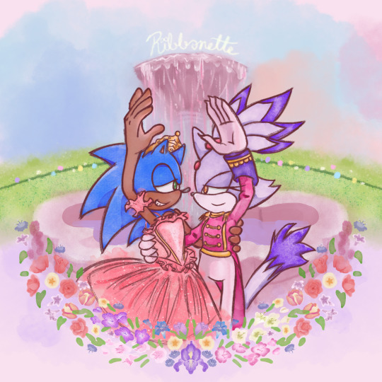
Tribute to one of my favorite movies of all time + the franchise that has me in a death grip 💖
a bit late for Christmas but at least Valentine's day is around the corner ^^;;
Process below if that interests you:
AS I SAID EARLIER, I had been working on this piece as early as December of 2021 😱!!!
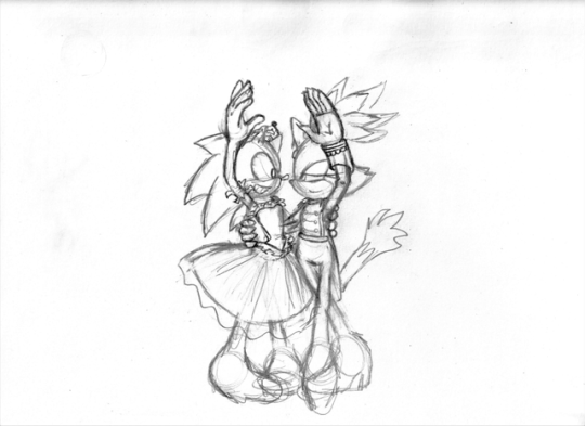
This was the original sketch! I was inspired after learning about Blaze's own design inspiration coming from Takarazuka theater, as well as it being the Nutcracker season so this film was in bouncing around in my head.
and this was allllll the way back in 2021 ^^; I had put the idea to paper to capture the image in my head immediately. But the idea in my head was extravagant and beautiful and would certainly take time to complete, as well as the patience and skill to work with watercolor 😔 I've certainly done my share of watercolor, both physical and digital, but I still feel like my physical watercolor work is a fluke, and I was still a novice digital artist at the time of this sketch.
In short, I was confident my skill could live up to the vision.
So I would put this on the back burner. It wouldn't be ready in time for Christmas, and I could use this as an opportunity to hone that digital art experience so it could be ready next year!
2 Years Later...
It's December 5th. Fuck it. Let's crack this open again, I tell myself.
SO starting with the line art, it's actually 2 different brushes layered over one another.
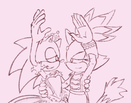
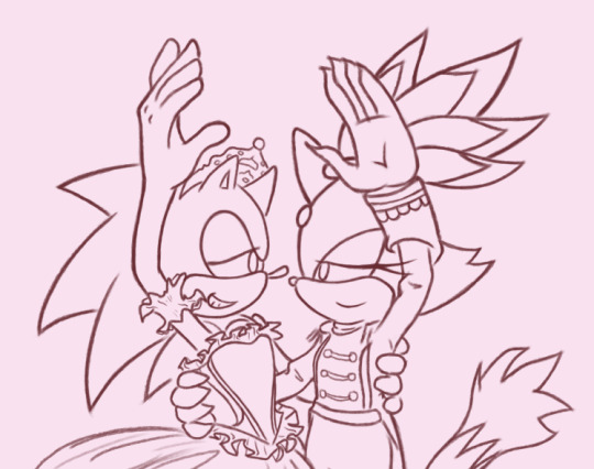
I also changed Sonic's expression to be more love struck-looking, because I'm a sucker for romance.
The image on the left is a watercolor line brush, while the right is a pencil brush. The reason I wanted a water color look was because I thought it would make the illustration look dreamy and fantastical, and I wanted that to extend to the line art as well. However, my usual lines on traditional usually veer more towards thick and cartoony from years of studying the Sonic art style, so I really felt like I was working against myself here. I had also asked friends for their input and they preferred the lines on the right as well. If my followers actually do read these blog posts, I'd love if you could comment which line art style you prefer drawing or looking at.
The happy medium was to just combine the 2. Here's a better look at that:
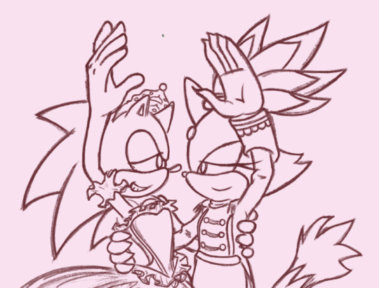
I like it! I think it combines the solid line with the rustic water color grain. Best of both worlds :]
For the actual painting, The most notable thing I can say is that getting the right pastel-y color was VERY difficult to achieve for someone like me who often loves to use bright and saturated colors in her art. I feel like I really set myself up to do one of those "evil art style" or "opposite art style" challenges I've been seeing around. I had to repaint Sonic at one paint because the blue of his fur was WAY too saturated for the style I was going for:
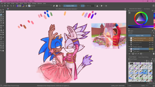
I started with painting Sonic and Blaze in first and then working on the background. I think that's probably the backwards way of doing it but one of the perks of digital art is you can do stuff any order you want when you have layers.
The background wasn't actually as difficult as I thought it would be. I wasn't going for any difficult perspective, and I was using a reference so that could be it. I'm usually averse to backgrounds but I really wanna tackle more of my weak points in art. I actually had way more fun than I was expecting, painting the sky and adding texture to the grass. I think I had the most fun rendering the water coming from the fountain (which you can't even see too well anyway, lol).
Funny enough, I had just about finished painting the characters and background by early January. So why am I posting this in February?
The Flowers...
In case you don't know. I love flowers. I love looking at them, I love learning about flower languages, I love drawing them. so seeing that my reference image showed flowers circling the fountain, I was excited! I was already having more fun than I expected to be, working against my usual style, rendering a background, so how could this be a pain in the ass?
Well, I am my own worst enemy 😞I couldn't exactly identify each flower offhand from this screenshot alone. The texture of the flowers is kinda grainy, since I don't think the animators were expecting viewers to look too closely at the set piece to use as reference for my lovingly crafted crossover fanart. If anyone has this in high quality though, please tell me.
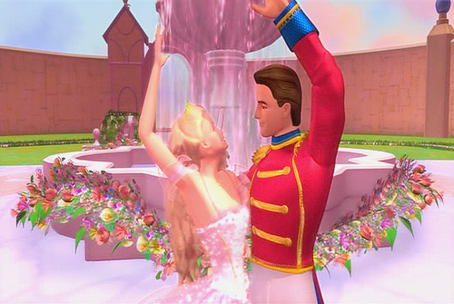
(I think I actually got this reference from a tumblr post but I can't find it on my blog for the life of me nor can I find it in the tags I'm so sorry)
I'm a huge stickler for details so I really wanted to be as "accurate" as possible in my illustration. I can hardly identify some of these flowers with confidence. I think there are roses in there? or tulips? I'm not sure if those yellow flowers are roses or some kinda petunia or if I'm way off.
I'm sure these details won't matter to most viewers but it was EATING AWAY AT ME. Eventually I decided to try drawing in flowers that might look similar to the ones in the reference. Or some based on their flower languages. I was certainly overthinking it ;;;; It led me to going "fuck it" and just throwing in whatever I wanted. There are no irises visible in that screenshot but I made it the centerpiece of the flower ring. Who give a shit.

I made some guides for me to follow: The blue ring was so I could make sure the flowers make a half circular border around Sonic and Blaze. I was envisioning how it could look as like an icon or sticker or something, which is why it's framed this way. then the second guide is the sketch of the flowers I made. I always do line art and I'm not great at just improvising with color to paper, or color to screen in this case.
The rest of this process is then just working on each flower piece by piece (with the help of the mirror tool of course) with varying degrees of detail. Some flowers are more abstract than others, and I had debated if that would look jarring and disrupted any kind of harmony I was trying to maintain with the style parameters I set for myself. And then I decided I was overthinking it once again which is why this was taking me nearly 2 months to complete.
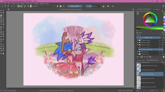
At some point during this process, my wifi went out for a whole week! Of course, I could still work on this illustration offline, but I had a lot of tabs open with a bunch of reference images on there (plus I like to listen to music while I draw otherwise I lose focus and I had neglected to download a varied selection on my phone or laptop 😭 Learn from my mistakes).
The most tedious of this process was making each set of gladioluses a unique color.
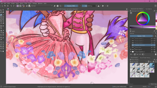
Was it worth it? You tell me! I think they're pretty, at least.
Along the way, I repainted the grass because it wasn't symmetrical (It didn't need to be but I had been using the mirror tool for a lot at this point and it was bugging me). I made other little final adjustments, like color adjusting the leaves on the flowers, lowering the flower ring border, and so on.
Ultimately, I'm extremely satisfied with the final product. I had my heart set on doing something like this for a long time. I had so much fun just experimenting throwing on color or not worrying about technical stuff. Of course, I did do what I usually do and overthink it at some points, but I'm working on it!
I've wanted to do an extremely indulgent AU illustration and other drawings for a Sonic x The Nutcracker story for a long while. I will be totally honest, I'm still a little embarrassed to share stuff like this, even after years of posting fan art online. It feels like the more self indulgent something is, the more people might judge me for it ^^; But I wanna practice what I preach and kill the thing inside me that cringes at my harmless attempts at joy and whimsy.
I would love to do some more drawings for this AU, but maybe post them around December when it would be more seasonally appropriate. I hope you'll stick around for it!
If you read this whole thing to the end, thank you. Whether you follow my blog or not, I hope you have a lovely day :3💝
#Barbie in the Nutcracker#Sonic the Hedgehog#Blaze the Cat#Sonaze#Jess's Digital Odyssey#Sorry for not posting frequently it may happen again
62 notes
·
View notes
Text
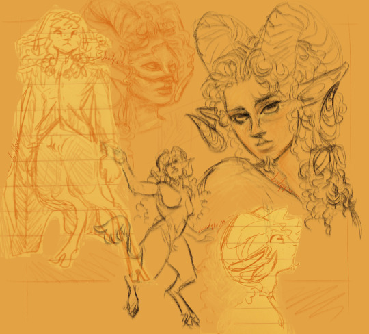
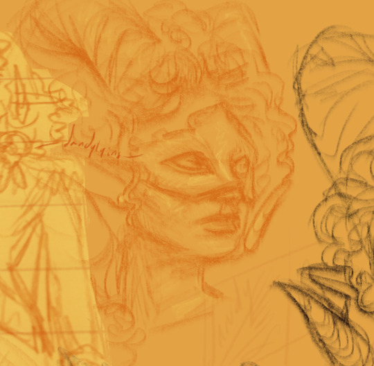


some wuvvy style/design experiments! some referencing of claudia's (? i don't watch iwv) masquerade outfit for the far right and middle left busts. i had the idea of her with a little goatee and got very attached last night, so i also drew an alt of that middle left one with a goatee :) because there's quite a bit here, ids are in alts and below the cut.
ID 1: a page of digital sketches of Wuvvy from Dimension 20's A Court of Fey and Flowers. The background is a cream orange, and the sketches are added in either a slightly darker orange or dark brown. From left to right, the sketches are as follows: a full-body sketch of Wuvvy in a slightly cartoony style, depicted as a round-faced satyr with forward-facing horns and curls bangs. She's wearing a pale suit jacket with epaullettes and a matching cape, and a string of flowers is around her neck. She is standing with a serious expression and in a ready stance.
Next to this is a semi-realistic bust, studied from Claudia's masquerade outfit. Wuvvy is shown here with a more human-like face, though she has long, elfish ears and enormous, curling ram's horns. Her curly hair is parted slightly off-center, framing her face and revealing a masquerade mask over her face. A pearl earring is visible in her left ear. She looks watchfully into the distance.
Below this is a simplistic full-body sketch of Wuvvy with long curly hair, curling horns, and a tail. She is mid-step, her pose perhaps a dance, and a smile can be seen on her face as she looks backward. She is not wearing clothes.
Next to this is a cartoonish profile of Wuvvy. She has goat eyes and long ears, and at the end of her chin a sprig of fur can be seen, like a goatee.
The final sketch shows Wuvvy in a semi-realistic, but stylized sketch, looking pensively toward the viewer with one shoulder raised. Her hair, like before, is referencing Claudia's masquerade outfit, parting slightly off-center and falling away from her face. Her horns curl far back and then come to an outward-facing point below her ears. Her hair is pulled to the right into a ribbon, the ends of which fall over her shoulder, and she has a short, soft goatee. The sketch has some rendering in yellow highlights and darker orange in the face, neck, and shoulders. End first ID.
ID 2 & 3: Close-ups of the two Claudia busts, showing greater detail in the rendering. Both sketches were done in a textured brush, like charcoal pencils. End IDs 2 & 3.
ID 4: A close-up of the realistic bust, but some rendering has been added, and a goatee has been added to her chin. End IDs.
#acofaf#wuvvy#d20#dimension 20#a court of fey and flowers#my fanart#2022#gender guy has gender moments about his goat blorbo more at 7#also shoutout to the new people who are here bc of that spock painting. you are very welcome here but im in my furry era right now#just so we're clear with each other
57 notes
·
View notes
Text
Sculpting the Larger Model - 12th April
After a few days away, I came back to my models to begin smoothing out the clay, and then to add details to the larger model, such as eyes and the mouth. I began with the larger model as he serves as the centerpiece for the sculpt, with the smaller character being more of an accent. I applied slightly larger chunks of clay here since I already had a base to smooth it into

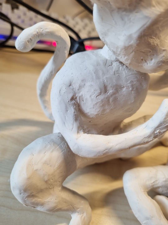
The main portions to get right with this sculpting section were of course the facial features, but also the tufts of fur around his neck and stomach. I considered adding texture to this but I thought it might detract from the cartoony vibe I was going for and so opted not to. After a day of extra sculpting on the larger model, I didn’t think his face looked right, and so I added some black paint with a toothpick into crevices and eyes to make the face stand out more, and I really think this in particular brought the model together. Here is how it looked as an almost final rendition:
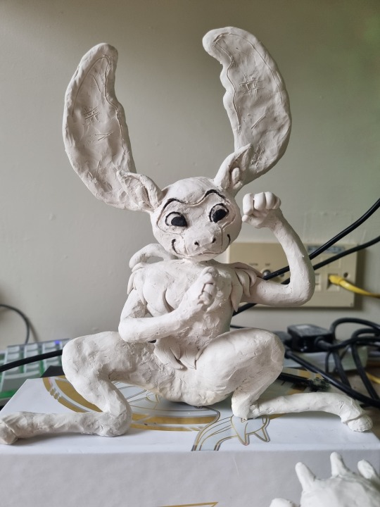
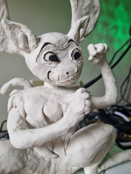
0 notes
Text
Whomever okayed Sonic's design in the live action movie I am genuinely curious. Who hurt you?
#bullshit from yours truly#noisy kit kat#negative#I am looking forward to jim carrey and ben schwartz as sonic and eggman and that's about it#like you could have still kept his cartoony design fine while adding realistic textures in his fur and quills#just look at dp
2 notes
·
View notes
Text
Toy Detective Masterpost!
This is how I look for toys online to help people find their missing buddies. This guide will mostly be for the U.S. because that’s where my experience lies. This should tell you both how to look for something of yours, and how to help people out online!
Asking for Help
-The best two places to ask for help are reddit.com/r/helpmefind, and the facebook group Plush Memories Lost Toy Search Service. You can also post on lostmylovey.com.
-When asking for help, try to come up with the most detailed description of your item as possible. try to differentiate between what you’re less sure about and what you’re absolutely positive about— memories can play tricks on us!
-An image says more than any description. If you don’t have a photo of the item itself, a drawing can be super helpful for getting across the pose and proportions.
-Here are some questions to get you started in describing your item:
What kind of animal, character, or object was it? What colors was it? How big was it? Around what year would you have gotten it? Do you know where you got it? Did it come from a crane game or arcade? What pose is it in (sitting up, lying down, etc)? Did it have joints? If a plush, was it filled with stuffing, beans (like a beanie baby), both, or something else? Were the eyes plastic or stitched on? What about the mouth? How stylized was the face— was it cartoony, realistic, somewhere in between? What texture was the fur (ex: terrycloth, velvety, coarse, wooly, fluffy, stringy)? Do you remember it being in a ‘set’ with any other items? Do you remember anything about its tags?
Searching
-The first place I search is almost always picclick.com, which lets you see current eBay listings in a grid view.
-When I’m looking for an item that I’m not personally familiar with (for example, on someone else’s description), I scan along the images looking for specific characteristics. For example, I might search something like “vintage white bear plush”, and look very quickly across the images, stopping only when I see ones with a pink plastic nose (assuming in this case that that’s something the person remembers). Then I cross-reference the ones I stop at with the description I have to see if it could match.
-If you have a brand name or even better, the specific name of the item, search that first. Then expand to get more general. Think about what a seller is likely to highlight in their listing— they may not put “plastic eyes” in the title of the listing, but they might put something that seems special, like “heart nose”.
-For claw machine plush, try searching for the following brand names with what you’re looking for: fiesta, peekaboo, king plush, national entertainment network, toy network, carnival toy co, national prize & toy co, toy factory, kellytoy, teddy time, emerald toy co. for example, “fiesta green cow”.
-If even a general search doesn’t get you far, try looking through toys sold in lots, especially if you need to find a photograph of your item. For example, “vintage plush frog lot”.
-Another place to search for information is worthpoint.com, which is an archive of sold eBay auctions. If your item can be distinctively described (for example “vintage yellow pink bunny plush gund”) and there’s still no trace on eBay, try looking on worthpoint. It might give you an old auction with a photo, a brand name, a toy line name, etc.
-If you’ve posted asking for help someplace, keep your post updated with any new pictures or information you find. If you find a picture but not an active listing, save the photo to your device. Old listings can often expire since so much information passes through eBay every day.
Buying Tips
-If you find what you’re looking for, but it’s too expensive, try adding the listing to your watchlist. Especially if the item has been for sale for a long time, sometimes the seller will send you a offer. This works on eBay as well as secondhand selling apps like Mercari.
-If shipping is super expensive and is “expedited”, as the seller if they would be willing to ship standard. Some sellers set the shipping to expedited by accident!
-You can ask sellers if they’re willing to split lots. They might say no, but it’s worth asking.
-Similarly, you can ask sellers if they will re-list items that ended without being sold. Often they will if they know they have a buyer (you!)
Extra Places to Look
-eBay isn’t the only place to find information or listings for sale. Here are some other sites:
Buying secondhand items:
-kidizen
-mercari
-poshmark
-depop
-etsy
-specifically for the EU, doudoutheque-co.com -http://ronsrescuedtreasures.com/
-https://plushmemories.com/lovie-shoppe/
-https://asuwishshop.ecrater.com/c/1079522/plush-toys-loveys
-your local facebook marketplace
-your local craigslist
Identifying your item/finding a photo of it:
-pinterest
-google image search
-google lens (if you right-click an image in chrome you should see an option to use google lens)
-checking the archives of ebay blogs (you can filter by tag in the archive, for example, ebayfriends.tumblr.com/archive/tagged/dog)
-collector’s personal sites and forums (for example, google “rubber duck collecting forum”)
-here’s an example of a really fun personal site on rubber ducks: http://rubberduckpond.com/index.htm
-trampt.com keeps track of designer vinyl toys
-lastdodo.com is a collection-organizing website that has a lot of information about European kinder surprise type toys.
http://animaltoyforum.com and http://www.dinotoyblog.com are helpful for small plastic model animals and dinosaurs
bogleech.com knows a lot about monsters, halloween, and “gross” toys
littleweirdos.net knows a lot about tiny plastic capsule toys, often monsters.
#plushblr#toyblr#kidcore#toycore#plushwave#toy collecting#toy collector#stuffed animals#plushie#toydetective
292 notes
·
View notes
Photo

Was in a fun experimental mood, so I tried yet another redesign of Sonic the Hedgehog XD This time, I combined the elements I like from Modern, Classic, Movie, and Boom Sonic!
Original Render: [link]
___________________________________
* Attempted to make his proportions more balanced like Movie and Classic Sonic's. Proportions are still cartoony but no part of the body is significantly larger than the torso. No bobbleheads here!
* Boom Sonic's concept of having extra quills (and of various sizes) better implies that his head and back are covered in them
* The idea of Sonic having blue arms grew on me but I also prefer the tan arms, so I tried combining both! XD
* No cheek mouth. That works better in 2D than 3D in my opinion!
-"Mono eye" works better in 2D than 3D too. Besides, separate eyes make room for more expression flexibility!
* Gave him a little more of a snout
* Added a gradient of Classic and Modern Sonic's shades of blue him for depth + to subtly separate his spines from his fur!
* Fun fact: hedgehog quills are connected to flexible muscles. They're also hollow and made of the same stuff as claws (keratin). Thus, I imagine sharp, pointy things when drawing Sonic's spines.
- I also like to consider how they may flair out or relax depending on Sonic's mood, just like a real hedgie!
* A cartoony hedgehog with cartoony fur textures!
- Though realistic fur on cartoon animal characters can work, it can be a challenge to make it work for some (like Sonic and co) without making them look a little uncanny. Thus, for Sonic characters, I personally feel that simplified, stylized textures could work best for their fur with the way they’re designed.
#sonic the hedgehog#sonic#hedgehog#anthro#redesign#reimagined#movie sonic#sonic movie#fanart#fan art#edit
247 notes
·
View notes
Text
i’ve been thinking a lot recently about like
the kind of clothes that i currently wear, and the kind of clothes that i actually want to wear, in terms of like... my every day. i have certain clothes and i wear the same things a lot, and certain things are beginning to wear out, especially my jeans and some of my favourite shirts
and i want to make my wardrobe more... me. bc in recent years i’ve not been dressing all that flamboyantly, because a lot of the flamboyant things i like are just too cold to wear, and i’ve not stuff to appropriately layer
and i’m thinking about like... what my ideal wardrobe would look like, and what i actually want to wear
in general... i like brocades and i like patterns - especially paisley, florals,and snakeskin, and i love anything that just looks like a grandmother’s wallpaper.
i like reds and greens and golds; i like black and brown. i love mustard yellow and venom green, i love crimson, i love dark, luxuriant purples, and i love different browns - dark chocolate hues, lighter leathery ones, dark tans... the only browns i don’t like are like, camels.
i don’t like to wear silver, although grey can be alright; i don’t really like blue that much, and i like burnt oranges that tend toward brown, but not really bright oranges. i also don’t really like brighter yellows or neon colours.
i like leathers and silks; i like embroidered fabrics and brocade; i like to feel the weight of fabric, whether it’s multiple layers or one. i like furs and fleeces. i love lace and i love ruffles, and i love being able to look at something and just see the volume. i love military bits and pieces, i love pockets, i love little chains and i love textured/carved buttons.
i like cinched waists, i like to be able to show off my wrists and my ankles and my neck; i like things with a stark silhouette; i like exaggerated shoulders and i like wide skirts on coats versus the narrow waist. i like to billow when i walk, especially because i walk with shoulders back and hips swinging.
and i like shoes that make a noise, i like to make a noise when i walk, and i like to feel the weight of everything i’m wearing, and have that pressure on my shoulders especially, but i want everything to be warm, and to be very comfortable to walk in no matter the weather.
in general, if i were to pick like... specific styles, i would pick the obvious dandy, for more understated things; i like rogueish/piratical styles, but especially piratical a la dustin hoffman’s costuming in hook (or jason isaacs’ in the ‘03 peter pan); i like sailor’s clothes in general, especially when it comes to jumpers and shirts for wearing around docks or on a ship; i... to my own surprise, i’m actually pretty down with a lot of elements to cowboy gear, but especially, you know, like sidney zweibel style Gay and Cartoony about it.
outerwear:
i like coats with brocade and colour - i like bold reds and golds, i like blacks. i love old-fashioned military style, like of the 18th and 19th century military styles, especially with big sexy epaulettes and a lot of brocade fronting. i like long coats, with big sleeves.
i think i would like to wear a cloak, or like, an inverness style coat with a cape - i love the victorian style of coat-with-cape, and i’d be well down for that. i also like brown leather, and as well as the brown suede coat i already have, i’m gonna try and nick my da’s brown leather coat with paisley lining
i also like. desperately want a yellow oil coat, like you wear on a boat. you know like if you imagine a lighthouse keeper in a yellow mackintosh? those are perfectly easy to buy, because i live beside the atlantic ocean, i just haven’t, because i’m kind of dim
general wear:
i like jeans. i do like jeans. but with that said, i think i want like... heavy jeans? like i want workman’s jeans, i think - i want the kind of jeans that if i went to a farm and expected to be working with horses and riding and jumping fences, they’d be perfectly serviceable, you know?
i also like trousers with patterning, with front-flaps or with buttons etc; i like trousers that have designs around the pockets and i really like to have them high-waisted that accentuate the hips and the ass, and remind me to keep my posture. i don’t know if i’d wear a corset, but i do like the victorian figure, and i don’t think i’d be opposed
i want more shirts with like... detailing. i really like shirts with lacing and ruffles; i really like shirts with exaggerated cuffs. i like bright patterns, and i like bright colours. i thin i also want to get some engineer’s shirts and heavy cowboy shirts that you wear undershirts beneath - again, workman’s shirts that are made to take some wear and keep you warm, but look very bright and sexy?
i want to wear the waistcoats i own more often. way more often. i want to wear suit jackets more - in general, i like things with embroidery and brocade, and i like to wear ties and bowties, and i should wear them more often, because i like them.
in general, i like cinched waists, i like to accentuate my wrists, my ankles, my neck; i like plunging necklines; i like tight-fitting stuff that’s warm, and i like to layer clothes, which is why it makes sense for me to transition toward wearing more suits
as for jumpers and cardigans, i like the ones i already have - i like sailor’s patterns and i like corded wool.
shoes and accessories:
i want some hoops for my ears. i tend to wear one earring on the left side, but i want some more sexy dangling ones - a gold hoop would do perfectly well, and i want stuff along those lines, like the smaller hoop with something dangling from it. i like it. it’s camp, it’s gay, it’s a little silly, i like it a lot
i think i’d also like a new pocketwatch, because mine gave up the ghost like seven years ago and i never got around to replacing it. i think i’d like to wear more rings???
i need more gloves, and i’m going to invest in proper leather gloves for the winter, ideally lined with fleece or cashmere or something - i want proper gloves that you can work in, and that i can like, keep on to do things. i want more scarves, i think - i only really use three? two are red, and one is mustard yellow, lmao, because i’m Predictable Like That
and for shoes... i want cowboy boots. i love them, and i want them. i had cowboy boots before and i will have more. in general, i think that i prefer boots to shoes - i like wearing steel toe boots for work, i like the weight, and i like how they fit to my calf. i LOVE chelsea boots, and i like snakeskin, i like red leather, i like brown leather.
white leather is... very sexy, but i think the BDE is a bit more than i’m ready to pretend i have just yet lmao
i favour chelsea boots and cowboy boots because i’m shallow about how short i am and i want the added boost - in a pair of good heeled boots, especially in like, cuban heels, i go from 5′6″ to 5′8″ which is like, average height rather than a little short
also SPATS???? yeah......
underclothes:
broadly happy with my choices of underwear, actually, but i want to wear more vests and thermal undershirts, and i think that also like... i want some long johns. i wouldn’t get a load of sets at once, but i would get one set and just... see how i go. i think i’d like them.
honestly, for formal occasions, i think sock suspenders are extremely sexy and i should wear them. i don’t need them. i just. i like them.
15 notes
·
View notes
Text
My First 3D Commission
This is a commission that I have been recently working on!! My good friend commissioned me to make a pair of ears that he can use for his models!


Here are the first two views of the model. He asked specifically for the fur tuft to be modeled in, and to use no particle system to create fur. He also asked for defining shading to be put onto the mesh to darken shadowy places. This will most likely be used for a cartoony stylized model.

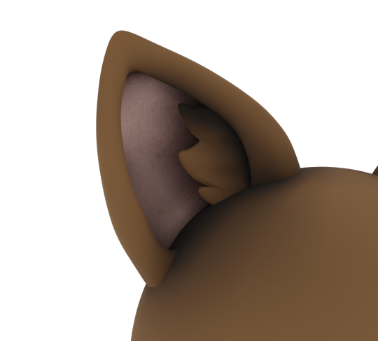
These two images were rendered to show the texture of the inner ear, and to see how the colors can be changed easily using the RGB and hue/saturation node. To set this up I added a mix RGB node and plugged both the image texture and RGB node into it. Then I plugged that into the hue/saturation node so that it can be changed more thoroughly.
youtube
Here is a full 360 degree view I rendered for him to see if he likes the shadows I painted on to the mesh. It was rendered in about 2 ½ hours. The ear texture has been scaled up since this render.
Here are the first two views of the model. He asked specifically for the fur tuft to be modeled in, and to use no particle system to create fur. He also asked for defining shading to be put onto the mesh to darken shadowy places. This will most likely be used for a cartoon stylized model.
Thank you so much for making it this far!! I will see you next time I post! I am open for commissions. I work in blender cycles, Photoshop, and Sketchable. I will also be posting some projects I am doing for art class here! Until next time, bye-bye!
#furryart#furry art#cat ears#catears#animal#3d model#3d#cartoon#art commisions#commisions open#commision#blender#blender cycles#blender community#digital art#artists on tumblr#the boldster#black and white#brown#furry#commission
0 notes
Text
character designs


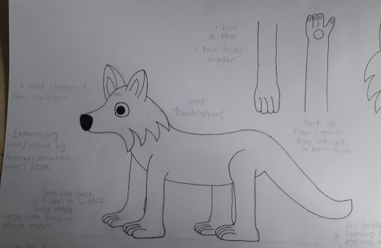


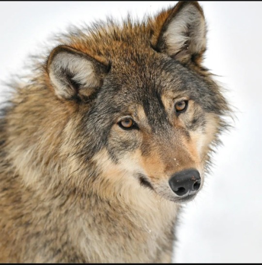
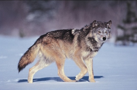
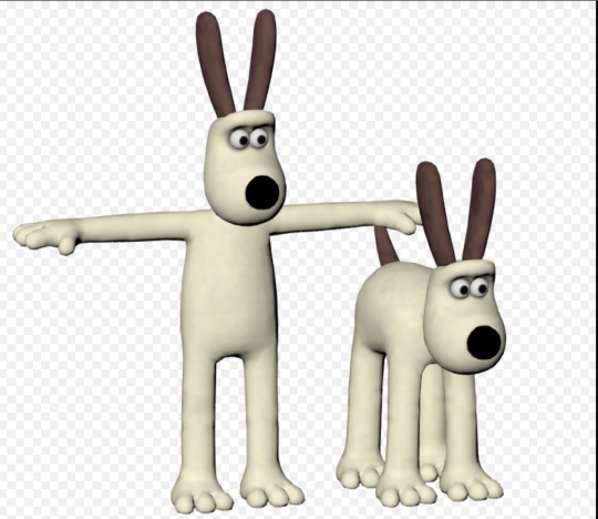

Wolf protagonist character design inspired by Aardman animation character style, particularly inspired by the character Gromit (references used below top four pictures) (Hand drawn)
I decided to make some character designs that where inspired by Aardman’s character style as they make characters specifically used for stop motion models so I thought their designs would be good to look at due to practicality. I didn’t resemble the character style exactly, I mostly focused on particular features that I liked from the style and that I thought would potentially make the designs good for animation and tried to incorporate those into various character designs that I could potentially use to convert into animation models. The features I particularly focused on were the large bead eyes that a lot of the designs have, the relatively big flat feet and thick legs and the large noses which also seem to be made of a harder material that quite a few of Aardman’s characters have. Not all of Aardman’s designs have these features as I’ve found there is quite a bit of variation in their style but I have seen quite a few that do. (All of the picture references I used including pictures of the real animals that the designs are based on come from Google images. I used the Aardman model pictures to help me with style and the pictures of the real animals to help me with the anatomy/getting the design to resemble the actual animal it’s meant to be.)
This is the first design sheet I did.(For now they are just the initial outlined sketches. Since my main aim is to make models to animate with I don’t think I’ll colour them all. I might just colour the designs I decide to use in order to save time as getting the models made and animated is more important to the project as my end goal is to animate rather than create detailed character concepts.) I started with trying to make a design for a wolf character that I could use as the protagonist in my animation. (There is also a sheep design on this sheet but I’ll go over that design in a different post.) As far as I’m aware Aardman doesn’t have any wolf characters but they do have Gromit who is a dog which is a pretty close alternative. So I used Gromit in particular as a reference for this design. Gromit has quite thick legs and large, flat feet which I suspect help quite a bit with supporting the models weight so I tried incorporating this into my own character with a few of my own alterations. Gromit only has three toes when he is on all fours which works fine for making the feet look like paws but I still find them rather odd looking because of this. A lot of animals and in particular wolves/dogs have four digits on their feet/paws so I decided to give my designs paws four digits as it’s more accurate to the actual animal and as a result I prefer how it looks. It also allows them to function more effectively as hand like appendages. Gromit as well as being quadrupedal is also capable of switching to being bipedal which is demonstrated in the second to last picture. Being bipedal this allows Gromit to use his front paws like hands but he seems to grow an extra digit to use as a thumb when this happens. This is also partly motivated me to give the design a fourth digit so if the model similarly stood up to use its paws like hands it wouldn’t just seem to grow another digit out of nowhere. I would like my character to similarly be able to switch between being on all fours and upright as I mentioned in a previous post that being able to stand upright would allow more complex and human like movements such as being able to hold things and pick them up. Despite being an animal the more human like they are the more relatable the character will be and considering I want to make an animation about internal interaction which I feel is a topic strongly related to people due to their more complex brains I feel that making the main character more human like is important. It’s also a way of creating differentiation between the main character and the physical manifestations by giving them different body types. I also gave the design the big bead eyes that Gromit and a lot of Aardman characters they have. I like this feature of Aardman characters as again I went over in a previous post they might be pretty good alternatives to animating with soft clay eyes as they won’t get damaged and are easier to move but also because I do like how they look. Due to being a different material to the rest of the model they really stand out which I think helps to make the characters more expressive and they also look a lot more like actual eyes than I think soft clay would due to being made of a more solid material and having slightly reflective properties. Also due to the eyes being rather unusual looking due to the way they stick out of the head and I personally haven’t seen this type of eye being used overly often it makes the design look more unique. I also quite like how similarly Gromit also has a nose that isn’t made out of clay and that it’s very prominent, I like it for pretty much the same reasons I like the eyes. So I made sure to incorporate a large sticking out nose into my design as well.
I think this wolf character design came out reasonably well. I re-drew quite a lot of pencil outlines(for example I tried adding a line for a mouth but it ended up looking rather creepy so I decided to remove it and give the character no mouth like Gromit. I’m not sure I’ll add mouths generally though, at least not complicated one’s as lip syncing seems really difficult.) so the sheet is a bit messy as well as some of the fine liner outlines due to the table I was drawing on but I think you get the general idea. The bipedal version of the wolf does look rather odd partly because of the angel I ended up drawing the head at but I think the design overall does look quite odd/weird due to the stylised nature of it which I could see being a turn off. The particularly large legs and feet seem to especially contribute to this as actuate wolf proportions are rather thin legs but again as I’ve previously mentioned this could help with stability. It does add a degree of uniqueness as well as it’s a mix of the Aardman style and my own drawing style which I just seem to naturally deviate to. (My style being quite cartoony/not realistic.) This wolf design which is the first design I drew did ended up being the only protagonist character I did in this style. I wanted to draw a wolf character first as I am somewhat biased towards them which I went over in the post where I went over my reasoning for picking them. I did look over my list of potential candidates for the protagonist character so I could draw an alternate animal. I was considering doing a highland cow as I like how they look. But one of their main characteristics is being very fluffy which is something I would like to incorporate into that kind of character. But if I was to use clay having an animal covered in a fur texture would make it very difficult to animate without damaging the fur texture as you have to press the clay with your fingers in order to move it. So because of this I decided against using a highland cow. My other options were a coyote which from the pictures on Google Images that I looked at are very similar in appearance to wolves so I didn’t really see a point in creating a new design for it, a sheep which I already wanted to use as a candid date for the “angel” character and an elephant. I decided not to use an elephant as I thought it would be a bit complicated to do/a wolf design would be simpler and as a result easier to animate. Also I’m not sure how you could make an elephants front feet into more dexterous/hand like appendages without it looking really weird. I could use its trunk but I really wanted the character to have something more like hands so the character was more human like.
I do want to try a different/alternative character style in order to broaden my options/explore alternatives but since I think the main character is going to be a wolf/coyote I should try making a mock up model of this design to see if it works well for animating purposes. Although as I just mentioned I think I need to look at and make other character styles and animation styles and methods first.
0 notes