#adrian frutiger
Text

Adrian Frutiger
#1968#1960s#68#60s#adrian frutiger#art#design#font#frutiger aero#frutiger font#graphic design#illustration#typography
90 notes
·
View notes
Text
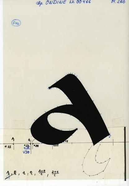
Adrian Frutiger, type design using the letter a, 1980-1996. Museum für Gestaltung Zürich
42 notes
·
View notes
Text

Adrian Frutiger(Font Designer)
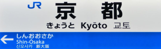
視認性抜群なJR京都駅のフォント。
日本語部分はモリサワの新ゴ・ボールド書体。
欧文部分はスイスの超有名フォントデザイナー、アドリアン・フルティガー氏によるフルティガー・ボールド書体。
スイスは世界で最も多くの有名書体デザイナ��を輩出している国の一つです。
ちなみに京阪の日本語部分はモリサワの新ゴM、欧文はこちらもJRと同じくフルティガーのボールドとなかなかオシャレ。
近鉄の欧文部分もフルティガーのボールド。神戸市営地下鉄も欧文部分は同じくフルティガーのボールド。
京都市営地下鉄の日本語部分は鎌田経世によるゴシック4550というマニアックさ。
阪急の日本語部分はイワタUD丸ゴシックM、欧文部分は定番のヘルベチカのレギュラー書体、駅番号はUD新ゴ DBという変則表示。
最後に阪神の日本語部分は、視覚デザイン研究所のロゴG DBですが、欧文部分はフリーフォントのベルダナというところが大阪らしいです。
フルティガーのもう一つの代表作にアベニール書体というのがあるのですが、1990年代後半、未完成だった残りのライト・ウェイトとヘビー・ウェイトを当時、ドイツのライノタイプ社に所属していた日本のフォントデザイナー、小林章と共同で制作してアベニールの全書体を完成させ、アベニール・ネクストとしてリリースしています。
9 notes
·
View notes
Photo
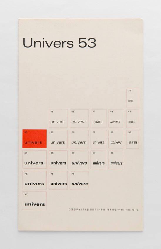
Adrian Frutiger / Deberny & Peignot / Univers 53 / Printed Matter / 1963
128 notes
·
View notes
Photo


hi
#selfies#selfie#adrian frutiger#frutiger aero#frutiger#old internet#puppies#puppy#tokidoki#sanrio#hello kitty#ilovepuppies#old interfaces#2000s
25 notes
·
View notes
Text
When I put my pen to a blank sheet, black isn't added but rather the white sheet is deprived of light. Thus I also grasped that the empty spaces are the most important aspect of a typeface.
Adrian Frutiger
16 notes
·
View notes
Photo
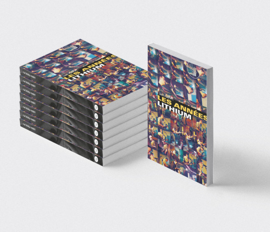

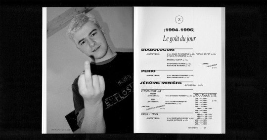

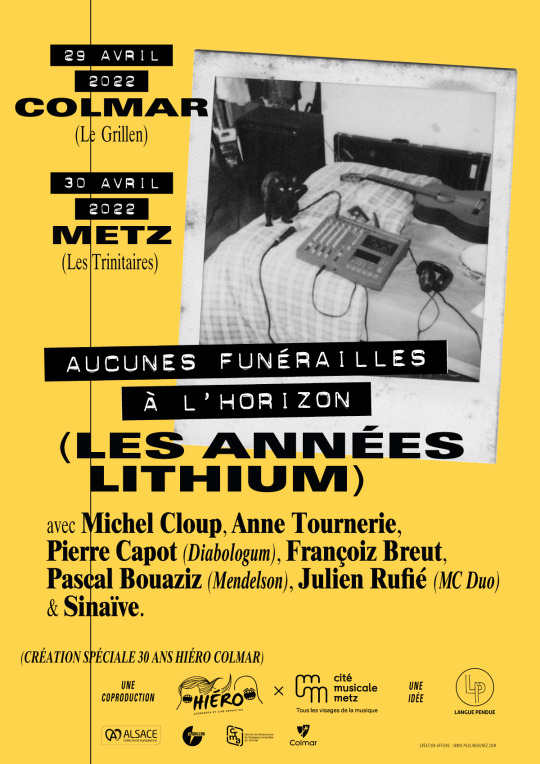

« Les Années Lithium », Langue pendue #11, Renaud Sachet ed., Strasbourg, 2022 »
#collab#typography#graphic design#Times 10#Univers#Adrian Frutiger#yellow#video#vhs#polaroïd#fanzines#magazine#poster#affiche#black and white#metz#colmar#strasbourg#michel cloup#lithium#anne tournerie#diabologum#françoiz breut#mendelson#pascal bouaziz#julien rufié#sinaïve#programme#expérience#arnaud michniak
0 notes
Photo
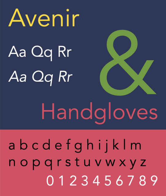


Released in 1988, Avenir is a geometric sans-serif typeface designed by legendary type designer Adrian Frutiger, best known for his Univers and Frutiger designs. Although modeled after Futura (Avenir is the French word for future) and classified as a geometric sans, Avenir has some slightly humanist features that add warmth to the face, such as the tail on the t and the o that isn’t a perfect circle. Frutiger considered Avenir his finest work and it was voted the top favorite font of designers in a recent poll on Typewolf. Avenir is available in six weights—light, book, roman, medium, heavy and black—each with corresponding oblique styles.
It ranks at position 65 among The 100 All Time Best Fonts.
#pangramma#avenir#fonderia: linotype#designer: adrian frutiger#1988#vox: geometric sans serif#top 100
0 notes
Text
Frutiger Aero isn’t a thing
Normally, I wouldn't get annoyed at stuff like this, but I feel it's my sacred duty to be very annoyed.
Adrian Frutiger had nothing to do with Windows aero—he wasn't a graphic designer. Frutiger was a typographer, and he was damn good at it too. Windows Vista/7 may have used Frutiger adjacent typefaces—like Segoe, which first appeared in Windows Vista, and is inspired by the Frutiger typeface—but that doesn't mean that he worked on the operating system.
I'm sorry about being a "well ackshually" weirdo, but in this case it matters—by crediting Adrian Frutiger, you're making it harder to actually appreciate both his, and the Microsoft design team's work.
16 notes
·
View notes
Photo

Adrian Frutiger / Deberny & Peignot / Univers 53 / Printed... https://ift.tt/SrseY54 Telegram: https://t.me/gdesignbot
25 notes
·
View notes
Text

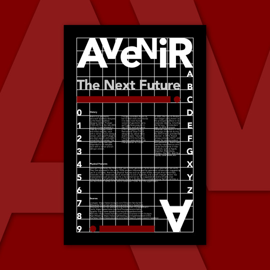
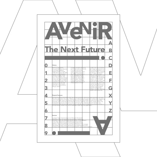
Avenir Typographic Poster Design - Typography Poster
Avenir Typeface Connotations:
When the word "avenir" comes to my mind, I immediately think of the future. The Avenir typeface reminds me of the geometric sans-serif typefaces popular between the 1920s and 1930s. When I see Avenir in books, screens, etc., I feel comfortable reading it, and it motivates me to read more due to its clean and modern design. If my typeface were a person, it would have a modern personality.
History:
Avenir is a geometric sans-serif typeface designed by the Swiss typeface designer Adrian Frutiger (1928–2015) in the late 20th century. It was released in 1988 by Linotype GmbH with three weights, each with a roman and an oblique version, and used Frutiger's two-digit weight and width convention for names. The typeface family was later expanded to six weights, each with a roman and an oblique version.
Frutiger considers Avenir to be his best work and intends it to be a more human version of geometric sans-serif typefaces popular in the 1930s, such as Futura (1927) designed by Paul Renner and Erbar (1922) designed by Jakob Erbar. Avenir means "future" in French and hints that the typeface owes some of its interpretation to Futura.
In 2003, the City of Amsterdam began using Avenir as the principal typeface in its corporate identity, including the famous "I Amsterdam" sign. In 2012, François Hollande used Avenir in his campaign materials during the 2012 French presidential election. In 2014, French railway company SNCF used Avenir for communication and advertising. Avenir was used by many famous companies and brands in their products, such as Apple, Snapchat, Bloomberg, Disney+, the BBC, Best Buy, Toyota, Land Rover, etc.
Physical Features:
Sans-serif typefaces like Avenir that use minimal geometric forms are called geometric san-serifs. They first appeared in the early 1920s and are characterized by geometric construction suggesting use of a compass. Avenir has physical features such as thicker stroke verticals than horizontals, classically drawn lowercase, short ascenders to aid in legibility, and a small x-height. Avenir has characteristics such as a circular O, a horizontal tail on Q, a squared-off end to G with a bar extending to the left and a flat section below, a double-story, a single-story g, flat top vertices, a pointed bottom vertex on M, and a lowercase f taller than the uppercase F.
Sources:
Linotype: https://www.linotype.com/72/avenir-family.html
Wikipedia: https://en.wikipedia.org/wiki/Avenir_(typeface)
Wikipedia: https://en.wikipedia.org/wiki/Adrian_Frutiger#Avenir
Fonts: https://www.fonts.com/font/linotype/avenir/story
Typedia: http://www.typedia.com/explore/typeface/avenir
MyFonts: https://www.myfonts.com/collections/avenir-font-linotype
Right Reading: https://www.rightreading.com/typehead/avenir.htm
YouTube: https://www.youtube.com/results?search_query=avenir+typeface
Thanks for reading!
#poster design#typographic#poster#design#calarts#graphic design#typography#typeface#type#artwork#art#digital art#graphic art#illustration#illustrator#print#lettering#artists on tumblr#creative#modern
4 notes
·
View notes
Text

Adrian Frutiger, M, Régie Autonome des Transports Parisiens (RATP), Paris, 1973 [Museum für Gestaltung Zürich]
#graphic design#visual identity#typography#typeface#alphabet#signage#adrian frutiger#régie autonome des transports parisiens#museum für gestaltung zürich#1970s
39 notes
·
View notes
Photo

Frutiger Adrian Frutiger 1977 @font_showcase is a curated gallery that celebrates the finest typefaces of all time. https://www.fontshowcase.com/ #design #designspiration #designfeed #eyeondesign #fonts #fruitsartclub #generaleclectics #goodtype #graphic #grafik #grafikfeed #graphicindex #graphicdesign #itsnicethat #pangrampangram #printedmatter #selectedwork #simplycooldesign #thedailytype #thedesignblacklist #typedesign #typegang #typecollect #typeface #typespire #typeeverything #typography #typographicdesign #36daysoftype #365typefaces https://www.instagram.com/p/CeBkfYsr1S0/?igshid=NGJjMDIxMWI=
#design#designspiration#designfeed#eyeondesign#fonts#fruitsartclub#generaleclectics#goodtype#graphic#grafik#grafikfeed#graphicindex#graphicdesign#itsnicethat#pangrampangram#printedmatter#selectedwork#simplycooldesign#thedailytype#thedesignblacklist#typedesign#typegang#typecollect#typeface#typespire#typeeverything#typography#typographicdesign#36daysoftype#365typefaces
2 notes
·
View notes
Text
youtube
Preface: This EP is an improvisational project.
What is past? What are memories? What is perception? Nothing and everything at once. What does that even mean, though?
Mind fog thickens when we try to find words for what has passed, it's an impossible conundrum, you cannot solve nor explain it. But images can. Music can.
This is an EP for all the 90s and 2000s kids who grew up with the Frutiger Aero aesthetic. Characterized by glossy, glassy textures, water, fish, plants and skeuomorphism, the nostalgic style should ring a bell for most of us. It truly was a different time. A hopeful time full of optimism.
released November 12, 2023
music and lyrics written by Adrian Chambers
album art drawn by Adrian Chambers
1 note
·
View note
Video
youtube
Test 7 Çağdaş Yayıncılık Aykut ilter Tipografi I 7. ÇAĞDAŞ YAYINCILIK YazdırTüm Cevapları GizleMateryal Listesine Dön ________________________________________ Soru 1: II. Dünya Savaşı sonrasında Batı dünyasının önemli kültür ve sanat merkezi hangi metropol olmuştur? (Çoktan Seçmeli) Londra, Paris, ✔ New York, Roma, Berlin Cevap : New York, ________________________________________ Soru 2: Savaş döneminde askeri amaçlarla çeşitli karmaşık hesaplamaları yapabilmek için geliştirilen cihaz, aygıt veya donanım hangisidir? (Çoktan Seçmeli) Radyo, Televizyon, Teleks, ✔ Bilgisayar, Cep telefonu Cevap : Bilgisayar, ________________________________________ Soru 3: 1948’de bilgisayarların geliştirilmesini ve daha sonraki yıllarda bilgisayar çağının başlamasını sağlayan buluş hangisidir? (Çoktan Seçmeli) Radyatör, ✔ Transistör, Jeneratör, Formatör, Gladyatör Cevap : Transistör, ________________________________________ Soru 4: 1961’de kuru aktarım (dry transfer) yöntemiyle instant lettering (anında veya hazır yazı) ürünü ilk olarak hangi kuruluş tarafından piyasaya sunulmuştur? (Çoktan Seçmeli) Trinitron, Chartpak, DecaDry, MecaNorma, ✔ Letraset Cevap : Letraset ________________________________________ Soru 5: Adrian Frutiger tarafından ‘Univers’ yazı karakteri hangi yıl tasarlanmıştır? (Çoktan Seçmeli) ✔ 1957, 1958, 1959, 1960, 1961 Cevap : 1957, ________________________________________ Soru 6: 1960’ların sonunda görüntülük (ekran) gösterimi üzerindeki işlemlerde bir imleme – ya da belirtme – aracı olarak Douglas Englebert tarafından geliştirilen cihaz hangisidir? (Çoktan Seçmeli) Tablet, Computer, Printer, Plotter, ✔ Mouse Cevap : Mouse ________________________________________ Soru 7: Hangi dizgi teknolojisi “soğuk dizgi” olarak adlandırılır? (Çoktan Seçmeli) Linotype, Monotype, ✔ Typewriter, Intertype, Ludlow Cevap : Typewriter, ________________________________________ Soru 8: II. Dünya Savaşı ve sonrasında Amerikan grafik tasarımında iz bırakan ancak göçmen olmayan sanatçı/tasarımcı aşağıdakilerden hangisidir? (Çoktan Seçmeli) ✔ Joseph Binder, Herbert Bayer, Laszlo Moholy-Nagy, Herbert Matter, Ladislav Sutnar Cevap : Joseph Binder, ________________________________________ Soru 9: Aşağıdaki sanatçı/tasarımcılardan hangisi “İsviçre Okulu” tarzının temsilcisi değildir? (Çoktan Seçmeli) Josepf Müller-Brockmann, Max Huber, Anton Stankowski, ✔ Jean Carlu, Armin Hofmann Cevap : Jean Carlu, ________________________________________ Soru 10: ‘Palatino,’ ‘Melior’ ve ‘Optima’ gibi yaygın olarak kullanılan en önemli yazı karakterlerini 1950’lerde tasarlayan ünlü kaligrafi ve tipografi sanatçısı kimdir? (Çoktan Seçmeli) Rudolf Koch, ✔ Hermann Zapf, Edward Johnston, Max Miedinger, Adrian Frutiger Cevap : Hermann Zapf, Tipografi,ÇAĞDAŞ YAYINCILIK,kültür ve sanat merkezi,New York,Transistör,dry transfer,kuru aktarım,instant lettering,anında veya hazır yazı,Letraset,Adrian Frutiger,Univers,yazı karakteri,görüntülük (ekran),imleme – ya da belirtme,mouse,“soğuk dizgi”,Joseph Binder,“İsviçre Okulu”,palatino,melior,optima,Hermann Zapf,grafik tasarım,tipografi dersi,test çözümü,soru cevap,öğrenci soruları,final,bütünleme,vize,ders notları,final soruları,vize soruları,test
0 notes
Text
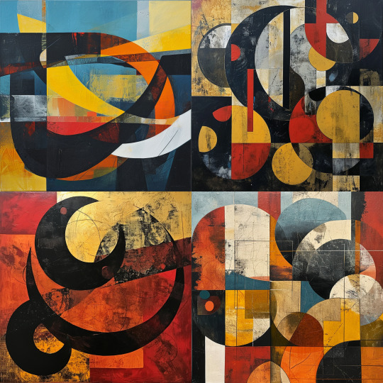
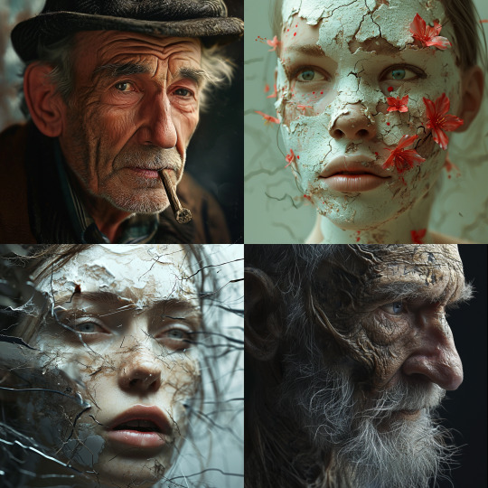
Artist: Adrian Frutiger
Illustration
Painting
Digital/Photorealistic
0 notes
Last Seen Blogs

anobscurename
the sauce of all evil

ferulujobidu
Untitled

thekogu
the Kids Online Games Universe

bestnootropicsnow
Best Nootropics Now

nenebewet
Untitled