#also I might try tabbing at the start of stuff to make it more readable
Text
One of the interesting things about self-publishing is that it's taught me to pay much more attention to the design choices of books -- covers, fonts, layout -- in a way I hadn't understood as a reader.
Right now, I'm working on formatting my upcoming, still not officially announced book, and I'm very much in the stage where I'm thinking about the reader's visual experience. With The Price and Prey of Magic (or Papom for short), I wanted the pages to be crisp with an easy visual flow, so I went with a larger font (most books are between 10 and 12) with generous space between the lines. And I think the format looks great -- it's very relaxing, easy on the eyes. However, it did turn my fairly mid-length fantasy book into a 400+ page book.
This new book is a bit longer, and this time I'm hoping to minimize the page count -- but without sacrificing readability. I've paid a lot of attention to what choices other books have made to see what could be useful to me. Does this or that size font make the book look a little juvenile? How many words can we squeeze on the page before it starts to look like your grandpa's sci-fi paperback from the 1970s? How small should/can the margins be? Let's try adjusting the tab settings...
I learned a lot with Papom, and I've learned stuff in the year since then, and so far I think it's going well.
But then there's also the cover design to think about. I've talked a little about this so far, and I'm coming nicely along as far as making it colorful and intricate and hand-drawn. I think it'll be really beautiful when it's all together.
But the hardest part is definitely the cover font. It needs to fit the "mood" of the book and the artwork, but it can't overwhelm the image. It's got to be easy to read at a glance, but it can't look lifeless and unconsidered.
(And all of the fonts have got to be legal to use. A not-fun fact many writers don't know? Times New Roman is not public domain.)
I'm not yet sure about these cover fonts here -- might use them, might not -- I definitely need to experiment more and get a better feel for what doesn't work before I have a clearer idea of what I want.
I really like doing the cover stuff, but unfortunately there's never a point where a helpful fairy perches on your screen to tell you congratulations, you've done everything the best it could be, this is perfect.
0 notes
Text

Patchouli just learned that she can’t even stand up on stream anymore, even if she turns off the camera. The creaking from her chair as she rises still makes chat go nuts.
#ic#also I might try tabbing at the start of stuff to make it more readable#totally not inspired my someone else's good formatting
3 notes
·
View notes
Text
If you want to write a good story, fanfiction or otherwise, here are some of my humble tips. Keep in mind, every writer has their own style and you can use or ignore these tips as necessary once you’ve discovered or gotten comfortable enough with writing to play around and bend the “rules” a bit. These are just guidelines, but I think they offer a decent starting point.
1) structure is important. Reading is still a visual art, even if most of those “visuals” are done by the imagination. But if someone opens up your story to see a giant intimidating block of text, chances are it won’t be read. Structure also helps the story flow easier, so the reader has to do less work to stay immersed in your created world. Keep your structure friendly to the eye and easy to read by using paragraph breaks (either by tabbing to separate blocks of text or skipping entire lines, depending on your platform). Think of it like allowing your audiences to take the story piece by piece at a time, even on the same page. It helps the story not seem so daunting.
2) This is a sub point of the above, but I see this mistake way too often to not give it its own bullet. START A NEW PARAGRAPH whenever the dialogue SWITCHES. For example, DON’T do;
“Yeah that sounds great,” Barbara agreed, and Tim nodded. “Then we’ll start with Plan Preach.” “Sounds good,” Jason spooked them, appearing out of nowhere.
Instead, do;
“Yeah, that sounds great,” Barbara agreed, and Tim nodded.
“Then we’ll start with Plan Preach,” Tim confirmed firmly. Out of nowhere, Jason appeared while cocking a gun in one hand.
“Sounds good.”
Which one sounds better? Always make sure your readers know without a shadow of a doubt who just finished speaking. Try not to allow for any confusion over who said what line, it can make people disassociate from the story and lose interest.
3) Use a thesaurus or Google to look up synonyms so you don’t use the same word thirty times in one chapter. I still make this mistake too often; learn from my misgivings children.
4) as long as your grammar and spelling are readable, don’t sweat the small stuff. You can always fix it later, but don’t get mad if someone points out that a big spelling or grammar mistake is made. Sometimes “little” mistakes can have a big impact on readability, but everyone makes them. Just fix it and move on.
That covers all the technical stuff. Onto flavor tips. Stuff that I recommend for the story itself.
1) Emotions. Don’t keep your story single-toned, make use of all the emotions you can throughout your story. One shots can use at least two emotions, longer stories (like novel length) are best making you experience as many as pheasibly possible. If you experience too much one emotion, you get numb to it. That ruins the experience entirely. Too much angst, and you just feel dull instead of getting the prick of ice in your chest and the flow of emotion that makes angst so enjoyable. You want your readers to feel, not get numb. That’s why you have to give them emotional pallet cleansers; a dash of humor here, a chapter of anger there, some fluff to soothe the angst before you make them cry so hard they need a new pillow. Trust me, mixing up the emotions and tones of scenes like this can really help you deliver a greater impact with each big plot development or dramatic moment.
2) don’t be afraid of predictability. If you’re putting down deliberate breadcrumbs and your readers catch it, good. They’re paying attention. You can reward them (just refer to Matthew Mercer if you don’t believe me!) by showing them that they were right. Rewarding their attention. Sure, that means you gotta make the reveal that they found out beforehand worth it, but you can play around with that. I have faith in you!
3) Experiment. Practice with characters and subjects that you might not be comfortable with, learn how to write them, and use them to further your story or your writing in general. A good writer is always evolving, but it doesn’t have to be at a fast pace. Experiment a little here and there to add depth.
4) research. You’ll hate me for saying this, but research new things. Become a pseudo-expert in whatever you have to be in order to make your writing convincing, or become a damn good bluffer. You want your readers to believe that you know exactly what you’re talking about.
5) READ. NEVER STOP READING! Good writers read all the time. It doesn’t have to be actual novels or “literature,” it can be poems or fanfics or scripts. Just read and experience stories however possible.
6) observe people around you whoever possible. Researching psychology can help a LOT too, especially when character building and trying to make your characters more three dimensional and realistic. Go out into a public area every once in a while and just people watch. Eavesdrop. It’s for SCIENCE LITERATURE! Just don’t gossip about what you might overhear. That’s not cool.
7) Have fun. If you aren’t having fun writing, it will show in the final product. If you need to stop, stop. Recharge. And if you can’t fall back in love with the story, that’s okay. You don’t owe anyone anything. Just apologize to your loyal readers and explain that you can’t enjoy it anymore. The ones that matter will understand.
Those are my tips. Feel free to ignore any of them if you want, this is just a baseboard for you guys to jump off of as you develop your own style. Love you all as always, and happy writing!
29 notes
·
View notes
Text
Considerations for Making a CSS Framework
Around eight months ago, I started building a framework which would eventually go on to become Halfmoon. I made a post on this very website announcing the launch of the very first version. Halfmoon has been billed as a Bootstrap alternative with a built-in dark mode feature, that is especially good when it comes to building dashboards and tools. All of this still applies to the framework.
However, today I would like to talk about an area of the framework that is a bit understated. I believe our industry as a whole seriously underestimates the value of customization and user personalization, i.e. users being able to set their own design preferences. Chris has written before about knowing who a design system is made for, pointing out a spectrum of flexibility depending on who a system is meant to help.
But it’s more than design systems. Let’s talk about how Halfmoon addresses these issues because they’re important considerations for knowing which framework works best for your specific needs.
Dashboard built using Halfmoon
Who is Halfmoon for?
Before diving in, let’s address an important question: Is Halfmoon the right framework for you? Here’s a list of questions to help you answer that:
Are you building a dashboard, tool, or even a documentation website? Halfmoon has many unique components and features that are specific to these use cases.
Are you familiar with Bootstrap’s class names, but wish that the design was a bit more premium-looking?
Does your users want or expect a dark mode on your website?
Do you dislike dependencies? Halfmoon does not use jQuery, and also has no build process involving CSS preprocessors. Everything is pure, vanilla CSS and JavaScript.
Are you tired of dealing with complex build systems and front-end tooling? This ties in to the previous point. Personally, I find it difficult to deal with front-end tooling and build processes. As mentioned above, Halfmoon has no build process, so you just pull in the files (local, CDN, or npm), and start building.
If you answered yes to any (or all) of these questions, you should probably give Halfmoon a try. It is important to note however, that Halfmoon is not a UI component library for React/Vue/Angular, so you shouldn’t go into it expecting that. Moreover, if you are more fond of purely utility driven development, then Tailwind CSS is a better option for you. When it comes to CSS utilities, Halfmoon takes a middle of the road approach – there are utilities plus semantic classes for common components.
Using CSS custom properties
First, let’s get the easy stuff out of the way. CSS custom properties are incredible, and I expect them to completely replace preprocessor variables in the future. Browser support is already at a solid ~96%, and with Internet Explorer being phased out by Microsoft, they are expected to become a standard feature.
Halfmoon is built entirely using CSS variables because they provide a huge degree of customization. Now, you might immediately think that all this means is that there are a few custom properties for colors sprinkled in there, but it’s more than that. In fact, there are over 1,500 global variables in Halfmoon. Almost everything can be customized by overriding a property. Here’s a nifty example from the docs:
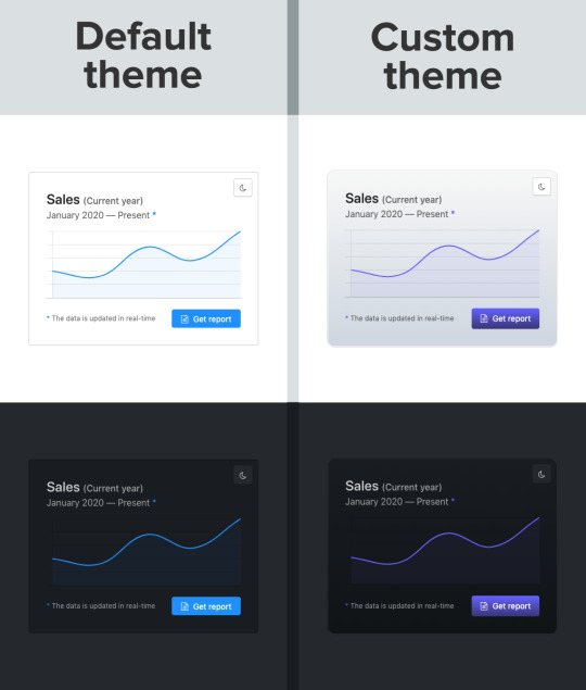
Swapping out a few custom property values opens up a ton of possibilities in Halfmoon, whether it’s theming things for a brand, or tweaking the UI to get just the right look.
That’s what we’re talking about here when it comes to customization: does the system still stand up and work well if the person using it overrides anything. I have written extensively about this (and much more) in the official Halfmoon docs page.
Variables aren’t a new concept to frameworks. Many frameworks actually use Sass or Less variables and have done so for quite a while. That’s still a good and effective way to establish a customizable experience. But at the same time, those will lock into a preprocessor (which, again, doesn’t have to be a bad thing). By relying instead on CSS custom properties — and variable-izing all the things — we are relying on native CSS, and that doesn’t require any sort of build dependency. So, not only can custom properties make it easier to customize a framework, but they are much more flexible in terms of the tech stack being used.
There is a balance to be had. I know I suggested creating variables for everything, but it can be equally tough to manage and maintain scores and scores of variables (just like anything else in the codebase). So, lean heavily on variables to make a framework or design system more flexible, but also be mindful of how much flexibility you need to provide and whether adding another variable is part of that scope.
Deciding what components to include
When it comes to building a CSS framework, deciding what components to include is a big part of that ordeal. Of course, for a developer working on a passion project, you want to include everything. But that is simply not feasible, so a few decisions were made on my part.
As of right now, Halfmoon has most of the components you can find in similar frameworks such as Bootstrap or Bulma. These frameworks are great and widely used, so they are a good frame of reference. However, as I have mentioned already, a unique thing about Halfmoon is the focus on building tools and dashboards on the web. This niche, if you could call it that, has led me to build some unique components and features:
5 different types of sidebars, with built-in toggle and overlay handlers. Sidebars are very important for most dashboards and tools (and a pain to get right), so this was a no brainer.
2 different types of navbars. There is one that sticks to the bottom of the page, which can be used to great effect for action buttons. Think about the actions that pop up when you select items on data-table. You could place those action buttons here.
Omni-directional dropdowns (with 12 different placements, 3 for each direction).
Beautiful form components.
Built-in keyboard shortcut system, with an easy way to declare new ones for your tool.
Tons of utilities. Of course, this is not comparable to Tailwind CSS, but Halfmoon has enough responsive utility classes to handle a lot of use cases right out of the box.
Moreover, the built-in dark mode, huge customizability, and the standard look and feel to the components, should all work together to make Halfmoon a great tool for building web tools and dashboards. And I am hopefully nowhere close to being done! The next updates will bring in a form validator (demo video), more form components, multi-select component, date and time picker, data-table component, etc.
So what is exactly missing from Halfmoon? Well the most obvious ones are tabs, list group, and spinners. But all of these are planned to be added in v1.2.0, which is the next update. There are also other missing components such as carousels, tree navigation, avatars, etc, which are slightly out of scope.
Providing user preferences
Giving end users the ability to set their preferences is often overlooked by frameworks. Things like setting the font size of an article, or whether to use a dark or light theme. In some ways, it’s sort of funny, because the web is catching up to what operating systems have allowed users to do for decades.
Here are some examples of user personalization on the web:
Being able to select your preferred color mode. And, even better, the website automatically saves and respects your preference when the page is loaded. Or better yet, looking at your operating system preferences and automatically accommodating them.
Setting the default size of elements. Especially font size. A small font might look good in a design, but allowing users to set their ideal font size makes the content actually readable. Technically, every modern browser has an option to zoom into content, but that is often unwieldy, and does not actually save your settings.
Setting the compactness of elements. For example, some people prefer large padding with rounded corners, while others find it a waste of space, instead preferring a tighter UI. Sort of like how Gmail lets you decide whether you want a lot of breathing room in your inbox or make it as small and tight as possible to see more content.
Setting the primary color on the website. While this is entirely cosmetic, it is still charming to be able to set your favorite color on every button and link on a website.
Enabling a high contrast mode. Someone pointed this out to me on GitHub. Apparently, many (and I mean many) CSS frameworks often fail the minimum contrast recommended between foreground and background colors on common elements, such as buttons. That list includes Halfmoon. This is often a tradeoff, because overly contrastive elements often look worse (purely in terms of aesthetic). User personalization can allow you to turn on a high contrast mode, if you have difficulty with the default contrast.
Allowing for user personalizations can be really difficult to pull off — especially for a framework — because that would could mean swapping out huge parts of CSS to accommodate the different personalization settings and combinations. However, with a framework like Halfmoon (i.e. built entirely using CSS variables), this becomes trivial as CSS variables can be set and changed on run-time using JavaScript, like so:
// Get the <html> tag (for reading and setting variables in global scope) var myElement = document.documentElement; // Read CSS variable getComputedStyle(myElement).getPropertyValue("--variable-name"); // Set CSS variable myElement.style.setProperty("--variable-name", "value");
Therefore, user personalization can be implemented using Halfmoon in the following way:
The user sets a preference. That basically means a variable value gets changed. The variable is set with JavaScript (as shown above), and the new value is stored in a cookie or local storage.
When the user comes back to the website, their preferences are retrieved and set using JavaScript (again, as shown above) once the page is loaded.
Here are visual examples to really hammer the point home.
Setting and saving the default font size
In the example above, whenever the range slider is changed, the variable --base-font-size is updated to the slider’s value. This is great for people who prefer larger text. As explained in the previous section, this new value can be saved in a cookie or local storage, and the next time the user visits the website, the user preference can be set on page load.
Setting the compactness of content

Because there are CSS custom properties used as utilities, like spacing and borders, we can remove or override them easily to create a more compact or expanded component layout.
Only two variables are updated in this example to go from an expanded view to a compact one:
--content-and-card-spacing changed from 3rem (30px) to 2rem (20px).
--card-border-radius changed from 0.4rem (4px) to 0.2rem (2px).
For a real life scenario, you could have a dropdown that asks the user whether they prefer their content to be Default or Compact, and choosing one would obviously set the above CSS variables to theme the site. Once again, this could be saved and set on page load when the user visits the website on their next session.
Wait, but why?
Even with all the examples I have shown so far, you may still be asking why is this actually necessary. The answer is really simple: one size does not fit all. In my estimate, around half of the population prefers a dark UI, while the other half prefers light. Similarly, people have wild variations about the things they like when it comes to design. User personalization is a form of improving the UX, because it lets the user choose what they prefer. This may not be so important on a landing page, but when it comes to a tool or dashboard (that one has to use for a long time to get something done), having a UI that can be personalized is a boon to productivity. And knowing that is what Halfmoon is designed to do makes it ideal for these types of use cases.
Moreover, you know how people often complain that websites made with a certain framework (eg Bootstrap) all look the same? This is a step toward making sure that websites built with Halfmoon will always look distinct, so that the focus is on the website and content itself, and not on the framework that was used to build it.
Again, I am not saying that everything should be allowed to be personalized. But knowing who the framework is for and what it is designed to do helps make it clear what should be personalized.
Looking ahead
I strongly feel that flexibility for customization and accounting for user preferences are often overlooked on the web, especially in the framework landscape. That’s what I’m trying to address with Halfmoon.
In the future, I want to make it a lot easier for developers to implement user preferences, and also promote diversity of design with new templates and themes. That said, here are some things on the horizon for Halfmoon:
A form validator (demo video)
New components, including range sliders, tabs and spinners
High contrast mode user preference
Multi-select component (like Select2, only without jQuery)
A date and time picker
A data-table component
A GUI-based form builder
More themes and templates
You can, of course, learn more about Halfmoon in the documentation website, and if you want to follow the project, you can give it a star on GitHub.
The post Considerations for Making a CSS Framework appeared first on CSS-Tricks.
You can support CSS-Tricks by being an MVP Supporter.
Considerations for Making a CSS Framework published first on https://deskbysnafu.tumblr.com/
0 notes
Video
youtube

college paper
About me
College Papers Help Online From Academic Writers
College Papers Help Online From Academic Writers To help you make up your mind, see how other customers really feel about our service. We need to share a particular low cost with you in your first purchase. Please leave your email, and we’ll ship you a 10% OFF coupon with an unique promo code. Use it when inserting your order and uncover all the advantages of our firm. Needed this for a writing class, the guide may be very concise and gives good examples. Your professional actually got here by way of, you know, every little thing was accomplished carefully, I obtained an A! You're the best, def will recommend you to my associates. You can examine the quality of our work by taking a look at numerous paper examples in the Samples section on our web site. The finish of the semester is coming, and your term project is simply around the corner? Ordered at BestCustomWriting.com, it'll present your competence in the easiest way possible, showcasing your expertise and providing you with the amount of time adequate for different issues. Gotta be honest - I totally skipped my homework to go to the live performance. Singing alongside and jamming to my fav rock ballads was far more fun than sweating over a paper that may be carried out by professionals. Were you assigned to create a detailed PowerPoint presentation? We will create a novel design based on your self-discipline and matter and stuff it with essentially the most relevant and absorbing information and numerous media. 30 days past the order download, your paper will be routinely deleted from our database. To really give yourself the benefit and make sure you’ve proofread your work to one of the best of your capacity, you should learn your paper backwards and out loud. All of the feedback they supply is effective and ought to be used on the next paper as a reference for what the expectations are going to be. The reality is, depending on your discipline, there could also be just one type of style that you have to use, ever. However, this isn't saying the foundations for the way to properly cite sources and references is not going to proceed to change and evolve over time. Fourth, to persuade your reader that your thesis is correct, you should support your viewpoint with evidence. Use quotations and examples out of your readings and from lectures to show your points. Third, your essay should take your reader by the hand and guide him or her through the process of thought resulting in the conclusions you need your reader to draw. You ought to assume that your reader is clever however does not essentially know the fabric you are presenting. Thus, if certain details are crucial to an essay, you should present them as such, and you can not assume that the reader already is aware of them. Writers sometimes use part headings to enhance a doc’s readability. These sections could include individual chapters or other named components of a guide or essay. Do not make a title page on your paper except particularly requested. Use italics all through your essay to point the titles of longer works and, only when absolutely necessary, present emphasis. You will get a a hundred% unique, mistake-free paper. It will be written from scratch and checked for plagiarism earlier than we deliver it to you. With specialists in a variety of matters, the Rutgers–Camden Faculty Experts Guide might help members of the media find the right college skilled in your publication or program. I don’t avoid procrastination, I’m embarrassed to say! But what I do is to start out early and work my means toward assembly writing duties by spreading the work out. I additionally share early drafts with folks whose opinions I value, even if it’s only a few paragraphs or main points. MLA recommends that when dividing an essay into sections you quantity these sections with an Arabic number and a period followed by an area and the part name. Indent the first line of each paragraph one half-inch from the left margin. MLA recommends that you just use the “Tab” key as opposed to pushing the area bar five times. Double-house the text of your paper and use a legible font (e.g. Times New Roman). Whatever font you select, MLA recommends that the regular and italics sort kinds contrast enough that they're every distinct from each other. Second, you must embody only the information in your essay that's relevant to the query you're addressing. Other information, whether factually right or not, is irrelevant. It confuses your reader and obscures the point you are trying to argue. I love the idea of enhancing the paper by reading it backwards.
0 notes
Text
The One-Hour Guide to SEO: Keyword Targeting & On-Page Optimization – Whiteboard Friday
Posted by randfish
We’ve covered strategy, keyword research, and how to satisfy searcher intent — now it’s time to tackle optimizing the webpage itself! In the fourth part of the One-Hour Guide to SEO, Rand offers up an on-page SEO checklist to start you off on your way towards perfectly optimized and keyword-targeted pages.
If you missed them, check out the other episodes in the series so far:
The One-Hour Guide to SEO, Part 1: SEO Strategy
The One-Hour Guide to SEO, Part 2: Keyword Research
The One-Hour Guide to SEO, Part 3: Searcher Satisfaction
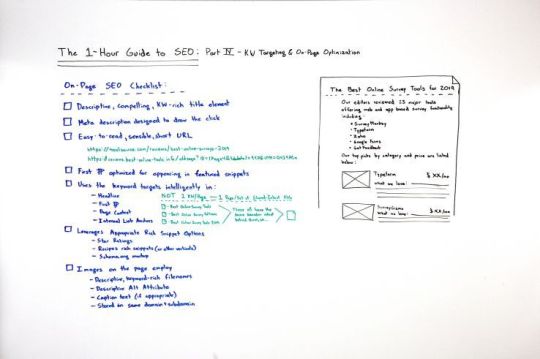
Click on the whiteboard image above to open a high resolution version in a new tab!
Video Transcription
Howdy, Moz fans. Welcome to another edition of our special One-Hour Guide to SEO. We are now on Part IV – Keyword Targeting and On-Page Optimization. So hopefully, you’ve watched Part III, where we talked about searcher satisfaction, how to make sure searchers are happy with the page content that you create and the user experience that you build for them, as well as Part II, where we talked about keyword research and how to make sure that you are targeting the right words and phrases that searchers are actually looking for, that you think you can actually rank for, and that actually get real organic click-through rate, because Google’s zero-click searches are rising.

Now we’re into on-page SEO. So this is essentially taking the words and phrases that we know we want to rank for with the content that we know will help searchers accomplish their task. Now how do we make sure that the page is optimal for ranking in Google?
On-page SEO has evolved
Well, this is very different from the way it was years ago. A long time ago, and unfortunately many people still believe this to be true about SEO, it was: How do I stuff my keywords into all the right tags and places on the page? How do I take advantage of things like the meta keywords tag, which hasn’t been used in a decade, maybe two? How do I take advantage of putting all the words and phrases stuffed into my title, my URL, my description, my headline, my H2 through H7 tags, all these kinds of things?
Most of that does not matter, but some of it still does. Some of it is still important, and we need to run through what those are so that you give yourself the best possible chance for ranking.
The on-page SEO checklist
So what I’ve done here is created a sort of brief, on-page SEO checklist. This is not comprehensive, especially on the technical portion, because we’re saving that for Part V, the technical SEO section, which we will get into, of this Guide. In this checklist, some of the most important things are on here.

Descriptive, compelling, keyword-rich title element
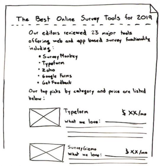
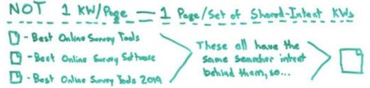
Many of the most important things are on here, and those include things like a descriptive, compelling, keyword-rich but not stuffed title element, also called the page title or a title tag. So, for example, if I am a tool website, like toolsource.com — I made that domain name up, I assume it’s registered to somebody — and I want to rank for the “best online survey tools,” well, “The Best Online Survey Tools for 2019” is a great title tag, and it’s very different from best online survey tools, best online survey software, best online survey software 2019. You’ve seen title tags like that. You’ve seen pages that contain stuff like that. That is no longer good SEO practices.
So we want that descriptive, compelling, makes me want to click. Remember that this title is also going to show up in the search results as the title of the snippet that your website appears in.
Meta description designed to draw the click
Second, a meta description. This is still used by search engines, not for rankings though. Sort of think of it like ad text. You are drawing a click, or you’re attempting to draw the click. So what you want to do is have a description that tells people what’s on the page and inspires them, incites them, makes them want to click on your result instead of somebody else’s. That’s your chance to say, “Here’s why we’re valuable and useful.”
Easy-to-read, sensible, short URL
An easy-to-read, sensible, short URL. For example, toolsource.com/reviews/best-online-surveys-2019. Perfect, very legible, very readable. I see that in the results, I think, “Okay, I know what that page is going to be.” I see that copied and pasted somewhere on the web, I think, “I know what’s going to be at that URL. That looks relevant to me.”
Or reviews.best-online-tools.info. Okay, well, first off, that’s a freaking terrible domain name. /oldseqs?ide=17 bunch of weird letters and tab detail equals this, and UTM parameter equals that. I don’t know what this is. I don’t know what all this means. By the way, having more than one or two URL parameters is very poorly correlated with and not recommended for trying to rank in search results. So you want to try and rewrite these to be more friendly, shorter, more sensible, and readable by a human being. That will help Google as well.
First paragraph optimized for appearing in featured snippets
That first paragraph, the first paragraph of the content or the first few words of the page should be optimized for appearing in what Google calls featured snippets. Now, featured snippets is when I perform a search, for many queries, I don’t just see a list of pages. Sometimes I’ll see this box, often with an image and a bunch of descriptive text that’s drawn from the page, often from the first paragraph or two. So if you want to get that featured snippet, you have to be able to rank on page one, and you need to be optimized to answer the query right in your first paragraph. But this is an opportunity for you to be ranking in position three or four or five, but still have the featured snippet answer above all the other results. Awesome when you can do this in SEO, very, very powerful thing. Featured snippet optimization, there’s a bunch of resources on Moz’s website that we can point you to there too.
Featured Snippets: From Start to Finish
How to Discover Featured Snippet Opportunities – Whiteboard Friday
How to Target Featured Snippet Opportunities – Whiteboard Friday
Use the keyword target intelligently in…
The headline
So if I’m trying to rank for “best online survey tools,” I would try and use that in my headline. Generally speaking, I like to have the headline and the title of the piece nearly the same or exactly the same so that when someone clicks on that title, they get the same headline on the page and they don’t get this cognitive dissonance between the two.
The first paragraph
The first paragraph, we talked about.
The page content
The page’s content, you don’t want to have a page that’s talking about best online survey tools and you never mention online surveys. That would be a little weird.
Internal link anchors
An internal link anchor. So if other places on your website talk about online survey tools, you should be linking to this page. This is helpful for Google finding it, helpful for visitors finding it, and helpful to say this is the page that is about this on our website.
I do strongly recommend taking the following advice, which is we are no longer in a world where it makes sense to target one keyword per page. For example, best online survey tools, best online survey software, and best online survey tools 2019 are technically three unique keyword phrases. They have different search volumes. Slightly different results will show up for each of them. But it is no longer the case, whereas it was maybe a decade ago, that I would go create a page for each one of those separate things.
Instead, because these all share the same searcher intent, I want to go with one page, just a single URL that targets all the keywords that share the exact same searcher intent. If searchers are looking to find exactly the same thing but with slightly modified or slight variations in how they phrase things, you should have a page that serves all of those keywords with that same searcher intent rather than multiple pages that try to break those up, for a bunch of reasons. One, it’s really hard to get links to all those different pages. Getting links just period is very challenging, and you need them to rank.
Second off, the difference between those is going to be very, very subtle, and it will be awkward and seem to Google very awkward that you have these slight variations with almost the same thing. It might even look to them like duplicate or very similar or low-quality content, which can get you down-ranked. So stick to one page per set of shared intent keywords.
Leverage appropriate rich snippet options
Next, you want to leverage appropriate rich snippet options. So, for example, if you are in the recipes space, you can use a schema markup for recipes to show Google that you’ve got a picture of the recipe and a cooking time and all these different details. Google offers this in a wide variety of places. When you’re doing reviews, they offer you the star ratings. Schema.org has a full list of these, and Google’s rich snippets markup page offers a bunch more. So we’ll point you to both of those as well.
Images on the page employ…
Last, but certainly not least, because image search is such a huge portion of where Google’s search traffic comes from and goes to, it is very wise to optimize the images on the page. Image search traffic can now send significant traffic to you, and optimizing for images can sometimes mean that other people will find your images through Google images and then take them, put them on their own website and link back to you, which solves a huge problem. Getting links is very hard. Images is a great way to do it.
Descriptive, keyword-rich filenames
The images on your page should employ descriptive, keyword-rich filenames, meaning if I have one for typeform, I don’t want it to be pick one, two or three. I want it to be typeformlogo or typeformsurveysoftware as the name of the file.
Descriptive alt attributes
The alt attribute or alt tag is part of how you describe that for screen readers and other accessibility-focused devices, and Google also uses that text too.
Caption text (if appropriate)
Caption text, if that’s appropriate, if you have like a photograph and a caption describing it, you want to be descriptive of what’s actually in the picture.
Stored in same domain and subdomain
These files, in order to perform well, they generally need to be hosted on the same domain and subdomain. If, for example, all your images are stored on an Amazon Web Services domain and you don’t bother rewriting or making sure that the domain looks like it’s on toolsource.com/photos or /images here, that can cause real ranking problems. Oftentimes you won’t perform at all in Google images because they don’t associate the image with the same domain. Same subdomain as well is preferable.
If you do all these things and you nail searcher intent and you’ve got your keyword research, you are ready to move on to technical SEO and link building and then start ranking. So we’ll see you for that next edition next week. Take care.
Video transcription by Speechpad.com
Sign up for The Moz Top 10, a semimonthly mailer updating you on the top ten hottest pieces of SEO news, tips, and rad links uncovered by the Moz team. Think of it as your exclusive digest of stuff you don’t have time to hunt down but want to read!
Source link
0 notes
Text
The One-Hour Guide to SEO: Keyword Targeting & On-Page Optimization – Whiteboard Friday
Posted by randfish
In the fourth part of the One-Hour Guide to SEO, Rand offers up an on-page SEO checklist to start you off on your way towards perfectly optimized and keyword-targeted pages.
If you missed them, check out the other episodes in the series so far:
The One-Hour Guide to SEO, Part 1: SEO Strategy
The One-Hour Guide to SEO, Part 2: Keyword Research
The One-Hour Guide to SEO, Part 3: Searcher Satisfaction
https://fast.wistia.net/embed/iframe/mho6yl0p39?seo=false&videoFoam=true
https://fast.wistia.net/assets/external/E-v1.js
Click on the whiteboard image above to open a high resolution version in a new tab!
Video Transcription
Howdy, Moz fans. Welcome to another edition of our special One-Hour Guide to SEO. We are now on Part IV – Keyword Targeting and On-Page Optimization. So hopefully, you’ve watched Part III, where we talked about searcher satisfaction, how to make sure searchers are happy with the page content that you create and the user experience that you build for them, as well as Part II, where we talked about keyword research and how to make sure that you are targeting the right words and phrases that searchers are actually looking for, that you think you can actually rank for, and that actually get real organic click-through rate, because Google’s zero-click searches are rising.
Now we’re into on-page SEO. So this is essentially taking the words and phrases that we know we want to rank for with the content that we know will help searchers accomplish their task. Now how do we make sure that the page is optimal for ranking in Google?
On-page SEO has evolved
Well, this is very different from the way it was years ago. A long time ago, and unfortunately many people still believe this to be true about SEO, it was: How do I stuff my keywords into all the right tags and places on the page? How do I take advantage of things like the meta keywords tag, which hasn’t been used in a decade, maybe two? How do I take advantage of putting all the words and phrases stuffed into my title, my URL, my description, my headline, my H2 through H7 tags, all these kinds of things?
Most of that does not matter, but some of it still does. Some of it is still important, and we need to run through what those are so that you give yourself the best possible chance for ranking.
The on-page SEO checklist
So what I’ve done here is created a sort of brief, on-page SEO checklist. This is not comprehensive, especially on the technical portion, because we’re saving that for Part V, the technical SEO section, which we will get into, of this Guide. In this checklist, some of the most important things are on here.

Descriptive, compelling, keyword-rich title element
Many of the most important things are on here, and those include things like a descriptive, compelling, keyword-rich but not stuffed title element, also called the page title or a title tag. So, for example, if I am a tool website, like toolsource.com — I made that domain name up, I assume it’s registered to somebody — and I want to rank for the “best online survey tools,” well, “The Best Online Survey Tools for 2019” is a great title tag, and it’s very different from best online survey tools, best online survey software, best online survey software 2019. You’ve seen title tags like that. You’ve seen pages that contain stuff like that. That is no longer good SEO practices.
So we want that descriptive, compelling, makes me want to click. Remember that this title is also going to show up in the search results as the title of the snippet that your website appears in.
Meta description designed to draw the click
Second, a meta description. This is still used by search engines, not for rankings though. Sort of think of it like ad text. You are drawing a click, or you’re attempting to draw the click. So what you want to do is have a description that tells people what’s on the page and inspires them, incites them, makes them want to click on your result instead of somebody else’s. That’s your chance to say, “Here’s why we’re valuable and useful.”
Easy-to-read, sensible, short URL
An easy-to-read, sensible, short URL. For example, toolsource.com/reviews/best-online-surveys-2019. Perfect, very legible, very readable. I see that in the results, I think, “Okay, I know what that page is going to be.” I see that copied and pasted somewhere on the web, I think, “I know what’s going to be at that URL. That looks relevant to me.”
Or reviews.best-online-tools.info. Okay, well, first off, that’s a freaking terrible domain name. /oldseqs?ide=17 bunch of weird letters and tab detail equals this, and UTM parameter equals that. I don’t know what this is. I don’t know what all this means. By the way, having more than one or two URL parameters is very poorly correlated with and not recommended for trying to rank in search results. So you want to try and rewrite these to be more friendly, shorter, more sensible, and readable by a human being. That will help Google as well.
First paragraph optimized for appearing in featured snippets
That first paragraph, the first paragraph of the content or the first few words of the page should be optimized for appearing in what Google calls featured snippets. Now, featured snippets is when I perform a search, for many queries, I don’t just see a list of pages. Sometimes I’ll see this box, often with an image and a bunch of descriptive text that’s drawn from the page, often from the first paragraph or two. So if you want to get that featured snippet, you have to be able to rank on page one, and you need to be optimized to answer the query right in your first paragraph. But this is an opportunity for you to be ranking in position three or four or five, but still have the featured snippet answer above all the other results. Awesome when you can do this in SEO, very, very powerful thing. Featured snippet optimization, there’s a bunch of resources on Moz’s website that we can point you to there too.
Featured Snippets: From Start to Finish
How to Discover Featured Snippet Opportunities – Whiteboard Friday
How to Target Featured Snippet Opportunities – Whiteboard Friday
Use the keyword target intelligently in…
The headline
So if I’m trying to rank for “best online survey tools,” I would try and use that in my headline. Generally speaking, I like to have the headline and the title of the piece nearly the same or exactly the same so that when someone clicks on that title, they get the same headline on the page and they don’t get this cognitive dissonance between the two.
The first paragraph
The first paragraph, we talked about.
The page content
The page’s content, you don’t want to have a page that’s talking about best online survey tools and you never mention online surveys. That would be a little weird.
Internal link anchors
An internal link anchor. So if other places on your website talk about online survey tools, you should be linking to this page. This is helpful for Google finding it, helpful for visitors finding it, and helpful to say this is the page that is about this on our website.
I do strongly recommend taking the following advice, which is we are no longer in a world where it makes sense to target one keyword per page. For example, best online survey tools, best online survey software, and best online survey tools 2019 are technically three unique keyword phrases. They have different search volumes. Slightly different results will show up for each of them. But it is no longer the case, whereas it was maybe a decade ago, that I would go create a page for each one of those separate things.
Instead, because these all share the same searcher intent, I want to go with one page, just a single URL that targets all the keywords that share the exact same searcher intent. If searchers are looking to find exactly the same thing but with slightly modified or slight variations in how they phrase things, you should have a page that serves all of those keywords with that same searcher intent rather than multiple pages that try to break those up, for a bunch of reasons. One, it’s really hard to get links to all those different pages. Getting links just period is very challenging, and you need them to rank.
Second off, the difference between those is going to be very, very subtle, and it will be awkward and seem to Google very awkward that you have these slight variations with almost the same thing. It might even look to them like duplicate or very similar or low-quality content, which can get you down-ranked. So stick to one page per set of shared intent keywords.
Leverage appropriate rich snippet options
Next, you want to leverage appropriate rich snippet options. So, for example, if you are in the recipes space, you can use a schema markup for recipes to show Google that you’ve got a picture of the recipe and a cooking time and all these different details. Google offers this in a wide variety of places. When you’re doing reviews, they offer you the star ratings. Schema.org has a full list of these, and Google’s rich snippets markup page offers a bunch more. So we’ll point you to both of those as well.
Images on the page employ…
Last, but certainly not least, because image search is such a huge portion of where Google’s search traffic comes from and goes to, it is very wise to optimize the images on the page. Image search traffic can now send significant traffic to you, and optimizing for images can sometimes mean that other people will find your images through Google images and then take them, put them on their own website and link back to you, which solves a huge problem. Getting links is very hard. Images is a great way to do it.
Descriptive, keyword-rich filenames
The images on your page should employ descriptive, keyword-rich filenames, meaning if I have one for typeform, I don’t want it to be pick one, two or three. I want it to be typeformlogo or typeformsurveysoftware as the name of the file.
Descriptive alt attributes
The alt attribute or alt tag is part of how you describe that for screen readers and other accessibility-focused devices, and Google also uses that text too.
Caption text (if appropriate)
Caption text, if that’s appropriate, if you have like a photograph and a caption describing it, you want to be descriptive of what’s actually in the picture.
Stored in same domain and subdomain
These files, in order to perform well, they generally need to be hosted on the same domain and subdomain. If, for example, all your images are stored on an Amazon Web Services domain and you don’t bother rewriting or making sure that the domain looks like it’s on toolsource.com/photos or /images here, that can cause real ranking problems. Oftentimes you won’t perform at all in Google images because they don’t associate the image with the same domain. Same subdomain as well is preferable.
If you do all these things and you nail searcher intent and you’ve got your keyword research, you are ready to move on to technical SEO and link building and then start ranking. So we’ll see you for that next edition next week. Take care.
Video transcription by Speechpad.com
Sign up for The Moz Top 10, a semimonthly mailer updating you on the top ten hottest pieces of SEO news, tips, and rad links uncovered by the Moz team. Think of it as your exclusive digest of stuff you don’t have time to hunt down but want to read!
from https://dentistry01.wordpress.com/2019/04/05/the-one-hour-guide-to-seo-keyword-targeting-on-page-optimization-whiteboard-friday/
0 notes
Text
2016-2017 School Year Reflection Masterpost✨
since the school year is coming to an end, i wanted to make a post about what worked and didn’t work for me, and also things i would like to try for the upcoming school year! i’ve noticed past years i tend to burn out around spring, so i’m trying what i can to prevent that!
so, i’ll start off with what didn’t work:
• using a 5-subject notebook for my classes – too many pages, I couldn’t fill up the whole notebook. Most of it is empty + it’s just way too big
• procrastinating – we’re all guilty of it, especially me. Every time I feel upset I do something else rather than work, and end up starting my work late at night, making me lose sleep
• making my notes too colorful – I found it better for me to stick to one color scheme every time I takes notes. For ex. One day red, the other blue, etc., rather than having the rainbow throw up on one page of paper. It gets too distracting and time consuming
• pens that are too thick – the ink bleeds through and most of the time your writing doesn’t look neat or coherent, you want your notes to be readable for you in the future so you don’t spend a long time trying to decipher what you wrote, use a .5 or .38 pen instead
• folders – rip easily, can’t organize well, need I say more
what worked:
• 1 ½ - 2 in. binder – LIFESAVER AND SPACE MAKER !! I used tabs to divide my classes and it’s just sooo much easier having everything in one place rather than all over the place in multiple forms of storage, making your bag even bulkier. They are also easier to organize as you can just flip through the binder rather than take out all the papers and sort through them like you would in a folder. Some classes may require you to have a big binder (usually 2 in) just for that class, but in my experience, I’d just transfer the work over when needed. If it’s a small 1 inch binder, it may not be a problem to bring it. This may not always work, as some teachers may require you to bring it everyday, but I’m just speaking from my experience.
• AN AGENDA - my lifeline, I literally do not know what I would do without it. Do NOT say you’ll just remember everything bc you WILL forget, that’s just how it works. I write down everything I have due in an agenda and if u want to be extra like me I also use the app Todoist for extra measure
• Write dates on all your work! – helps keep you chronologically organized as well as making it more efficient to find work when needed
• Dividing work between days – do NOT do 10 assignments in one night, I’ve done it and let me tell you, its not fun at all. Do a little every day, and it’s okay if you don’t meet your goal, doing something is more than nothing!
• Cleaning out your backpack every few weeks – I’m one of those people that kind of just let old gum packets load up in my bag (im srry its gross). Cleaning out your bag helps you feel more prepared in a way, imo its satisfying, makes me feel motivated. Less clutter makes you feel more organized
• Make flash cards of what you don’t know – I learn using repetition, and I found flashcards help a LOT, use different colored flashcards for different areas of a subject ex. Blue for historical people, pink for historical events, etc
• Knowing your boundaries – don’t stress yourself, don’t take a class you know you won’t be able to handle. At the end of the day, your physical and mental health are way more important. Take rests and drink lots of fluids
Treat urself once in awhile, remember u worked hard and u deserve it!!
what i want to try:
• Waking up early, I have a bad habit of sleeping in until the afternoon on days off, so I want to wake up early so I can get more work done!
• Using loose-leaf paper instead of notebooks, or maybe just using small notebooks for each class to prevent my backpack from getting bulky (still debating, pls recommend nice small notebooks if u can :-))
• SLEEPING EARLIER!!!!!!! I’ve been going to sleep so late and it messes up my whole schedule, idek how I got through this school year. I want to go to bed by 12 AM or earlier
• Eat healthier and be more active – I was doing good with this up until spring.. everything just crashed and burned lmao I need to learn how to cook so im healthier + my skin gets better • Be a little more organized + clean my stuff out more often • Use only one color scheme per week in each class (hoping to make a rainbow effect with my notes hehe)
i might add more later, and remember these r just methods that helped me, they may not apply to everyone ~
i’ll be posting a stationery haul soon so stay tuned for that :)
#school#studying#studyblr#study#studyspo#study motivation#study mood#notes#student#study inspiration#mildliner#pilot juice#motivation#tombow#muji#lihitlab#zebra sarasa
2 notes
·
View notes
Text
Coding Conventions
I've had a few people ask how I layout my code. So here's a quick overview. Of course coding conventions is a very touchy topic for a lot of programmers, so don't take this as the 'best' approach or anything. It's just what works for me. A lot of it has been inspired by various other guides such as the Google C++ Style Guide so look at those too.
Files
Naming Conventions
Rule: .cpp for C++ source files, .hpp for C++ header files.
Justification: Mostly makes it obvious what a file is written in. If you've ever included a C file without extern C and it didnt support c++ correctly, you know why this is useful.
General Indentation
Rule: Tabs for indentation, spaces for alignment.
Justification: This is probably the number one things programmers argue about. Personally, I find the benefit of having a specific alignment character nicer then not. And I hate typing lots of spaces in code (python) that requires it (or YAML : even if my editor is setup for tab=spaces, it always puts the cursor in the wrong place). Or even this stupid markdown editor because Tumblr doesnt understand triple grave code blocks properly *kicks*.
Header Guards
Rule: Use old style C #define header guards, generally named from the project down (like WOLFCORE_THREAD_HPP ).
Justification: I know some people prefer #pragma once and it's supported practically everywhere, but it's still non-standard. This is mostly a 'I'm used to it' type thing, and theirs a few cases where its useful. Like for example, you want to guarantee a certain file was included before you (like the hell that is Windows.h).
Forward declarations
Rule: Prefer forward declarations for classes to using includes.
Justification: This is something I never cared about till my compile times increased due to how big my projects have gotten. C++ also has a lot of constructs (templates, inlines) which require headers to be included so its best to give it as much of a help as possible. When modules becomes standardized, hopefully it'll help with this.
Documentation
Rule: Everything in headers should be documented. In source files, just readable comments are needed.
Justfication: For me, header files are like the index of a book. The main reason I'm looking through them is for an API I need, or need to learn how to use a class. Having everything documented and neatly sectioned makes this easy (especially when combined with doxygen). I definitely document more than most people do, but its come in handy too many times to count when coming back to a class I wrote years before and completely forgot the quirks a class has.
The one other related big rule is if something happens such as a crash due to using an API wrong, the documentation for that function must have pointed that out. If it did, I as a user of the function was wrong : if it doesn't, that's a bug in the function (either it should point it out, or the function needs to be fixed). This rule alone has improved stability of my programs, because just making it not crash anymore doesn't mean its actually fixed. And if its possible for the function to detect that condition (in debug mode) and abort, it is required to. If you can get every crash down to where the app detects it before the system does, that is huge. Its much nicer to get a 'Abort: Tried to access a null pointer here [backtrace]' instead of 'SIGSEGV'.
Naming Conventions
Macros
Rule: Macros will be named in all capitals. WOLF_APPLICATION() for example.
Justification: This keeps the preprocessor neatly seperated from the rest of the language. Anything in all caps or with #stuff you know happens before the compiler runs.
Constants
Rule: Constants will be CapitalCamelCase. Note this generally only applies to full constants, and not just variables marked 'const'.
Justifcation: With variables being different, this makes it easy to tell if something's designed to be assignable or not.
Variables
Rule: Variables will be lowerCamelCase (with the exceptions of prefixes). Variable names can have a prefix of '[letters]_[name]' if they fall into specific categories. Namely:
m : A member variable
s : A static variable (usually file scope)
A variable might also have postfix names too, though thats mostly up to the module. Common ones are S for seconds (durationS), str for string (durationStr) and so on.
Justfication: The lowerCamelCase is basically to counter with constants, so at a glance you can tell the basics of a type. With the prefixes, you also know the scope of a variable and cannot easily get confused between local variables and long living variables like members. The final part about prefixes is a form of Application Hungarian Notation (not to be confused with Systems Hungarian (ala lpCmdLine) which is what Windows uses and is annoying to work with).
Namespaces/Classes/Structs/Enums/Unions
Rule: Containers will use CapitalCamelCase, very much like constants. Add 'Private' somewhere to the name if its for internal use.
Justfication: Mostly distinctiveness again. The mixing between constants and containers also generally isnt a problem, and the compiler will point it out if you accidently use one at the other.
Functions/Methods
Rule: Functions/Methods will use lowerCamelCase with one of the prefixes below if required. Generally functions if they return a value should have the return as part of the name (aka do not do val = calculate(), instead val = calculateLength()). Setters start with set while get just name the value. Prefixes used include:
p : Protected/Private function - not callable outside the class and/or decendents.
i : Internal function - might be public, but isn't part of the common/normal interface. Be careful!
s : Static function - limited to the file. Note that this ISNT used for class static functions (since they are public interface).
v : Virtual function. See Private Virtuals below for more details. Not public generally.
r : CRTP function. Called by one of the classes we inherit from. Not public.
Justification: The difference from other constants makes it easier to deal names. You can tell instantly that WolfCore::Module is some form of container, while WolfCore::Module::v_init is a virtual function. The mixing with variables isn't an issue since they are never valid in the same contexts.
The setter/getter thing is mostly a question of style. The goal is to make public usage as straightforward as possible, and allow information hiding as easily as possible (since it costs 0 due to inlining). With the member variable rule above, this then means you have something like:
m_value : The member variable 'value' which stores the value.
value() : A function to retreieve the member variable 'value'.
setValue(Type&) : A function to set the member variable 'value'.
And now probably the most distinct thing in my style: the function prefixes. Anything off the normal public path has a prefix, which allows devs to know the category of a function without affecting users of the class. I'll explain each rule individually, and justify them seperately.
p_function() : Protected/Private functions. These are functions the normal user shouldnt ever care about, so theirs no reason it should come up in code-completion/etc. When using certain APIs, I've tried to call a function only to realize it was private, and was just part of the code because of how classes work. While IDEs try to show them differently, a little icon change isn't easily noticable. This makes it a lot more obvious. There is no distinction between protected/private because I default everything to private, and the few cases you use protected, you know what you're doing (since you're working on the backend of the class).
i_function() : 'Internal' public functions. There is a few cases where you need a function to be public that really shouldn't be - but for some reason friend wont solve it, or makes an even bigger mess. Internal functions allow you to public something, yet its still not a 'normal' function. If you ever see a call to one of these, its a big warning sign that its doing something odd. An example in Wolf is Matrix::i_fromEigenMatrix() : nothing in Wolf publically should depend on my matrix implementation being eigen, yet its needed for some of the helper classes to be able to easily pass things around.
s_function() : Static per file functions. This is mostly used for private helper functions for classes which arent part of the public interface. Mostly they'll end up in an anonymous namespace. Things like s_initKeyboardTable() in various window drivers that just setup a global table for looking up keyboard keys. Note this is not used for static class functions. Those use normal naming conventions (like Manager::manager()).
v_function() : This is Private Virtuals. More details at the end, but it is a way to seperate virtual implementations from the actual calling interface. You almost never call a v_function() directly, but it marks the interface a parent class might call you with.
r_function() : CRTP. If you don't need the runtime calling abilities that virtuals provide, CRTP allows you to require a specific interface thats completely resolved at compile time (mostly at 0 cost due to inling). From a code writer perspective, its the same as a virtual v_function(). Might write a blog post about CRTP someday, cause it's a handy technique that a lot of people don't know about.
All of these are cases where you're either limited where you can call it, or you need to be careful when you're calling it. Having these special function prefixes have helped me a lot.
Indentation/Spacing Rules
This is more of the 'feel good' type rules. Can't really justify most of them other then its just how I do things.
Tabs (Literal tab character, editor view set to 4 spaces)
Mostly Allman style in formatting. I've experimented a bit with others such as 1TBS, but while Allman loses a bit in density its pretty nice to read.
Spaces arround operators, keywords, etc
I do allow single statement constructs such as if, but been trying to get away with a condensed Allman for those cases.
Example:
if (condition) { break; }
instead of
if (condition) break;
Spaces after function names.
Namespaces use Allman, but if multiple namespace are grouped together, I use one line. I don't need this as much as I used to, but this probably the number one thing that editors despise me doing (they keep trying to fix it). This is mostly to prevent indentation explosion.
Example:
namespace Wolf { namespace Core { class A; } }
C++17 will add namespace Wolf::Core which will help.
Decorations on variables go with the types: aka const Type* t. Yes I know if you're abusing C this looks weird (the char* a, b example) but the answer is to stop abusing C. Yes its technically part of the variable not the value, yes its 'how you use it' and 'not part of its type' but it acts like part of the type, thus its part of the type. Ducks quack and all. Speaking of...
One declaration per line. End of story. No char* a, b crap. If you have a ton of variables to generate, use preprocessor macros or a supporting tool.
Dont use void in the parameter list. I used to, and a lot of code of mine still does, but blank is just fine. Unless you're in C of course, cause C defaults to int for some reason.
Prefer using to typedef. C++11 made it way more powerful, and its more readable too.
A quick example of everything put together, WolfThread::Thread's header! (some parts removed for space).
namespace WolfThread { // /// \brief A class that represents a thread of execution /// /// Subclass Constructor must have the format: /// explicit Thread (ThreadFunctionPointer f); // class Thread { public: /// \name Types /// \{ // /// \brief Function prototype for threads // using FunctionPointer = WolfType::Function<void (WolfThread::Thread* thread)>; /// \} /// \name Construction/Destruction /// \{ // /// \brief Destroy the thread - will join if joinable // virtual ~Thread () {} /// \} /// \name Joining/Detaching /// \{ // /// \brief Join the thread - waits for it to finish its execution // void join () { v_join(); } // /// \brief Detach the thread - the thread is now independent of this handle // void detach () { v_detach(); } /// \} WOLF_DEFAULT_MOVE(Thread); WOLF_DEFAULT_ASSIGN_MOVE(Thread); WOLF_DISABLE_COPY (Thread); WOLF_DISABLE_ASSIGN (Thread); protected /*child interface */: // /// \brief The thread is starting. Should be called by children when the thread started. // void p_threadStarted (); // /// \brief The thread is exiting. Cleans up runloop/etc : should be called by children classes when the thread is about to return. // void p_threadExiting (); private: /* child interface*/ // /// \brief Join the thread - waits for it to finish its execution // virtual void v_join () = 0; // /// \brief Detach the thread - the thread is now independent of this handle // virtual void v_detach () = 0; }; }
Private Virtuals
So a quick aside about virtuals. Virtual functions are pretty amazing, but theirs a few issues with using them:
Interface and Implementation are mixed. The caller of the function is tied directly to the implementation.
Not able to easily insert your own code. Want code to run before and after every call? Can't really do it, without assuming that your child classes will call back to you. Speaking of..
Can't guarantee what child classes will do. Will they call you before they do things? After?
What if later on you want the interface to change? All the callers and the callees have to change. Even if its mostly compatible.
If you have behavior in your parent class, you can't guarantee you're overridden. Modern C++ added support for having default behavior yet being pure, but its still odd.
So the C++ STL (among other places) has an interesting way to fix these. Instead of having one function (say init() that is both called and overridden) you instead have two:
public: void init () { v_init(); } // calls the virtual - public interface private: virtual void v_init () = 0; // child HAS to override [or not if you dont make it pure]
Even though its private, you can override it from a child class. They just cant call the base version (since its private). So what does this gain us?
Interface and Implementation are seperate. The implementation only messes with the v_init() one, and doesnt know/care if init() is the only caller of it.
Since the interface is seperate, we can easily add any code we want before/after the v_init() all. None of the callers have to change, because its all filtering through init.
We still can't guarantee what child classes will do, but thats fine because they cant call the parent function anyways! So we can guarantee we can do things before/after them regardless of what they do.
If you want to change the interface or the implementation, go right ahead. Only the callers or callees will need to change as long as you keep them compatible. You can even have multiple virtual interfaces and the public API choose whichever it wants.
You can have behavior in your parent class, yet your function is still pure virtual and must be overriden (since its not part of the implementation function).
And yes, at least for simple cases like this it's 0 cost - C++ will inline it all anyways.
The one downside you get is that you have to duplicate your functions - for every virtual, you need the public interface function too. Not a huge deal while you're building things. And if you document all interfaces like I do, it costs a bit more time there too.
This takes some time to get used to, but it comes in handy.
Ending
Wow, that turned out to be a lot more than I expected - and I bet I missed a lot of things. Anyways, thats a basic look in my code formatting - I still tweak things here and there, and theirs definitely places in my codebase with older styles. The most important thing though is having a style - because even if its different (unreal and its 'everything is capitalized' for example), as long as its consistent its fine working with.
0 notes
Text
How to add FAQ Schema in WordPress using Yoast SEO
Edwin Toonen
Edwin is a strategic content specialist. Before joining Yoast, he spent years honing his skill at The Netherlands’ leading web design magazine.
Many, many sites have an FAQ page. This is a page where a lot of frequently asked questions get the appropriate answer. It is often a single page filled to the brim with questions and answers. While it’s easy to add one, it’s good to keep in mind that not all sites need an FAQ. Most of the times all you need is good content targeted at the users’ needs. Here, I’ll discuss the use of FAQ pages and show you how to make one yourself with Yoast SEOs free FAQ structured data content block for the WordPress block editor. You won’t believe how easy it is.
For more information on the Yoast SEO Schema structured data implementation, please read our Schema documentation.
Table of contents
What is an FAQ?
FAQ stands for frequently asked questions. It is often a single page collecting a series of question and its answers on a specific subject, product or company. An FAQ is often seen as a tool to reduce the workload of the customer support team. It is also used to show that you are aware of the issues a customer might have and to provide an answer to that.
Do you really need an FAQ?
Usually, if you need to answer a lot of questions from users in an FAQ, that means that your content is not providing these answers and that you should work on that. Or maybe it is your product or service itself that’s not clear enough? One of the main criticisms of FAQs is that they hardly ever answer the questions consumers really have. They are also lazy: instead of figuring out how to truly answer a question with formidable content — using content design, for instance –, people rather throw some random stuff on a page and call it an FAQ.
That’s not to say you should never use an FAQ. Numerous sites successfully apply them — even we use them sparingly. In some cases, they do provide value. Users understand how an FAQ works and are quick to find what they are looking for — if the makers of the page know what they are doing. So don’t make endless lists of loosely related ‘How can I…’ or ‘How to…’ questions, because people will struggle to filter out what they need.
Answer real questions by real users
It has to be a page that’s easy to digest and has to have real answers to real questions by users. You can find scores of these if you search for them: ask your support team for instance! Collect and analyze the issues that come up frequently to see if you’re not missing some pain points in your products or if your content is targeting the wrong questions.
So don’t hide answers to pressings questions away on an FAQ page if you want to answer these in-depth: make an article out of it. This is what SEO Company deals with: provide an answer that matches your content to the search intent.
Questions and answers spoken out loud?
Google is trying to match a question from a searcher to an answer from a source. If you mark up your questions and answers with FAQ structured data, you tell search engines that this little sentence is a question and that this paragraph is its answer. And all these questions and answers are related to the main topic of the page.
Paragraph-based content is all the rage. One of the reasons? The advent of voice search. Google is looking for easy to understand, block-based content that it can use to answer searchers questions right in the search engine — or by speaking it out loud. Using the Schema property speakable might even speed up this content discovery by determining which part of the content is fit for text-to-speech conversion. Find out more about what’s powering conversational search.
How to build an FAQ page in WordPress via Yoast SEO content blocks
The best way to set up a findable, readable and understandable FAQ page on a WordPress site is by using the Schema structured data content blocks in Yoast SEO. These blocks for the new block editor – formerly known as Gutenberg – make building an FAQ page a piece of cake.
All the generated structured data for the FAQ will be added to the graph Yoast SEO Company generates for every page. This makes it even easier for search engines to understand your content. Yoast SEO Company automatically adds the necessary structured data so search engines like Google can do cool stuff with it. But, if nothing else, it might even give you an edge over your competitor. So, let’s get to it!
Open WordPress’ new block editor
Make a page in WordPress, add a title and an introductory paragraph. Now add the FAQ structured data content block. You can find the Yoast SEO Company structured data content blocks inside the Add Block modal. Scroll all the way down to find them or type ‘FAQ’ or ‘structured data’ in the search bar, which I’ve highlighted in the screenshot below.
Add questions and answers
After you’ve added the FAQ block, you can start to add questions and answers to it. Keep in mind that these questions live inside the FAQ block. It’s advisable to keep the content related to each other so you can keep the page clean and focused. So no throwing in random questions.
Keep filling, check and publish
After adding the first question and answering it well, keep adding the rest of your questions and answers until you’ve filled your FAQ page. In the screenshot below you see some questions filled in. I’ve highlighted two buttons, the Add Image button and the Add Question. These speak for themselves.
Once you are done, you’ll have a well-structured FAQ page with valid structured data. Go to the front-end of your site and check if everything is in order. If not, make the necessary changes.
A video showing how to use the Yoast SEO content blocks
Using the content blocks is easy. This is one of the main advantages of the block editor — it’s become a joy to build content like this. If you’re not sure about how it works — or you are still using the classic editor and to take a peak at the blocks — please check the video below. This’ll show you everything you need to know.
youtube
What does an FAQ rich result look like?
We have an FAQ page for our Yoast Diversity Fund and Google awarded that page an FAQ rich result after we added an FAQ structured data content block. So, wondering what an FAQ looks like in Google? Wonder no more:
An example FAQ rich result for a Yoast page
Keep in mind that an FAQ rich result like this might influence the CTR to that page. It might even lead to a decrease in traffic to your site since you are giving away answers instantly. It is a good idea, therefore, to use it only for information that you don’t mind giving away like this. Or you have to find a way to make people click to your site. Do experiment with it, of course, to see the effects. Maybe it works brilliantly for you, who knows?
What does this look like under the hood?
Run your new FAQ page through Rich Results Testing Tool to see what it looks like for Google. Yoast SEO Company automatically generates valid structured data for your FAQ page. Here’s a piece of the FAQ on the Yoast Diversity Fund page:
The FAQ is neatly integrated into the structured data graph
Let’s take a quick look at how it works. The context surrounding the questions is an FAQPage Schema graph. Every question gets a Question type and an acceptedAnswer with an answer type. The name field in the Question is the question, of course. The acceptedAnswer is the correct answer attached to this specific question.
A piece of the FAQ graph showing a Question and the corresponding Answer
That sounds hard, but it’s not. This is just what goes on behind the scenes. All you have to remember is fill in the Question and the Answer and Yoast SEO Company will take care of the rest!
Yoast SEO Schema tab helps you set your structured data
Using the Yoast SEO Company structured data content blocks, the correct Schema will automatically be added by the plugin. Also, Yoast SEO Company uses sensible default to describe your pages. If you need something more specific, you can change the content type for specific posts or pages in the Schema tab — you can find this in the meta box or the block editor sidebar. Here, you can describe your Contact page as being a ContactPage so search engines can understand. Find out more about selecting the Page or Article type in your Schema settings.
Use the Schema tab in Yoast SEO Company to specify different content types
FAQ structured data is so cool
Structured data is hot. It is one of the foundations of the web today and its importance will only increase with time. In this post, I’ve shown you one of the newest Schema additions, and you’ll increasingly see this pop up in the search results.
For more information on our Schema structured data implementation, please read our Schema documentation.
Become a Yoast SEO pro series
SEO Company by DBL07.co
source http://www.scpie.org/how-to-add-faq-schema-in-wordpress-using-yoast-seo/
source https://scpie1.blogspot.com/2020/09/how-to-add-faq-schema-in-wordpress.html
0 notes
Text
How to add FAQ Schema in WordPress using Yoast SEO
Edwin Toonen
Edwin is a strategic content specialist. Before joining Yoast, he spent years honing his skill at The Netherlands’ leading web design magazine.
Many, many sites have an FAQ page. This is a page where a lot of frequently asked questions get the appropriate answer. It is often a single page filled to the brim with questions and answers. While it’s easy to add one, it’s good to keep in mind that not all sites need an FAQ. Most of the times all you need is good content targeted at the users’ needs. Here, I’ll discuss the use of FAQ pages and show you how to make one yourself with Yoast SEOs free FAQ structured data content block for the WordPress block editor. You won’t believe how easy it is.
For more information on the Yoast SEO Schema structured data implementation, please read our Schema documentation.
Table of contents
What is an FAQ?
FAQ stands for frequently asked questions. It is often a single page collecting a series of question and its answers on a specific subject, product or company. An FAQ is often seen as a tool to reduce the workload of the customer support team. It is also used to show that you are aware of the issues a customer might have and to provide an answer to that.
Do you really need an FAQ?
Usually, if you need to answer a lot of questions from users in an FAQ, that means that your content is not providing these answers and that you should work on that. Or maybe it is your product or service itself that’s not clear enough? One of the main criticisms of FAQs is that they hardly ever answer the questions consumers really have. They are also lazy: instead of figuring out how to truly answer a question with formidable content — using content design, for instance –, people rather throw some random stuff on a page and call it an FAQ.
That’s not to say you should never use an FAQ. Numerous sites successfully apply them — even we use them sparingly. In some cases, they do provide value. Users understand how an FAQ works and are quick to find what they are looking for — if the makers of the page know what they are doing. So don’t make endless lists of loosely related ‘How can I…’ or ‘How to…’ questions, because people will struggle to filter out what they need.
Answer real questions by real users
It has to be a page that’s easy to digest and has to have real answers to real questions by users. You can find scores of these if you search for them: ask your support team for instance! Collect and analyze the issues that come up frequently to see if you’re not missing some pain points in your products or if your content is targeting the wrong questions.
So don’t hide answers to pressings questions away on an FAQ page if you want to answer these in-depth: make an article out of it. This is what SEO Company deals with: provide an answer that matches your content to the search intent.
Questions and answers spoken out loud?
Google is trying to match a question from a searcher to an answer from a source. If you mark up your questions and answers with FAQ structured data, you tell search engines that this little sentence is a question and that this paragraph is its answer. And all these questions and answers are related to the main topic of the page.
Paragraph-based content is all the rage. One of the reasons? The advent of voice search. Google is looking for easy to understand, block-based content that it can use to answer searchers questions right in the search engine — or by speaking it out loud. Using the Schema property speakable might even speed up this content discovery by determining which part of the content is fit for text-to-speech conversion. Find out more about what’s powering conversational search.
How to build an FAQ page in WordPress via Yoast SEO content blocks
The best way to set up a findable, readable and understandable FAQ page on a WordPress site is by using the Schema structured data content blocks in Yoast SEO. These blocks for the new block editor – formerly known as Gutenberg – make building an FAQ page a piece of cake.
All the generated structured data for the FAQ will be added to the graph Yoast SEO Company generates for every page. This makes it even easier for search engines to understand your content. Yoast SEO Company automatically adds the necessary structured data so search engines like Google can do cool stuff with it. But, if nothing else, it might even give you an edge over your competitor. So, let’s get to it!
Open WordPress’ new block editor
Make a page in WordPress, add a title and an introductory paragraph. Now add the FAQ structured data content block. You can find the Yoast SEO Company structured data content blocks inside the Add Block modal. Scroll all the way down to find them or type ‘FAQ’ or ‘structured data’ in the search bar, which I’ve highlighted in the screenshot below.
Add questions and answers
After you’ve added the FAQ block, you can start to add questions and answers to it. Keep in mind that these questions live inside the FAQ block. It’s advisable to keep the content related to each other so you can keep the page clean and focused. So no throwing in random questions.
Keep filling, check and publish
After adding the first question and answering it well, keep adding the rest of your questions and answers until you’ve filled your FAQ page. In the screenshot below you see some questions filled in. I’ve highlighted two buttons, the Add Image button and the Add Question. These speak for themselves.
Once you are done, you’ll have a well-structured FAQ page with valid structured data. Go to the front-end of your site and check if everything is in order. If not, make the necessary changes.
A video showing how to use the Yoast SEO content blocks
Using the content blocks is easy. This is one of the main advantages of the block editor — it’s become a joy to build content like this. If you’re not sure about how it works — or you are still using the classic editor and to take a peak at the blocks — please check the video below. This’ll show you everything you need to know.
youtube
What does an FAQ rich result look like?
We have an FAQ page for our Yoast Diversity Fund and Google awarded that page an FAQ rich result after we added an FAQ structured data content block. So, wondering what an FAQ looks like in Google? Wonder no more:
An example FAQ rich result for a Yoast page
Keep in mind that an FAQ rich result like this might influence the CTR to that page. It might even lead to a decrease in traffic to your site since you are giving away answers instantly. It is a good idea, therefore, to use it only for information that you don’t mind giving away like this. Or you have to find a way to make people click to your site. Do experiment with it, of course, to see the effects. Maybe it works brilliantly for you, who knows?
What does this look like under the hood?
Run your new FAQ page through Rich Results Testing Tool to see what it looks like for Google. Yoast SEO Company automatically generates valid structured data for your FAQ page. Here’s a piece of the FAQ on the Yoast Diversity Fund page:
The FAQ is neatly integrated into the structured data graph
Let’s take a quick look at how it works. The context surrounding the questions is an FAQPage Schema graph. Every question gets a Question type and an acceptedAnswer with an answer type. The name field in the Question is the question, of course. The acceptedAnswer is the correct answer attached to this specific question.
A piece of the FAQ graph showing a Question and the corresponding Answer
That sounds hard, but it’s not. This is just what goes on behind the scenes. All you have to remember is fill in the Question and the Answer and Yoast SEO Company will take care of the rest!
Yoast SEO Schema tab helps you set your structured data
Using the Yoast SEO Company structured data content blocks, the correct Schema will automatically be added by the plugin. Also, Yoast SEO Company uses sensible default to describe your pages. If you need something more specific, you can change the content type for specific posts or pages in the Schema tab — you can find this in the meta box or the block editor sidebar. Here, you can describe your Contact page as being a ContactPage so search engines can understand. Find out more about selecting the Page or Article type in your Schema settings.
Use the Schema tab in Yoast SEO Company to specify different content types
FAQ structured data is so cool
Structured data is hot. It is one of the foundations of the web today and its importance will only increase with time. In this post, I’ve shown you one of the newest Schema additions, and you’ll increasingly see this pop up in the search results.
For more information on our Schema structured data implementation, please read our Schema documentation.
Become a Yoast SEO pro series
SEO Company by DBL07.co
source http://www.scpie.org/how-to-add-faq-schema-in-wordpress-using-yoast-seo/
source https://scpie.tumblr.com/post/628046539793760256
0 notes
Text
How to add FAQ Schema in WordPress using Yoast SEO
Edwin Toonen
Edwin is a strategic content specialist. Before joining Yoast, he spent years honing his skill at The Netherlands’ leading web design magazine.
Many, many sites have an FAQ page. This is a page where a lot of frequently asked questions get the appropriate answer. It is often a single page filled to the brim with questions and answers. While it’s easy to add one, it’s good to keep in mind that not all sites need an FAQ. Most of the times all you need is good content targeted at the users’ needs. Here, I’ll discuss the use of FAQ pages and show you how to make one yourself with Yoast SEOs free FAQ structured data content block for the WordPress block editor. You won’t believe how easy it is.
For more information on the Yoast SEO Schema structured data implementation, please read our Schema documentation.
Table of contents
What is an FAQ?
FAQ stands for frequently asked questions. It is often a single page collecting a series of question and its answers on a specific subject, product or company. An FAQ is often seen as a tool to reduce the workload of the customer support team. It is also used to show that you are aware of the issues a customer might have and to provide an answer to that.
Do you really need an FAQ?
Usually, if you need to answer a lot of questions from users in an FAQ, that means that your content is not providing these answers and that you should work on that. Or maybe it is your product or service itself that’s not clear enough? One of the main criticisms of FAQs is that they hardly ever answer the questions consumers really have. They are also lazy: instead of figuring out how to truly answer a question with formidable content — using content design, for instance –, people rather throw some random stuff on a page and call it an FAQ.
That’s not to say you should never use an FAQ. Numerous sites successfully apply them — even we use them sparingly. In some cases, they do provide value. Users understand how an FAQ works and are quick to find what they are looking for — if the makers of the page know what they are doing. So don’t make endless lists of loosely related ‘How can I…’ or ‘How to…’ questions, because people will struggle to filter out what they need.
Answer real questions by real users
It has to be a page that’s easy to digest and has to have real answers to real questions by users. You can find scores of these if you search for them: ask your support team for instance! Collect and analyze the issues that come up frequently to see if you’re not missing some pain points in your products or if your content is targeting the wrong questions.
So don’t hide answers to pressings questions away on an FAQ page if you want to answer these in-depth: make an article out of it. This is what SEO Company deals with: provide an answer that matches your content to the search intent.
Questions and answers spoken out loud?
Google is trying to match a question from a searcher to an answer from a source. If you mark up your questions and answers with FAQ structured data, you tell search engines that this little sentence is a question and that this paragraph is its answer. And all these questions and answers are related to the main topic of the page.
Paragraph-based content is all the rage. One of the reasons? The advent of voice search. Google is looking for easy to understand, block-based content that it can use to answer searchers questions right in the search engine — or by speaking it out loud. Using the Schema property speakable might even speed up this content discovery by determining which part of the content is fit for text-to-speech conversion. Find out more about what’s powering conversational search.
How to build an FAQ page in WordPress via Yoast SEO content blocks
The best way to set up a findable, readable and understandable FAQ page on a WordPress site is by using the Schema structured data content blocks in Yoast SEO. These blocks for the new block editor – formerly known as Gutenberg – make building an FAQ page a piece of cake.
All the generated structured data for the FAQ will be added to the graph Yoast SEO Company generates for every page. This makes it even easier for search engines to understand your content. Yoast SEO Company automatically adds the necessary structured data so search engines like Google can do cool stuff with it. But, if nothing else, it might even give you an edge over your competitor. So, let’s get to it!
Open WordPress’ new block editor
Make a page in WordPress, add a title and an introductory paragraph. Now add the FAQ structured data content block. You can find the Yoast SEO Company structured data content blocks inside the Add Block modal. Scroll all the way down to find them or type ‘FAQ’ or ‘structured data’ in the search bar, which I’ve highlighted in the screenshot below.
Add questions and answers
After you’ve added the FAQ block, you can start to add questions and answers to it. Keep in mind that these questions live inside the FAQ block. It’s advisable to keep the content related to each other so you can keep the page clean and focused. So no throwing in random questions.
Keep filling, check and publish
After adding the first question and answering it well, keep adding the rest of your questions and answers until you’ve filled your FAQ page. In the screenshot below you see some questions filled in. I’ve highlighted two buttons, the Add Image button and the Add Question. These speak for themselves.
Once you are done, you’ll have a well-structured FAQ page with valid structured data. Go to the front-end of your site and check if everything is in order. If not, make the necessary changes.
A video showing how to use the Yoast SEO content blocks
Using the content blocks is easy. This is one of the main advantages of the block editor — it’s become a joy to build content like this. If you’re not sure about how it works — or you are still using the classic editor and to take a peak at the blocks — please check the video below. This’ll show you everything you need to know.
youtube
What does an FAQ rich result look like?
We have an FAQ page for our Yoast Diversity Fund and Google awarded that page an FAQ rich result after we added an FAQ structured data content block. So, wondering what an FAQ looks like in Google? Wonder no more:
An example FAQ rich result for a Yoast page
Keep in mind that an FAQ rich result like this might influence the CTR to that page. It might even lead to a decrease in traffic to your site since you are giving away answers instantly. It is a good idea, therefore, to use it only for information that you don’t mind giving away like this. Or you have to find a way to make people click to your site. Do experiment with it, of course, to see the effects. Maybe it works brilliantly for you, who knows?
What does this look like under the hood?
Run your new FAQ page through Rich Results Testing Tool to see what it looks like for Google. Yoast SEO Company automatically generates valid structured data for your FAQ page. Here’s a piece of the FAQ on the Yoast Diversity Fund page:
The FAQ is neatly integrated into the structured data graph
Let’s take a quick look at how it works. The context surrounding the questions is an FAQPage Schema graph. Every question gets a Question type and an acceptedAnswer with an answer type. The name field in the Question is the question, of course. The acceptedAnswer is the correct answer attached to this specific question.
A piece of the FAQ graph showing a Question and the corresponding Answer
That sounds hard, but it’s not. This is just what goes on behind the scenes. All you have to remember is fill in the Question and the Answer and Yoast SEO Company will take care of the rest!
Yoast SEO Schema tab helps you set your structured data
Using the Yoast SEO Company structured data content blocks, the correct Schema will automatically be added by the plugin. Also, Yoast SEO Company uses sensible default to describe your pages. If you need something more specific, you can change the content type for specific posts or pages in the Schema tab — you can find this in the meta box or the block editor sidebar. Here, you can describe your Contact page as being a ContactPage so search engines can understand. Find out more about selecting the Page or Article type in your Schema settings.
Use the Schema tab in Yoast SEO Company to specify different content types
FAQ structured data is so cool
Structured data is hot. It is one of the foundations of the web today and its importance will only increase with time. In this post, I’ve shown you one of the newest Schema additions, and you’ll increasingly see this pop up in the search results.
For more information on our Schema structured data implementation, please read our Schema documentation.
Become a Yoast SEO pro series
SEO Company by DBL07.co
source http://www.scpie.org/how-to-add-faq-schema-in-wordpress-using-yoast-seo/
0 notes
Text
The Perfect Documentation Storm
Let’s be clear. Nobody likes writing documentation. Writing good documentation is also hard. Making it look visually pleasing can be even more challenging. I’ve been involved with a project aimed to make user documentation easy to consume but also easy for anyone to contribute to. My north star for good documentation is the Ansible documentation. It’s visually very pleasing, easy to find stuff and it’s all there. Google does a damn good job indexing it so whatever you need is three keywords away. The project at hand is not capable of leveraging some of magic sauces behind the Ansible documentation project but I found a middle ground that completely blew my away. From here on forward this is the toolchain I will recommend for all and any documentation project: MkDocs and GitHub Pages.
Requirements
The bulk of our starting source docs today is all written in markdown and we were not interested in converting to a new “language” or learn a new one. It has to be version controlled, human readable and reviewable markdown. It disqualifies a bunch of different popular tools out there, but hear me out her. So, GitHub is an excellent place to store, version and review markdown files, let's start there.
Next, there needs to be a way to edit and review the markdown rendering locally (or remotely) efficiently before submitting pull requests. It should not be counter-productive with multiple tools, renders and manual refresh/walkthrough navigation to get visual feedback. As we sniffed around other successful documentation projects we learned about MkDocs as we investigated the capabilities of Read The Docs. Little did we know that MkDocs lets you render and edit docs locally very efficiently, it’s widely used, extensible and looks beautiful out-of-the-box. Just add markdown!
Also, MkDocs can deploy directly to GitHub Pages by putting the rendered output in a separate branch and all of a sudden you have everything in one place. That alone makes it very convenient as we don’t have to interact with separate services to host the documentation. One might think we’re done here but it leaves one big gap in the solution, that is the reviewing of pull requests part. In the event of a pull request, the person who merges to master needs to render the pages after the merge. You may quickly resort to readthedocs.org for this reason but what if I told you that there is a GitHub Action available that does this for you already? That changes the game. Full control end-to-end through GitHub. Let's do it!
Hello World
Since it wasn’t glaringly obvious to me on how to piece everything together, I thought I share my findings in this blog. Let’s walk through a Hello World example where we start with nothing.
First, create a new empty GitHub repo and clone it (you need to create your own repo as my demo repo won't work).
$ git clone https://github.com/drajen/hello-docs Cloning into 'hello-docs'...
Next, we need to install mkdocs if you haven’t already. Acquiring Python and pip is beyond the scope of this tutorial.
$ sudo pip install mkdocs
Change dir into the hello-docs directory and run:
$ cd hello-docs $ mkdocs new . INFO - Writing config file: ./mkdocs.yml INFO - Writing initial docs: ./docs/index.md
The mkdocs command creates the docs directory, this is where your source markdown lives. A skeleton index.md is populated with some MkDocs metadata. There’s also a starter mkdocs.yml file that allows you to configure your project. I want to use the Read The Docs theme, so, let’s configure that:
$ echo 'theme: readthedocs' >> mkdocs.yml
Next, we want to visually inspect what the documentation looks like:
$ mkdocs serve INFO - Building documentation... INFO - Cleaning site directory [I 200311 16:29:05 server:296] Serving on http://127.0.0.1:8000 [I 200311 16:29:05 handlers:62] Start watching changes [I 200311 16:29:05 handlers:64] Start detecting changes
Browsing to http://127.0.0.1:8000/ should now present the following website:
In an attempt to try illustrate how the local editing works, I generated a GIF from a screen capture. Simply edit text in your favorite editor (vi) and hit :w. The content will automatically be rebuilt and reloaded based on your markdown edits.
This is awesome!
Publish!
Not quite done yet. To demonstrate the next steps, we need to publish our site. Let’s add site/ (where the local build lives) to .gitignore and push our content.
$ echo 'site/' >>.gitignore $ git add . $ git commit -a -m 'Initial hack...' $ git push origin master
Next, have MkDocs publish to the gh-pages branch.
$ mkdocs gh-deploy INFO - Cleaning site directory INFO - Building documentation to directory: /Users/mmattsson/code/hello-docs/site WARNING - Version check skipped: No version specificed in previous deployment. INFO - Copying '/Users/mmattsson/code/hello-docs/site' to 'gh-pages' branch and pushing to GitHub. INFO - Your documentation should shortly be available at: https://drajen.github.io/hello-docs/
Visiting the URL MkDocs spits out above should be rendered in a few moments. It’s possible to tweak the URL by setting a custom domain for GitHub Pages under the repository settings. You’ll need a DNS CNAME pointing to <user/org>.github.io for that to work properly.
Action!
Now the skeleton is published. How do we accept pull requests and have the gh-pages branch rebuilt on merge to master? This GitHub Action does that exact job for you.
It only works reliably with personal tokens. A token is generated on your user account and a secret is part of the repository settings.
So, in the middle bar you’ll find an “Actions” tab, create a new workflow and paste in the YAML from the Deploy MkDocs GitHub Action. Don’t forget to change the token attribute!
Now, this GitHub Action will run for each merge to master, that makes it easy to accept pull requests for markdown. If big navigational changes is in the PR, it could make sense to clone the pull request and render the branch locally. That will allow visual inspection of the navigation and check for errors in the MkDocs build log.
Happy documenting!
0 notes
Text
Considerations for Making a CSS Framework
Around eight months ago, I started building a framework which would eventually go on to become Halfmoon. I made a post on this very website announcing the launch of the very first version. Halfmoon has been billed as a Bootstrap alternative with a built-in dark mode feature, that is especially good when it comes to building dashboards and tools. All of this still applies to the framework.
However, today I would like to talk about an area of the framework that is a bit understated. I believe our industry as a whole seriously underestimates the value of customization and user personalization, i.e. users being able to set their own design preferences. Chris has written before about knowing who a design system is made for, pointing out a spectrum of flexibility depending on who a system is meant to help.
But it’s more than design systems. Let’s talk about how Halfmoon addresses these issues because they’re important considerations for knowing which framework works best for your specific needs.
Dashboard built using Halfmoon
Who is Halfmoon for?
Before diving in, let’s address an important question: Is Halfmoon the right framework for you? Here’s a list of questions to help you answer that:
Are you building a dashboard, tool, or even a documentation website? Halfmoon has many unique components and features that are specific to these use cases.
Are you familiar with Bootstrap’s class names, but wish that the design was a bit more premium-looking?
Does your users want or expect a dark mode on your website?
Do you dislike dependencies? Halfmoon does not use jQuery, and also has no build process involving CSS preprocessors. Everything is pure, vanilla CSS and JavaScript.
Are you tired of dealing with complex build systems and front-end tooling? This ties in to the previous point. Personally, I find it difficult to deal with front-end tooling and build processes. As mentioned above, Halfmoon has no build process, so you just pull in the files (local, CDN, or npm), and start building.
If you answered yes to any (or all) of these questions, you should probably give Halfmoon a try. It is important to note however, that Halfmoon is not a UI component library for React/Vue/Angular, so you shouldn’t go into it expecting that. Moreover, if you are more fond of purely utility driven development, then Tailwind CSS is a better option for you. When it comes to CSS utilities, Halfmoon takes a middle of the road approach – there are utilities plus semantic classes for common components.
Using CSS custom properties
First, let’s get the easy stuff out of the way. CSS custom properties are incredible, and I expect them to completely replace preprocessor variables in the future. Browser support is already at a solid ~96%, and with Internet Explorer being phased out by Microsoft, they are expected to become a standard feature.
Halfmoon is built entirely using CSS variables because they provide a huge degree of customization. Now, you might immediately think that all this means is that there are a few custom properties for colors sprinkled in there, but it’s more than that. In fact, there are over 1,500 global variables in Halfmoon. Almost everything can be customized by overriding a property. Here’s a nifty example from the docs:

Swapping out a few custom property values opens up a ton of possibilities in Halfmoon, whether it’s theming things for a brand, or tweaking the UI to get just the right look.
That’s what we’re talking about here when it comes to customization: does the system still stand up and work well if the person using it overrides anything. I have written extensively about this (and much more) in the official Halfmoon docs page.
Variables aren’t a new concept to frameworks. Many frameworks actually use Sass or Less variables and have done so for quite a while. That’s still a good and effective way to establish a customizable experience. But at the same time, those will lock into a preprocessor (which, again, doesn’t have to be a bad thing). By relying instead on CSS custom properties — and variable-izing all the things — we are relying on native CSS, and that doesn’t require any sort of build dependency. So, not only can custom properties make it easier to customize a framework, but they are much more flexible in terms of the tech stack being used.
There is a balance to be had. I know I suggested creating variables for everything, but it can be equally tough to manage and maintain scores and scores of variables (just like anything else in the codebase). So, lean heavily on variables to make a framework or design system more flexible, but also be mindful of how much flexibility you need to provide and whether adding another variable is part of that scope.
Deciding what components to include
When it comes to building a CSS framework, deciding what components to include is a big part of that ordeal. Of course, for a developer working on a passion project, you want to include everything. But that is simply not feasible, so a few decisions were made on my part.
As of right now, Halfmoon has most of the components you can find in similar frameworks such as Bootstrap or Bulma. These frameworks are great and widely used, so they are a good frame of reference. However, as I have mentioned already, a unique thing about Halfmoon is the focus on building tools and dashboards on the web. This niche, if you could call it that, has led me to build some unique components and features:
5 different types of sidebars, with built-in toggle and overlay handlers. Sidebars are very important for most dashboards and tools (and a pain to get right), so this was a no brainer.
2 different types of navbars. There is one that sticks to the bottom of the page, which can be used to great effect for action buttons. Think about the actions that pop up when you select items on data-table. You could place those action buttons here.
Omni-directional dropdowns (with 12 different placements, 3 for each direction).
Beautiful form components.
Built-in keyboard shortcut system, with an easy way to declare new ones for your tool.
Tons of utilities. Of course, this is not comparable to Tailwind CSS, but Halfmoon has enough responsive utility classes to handle a lot of use cases right out of the box.
Moreover, the built-in dark mode, huge customizability, and the standard look and feel to the components, should all work together to make Halfmoon a great tool for building web tools and dashboards. And I am hopefully nowhere close to being done! The next updates will bring in a form validator (demo video), more form components, multi-select component, date and time picker, data-table component, etc.
So what is exactly missing from Halfmoon? Well the most obvious ones are tabs, list group, and spinners. But all of these are planned to be added in v1.2.0, which is the next update. There are also other missing components such as carousels, tree navigation, avatars, etc, which are slightly out of scope.
Providing user preferences
Giving end users the ability to set their preferences is often overlooked by frameworks. Things like setting the font size of an article, or whether to use a dark or light theme. In some ways, it’s sort of funny, because the web is catching up to what operating systems have allowed users to do for decades.
Here are some examples of user personalization on the web:
Being able to select your preferred color mode. And, even better, the website automatically saves and respects your preference when the page is loaded. Or better yet, looking at your operating system preferences and automatically accommodating them.
Setting the default size of elements. Especially font size. A small font might look good in a design, but allowing users to set their ideal font size makes the content actually readable. Technically, every modern browser has an option to zoom into content, but that is often unwieldy, and does not actually save your settings.
Setting the compactness of elements. For example, some people prefer large padding with rounded corners, while others find it a waste of space, instead preferring a tighter UI. Sort of like how Gmail lets you decide whether you want a lot of breathing room in your inbox or make it as small and tight as possible to see more content.
Setting the primary color on the website. While this is entirely cosmetic, it is still charming to be able to set your favorite color on every button and link on a website.
Enabling a high contrast mode. Someone pointed this out to me on GitHub. Apparently, many (and I mean many) CSS frameworks often fail the minimum contrast recommended between foreground and background colors on common elements, such as buttons. That list includes Halfmoon. This is often a tradeoff, because overly contrastive elements often look worse (purely in terms of aesthetic). User personalization can allow you to turn on a high contrast mode, if you have difficulty with the default contrast.
Allowing for user personalizations can be really difficult to pull off — especially for a framework — because that would could mean swapping out huge parts of CSS to accommodate the different personalization settings and combinations. However, with a framework like Halfmoon (i.e. built entirely using CSS variables), this becomes trivial as CSS variables can be set and changed on run-time using JavaScript, like so:
// Get the <html> tag (for reading and setting variables in global scope) var myElement = document.documentElement; // Read CSS variable getComputedStyle(myElement).getPropertyValue("--variable-name"); // Set CSS variable myElement.style.setProperty("--variable-name", "value");
Therefore, user personalization can be implemented using Halfmoon in the following way:
The user sets a preference. That basically means a variable value gets changed. The variable is set with JavaScript (as shown above), and the new value is stored in a cookie or local storage.
When the user comes back to the website, their preferences are retrieved and set using JavaScript (again, as shown above) once the page is loaded.
Here are visual examples to really hammer the point home.
Setting and saving the default font size
In the example above, whenever the range slider is changed, the variable --base-font-size is updated to the slider’s value. This is great for people who prefer larger text. As explained in the previous section, this new value can be saved in a cookie or local storage, and the next time the user visits the website, the user preference can be set on page load.
Setting the compactness of content
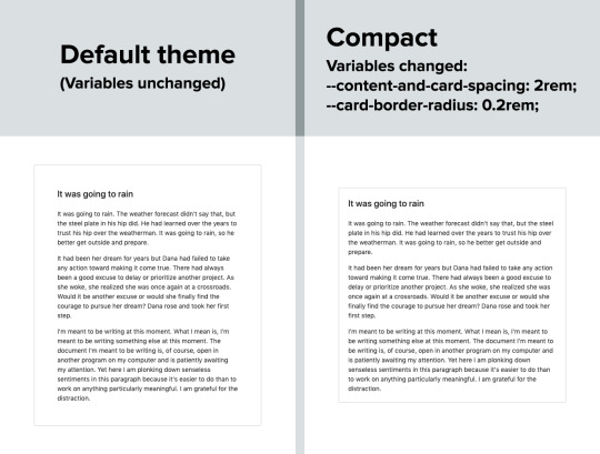
Because there are CSS custom properties used as utilities, like spacing and borders, we can remove or override them easily to create a more compact or expanded component layout.
Only two variables are updated in this example to go from an expanded view to a compact one:
--content-and-card-spacing changed from 3rem (30px) to 2rem (20px).
--card-border-radius changed from 0.4rem (4px) to 0.2rem (2px).
For a real life scenario, you could have a dropdown that asks the user whether they prefer their content to be Default or Compact, and choosing one would obviously set the above CSS variables to theme the site. Once again, this could be saved and set on page load when the user visits the website on their next session.
Wait, but why?
Even with all the examples I have shown so far, you may still be asking why is this actually necessary. The answer is really simple: one size does not fit all. In my estimate, around half of the population prefers a dark UI, while the other half prefers light. Similarly, people have wild variations about the things they like when it comes to design. User personalization is a form of improving the UX, because it lets the user choose what they prefer. This may not be so important on a landing page, but when it comes to a tool or dashboard (that one has to use for a long time to get something done), having a UI that can be personalized is a boon to productivity. And knowing that is what Halfmoon is designed to do makes it ideal for these types of use cases.
Moreover, you know how people often complain that websites made with a certain framework (eg Bootstrap) all look the same? This is a step toward making sure that websites built with Halfmoon will always look distinct, so that the focus is on the website and content itself, and not on the framework that was used to build it.
Again, I am not saying that everything should be allowed to be personalized. But knowing who the framework is for and what it is designed to do helps make it clear what should be personalized.
Looking ahead
I strongly feel that flexibility for customization and accounting for user preferences are often overlooked on the web, especially in the framework landscape. That’s what I’m trying to address with Halfmoon.
In the future, I want to make it a lot easier for developers to implement user preferences, and also promote diversity of design with new templates and themes. That said, here are some things on the horizon for Halfmoon:
A form validator (demo video)
New components, including range sliders, tabs and spinners
High contrast mode user preference
Multi-select component (like Select2, only without jQuery)
A date and time picker
A data-table component
A GUI-based form builder
More themes and templates
You can, of course, learn more about Halfmoon in the documentation website, and if you want to follow the project, you can give it a star on GitHub.
The post Considerations for Making a CSS Framework appeared first on CSS-Tricks.
You can support CSS-Tricks by being an MVP Supporter.
Considerations for Making a CSS Framework published first on https://deskbysnafu.tumblr.com/
0 notes
Text
The One-Hour Guide to SEO: Keyword Targeting & On-Page Optimization - Whiteboard Friday
Posted by randfish
We've covered strategy, keyword research, and how to satisfy searcher intent — now it's time to tackle optimizing the webpage itself! In the fourth part of the One-Hour Guide to SEO, Rand offers up an on-page SEO checklist to start you off on your way towards perfectly optimized and keyword-targeted pages.
If you missed them, check out the other episodes in the series so far:
The One-Hour Guide to SEO, Part 1: SEO Strategy
The One-Hour Guide to SEO, Part 2: Keyword Research
The One-Hour Guide to SEO, Part 3: Searcher Satisfaction
Click on the whiteboard image above to open a high resolution version in a new tab!
Video Transcription
Howdy, Moz fans. Welcome to another edition of our special One-Hour Guide to SEO. We are now on Part IV – Keyword Targeting and On-Page Optimization. So hopefully, you've watched Part III, where we talked about searcher satisfaction, how to make sure searchers are happy with the page content that you create and the user experience that you build for them, as well as Part II, where we talked about keyword research and how to make sure that you are targeting the right words and phrases that searchers are actually looking for, that you think you can actually rank for, and that actually get real organic click-through rate, because Google's zero-click searches are rising.
Now we're into on-page SEO. So this is essentially taking the words and phrases that we know we want to rank for with the content that we know will help searchers accomplish their task. Now how do we make sure that the page is optimal for ranking in Google?
On-page SEO has evolved
Well, this is very different from the way it was years ago. A long time ago, and unfortunately many people still believe this to be true about SEO, it was: How do I stuff my keywords into all the right tags and places on the page? How do I take advantage of things like the meta keywords tag, which hasn't been used in a decade, maybe two? How do I take advantage of putting all the words and phrases stuffed into my title, my URL, my description, my headline, my H2 through H7 tags, all these kinds of things?
Most of that does not matter, but some of it still does. Some of it is still important, and we need to run through what those are so that you give yourself the best possible chance for ranking.
The on-page SEO checklist
So what I've done here is created a sort of brief, on-page SEO checklist. This is not comprehensive, especially on the technical portion, because we're saving that for Part V, the technical SEO section, which we will get into, of this Guide. In this checklist, some of the most important things are on here.
☑ Descriptive, compelling, keyword-rich title element
Many of the most important things are on here, and those include things like a descriptive, compelling, keyword-rich but not stuffed title element, also called the page title or a title tag. So, for example, if I am a tool website, like toolsource.com — I made that domain name up, I assume it's registered to somebody — and I want to rank for the "best online survey tools," well, "The Best Online Survey Tools for 2019" is a great title tag, and it's very different from best online survey tools, best online survey software, best online survey software 2019. You've seen title tags like that. You've seen pages that contain stuff like that. That is no longer good SEO practices.
So we want that descriptive, compelling, makes me want to click. Remember that this title is also going to show up in the search results as the title of the snippet that your website appears in.
☑ Meta description designed to draw the click
Second, a meta description. This is still used by search engines, not for rankings though. Sort of think of it like ad text. You are drawing a click, or you're attempting to draw the click. So what you want to do is have a description that tells people what's on the page and inspires them, incites them, makes them want to click on your result instead of somebody else's. That's your chance to say, "Here's why we're valuable and useful."
☑ Easy-to-read, sensible, short URL
An easy-to-read, sensible, short URL. For example, toolsource.com/reviews/best-online-surveys-2019. Perfect, very legible, very readable. I see that in the results, I think, "Okay, I know what that page is going to be." I see that copied and pasted somewhere on the web, I think, "I know what's going to be at that URL. That looks relevant to me."
Or reviews.best-online-tools.info. Okay, well, first off, that's a freaking terrible domain name. /oldseqs?ide=17 bunch of weird letters and tab detail equals this, and UTM parameter equals that. I don't know what this is. I don't know what all this means. By the way, having more than one or two URL parameters is very poorly correlated with and not recommended for trying to rank in search results. So you want to try and rewrite these to be more friendly, shorter, more sensible, and readable by a human being. That will help Google as well.
☑ First paragraph optimized for appearing in featured snippets
That first paragraph, the first paragraph of the content or the first few words of the page should be optimized for appearing in what Google calls featured snippets. Now, featured snippets is when I perform a search, for many queries, I don't just see a list of pages. Sometimes I'll see this box, often with an image and a bunch of descriptive text that's drawn from the page, often from the first paragraph or two. So if you want to get that featured snippet, you have to be able to rank on page one, and you need to be optimized to answer the query right in your first paragraph. But this is an opportunity for you to be ranking in position three or four or five, but still have the featured snippet answer above all the other results. Awesome when you can do this in SEO, very, very powerful thing. Featured snippet optimization, there's a bunch of resources on Moz's website that we can point you to there too.
Featured Snippets: From Start to Finish
How to Discover Featured Snippet Opportunities - Whiteboard Friday
How to Target Featured Snippet Opportunities - Whiteboard Friday
☑ Use the keyword target intelligently in...
☑ The headline
So if I'm trying to rank for "best online survey tools," I would try and use that in my headline. Generally speaking, I like to have the headline and the title of the piece nearly the same or exactly the same so that when someone clicks on that title, they get the same headline on the page and they don't get this cognitive dissonance between the two.
☑ The first paragraph
The first paragraph, we talked about.
☑ The page content
The page's content, you don't want to have a page that's talking about best online survey tools and you never mention online surveys. That would be a little weird.
☑ Internal link anchors
An internal link anchor. So if other places on your website talk about online survey tools, you should be linking to this page. This is helpful for Google finding it, helpful for visitors finding it, and helpful to say this is the page that is about this on our website.
I do strongly recommend taking the following advice, which is we are no longer in a world where it makes sense to target one keyword per page. For example, best online survey tools, best online survey software, and best online survey tools 2019 are technically three unique keyword phrases. They have different search volumes. Slightly different results will show up for each of them. But it is no longer the case, whereas it was maybe a decade ago, that I would go create a page for each one of those separate things.
Instead, because these all share the same searcher intent, I want to go with one page, just a single URL that targets all the keywords that share the exact same searcher intent. If searchers are looking to find exactly the same thing but with slightly modified or slight variations in how they phrase things, you should have a page that serves all of those keywords with that same searcher intent rather than multiple pages that try to break those up, for a bunch of reasons. One, it's really hard to get links to all those different pages. Getting links just period is very challenging, and you need them to rank.
Second off, the difference between those is going to be very, very subtle, and it will be awkward and seem to Google very awkward that you have these slight variations with almost the same thing. It might even look to them like duplicate or very similar or low-quality content, which can get you down-ranked. So stick to one page per set of shared intent keywords.
☑ Leverage appropriate rich snippet options
Next, you want to leverage appropriate rich snippet options. So, for example, if you are in the recipes space, you can use a schema markup for recipes to show Google that you've got a picture of the recipe and a cooking time and all these different details. Google offers this in a wide variety of places. When you're doing reviews, they offer you the star ratings. Schema.org has a full list of these, and Google's rich snippets markup page offers a bunch more. So we'll point you to both of those as well.
☑ Images on the page employ...
Last, but certainly not least, because image search is such a huge portion of where Google's search traffic comes from and goes to, it is very wise to optimize the images on the page. Image search traffic can now send significant traffic to you, and optimizing for images can sometimes mean that other people will find your images through Google images and then take them, put them on their own website and link back to you, which solves a huge problem. Getting links is very hard. Images is a great way to do it.
☑ Descriptive, keyword-rich filenames
The images on your page should employ descriptive, keyword-rich filenames, meaning if I have one for typeform, I don't want it to be pick one, two or three. I want it to be typeformlogo or typeformsurveysoftware as the name of the file.
☑ Descriptive alt attributes
The alt attribute or alt tag is part of how you describe that for screen readers and other accessibility-focused devices, and Google also uses that text too.
☑ Caption text (if appropriate)
Caption text, if that's appropriate, if you have like a photograph and a caption describing it, you want to be descriptive of what's actually in the picture.
☑ Stored in same domain and subdomain
These files, in order to perform well, they generally need to be hosted on the same domain and subdomain. If, for example, all your images are stored on an Amazon Web Services domain and you don't bother rewriting or making sure that the domain looks like it's on toolsource.com/photos or /images here, that can cause real ranking problems. Oftentimes you won't perform at all in Google images because they don't associate the image with the same domain. Same subdomain as well is preferable.
If you do all these things and you nail searcher intent and you've got your keyword research, you are ready to move on to technical SEO and link building and then start ranking. So we'll see you for that next edition next week. Take care.
Video transcription by Speechpad.com
Sign up for The Moz Top 10, a semimonthly mailer updating you on the top ten hottest pieces of SEO news, tips, and rad links uncovered by the Moz team. Think of it as your exclusive digest of stuff you don't have time to hunt down but want to read!
from The Moz Blog http://tracking.feedpress.it/link/9375/11228159
0 notes
Text
The One-Hour Guide to SEO: Keyword Targeting & On-Page Optimization - Whiteboard Friday
Posted by randfish
We've covered strategy, keyword research, and how to satisfy searcher intent — now it's time to tackle optimizing the webpage itself! In the fourth part of the One-Hour Guide to SEO, Rand offers up an on-page SEO checklist to start you off on your way towards perfectly optimized and keyword-targeted pages.
If you missed them, check out the other episodes in the series so far:
The One-Hour Guide to SEO, Part 1: SEO Strategy
The One-Hour Guide to SEO, Part 2: Keyword Research
The One-Hour Guide to SEO, Part 3: Searcher Satisfaction
Click on the whiteboard image above to open a high resolution version in a new tab!
Video Transcription
Howdy, Moz fans. Welcome to another edition of our special One-Hour Guide to SEO. We are now on Part IV – Keyword Targeting and On-Page Optimization. So hopefully, you've watched Part III, where we talked about searcher satisfaction, how to make sure searchers are happy with the page content that you create and the user experience that you build for them, as well as Part II, where we talked about keyword research and how to make sure that you are targeting the right words and phrases that searchers are actually looking for, that you think you can actually rank for, and that actually get real organic click-through rate, because Google's zero-click searches are rising.
Now we're into on-page SEO. So this is essentially taking the words and phrases that we know we want to rank for with the content that we know will help searchers accomplish their task. Now how do we make sure that the page is optimal for ranking in Google?
On-page SEO has evolved
Well, this is very different from the way it was years ago. A long time ago, and unfortunately many people still believe this to be true about SEO, it was: How do I stuff my keywords into all the right tags and places on the page? How do I take advantage of things like the meta keywords tag, which hasn't been used in a decade, maybe two? How do I take advantage of putting all the words and phrases stuffed into my title, my URL, my description, my headline, my H2 through H7 tags, all these kinds of things?
Most of that does not matter, but some of it still does. Some of it is still important, and we need to run through what those are so that you give yourself the best possible chance for ranking.
The on-page SEO checklist
So what I've done here is created a sort of brief, on-page SEO checklist. This is not comprehensive, especially on the technical portion, because we're saving that for Part V, the technical SEO section, which we will get into, of this Guide. In this checklist, some of the most important things are on here.
☑ Descriptive, compelling, keyword-rich title element
Many of the most important things are on here, and those include things like a descriptive, compelling, keyword-rich but not stuffed title element, also called the page title or a title tag. So, for example, if I am a tool website, like toolsource.com — I made that domain name up, I assume it's registered to somebody — and I want to rank for the "best online survey tools," well, "The Best Online Survey Tools for 2019" is a great title tag, and it's very different from best online survey tools, best online survey software, best online survey software 2019. You've seen title tags like that. You've seen pages that contain stuff like that. That is no longer good SEO practices.
So we want that descriptive, compelling, makes me want to click. Remember that this title is also going to show up in the search results as the title of the snippet that your website appears in.
☑ Meta description designed to draw the click
Second, a meta description. This is still used by search engines, not for rankings though. Sort of think of it like ad text. You are drawing a click, or you're attempting to draw the click. So what you want to do is have a description that tells people what's on the page and inspires them, incites them, makes them want to click on your result instead of somebody else's. That's your chance to say, "Here's why we're valuable and useful."
☑ Easy-to-read, sensible, short URL
An easy-to-read, sensible, short URL. For example, toolsource.com/reviews/best-online-surveys-2019. Perfect, very legible, very readable. I see that in the results, I think, "Okay, I know what that page is going to be." I see that copied and pasted somewhere on the web, I think, "I know what's going to be at that URL. That looks relevant to me."
Or reviews.best-online-tools.info. Okay, well, first off, that's a freaking terrible domain name. /oldseqs?ide=17 bunch of weird letters and tab detail equals this, and UTM parameter equals that. I don't know what this is. I don't know what all this means. By the way, having more than one or two URL parameters is very poorly correlated with and not recommended for trying to rank in search results. So you want to try and rewrite these to be more friendly, shorter, more sensible, and readable by a human being. That will help Google as well.
☑ First paragraph optimized for appearing in featured snippets
That first paragraph, the first paragraph of the content or the first few words of the page should be optimized for appearing in what Google calls featured snippets. Now, featured snippets is when I perform a search, for many queries, I don't just see a list of pages. Sometimes I'll see this box, often with an image and a bunch of descriptive text that's drawn from the page, often from the first paragraph or two. So if you want to get that featured snippet, you have to be able to rank on page one, and you need to be optimized to answer the query right in your first paragraph. But this is an opportunity for you to be ranking in position three or four or five, but still have the featured snippet answer above all the other results. Awesome when you can do this in SEO, very, very powerful thing. Featured snippet optimization, there's a bunch of resources on Moz's website that we can point you to there too.
Featured Snippets: From Start to Finish
How to Discover Featured Snippet Opportunities - Whiteboard Friday
How to Target Featured Snippet Opportunities - Whiteboard Friday
☑ Use the keyword target intelligently in...
☑ The headline
So if I'm trying to rank for "best online survey tools," I would try and use that in my headline. Generally speaking, I like to have the headline and the title of the piece nearly the same or exactly the same so that when someone clicks on that title, they get the same headline on the page and they don't get this cognitive dissonance between the two.
☑ The first paragraph
The first paragraph, we talked about.
☑ The page content
The page's content, you don't want to have a page that's talking about best online survey tools and you never mention online surveys. That would be a little weird.
☑ Internal link anchors
An internal link anchor. So if other places on your website talk about online survey tools, you should be linking to this page. This is helpful for Google finding it, helpful for visitors finding it, and helpful to say this is the page that is about this on our website.
I do strongly recommend taking the following advice, which is we are no longer in a world where it makes sense to target one keyword per page. For example, best online survey tools, best online survey software, and best online survey tools 2019 are technically three unique keyword phrases. They have different search volumes. Slightly different results will show up for each of them. But it is no longer the case, whereas it was maybe a decade ago, that I would go create a page for each one of those separate things.
Instead, because these all share the same searcher intent, I want to go with one page, just a single URL that targets all the keywords that share the exact same searcher intent. If searchers are looking to find exactly the same thing but with slightly modified or slight variations in how they phrase things, you should have a page that serves all of those keywords with that same searcher intent rather than multiple pages that try to break those up, for a bunch of reasons. One, it's really hard to get links to all those different pages. Getting links just period is very challenging, and you need them to rank.
Second off, the difference between those is going to be very, very subtle, and it will be awkward and seem to Google very awkward that you have these slight variations with almost the same thing. It might even look to them like duplicate or very similar or low-quality content, which can get you down-ranked. So stick to one page per set of shared intent keywords.
☑ Leverage appropriate rich snippet options
Next, you want to leverage appropriate rich snippet options. So, for example, if you are in the recipes space, you can use a schema markup for recipes to show Google that you've got a picture of the recipe and a cooking time and all these different details. Google offers this in a wide variety of places. When you're doing reviews, they offer you the star ratings. Schema.org has a full list of these, and Google's rich snippets markup page offers a bunch more. So we'll point you to both of those as well.
☑ Images on the page employ...
Last, but certainly not least, because image search is such a huge portion of where Google's search traffic comes from and goes to, it is very wise to optimize the images on the page. Image search traffic can now send significant traffic to you, and optimizing for images can sometimes mean that other people will find your images through Google images and then take them, put them on their own website and link back to you, which solves a huge problem. Getting links is very hard. Images is a great way to do it.
☑ Descriptive, keyword-rich filenames
The images on your page should employ descriptive, keyword-rich filenames, meaning if I have one for typeform, I don't want it to be pick one, two or three. I want it to be typeformlogo or typeformsurveysoftware as the name of the file.
☑ Descriptive alt attributes
The alt attribute or alt tag is part of how you describe that for screen readers and other accessibility-focused devices, and Google also uses that text too.
☑ Caption text (if appropriate)
Caption text, if that's appropriate, if you have like a photograph and a caption describing it, you want to be descriptive of what's actually in the picture.
☑ Stored in same domain and subdomain
These files, in order to perform well, they generally need to be hosted on the same domain and subdomain. If, for example, all your images are stored on an Amazon Web Services domain and you don't bother rewriting or making sure that the domain looks like it's on toolsource.com/photos or /images here, that can cause real ranking problems. Oftentimes you won't perform at all in Google images because they don't associate the image with the same domain. Same subdomain as well is preferable.
If you do all these things and you nail searcher intent and you've got your keyword research, you are ready to move on to technical SEO and link building and then start ranking. So we'll see you for that next edition next week. Take care.
Video transcription by Speechpad.com
Sign up for The Moz Top 10, a semimonthly mailer updating you on the top ten hottest pieces of SEO news, tips, and rad links uncovered by the Moz team. Think of it as your exclusive digest of stuff you don't have time to hunt down but want to read!
from The Moz Blog http://bit.ly/2Kd0vY3
via IFTTT
0 notes
Last Seen Blogs

windona
Welcome to the Nerd Cave

ohjobrosoned
Oh Sexy Boys ||

eric9211
Untitled

death-yam
Death Yam

kafkathefuckdown
just quotes and literature and artwork
and shit