#also i wanted to make the text with the rainbow colours but the codes aren't working idkw :(
Photo
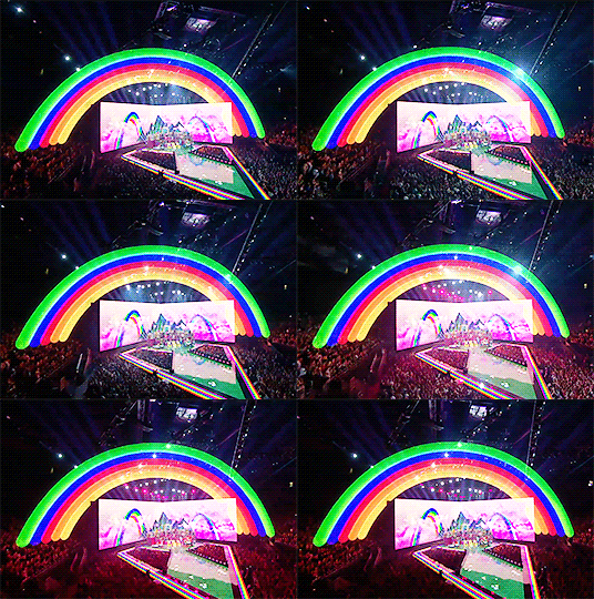
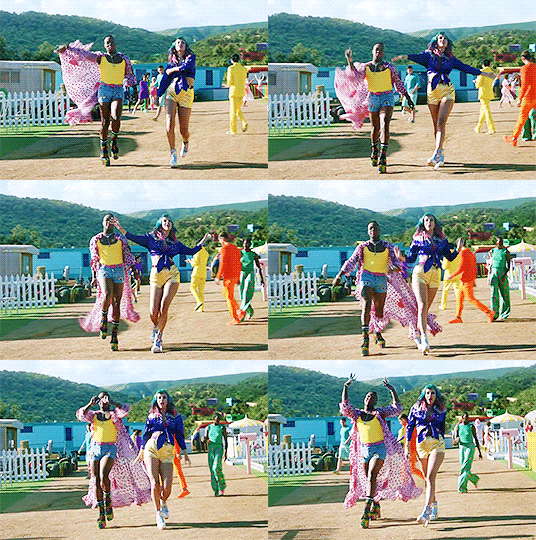




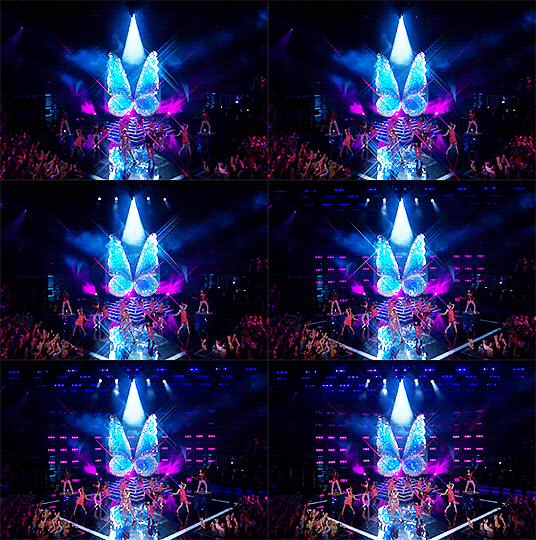
LOVE IS LOVE.
"May we end up in a world where everyone can live and love equally and no one has to be afraid to be vulnerable and say how they feel."
#taylor swift#happy pride month!!!!#tswiftedit#tscreators#tswiftgifs#taylorswiftedit#tswiftdaily#brendon urie#tswift#taylorswift#my gifs#*mine#*misc#this is horrible i'm sorry just pretend you didn't see this#also i wanted to make the text with the rainbow colours but the codes aren't working idkw :(#tw: flashing gif
320 notes
·
View notes
Text
The Greenery - label design - part 3
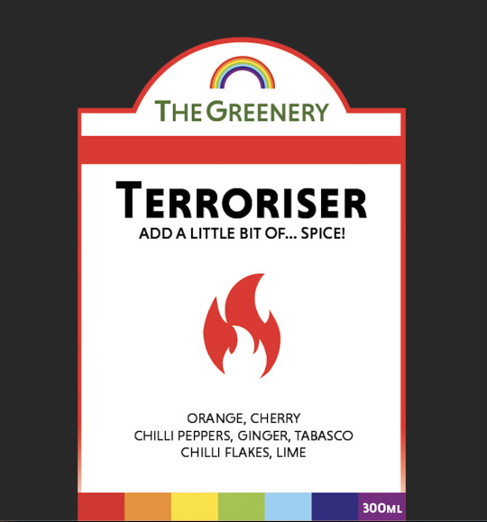
Above is the label design I ended up using on all of my bottles.
I focused on strong branding, the labels being bold and universal for all of The Greenery's clients. Most of our clientele is 15-19, however some of our products, such as Beautifier are targeted at people who are above that age range. Even though the products are mainly targeted at people within the age of 15-35, the labels have to attract everyone regardless of their age group.
1. The logo
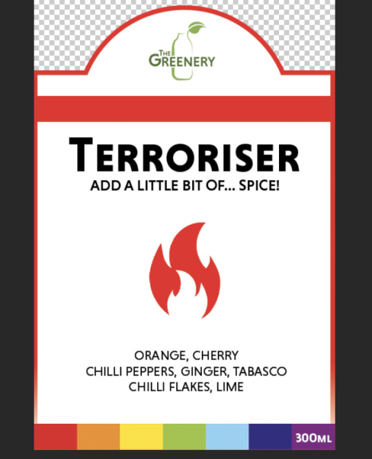
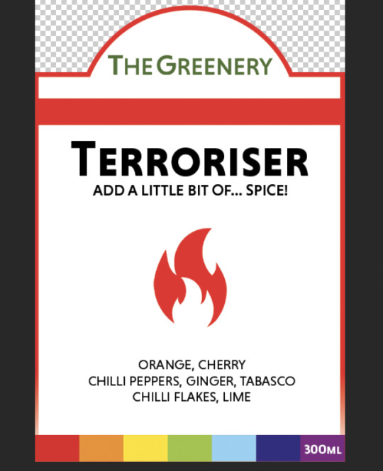
The original logo is a combination mark that features a bottle and type. My initial idea was to use it on my labels, however, it would not be a good design move. In the visual identity manual it is stated that the minimum size of this logo is 25mm height and it is that way for a very simple reason - if the logo was any smaller, it would be very hard to read. In such situations, it is recommended to use the logotype instead of the combination mark. Since I cannot disobey the rules stated in the visual identity manual, I had to turn down that idea and use the logotype instead. This is when I came across another compilation - since the logotype is wide, there was plenty of empty space above it that needed to be filled somehow. I created a rainbow icon and placed it at the top, above the logotype. I also lowered the logo's position - the baseline is no longer in the same line as the frame, instead it is now slightly lowered. This manipulation has allowed me to keep the logotype as big and visible as possible without cluttering the design. The space from the top of the label to the top of the rainbow is equal to the space from the thick red line to the baseline of the logotype. This makes the whole design look very consistent and tidy.

2. Hierarchy, typography and layout
I believe that the use of hierarchy is very important in every design. While in most cases, it is easy to get away with only using one font, if it's a Sans Serif or Serif font, it is crucial to include a hierarchy of some sort - whether it is using different sizes or thickness - to highlight certain parts of the design and make it look clearer. Each part of the text in my label design was made using the same font with different thickness and size. Considering the logo only consists of typography, I also had to divide it from the rest of the label somehow and since I couldn't make it any bigger, I used a red stripe as a divider. Below are screenshot of a version without the use of hierarchy and the final design for comparison - it shows how details like these can change the design completely.
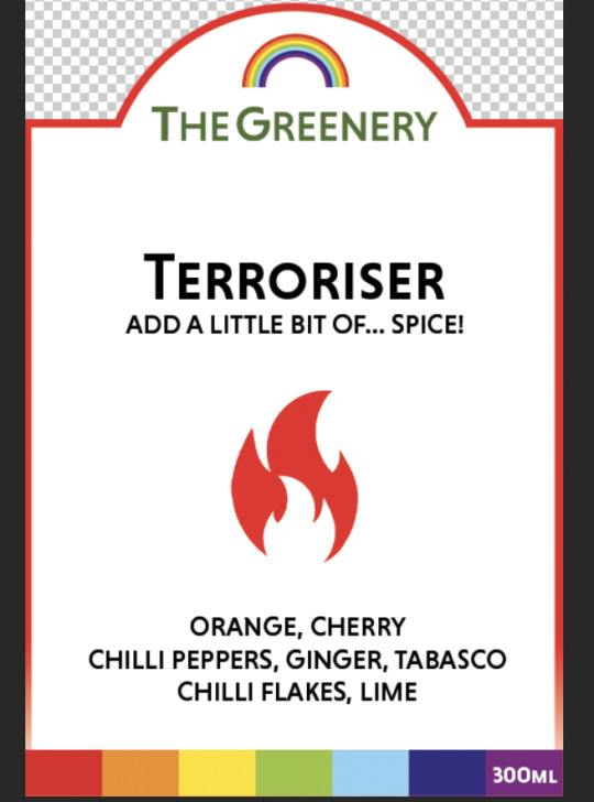
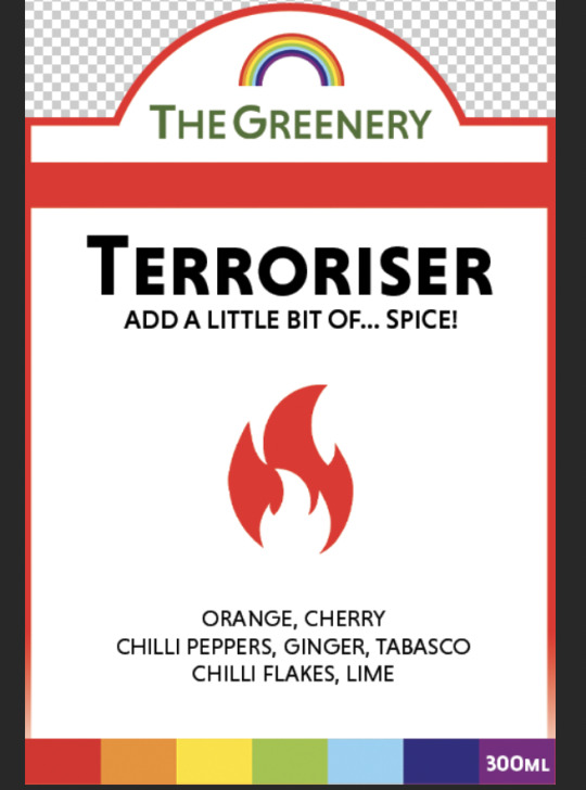
All of the labels have the same layout:
name of the smoothie
a short slogan
the flavour icon
ingredients
volume of the bottle - white on purple because of high contrast and saving as much space as possible
Using this type of layout makes the labels very logical for the customer and it's also another way to make the hierarchy very clear for everyone. If you look closely, you will notice that the distance between the name of the smoothie and the top line is not the same as the distance from the ingredients to the rainbow line - this choice, even though at first it might seem like it, was in fact a thought-out decision. Lowering the placement of the ingredients would make the distance between the text and the icon greater which would create more white space that I did not need. The bottom line is rainbow and, in most of my smoothies, the ingredient lists are wide. Placing them closer to each other would make the design look overcrowded at the bottom and empty at the top.
3. Colours and icons
I used 7 colours of the rainbow to symbolise each flavour. Each icon is in the same colour as the frame and one of the colours at the bottom of the label (for specific colour numbers, see The Greenery Visual Identity Manual). This, in my opinion, is a smart marketing move for two reasons.
1. Teenagers and LGBT Community. Pride Flag is in the colours of the rainbow and because of that, rainbows have become strongly associated with LGBT people. Today's generation of teenagers are very strongly opinionated, fight against inequality, homophobia, sexism and racism. A vast majority of teenagers, even the ones who aren't affected by mistreatment from the rest of society, would be happy to buy a drink with a pride flag on it. Another trend I have noticed amongst people born after the year 2000 is collecting drink cans - potentially, some people would want to have a collection of all The Greenery rainbow drink bottles and it could boost the sales.
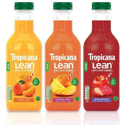
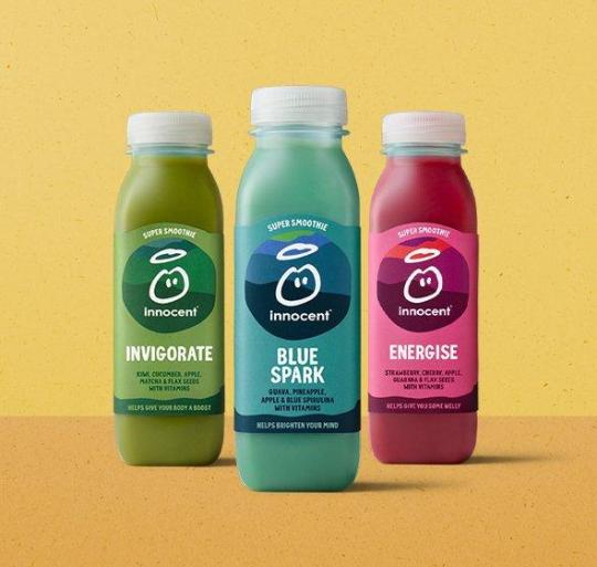
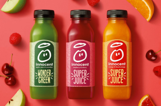
2. Strong branding. One of the basic principles of my brand is inclusion. There are plenty of people who have hidden disabilities. Those people might struggle with concentration, differentiating colours or reading. Instead of just writing the name of the drink on the label or using fruit pictures, I used a colour code as well as icons that represent the names of the drinks. This way, if a client doesn't remember the name of the smoothie, they can easily describe it by explaining either the colour of the label, the icon that was on it or the taste of it. Most brands don't have all of these features which makes it harder to recognise the specific drinks. For example, they have 3 types of red smoothies in their offer, all of which have. raspberries in them. A customer will have a hard time trying to pick the right drink that they liked previously and end up buying a product from a different brand. A great example of this are Tropicana and Innocent Juice.
Tropicana's labels always feature a photograph of a fruit. I think that it's a very outdated approach to the design and it isn't appealing to the young people. They don't have specific drink names on the bottles. The most visible elements are their logo and the fruit that was used to produce the juice. They are not original in any way, they don't stand out and it's hard to differentiate one flavour from the other.

Innocent Juice do use a strong colour code, however all of their bottles look so similar that it's very easy to mistake them if a customer misreads the label. The flavours are also quite similar and the only difference is the type of drink a customer is buying. It's overall very confusing and not intuitive at all especially for people who, as I mentioned, might have disabilities of some sort or are in a hurry.
My labels came out very good and are strong design pieces that look good and are functional and practical at the same time. I didn't end up putting nutritional information on them because I didn't think it was necessary - all nutritional information can be found in The Greenery's mobile app or at The Greenery shops. Since it is a brand that produces fresh smoothies blended in front of the client at a shop (similar system to cafes such as Starbucks or Costa) and our products cannot be purchased directly from grocery stores, The Greenery shops can be treated as takeaway restaurants in which case it is not essential to put the nutritional information on the label.
0 notes