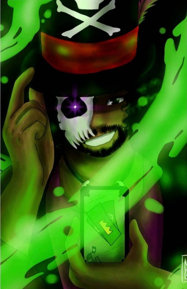
#also multiply mode in photoshop made everything WAY easier
Text
Updated Colouring Tutorial
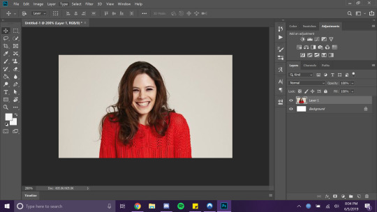
A while back I made a tutorial on colouring characters in, but I've since learned different ways of colouring characters so I've decided to do another tutorial! I'll be showing two different methods here, one using the multiply blending mode, and the other using hard light. Which one you choose will depend on if the image is coloured or not and how dark you want the character to be. I am using photoshop v.23, but these should also work in photopea :)

The first thing you do before colouring something in is using the curves adjustment layer to make sure everything is as dark and as bright as it can be. Using the dark-tipped eyedropper, click the area you would like to be black. You would want this to be the lines around the face and eyes, as otherwise your pencil will show on top of the art. Do the same with the white-tipped eyedropper, except this time choosing an area you want to be white. Play around with it until you're happy with the exposure of your piece!
Colouring methods under the cut.

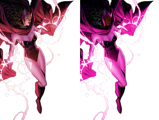
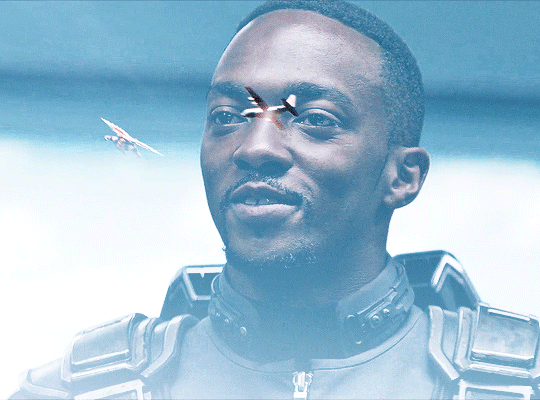
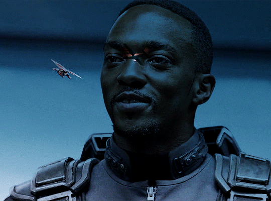
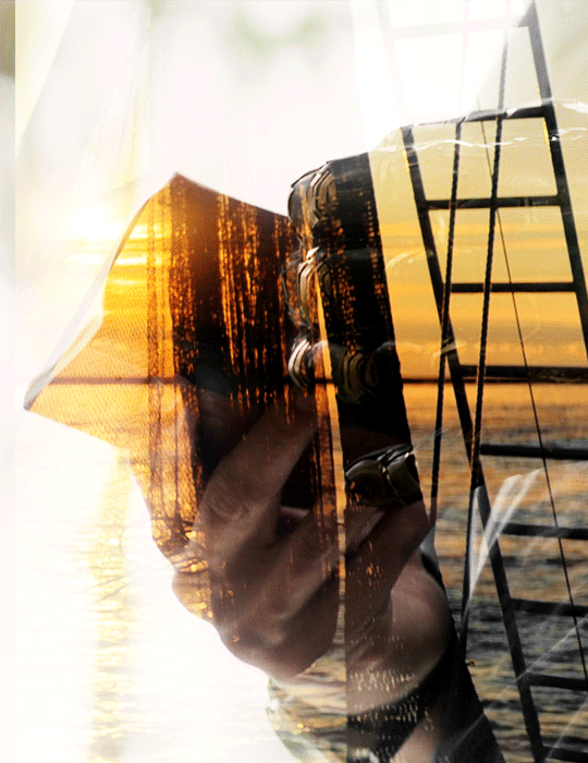
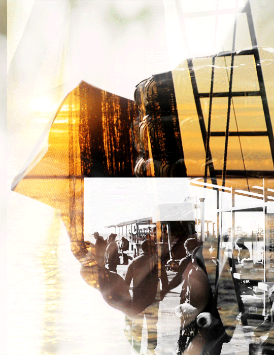
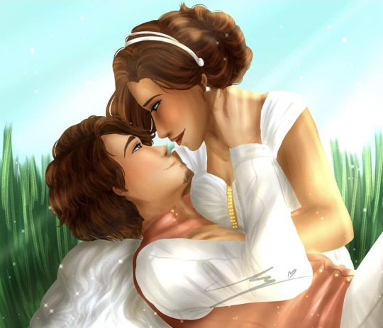
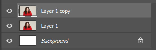
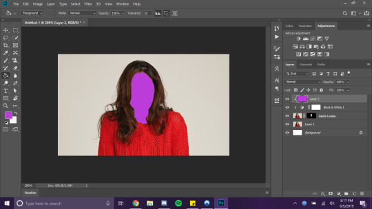
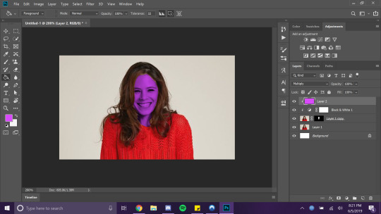
For our multiply method, I'll use Nightwing as the character we're colouring in! This piece was by Travis Moore, and has not been coloured in, so I'm doing it myself using multiply layers. Multiply works better on uncoloured, unshaded pieces, as depending on the darkness of your colour it can remove a lot of the shading. However, for older art pieces that don't have as much shading, multiply also works well.
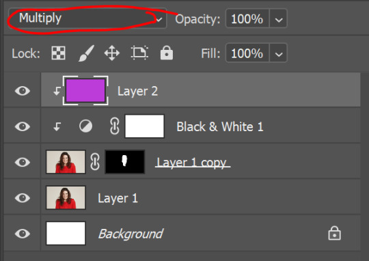
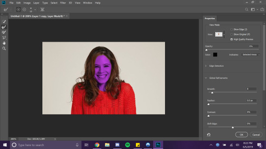
First thing is to make as many layers as you intend to use; I used one for the skin, one for the blue of his suit, one for his hair, one for his lips (optional), and one for a nice blush (optional). All of these, sans the blush, was done using multiply. You want to use the pencil tool, not brush, and go over all the areas you want that colour. You can do this either on the normal blending mode or on the multiply mode. Avoid the eyes, and if you want, the lips. For this piece I coloured in the lips and then went over it on a new layer with a pink colour & brush. Fill it in with the paint bucket, and do this for every layer. Make sure you're changing the layer every time you're done, because if you're unhappy with the colour choice it's much easier to change it back if its on a separate layer.
If there's issues with the hairline matching up, you can use the blur tool set to darken and click around on the hairline until it looks more smooth.
For the blush, I used the colour blending mode on a new layer and the gradient tool. I chose a slightly redder colour than the one I had, and chose the radial gradient with the foreground to transparent setting. I selected the skin tone using quick selection (another reason why it's useful to have every colour on a separate layer), and then made my gradient! You may want to retry this a few times with different colours or with different opacity.
If you're using a coloured piece, it may be helpful to use the quick selection tool to select your skin, and use the paint bucket tool on a new layer set to colour blending mode underneath. This will get rid of any different colour shades underneath, which can look weird with multiply.
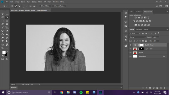
For our hard light method, I'm using Wanda as the character we're colouring in. This art piece is by Jim Cheung from Children's Crusade, and has been coloured and shaded. After using my curves adjustment, I am also going to use selective colour & vibrance to get the colour I want , but it's not necessary for the image.
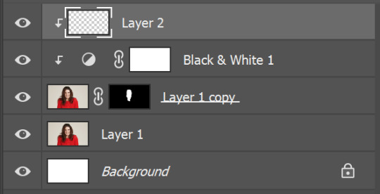
I'm going to do the same thing with the pencil that I did with the multiply layer, except this time it's set to hard light. After this, I am going to use quick selection and put a layer set to colour blending mode underneath. Unlike multiply, this is necessary; hard light will make things look incredibly red over something already shaded, especially if you've played around with the Vibrancy. Sometimes, I'll make another layer for the skin, this time blending set to soft light, and play around with the order of the layers to see what looks best.
I also went over the hair using a layer set to the colour blending mode, with black. Sometimes, I make another layer for the hair and set it to overlay or soft light, to make the hair look more black and less grey :)
So I hope these were useful to someone out there! Remember, these work best with sharp, high quality images from a large file. Smaller images are harder to work with and often look more pixelated. Make good use of clipping masks & experiment with different blending modes!
27 notes
·
View notes
Photo

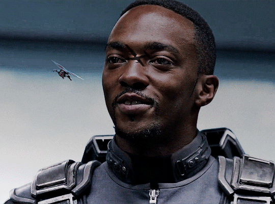
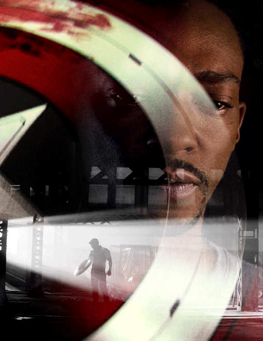
Sherman why are you like this
#it's been so long since I've posted a comic#college is killing me#but here I am despite all the odds#also multiply mode in photoshop made everything WAY easier#apush#ap us history#William Tecumseh Sherman#abraham lincoln#abe lincoln#baberaham lincoln#history#US history#us civil war#american civil war#american history#civil war#history humor#history jokes#comic strip#comic#history comic
2K notes
·
View notes
Photo

Some of my lovely friends asked to show how I do my blending, so here is a very long tutorial! I will explain how to:
Blend GIFs with lots of movement
Blend three or more GIFs on one canvas
You will need:
Any version of Photoshop with a timeline
Basic-intermediate knowledge of GIF making (including cropping, how to use adjustment layers for color correction, applying layer masks, and placing multiple GIFs on one canvas)
Since the way I blend depends on the footage I'm able to work with, I often end up going in a different direction than I first planned. So this isn't a strict step-by-step guide that can be applied to everything you make. These are just some tips!
Read the rest under the cut.
TERMINOLOGY:
(Pretty sure you already know this but I will be repeating these a lot here, so just in case!)
Highlights & Shadows - The highlights are the brightest parts of the image. The shadows are the darkest parts. Remember that just because it's bright doesn't mean it's actually white, and just because it's dark doesn't mean it's actually black!
Negative Space - This refers to empty space around your subject. When there's negative space, it's easier to spot the focal point of the image.
BLENDING GIFS WITH LOTS OF MOVEMENT
Number of GIFs: 2
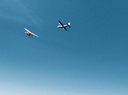
Main GIF: Closeup of Sam (“big!Sam”)
Secondary GIF: Sam flying (“flying!Sam”)
STEP 1: Find the right scenes
Since the subject of the secondary GIF is much smaller and basically cuts across the frame, it’s important (but not always essential!) that the main GIF has less movement and a decent amount of negative space.
STEP 2: Make your individual GIFs
Make your GIFs like how you usually do (Important: Remember that your GIFs need to have the same number of frames). When it’s time to crop, it’s best to have the two files opened in Photoshop at the same time so you can compare them against each other. It’s absolutely fine for them to overlap because that’s the whole point! The secondary GIF has Sam flying in from the top left to the bottom right, so I cropped the main GIF with him off-center so there would be space to see flying!Sam.
Now we have these two GIFs:

STEP 3: Combine your GIFs
Place the secondary GIF over the main one and adjust the blend mode. Setting the blend mode to Screen usually works, but in this case, this is how it looks:
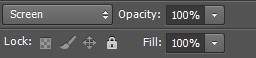
As you can see, the highlights in the main GIF are obscuring flying!Sam in the first frames. You can only see him clearly when he’s flying over big!Sam’s face. This is because the shadows on the top GIF will lighten and/or disappear against the highlights of the bottom GIF when set to Screen. It would be too complicated to fix this with a brush (which we will get to later) because of the movement in the secondary GIF, so instead I set the blending mode to Multiply, which is the opposite of Screen. Now here is the GIF:
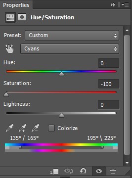
We can now see flying!Sam. But the blue of the sky is now a pseudo-filter over big!Sam’s face up until the last frames. So I applied a Hue/Saturation adjustment layer over the secondary GIF to remove those colors. The sky in the GIF is made up of cyans and blues, so I dragged those sliders down to -100. Here is how it looks now:
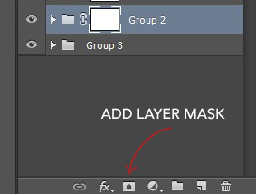
STEP 4: Erase the bits you don’t want
So that big!Sam’s face isn’t covered by flying!Sam’s wings and that pesky airplane up top, we have to use a brush to erase those parts. In the Layers panel, make sure your GIF layers (in this case, groups/folders) are selected and click the Add Layer Mask button. A little rectangle next to the layer/group name will show up like so:
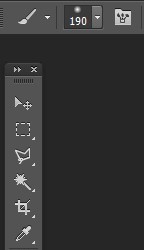
Then in the Tools panel, click the Brush tool, pick a soft brush and set the size to around 180-210px. The larger the brush, the softer the look. I learned this from Becca (@inejz-ghafa) who made an amazing tutorial a while back (will link it in the source at the bottom)! Adjust the brush size if you have to.
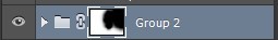
Now click on the little rectangle layer mask of the group you want to erase (in this case, the secondary GIF). When you do this, the Foreground and Background Colors buttons in the Tools panel will revert to the default black and white.

Painting with black will erase and painting with white will undo the erasure. So I erased the airplane and the bits of the wings covering his face. I didn’t erase the parts that overlap with his uniform, just to keep the effect of flying!Sam zooming across the GIF. And here is our finished product:
BLENDING THREE OR MORE GIFS ON ONE CANVAS
We will be working with these two GIFs since they use different techniques:

STEP 1: Compose your image
Find the scenes you want to put in your GIF and choose which of those is the most important. Once you've decided on that, you can build the rest of the elements around it.
Sam's GIF: Multiple Exposure Effect
Number of GIFs: 3
Main GIF: Bloodied shield
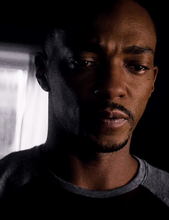
Secondary GIF: Closeup of Sam
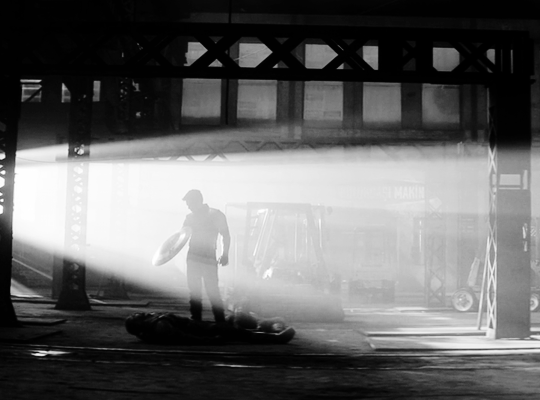
Tertiary GIF: Bucky with the shield
STEP 2: Make your individual GIFs
Since the shield is the most important part, I made it the largest GIF and cropped it close to emphasize the star and the blood. I made Sam's GIF the same size, but cropped it with his face off-center so that the star wouldn't completely cover his face. Again, it's totally fine for the images to overlap! The tertiary GIF is the least important so I cropped it smaller. To determine the size of that GIF compared to the shield, I made the Rulers visible (View > Rulers; or Ctrl+R) then clicked the top ruler and dragged down to create a guide to where I wanted the smaller GIF to end. Then I measured from the bottom of the GIF up to the guide to determine the height of the smaller GIF. (Tip: It's better to make the tertiary GIF too large than too small. That way, you have more to work with. So size it larger than it will appear on the final GIF.)
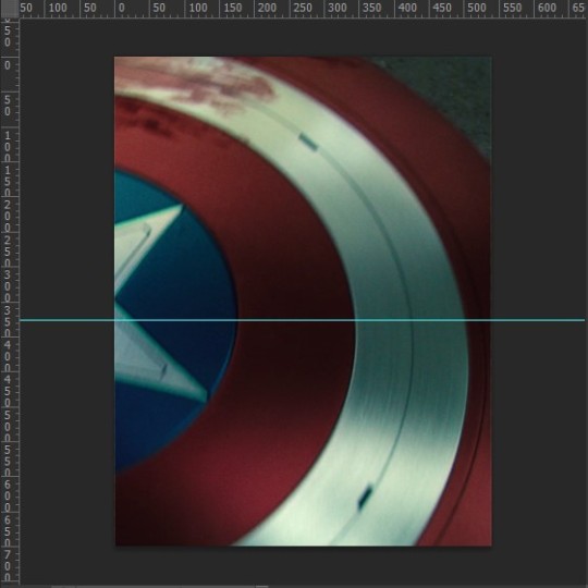
This is only a stylistic choice for this particular set, but I removed the blue from the shield and set the tertiary GIF to black and white, so that the only notable colors in the GIF are red, black and white. Varying up the coloring of each GIF (i.e. color vs. monochrome) adds some spice to the image, so play around with these different styles if you like!
Here are our three GIFs:
STEP 3: Combine your GIFs
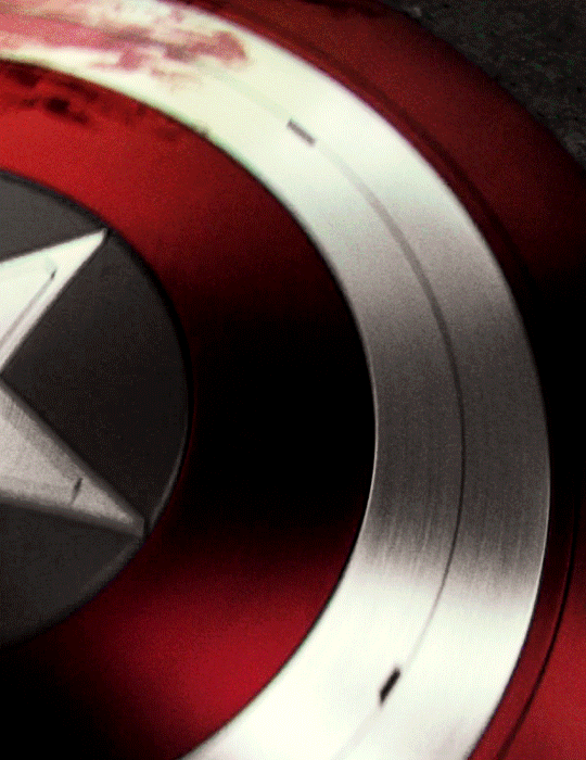
At first, I made the main GIF of the shield the bottom GIF. Then I placed the secondary GIF over it and set the blend mode to Screen, but found that it lacked depth. So I switched them and made the Sam GIF the bottom GIF (blend mode: Pass Through) and placed the shield GIF (blend mode: Screen) over it. And this is what I got:

Notice how the window behind Sam on the left side is distracting? It also partially obscures the star. So I went back to Sam’s GIF, created a New Layer and painted over the window with a black brush. Now here is our GIF:
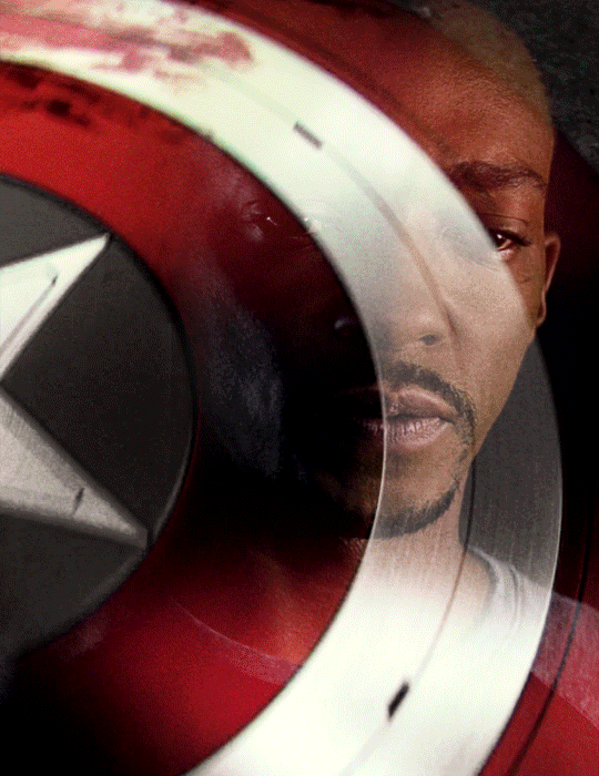
This is just my personal preference, but I wanted the area around the star to be a solid black rather than gray, so this time I created a New Layer over the shield GIF and applied a layer of black with the Paint Bucket tool, setting the blend mode to Soft Light. Now we’re done with the main and secondary GIFs:

Now let’s add the last GIF:
STEP 4: Erase the bits you don’t want
Lastly, I erased the warehouse rafters over Sam’s face and a bit of his shirt and the warehouse floor on the bottom right corner using Layer Masks and a soft brush (like in the first tutorial). And we’re done!

Bucky's GIF: Silhouette Effect
Number of GIFs: 3
Main GIF: Bucky holding the notebook
Secondary GIF: View of the sunrise from the boat
Tertiary GIF: Sam and Bucky walking away
STEP 2: Make your individual GIFs
To achieve this silhouette effect, the main GIF needs to have a clear focal point, which means it’s better to have negative space around the subject and for there to be minimal movement. In this case, the subject is made up of Bucky’s hands, notebook, and part of his shirt; and there’s some movement but we can still work with that. The other two GIFs will then be placed “inside” the subject. Because the negative space in the main GIF consists of highlights, I chose a secondary GIF which emphasized the shadows. For the smallest GIF, I used a guide like in the previous tutorial to measure its size.
We have these three GIFs:

STEP 3: Combine your GIFs
Place the secondary GIF over the main one. In my case, I didn’t measure it right so I had to nudge the top GIF a bit to the right to fit it inside the silhouette. The important thing is that the edge of the secondary GIF should not overlap with the silhouette itself, or else the illusion “breaks.”
Now let’s add the third GIF:
STEP 4: Erase the bits you don’t want
For this GIF, there’s a lot we need to erase! Using Layer Masks and a soft brush again, erase the parts of the secondary GIF that extend beyond the silhouette. It’s entirely based on personal preference if you want to keep some parts of the secondary GIF outside the silhouette (like I did here) or if you want them completely removed. And for the small GIF, erase the edges for it to blend with the secondary GIF while also staying within the silhouette of the main one.
Now here is our finished GIF:

And that’s it! If you’ve made it this far, thank you for reading. I hope this was useful! Remember, there is no definitive way to blend GIFs, so keep experimenting. And don’t be afraid to make mistakes either, because we learn a lot from those. Happy Photoshop-ing!
- Elle
#completeresources#allresources#blending tutorial#photoshop tutorial#userpavi#tusergabriela#usersae#userrex#usertk#supervalcsi#usernums#userringo#userkraina#usersmile#tuserlouise#usersof#mine#my tutorials
2K notes
·
View notes
Photo
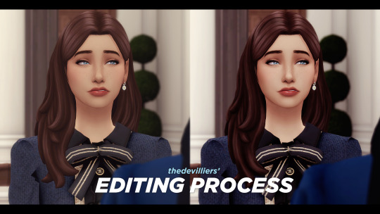

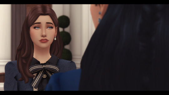
here’s my editing process, request by an anon! It’s nothing out of the ordinary; I just draw on shadows, highlights and add adjustment layers. I use photoshop cc 2020. everythings under the cut! if you have any questions, my inbox is open.
1. first off, opening my raw screenshot. I use reshade, more specifically my own modified version of simemi’s reshade v2! I just open it in photoshop.
2. next, on top of it I add my own psd I made to compliment my reshade.
some basics on color correction and adjustment layers you can do are: curves, levels, color balance, vibrance, exposure and contrast.
the amount of layers I have is definitely too many with many of them being barely visible and me not even remembering what half of them do. so don’t be like me. 👁️👁️
the MESS of adjustment layers i have (all vary in opacity and strength) [you are allowed to make fun of me]
3. next is sharpening! I do Filters > Sharpen > Smart Sharpen. these are my settings:

4. adding shadows: THE time consuming part since you have to do it on each panel you have + depends on the amount of people in your screenshot. i’d recommend being careful with shadows since sometimes without noticing you can go a lil overboard! if this happens, use the eraser tool to make it less strong.
first off, you make a new layer and you set this layer blending mode to Multiply.
with the color picker (shortcut: i) I pick a color from her cheeks to draw the shadows on + the base opacity I use for softer shadows is 6%. for stronger ones i go to 10-15%.

here, a few lil gifs [they are sped up]:

[ in the 2nd gif, i erased a shadow on the left side of the nose that was too strong. if you don’t like a shadow, just erase!]
i do the same process on her hair shadows, but this time with the color picker I choose a color from her hair. anddd the shadows result:
I find giving shadows to not only the sim, but the overall scene adds more “depth”, especially when the sims can look a bit flat. I also add shadows on objects such as food, chairs, decor, etc! of course everyone can edit (or not!) they way they want!!
I’m not doing it in this exact screenshot, but if there’s lightning that would realistically bounce off the sim, i’ll add it with a new layer set in Linear Dodge (Add).
5. adding highlights. the easier step! I use the dodge tool with very low exposure.
I duplicate my base layer in case I make any mistakes / I don’t like the end result.
I usually add highlights on faces (lips, nosetip, cupid’s bow, eyes, chin, a lil on the forehead and hair. if there’s a lot of jewelry in the scene, I also add highlights on earrings/necklaces.

6. anddd that’s it!! then I’ll just add my text on top.

andd one last tip, this time about text: to make text always be in the same spot, just duplicate your type layer (aka the text) into all your screenshots instead of creating a new type layer each time. I usually do it in one screenshot (which I call the base one), and just duplicate it by right clicking and doing duplicate layer. always make sure your text layer is on top of all adjustment layers.

now, rinse and repeat for all your panels 🧎♀️
#howto#ts4 tutorial#ts4#ts4 simblr#simblr#ts4 resources#i guess. i still dont know how to tag these things ok ANYWAYS#it actually didnt take me long since this was just one panel skdjfklf#ALSO FREE SPOILERS?!? uhm no comment
98 notes
·
View notes
Note
Hi! I love the new seb edit its gorgeous!! You’re so talented! Would you maybe like to do a tutorial on how you made it? Would be amazing!
Heyyy, thank you so much! I can try but have in mind that:
I'm not that good at explaining things
There are probably easier ways to do a few steps, so I'd suggest you to also look for other tutorials, maybe on youtube
I'm not recreating these posters, but I'm doing something similar.
English isn't my first language, so I'm sorry for any mistakes!
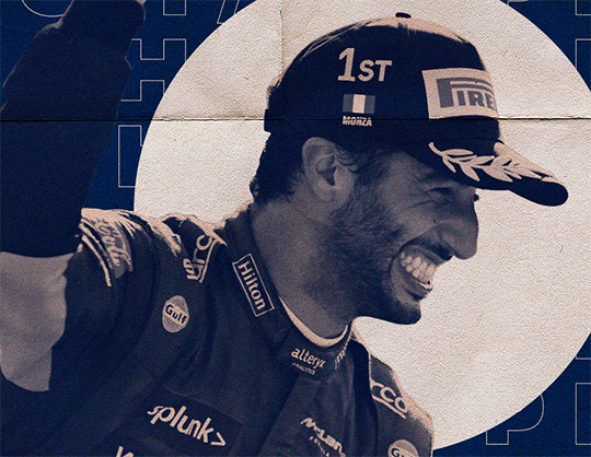
So here's a tutorial on how to do something similar to this in Photoshop

Step one
This isn't hard, but it's boring. If it's your first time doing it, I'd suggest using pictures where the hair isn't that messy, or maybe where the person is using a cap or a helmet. I usually use g*ttyim*ges or m*torsportim*ges to find pictures. You can use this site to remove the w*term*rk or follow this tutorial. The first one will reduce the image size.
It's time to remove the background! As I said, I know there are easier ways to do this, but I'll use the polygonal lasso tool (L). You can either: (i) trace around the area you want to keep, select inverse, and then delete the background, or (ii) trace the background and delete it. I usually go by the second option.
For this tutorial, I'll use this picture:
Step two
This is how I did on Seb graphics:
Using the paint bucket (G), fill the background layer. I used this color: #f1ebde
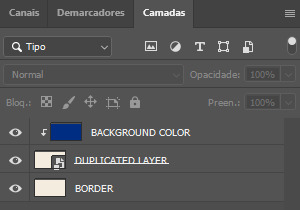
Duplicate the background layer (ctrl+J), converted it into a smart object (right-click on the layer in question and select that option), and then, using free transform (ctrl+alt+T) resized it.
Create a new layer, and, using the paint bucket again, fill this layer with the color that you really want to use as a background. After that, convert it into a clipping mask (ctrl+alt+G).
Your layers should look like this:
Step three
I don't really have a lot to say here, except that matching fonts is really hard. Take your time to try different things and try searching for fonts on sites like dafont.
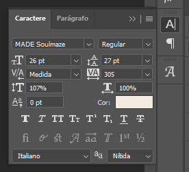
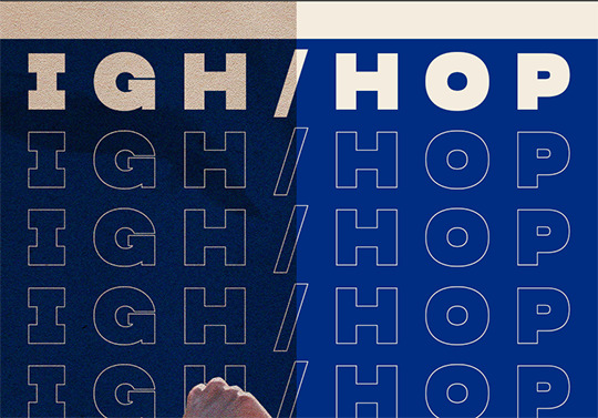
For this graphic, I'm using two fonts: MADE Soulmaze and MADE Soulmaze Outline. You can change a few things, like the spacing, on the character window. If this "A|" doesn't appear to you, you can enable it by clicking on window (at the top) > character. Here's my configuration for this text in special.
Also, if you want to create vertical text you just have to click the direction toggle button.

Step four
It's time to use the PNG we did earlier. Simply copy and paste it on your edit, but DON'T forget to convert it into a smart object. That way, if you resize it, you won't lose quality. Also, if you apply some effect, like sharpening, you will be able to remove it later.
You can use a gradient map for this kind of effect:
Adjustment panel > gradient map
The gradient map must be immediately after your png, so you can convert it into a clipping mask (ctrl+alt+G)
Step five
We're almost there! Now it's time to find textures and place them between the layers.
You can find a lot of free textures on google, deviantart and on behance. I've been using behance a lot lately because you can find a lot of textures in HQ, while on the other 2 sites you'll need to dig a little bit more.
When you find something you like, paste on your edit and convert it into a smart object too! I think that the most common blend mode is multiply, but feel free to try others and also change the opacity.
Textures are important because they will, definitely, give a totally new look to your graphic, and, most important, they'll help to cover up possible mistakes you've made (like not correctly tracing the person while removing the original background).
Look how the textures can influence the final result:
You can also add other things, like shapes etc. I'll add a circle behind Daniel using the ellipse shape tool (U). On Seb graphic, I used the line shape tool.
And that's it! It's done! This is how my edit and my layers ended up looking. I posted this graphic and you can see it here.

Useful tips:
I highly suggest you to convert everything possible into a smart object.
DON'T forget to save your edit in .png, but also in .psd. Trust me, if you don't save it in .psd you'll probably regret it at some point.
If you're planning on doing a poster with small dimensions, you can use this site to automatically remove the background, but it will reduce the size and the quality of your image. I used it to do this graphic.
If you don't know what colors to use, try searching for things like "pastel palette" or "blue tones" on google. Also, paletton is simply amazing! You just have to put a base color and they will suggest other colors based on the color wheel.
If you select two or more layers and then press V, this will appear and you can use it to align your images and texts

#this got long#and i'm sorry if it's confusing - feel free to ask again!#asks#anon#sorry for any typos etc etc#tutorial
39 notes
·
View notes
Note
Have you thought about ever doing a step by step video/tutorial on how you make skins? Or record your process? I'm trying to start doing skins but there's a lot of stuff I don't understand that the site's tutorial doesn't really explain and speed paints aren't exactly great to look for answers, so I was wondering if you would ever do something of the sort, it would be cool
I’m kinda dumb and terribad at video recording but I can totes make a process with some screenies :0 Hopefully the following helps a bit. There is gonna be an assumption of basic knowledge on layers and whatnot just fyi! Perhaps someday I’ll actually record myself making a skin if I don’t get distracted and/or forget lol.
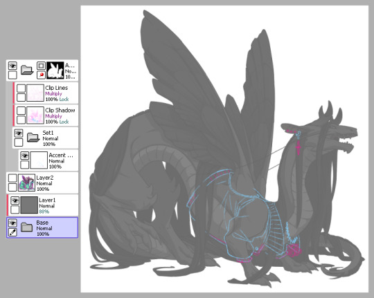
1) This is pretty much how I start my layers. I don’t change much from the default skin file provided by FR other than adding a mask to the skin folder so I don’t draw outside of the lines and then a gray overlay on top of the base just so it’s easier for me to see my sketch. I use bright colors like blue and pink to help me differentiate details. I turn off the clip lines/shadow as I don’t wanna see those atm.
The layer that says “Accent” is where I start my sketch.
If I’m making a skin for a particular dragon, I’ll often have them added in the file (note the hidden layer above the gray box). To do so, I save out a transparent version of the dragon and blow it up to 700px in waifu2x or something. Then I bump it up to 750px so it fits in the skin file. It’ll be a lil blurry but it’s good enough.
2) Next is line art - I have 2 layers for this skin: one for the jacket and another for the knuckle dusters and chains. Personally I like to close off all gaps in my line art, including drawing on the edges as you can see on the top of the collar by the wings or the gap formed by the hair on the midsection. This is just something I prefer doing as I find it makes my coloring less messy and annoying later on. But you can do it however it’s most comfortable.
At this stage, I’ll also either zoom out to 50% or resize to 50%, whichever works because it’s important to remember that the file size is 750 while the actual size you’ll have to save out will be 350 - details will shrink so make sure what you’re drawing will show up appropriately.
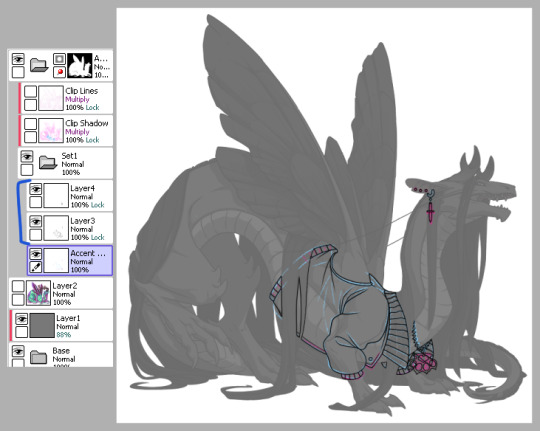
3) Now onto colors. Since I closed the gaps in the line art, I just fill bucket everything. For this skin, I drew the jacket’s colors on one layer because I’m trash and have 1 braincell but you can use as many layers as you need. In this case, the overlay layer was for extra saturation and the layer above that was for the black stripes. Be sure to clip additional color layers onto your base color so you keep things tidy and avoid coloring beyond the lines.
Again don’t forget to resize or zoom out to make sure your skin is looking as it should!
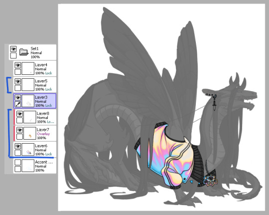
4) Finally I do some recoloring of the line art - in this case mostly the arm of the jacket. I lock the line art layer and go over it with colors darker than the surrounding colors - up to preference here. I don’t usually change the very edges just because I prefer a darker color there personally and my default is black. It’s also totally ok to have darker line art - again up to you.
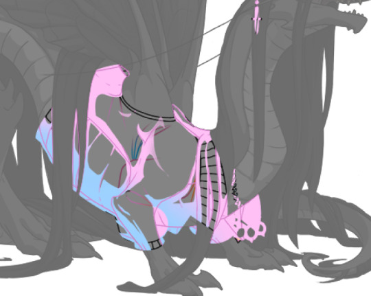
Then I turn on the clip lines/shadow since you have to make sure those show up in the final piece. Clip lines is usually set to normal but I change it to multiply because I feel it turns out better for recoloring. When I recolor, I try to match the colors of the skin while also making sure it’s dark enough to be seen. Same goes for shadows.
*If you ever get a skin rejected, it’ll usually be how visible you make the original shadows and line art. There’s not really a hard rule on what counts as “passing” since it’s up to staff but I try to make it obviously visible without ruining my skin. So here you can still see the belly scales for example, but it’s not so pronounced that it takes away from the jacket. It’s a lil uggo imo but it is what it is.
*Something to note when you color: be careful how dark you make your base colors! Too dark and you won’t be able to see the clip lines/shadow very well in the future. Note how the collar of the jacket is light enough that the shadows and lines beneath are still visible.
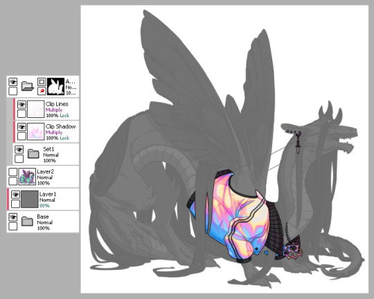
This is how my clip lines/shadow layers look on normal mode so you can see what colors I made them. Play around with the values to make sure you achieve some balance between your skin looking good while still showing off the base lines and shadows of the dragon. I used pink and blue here since it matched well with the skin. By default, the lines and shadows are gray and if you don’t recolor those, your skin will end up looking muddy.
*Other than recoloring, do not touch the clip lines/shadows at all. Do not edit them or erase them otherwise that’s a quick ticket to rejection.
5) Finally, turn off everything but your accent folder and save that sucker out and resize to 350px. At this point you can test it on your actual dragon by either pasting the skin onto a pic of the dragon or by using FR Tools. Reminder that you should not use/mention FR Tools on the official site cuz staff doesn’t like it. However on FR Tools you can also test the coverage of your skin when you select “upload skin.” Less than 30% and it’s an accent. Above that and it’s a skin. There’s other ways to test coverage but FR’s gimp tutorial sucks and is outdated and I don’t have photoshop so lol.
*I often go through several iterations of a skin just in case I see weird flaws or missing details. Testing is very important once you finish as major changes to your skin after submission is not a fun process so be sure to get it all squared away the first time.
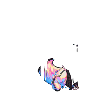
^ Your final product should look like this: transparent png (32bit) at 350px.
*Now this was the technical side of making skins using the tools at hand. If you have further questions I didn’t cover here, pls do feel free to ask! I’m no expert by any means but I can impart what I’ve learned after making a few.
#tutorial#fr skins and accents#flight rising#Anonymous#long post#sorry if it's a bit wordy#skin making isn't super hard but there's just a lotta rules and things to keep in mind
123 notes
·
View notes
Note
any digital art tips???
I'll try... hopefully this might be helpful! <3
Experiment!
Experiment not only with art styles, colors and brushes but also with different drawing programs! There's quite a lot accessible art programs that are free and do not require any payment like Photoshop, Procreate or ClipStudio Paint do, which is not to say that you can not use them. If you can, do that! (Although Adobe seems to be a prick atm with the prizes so think about whether or not you want to have that stress)
Free programs you can check out are:
-ibisPaintX
-Krita
-FireAlpaca
-MediBang Paint
-Autodesk Sketchbook
Just to name a few! There's a lot more drawing softwares than the ones I named but those are the ones I used at one point (except for Krita). Currently I'm very happy with MediBang Paint. What software suits you best is up to you of course, which is why I'd recommend you try out some and stick to your fave!
Also note that the software you use barely has an impact on how well you draw. People can even create amazing artworks with Microsoft Paint! It's not the program or software that makes the art, it's the artist and their skills.
Still, you should feel comfortable with your drawing software!
Equipment
You should also be comfortable with your equipment. Do you want to draw on a drawing pad connected to your laptop or PC? A tablet (with a pen) like an iPad (note that there's many other brands that produce tablets in good quality you do not necessarily require an iPad and Apple pen)? Or are you alright with your phone and fingers?
Artist equipment, no matter digital or traditional, is very expensive (I know that-) which is why you shouldn't be upset when someone draws with "better"/"more professional" equipment than you. Not everybody has the money to afford those expensive pads and tablets and not everybody has the room for a whole PC. This is totally fine. Because here too: of course equipment can be helpful in making it easier for you to draw and maybe even help improve your art but in the end the artist and their skills make the art. Not the equipment or software.
You can create amazing works with only your phone and fingers. No necessity for a whole tablet for example! Do not let anybody pull yourself down because of the equipment you use/have!
When I started digital art I also only had my (compared to my phone today) tiny Samsung, ibisPaintX or Autodesk Sketchbook and my fingers. Here's some examples if what that looked like:
Then someday I switched to a drawing pad and stayed with that equipment for years before getting a tablet for Christmas last year.
Drawing pad - beginning

Drawing pad - middle

Drawing pad - end
And everything post Christmas last year is made with my tablet. (Not trying to say my art was amazing then or is it now hhhhh)
Blending modes
Digital art gives artists the opportunity to use options their traditional counterparts don't have: blending modes aka. "multiply", "add", "overlay", "darken", "screen", "soft light", hard light", "color", "hue", "brightness" etc.
It's those options that can make your artwork go from
To

I recommend you experiment with those too! They should be found under "blending mode".
[P.S. you can use multiple blending mode layers over each other]
Use references! Use your features!
Finding references for all kinds of things is something every artist would recommend. It is done with a quickly with a Google (or any search machine of your choice) search or some scrolling through pinterest. Digital devices allow you to download or screenshot the pictures and insert them onto your canvas! With the invisible layer feature you can easily make the reference disappear and appear again as you like.
You can also sketch your motif on paper with pencil all traditional, take a photo of it and insert it onto your canvas/ make it your sketch. That way you even include both traditional and digital art! Quite some artists do that. Of course, it is up to you whether or not you want to follow this process.
What I'm trying to say with this section is: use the features and advantages you have with digital art!
Just have fun.
Art is a constant learning process. You develop and improve your skills over the time. And maybe now you're still insecure and unsure but one day you'll just know what to do and how. You'll get the hang of it! You're doing art for YOU and for YOURSELF most of the time (gifts or commissions for someone else not included). Have fun! Don't pressure yourself!
-Meg <3
34 notes
·
View notes
Note
Hello! May I ask how you draw? I'm currently learning how to myself and would be highly interested into a step to step process by you! Like from sketch to the done thing (no color necessary)
Hello there!
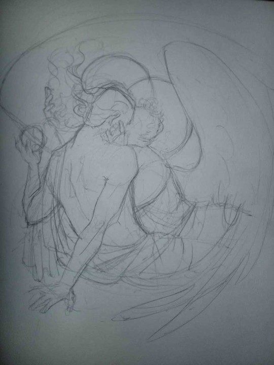
I dunno how I feel about showing how I work/giving advice to someone who’s learning (and I say it as a pro artist who went through years of traditional art education) because when I do the illustrations you see here on my tumblr I BREAK THE RULES you’d learn though life drawing routine, and give in to bad habits, and my methods are rather unplanned and chaotic which makes it difficult to pinpoint significant stages. But I used my portable potato to take some photos during working on my last piece, so I’ll throw it here with a bit of an explanation of what’s going on.
Before I begin - and because you’re about to look at a mess of a WIP - I’d like to give you some general advice that generally makes life easier when you draw (again, things that I learned in traditional arts education - another artist might advise you the complete opposite, dunno!)
Work holistically. Forget them satisfying-to-look-at clips on instagram showing someone produce a hyperrealistic portrait starting from an eye, with each and every element emerging being finished before they proceed to another part. It takes a lot of talent, yes, but these are ppl redrawing a photo in a kind of a mechanical manner. Most artists don’t work this way. Especially if you’re working without a reference, or if you’re doing a life drawing - your process will be layering and changing and finding what works best to give an impression of what you’re drawing rather than reproduce the exact image, and your artwork is likely to look messy most of the time.That said: don’t start with the details. Don’t spend too much time on a particular part while neglecting others. Your goal is to keep the whole piece at the same level of ‘finished’ (even though it’s unfinished - do I make sense?) before you’re confident that everything is where it should be and proceed to the details. So sketch out the composition first. See how things fit, what’s the dynamics. You’ll save yourself from limbs sticking out from the frame, odd proportions etc etc.
Because it’s a game of relationships between different parts of the picture/scene. I ask you not to worry about finishing a single element before laying out the rest because you’ll find that said element will look different once the other part appears! For instance - you might think that the colour you picked for a character’s hair is already very dark. But once you’re done with the night sky background, you’ll find that it’s in fact too light, and doesn’t work well with the cold palette. You’ll have to revisit different parts of the image as you go to balance these relationships and make the picture work as a whole.
Give an impression of something being there without actually drawing it ‘properly’- because details are hard, mate. You’ll see that my lineart usually has hardly any, and my colouring is large unrefined stains, but the finished thing looks convincing. Like, fuck, I can never focus on how Crowley’s eyes are really shaped. So I just turn them into large glowing yellow ellipses crossed by a line, and heard no protests so far.
Don’t panic if you messed up (you probably didn’t anyway). It might turn out to be a completely unnoticeable mistake - because, remember, things work together to balance each other, so another finished off prominent element will probably drown that badly placed line that looked so visible and out of place a second ago.
It might not look good before it’s finished. I’m mostly immune to it after years of drawing, and my recent illustrations all follow a specific method (ykno, my sunset glow effects and all that) so I can kinda predict the next stage. But I do my linearts on a specially picked crap paper, I don’t bother erasing the smudged graphite, and it looks messy af until I make the background white in Photoshop. Conclusion: you might have a moment of doubt as you work through a piece, but try to break through it - I often suddenly start to like what I cursed a minute before! - and try to finish it even if it’s meant to be bad. This way, looking through your past pieces, you’ll see the progress. And trust me, I can’t even look at my art from literally three months ago. It’s normal.
Now, pics! The sketches are paler in real life, but I increased the contrast a little so you can see something.
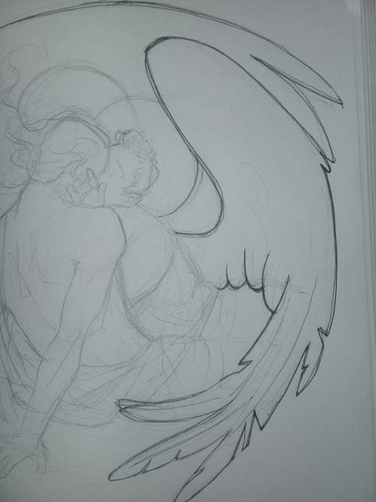
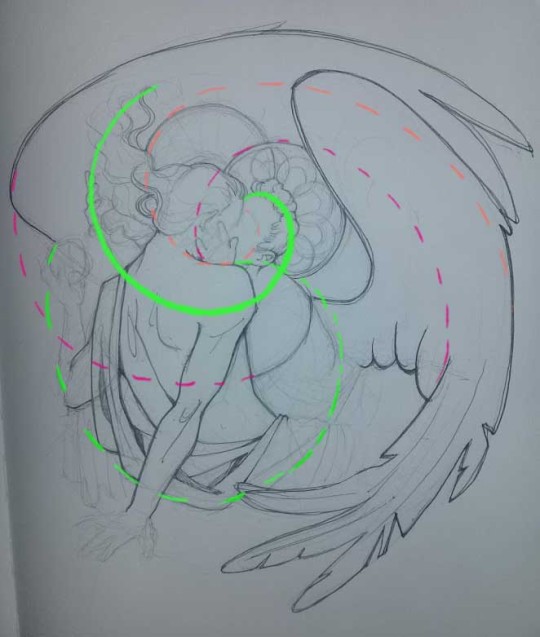
1. Laying out the composition!
I wanted to just show them kissing, but I got carried away due to some Art Nouveau inspiration. As you might have noticed, most of my illustrations are quite self-contained (ykno - they look like a sticker on a plain background). So I wanted a tight swirl bordered by Aziraphale’s wings creating a sort of rounded, yin-yang like bubble around them. Consequently I made the whole composition revolve around their heads.

2. Adding more details to the sketch. It’s messy af. It will be messy until I’m done. It’s fine.
3. These are the fineliners I use for the linearts! They are made by Uni-ball and come in light and dark grey. I also sometimes use the guy on the left - ‘Touch’ sign pen by Pentel, when I want more brush-like, wider strokes. I work in grey because when I scan it and do my usual boring trick with sunlight highlights - which is an Overlay mode layer in Photoshop - the highlights ‘burn out’ the lines too and make them vanish a little, and the lighting effect gets more striking. I also like to use the light grey ones to make something look pencil-y without actually using pencil, because pencil fucking smudges.
4. It smudges! So because I am right handed, I start inking from the right hand side, no matter how tempted I am to do their faces first.
5. You can see the composition directions here. I made it intuitively, but ofc some ppl actually use grids etc to lay out their drawings.
6. See how pale ans thin the lineart was at first? I kept adjusting it as new inked parts were appearing. It starts to look nice and consistent now!
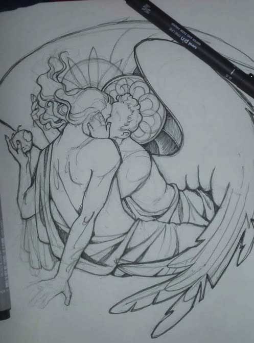
7. Finished lineart? There are some mistakes which I later corrected in PS. Notice that Aziraphale’s face has hardly any details on it - I tried to make the drawing suggest his expression rather than risk overdoing it.
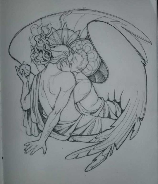
8. Photoshop time!! You can totally do what I did here even if you don’t have a graphic tablet. I used Curves tool to enhance the lineart, then Quick Selection Tool to select the background around around my sticker-like piece and filled it white (on a new layer ofc). I keep this white layer on top of the layer order so it works as a mask as I colour. I decided I did not like the hatching shading underneath Aziraphale’s halo, so I erased it with a Stamp tool (because I wanna keep the textured grey fill my crap paper naturally gives me!). It’s done roughly but won’t be visible once the thing is coloured.
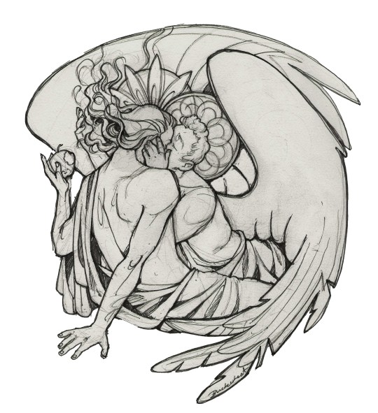
9. And the reason why I keep the grey shade instead of easily getting rid of it by using Curves/Levels is because when I set this layer to Multiply mode and colour underneath, it gives me this nice desaturated look like from an old cheap paper comic page. It works as a natural filter! But of course I can’t do bright colours this way, so all my glowing highlights happen ABOVE the lineart layer - on a separate layer in Overlay mode!
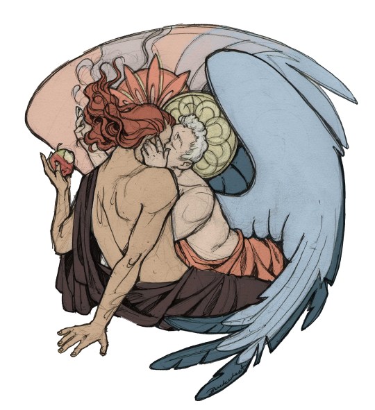
Finished thing here!
_____
Commission infoBuy Me a Coffee - help me with my transitioning expenses!Prints and stickers and things on my Redbubble!
#ask the buckwheat#long post#tutorial#drawing advice#drawing tutorial#good omens#ineffable husbands#good omens fanart#good omens art#my illustrations#doodles#toastedbuckwheat
1K notes
·
View notes
Note
Hey! Do you have any advice for people new to digital art!! I started recently but I'm having a really hard time especially with lineart and colors ;-;
Well digital art is such a huge and scary beast and it’s more than normal that you have difficulties with it. Tbh I still struggle with it a lot because I’m always afraid that i could do it better or that I should have been to choose absolutely another style for myself. Now my main struggle is a choice between more simple coloring with more sharp shadows and some kind of volume and more realistic lighting. I doubt very much now about all of this and wonder if my arts would be better and audience loved them more if I’d draw with sharp lineart and simple coloring.
Idk if I’m the only one who thinks that lol. I think that’s mostly because you have a really large amount of possibilities in digital art. Thousands of brushes, effects, instruments - all of this use to scare and make you confused. You don’t know where to start from or what you want from your style and how it should look like. And it’s normal, especially if you only started getting used to it. And you should be ready for that it’s gonna take a while before you finally feel comfortable with your style and digital art at all. However it all depends from the person.
So I would like to write some basic tips based on my own experience and thoughts and maybe it could help someone.
Find yourself a nice software you’d feel comfortable with. I wanted to make another post about my software but it’s for another time. I would recommend SAI or Sketchbook Pro for those who start. I still love them more than Krita and photoshop tbh because of simple interface and configurations.
Find tutorials for anatomy, expressions, all that stuff. Learn color theory, because that shit is really important in good illustration. Same goes to the laws of composition, lighting etc. Youtube has a lot of this things, also you can search on Pinterest.
Probably the most important tip: Don’t try to start from some difficult kind of drawing. And go to some kind of realism. Instead try to make a lot of pics with simple lineart and coloring, it will help you to get used to the pen and brushes and feel more confident. Many artists who only start try immediately to draw some very cool difficult idea with cool lighting and volume and details (trust me I was lterally that person) but I think it’s better to make just a lot of simple colored pics probably even with lineart + solid colors + blush for example instead of one big and “detailed’. I failed with that so much.
Make studies. Make a lot of studies. Of everything - poses, faces, environment. Just try to copy screencaps from shows or cool pics on Pinterest with trying to analyze how lighting and stuff works or which instruments are better for you. Plus studies often help to understand how color theory and composition work especially when you make them from someone’s already made pieces such as photos and movies. that’s just like in real life when you sketch smth or smb from real life, or make gestures drawings. It’s easier in digital because you can train yourself in coloring too without a need of thousands of coloring art stuff.
Make a lot of observation. Open an acc of your favourite artist. What features of their style do you like the most? Maybe they have a certain way of drawing eyes or noses, or maybe they usually add to line bright colors or make those good looking outlines with lighten color? Try to note these features and use in your drawings so you’d feel more satisfied with final result. Go watch their speedpaints so it would be easier to understand how stuff works. Don’t try to copy, just note some things you love the most about them.
Use references. It really can help with understanding what atmosphere you want from your piece, lighting, environment => it would be easier to imagine it in your head and I think that it’s already a half-finished work if you have a really clear imagine of the final piece in your head with poses, lighting and stuff. I always spend a while for imagining what I want from drawing, often while being on my way to university in a subway, listening to some themed music. Also I used references for my latest Halloween and autumn pieces. It’s not that you copy stuff - more like try to analyze how to make your drawing more realistic and detailed.
Use different modes of the layers. That’s honestly the best what the God of Digital Art could gift us. My leaders are definitely Glowing and Overlay. Also I would recommend to use rather Multiply mode for shadows than trying to draw them with just same color but darker. You can draw shadows with just purple or brown and than just use Multiply so the they would look more natural. The same goes to everything else - from backgrounds to lighting. These modes can become your true saviour in tough times.
Flip your canvas horizontally all the time to see the mistakes in anatomy, faces and stuff.
Don’t use too much texture brushes. Seriously they are good but sometimes you only need the most simple ones to create a decent piece.
And of course the very-very main advice. Without it everything I told above loses its sense completely. PRACTICE! Just practice-practice-practice, draw thousands of pics, sketches, try different styles, experiment. It’s the best way to get used to digital art and understand what is comfortable for you and what is not. Experience is really important in this field. Don’t expect that it would turn out immediately perfect and remember that with every piece you become better and more confident. Every finished drawing makes you closer to success and satisfaction from what you do. The most important thing is to not give up. Look for inspiration in songs, people, everything around you, try to make drawings of it, sketches, whatever. Just make a lot of that. Really a lot. Of course with analyze and permanent observation. That’s the only valid way to success.
These are very rough and maybe I forgot some important parts but tbh I wish someone told me these while I just started to draw digitally. Honestly a really good observation and practice make perfect and I understood it pretty good for these months.
80 notes
·
View notes
Text
Tutorial - Changing Skin Color in Photoshop
I made a tutorial about this on another blog a while back, but I have no idea where that post is anymore, so here is a fresh one! This is a tutorial for changing someone’s skin color in Photoshop.
Notes:
I use Photoshop CC 2019, but older versions should be perfectly fine as well. The more familiar you are with masks, selections, and the brush tool, the better.
You can use this same method for changing the color of pretty much anything! It works exactly the same. You could do this for her shirt if you wanted.
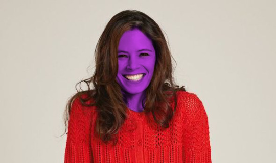
This is meant for if your character has an unnatural skin color, such as the bright purple alien character in this tutorial. If you’re wanting to make a POC look white, or a white person look like a POC... maybe rethink that. Be smart, don’t be racist.
Let’s begin!
The process is fairly straightforward. You want to isolate the subject’s skin, turn it black and white, then overlay the desired color on top of it. While you can simply paint over it with the brush tool, it’s much quicker and easier to use a mask.
I will be making skymade’s lovely character Willow for this tutorial! To start, open your image in Photoshop.
Duplicate your layer, putting one directly on top of the other.
On the top layer, select your subject’s skin. There are many ways to do this -- you can see an overview of Photoshop’s selection tools here. Personally, I’m a fan of Quick Select. Usually, it works well enough that I can get a good start and refine it later.
Your selection does not need to be perfect here. It just needs to be close.

Then, create a mask of your selection by clicking the create mask button in the bottom of the layers panel. It’s the rectangle with the circle inside it (I always think it looks like the Japanese flag).
The top layer is now only showing the skin that was selected, but you won’t see a difference right now because of the duplicate layer underneath. You’ll know it worked if you see the black and white mask on the top layer.

Now, add a black and white adjustment layer by clicking this button.

That will add a new layer above your current layer. The entire image should be displaying in black and white.
We want this black and white layer to only be affecting the skin. To do this, right click the adjustment layer and select Create Clipping Mask.

A small arrow to the left of the adjustment layer indicates that it is only affecting the layer below it. Your subject should now be in full color, with black and white skin.
Now, create a new blank layer above the adjustment layer, and create a clipping mask for that as well.
Using the paint bucket tool, fill this entire layer with whatever color you want the skin to become. Because of the clipping mask, it will fill the selected skin with that color.
Eek! That’s creepy. Don’t worry, we’re not leaving her like this.
With your layer of color selected, go into the blend mode drop down and cycle through them until you find one that looks best. Multiply, Overlay, and Soft Light are usually the best ones. Generally, I find Multiply works best for subjects with paler skin, while Soft Light works best for subjects with darker skin.

Much better.
The way the colors blend into the skin will often make it appear a different shade that what you selected. You often need to choose a color that is brighter and more saturated that your target. To change the color, simply use the paint bucket again on your color layer.
Now, there are still issues with the mask. Her eyes and teeth should not be included in the color, and there’s a jagged edge to the selection. We want to refine the original mask to fix this, now that we can see the colors.
To do this, double click on the black and white mask image in the layers panel. That will open up this window.

Let’s start on the right. The sliders at the bottom are very helpful. Smooth will smooth out the edges and make them less pixelated. Let’s bump that up a little.
Feather will soften the edges and blend them out. Let’s bump that a little, but not too much! It’s easy to overdo.

Shift Edge is useful if the entire edge of the mask needs to come in or out. Simply slide it left or right as needed. For this, I want to shift the edge out slightly, so I slide right.
Now, I want to remove her teeth from the mask. To do this, I’m going to use the tools in the left toolbar. The Brush Tool (third down from the top) will add or subtract items from the mask. Painting normally will add them, and painting while holding down alt will subtract them. (You can also use the + and - buttons in the top toolbar to toggle between them.) Everything else operates the same way as a normal brush.
So, while holding down alt (or having toggled to subtract mode), I am going to use a small brush and paint out her teeth. If you erase too much, just release alt (or toggle to addition mode) and paint it back in.

I’m going to do the same with her eyes. On this image it’s barely noticeable, but for other images it makes a world of difference.

I’m also going to go in with the brush tool and add to the mask around her hair. To do this, I’m going to set the hardness of the brush fairly low, so it softens into her hair. (This is easier with her because her darker hair will hide mistakes better. With very blond people, you have to be much more precise.)
When you’ve finished, hit OK.
And now she’s a-purple! I hope this has helped you out.
6 notes
·
View notes
Text
Art Process
Someone asked me for my process and how I do things. I thought I’d used the latest painting I made as an example, since I was compulsively saving each step of the way and thus have neat snapshots on how things go.
I use Photoshop CC. I used to use Corel Painter, but there are tools in Photoshop that I use all the time for correcting mistakes, which don't exist in Painter (at least the 2012 version.) My brushset can be found here. I spend 90% of my time using the square brush. To have it display properly, you’ll need to grab the little bottom right corner triangle and expand the little brush-window until things look like this:

I typically start off by blocking in big blobby, noodly shapes in greyscale and start sketching/rendering that up with more and more detail. This is all done with the plan that I will add color later via blending modes. By working in greyscale first, I can roughly figure out my values/shading without also having to worry about color at the same time. The old masters used to do something similar with oil painting by creating a grisaille first and adding washes of color later.
Rest of process is under the cut as it is a long post!
To add color my usual choices for blending modes are Multiply layer first right over the greyscale with an Overlay layer on top of that to stop things from getting too dark. I also use Overlay to do a bit of lighting adjustment too if I feel things would look better a bit brighter or darker. I try to also keep warm vs cool colors in mind at this point as well. You’ll notice that Tiergan’s pectorals, face, and the shoulder closest to the light are a bit brighter and warmer - while things get subtly darker and cooler as you get lower down his torso. Things look really funky and weird in this stage, but you just have to trust in the process and know it will gradually get less fugly.

Speaking of blending modes - I love the fuck out of them and I feel like they are an extremely powerful tool in your toolkit. Other blending modes I tend to use sometimes are Saturation (to knock things back if I made the colors too over-saturated using Overlay), Color (for color adjustment like the name suggests), Lighten (to affect only lighter values while leaving darker ones alone), Darken (tweak only darker values while leaving the lighter ones alone, Screen (great for glows), Linear Dodge (extremely situational, but can be neat for rim-lights, magic effects, and LIGHT SABERS if you put the blending mode on your brush).
Once I am satisfied with the color, I flatten everything and resume painting from there in full color, continuing to render and polish everything up, adding in all the details. I tend to do this by making new layers and painting on top instead of directly on my flattened layer. Sometimes I’ll have two or more extra layers set to Normal to paint different things. The reason I do this is so if I don’t like how I’ve rendered things, I can erase parts of it or just nuke it all back to a clean slate - without destroying the base foundation I’ve created.
I use a mix of Normal layers and layers with blending modes to render depending on what I need. Sometimes further along in the painting, I’ll realise I want to make things even brighter/darker and push the values more - so I’ll do something like add n Overlay or Multiply layer to do that, then add a Normal layer on top of all of that to keep painting in color. (And then flatten everything again when I start getting antsy about there being too many layers.)

You’ll notice above I realised that I forgot Tiergan’s hair and that he was looking super bald the more I rendered, so I just added it in on its own separate ‘hair’ layer. At the same time, I probably had another layer right beneath it that was just for rendering out all the skin details.
I always try to work as non-destructively as possible. This is also why I have so many versions of the same file and can show you past snapshots of what I was doing - every time I’m about to make a major decision, I save the file as a whole new copy of itself before continuing. Other ways I try to work non-destructively is to use Layer Masks instead of actually erasing things unless I am POSITIVE I want something gone and never want to bring it back.
If my character is on a separate layer from my background (which usually is the case, but not what I did this time around) - I abuse the shit out of Clipping Mask layers to paint only on my character. In fact, I used clipping masks on the ‘Hair’ layer I mentioned earlier to paint only on the hair when I wanted to add lights and shadows to it without risking fucking up the surrounding areas. The shadow cast by the hair onto the skin I did on a different layer just beneath the Hair layer.
Note: If you’re reading this and your first question is “What the heck is a Layer Mask/Clipping mask?” - then HOLY SHIT NUGGETS MY FREN, READ THIS AND FEEL YOUR MIND BEING BLOWN.
When I feel like I'm finished, I more often than not do a final pass of lighting/color adjustments and some finishing touches that would be tougher to do earlier in the process (like scars!) either with blending modes (to push or dial back lights/shadows, adjust colors/saturation) or slap a gradient map on top of everything as an adjustment layer set to low opacity to kinda help harmonize all the colors. It’s a little easier for me to try and bring everything together once all the information is there on the canvas and I just need to tie stuff together.
As for how I blend - almost all my brushes are set to change opacity depending on pen-pressure. Thus when blending values/colors, I just use the eyedropper tool to choose a color/value I want and use light brush-strokes to blend. When I REALLY want something to be soft, I use a big ole fuzzy airbrush-type brush and very, very lightly put down a stroke or two - but I do this very sparingly and try to avoid relying on fuzzy-brushes to blend as it can very quickly lead to your paintings looking like mashed potatoes. Making sure you have a nice mix of hard crisp edges and soft ones will make your work feel nicer.
And that’s it! I hope it was helpful!
130 notes
·
View notes
Text
Combine hand-drawn sketches with Photoshop
1. Produce an initial sketch
Start with a simple pencil sketch as a rough layout. Always use reference photos, but for a piece like this you can also work freehand. We’re not planning to create something realistic here, so try whatever you want and just create a broad impression of a lion. Always attempt to keep your work symmetrical at this stage.
2. Lay out one half of the piece
Now scan in the sketch and open it in Photoshop. Since the design is based on symmetry, we’ll only need to create one half of the detailed drawing. The challenge is to correctly set it up. Erase one half, copy the other one, mirror it and put them together. Correct every part that doesn’t look good, then erase one half again until the result works.
3. Divide the sketch
Print your (half) layout at an A4 size and trace it on a new piece of paper using a pencil. This next part all comes down to style. You can split the piece in a way that looks pleasing, there are no real rules here. Keep in mind that some parts are more important than others – like eyes and mouth – these should be accentuated.
4. Refine the final layout
Using the sketch, you can now start toprepare the detailed sections. Retrace all the single pencil lines with a black fine-liner (0.3mm), while trying to stay as clean as possible. Don’t rush this, as sometimes fine-liners tend to take a few moments to dry. Every mistake made will have to be corrected later in Photoshop, so it’s advisable to be patient at this point. After you’ve traced your sketch, erase the overlapping pencil lines.
5. Fill the fragments
Working with fine-liners sized at 0.03 – 1mm, you can start to fill all the single fragments. Again, this is a matter of taste. Here we’re using different kinds of hatching everywhere, but the same thing would work using dots, circles, waves or whatever you prefer. What’s vital is that you create different shades of grey, because that’s what gives depth to the drawing. Try not to use the same pattern on two parts that are next to each other.
6. Finalise outlines
To finish, you need to emphasise the outlines of every single fragment, as well as the lion itself. This should help accentuate the skull against the mane. You can also correct little mistakes made while hatching by covering them up in black. While a fat outline may help to keep the whole drawing together, it often also adds a street art look. Changing the thickness of the outlines in some places will also make the drawing more dynamic.
7. Turn your drawing digital
After finishing your drawing, scan it at 800dpi. Always keep in mind that it may be necessary to resize the image later, so it’s best to work with larger files now rather than needing a better resolution afterwards. Since no colour information is needed here, greyscales are enough. Now open your file in Photoshop and adjust its contrast by applying a Curves adjustment (Cmd/Ctrl+M). This way you should get the paper almost plain white, while the drawing should be black.
8. Prepare your mirror
Now you can remove any dirt that appears on the scanned images. Here it’s useful to invert the drawing (Cmd/Ctrl+I), as this will help you spot stains (white on black is easier to see than black on white, at least on screens). You can now use the simple Brush tool to remove some flaws. After this, use the Burn/Dodge tool (O) in case there are some shades of grey. Finally, change the canvas size so that there’s enough space for the whole graphic.
9. Finalise the drawing
Now remove the overlapping parts at your central line. Copy your layer, mirror it and change the blending mode to Multiply. You may need to redo this a few times if the original drawing is not at a perfect 180-degree angle. When done, put both layers together exactly pixel to pixel and reduce them to one layer.
10. Cut out the drawing
This is a process used a lot in these projects. Select everything by hitting Cmd/Ctrl+A, copy this, add a mask to your layer and click on it while holding Opt/Alt. This way you’ll remain inside your mask, where you’ll paste your drawing. Invert the whole thing and you should see a white drawing on a black background. Leave the mask and return to your layer. Fill the canvas with black, hit Cmd/Ctrl+G, then Cmd/Ctrl+E and your drawing should be cut out.
11. Add the main colour
While the final graphic should have strong colours, here we’ll keep it down to just two main tones; turquoise/green and yellow. Use different grades of green to fill the lion’s head by selecting the space surrounding the drawing. Invert this selection (Cmd/Ctrl+Shift+I) and go to Select>Modify>Contract. Depending of the size of your drawing about 5 pixels should be enough. Create a new layer below the drawing and fill the selection with a selected tone.
12. Use different grades
Now lock the opacity of your layer in the Layers palette. This way it’s easier to work without watching for the exact outlines of the graphic all the time. Now fill all the fragments using different tones of green, maybe almost some shades of grey to the different parts of your drawing. Think about where you could include darker colours and where injecting some lights might help achieve depth. You can use the simple Brush tool with a graphics tablet for this.
13. Accent the details
Now the second colour comes in. Here we’ve used a very warm, almost orange, yellow. It’s complementary to the green tone, which helps the eyes stick out a lot. This should be used very subtly, without overdoing the effect. Of course, it’s still best to use different grades and even add a bit of red surrounding the eyes. This is something you have to practise a bit to really get a feeling for what works and looks good in the end.
14. Layer on the shading
To give the design a little bit more depth, it’s a good idea to add some shadows. Create another layer on top of the colours, but beneath the drawing. Now apply the Brush tool again, setting its Opacity to 30%. You can either use just plain black, or different shades of dark green. As ever, this is just a matter of taste, so there are no limitations at this stage. In this piece, we worked especially around the skull to accent it further against the mane.
2 notes
·
View notes
Photo
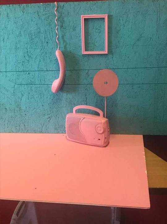
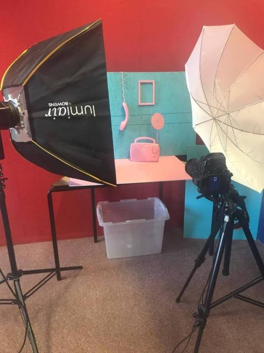

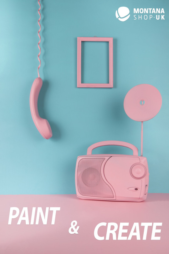
Montana Shoot -
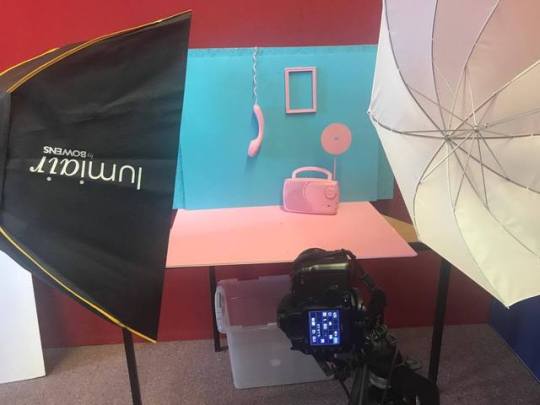
The actual shoot for Montana included setting up the lights, camera and display. First of all we had a play around with the lighting to see where we wanted it to be, we settled on a soft box coming from the left and an umbrella coming from the right - this balanced out the lighting and made our overall set up look good. It was important to experiment with the composition of the objects and lighting before shooting because we wanted to make sure it looked aesthetic to the eye and also make sure that our whole group liked the idea. Its also important to discuss the set up with the group because other peoples ideas may help the overall set up and help gain a different view to the project.
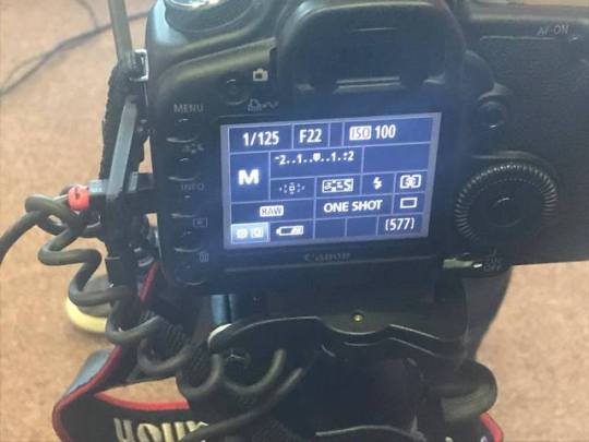
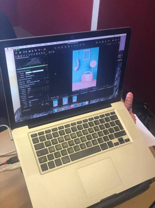
Next we shot out images and ended up moving a few props about as the shadow wasn’t 100% on them - but in the end we got a nice composition and ended up shooting it. To shoot we used capture one and a tethering cord this made it easier as we could review the full sized image straight away rather than having to guess off a tiny screen if it looked ok. The settings of the camera for the image we chose overall were ISO 100, F22, SS 1/125 and the focal length was at 43mm. The ISO of 100 was used because this is a basic studio ISO setting, I used an aperture of F22 to ensure everything in the image was in focus as we were showing off the colours of the paint and how it covers and I used a SS of 1/125 to make sure I could capture the image quickly and also to make the light meter balanced. The focal length came down to just seeing which perspective was right for the image. The group liked this image the best out of the range we took due to the smooth background and the composition of the products. This image caught my eye because the two pops of colour really make the image stand out as a whole. However, I did have to edit it in Photoshop. First of all I opened up the image in camera RAW and did some basic exposure and contrast editing as well as boosting some of the other settings such as vibrancy and clarity.
I then opened up the image in Photoshop and duplicated the layer using CTRL J to make sure I can edit non destructively. Now I went to the tool tab and selected the Spot Heal tool to get rid of some of the imperfections on the image - the spot heal tool uses the area around it to heal the bad area. After I had used the Spot Heal tool I moved on to the Clone Stamp tool - to use this you press ALT and click on the area you want to paint over the bad with - I used this on some areas of the frame and some of the objects to make sure they looked the best they could. Another tool I used was the Patch Tool, I used this on the bottom of the frame as there were bits which simply couldn’t be covered up using the other tools - to use the Patch Tool you draw around the area that is bad and then drag it one way or another to cover this up. Once I had edited the basics of the image I went on to placing the logo on - I opened up the logo for Montana in Photoshop and dragged it onto the image I was editing, using a layer mask I then had to invert this so it would match the background (white) however, by clicking twice on the edge of the layer tab it bought up a new window and on this window I clicked on Colour Overlay and changed the colour of the logo to pure white - I then moved the Logo to the top corner as I thought this looked best on the image. The slogan ‘Paint and Create’ also had to be included in our edit so I wrote this out using the text tool (word by word so I could place it how I wanted) and then changed some of the text settings - The font was called Myriad Pro and the size of the words varied as I wanted it to look as good as possible and I also made the text italic to add a spin on things. To get the text in the correct place I added a new guide layout and placed it within the margins so it was equal either side. I also added a drop shadow to the text as I thought it’d stand out more. The blend mode of the drop shadow was on multiply, opacity 21, angle 90, distance 3, spread 8 and size 7. I then saved my image!
Looking back at the original brief I think my image does resemble the ones we were given in the brief due to the whole colour scheme of things and the items used. The differences come in to the fact that we added a slogan and a logo! Thinking about my slogan and logo placement I think they look good on the image - I used the font because it look simplistic yet aesthetic on the image and the size was just right to fill the blank space at the bottom! I manipulated the text in the way I did because I think it overall suited the image better. I cropped my image slightly due to some of the classroom showing.
Overall, I’m pleased with how this shoot went and how the editing went - I think the image looks very professional and aesthetic for the company. If I were to do this again I would use some different products and paint them to see what set ups I could get and maybe even use some different coloured paint.
0 notes
Last Seen Blogs

drum-circles
Drum Circle World
this-is-emzy
What The What

xemphimhayorg
xemphimhayorg
ghost-in-love-owo
Your Highness,I am your most devoted beliver.