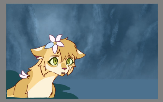
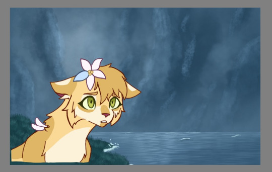
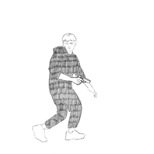
#also the lines of the first background are traced from the screenshot but the painting is totally made by me without any tracing
Text
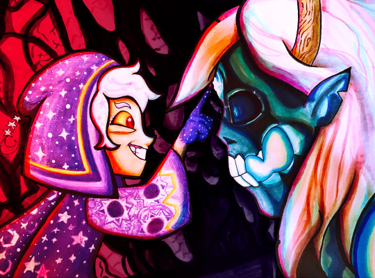
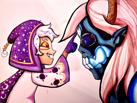
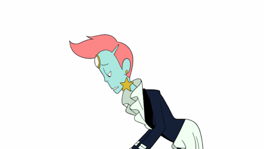
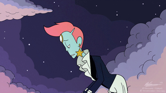
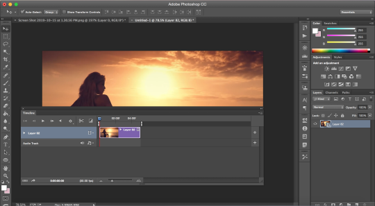
Did a screenshot redraw of that moment Belos knew he fucked up. With markers!
WIPs/links to higher quality under the cut 😌
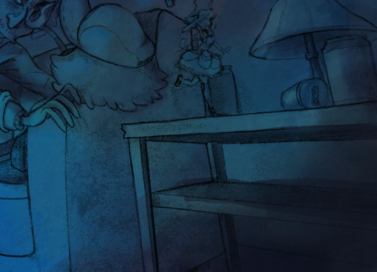
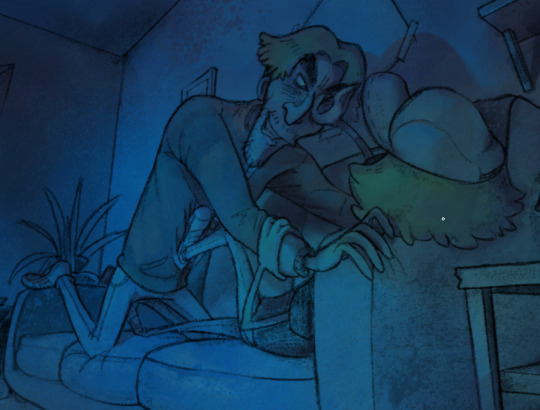
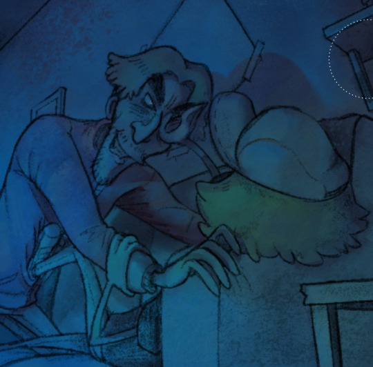
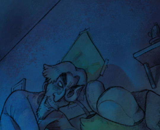
So what I did to create this image was hold my paper up to my screen and trace over the screenshot's lineart, then worked out the rest of the details on paper. The straight lines on the top and bottom are where the original screenshot cuts off.
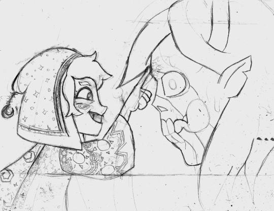
Once I decided the sketch was finished I put my blending card (special paper for the markers) over the sketch on a lightboard and traced over it with my pens.
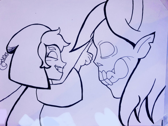
If I made mistakes I would sometimes use my white paint pen to draw over them.
Then, on a piece of scrap paper, I would test out my markers to see what blending combinations looked good.
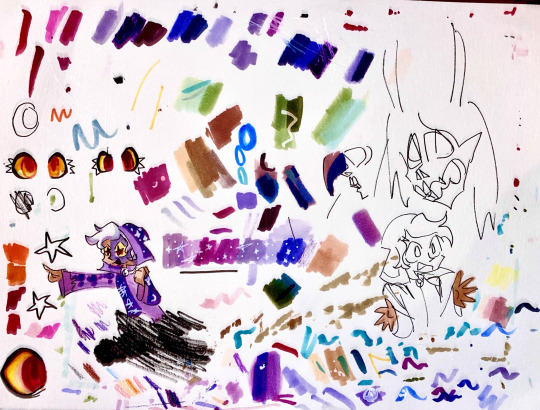
Tangent: I use alcohol markers, specifically COPICs, though I also have some Prismacolors too. Alcohol markers are built for blending and I recommend looking them up if you are interested. I use copics because they have a brush nib and while they're expensive, you can easily get refills and replacement parts so you'll never throw them away. You can buy 30 year old markers that are still good.
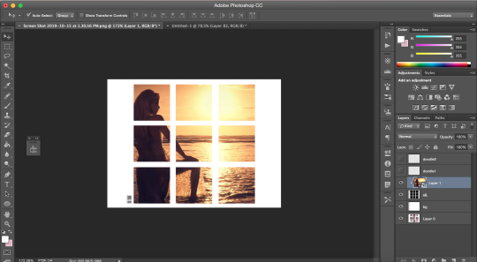
First I colored (most of) the characters (that took a lot of time, especially since I was cautious about how to color in things like the eye and would test on scrap paper first)
Then I tried making a background but I really didn't like it
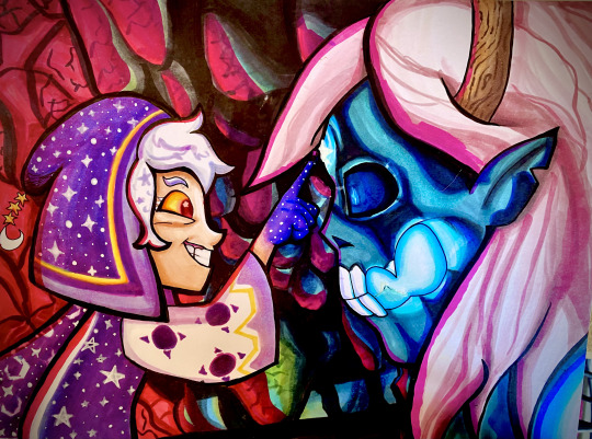
So in digital art I cut out the characters from the background to see how to fix it and came up with the idea of darkening it significantly.
Digital experiment on the left, experiment onto paper on the right.
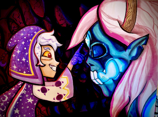
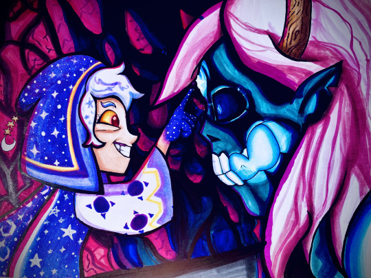
A lot of these WIPs look very different because of me taking pictures of the photo with a phone camera and doing different filters every time. I have a scanner but I've never liked how it comes out.
If you want to see a higher quality version of the final image, here's links to where I uploaded it on Deviantart and Newgrounds.
Also a Youtube upload of that video I made!
Note: There's an animation error in the original ToH clip I used where the Collector's clothes are miscolored, and the reason they're not here is because I fixed it.
#The Owl House#the collector#emperor belos#screenshot redraw#traditional art#quo's art#quo's colors#quo's traditional
63 notes
·
View notes
Note
Do you have a tutorial on how you did those color swap recolors?
I don’t have a tutorial, but I can tell you what I did!
First I got images of the characters I wanted to work with, usually from about waist up. I could’ve done full body, but it was just easier to make them smaller
Then I put them in my drawing software and adjusted the colors to counteract the lighting in the scene. I worked with a lot of V7 screenshots, so I had to get rid of a lot of blue lighting. Once the colors were adjusted, I eyedropped the ones I’d need into a separate file for ease of use later
To prepare an image to be color swapped, I would edit them (to the best of my ability) to remove their weapons from the picture. It just made it easier
The Final Step!! (Drumroll) I turn down the opacity of the image I want to use and trace down over all the lines with a like… 1.5 pixel brush. This gives me clean lines to work with for paint bucketing and what not
And that’s it! Everything after that is just decisions about which outfit colors go where. I also left the original image under the new colors, so I could use refer back to how the shadows fell acros skin and clothing and whatnot (and for the background lol)
So yeah. That’s how I did it
12 notes
·
View notes
Text
WIP Wednesday~
Hello hello! Long time no see, huh? I appreciate all of the tags y'all have sent my way in the last several weeks (or months?) - from WIP Wednesdays, Last Lines, and all of the other fun tag games. I haven't been ignoring them, I just have soup for a brain <3 It means the world to me that you would tag me, and I'm sending you love and cookies :3
And if you're in ADG, pretend you didn't see this before and it's brand new to you!!
So yeah! A few weeks ago, I'd stayed up late playing games with a friend. Towards the end of the night, we realised we hadn't looted the Last Wish chests for the week, so we took off to get those together. Eventually it turned into one of those evenings where you aren't even playing, you're just running around and jumping around together and talking about nothing. Something about the moment really struck me and I had the idea for this piece.
The problem is that I'm a little low on funds for a commission at the moment, and I'm also not an artist. I've always wanted to learn but never really stuck to it. (Like so many other failed hobbies…) But I have this expensive tablet that I've barely touched in the last year or two, and a desire to create, so I tried it anyway. :)
Ultimately, this is just a traced screenshot redraw of my guardian sitting at The First Spire in Last Wish, which is where we'd been jumping around. But it's also been a fun exercise in testing a bunch of silly brushes and also letting go of perfectionism to make something meaningful for myself. I've been trying to trace all the basic lines and then painting over them. Right now all I have are some scraps of guardians, lol. I did a little of the bridge in the background, but it looked weird when I left it in for this post, so I took it out. There will eventually probably be a background :)

Tags (no pressure!) and original screenshot below the cut :)
@melisusthewee | @ndostairlyrium | @greypetrel | @me1onmi1k | @zenstrike | @a-driftamongopenstars | and YOU!! I wanna see what y'all are working on, if you'd like to share :3

#if you do/don't wanna be tagged just let me know! :3#it's all flat because I'm not here for hard stuff right now!!! I'm letting myself be bad because who cares!!#this is for me!! well and maybe for the person whose guardian I stole for this random project (hi ezraaa)#wip wednesday
13 notes
·
View notes
Photo
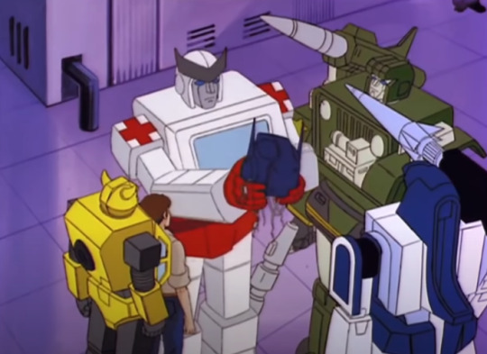
Oh, G1 Season 2.
Decapitated Optimus: “I can sense the presence of my legs.”
Meanwhile, Ratchet is standing there with no less than two missiles pointed INCHES ABOVE HIS HEAD, and Bumblebee is way, way too close to Spike.
Spike, who is standing in the exact same pose as Bumblebee (compare their arms), because they traced and scaled up the sketch for Spike on a different cel layer and then drew a Bumblebee over it to make a Bumblebee layer because fuck it, that works fine.
Alternatively, they only drew Bumblebee, then realised they fucked up and drew Spike in the only place he would fit in the composition of this shot, but Bumblebee here has juuust enough of a slightly crisper edge and brighter colour (closer to the top of the cel layers) to him that I think they did the first one.
So I think the cel layers here are BG, Hound, Ratchet (look at his forearm overlapping Hound, it’s a little blurrier because matte grey on cel material is a pain in the ass to work with and you see grey as a little weirdly outlined in a lot in older cartoons but here it looks like it was likely painted with a masking tape line to create as angular of an edge as possible), Spike, Bumblebee, then Mirage because foreground was almost always top of the cel stack.
Not always though, they notably fucked up cel layering more than once in G1 that’s for sure LOL
I mean I’m not 100% sure, I haven’t seen this scene in motion in years so I don’t remember what the animation actually looked like. lol
The scale is still a little fucked up, because it is always fucked up.
I don’t know why, but this specific screenshot always makes me laugh so hard. The missiles are SO CLOSE TO RATCHET’S HEAD
Also, look at the placement of Ratchet’s thumb. It has to be so close to Optimus’ eye. It might even be slightly hooked on the top edge of his battle mask, presumably to help Ratchet’s grip, assuming Optimus has his mask engaged in this scene. I don’t remember. It’s G1, so probably.
I also like how in the 80s, the idea of cool futuristic industrial complex style building was still tiled 70s disco venue flooring and purple mood lighting.
I mean there are reasons for choosing certain colours for backgrounds, but the floor and walls are the exact same colour here, which suggests that there is some kind of lighting situation happening.
I don’t even remember what episode this is from, I’ve just had this screenshot on my laptop forever. lmao
16 notes
·
View notes
Text
Another day without an official wordcount. More edit work. I really need to work on fixing a scene in my Malik backstory, but the sunny weather has me in a 'I just wanna chill and relax' kinda mood. Forecast calling for rain and thunderstorms tomorrow, so as long as the barometer doesn't trigger a migraine, might work on it then.
I ended up spending most of the day between leveling my Kura bunny on FFXIV and playing around with Krita in an attempt to learn digital art.
Super huge thanks to @resuri-art for taking the time to help me figure out the whole opaque layer thing so I can use base images to follow while I try to see if maybe hands can pick the muscle memory of drawing back up. My first attempt required me to hit that 'Undo' a lot, because I couldn't find the stylus my son lent me (turns out it fell on the floor and doggo had it hidden under his blanket), so I used my finger instead lol.
My two attempts for today were pretty pixilated, but it looks like it's because I didn't set the canvas size? I just left it default because I have no idea what I'm doing lol. Gonna play around more tomorrow.
Enjoy my lovely attempts below the cut!
So I decided to start with my favorite idiot for a base. Yeah, I know he's kinda crooked. I'm working with the touchscreen on my notebook so when I tried to do things I kept moving the image lol
Yes, I copy/pasted my desktop screenshots into paint and didn't crop them.

This is with the traced layer. Like I said, I had to use my finger so it was kinda crazy.

Hid the base. Lines aren't half bad for finger drawing.
tried to get rid of the checkered pattern by painting everything white. You can see the little dots from my fingers leaving marks while trying to move the image (I didn't notice them until after I painted the background).
Decided for trial numero dos that I was gonna try to use this base to draw my OC.
I actually used the stylus for this. You can see the pixilation I was referring to in this pic. I tried to fill in the white, but I eventually called it quits and just decided I would try again tomorrow. One finger had already locked up and it wasn't fun.
Also, I realized after that I really need to practice drawing eyes (and hair detail...I always get so lazy there).

Gonna try again tomorrow with a bigger canvas size. Fingers crossed! And hopefully not locked up!
#writing progress#once again none#enjoy my lovely attempts at digital art#not the greatest#but it's a start
4 notes
·
View notes
Text
Reflections on Tableturf
This blog post goes through a few of my Tableturf inspired artworks from 2023, ending with a quick timelapse of this painting:
With the launch of Splatoon 3 came a new game mode, Tableturf! I got quite into the idea of Tableturf, even being a part of coordinating an art collab project – Arty Siege – which paid homage to the in-game cards. I did lots of work for that – creating various design elements, having fun data merging artwork in InDesign, thinking about how the physical game would really play out, coordinating artists and creating artwork!
The art that I worked on included assets for the card backgrounds, and I illustrated one of the cards.
These background images were ink paintings traced from game screenshots. After doing a little photography tour in the game I exported the screenshots and used the Find Edges filter in Photoshop. I printed these reference lines to carbon paper and transferred them to watercolour paper.
After scanning the ink paintings, I applied some gradient map adjustments to them to adapt them into the card background.
I chose to illustrate the Splattershot Jr. as my designated card for the project. I’ve drawn the newbie squid before and as a Junior player (I became a Junior main because of having to unlock kits on many, many systems) I just feel a certain connection to the default loadout.
During initial project advertising, I used this artwork. The pose is taken directly from the pose of the original Tableturf card. With this version of the artwork, I mocked up the first version of how the cards would appear, including tweaks to the card UI and creating a 3D view of the card.
My motivations for changing the UI were to make the Arty Siege cards distinct from the in-game works, but also to think about what would make sense for a real card game. The original cards put all their important information at their base, but I wanted to make all the pertinent information visible easily from a fanned out hand of cards. So I moved the grid and special costs to the left side.
I also straightened the alignment of the block grid. The angled grid was cool, and saved a little space, but I felt that when looking down at the game board and determining how to make a move, it was easier to visualise the move you wanted to play by having an aligned grid. Maybe that was just me, it’s not like things in the real world would be completely squared anyway.
Anyhow, relatively late into the project I started feeling a bit insecure about that version of the Junior being my entry into the project. I was surrounded by an incredibly talented pool of artists and felt like I needed to step up to the standards of my peers! I still like my original artwork but I also felt inspired by the work I’d done on the backgrounds to do a piece in ink and use gradient mapping to add colour.
This time, I based the pose on some promotional artwork from Splatoon 2 – I wanted to show off the square ink tank because while the flat ink pack of Splatoon 3 features in some of the cards, many of the other ones seem to take cues from Splatoon 2’s fashion options.
Here’s the final version of the Splattershot Jr. card. Please do check out the Arty Siege website for all of the other works!
One of the things I did at the end of this project was to print out all the cards, which was a lot of fun! I felt like I built a new connection with each of the artists and their artwork in the process of printing, cutting and sleeving the cards.
While wrapping up Arty Siege I had a vague idea of running a promotional Tableturf tournament – maybe something in a casual vein, or with a bit of a team gimmick to allow a mix of player skills among drafted teams. The team angle was influenced by my favourite anime – Chihayafuru – a show that features a competitive karuta game based on the Ogura hyakunin isshu.
Chihayafuru is beautiful, and the way it depicts friendly competition really hits home. And there’s just something so great about the earnest enthusiasm of the players – they’re engaging in a pretty niche hobby so having the opportunity to play is something they’re truly grateful for. Coming from a grassroots Splatoon scene, I feel the parallels between the competition depicted in the show and some of my favourite times being a member of the Australian (and broader) Splatoon community.
I wish competitive video gaming was filled with people as kind and grateful for the opportunity to play with others as the karuta players in Chihayafuru.
— David Michael Kinne (@Mewd462) May 18, 2019
This kinda sums it up!
Although I didn’t end up running a Tableturf tournament, the imagery and the idea for an art piece stuck with me.
As much as I adore Chihayafuru, I’ve never felt brave enough to try to tackle fan art for it. The gorgeous scenes, the sense of movement, the game that I only have the most superficial understanding of… it all felt quite intimidating.
But Splatoon, I feel comfortable in that universe…
(A universe which coincidentally seems to have a version of karuta already!)
However, my painting is not an attempt to retcon that karuta into Tableturf. In my headcanon, the two coexist. I just wanted to borrow the aesthetics of karuta for my Tableturf scene. I was inspired by the glowing sunset scenes of karuta which I associated with the characters practicing in the school clubroom, but also by the tournament games played while wearing kimono.
Before starting this painting I did two “mood studies” – just getting a feel for whether I could tame the contrast of yellows, oranges and purples before I started. Watercolour can be a tricky medium, and it’d be hubris to walk into this kind of endeavour without a plan.
That first image is sort of a Chihayafuru fanart, I guess – the scene is most likely Arata sitting alone with his cards – but that wasn’t the purpose of the sketch. I wanted to get a feel for how I’d depict the trees in the windows, and the light entering the room. The second sketch really sets up the composition that I’d ultimately use for the final piece.
After deciding on that sketch, I made simple 3D version of the scene in Blender.
A digital sketch then filled in the character details
Which was then printed out and transferred to stretched watercolour paper, then painted over the span of a few weeks.
I also wrote a poem to go with this painting. It’s based on poem 77 of the Ogura hyakunin isshu. Here’s one blogger’s translation and writeup about the poem (I chose to highlight this blogger because they also have a post about the Karuta that appears in Splatoon 2!)
The translation included in that post is credited to Joshua Mostow,
Because the current is swift, even though the rapids, blocked by a boulder, are divided, like them, in the end, we will surely meet, I know
Other translations summarise the scene as
Swift waters parted by the jagged rocks are joined at river's end.
The overall mood that I get from this poem, having only experienced it through translations, is a mix of urgency and yet steadfast certainty that comes from love. Apparently, the “swift currents” were not in the original poem, and were a later edit, but I think the imagery is certainly much stronger with the idea of rapid waters.
I felt the scenario could be mapped quite closely to the energy and movement of Turf War, and by extension, Tableturf. The rapid currents can be whirls of paint instead, and the boulder standing in the way of the lovers could well be a grey block, created in Tableturf when both players play their cards over the same squares.
I chose to write my poem following the rough syllabic rules of the original poetry, the lines having 5-7-5-7-7 syllables. But I put a western poetic spin on them as well, making use of rhyme throughout.
Our rapid advance, Blocked by chance or wit wherefore. Must we halt our dance? No - surge forth in this turf war! We'll unite our ink once more.
The rapid advance describes that rush to claim turf, as well as for the rivals/lovers to meet at the middle of the map. “Chance or wit wherefore” refers to how the grey block ended up in their way. Was it coincidence that they played in the same tile, or was it cunning strategising from one of the players? With this obstacle in place, the shape of their relationship (whether it be a rivalry or a romance) is affected.
The ending couplet describes the characters choosing to rise above (or work around) adversity – in-game the boulders would not be passable at all, so they must certainly have some grit! Like the swift waters in the original poem, they’ll be sure to meet again.
I love how this artwork and poem came together. Reflecting upon them I feel all those warm fuzzy feels from all the ways that Splatoon – and more recently Tableturf – have made their impact on me. I’m grateful to have had another great year of art, friends and community and I’m looking forward to more good times in the future.
"Reflections on Tableturf" was originally published on Proairesis
0 notes
Text
A GUIDE TO HOW I DREW THIS

This drawing was for an art trade with a friend, but as going through and drawing it I was taking screen shots and notes to make a rough make shift guide to how I draw for those who may be interested :-D
I'm not particularly an amazing artist but I sometimes get questions so I might as well make a guide. This is my first time making a guide that doesn't involve me screaming down someone's ear on a discord call so sorry if it's a little unclear or messy ;D
Something that may surprise you... Or not.
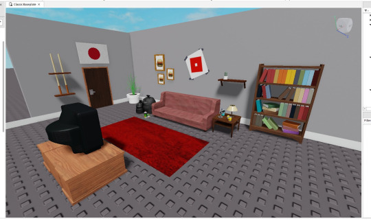
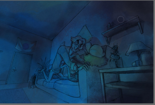
Most of my drawings that involve a background don't start with any sketch at all! For the sake of my sanity, or better yet a lack of my skill, I cannot draw backgrounds very well and often need visual guide to work. Using Roblox Studio I start my beginnings of drawings with simply just building the backgrounds part by part, with help from community made objects of course. Though I'm sure some may call this cheating I solely live by the idea of there being "no rules only tools" with art and that has been keeping me happy.
Anyways, the next step is for me to position the camera to an angle I think that might be cool for a drawing. Mind you, at this stage I've get to come up with much of any idea for the drawing I'm doing, but I only just know where I want the characters to be. In this case I want them on the couch.

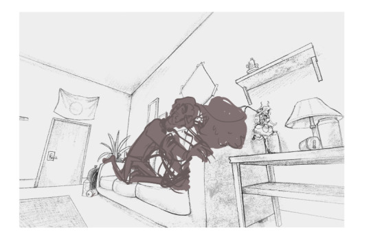
Now I'm sure some people will have issue with this, but the next stage of the drawing is to simply just trace :D (I am using clip studio paint for this but im more than sure tracing is possible in any drawing program lol)

Obviously there is some limitation with this in my art since I think an overly accurate and on point drawing of a background really sucks a lot of soul out of the art so I let small things slip through. This probably defeats some point of tracing for some people but personally I don't care.
The next step of the drawing is to simple go over what I have traced from the screenshot and refine it. This means going over it all again, playing with line weight, small amounts of shading and adding detail to the objects around.


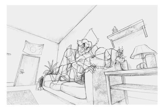
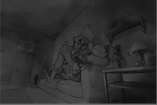
Because of how I draw, I like to frame the drawing inside of square on my canvas as a brief preview of how the drawing will look in full. I'm still doing this without even drawing the characters yet to this can obviously change later but "YOLO"
On to the next part of my drawing is to finally start drawing the characters. I still don't really have anything in mind yet for the pose so I simply go with the flow and see where it leads me as I rough out some thumbnail poses. This is on a new layer btw. I was told I should mention that...
... since a lot of...

… mistakes and changes...

... Will be made till you're happy.
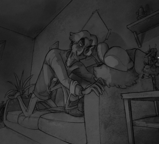
I'm not here to give you a guide on how I draw for this but really more of a process tour, so when the next step just skips to this, it must definitely feel like a leap. For this stage I simply draw out my characters on a new layer over the background, trying to make sure their line art stands out more from the background. If it looks to close, with a low opacity airbrush I will erase some of the line art on the background to make the character's line art pop out more by comparison.
Now just in case you're worried you may want to change the characters pose later and keep the background, make sure to NEVER erase the background and instead colour under the characters on a new layer with white so you will get the same appearance as erasing the background while keeping it.


That also gives some funny wiggle room to do something silly like this >;P
This may be hard to see, but the next step of the drawing is duplicating the characters line art, blurring it by 6% and lowering the duplicated layers opacity. When comparing it to the original, you can really see the POP

And just like that, we have the complete line art :D
Now when it comes to colouring, I don't use Clipstudio, I instead move over to a different program called Rebelle 7 for colouring. Using the 7th edition of the program is a new thing, I've been using 5 for waaay longer. I just skipped on using 6 lol.
For those unfamiliar, the appeal of the Rebelle software is simply for emulating traditional mediums digitally. I've been using them for the past year or so to make some cool drawings using what the programs offer. I mostly use the water colour stuff but there's tons of other stuff with them too. I'd love to shill it some more, but I'm not being paid, you can do some digging yourself about it >;-)
So before moving to Rebelle 7, I exsport my drawing as a png. Please make sure the background on the drawing is WHITE. This is because when we import the drawing to Rebelle 7 we will be using it on a multiply layer so the white of the background becomes transparent. If you are drawing with coloured lines you can export it transparent but I haven't messed with it enough to know much haha
A before and after of making the line art layer a multiply layer:


Now this is where the colouring fun begins >:D
So how I started with this drawing was by splashing down a LOT of blue teal and green for the colour theme of this image. With the water colour brush the colours blended together really well from the start. Of course you can always go over it and blend them some more if you don't like the appearance. Using the textured blenders gives a cool look to the colouring :D
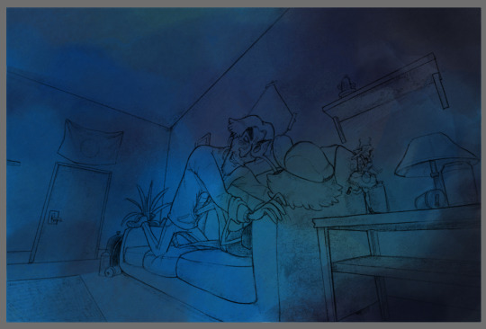
The next thing I do once I got the base colour down is that I move straight to shading. Typically on most drawings I would start with the character colours first, but in this specific drawings case the shading comes first since I want to keep hold of all these blues.

While shading I'm never too worried about keeping it messy since I thinks it gives my art a special charm to it since I adore the look of messy traditional art.

And just like that, after a LOT of trail and error my shading is done... FOR NOW
The next part of the drawing is now coming down to colouring the characters :D
With adding colours to this drawing I am only going to add them to the characters and maybe a few small parts around the background. I first start with making a new layer set to "Darken", "Soft light" or "Multiply". With each new colour I put down I make a new layer for it so I can experiment with it individually. PROBABLY not practical, however that's just how I do it. I'm sure other layer types work fine, it just really depends with your drawing and what you're trying to do.
Images below of me testing colours and layer types:


For this drawing, since the lighting is so strong (from the off camera TV) I want the character's colours to be very weak when against the light. The main colour of the drawing (our the base colours I put down earlier) the colours of the characters we are adding are only there to hint of what colours the characters really are. I want the focus to stay on the blue. This will involve a lot of testing.

I'm not really amazing at this so this will change a lot as I colour more and more. Using grey scale view helps to let you know if the colours you're adding are changing the lighting of the image. So make sure to check if you don't want to mess up your shading!

In the pictures on the wall I purposely left empty so while colouring i can give a vague illusion to a picture without really drawing it and keeping the attention to the characters and not the background. this is also a fun time to sneak in Easter eggs if I feel like it
I don't bother adding much colour to the BG as mentioned before, only to the characters.
After adding your colour check the grey scale and decide if your image needs any highlights to make it pop
In my case it does this part is optional depending on your drawing.
For deciding where the highlights go I pre pick a colour and go over the areas I want to make lighter in greyscale, not worrying about the colours just yet since it's on a new layer and that means I can mess with it more later :D
Turing greyscale off may not look the best NOW, but messing with the layers and blending blushes may go a long way!
Due to Tumblr's Image post limit I'll just go over with the next few parts over text, tho it can really be summarized with a few sentences.
After blending it looked fine, however the image STILL didn't pop in the way I had wanted so I changed the layer blending mode to "Linear Dodge". This worked perfectly however I had to re-do some highlights because I noticed mistakes.

But besides all that, we now have achieved the wanted look!
I don't really know how to end a guide, so I guess this is it. Thanks for reading! I hope this is a little bit helpful or at least interesting to someone. :D
1 note
·
View note
Text
I posted this on my Facebook (only for irl friends and family) but I wanna post it here too, I got really into talking about how I did the art process on my Neptune piece. This is only how I did one drawing, but I wanna share it because I think it’s so cool.
1. MS PAINT START
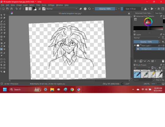
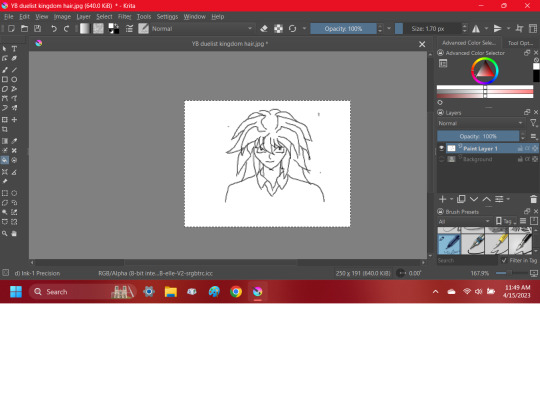
Pretty self explanitory. I get super perfectionist on other program so MS Paint is a good place to start because I lose my perfectionism there for some reason. I do my sketching, first lineart and first coloring there.
Lumine’s lines are colored as you can see, and the coloring is sadly a but inconsistient with one spot being more red. Her eye lineart is also colored.
2. MOVE TO KRITA

I basically trace over and recolor the ms paint drawin in krita, refining it and putting the coloring and lineart on different layers, I also put the eye’s coloring and lineart on it’s own pair of layers.
I also make adjustments to the expression, anatomy and design where I see fit. I was gonna add the darker color in the flower still but I actually just forgot about it.
Her line color for her fur is now consistientm and her eye lineart, while still colored, is much darker, which in my opinion looks much better.
I used Krita for the rest of this piece.
3. MAKING THE BACKGROUND PART 1
Pretty self explanitory, I begin my background. I expanded the canvas size and all of Lumine’s pieces in a group layer and moved it. Just basic blobs, but I ended up detailing the sky a bit. There is a loud brush on Krita, but I like how the watercolor brus looked more, I used a handful of layers to make it.
3. MAKING THE BACKGROUND PART 2
Same thing kinda but more additions. I used a waves brush tool for most of the water, using a handful of layers to get the look I wanted but I thought the water looked too flat so I started adding more waves.
I also detailed the sky a bit more, and added grass.
I want to make an entire post about how I did the grass but I didn’t take screenshots. So stay tuned for that, next time I have a piece where grass is involved.
3. MAKING THE BACKGROUND PART 3

Not super important but I had this screenshot of more waves.
4. MY FAILED SHADING ATTEMPT

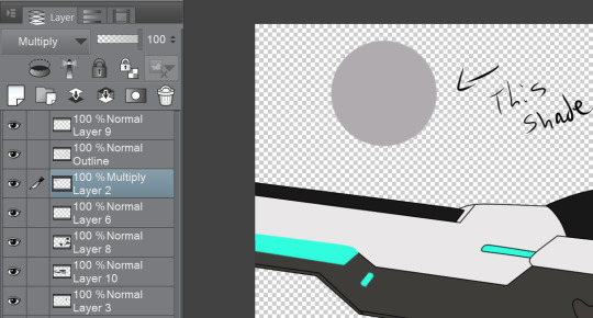
I struggled with the shading at first and my first idea was not good but I wanted to share it. I used a blue-grey color and used multiply for it, which is what I still do for my good shading.
It’s important to see that sometimes you have an attempt at something that doesn’t go well and you have to start over, this does not mean you’re a bad artist. You’re just human.
I also just cropped it so Lumine’s little bubble self underneath is no longer visible. I probably should have just moved her but that’s alright, we all make mistakes, and even finished pieces have errors. But thankfully this was a minor one and more down to my personal opinion.
4. MY SECOND SHADING ATTEMPT

A lot simplier than my first try, this one was instantly better as a starting point. I just slapped the whole character with the blue-grey I used from before and then on a different layer grabbed a lighter shade of blue-grey and put the luminosity fliter over it. I put both layers over my lineart. She’s now starting to look like she belongs in this piece.
5. MORE SHADING AND RAIN

I added more shading which I think looks good, exact same method from before with the same shade of blue and the multiply tool, just less shaded.
I also added rain. There’s a dots tool on Krita so I used that to put in the rain and added motion blurr to varying degrees.
I didn’t take screenshots sadly but I added a layer underneath the water for the first rain, making the dots super tiny, and i made the motion blur on the very little.
The second layer is over the water, slightly bigger with more motion blur, I made sure all drops were still going in the same direction.
And the last layer is in front of the water, bigger dots with more motion blur. I did this to hopefully give the illusion of depth.
6. MORE RAIN

I added rain in front of Lumine. And made her fur look wet by adding squiggily white lines, using the same shade I used for the rain, and adjusting the opacity.
I probably could’ve added a few little dots in the wter to look lish splashes from the rain at this stage, but I forgot to.
7. SHADING, RAIN, AND EYES, OH MY

So I adjusted the opacity of my rain squiggilies (maybe a bit too much if you want my honest opinion) and put in highlighted rain bits.
I added more shading, first just a big gradient over it for a big shadow at low opacity, and then some more refined soft shadows. I also added some purple-red shaddows in some areas to add depth.
The eyes are a bit complicated because I barely remeber what I did there, all O reember was using the blur tool and the luminosity filter a lot and using a good handful of layers for the eyes and the tears.
8. OVERLAY AND BLUR HACKING

If you take away anything from this, use overlay and blur tools. I used a blue overlay for the whole piece. In fact, I used multiple overlay layers, one for lighting and two for everything else, it ended up being more blue than I intitially intended, but I like how it looks so not a problem.
I worried the background and it’s amount of details would overpower the focus od the peice, so I blurred everything in the background by a low amount. I think it worked but I’m still not entirely sure.
1 note
·
View note
Photo

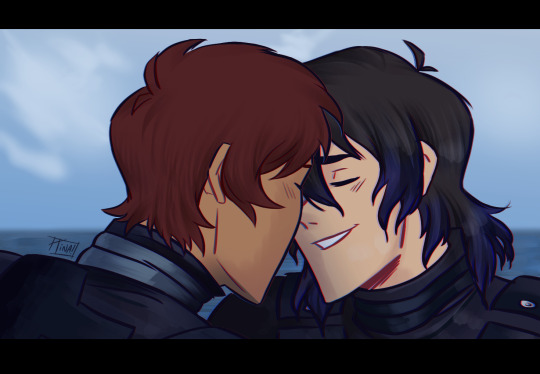
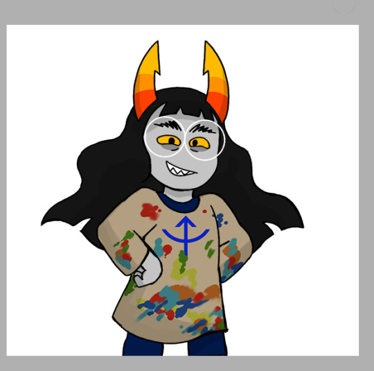
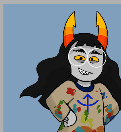
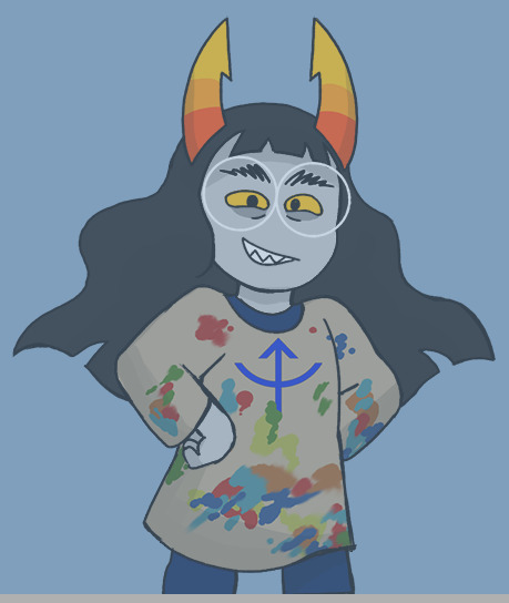
Long time ago when I brought CSP, I made these redraws of Pacific Rim secenes but with klance. I wanted to make a few but I kinda don’t know when I’m going to start working on the others (or even if I do start) so might as well share these ones :D
#also the lines of the first background are traced from the screenshot but the painting is totally made by me without any tracing#and I remember it took so long#especially the floor because the lighting didn't look okay#also I saw 0 CSP tutorials so I had no idea what I was doing :'D#klance#vld klance#klance pacific rim au#vld keith#vld lance#lance mcclain#keith kogane#vld#voltron#digital art#fanart#my art
711 notes
·
View notes
Text
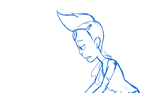
“It’s Over Isn’t It” Reanimation progress
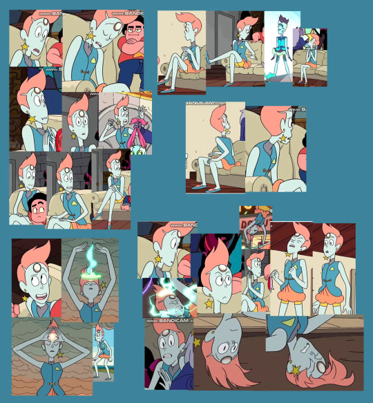
Honestly one of my favourite parts about animating is posting the WIPs online. Here’s the step-by-step of how I went about doing my reanimation for the end section of “It’s Over Isn’t It” from the Steven Universe episode Mr. Greg.
1) Idea and Prep
I was flicking through Steven Universe: Art & Origins. I think at the time I must’ve been between jobs or bored or something, because it came into my head to do a bit of animation based on the pilot style SU. I’ve always been quite fond of the pilot style, especially Pearl’s David Bowie / LaRoux look. The little tux design by Hellen Jo was quite snazzy as well, so I decided to have a go at doing a segment of “It’s Over Isn’t It”, using these designs.
I traced the turnaround from the book in Clip Studio Paint and approximated Jo’s design to it. At first I had the colour turnaround, but did the low-colour turnaround with the heads to give me a better idea of where the lines are and proportions of the body. I also get a clip of “It’s Over Isn’t It” and trim it down to the section I want to do.
This is a long one so strap in.
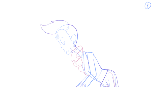
2) Sketch Pass
I’ll be using gifs that show the first 100-130 frames of the animation, because the full segment is 22 seconds long.
Very very loose animation of what I’m going to be doing with this segment, done in Adobe Animate. I have a video of the real segment in the corner of the stage and audio in the timeline, and closely reference them for layout and acting.
I’ve decided I want to go really nuts with the animation. Lots of angles on her face, smooth movement, secondary animation / follow-through on her various clothing elements. Technically her earring’s supposed to be on the other side but I want to animate that flailing around dangit, so I change it so it faces the camera.
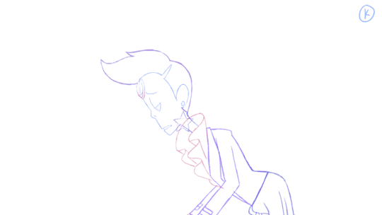
3) Rough Pass

I tidy up the rough I did somewhat. It’s still very rough, but Pearl is better proportioned and the motion is more complete. I get a better idea of how she moves by focusing on drawing keys (the most important drawings) and breakdowns (drawings that help you figure out the motion a little bit, without full animation). I have Pearl, her suit, ruffles and earring on separate layers so I can turn things on and off or lower their opacity as needed.
4) Tiedowns
At some point between the rough and tie-down phase I realized that I’d been animating at 30fps instead of 25fps like I’d meant to, so I had to end up shifting all the roughs I’d been doing. Bad news: having to wrestle with getting the timings I’d so carefully planned out in the rough to still look good. Good news: I have to animate and clean up 5 fewer frames per second, so that’s 110 fewer drawings to worry about. Yussssss. For reference, the above clip has now gone from 132 frames to 107.
During the tiedown phase, I go over the roughs and more carefully try to match the proportions in the turnaround. I keep a flattened version of the first frame of animation to use as reference thoughout to prevent morphing. Sometimes when you’re animating, things will get bigger or small as you re-draw them, so it’s good to have a base drawing to refer back to and make the sizes stay consistent.
At this point I’m way more aware of reasons behind the big design change for Pearl between the pilot and the show. She’s so dang skinny and tall with that extra poof of hair up top that she’s really annoying to frame up. If you want to keep all of her in the frame, there’s going to be tons of empty space.
I also find that my turnaround isn’t enough reference for Pearl’s awkwardly-shaped head. I snap me a bunch of screenshots of pearl’s head from different angles and collate them into a big sheet.
5) Inbetweening
Inbetweening, aka filling out all the gaps in the timeline between the keys and breakdowns. If you’ve done your keys and BD’s well, inbetweening can be a pretty straight-forward.
But I’ve got like a million bits of secondary animation to content with, which means this still takes a significant amount of time. The hair and ruffles have to move a little later than the rest of the body, and some parts of the ruffles have to move at a different rate from the rest. I’m trying to animate like there’s wind since Pearl’s on top of a tall building. I keep animating until it feels good enough.
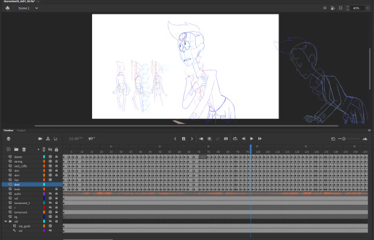
This is what my timeline and stage look like in Animate by this point. The animation is mostly on 2s, with some 1s, 3s and 4s thrown in when needed.
6) Cleanup and Colour
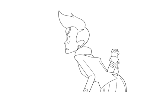
I did the cleanup in Toon Boom Harmony. As a program, I like it was more than Animate, even though it isn’t without it’s flaws. But it’s also really dang expensive. Fortunately, by this point I’d been working on the upcoming Deadendia series for Netflix. What with the pandemic, we were working from home and the studio gave me a license for Toon Boom. So I exported my frames from Animate, put ‘em in TB and started cleaning up.
I’ve found that cleanup is something that’s often offloaded to new or less experienced artists at studios because blah it’s just tracing the rough animation. But you’ve got good cleanup and bad cleanup, and a good cleanup artist will compensate for flaws in volume and have a good, clear and natural line.
I’m not terribly fond of doing cleanup myself. I feel I tend to end up rushing, which leads to sloppy work. I tried really hard to keep up a standard here.
7) Comping
a.k.a. Compositing, the final layering of the various elements before exporting a film. Another stage I don’t quite care for because of its nuances. Also drawing backgrounds.
I admit that I’m not very good at drawing backgrounds or environments. I tried to do the one for the second shot of this animation, since it was acutally really important. In shots 1 and 3, you don’t really see the ground or even the railing that Pearl is leaning on, but 2 is a wide shot. My first attempts at it were unfortunate. Fortunately my husband @joe-sparrow is both good at backgrounds and good at imitating the style and colour palette of the show. He volunteered to do the BGs and I accepted. See mine vs. his:

So yeah, get me some nice backgrounds, put the animation on top, then fiddle with a couple of elements in the comp to give things a little bit more depth. During this stage, errors that had happened during the animation progress that I hoped would just go away became annoyingly obvious, so there was a fair bit of going back to fix them.
So that’s how I done made this animation. I started April 2018 and posted in on January 1st 2021, so that’s over 1.5 years it took me to do these 22 seconds of animation. However, I wasn’t working on it continuously through that time. Sometimes I’d be working on it every day, other times I’d not touch it for weeks or months at a time. It really depended on how busy or whatever I was at the time. I think if I’d been working on it non-stop, it still would’ve taken me at least like 2-3 months to finish it.
If you made it to the end of this post, I hope you found all this information interesting.
Happy drawing.
It’s over, isn’t it.
156 notes
·
View notes
Text
"palette” gif tutorial
hi everyone!!! so i’ve gotten countless requests to make a tutorial for my lara jean gifset, more specifically this gif:
so today i’ll be showing you how i make this gif right here:
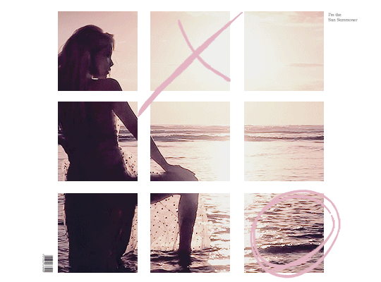
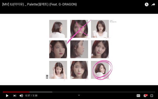
as mentioned in the original post, this whole gifset was inspired by one of my favorite mvs of all time: palette (hence the creative name lmao). i essentially used screenshots of the mv to make my own similar template to work off!
disclaimer: i suck at explaining things, so you’re all gonna have to bear with me and my 100000 screenshots and poor attempts at explaining wtf i’m doing. hopefully you can manage to understand what i’m on about!!
if you’ve never made a gif, check out this detailed tutorial i made some time ago:
how to make gifs + color gifs (this tutorial includes links to download ps)
tutorial under the cut (i’m sorry for how long this is rip)
first, screenshot the mv. (timestamp 0:38)
here is my screenshot:
now, we’re gonna open ps and go to file > open to open the screenshot on there. this is my screen rn:
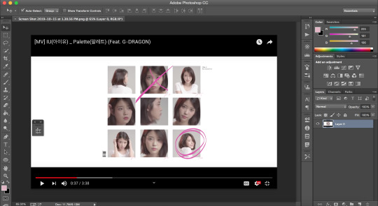
notice how my timeline is there (little box on the right side of the screenshot). we’re going to need the timeline for the gif later. if u don’t see the timeline, go to window > timeline and it should show up!!
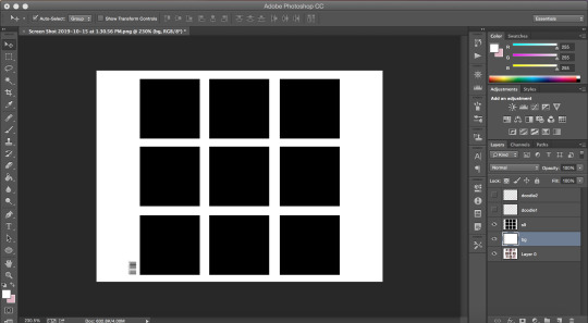
time to crop the screenshot. using the crop tool, (left sidebar, 5th icon from the top) remove the black parts of the image (top and bottom) until all you’re left w is the white area. final product:
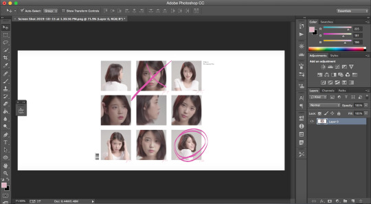
now it’s time to change the size of the canvas we’re working it so it can be the dimensions we want it to be! go to image > canvas size
a window like this should pop up:
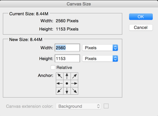
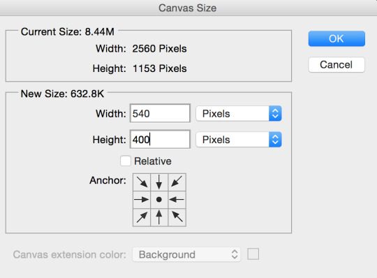
we want our gif to b 540px by 400px, so just fill that out and press ok:
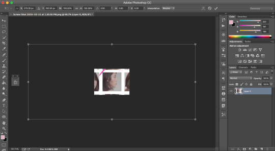
this is what your screen should look like after (aka super zoomed in):

we’re gonna fix that rn!!! making sure the layer (right sidebar) is selected (you can tell it’s selected when it’s in blue), press command + t, which will leave you with this:
okay, so i’ve covered this before in my previous basic gif making tutorial and not much has changed since then aka i’m still shit at attempting to explain wtf i’m doing. BUT basically this part involves using the top bar (pictured below) and changing the % of the W and the H to make the image the amount of zoomed in i want it to b (if that makes sense)

again, i usually just play around w the %s, depending on how zoomed in i want my image or gif to be, its dimensions, etc. the higher the %, the more zoomed in it is. basically, putting in 50% would make it way more zoomed in than 20% and so on. for this, i’ve tried out several % and decided to use 39%, but of course you can pick the % you prefer. so write in your chosen % in these two boxes in the top bar like this:
click the checkmark at the right of the top box and voilà! this is what you should have rn:
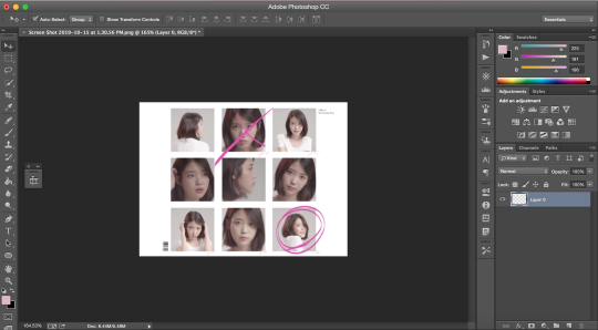
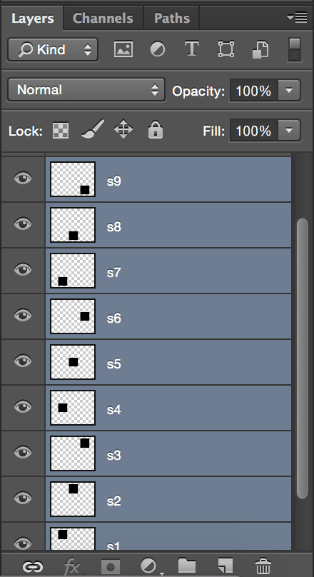
see how all the 9 squares fit perfectly inside? wow, powerful. anyway, let’s keep going djfhdkfd. now we’re going to make our own squares aka the squares in which the gif is going to be. start by creating a new layer (at the bottom of the right sidebar, the second to last icon before the trash icon). give it a name so it’s easier to keep track of: i picked s1, since this is going to be the layer where the first square is going to be (and so on). also make sure the new layer is above your image like this:
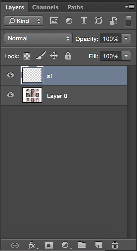
time to actually make the first square!! select the rectangular marquee tool (left sidebar, 2nd icon from the top) and select one of the squares in the image (113px by 113px) like this:

select the paint bucket tool (left sidebar, under the eraser tool) and make sure the color is set to black (#000000) before you click on the square you just selected. very important: don’t forget to have the s1 layer selected (should be in blue) when you do this or else it will fuck up.
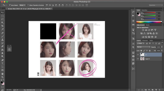
this is what your screen should look like after:
as you can see, we have one square done, but there are 8 more left. right click on your s1 layer in the right sidebar and click on duplicate layer. name that layer s2. making sure the s2 layer is selected, drag it to the place of the second square:
keep doing the same thing until all the squares are covered with black ones like this:
now i’m going to hide the black square layers by clicking on the little eye icon (left of layer) for each of them bc i want to include the little dark pink doodles on my gif as well, but you don’t have to, so if you don’t wanna include it in your gif, you can skip over this part!!
there are technically 3 ways you could do that (well maybe more lol but these 3 are the ones who came to mind:
method #1: use the brush tool to draw your own doodle (or trace over the existing one with a new brush)
method #2: use the magic wand tool to select the doodle and use the brush tool over your selection
or method #3: look up doodles on google and drag them onto your image
i don’t have an ounce of patience rn, so i will b using method #2. select the magic wand tool (left sidebar, 4th icon) and make sure you select the first doodle the best you can. don’t forget to make sure your screenshot (image with the doodle on it) is selected while you select the doodle or it won’t select anything!!! like this:
create a new layer (bottom of the right sidebar, the second to last icon before the trash icon) and again, make sure it’s above all the other layers. with your new layer selected (in blue), select the paint bucket tool (left sidebar, under the eraser tool) and pick a color (i used #e1b5c4). click on your selected doodle. this is what you should have:
repeat for the other doodle with another layer.
final product:
it looks a bit Rough, but hopefully you get the idea?
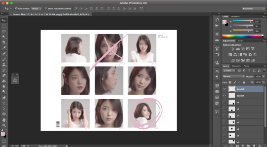
now we’re going to merge all the little squares into one layer of little squares. if you have doodles, remove the eye icon (left of layers) for both of them to hide them and make sure all of your eyes are there for the square layers. select the s1 layer and then the other layers up to s9 while keeping one finger on the shift button until all the square layers are selected (in blue) like this:
right click on the s1 layer > merge layers. all you should be left with is:
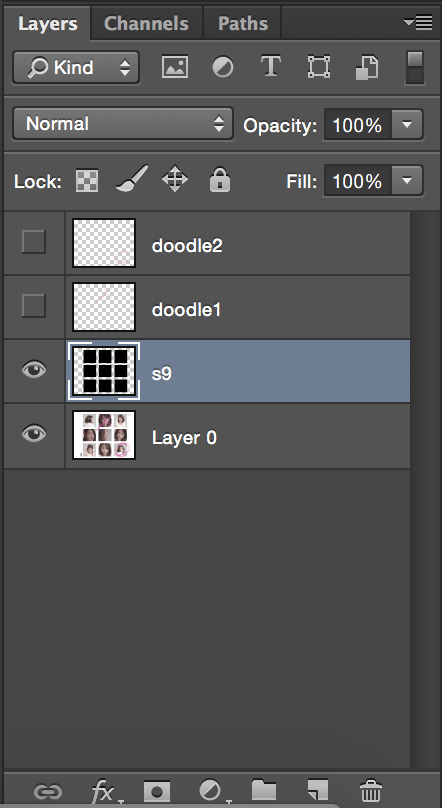
now that this is done, we need to fix the background.
create a new layer that you will drag above the screenshot (layer 0) but under the s9 layer. i named mine bg (background). i want to keep the barcode in the original screenshot, so i won’t select that part. using the rectangular marquee tool (left sidebar, 2nd icon from the top) and with the bg layer selected, draw a square at the right of the bar code so you have this:
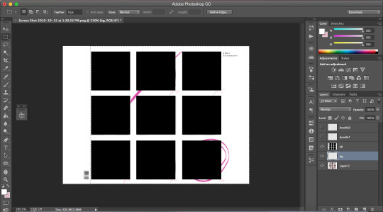
with the paint bucket tool (left sidebar, under the eraser tool) and the color set to white (#ffffff), click on the selection.
and that’s your template!!!
with doodles:
now onto making sure the gif is going to actually move properly.
click on the little arrows at the right side of the timeline to expand it until you have this:
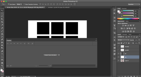
and then click on create frame animation. your screen should look like this:
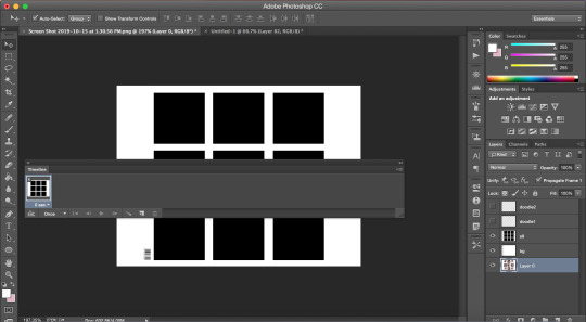
notice how it says once at the bottom of the timeline? make sure to change that to forever, or it will not play:
click on the convert to video timeline icon (the one on the left of the forever). this is what you should be left with:
now, time to make the gif that is going to go there*
*if you have no idea how to make gif and are lost af, i suggest you check out my previous tutorial where i explained this part with more screenshots and more specifically bc i will be more vague here regarding this
also i’ve said this again and again, but remember to ALWAYS USE 720P OR 1080P FOOTAGE WHENEVER POSSIBLE FOR YOUR GIFS or else they will be grainy and extremely unpleasant to work with.
i’ll be using a video from youtube for this. i suggest converto as a converter, it works really well and allows you to download youtube videos in 720p and 1080p!! once you have your footage ready, go to file > import > video frames to layers. use the markers to select the part you wish to gif, and, once you’re happy with your selection, click ok.
to select all the frames, click on the icon on the right of the timeline (4 lines with an arrow) and click on select all frames. then, go to select > all layers in the top bar. everything should be selected (in blue) like this:
now, fixing the speed of the gif.
super helpful post explaining gif speed right here
i’ll personally be using 0.06 here.
click on one of the frames in the timeline > other. write in the speed you chose and then press ok. go to convert to video timeline icon (the one on the left of the forever).
you should have something like this:
go to filter > convert for smart filters:
the time has come to drag your gif to the canvas:
make sure the gif is above the s9 layer (layer with the black squares) like this:
to make our gif fit inside the squares, we’re going to make sure the gif layer is selected. then, press the option (alt) button and click between the gif layer and the s9 layer to create a clipping mask (like this). this is what it does:
this is where i usually play around trying to find a size for my gif that looks nice. press command + t and, like we did earlier, find a % you’re happy with. i’m going to go with 20%. after moving my gif around and making it less zoomed in, it now looks like this:
this is usually where i would sharpen my gif, so, with your gif layer still selected, go to filter > sharpen > smart sharpen, and then ok.
these are my settings:
we have to fix the length of the gif, since there’s a lovely limit on this amazing site. i suggest you pick something to gif with not much movement, or you’ll have to make it even shorter. there’s no magic formula, just try not to make it too long, especially since the gif is large in size, so the smaller the better in this situation. this is what i have:
notice how the layers in the timeline are all of different lengths, so make sure you make them all the same like this:
once you have a psd ready, go to file > open and when it loads, drag it onto the canvas, above the gif. i added one of my psd on mine.
for the text on the top right, i can’t remember the exact font i used, so i picked another font different from the original.
these are my settings:
what it looks like with the psd + doodles + text:
and we are DONE!!! all that’s left is to save our gif!! go to file > save for web
these are my settings:
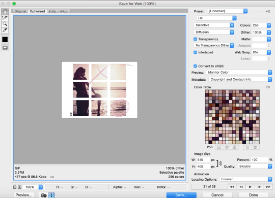
SUPER SUPER IMPORTANT: make sure your gif is set to forever in the looping options at the bottom right of the window or else your gif will absolutely not play properly!!
also, CHECK YOUR GIF SIZE (bottom left). with this website changing its gif limit every 2 seconds, better safe than sorry!!
here’s the final product:
thanks for sticking around and reading all of this!!! i hope it was somewhat helpful even though i suck at explaining how i do stuff! :)
#stupid tumblr crashed so i had to start over but here it is finally!!! sorry for how long it took!!#gif tutorial
48 notes
·
View notes
Photo
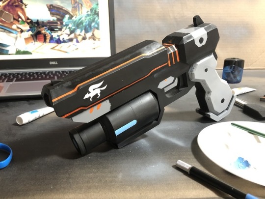
Fox’s Blaster (Super Smash Bros Ultimate)
This is my first finished prop and I am incredibly proud of it. It is not my first prop because I’ve started a few in the past and just never got around to finishing them either for complications, not enough skill, or just boredom; but it is the first prop I’ve completed. I intend to finish all those other, but I just wanted to ride the motivation for this one and it certainly paid off.
For anyone interested in how I made it, please continue reading.
(Tried to edit which messed up my post so most of the pictures are unreadable. Trying to fix, but connection is shoty. Check out someones reblog to see all)
Step 1: References and Drafting
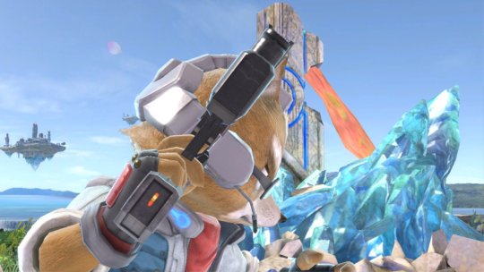
First I needed to get some reference images for the blaster. Thankfully, Smash Bros has a convenient in-game camera mode so I was able to zoom in and take screenshots of the blaster in any frame of gameplay.
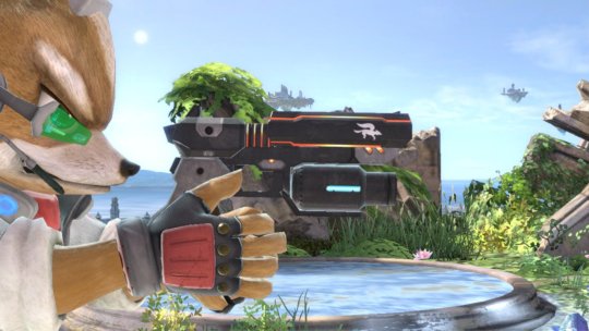
I briefly considered making the blaster able to open up like in the second image above, but I had no idea how to do that and figured it’d take too long to figure it out, let alone actually make a prop capable of that. So, I decided on a single piece prop with nothing moving. Better to keep things simple when you’re starting out.
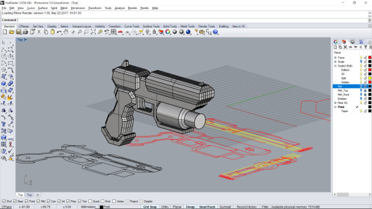
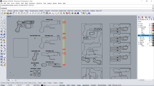
Now I had to draft outlines for it. I use Rhino 3D for all of my drafting, whether 2D or 3D.
I imported my reference images and traced them as best I could. Unfortunately, since there’s no option to turn off perspective in Smash, some dimensions were a bit off, but hardly an issue.
Before I went any further, I needed to make sure I had the right scaling, so I made a mock-up. Since I needed the handle to fit my hand, I made it out of layers of PVC foam board and just used cardboard for the rest of the gun.The sizing was actually perfect by coincidence, but I needed to determine the best thickness. I tried out a few thicknesses for the handle with different numbers of layers and found 5 layers of 6mm foam board was perfect.

Next I made a 3D model to make sure all my dimensions looked right when put together.
Step 2: Materials
Before I did anything to start making the physical prop, I had to plan out all my materials and cuts. I did some adjustments to my traces so that a length wise cross section would fit into several pieces of equal size. Below, to the left of the yellow lines, are one of each kind of cross section I need. There are 7 total layers. The largest pieces are within layers 2-6, comprising the main body of the blaster and part of the handle, as well as support for the laser-sight barrel. After those are the two outer layers for the handle which will have some beveling, and then layers 1 & 7 include a few smaller pieces to add bulk to the two bulging sections at the top of the gun.
The section to the right of the yellow lines are for planning out how many cuts to fit into each board of material (For some reason I doubled a few layers on the right sheet, not sure why).
Materials (everything in the finished product):
6mm PVC foam board (celtec)
1″ PVC pipe
1.5″ PVC pipe
PVC cement
Spray paint
Acrylic paint
Tools and disposable materials:
X-acto knife
Straight-edge of some kind
Sand paper, both fine and course versions
Blue painter’s tape
Brown paper
PVC pipe cutter (any kind of saw will also work)
Thumbtack (or something with a fine point)
Large piece of cardboard (painting surface; can use whatever you don’t mind being spray painted)
I spent some time debating what I wanted the blaster to be primarily made out of. I had worked with PVC foam board before and I knew it was high quality and would provide a good weight to the prop. I also considered EVA foam which I’d just heard about at the time, or just plain cardboard. PVC foam board was the best choice, though I does take a few passes with an X-acto knife to cute through 6mm, but if you’re patient it’s worth it.
Step 3: Cut and Assemble
Now comes the tedious part.
Since I had digital plans I printed out full-scale outlines of each part. I then taped the sheets down on the PVC boards and used a thumbtack to poke the corners of the outlines and leave small impressions in the board. Then with a straight-edge I used my X-acto to connect the dots and cut out each piece.
Below is layer 5, i.e. the middle most piece of the blaster.
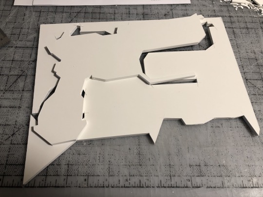
The PVC board is pretty dense, which adds to it’s quality, but like I said I had to run through each line several times before cute when all the way through. Do not rush this part. I may have been a bit too anal about it, but I did not want any mistakes at all.
Some pieces required beveling. I do not have any kind of table saw or other tool made specifically for beveling so I did it all by hand with my X-acto knife. This requires even more patience than the last part. Once you cut too much, you can get it back on and look the same. I recommend listening to some music or have a show play in the background, just be careful with the knife and always cut away from yourself.
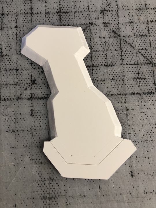
Once all the board and pipes where cut I cemented everything together. You can see the other parts which have beveling. Again, takes a long time, especially when it’s circular.
What I found is despite my best efforts, not all the parts where exactly aligned and flush with those next to it. this part was 0.5mm too high here. This one was 1mm too thick there. I spent a lot of time sanding everything down so the edges were all aligned. I didn’t get everything perfecting flush due to my limited tools, but I was happy with it. This actually killed two birds with one stone because I would have needed to sand it down anyway so the paint would hold onto it better.
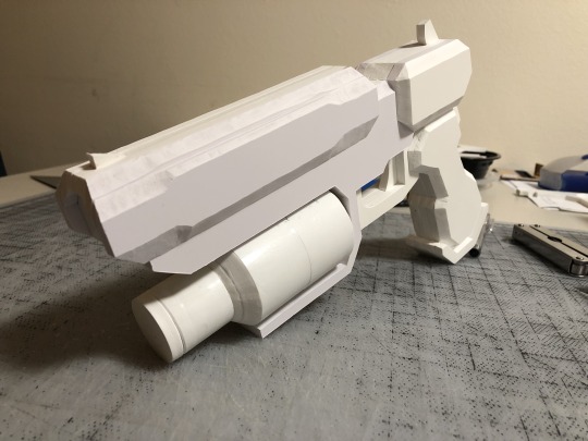
Step 4: Painting
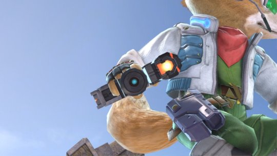
Now for the fun part.
The base of the blaster is black so I can paint the whole thing a black coat, but for the grey on parts like the outer handle I’ll have to tape sections off to protect the black.
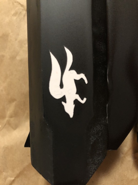
As you can see, the only thing I taped off from the black coat was the Star Fox emblem on both sides of the barrel. Since it’s small with lots of curves and made of tape, I had to be delicate with cutting it.
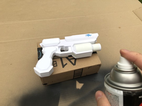
But I think it worked out. Just a little tap residue to wipe off.
The grey was fun because of how I had to weave tape between all the joints and crevices. As you can see, used brown paper and taped that on, rather than cover the whole thing in a layer of tape. Just tape along the edge of the paper and attach.
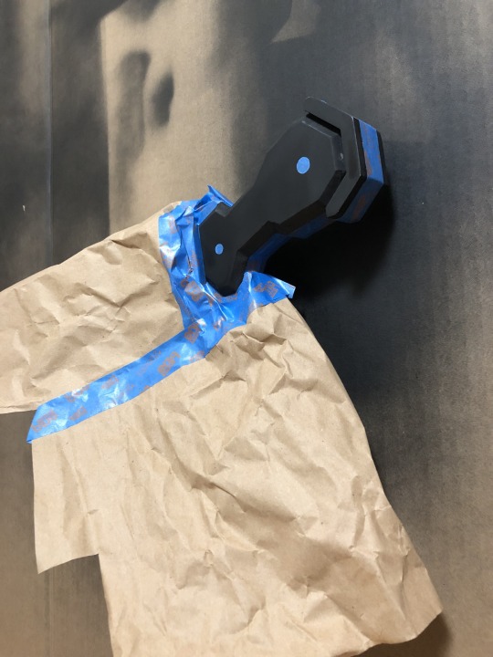

Lastly, the finer details, i.e. anything orange or blue. I did all these details by hand, again using painter’s tape to make sure my lines were exact. Don’t forget to sand whenever you put on a new layer of paint. I forget to sand for the orange on the picture below the first time and the acrylic ended up peeling off. Sand so the paint can grip onto something rather than a smooth surface.

And voila!
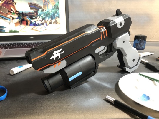
Pretty damn close to Nintendo’s replica (below), don’t you think?
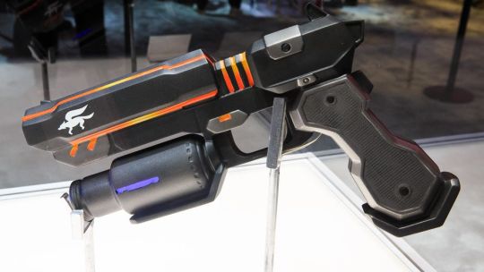
From start to finish, this took me about 2 months in my down time. 1 month drafting and obsessing over how every detail needed to be replicated perfectly, and 1 month of actually building it. I should have paid a little more attention to the spray painting, though. I’ve never spray painted before I had trouble figuring out the right distance to hold the can, and some of the grey paint found it’s way under some edges of the tape, but not a big deal. And maybe some time spent to texture the handle.
Overall, I absolutely love it! It’s got a great weight to it, feels wonderful in my hand. I don’t think I’ll ever cosplay as Fox, but this has been a wonderful use of my down time rather than just web-surfing and video games all the time. I built something with my hands. There’s nothing quite like it.
If you enjoyed this, consider supporting me on Patreon at https://www.patreon.com/erikchamber
#star fox#fox's blaster#smash bros#super smash bros ultimate#ssbu#smash bros ultimate#gotta blast#cosplay#prop#cosplay prop#sci-fi#pvc foam#first cosplay#blaster#nintendo#fox mccloud#spam b
65 notes
·
View notes
Text
𝕮𝖗𝖊𝖆𝖙𝖎𝖓𝖌 𝖗𝖔𝖙𝖔𝖘𝖈𝖔𝖕𝖎𝖓𝖌 | 23/10/19
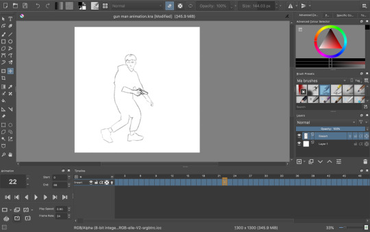
During the morning we went to the photography department of the school where we would start the day off there by filming our own footage to rotoscope later on. There were no restrictions as to what we were allowed to do in front of the camera and green screen, but we had to move from one side of the screen to the other. I decided to go for a gun man or James Bond type of vibe. I didn’t want to just do a simple walk or run cycle, but instead I wanted to challenge myself a little. I did this by sneaking into frame, holding my hands up as if I was holding a gun (this added a prop that I would have to draw form scratch during the process of rotoscoping) then doing a turn and running back out the frame. When recording the clips in the green screen room, I also decided to turn around and then turn back while moving to add to the difficulty of animating everything together. This is how both of them turned out:

I decided to go with the first of the two clips for my rotoscope. I did this simply because of the turn being slower and therefore making it more challenging to animate the gun to follow the movement in such a way that it won't look “out of place”.
I didn’t find the time during college hours to actually do the rotoscope for this, so I did it at home using my own program (Krita) and my drawing tablet.
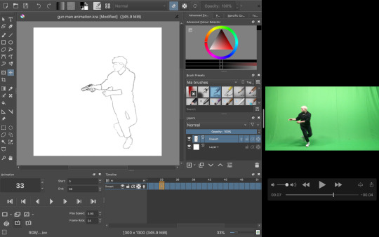
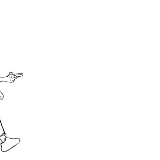
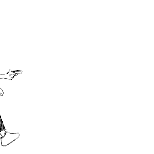
The process was relatively simple; I took the video and took a screenshot of each frame as I went, dragging the screen grab onto the canvas and began tracing my figure. As I went, I also drew in the gun for each frame, lining it up with the position with my hands.
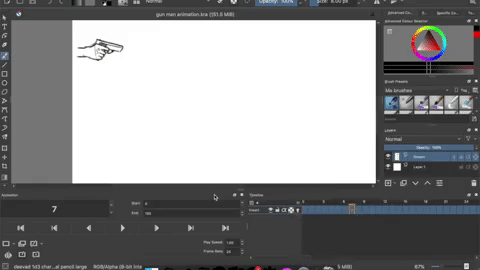
To keep the appearance of the gun consistent I copied most of the frames, up until I came to the part where I had to change the perspective of which the gun is seen from (during the turn).
Once I had finished the whole rotoscope this is what I was left with:
The finished amount of frames came to 66. Quite a high number for such a short animation, but I didn’t want to take away from the fluidity and smoothness. Now I could have just left it here, but I wanted to do some more experimenting. I tried out filling in the clothes with some texture to create a more interesting looking sequence, but half way through I decided to go back to the original linework since I just wasn’t happy with how it was turning out, but here was that in motion:
Instead I did a bit of brainstorming, thinking about what I could do to improve what I had already made. Here’s the mindmap of the brainstorm that I did:

So as you can see, I ended up wanting to experiment with depth, leading me to be doing something to the background. Most of the mind map is based off visual language. I found using this as the root for my brainstorm really useful due to the way you can interpret each term differently to whatever the context is. I will definitely be doing this again and experiment with it further in the future.
I had also settled on wanting to keep it monochrome (misspelling in mind map) and more specifically drawing towards the style of the classic black & white manga comic book style. Based on this, what immediately popped into my mind was this program I recall trying out years and years ago called Medi Bang Paint Pro, or as I think it was used to called; Medi Bang. I was probably around 12 or 13 when I first downloaded it, but I didn't know what I was doing what so ever, so I quickly gave up. For a long time it wasn’t compatible with Mac up until recently; so I decided to take a shot and download it again. The program is free; but that wasn’t the main reason to why I wanted to try out this program again in particular. It has a lot of great tools for drawing and building comic pages, and I thought “What would it look like if I made a background inspired by traditional manga?”- so that’s what I did.
I wasn’t sure if I was going to be able to pull it off at first, so I did a little test run beforehand and I really liked the result:
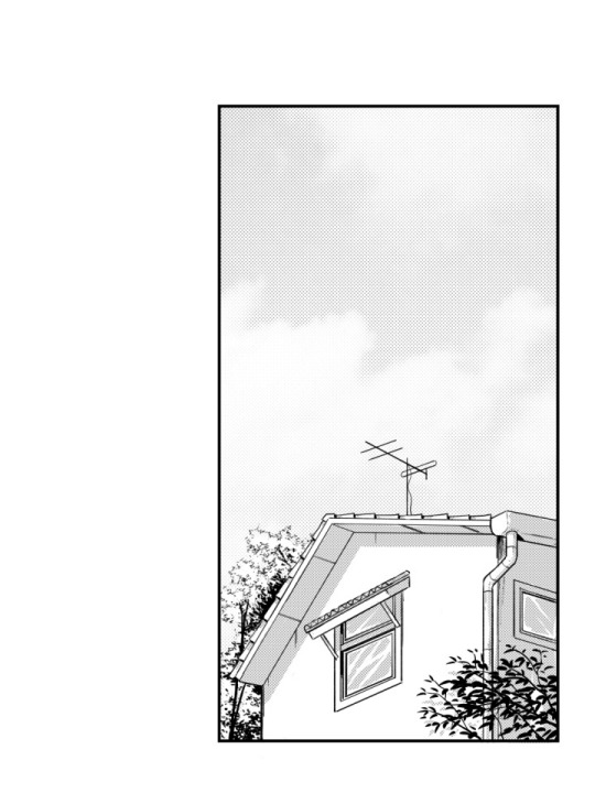
So the way that I did this was by taking a picture (that I unfortunately have lost now) and then proceeding by changing the levels of the picture, playing around with it until it’s primarily just blacks and whites. With a brush tool I began cleaning everything up a little by either erasing unwanted bits or adding additional linework just to emphasise on the subject and shapes within the drawing. I added leaves and other vegetation with some pre-made brushes that came with the program. The last step was to add a screentone of a clouded sky to add a bit of texture, shading and general interest to the whole piece, and voila! Done. This technique is super quick and efficient for creating backgrounds for comics of this style, though I still prefer when everything is painted by hand. The screentone has a very recognisable style to it and is quite often used in manga’s. One of the ones that come to mind for me is Berserk. I have always loved the artwork of that comic series; it’s the kind of art that you could stare at for hours on end and not get bored with. When looking at the artwork from the series, you can clearly see the technique of screentones are being used to create a lot of additional detail to each panel.
Here are some examples of some screentones:

In this example, it has been used for the background. A screentone with blobs lightly shaded has been added to almost create some sort of mist, changing the whole mood and feel of the panel very effectively.

Like mentioned before, in Berserk, the screentones are mostly used as an extra bit of atmospheric detail, rather than being used for any of the shading which is all hand drawn. In this example, it has been used for the lettering/type and again for the background. It creates a gritty and sort of dirty effect, emphasising how he is in a battlefield with monsters around him; definitely not a place you could call “clean”.

In this example, different kinds of sceentones have been used in each panel. In the panel to the left, the opaque stripes are a type of screentone very often used to indicate either speed, focal point or action of some kind. Not only that, but at the bottom of the panel a softer pattern of screentone has been used to create the look of dirt or sand, again with a gritty texture to emphasise on the fact that the character, Guts, is inferior at this moment.
In this super epic and intense illustration, you can again see the great use of screentones, most notably used for the background yet again. It really helps to create a strong feel to each illustration. The use of tone is especially important in manga or comics, since it so often is done in just black & white, so you have no use of colour; this is where screentones come in as a great tool to use for just this.
So, with all of this brainstorming and researching done, and by using the same technique as I did when doing the “test”, I began drawing. I used this picture which I recall taking somewhere on the border to Germany as the base image:

I chose this because it has that “street” vibe to it, which I thought could be cool with the whole theme of “gun man”. Very edgy, very edgy indeed.
This gif above shows loosely the process of the piece from start to finish. It was mostly just me playing around and figuring out all the tools of the program, but it was quite fun to put together.
With the background now complete, I put it into my rotoscope, went over each frame and painted the shape of myself in the animation white and was finally finished with the final rotoscope; being the third version or option that I did.


I am very happy with how it turned out in the end, and I have definitely learnt masses with this exercise of rotoscoping something that that I have filmed myself. I think if I were to further improve on this, I’d definitely consider animating the background itself (birds flying or leaves rustling), or maybe even try shading the subject somehow, taking inspiration from manga’s such as Berserk or any of Junji Ito’s work.
I decided to try out asking a few of my peers in the class what their opinion was on the final rotoscope. The feedback that I received was purely positive; the people I asked said they couldn't think of any particular way of improving the finished product. They said it both looked great as well as it answered what the task was questioning and challenging us to do.
To me, this really shows and proves that the work I have done here is successful work that I can be proud of and take what I have learnt through doing this task with me for the future, without doubting if what I have learnt is of quality.
✄┈┈┈┈┈┈┈┈┈┈┈┈┈┈┈┈┈┈┈┈┈┈┈┈┈┈
As a little extra note, here are the same frames (frame 23) in the three different versions:


4 notes
·
View notes
Text
Voltron Editing Tutorial
Aight so someone asked, and now I’m here. I have made YouTube tutorial videos before here, but I’ll go into more depth on what to do, how to get started, and what I do personally.
For this, I will be showing you how to make a simple color edit (A request I received of Black Paladin Lance) but I will still describe briefly how you can do Altean/Galra edits (which implies to other edits like outfit changes and more!)
So let’s get started
So lemme get this out of the way - my program is called Clip Studio Paint EX, a $100+ art program with many features, including manga, 3D models, animation, and more. Of course, you can use other programs like Clip Studio Paint Pro and SAI (I have used both before) but this tutorial will follow with EX.
First thing you need to do is figure out what to edit, then get a screenshot. Now, you can either go to Netflix and clip out a screenshot, or find an image on Tumblr/Instagram/other (Note: For the best edit, make sure the image is as clear as possible)
I use Netflix, but I also sometimes go to @voltronreference who posted quite a lot of Voltron screenshots.
Once you find your image, something you’ll want to do is put the image on a completely new image with the size 1600x900 (or 1600x1000)
Now this part can be tricky. If you use @voltronreference ‘s screenshots, transporting it to another image is easy, as seen below. (To copy and paste, all you need to do is press Ctrl+c then Ctrl+v like usual)

However, if you get a screenshot from Netflix, the image size is probably somewhere in the two hundred. What you’ll need to do is shrink the image before you copy and paste it as seen below.

Once you have the image how you want, you can start editing!
Now, this next part is completely up to you! When editing, you have a choice to either only edit what you want to change or the entire thing (Not including Background). I personally edit the entire character so that everything blends together smoothly, but some editors only edit what they change, and that’s completely okay (just make sure everything blends together well).
For edits including changes like Altean/Galra ears or outfit changes, you’ll need to create a new layer above the image.

If it’s just a color edit, you can completely skip the sketch and jump straight to outlining.
For Voltron edits, the best tool to use is the Line Tool between 2-4 thickness (3 is the perfect thickness for me almost every time, but sometimes you need thicker/thinner lines)
Now all you have to do is outline the character as seen below.

Once you have completely outlined your edit, you can begin coloring. (Note: make sure your colors match your background) If you don’t change the background at all, you keep the same colors except for the ones you’re changing. For the ones you are changing, you can either find another scene with the same background and colors you need (Ex. You need black for Lance’s armor, so find Shiro wearing his armor in the training deck)
You can either color by hand or use the Select and Fill Tool, as seen below.
If you use this tool, you’ll need to go back and color in the little nooks the Select Tool couldn’t reach. (Note: Best way to color is by setting each group of colors in different layers (Ex. One layer for hair and eyelashes, another layer for clothes (or three to four layers for clothes, your choice), and a layer for skin) as to avoid constant coloring over and needing to recolor certain areas. My order of layers if Hair, Clothing, then Skin.)
A little fun token for you: Make a separate image for colors for individual characters - the basic colors, as seen below.
Once you got everything colored, you can move onto shading. What you do here is create a completely new layer above all except the outline, and turn it to Multiply. This setting makes the colors darker and colorful depending on the shade color you use. I always use this shade of grey below.
All you do here is take your Line Tool and outline the shaded areas of your image (Note: You can add your own shades to make it look better, for sometimes Voltron didn’t shade at all/enough) Then use your Select Tool and Fill in your shaded areas (of course go back and fill in the nooks)
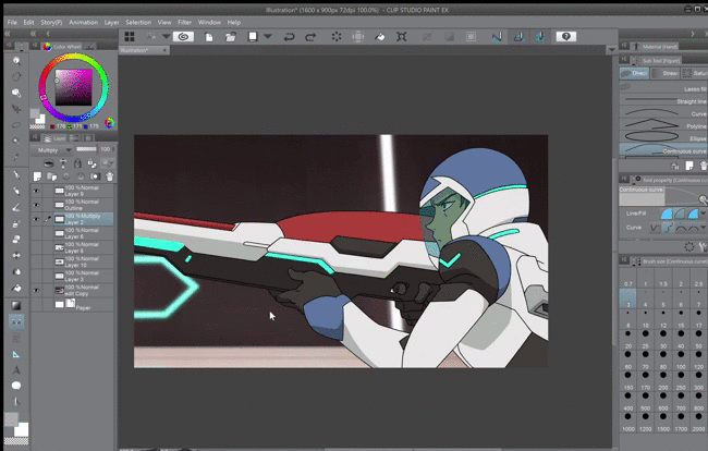
Step back and take a look at your edit so far. Does it need a color fix? Any more shading? Once you have everything you like, here comes the fun part (not really)
Sometimes, the background will still have traces of the character you just colored over, as seen below.

Going back to the original image layer, all you do it color over the patches with the same color behind it and blur it together to make everything blend better. Once you checked around the entire character for those patches, you’re almost done!
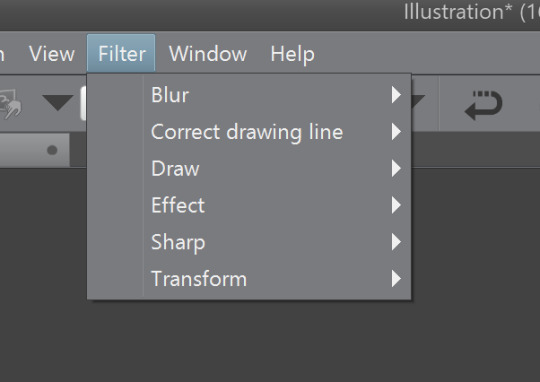
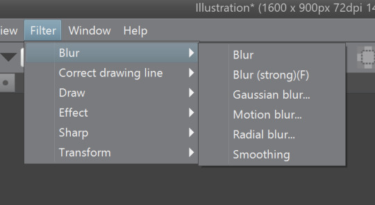
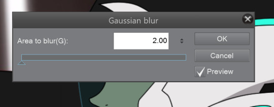
Going to your Filter Tab: Blur for your shading layer, you will select one of the two options - You will select the first options, which is just Blur, to blur your shading in with the colors better. Or, you will go down to Gaussian Blur and take the strength all the way down to 2.00 - as this gives the least amount of blur, which is the best option in a lot of far away characters.
Now, keeping the same Blur choices above in mind, you can do one of those with the outline, or not blur it at all. Just go by what you think is the best option to achieve the closest Voltron style as possible.
And Bingo!! Your edit is complete!
Now y’all know how to make a Voltron edit (at least how I do it), and even though it looks difficult, if you keeping working on this you’ll be dishing out edits in thirty minutes!
I hope this helped. If you have any questions or want more details or want to know how to make other edits (Altean/Galra, outfits, character changes, etc.), send in an ask and I’ll explain further. Good luck!
58 notes
·
View notes
Text
How I do my sprite edits!
This is long so!! Read more
First things first. Ya gotta open up this lil dohicky

(Can be replaced by other art programs, dw)
Once ya got this bitch open, you’re gonna open a new heccin canvas
“why tho? we’re doing a sprite edit! shouldnt we open the sprite??”
Well I’ll fuckin tell ya why you silly lil bastard.
We gotta design our bloodswap frist silly!
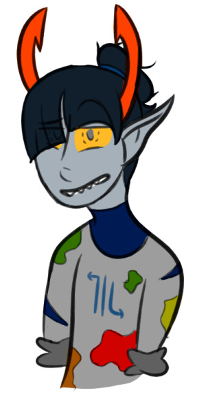
Now I got this old request, so we’re gonna be makin a cerulean Amisia today.
Get out your trusty sketchin pen (this is mine) and start sketchin!
Important things to remember!!
1. This is a bloodswap! We are not switching Amisia erdehn with an existing cerulean! we are takin out Amisias blue blood, and givin her cerulean instead!!
2. The only time you need to change a swaps horns is if they’re bein turned into a goldblood, or they are being switched away from a goldblood
3. While changing a sign is optional, it always feels more complete when ya do! Leaving the sign the same (imo) makes it seem like you just slapped the new colour onto the troll. In Amisias case, instead of giving her Sagira, we will be giving her Scorra.
Alright now that ya got your sketch (I forgot her glasses-)
now you can open up the sprite.
Now, granted I didn’t change much about her- and thats cause Amisia has one defining character trait (being/atempting to be an artist) thats obvious in her design, that can apply to every caste
It’s what she does with this trait that really changes from caste to caste.
But because of it, this may seem a bit overboard for how simple changin Amisias sprite seems, but when you get more complicated swaps (i.e: purple Tagora) it becomes pretty necessary
Now open up a new heccin layer
colour it cerulean (I change the colour based on the swap m doin, like purple goras background was purple), and lower the opacity. This seems a tad useless, but trust me it makes thing alot easier to make out when you
Also lower Amisias opacity!!!
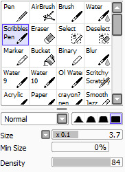
Selet a pen that you can use to replicate the line style, I use this at different sizes for all of mine
Now you’re gonna line everything in the sprite that doesn’t, or just barely changes- In this case, I’ll be lining everything but the hair, and eyeballing the arms to make them the right size
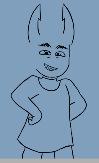
Now that we got this lil bald cutie, we gotta draw in her hair
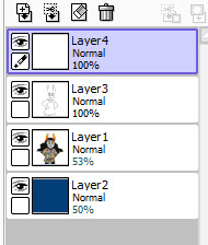
So open a new fuckin layer n go in and just fuckin draw that shite in, you can sketch it if you’d like, but I tend to just... draw it in
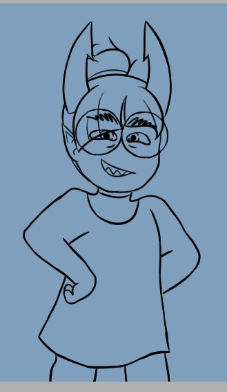
Now look at that, aint she cute? The hair is where your own personal style is gonna show the most- if you’re like me and learned to draw hair from homestuck, it’ll be barely noticeable. It’s always important to try to replicate the style as much as you can.
Now she needs her symbol, and since this is a simple one, I’m gonna draw it. If you’d rather not, it’s really easy to save/get a screenshot of the sign and remove the background from it, if you want I’ll do a mini tutorial on that but I think it’s self explanitory.
This is the brush I use to draw symbols, it’s a nice, solid square brush
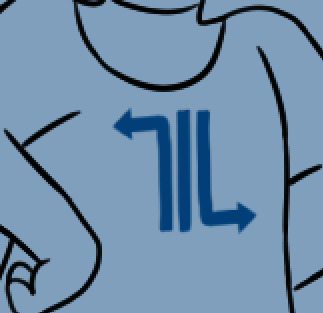
I usually draw it off to the side, then position it where it’s gotta go, use the base sprite to help you position it if you didn’t change it’s location
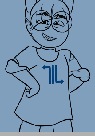
REALISE YOU FORGOT SOME CLOTHING DETAILS AND FIX IT (this is a very important step)
Now that all the lines are done! we move onto shading and colouring
Now show the base sprite again, and make a new layer set to multiply, you can try to mimic the shading style (like I did with vikare’s sprites) but I prefer not to

While you’re doing the shading, pay attention to the spots you’ve changed, and take a guess at how the original artist would’ve shaded those areas. Successful sprite edits are all about mimicing styles, which can be surprisingly easy.
Now ya get to colour it! (shading and colouring can be done in any order, I just like doing the shading first)
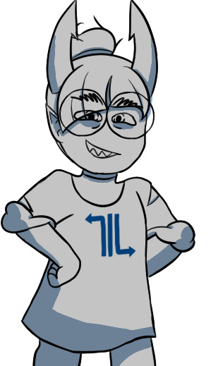
You’re gonna fill that in with grey, and adjust the shading til it looks good against the colour. I find this is easier to do with the cooler colours, but for colours like yellow, I usually have to change the colour of the face shading to a grey (Like yellow Gale)
Now preserve the opacity of that fucker, n colour it all in, using the sprite and your original sketch as a guide
While you’re colouring, you might see that you need to double up the lines, at least I usually need to- So do that if you think ya need it
There we go!
Now gettin the paint splaters, you could just trace em all from Amisias normal sprite... But I don’t think Cerulean Amisia would have that much paint on herself, so I’m just gonna draw it in on my own.
Now once you’re done, you’re gonna crop (if desired) and save it (make sure its transparent!)
And there ya go! We got a lovely Cerulean Amisia!!
Now if you want, you can start thinkin of some slight story for her- though you may have been doin that along the way (Like I usually do) Some stuff I thought of is:
She actually produces art!!
But it’s by making lowbloods do it for her!
She doesnt have much paint on her cause she’s rarely doing the painting, and most mess is cleaned up by her lusus
#Hiveswap#HIveswap friendsim#amisia erdehn#Tutorial#Sprite edit#Bloodswap Amisia#Baizli's sprite edits :0)#Baizli's tut0rials :0)
50 notes
·
View notes
Text
Creating A Repeat Pattern
Now that I have analysed some repeat pattern designs and know what sort of thing I need to achieve by the end of this task, I will be moving onto producing my own. I will be using illustrator to do this whole process which is good because I wont have to transfer objects from one program to another.
Before anything, I firstly had to decided on what font I was going to use along with what sort of objects I was going to draw as well. I knew I had to do around 3 to 5 objects otherwise the pattern could either look too boring or too complicated. I decided to start with an axe which I did previous mention in my last post. I think this object will be very simple as there isn't really many details to add to this object. This means I can then draw some more detailed objects later on. So I started by getting an image from google chrome. This didn't have to be a high quality picture as I was only tracing it which meant I only needed the general shape of the object.
Below is showing the general shape I traced from the image that I used. Although this screenshot wasn't actually how I left it. Once I tried adding the colours onto he design, it seemed very boring and looked quite messy too. I solved this problem by redrawing this axe completely, so that there was another section at the end of the object. This meant I could add in another colour to the piece. While doing this, I slightly changed the shape of certain places too. To draw this, I used the the ‘pen tool’ and just went around the image that I had placed behind. I had both of these things on a separate layer so that it made it easier for me.
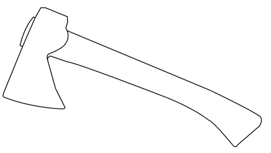
Here, is the final outcome I produced. I think this looks overall quite effective especially compared to when I coloured it before. To do this, I have gone to ‘object’, ‘expand’ and then selected the drawing and clicked on the ‘live paint bucket tool’. Doing this mean you can now choose any colour and click on the areas you want coloured. Although before this, I decided on having this brown stroke as I felt this would add to the outcome. I remembered in one of the repeat patterns in my research did this and I thought it was really effective. I then went ahead and coloured in the rest of the object. Before, this stage, I had actually already decided on what colours I was going to use throughout all my objects. The colours were light brown, dark brown and green. I felt that these reminded me of nature but also looked really striking together.

I have then moved onto my next object which I chose to be a jar of Nutella. The reason for this is because I feel that a lot of people know that this product contains palm oil. But even if the viewers didn't know this, when looking at this repeat pattern design they can then learn form looking at this. As well as this, I asked one of my peers as to what the first produce that had palm oil in came to mind was, to which she responded with Nutella. I think that overall this was a god decision to go with as I found it easy to trace but also as everyone should have at least heard of this product/brand.
Below is presenting what the result of this drawing looks like after tracing it. As you can see, I have added a highlight onto the corner as I thought this might improve the overall look. I decided on only adding in one of these as it could become too much otherwise. Another thing is that I also felt to only draw on the word ‘nutella’ and not the image that would normally be sitting beneath this. This is because it could overcomplicate things and once it has been placed onto a repeat pattern design, this wouldn't show at all.

This is the outcome after adding in colour to the piece. From looking at the jar whilst doing this, I thought to have the letter ‘n’ in green as this would then relate to the real jar. The reason for this is because this letter is a different colour on the real jar so to make this seem as realistic as possible I did the same but with my colour palette. Once I have finished doing this, I was actually very surprised with the end result as it looks so clean and effective. Again, I have added a thin stroke to which this time it is the dark brown colour instead. This now means that the lid and label of the jar standout from the background.

Here, is an orangutan that I have traced once again. This is the object that I did previous plan on drawing as i would say this is one of the most obvious objects that people associate with palm oil. Or at least the main animals that gets effected by this. As you can see from looking below, I have created the lines so that they are thicker this time. I did this because I had already planned on what colours I was going to use. But I also thought that as there are more details features in this drawing, that I would make sure they are all visible. This animal took me quite a lot of time to get right as I couldn't get the line and shape right at first. Although, I ended up manging to do it and I think it has achieved an appealing effect.

This is now showing how I chose to produce this object when adding in the colours. I thought that as this was the main element and the most detailed too, that I would make this a little more prominent when I get to adding it all together. So to do this, I thought to use white as the stroke this time rather than a colour from my palette. I though that this shade would make the lines I drew pop out a little more. Next, I decided to have the outside sections from the mouth areas and face as being the light brown with the centre parts being dark brown. I couldn't add the green colour into the piece as there was no space for it to go, but I feel that this doesn't matter. To finish this off, I chose to have the eye and nose area as being black.
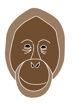
After this, I decided on drawing one more object, but at first I want sure on what this was going to be. I thought of having an inside of a log where I could show the lines that go round. But just as I was about to try this idea, I thought that I could have palm fruit instead. This then relates a lot more closely with my theme but I have also used palm fruit in my collage design as I knew what they looked like. Once I got some images up on Pexels, I wasn't sure at first on whether to go for a single palm fruit or a bunch. I chose to go on Pexels as I knew from previous work that there are some good quality images I could use.
I then traced around one of the images where I decided to only include three of the palm fruits which were the three at the focal point of the image. When I started drawing these onto my page, I wasn't sure at first on how they were going to come as they didn't look like palm fruits to me. However, once I had added the colours onto the piece, I think this completely changed. As shown below, I have put the stroke as being the light brown colour with the main part of the object being dark born and details as green and light brown. Now looking back, I probably could have made the stroke a little thicker as it hardly shows.

Here, is then the font and colour at which I chose to add to my pattern. I did actually use this font in the previous work where I was adding text onto my symmetrical designs. But I thought to use it again as I was attracted by the idea that it was a serif font but had a bit of curve to it. Another thing is that I chose to ever so slightly change the position at which each letter sits at. So to do this, I went to ‘object’, ‘create outlines’ and with the ‘selection tool’ I can move each letter individually. I only repositioned a few of the letters but I just wanted the letters to all be close to one another. This should then work a lot better once put on the design as it wont mix with any other elements.
As you can see, I have also changed the colours so that the first word being ‘palm’ is in dark brown and the other is green. I thought this would give a little more interest to the words and match with the colour theme.

Here, is the first composition I put together, where I have duplicated a couple of the objects to fill some of the gaps. The page that I created for this was 200mm x 200mm. This is a perfect square which is what I wasted as the repeat pattern process will work better this way when it comes to changing the layout later on.
As well as this, I have added another element on the page too, which is another bit of typography. I chose to do this because I thought that having a more messgae based bit of type could help to give a point across as well as for the viewers to understand what this is about too.
I have also rotated the text so that it is no longer written horizontally. The reason for doing this is because it will make the overall pattern become less predictable.
Although, this previous pattern didn't seem quite right as there was areas in which didn't look very effective. Beneath, is presenting where I have drawn a black rectangle behind the rest of the design. I chose to do this because it will help me to know what its going to look like later on when I start adding background colours to the piece. I can now see what areas will show the background and parts are filled. When I did this, I saw that there were two gaps in the palm fruit. I didn't like this so I covered it up with another shape presented behind.
Additionally, I think this new layout works a lot better. I have reflected one of the the axes so they have a complete different look. I have aloes thought carefully about the sizes in which I have each object. Further more, because there is a black background here, this meant I had to change around the black type so that its now white. To me, I feel this achieves a really striking effect as it looks very clean and pops out from the backdrop.
Lastly, this is the exact same composition as the previous screenshot but I have just taken away the black background. The reason for this is because this was only a test to see if it still works with a different colour. Also when it comes to actually turning this square into a pattern, I can’t add a backdrop at this point. This step comes later on.

Overall, I have now completed the hardest and longest part of this process to which I’m very pleased with the results. At the start, I remember I had no ideas on what objects would work well for this but it was actually a little easier than expected. Along with this, I really enjoyed creating this too. This might have been down to the objects that I chose as they were quite simple meaning they didn't take too much time. My next step will be to turn this into a repeat pattern where I can then play around with colours.
0 notes
Last Seen Blogs
dotflare
I make 3D, sometimes

papa2118
Untitled
dayafterdae
사랑하자
that-fluttershy-blog
Element Of Kindness💞

inflated-men-world
Inflated Men World