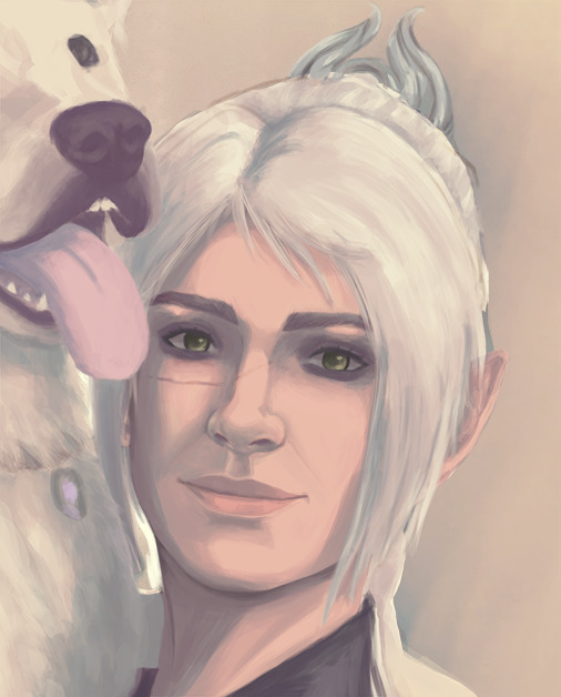
#and i am still figuring out csp and how to paint in it
Note
Is there any chance we can get a coloring tutorial or your brush settings? I am OBSESSED with the vibes of your art <3
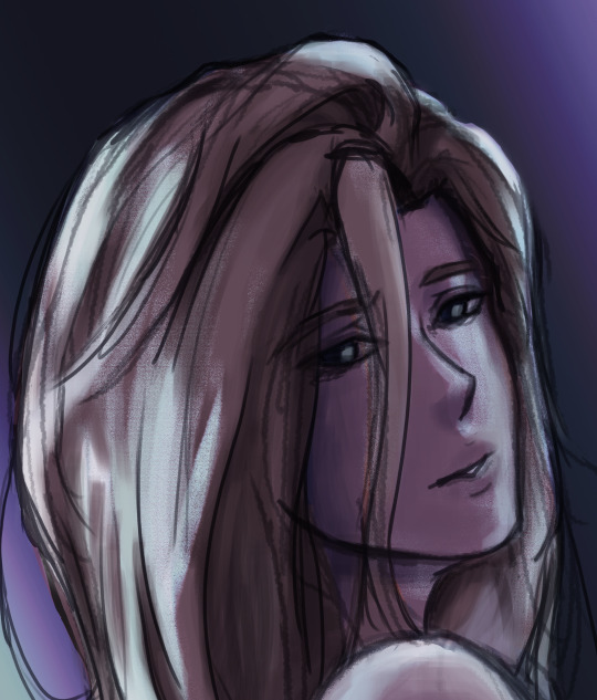
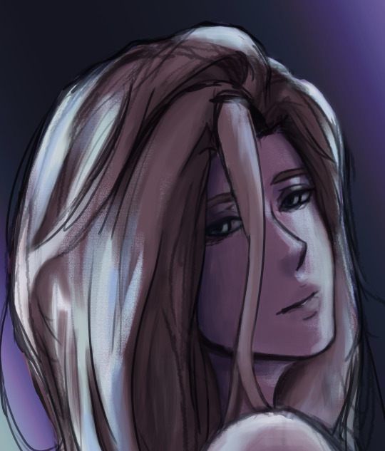
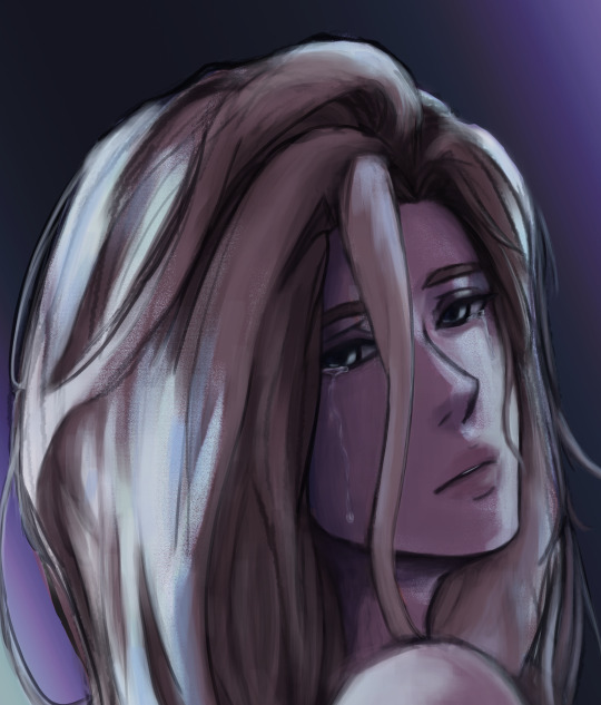
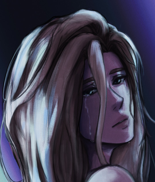
FROM LIL OLE ME ?????? honestly im still in a constant phase of trying to figure out what brushes/coloring styles i like but i really appreciate you saying that!! im going to assume this ask was influenced by the last art i posted since it blew up? so im going to mainly talk abt how i did those. but if you have any questions abt a specific piece or smth feel free to send a msg or ask! 💛
first off i use clip paint studio so these r all exclusively free csp brushes. artemus chalk and artemus pencil i use for flat colors or small sharper detailing, and intoxicate pencil set for soft lines and blending (its a set but they're all pretty much the same so it doesn't rlly matter which one you use).
however i use these 3 pretty interchangeably tbh so its not a strict guideline for me or anything. but for my last post, its almost exclusively the intoxicate pencil. it's what gives that "fuzzy" effect. i made these if they help visualize it


plus quick coloring tutorial! which is just basically my entire process. i can't clarify anything abt picking colors bc i genuinely don't know and pick whatever itches my brain at that moment in time
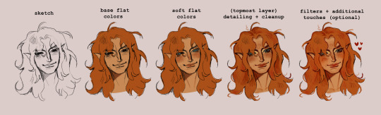
hope this helps! thank you so much for the ask! 💕
#ask#Anonymous#my art#art#illustration#drawing#artists on tumblr#digital art#my ocs#oc#ocs#original character#charlie
226 notes
·
View notes
Note
Hi! You're one of my favorite artists ever, and I would love to do some studies of your art! What are some of your favorite pieces that you've done, and how do you pick your colors? There's a lot more questions that I could ask, but figured you wouldn't appreciate an entire list of questions XD
Hello and thank you, I am honored! Feel free to send me all and any questions! I'll answer these two, starting by:
How do you pick your colors?
As I change art style with pretty much every illustration project of significance, this varies a lot. Here are, from most to least common, ways I pick my colors.
Eyeballing it. Unfortunately my most common... What I will do a lot digitally is lay down a color background, and flats of a few colors, then manually adjust each until they look good together by selecting by color and using adjustements. I then paint over it all.
Using a limited palette, eyeballed. Same as before, but this time I force myself to only use a few colors. It helps me, as constraints do.
Using a reference, eyeballed. This happens a lot when I mimick an art style. My medieval drawings for example, are often done by looking at images of actual medieval art to get an idea of what colors to use to look medieval.
Using an existing image, pipetted. Rarely, often as a challenge or if I'm super stuck, I'll just take a pic with colors I like and pipet from it. This website automates this if you want a good easy starting point!
These can be combined around. I'll post examples now, explaining how they use each.
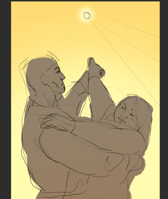
This is a sketch for a drawing I ended up doing way different. This is the first method - I used a flat layer for the characteres and three colors for the sky to test out atmosphere. This is how I plan out most full paintings, just trying to nail down a mood I have in my head. I fiddle around until I like it or, like in this case, fully give up and iterate further. Here, the composition was to be redone too as I did not like the body language. I was going for "bright hot sunny day under a weather that feels wrong".
For this comic, I combined a very limited palette and a photo ref to pipet from. I was looking for the stark cold/warm contrast of a mid-season bright night by a fireside. I took a google image photo of a campfire at night that was already edited. The photo itself looks unnatural but conveyed what I wanted. It's still on the file itself! From it, I pipetted a few colors I found "summed up" the palette and did all with them.

While my own habits make me prefer painting as you would in traditional methods, with directly picking the right colors, I will often digitally alter with overlays and layer blending modes some colors and gradients, etc, to alter a drawing to fix it's color palette. The following is a quite egregious example, because I first drew the character in flats before putting him in a full scene. Here is a before/after summed up.

The shadow is a layer, the bright yellow light zones also, and the orange "transitions" of light zones on the skin a third. There's also an overlay over the full character to blend him in. I do this by...making a full flat color of a layer, fucking around until a blending mode does what I want, and adjusting hue/brightness/saturation and opacity until it looks good.
Another WIP where I was struggling with the overall palette. I was going for late 60s psychedelic. You can see in the top right the original color. I thought it looked too...new, so I added a yellow layer on top, and fiddled with it. Final choice was the following setting. I then put it with my sketch and color blockout in a folder and painted over it.
For this sort of adjustement, the "Color Balance" modifier in CSP, Photoshop, and others is also a godsend - but one I often use for fine tuning a finished piece.


This being said, there's some rough rules to coloring which are...born from studying color theory and doing studies. I am guilty of doing very little studies...so I'll just sum up the basics of the color theory rules I use.
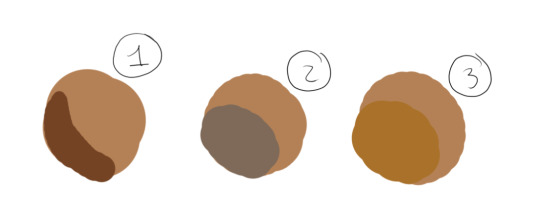
For "default" shading, I use a color that is darker, more saturated and with a slight hue diff. This is my "don't shade with black".
Using a shadow that's cooler will make the light look warm.
Vice versa.
There's a bunch of stuff to remember in how colors relate to each other and pipetting images who's atmosphere you think is interesting really is the best way to learn... It's learning how to black-blue/gold-yellow dress in your own art for the lack of a better word...But the basics will be:

Don't trust numerical values, but look at your colors in context. A same hue, brightness, saturation can look so much different. This is how Rakkan's beard looks whiteish here despite being a light very grey brown.

All this but...colour is such a wide topic, I can't really say a lot but can also type for hours... if you have precise questions about a piece in particular I can explain :') I hope this wasn't too vague and was instructive!
Speaking of particular pieces, answering your question last under the cut:
What are some of your favorite pieces that you've done?
In no particular order, illustration only.
Including this in another poast bc staff's new post editor limits the amounts of pics I can put in response to asks. Insert colorful language here...
Frankly twas hard to pick I am rarely fond of what I draw
41 notes
·
View notes
Note
Hiii can u pls do a face tut pls I’m begging you
heya! sorry this took some time, i just moved and it's been really hectic @@
and thank you for the question! i'll use stuff for bela and shadowheart as an example for ya for the two styles i usually do
warning, i am not a teacher and i'm still experimenting and learning so uhh some of this might be scuffed but is how i do it :>
also noting that i use csp or photoshop depending on my mood and what brushes i want to use but the same technique works for either and i use 2 brushes for the main bits and additional brushes if i want to add texture
--
1 - so after i have the sketch roughed, i usually put it on a multiply layer and add a background layer under it (i leave it white or almost white if i'm just doing a doodle or sketch) and i start to figure out the lighting and shading under the outline layer
the lighting is usually pretty rough and i'll start to understand what i'm going for as it starts to shape up but i try not to reduce the brush size too much so i don't get too muddled
(at this point i'm going thru my mantra of "trust the process" and breathing into a paper bag and kicking and screaming about how i want to quit)
--
2 - once i have the lighting somewhat how i want it, i start tweaking the color and i do it by using adjustment layers and manually painting. this part is kinda like cooking and tasting as you go, if i feel i want the image to feel colder/warmer i'll adjust accordingly but i will tell you how i did it for both examples below:
for bela, i actually painting above the shading/lighting layer and used "soft light" and "hard light" blending modes for the hair and skin to fit more with how i wanted it to look. i used color balance and curves for the background to get it to more of a purple/blue and darker
for shadowheart, i actually put the color below the shading/lighting layer and left the color as is and swapped the blending mode for the shading/lighting layer to "multiply" and then did adjustments using curves and gradient maps using "hard light" and "soft light" too and i think i had a "color burn" just for fun
this is my fav part of the process bc i just experiment and mess around with different layers. i usually have a vision for how i want the color and lighting to look but there's always room for new ideas! so i just mess around for a while here till i'm happy!
--
3 - rendering time! um i don't really have much advice here except i just start going in and rendering in closer detail. and remember references are your friend!!!
bela render progression:
shadowheart render progression:


i sometimes end up changing the drawing quite a bit during rendering but that's okay bc as you go into detail, you will notice discrepancies from the pre-render stages
for the style i used with shadowheart i just paint over the outline pretty much with some bits of it left it and i blend more to smooth it out more. for the style i used with bela, i add back in any outlines i painted over that i wanted to keep
--
and at the end of the day it's your art and how you express it is what's always gonna be the best so trust your gut (and references) but also it's okay to take creative liberties and go with the "cool rule" :3
and keep practicing!!!! i def feel i've gotten better with drawing faces compared to a year ago
i hope this helps and if it didn't ":3 i hope you had fun reading
#i hope this makes sense#i had to go back into my files and disable layers to get these screenshots Dx and i have a LOT of layers but for you anon i did it#i didn't know if u just wanted a broad tut of how i draw the face or if you wanted smth specific but i hope this helps anyways#i didn't promise this would help#pretty long post#asks#anonymous#my art
4 notes
·
View notes
Text
NOW HIRING: Colorist/Background Artist
Hello, DJW here:
I am actively seeking a COLORIST/BACJGROUND ARTIST for my webcomic 'Descendant'.
More info UTC.
You must have the following:
A good, fundamental grasp on color theory and the elements of design. Anyone who is also demonstratively improving their basics are also welcome to apply. Good grasp on lighting is also preferred, please.
MUST have a stomach for horror/Lovecraftian designs/mild gore/mild sexual content.
You MUST NOT be adverse to coloring People of Color, LGBTQ+ characters, (This is a very diverse story) as well as the problems they faced in the time period. This story can be very sticky but I do NOT want to traumatize a community for the sake of the story. These various -isms won't be tolerated.
You probably should enjoy some form of "Old Western"-style media: saloons, wagons, horses; etc. etc.
You should also probably enjoy occult stories: vampires, angels, demons, etc. etc.
You must be respectful of my story and how it progresses and have faith that I have control over my narrative.
This will be (hopefully be) a partnership so please do not apply if you don't want to commit to a serious comic endeavor. I've been working on this story for over 20 years.
You MAY build and/or use 3-D models but AI Generated content will NOT be tolerated whatsoever.
Even better if you're a Black or Native American artist so YOU can crack the whip if I'm not representing POC correctly or enough.
You MUST be okay with a 50/50 payment split, meaning: I ALWAYS PAY FELLOW ARTIST HALF UP FRONT AND HALF WHEN THE WORK IS DONE. (<---EVERYONE should be doing this. That way you still get paid for the work you did, and your payee doesn't lose out on hard work.)
MUST be willing to enter into a non-disclosure agreement, as well as a theft-protection agreement meaning: I will absolutely pursue legal action if, for some reason, we part ways and I find out you're using my characters or story ideas in your own works.
MUST have Clip Studio Paint or a program that allows you to work with the CSP files. Clip studio has a STUDIO option where I can add you, and you can open the pages from a cloud service, which really cool once I figure out how to set it all up.
Currently, I am offering $100/page (in reality, it's more like 1 or 2 panels, but we can discuss that later) in webtoon format (vertical form comics). You will not be required to draw much beyond backgrounds and only on select panels to be discussed with me as they come into play. I will specify through conversations what I'm looking for. I am not looking to micro-manage anyone, either. I will let you have your creative freedom, as long as it falls in line with the theme. <--this will be discussed during the planning phases of each chapter.
I will have a tryout period beginning on September 7th where I will pass along something that I drew, and you will color it to demonstrate your skills. I am paying $50 per person (up to 4).
For the work I'm doing: I will be writing, sketching, inking, lettering, paneling...pretty much everything but backgrounds and color.
I am open to different coloring styles, as long as we agree on an inking style and stick to it. I am pushing hard for quality but I understand I am not paying much right now. As time goes on, if this turns out well, I fully intend on upping that payout more and eventually setting up a Patreon which I will be using to pay YOU as well as my editor, and any beta readers I may need before posting. (you can also be that beta reader if you'd like; get that money, baby!)
Also, if this goes well, I am very open to also helping YOU create your own comics, especially on any downtime on my own, FREE OF CHARGE!!
And, if this goes SUPER-DUPER well, I've got a really great idea for a companion project to go along with this story.
If you are interested, please send me a DM on Tumblr, Instagram, or Deviantart along with a little blurb about yourself and a few examples of your best work:
https://www.instagram.com/djwaglmuffin/
Thanks in advance for the interest and I hope to see people apply!
PS: If y'all could reblog and share this on various places to drum up interest, that'd sure be swell.

Here, have a sticker!
#Now Hiring#Commissions#art commissions#art#art community#writers#artists#fellow artists#comics#webcomic#webtoon#global comix#manga#manwha
5 notes
·
View notes
Text
Witness my struggle with Krita as I am trying hard not to switch back to Clip Studio Paint. I still could not figure out how to make the light and glow effects, brush settings and blending and texture options. CSP has a clearer UI and I can just set layers to whatever setting I want with easy masking options. I am very close to just switching back and doing this on CSP. Right now, I just want to do my art in peace without this struggle. I will give Krita another chance later because I know I will love it once I get the hang of it.
#digital illustration#wip#work in progress#krita#clipstudiopaint#timelapse#speedpaint#digital artist#artistsoninstagram#artists on tumblr#jeheiaart
2 notes
·
View notes
Text
Welcome to @askstrangeweird! Where you can see all my fandom art and OC art and plans for my upcoming webcomic, "Glitch Hunters!" which is still pretty early in development. Most of my about me is in my Bio but I will include more here with an edit at another time.

[[Commission Status: Currently Closed]]
[[Blog Status: Figuring out how to make stuff in Blender while balancing fandom art and prepping for my indie animation project while having poor motivation and time management skills, wish me luck!]]
The programs I use are, MediBang Paint, CSP, and Blender, I do all my art I can on my phone besides the 3D stuff.
A sample of my stuff below the cut:


Updated Height Charts of Current OC roster:


((Cakes was created and designed by my wonderful and talented friend @sleepy-galaxydragon-art, who helps me with ideas, and who you should totally go follow))
To find individual reference sheets for each OC click the first tag in this post on my blog.
((content warning: weed use and adult humor/language))
*Note*
((Please don't assume things about me irl based on my characters. I am a bi white male, however I like having a diverse cast of characters of all sexualities, genders and races because it reflects my friends and the reality we should be working towards, and I refuse to change that to fit anyone else's wants, and I avoid writing about hate centered issues like racism sexism, and homo/Xenophobia, not because I'm denying they exist and matter, but because I don't have the authority to speak on these things as if I have experienced them from all perspectives, and I understand that even if I did i may be speaking from a place of privilege. I also avoid religion as a topic, for much of the same reason, and because my fictional world in a fictional simulation may not mess with irl belief systems in a respectful way. If I am ever successful enough to hire a diverse team of people to help me improve the world I'm building now to be equipped to tell those kinds of stories through the correct lens, I'd be more than happy to consider it, but for now it's just me and I'll stick to what I'm comfortable with speaking on.))
#heres my references#digital art#ask blog#oc ask blog#original character#original characters#webcomic#Webtoon#comic planning#concept art#artists on tumblr#my oc art#send me asks#story#oc height chart#height comparison#height chart#lineup#Glitch Hunters#Glitch Hunters comic#creature design#blender 3d#blender#clip studio paint#csp#medibang#medibang paint#pinned post#welcome post#action comedy
7 notes
·
View notes
Text
General Art Tips :)
I kinda went off on twitter about this but figured I’d put all my thoughts into one post, and on a site OFF twitter lmao. I know some people ain’t there anymore.
Anyways! Some thoughts from a long time artist, aimed at newer artists or anyone struggling with motivation. A lot of this has to do with brushes, which I don’t?? See touched on too much I guess????
Obviously this is aimed at digital artists. That’s all I know, I’m afraid!
I am most familiar with CSP but really, all of this is true for other programs too!
-Find a brush you vibe with. Find MANY brushes you vibe with!
When your brushes feel better, and by extension, drawing feels better, you’re more likely to do it.
I know it sounds a bit silly to say that brushes feel different from one another when they’re all controlled by the same pen on the same screen, but trust me.
Play with every brush in the program you’re using. Draw out some scribbles. Increase the brush size, scribble a bit, decrease the size, scribble some more. if it has blending properties, grab another color and scribble on that scribble and see how they blend. If you’re still liking it, doodle out a cat or a leaf or a little bug with a knife or.. you get it. You’ll get a feel for a brush as you use it, and you can tell if you like it. If you don’t like it? Move on to the next one!
This is true for every stage of drawing! You found a brush you like to sketch with? Great! Sketch something so you can play around with lining brushes! The worst that can happen is you get half way in and don’t like how the lines look or feel. You can delete the layer and start over with a brush you like better. You’re getting practice with lining!
As you’re just playing around with brushes, you’re ALSO practicing drawing. Cool, huh? :3
-Ask other artists for their brushes/brush settings.
This one is obviously on a case by case basis, and you should be respectful of what an artist has said beforehand, and their response after you ask. Some artists aren’t comfortable sharing for one reason or another, and those boundaries should be respected.
There are just as many of us that are more than happy to help, though! Some make their own brushes are are happy to share, or sell their brushes publicly already. Some of us (like myself) have bought our brushes off personal sites or sites like gumroad and would be happy to point you in that direction towards what we personally use and can recommend.
-Grab cheap, or even better, FREE brushes when they show up!
Occasionally, people will reblog/retweet brushes they’ve found on the clip asset store or have put up themselves on aforementioned sites. They’re usually only a few bucks at most, and very often free with the original creator leaving it open to what the person wants to pay. It’s a very risk free way to pick up brushes to play with! At worst, you don’t click with it and you can delete the brush.
You can obviously also go browsing through these resources yourself for brushes and brush packs that look interesting to you!
-Just because something is labeled a sketch/lining/painting brush, doesn’t mean you have to use it that way.
This one is a bit sneaky, so don’t tell anyone, but you can use any brush however it feels best to you. No one will get mad. No one will get mad at you if you use the same one brush for every single stage of a drawing, even.
If that hard edged lining brush feels great to sketch with? Do it! If the soft edge on your lines that that shading brush offers makes you happy? That’s what art is about.
-Have multiple brushes of any one kind.
This one is a very loose suggestion, and just one that works for me, so don’t worry about it too much, but I figured I’d include it anyways!
Sometimes, a brush just... Feels Off some days and nothing you draw comes out well. Sometimes, a solution is switching to another brush. That can be hard if you haven’t taken the time beforehand to find a couple extra brushes, and you’ll just... lose motivation to draw entirely, and that sucks.
I currently have three sketching brushes and swap between them freely depending on how I’m feeling, and how they feel to me!
*The exception to this is if you’re a commission artist, doing commissions. Your customers are expecting a quality and style from you, so do your best to give them what they’re paying for. If you can’t work with brushes you have before, talk to them! Most people won’t really notice much of a change and are there for your overall style anyways, but it’s most polite to be transparent that something will be different than assume it will be fine. It really is better to ask permission than forgiveness, turns out.
-Use the tools at your disposal!
This is referring to both in-program tools and art tools in general! CSP has a built in 3D model program that you can use to help with posing. It exists to help you. Stabilizers on brushes aren’t cheating, symmetry rulers aren’t cheating. If it exists in the program, use it.
Out of program? Use references. Use pictures of real people, of real animals, of real cities and plants and water and clothes and crystals and and and
If you don’t know how to draw it, look it up.
There are tutorials on how to paint digitally, and how to do 3D modeling.
You can teach yourself... just about anything. The tools are there, and they’re there to help you. Don’t be afraid to use them.
-Practice, and have fun!
I know this one is kinda hard sometimes, but art really is supposed to be fun.
Draw the things you love. Draw your ocs, and your favorite cartoon characters, and things for your friends. Watch them light up. Draw the things kid you never could. Draw things to make them happy. Draw things to make you happy.
If you’re unhappy with something in your style, it means: A) You’re good enough to see that something’s wrong, and B) You do have the ability to fix it. You have resources at your disposal to improve. You have time to improve. You just have to let yourself, you know?
Don’t give up on this. It’s so worth it, I promise.
#art#long post lmao#idk what to even tag this as#i just really care about art and want people to succeed you know
6 notes
·
View notes
Note
3, 14, 15 MWAHAHA
(something you don't like about your art but aren't sure how to go about it, funniest/most frustrating thing to have happen during your art process)
3. What technique(s) is/are you using that you feel is wrong, but you have no idea how to go about it?
Right now, I dislike the way I’d render more detailed faces the most. Being in the JJBA influenced my art quite a bit where I’d add more details than simplifying (especially when drawing buffer masc characters). It’s not wrong stylistically speaking (skill-wise, I’m doing it poorly), but simply a different style and a way to interpret a subject.
Growing out of the JJBA fandom, I noticed I enjoy drawing more femme and cute characters— but I wouldn’t want that aspect to transfer to everyone in my style. I’m currently at an awkward limbo where I’m still trying to figure out if I’d like to go for the more detailed route or simplified, I love them both equally.
To render better faces with detail means more anatomy practice, though I’m still trying to figure out the steps and to do what first.
14. Funniest thing that happened to you during the drawing process?
You know how when you do gesture drawings/warm ups, you only care about the motion and try to get the pose down? After drawing one of the various poses, I realized, “Oh hey— doesn’t that hand look like it’s touching the person’s crotch?”
Yes. I am very immature. Still the same person who told a “Rook Oui-Oui” joke.
14. Most frustrating thing that happened to you during the drawing process?
When my laptop interrupted my date with Clip Studio Paint by third-wheeling us with the blue screen of death.
Thank goodness— there’s a back up cloud function in CSP where it automatically saves your drawing process every few minutes— but it is a pain.
This my 13th reason why I moved from PC to iPad. It’s sucky the CSP app uses a subscription— but oh well…
Ask game
#thanks for the ask!#you are the one thing stopping me from developing a god complex/j#ask 🎊#meowing 🌸#ask game#ask meme
6 notes
·
View notes
Note
what art program do you use and why did you pick it?
Oh I have used SO many programs. I started on an iPad Air (might have been an Air 2 not sure) and Procreate which I picked primarily because my mom had one lying about and I stole it like a gremlin (nah, I just asked if I could have one for my birthday one time) and so that was more out of convenience.
Currently I use a Samsung Galaxy S6 Lite which I choose cause FUCK APPLE and because its arguably one of the best drawing tablets at a relatively budgeted price. I also personally can't sit in a chair like a normal person to save my life, find tablet pads frustrating as hell, and am often a busy person on the go, so having one of those "plug into the computer" tablets was completely off the table.
Program wise, I use both ibisPaint X and have recently started using Clip Studio Paint Pro (CSP). I use ibis primarily when I am either A) sketching B) doodling or C) not intending to to a complex / serious piece since I have been using it much longer than CSP and the user interface is so much more simpler and easier to navigate. I'm considerably faster on ibis still since I only started using CSP like a month or so ago.
CSP is a FANTASITC software I've just started to learn and figure out how to do since I just started and I swapped over to it because following the end of Art Fight 2022, I found that I had really done as much exploring as I could with the tools that ibis offered and that if I really wanted to get more practice in comic making and just wanted more room and tools to play around with to expand my skill set, that I'd probably want to move up to the more professional, more expansive, more tool-filled CSP since it has so many more features to make animations, story boards, comics, and art a lot easier, more efficient and just all around better. The only issue is that I'm not the most used to sketching on it like I do with ibis and its user interface is a lot like photoshop which isn't BAD but I'm not as much used to it in terms of digital art since I only used photoshop when I was in middle school (ie like 8 years ago??) and I've been on Procreate and Ibis since.
I really love CSP though even if the UI gives me headaches sometimes and I tried the animation tools it has for an hour and just decided Ill do that in the later nondefined future cause it scares me with how complicated it is and how it makes me feel like a caveman (I've done animations but I've done it HELLA old school as if I were drawing a flip book which is SUPER inefficient, but also requires a lot less complicated tech knowledge)
-Riku
5 notes
·
View notes
Text
Cumulohimbus's 2023 Digital Painting/Drawing Program Ranking
*Note: this is purely my opinion, and only includes programs I have personally used.*
Digital Painting/Drawing Programs from best to worst
Paint Tool SAI
Krita
Clip Studio Paint
Adobe Photoshop
GIMP
Medibang Paint (Mobile)
Breakdowns under the cut
Paint Tool SAI - Pros: lightweight/fast/responsive, one-time purchase, easy to navigate. Cons: not as many bells and whistles or editing capabilities as other programs, there is a monetary cost associated with it (it is allegedly easily piratable, but I would recommend paying the ~$45 USD to purchase it bc I think it's worth supporting the creator). Probably still my favorite program to use, Paint Tool SAI just runs really well. It's quite beginner friendly, but doesn't have all of the editing capabilities of other programs. That said, it's specifically for digital painting and drawing, and it does a phenomenal job when used for those purposes. 9/10.
Krita - Pros: free, has almost all of the same things you would find in commercial products including basic animation capabilities (I believe they're working on expanding and improving these as well). Cons: runs a bit slow at times, layers & layer modes are kinda complicated to figure out. I got Krita not too terribly long ago, and after exploring it a bit, I think it's perfectly viable up alongside commercial programs. It can lag a little at times, and it has a bit of a learning curve, even for those familiar with digital painting/drawing programs, particularly in how to set up layers and layer modes (I have a document set up to remind of certain steps in Krita, like how to make clipping masks). Other than that though, I'm excited to see the improvements it gets going forward. 8/10.
Clip Studio Paint - Pros: an all around solid program with lots of unique tools and access to a user community where you can acquire additional assets, highly customizable. Cons: paid license subscriptions 🤮, can run slow and lag at times, limited brush options at the start. I tested out CSP fully for the first time yesterday and I was pretty impressed by its capabilities. I especially enjoyed the ability to pull up a bunch of reference images in a sub view window, and a seemingly infinite color history which was super helpful in painting. I wish there had been more brush preset from the get-go so didn't have to teach myself how to get/make more, but the ones that are there are decent enough, and I'll probably use CSP some more before my free 2-year license of it expires. That said, I am disgusted by the paid subscription cost, and if you're a low-income artist, Krita can do a majority of what CSP can, for no cost. 7.5/10.
Adobe Photoshop/Illustrator - Pros: I mean, they can do what you want them to do I guess. Cons: paid license subscriptions 🤮 (by Adobe 🤮🤮). Joking and hatred of big corporations aside, I think both Photoshop and Illustrator would be better if they had more tools for painting/drawing, but you'll still be able to accomplish everything you hope to with them. They're two really well-known programs; Photoshop especially is frequently used for digital painting/drawing, but it's not really built for that. It's got a lot more photo editing capabilities (as it's name implies) than tools for digital painting/drawing/ illustration, though it can do those things just fine. Adobe Fresco is the program that's supposed to be more painterly, but I haven't tried that one out. Not going to give Adobe my money if I can avoid it though. There are cheaper, even free programs, that can do everything Adobe products can do and then some. 7/10.
GIMP - Pros: free + open source, very good editing & selection tools, customizable, you get a lot for $0. Cons: can run pretty slow/lag, actual drawing/painting tools aren't that great, even with pressure sensitive tablets, bit of a learning curve but if you've used other similar programs before GIMP is pretty easy to explore and figure out. I used to use GIMP for making thumbnails for my YouTube videos, and I still really enjoy it's image editing capabilities, but I wouldn't say it's very good for digital drawing and painting. 6/10 since it's free and does some stuff better than commercial programs.
Medibang Paint (Mobile) - Pros: it's nice to have a painting/drawing app I can access on the go, free, has all the basics. Cons: probably better on a device larger than a smartphone lol, mobile UI is a little annoying as well. I haven't tried the freemium version of Medibang, or any other version not on my smartphone. I don't hate it, but I wish the mobile version had a slightly different layout. I'd say the painting/drawing capabilities of Medibang mobile are at least on par with GIMP's, maybe a little better. It's tough to use the editing tools on mobile as well. 6/10.
#art#the larkchive#digital art programs#krita#gimp#paint tool sai#clip studio paint#medibang paint#photoshop my becursed#art program rankings
1 note
·
View note
Photo

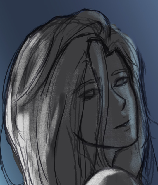
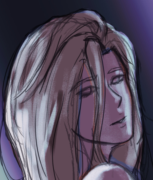
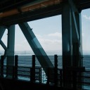
so softened and tender / so lost and young / and I don’t know where I’m going
#hi emo art time#normally art is only therapy because stress relief#now it's a little more direct#this was really quick i really just wanted to get it out there#and i am still figuring out csp and how to paint in it#hence the sort of shitty use of materials#but hey! a calligraphy brush!#that was pretty easy to use!#and looks great!#i love typography so damn muchhhhh#i think this is one of two things i have posted that is entirely digital at every stage wow#and i forgot to put blue highlights on her coat#and i completely forgot to add her hands until i'd already opened the thing to make a new post#so whoops#all good now though#drawawyvern#Natasha Rostova#Natasha Pierre and the Great Comet of 1812#i was gonna do pippa but i haven't drawn her i don't know her face as well i'd have had to find references and stuff........#this was a quick project#if he were here now#denee benton#anyway the point was atmosphere and general mood of how she stands and text#so mission accomplished#funny detail: i did the o in love like how you'd do it in russian calligraphy not english#which i would have gone back and fixed except it looked good and it's set in russia so that's forgivable#i did it completely by accident i just have done way more russian calligraphy recently than english and muscle memory#war and peace
11 notes
·
View notes
Text
End of year questions for writers and artists
Tagged by @heartoferebor, thank you! Answers under cut. Anyone who would like to answer the questions, please consider yourself tagged! :) (If you work on projects that don’t fit neatly into writing and artmaking, feel free to apply the questions to your work as well)
Questions:
1. What project are you most proud of and why?
2. Which project did you have the most fun making?
3. Which project was the most unexpected and/or challenging and why?
4. Which project would you like to receive more attention?
5. Is there a project you intended to work on but couldn’t find the time? If so, what is it?
6. Have you noticed an improvement in your skill this year? Did a specific project help?
7. If you could remake any project you’ve created this year, which one would it be and why?
8. What project would you like to make next year?
These are hard questions. When I have time to draw I blurt out so much stuff almost on autopilot and with barely any forethought that I rarely consider any particular drawing to be a “project.” That said...
1. most proud of

This was actually planned and executed over more than one drawing session. I hadn’t figured out how to color the figures until I filled in the background, then chose the colors for the figures based on that. Also, this was done in GIMP, so many layers (because of the way I work in GIMP, nothing inherent to the program). It’s not the prettiest drawing I’ve made in 2021, but I certainly put effort and care into it and didn’t give up, so I’m proud of that.
2. most fun
Everything under the tag “silliness” and especially “reblog with a drawing” is fun (hooray for audience participation, you all leave very entertaining tags which inspire me—sometimes I have to hold the idea for a response in my head for hours and can’t wait to sit down and doodle it out).
3. most unexpected/challenging

I already had the base painting but animating it with the changing hair and eye colors and sparks and lighting was challenging: not because it was inherently so but because I took so very long to figure out how to animate things in Clip Studio Paint. Had already done some simple blinks/flickers/fades in previous animated illustrations, but forgot everything and had to regoogle it all. I was thinking I’d be done animating this really quickly and instead sat there clicking around the animation tools in CSP going “???” for quite a while.
4. would like to receive more attention
Geoffrey McCullum from Vampyr. I should draw him more. His facial structure is interesting and, like with Regis, I just can’t get it right intuitively.
5. wanted to work on, couldn’t find time
I want to learn to draw comics (the whole shebang, backgrounds and figures and lettering and everything) and do a couple of comic-style pages for ideas I’ve held onto for a long time. Unfortunately I love drawing the same faces over and over again too much to have the motivation to put brainpower towards learning new stuff in my downtime.
6. improvement? specific project?
Yes, I’d gotten more comfortable with ArtRage then switched to Clip Studio Paint in mid-October and am finding my footing in that. I’m not sure how to quantify the improvement except that the art (most of the time) looks nicer (closer to ref? more coherent in thumbnail?). There wasn’t a specific project, just a lot of drawing the same faces over and over again, looking at different kinds of references (paintings, photos, video stills, game screencaps), and being very lazy (and hence finding shortcuts to do a reasonable amount of stuff within short drawing sessions, like my color blob way of starting color portraits; I could do a whole little post about how being lazy has shaped my way of drawing digitally).
7. remake?
Interesting question. Since most drawings are just a spur-of-the-moment thing, there are few drawings I’m invested in enough to want to improve them. I know just about as soon as I post something where the major flaws are that need fixing, but usually I just leave it be and move on to the next drawing. But I actually just redid Book!Dandelion (Oct 2020 vs. Dec 2021):

First one was in the Calyxestra Copies series (i.e., pastiche), done on my old drawing tablet and in ArtRage. Second one was done with reference to an Artbreeder pic I generated last year; drawn as the first complete piece on my new tablet (with a screen!), in Clip Studio Paint. Fabrics are still out of my comfort zone, and that poor hand looks so muddy, but at least the face isn’t so blurry this time, ha. I think drawing directly on a screen where I can see where the pen tip is going on the picture itself is going to result in a lot less imprecision and fluffy edges :)
8. next year?
I would really like to make those two little comic projects that I have in mind at some point. But again, I’d have to learn to draw more than just faces reliably... One "project” I’ve been keeping for when I got my new tablet is tracing some penciled lineart and turning it into a complete piece digitally. Nothing big, just have to remember to do it.
17 notes
·
View notes
Text
Idk, brush tutorial bc I'm bored
I actually have a lot of things to do but I don't wanna do em, so here I am doing a lil useless tutorial.
If ur like me who can't do consistent signatures or if ur tired of typing out your watermarks, I think this method is pretty helpful for you.
I'll do this in both CSP and Photoshop, I'm still figuring out how to do this on ibis paint and in sai.
Anyway, here we go!!
How to do this brush thingy in Clip Studio Paint

Step 1. Write or type out your signature/watermark. I love this thing about CSP bc you can use colored images for this, unlike Photoshop where it converts the image to black and white. Ya can also use this method when you wanna make stamps.

Step 2. Go to Edit>Register Material>Image
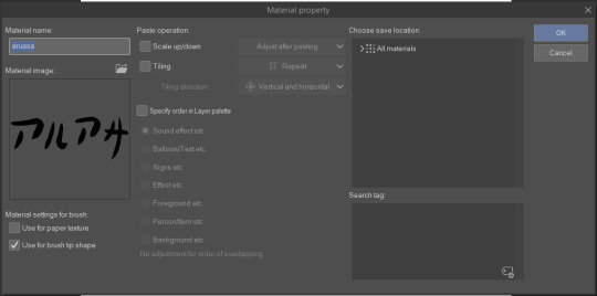
Step 3. This thingy will pop up. Name your material if u wanna and tick the box "Use for brush tip shape"
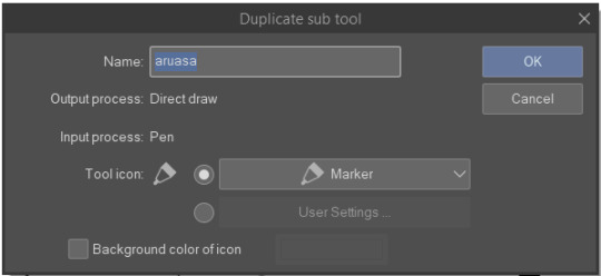
Step 4. Duplicate a pen tool or something similar. Customize it to ur liking.

Step 5. Click the options and go to the brush tip settings.
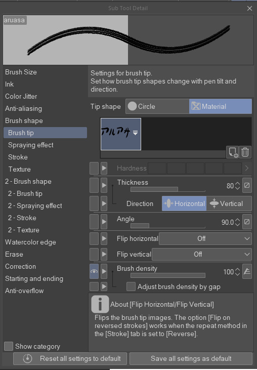
Step 6. Click the material tip shape and the add new material button. Find your created material and add it. Adjust the angle to 0 degree.

Step 7. Now head to the stroke option. Click the single circle and set the gap to 2000 (depends on you if you want wide space)
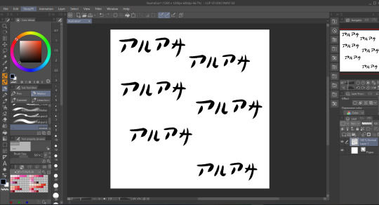
Step 8. Go batshit crazy with your new signature/watermark brush.
REMEMBER: This also works on texts and other images
If this goes well, I'll link the tutorial for Photoshop in the future.
#tutorial#tutorials#resources#clip studio paint#brushes#art tutorials#art tips#clip stusio paint brushes#hello fellow astronomers
30 notes
·
View notes
Text
working on lc and im very happy to say i am using both paint tool sai and clip studio. I probably could find a way to make clip studio do what i like about paint tool sai, but is there a point? idk. Plus i’d have to get adjusted to it there again. I dont want to spend the entire time chasing what I already had in the other one. Currently for me they are very good at seperate things and i enjoy using them for those things. Probably some day i will migrate to mostly csp but sai still does things i cant figure out how to emulate perfectly in csp so for now i use both
3 notes
·
View notes
Text
i think a lot about the mondo article about my anubis!polnareff piece because it says shit like “the artist knows their tools” and i... don’t? i just wing it and sometimes the result looks satisfying. i still dont know how to stylize things and use watercolours to make things look like what i would like to do. i dont know how to make cool cartoon art or paint digitally and since like january i still couldnt get used to csp and figure out how it works... i know i shouldnt drag myself down and compare my art to other people with 10k+ followers but its depressing that i cant get where i want to be.
imposter syndrome real but i cant help it if for every 90% japanese test im given a “good job” headpat and then told that ill make a great career with anything but translating japanese literature. and i know i cant have everything in my life and that i have to work to get somewhere but. it sucks that when i work for something it turns out to be in vain.
i just cant stop thinking about my vet sister being told to go for an extra course because she “worked hard for it and deserves to do what she studied for”. im never told that. its demotivating too. how am i supposed to be wanting to write my thesis and graduate and get my degree when i know nobody is going to want what i have to offer.
im complimented for things i have no idea about and the one thing im good at is just a plus that i can use to boost my paycheck but not to actually do what im good at for a living. turns out when my parents said “just get a degree in whatever you like” they didnt mean they will support my dreams but that no matter what i put 5-6 years of studying and work into nobody will care if i can be used to interpret for rich people that cant speak english.
3 notes
·
View notes
Text
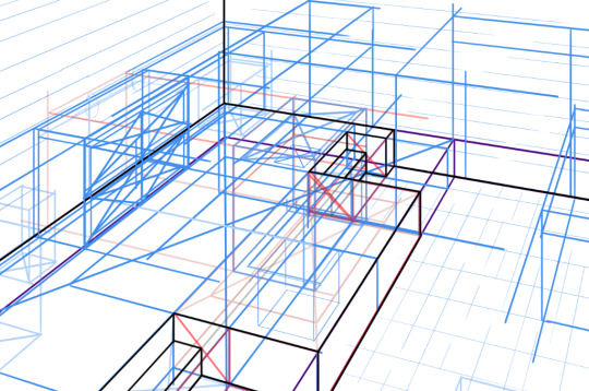
here’s the steps i normally use when drawing a scene in perspective!
sorry if this is a sorta bad or vague guide, i’m not the best at explaining things ;o;
1: MAP OUT THE ROOM/ENVIRONMENT
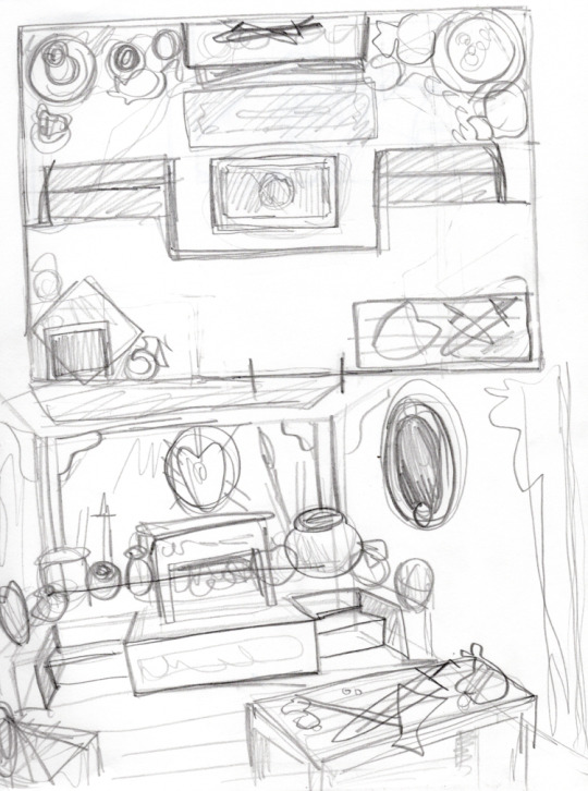
i’ve been experimenting with creating an overhead guide when constructing interiors i’m about to draw in perspective. this helps me figure out where everything goes and how much space it occupies when i am drawing it in perspective!
also seen here is a rough doodle i did from another angle so i could get a general idea of what i wanted on the walls too :U
2: THUMBNAILS
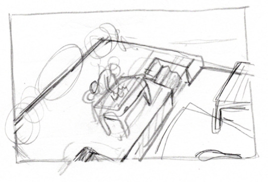
i do some rough thumbnails to figure out how i want to frame the piece, as well as figure out where i want the horizon line to be.
3: ROUGHLY MAPPING IT OUT IN PERSPECTIVE
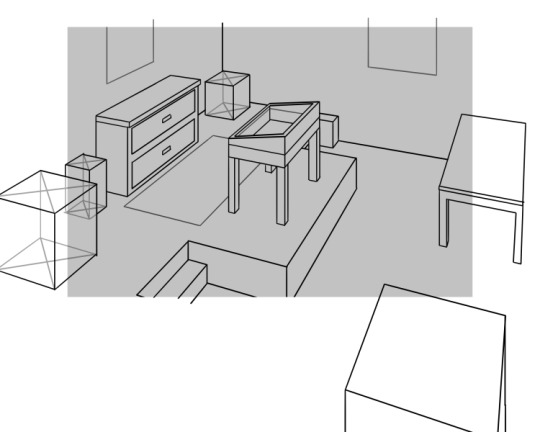
for this stage, i will create a 2-point perspective layer in clip studio paint! (i’m still pretty shaky with 3-point perspective, so i try to stick to 2-point for now) when using a perspective layer, you can set it so that each stroke you make automatically snaps to each vanishing point. that’s how my lines are so straight and consistent in their line quality here. this tool has saved me on many occasions lmao
the way i do this is either by sighting approximate vanishing points and a horizon line from the thumbnail (like i did in this case, which is why it’s not precisely accurate) OR by pasting the thumbnail into my canvas and then matching up some approximate vanishing points from parallel lines in the thumbnail. (in my experience, the latter makes it a bit more accurate to your thumbnail but you have to sorta bs your vanishing points and horizon line which can be tricky. it’s a little easier than just sighting your vanishing points and horizon line tho)
i start making blocks and boxes to give myself an idea of how to construct the objects in the room. and then i refine them just a little further so i have some rough guidelines to go by in the next stage (which is redrawing everything so it looks more natural.)
the slightly darker gray rectangle is the actual size of the piece. i add some space around the edges because otherwise the objects in the room would be cropped weirdly, and i like having some extra space when mapping out everything in the room!
once i am satisfied with the level of detail in this draft, i will crop it so it looks like this:

4: FINAL SKETCH
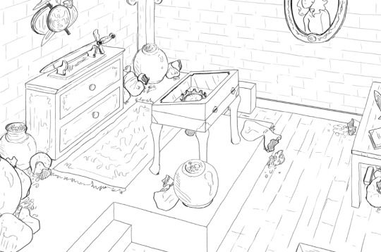
here’s the stage i’m at right now, which is the final sketch! i turn the previous draft into nonphoto blue on clip studio paint, and then reduce the opacity to 20-30% so i can sketch over it.
i was using the default dark pencil brush that comes with clip studio paint before when the perspective tool was being used, but for this step i’ve swapped over to frenden’s Pensul brush which you can get in his csp brush pack here
from this step, i will ink and then color and shade! if you are interested in seeing these steps as well lmk and i can add on to this post when i’m done with them :~D
BONUS:
here’s the hell version with all my guide layers i used when drawing in perspective visible at 100% opacity
1 note
·
View note
Last Seen Blogs
arcanewisdxm-blog
you know nothing of fear
bornbluediving
Born Blue Scuba Diving & Charters

kennewicktopwinetours
Untitled
all-spirits-of-the-night
side character

santeifff
I love mature названия