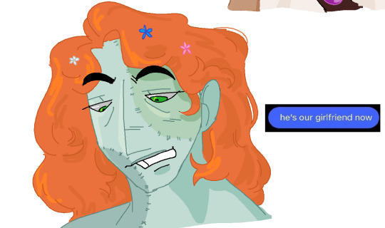
#art filters
Text
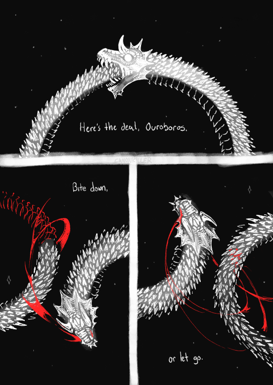
but you can't keep holding on like this.
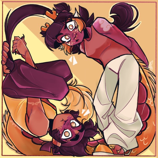
#you can put a disability metaphor in any legfndary draconic entity. many people dont know this#my art#comic#ouroboros#for tag filtering:#blood#its a blurry day forgive typos
53K notes
·
View notes
Text
I'm not just cooking, i'm baking a whole ass CAKE
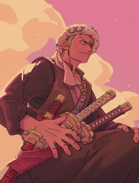
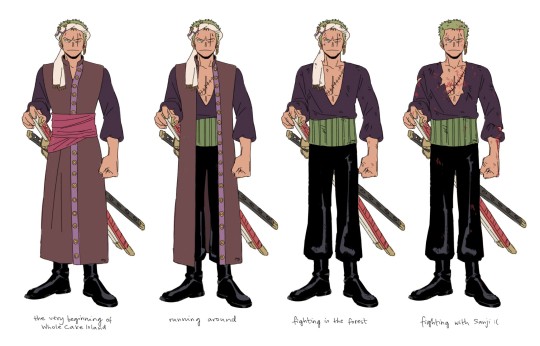
not 100% happy with the design but I wanted to get it out of my system, I went for darker and more muted colors for Zoro while still utilizing the usual elemnts of his outfit like the sash and the haramaki. also the color palette for the full outfit turned out very tasty, like it makes me think of chocolate and sweets. not sure about the use of haramaki though, I feel like it makes the proportions a bit awkward when everything else is dark, but it does make the shirt fold nicely so I may keep it in the end
now that I'm further into WCI I think I should add a suit version as well for the wedding bit hmmm
My idea for this is after coming to Big Mom's territory and fighting her commanders they get to the Germa carriage just like in canon. Zoro watches Sanji fight Luffy, restraining himself from interfering. He respects Luffy's decision to not fight Sanji back, but the moment Luffy gets knocked down it's Zoro's turn to try and bring the cook around and he's not gonna hold back
a very tense fight ensues
#I have a comic for the fight in my head but I'm gonna need time I have so many artworks started lmaooo#amazing that tomorrow is Sunday#have a whole another day before monday and going back to work#and I dont have to do anything!!#anyway#my art#zosan#zoro#roronoa zoro#sanji#whole cake island#whole cake arc#wci#one piece fanart#one piece#fun fact: I was coloring the top pic while having an evening mode on my screen and I didn't realize it#but I liked it with that filter so much that I recriated it at the end thats why it has them juicy sunset colors#wci zoro au
4K notes
·
View notes
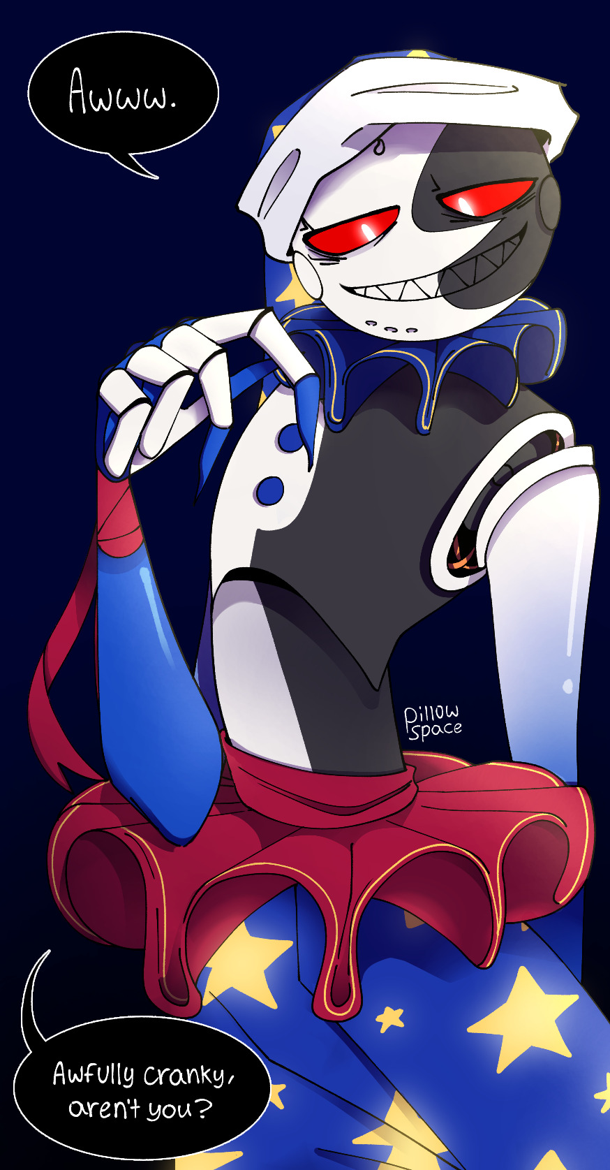
Text
obsession
#my art#ethoslab#joel smallishbeans#hermitshipping#<- not. really? but for the filter#it’s like close enough even if not my intention#drew this without thinking ahead during any part of the process and it was kinda fun but also all over the place x)#hence the strange colors.i think i like them?
4K notes
·
View notes
Text

dramatic eyes. dramatic lips. drama on the cheeks.
sketch
#the fuck's a look??#this show keeps making me cry happy tears#this show made me cry last season when ed and stede kissed. Now I'm crying because LOOK AT IZZY! LOOK AT WEE JOHN!!!#please for the love of god only look at this with the night light filter on. forgot my screen was tinted yellow and the colors are FUCKEDDD#ya ya It’s la vie en rose I didn’t check my references my b my b je regrette ok#our flag means death#ofmd#our flag means death spoilers#ofmd season 2#izzy hands#wee john feeney#ofmd s2e6#this show brings me so much joy especially now when everything is so hard in real life.#they just get to be queer with their pirate friends#skdfjhskhgjfnlisadfhlksjdfh;sk#art#fan art#the first time in a while I've been inspired to make art :_) I love
7K notes
·
View notes
Text
Im like pretty sure drawing the portal accident a million different ways is a right of passage
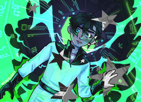
#danny phantom#my art#phanart#this was inspired by a tiktok filter ngl#specifically the inverted black and white star over one eye#i saw it and was like ooooooh this is so space obsession dannycore#and then i was like but wait what if that but also portal accident????#also side note i think the stars could work as a fun transition thing if he had a full blown precure style magical girl transformation
5K notes
·
View notes
Text
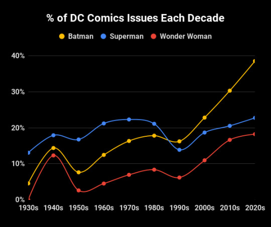

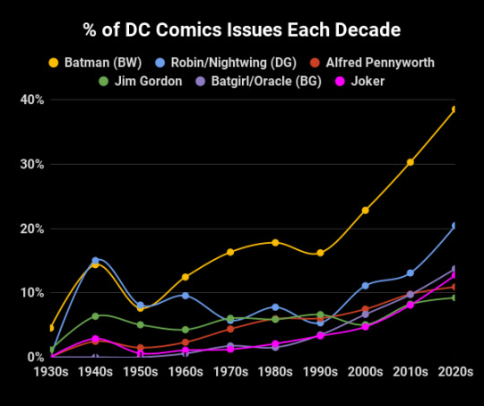
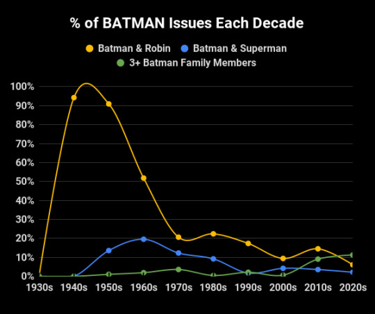
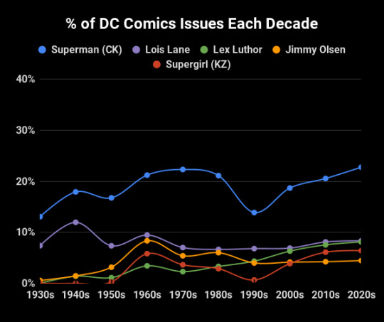
In case it seems like every third comic has Batman in it... you're not wrong. He's been in 38.6% of DC issues since 2020, with a stark increase of 8% each decade since the 90s and surpassing Superman in popularity. Despite this, there's been a massive drop off of comics where he is teamed up with Superman or a Robin (although the amount of group team ups between Batman Family members has increased, as well as Nightwing solos).
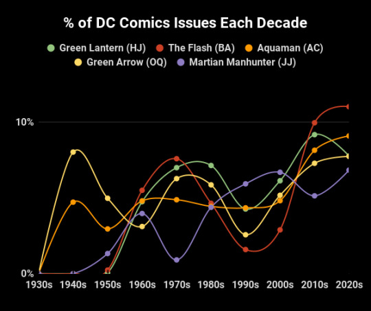
#I made the graphs but the numbers were sourced from ComicVine#idk thought this was interesting#once they embraced the gritty aspect of his character#it popped off#but before than it was really just superman who thrived in the absurd space comics#dc comics#my art#batman#bruce wayne#superman#clark kent#wonder woman#lois lane#diana prince#my graphs#dick grayson#hal jordan#green lantern#barry allen#aquaman#green arrow#martian manhunter#barbara gordon#jim gordon#joker#jimmy olsen#supergirl#long post#like obvs not this installment but later ones get long so I'll tag it here to help filter
3K notes
·
View notes
Text
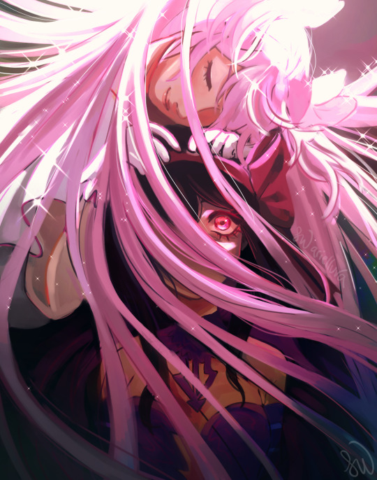
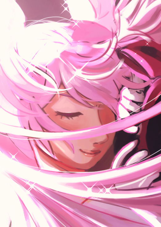

god's favorite (but do you really deserve that role?)
id under cut
[ID: a digital drawing of madoka kaname and homura akemi, in their god and devil forms respectively. madoka is above homura and has her hands on homura's head, resting her head on her hands with her eyes closed, a peaceful expression on her face. madoka is covered in sparkles. her hair is falling below her, covering most of homura's face, except for her left eye, which is wide open. homura is standing at the bottom of the image, her arms straight at her side. homura's colors are more saturated as opposed to madoka's colors being more calm and muted. /end ID]
#my art#puella magi madoka magica#madoka magica#pmmm#homura akemi#madoka kaname#madohomu#another episode of drawing homura being tormented somehow!! yippee#i really gotta draw some of the other characters but. alas.#anyways im really proud of this :3#i wasnt feeling it at first but i think rendering and putting more effects and filters really helped it#2023
3K notes
·
View notes
Text
in the hour or so it took me to draw this op turned reblogs off
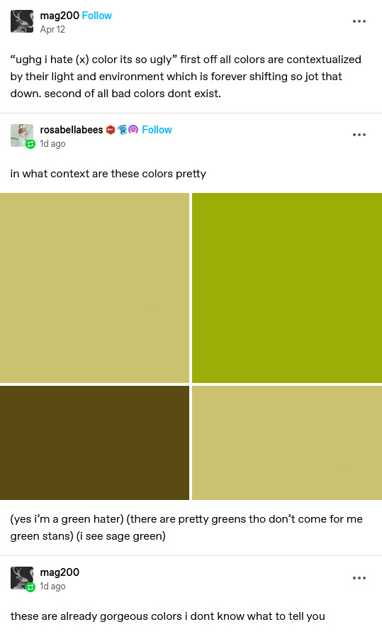
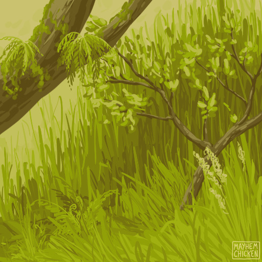
#art#artists on tumblr#bitches will say ''in what context are these colors pretty''#and then post the delicate hues of sunlight filtering through the leaves of a forest in late springtime
1K notes
·
View notes
Text
i like these guys a lot (alt ver. with a filter under the cut)
#my art#lmk#lego monkie kid#lego monkie kid fanart#monkie kid#monkie kid fanart#lmk fanart#lmk mk#lmk mei#goldendragon#i use it as their duo name but you can take this as ship art if you want#just personally i dont ship them#goldendragon fanart#couldnt decide if i liked the one w or without the filter better#i like the contrasting colors wo the filter but the filter scratches my brain so good#long xiaojiao#qi xiaotian
5K notes
·
View notes
Text
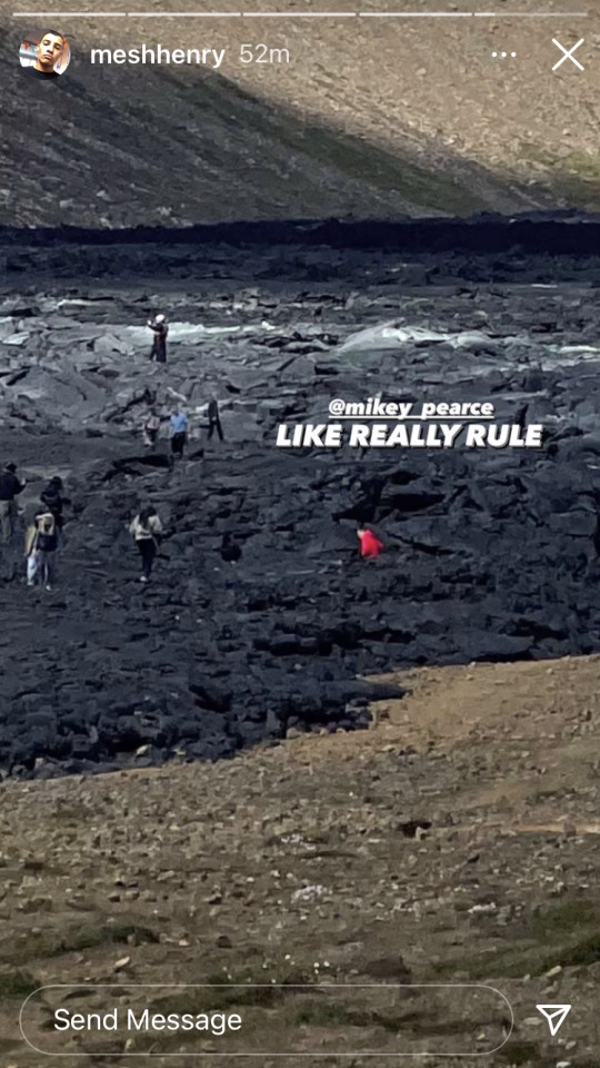
Mesh's IG stories
December 4th, 2022; 2:06 p.m. EST

0 notes
Text


soap never touched a joint ever again
#art#fanart#cod fanart#call of duty modern warfare 2#cod mw2#ghostsoap#simon ghost riley#sketch#soapghost#john soap mactavish#just projecting#that man’s filter is GONE when he’s high
1K notes
·
View notes
Text
#pillowspace art#moondrop#fnaf moon#fnaf daycare attendant#fnaf dca#fnafsb#fnaf security breach#while this isn't explicitly x reader. i'll tag it as such for peoples' filtering purposes#just in case#moon x reader#dca x reader#dca fandom
3K notes
·
View notes
Text
I think 90% of my gripes with how modern anime looks comes down to flat color design/palettes.
Non-cohesive, washed-out color palettes can destroy lineart quality. I see this all the time when comparing an anime's lineart/layout to its colored/post-processed final product and it's heartbreaking. Compare this pre-color vs. final frame from Dungeon Meshi's OP.


So much sharpness and detail and weight gets washed out and flattened by 'meh' color design. I LOVE the flow and thickness and shadows in the fabrics on the left. The white against pastel really brings it out. Check out all the detail in their hair, the highlights in Rin's, the different hues to denote hair color, the blue tint in the clothes' shadows, and how all of that just gets... lost. It works, but it's not particularly good and does a disservice to the line-artist.
I'm using Dungeon Meshi as an example not because it's bad, I'm just especially disappointed because this is Studio Trigger we're talking about. The character animation is fantastic, but the color design is usually much more exciting. We're not seeing Trigger at their full potential, so I'm focusing on them.
Here's a very quick and messy color correct. Not meant to be taken seriously, just to provide comparison to see why colors can feel "washed out." Top is edit, bottom is original.
You can really see how desaturated and "white fluorescent lighting" the original color palettes are.
[Remember: the easiest way to make your colors more lively is to choose a warm or cool tint. From there, you can play around with bringing out complementary colors for a cohesive palette (I warmed Marcille's skintone and hair but made sure to bring out her deep blue clothes). Avoid using too many blend mode layers; hand-picking colors will really help you build your innate color sense and find a color style. Try using saturated colors in unexpected places! If you're coloring a night scene, try using deep blues or greens or magentas. You see these deep colors used all the time in older anime because they couldn't rely on a lightness scale to make colors darker, they had to use darker paints with specific hues. Don't overthink it, simpler is better!]
#not art#dungeon meshi#rant#i'm someone who can get obsessive over colors in my own art#will stare at the screen adjusting hues/saturation for hours#luckily i've gotten faster at color picking#but yeah modern anime's color design is saddening to me. the general trend leans towards white/grey desaturated palettes#simply because they're easier to pick digitally#this is not the colorists fault mind you. the anime industry's problems are also labor problems. artists are severely underpaid#and overworked. colorists literally aren't paid enough to do their best#there isn't a “creative drought” in the anime industry. this trend is widespread across studios purely BECAUSE it's not up to individuals#until work conditions improve anime will unfortunately continue to miss its fullest potential visually#don't even GET ME STARTED ON THE USE OF POST-PROCESSING FILTERS AND LIGHTING IN ANIME THOUGH#SOMEONE HOLD ME BACK. I HATE LENS FLARES I HATE GRADIENT SHADING I HATE CHROMATIC ABBERATION AND BLUR
2K notes
·
View notes
Text
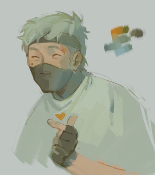
<3
#my art#ethoslab#don’t have much of a reason for this one lol just trying to figure out interesting colors without any filters/curve adjustments etc#also giving him the tall person slouch
2K notes
·
View notes
Text
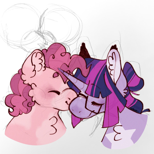
♡♡
#art#digital art#mlp#mlp g4#fanart#mlp fanart#my little pony#pinkie pie#twilight sparkle#twipie#pinkietwi#this was inspired by some tags i got#also i did some experiments with filters can you tell?
3K notes
·
View notes
Text

this is the dynamic right
>leave a tip?
#zombiecleo#ethoslab#bdubs#bdoubleo100#trafficblr#secret life#life smp#hermitcraft#trafficshipping#clethubs#cletho#ethubs#<- for filtering purposes#my art#mspaint
2K notes
·
View notes
Last Seen Blogs

post-attacks
Kaboom

joveene-blog
Untitled
professionalballerina
Professional Ballerina

cvhj
제목 없음
shanalichulalu123
TFPF Luna