#art notes
Note
Hi there! Saw your post about things we’d like to learn about your workflow. I was wondering about how you compose an image at the value stage, before even considering colors? I personally struggle a lot with making my values blend too much together and would love a tutorial or something about how you pick good ones that are separate enough while remaining graphically appealing? Thanks! And I really enjoy your work :)
Hi! I apologize for long due reply
I am familiar with the problem! It's not easy. But I must confess... I rarely do value sketches. I do them more for client work (if needed) but for personal work I tend to work with color from the get-go (it's a mess). However, I do check on values and think about them all the time.
At the very early stages of pictures I tend to think about the shapes the most and everything else is kinda dictated by that... that should probably be a different post entirely, me breaking down what kind of shapes I just like and why I choose them. It's very intuitive to me so I just generally "feel" about shapes rather than think, so it would be useful for myself to break them down too.
However, I did think about what you said about values, and your particular problem about values blending together too much.
I made some notes on top of my own work, to illustrate my approach a bit better:


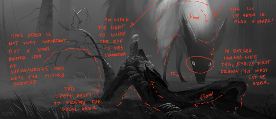

If you feel like your values tend to be too close to each other, don't be afraid to choose a focal point for the image and add contrast there. You can move on from high contrast to more subtle contrasts. Think of how to best frame the focal point in a way that the viewer will definitely look at it first. It can help to look at any pictures, art and photographs, and squint your eyes until you can only see the bigger shapes and contrasts.
When thinking about how to construct stylistically more graphic pictures, the shapes of everything are most important. Not just the character or objects, but negative space, lit up areas and shadows too - they're all shapes.
Additionally, my trick for checking the values is, I keep a solid black color (# 000000) layer on top of all artwork, with layer mode set to "color". Here's also reason why it's more accurate than other ways of checking value:

For photoshop users, you can check the greyscale of the picture in multiple ways. However, they don't have the same effect! If you use "Desaturate" or "Hue/Saturation" adjustment, you DON'T get the actual values of the picture.
The areas I circled with red had their values flattened, compared to the image with black color layer on top.
473 notes
·
View notes
Text
Scenario Descriptions, Rambling & Art Notes
Read more about what's happening in the photos, and some technical notes, under the cut!
Links
Original Artwork this is talking about is here.
Winter Notes - You are here. For individual cropped photos, see Ko-Fi Post
Spring - TBA (Maybe if Kofi goal is reached, or if I get bored)
Summer - TBA (Kofi or if I get bored)
I'll update the links once everything is up!
Notes from Twitter
(Selected notes from my Twitter.)
This takes place after the events of the game. Susie, Noelle, Kris and Berdly have all started to change, either an obvious way or not. Change takes time. Sometimes you regress. Or sometimes you remain at a certain stage and that's fine for you. Whatever, that's life.
Not pictured: whenever they all had a fight
I started drawing the image set (4 images) 2 weeks before it was finished, so I didn't get to add the other HomeTown kids as cameos (Jock in Summer, Catti & Tem in Spring, MK and Snowy in Winter). I wanted more scenarios but I just blew up what I had to fill up the canvas more. But the hands in the original image block out so much anyway.
Scenario Descriptions
As some people have noticed, each Lightner has a season assigned to them.
Winter - Noelle
Spring - Susie
Summer - Berdly
Autumn - Kris
I chose Winter for Noelle. I like to imagine she can handle the cold. In the game it says she stands in front of the fridge in Sans' shop often, and she probably likes cool air. I took that at face value. But, in the game, it's Autumn and she wears a sweater-vest like thing. And some people said she might be staring at the fridge in Sans' shop because they print Missing Children on milk cartons (Dess).
At the very least Noelle seems to like the pretty snow things in the Cyber World. It's fun to imagine things about characters, isn't it? It also makes writing very tough.
Anyway, Noelle decided for her part of the trip, she wanted to see a snow festival somewhere outside of HomeTown. Kris and Berdly suggested snowboarding or skiing. Susie agreed to snowboarding (because it's close to Skateboarding...?). I didn't really get to draw a snow festival in the end... oops.
Extra scenarios I wanted to draw:
Ice Sculpture festival. Noelle sees some creatures and thinks about how some of the more artsy sculptures remind her of Cat Petterz 2. There is a Drinks Bar made of ice.
Snowball fight. Susie is defeated immediately purely due to having a larger hitbox. Kris is the smallest and good at dodging (or are they just good at deflecting?). Berdly comes up a bunch of mid-tier tactics, all of them fail but the last one works so he considers himself a winner anyway. Also Snowy and Monster Kid are here too. Snowy's head is a snowflake shape, each 'leaf' is loaded with a snowball each, and they are used like a chain gun/snowball machine gun like RATATATATATA...
Ice skating. Noelle is tries to teach Susie. Kris watches from afar while talking with Monster Kid and Snowy.
Quiet moments in the snow with friends watching the sunset. Just as a reminder I don't ship anything (I only explore friendships). So all the relationships/crushes that are in the game as of Chapter 2 are still intact, I haven't changed that part.

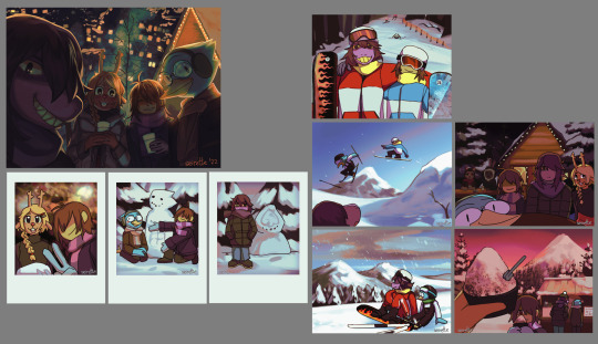
Photo 1
Do you think Susie and Berdly will become better 'friends' after Deltarune? At least in the timeline where you don't Kill Berdly, anyway. I think they could have some good slapstick moments. Honestly anything involving Berdly is great, unless you hate Berdly.
Anyway in the first photo, Kris, Susie and Berdly have decided to snowboard/ski down from the top of the mountain. Noelle is on a break. Susie is impressed by the scenery. She's with her friends, she's getting better at snow boarding. She's happy. They take a break together to stare at the mountains as the snow falls and melts on their noses. They don't mind the cold.
Kris takes the photo to preserve the moment for Susie. Also because if Berdly and Susie ever have a fight they can all stare at this photo together and remember the good times.
Photo 2
The gang reunite with Noelle at the bottom of the mountain. It was Noelle's idea to take the photo. Noelle also says she 'wants more photos with "everyone else"'. That doesn't happen, because if you look at the background, Berdly has fallen on his arse. They wait for him to travel down the mountainside, just to tell him they caught his epic fall on film.
The stickers on the snowboards don't mean anything - it is rental gear, the rental shop has a lot of duplicates of the same design. The stickers are just for the customers to tell them apart from other customers with the same design... I wanted to put funny numbers like 420...
Photo 3
On another trip down the mountain. It's just a cool shot of Kris. Berdly's about to stack it again. I'm sure Berdly isn't that bad at sports, but he's just not going well today. Despite the protective gear and snow goggles, you'll notice something about his glasses later.
Do you think Susie and Noelle also stacked it on this hill? Do you think Susie kept asking everyone to go up the mountain "one more time" so she could ace this hill? How do you think Berdly felt about having a bad day with Sports?
Clothes Part 1
For the clothes, Kris and Susie are wearing rentals. Originally they were both going to be wearing red. But I thought Kris wearing blue like their Dark World outfit was nice. I was thinking of giving Kris a custom outfit but I thought "Kris has some money after Deltarune but not THAT much money, so I'll give them a rental outfit". Actually none of these kids should have the money for 4 trips in a single year, OR a sabbatical, but I decided to stop thinking about that because I just want to see blorbos enjoying themselves.
Also I had to give SOMEONE overalls, so Berdly gets his custom bought overalls with a green neck warmer. Even though snowboarding looks cooler, he chooses to ski this trip. Noelle is also skiing. They're the
Super-Elegant Skiing Duo of HomeTown High

Photo 4 & Photo 5
Berdly's glasses are botched. I wonder what happened? Don't you think it's a good metaphor for something? You should think about what it means to you, because I can't do that for you.
Anyway, what's Kris doing? Sometimes you banter with Berdly, sometimes you help him build his dream body in a snowman. Originally the beak was going to be broken, and the whole statue was botched, with Kris snickering at Berdly.
But I decided Kris is so tired from snowboarding the previous day that they've decided to just chill out the day this photo was taken.
Susie snuck away past the trees. She misses Lancer. Kris and Noelle find her and insist on take a photo next to her masterpiece.
Photo 6
Noelle - food pic! It's not a very interesting food item, though. Some gimmicky food cart selling shaved ice with dark colored sprinkles that look like the hairy mountain behind them.
It's actually seaweed sprinkles. Kris eats moss in the Dark World, but they're not sure how they feel about seaweed on shaved ice. There's other syrup flavors in the cup too. It just tastes like an average savory-flavored sweet.
Susie was starting to feel cold, so Noelle and Kris gave her a beanie. But Susie loses the beanie somehow, shortly afterward. Susie, running low on cash, asks if she can share with Berdly. Once purchased, Noelle sees them sharing the shaved ice and wishes she offered to share first.Kris regrets buying a whole serving at all.
Clothes Part 2
Berdly: He gets surprisingly neutral clothes. Also I thought earmuffs would match the ear things he has in the Dark World. Also a bird needing earmuffs but the human not wearing them is hilarious to me.
Kris: I like it when people paint Kris' Dark World scarf as a pink scarf with purple shading, or vice-versa. But it wasn't obvious enough so I just went for the other fandom interpretation of "stripy scarf". By the way, I think it would be REALLY COOL if the scarf was actually a sweater. Like, when you take off the sweater but you didn't actually take it off completely, so it's just stuck around your neck. Anyway that's why Kris has a Stripy scarf and grey mitts. I also took some time to think about what would look 'gender'. But I'm no good at fashion. I'm going f*cking insane over Kris Dreemurr.
Susie is wearing the same pants here, but she has thermal wear underneath. She just gets the cheapest warmest jacket possible (the type that old people all seem to wear).
Noelle (see below): I'll talk about it more in the Spring Anniversary image, but I have a hard time thinking about what kind of clothes Noelle would pick. Like, in the game, is she wearing clothes that her mom picked for her? Anyway she's wearing a skirt and turtleneck here. She wears the same skirt in Spring.
Overall I wanted to give them all neutral/normal looking clothing.

Photo 7 & Photo 8
Last part of the trip. They have dinner at some place that gets lots of pictures and reviews on social media. Also, I was going to draw them drinking mulled wine. I have always heard of stories of people going on ski trips and drinking mulled wine at a random house. I've never drunken mulled wine. But the imagery of being red faced and merry in the snow seems very warm to me.
I decided not to draw them drinking alcohol because if it turns out any of these Lightners have bad experiences/memories of it, I'd be pretty sad... By the way, in Australia you can legally start to drink alcohol at 18. Please consume alcohol safely. Anyway, now the Lightners are just waiting for food in this picture
The cat and rabbit in the background are dating.
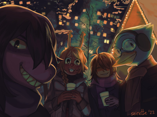
Photo 9 (not pictured in above image, scroll to top)
The main picture is the last photo of the trip. Noelle's expression seems flustered, doesn't it? Originally Noelle was going to be tipsy and "OH SUSIE YOU CAN'T LET MY MOM SEE THIS PHOTO" but I changed my mind with the alcohol. Now she's happy Susie's taking a photo, but also been caught off-guard. Okay but she's holding a cup, she could totally be having a sippy. The reality is that I drew this picture but I still don't know. I'll let you decide.
By the way, just to let you know, Berdly is doing most of the driving in these trips. Kris can drive a little but isn't able to drive internationally yet. I don't know about Susie and Noelle (I don't think Susie could have afforded the lessons, but I do like the idea of Susie driving Kris around in college due to REASONS). If it turns out I'm totally wrong... whatever, I don't care, it's not shown in these images anyway so you can assume they took public transport.
I think the most "drama" is in the Spring set of images.
Art Notes
First off let's look at the thumbnails.

My handwriting is passable here. Usually it looks like squiggles. The main ideas are pretty much the same, but you can see that I changed Susie's hairstyle back to her default hair style. Also Kris was originally laughing at Berdly's broken snowman.
Most of these thumbnails (background photos) were drawn in Cartoon/comic style - to save time... more on that later.
Row 1 (see below): For the main image, I drew 2-3 passes (Thumbnail, rough sketch, maybe extra for clothes, then line art). Berdly looked awful at first so I redrew him a few times. Actually I'm not so happy with Susie's snoot but since this was the first canvas, I was worried about time and didn't want to deal with her snoot blocking out Noelle, and I wanted Susie's face to still be in frame... so I left it.
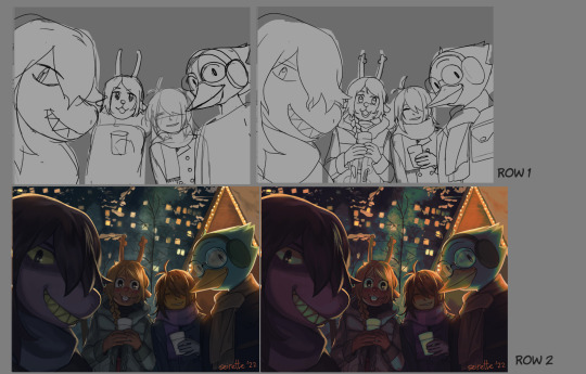
Row 2: Left - without color filters, Right - with filters. (It might not look that different... oops)
Since I use grisaille, it's kind of like shading with black... nothing wrong with that if you want that look, but if I want the colors to pop more, I add a gradient map...
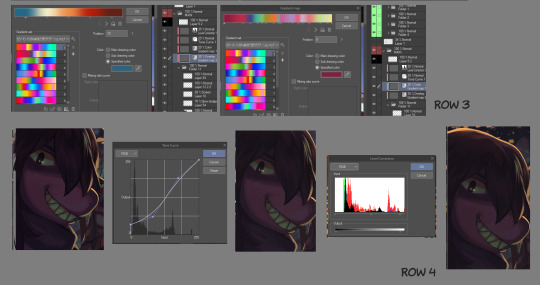
Row 3: Nothing special. Just two layers of gradient maps... I literally just downloaded whatever the popular gradient map packs were, flicked through a bunch and picked what I liked. The first one is set to overlay, the second one the instructions in Japanese roughly says "Set this gradient map to ~20% Color" so that's why I've set the layer to those settings.
Row 4: Left most Susie - this is the original painted image with the color gradient maps, before Tone Curve and Level Correction.
I wanted to imitate the coloring in photos. The polaroid photos I've seen, the first thing I think of is "Flash was used so all the highlights are blown out", and that the black shadow areas are never #FFFFFF amount of dark... so that's why, in the Tone Curve, I lifted the leftmost (axis at 0) up a notch. Anyway you can see the effect is lower contrast by a bit. Instead of using a Tone Curve you can also just use some layer effects (e.g., Exclusion layer blend mode or whatever). It doesn't really matter just do whatever you feel like doing, I can't stop you.
The next step I added Level correction (just to play around, honestly). Actually this added back some contrast. Whatever, I just did what looked nice...

Row 5: This is the layer composition.
Characters (By the way Berdly looks great without glasses).
Lights (1 layer of boxes of random colors, then I duplicated, blurred, and set to glow/light blend modes)
Trees with snow clumps
Smog (used some smoke/cloud brush set for this)
Main background flats
When I do paintings like this, the characters are always painted in grisaille. I have a few posts with WIPs on this blog showing grisaille stuff, but anyway I'll talk about it in the Spring Anniversary image details. If you want to see that, and also what the hell is going on in the Spring photos, you can donate to my Kofi to reach the goal.......
A nice thing to note about the Anniversary artwork as a whole is that the characters are mostly close to the camera, so I can just wing the background (i.e., I don't have to draw buildings or architecture TOO detailed). This is great because I was in a rush!

For the remaining images, I knew they were going to be blurred. So I just drew the characters in cartoon comic style that I use. This means for the characters I can just grab the palette I already have (don't have to spend any time picking colors).
The backgrounds were still (roughly) painted.
Row 6: Some images without the filters and layer effects. You can see the characters don't fit well into the background without them...!
Row 7 (Left): Polaroid layers
Polaroid Frame
Multiply - shadow layer of the Polaroid frame
Background - I just winged this
Set - Lineart and flats.
Multiply layer - shadows for the Set above. I have 2 shadow colors which are just light and dark purple (you can see my palette in Row 6).
Row 7 (Right): Photo layers - not much to say here, same as previous, just a more background oriented photo...
Details I really wanted to add but skipped them due to time shortage:
Extra lighting (highlights)
Blurring items (e.g., far away background images, whatever is 'not in focus, and so on...)
Drawing other Lightner characters into the scenarios!
MORE FOOD PICTURES!
Fixing wonky anatomy (even the 'chibi' anatomy)
I think I wrote too much. If you got this far, thanks for reading so much :)
Also if anything I make (comics, etc) makes you happy feel free to tip me/buy me a coffee 😊
185 notes
·
View notes
Text
13 notes
·
View notes
Text

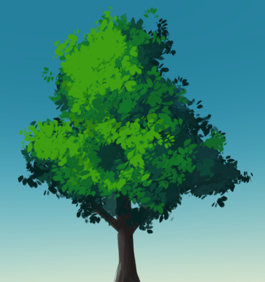
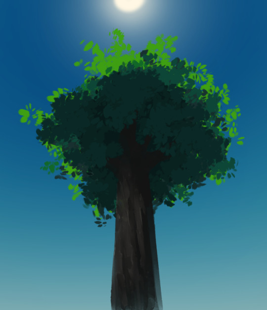
Compiling some notes about drawing trees & leafy vegetation. Might make a TikTok about it! Some thoughts:
- I've found I like to split trees into multiple layers depending on the lighting! For example, if the tree is lit from the opposite side as the viewer, then I like to put the most lit layer down first, then I'll put the shadows on another layer on top, and then often I sandwich the trunk & branches layer in between. Meanwhile, if the tree is lit from the same side as the viewer, then I put the most shadowed layer down first, then put the lighting on another layer on top.
- Colors are hard, but my rules of thumb are: during the day, I like my shadow colors to be a bit blue-green-ish, then the lighting is bright green (just barely edging into yellow-green for the highlights). During sunset/sunrise, shadows are somewhere in the yellow-green area, and lighting is more yellow-orange (ended up kinda mustard yellow in my sketch).
- Ambient lighting *inside* the shadowed areas is SUPER important to prevent them from getting too flat. In the first pic, I added a secondary subtle light source I kind of thought of as being the "sky light" (remember, even the sky itself casts a soft ambient light, not just the sun!). In the third pic I layered dark tones with clusters of lighter tones to give the impression of ambient occlusion & give a better sense of depth
#art tutorial#art notes#painting#art tips#digital art#digital painting#glaire art#landscape painting#background art
89 notes
·
View notes
Text
Full collage board for a project in pottery class
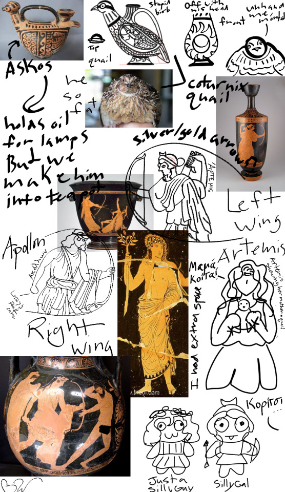
#art#sketch#greek mythology#digital drawing#warrior women#doodles#pottery#collage#art notes#quail#teapot
11 notes
·
View notes
Text
AHODJSLSMJFK art class notes + random doodles


I have more. (More info in tags) ((I ran outta tags D:))
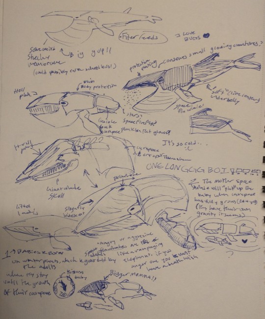
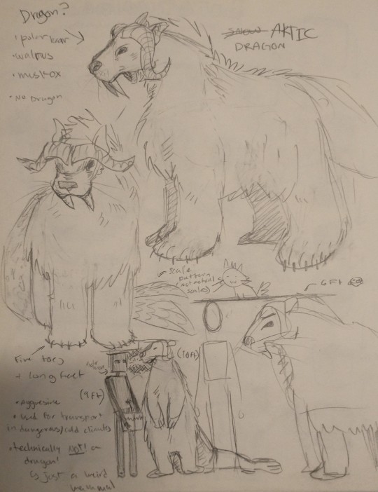
#art class#<- look under this tag on my blog to find the second if i cant link it#art#art notes#random stuff#tw scopophobia#pikmin 4#pikmin dingo#pikmin shepherd#pikmin bernard#pikmin yonny#creature concepts#space whale#bug?#bug#bear dragon#thing#hmm#ummm#skeleton#(its cartoony)#gesture drawing#random poses#pose#(feel free to use those poses)#oatchi#pikmin oatchi#silly lad#guh i think thats it#comic
19 notes
·
View notes
Text
Yet another collection of my art and notes on Andrew Loomis’ book for today’s art of the day! For more posts like this, follow me on Pinterest (:
#digitalart#art#procreate#artist#artwork#artoftheday#procreateart#procreate artist#sketch#andrew loomis#art notes#digital artist
15 notes
·
View notes
Text
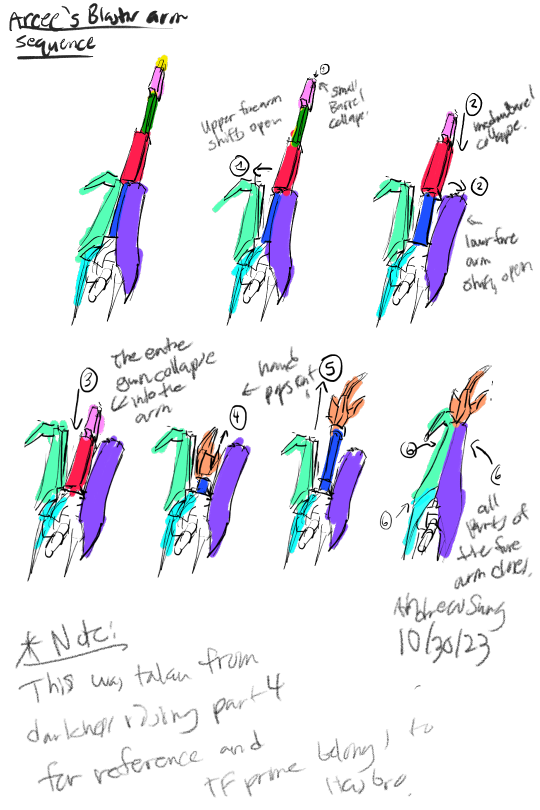
Tf prime note: Arcee's twin energon blaster arm sequence.
Since the artbook only provided weapon transformation sequences for only optimus and bulkheads blaster, I have decided to add in more weapon arm sequences for autobots and decepticons.
Tfprime belongs to hasbro. I do not own the property.
11 notes
·
View notes
Text
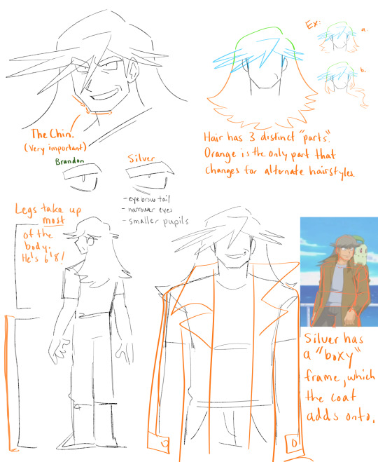
nobody asked for this BUT!! just some notes on how i draw Silver because it was extraordinarily difficult for me to learn how to draw him initially lol
5 notes
·
View notes
Text
“Many of life’s failures are people who did not realize how close they were to success when they gave up.” – Thomas Edison
Just finished art homework, had to analyze a propaganda poster, I chose the "Lord Kitchener Wants You" to analyze. It was actually enjoyable.
Gotta do some maths and programming!
Excuse the mess on my table lol.
#studyblr#art analysis#study aesthetic#aesthetic#study notes#art notes#studystudystudy#study space#study area#study hard#studying#study motivation#not really aesthetic but yeah#studyspo#high school#student life#study quotes#studygram
22 notes
·
View notes
Text
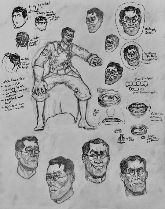
Notes for drawing medic, might come in handy for some people! I also figured out his hair!! Super proud of all the little details I found and I’m planning to add some more small face details like a mole or something, as long as it fits with the high quality model and how it looks.
#team fortress 2#tf2#team fortress two#art#medic tf2#tf2 medic#medic team fortress 2#i love tf2#traditional art#sketch#character study#medics hair makes sense now#art notes#art with notes#how to draw medic tf2
40 notes
·
View notes
Text
Urrrgh... Hate being that guy...
As somebody with face markings, including a mole on the mirrored side of the same spot, it confuses me that nobody's drawing Quaritch’s one on his left cheek.

Like, it’s right there. Can’t you see it? Do you not want to include one more dot? It’s plain as day in close ups even with shitty cam footage.
Regardless, I’m gonna be including it in my art of him I’m working on. Rep is rep.
This goes for all the other Na’vi characters, too. Kiri has quite a few nobody puts in, as well.
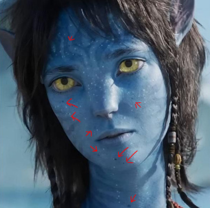
But Ritch’s is just plain baffling considering how many people pour over every little tiny detail of his proportions and markings accurately trying to depict them but miss out on this one little thing... Well, more than one. But this one specifically not getting hit by radar feels like a minor personal attack sometimes because of said similarity I share (but mildly funny). And I know for a fact people can’t miss mine when drawing me. So what’s up with that?
#face marks#body markings#fanart#character notes#include this#please include this#face mole#recom quaritch#recom miles quaritch#na'vi miles quaritch#art notes#minor pet peeve#better see more of this when the home release happens swear to christ#avatar miles quaritch#na'vi fan art#na'vi quaritch#avatar fanart#james cameron's avatar#character design#kiri avatar#kiri sully#face markings#freckles
17 notes
·
View notes
Text
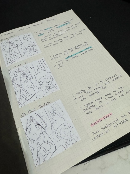
Trying something different where I make notes on each step of my process like studying 👩🏫
#digital art#artists on tumblr#digital drawing#anime stickers#sketch#anime fanart#learning to draw#sticker design#art notes#art study#art process#art progress#pokemon fanart#pokemon james#team rocket james#anime scenes
2 notes
·
View notes
Text
I think I’m getting it…
I’ll post my notes if people interested hm (I’ll still post it if no one’s interested)
5 notes
·
View notes
Text
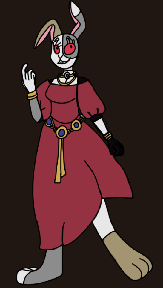
Notre Dame AU Art: The Dancing Rabbit Lady
This was supposed to be part of a full Vanessa reveal, but um...

I got carried away.
Here’s the picture without the costume notes:
#vanny fnaf#au art#hunchback of notre dame#notre dame au#vanessa fnaf#pond’s art#art notes#concept art#this was supposed to be a sketch
11 notes
·
View notes
Text
So many hours…. But I did it…..
B e h o l d….
N O T E S
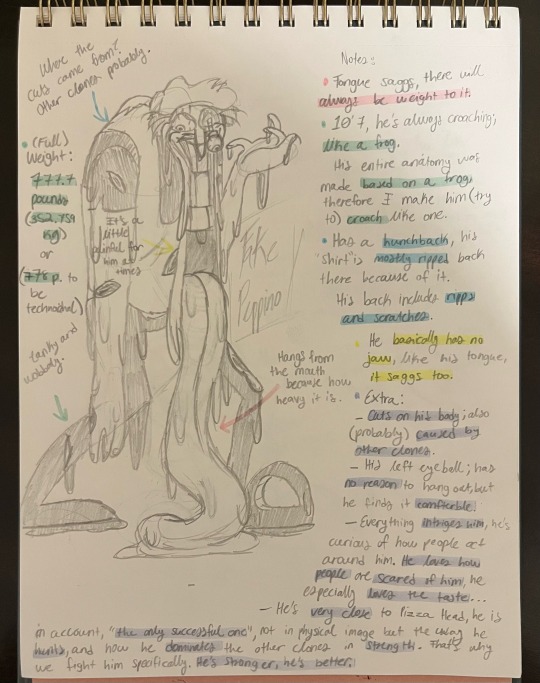
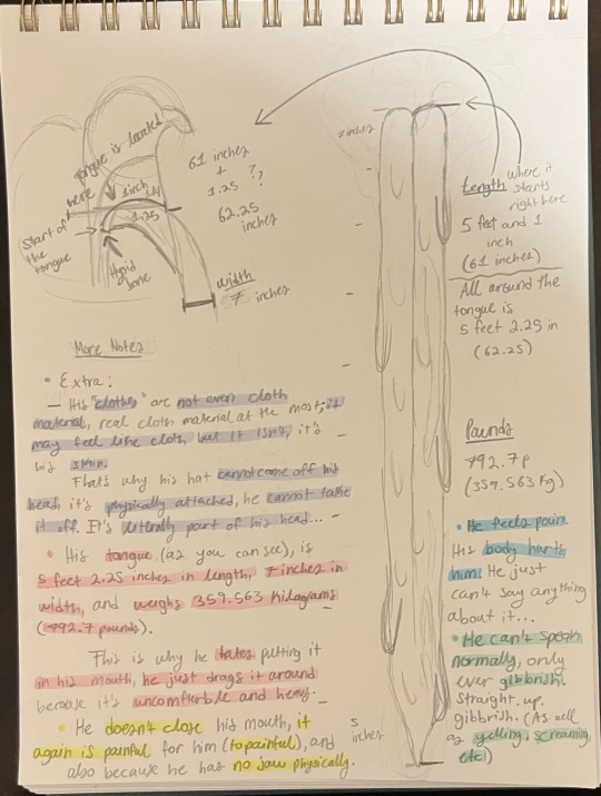
Fake Peppino notes specifically.
I’ll go over the basics.
His tongue weighs 792.7 pounds (it weighs more than him, his full weight is 777.7 pounds) The width of his tongue is 7 inches and the length of his tongue is 5 feet 2.25 inches. (I wanted to make it bigger but I felt like it was stretching it so I just left it as is.)
His anatomy is based off a frog which is why he’s always crouching. Unfortunately he’s also always in pain because of how he’s built, his body is INSANELY heavy and that’s why he tries to walk as slow as possible (speed of a slug), which is why when he makes himself bigger he goes slower, he HATES being big but if he has to he has to.
And he only speaks gibberish. Like, pure gibberish, it’s hard to understand him and it makes him upset that nobody understands what he’s saying. (Only except for Pizza Head, he understands him by body language.)
That’s all I’ll put for now, the rest is on the paper (if you can read it I’m so sorry if you can’t-). I was so intrigued I wanted to make Fake Peppino notes for myself and even RESEARCHED tongue anatomy for this. I also asked my family a bunch of weird questions and I think they are officially weirded out by me-.
I put some extra stuff on there if you wanna read it, the only last thing I’ll say is-
Pizza Head treats Fake Peppino like a son (I’ve said it a bunch on times but I mean it) and Fake Peppino is his FAVORITE clone he’s created. And Fake Peppino will always, try to be by his side….
This is also just for fun, this IS NOT my character, I just wanted to goof around and make my own anatomy for this guy since I draw him (mostly) differently. I wanna have fun with it. :]
Have a nice day guys 👋
#pizza tower#notes#art notes#Fake Peppino#Fake Peppino anatomy#Fake Peppino notes#Many research was done#I loved doing this-
19 notes
·
View notes
Last Seen Blogs
incloudspirit-blog-blog-blog
INcloudSPIRIT∞
anariafromarcadia
Before an Afterthought
backyardvoodoo
BACKYARD VOODOO
dreamkitsworld
Dreamkits World
puppetward
bla bla bla i crazy now