#aurora talks
Text

dnd honor among thieves without context

#dungeons and dragons#dungeons and dragons honor among thieves#chris pine#dnd movie#d&d movie#honor among thieves#dungeons & dragons#aurora talks#this movie surprised me with how much i liked it!!!!#i enjoyed myself thoroughly --- totally was thinking it was a 10/10 the entire time#it was fun and didnt take itself too seriously but also wasnt a fan wank station#and crhis pine was in it <333333333#and i loved helga sooooooooooooooooooooooooooooooooo much#i can be her tiny man
1K notes
·
View notes
Text
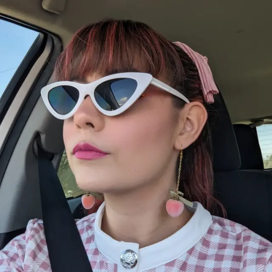
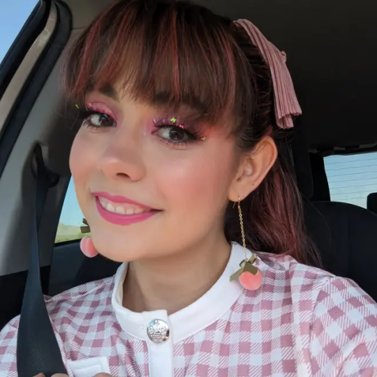


Living my Barbie life!!
40 notes
·
View notes
Text
I LOVE U SO MUCH FALLOUTBOYS AAAAAAAAAAAAAAA
the FaceTime geranium....
#IM LISTENING TO SO MUCH (FOR) STARDUST ALBUM AND IT FUCKS AND I FORGOT HOW FUN THEIR MUSIC VIDEOS ARE#WRASTLER FALLOUBOY..... EYEPATCH.. MONK AND CREATURE...#would it be weird to draw fanart#fall out boy#so much (for) stardust#love from the others side and heartbreak feels so good have already been in my rec playlists ever since they came out#and fucking the two other songs ive heard so far - hokd me like agrudge and i am my own muse-- have also FUCKED#YEAAAAAAAAAAAAAAA#aurora talks
7 notes
·
View notes
Text
Do you ever…
Open your WIP story document after a hiatus to continue writing the newest WIP chapter…only to realise it has been sitting there FINISHED and unpublished for the past few months…or year? 💀
Well yeah, me too.
2 notes
·
View notes
Text
why Aurora's art is genius
It's break for me, and I've been meaning to sit down and read the Aurora webcomic (https://comicaurora.com/, @comicaurora on Tumblr) for quite a bit. So I did that over the last few days.
And… y'know. I can't actually say "I should've read this earlier," because otherwise I would've been up at 2:30-3am when I had responsibilities in the morning and I couldn't have properly enjoyed it, but. Holy shit guys THIS COMIC.
I intended to just do a generalized "hello this is all the things I love about this story," and I wrote a paragraph or two about art style. …and then another. And another. And I realized I needed to actually reference things so I would stop being too vague. I was reading the comic on my tablet or phone, because I wanted to stay curled up in my chair, but I type at a big monitor and so I saw more details… aaaaaand it turned into its own giant-ass post.
SO. Enjoy a few thousand words of me nerding out about this insanely cool art style and how fucking gorgeous this comic is? (There are screenshots, I promise it isn't just a wall of text.) In my defense, I just spent two semesters in graphic design classes focusing on the Adobe Suite, so… I get to be a nerd about pretty things…???
All positive feedback btw! No downers here. <3
---
I cannot emphasize enough how much I love the beautiful, simple stylistic method of drawing characters and figures. It is absolutely stunning and effortless and utterly graceful—it is so hard to capture the sheer beauty and fluidity of the human form in such a fashion. Even a simple outline of a character feels dynamic! It's gorgeous!
Though I do have a love-hate relationship with this, because my artistic side looks at that lovely simplicity, goes "I CAN DO THAT!" and then I sit down and go to the paper and realize that no, in fact, I cannot do that yet, because that simplicity is born of a hell of a lot of practice and understanding of bodies and actually is really hard to do. It's a very developed style that only looks simple because the artist knows what they're doing. The human body is hard to pull off, and this comic does so beautifully and makes it look effortless.
Also: line weight line weight line weight. It's especially important in simplified shapes and figures like this, and hoo boy is it used excellently. It's especially apparent the newer the pages get—I love watching that improvement over time—but with simpler figures and lines, you get nice light lines to emphasize both smaller details, like in the draping of clothing and the curls of hair—which, hello, yes—and thicker lines to emphasize bigger and more important details and silhouettes. It's the sort of thing that's essential to most illustrations, but I wanted to make a note of it because it's so vital to this art style.
THE USE OF LAYER BLENDING MODES OH MY GODS. (...uhhh, apologies to the people who don't know what that means, it's a digital art program thing? This article explains it for beginners.)
Bear with me, I just finished my second Photoshop course, I spent months and months working on projects with this shit so I see the genius use of Screen and/or its siblings (of which there are many—if I say "Screen" here, assume I mean the entire umbrella of Screen blending modes and possibly Overlay) and go nuts, but seriously it's so clever and also fucking gorgeous:
Firstly: the use of screened-on sound effect words over an action? A "CRACK" written over a branch and then put on Screen in glowy green so that it's subtle enough that it doesn't disrupt the visual flow, but still sticks out enough to make itself heard? Little "scritches" that are transparent where they're laid on without outlines to emphasize the sound without disrupting the underlying image? FUCK YES. I haven't seen this done literally anywhere else—granted, I haven't read a massive amount of comics, but I've read enough—and it is so clever and I adore it. Examples:


Secondly: The beautiful lighting effects. The curling leaves, all the magic, the various glowing eyes, the fog, the way it's all so vividly colored but doesn't burn your eyeballs out—a balance that's way harder to achieve than you'd think—and the soft glows around them, eeeee it's so pretty so pretty SO PRETTY. Not sure if some of these are Outer/Inner Glow/Shadow layer effects or if it's entirely hand-drawn, but major kudos either way; I can see the beautiful use of blending modes and I SALUTE YOUR GENIUS.
I keep looking at some of this stuff and go "is that a layer effect or is it done by hand?" Because you can make some similar things with the Satin layer effect in Photoshop (I don't know if other programs have this? I'm gonna have to find out since I won't have access to PS for much longer ;-;) that resembles some of the swirly inner bits on some of the lit effects, but I'm not sure if it is that or not. Or you could mask over textures? There's... many ways to do it.
If done by hand: oh my gods the patience, how. If done with layer effects: really clever work that knows how to stop said effects from looking wonky, because ugh those things get temperamental. If done with a layer of texture that's been masked over: very, very good masking work. No matter the method, pretty shimmers and swirly bits inside the bigger pretty swirls!
Next: The way color contrast is used! I will never be over the glowy green-on-black Primordial Life vibes when Alinua gets dropped into that… unconscious space?? with Life, for example, and the sharp contrast of vines and crack and branches and leaves against pitch black is just visually stunning. The way the roots sink into the ground and the three-dimensional sensation of it is particularly badass here:

Friggin. How does this imply depth like that. HOW. IT'S SO FREAKING COOL.
A huge point here is also color language and use! Everybody has their own particular shade, generally matching their eyes, magic, and personality, and I adore how this is used to make it clear who's talking or who's doing an action. That was especially apparent to me with Dainix and Falst in the caves—their colors are both fairly warm, but quite distinct, and I love how this clarifies who's doing what in panels with a lot of action from both of them. There is a particular bit that stuck out to me, so I dug up the panels (see this page and the following one https://comicaurora.com/aurora/1-20-30/):

(Gods it looks even prettier now that I put it against a plain background. Also, appreciation to Falst for managing a bridal-carry midair, damn.)
The way that their colors MERGE here! And the immense attention to detail in doing so—Dainix is higher up than Falst is in the first panel, so Dainix's orange fades into Falst's orange at the base. The next panel has gold up top and orange on bottom; we can't really tell in that panel where each of them are, but that's carried over to the next panel—

—where we now see that Falst's position is raised above Dainix's due to the way he's carrying him. (Points for continuity!) And, of course, we see the little "huffs" flowing from orange to yellow over their heads (where Dainix's head is higher than Falst's) to merge the sound of their breathing, which is absurdly clever because it emphasizes to the viewer how we hear two sets of huffing overlaying each other, not one. Absolutely brilliant.
(A few other notes of appreciation to that panel: beautiful glows around them, the sparks, the jagged silhouette of the spider legs, the lovely colors that have no right to make the area around a spider corpse that pretty, the excellent texturing on the cave walls plus perspective, the way Falst's movements imply Dainix's hefty weight, the natural posing of the characters, their on-point expressions that convey exactly how fuckin terrifying everything is right now, the slight glows to their eyes, and also they're just handsome boys <3)
Next up: Rain!!!! So well done! It's subtle enough that it never ever disrupts the impact of the focal point, but evident enough you can tell! And more importantly: THE MIST OFF THE CHARACTERS. Rain does this irl, it has that little vapor that comes off you and makes that little misty effect that plays with lighting, it's so cool-looking and here it's used to such pretty effect!
One of the panel captions says something about it blurring out all the injuries on the characters but like THAT AIN'T TOO BIG OF A PROBLEM when it gets across the environmental vibes, and also that'd be how it would look in real life too so like… outside viewer's angle is the same as the characters', mostly? my point is: that's the environment!!! that's the vibes, that's the feel! It gets it across and it does so in the most pretty way possible!
And another thing re: rain, the use of it to establish perspective, particularly in panels like this—

—where we can tell we're looking down at Tynan due to the perspective on the rain and where it's pointing. Excellent. (Also, kudos for looking down and emphasizing how Tynan's losing his advantage—lovely use of visual storytelling.)
Additionally, the misting here:

We see it most heavily in the leftmost panel, where it's quite foggy as you would expect in a rainstorm, especially in an environment with a lot of heat, but it's also lightly powdered on in the following two panels and tends to follow light sources, which makes complete sense given how light bounces off particles in the air.
A major point of strength in these too is a thorough understanding of lighting, like rim lighting, the various hues and shades, and an intricate understanding of how light bounces off surfaces even when they're in shadow (we'll see a faint glow in spots where characters are half in shadow, but that's how it would work in real life, because of how light bounces around).
Bringing some of these points together: the fluidity of the lines in magic, and the way simple glowing lines are used to emphasize motion and the magic itself, is deeply clever. I'm basically pulling at random from panels and there's definitely even better examples, but here's one (see this page https://comicaurora.com/aurora/1-16-33/):

First panel, listed in numbers because these build on each other:
The tension of the lines in Tess's magic here. This works on a couple levels: first, the way she's holding her fists, as if she's pulling a rope taut.
The way there's one primary line, emphasizing the rope feeling, accompanied by smaller ones.
The additional lines starbursting around her hands, to indicate the energy crackling in her hands and how she's doing a good bit more than just holding it. (That combined with the fists suggests some tension to the magic, too.) Also the variations in brightness, a feature you'll find in actual lightning. :D Additional kudos for how the lightning sparks and breaks off the metal of the sword.
A handful of miscellaneous notes on the second panel:
The reflection of the flames in Erin's typically dark blue eyes (which bears a remarkable resemblance to Dainix, incidentally—almost a thematic sort of parallel given Erin's using the same magic Dainix specializes in?)
The flowing of fabric in the wind and associated variation in the lineart
The way Erin's tattoos interact with the fire he's pulling to his hand
The way the rain overlays some of the fainter areas of fire (attention! to! detail! hell yeah!)
I could go on. I won't because this is a lot of writing already.
Third panel gets paragraphs, not bullets:
Erin's giant-ass "FWOOM" of fire there, and the way the outline of the word is puffy-edged and gradated to feel almost three-dimensional, plus once again using Screen or a variation on it so that the stars show up in the background. All this against that stunning plume of fire, which ripples and sparks so gorgeously, and the ending "om" of the onomatopoeia is emphasized incredibly brightly against that, adding to the punch of it and making the plume feel even brighter.
Also, once again, rain helping establish perspective, especially in how it's very angular in the left side of the panel and then slowly becomes more like a point to the right to indicate it's falling directly down on the viewer. Add in the bright, beautiful glow effects, fainter but no less important black lines beneath them to emphasize the sky and smoke and the like, and the stunningly beautiful lighting and gradated glows surrounding Erin plus the lightning jagging up at him from below, and you get one hell of an impactful panel right there. (And there is definitely more in there I could break down, this is just a lot already.)
And in general: The colors in this? Incredible. The blues and purples and oranges and golds compliment so well, and it's all so rich.
Like, seriously, just throughout the whole comic, the use of gradients, blending modes, color balance and hues, all the things, all the things, it makes for the most beautiful effects and glows and such a rich environment. There's a very distinct style to this comic in its simplified backgrounds (which I recognize are done partly because it's way easier and also backgrounds are so time-consuming dear gods but lemme say this) and vivid, smoothly drawn characters; the simplicity lets them come to the front and gives room for those beautiful, richly saturated focal points, letting the stylized designs of the magic and characters shine. The use of distinct silhouettes is insanely good. Honestly, complex backgrounds might run the risk of making everything too visually busy in this case. It's just, augh, so GORGEOUS.
Another bit, take a look at this page (https://comicaurora.com/aurora/1-15-28/):

It's not quite as evident here as it is in the next page, but this one does some other fun things so I'm grabbing it. Points:
Once again, using different colors to represent different character actions. The "WHAM" of Kendal hitting the ground is caused by Dainix's force, so it's orange (and kudos for doubling the word over to add a shake effect). But we see blue layered underneath, which could be an environmental choice, but might also be because it's Kendal, whose color is blue.
And speaking off, take a look at the right-most panel on top, where Kendal grabs the spear: his motion is, again, illustrated in bright blue, versus the atmospheric screened-on orange lines that point toward him around the whole panel (I'm sure these have a name, I think they might be more of a manga thing though and the only experience I have in manga is reading a bit of Fullmetal Alchemist). Those lines emphasize the weight of the spear being shoved at him, and their color tells us Dainix is responsible for it.
One of my all-time favorite effects in this comic is the way cracks manifest across Dainix's body to represent when he starts to lose control; it is utterly gorgeous and wonderfully thematic. These are more evident in the page before and after this one, but you get a decent idea here. I love the way they glow softly, the way the fire juuuust flickers through at the start and then becomes more evident over time, and the cracks feel so realistic, like his skin is made of pottery. Additional points for how fire begins to creep into his hair.
A small detail that's generally consistent across the comic, but which I want to make note of here because you can see it pretty well: Kendal's eyes glow about the same as the jewel in his sword, mirroring his connection to said sword and calling back to how the jewel became Vash's eye temporarily and thus was once Kendal's eye. You can always see this connection (though there might be some spots where this also changes in a symbolic manner; I went through it quickly on the first time around, so I'll pay more attention when I inevitably reread this), where Kendal's always got that little shine of blue in his eyes the same as the jewel. It's a beautiful visual parallel that encourages the reader to subconsciously link them together, especially since the lines used to illustrate character movements typically mirror their eye color. It's an extension of Kendal.
Did I mention how ABSOLUTELY BEAUTIFUL the colors in this are?
Also, the mythological/legend-type scenes are illustrated in familiar style often used for that type of story, a simple and heavily symbolic two-dimensional cave-painting-like look. They are absolutely beautiful on many levels, employing simple, lovely gradients, slightly rougher and thicker lineart that is nonetheless smoothly beautiful, and working with clear silhouettes (a major strength of this art style, but also a strength in the comic overall). But in particular, I wanted to call attention to a particular thing (see this page https://comicaurora.com/aurora/1-12-4/):

The flowing symbolic lineart surrounding each character. This is actually quite consistent across characters—see also Life's typical lines and how they curl:

What's particularly interesting here is how these symbols are often similar, but not the same. Vash's lines are always smooth, clean curls, often playing off each other and echoing one another like ripples in a pond. You'd think they'd look too similar to Life's—but they don't. Life's curl like vines, and they remain connected; where one curve might echo another but exist entirely detached from each other in Vash's, Life's lines still remain wound together, because vines are continuous and don't float around. :P
Tahraim's are less continuous, often breaking up with significantly smaller bits and pieces floating around like—of course—sparks, and come to sharper points. These are also constants: we see the vines repeated over and over in Alinua's dreams of Life, and the echoing ripples of Vash are consistent wherever we encounter him. Kendal's dream of the ghost citizens of the city of Vash in the last few chapters is filled with these rippling, echoing patterns, to beautiful effect (https://comicaurora.com/aurora/1-20-14/):

They ripple and spiral, often in long, sinuous curves, with smooth elegance. It reminds me a great deal of images of space and sine waves and the like. This establishes a definite feel to these different characters and their magic. And the thing is, that's not something that had to be done—the colors are good at emphasizing who's who. But it was done, and it adds a whole other dimension to the story. Whenever you're in a deity's domain, you know whose it is no matter the color.
Regarding that shape language, I wanted to make another note, too—Vash is sometimes described as chaotic and doing what he likes, which is interesting to me, because smooth, elegant curves and the color blue aren't generally associated with chaos. So while Vash might behave like that on the surface, I'm guessing he's got a lot more going on underneath; he's probably much more intentional in his actions than you'd think at a glance, and he is certainly quite caring with his city. The other thing is that this suits Kendal perfectly. He's a paragon character; he is kind, virtuous, and self-sacrificing, and often we see him aiming to calm others and keep them safe. Blue is such a good color for him. There is… probably more to this, but I'm not deep enough in yet to say.
And here's the thing: I'm only scratching the surface. There is so much more here I'm not covering (color palettes! outfits! character design! environment! the deities! so much more!) and a lot more I can't cover, because I don't have the experience; this is me as a hobbyist artist who happened to take a couple design classes because I wanted to. The art style to this comic is so clever and creative and beautiful, though, I just had to go off about it. <3
...brownie points for getting all the way down here? Have a cookie.
#aurora comic#aurora webcomic#comicaurora#art analysis#...I hope those are the right tags???#new fandom new tagging practices to learn ig#much thanks for something to read while I try to rest my wrists. carpal tunnel BAD. (ignore that I wrote this I've got braces ok it's fine)#anyway! I HAVE. MANY MORE THOUGHTS. ON THE STORY ITSELF. THIS LOVELY STORY#also a collection of reactions to a chunk of the comic before I hit the point where I was too busy reading to write anything down#idk how to format those tho#...yeet them into one post...???#eh I usually don't go off this much these days but this seems like a smaller tight-knit fandom so... might as well help build it?#and I have a little more time thanks to break so#oh yes also shoutout to my insanely awesome professor for teaching me all the technical stuff from this he is LOVELY#made an incredibly complex program into something comprehensible <3#synapse talks
743 notes
·
View notes
Text
AURORA IS BEING TEACHED BY SWISS TO SHIMMY COPIA TO DEATH HUH, man things are soooo getting wild lol
[ credit to the owner on TikTok as you can see the username cuz my eyes are too scared to see this lol ]
#bs talks a lot.#ghost#ghost bc#the band ghost#ghost band bc#ghost bc band#the ghost band#copia#cardinal copia#papa emeritus 4#papa emeritus iv#nameless ghouls#nameless ghoulettes#swiss ghoul#aurora ghoulette#swissrora#swiss x aurora#THERE'S ANOTHER ONE. I REPEAT. ANOTHER SWISSRORA MOMENT HERE
645 notes
·
View notes
Text
Hiiiiii my darlings, we all know I love love love to talk about the ghouls, my babies, so today I wanna take a look at the different ghoul costumes and talk about the evolution of their costumes.
Opus Eponymous :
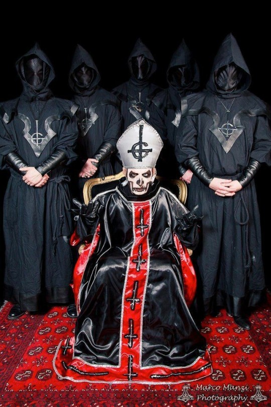
The first ghoul costumes, I really like what they did with them despite the fact they probably had a very limited budget to work with (which shows in Primo's costume ngl). They're pretty simple and they will set the example for the next few eras. The masks are nothing complicated but I do like that they have some structure despite being completely blank. I like the shape of the capelet a lot, it reminds me of gothic architecture. The arm "wraps" add some nice shapes in the design and I really like the leather on the bottom of the robe and on the capelet. They're of course wearing grucifix necklaces, as they will up to Meliora.
Infestissumam :
We still have a robe, like the Opus design. The rope as a belt has been replaced by a wide fabric belt and the capelet design was changed for a much simpler one. We get the introduction to the elemental symbols, which are stitched on the waist sash. Each ghoul's respective element is highlighted by a lighter colour. The masks are now starting to get more inteicate designs, this version being inspired by the last mascarade costume of king Gustav iii.
Meliora :

We can still very much see the influence of the Infest design in Meliora's, despite the loss of the hood and capelet. The top went from a full robe to a mid-thigh jacket but kept the belt sash. The elemental symbols are no longer stitched on it, replaced by a logo that I think is meant to be a mix of all of them, but I could be wrong. The elements are still found on the costume as a patch on the right side of the chest. We have new metal masks, full faces with horns and without any mouths.
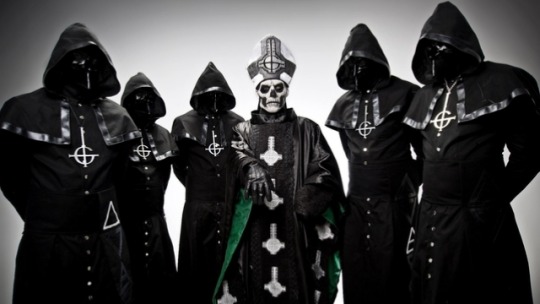
Prequelle :
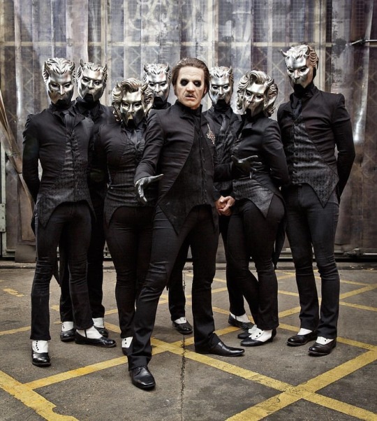
A true departure from the previous costumes we had seen so far, the only element still remaining being the masks, which are almost the same as Meliora except for the cut-out mouth. We also have a different mask design for the ghoulettes. The cut of the jacket is more reminiscent of Terzo's uniform than it is of the previous ghouls, which is also inspired by king Gustav iii. It also matches most of Copia's outfits during that era. Despite not looking much like the previous version, it was (and still is) a huge hit with the fans.
Impera :

Forget everything you thought you knew about the ghouls, Impera throws it out the window. The shape of the masks that defined two eras is completely gone, replaced by steampunk inspired helmets. The robes or long coats are now military style jackets. The tight Prequelle pants replaced by Jodhpurs. Every metallic piece that was once silver are now bronze. I've talked to great lengths about the Impera costumes and why I love them so much. Them being so different is a big reason why.
#the band ghost#ghost bc#nameless ghoul#nameless ghouls#swiss ghoul#phantom ghoul#dewdrop ghost#rain ghoul#mountain ghoul#cirrus ghost#aurora ghoulette#cumulus ghost#meerkat talks about ghost costumes
344 notes
·
View notes
Text
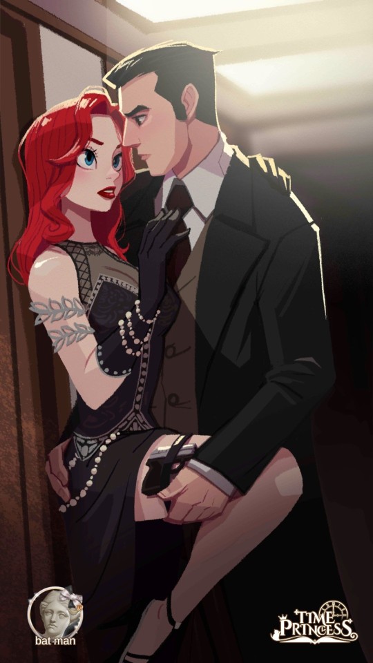
I just finished Gotham Memoirs with the ending "Mafia Wife" and ???? That ending sucked????? 😭 They clearly ran out of chapter slots I guess because SO MUCH was just dumped on me via "and then this happened and then this happened" exposition. We should have been spending so much MORE time interacting with Vittorio??? Ough.
I have all the other endings to get and I know I'm missing at least one more special image like this one -- with Juliano pointing a gun at the player character while Vittorio aims at him -- so hopefully getting that ending and setup will have a better payoff than, "and then I was a mafia wife and I lived happily ever after" 😭
#i think im mostly mad bc of how much fun ive been having with this story ghgjf#dress up time princess#gotham memoirs#aurora talks#aurora plays dress up time princess#dutp#been playing gm as a break from poto bc that story was kicking my ass#and like i dont care mucu about davis but ill go get his endings too to 100% gm#and charlotte heehee and maybe boseman has an ending?#anyway. i shouldnt expect much bc the writing in this game isnt good per se... but like. i was really enjoying gm vitto route so to have it#just end like that was horrible 😭
36 notes
·
View notes
Text
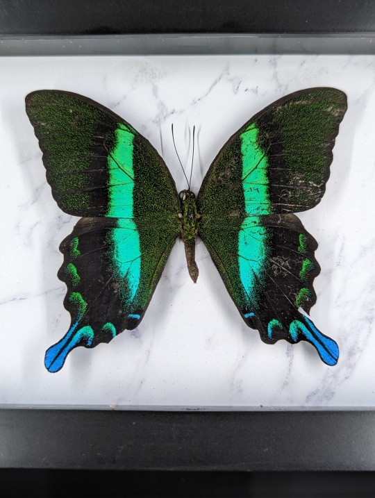
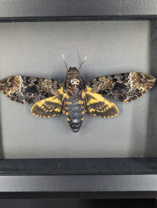
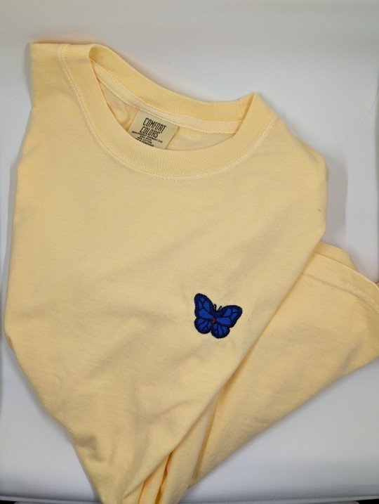


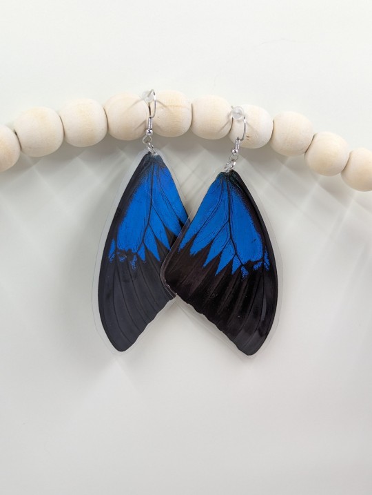


FYI, my husband and I pin insects, we have a real butterfly jewelry line, AND just came out with new apparel. Our Black Friday sale is happening now until 11/26 on Etsy.
https://houseplanthideaway.etsy.com
#black friday#taxidermy#insects#insect art#butterfly#butterfly jewelry#bugs#etsy#small business#aurora talks#animal crossing
9 notes
·
View notes
Text
With my final semester of college starting tomorrow I decided to clean out and organize and label my email, and umm maybe gathering all my job rejections into one folder was a bad idea?? Aha I've heard from people that it's good to collect them and be able to look back and see how you've improved, but as someone who still isn't in the industry I want to be in it kinda umm just made me so sad LMAO. Self flagellating on a Sunday I guess
#was gonna post this to my main but then decided since it's about art that it goes on the art blog#and like I KNOW why i havent ever gotten hired#my portfolio is all over the place and I havent had the focus to niche down#almost like ive been attending college the past several years#and even illustration college still means stopping the concept art to learn anatomy and compositional skills and simply mature as a human#and its probably not fair of me to compare myself to the art prodigies that i adore who got hired out of high school#but oh as im writing these tags ive started crying which luckily is good for your eyelashes#i realize this is unprofessional but hopefully nobody will be looking at tumblr to hire me#this post ISNT to be oh woe is me -- its to humanize the blog and show you im struggling the way probably most artists struggle#and hopefully to look back on someday and be like oh silly me#i'll get where i want to be eventually. it will be okay and i will be okay#but right now i am sad and also hungry so im gonna finish crying and then go make some ramen with lots of yummy veggies#not art#aurora talks
4 notes
·
View notes
Text

heehoo
#will start adding IDs in alt text :)#persona 5#p5r#persona 5 royal#enkidoodles#persona#doodles#the rest of the tags r just my persona ramblings ANYWAYS#i gen think harus awakening was so badass#im so mad mona stole her spotlight#also this is so random but#i based sumis pose off a pose i did in disneyland#bc i was talking to princess aurora#i dont even see joker as a flirt i think akechis just down bad for losers#joker goes 🥺 and he folds immediately
1K notes
·
View notes
Text
the parallels are so-
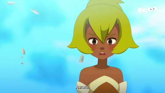


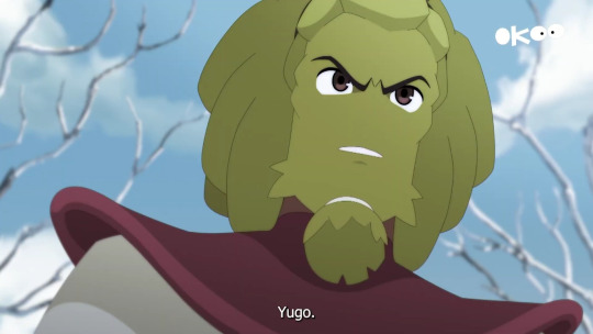
#the four of them obviously have beef between each other 😭😭#PLZ-#and i’m all here for it#PLZ I WANT THEM ALL TO GO ON A DOUBLE DATE TOGETHER#SHIT WOULD GET WILD#CAN U IMAGINE WHAT KIND OF STUFF THEY’D BE TALKING ABOUT BEHIND THE OTHER PAIR?!???#wakfu amalia sheran sharm#wakfu#wakfu amalia#wakfu yugo#yugo#wakfu armand#wakfu armand sheran sharm#wakfu aurora#ankama#krosmoz#wakfu season 4#wakfu s4#wakfu season 4 episode 4#wakfu s4 ep4#wakfu season 4 episode 6#wakfu s4 ep6#wakfu season 4 spoilers#wakfu s4 spoilers#wakfu season 4 episode 4 spoilers#wakfu s4 ep4 spoilers#wakfu season 4 episode 6 spoilers#wakfu s4 ep6 spoilers
174 notes
·
View notes
Text
"Wherever my heart takes me."


[Where will music take you next?]

Dream: "We'll see, we'll see. I feel like I just go where my heart goes ..."
Dream: "Wherever my heart takes me ..."

Dream: "I'll let my heart guide me and see what happens."

Dream spills his heart and shares: his first tour, giving his all to music, vulnerability, bravery, and the people who are by his side unwaveringly through it all.
#ilovehimsomuch#the lastg photo is my fucknig aurora borealisj i ams o real#anwyaysys go watch new dreamie talk abt loving creativty n fans#sigh#dreamie#dnf#georgie#my webs#web weaving#compilations
255 notes
·
View notes
Text
watching a horror movie with the ghoulettes and ghouls
Cumulus - Loves it when you cuddle into her side and hide the bottom half of your face with the blanket. You usually hold a pillow during particularly scary scenes but she is a much soft, warmer, and sweeter substitute. Loves paranormal horror and ghosts.
Cirrus - Queen of the move where you slowly wrap your arm around someone else's shoulders. Very smooth. She strokes your arm throughout the movie and tickles you when you start at a jump scare. Will trace her claws up the inside of your thigh during a tense moment on the screen, making you blush.
Sunshine - Is the jump scare. You'll be at a quiet part in the movie and she'll screech and leap at you, making you scream and swat at her while she attempts to distract you with kisses. You barely get a chance to hit the pause button when she drags you to the floor with her.
Aurora - Is huddled underneath the blanket with you, but has a distinct taste for gorier horror movies. When you're grossed out she loves it and gets a good laugh out of your queasy face but ultimate comforts you in the end. Hogs the popcorn.
Swiss - Attempts to distract you from your fear with his lips on your neck, fangs scraping against your pulse point. Especially enjoyable when the two of you are watching a vampire movie - you love the irony. When you're not canoodling you've got your legs in his lap.
Aether - King of making a comfortable space for you. Pillows, blankets, snacks, everything. You definitely swoon a little when he wraps one of his big, strong arms around you and pulls you into his chest.
Mountain - Unshakable. No matter the scare, no matter how gory he can weather it all. Teases you when you jump at the simplest things but still knows to leave the night light on when the two of you go to bed.
Rain - Gets distracted easily while watching a horror movie because he's got his fingers running through your hair. Cannot stomach heavy gore - which means you get to tease him for being a very poor example of a ghoul.
Dewdrop - Tries to sneak his hand into your pants at random intervals throughout the movie. Will murmur delicious little sinister promises into your ear at the same time someone is being mauled or mangled on the screen. He knows exactly what he is and what it does to you.
Phantom - Ultimate scaredy cat. You jump, he jumps and he has an iron grip on your hand the whole time. Hides his face behind a pillow at scenes even you can handle, which makes you laugh despite the fear.
#i just think watching an exorcism movie with them would be so fucking funny#some priest on screen talking about demons when you're next to a literal demon#nameless ghoulettes#nameless ghouls#cumulus ghoulette#cirrus ghoulette#sunshine ghoulette#aurora ghoulette#swiss ghoul#aether ghoul#mountain ghoul#rain ghoul#phantom ghoul#dewdrop ghoul#the band ghost
292 notes
·
View notes
Last Seen Blogs

geirvy
Spatial Design III

thailandaccuvistum-blog
Accuvistum
philipp79
Phil

reeblogando
Vamos esquecer o passado e viver o agora.

cinammonbun
CinammonBun