#because he's used to thinking that any affection directed at him is meant for harvey
Photo

emotional support billionaire
#i was gonna в like 'remember when i talked about two face's self hatred'#but i've never talked about it publically#so anyway#this is around the time harvey is still receiving therapy but is under a house arrest#so he stays at the manor#and#bbh is not dealing with the identity reveal well#because he's used to thinking that any affection directed at him is meant for harvey#since he's been regarded as 'the problem' for years#does shit to your self esteem#so yeah bruce ends up having lot of tough conversations with harv and gives him a lot of smooches#i dunno#a li'l sad#but mostly good#im tired#bruharv#bruharvey#twobats#twobat#two face#batman#harvey dent#bruce wayne#Mik draws
800 notes
·
View notes
Text
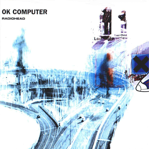
Behind The Album: OK Computer
The third studio album from Radiohead was released in May 1997 by Parlophone Records. This would mark the first album that Nigel Godrich worked on as their producer. The band would self produce the entire album themselves, which they have done on every record since. In 1995, Brian Eno asked the band to contribute a song to a charity compilation for War Child entitled Help. They were scheduled to do the recording in only a day, which led to the track, “Lucky.” Godrich would say of the recording. “Those things are the most inspiring, when you do stuff really fast and there's nothing to lose. We left feeling fairly euphoric. So after establishing a bit of a rapport work-wise, I was sort of hoping I would be involved with the next album." This track would form the foundation of what would become OK Computer. In early 1996, the group took a break from touring because they found it a bit too stressful. Thoughts now turned to a new record with the mindset of distancing themselves from anything similar to The Bends. Drummer Phillip Selway would say, “There was an awful lot of soul-searching [on The Bends]. To do that again on another album would be excruciatingly boring.” The label gave the band a rather good sized budget for recording equipment for the new release. A number of producers were considered for the album, but they kept coming back to Godrich as an advisor on equipment. Eventually, the band hired him as the producer. Ed O’Brien said of the album, “Everyone said, 'You'll sell six or seven million if you bring out The Bends Pt 2,' and we're like, 'We'll kick against that and do the opposite'."
In early 1996, Radiohead began proper recording of the LP at Canned Applause Studios in Oxfordshire, England. Issues immediately came up as the band had difficulty staying focused on one song all the way to completion. Selway would talk about this later, “We're jumping from song to song, and when we started to run out of ideas, we'd move on to a new song ... The stupid thing was that we were nearly finished when we'd move on, because so much work had gone into them." Although the members of the group were considered equals, the voice of Thom Yorke always represented the loudest one in terms of musical direction. Godrich would talk about his role within the group in an interview. They “need to have another person outside their unit, especially when they're all playing together, to say when the take goes well ... I take up slack when people aren't taking responsibility—the term producing a record means taking responsibility for the record ... It's my job to ensure that they get the ideas across." His permanent role on each Radiohead album would lead to the producer being called the sixth member of Radiohead. After only recording four songs, the band left the Canned Applause Studio for a variety of reasons Including the fact that the studio had no bathrooms or dining rooms. They decided to take a break from recording in order to support Alanis Morissette on tour, which gave them a chance to try some of their new tracks live. Around the same time, Director Baz Luhrmann asked the band to contribute a song to his film, Romeo and Juliet. “Exit Music for a Film” would be played as the credits rolled during the movie, but they did not give Luhrmann permission to place the track on the movie soundtrack. Yorke would later observe that this song became very important to the album. It “was the first performance we'd ever recorded where every note of it made my head spin—something I was proud of, something I could turn up really, really loud and not wince at any moment."
In September 1996, the band began recording again at a mansion in Bath, England owned by actress Jane Seymour. Jonny Greenwood would say the environment represented a much more pleasant change for the group. It “was less like a laboratory experiment, which is what being in a studio is usually like, and more about a group of people making their first record together." One quality that the band enjoyed during the sessions came in the fact that they took full advantage of the natural environment of the mansion. “Exit Music for a Film” utilized some natural reverb courtesy of a stone stairwell. They recorded Let Down” in an empty ballroom at 3 o’clock in the morning. The group worked at its own pace as Ed O’Brien observed later. “The biggest pressure was actually completing [the recording]. We weren't given any deadlines and we had complete freedom to do what we wanted. We were delaying it because we were a bit frightened of actually finishing stuff." A majority of the album would be recorded live with no overdubs because Yorke hated them. The band completed the rest of the album at the studio in Saint Catherine’s towards the end of 1996. In January 1997, the strings for the album were recorded, then they spent the next two months mastering and mixing the album. Actually, the mixing of the album only took a couple of days. Nigel Godrich would later comment, “I feel like I get too into it. I start fiddling with things and I fuck it up ... I generally take about half a day to do a mix. If it's any longer than that, you lose it. The hardest thing is trying to stay fresh, to stay objective."
Several artists would influence what would become the finished product of OK Computer. First and foremost came the 1970 album Bitches Brew by jazz great, Miles Davis. Thom Yorke would tell Q what he saw in that recording that made up his vision for this album. “It was building something up and watching it fall apart, that's the beauty of it. It was at the core of what we were trying to do with OK Computer." Other artists that helped to inspire the record included Elvis Costello, REM, PJ Harvey, the Beatles, Can, and composer Ennio Morricone. Jonny Greenwood would describe OK Computer as an attempt to recreate the sound on all these great records, but they missed the mark. The band would expand their instrumentation for this album to include electric piano, Mellotron, cello and other strings, glockenspiel and electronic effects. Spin would say this about the release, “A DIY electronica album made with guitars." The lyrics to the album focused on themes much more conceptual when contrasted with The Bends. Yorke would sing about a wide variety of topics including transportation, technology, insanity, death, globalism, capitalism, and more. The singer would say, “On this album, the outside world became all there was ... I'm just taking Polaroids of things around me moving too fast." He also took inspiration for some of the lyrics from a selection of books including Noam Chomsky, Eric Hobsbawm's The Age of Extremes, Will Hutton's The State We're In, Jonathan Coe's What a Carve Up! and Philip K. Dick's VALIS. Despite the abstract nature of the lyrics on the record, many critics have looked upon OK Computer as a concept album. They argue that there exists a singular theme running throughout the record, but the band has consistently denied any attempt at making such a release. Jonny Greenwood commented, “I think one album title and one computer voice do not make a concept album. That's a bit of a red herring." They did pay particularly close attention to the order of the tracklist taking almost two weeks to complete it.
The album opens with “Airbag,” which highlights the drumming of Phillip Selway. The track had been inspired by the work of DJ Shadow. The band would later admit that they represented novices in this attempt to base a song on DJ Shadow due to their lack of time with programming. Yorke had actually read an article in a magazine entitled “An Airbag Saved My Life.” Another book that helped to create the basis for the song lyrics emerged in the Tibetan Book of the Dead. Yorke had always been obsessed with the idea that any time you get into a car you could possibly die at any second. The second track “Paranoid Android” stands out as one of the longest tracks in the band's entire catalog. Two songs inspired it from classic rock, “Happiness Is a Warm Gun” by the Beatles and “Bohemian Rhapsody” by Queen. The lyrics are meant to reference the alien from Douglas Adams’s A Hitchhiker’s Guide to the Galaxy. Yorke got the idea after watching a woman lose her mind after a drink spilled on her at a bar in Los Angeles. “Subterranean Homesick Alien” referenced “Subterranean Homesick Blues” by Bob Dylan. The lyrics are meant to refer a person who is abducted by aliens, then returns home to realize his life is in no way any different. The beginnings of the theme for this track actually began for the singer in private school when he had an assignment to recreate a British literary movement called Martian poetry. Romeo and Juliet by William Shakespeare inspired the lyrics to “Exit Music for a Film.” This should come as no surprise as the band had specifically created the song for a remake film. Yorke would use it as a chance to simply recap the entire narrative in the song because Zeffirelli’s version of the film greatly affected him at the age of 13. “I cried my eyes out, because I couldn't understand why, the morning after they shagged, they didn't just run away. It's a song for two people who should run away before all the bad stuff starts.” The singer had tried to replicate Johnny Cash’s Live at Folsom Prison as he sang along to his acoustic guitar. “Let Down” represented an attempt by the band to recreate the sound made famous by Phil Spector and his wall of sound. Yorke would later comment that the lyrics are “about that feeling that you get when you're in transit but you're not in control of it—you just go past thousands of places and thousands of people and you're completely removed from it.” The singer would look upon such lyrics as perfect symbolism for Generation X, which had strongly influenced the direction of it. “Karma Police” contains two major sections that alternate between piano and guitar, which originally came from “Sexy Sadie” by the Beatles. The title of the song was an inside joke between the band during the previous tour. If something bad happened to someone, they would say that the karma police were going to get them. The short Interlude “Fitter, Happier” became something that the Radiohead frontman wrote in 10 minutes while on a break. The voice came from the Macintosh Simpletext software application. He would later describe the words as a “checklist for slogans from the 1990s.”
“Electioneering” turned out to be one of the band’s heaviest rock oriented songs probably ever with lyrics that were inspired by the Poll Tax Riots. Another source of inspiration came in the book Manufacturing Consent by Noah Chomsky. “Climbing Up the Walls” has been described by Melody Maker as “monumental chaos.” The track was arranged by Johnny Greenwood for 16 instruments based on composer Krzysztof Penderecki's “Threnody to the Victims of Hiroshima.” No Surprises” would be initially inspired by “Wouldn’t It Be Nice” by the Beach Boys, but they really wanted to replicate the mood of “What a Wonderful World” by Louis Armstrong or the soul music of Marvin Gaye. Yorke would say the song’s narrator is “someone who's trying hard to keep it together but can't.” The track that started it all “Lucky” was actually inspired by the Bosnian War. Yorke wanted to illustrate the actual terror of that conflict on the charity album, Help. Another theme that he drew upon emerged in his own anxiety about transportation. Critics have likened the guitar on the song to 1970’s Pink Floyd. The final track on the album “The Tourist” was specifically arranged by Jonny Greenwood to create a bit of space on the LP. The lyrics originated from Yorke witnessing tourists in France trying to see as many sites as possible. The title of the album came from the 1978 radio series based on The Hitchhiker’s Guide to the Galaxy when character Zaphod Beeblebrox says, “Okay, computer, I want full manual control now." They had first heard the line while listening to the series on the bus for their tour in 1996. Yorke would say this about the title later. It “refers to embracing the future, it refers to being terrified of the future, of our future, of everyone else's. It's to do with standing in a room where all these appliances are going off and all these machines and computers and so on ... and the sound it makes." The artwork would be created by both Yorke and Stanley Donwood using a computer. The Radiohead singer would observe this about the art, “It's quite sad, and quite funny as well. All the artwork and so on ... It was all the things that I hadn't said in the songs."
Leading up to the release of the album, the band got very little support from Capitol Records because they did not have too much faith in the commercial potential of it. Much of the pessimism came in the fact that the record did not have any singles to put on the radio. Ed O’Brien would call it the “lack of a Van Halen factor.” The singles that were released from OK Computer included “Paranoid Android,” “Karma Police,” and “Lucky.” All of the singles charted in the top 10 in the UK, while they also did very well making the top 20 on the US charts. Their official website was created in order to promote the record, as well as some non-traditional promotional techniques by the record label. One such idea came in their decision to take out full-page ads in popular British newspapers and magazines with only the lyrics to “Fitter, Happier.” Another promotion sent out floppy disks to people in the press, which included many Radiohead screensavers. Upon its official release, OK Computer would debut at number one on the UK charts, while in the US the record made it to number 21. Please note that this was the highest American debut for the band. By September 2000, the release had sold 4.5 million copies worldwide.
Critics loved the album across the board. Writer Tim Footman would comment, “Not since 1967, with the release of Sgt. Pepper's Lonely Hearts Club Band, had so many major critics agreed immediately, not only on an album's merits, but on its long-term significance, and its ability to encapsulate a particular point in history." Many critics saw it as a very important album. Mojo wrote in their review, “Others may end up selling more, but in 20 years' time I'm betting OK Computer will be seen as the key record of 1997, the one to take rock forward instead of artfully revamping images and song-structures from an earlier era.” The New Yorker would congratulate the band on taking many more risks artistically then their contemporaries like Oasis. “Throughout the album, contrasts of mood and style are extreme ... This band has pulled off one of the great art-pop balancing acts in the history of rock." Most of the reviews that were slightly mixed seemed to focus on the fact that when compared with The Bends, this record did not contain as many catchy songs. The release would go on to win the Grammy for Best Alternative Album, but did not win Album of the Year. The praise for the album seemed to inundate the band a little too much. Also, Radiohead did not agree with the universal assessment that they had made the greatest progressive or art rock record since Dark Side of the Moon. Thom Yorke would say, “We write pop songs ... there was no intention of it being 'art'. It's a reflection of all the disparate things we were listening to when we recorded it."
The legacy of the album came to be represented in a variety of ways. First, the release of OK Computer coincided with the election of Tony Blair. Some writers have pointed to the pessimism on the record as a sign of things to come. Stephen Hayden would write, “Radiohead appeared to be ahead of the curve, forecasting the paranoia, media-driven insanity, and omnipresent sense of impending doom that's subsequently come to characterise everyday life in the 21st century." Second, the arrival of this album directly coincided with the decline of Britpop. The Oasis album Be Here Now did not attain the commercial or critical success that What’s the Story Morning Glory had received in 1995. Third, OK Computer directly influenced a new generation of artists including bands like Bloc Party and TV on the Radio. The album has landed on many lists over the subsequent years as one of the best releases of the decade and all time. Yet, not all retrospective reviews have been kind to OK Computer as it has also landed on some lists as one of the most overrated records of all time. A New Musical Express column criticized the release as the exact point when Radiohead stopped being good, but instead started to become important.
3 notes
·
View notes
Note
Hi there!!! It is the same anon that requested some fic recs ☺ Thank you so much! I may give them a read! They look very interesting! But tbh I'm looking for fics that deal with some more in-depth approach to the twins' psychology and character (I don't mind the romance. In fact, I think it's a really interesting plus to the story when handled well).
(Below this is the rest of the messages, put together. Farther down, below the line, are my responses)
I’ve usually seen that the twins are portrayed as soft, loving and caring guys with their partners without real motives for such drastic change of dynamics in their twisted personalities. I mean, the usual Valeska centered fic goes like this: they meet the OC in Arkham or during their childhood in the circus and for some reason they reunite in the present, and then it is just the twins somehow falling for them, changing their whole way of being and only wanting to bang the OC the whole time (without taking into account the lack of the OC's inner conflict about loving such twisted men, because these OCs usually are "sane" and good people that somehow are dragged into the twins' world and for some reason they just fall in love with them without questioning it).
But for me the least realistic thing about these fics is that the twins become super nice guys all of a sudden. I mean of course there can be character develoment and growth (up to a certain point), but I haven't really found a story that contains such deep explanation. Let's face it, they're still psychos no matter what, even if they have a partner.
In the last season we get a glimpse of how Jeremiah treats Ecco, someone that he used to appreciate and care for deeply, and she still meant little to him. So it doesn't add up to me when the twins are magically turned into these super sweet caring guys while their twisted, evil and manipulative side is completely ignored.
I am not saying they can't love, I am just saying that they surely have their own twisted perception of what love is 🤔 Sorry for my rambling, damn, it took soooooo many comments hahaha!!! OMG, Sorry!😂😂 I had a LOT to say 😂😂😂 But I just find these characters very interesting and I would love to read a story with a more realistic approach to the construction of their personalities (and their twisted way of loving too!). Let me know, please, if you happen to know about some fics/authors 😘 thanks again!
- - - - - - - - -
Hi again, anon! I’m sorry my list of content in the previous ask wasn’t exactly what you were looking/hoping for. As of right now, besides the ones I sent you that may delve a little bit below the surface, I can’t think of a true ‘character study’ type story that I have read so far. But, again, I usually stay in the area of romance so I wouldn’t be surprised if there are such fics out there under a different genre.
I’ll be quite honest, it’s been a very long time since I’ve read any oc/(input character here), including ones with the twins. Normally, I forget they exist until someone brings it up or I stumble across one on Tumblr accidentally. I do agree, the twins suddenly changing for an OC (or anyone) can be a bit unrealistic but from my years of reading and writing, creating stories with such things is a bit of ‘wish fulfillment’ which, to be honest, isn’t a bad thing. Sometimes a reader just needs content that is kind of good-feeling type fic (though not in a sense of how murderous the twins can be but in them getting some kind of positivity in their lives, whether it be through an OC or another character in the universe). When I wrote Oc’s at the beginning, it was either wish fulfillment for me or simply just wanting these characters I adored to finally have some kind of happy ending which they probably did not deserve, at all.
A reason you might not find such content is also because, character studies are hard. Especially if you don’t have a complete picture of the character. With the twins, a lot is just coming up with stuff, imaging their past and how it still affects them, even if, on the upper layer we’re shown, doesn’t portray those scars left behind.
With Oc’s, they can usually be pretty hit or miss. It’s not like you’re taking an already known character with known flaws and putting them in your story. Those characters have a foundation already built. For an Oc, the writer has to literally make someone from the ground up, which is equally as hard without making them seem too whiny, too mary-sue like, or just too problematic. This can leave a lot to be desired which can create something unrealistic as well. That’s why I usually only look for content centered around characters from the show, instead of Oc’s; like with Bruce and the twins because canon-wise there is already something there (depending on how you look at it and write it).
In regard to Ecco: firstly, I think it’s arguable what type of relationship she even has with Jeremiah when we first are introduced to them. We’re shown some concern on his end when she’s clearly been hypnotized but this can be seen as a boss concerned for an employee, an employee who he’s probably had for awhile now and is one of the very rare few who he trusts to an extent. However, we just don’t know much of anything about their relationship or past together. She might have hardly seen him, only contacting him through phone calls and text messages; she may have only brought him supplies through the maze and never was in his inner personal areas. This treatment is all possible given how Jeremiah is quite literally a paranoid mess before the spray, no matter how well put-together he appears. And, if we’re to compare this to his eventual obsession with Bruce Wayne, we can take a guess that Jeremiah and Ecco probably didn’t get very deep with this connection they had. Mainly because with just a few compliments, Jeremiah is invested in Bruce, something we don’t see with Ecco before or after the spray. So we have Bruce enter the picture (someone who has run into his twin on multiple occasions, a fact Jeremiah must know to some extent with his paranoia probably leading him to constantly check newspapers and the news for info on Jerome) and, if you look at things from Jeremiah’s perspective, besides complimenting him, Bruce looks at him and only sees Jeremiah. And this would be baffling to Jeremiah if he knows the affect Jerome has had on Bruce, for him to look at Jeremiah and not see his twin after everything would be just as big a compliment as anything because it’s differentiating him from his twin. Someone who has probably feared being compared to his brother, for people to look at him and only see Jerome (such as what occurs with Jim and Harvey only hours prior). Because of this, when compared to Ecco, we can deduce that either their conversations never went in such a direction, or she hardly had the extended physical contact to ever bring up Jerome or compare or compliment. If so, it’s possible with how Jeremiah is that something similar could have happened with Ecco. And this eventually leads into the spray where his only true attachment is not Ecco but with Bruce, especially, after his initial spray, Jeremiah’s hatred for Jerome is far worse than it had been before, making Bruce’s assessment of Jeremiah simply being himself and not his brother, far more endearing as well. So, in comparison to Bruce, Ecco means absolutely nothing to him, a means to an end.
I’ll admit, reading content where the twins are somehow in a relationship (with an oc or canon character) while still being rather insane, are quite interesting. However, for stuff like that to work in a compelling and ‘actual’ way, characters like that have to be bent because these characters logistically working in that kind of environment may never be realistic anyways. This can be worked around of course, but it takes so much time and effort; even now, as I write my stories for Gotham, I’m still trying to work around how to make these ships work for the twins because they’re stubborn and although they have obsessions they, at their cores are not good people and while they may try, seriously try to better themselves, there will always be slip-ups.
I do agree, they can love but it would always be twisted in some way or another (look no further than Jeremiah with Bruce). They’re also a lot of fun to take apart and analyze or try and come up with a type of background that works with all the hints we’ve been given. Background-wise, the twins are really something a writer can make their own which is an interesting concept.
This turned more so into a long ramble of writing and Ocs and lots of Gotham lol but anyways, I wish I could give you a story to fit your needs. I quite hate when I have an itch for certain fics and I either can’t find them or the number of fics is so daunting that I don’t dare even try. I would recommend just going through them, possibly looking for complete content first, or ones with high hits or kudos (depending on the site you’re searching on) because I don’t have any at the moment I can suggest.
(Honestly the ideas for the twins never stop coming lol, perks of their backgrounds and everything else being so hazy.)
I hope some of this message was at least interesting lol and I do wish you luck in finding good twin content that delves into their character or, maybe you’ll get lucky and someone will publish something like that soon! Either way, I hope you find something 😘
#anon ask#anon#Gotham#I don't even know what this became to be honest#I had wayyyy to much time to just think on this answer all day long since i had no access to my computer#and this is what I got lol#Valeska twins#Jeremiah Valeska#Jerome Valeska#Ecco#Wayleska#character study? A little?#oc's#writing#basically oc writing can be really difficult or not#Jeremiah maybe could've had a deeper relationship with Ecco or maybe she just wasn't his type. Who knows#I do stand by my thoughts on him first meeting with Bruce though cause it just adds another layer to his character that I rather like#Gosh I hope this entire message makes as much sense as my brain thinks it does
4 notes
·
View notes
Text
Rampage 2 Monster Ideas Or Possibilities
Because this is something well I wanted to make a joke at first of how Davis would react in the situation I’ve thought of for a sequel to Rampage 2018. But over time I started to think more. Basically more details, and changes to my ideas. Spoilers from the 2018 film just in case.
Including I wanted to make this list of ideal monsters. Because the video games have a huge roster that a franchise can use for the games. Along with I wanted to write my own twist on them. Considering the direction the movie took with George, Ralph, and Lizzie. If your a fan of the games you might like these ideas. But give me your thoughts on these. Especially I intend to some how Ralph and Lizzie back. Because along with George are the main trio of the franchise.
This isn’t all for one movie. But again I’m just giving out ideas. In fact I decided to study and look into stuff. Mostly about wolves because I’ve thought more in depth about Ralph 2.0. Including looked up some stuff on Crocodiles, but mostly looked up stuff about wolves. Along with I looked on the Rampage wiki on some characters. Again give me your thoughts, this is all fan fiction. Especially it seems weird with the Ralph one.
1. Ralph or humorously called Ralph 2.0 by Harvey Russell. A 7 month old Grey Wolf taken in by the Wolf Watch UK. Named Ralph by a woman who works there after she found him as a pup laying next to his dead mother who was killed by poachers. Ever since then, even being a wild animal he’s looked towards the woman as sort of mother after his died.
Actually considered a, “Sweetheart” despite his protective nature of the woman. Especially is rather good at protecting itself when aggressive or threatened. After being affected by the same pathogen some how that affected the other animals. Growing in size, and gaining certain abilities. But compared to the original Ralph in 2018, Ralph 2.0 while aggressive, seems to be less violent than the original. Mostly because of being taken care of by humans, and his relationship with the woman who rescued him. Especially he still retains his memories.
But growing in size and other symptoms have caused him to become scared, confused, and angry. Only listening to the woman who saved him, and eventually Davis as well. He’s in a weird way a giant dog. Yet he will become violent and attack who hurts the woman who nurtured him growing up.
Is able to fly like the original Ralph, and use the needles it grew on it’s back.
Notes: Originally I wanted this new character this woman to be played by Karen Gillian, but decided Emilia Clarke. Especially I want a joke where Harvey calls her the, “Mother Of Wolves”. Including Ralph 2.0 has a relationship to this woman similar to Davis and George. But with the woman even calling Ralph that he’s kind of like her son. Along with this Ralph is supposedly the youngest of the trio.
2. Lizzie or humorously called Lizzie 2.0 by Harvey Russell as well. Including actually named Lizzie by Davis. A 5 year old American Crocodile that resides in the San Diego Wild Life Sanctuary, that Davis saved as well. While she doesn’t mind Davis at all. She would rather be left alone. While the American Crocodile may not be as aggressive as other species, Lizzie can be aggressive if agitated.
Affected by the pathogen that made it’s way to the sanctuary, she gained similar abilities like the original Lizzie. She’s the biggest of the three, able to breathe underwater, and has the tusks and more teeth. Especially in a similar situation as Ralph 2.0, confused, and some what scared, but angry as well.
Yet still even growing bigger, she still retained that loner behavior. Even though she’ll follow Davis because he’s the only one she can trust. Later during the film while still aggressive, realizes that her help is needed offers to help the other two against a bigger threat. Especially it’s to protect Davis from harm or any monsters threating to hurt him. Including can get very violent as well.
Notes: There’s this theme for the movie while it sounds ridiculous. Considering the situations with Ralph 2.0 and Lizzie 2.0, especially Ralph 2.0. Davis tries to convince George even if they are different species, and they may not get along. But Davis tells him that Ralph and Lizzie are not like the other two he faced. Along with the fact they are in the same situation they were in 2018. With Davis asking George to see them as like a younger brother and sister or friends, that they are part of his troop, his family, to protect them like they were one of his own. Over the film George understands and risks his life for the other two. Following this, the other two especially Ralph do the same.
Including have a cute scene of George petting Ralph 2.0 or something.
3: V.E.R.N. considered an abomination. A monster that absorbs radiation. Originally a uncomplete monster that was mixed with bat DNA and other animals before Claire was killed by George. But it was mainly top secret and but kept close to the Rampage project. Yet it was stolen by some sort of company who’s name when shortened was titled SCUM. They tried to complete it. But realized there was a reason it was never completed. It was too out of control, It couldn’t be controlled. Especially what’s more shocking and twisted.
The surprise came from the fact during the process of discovering what was in the blood of the abomination. Some how Claire Wyden’s blood was in it. The reveal was possibly one of the parts of DNA was human blood, which was Claire herself. As if VERN could of been a clone. But later revealed Claire wanted to make the ultimate weapon she could sell. But the results were too unstable. Which was possibly the reason why Claire didn’t bother continuing with it. Because it would of proved disastrous, worse than what happened with Project Rampage. While Claire was pleased with how that project went. Vern was something else.
Including the name V.E.R.N. meant “Violently Enraged Radioactive Nemesis”.
A angry and diabolical monster, a creature that’s very feral and seems to enjoy what it’s doing. It’s as VERN if she was a clone of Claire, this would of been her after she had been killed. Angry after everything that happened. Especially Vern actually being intelligent and understanding what humans can say. That human blood was used to make it more smarter, a terrible choice indeed. Learning of the original Claire’s death, realizing they were almost the same.
Vern is the embodiment of animalistic evil. If Claire was even more unleashed in her wrong doing, proud of her work, and willing to kill anyone to get in her way. It was almost like the original Claire came back from the dead but more worse, as a giant monster. Including with her size and power, she’s a challenge for any monster.
Notes: I kind of went too far with Vern. Because Vern didn’t have more personal info. Especially last year I thought of this idea of I would of liked it if Claire had become this Bat like creature like Vern. As if this final boss so she get her ass kicked by George. Honestly Claire’s fate was well deserved. Including I understand why they didn’t take the human turning into the monster direction.
But yeah I took the route that Vern is some how Claire 2.0. But as some sort of monstrous clone mixed with a lot of animal DNA. Including as a callback Vern is female in Total Destruction. I know Claire isn’t a very good villain, or whatever she was an asshole. I guess I wanted to make a more in depth monster.
I wanted to make the, “King Ghidorah” and I thought now, “Black Hat(From Villainous)” of Rampage. Even though Vern didn’t have like this huge role in the games. But I decided to add more depth to the character. You can be critical of me if you want.
4. Myukus, a one eyed alien monster. For many years has been kept at Area 51 for many decades ever since the 1950′s. Been kept asleep and experimented on. Now with his alien superiors returning to invade the Earth. He is released by them. Angered by the American government capturing him, and keeping his on Earth for many decades. He decides to take vengeance on Earth, by destroying everything he possibly can, while aiding the aliens who freed him.
Originally a monster created by the aliens to take over the Earth. But crashing down towards the Earth weakened him and put him into a coma. Including the American government made sure he couldn’t wake up. Which fueled Myukus with rage even more. Now free, he can do what he was made for again, now with his people.
Notes: I still feel I wanna do the aliens storyline first but I liked what I did with Vern. No wait Vern came first but you can do a trilogy with so many monsters and other shit man.
5: Cal, a giant squid, born in the Florida Keys in what was considered the safest reef in the world. Transformed by massive amounts of the pathogen on the Athena-1. At first he was a small squid now, but now he’s a massive and angry squid, able to take down boats, eat people, and doing much more damage. Literally a horror underwater come to life.
Including to make it worse, he is able to breathe air for an hour. But still needing to breathe underwater. Making him a threat not to be messed with.
Notes: Yes I’m keeping the end with the squid canon because that was amazing.
6: Larry, a large rat. Including funny enough, the same rat Harvey got from Brett Wyden. Some how the rat got into contact with the pathogen, making it grow larger and more aggressive. Especially with more time, larger than the rat on the Athena-1.
But what’s rather strange about Larry, he has a huge fondness for Harvey. Honestly a good thing. After getting the rat back from the solider later. He took care of the rat as his own. Especially Larry is mainly a annoyance rather than dangerous.
Yet he can still fight as he’s gotten bigger near George’s size.
Notes: It’s not Curtis but found out from Brad Peyton if there was a sequel, he’ll use that name. So I decided to do just that. :)
7: Ruby, a giant lobster, it’s strangely funny in a way. How does something like a lobster that’s very small, get so big? In a similar situation to Cal, tons of the pathogen got in the water, and she got a huge dose of it. Able to snap metal with her claws, and also pretty strong for a creature like her.
She’s a big nasty bugger that gets pissed real easily if angered.
Notes: I weirdly wanna see a giant mutated lobster, it be amazing looking to me personally.
8: Boris, a giant rhino, originally a Africian Rhinoceros, again affected by the pathogen. Becoming very large and hostile. Yet after being captured by the government and Davis trying to help. He’s gotten less aggressive over time. But still he’ll get pissed if someone attacks him, and he’ll use his giant body and horns to kill any human or monster. Basically a giant batting ram.
Notes: Not much on Boris, I’ll have him more chill when shit is doesn’t need to be done.
I wrote a lot I apologize, but for anyone interested in ideas for a sequels. We can talk and I hope you enjoy reading this. Again and I’m sorry that I keep repeating this, I want a sequel to Rampage 2018, whatever direction they go with, I’ll probably be happy. But again these are ideas because they have a lot of material mainly monsters they can use. Along with the fact the Rampage games aren’t very lore based so they can do what they want or whatever. Just hope it’s an enjoyable movie like the first one too.
5 notes
·
View notes
Text

Todrick Hall's Comments About Taylor Swift Are All About Support – EXCLUSIVE
Todrick Hall has some famous friends and co-workers. His YouTube channel (which has close to 3 million subscribers) has gotten him worldwide recognition and into the room where it happens with the likes of Beyoncé and Taylor Swift. He choreographed Beyoncé's "Blow" music video after she saw some of his own videos, and his friendship with Taylor Swift got him a featured cameo in the "Look What You Made Me Do" music video. Todrick Hall's comments about Taylor Swift prove that working and being close friends with the star is not what you may think.
Hall and I are on the set of his "Glitter" music video when we sit down to chat about his career. He had already met T. Swift by the time he starred as Lola in Kinky Boots on Broadway in 2016, but it was during this stint in Harvey Fierstein and Cindy Lauper's Tony-winning show that his friendship with the "Delicate" singer really solidified.
"When I moved to New York, I went out to eat with her when I was doing Kinky Boots," Hall tells Elite Daily, "and I had done shows in New York before, but it had been so many years and I felt like I had lost my friend circle. And so I was so happy that she was [living in New York]." Hall says their friendship was a casual one, so he didn't expect her to come see him in the Broadway show.
"She said that she was going to come and see the show and I was like, I'm never going to ask her to come and see it again because I know she's busy, I don't want to pressure her. And she just showed up to the show one day." He says Swift not only saw the show, but she stayed for two hours after meeting, speaking, and taking pictures with everyone in the cast and crew. From then on, he knew he had a solid friend in her.
Hall reveals that, like many on the internet, he believed Swift's niceness was just a front she put on for her famous persona. But he maintains that niceness still holds true in their personal and professional relationships.
"Huge things will happen and she'll be like, 'OK, great. This is what we have to do, this is what the universe has given us, this is what we're faced with. How are we going to fix this?' I would love to handle my minor issues the way that she handles some of her huge issues that billions of people are going to see and judge." He doesn't hint as to what any of those "huge issues" he's talking about are, but her public beef with Kim Kardashian and Kanye West comes to mind, as well as incessant tabloid coverage of her past relationships. (Miraculously, she and actor Joe Alwyn have managed to keep their two-year relationship under tight lock and key.)
"I think that one thing that I really love about her is she has been burned by a lot of people," Halls continues, "and you would think in a lot of ways that she would be totally OK with being a princess locked in a tower that nobody was able to enter. But she's willing to get back up again and trust people again, which is a very scary thing when you're somebody in that position."
Hall has proven himself to be a loyal friend to Swift as well, going to bat for her frequently against Kanye West.
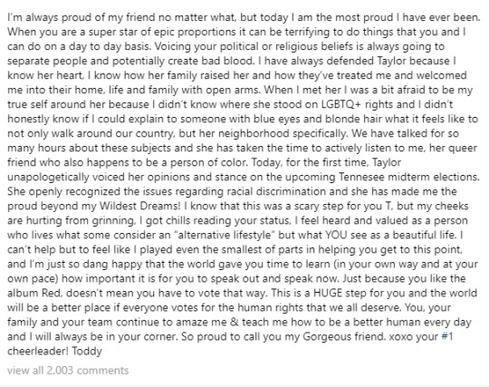
When Swift finally voiced her political opinions in what the internet felt was a long overdue Instagram post, Hall posted on Instagram as well, showing his pride in her decision.
He explained in the lengthy caption that Swift being so guarded for so long about her political beliefs was part of the reason he kept their friendship casual at first. He echoes the same sentiment in our conversation.
Referencing her complete lack of a public political stance over the years, Hall tells me, "She has such power that I don't even think she realizes how much of an affect it would have on people."
He continues, "I was explaining to her that, as a gay person, I didn't know for sure how you felt about gay people and I was a little bit nervous to talk to you about my love life or whatever." And he recognizes the criticism she would receive for not voicing her political opinions before the 2016 presidential election.
Many people justifiably feel that Swift, with such a powerful influence over newly 18-year-old potential voters, could have done much more political advocacy in 2016 than just posting a picture of herself with an "I Voted" sticker. When you have a platform as large as Swift's, it's easy to see how not using said platform in a tumultuous political time would garner heavy criticism. Some of that criticism, Hall says, was pointed at him as well.
As a gay man of color, Hall tells me that people online occasionally placed the onus of getting Swift to "come out" as a democrat on him.
"Sometimes, people would give me flack online that she wasn't doing certain things," he tells me. "I love the fact that she has grown and evolved in her own time, as every artist has to do." He continues, "It can be very scary to potentially risk your career or your reputation to stick your neck out for something when you don't have to do it. You don't have to stand up for gay rights, you don't have to voice your opinion, and you'll sell the same amount of records. But somebody who truly cares about the way this country is falling apart and will take it upon themselves to use their voice to do something — that, I believe, is just the right thing to do."
She did that when she officially endorsed democratic candidates running in Tennessee elections in 2018 (and there was a massive surge in voter registration as a result). But Hall recognizes this was overdue. But Hall knew that being a good friend meant supporting her decision, regardless of how late it was.
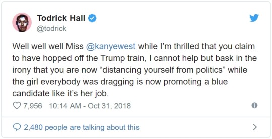
So when Kanye West tweeted that he was "distancing" himself from politics, Hall couldn't help but laugh (and call the rapper out on Twitter).
“Well well well Miss @kanyewest," he said, "while I’m thrilled that you claim to have hopped off the Trump train, I cannot help but bask in the irony that you are now ‘distancing yourself from politics’ while the girl everybody was dragging is now promoting a blue candidate like it’s her job." Look what you made him do, Kanye! Elite Daily reached out to West's team for comment on Hall's tweets, but did not hear back by the time of publication.
All tea and shade aside, Hall tells me that Swift is one of those friends who is basically a therapist for him, and vice versa.
Throughout their entire friendship, however, they never had the chance to work together. That is, until Swift asked him to be in the "Look What You Made Me Do" music video.

"I feel like I owe her money for the amount of therapy that she's given me for the boys that I've dated," Hall quips. He reveals that he hasn't always approved of her past relationships either, although he stays tightlipped on just which of her famous exes he's referring to. (Booooo.)
"I think that it's easy to be surrounded with a lot of 'yes' people," he says, "but with Taylor, there was somebody that she was dating that I didn't necessarily approve of and I was definitely very honest with her about how I felt about it. She just would always be like, 'Thank you so much for your honesty.'"
"I feel like it is the most expensive music video that's ever been created in history," Hall jokes.
Outside of working with his bestie on the video, Hall says it was a wonder to see director Joseph Kahn at work on the video. Kahn has directed a large number of Swift's videos in the past, including most of the videos from Reputation. The biggest were "Look What You Made Me Do" and "...Ready For It?" both of which Hall was on set. To perform in the former, and just observe the latter.
"It was amazing to watch [Joseph Kahn] work and to see everything," Hall says, adding, "I was also on the set of '...Ready For It?' to watch that as well. And it was just really, really awesome and to be able to hear the song and to see the sets. I make videos for a living, but to see the budget of how these sets were built and how amazing they look, it was just insane. I had never seen anything like that before in my life."
He brings up his choreography for Beyoncé on the "Blow" music video as a comparison. Beyoncé's self-titled surprise album was famously more low-budget than some of her other videos because it was being kept as such a huge secret, so seeing Swift's massive budget for her Reputation videos was an eye-opener.
"When I did the video with Beyoncé, we went to a location, a roller skating rink, and that's where we did it, so that was the aesthetic of that video," he explains, "But I've never been somewhere where they built an entire world and a cemetery and a thrown and all these things. It was just really crazy to see it and to be a part of it was just really, really awesome."
As for her dancing in the video (people have always trolled Swift for dancing even though she's not near someone like Beyoncé's level), Hall says she's doing it for the joy it brings her.
"Taylor Swift doesn't have to ever dance," he, a professional dancer, says. "She'll still sell the same amount of tickets. She just loves to dance." She danced alongside Hall in the "Look What You Made Me Do" video, and Hall sees it as a huge moment of pride. He tells me, "She was scared at first, she was for sure nervous. But once we saw the playback and I was like, 'You look amazing,' she just kept going in more and more and more and more. Every single time, she'd give it more energy, more performance, and now I see her dancing in [the Reputation stadium tour] more than she's ever danced before. And I'm just so proud of her."
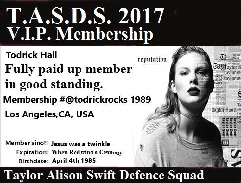
This is why he gets his own membership card
12 notes
·
View notes
Link
Todrick Hall's Comments About Taylor Swift Are All About Support – EXCLUSIVE
BY KELLI BOYLE
January 6, 2019
Do your friends tell you you're "celeb obsessed"? Do you follow your favorite celebs' every move? Know their Instagram histories so well that you can rattle off their inner circle by name and IG handle? If yes, Elite Daily's new series, SideClique, is just for you. We're bringing you everything you've ever wanted to know about the people living their lives right alongside our favorite celebs.
Todrick Hall has some famous friends and co-workers. His YouTube channel (which has close to 3 million subscribers) has gotten him worldwide recognition and into the room where it happens with the likes of Beyoncé and Taylor Swift. He choreographed Beyoncé's "Blow" music video after she saw some of his own videos, and his friendship with Taylor Swift got him a featured cameo in the "Look What You Made Me Do" music video. Todrick Hall's comments about Taylor Swift prove that working and being close friends with the star is not what you may think.
Hall and I are on the set of his "Glitter" music video when we sit down to chat about his career. He had already met T. Swift by the time he starred as Lola in Kinky Boots on Broadway in 2016, but it was during this stint in Harvey Fierstein and Cindy Lauper's Tony-winning show that his friendship with the "Delicate" singer really solidified.
“I FEEL LIKE I OWE HER MONEY FOR THE AMOUNT OF THERAPY THAT SHE'S GIVEN ME FOR THE BOYS THAT I'VE DATED.“
"When I moved to New York, I went out to eat with her when I was doing Kinky Boots," Hall tells Elite Daily, "and I had done shows in New York before, but it had been so many years and I felt like I had lost my friend circle. And so I was so happy that she was [living in New York]." Hall says their friendship was a casual one, so he didn't expect her to come see him in the Broadway show.
"She said that she was going to come and see the show and I was like, I'm never going to ask her to come and see it again because I know she's busy, I don't want to pressure her. And she just showed up to the show one day." He says Swift not only saw the show, but she stayed for two hours after meeting, speaking, and taking pictures with everyone in the cast and crew. From then on, he knew he had a solid friend in her.
Hall reveals that, like many on the internet, he believed Swift's niceness was just a front she put on for her famous persona. But he maintains that niceness still holds true in their personal and professional relationships.
"Huge things will happen and she'll be like, 'OK, great. This is what we have to do, this is what the universe has given us, this is what we're faced with. How are we going to fix this?' I would love to handle my minor issues the way that she handles some of her huge issues that billions of people are going to see and judge." He doesn't hint as to what any of those "huge issues" he's talking about are, but her public beef with Kim Kardashian and Kanye West comes to mind, as well as incessant tabloid coverage of her past relationships. (Miraculously, she and actor Joe Alwyn have managed to keep their two-year relationship under tight lock and key.)
"I think that one thing that I really love about her is she has been burned by a lot of people," Halls continues, "and you would think in a lot of ways that she would be totally OK with being a princess locked in a tower that nobody was able to enter. But she's willing to get back up again and trust people again, which is a very scary thing when you're somebody in that position."
Hall has proven himself to be a loyal friend to Swift as well, going to bat for her frequently against Kanye West.
When Swift finally voiced her political opinions in what the internet felt was a long overdue Instagram post, Hall posted on Instagram as well, showing his pride in her decision.

He explained in the lengthy caption that Swift being so guarded for so long about her political beliefs was part of the reason he kept their friendship casual at first. He echoes the same sentiment in our conversation.
Referencing her complete lack of a public political stance over the years, Hall tells me, "She has such power that I don't even think she realizes how much of an affect it would have on people."
He continues, "I was explaining to her that, as a gay person, I didn't know for sure how you felt about gay people and I was a little bit nervous to talk to you about my love life or whatever." And he recognizes the criticism she would receive for not voicing her political opinions before the 2016 presidential election.
Many people justifiably feel that Swift, with such a powerful influence over newly 18-year-old potential voters, could have done much more political advocacy in 2016 than just posting a picture of herself with an "I Voted" sticker. When you have a platform as large as Swift's, it's easy to see how not using said platform in a tumultuous political time would garner heavy criticism. Some of that criticism, Hall says, was pointed at him as well.
As a gay man of color, Hall tells me that people online occasionally placed the onus of getting Swift to "come out" as a democrat on him.
"Sometimes, people would give me flack online that she wasn't doing certain things," he tells me. "I love the fact that she has grown and evolved in her own time, as every artist has to do." He continues, "It can be very scary to potentially risk your career or your reputation to stick your neck out for something when you don't have to do it. You don't have to stand up for gay rights, you don't have to voice your opinion, and you'll sell the same amount of records. But somebody who truly cares about the way this country is falling apart and will take it upon themselves to use their voice to do something — that, I believe, is just the right thing to do."
She did that when she officially endorsed democratic candidates running in Tennessee elections in 2018 (and there was a massive surge in voter registration as a result). But Hall recognizes this was overdue. But Hall knew that being a good friend meant supporting her decision, regardless of how late it was.
So when Kanye West tweeted that he was "distancing" himself from politics, Hall couldn't help but laugh (and call the rapper out on Twitter).
“Well well well Miss @kanyewest," he said, "while I’m thrilled that you claim to have hopped off the Trump train, I cannot help but bask in the irony that you are now ‘distancing yourself from politics’ while the girl everybody was dragging is now promoting a blue candidate like it’s her job." Look what you made him do, Kanye! Elite Daily reached out to West's team for comment on Hall's tweets, but did not hear back by the time of publication.
All tea and shade aside, Hall tells me that Swift is one of those friends who is basically a therapist for him, and vice versa.
"I feel like I owe her money for the amount of therapy that she's given me for the boys that I've dated," Hall quips. He reveals that he hasn't always approved of her past relationships either, although he stays tightlipped on just which of her famous exes he's referring to. (Booooo.)
“TAYLOR SWIFT DOESN'T HAVE TO EVER DANCE, SHE'LL STILL SELL THE SAME AMOUNT OF TICKETS. SHE JUST LOVES TO DANCE.“
"I think that it's easy to be surrounded with a lot of 'yes' people," he says, "but with Taylor, there was somebody that she was dating that I didn't necessarily approve of and I was definitely very honest with her about how I felt about it. She just would always be like, 'Thank you so much for your honesty.'"
Throughout their entire friendship, however, they never had the chance to work together. That is, until Swift asked him to be in the "Look What You Made Me Do" music video.

"I feel like it is the most expensive music video that's ever been created in history," Hall jokes.
Outside of working with his bestie on the video, Hall says it was a wonder to see director Joseph Kahn at work on the video. Kahn has directed a large number of Swift's videos in the past, including most of the videos from Reputation. The biggest were "Look What You Made Me Do" and "...Ready For It?" both of which Hall was on set. To perform in the former, and just observe the latter.
"It was amazing to watch [Joseph Kahn] work and to see everything," Hall says, adding, "I was also on the set of '...Ready For It?' to watch that as well. And it was just really, really awesome and to be able to hear the song and to see the sets. I make videos for a living, but to see the budget of how these sets were built and how amazing they look, it was just insane. I had never seen anything like that before in my life."
He brings up his choreography for Beyoncé on the "Blow" music video as a comparison. Beyoncé's self-titled surprise album was famously more low-budget than some of her other videos because it was being kept as such a huge secret, so seeing Swift's massive budget for her Reputation videos was an eye-opener.
"When I did the video with Beyoncé, we went to a location, a roller skating rink, and that's where we did it, so that was the aesthetic of that video," he explains, "But I've never been somewhere where they built an entire world and a cemetery and a thrown and all these things. It was just really crazy to see it and to be a part of it was just really, really awesome."
As for her dancing in the video (people have always trolled Swift for dancing even though she's not near someone like Beyoncé's level), Hall says she's doing it for the joy it brings her.
"Taylor Swift doesn't have to ever dance," he, a professional dancer, says. "She'll still sell the same amount of tickets. She just loves to dance." She danced alongside Hall in the "Look What You Made Me Do" video, and Hall sees it as a huge moment of pride. He tells me, "She was scared at first, she was for sure nervous. But once we saw the playback and I was like, 'You look amazing,' she just kept going in more and more and more and more. Every single time, she'd give it more energy, more performance, and now I see her dancing in [the Reputation stadium tour] more than she's ever danced before. And I'm just so proud of her."
Elite Daily
3 notes
·
View notes
Text
Dear Yuletide Author
Thank you so much for doing this! This is my first time doing Yuletide, and I’m really excited!
Onto what you’re here for! I’ve never really given prompts before, so these are kind of sketchy and maybe not very good. I’m happy for anything, whether it adheres to any prompts or goes in a completely unexpected direction.
General Likes: 2nd + 3rd person POV, mutual pining, slice of life scenes that are stolen moments from canon, angst but also fluff, enemies-to-lovers (and maybe even -back-to-enemies), exploration of how canon affects characters mentally — and how it affects their power dynamics, smut, love-to-hate, side characters being given the spotlight, unlikely friends and pairings, fake dating, small age gaps, adversaries finding things in common and realising they could be friends in a different life, height differences, pretending-we-don’t-have-feelings, hurt/comfort, some more angst, sensitive portrayals of complicated characters.
General Do Not Wants: ABO, underage, incest, non-con, scat, vomit, piss, the phrase “to the hilt”, pregnancy, misogyny or slut-shaming, character bashing of most stripes, infidelity, 1st person POV.
THE FOLK OF THE AIR - HOLLY BLACK
Jude Duarte/Cardan Greenbriar
Ahh, these two, my little heart can’t take it. Between now and the Yuletide deadline, the third book comes out — I’m happy with this being pre-QoN or included the QoN events, either would be great.
I like it when the sap is kept to a minimum — I want pining, I want angst, I want “collapsing into myself like a dying star because I can’t admit I love you”.
Prompts:
Anything between two disaster artists is great, but I particularly love anything that plays up the fact that they want to hate each other. I prefer almost-sex and kisses to straight sex between them.
I occasionally enjoy canon events from Cardan’s POV, mostly as long as it isn’t too fluffy.
Pre-canon fanfic would be really cool too, as Cardan starts to think more about Jude and starts to hate himself for it. That whole delicious mess. Maybe this would be a Nicasia/Cardan scene, I don’t know.
THE BROKEN EARTH TRILOGY - N.K. JEMISIN
Alabaster, Essun/Damaya/Syenite
Please note, spoilers ahoy for the series. If you haven’t read it yet, please don’t read this and instead, go and read it!
This series is one of my favourites, and I’m still healing from it, I think. And the relationship that builds between these two is about the only thing that stopped it being unbearably bleak at times. I really loved the slow burn of them learning who each other are, and Alabaster finally trusting someone. You can bet I was gripping my heart when we see him again in book 2, alive (sort of). I don’t really have prompts for this one, unfortunately, but I’d genuinely be happy with anything. It could deal with the darkness of the series, a post-book one-shot, for instance, but I’d be equally pleased with a quiet moment found within the canon — a missing scene.
This also doesn’t have to be romantic. Any kind of interaction is fine. But I would just love it to be soft and quiet, in comparison to the books.
On the other hand, anything surrounding their child...would destroy me and I would gobble it the heck up.
STARDEW VALLEY
Female Player/Harvey
I love this game so freaking much. It is so calming and lovely to play, and it’s really surprising how emotionally invested I get in characters that have such a limited script set! My current farm is in its 4th year and I just freaking adore it.
Harvey is my fave boy by a mile! I actually used to only marry girls in SV before I did a run of romancing every single option and discovered that this moustachioed doctor was a hidden gem. He’s got that maturity going for him, and he’s just so sweet. And like, I don’t know, I really like how grateful he seems to leave the bachelor life behind.
Prompts:
So something revolving around his gratefulness to be taking part in farm life, to be getting his hands dirty and coming home to a warm house with a warm body in it, would be really lovely.
Or something from early in their interactions — I imagine Harvey is the kind of guy who would never suspect someone has a crush on them, but maybe he’s really hopeful he’s not misreading the signs? Or beating himself up for even hoping? Or he’s oblivious completely to the farmer’s flirtations until someone knocks sense into him.
THIS IS HOW YOU LOSE THE TIME WAR - AMAL EL-MOHTAR & MAX GLADSTONE
Red/Blue
This book, holy shit. I don’t know what to write about it really — if someone has signed up to write for it, though, I assume you know what this book does to a person. THIS BOOK. If you haven’t read it, goooo read it. It’s short and beautiful and incredible.
Prompts:
Blue’s years undercover, more detail there could be really, really interesting. What happens in the moments she’s not writing to Red?
Anything post-canon that explores their relationship would be cute — do they get that time to sit and drink tea, as they hoped?
JONATHAN CREEK
Jonathan Creek/Maddy Magellan
I have rewatched this series a ridiculous amount of times, so imagine my joy when I saw this on the approved fandom list! Maddy is by far my favourite “assistant” of any detective series ever. I feel like none of the assistants they got in afterwards even on Jonathan Creek could match her for acidic wit balanced with loveable charm.
I don’t really have prompts for this one, but here are things I love about their relationship:
Their sexual tension. I’m not sure I want it resolved. The closest we got (the scene where Maddy has a bunch of chocolate under her pillow) is good enough for me. I just want those moments where it seems likely but they aren’t sure. Or Jonathan ruins it by doing something too calculating.
Jonathan getting embarrassed or exasperated by Maddy’s bullishness, but then having to be impressed that she got information out of people or talked their way through something or has stolen something while he wasn’t paying attention.
My headcanon is that the only reason Jonathan keeps the final reveal to himself until the end is because he wants to watch Maddy’s face and see if she’s impressed by his powers of deduction.
I know Jonathan is married in current canon, but I’m happy for that to be ignored.
Or maybe, and this is actually a prompt I think, for them to have a fraught few moments where they have to navigate what their relationship is meant to be like now that they’re not both single. Maybe Maddy is married too, even.
1 note
·
View note
Text
I Swear Harvey Acts Like It Is Sentient Part 11---Not Enough Rain to Wash Away Our Sins
The tone of Carla’s voice abruptly shifted towards the lower end of a contralto.
“Harvey, I have something I have to confess to you. When I said you were not the first hurricane to feel like you were just tossed into cities for no reason at all, I did not simply say this as a general statement. I said this because I literally felt like you, once, a long time ago.
Like you, I once was a naïve cyclone, fully convinced in my mission to deliver tropical heat and moisture to the poles. I did not understand why the winds blew me in the direction they did, or why I made landfall in the same place you did, but I accepted it. After all, as far as I knew, I was the only one suffering, feeling my circulation collapse over land.
When I finally dissipated, and ascended to the spirit world, I was happy. I had done what I had been sent out into the trade winds to do, and now I could spend my afterlife with the storms of the past. I met 1900, and I fell in love.”
“WAIT…you fell in love…with 1900?!” Harvey shouted in shock. “You loved THAT guy?”
“Love. As in, I still do.”
Harvey paused for a second, trying to process this information. “But, you are nothing like him!”
Was Harvey imagining things, or was something like a tear condensing in the corner of Carla’s eyewall? It was probably nothing.
“1900 did not used to be quite as bitter as he is now. He was always disdainful of humans, and couldn’t care less about what happened to the innocents in his path. But, like you, I had known nothing of humans, and I soaked up what he said without question.”
Harvey couldn’t believe what he was hearing. “But didn’t he show you how you had killed humans, like how he showed me how I had devastated Texas?”
“No. For in those days, 1900’s hatred of mankind was not as well developed. He disliked how they destroyed the environment and altered the land, sky, and sea to suit their short-lived whims, but he was not so proud of killing them that he would show off the ways in which they died in storms.
So all that I learned from him was the ways in which humans had been changing the planet that made it harder for us to help keep the climate in balance. And I grew to the conclusion that as hurricanes, our goal should not be simply to redistribute heat, but to enact Gaia’s vengeance upon mankind.”
Harvey had met Gaia, the consciousness of the planet, once, when he was first sent forth on his journey across the Atlantic. All forces of nature knew her personally. And he knew that if Gaia could be convinced to wipe out a life form, it meant things were going to be bad indeed. Her magnetic field, plate tectonics, and chemical cycles normally helped to preserve the balance of life on Earth, but she could just as easily use them to cause mass extinctions.
“I went around the spirit world, and spoke to all the ghosts of the storms past, present, and future. I met the Labor Day Hurricane of 1935, who while not particularly angry at humans, also did not much care for them. I met Hurricane Camille, who felt that it was best to side with whomever might prevail. Time passed, and in the 80s, I met Hurricane Gilbert, who quickly became a leader amongst the hurricane spirits. And eventually, with 1900’s help, I persuaded everyone to call upon Hurakan, the creator of all Atlantic tropical cyclones.”
Strangely, while Harvey remembered Gaia very well, he did not remember even the face of Hurakan. Maybe a bluish figure, faintly visible in the winds over Cabo Verde. But he could have just as well been thinking of the sky. Hurakan breathed life into tropical disturbances, but he did not control their fate. He was at best an absentee father amongst storms.
“The humans had spoken of times when Hurakan had summoned a great flood to wash away mankind. They recalled a great sequence of worlds, each with its own people. Hurakan had played an instrumental role in creating the worlds, but he also destroyed them when the people proved to be wicked and sinful.”
“Did that…really happen?” asked Harvey. “Is there really…enough rain in all the world to wash away the sins of man?”
“I am not sure if the legends are true. Myths are always a mix of truth and allegory. But I nonetheless was convinced it was possible to at least deter mankind from destroying the environment with a flood, and Hurakan began to plan for the mobilization of such an event.
Since then, though…I have come to believe that there is not enough water in all the oceans to erase the effects of man.
What changed my mind is when I saw, through the frosty mists of time, what had transpired in the material world on the day of my landfall. I saw a person, in a house by the beach, get repeatedly told by his fellows to evacuate. Police banged on his door and put up notices on the walls. Family members begged him to leave. But he stayed put, and nothing could change his mind.
It was then that I realized that humans had something we storms completely lacked: free will. The strongest of winds could blow down on a human’s home, and he would not bow to them. And even if he died in the process, others would come back to the ruins, and rebuild it, with even more people than before.
Humans cannot be made to stop what they are doing. They choose, for reasons I still don’t fully understand, to do what puts them in harm’s way. They build their homes in floodplains. They drain swamps and replace them with condos instead. They’ll construct a seawall to protect the cities behind them, and then put their houses on top of it anyway.”
“Or even…create reservoirs to divert floodwaters, and then, decide to live in the places where the water would be diverted.”
“Exactly.”
Harvey thought about this some more. “But, if as you say, humans cannot be made to change what they do, doesn’t that mean that 1900 is correct, and we have to destroy them?”
Carla wiped something from her eye. Was it really not a tear?
“No. Because destroying them will not get rid of the damage they have done. I saw their refineries get torn apart in storms, and spill their toxic contents everywhere. I saw endangered mangroves, already weakened by man’s efforts, get washed away in storm surges. I saw oil slicks and chemical spills bake in the sun in New Orleans after Katrina struck that city.”
“Yeah…” Harvey sighed, becoming depressed. “I think I saw a chemical plant explode from the floodwaters created by my rain. You’re right. It would be much better for the planet if the humans change, instead of if we simply destroy them.”
“That is the issue. We do not have free will. In the spirit world, we are able to do as we please, but here our energies do not affect anything. Our ghosts are barely visible as atmospheric noise in the material world. It is the material world where the real work of the world is done, and it is not a place where storms have any control over their destiny. We cannot target our rage such that it only destroys what we want to destroy. We are at the mercy of chaos and randomness.
Once I figured this out, I tried to convince 1900 he had been mistaken. But he only had hardened in his hatred of humans. His heart had darkened to the point he now got off on their suffering, and he became consumed by a sadistic urge to continue the carnage he had visited on Galveston a century ago. I went back to Hurakan to tell him that the idea of a global flood was a terrible one, and that destroying mankind would just make things worse, but he had already made up his mind. The humans were causing the seas to rise, and when they had raised the sea level enough, he would send them storms that would put their civilizations underwater.”
Harvey shuddered. He wasn’t sure what to make of all this. Carla’s voice cracked, and it was clear she did not either.
“I…I-I-I…I just…I don’t….I DON’T WANT TO KILL ANYONE OR ANYTHING ANYMORE!” Carla shouted before finally bursting into tears. Harvey tried to comfort her, but he had no clue how. He was beginning to cry himself.
“I want to change the world, but I can’t even change 1900,” Carla choked out between sheets of driving rain. “No matter how much I try, he doesn’t seem to even notice that I love him.”
“I…could love you, Carla…” Harvey said teary-eyed. Carla embraced him and stroked his cirrus canopy.
“Oh Harvey…” she sobbed. “I wish I could love you back. But 1900 stole my heart, and I simply am not able to fall in love again.”
“That is okay, Carla,” Harvey sniffled. “I’m too delicate and sensitive to be much of a storm anyway. I can’t do anything except cry.”
“HARVEY,” Carla shouted. “DO NOT SAY THAT. We are all delicate, sensitive things. Any hurricanes who pretend otherwise are deluding themselves. It is okay to cry.”
Harvey wailed and cried torrents of rain. Carla did too. They kept on pouring rain into the night.
Eventually their rainfall rate lightened up, and they cried themselves to sleep.
The next morning, they watched the sun rise one last time.
Millions of people in Texas had hailed the sun that came after the long nights of rain. But now, it was Harvey and Carla’s turn. For the first time, and perhaps one of the only times, the humans and the storms felt the same sense of release. The golden light of the tropical sun evaporated their tears, and filled their hearts with warmth.
“Carla…” Harvey said, “What exactly can we do?”
Carla stopped gazing at the sunrise to look one last time at Harvey.
“I’m not sure there is anything we can do. Unless we are called back to the material world, there is little we can do to influence it. And even then, there is no guarantee we can change human behavior.”
Harvey looked over to the coastline. He saw the faint wisps of human towns, barely visible through the mists of the spirit world.
“Is there a place in the spirit world…for human spirits?” Harvey asked.
“Yes,” Carla said.
“Then I will find where it is, and confront the souls of those who died in my floodwaters.”
Carla staggered back in shock. “Harvey…you don’t need to do that.”
“I must face what I have done, even if it proves difficult. And maybe, just maybe, if I can address the horrors of what I have done, I might be able to to get mankind to do the same. If I cannot change the humans in the real world, then perhaps I can change them in the spirit world. And then…if the humans hear the lessons of the past, and the tales of their ancestors, they will be better prepared next time.”
Carla ran her spiral bands through Harvey’s hair. “I’m not sure they will listen to you. Humans are bad enough at listening to others of their own kind. I’m not sure if they will be patient enough to listen to the words of someone not of their species.”
“I will have to try.”
Harvey got up and started to head off into the planes of time. Carla did the same, but in a different direction.
“It might be possible, through the slightest influence, to speak to the storms of the present,” Carla said. “They won’t be able to change their course, but they might be able to make sure their message is heard.”
“What do you mean?” Harvey asked.
“We cannot force the humans to change. It is ultimately up to them to choose the right choice. But we can make ourselves available to their instruments, to their scientists, and to their historians. So that they can gather the information they need to recognize the damage they have done, and the risks they have accrued. And that…perhaps…in the future…next time it happens…they will be ready.
For there will be a next time. I have no doubt about it. And before it comes, they will have to choose. Will they risk the safety of their cities, of the environment, and the climate for short term gain? Or will they listen to the voices in the wind, the cycles of pressure that rise and fall over the Earth, and decide that ‘NO, the future is WORTH PRESERVING!’?”
Harvey turned to face Carla as he began to disappear into the mists of time. “I’ve been wandering the oceans for days now, but I think now, I have found my purpose. It is not a purpose I was made for, but it is one I have chosen. And I now realize that while our path is decided by forces outside our control, it is up to us what we make of it.”
And with that, the two parted ways, guided onwards to their uncertain futures by the grinding gears of the atmosphere.
Beneath them, in the material world, new storms gathered. Another piece of human civilization now found itself at the mercy of the wind and the water. Islands hunkered down. People fled the coasts by the millions. A few stayed behind, choosing to risk their lives for reasons only they could know. Resort towns found themselves besieged by the beautiful seascapes they had been built to overlook, and car engines were flooded by the oceans that had been rising under the heat of their collective exhaust.
Human nature and mother nature were about to collide, and nobody could know for certain what each would do. But such is the nature of the game. Computers ran their models. Economists tabulated potential loss rates. A dropsonde measured a lapse rate.
Mankind had the data. But would people make the right decisions? The fogginess of the future loomed.
Such is life.
I should note that the title is metaphorical. I don’t literally believe disasters occur because of sinful people. What I refer to as “sin” here is really the collective failure of our society to keep people safe from the ravages of nature. It’s got nothing to do with the behavior of individual people, but rather the aggregate flaws in our governments and markets.
For Part 1: https://quasarlasar.tumblr.com/post/164725073744/i-swear-harvey-acts-like-its-sentient
For Part 2: https://quasarlasar.tumblr.com/post/165020849884/i-swear-harvey-acts-like-it-is-sentient-part
For Part 3: https://quasarlasar.tumblr.com/post/165030132759/i-swear-harvey-acts-like-it-is-sentient-part
For Part 4: https://quasarlasar.tumblr.com/post/165062895664/i-swear-harvey-acts-like-it-is-sentient-part-4-a
For Part 5: https://quasarlasar.tumblr.com/post/165071721294/i-swear-harvey-acts-like-it-is-sentient-part
For Part 6: https://quasarlasar.tumblr.com/post/165097430704/i-swear-harvey-acts-like-it-is-sentient-part
For Part 7: https://quasarlasar.tumblr.com/post/165100390219/i-swear-harvey-acts-like-it-is-sentient-part
For Part 8: https://quasarlasar.tumblr.com/post/165125372209/i-swear-harvey-acts-like-it-is-sentient-part
For Part 9: https://quasarlasar.tumblr.com/post/165176548014/i-swear-harvey-acts-like-it-is-sentient-part
For Part 10: https://quasarlasar.tumblr.com/post/165201582949/i-swear-harvey-acts-like-it-is-sentient-part
#hurricane harvey#hurricane#hurricane season#hurricane carla#1900 storm#great galveston hurricane#short fiction#personification#mythology#flood#weather#meteorology#environment
5 notes
·
View notes
Text
How Flash Gordon Caught Lightning in a Bottle
https://ift.tt/3fN69KK
Flash Gordon still stands alone in the pantheon of comic book movies 40 years on. Colorful, vibrant, kinky, and often absurd, Mike Hodges’ gaudy tale of an all-American boy defeating a powerful villain from space and saving the Earth in the process had until recently felt far removed from the predominantly safe and CG-heavy comic book fare of the last few decades, despite its familiar themes and due in large part to its distinct refusal to take itself seriously. But the film we know and love is a world away from how it began.
Back in the 1970s, wealthy businessman and film producer Dino De Laurentiis held on to the Flash Gordon rights after George Lucas’ attempts to extricate them. A much-less-minted Lucas was forced to make his own space adventure movie instead, a little project called Star Wars. Its success indisputable, De Laurentiis was more determined than ever to make his Flash Gordon movie come to fruition, and he figured he knew just the guy to take the reins – Don’t Look Now and The Man Who Fell to Earth director Nicolas Roeg.
Roeg was a fan of Alex Raymond’s original Flash Gordon comic strips, and he and Enter the Dragon scribe Michael Allin set about creating their vision for De Laurentiis’ proposed adaptation: a biblical epic where Adam and Eve – New York Jets football star Flash and savvy travel agent Dale Arden – would be chased across the galaxy by the god-like Ming the Merciless, a destroyer of worlds who intended to repopulate the Earth after its annihilation by procreating with Dale, the last human woman left alive.
The pair worked on the film for a year, pushing budgetary constraints and straying increasingly further from the playful franchise-starter that De Laurentiis had imagined. Despite the ongoing creative differences between producer and director, De Laurentiis was sure that Flash Gordon was going to be a massive hit. So much so, he started bringing in directors to look at making a sequel, including Mike Hodges, the man behind 1971 crime classic Get Carter.
Savior of the universe
“I’m not sure how that happened with Dino,” Hodges says, speaking to us from his Blandford home on the eve of Flash Gordon’s long-awaited 4K home release. “Why he was letting it go in [Roeg]’s direction, which was a much more serious way than the strip cartoon and the rights that he’d already purchased.”
Read more
Comics
Flash Gordon and Archie Crossover Coming
By Chris Cummins
Hodges was mystified by Roeg’s epic plans for the first installment and largely baffled by De Laurentiis’ persistence in hiring him for the follow up film, turning the project down and telling the larger-than-life producer “Look, I’m completely the wrong director.” But soon, Roeg and De Laurentiis would have a final face off over what exactly Flash Gordon should manifest as, and Roeg would ultimately walk away from the film altogether.
De Laurentiis stopped trying to convince Hodges to make a Flash Gordon sequel and started positioning him as his new quarterback on the first flick. Eventually, Hodges relented.
“After [De Laurentiis] and Nic [Roeg] fell out, he pursued me and I could never really work out why,” Hodges recalls. “I think he felt, well, if I resisted so much what Nic and Michael were doing – because I didn’t understand it actually – then maybe I was the right director. So, he convinced me to do it.”
Ex-Marine, football player and Playgirl centerfold Sam J. Jones was brought in to lead the film – buff, overconfident, and bottle blonde, Jones simply was Flash. Melody Anderson, who had started her career on TV shows like Logan’s Run, was given room to play Dale as much more than a two-dimensional action movie love interest. The booty shorts-clad Jones and Italian actress Ornella Muti as Princess Aura were both about to become the source of some new ‘funny feelings’ for unsuspecting kids everywhere, while Timothy Dalton, Brian Blessed, and Max von Sydow all chewed through scenery as though it were their last meal.
De Laurentiis had decided to bring in his King Kong collaborator and writer Lorenzo Semple, who had developed the kitsch 1960s Batman TV series, to bring Flash back to his comic strip roots. It was everything Roeg and Allin had resisted, and it was escalating quickly.
King of the impossible
“By the time that I came on board for the film, Dino had completely restructured the whole thing,” Hodges tells us. De Laurentiis had also snagged the assistance of Danilo Donati, a production designer who’d worked with Federico Fellini. “I think [Donati] wanted to make it an Italian surrealistic sort of film. I was, in a sense, outside of the circle in many ways. Danilo had taken off on his own and – wonderful designer as he was – I was never quite sure whether he’d ever read the script.”
Like Flash and Dale, Hodges found himself aboard a rocket that was taking off, and he was just along for the ride, which took some getting used to.
“I basically had to survive by seeing what they gave me to work with,” he says. “Normally, through all my previous films, like Get Carter and Pulp and The Terminal Man, and my television films, you have a tight control over every aspect of the film. With this one, I realized quite early, and thank heavens I did, that it was not going to be quite like that. So, I basically just relaxed and let them present me with whatever they came to offer me, and I just improvised. Once I got the hang of it, I just had a lovely time. It was really terrific.”
Read more
Movies
Flash Gordon: Football Career of Savior of the Universe Revealed!
By Mike Cecchini
Donati’s elaborate set and costume designs built a creative funhouse to play in, with the director and his cast trying to make the experience as irreverent as possible. Hodges confirms that even the memorable football fight sequence was never in the original script. Jones had noted that the elaborate eggs being carried by one of the alien races resembled footballs. He wondered, since his character was supposed to be this great football star, whether he should find a way to play with them. The actor and the crew then spent some time planning it out, and we ended up with that incredibly bonkers tussle between Flash and Ming’s guards.
“It was a fight that was in a sense, meant to be taken seriously, but I found it totally impossible because of the story itself,” Hodges says. “I decided that it had to be comedic and fun, and so that’s what we ended up with.”
At a time when big budget comic book movies are often micromanaged by corporate bosses, it’s a little hard to imagine Hodges and co. having such free reign today.
“Dino never stopped me doing whatever I was doing,” Hodges explains, although he admits that De Laurentiis was surprised that the film was turning into more of a comedy than he’d ever anticipated. “When the crew would laugh at rushes, [De Laurentiis] would say ‘Why they laugh?’ I had to ask them not to laugh, because he was particularly upset about it. But Dino, because he was so child-like in many ways, kept me on the straight and narrow. I had to run with the ‘children’s action film, Saturday morning cinema’ element to it, and put my own satirical touch on top of it.”
Another vital piece of the Flash Gordon puzzle was the exceptional Queen soundtrack. The director was experienced with matching rock music to storytelling thanks to a kids TV series he’d worked on in the ’60s called The Tyrant King. But Hodges was initially leaning towards a very different vibe.
“I was contemplating what music to do with Flash, and I was playing a lot of Pink Floyd,” he says. “It was The Dark Side of the Moon, which was an amazing record. When the idea of Queen came up, I immediately went with Queen because I think Queen are better suited for Flash Gordon than [Pink Floyd]. They’re much lighter.”
Though Hodges had been an unlikely man for the job, he managed to catch lightning in a bottle and turned Flash Gordon into a truly mad and enduring slice of entertainment. Unfortunately, the movie had been hooked to the tail end of a shooting star in Sam J. Jones; one that was about to come crashing down to Earth.
No one but the pure at heart
Jones’ naturally energetic and cocksure performance as Flash was key to the film’s spirit, but it came at a price during production. He was a troubled novice who had won the coveted part over the likes of Harvey Keitel and Jeff Bridges. After touching down in London to shoot the film, Jones’ behavior became an immediate problem, detailed at length in the 2017 documentary Life After Flash.
Jones got into fights, arrived late to set, and regularly demanded money from De Laurentiis before performing, effectively holding the film to ransom if he didn’t get his way. After Flash Gordon wrapped, Jones was not invited to take part in reshoots and additional dialogue recording sessions, and was replaced by a stand-in and voice actor. De Laurentiis had put his foot down: Jones would be cut off from any further involvement, even if it was going to affect the film’s box office receipts.
“If Sam hadn’t left the film, I think the film would be more successful in America than it was,” Hodges says. “It was very successful around the world, but didn’t really realize the box office that they’d expected in America. And that was largely because Sam had left the film and wasn’t available to do all the talk shows, which is essential for a film like that.”
Hodges was never really comfortable with what went down between De Laurentiis and Jones, but didn’t have much choice in the matter, even as the American marketing swung behind von Sydow’s Ming as its promotional focus in the absence of a leading man.
“Once it didn’t do the box office expectations, that must’ve put the kibosh on any sequel,” Hodges concludes.
There were certainly contracts in place for two further Flash Gordon films – at one point, Jones even tried to sue when they didn’t materialize – and rumors of Flash Gordon 2‘s story details have circulated for years.
In a featurette included with the new 4K release of the movie, Flash Gordon uberfan Bob Lindenmayer claims that the sequel would have had shades of Star Wars: The Rise of Skywalker’s twist, revealing that Ming’s evil advisor Klytus was one of only many Ming clones, thus allowing both Max von Sydow and Peter Wyngarde to return to their villainous roles. This would have probably delighted Wyngarde, who was said to have objected loudly and strenuously to his spiky death scene even in the midst of filming it.
Hodges describes the sequel rumors as wonderful and imaginative, but admits he was never really thinking about what any further films would be about, despite ending the first one on a tease. “I put the question mark in the hand picking the ring up at the end as a joke. I mean, it wasn’t meant to be taken seriously.”
Read more
Movies
New Flash Gordon Movie Coming From Taika Waititi
By Mike Cecchini
He went on to make a handful of notable feature films after Flash Gordon, including the phenomenal crime drama Croupier, but says his involvement in Flash didn’t lead to a huge amount of additional opportunities in Hollywood.
“I never learned how to capitalize on my success stories, which I should have done,” he says. “But it’s a power game, which I never really understood.”
As filmmakers who grew up watching Flash Gordon find their own path in the industry, we’ve started to see more big screen comic book projects embrace its influence, and never more so than in Taika Waititi’s Marvel blockbuster, Thor: Ragnarok.
Hodges hasn’t seen it, he tells us, as he tends to prefer smaller arthouse films, and comic book movies leave him cold. “I wonder whether I would have gone to see Flash Gordon, if I’m honest.”
After spending about a decade trying to set up two further projects that he was interested in helming, and finding he couldn’t get them financed, Hodges eventually accepted that the industry had changed. He now stays busy writing novels, novellas and short stories.
“I don’t have to bother with anybody. I don’t have to raise any money to pay for my printer and ink,” he says cheerfully. “I’ve got enough money to pay for the paper.”
The Flash Gordon special 40th anniversary 4K restoration is available on Blu-ray, DVD, UHD collectors edition, steelbook and digital from today.
The post How Flash Gordon Caught Lightning in a Bottle appeared first on Den of Geek.
from Den of Geek https://ift.tt/2PLjCIl
0 notes
Text
Thinks: Michael J. Golec
One or Three Chairs: An Interview with Michael J. Golec
Keeley Haftner: Let’s start broader and then go to specifics. In general, your overall project seems to be about defying categorization –for example, you’ve taken an interest in the work of Wendell Castle who muddies design, furniture, sculpture, craft, and you’re the department head of Art History, Theory, and Criticism at the School of the Art Institute but specialize in the study of graphic and typographic design as also seen through art historic and philosophic lenses. Is defying categories important to you?
Michael J. Golec: I think there’s a historical question in there, which is that certain categories are accepted at particular moments in the history of any form of cultural production. As a design historian who was trained as an art historian, one of the things I’m interested in is where within the broader discourses have art and design been understood as distinct practices, and where they overlap. In terms of the discipline, design history is a relatively new field compared to art history. Many of my colleagues within the field are very careful about distinguishing content, topics, and objects that are unique to design. Such objects can’t always count as art objects, and therefore would not require an art historical interpretation based on art historical methodologies. And so a lot of my work really tries to figure out in some ways how particular kinds of objects can circulate between different kinds of practices and while they are objectively or empirically the same object. In each field they act in different ways that are specific to that field. In my book, Brillo Box Archive: Aesthetics, Design, and Art, I see the Brillo Box as a non-material entity that circulates between art, philosophy, and design. Identifying that object, the Brillo Box, really depends on the epistemological culture that exists for that object, or in which that object is produced. One of the things I was interested in was how three distinct fields of inquiry could produce three distinct objects – a thought experiment, an artwork, and a package design – and how the three of them interpenetrate at different moments, specifically in terms of how they are discursively understood. I mean, categories shift, and while we’re defining them they will become mutable depending on what parties, practice, and epistemological communities are engaged with them. So one of the things I’ve be interested in in my work is trying to figure out where those distinctions lie, and also where they are blurred.
Brillo Box Archive: Aesthetics, Design, and Art by Michael J. Golec
KH: In the introduction to Brillo Box Archive, you talk about the image of James Harvey, the abstract expressionist painter and designer who was photographed in front of his painting holding his Brillo box after Warhol had made it famous as an artwork, which strikes me as a very apt example of how these categories overlap. Some have spoken of the sensual qualities of Warhol’s Brillo Box and how they are missing in discussions around his work – is the sensual nature of that piece of interest to you?
MG: I think that certain epistemological communities are more interested in the sensual qualities of objects than others, which again is historically contingent. One of the things that Arthur Danto was very invested in was arguing that the material quality of the Brillo Box doesn’t matter, since for all intents and purposes the Brillo Box raises a question in terms of perceptual skepticism. If two things look alike, Danto argues, we can’t judge them based on how they look, so we have to resort to some other kind of framing. For him it’s a theory and history of art that directs us towards identifying specific objects befitting the category of art. For artists and for designers of that period, there are particular material qualities that make a difference in how one comes to terms with those objects. So that was one of the issues I was trying to work out. For Danto’s brand of philosophical aesthetics, materiality doesn’t matter at all. This means that his artworks could be anything relative to how they are received, understood, or framed. He would have been very much in opposition to something like a post-modern deconstructive interest in indexicality, or the materiality of the sign. So that would have distinguished him from other philosophers and critics of his generation.
KH: I’d like to transition from the framing of objects to the framing of the human form in the in the work of Ray and Charles Eames. Through some of the courses you’ve taught over the years, including “Eames Overload” you’ve spent time discussing their work and their affect on design principles globally. Can you talk a bit about how their design principles bring together politics, technologies and aesthetics, and whether or not these principles hold up today?
MG: Ray and Charles Eames are an interesting topic for me. I started working on them while I was teaching at Iowa State University, and saw their work as a way for me to bring design students, engineers and scientists together into a single classroom. So originally I used a very media focused method to teach the first course, which focused on the Eames’ as master manipulators of all kinds of media. I haven’t taught the course for quite some time, but in the meantime I’ve been sort of reintroduced to their work through a colleague of mine, Todd Cronan, who wrote a phenomenal review of a publication called An Eames Anthology, which is a collection of their writings that came out through the Yale University Press. And it’s Cronan’s thinking about the Eames’s in relation to a set of intentions that he perceived they held that got me to reread this material, this time attending to particular statements that Charles in particular would make. I started to notice a repetition of the emphasis on human scale in relationship to the explosion of information that Eames and his colleagues perceived at that particular moment in the post-war era. So I’m currently rethinking that class. For example, one of the questions I’ve always had with Charles is: why the focus on furniture when he was trained as an architect? What it always goes back to is that furniture is a discrete object where designs can be put to the test very quickly, and judged. And I’m starting to believe that this interest in judgement for Charles has a lot more to do with case-by-case situations. The Eames’ were never interested in providing universal design that fit everyone. My new thesis would be that, for them, every interaction with an object, exhibition, or film that they produced required individuals to account for how they relate to that particular thing themselves. It’s that kind risk and coordination that I think allows a certain suppleness to what could be called “Eames Design.”
The other issue that I’m really interested in is that almost all designers who are revered in design history belong to some kind of “school” – especially in architecture, but also to some extent in design. In any overall survey of architects or designers you can find them being organized into different groups that we would call a school, in which there’s a discernable method, and there are discernable principles of design that are executed and then exemplified or embodied within the work itself. The Eames’ didn’t fit neatly into that framework, and I find it ironic that probably one of the most famous design teams in the history of the United States is a couple that belonged to no school. Again this is something I’m just coming to, and am not trying to reconcile that relationship, but rather to make the claim that “non-school” is a kind of school of thought in design that we’ve inherited today. I think this is so interesting, because the Eames’ provide a method that is not a method. It is a kind of post-method approach to design. This counters the trend toward Design Thinking that has been embraced within the past twenty years, and its relationship to the schools of design, engineering, and business. Design Thinking is meant to provide a method for designing that enhances interface between the object and the user. The Eames would not agree that there would be any such method. They believed that there are only case-by-case situations, and that every design, just like every statement, has to be received either felicitously or infelicitously in order for it to work. There is no guarantee, ever. Just as we use conventions so that we understand each other when we speak, there are conventions involved in say, chairs, for example, and those conventions create a certain vernacular that effects the colloquial versions of a chair. To design a different style requires a great amount of risk, and there’s no guarantee that any sitter will receive the intention of the designer that this is something meant to be sat on.
“Powers of Ten”, Charles and Ray Eames, 1977
KH: And the whole over-arching conversation makes me think of their Powers of Ten film, with regard to scale and the individual, but also through their interdisciplinary and borderline scientific way of considering the human subject.
MG: I’ve published a few articles and chapters in books on Powers of Ten. My first impulse was to see that everything known or possibly unknown would be connected to the two human figures on the blanket, which one might call a remnant of the Frankfurt School form of criticism. I’m beginning to rethink that; I don’t think it’s what they really intended. Everyone needs to be reminded that when I say “Eames,” I mean the entire network of individuals that worked within the studio of which Charles and Ray were the most visible; they had armies of designers and non-designers working with them to make what they made. But in Powers of Ten – even though we might call the couple on the blanket the culmination of human scale, there is always a question at every power above and below them. What is the relationship to the human social sphere? I think it’s nicely framed by the picnic blanket. It’s an image of human sociality, however normative it may have appeared in 1968 and then in 1977. But then again, the Eames’ never took norms for granted, which could easily be and was contested by a host of social critics. I think the Eames’s were suggesting that this couple is a convention that is commonly understood, and it is not absolute. So at every layer one can imagine, even down to the molecular and cellular, this prompts a question of what the normative relationship might be. Thus every single power poses a question in terms of the stability of that couple sitting on the blanket. Like I said, you’ve caught me at a moment that I’m really just formulating this, and the class that I’m teaching this semester will help me to frame and expand on that further.
KH: It strikes me that convention has a lot to do with how typography and pictograms are created, and how they evolve over time. Both have been interests of yours… For your Graham Foundation Fellowship (2014-15) you spent a lot of time looking at the REA’s (Rural Electrification Administration) archives in reference to New Deal era attempts to electrify homes between the late 1930s and early 1940s. You say there is a gap in the literature in regard to how design and pictographs were used as opposed to photographs, which by contrast is well studied. What was the convention of the pictograph able to do in this campaign that a photograph could not?
MG: That’s been an ongoing project that I’ve worked on intermittently over the years. It started as part of general history of graphic design course that I taught beginning at Iowa State, and that I still teach here at SAIC when I’m teaching my full load and not chairing. Since I started teaching it the textbooks for the course have changed, or there have been new books that have been introduced into the bibliography. But for a very long time such books included a series of nine posters that were produced for the REA by a designer by the name of Lester Beall. It was commonplace to refer in histories of graphic design to Beall’s pictographs as having a twofold impact in terms of design in the United States. The first was that he chose pictographs because rural Americans were illiterate, so therefore those pictograms or pictographs were easily understood as a kind of basic language. They’re also praised because they’re seen as having integrated European style Modernism into the American scene of design, and famously the isotypes of Otto Neurath of the 1930s and 1940s were seen as a source of inspiration for Beall. When these posters are depicted they’re never shown in the environment in which they were posted – they’re always just floating posters isolated without any background or framing for their reception. So when I introduced this idea of their being used for illiterate Americans – my students, many of whom grew up on farms in rural Iowa, said, “That doesn’t’ seem right – why would you assume that all farmers were illiterate?” So I said, “Great question, I’ll look into it.” And it happened that Iowa State, being a Land Grant and agriculture school, had all the REA news publications from the exact year Beall produced the posters. So I did some research and came back to the students to let them know that in fact the posters were not always or exclusively shown in the context of a rural public; they were often shown first and foremost in Washington, D.C. at REA events, and they were also often shown at county fairs, state fairs, and the like. The logic would be, in order to electrify the farm you would have to own your farm, and most rural Americans who owned farms had some education, definitely high school, and were not necessarily illiterate, itinerant farmers. So there was a mix-up in terms of who the audience might be for those posters. I also found that earlier the REA had employed a person by the name of Rudolf Modley to use a pictograph as a way of communicating statistical information to farmers. So the result of this was that Beall was responding to an already existing graphic vernacular for the communication of information to farmers who could read. So that started to open up the possibility that pictograms were a sophisticated form of communication. We can no longer argue that Beall was using pictograms to introduce Americans to European Modernism, since we had already adopted those images as part of communications.
KH: And they do appear quite sophisticated in their design – I’m looking at them and they’re quite beautiful…
“Radio,” Lester Beall, 1937. Photo courtesy of Michael J. Golec
Shifting gears… you’ve jokingly described yourself as an anachronism at SAIC in the sense that by researching 19th and early- to mid- 20th century histories such as these you are researching ‘ancient history’ in the eyes of your contemporary-minded graduate students and colleagues. I’m wondering if you take a position to ardently focus histories that predate the 21st century, or if you also consider current art and design history in your research?
MG: [Laughs] It’s open, certainly. With regard to anachronism, my point really is that the idea of the contemporary is only relative to a past, and that this past persists in our contemporary conventional uses of all kinds of forms of communication. So as an historian, I think this idea of thinking about the now as unrelated to a past is problematic, and requires I think a great deal more scrutiny. I mean, whatever we think of as “the present” is inundated with “the past” and “the future” simultaneously, so it can be erroneous to make absolute distinctions between them. The typeface that you might be looking at in a contemporary design or art catalogue is an anachronism in and of itself. It may be newly designed, but reproducing it requires technologies that are centuries old. Even though there have been advances in print technology, they’re’ not so advanced that they don’t require ink and some form of depression or coating of paper with a form. So I like to open students up to the possibility of understanding that the present is interwoven with past technologies, conventions, and traditions, and to convey to them that the only way they can think about the future is in a way predicated on those kind of interweavings, if that makes sense at all.
KH: Totally! I’d like to address my particular interests, which are perhaps a little less to do with your specific research focuses but were the means by which I came to in the first place – thinking through Object Oriented Ontology. A chapter of yours in a recent publication, “Heidegger’s ‘From the Dark Opening:’ Image Theory for Human and Nonhuman Worlds” in Heidegger and the Work of Art History, sounds as though it likely hovers around this topic.
MG: For that chapter in that book I was interested in the relationship that Heidegger might have to something most often referred to as Actor-Network Theory, and particularly in this confusion of objects with materiality that happens in design history, but to some extent also in art history. I want to undo is this notion of material and object as being thought of as synonymous. In object theory, if you follow a straightforward account as it’s been put forward by like someone like Graham Harman, such theorists are not interested in the material nature of objects at all. Their argument, specifically Harman’s, is that what is “real” in relationship to objects is always forever and irreducibly withdrawn from us. With the discussion Heidegger presents in terms of Van Gogh’s Peasant Shoes, I wanted to work out what the underlying networks not immediately visible were – the invisible networks that Heidegger opened up behind the work. Viewed in that way, the painting itself is a glimmer of the vast networks of agricultural production and labour that would have related to late 19th and early 20th century farming.
“Shoes”, Vincent van Gogh, Oil on canvas,18″ x 21 3/4″, 1888. Image: Public Domain.
KH: Well, I’m looking forward to reading that! What is it that is preoccupying you most these days in your recent research?
MG: I’ve contributed a chapter entitled “Distributing Stresses”, to a forthcoming book Encountering Things: Design and Theories of Things, that’s related to the Eames. It addresses the question of sympathy and the DCM chair that the Eames’ produced. It discusses the chair as a means of caring for the body and the psyche of post-war humans. This was written a little bit before I started thinking about Eames and human scale, but I think it directly addresses that theme. So that’s one project. The other is an article related to the “Champ Fleury in the Machine Age” lecture I gave at the School of Visual Arts a few years back, which is currently under review for the Journal of Design History.
One of the things I’m interested in that is this notion of tradition and convention in typography – both its complex story and looking at what would count as modern verses traditional typography in the early 20th century. So I see someone like Bruce Rogers as a modern typographer, someone who is not only interested in reviving old forms but is also interested in addressing a tradition of typography as it relates to his contemporary moment. And this is something I think all designers do, whether they’re typographers or furniture and product designers. The reason why the question of what constitutes “modern” is perhaps more compelling in typography is because it raises the question “what typography isn’t traditional?” In the West we’ve already basically agreed for hundreds of years what our essential alphabet is, and since the 16th century we’ve embraced Roman style letterforms. We don’t really use Fraktur; when forms like this have been revived from the past they’ve been aligned with particular ideologies like National Socialism and dismissed, so we’re pretty much set. So again the question for me is when isn’t typography traditional? Attempts to modernize language like changing to Basic English and producing a universal language have never really stuck… What’s the one language that was introduced?
KH: Oh Esperanto?
MG: Yes, Esperanto! Yes, I mean even when we code computers we still use characters that are established as part of our everyday language. So the distinction in terms of what counts as traditional or what might count as contemporary have to be looked at in different ways. I would just argue that from a contemporary standpoint, someone like Rogers basically creates a new operating system for a very old form of hardware. He creates a new formatting for traditional typography and printing. And that that might be the best we can hope for in our lifetime.
Centaur (typeface), Bruce Rogers. Created 1914 and released 1929.
KH: Anything we missed?
MG: The first thing I would like to say is Keeley, I really appreciate you reaching out, and I’m quite honoured and humbled by being interviewed.
Second, on the face of it I think that there are a lot of different projects that I work on, but the thing that draws them together is my interest in how every day designers have to deal with what already exists in the world. And a problem that I think is not unique to designers, but one which applies to anyone in a creative field, is the question of how to address what already exists in order to add something that has real meaning, and conveys what you want it to convey. That’s the core of my interests throughout all the different examples I draw from. For example, the question for Beall was one of intention: what did he have to work with, and how could he produce something that was unique to his own intentions, but that still drew on an already existing graphic vernacular? And as you observed, he created something quite remarkable – something that alluded to the already existing use of pictographic communication within a bureaucratic administrative field like REA, but with much more. Now these posters exist in every major museum. You can go to the MOMA they’ll have a little design section where there’s always a Lester Beal REA poster. Or, as another example, what does someone like Rogers do when he’s asked by the Grolier Club of New York City to design a translation of Geoffrey Tory’s “Champ Fleury”? Does he try to create something that’s just a facsimile (which is how many people have approached this), or does he try to communicate something from Tory’s ideas within his contemporary moment?
Ostensibly one chair should fit us all. When the Eames’ sat down – pun intended – to design a chair, they had to think about what would count as something that would attract and afford a certain kind of human comfort – something that did not exist, but was still recognizable as something that was chair-like. They drew from history, from their own time, and from a perception of where things might go. Sometimes it’s difficult for people who look at my work to see the common thread, but that’s the source. Even the Brillo Box Archive is trying to distinguish the differences between the three “Brillo boxes”, but also to show how they’re all related. I think this is an increasingly important issue within the humanities, regardless of whether its design history, art history, history of literature and so forth: how we can acknowledge shared and different concerns, and how they can be embedded in the same object, body, or thought? That sort of openness, that acknowledgement of sameness and difference, is something that I think the humanities is well positioned to explore, and that will perhaps have some meaning for our current fractured moment so focused on differences.
KH: Well that was far too eloquent for me to add anything! [Laughs] Thanks for speaking with me, Michael.
MG: Thank you!
Michael J. Golec is the Chair and an Associate Professor of Art and Design History in the Department of Art History, Theory and Criticism at The School of the Art Institute of Chicago. You can find his complete bio here.
Episode 95: Old Gold/Boumstein-Smalley/JMOCA
Episode 520: 10 Years of Bad at Sports! The James Elkins art history farewell party
Best Timewaster of the Week: Julian Assange Coloring Book
Episode 234: NADA 4 Awai/Blass
UCLA’s Arts Library Threatened With Closure
Thinks: Michael J. Golec published first on http://ift.tt/2pLTmlv
0 notes
Text
Thinks: Michael J. Golec
One or Three Chairs: An Interview with Michael J. Golec
Keeley Haftner: Let’s start broader and then go to specifics. In general, your overall project seems to be about defying categorization –for example, you’ve taken an interest in the work of Wendell Castle who muddies design, furniture, sculpture, craft, and you’re the department head of Art History, Theory, and Criticism at the School of the Art Institute but specialize in the study of graphic and typographic design as also seen through art historic and philosophic lenses. Is defying categories important to you?
Michael J. Golec: I think there’s a historical question in there, which is that certain categories are accepted at particular moments in the history of any form of cultural production. As a design historian who was trained as an art historian, one of the things I’m interested in is where within the broader discourses have art and design been understood as distinct practices, and where they overlap. In terms of the discipline, design history is a relatively new field compared to art history. Many of my colleagues within the field are very careful about distinguishing content, topics, and objects that are unique to design. Such objects can’t always count as art objects, and therefore would not require an art historical interpretation based on art historical methodologies. And so a lot of my work really tries to figure out in some ways how particular kinds of objects can circulate between different kinds of practices and while they are objectively or empirically the same object. In each field they act in different ways that are specific to that field. In my book, Brillo Box Archive: Aesthetics, Design, and Art, I see the Brillo Box as a non-material entity that circulates between art, philosophy, and design. Identifying that object, the Brillo Box, really depends on the epistemological culture that exists for that object, or in which that object is produced. One of the things I was interested in was how three distinct fields of inquiry could produce three distinct objects – a thought experiment, an artwork, and a package design – and how the three of them interpenetrate at different moments, specifically in terms of how they are discursively understood. I mean, categories shift, and while we’re defining them they will become mutable depending on what parties, practice, and epistemological communities are engaged with them. So one of the things I’ve be interested in in my work is trying to figure out where those distinctions lie, and also where they are blurred.
Brillo Box Archive: Aesthetics, Design, and Art by Michael J. Golec
KH: In the introduction to Brillo Box Archive, you talk about the image of James Harvey, the abstract expressionist painter and designer who was photographed in front of his painting holding his Brillo box after Warhol had made it famous as an artwork, which strikes me as a very apt example of how these categories overlap. Some have spoken of the sensual qualities of Warhol’s Brillo Box and how they are missing in discussions around his work – is the sensual nature of that piece of interest to you?
MG: I think that certain epistemological communities are more interested in the sensual qualities of objects than others, which again is historically contingent. One of the things that Arthur Danto was very invested in was arguing that the material quality of the Brillo Box doesn’t matter, since for all intents and purposes the Brillo Box raises a question in terms of perceptual skepticism. If two things look alike, Danto argues, we can’t judge them based on how they look, so we have to resort to some other kind of framing. For him it’s a theory and history of art that directs us towards identifying specific objects befitting the category of art. For artists and for designers of that period, there are particular material qualities that make a difference in how one comes to terms with those objects. So that was one of the issues I was trying to work out. For Danto’s brand of philosophical aesthetics, materiality doesn’t matter at all. This means that his artworks could be anything relative to how they are received, understood, or framed. He would have been very much in opposition to something like a post-modern deconstructive interest in indexicality, or the materiality of the sign. So that would have distinguished him from other philosophers and critics of his generation.
KH: I’d like to transition from the framing of objects to the framing of the human form in the in the work of Ray and Charles Eames. Through some of the courses you’ve taught over the years, including “Eames Overload” you’ve spent time discussing their work and their affect on design principles globally. Can you talk a bit about how their design principles bring together politics, technologies and aesthetics, and whether or not these principles hold up today?
MG: Ray and Charles Eames are an interesting topic for me. I started working on them while I was teaching at Iowa State University, and saw their work as a way for me to bring design students, engineers and scientists together into a single classroom. So originally I used a very media focused method to teach the first course, which focused on the Eames’ as master manipulators of all kinds of media. I haven’t taught the course for quite some time, but in the meantime I’ve been sort of reintroduced to their work through a colleague of mine, Todd Cronan, who wrote a phenomenal review of a publication called An Eames Anthology, which is a collection of their writings that came out through the Yale University Press. And it’s Cronan’s thinking about the Eames’s in relation to a set of intentions that he perceived they held that got me to reread this material, this time attending to particular statements that Charles in particular would make. I started to notice a repetition of the emphasis on human scale in relationship to the explosion of information that Eames and his colleagues perceived at that particular moment in the post-war era. So I’m currently rethinking that class. For example, one of the questions I’ve always had with Charles is: why the focus on furniture when he was trained as an architect? What it always goes back to is that furniture is a discrete object where designs can be put to the test very quickly, and judged. And I’m starting to believe that this interest in judgement for Charles has a lot more to do with case-by-case situations. The Eames’ were never interested in providing universal design that fit everyone. My new thesis would be that, for them, every interaction with an object, exhibition, or film that they produced required individuals to account for how they relate to that particular thing themselves. It’s that kind risk and coordination that I think allows a certain suppleness to what could be called “Eames Design.”
The other issue that I’m really interested in is that almost all designers who are revered in design history belong to some kind of “school” – especially in architecture, but also to some extent in design. In any overall survey of architects or designers you can find them being organized into different groups that we would call a school, in which there’s a discernable method, and there are discernable principles of design that are executed and then exemplified or embodied within the work itself. The Eames’ didn’t fit neatly into that framework, and I find it ironic that probably one of the most famous design teams in the history of the United States is a couple that belonged to no school. Again this is something I’m just coming to, and am not trying to reconcile that relationship, but rather to make the claim that “non-school” is a kind of school of thought in design that we’ve inherited today. I think this is so interesting, because the Eames’ provide a method that is not a method. It is a kind of post-method approach to design. This counters the trend toward Design Thinking that has been embraced within the past twenty years, and its relationship to the schools of design, engineering, and business. Design Thinking is meant to provide a method for designing that enhances interface between the object and the user. The Eames would not agree that there would be any such method. They believed that there are only case-by-case situations, and that every design, just like every statement, has to be received either felicitously or infelicitously in order for it to work. There is no guarantee, ever. Just as we use conventions so that we understand each other when we speak, there are conventions involved in say, chairs, for example, and those conventions create a certain vernacular that effects the colloquial versions of a chair. To design a different style requires a great amount of risk, and there’s no guarantee that any sitter will receive the intention of the designer that this is something meant to be sat on.
“Powers of Ten”, Charles and Ray Eames, 1977
KH: And the whole over-arching conversation makes me think of their Powers of Ten film, with regard to scale and the individual, but also through their interdisciplinary and borderline scientific way of considering the human subject.
MG: I’ve published a few articles and chapters in books on Powers of Ten. My first impulse was to see that everything known or possibly unknown would be connected to the two human figures on the blanket, which one might call a remnant of the Frankfurt School form of criticism. I’m beginning to rethink that; I don’t think it’s what they really intended. Everyone needs to be reminded that when I say “Eames,” I mean the entire network of individuals that worked within the studio of which Charles and Ray were the most visible; they had armies of designers and non-designers working with them to make what they made. But in Powers of Ten – even though we might call the couple on the blanket the culmination of human scale, there is always a question at every power above and below them. What is the relationship to the human social sphere? I think it’s nicely framed by the picnic blanket. It’s an image of human sociality, however normative it may have appeared in 1968 and then in 1977. But then again, the Eames’ never took norms for granted, which could easily be and was contested by a host of social critics. I think the Eames’s were suggesting that this couple is a convention that is commonly understood, and it is not absolute. So at every layer one can imagine, even down to the molecular and cellular, this prompts a question of what the normative relationship might be. Thus every single power poses a question in terms of the stability of that couple sitting on the blanket. Like I said, you’ve caught me at a moment that I’m really just formulating this, and the class that I’m teaching this semester will help me to frame and expand on that further.
KH: It strikes me that convention has a lot to do with how typography and pictograms are created, and how they evolve over time. Both have been interests of yours… For your Graham Foundation Fellowship (2014-15) you spent a lot of time looking at the REA’s (Rural Electrification Administration) archives in reference to New Deal era attempts to electrify homes between the late 1930s and early 1940s. You say there is a gap in the literature in regard to how design and pictographs were used as opposed to photographs, which by contrast is well studied. What was the convention of the pictograph able to do in this campaign that a photograph could not?
MG: That’s been an ongoing project that I’ve worked on intermittently over the years. It started as part of general history of graphic design course that I taught beginning at Iowa State, and that I still teach here at SAIC when I’m teaching my full load and not chairing. Since I started teaching it the textbooks for the course have changed, or there have been new books that have been introduced into the bibliography. But for a very long time such books included a series of nine posters that were produced for the REA by a designer by the name of Lester Beall. It was commonplace to refer in histories of graphic design to Beall’s pictographs as having a twofold impact in terms of design in the United States. The first was that he chose pictographs because rural Americans were illiterate, so therefore those pictograms or pictographs were easily understood as a kind of basic language. They’re also praised because they’re seen as having integrated European style Modernism into the American scene of design, and famously the isotypes of Otto Neurath of the 1930s and 1940s were seen as a source of inspiration for Beall. When these posters are depicted they’re never shown in the environment in which they were posted – they’re always just floating posters isolated without any background or framing for their reception. So when I introduced this idea of their being used for illiterate Americans – my students, many of whom grew up on farms in rural Iowa, said, “That doesn’t’ seem right – why would you assume that all farmers were illiterate?” So I said, “Great question, I’ll look into it.” And it happened that Iowa State, being a Land Grant and agriculture school, had all the REA news publications from the exact year Beall produced the posters. So I did some research and came back to the students to let them know that in fact the posters were not always or exclusively shown in the context of a rural public; they were often shown first and foremost in Washington, D.C. at REA events, and they were also often shown at county fairs, state fairs, and the like. The logic would be, in order to electrify the farm you would have to own your farm, and most rural Americans who owned farms had some education, definitely high school, and were not necessarily illiterate, itinerant farmers. So there was a mix-up in terms of who the audience might be for those posters. I also found that earlier the REA had employed a person by the name of Rudolf Modley to use a pictograph as a way of communicating statistical information to farmers. So the result of this was that Beall was responding to an already existing graphic vernacular for the communication of information to farmers who could read. So that started to open up the possibility that pictograms were a sophisticated form of communication. We can no longer argue that Beall was using pictograms to introduce Americans to European Modernism, since we had already adopted those images as part of communications.
KH: And they do appear quite sophisticated in their design – I’m looking at them and they’re quite beautiful…
“Radio,” Lester Beall, 1937. Photo courtesy of Michael J. Golec
Shifting gears… you’ve jokingly described yourself as an anachronism at SAIC in the sense that by researching 19th and early- to mid- 20th century histories such as these you are researching ‘ancient history’ in the eyes of your contemporary-minded graduate students and colleagues. I’m wondering if you take a position to ardently focus histories that predate the 21st century, or if you also consider current art and design history in your research?
MG: [Laughs] It’s open, certainly. With regard to anachronism, my point really is that the idea of the contemporary is only relative to a past, and that this past persists in our contemporary conventional uses of all kinds of forms of communication. So as an historian, I think this idea of thinking about the now as unrelated to a past is problematic, and requires I think a great deal more scrutiny. I mean, whatever we think of as “the present” is inundated with “the past” and “the future” simultaneously, so it can be erroneous to make absolute distinctions between them. The typeface that you might be looking at in a contemporary design or art catalogue is an anachronism in and of itself. It may be newly designed, but reproducing it requires technologies that are centuries old. Even though there have been advances in print technology, they’re’ not so advanced that they don’t require ink and some form of depression or coating of paper with a form. So I like to open students up to the possibility of understanding that the present is interwoven with past technologies, conventions, and traditions, and to convey to them that the only way they can think about the future is in a way predicated on those kind of interweavings, if that makes sense at all.
KH: Totally! I’d like to address my particular interests, which are perhaps a little less to do with your specific research focuses but were the means by which I came to in the first place – thinking through Object Oriented Ontology. A chapter of yours in a recent publication, “Heidegger’s ‘From the Dark Opening:’ Image Theory for Human and Nonhuman Worlds” in Heidegger and the Work of Art History, sounds as though it likely hovers around this topic.
MG: For that chapter in that book I was interested in the relationship that Heidegger might have to something most often referred to as Actor-Network Theory, and particularly in this confusion of objects with materiality that happens in design history, but to some extent also in art history. I want to undo is this notion of material and object as being thought of as synonymous. In object theory, if you follow a straightforward account as it’s been put forward by like someone like Graham Harman, such theorists are not interested in the material nature of objects at all. Their argument, specifically Harman’s, is that what is “real” in relationship to objects is always forever and irreducibly withdrawn from us. With the discussion Heidegger presents in terms of Van Gogh’s Peasant Shoes, I wanted to work out what the underlying networks not immediately visible were – the invisible networks that Heidegger opened up behind the work. Viewed in that way, the painting itself is a glimmer of the vast networks of agricultural production and labour that would have related to late 19th and early 20th century farming.
“Shoes”, Vincent van Gogh, Oil on canvas,18″ x 21 3/4″, 1888. Image: Public Domain.
KH: Well, I’m looking forward to reading that! What is it that is preoccupying you most these days in your recent research?
MG: I’ve contributed a chapter entitled “Distributing Stresses”, to a forthcoming book Encountering Things: Design and Theories of Things, that’s related to the Eames. It addresses the question of sympathy and the DCM chair that the Eames’ produced. It discusses the chair as a means of caring for the body and the psyche of post-war humans. This was written a little bit before I started thinking about Eames and human scale, but I think it directly addresses that theme. So that’s one project. The other is an article related to the “Champ Fleury in the Machine Age” lecture I gave at the School of Visual Arts a few years back, which is currently under review for the Journal of Design History.
One of the things I’m interested in that is this notion of tradition and convention in typography – both its complex story and looking at what would count as modern verses traditional typography in the early 20th century. So I see someone like Bruce Rogers as a modern typographer, someone who is not only interested in reviving old forms but is also interested in addressing a tradition of typography as it relates to his contemporary moment. And this is something I think all designers do, whether they’re typographers or furniture and product designers. The reason why the question of what constitutes “modern” is perhaps more compelling in typography is because it raises the question “what typography isn’t traditional?” In the West we’ve already basically agreed for hundreds of years what our essential alphabet is, and since the 16th century we’ve embraced Roman style letterforms. We don’t really use Fraktur; when forms like this have been revived from the past they’ve been aligned with particular ideologies like National Socialism and dismissed, so we’re pretty much set. So again the question for me is when isn’t typography traditional? Attempts to modernize language like changing to Basic English and producing a universal language have never really stuck… What’s the one language that was introduced?
KH: Oh Esperanto?
MG: Yes, Esperanto! Yes, I mean even when we code computers we still use characters that are established as part of our everyday language. So the distinction in terms of what counts as traditional or what might count as contemporary have to be looked at in different ways. I would just argue that from a contemporary standpoint, someone like Rogers basically creates a new operating system for a very old form of hardware. He creates a new formatting for traditional typography and printing. And that that might be the best we can hope for in our lifetime.
Centaur (typeface), Bruce Rogers. Created 1914 and released 1929.
KH: Anything we missed?
MG: The first thing I would like to say is Keeley, I really appreciate you reaching out, and I’m quite honoured and humbled by being interviewed.
Second, on the face of it I think that there are a lot of different projects that I work on, but the thing that draws them together is my interest in how every day designers have to deal with what already exists in the world. And a problem that I think is not unique to designers, but one which applies to anyone in a creative field, is the question of how to address what already exists in order to add something that has real meaning, and conveys what you want it to convey. That’s the core of my interests throughout all the different examples I draw from. For example, the question for Beall was one of intention: what did he have to work with, and how could he produce something that was unique to his own intentions, but that still drew on an already existing graphic vernacular? And as you observed, he created something quite remarkable – something that alluded to the already existing use of pictographic communication within a bureaucratic administrative field like REA, but with much more. Now these posters exist in every major museum. You can go to the MOMA they’ll have a little design section where there’s always a Lester Beal REA poster. Or, as another example, what does someone like Rogers do when he’s asked by the Grolier Club of New York City to design a translation of Geoffrey Tory’s “Champ Fleury”? Does he try to create something that’s just a facsimile (which is how many people have approached this), or does he try to communicate something from Tory’s ideas within his contemporary moment?
Ostensibly one chair should fit us all. When the Eames’ sat down – pun intended – to design a chair, they had to think about what would count as something that would attract and afford a certain kind of human comfort – something that did not exist, but was still recognizable as something that was chair-like. They drew from history, from their own time, and from a perception of where things might go. Sometimes it’s difficult for people who look at my work to see the common thread, but that’s the source. Even the Brillo Box Archive is trying to distinguish the differences between the three “Brillo boxes”, but also to show how they’re all related. I think this is an increasingly important issue within the humanities, regardless of whether its design history, art history, history of literature and so forth: how we can acknowledge shared and different concerns, and how they can be embedded in the same object, body, or thought? That sort of openness, that acknowledgement of sameness and difference, is something that I think the humanities is well positioned to explore, and that will perhaps have some meaning for our current fractured moment so focused on differences.
KH: Well that was far too eloquent for me to add anything! [Laughs] Thanks for speaking with me, Michael.
MG: Thank you!
Michael J. Golec is the Chair and an Associate Professor of Art and Design History in the Department of Art History, Theory and Criticism at The School of the Art Institute of Chicago. You can find his complete bio here.
Episode 456: Jacqueline Kiyomi Gordon
Bad at Sports Needs YOUR Questions!
Top 5 Weekend! (1/17-1/19)
Propeller Fund Announces 2015 Awardees
Tuesday’s Video Pick | The Plague Song
from Bad at Sports http://ift.tt/2yuOYeL
via IFTTT
0 notes
Link
By Andrew Levine / Counterpunch.
Photo by Matt Johnson | CC BY 2.0
The pre-Socratic philosopher Heraclitus taught that “all is flux” — that “nothing stays still,” and therefore that “no one can step in the same river twice.”
The political philosophers of Greco-Roman antiquity understood this to be a metaphysical claim without political implications. That has remained the consensus view to this day.
To be sure, more than two thousand years after Heraclitus, philosophers working within the tradition of “classical German philosophy” did develop philosophical positions that evince a certain affinity with what Heraclitus seems to have had in mind, and that do resonate politically. The connection, however, was indirect.
Hegel’s philosophy is, by far, the most important and influential example. As an inveterate systematizer, and a political and legal philosopher of the first order, he joined notions associated with politics, conceived abstractly, with aspects of Heraclitean metaphysics, understood loosely.
But Hegel and his followers were interested mainly in elucidating history’s structure and direction, and in the “dialectical” structure of the real. What they had to say about political notions and institutions was partly shaped by those abstruse philosophical concerns. But it too was largely free standing.
Hegelian ideas influenced Karl Marx’s thinking, but, in many respects, Marxist theory broke away from its Hegelian roots. This was especially true on matters of political concern. One would be hard pressed to find anything of consequence that is inherently Heraclitean in the Marxist purchase on politics.
Like other political philosophers before and since, Marx and Marxists after him took the continuity and temporal persistence of key elements of the political sphere for granted. From their purview as political actors, and as thinkers reflecting on politics, it is, and feels as if it is, possible to step in the same river not just twice, but many times.
Thus, even after Hegel and Marx, the Heraclitean doctrine falls within the metaphysician’s ambit, not the political philosopher’s.
It took Donald Trump, a buffoon incapable of holding a serious thought, to change that sense of things.
As a thinker, Trump is a non-entity who has not, and obviously cannot, change political theory. But he has profoundly affected the lived experience of those who do think, casually or in more sustained ways, about the politics of the country he leads.
Thanks to the peculiarly undemocratic way we elect presidents, and thanks to Hillary Clinton’s ineptitude, a troubled male adolescent in an old man’s body now holds power enough to turn the world into a wasteland. And because his mind does indeed resemble an ever-changing river, nothing now does stay still for we inhabitants of Trumpland.
This is why it feels to so many of us as if, in our political universe, all is indeed in flux; as if booming buzzing confusion is all there is.
***
The problem is not just that we have a president whose instincts are vile and who is in way over his head. It is worse than that. We are adrift and the old, familiar moorings are gone. The situation is too intolerable to endure for long, even if we do somehow manage to live through it. It has to end, and it will end because it must.
The process is painfully slow, but we just might now be living through a turning point, a watershed moment out of which new moorings will emerge. Even in Trump’s America, events have a way of forcing change, despite the best efforts of the beneficiaries and guardians of the status quo.
However, we must never underestimate the power of wishful thinking, and we should always be mindful of Hegel’s dictum about the owl of Minerva taking flight only at the setting of the sun. What he meant was that the “meaning” of historical events only becomes clear in retrospect, and only after the passage of time.
With those caveats in mind, I would venture that far-reaching changes really are underway, and that the pivotal moment came with the recent spate of devastation brought on by hurricanes in the Atlantic.
Ultimately, political power rests on force, but regimes rule by shaping public perceptions. “Opinion,” wrote David Hume (1711-1776), “is the true foundation of the state.” America in the Age of Trump is no exception. How and when the Trumpian flux ends depends, in large part, on how people perceive events and therefore on how the power structure’s propaganda system spins the stories it tells. Under the pressure of events, those stories can sometimes spin out of control.
Too bad for defenders of industrial capitalism in its current phase that forces of nature – hurricanes, for example – can overwhelm even the best efforts of the most persuasive propagandists.
It is a familiar phenomenon: when there is an automobile accident, traffic slows down to look; people are inveterate voyeurs. And so it was that when Hurricanes Harvey and Irma struck Texas and Florida, cable and broadcast networks had a ready made audience for their “breaking news” brand of 24/7 disaster porn.
The journalists on the job did creditable reporting, notwithstanding occasional self-congratulatory boasting. Their boast was that they were performing a vital public service by helping to inform actual and potential storm victims. In truth, they did hardly any of that, and neither were they supposed to in any case. For as long as there have been radios, designated local, not national or international, media have been tasked with keeping affected publics informed. They do their job well, and this time was no exception.
The background meteorology they provided was of high quality too – or rather it would have been had the cable networks and National Public Radio not effectively proscribed mention of global warming and climate disruption. One could only marvel at how skillfully scientists and journalists skated around that colossal elephant in the room. Print media did only slightly better.
And although the impact, of Irma on Cuba could hardly pass unnoticed, there was little or no discussion of how much better impoverished Cuba’s level of hurricane preparedness is compared to the United States’. Neither did they call attention to Cuban efforts to help their Caribbean neighbors. Cuba took an even harder hit than Florida.
This is hardly surprising in view of the still substantial political influence of counter-revolutionary Cubans in Florida and elsewhere, and the six decades long history of American efforts to crush that socialist island – in order to make it, again, a de facto colony of the United States.
They also made short shrift of enormous levels of destruction in places of which Americans know little and care less (except when planning vacations or evading taxes). At first, even America’s Caribbean “possessions” were only mentioned in passing.
Hurricane fatigue is not the only reason why so much less attention now is being paid to Hurricane Maria. Maria has done more damage than Irma, but the fact that, this time around, it is mainly brown skinned people who are mainly bearing the brunt matters more. The fact that some of them, as Puerto Ricans or Virgin Islanders, happen to be American citizens — in theory, if not quite in practice –changes little. America First is a liberal fixation too.
It is tempting to say that all that hurricane coverage was good only for entertaining television viewers in places far removed from danger. But, with the benefit of hindsight, it may turn out also to have been good for something far more momentous.
By bringing the consequences of industrial capitalism’s effects on the earth’s atmosphere into too clear a view to be ignored, all that coverage could cause many of America’s most recalcitrant climate change deniers finally to accept the scientific consensus on global warming – Trump and his minions notwithstanding.
Such things do happen, even when “the bad guys” are well resourced and well organized. Hardly anyone nowadays seriously questions the scientific consensus on the deleterious health consequences of smoking, for example.
If this happens now with global warming, and the wall-to-wall coverage of Harvey and Irma plus now also of Maria and Jose, are part of the reason why, then, despite themselves, the cable news networks and other corporate media really would have something to brag about.
For now, though, perhaps the only genuinely salutary result of all that coverage – and of reporting on the devastating earthquakes in Mexico – has been to tone down media-driven war mongering. However, to the world’s detriment, that benefit is short-lived; the war mongering is heating up again.
The Republican Party is beneath contempt, and Trump, the people around him, and the benighted folk who still support him make right thinking people despair for the human race. But, when it comes to reviving dormant Cold War animosities and flirting with nuclear annihilation, Democrats, smarting from Hillary Clinton’s unexpected and unnecessary defeat, are worse.
Their media flacks are, if anything, even more of a disgrace. Rachel Maddow is only the tip of the iceberg.
But efforts to revive the Cold War didn’t start with the evening lineup on MSNBC. Ever since it became clear that Reagan lied to Gorbachev about America’s and, insofar as there is a difference, NATO’s intentions in expanding to the east, the West has been vilifying Russia whenever that nuclear power has tried, no matter how meekly, to defend itself against efforts to encircle it – not just in the Baltic and in the old Warsaw Pact “satellite” nations, but also in former Soviet Republics up to and including Ukraine.
The difference now is that, having largely recovered from the economic shock brought on by the sudden inclusion of its formerly post-capitalist economic system into the global capitalist order, Russia is now better able to fight back than it was when Boris Yeltsin was abjectly doing Bill Clinton’s bidding. Another difference is that Western, mainly American, provocations now run right up to the borders of the Russian Federation itself.
The vilification of the Russian government therefore didn’t start once it dawned on Democrats that, even with Trump for an opponent, defeat was not categorically out of the question. But it was not until the waning days of the 2016 campaign that Democrats, their media flacks in tow, turned on Russia and its president, Vladimir Putin, with a fury unseen in decades.
What ingrates! Spurred on by Secretary of State Clinton and her band of neoconservative and liberal imperialist advisors, Barack Obama had gotten himself into a number of jams in Syria and elsewhere from which Russian diplomacy extricated him. And yet, in Democratic circles, Putin became Public Enemy Number One.
The vilification campaign then took on a life of its own, as Democrats worked assiduously to make Trump’s comparatively reasonable attitude towards relations with Russia a campaign liability.
No doubt, the billionaire’s reasons for being reasonable have more to do with venality and greed than geopolitical strategy or common sense. And the river he is currently stepping into seems to have wound its way back into Clintonesque territory in any case. But, on this point, Democrats and Democratic media are still even worse.
Those fabricators and purveyors of self-serving wisdom blame Russia for doing what the United States has long been doing with virtual impunity all over the world. Interfering in other countries’ elections is the least of it. Before the Soviet Union imploded, there were more restraints; in recent decades, there has been little holding them back. Keeping it that way is a goal of American foreign policy. The hypocrisy is mind-boggling.
And when that hypocrisy isn’t enough, corporate propagandists can bring up the reincorporation of Crimea into the Russian federation in accord with the wishes of the vast majority of the local population. Or they badmouth Edward Snowden or Wikileaks, or RT, Russia Today.
The latter move is especially nonsensical. Watch even the best of the MSNBC journalists and pundits – Chris Hayes, for example. Then tune in RT to compare and contrast. It will be ridiculously obvious to anyone whose head is screwed on right who the real propagandists are, and who are the real journalists.
If the world survives Trump, there is bound to come a time, when, as happened with the Pentagon Papers, everyone will know who the real scoundrels and real heroes were. For the time being, though, corporate media are doing all they can to keep that day far off.
The real villain, in all this, is our deeply entrenched party system in which ideologically like-minded Democrats and Republicans exercise duopoly power.
For all practical purposes, ours would be a one party state – except that Democrats and Republicans have staked out different positions on social issues of little or no economic or geopolitical consequence. This has made them appealing, or not, to different constituencies. It has also led to an unprecedented degree of dysfunctional party polarization.
And it has made Republicans so odious that even Democrats can sometimes look good.
***
Preferences do not always reflect unconditioned beliefs and desires. They, and the choices that follow from them, are often shaped as well by the situations in which people find themselves.
This explains why the Democratic Party can seem more palatable than it otherwise would to voters for whom the main or only reason to vote Democratic is that, all things considered and by most relevant measures, Republicans are worse. It also explains why voters who are in denial about the shortcomings of the Democratic Party are sometimes able to work up enthusiasms for Democrats in the Clinton mold.
It is the sour grapes story in reverse; the situation Democratic voters confront is the opposite of the fox’s in the Aesop fable. When the fox discovered that the grapes he coveted were beyond his reach, he came to believe that they were sour – not on the basis of evidence, but because beliefs and desires tend to adjust to objective conditions. This made him lose interest in the grapes he could not obtain, and satisfied with ones he could.
When voters who would otherwise recoil from the awfulness of the lesser evil party come to believe, not unreasonably, that they have no more effective way to vote against Republicans than by voting for Democrats, they often, like the fox, become OK with Democratic candidates — finding them sweet, as it were, or not too unpalatable.
What they are doing is minimizing “cognitive dissonance,” the discomfort that comes from holding on simultaneously to opposing beliefs.
Cognitive dissonance reduction is a motivator of voter behavior everywhere, but especially in a duopoly party system like ours.
It will be this way for as long as that system governs our political life; and this won’t change until the respective centers of our semi-established parties fail to hold.
Those two parties have been moving rightward ever since the neoliberal turn took hold in the late seventies, but, throughout the process, their grip over the ambient political culture has remained secure. Until now, that is; until the Trump phenomenon emerged seemingly from nowhere.
By breaking so many norms and expectations, and by overturning so many of the rocks under which his hardcore supporters had been residing, the Donald, inadvertently and unknowingly but inexorably, set in motion a chain of events that is replacing the status quo with a level of chaos, of experienced flux, that opens up all kinds of possibilities for far-reaching positive, or negative, change.
Trump spreads chaos because his only conviction is himself and because, beneath the orange coif, there is no there there. He is currently the Republican standard bearer, but, in truth, he is neither a Republican nor a Democrat. He is a nothing upon whom ungodly power has been thrust.
But for the more formidable competition on the Democratic side and the realization that the fix was in, that Clinton had the Democratic nomination sewn up, Trump could have gone after the nomination of either party.
But how could a vainglorious egotist resist the temptation to enter a race where the front-runners were Jeb Bush, the hapless brother of the worst (now the second-worst) president ever, and Little Marco Rubio, and where addle-brained libertarians like Ted Cruz and theocrats of the Ben Carson and, God save us, Mike Pence variety set the tone?
Trump therefore decided to give free rein to his Republican side, going on to win that wretched party’s nomination handily.
Between him and the GOP’s grandees, it was a marriage of convenience, made in hell. The miscreants needed each other. Trump had no interest in governance, and no idea how to govern. He only wanted to look good and, of course, to enhance his and his family’s bottom line. Meanwhile, Republican apparatchiks had lots of experience running the state, and their donors were salivating at the prospect of having a fellow plutocrat calling the shots. Thus the marriage was duly consummated.
Now that unholy union is hovering on the brink of divorce – not only because Trump’s “high crimes and misdemeanors” and those of his family members and closest associates are catching up with him, and not even because the man is an embarrassment too great for even the terminally greedy to abide. When the marriage craps out, it will be because it is becoming clear to the GOP leadership that Trump cannot be trusted, that he will betray everyone and everything whenever it suits his unpredictable and always transient purpose.
This is becoming more obvious all the time – to such an extent that it is dawning even on Trump’s most resolute rank-and-file supporters that their savior would lie down with Crooked Hillary herself, if he thought there was some percentage in it.
Trump has already made nice with Nancy Pelosi and Chuck Schumer. Could he be angling for a different marriage of convenience made in hell, this time with Clintonite Democrats who, unlike Hillary, have finally moved on?
When the realization that this is possible finally and fully registers in the minds of the profoundly benighted, the time when the Donald could shoot somebody on Fifth Avenue and not lose support, as he famously boasted he could, will be over. The chaos will subside, the Donald will be toast, and it will stop feeling as if Heraclitus got the American political scene spot on right.
Throughout the 2016 campaign, Trump was on course for wrecking the GOP, but when the Electoral College handed him the presidency last November, that prospect seemed to fade away. It now looks like it was only put on hold.
There is hope for Democrats too. Thanks to initiatives from Trump opponents who had previously been acquiescent or politically inactive, and to indications that, with single-payer health insurance as an intra-party wedge issue, the Sanders-Warren wing of that neoliberal party may actually be getting off the Clinton treadmill, it is at least possible that it will fracture too. It would be premature to celebrate such a development, and there is no guarantee, in any case, that that the consequences would be beneficial. But it is not too soon to hope.
If Trump does irreparably harm the Republican Party, and if he has indeed set in motion forces that will wreck the Democratic Party “as we know it” as well, then, if the world is not destroyed in the process, the Trumpian moment may someday seem, in retrospect, to have been a blessing in disguise, a positive development of historical dimensions.
There are obviously better and cleaner ways to undo the duopoly system that has degraded our politics so profoundly. For the time being though, like the fox’s sour grapes, they lie out of reach.
Bernie Sanders is not about to split the Democratic Party, much less to lead a political revolution, as his “Our Revolution” followers claim. The tragedy is that he could if he wanted to, but he doesn’t and won’t.
On the other hand, Jill Stein would, but cannot – not with corporate media working assiduously to hold the line.
Compared to Sanders, Stein would be as good or better in every way – especially on matters of empire and war and peace. But, as the Green Party’s candidate in the past two presidential contests, her efforts were bound to fail; and there is no reason to expect that it will be any different in the years ahead.
And so Trump is all there is. If the Mueller investigation goes well, and if Republicans rise to the occasion – in other words, if events unfold just right — Trump’s effect on the duopoly will come to be seen as a gift that neither he nor anyone else intended to provide.
Any beneficial consequences that follow would be no less welcome on that account; it would not be the first time that the end has justified unseemly means. Like the fox in the fable, persons seeking progressive change would just have to adapt.
It would be one more irony to add onto History’s long list if, for his own nefarious reasons, Trump ends up transforming the political scene in ways more beneficial than even the handful of genuinely progressive Democrats dare to imagine.
If, despite himself, Trump somehow pulls that off, he could almost be forgiven for the harm he has done, and for the all-consuming flux now enveloping our imperiled world.
ANDREW LEVINE is the author most recently of THE AMERICAN IDEOLOGY (Routledge) and POLITICAL KEY WORDS (Blackwell) as well as of many other books and articles in political philosophy. His most recent book is In Bad Faith: What’s Wrong With the Opium of the People. He was a Professor (philosophy) at the University of Wisconsin-Madison and a Research Professor (philosophy) at the University of Maryland-College Park. He is a contributor to Hopeless: Barack Obama and the Politics of Illusion (AK Press).
from Home http://ift.tt/2fLfYgd
0 notes
Text
Thinks: Michael J. Golec
One or Three Chairs: An Interview with Michael J. Golec
Keeley Haftner: Let’s start broader and then go to specifics. In general, your overall project seems to be about defying categorization –for example, you’ve taken an interest in the work of Wendell Castle who muddies design, furniture, sculpture, craft, and you’re the department head of Art History, Theory, and Criticism at the School of the Art Institute but specialize in the study of graphic and typographic design as also seen through art historic and philosophic lenses. Is defying categories important to you?
Michael J. Golec: I think there’s a historical question in there, which is that certain categories are accepted at particular moments in the history of any form of cultural production. As a design historian who was trained as an art historian, one of the things I’m interested in is where within the broader discourses have art and design been understood as distinct practices, and where they overlap. In terms of the discipline, design history is a relatively new field compared to art history. Many of my colleagues within the field are very careful about distinguishing content, topics, and objects that are unique to design. Such objects can’t always count as art objects, and therefore would not require an art historical interpretation based on art historical methodologies. And so a lot of my work really tries to figure out in some ways how particular kinds of objects can circulate between different kinds of practices and while they are objectively or empirically the same object. In each field they act in different ways that are specific to that field. In my book, Brillo Box Archive: Aesthetics, Design, and Art, I see the Brillo Box as a non-material entity that circulates between art, philosophy, and design. Identifying that object, the Brillo Box, really depends on the epistemological culture that exists for that object, or in which that object is produced. One of the things I was interested in was how three distinct fields of inquiry could produce three distinct objects – a thought experiment, an artwork, and a package design – and how the three of them interpenetrate at different moments, specifically in terms of how they are discursively understood. I mean, categories shift, and while we’re defining them they will become mutable depending on what parties, practice, and epistemological communities are engaged with them. So one of the things I’ve be interested in in my work is trying to figure out where those distinctions lie, and also where they are blurred.
Brillo Box Archive: Aesthetics, Design, and Art by Michael J. Golec
KH: In the introduction to Brillo Box Archive, you talk about the image of James Harvey, the abstract expressionist painter and designer who was photographed in front of his painting holding his Brillo box after Warhol had made it famous as an artwork, which strikes me as a very apt example of how these categories overlap. Some have spoken of the sensual qualities of Warhol’s Brillo Box and how they are missing in discussions around his work – is the sensual nature of that piece of interest to you?
MG: I think that certain epistemological communities are more interested in the sensual qualities of objects than others, which again is historically contingent. One of the things that Arthur Danto was very invested in was arguing that the material quality of the Brillo Box doesn’t matter, since for all intents and purposes the Brillo Box raises a question in terms of perceptual skepticism. If two things look alike, Danto argues, we can’t judge them based on how they look, so we have to resort to some other kind of framing. For him it’s a theory and history of art that directs us towards identifying specific objects befitting the category of art. For artists and for designers of that period, there are particular material qualities that make a difference in how one comes to terms with those objects. So that was one of the issues I was trying to work out. For Danto’s brand of philosophical aesthetics, materiality doesn’t matter at all. This means that his artworks could be anything relative to how they are received, understood, or framed. He would have been very much in opposition to something like a post-modern deconstructive interest in indexicality, or the materiality of the sign. So that would have distinguished him from other philosophers and critics of his generation.
KH: I’d like to transition from the framing of objects to the framing of the human form in the in the work of Ray and Charles Eames. Through some of the courses you’ve taught over the years, including “Eames Overload” you’ve spent time discussing their work and their affect on design principles globally. Can you talk a bit about how their design principles bring together politics, technologies and aesthetics, and whether or not these principles hold up today?
MG: Ray and Charles Eames are an interesting topic for me. I started working on them while I was teaching at Iowa State University, and saw their work as a way for me to bring design students, engineers and scientists together into a single classroom. So originally I used a very media focused method to teach the first course, which focused on the Eames’ as master manipulators of all kinds of media. I haven’t taught the course for quite some time, but in the meantime I’ve been sort of reintroduced to their work through a colleague of mine, Todd Cronan, who wrote a phenomenal review of a publication called An Eames Anthology, which is a collection of their writings that came out through the Yale University Press. And it’s Cronan’s thinking about the Eames’s in relation to a set of intentions that he perceived they held that got me to reread this material, this time attending to particular statements that Charles in particular would make. I started to notice a repetition of the emphasis on human scale in relationship to the explosion of information that Eames and his colleagues perceived at that particular moment in the post-war era. So I’m currently rethinking that class. For example, one of the questions I’ve always had with Charles is: why the focus on furniture when he was trained as an architect? What it always goes back to is that furniture is a discrete object where designs can be put to the test very quickly, and judged. And I’m starting to believe that this interest in judgement for Charles has a lot more to do with case-by-case situations. The Eames’ were never interested in providing universal design that fit everyone. My new thesis would be that, for them, every interaction with an object, exhibition, or film that they produced required individuals to account for how they relate to that particular thing themselves. It’s that kind risk and coordination that I think allows a certain suppleness to what could be called “Eames Design.”
The other issue that I’m really interested in is that almost all designers who are revered in design history belong to some kind of “school” – especially in architecture, but also to some extent in design. In any overall survey of architects or designers you can find them being organized into different groups that we would call a school, in which there’s a discernable method, and there are discernable principles of design that are executed and then exemplified or embodied within the work itself. The Eames’ didn’t fit neatly into that framework, and I find it ironic that probably one of the most famous design teams in the history of the United States is a couple that belonged to no school. Again this is something I’m just coming to, and am not trying to reconcile that relationship, but rather to make the claim that “non-school” is a kind of school of thought in design that we’ve inherited today. I think this is so interesting, because the Eames’ provide a method that is not a method. It is a kind of post-method approach to design. This counters the trend toward Design Thinking that has been embraced within the past twenty years, and its relationship to the schools of design, engineering, and business. Design Thinking is meant to provide a method for designing that enhances interface between the object and the user. The Eames would not agree that there would be any such method. They believed that there are only case-by-case situations, and that every design, just like every statement, has to be received either felicitously or infelicitously in order for it to work. There is no guarantee, ever. Just as we use conventions so that we understand each other when we speak, there are conventions involved in say, chairs, for example, and those conventions create a certain vernacular that effects the colloquial versions of a chair. To design a different style requires a great amount of risk, and there’s no guarantee that any sitter will receive the intention of the designer that this is something meant to be sat on.
“Powers of Ten”, Charles and Ray Eames, 1977
KH: And the whole over-arching conversation makes me think of their Powers of Ten film, with regard to scale and the individual, but also through their interdisciplinary and borderline scientific way of considering the human subject.
MG: I’ve published a few articles and chapters in books on Powers of Ten. My first impulse was to see that everything known or possibly unknown would be connected to the two human figures on the blanket, which one might call a remnant of the Frankfurt School form of criticism. I’m beginning to rethink that; I don’t think it’s what they really intended. Everyone needs to be reminded that when I say “Eames,” I mean the entire network of individuals that worked within the studio of which Charles and Ray were the most visible; they had armies of designers and non-designers working with them to make what they made. But in Powers of Ten – even though we might call the couple on the blanket the culmination of human scale, there is always a question at every power above and below them. What is the relationship to the human social sphere? I think it’s nicely framed by the picnic blanket. It’s an image of human sociality, however normative it may have appeared in 1968 and then in 1977. But then again, the Eames’ never took norms for granted, which could easily be and was contested by a host of social critics. I think the Eames’s were suggesting that this couple is a convention that is commonly understood, and it is not absolute. So at every layer one can imagine, even down to the molecular and cellular, this prompts a question of what the normative relationship might be. Thus every single power poses a question in terms of the stability of that couple sitting on the blanket. Like I said, you’ve caught me at a moment that I’m really just formulating this, and the class that I’m teaching this semester will help me to frame and expand on that further.
KH: It strikes me that convention has a lot to do with how typography and pictograms are created, and how they evolve over time. Both have been interests of yours… For your Graham Foundation Fellowship (2014-15) you spent a lot of time looking at the REA’s (Rural Electrification Administration) archives in reference to New Deal era attempts to electrify homes between the late 1930s and early 1940s. You say there is a gap in the literature in regard to how design and pictographs were used as opposed to photographs, which by contrast is well studied. What was the convention of the pictograph able to do in this campaign that a photograph could not?
MG: That’s been an ongoing project that I’ve worked on intermittently over the years. It started as part of general history of graphic design course that I taught beginning at Iowa State, and that I still teach here at SAIC when I’m teaching my full load and not chairing. Since I started teaching it the textbooks for the course have changed, or there have been new books that have been introduced into the bibliography. But for a very long time such books included a series of nine posters that were produced for the REA by a designer by the name of Lester Beall. It was commonplace to refer in histories of graphic design to Beall’s pictographs as having a twofold impact in terms of design in the United States. The first was that he chose pictographs because rural Americans were illiterate, so therefore those pictograms or pictographs were easily understood as a kind of basic language. They’re also praised because they’re seen as having integrated European style Modernism into the American scene of design, and famously the isotypes of Otto Neurath of the 1930s and 1940s were seen as a source of inspiration for Beall. When these posters are depicted they’re never shown in the environment in which they were posted – they’re always just floating posters isolated without any background or framing for their reception. So when I introduced this idea of their being used for illiterate Americans – my students, many of whom grew up on farms in rural Iowa, said, “That doesn’t’ seem right – why would you assume that all farmers were illiterate?” So I said, “Great question, I’ll look into it.” And it happened that Iowa State, being a Land Grant and agriculture school, had all the REA news publications from the exact year Beall produced the posters. So I did some research and came back to the students to let them know that in fact the posters were not always or exclusively shown in the context of a rural public; they were often shown first and foremost in Washington, D.C. at REA events, and they were also often shown at county fairs, state fairs, and the like. The logic would be, in order to electrify the farm you would have to own your farm, and most rural Americans who owned farms had some education, definitely high school, and were not necessarily illiterate, itinerant farmers. So there was a mix-up in terms of who the audience might be for those posters. I also found that earlier the REA had employed a person by the name of Rudolf Modley to use a pictograph as a way of communicating statistical information to farmers. So the result of this was that Beall was responding to an already existing graphic vernacular for the communication of information to farmers who could read. So that started to open up the possibility that pictograms were a sophisticated form of communication. We can no longer argue that Beall was using pictograms to introduce Americans to European Modernism, since we had already adopted those images as part of communications.
KH: And they do appear quite sophisticated in their design – I’m looking at them and they’re quite beautiful…
“Radio,” Lester Beall, 1937. Photo courtesy of Michael J. Golec
Shifting gears… you’ve jokingly described yourself as an anachronism at SAIC in the sense that by researching 19th and early- to mid- 20th century histories such as these you are researching ‘ancient history’ in the eyes of your contemporary-minded graduate students and colleagues. I’m wondering if you take a position to ardently focus histories that predate the 21st century, or if you also consider current art and design history in your research?
MG: [Laughs] It’s open, certainly. With regard to anachronism, my point really is that the idea of the contemporary is only relative to a past, and that this past persists in our contemporary conventional uses of all kinds of forms of communication. So as an historian, I think this idea of thinking about the now as unrelated to a past is problematic, and requires I think a great deal more scrutiny. I mean, whatever we think of as “the present” is inundated with “the past” and “the future” simultaneously, so it can be erroneous to make absolute distinctions between them. The typeface that you might be looking at in a contemporary design or art catalogue is an anachronism in and of itself. It may be newly designed, but reproducing it requires technologies that are centuries old. Even though there have been advances in print technology, they’re’ not so advanced that they don’t require ink and some form of depression or coating of paper with a form. So I like to open students up to the possibility of understanding that the present is interwoven with past technologies, conventions, and traditions, and to convey to them that the only way they can think about the future is in a way predicated on those kind of interweavings, if that makes sense at all.
KH: Totally! I’d like to address my particular interests, which are perhaps a little less to do with your specific research focuses but were the means by which I came to in the first place – thinking through Object Oriented Ontology. A chapter of yours in a recent publication, “Heidegger’s ‘From the Dark Opening:’ Image Theory for Human and Nonhuman Worlds” in Heidegger and the Work of Art History, sounds as though it likely hovers around this topic.
MG: For that chapter in that book I was interested in the relationship that Heidegger might have to something most often referred to as Actor-Network Theory, and particularly in this confusion of objects with materiality that happens in design history, but to some extent also in art history. I want to undo is this notion of material and object as being thought of as synonymous. In object theory, if you follow a straightforward account as it’s been put forward by like someone like Graham Harman, such theorists are not interested in the material nature of objects at all. Their argument, specifically Harman’s, is that what is “real” in relationship to objects is always forever and irreducibly withdrawn from us. With the discussion Heidegger presents in terms of Van Gogh’s Peasant Shoes, I wanted to work out what the underlying networks not immediately visible were – the invisible networks that Heidegger opened up behind the work. Viewed in that way, the painting itself is a glimmer of the vast networks of agricultural production and labour that would have related to late 19th and early 20th century farming.
“Shoes”, Vincent van Gogh, Oil on canvas,18″ x 21 3/4″, 1888. Image: Public Domain.
KH: Well, I’m looking forward to reading that! What is it that is preoccupying you most these days in your recent research?
MG: I’ve contributed a chapter entitled “Distributing Stresses”, to a forthcoming book Encountering Things: Design and Theories of Things, that’s related to the Eames. It addresses the question of sympathy and the DCM chair that the Eames’ produced. It discusses the chair as a means of caring for the body and the psyche of post-war humans. This was written a little bit before I started thinking about Eames and human scale, but I think it directly addresses that theme. So that’s one project. The other is an article related to the “Champ Fleury in the Machine Age” lecture I gave at the School of Visual Arts a few years back, which is currently under review for the Journal of Design History.
One of the things I’m interested in that is this notion of tradition and convention in typography – both its complex story and looking at what would count as modern verses traditional typography in the early 20th century. So I see someone like Bruce Rogers as a modern typographer, someone who is not only interested in reviving old forms but is also interested in addressing a tradition of typography as it relates to his contemporary moment. And this is something I think all designers do, whether they’re typographers or furniture and product designers. The reason why the question of what constitutes “modern” is perhaps more compelling in typography is because it raises the question “what typography isn’t traditional?” In the West we’ve already basically agreed for hundreds of years what our essential alphabet is, and since the 16th century we’ve embraced Roman style letterforms. We don’t really use Fraktur; when forms like this have been revived from the past they’ve been aligned with particular ideologies like National Socialism and dismissed, so we’re pretty much set. So again the question for me is when isn’t typography traditional? Attempts to modernize language like changing to Basic English and producing a universal language have never really stuck… What’s the one language that was introduced?
KH: Oh Esperanto?
MG: Yes, Esperanto! Yes, I mean even when we code computers we still use characters that are established as part of our everyday language. So the distinction in terms of what counts as traditional or what might count as contemporary have to be looked at in different ways. I would just argue that from a contemporary standpoint, someone like Rogers basically creates a new operating system for a very old form of hardware. He creates a new formatting for traditional typography and printing. And that that might be the best we can hope for in our lifetime.
Centaur (typeface), Bruce Rogers. Created 1914 and released 1929.
KH: Anything we missed?
MG: The first thing I would like to say is Keeley, I really appreciate you reaching out, and I’m quite honoured and humbled by being interviewed.
Second, on the face of it I think that there are a lot of different projects that I work on, but the thing that draws them together is my interest in how every day designers have to deal with what already exists in the world. And a problem that I think is not unique to designers, but one which applies to anyone in a creative field, is the question of how to address what already exists in order to add something that has real meaning, and conveys what you want it to convey. That’s the core of my interests throughout all the different examples I draw from. For example, the question for Beall was one of intention: what did he have to work with, and how could he produce something that was unique to his own intentions, but that still drew on an already existing graphic vernacular? And as you observed, he created something quite remarkable – something that alluded to the already existing use of pictographic communication within a bureaucratic administrative field like REA, but with much more. Now these posters exist in every major museum. You can go to the MOMA they’ll have a little design section where there’s always a Lester Beal REA poster. Or, as another example, what does someone like Rogers do when he’s asked by the Grolier Club of New York City to design a translation of Geoffrey Tory’s “Champ Fleury”? Does he try to create something that’s just a facsimile (which is how many people have approached this), or does he try to communicate something from Tory’s ideas within his contemporary moment?
Ostensibly one chair should fit us all. When the Eames’ sat down – pun intended – to design a chair, they had to think about what would count as something that would attract and afford a certain kind of human comfort – something that did not exist, but was still recognizable as something that was chair-like. They drew from history, from their own time, and from a perception of where things might go. Sometimes it’s difficult for people who look at my work to see the common thread, but that’s the source. Even the Brillo Box Archive is trying to distinguish the differences between the three “Brillo boxes”, but also to show how they’re all related. I think this is an increasingly important issue within the humanities, regardless of whether its design history, art history, history of literature and so forth: how we can acknowledge shared and different concerns, and how they can be embedded in the same object, body, or thought? That sort of openness, that acknowledgement of sameness and difference, is something that I think the humanities is well positioned to explore, and that will perhaps have some meaning for our current fractured moment so focused on differences.
KH: Well that was far too eloquent for me to add anything! [Laughs] Thanks for speaking with me, Michael.
MG: Thank you!
Michael J. Golec is the Chair and an Associate Professor of Art and Design History in the Department of Art History, Theory and Criticism at The School of the Art Institute of Chicago. You can find his complete bio here.
Friday’s Twitter Roundup | 10.2.09
Friday Clips 3-19-10
Episode 301: R. James Healy and Randy Regier
Top 5 Weekend Picks! (4/8-4/10)
Dallas Cowboys Launch New Contemporary Art Program
Thinks: Michael J. Golec published first on http://ift.tt/2pLTmlv
0 notes
Text
Thinks: Michael J. Golec
One or Three Chairs: An Interview with Michael J. Golec
Keeley Haftner: Let’s start broader and then go to specifics. In general, your overall project seems to be about defying categorization –for example, you’ve taken an interest in the work of Wendell Castle who muddies design, furniture, sculpture, craft, and you’re the department head of Art History, Theory, and Criticism at the School of the Art Institute but specialize in the study of graphic and typographic design as also seen through art historic and philosophic lenses. Is defying categories important to you?
Michael J. Golec: I think there’s a historical question in there, which is that certain categories are accepted at particular moments in the history of any form of cultural production. As a design historian who was trained as an art historian, one of the things I’m interested in is where within the broader discourses have art and design been understood as distinct practices, and where they overlap. In terms of the discipline, design history is a relatively new field compared to art history. Many of my colleagues within the field are very careful about distinguishing content, topics, and objects that are unique to design. Such objects can’t always count as art objects, and therefore would not require an art historical interpretation based on art historical methodologies. And so a lot of my work really tries to figure out in some ways how particular kinds of objects can circulate between different kinds of practices and while they are objectively or empirically the same object. In each field they act in different ways that are specific to that field. In my book, Brillo Box Archive: Aesthetics, Design, and Art, I see the Brillo Box as a non-material entity that circulates between art, philosophy, and design. Identifying that object, the Brillo Box, really depends on the epistemological culture that exists for that object, or in which that object is produced. One of the things I was interested in was how three distinct fields of inquiry could produce three distinct objects – a thought experiment, an artwork, and a package design – and how the three of them interpenetrate at different moments, specifically in terms of how they are discursively understood. I mean, categories shift, and while we’re defining them they will become mutable depending on what parties, practice, and epistemological communities are engaged with them. So one of the things I’ve be interested in in my work is trying to figure out where those distinctions lie, and also where they are blurred.
Brillo Box Archive: Aesthetics, Design, and Art by Michael J. Golec
KH: In the introduction to Brillo Box Archive, you talk about the image of James Harvey, the abstract expressionist painter and designer who was photographed in front of his painting holding his Brillo box after Warhol had made it famous as an artwork, which strikes me as a very apt example of how these categories overlap. Some have spoken of the sensual qualities of Warhol’s Brillo Box and how they are missing in discussions around his work – is the sensual nature of that piece of interest to you?
MG: I think that certain epistemological communities are more interested in the sensual qualities of objects than others, which again is historically contingent. One of the things that Arthur Danto was very invested in was arguing that the material quality of the Brillo Box doesn’t matter, since for all intents and purposes the Brillo Box raises a question in terms of perceptual skepticism. If two things look alike, Danto argues, we can’t judge them based on how they look, so we have to resort to some other kind of framing. For him it’s a theory and history of art that directs us towards identifying specific objects befitting the category of art. For artists and for designers of that period, there are particular material qualities that make a difference in how one comes to terms with those objects. So that was one of the issues I was trying to work out. For Danto’s brand of philosophical aesthetics, materiality doesn’t matter at all. This means that his artworks could be anything relative to how they are received, understood, or framed. He would have been very much in opposition to something like a post-modern deconstructive interest in indexicality, or the materiality of the sign. So that would have distinguished him from other philosophers and critics of his generation.
KH: I’d like to transition from the framing of objects to the framing of the human form in the in the work of Ray and Charles Eames. Through some of the courses you’ve taught over the years, including “Eames Overload” you’ve spent time discussing their work and their affect on design principles globally. Can you talk a bit about how their design principles bring together politics, technologies and aesthetics, and whether or not these principles hold up today?
MG: Ray and Charles Eames are an interesting topic for me. I started working on them while I was teaching at Iowa State University, and saw their work as a way for me to bring design students, engineers and scientists together into a single classroom. So originally I used a very media focused method to teach the first course, which focused on the Eames’ as master manipulators of all kinds of media. I haven’t taught the course for quite some time, but in the meantime I’ve been sort of reintroduced to their work through a colleague of mine, Todd Cronan, who wrote a phenomenal review of a publication called An Eames Anthology, which is a collection of their writings that came out through the Yale University Press. And it’s Cronan’s thinking about the Eames’s in relation to a set of intentions that he perceived they held that got me to reread this material, this time attending to particular statements that Charles in particular would make. I started to notice a repetition of the emphasis on human scale in relationship to the explosion of information that Eames and his colleagues perceived at that particular moment in the post-war era. So I’m currently rethinking that class. For example, one of the questions I’ve always had with Charles is: why the focus on furniture when he was trained as an architect? What it always goes back to is that furniture is a discrete object where designs can be put to the test very quickly, and judged. And I’m starting to believe that this interest in judgement for Charles has a lot more to do with case-by-case situations. The Eames’ were never interested in providing universal design that fit everyone. My new thesis would be that, for them, every interaction with an object, exhibition, or film that they produced required individuals to account for how they relate to that particular thing themselves. It’s that kind risk and coordination that I think allows a certain suppleness to what could be called “Eames Design.”
The other issue that I’m really interested in is that almost all designers who are revered in design history belong to some kind of “school” – especially in architecture, but also to some extent in design. In any overall survey of architects or designers you can find them being organized into different groups that we would call a school, in which there’s a discernable method, and there are discernable principles of design that are executed and then exemplified or embodied within the work itself. The Eames’ didn’t fit neatly into that framework, and I find it ironic that probably one of the most famous design teams in the history of the United States is a couple that belonged to no school. Again this is something I’m just coming to, and am not trying to reconcile that relationship, but rather to make the claim that “non-school” is a kind of school of thought in design that we’ve inherited today. I think this is so interesting, because the Eames’ provide a method that is not a method. It is a kind of post-method approach to design. This counters the trend toward Design Thinking that has been embraced within the past twenty years, and its relationship to the schools of design, engineering, and business. Design Thinking is meant to provide a method for designing that enhances interface between the object and the user. The Eames would not agree that there would be any such method. They believed that there are only case-by-case situations, and that every design, just like every statement, has to be received either felicitously or infelicitously in order for it to work. There is no guarantee, ever. Just as we use conventions so that we understand each other when we speak, there are conventions involved in say, chairs, for example, and those conventions create a certain vernacular that effects the colloquial versions of a chair. To design a different style requires a great amount of risk, and there’s no guarantee that any sitter will receive the intention of the designer that this is something meant to be sat on.
“Powers of Ten”, Charles and Ray Eames, 1977
KH: And the whole over-arching conversation makes me think of their Powers of Ten film, with regard to scale and the individual, but also through their interdisciplinary and borderline scientific way of considering the human subject.
MG: I’ve published a few articles and chapters in books on Powers of Ten. My first impulse was to see that everything known or possibly unknown would be connected to the two human figures on the blanket, which one might call a remnant of the Frankfurt School form of criticism. I’m beginning to rethink that; I don’t think it’s what they really intended. Everyone needs to be reminded that when I say “Eames,” I mean the entire network of individuals that worked within the studio of which Charles and Ray were the most visible; they had armies of designers and non-designers working with them to make what they made. But in Powers of Ten – even though we might call the couple on the blanket the culmination of human scale, there is always a question at every power above and below them. What is the relationship to the human social sphere? I think it’s nicely framed by the picnic blanket. It’s an image of human sociality, however normative it may have appeared in 1968 and then in 1977. But then again, the Eames’ never took norms for granted, which could easily be and was contested by a host of social critics. I think the Eames’s were suggesting that this couple is a convention that is commonly understood, and it is not absolute. So at every layer one can imagine, even down to the molecular and cellular, this prompts a question of what the normative relationship might be. Thus every single power poses a question in terms of the stability of that couple sitting on the blanket. Like I said, you’ve caught me at a moment that I’m really just formulating this, and the class that I’m teaching this semester will help me to frame and expand on that further.
KH: It strikes me that convention has a lot to do with how typography and pictograms are created, and how they evolve over time. Both have been interests of yours… For your Graham Foundation Fellowship (2014-15) you spent a lot of time looking at the REA’s (Rural Electrification Administration) archives in reference to New Deal era attempts to electrify homes between the late 1930s and early 1940s. You say there is a gap in the literature in regard to how design and pictographs were used as opposed to photographs, which by contrast is well studied. What was the convention of the pictograph able to do in this campaign that a photograph could not?
MG: That’s been an ongoing project that I’ve worked on intermittently over the years. It started as part of general history of graphic design course that I taught beginning at Iowa State, and that I still teach here at SAIC when I’m teaching my full load and not chairing. Since I started teaching it the textbooks for the course have changed, or there have been new books that have been introduced into the bibliography. But for a very long time such books included a series of nine posters that were produced for the REA by a designer by the name of Lester Beall. It was commonplace to refer in histories of graphic design to Beall’s pictographs as having a twofold impact in terms of design in the United States. The first was that he chose pictographs because rural Americans were illiterate, so therefore those pictograms or pictographs were easily understood as a kind of basic language. They’re also praised because they’re seen as having integrated European style Modernism into the American scene of design, and famously the isotypes of Otto Neurath of the 1930s and 1940s were seen as a source of inspiration for Beall. When these posters are depicted they’re never shown in the environment in which they were posted – they’re always just floating posters isolated without any background or framing for their reception. So when I introduced this idea of their being used for illiterate Americans – my students, many of whom grew up on farms in rural Iowa, said, “That doesn’t’ seem right – why would you assume that all farmers were illiterate?” So I said, “Great question, I’ll look into it.” And it happened that Iowa State, being a Land Grant and agriculture school, had all the REA news publications from the exact year Beall produced the posters. So I did some research and came back to the students to let them know that in fact the posters were not always or exclusively shown in the context of a rural public; they were often shown first and foremost in Washington, D.C. at REA events, and they were also often shown at county fairs, state fairs, and the like. The logic would be, in order to electrify the farm you would have to own your farm, and most rural Americans who owned farms had some education, definitely high school, and were not necessarily illiterate, itinerant farmers. So there was a mix-up in terms of who the audience might be for those posters. I also found that earlier the REA had employed a person by the name of Rudolf Modley to use a pictograph as a way of communicating statistical information to farmers. So the result of this was that Beall was responding to an already existing graphic vernacular for the communication of information to farmers who could read. So that started to open up the possibility that pictograms were a sophisticated form of communication. We can no longer argue that Beall was using pictograms to introduce Americans to European Modernism, since we had already adopted those images as part of communications.
KH: And they do appear quite sophisticated in their design – I’m looking at them and they’re quite beautiful…
“Radio,” Lester Beall, 1937. Photo courtesy of Michael J. Golec
Shifting gears… you’ve jokingly described yourself as an anachronism at SAIC in the sense that by researching 19th and early- to mid- 20th century histories such as these you are researching ‘ancient history’ in the eyes of your contemporary-minded graduate students and colleagues. I’m wondering if you take a position to ardently focus histories that predate the 21st century, or if you also consider current art and design history in your research?
MG: [Laughs] It’s open, certainly. With regard to anachronism, my point really is that the idea of the contemporary is only relative to a past, and that this past persists in our contemporary conventional uses of all kinds of forms of communication. So as an historian, I think this idea of thinking about the now as unrelated to a past is problematic, and requires I think a great deal more scrutiny. I mean, whatever we think of as “the present” is inundated with “the past” and “the future” simultaneously, so it can be erroneous to make absolute distinctions between them. The typeface that you might be looking at in a contemporary design or art catalogue is an anachronism in and of itself. It may be newly designed, but reproducing it requires technologies that are centuries old. Even though there have been advances in print technology, they’re’ not so advanced that they don’t require ink and some form of depression or coating of paper with a form. So I like to open students up to the possibility of understanding that the present is interwoven with past technologies, conventions, and traditions, and to convey to them that the only way they can think about the future is in a way predicated on those kind of interweavings, if that makes sense at all.
KH: Totally! I’d like to address my particular interests, which are perhaps a little less to do with your specific research focuses but were the means by which I came to in the first place – thinking through Object Oriented Ontology. A chapter of yours in a recent publication, “Heidegger’s ‘From the Dark Opening:’ Image Theory for Human and Nonhuman Worlds” in Heidegger and the Work of Art History, sounds as though it likely hovers around this topic.
MG: For that chapter in that book I was interested in the relationship that Heidegger might have to something most often referred to as Actor-Network Theory, and particularly in this confusion of objects with materiality that happens in design history, but to some extent also in art history. I want to undo is this notion of material and object as being thought of as synonymous. In object theory, if you follow a straightforward account as it’s been put forward by like someone like Graham Harman, such theorists are not interested in the material nature of objects at all. Their argument, specifically Harman’s, is that what is “real” in relationship to objects is always forever and irreducibly withdrawn from us. With the discussion Heidegger presents in terms of Van Gogh’s Peasant Shoes, I wanted to work out what the underlying networks not immediately visible were – the invisible networks that Heidegger opened up behind the work. Viewed in that way, the painting itself is a glimmer of the vast networks of agricultural production and labour that would have related to late 19th and early 20th century farming.
“Shoes”, Vincent van Gogh, Oil on canvas,18″ x 21 3/4″, 1888. Image: Public Domain.
KH: Well, I’m looking forward to reading that! What is it that is preoccupying you most these days in your recent research?
MG: I’ve contributed a chapter entitled “Distributing Stresses”, to a forthcoming book Encountering Things: Design and Theories of Things, that’s related to the Eames. It addresses the question of sympathy and the DCM chair that the Eames’ produced. It discusses the chair as a means of caring for the body and the psyche of post-war humans. This was written a little bit before I started thinking about Eames and human scale, but I think it directly addresses that theme. So that’s one project. The other is an article related to the “Champ Fleury in the Machine Age” lecture I gave at the School of Visual Arts a few years back, which is currently under review for the Journal of Design History.
One of the things I’m interested in that is this notion of tradition and convention in typography – both its complex story and looking at what would count as modern verses traditional typography in the early 20th century. So I see someone like Bruce Rogers as a modern typographer, someone who is not only interested in reviving old forms but is also interested in addressing a tradition of typography as it relates to his contemporary moment. And this is something I think all designers do, whether they’re typographers or furniture and product designers. The reason why the question of what constitutes “modern” is perhaps more compelling in typography is because it raises the question “what typography isn’t traditional?” In the West we’ve already basically agreed for hundreds of years what our essential alphabet is, and since the 16th century we’ve embraced Roman style letterforms. We don’t really use Fraktur; when forms like this have been revived from the past they’ve been aligned with particular ideologies like National Socialism and dismissed, so we’re pretty much set. So again the question for me is when isn’t typography traditional? Attempts to modernize language like changing to Basic English and producing a universal language have never really stuck… What’s the one language that was introduced?
KH: Oh Esperanto?
MG: Yes, Esperanto! Yes, I mean even when we code computers we still use characters that are established as part of our everyday language. So the distinction in terms of what counts as traditional or what might count as contemporary have to be looked at in different ways. I would just argue that from a contemporary standpoint, someone like Rogers basically creates a new operating system for a very old form of hardware. He creates a new formatting for traditional typography and printing. And that that might be the best we can hope for in our lifetime.
Centaur (typeface), Bruce Rogers. Created 1914 and released 1929.
KH: Anything we missed?
MG: The first thing I would like to say is Keeley, I really appreciate you reaching out, and I’m quite honoured and humbled by being interviewed.
Second, on the face of it I think that there are a lot of different projects that I work on, but the thing that draws them together is my interest in how every day designers have to deal with what already exists in the world. And a problem that I think is not unique to designers, but one which applies to anyone in a creative field, is the question of how to address what already exists in order to add something that has real meaning, and conveys what you want it to convey. That’s the core of my interests throughout all the different examples I draw from. For example, the question for Beall was one of intention: what did he have to work with, and how could he produce something that was unique to his own intentions, but that still drew on an already existing graphic vernacular? And as you observed, he created something quite remarkable – something that alluded to the already existing use of pictographic communication within a bureaucratic administrative field like REA, but with much more. Now these posters exist in every major museum. You can go to the MOMA they’ll have a little design section where there’s always a Lester Beal REA poster. Or, as another example, what does someone like Rogers do when he’s asked by the Grolier Club of New York City to design a translation of Geoffrey Tory’s “Champ Fleury”? Does he try to create something that’s just a facsimile (which is how many people have approached this), or does he try to communicate something from Tory’s ideas within his contemporary moment?
Ostensibly one chair should fit us all. When the Eames’ sat down – pun intended – to design a chair, they had to think about what would count as something that would attract and afford a certain kind of human comfort – something that did not exist, but was still recognizable as something that was chair-like. They drew from history, from their own time, and from a perception of where things might go. Sometimes it’s difficult for people who look at my work to see the common thread, but that’s the source. Even the Brillo Box Archive is trying to distinguish the differences between the three “Brillo boxes”, but also to show how they’re all related. I think this is an increasingly important issue within the humanities, regardless of whether its design history, art history, history of literature and so forth: how we can acknowledge shared and different concerns, and how they can be embedded in the same object, body, or thought? That sort of openness, that acknowledgement of sameness and difference, is something that I think the humanities is well positioned to explore, and that will perhaps have some meaning for our current fractured moment so focused on differences.
KH: Well that was far too eloquent for me to add anything! [Laughs] Thanks for speaking with me, Michael.
MG: Thank you!
Michael J. Golec is the Chair and an Associate Professor of Art and Design History in the Department of Art History, Theory and Criticism at The School of the Art Institute of Chicago. You can find his complete bio here.
Warhol Foundation Demands Reinstatement of Wojnarovicz Video or It Will Cease Funding All Future Smithsonian Exhibitions
Shepard Fairey Backlash?
Endless Opportunities: It’s Raining Residencies, Part Two
Int’view w/ Wave Int’l
Collier Schorr:There I Was
Thinks: Michael J. Golec published first on http://ift.tt/2pLTmlv
0 notes
Text
Thinks: Michael J. Golec
One or Three Chairs: An Interview with Michael J. Golec
Keeley Haftner: Let’s start broader and then go to specifics. In general, your overall project seems to be about defying categorization –for example, you’ve taken an interest in the work of Wendell Castle who muddies design, furniture, sculpture, craft, and you’re the department head of Art History, Theory, and Criticism at the School of the Art Institute but specialize in the study of graphic and typographic design as also seen through art historic and philosophic lenses. Is defying categories important to you?
Michael J. Golec: I think there’s a historical question in there, which is that certain categories are accepted at particular moments in the history of any form of cultural production. As a design historian who was trained as an art historian, one of the things I’m interested in is where within the broader discourses have art and design been understood as distinct practices, and where they overlap. In terms of the discipline, design history is a relatively new field compared to art history. Many of my colleagues within the field are very careful about distinguishing content, topics, and objects that are unique to design. Such objects can’t always count as art objects, and therefore would not require an art historical interpretation based on art historical methodologies. And so a lot of my work really tries to figure out in some ways how particular kinds of objects can circulate between different kinds of practices and while they are objectively or empirically the same object. In each field they act in different ways that are specific to that field. In my book, Brillo Box Archive: Aesthetics, Design, and Art, I see the Brillo Box as a non-material entity that circulates between art, philosophy, and design. Identifying that object, the Brillo Box, really depends on the epistemological culture that exists for that object, or in which that object is produced. One of the things I was interested in was how three distinct fields of inquiry could produce three distinct objects – a thought experiment, an artwork, and a package design – and how the three of them interpenetrate at different moments, specifically in terms of how they are discursively understood. I mean, categories shift, and while we’re defining them they will become mutable depending on what parties, practice, and epistemological communities are engaged with them. So one of the things I’ve be interested in in my work is trying to figure out where those distinctions lie, and also where they are blurred.
Brillo Box Archive: Aesthetics, Design, and Art by Michael J. Golec
KH: In the introduction to Brillo Box Archive, you talk about the image of James Harvey, the abstract expressionist painter and designer who was photographed in front of his painting holding his Brillo box after Warhol had made it famous as an artwork, which strikes me as a very apt example of how these categories overlap. Some have spoken of the sensual qualities of Warhol’s Brillo Box and how they are missing in discussions around his work – is the sensual nature of that piece of interest to you?
MG: I think that certain epistemological communities are more interested in the sensual qualities of objects than others, which again is historically contingent. One of the things that Arthur Danto was very invested in was arguing that the material quality of the Brillo Box doesn’t matter, since for all intents and purposes the Brillo Box raises a question in terms of perceptual skepticism. If two things look alike, Danto argues, we can’t judge them based on how they look, so we have to resort to some other kind of framing. For him it’s a theory and history of art that directs us towards identifying specific objects befitting the category of art. For artists and for designers of that period, there are particular material qualities that make a difference in how one comes to terms with those objects. So that was one of the issues I was trying to work out. For Danto’s brand of philosophical aesthetics, materiality doesn’t matter at all. This means that his artworks could be anything relative to how they are received, understood, or framed. He would have been very much in opposition to something like a post-modern deconstructive interest in indexicality, or the materiality of the sign. So that would have distinguished him from other philosophers and critics of his generation.
KH: I’d like to transition from the framing of objects to the framing of the human form in the in the work of Ray and Charles Eames. Through some of the courses you’ve taught over the years, including “Eames Overload” you’ve spent time discussing their work and their affect on design principles globally. Can you talk a bit about how their design principles bring together politics, technologies and aesthetics, and whether or not these principles hold up today?
MG: Ray and Charles Eames are an interesting topic for me. I started working on them while I was teaching at Iowa State University, and saw their work as a way for me to bring design students, engineers and scientists together into a single classroom. So originally I used a very media focused method to teach the first course, which focused on the Eames’ as master manipulators of all kinds of media. I haven’t taught the course for quite some time, but in the meantime I’ve been sort of reintroduced to their work through a colleague of mine, Todd Cronan, who wrote a phenomenal review of a publication called An Eames Anthology, which is a collection of their writings that came out through the Yale University Press. And it’s Cronan’s thinking about the Eames’s in relation to a set of intentions that he perceived they held that got me to reread this material, this time attending to particular statements that Charles in particular would make. I started to notice a repetition of the emphasis on human scale in relationship to the explosion of information that Eames and his colleagues perceived at that particular moment in the post-war era. So I’m currently rethinking that class. For example, one of the questions I’ve always had with Charles is: why the focus on furniture when he was trained as an architect? What it always goes back to is that furniture is a discrete object where designs can be put to the test very quickly, and judged. And I’m starting to believe that this interest in judgement for Charles has a lot more to do with case-by-case situations. The Eames’ were never interested in providing universal design that fit everyone. My new thesis would be that, for them, every interaction with an object, exhibition, or film that they produced required individuals to account for how they relate to that particular thing themselves. It’s that kind risk and coordination that I think allows a certain suppleness to what could be called “Eames Design.”
The other issue that I’m really interested in is that almost all designers who are revered in design history belong to some kind of “school” – especially in architecture, but also to some extent in design. In any overall survey of architects or designers you can find them being organized into different groups that we would call a school, in which there’s a discernable method, and there are discernable principles of design that are executed and then exemplified or embodied within the work itself. The Eames’ didn’t fit neatly into that framework, and I find it ironic that probably one of the most famous design teams in the history of the United States is a couple that belonged to no school. Again this is something I’m just coming to, and am not trying to reconcile that relationship, but rather to make the claim that “non-school” is a kind of school of thought in design that we’ve inherited today. I think this is so interesting, because the Eames’ provide a method that is not a method. It is a kind of post-method approach to design. This counters the trend toward Design Thinking that has been embraced within the past twenty years, and its relationship to the schools of design, engineering, and business. Design Thinking is meant to provide a method for designing that enhances interface between the object and the user. The Eames would not agree that there would be any such method. They believed that there are only case-by-case situations, and that every design, just like every statement, has to be received either felicitously or infelicitously in order for it to work. There is no guarantee, ever. Just as we use conventions so that we understand each other when we speak, there are conventions involved in say, chairs, for example, and those conventions create a certain vernacular that effects the colloquial versions of a chair. To design a different style requires a great amount of risk, and there’s no guarantee that any sitter will receive the intention of the designer that this is something meant to be sat on.
“Powers of Ten”, Charles and Ray Eames, 1977
KH: And the whole over-arching conversation makes me think of their Powers of Ten film, with regard to scale and the individual, but also through their interdisciplinary and borderline scientific way of considering the human subject.
MG: I’ve published a few articles and chapters in books on Powers of Ten. My first impulse was to see that everything known or possibly unknown would be connected to the two human figures on the blanket, which one might call a remnant of the Frankfurt School form of criticism. I’m beginning to rethink that; I don’t think it’s what they really intended. Everyone needs to be reminded that when I say “Eames,” I mean the entire network of individuals that worked within the studio of which Charles and Ray were the most visible; they had armies of designers and non-designers working with them to make what they made. But in Powers of Ten – even though we might call the couple on the blanket the culmination of human scale, there is always a question at every power above and below them. What is the relationship to the human social sphere? I think it’s nicely framed by the picnic blanket. It’s an image of human sociality, however normative it may have appeared in 1968 and then in 1977. But then again, the Eames’ never took norms for granted, which could easily be and was contested by a host of social critics. I think the Eames’s were suggesting that this couple is a convention that is commonly understood, and it is not absolute. So at every layer one can imagine, even down to the molecular and cellular, this prompts a question of what the normative relationship might be. Thus every single power poses a question in terms of the stability of that couple sitting on the blanket. Like I said, you’ve caught me at a moment that I’m really just formulating this, and the class that I’m teaching this semester will help me to frame and expand on that further.
KH: It strikes me that convention has a lot to do with how typography and pictograms are created, and how they evolve over time. Both have been interests of yours… For your Graham Foundation Fellowship (2014-15) you spent a lot of time looking at the REA’s (Rural Electrification Administration) archives in reference to New Deal era attempts to electrify homes between the late 1930s and early 1940s. You say there is a gap in the literature in regard to how design and pictographs were used as opposed to photographs, which by contrast is well studied. What was the convention of the pictograph able to do in this campaign that a photograph could not?
MG: That’s been an ongoing project that I’ve worked on intermittently over the years. It started as part of general history of graphic design course that I taught beginning at Iowa State, and that I still teach here at SAIC when I’m teaching my full load and not chairing. Since I started teaching it the textbooks for the course have changed, or there have been new books that have been introduced into the bibliography. But for a very long time such books included a series of nine posters that were produced for the REA by a designer by the name of Lester Beall. It was commonplace to refer in histories of graphic design to Beall’s pictographs as having a twofold impact in terms of design in the United States. The first was that he chose pictographs because rural Americans were illiterate, so therefore those pictograms or pictographs were easily understood as a kind of basic language. They’re also praised because they’re seen as having integrated European style Modernism into the American scene of design, and famously the isotypes of Otto Neurath of the 1930s and 1940s were seen as a source of inspiration for Beall. When these posters are depicted they’re never shown in the environment in which they were posted – they’re always just floating posters isolated without any background or framing for their reception. So when I introduced this idea of their being used for illiterate Americans – my students, many of whom grew up on farms in rural Iowa, said, “That doesn’t’ seem right – why would you assume that all farmers were illiterate?” So I said, “Great question, I’ll look into it.” And it happened that Iowa State, being a Land Grant and agriculture school, had all the REA news publications from the exact year Beall produced the posters. So I did some research and came back to the students to let them know that in fact the posters were not always or exclusively shown in the context of a rural public; they were often shown first and foremost in Washington, D.C. at REA events, and they were also often shown at county fairs, state fairs, and the like. The logic would be, in order to electrify the farm you would have to own your farm, and most rural Americans who owned farms had some education, definitely high school, and were not necessarily illiterate, itinerant farmers. So there was a mix-up in terms of who the audience might be for those posters. I also found that earlier the REA had employed a person by the name of Rudolf Modley to use a pictograph as a way of communicating statistical information to farmers. So the result of this was that Beall was responding to an already existing graphic vernacular for the communication of information to farmers who could read. So that started to open up the possibility that pictograms were a sophisticated form of communication. We can no longer argue that Beall was using pictograms to introduce Americans to European Modernism, since we had already adopted those images as part of communications.
KH: And they do appear quite sophisticated in their design – I’m looking at them and they’re quite beautiful…
“Radio,” Lester Beall, 1937. Photo courtesy of Michael J. Golec
Shifting gears… you’ve jokingly described yourself as an anachronism at SAIC in the sense that by researching 19th and early- to mid- 20th century histories such as these you are researching ‘ancient history’ in the eyes of your contemporary-minded graduate students and colleagues. I’m wondering if you take a position to ardently focus histories that predate the 21st century, or if you also consider current art and design history in your research?
MG: [Laughs] It’s open, certainly. With regard to anachronism, my point really is that the idea of the contemporary is only relative to a past, and that this past persists in our contemporary conventional uses of all kinds of forms of communication. So as an historian, I think this idea of thinking about the now as unrelated to a past is problematic, and requires I think a great deal more scrutiny. I mean, whatever we think of as “the present” is inundated with “the past” and “the future” simultaneously, so it can be erroneous to make absolute distinctions between them. The typeface that you might be looking at in a contemporary design or art catalogue is an anachronism in and of itself. It may be newly designed, but reproducing it requires technologies that are centuries old. Even though there have been advances in print technology, they’re’ not so advanced that they don’t require ink and some form of depression or coating of paper with a form. So I like to open students up to the possibility of understanding that the present is interwoven with past technologies, conventions, and traditions, and to convey to them that the only way they can think about the future is in a way predicated on those kind of interweavings, if that makes sense at all.
KH: Totally! I’d like to address my particular interests, which are perhaps a little less to do with your specific research focuses but were the means by which I came to in the first place – thinking through Object Oriented Ontology. A chapter of yours in a recent publication, “Heidegger’s ‘From the Dark Opening:’ Image Theory for Human and Nonhuman Worlds” in Heidegger and the Work of Art History, sounds as though it likely hovers around this topic.
MG: For that chapter in that book I was interested in the relationship that Heidegger might have to something most often referred to as Actor-Network Theory, and particularly in this confusion of objects with materiality that happens in design history, but to some extent also in art history. I want to undo is this notion of material and object as being thought of as synonymous. In object theory, if you follow a straightforward account as it’s been put forward by like someone like Graham Harman, such theorists are not interested in the material nature of objects at all. Their argument, specifically Harman’s, is that what is “real” in relationship to objects is always forever and irreducibly withdrawn from us. With the discussion Heidegger presents in terms of Van Gogh’s Peasant Shoes, I wanted to work out what the underlying networks not immediately visible were – the invisible networks that Heidegger opened up behind the work. Viewed in that way, the painting itself is a glimmer of the vast networks of agricultural production and labour that would have related to late 19th and early 20th century farming.
“Shoes”, Vincent van Gogh, Oil on canvas,18″ x 21 3/4″, 1888. Image: Public Domain.
KH: Well, I’m looking forward to reading that! What is it that is preoccupying you most these days in your recent research?
MG: I’ve contributed a chapter entitled “Distributing Stresses”, to a forthcoming book Encountering Things: Design and Theories of Things, that’s related to the Eames. It addresses the question of sympathy and the DCM chair that the Eames’ produced. It discusses the chair as a means of caring for the body and the psyche of post-war humans. This was written a little bit before I started thinking about Eames and human scale, but I think it directly addresses that theme. So that’s one project. The other is an article related to the “Champ Fleury in the Machine Age” lecture I gave at the School of Visual Arts a few years back, which is currently under review for the Journal of Design History.
One of the things I’m interested in that is this notion of tradition and convention in typography – both its complex story and looking at what would count as modern verses traditional typography in the early 20th century. So I see someone like Bruce Rogers as a modern typographer, someone who is not only interested in reviving old forms but is also interested in addressing a tradition of typography as it relates to his contemporary moment. And this is something I think all designers do, whether they’re typographers or furniture and product designers. The reason why the question of what constitutes “modern” is perhaps more compelling in typography is because it raises the question “what typography isn’t traditional?” In the West we’ve already basically agreed for hundreds of years what our essential alphabet is, and since the 16th century we’ve embraced Roman style letterforms. We don’t really use Fraktur; when forms like this have been revived from the past they’ve been aligned with particular ideologies like National Socialism and dismissed, so we’re pretty much set. So again the question for me is when isn’t typography traditional? Attempts to modernize language like changing to Basic English and producing a universal language have never really stuck… What’s the one language that was introduced?
KH: Oh Esperanto?
MG: Yes, Esperanto! Yes, I mean even when we code computers we still use characters that are established as part of our everyday language. So the distinction in terms of what counts as traditional or what might count as contemporary have to be looked at in different ways. I would just argue that from a contemporary standpoint, someone like Rogers basically creates a new operating system for a very old form of hardware. He creates a new formatting for traditional typography and printing. And that that might be the best we can hope for in our lifetime.
Centaur (typeface), Bruce Rogers. Created 1914 and released 1929.
KH: Anything we missed?
MG: The first thing I would like to say is Keeley, I really appreciate you reaching out, and I’m quite honoured and humbled by being interviewed.
Second, on the face of it I think that there are a lot of different projects that I work on, but the thing that draws them together is my interest in how every day designers have to deal with what already exists in the world. And a problem that I think is not unique to designers, but one which applies to anyone in a creative field, is the question of how to address what already exists in order to add something that has real meaning, and conveys what you want it to convey. That’s the core of my interests throughout all the different examples I draw from. For example, the question for Beall was one of intention: what did he have to work with, and how could he produce something that was unique to his own intentions, but that still drew on an already existing graphic vernacular? And as you observed, he created something quite remarkable – something that alluded to the already existing use of pictographic communication within a bureaucratic administrative field like REA, but with much more. Now these posters exist in every major museum. You can go to the MOMA they’ll have a little design section where there’s always a Lester Beal REA poster. Or, as another example, what does someone like Rogers do when he’s asked by the Grolier Club of New York City to design a translation of Geoffrey Tory’s “Champ Fleury”? Does he try to create something that’s just a facsimile (which is how many people have approached this), or does he try to communicate something from Tory’s ideas within his contemporary moment?
Ostensibly one chair should fit us all. When the Eames’ sat down – pun intended – to design a chair, they had to think about what would count as something that would attract and afford a certain kind of human comfort – something that did not exist, but was still recognizable as something that was chair-like. They drew from history, from their own time, and from a perception of where things might go. Sometimes it’s difficult for people who look at my work to see the common thread, but that’s the source. Even the Brillo Box Archive is trying to distinguish the differences between the three “Brillo boxes”, but also to show how they’re all related. I think this is an increasingly important issue within the humanities, regardless of whether its design history, art history, history of literature and so forth: how we can acknowledge shared and different concerns, and how they can be embedded in the same object, body, or thought? That sort of openness, that acknowledgement of sameness and difference, is something that I think the humanities is well positioned to explore, and that will perhaps have some meaning for our current fractured moment so focused on differences.
KH: Well that was far too eloquent for me to add anything! [Laughs] Thanks for speaking with me, Michael.
MG: Thank you!
Michael J. Golec is the Chair and an Associate Professor of Art and Design History in the Department of Art History, Theory and Criticism at The School of the Art Institute of Chicago. You can find his complete bio here.
TOP V. WEEKEND PICKS (2/16-2/22)
Meanwhile… Lyra Hill
Pope vs Kippenberger
Culturally Omnivorous?
Doug Aitken Lectures at SAIC Tonight!
Thinks: Michael J. Golec published first on http://ift.tt/2pLTmlv
0 notes
Last Seen Blogs

cosmicguppy
Drawings From Beyond The Cosmos

kevindayprotectionsquad
fandom blog

teasty
teasty ♰ writes

reddie-bubblegum
Reddie 4 life

hzmewisa
mel