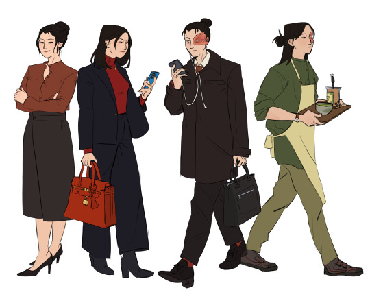
#because visuals
Text
if you all could see all the fanart i imagine in my head and never draw it’d blow your tits clean off
#shitpost#i have SO MANY ideas#you’d LOVE them guys#they look SO COOL in my head#yes they’re indistinct because I can’t really visualize things#but the concept is there
44K notes
·
View notes
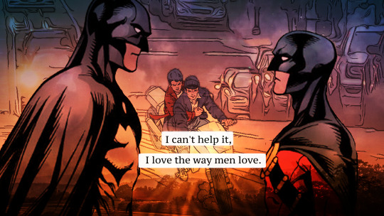
Text
Text:
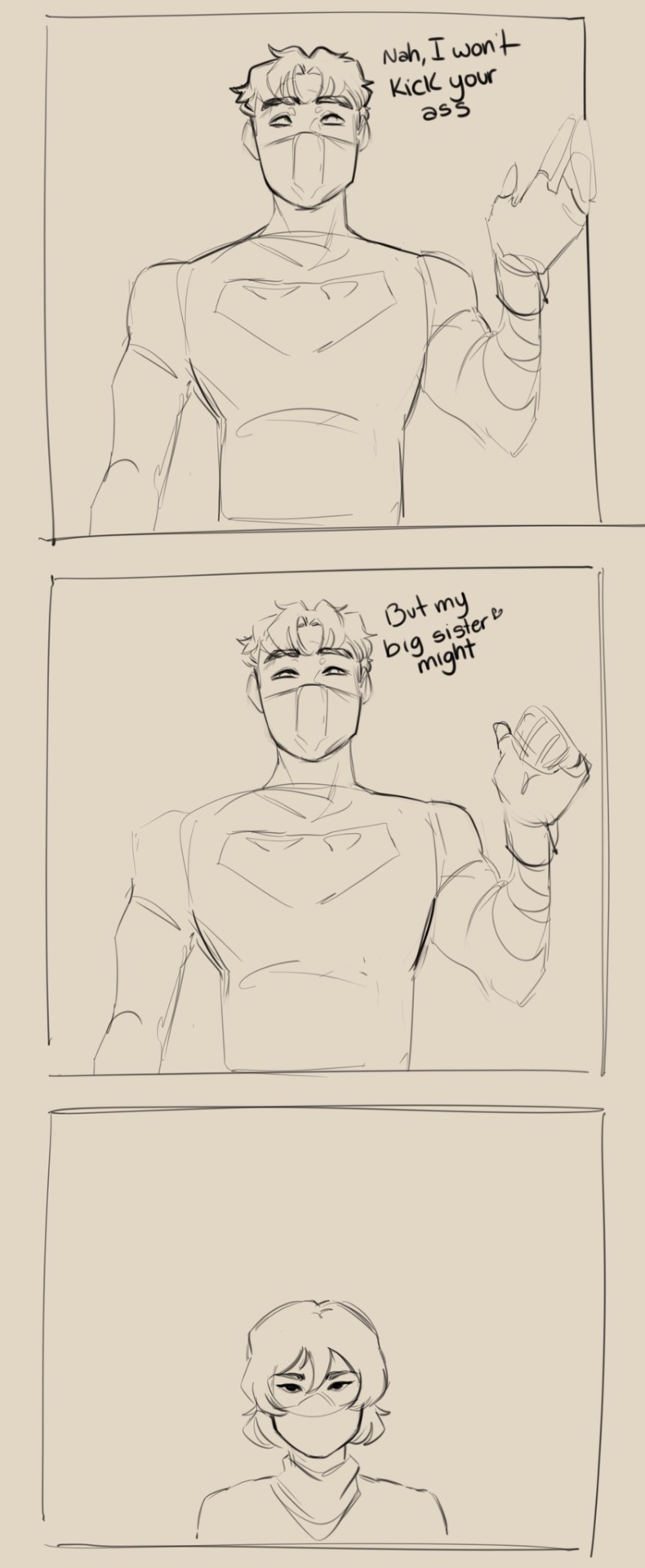
Jay: Nah, I won’t kick your ass
Jay: but my sister might
Based on this post by @thevanillahorizon
#quick sketch because I kept thinking about it and laughing hysterically so I needed a visual#dc#batfam#dc comics#batfamily#batgirl#cassandra cain#jason todd#red hood#my art#bats
11K notes
·
View notes
Text

Moomin plate. if you even care
#it’s a little smudged because I’m an idiot & wanted to see what happened if I pressed a wet sponge. that ☝️ happen#ceramica#my art#visual diary#moomins
7K notes
·
View notes
Text
TWO THANGS
when I say "love" with no descriptors, I don't mean romantic by default
when I say "art" with no descriptors, I don't mean visual by default
#relevant to my recent posts . everyone should live like this in my opinion but life isnt perfect..........#adddna#I'll admit I tend to give visual art examples because I enjoy making visual art meself#but i say art and mean writing and music and sculpture etc#and i say love and mean the general concept of humans caring about each other a whole whole extra lot
5K notes
·
View notes
Text
Me: Wow, the Netflix ATLA was better than what I expected. Indeed, it felt too rushed, probably because they were asked to do only 8 episodes like everything in the platform; but they were still able to capture the feeling of the original, and it was an enjoyable show. Not to mention the effects, those were so well done, especially Zuko fire kicks, I loved those.
Me: *checks internet opinions*
Me: Oh... I'm supposed to hate this adaptation.
#i don't by the way#i enjoyed every episode#loved the cast#loved the visuals#it obviously doesn't compare with the original#but that is because it is an ADAPTATION#impatiently waiting for more seasons#i want to se Toph!!#atla#natla#avatar the last airbender#avatar netflix#avatar aang#katara#sokka#zuko#iroh#ozai#azula#avatar
2K notes
·
View notes
Text


Failure
#sorry if it's ooc because this was inspired by my dream lmao#just trying to visualize it#sunday honkai star rail#robin honkai star rail#honkai star rail#hsr
1K notes
·
View notes
Text
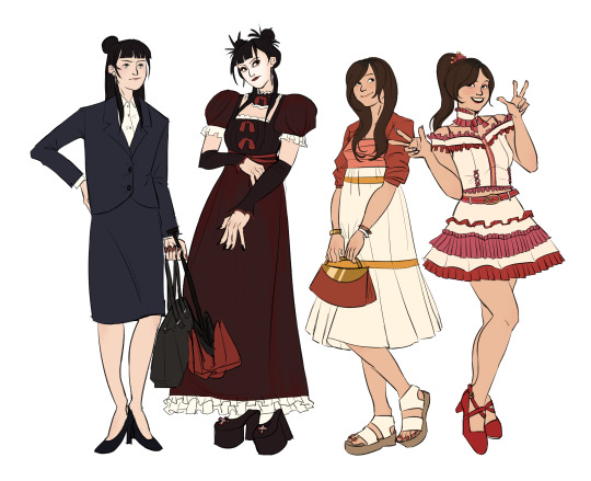
Part 1 of my modern avatar au, the fire nation
#avatar the last airbender#atla#atla azula#atla zuko#atla mai#atla ty lee#mailee#because they in messy yuri in this au#atla modern au#technically all of them work under ozai's company in some form#azula of course is very close to power zuko is at a lower position than her#mai is under her father's department which is in ozai's company#ty lee is in an idol group sponsored by ozai's company#mai visual kei girlie in her free time duh#zuko also depicted when he finally gets out of ozai's company and works at Iroh's cafe#ive got like a decent amount of lore built up so far around this AU so dont worry sokka katara aang toph and suki have places in this world#also its set on our earth so real life locations not the nations
1K notes
·
View notes
Text
I think 90% of my gripes with how modern anime looks comes down to flat color design/palettes.
Non-cohesive, washed-out color palettes can destroy lineart quality. I see this all the time when comparing an anime's lineart/layout to its colored/post-processed final product and it's heartbreaking. Compare this pre-color vs. final frame from Dungeon Meshi's OP.


So much sharpness and detail and weight gets washed out and flattened by 'meh' color design. I LOVE the flow and thickness and shadows in the fabrics on the left. The white against pastel really brings it out. Check out all the detail in their hair, the highlights in Rin's, the different hues to denote hair color, the blue tint in the clothes' shadows, and how all of that just gets... lost. It works, but it's not particularly good and does a disservice to the line-artist.
I'm using Dungeon Meshi as an example not because it's bad, I'm just especially disappointed because this is Studio Trigger we're talking about. The character animation is fantastic, but the color design is usually much more exciting. We're not seeing Trigger at their full potential, so I'm focusing on them.
Here's a very quick and messy color correct. Not meant to be taken seriously, just to provide comparison to see why colors can feel "washed out." Top is edit, bottom is original.
You can really see how desaturated and "white fluorescent lighting" the original color palettes are.
[Remember: the easiest way to make your colors more lively is to choose a warm or cool tint. From there, you can play around with bringing out complementary colors for a cohesive palette (I warmed Marcille's skintone and hair but made sure to bring out her deep blue clothes). Avoid using too many blend mode layers; hand-picking colors will really help you build your innate color sense and find a color style. Try using saturated colors in unexpected places! If you're coloring a night scene, try using deep blues or greens or magentas. You see these deep colors used all the time in older anime because they couldn't rely on a lightness scale to make colors darker, they had to use darker paints with specific hues. Don't overthink it, simpler is better!]
#not art#dungeon meshi#rant#i'm someone who can get obsessive over colors in my own art#will stare at the screen adjusting hues/saturation for hours#luckily i've gotten faster at color picking#but yeah modern anime's color design is saddening to me. the general trend leans towards white/grey desaturated palettes#simply because they're easier to pick digitally#this is not the colorists fault mind you. the anime industry's problems are also labor problems. artists are severely underpaid#and overworked. colorists literally aren't paid enough to do their best#there isn't a “creative drought” in the anime industry. this trend is widespread across studios purely BECAUSE it's not up to individuals#until work conditions improve anime will unfortunately continue to miss its fullest potential visually#don't even GET ME STARTED ON THE USE OF POST-PROCESSING FILTERS AND LIGHTING IN ANIME THOUGH#SOMEONE HOLD ME BACK. I HATE LENS FLARES I HATE GRADIENT SHADING I HATE CHROMATIC ABBERATION AND BLUR
2K notes
·
View notes
Text
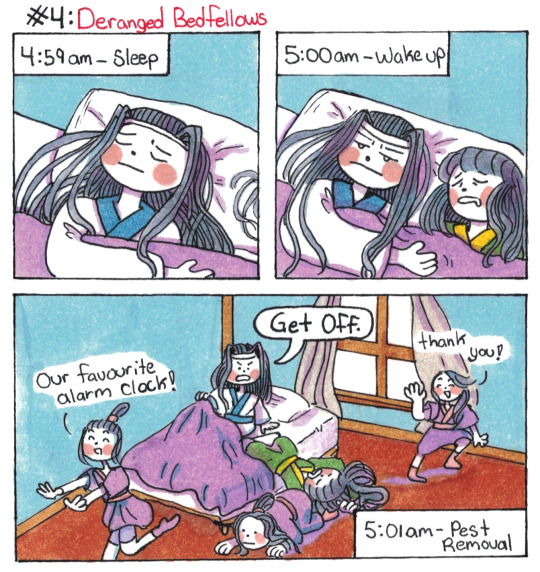
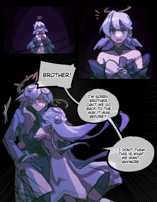
Lan Wangji Goes To Lotus Pier AU: Part 4: Deranged Bedfellows
(Part 1, Part 2, Part 3, Part 4.5)
#poorly drawn mdzs#mdzs#mdzs au#lan wangji#nie huaisang#Yungmeng Jiang training arc AU#This is the *first* part of what was supposed to be a much longer comic (LWJ's morning routine in full).#I'll finish the remaining part as a reblog to this post! I just think this is the funnier chunk.#Lan Wangji absolutely is the kind of person who has a perfect internal alarm clock for when it is time to get up.#He already has a dedicated sleep schedule. He is accurate within 10 seconds of 5am every day.#I think the Jiang disciples are most likely used to waking up around 6:00-7:00am#But the allure of having a guaranteed time keeper getting you up in the morning is worth the earlier hour.#I imagine they started outside lwj's door and slowly moved closer as the weeks went on.#Now LWJ has to cope with being way too warm in the night from all the extra body heat.#LWJ is not a fan of this but they scamper off immediately after he wakes up and they at least show initiative to follow routine.#NHS joins in only because he is a chronically heavy sleeper and needs this level of intervention to get up early.#His boldness would be a death sentence in the cloud recesses but here? Whole new game.#Yungmeng Jiang isn't a lawless land. It's just a land with different laws.#And one of those laws is to forcefully domesticate the catboy coded Lan boy through any means necessary.#Completely different tangent: I drew the thumbnail for this before I did comic 134. I then realized they had the same visual gag.#So I had to space this one out so it didn't seem like I repeated the waking up joke. That's my secret and all of you have to keep it.#And in my land the law is that snitches get itches (telepathically transfers hives onto your body)
975 notes
·
View notes
Note
have you ever drawn a deer?
Yeah occasionally! I like reindeer/caribou in particular, their antlers have such unusual and interesting shapes.


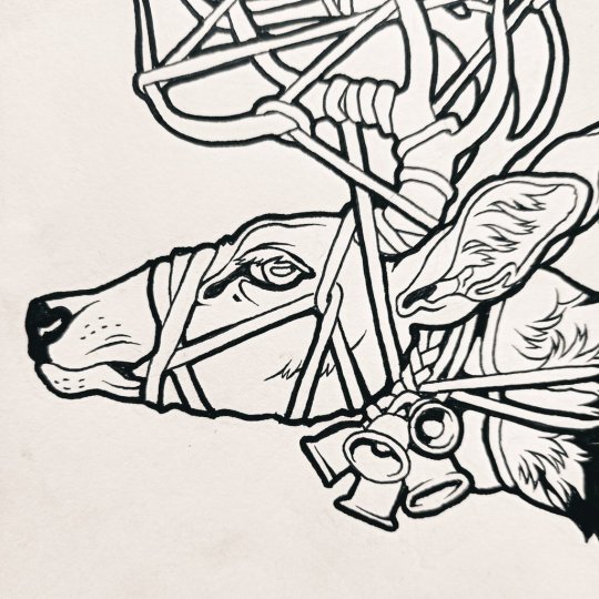


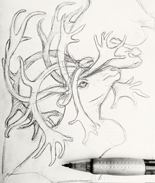


#answered#anonymous#own art#I should be depicting them more often because they're such visually pleasing and inspiring animals but canines are more fun#drawing cervines is always a stressful event#I have a lot of deer pieces stuck in wip limbo
1K notes
·
View notes
Text
once i was in a creative writing class in college, and in a bit of humor i wrote the line:
"Um," I said, eloquently.
And my teacher was so adamant that I had to remove it because "um is not an eloquent word, so it makes no sense" and i was like my brother in christ it's called Irony
#she was so so adamant about it like.#ma'am.#specifically i did it that way because i wanted to express the fact that the character felt particularly foolish#like their brain being all like 'oh nice job what an eloquent way of putting it dumbass'#but without writing all that out ya know.#but no it was 'wrong' and it had to be removed :/#creative writing courses have never done a damn thing for me tbh#i know there has got to be a better way to teach it so that it doesn't quash someone's creativity#but i have yet to find one that does so#people are so weird about writing as an art compared to other visual arts :/#lulu talks
846 notes
·
View notes
Text
You know what, while I'm doing hot takes. And this one may be obvious considering I'm actively contributing to hosting the Solarpunk Aesthetic Week event but like.
Dear everyone who's constantly deriding the aesthetic portions of the solarpunk movement/genre; do you just not understand that being able to visualize the future you want is immensely important to being able to work towards it? Being able to get other people on board with it?
When I first got interested in Solarpunk, it wasn't for the hot leftist takes about the top ways to dismantle the government for the people, or top tips on how to build your own solar panel apparatuses. What brought me in? Visions of a hopeful future. I learned and began to love the rest as I dove deeper into solarpunk circles, but there is no denying that my first intro to it--and likely many people's first intro to it--was via the art and aesthetic spheres. The term 'solarpunk' was literally coined to refer to the aesthetic movement, and we've been building up from there ever since.
'When are people going to realize the aesthetic parts don't matter and what really matters is praxis--' dude, the aesthetic parts do matter. Inspiring people does matter. Showing people visions of a hopeful future is immensely important, it's why so many people join this movement. We see glimpses of what a hopeful future could look like, through beautiful art or riveting stories, we're inspired by things like stained glass and organic designs and statues and fashion concepts--and then we think to ourselves 'how can we help make this future happen?' And we learn the praxis and we work towards the goals and we share it with others because that's just how we work.
Seeing isn't always believing, but sometimes in order to believe in something with your whole heart, it helps to be able to visualize what you want. For yourself and for others.
So yes. The aesthetic parts of solarpunk do matter. Thank you for coming to my TEDTalk.
#solarpunk#out of queue#ani rambles#honestly in my opinion if the younger me saw posts saying shit like 'the aesthetic part of solarpunk is stupid and unimportant'#that would have chased me away more than anything.#A movement like this? the last thing we want is to chase people away! We want people to get excited!#We want people to get on board eagerly and wholeheartedly!#Yes I'm sure some people got into solarpunk praxis-first aesthetic-later (or maybe even aesthetic-never)#But that's no reason to deride the people who got in here aesthetic-first praxis-later#solarpunk is beautiful BECAUSE there's so many ways to learn about it and visualize it#anyways everyone get hype about solarpunk aesthetic week a month from now!!!#honestly might delete later who knows
4K notes
·
View notes
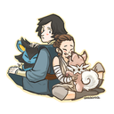
Text


poem: "accident report in the tall, tall weeds" by ada limón
#when i started fussing with this it was going to be a pitch for that never-made comic series where tim moves to blüdhaven#when dick is injured and helps out as nightwing for a while#but then it felt weird having visuals and no text#so instead you get this poem i'm very attached to#it's like mmm okay it's reductive bc this is not actually just the way that men love but the poem is so good <3#dick grayson#tim drake#dick & tim#my comic art but we are using the term ''art'' loosely#since it's just copy-pasted pictures from the comics + unsplash photos + layering to add outlines/lighting#all the comic book art here is by marcus to + patrick zircher because they are my favorites <3#so red robin + zircher's run on nightwing
711 notes
·
View notes
Text
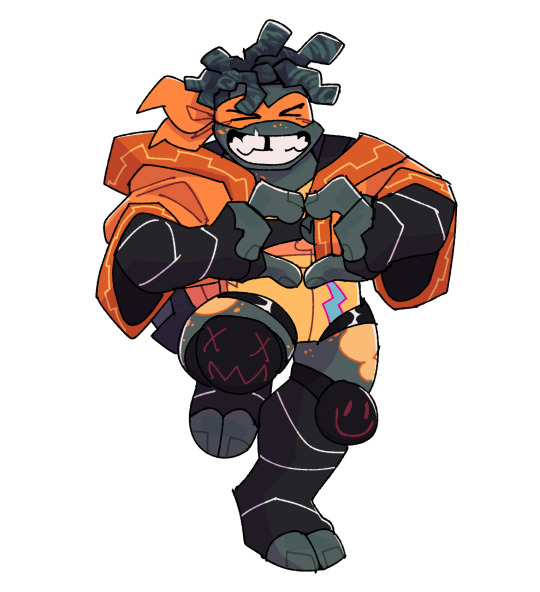
just wanted to say it's really awesome seeing the positive reception to chunky mikey LOVE YOU ALL 🧡🧡
#I WAS A LITTLE WORRIED BUT EVERYONE'S BEEN SUPER COOL he's very important to me#rottmnt#rise of the tmnt#rise mikey#rottmnt mikey#avepharts#number one reason for his design It Is Self-Care To Draw Your Characters Fat and it's fun and i wanted to#but also ! i think it's a really interesting visual contrast to apocalypse mikey (who's very bony) esp bc you'd assume mikey would live a#really hearty lifestyle. like i think f!mikey's figure is so striking to me because it feels so alien for him.#also! mikey does a lot of throwing and lifting heavy shit and in sports like deadlifting and shot-put athletes tend to have more fat muscle#and i think there should be more body diversity in acrobatic fighter characters#AND OF COURSE! he looks like raph <3#rot20mnt
2K notes
·
View notes
Text
Me: hm, I want something to put on the TV as background noise... Huh. Looks like YouTube is recommending something called The Last Unicorn. That's perfect, it's probably some old shitty animation that has aged poorly! I can watch it ironically!
Me, 2 hours later as the credits roll: *crying, cheering, buying the book, composing the songs*
Me, 2 weeks later: So I have compiled all of the quotes from the book that I think could make good tattoos, and also, HOW HAVE I NEVER LEARNED ABOUT HOW THE LAST UNICORN FUCKING SLAPS??? This gay-ass little fairytale fed my soul! Watered my crops! Transed my gender! Can't believe I heard of this story from youtube recommendations, of all places!!
#original#the last unicorn#tlu#peter s beagle#molly gru#schmendrick#schmendrick the magician#two of my favorite characters in anything right there in the center of the story! and I'm glad I saw the film first!#my reading ability has diminished due to trauma disability etc. but it seems like having a visual reference actually really helped!#no wonder i only ever want to read fan fic! turns out reading is not actually Superior to other types of Storytelling. it's just different.#to say otherwise is snobbishness I have been eminently guilty of in my life!#but like it is easier for me to consume tv and movies and that is fine actually. also that's why I'm doing a graphic novel lol#because i wanted to make something i would actually be able to read if i found it at a library. altho the audio book IS gonna be bomb#the audiobook is for visually impaired readers and anyone who wants or needs it! accessible stories for everyone! yeah!!#my gender was already transed but now I've gained an ADDITIONAL gender! which one? I'll never tell 😘#i am so powerful i have so much fuckin gender. my wife has no gender. and she is equally as powerful.#and also she has STUDIED THE BLADE#mostly zoro's blades from One Piece#normally YouTube recommends me shit movies like idiocracy or smth this is like if every day ur cat brought you a piece of rotten food and#then one day it brings you a BEAUTIFULLY ANIMATED TALE FEATURING MY BELOVED TWINK FUCK-UP WIZARD FRIEND AND MY ALL-TIME HOMEGIRL MOLLY GRU#and also it's soft and beautiful and funny and fucking weird!! i wrote melodies to the songs in the books on my ukulele
3K notes
·
View notes
Note
Everyone’s Tiresias designs now be like:

twinkfication: ACTIVATE
already brainstorming ab this

#people are saying that I can keep my design of him because of the lore and stuff#thing is I'll have a really hard time animating my old tiresias with a young voice when the song comes out#it's not that I think it's inaccurate for him to sound different than he looks#it's just that it'll be weird and confusing visually#gigi's asks#digital art#art#epic the musical#greek myths#epic: the musical#character design#epic the underworld saga
504 notes
·
View notes
Last Seen Blogs

hashtag-bitch
I'm that #Bitch.

sxnchihae-blog
never mind, kid

cowcat44
Cowcat44
alunasky-blog
Alunasky

heidirocksit
HeidiRocksIt