#bedow
Photo
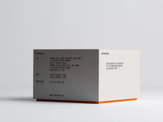
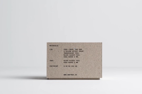
Bedow / GBGT Box / A Lovely Atmosphere / Packaging / 2023
143 notes
·
View notes
Text

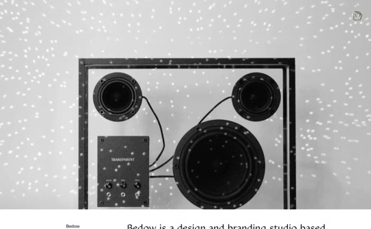
Bedow / Transparent / Visual Identity / 2020
8 notes
·
View notes
Photo

https://www.bedow.se/
#Bedow#design#studio#Stockholm#portfolio#typography#type#typeface#font#Bedow Head#Bedow Hand#2022#Week 47#website#web design#inspire#inspiration#happywebdesign
5 notes
·
View notes
Photo
Perniclas Bedow | Slanted Publishers
12 notes
·
View notes
Text
#kaina#music#playlist#bandcamp#burns twins#bedows#honey#r&b#pop#indie#electropop#soul#jazz#hip-hop#sweet asl.
1 note
·
View note
Text
Top Surgery Fundraising
Since my top surgery consultation is tomorrow I finally made my donation fundraiser so I can (hopefully) get it done by the end of this year
any reblogs or donations are greatly appreciated!! 🥺
#not art#mutual aid#signal boost#fundraising#top surgery#trans fundraiser#ftm#transgender#trans#surgery fund#fund
184 notes
·
View notes
Text

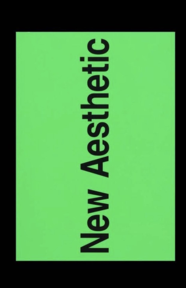
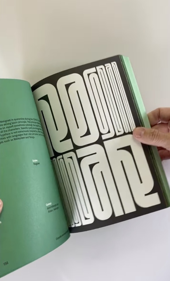
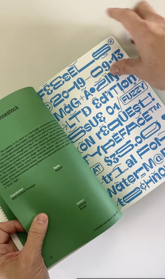
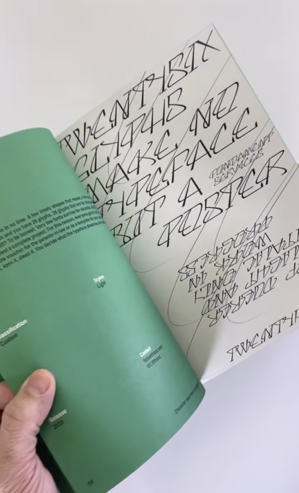

New Aesthetic 2: A Collection of Independent Type Design
www.draw-down.com
New Aesthetic approaches type design as an opportunity to create art: looking at type design with benevolence towards the experimental and process-based approaches. New Aesthetic finds potential in the unusual, identifying work that may point us into a new future of visual communication practice.
Contributors include 3, Quatorze, Alex Ortiga, Alexander Raffl, Alexandre Bassi, Alff Rosine, Antoine Brun, Antonio D’Elisiis, Ariel Martín Pérez, Arthur Schwarz, Awista Montagne, Baptiste Bernazeau, Bayonet Services, Bedow Design, Bouk RA, Brando Corradini, Carolina Festa, Charlotte Rohde, Christos Georgatos, Ciarán Brandin, Colin Doerffler, Daan Rietbergen, Daniel Hermes, Daniel Stuhlpfarrer, Daniel Wenzel, Davide Melotti, Dr. Martin Lorenz, Eleonora Šljanda, Elias Hanzer, Emilie Vizcano, Emma Marichal, Eric Lish, Fabian Franz, Fabian Maier-Bode, Fabio Furlani, Fatih Hardal, Felix Sandvoß, Floriane Rousselot, Frédéric Jaman, Gianluca Ciancaglini, Giuseppe Tangaro, Gregory Page, Han Gao, Hugo Jourdan, Ishar Hawkins, István Fazekas, Jack Halten Fahnestock, Jacob Jan Wise, Jake Dalton, János Hunor Vári, Javier Unknos, Jimmy Auger, and Jules Durand.
Edited by Leonhard Laupichler and Sophia Brinkgerd
Published by Sorry Press, 2020
304 pages, full color, 6.75 × 9.5 inches
instagram
#typography#graphic design#graphic design book#Sorry Press#experimental typography#New Aesthetic#type design#Draw Down#Instagram
46 notes
·
View notes
Photo
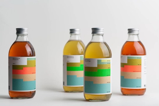
Bedow / Swee / Packaging / 2022 https://ift.tt/3z0E1Ou
30 notes
·
View notes

Note
skippidy baw bop bedow scat dad sat ada de deau doo de dow
this is what i'm talking about
1 note
·
View note
Photo
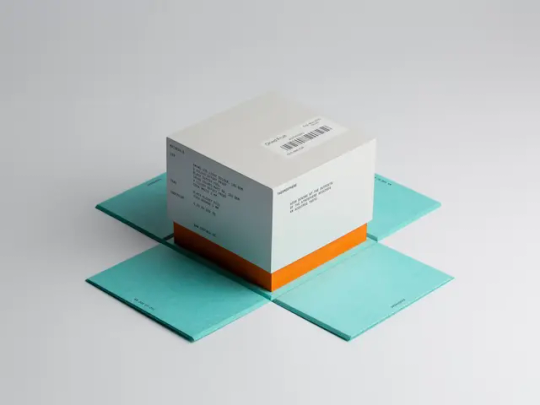
Bedow / GBGT Box / A Lovely Atmosphere / Packaging / 2023
32 notes
·
View notes
Text
Bedow / Gbgt Box / A Lovely Atmosphere / Packaging / 2023
0 notes
Photo
https://www.siteinspire.com/websites/4438-bedow
0 notes
Photo
10 notes
·
View notes
Photo
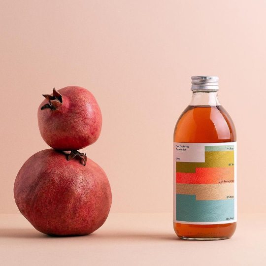
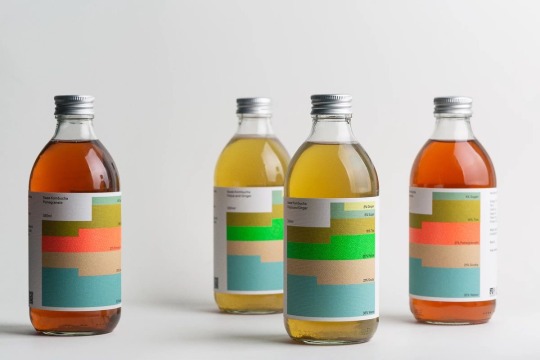
@bedowdesign . Brand new work! A design collaboration between @bedowdesign and @sweekombucha Swee is a kombucha brand born in the Georgian capital of Tbilisi, a city with a rich culinary and cultural heritage in its own right, deepened by a myriad different influences over the centuries. Swee brews its probiotic ferments from a careful selection of local, all-natural ingredients to create a range of refreshing drinks that are delicious and good for the gut. Swee’s brand identity is built around the tagline “100% natural”, to reflect the brand’s commitment to using local, all-natural ingredients. Visually, this is communicated through two different modular systems, one of which focuses on the drink’s unique list of ingredients and the other on the symbiotic nature of the drink itself; a word mark which comes in 10 different iterations and represents the bacteria and yeast from which a kombucha SCOBY is formed. The ingredient list forms the basis of Swee’s brand identity, taking what is typically functional information and turning it into a visually rich infographic system. Each ingredient is represented by a bespoke colour and pattern which combine to create unique chromatic graphics, representing the percentage value of each ingredient. This offers limitless potential for variation as the brand grows its offering and clearly embodies the brand’s tagline. The still life photographs builds on the brand’s infographic foundations, featuring the ingredients stacked according to their percentage values. Full case study on www.bedow.se #packagingdesign #branding #graphicdesign #logotype #kombucha #sweekombucha #swee #bedow #photography #stillife #feijoa #pomegranate #fermentedtea #scoby #packagingoftheworld #georgia #tbilisi https://www.instagram.com/p/Cb_0SsHDw_G/?utm_medium=tumblr
#packagingdesign#branding#graphicdesign#logotype#kombucha#sweekombucha#swee#bedow#photography#stillife#feijoa#pomegranate#fermentedtea#scoby#packagingoftheworld#georgia#tbilisi
2 notes
·
View notes
Last Seen Blogs

coolcaptainlee2
Cool Captain Lee

meowmeoemew
Liam!1!1!

grimg1assmirror
Grim Mirror

gg-brasil
gg-Brasil