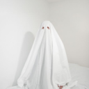
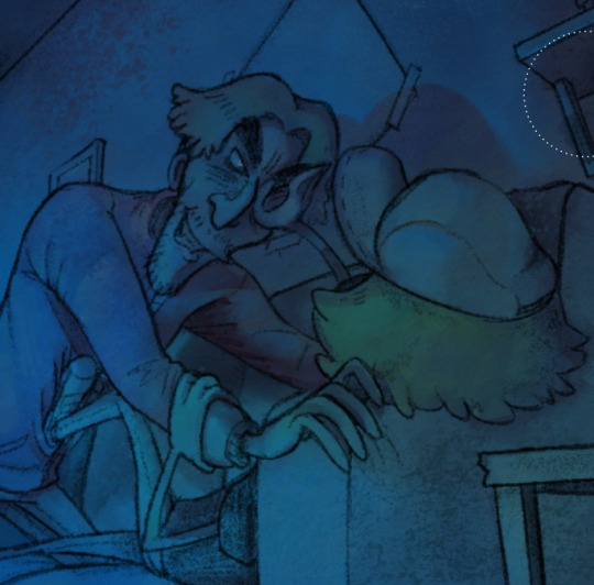
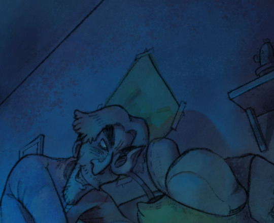
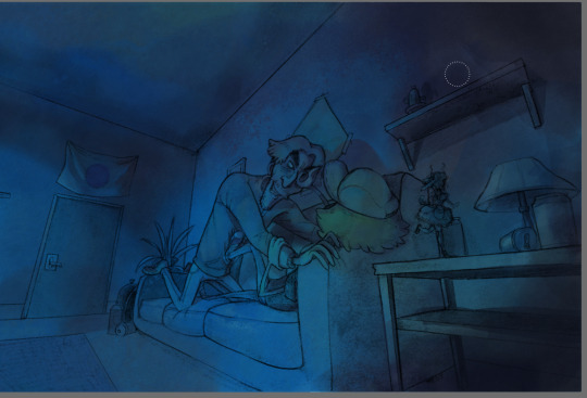
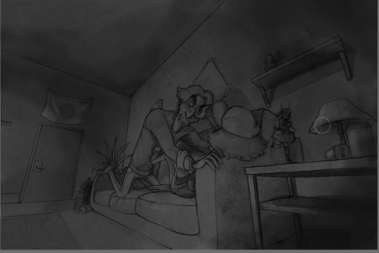
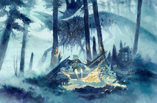
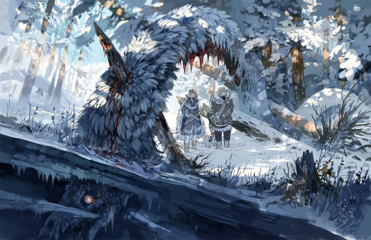
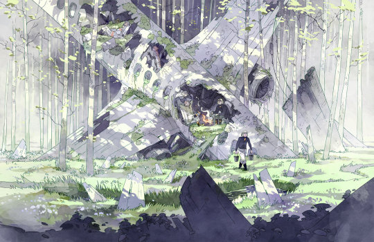
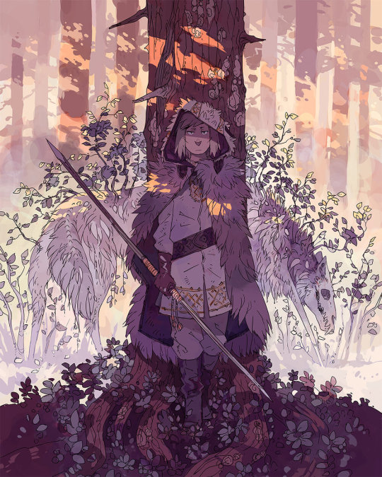
#been a while since I coloured with clip studio
Photo
And with colours! I spent way longer on them than planned and at first thought I hated it. But coming back to look at it after a break made me warm up to it. I think I’m just in a bad headspace right now, where I struggle to see the qualities of my own work. Hope I can break out of it soon!
#tiefling#druid#abyssal tiefling#circle of spores#dnd#d&d#dungeons and dragons#dndart#forest#fantasy#fantasy forest#digital art#been a while since I coloured with clip studio#and used bunch of new brushes#so being an experiment#it probably took extra long
708 notes
·
View notes
Note
I'm sure you've probably been asked this before but tumblrs search feature is wonk and I can't seem to find it
So I'd like to ask what program and brushes you usually use for your art
I've been using photoshop the past few years since I got free access to it through uni (gonna be switching to clip studio soon since I'm currently finishing up my degree!) and I use the same brush for near enough everything, it's the "kyle's drawing box - happy hb" brush that I'm pretty sure comes with photoshop and I use it for sketching, lines, colours, and shading! The only other brush I regularly use is "kyle's spatter brushes - pressure control 02" and I use that one for doing freckles
#if anyone has any tips for getting started with clip studio paint please let me know!!#it's been a long time since i switched up my digital art program so i'm gonna be messing about trying to get used to it for a little while#also i used to work with various brushes for lines and colour and shading but eventually i found i just liked working with that one brush
10 notes
·
View notes
Text
Where we headed Namjoon?
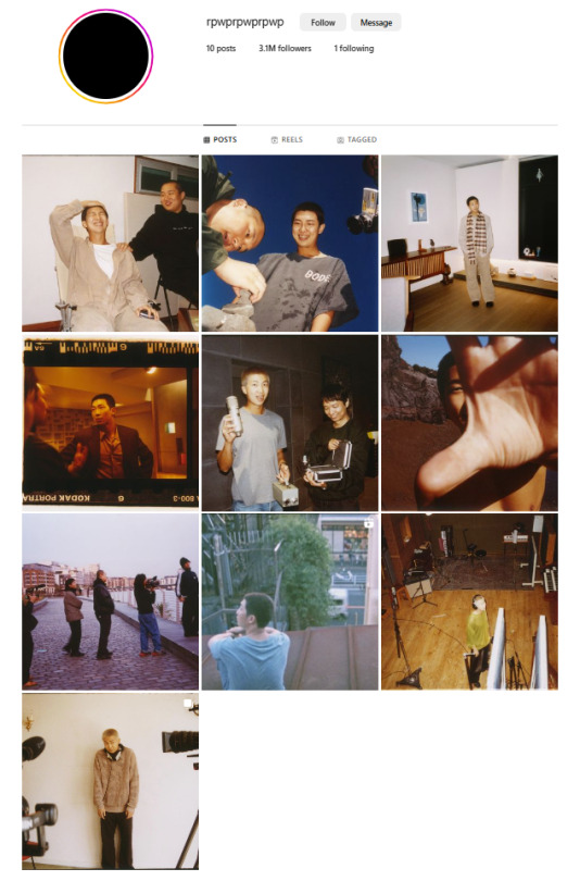
The rpwprpwprpwp account's first post was on the 23/11/2023. Kim Namjoon centre stage for filming, looking dorky and hesitant. Then a second picture of dead or dying sunflowers. Is this a music video or a final art school project? I can see Namjoon really embracing a project mixing art, film and music. Acting but in a heightened stylized way.


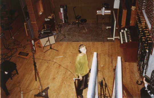
The 02/12/23 post showed him in a recording studio. Music yes, but is this his new album or something else?
On 04/12/23 there was a clip of him holding a bunch of colourful balloons. They provide an element of circus with which he doesn't seem completely at ease .
More filming (while singing?) beside the Han River on the 08/12/23.

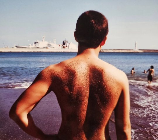
Then just before he enlists (10/12/2023) a shot taken at the beach

taken the same time as these photos from his IG (02/11/2023)?

But it doesn't stop there, on 19/12/2023, when RM is busy with basic training, there is another post from the studio.
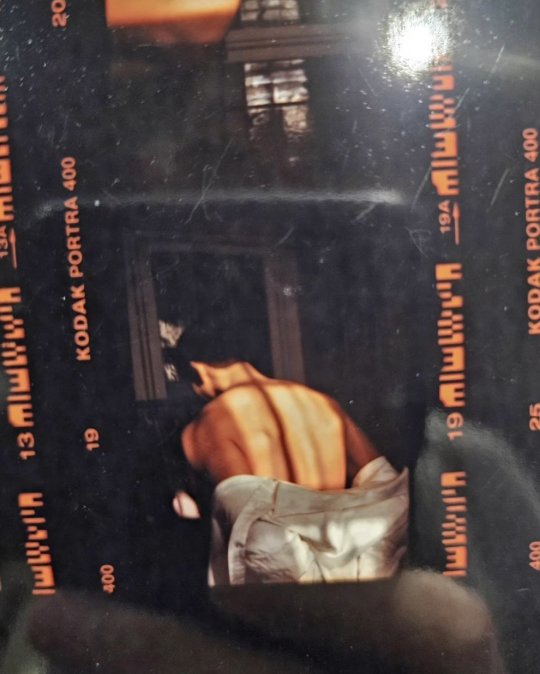
On 27/12/2023 there is a kodak portra photo with decor that evokes the gaudy styles of the 1970s.

It looks like it came from the same photographer who took these, posted on his original IG on 02/11/2023 and taken on his London trip.

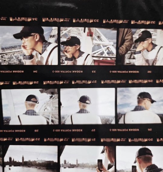
It reminds me of the 032c magazine photoshoot. Is it all related? I think it is. Look at the photo below - Creative Direction by San Yawn.

Since Saturday we have had three more posts. The first one on 13/01/24 looks like it was taken at Namjoon's flat. Someone seems to be directing him from behind the camera (see the left of the photo).

The second on 14/01/24 again filming on the beach. Who is that guy with him? None other than Balming Tiger Director San Yawn who also appears in the photo posted today (16/01/24)

Definitely a collaboration with the Balming Tiger Collective and they have been working on it for sometime, maybe since last summer.
Isn't this some of them seeing him off to the military last December?
Have they made some kind of arty music documentary that we'll see at Cannes, Berlin or the Sundance Festivals? Is San Yawn the creative director for the MVs for Namjoon's new album.
youtube
Remember Sexy Nukim, I wouldn't mind seeing visuals like these set against music Namjoon makes. He said he was going for something lighter perhaps with a bit of humour. Perhaps he found a perfect partner in crime for this project.
I get the feeling all will become clear very very soon!
Post Date: 16/01/2024
100 notes
·
View notes
Text
aid’s collection of neat art tricks
aka I wanted to compile all the neat things I’ve learned and picked up over the years across various sources; I wish I knew some of these, but they’re scattered across a variety of social medias and some from conversations.
of course, these are not a must and just have helped me! I just wanted to put them all in one place in hopes that maybe it’ll click something in someone like it has for me. c: I’m not the best at explaining, but I hope it makes sense!
some may use Clip Studio assets but can be replicated through other methods (or done by hand in the case of how I do my lineart colouring), but do keep in mind all of these are written with CSP in mind.
this is pretty heavy in images and gifs, and is quite long.
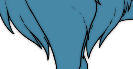
how to quickly fill your outlines (CSP tool)
this is a CSP specific method, but this tool has been my absolute saviour for making colouring so much easier for me (even if sometimes it still does require me to manually fill in some holes or erase sections). the bulk of how it works is explained in the tool as well, but I’m going to show a gif example for myself!

you have to make sure your lineart is set as the reference layer to ensure this tool does work; with messy outlines (like my own) you may need to manually fill in holes as can be seen in the gif above; with cleaner outlines, you don’t need to worry as much, but you may have some bleeding out of the lines for places that are a bit too close together (as you can see below, those areas would need to be erased).
the tool can also help to close ‘gaps’ between colours!

I usually tend to have a ‘base’ colour that I just clip a folder of flat colours to, so it doesn’t bleed outside of it, but I’m also a nested folder freak to make sure everything is cleanly separated and doesn’t get ‘destroyed’ while I work on it. this tool just makes it so much easier to get that base down and just jump right into adding flats.
adding a little pop of depth
this one is thanks to a clip studio article itself where I saw it from, and I’ve been using it in practically all my drawings so far; all it is, is a simple blue-ish overlay layer with some muted yellow/red shading to give it a bit of a “3D” effect, for me I enjoy more that it adds a bit more colour variation underneath (usually lowered to 20-50% opacity, depends on the drawing)
the article definitely explains it a bit more nicely, but this is an example of having it at 50% opacity over one of my drawings
making your lineart feel less ... boring?
of course, boring is subjective from person to person, but I’ve always found my lineart to be too boring by itself

like this is fine, but it’s missing some kind of oomph. there are two tricks I use when it comes to sprucing up my lineart: using the watercolour edge effect in CSP, and a combo of coloured outlines + black outlines
first things first, the watercolour edge option: by default it’s a bit too strong, so I usually find the sweet spot to be at 1 range and with an opacity of ~20


this can be replicated through duplicating your lineart, and if the option is available, using gaussian blur on the duplicated lineart to achieve around a similar effect.
coloured outlines!
when it comes to colouring my lineart, truth be told I do use a wonderful auto action for it which can be found here, and there is this alternative one as well (which i’ll be trying now!!!).

it is a little different since it uses the flats, vs the one i use which just requires you to have the lineart selected, but as you can see it is a very quick way to colour your lineart ... this isn’t perfect by itself and will require you to have your flats finished.
this is my process: outlines done, autoaction, cleaning up by adding black outlines where they’re required and fixing up sections where the colours don’t quite make sense (like the sleeve area).

as you can see with the last drawing, I also tend to add a black outline around the outside of the piece, I personally found I really enjoy the contrast of the dark outside and coloured interior lines, as you can see in this little sample; it just adds a bit more visual interest for me!

unfortunately, outside of manually doing it, I cannot think of alternatives for this specific action (perhaps duplicating + flattening all your colours and placing it on top of the lineart may be a start)
crunchy textures and pretty colours ...
the texture i use on top of my drawings can be found in this CSP asset pack (though the marker brushes themselves are very lovely, and I’ve used them myself). this can be replicated through adding perlin noise, but I just find this texture to tickle the good spots in my brain, and it’s why I use it on pretty much all my drawings for some additional visual goodies.
yes, i am also a person who uses gradient maps. I usually tend to use them as finishers and more subtle ways to add more colours and variations to keep my shading from looking too flat, but they do have to be handled with care lest they become overwhelming. vampbyte does a wonderful introductory thread on gradient maps, how they function, and how they can be used.
they can be found through layer > new correction layer > gradient map -- or at least that’s how i usually access mine!
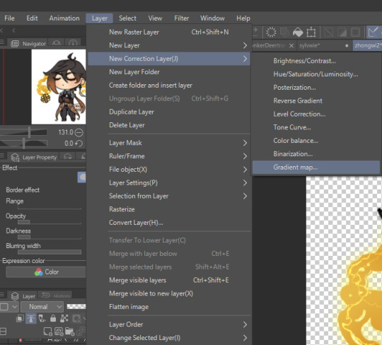
i often place mine at 20% opacity on the colour mode, though soft light and overlay also do their own fancy things! really depends on which you like most and works with your piece.
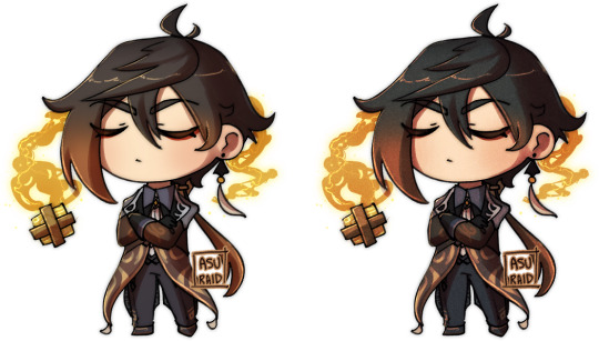
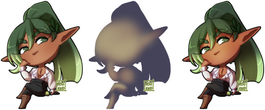
an example of my chibi w/o texture and colour gradients vs the texture + colour gradient ... as you can see it does change the colours quite a bit, so usually it does take me a bit of playing around to find a colour gradient I like (I’m a gremlin who has downloaded a lot of them) and to play with opacity values.
and to top it off, here’s the combination of all of these vs one with them all off.

how i personally shade (multiply layers)
i usually tend to either go for multiply shading over the whole drawing using one colour (and a few lil tricks to add more depth) for smaller pieces, or hard light shading for bigger and more complex pieces since it has more value depth.
my multiply layers are usually just one or two layers using around the same off-purple shade (though i shuffle it around pending on how it looks on the drawing

the second layer is a duplicate of the first, and i usually use an airbrush to either erase or expand areas to give it a softer shade (as you can see in the gif, the second layer is definitely missing chunks), or to add a different colour to the shading that isn’t the off-purple
how i personally shade (hard light mode)
this one’s a bit more of a mouthful, and thanks to a friend who introduced me to it! my second method is hard light shading, which, at its simplest, is greyscale shading and feels like it leans more into ‘painting’ your shades (as it works best with a brush that blends colours).

although I’m obliterating my own art here, it’s to show that most of your work will be in the greyscale/muted colours! it is inherently a non-destructive method of shading, so any changes to the colours underneath will maintain the shading regardless. normally I do have to duplicate the layer a second time since I don’t go too close to black shades, and it gives me a bit more control over how ‘hard’ I want my shading to be.

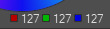
the middle is your ‘neutral’ shade, aka what you want to fill your entire hard light layer with, then your lighter greys will be your highlights, and darker greys your shading!
alternatively, you’re looking for this when you want to find your ‘neutral’ shade.
once you got your hard light layer filled with your base/neutral shade, grab your favourite painting/blending brush and go ham!
as a heads up: when it comes to skin or warm colours in general, you may need to get out of the greyscale range otherwise it will look too desaturated and grey, as you can see below. for any other tones, the greys usually work well.

as of the moment, I think that’s all the little tricks I use when doing art, I hope it helps you guys!
(unless I somehow remember something else, but these are usually my default tricks I use for everything)
#art tutorial#clip studio paint tutorial#digital art tutorial#clip studio paint#tutorial#art tricks#mine.txt#10#20#50#100
222 notes
·
View notes
Text
JUMP GIGA Winter 2023 Special Interview with Yūto Suzuki-sensei!!
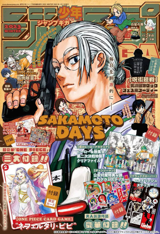
First JUMP GIGA 2023 cover to commemorate SAKAMOTO DAYS reaching its 100th chapter milestone since its serialization!!
In-depth discussion with Suzuki-sensei about his life and work, so on and so forth!!
Please tell us the things that you paid particular attention to when drawing the cover illustration of this GIGA issue.
Suzuki-sensei: The chosen pose is stationary, but I also wanted it to look intricate so I made the silhouette not too thin! I wanted to draw attention to his eyes, so I placed the gun next to his face and chose a strong colour (to create contrast)! I drew the texture more firmly than usual to give off a more powerful effect! I wanted to highlight his skin complexion so I deliberately chose cold colours for his shirt, hair, etc. but later I thought it looked a bit dull so I added the red light for the barcode scanner as an accent colour.
—
A must-see exclusive interview for readers of SAKAMOTO DAYS, and aspiring manga artists!
Suzuki-sensei Profile
Birthday: July 6
Hobbies: Basketball
Special skill: Handicraft
Favourite manga: Hunter x Hunter (Note: This is additional, known info from the one-shot.)
First debuted in April 2019: Published Garaku (骸区) on Jump Plus.
September 2019: Published Locker Room (ロッカールーム) on Jump Plus. In November of the following year, it received a live-action drama.
December 2019: SAKAMOTO •坂本• (SAKAMOTO -サカモト-) was published on Jump GIGA 2020 Winter. (Note: FYI, this was kinda a prototype of SAKAMOTO DAYS.)
SAKAMOTO DAYS serialization commenced in Weekly Shonen Jump 2020, Issue No. 51. It has become a popular serialization today!!!
Suzuki-sensei, you were once featured in GIGA. Please tell us if you have any memories from that time.
Suzuki-sensei: There was that one time when I tried using Clip Studio Paint, I realized that there were many missing tones when I pasted the image. [Turns out that] I did not display the tone area. I remember the person-in-charge told me, “Full analog is better.”
—

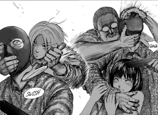
Top Column: Suzuki-sensei published SAKAMOTO•坂本• (above photos) in Jump GIGA 2020 Winter after being published in Jump+ twice!! The main character Sakamoto, his family, Shin and other characters have appeared in the series since then. The concept of the story is the same as the serialization version, but there are several differences such as Sakamoto being a supermarket store clerk, and he [and Shin] even killed robbers, so it’s interesting to see the difference!!
*Shin’s comment: This version of Sakamoto-san is so cool~*
Please tell us what’s the biggest growth or change you’ve experienced between when you were drawing one-shots and now.
Suzuki-sensei: When I was drawing one-shots, my stance was that I would just draw whatever I thought was interesting, so the readers could see what I wanted them to see. But now, I always think about how I could entertain the readers, and how I could make everyone find [the story] interesting. As for [my] growth, I’ve been able to use Clip Studio Paint much better now.
Do you have any advice for the new and upcoming aspiring manga artists on how to create a good one-shot?
Suzuki-sensei: I think that “attention-grabbing” and “page-turning” are key elements in a one-shot! It is important to have this thought in mind while you’re drawing - “This one’s interesting!” - and whether you can really draw that or not. It’s also very important that the reader is able to get on board with the story just because it interests them. Readers will tend to notice if you are focused only on making everything nice and neat or if you’re just summarizing things up. After all, these elements are intended to reduce the “stress of reading.” It might sound weird to make [your story] more exciting just for the sake of attracting people to read, but I think that is one good tactic for competing in a one-shot contest!
*On the next page, we will learn more about Suzuki-sensei!*
Top Column: You can tell from reading Suzuki-sensei’s debut work Garaku, that he’s a mangaka who loves manga and movies! The carefully-drawn backgrounds and elaborate camera work are one of Suzuki-sensei’s strong points!
Please tell us how you became interested in drawing manga and how you chose to pursue this career.
Suzuki-sensei: I was worried about my future career path when I was graduating from my graduate school. But then I came across Katsuhiro Ōtomo-sensei’s manga, Dōmu, which helped develop my interest to become a manga artist.
Are there any other creators or works that you feel have influenced you as a writer?
Suzuki-sensei: I really like the manga written by Katsuhiro Ōtomo-sensei, Takehiko Inoue-sensei and Hiroya Oku-sensei. As for movies, I love the director Christopher Nolan.
I heard that you studied Japanese painting. Does the knowledge you acquired turn out to be of use when drawing your manga?
Suzuki-sensei: I think that it is mainly useful when it comes to composition and form. Japanese painting focuses on the concept of creating a beautiful arrangement of shapes within beautiful compositions, and I always keep that in mind with my work. In the near future, I wish to draw more Japanese-style illustrations.
Please tell us about your manga work process and the tools you use.
Suzuki-sensei: I use an analog pen for drawing the characters. The solid colours, sound effects, effect lines, and backgrounds are digitally drawn by my assistants. I use a Zebra hard G Pen for pen work and inking, and also a digital software, Clip Studio Paint!
Bottom Column: The Ferris wheel scene [Sakamoto vs Boiled], which ranked 3rd in the “Spread Campaign” poll, and the coloured single-page illustrations also portray the balance of the margins, cool silhouettes and compositions!
—
Top Column: The world of SAKAMOTO DAYS features characters with many gaps! From the strongest old man, Takamura, to the handsome but merciless Nagumo… The intense gaps are important to highlight the character’s individuality!
(T/n: “Gap” -also known as gap moe- refers to the contrast between one’s appearance and personality, or the difference between someone's actual personality and from first impression you had of them.)
How did you come up with the idea of a “retired assassin”?
Suzuki-sensei: First of all, I thought the idea of fat people being insanely strong is fascinating. So I asked myself, why are they fat? → Because they retired. Why? → Perhaps they got married or something? And that’s how I ended up making it.
Retired Sakamoto’s plump figure is cute, but it is an unusual character design for the protagonist of a shōnen manga. Please tell us the story behind this “fat assassin.”
Suzuki-sensei: I like characters with strong gaps, so I combined some elements from the two extreme opposites, such as the strongest old man and the strongest fat guy. And the result is that I found it more exciting to draw the strongest fat guy. Back then, I wanted to do a one-shot anyway, so I was focused on the story to make an impact. I truly never expected for it to get a serialization. I never modeled my character after anyone but later on when I learned about the movie “Enter the Fat Dragon”, I thought to myself that they are rather similar.
In SAKAMOTO DAYS, there seems to be many unique action ideas, such as Sakamoto repelled with a cough drop and fights inside the trains. How do you come up with such ideas?
Suzuki-sensei: Ever since I was a kid, I’ve always dreamed of absurd action [sequences]. Even in movies, one could wonder how they'd never think about doing this kind of action sequence or direction, and they may even ask themselves, “Do battles even occur in a situation like that?!” I like the kind of direction which would take the audience by surprise!
Bottom Column: One of the major attractions of this work is the depiction of powerful battles! It’s because the locations are familiar to the readers, and the battles are realistic and powerful beyond one’s imagination. It’s important to narrow down the situation in order to bring out the intensity of the battles!
—
Many attractive side characters appear in your series, such as Shin and Lu. How did you come up with such characters?
Suzuki-sensei: Sakamoto is fat and a man of little words, so I figured he needed a handsome sidekick. During a conversation between the two of them, there was this stuff, “killing in [your] imagination.” I wished to portray that and that’s the reason why I made Shin a clairvoyant. He gets along well with the quiet Sakamoto and they surprisingly made a good team. As for Lu, I initially wanted to draw a battle with a Chinese assassin, and in the course of that, she would show up as a pitiable heroine. [I guess] in my case, I often have a “I want to draw this kind of development!” or “This is how I want the story to unfold!” goal in mind, so the characters are born in the process due to that.
*Lu’s comment: So that’s how I was born, huh~*
Among the characters in your work, is there any character that is particularly easy or the most difficult to draw?
Suzuki-sensei: I don’t have many characters that I find difficult to draw but there are times where they do look alike. So I tend to be careful with that. Gaku is a character that I can draw easily among all the characters. He is someone who doesn’t depend on others and pushes forward on his own path, and I admire people like that, so I enjoy drawing him.
*Gaku’s comment: Ahhh, I see.*
Please tell us your favourite scene from Volume 1 of the manga.
Suzuki-sensei: I like the scene where Shin jumps off the roller coaster in Volume 1. I drew it in such a way so that the readers would be able feel the floating feeling during that scene whilst they're reading. When I drew that scene, I thought to myself that I might be good with drawing action scenes! I remember getting a positive feeling [from it].
Bottom Column: A scene that captures the moment Shin jumped off from the roller coaster – from various camera [angles]! It is important to capture the cool moments in powerful action scenes, such as when Sakamoto tried to punch while disassembling a gun, or when Sakamoto approached the enemy from behind!!
—
Top Column: One of the charms of the work is that it will always make you laugh!! In order to make the reader want to meet the characters and experience their world, it is important to make the story “easy” to read! Despite being a world where assassins are rampant, it still seems like a fun world [to be in] and that’s the charm of this work!
Your one-shots Garaku and Locker Room both have a darker worldview, whereas your serialized SAKAMOTO DAYS is a shōnen manga with comedy and action elements. Is there a reason why you decided to go with this genre?
Suzuki-sensei: It’s easier to make a dark story if it’s a one-shot. But with serialization, I thought it might become potentially harder, so I decided to make the most stress-free manga that I could draw and read, and that’s how this kind of setting came about.
Do you already have the ending of the story in mind, or have you not decided it yet?
Suzuki-sensei: Yes, I have already planned a definite conclusion in mind.
Finally, SAKAMOTO DAYS has reached its 100th chapter. Could you give a final message to our readers who are reading the story?
Suzuki-sensei: The series is only able to continue into a serialization all thanks to the readers! I cannot thank you enough. Thank you very much! I’m also very happy with the fan letters that I’ve received. Please keep sending them. Please continue to support SAKAMOTO DAYS!
*Sakamoto’s comment: Thanks for reading this far. I appreciate it.*
*Over 2.3 million copies sold!! Volumes 1 to 9 are on sale now!!*
fin.
#SAKAMOTO DAYS#Jump GIGA 2023 Winter#サカモトデイズ#interview#official media#yūto suzuki#yūto suzuki exclusive interview#jaen
23 notes
·
View notes
Note
I love how not only you draw the Mario characters in a beautiful style (especially Bowser ! His hair, his eyeshadow, he's absolutely fabulous <3) but you can also draw incredible backgrounds ??
I could stare for hours at that large panel of Bowser's throne room. So many details, such incredible colours!
And of course the comic itself is amazing <3
Thank you so much!! Drawing human Bowser is super fun for me even after all this time. Right now I'm practicing really hard to draw Bowser's koopa form better because I will be drawing it a lot in the sequel.
I really really recommend Clip Studio Paint if you're a digital artist. They have so, so many things that help with making comics. Their EX version has extra tools, they have an entire community and shop with brushes, assets ect.
Once I switched from Photoshop to Clip a while back I learned a lot more and have been having way more fun drawing.
I've also been watching more YouTube videos on the art of story telling in comics, paneling, and act structure. I really, really want to do the best I can and have found that making comics is a huge learning experience every step of the way but also very very fun. And the Mario fandom is so fun to draw for. There are so many different ways you can take a story within the mario universe, especially since there are so many different games to use as inspiration.
10 notes
·
View notes
Text
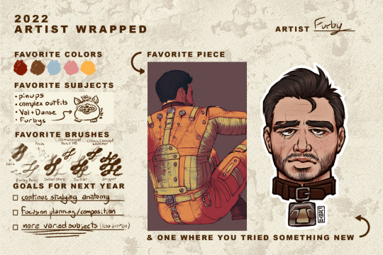
Thank you so much @bokatan and @h3raklion for the tag!
I can tell this is going to become a patented Furby wall of text™ so I'll just throw in a cut now. tl;dr: I love you all and i draw danse way too much
This has been an interesting year mostly in that its my first time posting personal art online in, what, 7 years? I stopped doing this kind of drawing shortly after high school. I picked up painting flash and have been focusing on my tattooing since then. In that time I never did any digital drawing or character drawing until 2 years ago this month, when I drew Val for the first time.
I was terrified to post anything anywhere, I think I posted one piece to reddit, but besides that I kept everything pretty private until April of 2022. I originally made this blog as a place to silently post my drawings and screenshots while providing a sort of devlog of my mods for my own records, and didn't think I would be noticed. I didn't realize people tracked the paladin danse tag, lol!
I'm really glad for all the people I've met through here, I never would have kept this blog up if it weren't for the wonderful messages from all of you guys. So much of my art, both in subject and execution has been influenced by the other users I've had the pleasure of interacting with and I hope to keep it up this year!
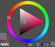
You all know I mostly just draw Val and Danse, and this is the palette I use for most things:
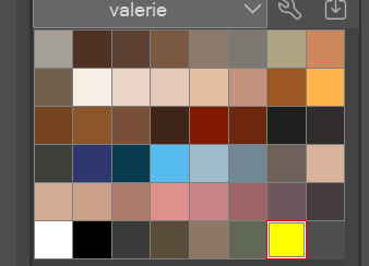
These are all pretty drab, I use different of blending layers and photoshop adjustments to get the colours how I want them at the end.
I usually try to use different brushes in each of my drawings, but these are the ones I come back to most often. The first one is a variant of one of these brushes, I modified it to change size based on direction and tilt. I used the brush almost exclusively until august and its still my favourite for quickly laying out forms and values. I use this one for freckles. The rest are some of my top picks from True Grit Texture Supply, mostly from Chromagraph and Monomania.
I'm glad I was able to really get into drawing this year, and going through my folder I'm pleased with how my anatomy and faces have improved. However I am disappointed in how much of it is just the same ginger fuck. I'm really stunting my growth by not varying my subjects, and now that I'm more comfortable with the tools I want to push myself to actually. uh. try. Put in the effort to make art that says something, tells a story. Less single characters floating in blank voids. More people interacting, scenes, environments. I also really want to get back into digital painting, I used to be really into digital painting and in theory know how to do it. I'm going to try and dig out that old knowledge lol.
Despite being bit bland, and having some glaring errors that still bug me, that Danse drawing is still one of my favourites. I think I spent at least 8 hours on it. I was dealing with some personal issues at the time and just really wanted to scratch that brain itch that the bos knight uniform gives me. It's stupid, I hate it, I can draw it nearly completely from memory by how often I'm looking at it.
The 'tried something new' panel is difficult because I feel like a lot of my recent work has been pretty stagnant. It's all done with the same technique, same palette, same boring cel shading, same layer order, boring. This is one of the few times I did any proper digital painting, and tried to adapt the looser style that I use when I'm drawing in analogue mediums to my digital work.
I just talked about art here and not mods because that would be a whole other wall of text. But it would boil down to: love to do it, no time, and expensive.
Also, if anybody is interested, I do my drawing in Clip Studio Paint and Photoshop on a Surface Laptop Studio.
39 notes
·
View notes
Text
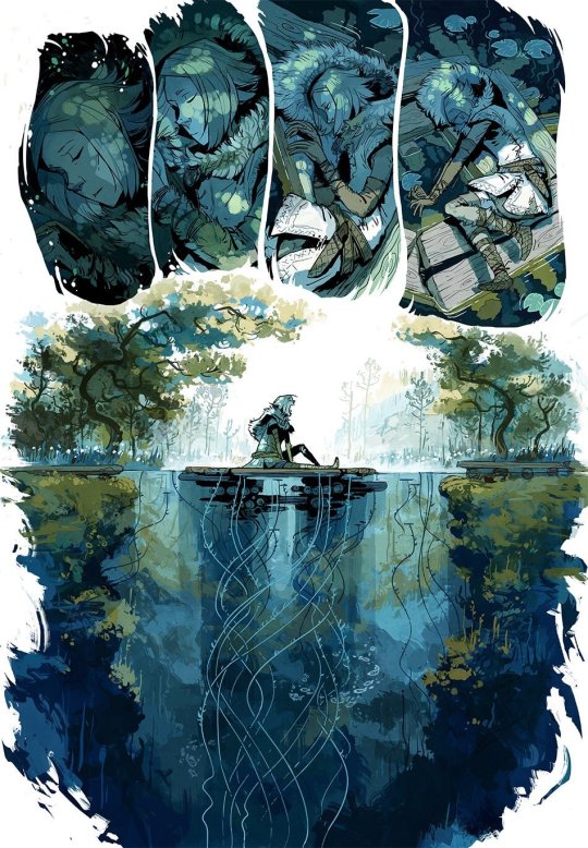
post one
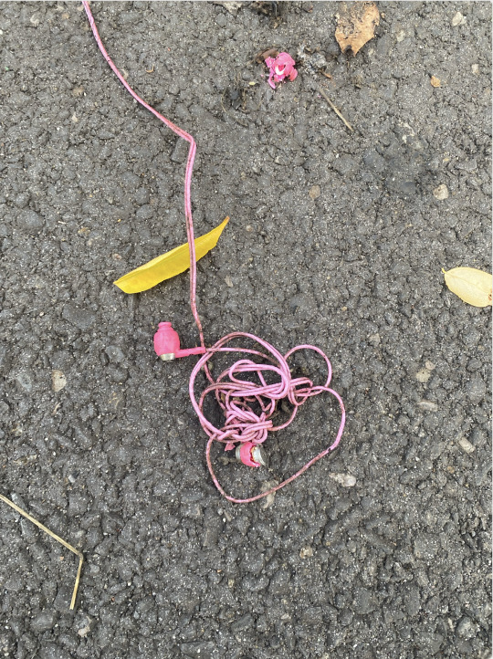
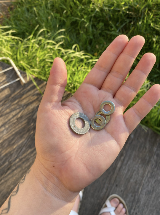
The other day I went on what I have since coined a "trash-walk" which involved me meandering around my neighbourhood, taking my time, looking for any little discarded treasures that caught my eye – objects that possessed a certain cuteness, or had the potential for transmutation, or both. The area I live in is pretty great for this type of thing, I live parallel to a train station + train yard where they are in the process of building a car park, plus there is a charity bin which is always overflowing and has basically just become a dump site, not to mention that it seems to be hard rubbish day like, every other day. I came back with some good finds: a tangle of pink earbuds that I had passed on my way to the station that morning, a cute ghost bucket from halloween that was haunting some bushes, faded blue rope, a couple of washers, clippings of wires from the construction site in assorted bright colours, offcuts of wood, etc.
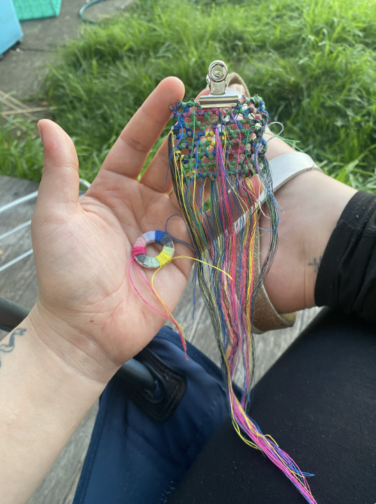
This walk and the objects I found during it gave me some new direction for my structural work for class. I had been experimenting/playing around with some metal offcuts that I gleaned from the bins in the jewellery workshop. I was particularly drawn to the perforated bits of metal. I started sewing into the holes and wrapping the positive space in an attempt to make patterns and blocks of colour. My approach was really loose and I was letting my intuition guide my hand. I've been having so much fun with this process – I find sewing so meditative and relaxing, kind of like a form of stimming. It's funny, I find it much less stressful than drawing or painting. I've been doing it on the couch, in bed, on the train, while hanging out and working alongside my friends their studio. I think it even helps me focus while listening to other people talk.
I wonder why sewing feels so much more relaxed and approachable to me than drawing and painting? I suspect it has something to do with the Western hierarchy of art and the devaluation of "craft"...but these are bigger topics to unpick later...I'm just so glad to be enjoying making so freely and often at the moment. Anyway, this is what they look like so far:

2 notes
·
View notes
Note
How'd you edit the photos on for your bracket? I'm trying ibis paint but it's incredibly hard trying to get them to be the same size
I use clip studio paint and have for a long while, so I’m not sure how other programs might handle these features! But if you mean the actual images on the bracket rather than the individual vs. images, my process was:
Find official art, preferably large and high quality, of the couple together and paste it into csp
Use the select rectangle tool, holding shift to keep the length and width even, to make a square focused on the image’s subject, and then use the crop tool to crop it to that square
save these square images at full size
To add the images to the bracket, resize the square image to the desired size (mine have been I think 100 px -> 200 px -> 250 px -> 300 px -> 400 px as they’ve advanced in the rounds)
copy/paste the image at that size onto the bracket image, but do not save the original image file at this smaller size. this way, you can just resize the same image each time, so you won’t lose quality by having to upsize a downsized image later
Use the move tool to put them where you want them on the bracket. I’ve never actually figured out how to work snapping on csp so I’ve just made them approximately even by eye, but if ibispaint has good snap that would probably be helpful here
Save the bracket as a .csp file with layer info intact so it’s easy to edit later
when they are eliminated, I change the colour mode on the layer with a couple’s image on it to grayscale. obviously not necessary, but that’s how I like to do it
I have been using image editing software for over 10 years now so since I’m not sure what your skill level is I’m not sure how useful or understandable these instructions will be. I’m also not at my computer (cat on my lap incident) so I can’t provide explanatory screenshots right now. but let me know if you need any further advice and I’d be happy to offer it, and if anyone reading this is familiar with ibispaint, I’m sure your input would be helpful for anon as well!
#yuri asks#also if you did mean the vs images I can explain that too but this post was already long#and I didn’t want to make it unnecessarily longwr
5 notes
·
View notes
Photo
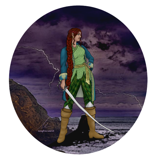

For some info on her outfit choice: I wanted to do an outfit that was a mix of European and Mughal fashion during the Golden Age of Piracy. She’s wearing a European style frock coat, boots, and a not-visible bastian shirt., with a jama coat that’s been [messily] cut off at the hips, worn without sleeves to emulate a waist coast, with dhoti style pants [the exact design of them is more modern/ anachronistic than what would have been worn], and the specific type of sword she’s wielding is a Tulwar.
The colours are taken from historical art and fashion plates. Blues, reds, and yellows were popular during the 1710s in Europe [darker and more muted colours were more common in the colonies], while green, yellow, and white were some popular colours choices during the Mughal period.
I used some new brushes from Clip Studio [including the braid and the fabric prints] since I wanted to play around with my new tablet.
13 notes
·
View notes
Note
cursed with knowledge every time i see your works and remember the ask i sent you ages ago about your style looking suuuuper smooth and easy on the eyes and your reply that you use the airbrush tool with everything (its honestly very impressive), i gotta ask how meticulous is it to work like that? do your pieces take very long to do on average or is it somewhat streamlined because of your workflow/how used to and versed you are using said tool?
Lmao, every time I get an ask like this it gets a chuckle out of me. I'm sorry to haunt your waking hours with my caveman methods hahah. I have actually been trying to branch out with brushes in photoshop and such! Even getting into clip studio finally, ever since a coworker showed me the light... I would love to experiment with more texture in my work instead of everything looking a bit plastic-y, but at my core I still feel most comfortable with the good old airbrush.
To answer your question though, I actually work quite fast. I did 90% of that Blackbeard painting on a whim during an online D&D session - to give you an idea. So yeah, my workflow is very much attuned to it.
I mainly use the airbrush because it's fast and efficient for me. I ink with a small version of the brush, then just scale up and lower the opacity a tad when it's time to colour. I have my pressure sensitivity set up so that it takes a lot of force to make a stroke at its max size, giving me a lot of control. I can lay down large softer areas of shading with it when I want, while also being able to use the same brush for all the detail I need... if that makes sense?
Also, I will admit: when I do lineless pieces (like the cambion one) I do use the selection tool and sometimes a harder brush to get the edges of areas of colour nice and crisp. So it's not 100% airbrush! I'm no wizard, and I don't stick to the same brushes on purpose or anything either. I'm... just easily overwhelmed by too many brushes and features and reluctant to try new things :' )
2 notes
·
View notes
Text
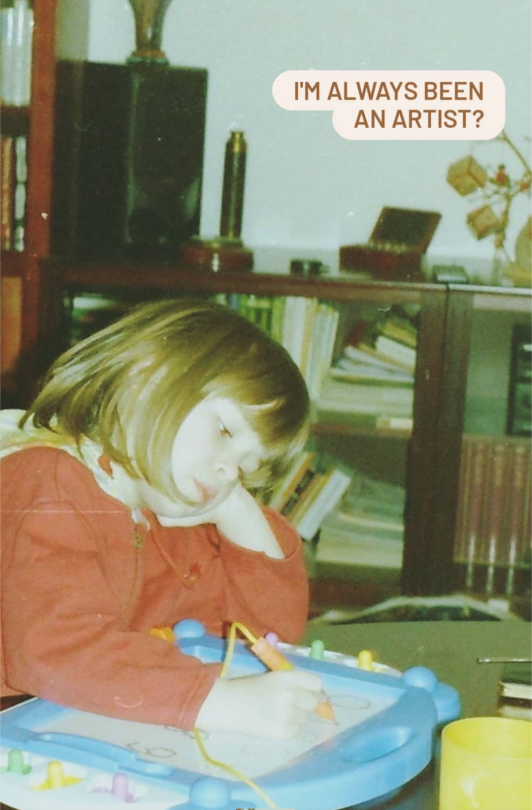
Starts with a little question and answer entry. Because I've been drawing for a while. (Since 2007...)
Q: Can I draw something for you?
Gowen: Sure!! Of course. I would be very happy.
Q: Can I use your artwork as a tatoo template?
Gowen: ask me for a tatoo commission. Don't use my other artworks.
Q: Do you have any tips for me?
Gowen: Draw what you love! Take enough breaks and look for challenges.
Q: Do you ever frustrated?
Gowen: Very often! Sure. That is the daily life of an artist.
Q: Do you prefer digital or traditional art?
Gowen: I love to draw with watercolor on paper! It's relaxing. But I prefer digitally with because it's cheaper, more options and I love the colors palette and brushes.
Q: Where do you get your ideas?
Gowen: From the nature, other people, my own experience, my dreams, film/game/music, other artists and pinterest. I collect a few pictures on my pinterest. :)
Q: Do you use photos for reference?
Gowen: Of course, why not? I can't know all things in this world.
Q: Do you draw me a picture?
Gowen: I take commissions. Ask me. :)
Q: What program/Material do you use?
Gowen: I use Clip Studio Paint with a Wacom Cintiq. Brushes? Default brushes that comes with it. (You don't need to buy brushes...).
And for traditional art I work with watercolor and Gouache (Winsor & Newton), Colour Pencils (Faber Castell), Pastell Crayons (Faber Castell).
Q: Favorite animal?
Gowen: Red Panda and Cats
Q: Favorite game?
Gowen: I played alot. But... hmm.. Journey.
Answer not here? Feel free to ask me! :)
Btw. I love tea, dancing, studied grafik design/photography...
0 notes
Text
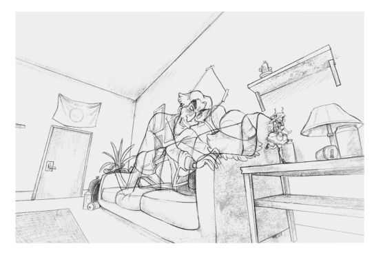
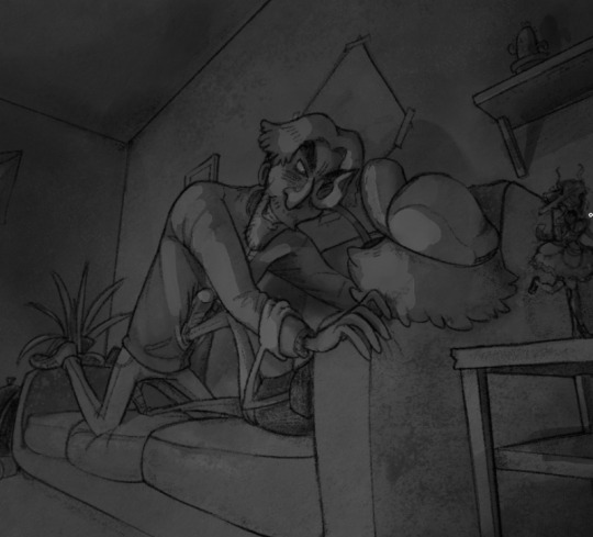
A GUIDE TO HOW I DREW THIS

This drawing was for an art trade with a friend, but as going through and drawing it I was taking screen shots and notes to make a rough make shift guide to how I draw for those who may be interested :-D
I'm not particularly an amazing artist but I sometimes get questions so I might as well make a guide. This is my first time making a guide that doesn't involve me screaming down someone's ear on a discord call so sorry if it's a little unclear or messy ;D
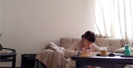
Something that may surprise you... Or not.
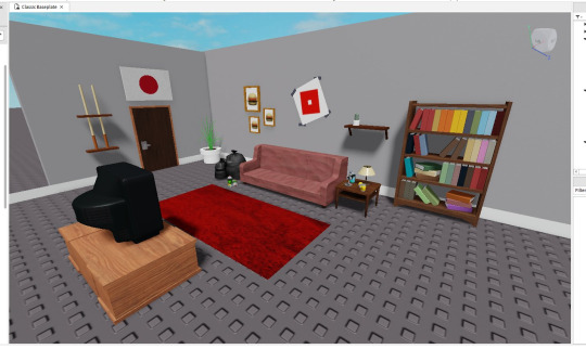
Most of my drawings that involve a background don't start with any sketch at all! For the sake of my sanity, or better yet a lack of my skill, I cannot draw backgrounds very well and often need visual guide to work. Using Roblox Studio I start my beginnings of drawings with simply just building the backgrounds part by part, with help from community made objects of course. Though I'm sure some may call this cheating I solely live by the idea of there being "no rules only tools" with art and that has been keeping me happy.
Anyways, the next step is for me to position the camera to an angle I think that might be cool for a drawing. Mind you, at this stage I've get to come up with much of any idea for the drawing I'm doing, but I only just know where I want the characters to be. In this case I want them on the couch.

Now I'm sure some people will have issue with this, but the next stage of the drawing is to simply just trace :D (I am using clip studio paint for this but im more than sure tracing is possible in any drawing program lol)

Obviously there is some limitation with this in my art since I think an overly accurate and on point drawing of a background really sucks a lot of soul out of the art so I let small things slip through. This probably defeats some point of tracing for some people but personally I don't care.
The next step of the drawing is to simple go over what I have traced from the screenshot and refine it. This means going over it all again, playing with line weight, small amounts of shading and adding detail to the objects around.


Because of how I draw, I like to frame the drawing inside of square on my canvas as a brief preview of how the drawing will look in full. I'm still doing this without even drawing the characters yet to this can obviously change later but "YOLO"
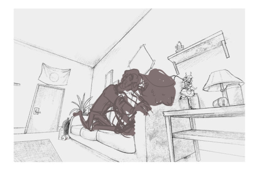
On to the next part of my drawing is to finally start drawing the characters. I still don't really have anything in mind yet for the pose so I simply go with the flow and see where it leads me as I rough out some thumbnail poses. This is on a new layer btw. I was told I should mention that...
... since a lot of...

… mistakes and changes...

... Will be made till you're happy.
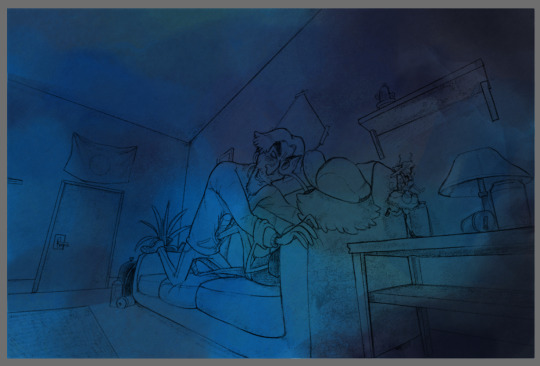
I'm not here to give you a guide on how I draw for this but really more of a process tour, so when the next step just skips to this, it must definitely feel like a leap. For this stage I simply draw out my characters on a new layer over the background, trying to make sure their line art stands out more from the background. If it looks to close, with a low opacity airbrush I will erase some of the line art on the background to make the character's line art pop out more by comparison.
Now just in case you're worried you may want to change the characters pose later and keep the background, make sure to NEVER erase the background and instead colour under the characters on a new layer with white so you will get the same appearance as erasing the background while keeping it.


That also gives some funny wiggle room to do something silly like this >;P
This may be hard to see, but the next step of the drawing is duplicating the characters line art, blurring it by 6% and lowering the duplicated layers opacity. When comparing it to the original, you can really see the POP

And just like that, we have the complete line art :D
Now when it comes to colouring, I don't use Clipstudio, I instead move over to a different program called Rebelle 7 for colouring. Using the 7th edition of the program is a new thing, I've been using 5 for waaay longer. I just skipped on using 6 lol.
For those unfamiliar, the appeal of the Rebelle software is simply for emulating traditional mediums digitally. I've been using them for the past year or so to make some cool drawings using what the programs offer. I mostly use the water colour stuff but there's tons of other stuff with them too. I'd love to shill it some more, but I'm not being paid, you can do some digging yourself about it >;-)
So before moving to Rebelle 7, I exsport my drawing as a png. Please make sure the background on the drawing is WHITE. This is because when we import the drawing to Rebelle 7 we will be using it on a multiply layer so the white of the background becomes transparent. If you are drawing with coloured lines you can export it transparent but I haven't messed with it enough to know much haha
A before and after of making the line art layer a multiply layer:


Now this is where the colouring fun begins >:D
So how I started with this drawing was by splashing down a LOT of blue teal and green for the colour theme of this image. With the water colour brush the colours blended together really well from the start. Of course you can always go over it and blend them some more if you don't like the appearance. Using the textured blenders gives a cool look to the colouring :D
The next thing I do once I got the base colour down is that I move straight to shading. Typically on most drawings I would start with the character colours first, but in this specific drawings case the shading comes first since I want to keep hold of all these blues.

While shading I'm never too worried about keeping it messy since I thinks it gives my art a special charm to it since I adore the look of messy traditional art.
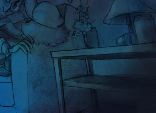

And just like that, after a LOT of trail and error my shading is done... FOR NOW
The next part of the drawing is now coming down to colouring the characters :D
With adding colours to this drawing I am only going to add them to the characters and maybe a few small parts around the background. I first start with making a new layer set to "Darken", "Soft light" or "Multiply". With each new colour I put down I make a new layer for it so I can experiment with it individually. PROBABLY not practical, however that's just how I do it. I'm sure other layer types work fine, it just really depends with your drawing and what you're trying to do.
Images below of me testing colours and layer types:


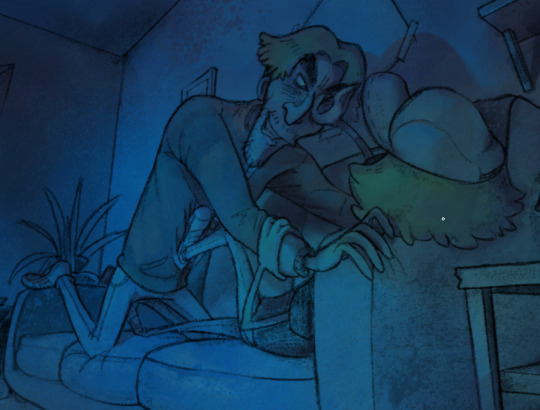
For this drawing, since the lighting is so strong (from the off camera TV) I want the character's colours to be very weak when against the light. The main colour of the drawing (our the base colours I put down earlier) the colours of the characters we are adding are only there to hint of what colours the characters really are. I want the focus to stay on the blue. This will involve a lot of testing.

I'm not really amazing at this so this will change a lot as I colour more and more. Using grey scale view helps to let you know if the colours you're adding are changing the lighting of the image. So make sure to check if you don't want to mess up your shading!

In the pictures on the wall I purposely left empty so while colouring i can give a vague illusion to a picture without really drawing it and keeping the attention to the characters and not the background. this is also a fun time to sneak in Easter eggs if I feel like it
I don't bother adding much colour to the BG as mentioned before, only to the characters.
After adding your colour check the grey scale and decide if your image needs any highlights to make it pop
In my case it does this part is optional depending on your drawing.
For deciding where the highlights go I pre pick a colour and go over the areas I want to make lighter in greyscale, not worrying about the colours just yet since it's on a new layer and that means I can mess with it more later :D
Turing greyscale off may not look the best NOW, but messing with the layers and blending blushes may go a long way!
Due to Tumblr's Image post limit I'll just go over with the next few parts over text, tho it can really be summarized with a few sentences.
After blending it looked fine, however the image STILL didn't pop in the way I had wanted so I changed the layer blending mode to "Linear Dodge". This worked perfectly however I had to re-do some highlights because I noticed mistakes.

But besides all that, we now have achieved the wanted look!
I don't really know how to end a guide, so I guess this is it. Thanks for reading! I hope this is a little bit helpful or at least interesting to someone. :D
1 note
·
View note
Text
HMsEx Blog Entry 12 (week 13-14)
Colour Grading Feedback
Considering how I should compose my 4 liminal spaces in relation to the colour of the light they have. All except amber light carpark primarily have white light, I’ve then given a subtle blue tint to their highlights making it look colder and more urban. The issue is I find the correction and gradeless amber light carpark actually looks better without grading to be consistent with other three spaces. Nonetheless, I’ve graded it for testing purposes. Let’s look at the feedback from random viewers.
Original order:
Museum Sign Carpark, Empty Street shops 1, Amber light carpark, Empty Street shops 2.
Colour based linear order:
Amber light carpark, Museum Sign Carpark, Empty Street shops 1, Empty Street shops 2.
Amber Colour Changed to be consistent with the coldness of other 3:
Amber light carpark vs Amber light carpark
RESULTS
I interviewed Jo and she didn’t really speak much on the questions above regarding colour grade consistency, she was primarily concerned with my glitch-in rotoscopes position in each of the four clips. She said the current order doesn’t make much sense and I should order them so that I start close and in the last clip I’m the furthest away.
Nik said he prefers my most open carpark shot without the colour grade while Darrin says the opposite, I too prefer it without the grade so I’m glad I wasn’t alone in that. Thus, I’ve decided to disable the colour grade for now.
I’ve encountered massive workflow issues ever since Creative cloud on my laptop automatically updated my Pr and Ae to the 2024 versions. My adobe dynamic links which allow me to import my rotoscoping compositions from after effects into my premiere pro timeline that sync as I edit them in affect effects, were disconnected and I haven’t been able to reconnect them.
This problem is made even more inconvenient as the RMIT computers’ adobe apps haven’t been updated to 2024 so that means that my project files couldn’t be opened on them.
SOLUTION FOUND: quite simple I just save the project file as a v23.x project file and then I can open it and edit it on RMIT desktops.
Creative Practice Research
I’ve been attending a lot of the exhibitions from Ben’s Curation studio; I’ve enjoyed them all but the most impressive one I saw was by my friends Minnie and Adrian, BodyMorphosis (https://minnie427.github.io/curating/). Minnie’s area was specific emotions that people can’t usually define or articulate but do in fact have names. Considering my great endeavour of breaking down this feeling I’m calling Liminal Exhilaration and exploring the under-attribution of the word exhilaration itself, I found her research really relieving to see because a lot of people see my work and as soon as they hear me say exhilaration they say “nah no way”, it felt nice to see someone else interested in having a broader understanding of the countless emotions we feel.
Minnie referenced a book by author John Koenig called The Dictionary of Obscure Sorrows which looks at countless very specific feelings that you get from particular scenarios.
Progress update: I think I've spent 6 hours a day in this computer lab for the past 5 days. I'm amazed that it takes this long to rotoscope, and Im not dilly dallying either I'm focused and yet it takes this long. Luckily I'm at the 1:10 mark now, only 20 seconds left to edit! :)
0 notes
Photo


(Images are ordered top to bottom for each post)
Figure 1. Figure 2. Figure 3. Figure 4. Figure 5. Figure 6. Figure 7. Figure 8. Figure 9. Figure 10.
Minna Sundberg is a Swedish-speaking Finnish illustrator who was born in Sweden, but moved back to Finland with her family when she was 7. She began creating comics when she was 12 as many of her online friends were making their own, even though she wasn’t particularly interested in them, however she came to find that she enjoyed it. It became a hobby for her from then on, but it wasn’t until her time studying Graphic Design at the School of Industrial Arts in Helsinki that she began thinking about getting into comics seriously. She began this by working on the 556 page comic A Redtail’s Dream in her spare time throughout her course. After graduating she began work on her largest comic so far: Stand Still Stay Silent, which started in 2013 and ended in 2022 - which became her full time job while she was making it, even selling merchandise and physical hardback copies of the comic.
Much of Sundberg’s work is inspired by Nordic culture and mythology. Stand Still Stay Silent is also heavily inspired by her love of post-apocalyptic stories - especially ones involving pandemics and mutated monsters.
Her art is painted digitally using mainly Clip Studio Paint, moving into Photoshop at times when colouring for the use of specific brushes. She would begin adding colour very loosely with a blocky semi-transparent brush, before moving on to adding detail with a opaque round brush, all on a singular layer below the line art.
Sundberg’s art has been a big inspiration for me for years since I first discovered Stand Still Stay Silent online. I was immediately drawn to the hauntingly beautiful monsters and scenes of decay she depicts throughout the comic, as I have always been especially interested in themes of fantasy, supernatural & horror throughout any form of storytelling. I also find myself drawn to ‘pretty’ art styles with probably more stylised, cartoony characters/defining features, and I found that Sundberg’s illustrations hit that perfect spot for me between cute/pretty, sophisticated beauty, and horror. Her use of overarching colour schemes in her illustrations and comic pages is another aspect that draws me to her artwork. The way the colour emphasises the mood/tone of the scene and brings it together into a very cohesive feeling product (especially when it comes to comic pages that keep a consistent colour scheme throughout) is something I have always felt inspired to try and emulate in my own work, even if I have never really ended up doing it so fully so far. The detail and delicate line art, along with the way she almost makes her digital art feel like watercolour, also drew me to her work.
1 note
·
View note
Text
W1
I wanted to investigate some of the typographers that were participating in the conference and that I would need to include in my brochure. For this initial research, I wanted to collate some pictures of the designers as well as information about their work as I know that I will be having to include some images of the designers within my printed material. This will help me start building a library of possible resources I can use for my design.
Joseph Churchward
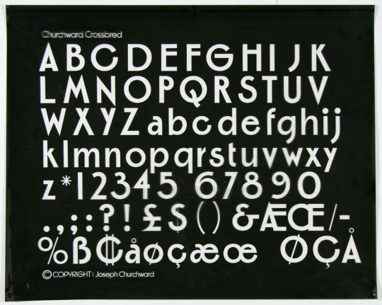
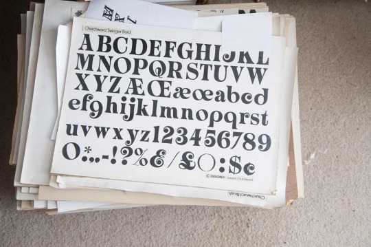
Through reading the provided material about the designers, as well as doing some of my own research, I have discovered that Churchwards work has appeared throughout the Dominion Post as well as used on tools and material used by opticians to evaluate eyesight in patients. Born in Samoa, Churchward ended up moving to New Zealand when he was thirteen and subsequently attended Wellington Technical College. He won the Art Distinction award for his lettering and has crafted over 600 typefaces over his career.
source
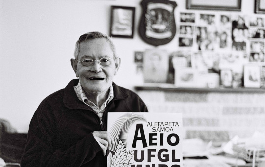
I also used Photoshop's coloriser tool to turn these black and white photos into colour, as I might want to opt for colour images for my brochure, of which there aren't many examples for Churchward.


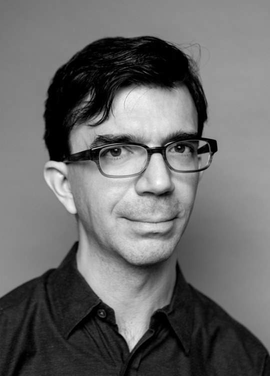
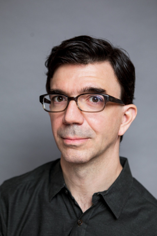
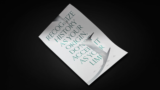
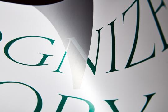
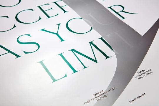
Tobias Frere Jones
Frere Jones is based in New York City and has built up an extremely successful type design career with his own company, Frere Jones Type. He is known to have created some of the most popular and widely used fonts today, including Gotham, Tungsten, Interstate, Poynter Oldstyle, Whitney, Surveyor, and Retina. He studied design at RISD (Rhode Island School of Design) and has lectured at Yale University School of Art as well as across the world in Australia, Europe, and the United States. His work is notably in permanent collections across the Museum of Modern Art in New York as well as in Victoria & Albert Museum in London. Notably, Frere Jones has also been awarded many prizes to acknowledge his importance within design and his academic success as a lecturer in education - he has received the AIGA Medal, the Gerrit Noordzjj Prijs as well as the Cooper Hewitt's Nation Design Award for Communication Design in 2019.
source
further resource


Verena Gerlach
Renowned German type designer Verena Gerlach started her design studio very soon after she graduated design school in 1998, focusing on design, type design and typography. Gerlach loves working in a variety of mediums and enjoys exploring the many different forms and material associated with type - her expertise and projects range from standard print and type design material to visual and video clip production. Gerlach generously gives lectures and workshops all around the globe, and since 2006 she has works as a freelance book designer for different art publishers around the world.
source: here & here


Nadine Chahine
Dr Chahine is a Lebanese type designer whose research specialises in eye movement studies and legibility for arabic, Chinese and Latin scripts. She is an award winning designer with many accreditations and awards received for her contribution to the industry, including two awards for Excellence in Type Design from the Type Directors Club in New York in both 2008 and 2011. Some of her notable typefaces include the widely used Frutiger Arabic, Neue Helvetica Arabic, Univers Next Arabic, Palatino and Palatino Sans Arabic, and Koufiya.
source


Carol Twombly
Carol Twombly has created and designed many widely recognised fonts. In 2008, Twombly joined the team at Adobe and one of her earliest projects at the company was Trajan which is a very popular display typeface used by users worldwide. Throughout her time at Adobe which spanned over eleven years, Twombly designed numerous classic-inspired letterforms including Charlemagne, Lithos, and Adobe Caslon as well as typefaces like Viva and Nueva which explore new territory and take a more modern approach to type design while holding onto some of traditional aspects as well. She was the first female and the second American to win the Charles Peignot award from the Association Typographique Internationale for outstanding contributions to type design in 1994.
source


0 notes
Last Seen Blogs

trchituan
Untitled

askkaku
Kaku. 25. Male. Giraffe. Ex-CP9 Member. Square.
mutantbanner
professor hulk #1 fan
daria-sicksadworld
Sick Sad World