#boac
Text

British Overseas Airways Corporation (BOAC) travel poster for Canada (c. 1950). Artwork by Paul Chater.
#vintage poster#vintage travel poster#canada#1950s#Paul Chater#BOAC#British Overseas Airways Corporation#travel#tourism#holiday
53 notes
·
View notes
Text

Boeing 377 Stratocruiser. With Camel and Volkswagen van. Probably somewhere other than Heathrow!
84 notes
·
View notes
Text
No. 55 - British Airways, Part One - British (European) Airways and British (Overseas) Airways (Corporation)
British Airways.
Starting this post was harder than actually writing it. It's hard to start a post about British Airways, because it's a deceptively weird airline. If you very precisely altered my memory, kept my knowledge of the United Kingdom and of flag carriers but erased all I knew about British Airways and asked me to speculate about the UK's flag carrier, what I came up with would look absolutely nothing like British Airways. British Airways is weird. It was weird when it came into existence in 1974. It's weird now. It's a completely typical airline in terms of things like...routes and safety and in-flight meals and...I don't know...contribution to human rights abuses. But that's not what I talk about here.

The story of British Airways' livery is interesting. It's messy. It's political. All of that comes in due time. More than most other airlines, it just can't keep to a livery for too long - and that's when it even has a livery. In its early youth, British Airways couldn't really figure itself out at all. And in its even earlier youth...well, actually, British Airways isn't that old. It's also not the UK's first flag carrier.
image: British Airways
There is a reason that two of British Airways' fleet of retro liveries wear wordmarks that say other names. To discuss the history of the British Airways livery, I have to first begin by discussing the fact that British Airways...is a weird airline.

British Airways. IATA code BA, ICAO code BAW, callsign SPEEDBIRD. Flag carrier of the United Kingdom.

Honestly a better logo than at least 40% of actual airlines.
Well, it's actually a subsidiary of the unimaginatively named International Airlines Group, Europe's third-largest airline holding company, below Ryanair and the Lufthansa Group but ahead of Air France-KLM. IAG is a member of the oneworld alliance and is the parent company of British Airways, Iberia, Aer Lingus, Vueling, and LEVEL, and just last year acquired Air Europa and began the process of absorbing it away from SkyTeam. To anyone who may have had the thought enter their head: yes, they do now basically have a monopoly on Spanish airlines. To any Spaniards reading, my condolences. At least you still have EasyJet.
Their largest shareholder is Qatar Airways, so when you really think about it British Airways is kind of a subsidiary of Qatar Airways a little bit. Their share is still only 25%, though, so that actually just completely isn't true, but in a vibes sense it feels that way from the outside looking in. Of course, all these airlines have maintained their own identities and operate independently. This is not a LATAM situation. British Airways adopted its present-day livery long before it merged with Iberia to form the IAG in 2011. I'm still not totally sure why they did that. Maybe they wanted to one-up Air France. Iberia's not exactly KLM, but - no, this is not that post.
British Airways. I've always thought it was a little bit strange that it was called that. Few places love reminding the world they're at least nominally still a monarchy more than England. KLM isn't the only airline with 'Royal' in the name - Royal Air Maroc, Royal Jordanian Airlines, and Royal Brunei Airlines are just a few other examples. And yet the United Kingdom has never had an airline, at least not a major one, named anything like The Queen's Royal Air Fleet, which is what I would have expected of them. No. British Airways.
There's not much gravitas to that, is there? Not really any punch. Nothing making it better than Air France. 'British Airways' is a pretty sterile name for a flag carrier.
Their callsign is SPEEDBIRD, though. And that's not sterile. That's awesome. That's Europe's equivalent to Pan Am's CLIPPER or China Airlines' DYNASTY, just pure style. But what is a speedbird, other than a really cool name for a jet?
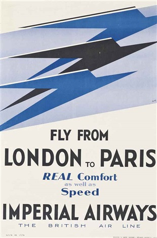
This is a speedbird. Rather, this is the logo for Imperial Airways. Not to be confused with the very strangely named 1964-1986 Californian commuter airline Imperial Airlines, Imperial Airways was a very early precursor to what British Airways is now. In the inter-war years it served destinations like South Africa, Hong Kong, and Australia - the sorts of places two dozen or so wealthy individuals of power might have reason to go quickly. Unlike Imperial Airlines, Imperial Airways had a very fitting name.
So here's another weird thing about British Airways: it's young. Really young for what it is. Most flag carriers are pretty old, and the few exceptions are airlines founded in the 21st century to replace flag carriers which went defunct in the 90s and on, like Brussels Airlines or ITA Airways. Even when you discount centenarians like KLM and Finnair, most of the names you'd recognize in the rest of the world (and plenty you probably haven't heard of) existed by the 1940s, with the major Axis powers being forced to reboot theirs in the 50s. Even the places Imperial Airways served, despite not having the resources of an empire at their disposal, have far older flag carriers. British Airways didn't exist until 1974, making it younger than my mother, the Boeing 747, the Twin Towers, 2001: A Space Odyssey, and the moon landing.
The primary reason for this was, as far as I can tell, bureaucratic shuffling about, but I'm not especially well-versed or interested in the history of UK corporations so that's where I'll leave this bit off. It is possible, and indeed likely, that someone reading this has the urge to say that I'm being uncharitable and that British Airways is functionally just BOAC or BOAC is just functionally Imperial Airways (or maybe nobody thinks that - I simply don't know enough about the corporate side of it to confidently dismiss the possibility of this indeed being the case). It's just not relevant because I'm ultimately here to talk about the airline as an entity in the public eye that has a livery, and in this sense Imperial Airways, British Airways, and the intermediate steps are fully distinct. So, for my taste, British Airways began operations less than a month before the release of the novel "Carrie". That's strange. British Airways is strange.
Still, even though in most other cases the process was significantly faster, very few flag carriers we'd recognize today were founded outright in their current state.
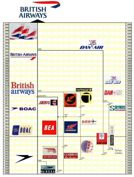
This timeline, compiled by Yesterday's Airlines, documents the 'family tree' of airline mergers that has built up today's British Airways. It actually goes back far earlier. Debatably it began with manufacturer Airco and its subsidiary airline Aircraft Transport and Travel, founded in 1916. Though it went under in 1920, its assets were repurposed by Daimler Airway (singular), which was one of the four airlines (mostly all subsidiaries of aircraft manufacturers) which in 1924 became Imperial Airways. That's right, even the building blocks on this chart are themselves built from blocks!
There are plenty more long-forgotten airline mergers beneath where this graphic cuts off, but this is all to say that the speedbird emblem originated with Imperial Airways, and it has floated to the top of this soup of assorted vaguely British brands, many of which nobody has thought about in decades. Speedbird aside, British Airways resembles basically none of its component parts in any ways that aren't just explained by them both being British, and Airways.
The speedbird was created by notable art deco designer Theyre Lee-Elliott, who created several pieces of iconography and many graphics and posters for the UK government, among other things, like the first-edition cover of "A Farewell to Arms" that an English teacher of mine once had as a poster on her wall. Much of his early work was for airlines, and the speedbird happened to stick.
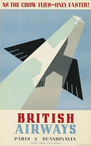
Left poster isn't anachronistic - 'British Airways' was the name of a late-30s airline, itself merged from three other airlines, which would go on to join Imperial Airways as one of the components of BOAC.
Airlines didn't really have liveries as we know them now back when the speedbird was invented, so it would lie dormant as an emblem used on posters and signage for a little while. It was the only part of Imperial Airways' identity which survived when, in 1939, it merged into the British Overseas Airways Corporation.
'British Overseas Airways Corporation' has the same nostalgic punch to it as 'Pan American World Airways'. It was almost always just called BOAC, though, even in the wordmarks of its airplanes. When BOAC came into being the airplane livery was not what it is today. They began with just a painted tail and cheatline, scarcely worth showing or commenting on.
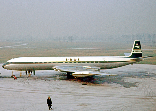
image: RuthAS
Okay, I'll show it, but I don't think it needs any further comment.
There's only one BOAC livery that was really recognizable a BOAC livery. It was still fairly boring. More like BOA(rin)C(g). (That one needs work.)
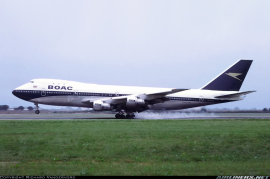
The only interesting thing about the BOAC livery, to me, is the way that sort of face mask shape combined with the tail almost gives it a sort of diagonal symmetry - the front with a blue dip below the white center, the end with a peak above it. It is a very efficient and deceptively effective, potentially unintentionally, use of geometry. I also appreciate the restraint of sticking to blue and white and leaving out red. The minimal nature of it increases the geometric feeling, really saving this livery from my complete disdain. The speedbird logo is really well-centered on the tail, feeling almost like a diagonal slash cut right through it, and I like the use of greyish gold instead of white, which makes it appear less jarring while still being clearly visible. For its day, these positives are certainly not to be fully ignored, though saying that this is a pretty alright 60s white-and-blue cheatline livery is not that high of a compliment. It is cleanly done but in no way exceptional, with a neat bit of art deco angularity to it that you really only notice if you stare at pictures of airplanes as a hobby.
On the other hand, it has a nothing wordmark that honestly just irritates me by breaking up that big clean white block in the same way an old scratch breaks up the flatness of an iPhone screen and it does that thing I hate where a cheatline sort of just...trails off under the tailplane that a fair number of 747 liveries do. It feels like they just couldn't think of anything to do with the end of the plane, which is never what you want from a livery, especially not from an airline that takes itself as seriously as BOAC did. It also uses the isolated tail block, which is a design feature I dislike. At least the extreme matteness of BOAC's midnight-blue-on-white makes it a bit less awful, and the white forward trim is a nice touch.
On balance, I'll give it a BOAC-. That is referring, of course, to the face mask livery, which I think is straddling the fence between 'adequate' and 'forgettable'. I truly have so little to say about the earlier liveries that I'm not going to even give them a grade.

The BOAC livery briefly flew again in 2019 (which British Airways claims to be centenary based on the foundation of Aircraft Transport and Travel, except I've mainly seen that said to be 1916 and most people's consensus is that British Airways was founded in 1974 and no earlier) when it was painted on the 747-400 registered G-BYGC. She was the last 747 to fly for British Airways, just a year after the livery was applied, and there were plans to preserve her in the heritage livery which never materialized. Sadly, she was scrapped in late 2023.
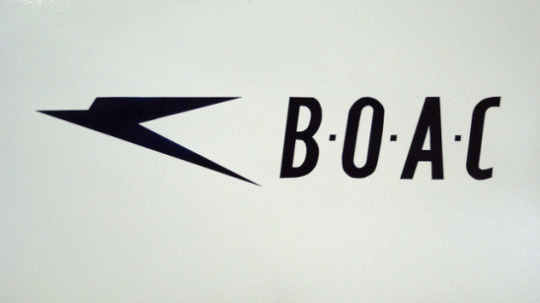
But there was that speedbird on the tail! The speedbird was so damn iconic that it was even BOAC's callsign. So where did it go?
We'll get to that. There's more to British Airways than BOAC.
BOAC was state-owned, and it held a place of national prominence...so it was the flag carrier, right?
Sort of. It was a flag carrier. BOAC was the UK's Pan Am, specializing in long-distance international flights (hence 'overseas' in the name). There was also British South American Airways, a short-lived national carrier which was absorbed into BOAC after two years, with its most notable contributions to history being the disappearances of its planes Star Tiger and Star Ariel, but a significantly more enduring brand was BEA.
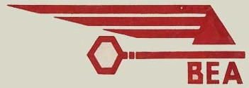
This initial logo, also the work of Theyre Lee-Elliott, had a key motif to accompany BEA's slogan, 'the key to Europe'. I adore it. I like BEA a lot.
While initially founded as an offshoot of BOAC (which I suppose was the singular flag carrier from 1939 to 1946), British European Airways Corporation specialized in, as the name implied, flights within Europe (and other relatively nearby destinations). It was something of a VASP-and-VARIG situation. Nobody ever called it BEAC, though, even though it sounds like 'beak' and birds are a whole thing, because...flying...well, look, we can all understand, in retrospect, that one of the great tragedies of aviation history is that I wasn't there to have ideas. That said, maybe it's a good thing I never planted this seed, because their callsign was BEALINE, which is...just the most adorable thing I think I've ever heard. It genuinely makes me smile. It may be my favorite ever callsign.
They did eventually change their official name to just British European Airways. Sort of a shame, if you ask me - you could have been twinsies. Ah, well. Also a shame is the perplexing choice to shelve their rather nice and meaningful original logo and replace it with what I can generously describe as 'a square' in 1957. I think SAS did it better. I can't rule out that I just hate it because the old one was so much better, though. I've seen far uglier, but again - this is a square.

image: Adrian Pingstone
When it's on the livery, it's not even well-aligned! And it's difficult to imagine negotiating this onto an aircraft tail, even when dealing with a generously square fin like the Trident's. (BEA loved their Tridents, which were essentially designed for the airline's operations, and operated 70 of the 117 airframes completed. This makes me like them, because I love the Trident too.) That said, I think that if you're using a logo that is just the name of your airline, putting it on the tail rather than the front side fuselage is a bold move. Today it rarely pays off, but in the era of cheatlines and half-bare planes it actually avoids the issues of legibility and vertical space that a lot of other contemporary liveries struggled with.
Still, the square. It will simply never not look strange to have two straight vertical lines on a fin that's more or less diagonal to them, and I'm not sure how that could be fixed. They did the best they could, I think, but this was just doomed from the start.
On the other hand, I do enjoy its placement within the cheatline. It helps keep a sense of pace but doesn't break up the line, and it just feels like it clicks into place in a way I love. I like the continuity with the black line at the tip of the horizontal stabilizer, and I like that the white paint doesn't extend down as far as on a lot of liveries of the time, leaving the cheatline to taper above the Trident's rear-mounted engines instead of underlying them as many other airlines' did.
This logo and livery were designed by Mary de Saulles, who was trained as an architect rather than a graphic designer. I think it shows in the very simple shapes and lines present here, and it also shows in the fact that despite it technically not doing anything too unusual the BEA livery was very distinctive when actually on the apron.
BEA's liveries weren't terribly more innovative than BOAC's at first glance. But their black-and-red 60s livery was actually, deceptively, a standout of the era.

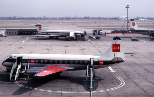
images: Ralf Manteufel | Adrian Pingstone
The red wings on BEA's aircraft were absurdly stylish. There are dozens of reasons involving weight and heat and aerodynamic properties that prevent airlines from painting the wings on their airliners anything but a very dull drab, and I despise it, but when even the all-black Air New Zealand plane has white wings it begins to feel like it's just not possible to do anything else. Actually, it is hypothetically possible, though expensive, as long as you avoid the leading edges, though I'm sure the margins for shape and weight of a wing are far more precise on a 787 than they were on a Viscount. Still, I can't help but wish airlines would swallow the costs of painting wings (not like liveries aren't already a needless expense if you're trying to really optimize), because just look at this. It's absolutely stunning. It brings BEA's livery all the way from completely forgettable to by far the most eye-catching in the approach pattern.
And, you know what? I'll give them a BEA for that.
It might seem like a bit of a strange evaluation when I spent two paragraphs complaining about that square, but just imagine being on the ground and seeing a Comet landing, the lack of underwing pylons leaving that big red wing, like the lining of a cloak. That's a real Riyadh Air first impression. So while yes, the square is a square and certain aspects of the livery's implementation on various models range from forgettable to clunky, I am disregarding all of that, because this is like Dracula showing up to a board meeting. They are literally flying Louboutins.
BEA's livery and branding evolved over time in a way BOAC just didn't. BOAC never had anything I would identify as a 'rebranding' - it sprang fully formed from the Queen's (or something) head and stayed in its pristine state until the day it abruptly vanished. This was not quite the case for BEA.

image: Adrian Pingstone
This is a preserved airframe, hence the very anachronistic car models in the foreground. Still, the livery is accurate.
Their final livery, introduced 1968, was this - the 'speedjack' livery. The speedjack is, more specifically, that delightfully pointed Union Jack emblem on the tail. I do like the speedjack itself, being one of the only decent uses of a Union Jack base I've ever seen. It feels obvious yet brilliant to turn the intersecting lines of the flag into an arrow shape. Unfortunately, far more was changed than just the logo.
My beloved flying Louboutin was gone. They still sometimes had the red wings at this point, but in every other way it was a new livery. I actually find that something is lost here, because the old BEA livery had red but not blue, and the BOAC livery had blue but not red, so they were sort of a matching set. Also, um, that wordmark is legitimately hideous.

It's a bit less horrible when it's not red letters on a white background, at least. And it does have a forward slant, a continuity...but this lacks the brilliance of Lee-Elliott's key or the charm of the de Saulles square.
The speedjack, logo, and livery were created by FHK Henrion, whose work has appeared on this blog before, though I failed to mention it. He designed the KLM crown logo!
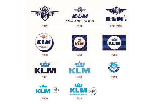
...a logo I used to think was fine until learning about the absolute beauty they had from 1930 to 1938. Henrion designed the totally palatable 1961 version, and further modifications were made by the firm Henrion, Ludlow & Schmidt, with at least the 1991 change being the work of Ludlow. It's certainly gone downhill, but maybe I just think that because of how much I adore the 1930 iteration.
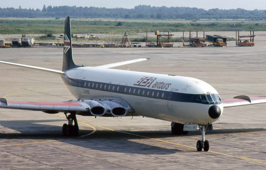
image: Piergiuliano Chesi
As for BEA - at the very least they kept the red wings. This is sort of a double-edged sword, though. This livery was, overall, far less distinct from its surroundings than the de Saulles livery, and the addition of the lighter blue to the fuselage really dulls the impact of the red against the stark black it used to share the airframe with. It just feels...flat. Neutered. Like an interim livery when one airline has bought out another and the paint jobs are changed out piecemeal. (And I think a red-only speedjack on a black tail would look fantastic, for the record.)
The details aren't much better. The cheatline feels almost too thin for the cockpit windows and the tiny wordmark makes the white fuselage feel as empty as it is without the little BEA logos making sure that isn't what you're focused on. Some models, like the Trident Three and Super One-Eleven, get their status indicated by text on the tail that looks like the default font of a word processor. It's just sloppy. Henrion's effort went to the speedjack, where a firm which specializes in image identity generally would be directed, and some interest was taken in the wordmark, but the livery itself feels like a pieced-together afterthought.
This gets a grade of...please just go back. I want to say D+.
How much of that grade comes from genuine dislike of the Henrion livery versus just thinking it's worse than what came before, I don't know, but it's one of the most immediate downgrades I've ever seen and the attempt to keep the most striking feature of the old livery while sapping it of its power feels almost insulting. It feels messy and pieced-together, and it's angling dangerously close to having the same approximate color layout as the old SAS livery - you know, the only thing that's ever failed the Star Alliance Test.

And, at least from the side, and from farther away, it really doesn't fail the Star Alliance Test. It's serviceable, and I wouldn't be nearly this harsh on it if I didn't know what came before. But I've committed to a chronology of what would become British Airways, so I have to mention both, and that includes looking at them, reading about their design processes, and forming detailed opinions of them. This livery was just doomed by its predecessor.

Even British Airways seems to agree with me, given that when they painted an A319 (G-EUPJ) in a BEA retro livery they chose the older black-and-red. Some liveries are simply iconic. Some simply aren't.
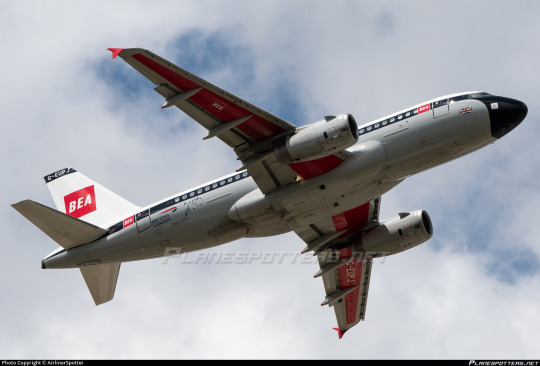
And, yes - the wings are red. At least, the bottom is. The top was forced to remain grey for reasons of 'reflectivity', which is fairly vague. Still, this should be a sign to other airlines - your planes will make an impression from below, and that impression could be as powerful as the one BEA used to make.
image: Ben Brooksbank
BEA, at its height, flew more passengers than any other airline in Europe. It had subsidiaries, including...Cyprus Airways. (Yes, the same one that's still the flag carrier of Cyprus. That's its own story.) They even operated helicopters.
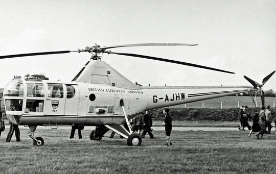
image: RuthAS
Cursed? You decide.
And then, as the 70s began, the decision was made to merge the two state-owned airlines - something which I would personally have done earlier, and apparently people did try to do earlier but were prevented from doing by...politics. You know, just a couple people with titles that begin with 'Secretary of' passive-aggressively fighting over financial things. In 1974, what was probably inevitable finally became a reality.
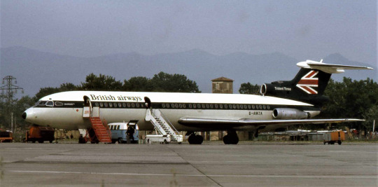
image: Piergiuliano Chesi
It takes a while to repaint a full airframe. When two airlines merge the change is often done bit by bit, making sure the wordmark's right but not bothering with the rest. In 1975, G-AWZA, pictured here, still wore the speedjack, but the wordmark above her cheatline said something new entirely, and a new airline was using the callsign SPEEDBIRD.

And this is where I will conclude today, thwarted by image limit. Of course, being the person I am, I couldn't help but make my return for the new year not just a two-parter but a three-parter. Having dispensed with the British Airwayses that weren't British Airways, part two will cover the British Airways of the surprisingly recent past.
In the meantime thank you to all readers, old and new. I'm thrilled to be back from my break, and I hope you'll stick around for another year of Runway Runway.
#tarmac fashion week#region: west/central europe#region: united kingdom#grade: a#grade: c-#grade: d+#british airways#british european airways#boac#double sunrise#era: 1950s#era: 1960s#era: 1970s#klm royal dutch airlines#imperial airways#long haul
34 notes
·
View notes
Text
Design Reviewed
15 notes
·
View notes
Text
#boac#british overseas airways corporation#vickers vc10#los angeles#vintage#airline#california#la#60's
10 notes
·
View notes
Text
1960's
#vintage#vintage advertising#vintage ads#vintage advertisement#airlines#airline#air travel#air stewardess#boac
7 notes
·
View notes
Text

Now boarding -
.
BOAC Boeing 707 Postcard
@postcardtimemachine
22 notes
·
View notes
Text
5 notes
·
View notes
Photo


I always found it fascinating when airlines at the dawn of the jet age would operate competing models just to see which one was better.
And it usually was the Boeing 707, seen here operating alongside the DC-8 in Pan Am service, and the VC-10 in BOAC service.
60 notes
·
View notes
Photo

1961 Fly There By BOAC
Source: Pinterest / fabienne jerot
Published at: https://propadv.com/airlines-poster-and-ad-collection/boac-poster-and-ad-collection/
21 notes
·
View notes
Photo

Dexter Brown, 1970 BOAC 1000km at Brands Hatch poster.
#technology#automotive#sport#racing#poster#Dexter Brown#BOAC#1000km of Brands Hatch#Brands Hatch#West Kingsdown#Kent#England#UK#1970
140 notes
·
View notes
Text

British Overseas Airways Corporation (BOAC) travel poster featuring an illustration of a green Chinese dragon (1956). Artwork by Maurice Laban.
#vintage poster#vintage travel poster#1950s#Maurice Laban#BOAC#British Overseas Airways Corporation#dragon#far east#travel#tourism#holiday#pagoda#chinese dragon
40 notes
·
View notes
Photo

Two classics. de Havilland DH.106 Comet. BOAC. With Rolls Royce Silver Cloud. 1958
#de Havilland#DH 106#Comet#passenger aircraft#jet aircraft#commercial aircraft#civil aviation#civil aircraft#BOAC#Rolls#Silver#Shadow#airlines#airliner
134 notes
·
View notes
Text


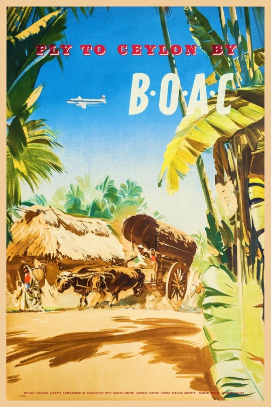
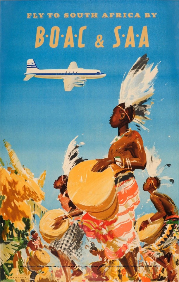
Frank Wootton (1911-1998) for B.O.A.C. (British Overseas Airways Corp.) precursor to British Airways
4 notes
·
View notes
Text
9 notes
·
View notes
Text
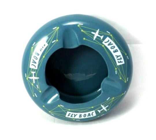
FLY BOAC Airlines Ceramic Ashtray Copeland Spode made ENGLAND Vintage 1950s || SWtradepost
#vintage ashtray#fly boac ashtray#collectible ashtrays#man cave#bar#vintage ceramic ashtray#boac#boac airways
4 notes
·
View notes
Last Seen Blogs