#but also I feel like printing these out in low res on a4 paper and put them on the fridge is the only correct aesthetics
Photo


for no reason at all: champion chugger dante reminds you to hydrate, the graphic
#devil may cry#dmc dante#fkdjshf the backstory of this is like. literally nothing#it was like. mim has been playing dmc as previously stated#and we realized in two out of the three games she's played dante really does fucking cry#so I was like. damn this man must be dehydrated all the time#and then a few days later. here we are. in the champion chugger dante timeline#last week was super hectic so. I gave myself this I guess#these are available on redbubble as prints and such if you want to hang em on wall#so dante can remind you to drink water#but also I feel like printing these out in low res on a4 paper and put them on the fridge is the only correct aesthetics#also may I just say I love the funky look of dmc3 but#why do none of the renders have the same details.......#AND his figure also looks?? different?????#dante is created specifically to attack and defeat cosplayers#anyways. freeware for yall go hogwild just dont crop out my signature lol#have a good night guys! yet another busy week ahead#but we do what we must. and we drink water.
347 notes
·
View notes
Text
PDP: PORTFOLIO REVIEW 1
Portfolio review 1 by Emma Reynolds
Emma Reynolds has kindly responded to my email. As she is very busy at the moment, a meeting may not be possible, but she has kindly given me the option to send over my work via email so that she can have a look through it to give me some advice, answer some questions and review my portfolio.
I took her up on this offer so that I can continue working on my portfolio, depending on the advice given, in time for my final deadline.
Hi Christine,
Apologies I've not had time to reply yet, things are very busy!
More likely I will have some time in May - or you're welcome to email me your work (low rez) and I can look at it that way and give advice when I get a chance?
Thank you,
Emma
Thank you Emma, yes I understand that you must be very busy I appreciate that. Thank you for your reply also. My final deadline is May 8th so it is probably best that I email you my work instead. I will put together my portfolio ready to send along with some questions that you may be able to help me with and I will have these sent over to you within the next couple of days.
Any advice and information will go a long way.
Thank you
Christine
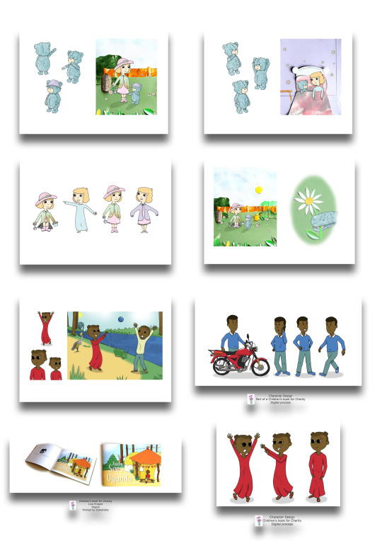
I sent over a PDF low rez file consisting of 16 images that I thought were what was required for a portfolio to show the work style that I do, work I like to do and what supports my field of work.
Some images I wasn’t sure about including, but did anyway. This was to give me an idea of what works and what doesn’t. ie, if I receive feedback on particular images that could answer my fears of the image etc.
Some images I held back on sending completely as I thought they may not be relevant or may confuse my style.
Hi Emma,
I have attached my PDF portfolio, low res, for you to have a look at when you can, I understand that your busy so please don’t feel pressured to respond immediately.
I also have a couple of questions based around what to do after I graduate to be successful in children’s book illustration, so if you have any key tips and general information, I’d love to hear them!
Portfolio Review;
Would you mind letting me know your thoughts please in terms of my portfolio content & layout.
I have heard on the grape vine that illustrators of children’s books are sometimes required to produce two separate portfolios, one for character designs and one focusing on scenes. I’ve also heard that just one portfolio is adequate providing the character is shown within a scene in action. What are your thoughts on this?
Do you suggest any alterations within my images?
Have I put in enough or too much work?
Should I apply my logo to each page?
I have considered creating a concertina style portfolio to present, do you think that this idea would work for my style?
After Graduation;
To continue producing work and keeping my portfolio up to date, I intend re-visiting a previous project, (a children’s book regarding stranger danger) where I feel my skills have improved and I would like to improve the project. How did you continue to produce work after graduation?
Do you have any advice on how to go about getting an agent such as where to go and what may be required etc? (Any information in this area will be much appreciated)
Thanks again for your time.
Christine.
Hi Christine,
Thank you for your email!
I'm gradually putting some advice together.
Can I ask who your favourite artists are?
Which artist's whose work you think 'I love that technique!?
What is your favourite thing to draw? (The thing that gives you genuine joy, not the thing that you feel you -should- be drawing for kids)
What do you find difficult to draw? What don't you enjoy drawing as much?
What process brings you the most joy?
Thank you!
These questions will help me advise you.
Emma
Hi Emma,
That’s great, thank you!
The illustrator’s that are my favourite are Holly Hatam, Clover Robin and Natalie Merheb.
The work I most admire are possibly from Holly Hatam as the textures of backgrounds display great detail. I was inspired by Holly to try paper collage for my previous book which I enjoyed combining with my digital characters.
I have recently been inspired by helen_po_art found on Instagram for her latest few images consisting of brown outlines for her character designs.
I particularly enjoy drawing children, expressions and various outfits. There is something quite satisfying with bringing the emotions and excitement out in a child within a story. I like to draw animals, but the cute talking type, not so much the realistic animal drawing. I also enjoy drawing leaves, flowers, houses, furniture and household objects.
I think what I dislike drawing the most is cars and other vehicles, towns and city scape. I much prefer a colourful, and relaxed scene to draw and read about than a busy town.
I guess I find hands difficult to draw, it usually takes a lot of mistakes before I allow an image to be completed and even then, I’m never really 100% happy with it.
The process I enjoy most is line drawing characters with digital colour application where I can apply a pattern or texture, such as a print on a dress. I also like to combine media with paper even if it is only small parts to make up the completed image which creates natural shadow.
Hope this helps.
Christine.
So there have been emails sent between Emma and I which have helped gain a bigger picture of the way I work and where I require advice to improve.
Emma sent me a very informative email which contained my portfolio review in depth along with some helpful links for other artists in the children’s book field all of which are completely relevant to me.
Here are some of the critiques for my portfolio:
I like your little girl (floppy hat) character, she has a nice face! It would be nice to see her from different angles though and with some different facial expressions though - expressing how a character is feeling and their reactions is really important. I would re-visit the sitting down pose, her legs look a bit disconnected! Look up some ref pics of children sitting down and see what you can do. Same with hands and feet - They are hard! But try not to avoid them or miss off fingers or toes. You can feet more easily (just draw shoes!) but you can't have characters hiding their hands in gloves or sleeves, so just do some hand drawing exercises (there's loads online a quick google away or on YouTube) and get practising :) Your other characters are expressing more which is great to see.
Have you seen Lauren Child's work, she made the 'Charlie and Lola' books.
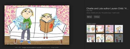
https://images.app.goo.gl/2BgVfBzB5r2AX2U86
I think she'd be a useful artist for you to look at. Her colours are 'flat', but she uses pattern and collage. And she uses outlines on the characters, but she also carries those outlines across into the background too, which makes the piece more cohesive as a whole, rather than - collaged background, and then outlined characters on top in a very different style. I think trying to have a more cohesive feel in your work would be good. Either making your characters also out of collage, or adding some line details also onto the background like Lauren Child does. You've done this on the bin which works well. Just make sure that the colours of the collage aren't taking over the character and vice versa, it just helps to work as a whole.
Other artists to check out -

Kelly Pousette - https://www.instagram.com/kpousetteillustration/?hl=en

Kate Slater - http://www.kateslaterillustration.com/
The email was quite big, so I won’t add it all, Emma had answered all of my questions really well which is quite helpful to me and has put my mind at ease with a lot.
Heres some;
Should I apply my logo to each page?
No, I don't this it's necessary. And to honest, showing your physicaly portfolio is very rare these days. It's mostly all done online with some low rez jpegs attached and a link to your website in the covering email for the rest :)
Also - I would maybe consider that you don't need a logo as an illustrator necessarily. Perhaps just a 'Cover image' for your portfolio front page instead, perhaps the girl with the floppy hat standing up holding the spade.
I have considered creating a concertina style portfolio to present, do you think that this idea would work for my style?
Keep it simple, A4 or A3 portfolio prints in a clean portfolio is fine. And as I say, degree shows place importance on physical portfolios, but it is very rare that I ever show my work in person printed out nowadays. Your website, and having a social media presence, is the most important thing. (don't have to have loads of followers! Just accounts with sensible usernames (avoid underscores))
How did you continue to produce work after graduation?
You keep going!I worked part time while I built up my work. There are briefs you can do that can give you a focus, such as book illustration competitions like ones you might have done in University.
Keep going, keep learning and keep believing in yourself :)
Since then I have thanked Emma for her time for such a detailed review and I will return to this information again as I find my feet after graduation.
“Thank you Emma”!
0 notes
Last Seen Blogs

ivanoff-ph
Ivanoff_ph

curious-morality
Korekiyo Shinguji
arteva
𝔞𝔯𝔱_.𝔢𝔳𝔞

qu1cks1lversb1tch
Amanda Barnes

laugh-eigo-bennkyou
laugh 英語のお勉強