#but also please don't come for me for the quality of the images and graphics themselves
Text
*click on image for better quality*
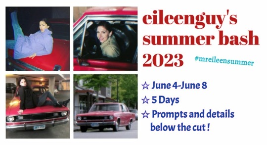
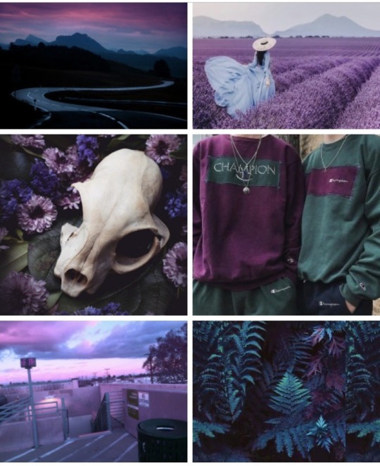
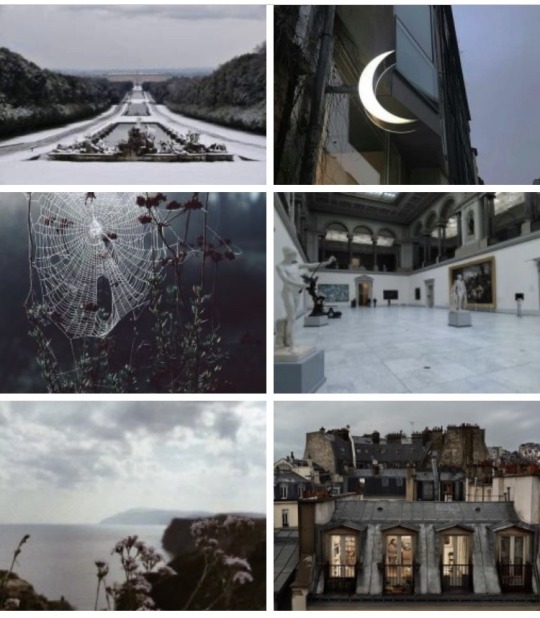
-muku tries to host an event 2: electric boogaloo-
hi everyone 👋 it's muku eileenguy again! to commemorate the end of my finals + the beginning of summer vacation i've decided to try holding a creator's event again, this time themed around summer and film. the prompts are structured like so; a miscellaneous prompt ☆ a film/literature/television genre ☆ an spn specific or related prompt. all creations like fics, amvs, graphics, gifs, fanart and more are welcome <3 you don't need to be following me to participate! the prompts are:
♡ June 4- environments ☆ horror/sci-fi ☆ motw
♡ June 5- favourite episode(s) ☆ romance/tragedy ☆ brown eyed girls of spn
♡ June 6- memories ☆ coming-of-age/drama ☆ "thank you"
♡ June 7- water ☆ cinematography ☆ music
♡ June 8- free spot
✨ + BONUS prompts for all days- eileen leahy
rules and explanation:
first and foremost, i'd preferred it if there was no inc*st (including winkline/cas+jack), samifer and nsfw content (although suggestive is ok). tag all subjects that you might think may be triggering or graphic in your creation. please respect this.
second, the prompts aren't strict at all! you can mix and match prompts as you wish. the "free spot" day is to post things that you didn't get the time to post on the day/s with their respective prompts. i'll also be reblogging any creations people have made for this specific event upto a week after the last date (that being until June 15) so it's ok to post them a bit late<3
lastly, you can either @ me directly anywhere on the body, replies or reblogs of your post or use the tag #mreileensummer. don't hesitate to DM if you think i didn't see your post!
send me an ask if you have any doubts or queries regarding the prompts or any other thing. have fun ;)
138 notes
·
View notes
Text
ramble incoming about indie websites, neocities, and modern web design... putting below a read more because i wrote way more than i thought i would, oops.
whenever i see posts going around about how imaginative and creative old web design used to be, and how minimalist and same-y everything is now, while i do agree and wish that modern web design was more interesting and more dense with information... it's not as simple as "let's go back to how it used to be."
most old websites did not conform to modern accessibility standards, making the internet harder to use for many people, and on top of that we live in a smartphone era now where websites have to be designed in such a way that they work on both phones and computers... phones have a much smaller space to work with - kind of hard to decorate your website in pretty graphics and lay out the information in unique ways when you're designing for tiny screens in portrait resolutions!
i work pretty hard to make sure CPG displays on both mobile devices and computer monitors in at least decent fashion, and the website is absolutely less interesting looking on mobile. the sidebars are traded in for a toggle-able menu at the top of the screen (i'm considering changing it to a button that sticks to the bottom of the screen so you can open the menu without scrolling up, but i digress) and images that would float on the right or left side of articles in an aesthetically pleasing way have to be put into their own blocks between passages of text so that the text doesn't become impossible to read, squished on the sides. i'm not perfect at accessibility, nor am i perfect at optimizing the site for mobile, but i think i do an okay job with my relatively simple layout. i do this because i want my website to be viewable to people on any device, even people who aren't enthusiastic about the indie web, or desktop browsing. this would not be nearly as easy with some of the complex table layouts of the past.
it is interesting to me that a lot of people choose to simply not make their website usable on mobile and will put a notification that the site is either best viewed on desktop or doesn't work on mobile at all on the front page... there is nothing wrong with this, mind you, i'm not making a judgement of the person or their coding abilities, some people are just chilling and doing their hobbyist thing without fretting about that, or making their content for a specific audience that would mostly view from their computers, which is fine! how other people make and run their websites is none of my business. but i do think a lot could be gained from exploring mobile design and making the indie web space more accessible to mobile users, which take up a large percentage of the population. we'd probably have more eyes on us if our spaces were more accessible for people on phones. also, personally, i actually find making my site compatible for mobile with pure vanilla html/css/js a fun challenge.
at the very least, even if a website isn't built to be mobile-friendly, making sure everything is at least visible and clickable is a good thing. my website dynamically changes the size of elements based on the device viewing it, but there is also the option of making your entire website layout a set pixel width, so that it is the same on every device, people just might have to scroll horizontally or zoom in to see/click things... which is annoying but at the very least workable. i have seen some high quality neocities sites that do exactly this and i think it's a good alternative from dynamically sizing pages.
all this being said, i'm coming from the perspective of someone who actually wants their website to be seen and be used by as many people as possible because i'm providing niche game guides/tools/resources, so again, people who are just doing their hobbyist thing probably don't care as much about how many people see their site, especially outside of indie web spaces and especially neocities. it's a bit of an insular community where everyone on there is exploring their fellow users' desktop websites. also, just because a website is not workable on mobile doesn't mean people won't see it! plenty of people still use their computers to browse the web of course, it just cuts out some parts of the population. it's complicated and i'm not an expert on the subject but i don't know, i just felt like talking about it ww
TLDR; i think the ideal would be for a less corporate, more creative internet that still is accessible for disabled people and still allows the use of smartphone browsing. maybe one day when i'm more educated on code, i can make some cooler things in this regard...
#ayano.txt#ayano was here#i feel weird talking this much but i don't really have anywhere else to put these thoughts
10 notes
·
View notes
Link
Check out this listing I just added to my Poshmark closet: Sometimes you just gotta get your halo dirty graphic tee.
0 notes
Text


For the MDZS Language Fest
Language: Luxembourgish 🇱🇺
Prompts used: Day four - green and old, since many of those proverbs and idioms are really dated (and thus also a bit outdated), but still in use in Luxembourg, albeit with a hint of irony.
I am no graphic wizard or .gif magician, but I wanted to play too, so here we are. ♥ Click on the images to enlarge them for better viewing and reading, or use the transcript below.
Transcript for readability:
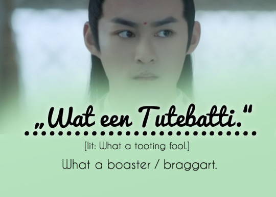
"Wat een Tutebatti."
[lit: What a tooting fool.]
What a boaster/braggart.
"Dat huet mäi klenge Fanger mer gesot."
[lit: My little finger told me.]
A little birdie told me.
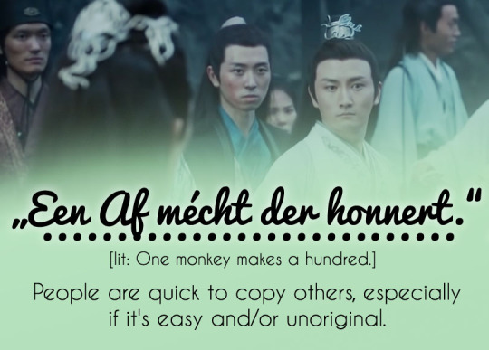
"Een Af mécht der honnert."
[lit: One monkey makes a hundred.]
People are quick to copy others, especially if it's easy and/or unoriginal.
"Hie läit nach am Jelli."
[lit: He's still lying in jelly/he's still being pickled.]
He's still asleep and probably hella hungover from last night.
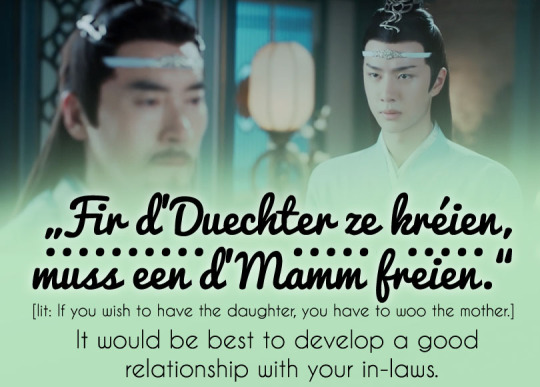
"Fir d'Duechter ze kréien, muss een d'Mamm freien."
[lit: If you wish to have the daughter, you have to woo the mother.]
t would be best to develop a good relationship with your in-laws.
"Ech kréien elo gläich Mippercher."
[lit: I'm about to give birth to a litter of puppies.]
I am so stressed/overwhelmed that I'm about to angrily lose it.
#Sweet is rambling#mdzsmultilingual21#mdzsnet#The Untamed#CQL#Chen Qing Ling#MDZS#Mo Dao Zu Shi#Lan Wangji#Su She#Wen Qing#Lan Qiren#Jin Zixun#Nie Huaisang#Luxembourgish#listem I had a ton of fun with this#I'm on vacation with the girlfriend#and she kept on throwing the funniest idioms and phrases at me#what was I supposed to do? NOT try and make something for this?#but also please don't come for me for the quality of the images and graphics themselves#I know they are...questionable#also the font is on purpose#because Luxembourgish is a funny language#so a funny font was in order
110 notes
·
View notes
Text
How I Make Aesthetics.
Long post ahead, sorry :(
In the past, I've been asked multiple times how I create my aesthetics and where do I get the best pictures for them, so I figured I'd make this master post of what exactly I do. Btw this is coming from a person who has studied graphic design for 4 years and had about 4 years of experience in making zodiac collages here on tumblr. Do what you want with that information.
A few disclaimers
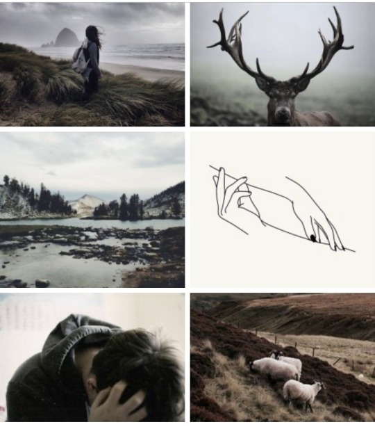
There are different types of aesthetics and in this post, I'm going to be specifically talking about a certain type that I like to make. Here, examples:
My most used format is 6 pictures in 3 rows, but I've also tried 4 pictures, like here for example:
There are other types such as minimalistic photos, dark academia, grunge, and SO many more. Please keep in mind that I'm not hating on these types and when I mention a rule such as don't use photos that are too minimalistic, I am not saying that minimalistic aesthetics are wrong or ugly or anything of that sort!
Just because I don't choose a certain photo doesn't mean I don't like it, it just means that the photo is not exactly what I'm looking for. By me showing you the examples below, I'm just trying to paint a picture. No hate here, okay?
I don't own any of the pictures I use (I've only used like one or two of my own photos in the past) but then again this is just for entertainment, I don't make money doing this or anything. If I ever get a message from an owner of any of these photos and they want me to delete it, I will delete it.
Where to get the photos
Pinterest! Period. AHAHAHA
No but seriously, pinterest and tumblr are my two favorite sources and you will find pretty much exactly what you need there. pinterest specifically.
On tumblr, I usually search for hipster, grunge, indie, and nature, but it also helps to just find specific blogs that focus on photography, follow them and then just download anything from your dashboard that you fancy.
I'll share what I search for on pinterest below👇. My secret tip would be to not always go for the first photo you find but rather to open a picture that sorta has what you like in it and then scroll down, because pinterest is going to recommend you similar, sometimes better fitting photos. On tumblr, I sometimes go to the blog of the person whose one photo I like, and there I tend to find many more of the same kind (since these bloggers usually post a specific kind of aesthetic).
How to choose photos
My number one tip would be to seek texture. Avoid photos that have little going on in them and anything too empty or minimalistic (unless that's what you're aiming for, obviously). Also, don't choose pictures that are very light or very dark, as they tend to stand out in aesthetics and that's not really what you want. At least in the type of aesthetics that I make, I want the final product to be almost a new picture in itself if that makes sense. To show you an example, look at this photo of two sleeping cats:
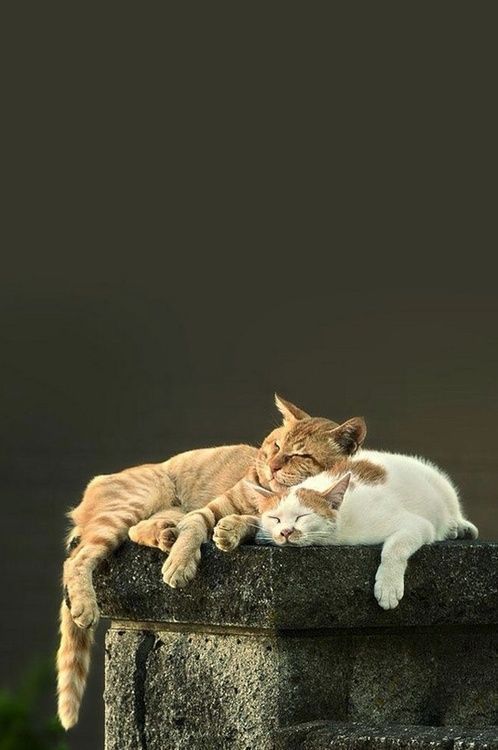
This photo seems like a good fit; it is well balanced in colours (there are shades of white, beige/ginger as well as some greens) and c'mon, it's two cats, what more do you need!!! However, let's look at it in a complete aesthetic:
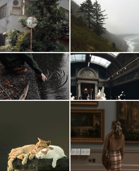
While this aesthetic has a nice color scheme to it (well, it doesn't, I threw it together super quickly, but you get the gist), the photo of the two cats just stands out because the khaki background creates this kind of block of color that your eye will automatically go to and it sort of breaks the collage apart. So, by texture, I mean that a picture is filled, for example with trees, flowers, architecture, little people in the background, etc., etc. Furthermore, I prefer when there are more things photographed (for instance, look at the first picture of the aesthetic above; it has a mirror (and a tiny person in it), architecture and leaves all in one picture)
Next, personality. Go to Google Images and search 'Nature Photography' or 'Sunset Photos'. You might get something like this:
Or this:
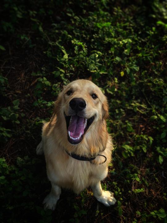
Look at this absolute angel of a boy💚💚💚💚💚💚Isn't he the cutest freaking thing you've ever seen?????? I just want to give him all the treats and all the pets and — ...ehm, sorry, that's not why we're here.
So I don't quite know how to explain this point, but I guess usually professional photos like this are just so well done that they work perfectly well on their own and you usually don't put them in a set (only with other photos from the same photoshoot maybe). They're obviously well-balanced color-wise and high in quality, but they're just very individual and don't really need any addition in the form of other photos. This point also applies to the previous one (textures, in case you forgot); for example, a bunch of blueberries creates a nice texture, however it might be difficult to pair them with other photos. They have enough personality on their own (and this is not meant in a bad way to the photos I do use).
Related to this, you're looking for a story. Usually, if a photo gives off a certain vibe, tells a story, or just leaves any kind of strong impression, it might be a good indication that this is a good photo to use (given all the other rules as well, of course).
The main themes I search for are:
cities, villages, or abandoned places
related to that — architecture or only parts (details) of it
nature, specifically forests with either road or a body of water nearby, beaches, deserts and so on. plus points for tiny people in the distance
animals, usually with the addition of maybe the texture of a sweater sleeve or some blankets, something of that sort
people, my favorite kind is people turned away from the camera with an interesting background, because by them not having a face, they become a bit more relatable in a sense?
people in a river or some kind of water
museums, sculptures
etc.
Usually, I tend to avoid:
photos with text in it (though as an exception I would mention neon signs or letters/words that are for example above shops, on books, etc.)
heavily filtered pictures
photos with very specific (often bold) colors in them, unless you find multiple photos with that same shade. this again distracts the eye too much
GIFs, animated pictures, illustrations/drawings. also, don't use collages (cause you are creating a collage, duh)
black & white pictures
blurred pictures (or those that are purposely grainy — that goes back to the filters above)
anything obviously photoshopped
When trying to figure out where to put each photo
Squint your eyes. The photos should create a nice harmony, there shouldn't be a corner where it gets too light or dark or where some textures blend together, for example, if using multiple flower patterns, try to place them in different corners.
When to know your aesthetic is done
Actually even before you start, you should be in the mood. I have to admit, there have been times where I've felt pressured into making aesthetics, and now, looking back at them, I'm really ashamed of them. That is why I don't always post aesthetics as soon as I get them requested because I genuinely want them to look good.
Sometimes, it helps to not post the aesthetic straight away but to come back to it later with a fresh look. I'd say go with your gut. You should have a good, satisfying feeling about the aesthetic.
Last note
Rules are meant to be broken. Look at the aesthetic below. I used a minimalistic illustration (two birds with one stone I guess) (and admittedly, that one picture does stand out) and yet the aesthetic still came out pretty nice. So, just play around with your ideas and see what you like the most! I'm just a random person on the internet, you literally don't have to listen to any of the tips I gave you here today.
I know this might seem like a lot (honestly, if you've read this entire thing, you're crazy), but it gets easier and easier with practice, soon you won't even think about it.
Hopefully these tips will help you and please let me know if you decide to make any aesthetics. I would love to see them!! <3
#does anyone even care#this post makes me feel like i forgot how to write in english#also#i was thinking we might do this thing where I like... rate your aesthetics?#idk am I being too confident LMAOOOO#oh well#aesthetic#aesthetics#aesthetic masterpost#masterpost#how to#how i create aesthetics#how to create an aessthetic#aesthetic tips#aesthetic advice#collage#collage art#zodiac#astrology
70 notes
·
View notes
Text
(While we don't cross the line)
1: Final Fantasy 9
PS1 ISO and emulator - free
Steam - $20
Classic JRPG with a upbeat and optimistic adventure to overthrow corrupt monarchy with deeper themes of self identity, death, and life affirmation.

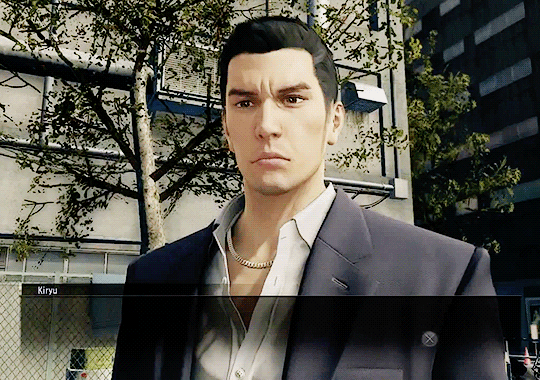
2: Yakuza 0 and Yakuza 6
Steam - $20 each
Open world Action Beat 'em up.... TECHNICALLY. Yakuza games are about the extra content. From Rhythm game karaoke, to slot car racing, to hostess bar management sim, to dating sim, to Idol manager sim, the list is endless. Yakuza 0 follows Kazuma Kiryu as he enters the world of Japanese organized crime focused on a singular district in 1980s Japan. It's a heavy crime drama that will swing from comedy in one mission to hard hitting gritty emotions the next. Yakuza 6 sees the end of Kazuma Kiryu's involvement with the Yakuza in the same district, now in modern day, as he tries to free himself from his past and live out his future with his adopted daughter. Playing 0 and 6 back to back creates a very melancholic feeling as you can feel the age of the district as it goes from the neon filled, dirty seedy "bad part of Tokyo" into a sleek, clean, modern metropolis.
3: Star Wars: Knights of the Old Republic
Steam - $10
Despite being a Star Wars game, KOTOR plays more like the older Neverwinter Nights games with its combat, relying on "select type of attack" and "click enemy target" type controls. (As opposed to an action game requiring quick reflexes from the player). Developed by Bioware before they went on to make Mass Effect and Dragon Age, WAY before being bought by EA, KOTOR is considered one of the best non-movie stories in the Star Wars universe, full of grey morality, complex characters with well written motivations, a morality system that's more complex than just "super hero or baby killer" and an in depth look into the deeper workings of the Star Wars universe post Prequels but pre original Trilogy.
(the sequel which is even better is also on Steam for $10)
I am unsure if the GOG version is better or not but it's the same price)

4: 13 Sentinels: Aegis Rim
(Currently $30 on PS4)
I still need to get 13 Sentinels and everyone who has played it has told me to go in knowing as little as possible. All I have been told is "It's Sci fi. ALL sci fi. Every sci fi trope in one game"
It plays like a tactical game but I have also been told "if the look of the gameplay turns you off please don't let it! Just play it!"
So there's that.
5: Grandia
PS1 ISO and Emulator - free
Steam - $10 +-
Another Classic JRPG from the 90s, the Emulated ISO version has an "undub" that removes the poor quality english dub and re-instates the original Japanese voices but keeps all the english text. Grandia is another upbeat, positive adventure story following 3 kids, Justin, Feena and Sue as they leave their hometown to go see if there's anything beyond the Great Wall which circles the whole world, in the process uncovering political corruption, ancient civilizations, unknown countries and cultures, and long gone ancient technologies. If you like the Ghibli movie "Castle in the Sky" you'll like Grandia.
I do not recommend the steam version which has an ugly filter over all of the graphics and the presentation in widescreen breaks a lot of the battles

I tried to add more images after this but tumblr kept breaking the post and after like 6 tries fuck it.
6: Atelier Escha & Logy: Alchemists of the Dusk Sky DX
Steam - (unsure, Steam's price is coming up weird for me in $)
Part classic JRPG, part time management, part recipe game, Escha & Logy is one of the better instalments in the Atelier game series where you play as an alchemist who needs to gather ingredients, develop potions, poisons and weapons for clients, and fulfil their orders within a certain time limit. Despite the Time Limit, the Atelier games are consistently described as calming and "feel good". Ryza is the latest in the series but I'm recommending Escha and Logy due to its setting.
The Dusk trilogy (don't worry each game is for the most part completely stand alone) takes place in a world thousands of years after the fall of a great civilization, and the natural world is slowly dying due to unknown reasons. So of curse part of the story is to find out why this is happening... but for the most part you're just playing as a duo of alchemists trying to do your best.
7: Drakengard
PS2 ISO and Emulator - free
The game where you ride a dragon in aerial battles, fight mass armies on the ground a bit like Dynasty Warriors... and where EVERY SINGLE ENDING is a "bad ending". The game with no happy endings and every character in your party is objectively a horrible person for different reasons. literally ALL the triggers for this game. But if you want a game that's going to horrify you and make you supremely uncomfortable without it actually being a horror game.... this is the one.
Also one of its endings is what starts the NieR timeline which includes NieR Automata.
It sucks! I recommend it!
8: Hylics 2
Steam - $15
I have no idea how to describe Hylics 2.It KIND OF plays like a JRPG in that the fight sequences are turn based combat... but there's no leveling system.
Also it looks like this.

Just play it. You don't need to play Hylics 1 to play 2.
9: Mother 3
GBA ROM and Emulator - free
Just because Nintendo refuses to translate it doesn't mean there isn't an extensive fan translation of Mother 3 for YEARS no to the point of it being available as a hard cartridge on Etsy.
One of the big inspirations for Undertale, Mother 3 uses a similar but not completely the same battle system as Earthbound (also similar to Undertale's Battle system minus the bullet hell) but with a rhtythm aspect in it as well.
Anyway Mother 3 is renowned to completely shatter your heart into a million pieces and make you cry so also highly recommended.
10: Disco Elysium
Steam - $25
I haven't played it yet (I'm going to maybe this week) but everyone says it has some of the best writing ever in a game. I'll have to see what I think about that.
However I hear it can be pretty grim. So just be aware of that.
32 notes
·
View notes
Note
Hi! You work a lot with prints and that stuff so i wanted to ask you if there are important things i have to take into consideration when printing? I recently test printed a 2000x2000 piece (i think that's around 6 inches) and at 300 dpi but for some reason the colors look off? It also looks like when a picture has a lot of noise, like the colors don't look very smooth, maybe it was because of the printer but i don't really know
Hi! I’m not an expert when it comes to print making by any means but I’ll try to let you know what I know!! gonna put it under the cut since it got quite long!
I’m not sure about the noise, if your piece was at 300dpi and looks smooth digitally then it should translate over to print just fine! That’s only if your drawing was //drawn// at 300 dpi and not converted later. If that’s the case, then it might be an issue with your printer! If you’re using a local place like Staples or OfficeDepot, or using a bad quality printer at home then you’re likely to get a low quality print that will have some grain to it! It is possible to make nice prints with a printer at home, but you have to consider the paper and print settings. Settings for printing a black and white document on printer paper are gonna be completely different from printing a full color image on glossy photo paper!! dfkljfsd that might be a little obvious, but I wanted to mention it jic since I don’t know where you printed your test!
Also, if your canvas was originally around 6x6 inches and you’re trying to print it bigger, you’ll run into the same loss of quality. I always reccomend drawing bigger than you plan to print (or at least at the same size for bigger cavnases) since sizing down is better than sizing up!
As for the colors, what you’re probably noticing is the difference between RGB and CMYK! RGB refers to the colors we see on monitors and screens, while CMYK refers to actual print colors. When you try to print RGB colors, especially bright neon-y ones (or sometimes specific hues like purple), they often come out looking more desaturated or in a different tone than the original art piece as the printer ink cant make the exact colors. CMYK basically just refers to the ink cartridges in your printer!
A lot of artists use programs like Photoshop (and maybe Clip Studio?? idk) to convert their pieces to CMYK as they work in order to see how the colors will transfer over irl. Some prefer to simply work just in CMYK as it makes it easier and there are no nasty surprises after printing. Personally? I kinda just ignore it sdksdfjkl, the printer I work with for my prints converts my artwork from RGB to CMYK better than when I try to do it myself with a program, and I’m satisfied with that. Printers tend to convert things to CMYK automaticallys, and personally I find my art comes out brighter than if I convert it to CMYK beforehand. So its really a matter of preference, but once you adjust to the initial shock of having your colors changed, its not a huge deal imo (my very first print ever had a neon pink background and you better believe i was so disappointed when it came out looking grey af sdfkjlldfks)
I know some home printers are pretty good at replicating RGB colors. My friend had like a 5ink cartridge printer and she used it to print stickers and they turned out a lot brighter. So, that’s a possible advantage to making prints at home if you’re willing to invest in a nice quality printer.
Lastly, bleed is very important. Full bleed refers to when the artwork on a print goes to the very edge. Without full bleed your art will have a border around it. Its important to make sure your art doesnt have important text or graphic elements too close to the border as they could potentially get cut off when cropping the print. Every printer will have their own specifications, but most will recommend that you work with a canvas that is slightly bigger than the size you are printing in order to account for bleed. Ex: If you want to make an 8.5″x11″ print with full bleed, you’d wanna draw on a canvas that is a quarter inch bigger all the way around (or whatever the specification that you printer requires). So you’d draw on an 8.75″x11.25″ canvas instead, making sure that important details dont touch a 1/2 inch safety border around the whole print. (The safety border includes the quarter inch that gets cut off and then another quarter inch inner border just in case.)
I know all of this might sound confusing and overwhelming but its really about trial and error. Take advantage of ordering sample prints/soft copies before you order a bunch in order to ensure that your print turns out nice! Once you get the hang of it its really not that much work to format! The company I use is called CatPrint, and while they have their ups and downs, I’m familiar with working with them and their quality is usually pretty good. If you order from them, please use my referral link as it helps me out and will get you $10 off your first order!
#FAQ#sorry if there r any typos i dont have time 2 proofread this rn but i hope this helps a little!#Anonymous
41 notes
·
View notes
Note
Your art style is really cute and very fun to look at! If you don't mind me asking, how did you come up with it? Do you have any particular art inspirations or maybe references you regularly use? I also adore the way how you draw stretch marks. May I ask for some tips on that, too, please? Thank you for sharing your beautiful content with us!
Aw thank you so much! I'm so glad to hear I'm doing a good job!!
My artstyle takes cues from a lot of very simple but graphic media: s/u, kir/by, meg/aman cla/ssi/c, po/kem/on, m/l/p, in/fini/ty tr/ain, and sho/vel kn/ight are all examples of things that I'll look at and try to apply to my art.
If you can, I also really recommend finding individual artists to look at the work of as well, since there can be a lot of variance within shows. Don't worry if they don't "match" your style. Fa/yren is a stunning artist who's work doesn't necessarily match my style, but I study the way she draws things because there's always something to learn from others' techniques. If something about an artstyle catches your eye, observe it; figure out what about it you like and try incorporating that into your art.
It's also worth asking yourself what your goal is with your art, and working towards developing your style with that in mind. My goal with art is not necessarily to make something representational or "realistic" looking, but for the viewer to instantly be able to recognize what's going on with relatively little effort on my part, while also making an image that's pleasant to look at. Being able to shorthand certain things and whip out a shape that easily communicates an idea is a skill I've taught myself over the years, and it's what enables me to churn out art like nuts.
I love the look of more naturalistic art, but I'm usually very frustrated trying to create it (I like instant gratification, which is not a compatible mindset for the amount of rendering in most representational art XD), so I'd rather make something that takes relatively little time but has a lot of spirit in it.
Something I try to keep in mind with when using my style is that nothing is set in stone; my style is fluid. If I like the way something looks, I try it out, and see how I can fit it into my art.
Drawing Sta/rscre/am's hands as rectangles with sticks attached to them in simpler drawings is an example of this; I don't normally do that, but I thought it would be cool and communicate how I think his hands look better than my usual method.
Ahaha, stretch marks! One of the things I was hoping someone would ask about!
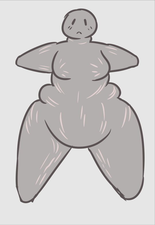
I happen to have some pretty sizeable stretchmarks in easy-to-reach places on my body, so I have a hands-on reference for them, but if you don't happen to have any of your own, there's a few things I do to quickly communicate them.
Stretchmarks are usually in the shapes of little lightning streaks, or branches. They form where the skin stretches after a rapid change in mass. Different things cause stretch marks, so it's worth knowing that not all stretch marks will look the same; you can get stretch marks from a pubescent growth spurt, pregnancy, going on HRT, bodybuilding, and of course, an increase in weight.
Of course, they don't just lie flat on the body; they follow the curves. Here's a (very) rough drawing showing how they tend to fall with the gain of weight, and a better view of the ones on Sta/rscr/eam:
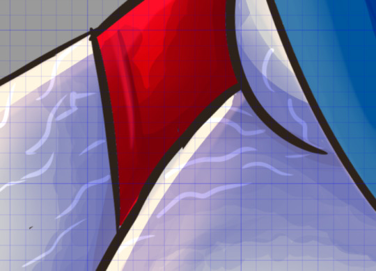
With fresh ones, they tend to be red on people, but if you're drawing, say, a giant alien from another planet, consider using the color you would use to convey blood or blush.
On older stretchmarks, they tend to be lighter than the skin around them because of the way the scar tissue forms. They have a slightly satin quality compared to the matte skin around them. This is pretty easy to replicate in digital art, because you can use a screen or lighten layer to get that effect, but if you wanna go the extra mile, you can also ad a gradient to them. The ones Sta/rscr/eam has are tinted pink and blue. If the lighting was different, I might have used different colors.
For traditional art, what I'd probably do is either use a thinned down acrylic or gouache to block them in if I were painting, or create them in the negative space while shading. They can be pretty fiddly! I'm 100% sure there are skilled traditional artists who can whip them out without struggling (If not for kink, then for the sake of creating gorgeous renders to pay homage to the classical era of art), so don't be discouraged by my lack of advice!
2 notes
·
View notes
Text
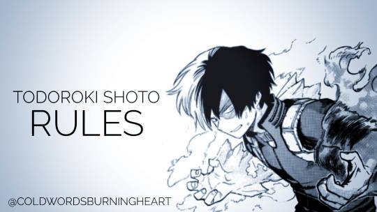
Age: I won't roleplay with anyone younger than fourteen. I have nothing against younger roleplayers but I am not going to plot anything with someone who shouldn't even have a phone or social media at least. (Yes, I am not an oldie, gen z here but this won't change anything.)
NSFW: Mun is over 18. That means this is a free NSFW blog and I am open to roleplay anything but with a discussed plot beforehand. There are some triggers I have (about NSFW roleplay or some NSFW verses) but I'll discuss this with you and ask about yours. I think there's no need to say that I won't roleplay anything sexual with minors. I'll have to ask your age if we do something like this, but only because I need to make sure that I am not doing anything illegal. Else, we can always stick to the romantic part and fade to black.
Shipping: By the way I portray Shoto, he is biromantic. That means that I will ship him with both males and females but I prefer to stick to male characters. As long as the female character is well written, there's always a chance to ship him with her. I have to admit I'm picky with female OCs because in my experience their portrayal is too swallow. Shoto is not just romantic. He needs to share a deeper bond with his partner.
Tagging: I will tag anything NSFW under the tag #|NSFW|. That's because I don't want Tumblr to track the tag and flag my posts. You have been warned. I'll also write NSFW stuff under the Read More tool. When it comes to triggers, I will try and tag some heavy matters under the tag: #|tw:yourwarninggoeshere|. You can tell me your triggers by sending me a message or an ask. Right now I tag those trigger warnings: suicide, mentalillness, torture, parentalabuse. I am a human being so I might forget to tag something, so remind me if I haven't.
Following: I follow back from my main blog @knightinsourarmor . I will follow most of my roleplay partners or those I want to roleplay with but if we don't interact for a long time (a few months) or have stopped roleplaying for various reasons, I will unfollow you. I don't mind not being followed back. This blog will include graphic images of pain and horror or NSFW content so I understand if someone doesn't want to have my posts on their dash.
Post length: My writing style is advanced literate. That means I need more than a paragraph to roleplay with. One paragraph is fine still, but as long as there's something interesting to reply. I don't mind how long your replies are. Just take notice that I will probably mirror you and my reply will be the same length.
Warning: I have written this again but I want to make sure that it's clear enough. I will probably roleplay some heavy matters like mental illness, suicide, torture etc. There are matters I will roleplay that might make some people sick. So either tell me your trigger warning to tag those, either don't follow me. That doesn't mean that if you request me to roleplay something soft or something canon I won't.
Selective: I am selective when it comes to writing. Like I said, I need a paragraph or more to reply. I need to roleplay in third person and I don't roleplay on DM.
Multiple Threads: I don't mind having multiple threads with the same person especially if I enjoy their writing.
Tracking: I used to track my threads with an app but it takes a lot of my time. Now I try to use a tagging system even if it doesn't work as well as I want it to. Don't be scared to remind me to reply on something I might have forgotten.
Reminders: Constant reminders make me lose my interest to the roleplay (if there's any). I understand and appreciate for someone to tell me I have forgotten something. Myself, I will remind someone our thread after a month or even more.
Replies: I am a med student and have to work at the same time. That means that I can be really slow when it comes to replies. I wish you understand and don't feel offended or lose your interest if I take some time to answer our thread. I believe in quality over quantity. Some days I might reply to specific people. That has nothing to do with you or your writing. I just might need to roleplay a specific matter or thread or enjoy someone's writing too much and need to focus on that for some time.
Asks: I will reply any asks. Sending me memes or starters makes me really happy, but I am someone who thinks of those as a chance to start something which has a well-built plot. Short time threads is not my thing.
Games: Tag me to any games and stuff. I love those and there's a chance to show more aspects of my muse. I'd prefer not to reply those as mun though.
Icons: I roleplay with icons but I don't expect you to do so. I edit and make all my icons, so I'd appreciate if you didn't use them/save them for future usage.
Cutting Posts: I have finally found out how to cut posts. Still I don't expect you to do so.
English: English is not my mother language. I have learnt English completely alone and it's something who had been hard for me. I understand telling me if I have made any mistakes or ask me if you didn't understand anything but I won't take any criticism.
Triggers: I don't have any triggers except some NSFW one's like age-play. Those can be discussed only if we go that far.
Time-skip: Well, I'm someone who can enjoy something that is slow. I am pleased with anything as long as there's some really good and inspiring writing (how many times have I said this?). If you start getting bored we can time-skip but I'd want to discuss about this first.
Thank you for reading my rumbling before messaging me first. Please check my Intro and my Basic Info page. Also you can check my Verses and Open Starters. Links are on my description for both computer or mobile users. You can message me and plot any time. Thanks for your time. Just FYI I am a lot like Shoto so I might not be talkative. This is not personal and doesn't mean I am not interested for our muses to interact.
#mha roleplay#todoroki#shouto todoroki#mha#bnha shoto todoroki#mha todoroki#mha rp blog#mha edit#bnha roleplay#bnha rp#bnha#my hero academia#boku no hero academia#todoroki shouto#shoto todoroki#todoroki shōto#bnha todoroki#todoroki shoto rp#todoroki shoto
7 notes
·
View notes
Text
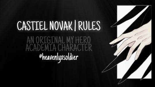
Age: I won’t roleplay with anyone younger than fourteen. I have nothing against younger roleplayers but I am not going to plot anything with someone who shouldn’t even have a phone or social media at least. (Yes, I am not an oldie, gen z here but this won’t change anything.)
NSFW: Mun is over 18. That means this is a free NSFW blog and I am open to roleplay anything but with a discussed plot beforehand. There are some triggers I have (about NSFW roleplay or some NSFW verses) but I’ll discuss this with you and ask about yours. I think there’s no need to say that I won’t roleplay anything sexual with minors. I’ll have to ask your age if we do something like this, but only because I need to make sure that I am not doing anything illegal. Else, we can always stick to the romantic part and fade to black.
Shipping: By the way I portray Castiel, he is biromantic. That means that I will ship him with both males and females but I prefer to stick to male characters. As long as the female character is well written, there’s always a chance to ship him with her. I have to admit I’m picky with female OCs because in my experience their portrayal is too swallow. Castiel is not just romantic. He needs to share a deeper bond with his partner.
Tagging: I will tag anything NSFW under the tag #|NSFW|. That’s because I don’t want Tumblr to track the tag and flag my posts. You have been warned. I'll also write NSFW stuff under the Read More tool. When it comes to triggers, I will try and tag some heavy matters under the tag: #|tw:yourwarninggoeshere|. You can tell me your triggers by sending me a message or an ask. Right now I tag those trigger warnings: suicide, mentalillness, torture, parentalabuse. I am a human being so I might forget to tag something, so remind me if I haven’t.
Following: I follow back from my main blog @knightinsourarmor . I will follow most of my roleplay partners or those I want to roleplay with but if we don’t interact for a long time (a few months) or have stopped roleplaying for various reasons, I will unfollow you. I don’t mind not being followed back. This blog will include graphic images of pain and horror or NSFW content so I understand if someone doesn’t want to have my posts on their dash.
Post length: My writing style is advanced literate. That means I need more than a paragraph to roleplay with. One paragraph is fine still, but as long as there’s something interesting to reply. I don’t mind how long your replies are. Just take notice that I will probably mirror you and my reply will be the same length.
Warning: I have written this again but I want to make sure that it’s clear enough. I will probably roleplay some heavy matters like mental illness, suicide, torture etc. There are matters I will roleplay that might make some people sick. So either tell me your trigger warning to tag those, either don’t follow me. That doesn’t mean that if you request me to roleplay something soft or something canon I won't.
Selective: I am selective when it comes to writing. Like I said, I need a paragraph or more to reply. I need to roleplay in third person and I don’t roleplay on DM.
Multiple Threads: I don’t mind having multiple threads with the same person especially if I enjoy their writing.
Tracking: I used to track my threads with an app but it takes a lot of my time. Now I try to use a tagging system even if it doesn’t work as well as I want it to. Don’t be scared to remind me to reply on something I might have forgotten.
Reminders: Constant reminders make me lose my interest to the roleplay (if there’s any). I understand and appreciate for someone to tell me I have forgotten something. Myself, I will remind someone our thread after a month or even more.
Replies: I am a med student and have to work at the same time. That means that I can be really slow when it comes to replies. I wish you understand and don’t feel offended or lose your interest if I take some time to answer our thread. I believe in quality over quantity. Some days I might reply to specific people. That has nothing to do with you or your writing. I just might need to roleplay a specific matter or thread or enjoy someone’s writing too much and need to focus on that for some time.
Asks: I will reply any asks. Sending me memes or starters makes me really happy, but I am someone who thinks of those as a chance to start something which has a well-built plot. Short time threads is not my thing.
Games: Tag me to any games and stuff. I love those and there’s a chance to show more aspects of my muse. I’d prefer not to reply those as mun though.
Icons: I roleplay with icons. I don't expect you to do so.
Cutting Posts: I have finally found out how to cut posts. Still I don’t expect you to do so.
English: English is not my mother language. I have learnt English completely alone and it’s something who had been hard for me. I understand telling me if I have made any mistakes or ask me if you didn’t understand anything but I won’t take any criticism.
Triggers: I don’t have any triggers except some NSFW one’s like age-play. Those can be discussed only if we go that far.
Time-skip: Well, I’m someone who can enjoy something that is slow. I am pleased with anything as long as there’s some really good and inspiring writing (how many times have I said this?). If you start getting bored we can time-skip but I’d want to discuss about this first.
Thank you for reading my rumbling before messaging me first. Please check my Intro and my Basic Info page. Also you can check my Verses and Open Starters. Links are on my description for both computer or mobile users. You can message me and plot any time. Thanks for your time. Just FYI I am a lot like Shoto so I might not be talkative. This is not personal and doesn’t mean I am not interested for our muses to interact.
#castiel#mha#my hero academia rp#my hero academia#bnha roleplay#bnha oc#bnha rp#mha roleplay#mha oc#boku no hero acadamia oc#boku no hero academia#boku no hero oc#castiel novak#roleplay oc#roleplay#my hero acadamy#original character#mha crossover
2 notes
·
View notes
Text

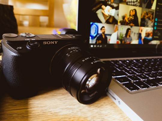

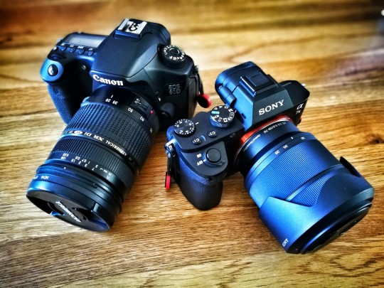
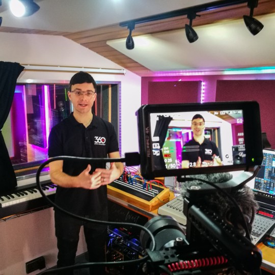
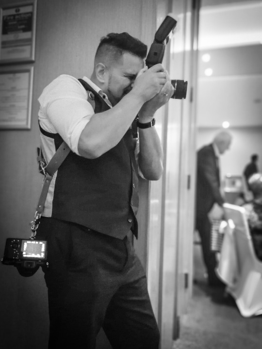

What kit should you buy?
Ok, so you're probably expecting me to recommend cameras, tripods, lenses etc. I'm not gonna do that.
There is tonnes of content on YouTube etc to tell you all about that stuff.
So I'm going to keep it simple.
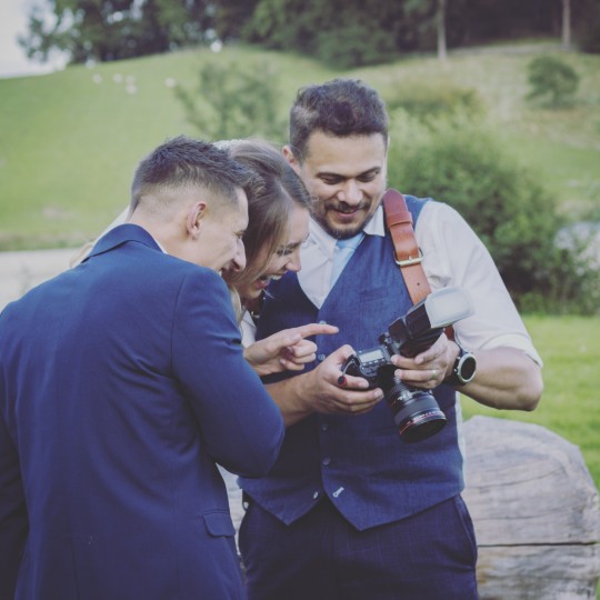
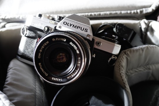
First, just scroll back up and spend a minute going through the images above. What do you notice?
I'm hoping what you'll notice are a few things.
I'm shooting different things within the images for different reasons or clients.
I have a fair few cameras (about 15 I think at my last count).
The cameras are all different. Why is that?
I'm carrying some kit on my person.
So, here is the thing.
You get to ask yourself the following questions.
What do I want to shoot?
How much kit do I want to carry?
Do I really need to carry all that kit?
So how much kit do I REALLY want to carry?
Do I want to generate an income from shooting?
Do I actually generate an income from shooting?
I have been a photographer for around 30 years now. Starting out as everyone does as a novice, then amateur, then enthusiast and progressed to a semi-pro (semi because I have another job I do I don't shoot full time but I do run my own photography and video business as well).
So my needs right now reflect the kit I buy. I've read loads of magazines with lovely flashy looking kit that I worked hard for to buy from my own day job wages. I spent a fortune. Then a year later, a new camera came out and my head was turned. Then I was lusting after that kit!
It's a never ending cycle where you can be bombarded with videos, reviews of kit and as you've probably learned,targeted adverts on Social Media.
Now my film cameras are purely a purist thing and I learned on film cameras from being a very young kid. So I am attracted to the nostalgia of it. Yes there is something about film that is so super difficult to replicate on digital, but do clients demand shoots on film? Nope!
Only one client ever asked for a shoot on medium format film on my Mamiya 645 pro camera. They had a specific look they were going for. It's expensive and it takes longer to turn the images around.
Clients want high quality media that can be manipulated by graphic designers for ad campaigns etc. And they want it quickly. So digital has to be the most efficient way to go.
I've bought kit that I've used once then stored it away for years! I've learned since then.
For several years now I only buy what I need to get the job done to the high standards that I set myself and that clients demand. If I need kit I may only use once, I'll borrow from a fellow pro shooter or I'll hire it.
So if you're not making money from your photography and unless you have more money than sense, don't waste your money on buying the best money can buy.
On saying that if you buy cheap 'tat' you'll be disappointed and buy twice.
Buy the kit you know you'll use often if you're a hobbyist, or if you want to take photos better than a smart phone can.
Remember also. You have to carry it.
I only buy stuff for my business now that I know I'm happy carrying and gets the job done. I'm fit and healthy but I'm also in my late 40s now and I've put my body through a lot of stuff over the years such as a motorbike accident, bashed about in full contact martial arts and other daft stuff, so wear and tear starts to kick in. Don't buy shit loads of kit that you'll have to carry and either injure yourself or just leave at home because it becomes a chore to carry it.
The best camera in the world is the one that is with you at the time. A £10k Leica with a Summicron lens sat at home in the drawer is useless at that point because it's not with you when you find that photographic opportunity.
So I have been switching out from DSLR to Mirrorless cameras for the last 2 years now. I'm not gonna harp on about what brands. It doesn't matter. Find what works for you.
Finally I'd like to share with you the two most important things that I've invested into my photography that supercede any fancy kit:-
Time and mentorship/lifelong learning.
Time and Mentorship.
By time I mean putting time into practising. No amount of YouTube tutorials or books will improve your photography if you're not putting the practice in. Shoot as often as you can. Practice with light, play with it.
Learn the limits of your kit and learn your own limitations and then fill the gaps by committing to learning for the long haul.
Not one successful photographer worth their salt believes they know it all. The world's best photographers have committed to life long learning.
Leads me onto the last thing.
I currently learn from many sources. Yes I'll admit, the odd YouTube video on editing techniques as software continues to develop. I'm a Pro member of the Photographer's Guild so I have access to all sorts of workshops and learning there.
I am a member of Karl Taylor Education and I've studied with Karl's many products for about 7 years now and I pay a subscription to access his classes.
I have paid to work with some leading industry photographers such as Gary Wallis from the London Photography Institute, Steve Howdle (Elinchrom Ambassador) and the Late Andrew Appleton (Former Photographers guild panel judge and very well respected photography coach and teacher).
I have developed connections with other professionals in my area and I will work with them on projects in and out of the studio.
We'll share tips and go out to other cities to shoot together or shoot together in the studio.
I'll take myself off to London for the day to shoot and I'll get into the less touristy areas of London to do this. It's a 200+ mile trip each way for me but I'll go to the effort of hopping down for the day several times a year.
The point I am trying to make here is there are always opportunities to learn. I have had to invest time and money into them all.
However, I've learned so much that when I look back it amazes me just how far I've come and what I have learned.
Just as with anything. Improving your skills requires time and commitment.
So to summarise:
Decide what you want to shoot and where and buy the camera and kit that suits that.
Travel as light as possible. Develop your knowledge before spending lots of money on more kit.
Find a mentor and ask them to help you. It might cost you money, it might not, but it's a worthwhile investment. It's massively accelerates your learning curve, cutting down your learning duration by years. If someone told you to learn your current job from YouTube videos and books how long would it take you to become proficient at it? Compared to on the job learning/training, learning from people around who are already experts at that job? It's the same principal when you work with a good mentor. Once you have the knowledge in it weighs nothing and the more you use what you've learned the stronger you become in you're art.
As usual, if this post has been of use to you, please hit the like button, subscribe for more content and fire any questions you have in the comments below.
Speak soon.
Regards.
Neil.
#whatkit#improving#Photographymentorship#whatcamerashouldibuy#whatphotographykit#learnphotography#learn photo editing#shouldibuyapropercamera
0 notes
Last Seen Blogs
creationest
Creation in creation
silentsymbols
silentsymbols
official-mae
ひとり思う
toofypigeon
Tooth3d Pige0n
inhorrors
PATH : UNDEFINED