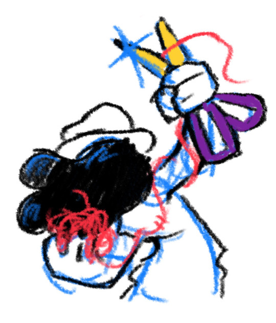
#but it fit the composition and the flag so
Text
TS4 Infant Conversions & Recolours


Want some little Ghoulies in your Sims 4 game? Your vampire sims have an infant that doesn't quite fit in because of how they look? Well now you can have some cute little Ghouls, Demons and Vampires with the use of some custom content that I have converted to be used with Infants! I initially didn't make these conversions and recolours for Halloween, but after doing so I realized these would be perfect to use for just costumes if you didn't want your infants to always be looking like little Ghoulies :)
I have converted @lady-moriel's Tiefling Tails, #ScreamingMustard's Capricorn Horns Accessory (edited slightly and added swatches with your choice of gold, silver or black titanium rings for each swatch), #Cerberus Little Demon Horns (with a cpl added swatches), @leahlillith's Vision Horns, @remussirion's Demon Claws, @natalia-auditore's Chernobog Wings Closed, @suzuesims Demonic Toddler Wings; as well as recolours of @rplts4's 247 Infant Dress. I also included @meowsaucepan's body paint that I fixed in Sims4Studio by changing the composition method to 0 so it shows up on top of cc skins; as well as adding all ages including infants in the Age & Gender Flags category. There is also a Neck Only version of the body paint as well. I also made the body paint HQ compatible. Unfortunately since I made changes to the actual tattoo in S4S and it's not a recolour you do not need the original mesh. Just note that I did not create this tattoo and all credits go to @meowsaucepan. You can see the original post of the body paint here CLICK
You *NEED* the original mesh for each conversion/recolour to show up in game.
Lady Moriel's Tiefling Tails here ---> CLICK
My Infant Tails Conversions here ---> SFS
Screaming Mustard's Capricorn Horns here ---> CLICK
My Capricorn Horns Conversion here ---> SFS
Cerberus' Little Demon Horns here ---> CLICK
My Little Demon Horns Conversion here ---> SFS
Leah Lillith's Vision Horns here ---> CLICK
My Vision Horns Conversion here ---> SFS
RemusSirion's Demon Claws here ---> CLICK
My Demon Claws Conversion here ---> SFS
Natalia Auditore's Chernobog Wings Closed here ---> CLICK
My Chernobog Wings Conversion here ---> SFS
Suzue's Demonic Toddler Wings here ---> CLICK
My Demonic Wings Conversion here ---> SFS
Roberta P Lobo's 247 Infant Dress here ---> CLICK
My 247 Infant Dress Recolour here ---> SFS
Meowsaucepan Body Paint and Neck Only Body Paint here ---> SFS
A *note* about the Capricorn Horns. Originally they were made to be in the necklace category. With some shirts and other ACC they would not show up on the sim. So I also created one for the L Wrist category. When testing with the Tiefling Tails for example, while wearing some tails the Capricorn Horns in the necklace category would not appear on the sim, but the horns in the wrist category would. Likewise with some tails the wrist category horns would not appear on the sims but they would if using the horns from the necklace category. This will also happen with some clothing items.
Enjoy! :)
290 notes
·
View notes
Note
I loved your diegetic edit of stayed gone!!!!!! It’s so good that it sparked a crack what-if (btw I say all this with manic bouncing glee, I do a design brief class too atm, I don’t want this to sound like? A criticism??? Because it’s NOT, HOLY SHIT- it’s a what-if which confirms your edit’s good balanced decisions) so this is just for laughsies! you know when Vox starts glitching out and crashes? It would be very extra if the glitches and error messages on his face were what was showing on the window display screens too. the mental image of everyone at the window blasted with the bi disaster screen and the blue screen of death, adding to Vox’s public embarrassment. But CHRIST the isolating and compositing though,,,,,,,, (solution-addicted brain is saying “recreate the individual screens” but we’re not listening to it because tHATS THE DEVIL TALKING) which is why it’s good you didn’t do that because you would have died and we need you
(link to said edit)
HAHAHA thank you, that is a good idea actually, I think it sounds doable it would theoretically just have taken a bit more time, imagine if like the big screen was just the vox scene you see in normal stayed gone but all the surrounding screens are the corresponding crash screens (I'm not like. planning on redoing another version of it I'm just putting the idea out there KSLGLLHLDLL)
not sure if the screens would have to be entirely recreated, but probably would have to be edited to fit the screens/have the static removed that's true, but THEORETICALLY sounds doable
but also....

alas, canonically that is not the case (no bluescreens taking up the entire screen), but it is interesting to think about and would be funny cause it'd give the audience a clear view of vox's screen literally calling him out for his hate-crush (alastor blue screen, bi flag crash, rainbow crash) and would make it ALL the more easier for a sinner to take it and post it online too (like this silly idea) LMDFGOSODF
also while I'm at it I wanna say, the reason I decided to do the edit is because I remember seeing a bunch of pov of outsiders in hazbin song edits a while back (particularly also stayed gone but you're the other vees) and thought "why hasn't anyone done this with the sinners in stayed gone yet it'd be so cool with all the screens" then I thought of the tedious process and realised that's why (and I did it anyways)
#ask#osrs.txt#design and media students nerd out session#bi flag crash has an obligatory link to my post just for the people who don't know about it#radiostatic#staticradio#onewaybroadcast#hazbin vox#hazbin hotel vox
42 notes
·
View notes
Text
A very thorough; very long analysis of Tsukasa's latest card.

I first want to preface this by saying thank you to Tsukasa for coming in only 40 pulls. I still have a good amount ready for your next limited!
:)
This card has made me go insane.
This an exaggeration on my part, but it seems like every time I look at this card I find another detail I've overlooked that just makes me love this card even more. It's an understatement to say that the artists of the Project SEKAI cards put a lot of thought into composition, lighting, and the theme for each set--especially for story-driven cards. So this post will be my in-depth analysis of this card and my personal thoughts and theories.
This post is separated into parts in hopes of this post having some semblance of organization.
Card Artwork Composition
Tsukasa's trained artwork from the card A rush of Excitement shows Tsukasa at the very forefront of the card. The camera is positioned slightly upright--giving the viewer the feeling as though they're looking up at Tsukasa. The art is also positioned at an angle, giving a sense of movement which works to emphasize Tsukasa's pose: A confident stride toward the warmly lit stage. The bright light fills the dim backstage with light. This is further emphasized by the billowing movement of the flag he clutches behind him, the tail of his suit, his bowtie, and his hair. He's giving the viewer a bright smile full of confidence
His card highly contrasts Rui's card Blowing in the Evening Breeze. He's static--sitting farther away from the camera. A barrier separates him from the viewer: a tilted hourglass that he watches with a solemn expression. He's surrounded by clutter and darkness floods the room he's in--only a small sliver of light reflecting against the hourglass and highlighting Rui's eyes.

For Nene's card A Childhood Friend's Gaze, there's more movement (shown by her hair and skirt), but she has a bittersweet smile and is seen stopping to look at a nearby hourglass. The light behind her is similar in color to Rui's: a bright white, unlike Tsukasa's warm yellow.

Overall, Tsukasa's card seems very out of place when you compare it to Rui and Nene's cards in the same set. Additionally, there's a large emphasis on the hourglasses in their cards (I'll discuss more on that later).
I feel like this decision to make Tsukasa's card such is very intentional on the artists' part and was the first thing that caught my attention when I saw them. Rui and Nene's cards have a solemn vibe to them--fitting alongside the plot of the set's corresponding event. Tsukasa's not so much.
It's almost as if he is ignoring the weight of it all.
Background Analysis
Let's return to Tsukasa's card.
Tsukasa is backstage, the warm light of center stage behind him floods a usually dim area with glowing light. This symbolizes Tsukasa's dream to be a world-renown actor and that the steps he takes in the present bring him closer to that light--his dream.
But this isn't an event about entering the stage. It's about leaving--saying farewell. A Sorrowful Farewell at Curtain Call--the part of a show where all affiliated actors bow to the audience and the show comes to a close.
It's strange that this card illustrates the polar opposite of the event name itself.
Now, let's talk hourglasses.
The appearance of the hourglass is especially important throughout the event. Hourglasses represent the passing of time--finite time specifically. They could have chosen a simple clock, but the idea of limited time--which the hourglass best represents--fits perfectly when we think of the future end of WxS. Their time together is limited and their goals--the closer they become--will pull them farther apart.
Rui's is situated behind one, glaring at the large hourglass. The hourglass is tilted, but the sand is still falling representing Rui's wish to stay with WxS longer (hence the hourglass being tilted in an attempt to stop the sand from falling to the bottom). This event focuses on Rui's shattering realization that his time with WxS will end in order for him to achieve his dreams. He'll have to let go of the people who accepted him and back into a world where that situation is not guaranteed.
Nene's card has many hourglasses, but here they stand upright and act as supports for the building behind her, symbolizing her dream. She's somewhat come to terms with the thought of WxS disbanding as showcased in past events (Mermaid Admiration and Island Panic) and can deal with it although with a bittersweet smile. She focuses on the good times she had and the good times yet to come with the troupe.
But take another look at the hourglasses in Tsukasa's card.
The hourglasses are small, upright, organized;
caged.
He doesn't interact with the hourglasses at all--not even a glance at them. He's focused on us, the audience, and the stage ahead. You can argue the idea that he just doesn't realize that his time with WxS is slowly fading away, but Tsukasa is a lot more aware than that. We've seen this shown multiple times throughout multiple event stories. He does know, but he doesn't want to think about it. Ignorance is bliss, after all.
Why sulk about the future if you just focus on the present? Why reminisce about the pain of the past if that doesn't make anyone smile? Forget the pain in those bad memories. Push them away, lock them up and never think of them again.
Sounds familiar, doesn't it?
This is further shown through the flag he carries behind him. We've seen this flag in his card in only two instances. His 2-star and 4-star from Wonder Magical Showtime. These two cards symbolize a great shift in the story of WxS: the formation of the troupe and their promotion to park ambassador respectively. The flag partly covers parts of the hourglasses as though he's involuntarily trying to hide them. The flag Tsukasa carries has been a symbol of WxS since the beginning. It's almost like he's trying to reassure everyone. "Everything's alright. We're still good ol' Wonderland x Showtime!"
Tsukasa has yet to come to terms with the future of WxS and the pain that it will cause him. So he does what he does best: he ignores it and forgets it. He smiles, reassuring us and the people around him that there's nothing to worry about.
But the hourglasses remain unchecked, and the longer Tsukasa ignores them, the more sand that will fill the bottom. They're bound to break someday under the weight, and Tsukasa will be left to pick up the pieces if nothing changes.
TLDR: Tsukasa, sweetie, it's okay to be sad.
#tsukasa tenma#tenma tsukasa#wxs tsukasa#tsukasa project sekai#project sekai#colorful stage#wonderlands x showtime#wxs#rui kamishiro#nene kusanagi#emu otori#hatsune miku#analysis#art analysis#I love this card so much you don't understand#proseka#Probably my new favorite card ever
258 notes
·
View notes
Text
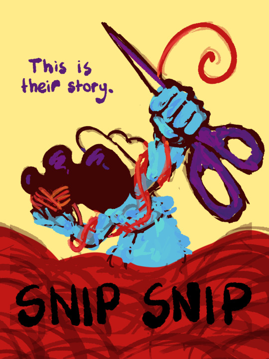
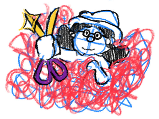
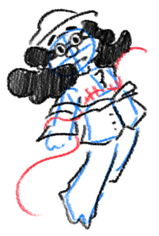
I thought I'd share the sketch of this poster/book cover as well as my initial concepts! You can click the "Read More" button for more in-depth explanations on my design process.
Thhis is all for my latest fanfiction, Snip Snip, so if you'd like to check that out, then...
Now let's crack in!
For the release of "Snip Snip", I actually had several different directions in mind! One was a comic of one of the scenes from the fanfic—specifically the one where the Professor breaks down in front of Kate and Joyce with the line "I don't like being a woman"—and the other was a series of doodles showing the Professor's transition. Unfortunately, both directions met dead ends as I couldn't find the motivation to do either. The most progress I made were these sketches.
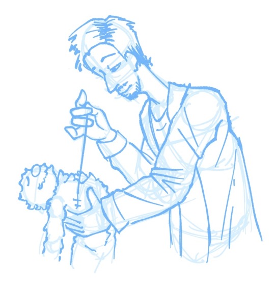
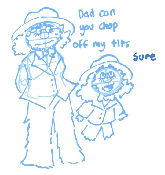
If you're wondering, "The first one looks familiar..." that's because I reused that pose for my first promo art! It was too good of a pose. I couldn't waste it :P
But anyways, after a period of getting extremely frustrated over the lack of progress, I realized my main problem: I was biting off more than I could chew. I didn't know this at the time, but I was dealing with burnout from school assignments that made drawing more ambitious ideas like the ones I had very difficult. Hence, I had to scale it down. It made me think, "Why not do something like a movie poster or a book cover?"
That's how the sketches at the top of the post came to be! I consulted a friend of mine over which pose to choose, and he picked the third one which I understand why so. The obscuring of the Professor's face not only made it cool, but it adds symbolism in how we don't really see his true identity—the real him—until his transition. Here's the first sketch!
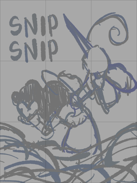
As you can see, the title is on the top left corner! However, I moved it to the bottom for two reasons
It's advice I learnt while looking up how to make movie posters since moving the title to the bottom tends to bring more focus to the illustration above.
I couldn't find a font that fits! And the idea of doing typography again (especially after the Keep Yourself Safe poster...) was really not what I signed up for.
But then it left the problem of the top corner looking empty. It was too distracting! So what did I fill it in with? The subtitle: This is their story. The composition is now more balanced, and also the subtitle tickles me.
As I said before, I looked up movie posters for this! Special thanks to the Nashville Film Institute and Muse by Clio for their articles that guided me during this poster making process. I will say though I got really sidetracked watching Filmmaker IQ's The History of the Hollywood Movie Poster 😭 It's really interesting, I'd recommend watching it!
One thing I learnt is that movie posters limit their colour palettes. Of course, this is good advice for art in general, but movie posters emphasize on its colour usage to attract the audience with their simple yet bold schemes. It is a piece of advertisement after all! Following their footsteps, I limited my colours to the primary colours (red, yellow, blue) and purple to make the scissors pop and allude to the nonbinary flag colour scheme.
And from there, it was just a matter of experimenting with rendering! I wanted a mix of pop art and storybook illustrations, so I mixed lineart with lineless, and I wanted to retain the energy of the sketch while still polishing it, so I cleaned the sketch, merged it with the colours, and painted on top of it rather than make a separate lineart layer.
Overall, I'm extremly proud of the end result! The struggle of figuring out the promo art for this fic has been tormenting me since the beginning of the year, so I'm glad to bring it to an end. Thank you for reading my ramblings! I hope you learnt something or at least had fun? Either way, have a good day!!
#this truly has been a rambles moment#i really really recommend watching that video by the way it is FASCINATING#the professor#shane madej#puppet history#poster design#art process#design process#art#artists on tumblr#sketches#concept art#chris p fried rambles#chris p fried art
8 notes
·
View notes
Text
Confections Pulverizer
Commandant Effyl of Military intelligence began the briefing. Behind and above them was a large viewscreen displaying the galaxy's most popular video game, "Confections Pulverized." Game play involved manipulation of brightly colored geometric shapes so that three or more were aligned orthogonally. Success resulted in pleasant, on screen explosions and increased score. The audience quietly chuckled.
"The incongruity of this briefing is not lost on me." The Commandant began. "No doubt many of you are wondering why Military Intelligence would bother researching such a harmless frivolity. My own subordinates had a difficult time convincing me of the grave threat human malware presented.
“The game on display is relatively harmless. The danger is the underlying code within it. Almost all human programs include instructions to save and transmit user location data. In short, they have turned our electronic devices into little spies that note our every move.”
The viewscreen changed to display military personnel exercising in group calisthenics.
"The coordinates of several secret military bases became known to humans through fitness trackers. Hidden in the code of so-called "health software" is location tracking. Earth government has purchased the data generated by the applications, or apps. These apps are available to consumers free of charge. This data was analyzed and it was noted that users flagged as military service members had begun exercising in a routine manner in remote locations."
The next image was a spinning circle of question marks.
"Trivia games are being used to assess information ubiquity in user populations. Using algorithmic, artificial intelligence, the game learns the depth and breadth of each user's information and skill level. Military Intelligence was informed of this by an arms research group that noticed the trivia categories had gradually shifted from general knowledge questions towards categories that match their professional expertise."
Above the Commandant's head was a sound wave & a timer icon.
"This is an application titled 'Sound Worms.' It is a specific type of trivia game. Players are presented with an audio file of popular music. The task is to identify the composition in the least amount of time. Preliminary reports indicate the data mined from this app aids in the creation of propaganda."
New image is a nine digit number. Straight lines emanate from it to other numbers. Webs and clusters form as the video continues.
"Military Intelligence has been able to purchase data sets from the human malware companies. Displayed behind me are social networks. The deductions and probability extrapolations generated are truly staggering. We are still analyzing the data and will make a full report later”
Icons and symbols referring to romance and sexuality start to flicker onto the screen. Quickly the display becomes a scrolling screen of tiny thumbnail images.
“These are just a small sampling of the countless dating apps that humans have been flooding the personal electronic software market with. I say without exaggeration that they will fundamentally destabilize interstellar society. There are unpleasant and unspoken differences between public morality and private behavior. A staggering amount of politicians and bureaucrats have become susceptible to blackmail and corruption.”
Stifled gasps and nervous laughter from the audience
“Compounding this danger is that the private entities that publish this malware do not properly secure their data networks. Collectives that are not associated with governmental or commercial entities routinely release huge swaths of privileged user information on the galactinet. So far these disclosures have been small in scale and limited in damage. If anyone here has used these services, I implore you to stop at once and delete it from your devices.”
More than half the attendees start pulling out various objects and interacting with operating screens. Some hurriedly leave the lecture hall. Effyl was losing their audience.
“Oh, and one last thing.” The Commandant pulls out their own personal device. “These damn things are recording audio and video without our permission.”
#humans are space orcs#humans are space oddities#humans are aliens#humans are confusing#humans are deathworlders#humans are silly#humans are space australians
140 notes
·
View notes
Text
“Recognize when things no longer serve a purpose and begin to harm you. You let it go not because of arrogance or pride but because it doesn't fit into your life anymore. So close the chapter, learn the lessons and shake off the dust. Don’t waste your life. Move on.” (Mufti Menk)
This post is a highly personal story and pretty atypical from what I share on social media, but I feel it is crucial to be open about what has recently happened in my life to satisfy people’s curiosity. A heartfelt thank you to the folks who have given me emotional support during this journey so far.
As some of you may know, I was in a long-term relationship that recently ended. The person I once loved found me at Imperial College several years ago. At first, it seemed like a perfect match. We had a beautiful friendship as well as many shared values and goals in life. Our bond seemed so strong that we made plans for our future life together. However, we ended up being long-distance during most of our relationship due to the pandemic and other complications. We diligently stayed in touch and kept each other company during this stressful time while staying hopeful about our future as a couple.
However, things drastically changed between us in the last year. When my Dad became sick and passed away, my partner completely let me down in terms of help and emotional support. That made me feel very alone in the relationship when I needed the strength of a loving partner. This year he did travel from his home country to the UK to spend time with me. We had a lovely time, but sadly it turned out our life goals had significantly diverged during the time apart.
His life now revolved around his career and building wealth. He made it clear that he expected me to leave the life I have built for myself in the UK to relocate to his home country and later to follow him around the world while he built his career. He also pressured me to take unreasonable personal and financial risks for the sake of “our” future, which made me feel unsafe with him. Over the last year, he became less open in our interactions and seemed to be hiding many important things in his personal and professional life from me. When I was struggling with depression last year, he was cold and sarcastic towards me. In addition, he become more critical and judgemental towards me, while showing hints of possible coercive controlling tendencies.
Over the course of our serious conversations about our future plans, I came to a heart-breaking realisation – I did not love or trust him anymore. I tried to be open minded and explore the possibilities of taking a leap of faith with him in our potential life together, but there were too many red flags to ignore. When I imagined my future with him I felt dread, and when I imagined my future without him I felt free and hopeful. After much reflection and soul-searching, I realised that we had to go our separate ways and I decisively ended the relationship. He was shocked and disappointed, but in time he may find someone who is a better fit with his socioeconomic background and culture. At least, he will find solace in his career, which is his real love in life.
I am sharing this story to encourage anyone who feels trapped in a situation by social expectations or fear to reclaim their freedom. Sometimes, what seemed perfect at an earlier stage of one’s life can turn out to be a nightmare as people and situations evolve. I feel much more optimistic about my future now that I am free to pursue my dreams and be true to myself.
Art Credit: AI generated composition based on the French Impressionist style by Katia Hougaard and DALL E.
#relationship#love story#love#inspirational quotes#breakup#heartbreak#breaking news#ending relationships#coercive control#intercultural#couples#freedom
10 notes
·
View notes
Text
Western Influence on Anime - A Short Closer Look At Lazarus and Ninja Kamui


I wanted to break down something that irks me, not in a way that sends me into a spiral, but one that bemoans Corporate America and their desire to beat things to death. I think Adult Swim is cool, I grew up on some of their series like Robot Chicken (which I definitely shouldn't have been watching when I did). I like a lot of what they put down. I'm just not a fan of all these American IPs and studios/networks getting JP studios to produce an "anime" based on their works. It's not an anime, and I really want to break down why that title is ill fitted to these works (based largely upon Lazarus and Ninja Kamui).
So we'll begin at the root. Both Mappa and E&H Production have been contracted by Adult Swim to produce series for them. Both of them are also working alongside Sola Entertainment, a 3D-based studio that's stayed close to Adult Swim in recent years (even has a US-based office). I think this is the biggest giveaway/red flag as to the departure from a typical anime style, personally. Sola Entertainment isn't just another studio on the series though, they're listed as a producer for it. When looking information up for these projects, neither MAPPA or E&H are listed as producers as well, just the animation studios. If it wasn't clear, this gives Sola the lead/initiative on how to approach both series, and the results speak for themselves.
With Lazarus, what you see is what you get: a 3D-first series. Is it expected? Sort of, they've got the action choreographer for John Wick on tap for the work. Do I think it meshes well? Arguably not, no. It finds an uncanny valley in a lot of the camera movement as it gets overly excited, and not only that, but the choreography lacks the weight usually ascribed to anime action. It floats and flutters rather than jumps and punches.
Could some of that struggle be the cause of the 3D environments? Quite possible yes, but it doesn't account for the struggle in its entirety. It's a very odd middle ground, and immediately you can see some of the shortcomings in terms of composition alone. The characters do a decent enough job of meshing (most of the time), but the difference between environment CGI and object CGI are pretty clear cut.

Fundamentally, I think what this comes to is a lack of understanding of 3D anime between Sola's inclusion and Mappa's experience. Studio Orange pulled Trigun Stampede out from their sleeve this year, and the camera work is on a totally different level. Of course, they had the advent of being a fully 3D affair. Because of that, you might say that Lazarus wants to be a fully 3D series like Blade Runner: Black Lotus (which Sola animated), but is stuck in uncanny valley with its 2D work. But well, I'm sure not many have watched Black Lotus, and I can't say I really recommend it. If you do though, you'll immediately understand the struggles that appear with Lazarus.
Anyways, onto Ninja Kamui, Sunghoo Park's seemingly first series post-Mappa. I'm rather sad about this one, honestly. Park's sensibilities are felt incredibly strong in the trailer, but even still are somewhat masked by the American interference in style.
I'm very comfortable in saying though that Ninja Kamui appears miles better and more confident in its approach and style than Lazarus does. Just take a look at the weight and movement of this action. Even under Sola Entertainment, Sunghoo Park's impeccable eye for action is unmistakable.

Obviously it's not all sunshine and rainbows as things like the camera are still a little trigger happy on shakes and movements compared to the usual. It's such a curious thing that the West prioritizes shock and awe in comparison to the East's more grounded and focused approach. Regardless, it's a very easy tell for the difference between the two.
Anyways, here's Sunghoo Park stating that the action is different because of a live-action influence. Clearly, since the words are coming from him, so we can't explicitly ascribe this to Sola or Adult Swim/Warner Bros, but I think most would be comfortable in making that assumption.

Truthfully, I think this is the crown jewel of reasoning for why Western-produced anime fail.
They try to make a Western anime
It's like trying to make a Japanese Western movie, or a Western Samurai movie (we all know how well these go over). They're entirely incompatible things. The sensibilities, the styles, the history, they are totally incongruent to one another. You're mixing oil and water with the two, and it produces weird things that occupy neither side of the equation, like the new Superman series (which is admittedly better since it's a shallow mimicry at best).
If you want to make an anime based on a Western IP or product, look no further than Cybeprunk: Edgerunners. CD Projekt supplied the story, and allowed Trigger to do all the heavy lifting. It remains a Trigger anime, it remains a proper anime. Series like Lazarus and Ninja Kamui dig up too much of their roots in the name of American greed and control.
Need I say more than Yasuke? The Mappa-animated, Western-created anime that people were hyping up for ages? The series that is in the top 3 worst scored anime series from MAPPA? I love Shinichiro Watanabe and Sunghoo Park, and I'm still going to be 1000% watching these series. But I already know what I'll be getting out of them, and at best, it isn't going to be an anime.
#mappa#shinichiro watanabe#anime and manga#anime#anime original#ninja kamui#lazarus#sunghoo park#adult swim
14 notes
·
View notes
Text
obviously it's early yet and there have only been 2 episodes but so far i am underwhelmed by the percy jackson tv show. thoughts behind cut (i guess very mild spoilers but nothing big)
mostly b/c every time it uses cgi fx the lighting gets DULL AF and terrible and i am begging disney etc to just pay for lighting people and practical effects/mixture of cgi and practical so it can be lit properly and not rely on making everything dark to hide shitty looking composition with weird flattening color grading (the actual models don't look that bad, they're just badly composited. like let a dramatic rim light enter your life, fam, i am begging you).
The props also look a little cheap? Esp in the capture the flag war scene, they all look/sound like plastic with little to make it seem like they're not (also the fit on the helmets was kinda meh, but i realize this is nitpicky).
it just added to making the show look cheap in a way it def shouldn't be b/c the mouse has so much freaking money. idk, it feels like they got a meager budget for a thing that deserves a GoT or at least a Mandalorian/SW budget tbh (orrrrrr i wish they'd just done a cool animated show in the style of the opening/closing credits but obviously that would be more expensive and the house of mouse are cowards T.T)
also the writing has been a lot of "tell instead of show" exposition so far which makes for not so great tv (it would have been much cooler to see the luke/thalia/anabeth bg stuff as a flashback instead of just having luke explain it on screen- stuff like that. Which is probably a budget/direction issue and less of a writing issue tbf). More characterization in general- like it just feels a little rushed like they were trying to hit major plot points faster (esp with the inter god house relations).
It also feels like someone told Jason Mantzoukas to dial it back and so he feels weirdly restrained as mr.d (a very strange choice imho). Like you hire him to be loud and a little obnoxious and i'm not sure about this directing choice for this character (this is sort of minor but it contributed to the first 2 eps feeling overall kinda muted?)
Book 1 is the weakest book by far tho so probably season 1 will be the weakest since it's an adaptation of that but I thought maybe they'd be able to fix some of the issues since Riordan has more direct control over that with this adaptation. Like move some plot points around/character narratives to make it a little more dynamic and make us care about more of the main characters sooner.
it also feels like it's missing a little bit of that rick riordan is a huge classics/mythology nerd DEEP CUT references that are in the books (we got a little with that one kid talking about the goddess of failure but not really enough)
the casting is great tho and maybe it will get rolling as the season goes on, i will keep watching for sure. I'm just sad it wasn't better b/c now I'm not going to be able to convince my partner to read the books lol. He already read the Magnus Chase books which he liked, but he's afraid of the PJ books b/c the first few aren't as good/were written earlier
#percy jackon and the olympians#percy jackson#percy jackson show#percy jackson spoilers#percy jackson premier#percy jackson disney+#text post#i think this suffers from the trend in doing 8 to 10 eps of shows these days#i feel like 12 to 15 is the magic number for good storytelling balance without the story feeling crunched#more than that usually has too much filler#josh pointed out that 12 to 15 eps is a season of modern anime lol (look they usually do have good pacing)#i mean obvs there's lots of corporate greed trying to not pay people or run around labor unions at work here too i think#pretty sure if it's 8 eps they can call it something else and pay folks less/do less residuals kinda thing#but in an ideal world it'd be nice if good storytelling and paying people proper wages was prioritized instead#q
3 notes
·
View notes
Text
Journaling/Writing and Looking/Connecting/ Art
JOURNALING – Make a visual outline of all the Principles of Design (Chapter 4) and define each one, interpreting the text’s definition of each one in your own words, so you fully understand it. Identify where you see examples of these principles in your everyday life or identify how an artist uses each element and principle by posting an example of an art form or drawing an example that uses that Principle next to the definition. (6 examples TOTAL)
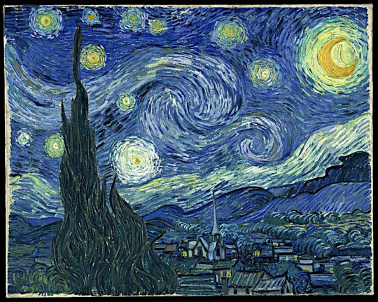
Unity and Variety is about separate parts working together in a composition, for example Starry Night by Van Gogh exemplifies how there are many separate parts of the piece working together to form one composition.
2) Balance is the distribution of the visual weight of objects, colors, texture, and space. In this piece it appears very symmetric, therefore it is balanced because the object is distributed evenly across the piece.
3) Emphasis and Subordination underscore concepts, themes, or ideas the artist wants to express in an artwork. As one can see all the other roses are red, but there is one singular yellow rose to create emphasis and subordination which creates a focal point for the audience to be drawn to when observing the piece
4) Directional Forces or the path or gesture in an artwork is created through visual directional forces. This piece very accurately exemplifies what directional force is because it's very clear where the planes are coming from and where they’re going by using the principle Directional Forces.
5) Repetition and rhythm in art implies the use of two or more of the same or similar elements such as colors, shapes, or lines. In this case the flags represent repetition such that they are multiplied and either shrunk or enlarged depending on how one looks at the piece.
6) Scale and proportions are the last principle where scale refers to a comparison of objects whose size is known, and proportion refers to the size of two objects whose sizes and scales are unknown. This visually represents how these two balls are being exemplified by their scale and proportion, where the scale and proportion are also both unknown. It also creates a good piece of artwork because it gets the audience wondering and questioning why the artist intentionally did this.


WRITING AND LOOKING – Just as a good cook assembles the perfect ingredients for a delicious recipe, an artist assembles the right elements for a successful artwork. Choose any artwork from your textbook and make a recipe of the composition. For example, Velásquez’s artwork, Las Meninas contains implied lines, linear perspective, a distinct vanishing point, neutral colors, highlights, focal points described by geometric shapes (triangles and rectangles) and achieves balance through placement of figures and rhythm between foreground and background etc. Make sure to include the title of your choice with the figure and page number. Don’t use my example.
Ch. 18.4 Japan, fig 18.26 – Horyuji Temple founded by Prince Shotoku exemplifies all elements such as land, water, rocks, and plants and were all integrated in a garden design that blends human made and natural elements.
CONNECTING ART TO YOUR WORLD – Share a personal experience of how color has affected you (one paragraph). Make sure to use some of your new vocabulary (hue, value, intensity, saturation). If you had to pick a “color scheme” for your life, what would it be?
Color has always played a role in my life from everything to outfit change to what aesthetically pleases my mind. I’ve always been attracted to warmer colors, or maybe just a few colors like red, blue, and a lavender color, maybe not specifically warm but in my mind they’re warm to an extent. They all fit into my life in some type or way such as red and blue are two primary colors that are used in a lot of things and purple is what the two make when mixed. If I had to pick a color scheme for my life it would be an analogous scheme so that I can use the colors all closely related to each other that happen to be my favorite more than others.
ART PROJECT – ARTIST’S CHOICE - Draw a cartoon or make a painting. The form: If you choose the cartoon (comic) it must be at least 3 panels. The size is not important. The painting can be executed with any of the materials (media) outlined in your textbook (see Chapters 6 and 7) and note that painting involves the use of WET media, drawing usually refers to dry media – I want to see PAINTING if you choose to make a painting, DRAWING is NOT the same thing). The content: The subject matter should be something that you are passionate about – something that has a deep personal meaning for you. The comic or the painting should be able to tell some type of story that relates your feelings about your chosen subject matter. Post pics of the finished product (in-process photos are also interesting!).
the picture wont let me post on anything so I'll send to you separately
0 notes
Text
Tracy Grimshaw Keto Gummies Australia
➢Product Name —Tracy Grimshaw Keto Gummies Australia
➢Main Benefits — Burn Fat
➢Composition — Natural Organic Compound
➢Side-Effects — NA
➢Availability — Online
➢Rating :— ⭐⭐⭐⭐⭐
➢Product Category— Health Care
More strength in your body
Keto gummies start the natural device of ketosis, which gives you more energy that lasts all day. Ketosis is a country of your metabolism that could first-class display up in case you devour a whole lot of fats. Because of this, you may now not most effective feel greater energized, but you may moreover end up more potent and lots less possibly to get wiped out.
VISIT OFFICIAL WEBSITE - CLICK HERE FOR THE EXCLUSIVE DISCOUNTS ON Tracy Grimshaw Keto Gummies Australia
Helps the fitness of the complete
Keto Gummies are genuine on your famous fitness and health in a lovely variety of techniques. These goodies are very good at preventing the body from making an excessive amount of dangerous fat, which can also motive health problems like coronary heart disease and diabetes which is probably connected to weight problems. It has been verified that those lessen contamination inside the frame and lower the chance of some fitness problems.
Increased clarity of idea
Research that looks remarkable shows that taking Tracy Grimshaw Keto Gummies Australiacan beautify every mental and physical fitness. These treats help you loosen up, which makes it simpler so that it will attention. They are pretty suitable at decreasing the terrible consequences of being overweight on intellectual health.
I am no longer a nutritionist so I must take a few consultancy about Slim keto gummies before taking it so I requested my physician and when he gave me a inexperienced flag that yes you can have those gummies along with your weight loss plan as it has no, side consequences in your frame. So, please take some recommendation from a physician earlier than taking it.
Apple Cider Vinegar Keto Gummies moreover upload a bit of flavor to the stinky-tasting ACV and that’s appropriate for intermittent fasters who can not engulf the acidic apple cider vinegar similar to that. It helped my way of Keto gummies weight reduction.
VISIT OFFICIAL WEBSITE - CLICK HERE FOR THE EXCLUSIVE DISCOUNTS ON Tracy Grimshaw Keto Gummies Australia
Slim Labs Tracy Grimshaw Keto Gummies Australia are organic weight loss gummies product of extracts of plant life and end result. They may assist to melt stubborn fat within the body and produce again your figure into shape. Apart from that, the gummies might also decorate your electricity ranges in the body.
Additionally, the gummies may assist to speed up Ketosis within the frame and make your enjoy at ease. They may help to govern common starvation and meal cravings.
VISIT OFFICIAL WEBSITE - CLICK HERE FOR THE EXCLUSIVE DISCOUNTS ON Tracy Grimshaw Keto Gummies Australia
If you are new to the Keto ACV Gummies, you need to recognize that there are such a lot of Tracy Grimshaw Keto Gummies Australiaobtainable. Keto gummies Where to buy? If you want to buy this one you need to click on the hyperlink under to get your order.
We are doing our high-quality to provide you all the facts about Keto gummies. We choice this Tracy Grimshaw Keto Gummies AustraliaReviews Weight loss article would possibly help you to clear your all facts about the Keto ACV Gummies.
Transparency and Quality Assurance
As with any popular meals fashion, there are continually issues approximately transparency and the authenticity of merchandise. We'll take a look at the significance of scrutinizing labels and substances to make sure that the Keto Gummies we are indulging in are absolutely aligned with the thoughts of the ketogenic food plan. Quality warranty and accountable production practices play a pivotal function in retaining the integrity of these products.
Personal Reflections and Moderation
As an actress, author, and mom, my lifestyles is a normal whirlwind, and I choose a more flexible method for my eating conduct. While I might not strictly adhere to the ketogenic food plan, I've located that Keto Gummies still provide an fantastic desire for individuals who do follow this manner of existence. We'll speak the significance of moderation and locating a stability that works for all of us's precise desires and alternatives. I can propose every other ACV known as Slim Lab ACV Gummies.
The Skeptics' Perspective
Tracy Grimshaw Keto Gummies Australiahave amassed a tremendous fan base, there are usually skeptics who enhance valid concerns. We'll cope with some of the not unusual criticisms surrounding the ones gummies, together with whether or not or now not they are most effective a advertising gimmick or if they may be capable of surely be part of a healthful food plan. It's vital to have a balanced view of any food fashion, and we are going to find out both the experts and cons of incorporating Keto Gummies into one's life-style.
Now in which there are such a lot of ACV Gummies within the marketplace its incredible opposition for keto ACV gummies. But it's far popular inside the market why? Because of its unique taste and the substances that have been utilized in those Keto ACV gummies. It is good and a bit bit bitter in flavor and that's what make it unique. It is sweet in flavor however it does incorporate no sugar in it. It incorporates an opportunity taste which is stevia, it makes these gummies sweet in flavor. And it works pleasant while you upload it into the ketogenic weight loss program.
Tracy Grimshaw Keto Gummies Australiafor weight loss inside the marketplace
VISIT OFFICIAL WEBSITE - CLICK HERE FOR THE EXCLUSIVE DISCOUNTS ON Tracy Grimshaw Keto Gummies Australia
Keto gummies has their personal value in the marketplace for the previous few years. And why it is Top-Rated? Because it has such a lot of advantages other than weight reduction, as an example, it helps to relieve mental health, and enhance general feature or bodily benefits. There are so many nice reviews at the purchases of those Slim Labs Keto Gummies Review. It doesn't contain sugar, infact it has some other alternative stevia. It increases the ketosis technique it way it burns fats as a fuel than carbohydrate, it stimulates the metabolism, and decreases the calorie intake.
Get the most demanding Slim Labs ACV + Keto Gummies weight reduction method from the Official Website of Slim Labs Tracy Grimshaw Keto Gummies Australia.
Disclaimer
The statistics furnished in this text is for famous informational functions best.
The content material fabric in this newsletter isn't always supposed to be an alternative to professional scientific recommendation, analysis, or remedy. Always attempting to find the steerage of your healthcare provider with any questions you can have concerning a scientific condition or any capability side results of products or supplements noted herein.
By reading this article, you famend and comply with the above disclaimer and understand that any movements taken based totally on the content cloth are at your own hazard. Always use your outstanding judgment and consult certified experts to make knowledgeable decisions about your fitness and well-being.
RELATED LINKS:-
https://www.tribuneindia.com/news/brand-connect/chemist-warehouse-keto-gummies-australia-fake-exposed-gold-coast-keto-gummies-au-is-keto-gummies-australia-scam-or-price-alert-467379
https://www.tribuneindia.com/news/brand-connect/keto-excel-gummies-australia-fake-exposed-maggie-beer-chemist-warehouse-scam-is-chrissie-swan-weight-loss-scam-or-trusted-works-471557
https://www.tribuneindia.com/news/brand-connect/active-keto-gummies-australia-reviews-active-keto-gummies-chemist-warehouse-ca-scam-or-active-keto-weight-loss-scam-or-legitimate-484555
1 note
·
View note
Text
4 Types of Fiberglass Poles
Fiberglass poles are an effective way to support a variety of structures and projects. They are durable and light, and are available in many different shapes and sizes. They can also be a useful alternative to traditional metal poles in certain situations.
Whether you need to build a custom flagpole or simply want to replace your old, damaged poles, fiberglass is a great choice. It is resistant to rot, insects, and extreme temperatures.
In addition, it is lightweight and can be customized to meet the specific needs of your project. This makes it an excellent choice for any outdoor construction project.
Custom Fiberglass Rods
Fiberglass poles are a type of composite material that consists of a thermoplastic resin and fiberglass threading. They are often used in high-performance applications, including marine and aerospace.
Pultruded fiberglass rods are manufactured by pulling fibers through a resin bath and then through a heated die to shape the rod. They are a cost-effective and high-performance choice for structural components, including cable supports, plant stakes, transformer spacers, isolation rods, advertising panels, retaining wall pins, and tent and flag poles.
The pultrusion process creates a strong, durable, lightweight and rigid fiberglass rod that is easy to shape, mold or form to fit your requirements. Moreover, it can be customized to meet the specific requirements of your project, making it an excellent choice for any electrical or industrial application.
For Electrical Workers
In electrical utility, a solid fiberglass rod is commonly known as a hot line stick, and is used to hold electrical wires during power outages and maintenance. This is a highly durable and non-conductive material that can withstand up to 100 KV per foot.
This product can be fabricated to lengths of 3' to 20' and is available in thicknesses of 1", 1-1/4" and 1-1/2" in diameter. It is built to withstand up to 100 KV per foot and is designed to be durable as well as impervious to moisture.
Compared to steel, pultruded fiberglass rods are much lighter, non-conductive and offer long-term cost savings because they require less frequent replacement. They're also dimensionally stable, impact-resistant, and don't interfere with radio waves or EMI/RFI transmissions. Get more facts about fiberglass at https://simple.wikipedia.org/wiki/Fiberglass.
The pultrusion method produces structural components that are highly resistant to corrosion and offer exceptional strength-to-weight ratios. They're typically manufactured in small, high-volume runs, reducing the need for expensive, custom equipment. They're also a cost-effective alternative to other materials, such as metal, which can become corroded and rusty over time.
Fishing Rods
A fiberglass fishing rod is a good option for anglers who want a long-lasting, durable rod that is suitable for catching soft-mouth species. However, if you're planning on catching large fish, then graphite might be a better choice.
It's a little slower, but it can be more flexible and can handle larger fish. It's also a little more durable, so it is a good choice for fishing in harsh conditions.
Fiberglass is also a popular choice for outdoor camping poles. Unlike aluminum, it does not corrode or break under stress. It can also be rolled into a compact and lightweight form. It is an inexpensive and versatile material that can be used to make a wide variety of rods, including fly fishing rods.
1 note
·
View note
Text
Benefits of Custom Fiberglass Poles
Custom fiberglass poles are an excellent choice for a wide range of applications. They combine extreme high strength with lightweight construction, corrosion resistance, and a long life cycle. These poles are durable, easy to install, and can be repainted or decorated for aesthetic appeal. The Fiberglass poles are also resistant to rot and insect infestation, so they can be used in all types of weather.
They are a popular alternative to steel poles for power lines in many areas because they don't rust or corrode, and don't require costly coatings or preservatives. They're also environmentally friendly, because they don't release toxins into the environment and don't leach chemicals into the ground.
The material is highly versatile and can be formed into various shapes through a process called pultrusion. The rods are usually round, but they can be shaped into tubes, bar stock, oval solids, channels, half rounds, and tees. They can be machined, butted, slotted, chamfered, rounded, and pointed with ease.
Their flexibility is a great benefit for a variety of uses, including building framing and kites, flag whips and poles, and greenhouses. They're also available in a wide selection of colors and finishes to match other building materials.
They're also a popular option for utility poles in areas with a high demand for electricity, because they are strong, non-conductive, and durable. They can resist rot, mildew, and insects. They're lightweight, so they can be transported easily to and from job sites.
These poles are a popular choice for lighting in many settings, including city parks and upscale shopping centers. They're also common in condominiums and residential developments. They're typically buried, which makes them less expensive than poles that require anchor bases.
When choosing a pole for your lighting project, it's important to consider the type of lighting system you have in mind. You'll need to ensure that your lighting fixtures are compatible with a pole made from fiberglass.
In addition to their durability and flexibility, fiberglass poles are extremely affordable. They're often less expensive than other materials, such as aluminum or steel, and can be customized to meet your needs.
They are also a popular choice for telescoping, which means they can be flexed like an antenna to fit the desired length. They're a great option for anglers who want a high quality, inexpensive rod without spending more on an expensive graphite pole.
The flexible butt section of a fiberglass rod can help prevent breaks and splits, while the wall thickness can improve strength. The pultrusion is more durable and can withstand more intense conditions.
If you're planning a long-term fishing trip and want to save money, a composite rod is an ideal option. They're made of a combination of fiberglass and graphite parts, which combine the best qualities of both materials. They are a good choice for both beginners and experienced fishermen who want to step up their game.
Whether you're looking for a custom fiberglass fishing rod, a telescoping light pole, or a fiberglass base to enhance the look of your lighting installation, Access Fixtures has everything you need. Contact us today to learn more about our fiberglass products and services. For more details about this subject, click here: https://simple.wikipedia.org/wiki/Fiberglass.
0 notes
Text
2000
today's edition of "shiloh watches old eurovision" brought to you by ukraine selecting their song and also @technofantasia's prefsorter!!!! which is going to be really helpful when sorting songs in the future!!! i had been painstakingly hand-sorting songs in google sheets before!!!!! everybody say thank you technofantasia!
anyway lets gooooo
Israel
thinking about that post llewyn sent me about 90s eurodance... the stereotypes are all true... the song is repetitive but pretty characteristic of the era, the two main singers just were so low-energy compared to the rest of the group and, most of the time, off-key. i respect the sentiment of the flag-waving although i am mildly ashamed of myself to say i don't recognize the MENA flag in question.
Netherlands
good transition at the beginning and good ending pose. her voice was thin but for the most part i think she did a good job. i don't... listen, i don't like this era of eurodance. i just don't. but considering what we're working with here she did well.
United Kingdom
this was pretty good! melody is enjoyable and i think nicki's voice really suits the song here. also, this song is a mood for looking at my spotify wrapped this year. lotta songs on there that i associate with the girl who broke my heart. big mood, nicki.
Estonia
this was well-staged and ines looks gorgeous, although she does sound pretty hesitant vocally. i think it's an okay song but it does have a "forgettable" vibe to it that i wasn't expecting because i know this placed well.
France
i suppose i enjoy it stylistically. i wish sofia's voice had been in better condition because i really like her low range, as it is i spent most of the performance thinking "wow i wish she was singing better". i would have loved this a lot had she been a better singer on the night. i can tell that she has it in her.
Romania
in terms of composition, this is my favorite so far, especially the first half. however, i do not like mr. taxi's singing voice.
Malta
malta did a good job here! it's an enjoyable song with solid staging and claudette is performing well. something about it isn't coming together for me, which is weird because it ticks all of my individual boxes.
Norway
hell yeahhhhhhh!!!!!! this is such an infectious and fun song that it almost doesn't matter to me that they are styled in such an extremely early 2000s way or that their vocal performance isn't exact. i'm having so much fun, bopping right along in my desk chair! easily my favorite so far.
Russia
the whole of this needed to be sung in a higher key. alsou sounded so much better after the key change. i'm struggling to tell if i like this because it's familiar to me or if i like it because it's actually to my taste, i think it's a bit of both? certainly a solid staging job. but when i heard snippets of the song before i didn't really like it.
Belgium
unfortunate voice crack in the middle there and by the end of the song it did feel like it had gone on forever. songwise not for me but for the most part nathalie's vocals were strong, i don't have anything to outright argue with here.
Cyprus
tbh i'm no thoughts head empty about this one. idk, i liked the bridge?
Iceland
a great song to mark the halfway point, i'm having a lot of fun with this and i enjoy the male singer's voice a lot. will probably end up higher in my personal ranking.
Spain
this song is muted on the video i'm watching (polish commentary archive) so i had to go find the audio elsewhere. it's alright, the studio version is good but obviously i can't judge the live sound at all.
Denmark
the whole thing fits together in a way i didn't really expect to happen so i kept startling during the transition between the prechorus and the chorus (the latter of which is the part that gets put in all the winner compilations so it's the part that everyone knows). wasn't expecting the vocal effect, either. it's good, though! i don't think it's my favorite of the night but i'm satisfied with this as the winner.
Germany
stefan raab, my guy stefan raab! it's fun, it's weird, it's the german equivalent of ubby-dubby (is that a reference anyone will get did anyone else watch the electric company as a kid), it's rap, it's wadde hadde dudde da in all it's memeish glory. i'm having a good time here. also having a good time running the polish for "due to copyright protection, we can't show the german performance in its entirety, sorry for the inconvenience" through google translate. :) i recognized like four whole words!!!!!
Switzerland
eh, it's fine. she has a good belt but for the low notes in the verse i can BARELY hear her.
Croatia
i mean the balkans have been sending this exact kind of thing for the past 20 years. it is what it is and i still don't find it particularly impressive.
Sweden
well! i could certainly do without the blatant racism. that is what i have to say about that.
North Macedonia
the nicest thing i can say about this performance is that it's cute. off-key, verses are weirdly atonal, the english lyrics are bad.
Finland
this is overall pleasant. perfectly fine song, i like listening to it, not really a standout in any way but i have nothing bad to say here.
Latvia
ah, renars... this man has the same manic energy that you see in other latvian entries over the years. regardless, i want his gender. and my star is a nice song. not my thing but it's nice, he does a good job.
Turkey
i like it! i could keep on listening to this! no notes!
Ireland
hello, the 80s... i want eamonn's gender too... it's a good song and of course it's a song that places itself solidly in time (being, yknow, about the millenium). it's okay. strong for what it is but not really my genre.
Austria
loving the vibes of this, i have no idea what genre this is but i like other songs that are similar. also i adore the bassline here. good job austria.
My top 24
Norway
Turkey
Iceland
United Kingdom
Finland
Austria
Denmark
Russia
Germany
Ireland
Spain
Latvia
Malta
Netherlands
Estonia
Romania
France
Cyprus
Croatia
Switzerland
Belgium
Sweden
Israel
North Macedonia
Miscellaneous thoughts
I like these hosts and I like their little gag with the binder at the beginning. Also extremely endeared by the language-mixing.
the postcards are also interesting because they reflect a certain kind of globalized interconnectedness. the 2011 postcards did something similar, but i feel like with the items as opposed to people the 2000 postcards really make a point about everything being connected. not just people but everything in the world has a point of origin that not everyone thinks about!
overall a solid year. really tested my attention, though, and also my polish comprehension lol the polish commentator was CHATTY and he talked so fast and like, i only took a semester so i was basically picking out numbers and nationalities and the occasional filler word.
0 notes
Text
Small Group Recap 10/18
I met with my small group today: myself, Sarah, and Mary! We went around and explained our projects to each other and gave feedback or suggestions that we determined to be helpful to each other.
First we discussed Sarah's design, she had a very fancy sketch of her idea and it was really cool. Upon first glance, it looked like an abstract design of the human heart so I was intrigued, but then she explained her sketch (very detailed by the way with great notes and ideas). Her idea is much better than the human heart to be honest, it incorporated a multitude of fabrics that she would shibori and assemble in an almost three dimensional way, so that there is something different to look at from all angles. She also explained that it was her plan to embellish it with something sparkly!
Next, we talked about my design. Last week I draft a triangle shaped flag with a Mario theme and it included: a character from Mario, a koopa troopa (those menacing turtles that look cute and do a little jig, but will kill your character), many bricks for the character to jump on, and my favorite the background foliage that makes no sense but is acceptable since it is designed in a video game. The thing is, I came to class today and I looked at it and I hated it. It was ugly to say the least. I then noticed that I already had written a note about how I did not like it last week. So basically after 5 days I still did not like it. I then, upon Bailey's suggestion (she is not in my group, but I appreciate talking to others), I thought it would be a fun idea to take the little tiny bits and ends that I dye and embroider and incorporate them into the work somehow, maybe like a sort of quilt. This might prove to be better since, and I discussed this with my group, I have a great time making small little things and put a lot of time and effort into them, but when the design or fabric becomes larger it is much more intimidating and I will procrastinate it due to overwhelming feelings and then not work to the best of my abilities resulting in a questionable result. So with this, I can still enjoy a fun happy time with my small works (I will consider getting a little bigger though because I cannot live in fear like this) and then patch them together in a fun and exciting way that is able to capture my essence. We discussed that I might use the ridiculous background foliage from the Mario video game in my work to add to the essence.
Finally, we discussed Mary's project. It is a great idea, I love it!! I like that she is truly leaning into both the science and design aspects of her personality. On the surface, the carbon rings are truly great patterns that come together to create a whole molecule, with out the specific individual carbon bonds, the molecule would be something completely different. She is making the compound her own, by artistically drafting the carbon rings, chiral centers, and chlorine molecules into a composition that incorporates design so that it is also pleasing to look at. I believe that she is still taking into consideration the presentation of the piece. We talked about her color palette for the carbon structures and I feel like for the specifics of what she is doing it fits really well.
I am overall very excited to see the results of everyone's projects!
0 notes
Text
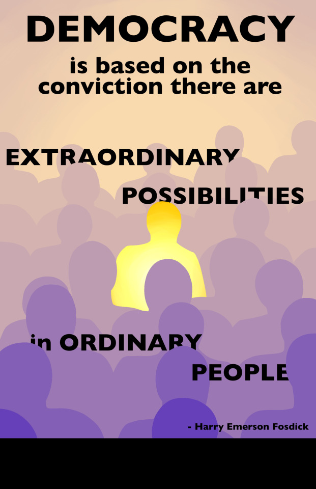
Project 3: AIGA Poster Design
At the beginning of this project, I chose to make a poster based around the quote “Democracy is based on the conviction there are extraordinary possibilities in ordinary people” by Harry Emerson Fosdick. To get an idea of how I wanted the design to look, I made a word map and mood board organizing my thoughts on typefaces and compositions I wanted to use.


Based on these ideas, I made thumbnail sketches of potential posters. I found while doing this that I repeated the same concept several times: one person standing out in a large crowd, differentiated by a different color or brightness, symbolized by a light.
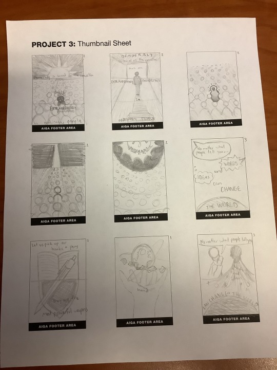
I followed this idea and made a draft poster based on sketch 3. I found from feedback I received that the colors, although following the red and blue of our flag, gave off a one-sided message as the person standing out could be seen as Republican in a crowd of Democrats. The font I used in this draft also didn’t give off the message I wanted, as the rounded text felt too playful.

For my final design, I chose colors that were nonpartisan but still stood out and complemented each other. I cleaned up the design from my draft and added more rows of people so that I could fit some of the text behind them to add depth. I chose a smoother sans serif font to give a more impactful tone.
0 notes
Text
Innovative Roofing Options From Bristile Roofing

Bristile Roofing has a broad range of products, including innovative and stylish roof tiles. It also provides roof fittings and fixings, ventilators, and sarking. It has a reputation for offering exceptional aesthetic value for the money. Whether you need a new roof for your home or are in the market for a new roof for your business, there is a bristile roofing product for you.
Planum is a bristile roofing product
Planum is a range of roof tiles from Bristile Roofing. These tiles have a flat profile with a slate look, which can be used to create a sleek and stylish roof. These tiles have a colour for life warranty and can be easily installed. They can be purchased in nine modern colours and complement a wide range of exterior finishes.
The range includes Planum tiles, which can be installed quickly and easily on roofs with a pitch of up to 15 degrees. Other products include Escandella Innova tiles, which feature strong straight lines, which suit a wide range of house designs. Another popular range is the Curvado Glazed tiles, which replicate slate and ceramic tiles.
Slate is a natural stone with a unique appearance
Slate is a fine-grained metamorphic rock that has unique color and texture. It is formed when sediments on the sea floor were subjected to extremely high pressures. It has many uses, including roofing and flooring. It is extremely durable and is available in a variety of colours. Slate is very unique and has a foliated texture that makes it highly attractive. Slate is metamorphosed by heat and chemical reactions that alter its composition and structure. Due to these unique properties, slate is widely used in roofing, flooring, and flagging construction.
Slate is a gray stone that grows in many different types and colors. It can range from medium gray to dark gray, with blue hues occurring occasionally. However, depending on the region of its origin, it can also take on other colors. The stone found in North Wales is particularly colorful. Slate is also distinguished by its rough, irregular surface, which is why it is preferred by many architects and designers. This natural stone design makes slate a beautiful roofing material that is also ideal for driveway tiles.
Terracotta tiles offer unmatched aesthetics
If you’re looking for a roofing material that won’t fade over time, consider terracotta tiles. This type of tile is so durable that it can even withstand the harshest weather. It also provides excellent insulation, and it’s fire resistant. What’s more, terracotta tiles require very little maintenance.
These tiles are inexpensive and readily available, and they’re a greener alternative to galvanized steel or other roofing materials. They’re also easily renewable, and they’re biodegradable. In addition to their low maintenance requirements, terracotta tiles have a wide range of colour options. This means you can use them in any room of your home, and if you ever need to replace them, you can buy new ones with ease.
Concrete tiles are energy-efficient
Concrete tiles are a great choice for bristile roofing because they reflect heat away from your home. This means that you won’t have to use air conditioning as much as you would with other roof types, and your carbon footprint will be reduced too. In addition, you can choose from a variety of colour and profile combinations, which allows you to find the perfect look for your home.
Concrete tiles also boast high wind performance and don’t need much maintenance after installation. Moreover, they don’t corrode or fade even when exposed to sea salt. They’re a proven choice for bristile roofing because they’re familiar and reliable. Concrete roof tiles are available in two modern profiles and 15 standard colours.
Terracotta roofs are durable
Among the benefits of terracotta roofs is its durability. If properly maintained, they can last for up to 75 years. In addition, they are eco-friendly and improve indoor air quality. These factors make terracotta roofs an ideal choice for roofing. So, if you are looking for a roofing material that will withstand harsh weather, terracotta roofs are an excellent choice.
In addition to their long-term durability, terracotta roofs are also fireproof and weather-resistant. This quality makes them a preferred choice for buildings in high-risk areas such as wildfires. In addition to this, terracotta roofs require minimal maintenance. Broken tiles are easily replaced, and the layering of tiles makes them highly insulating.
0 notes
Last Seen Blogs

meagsop88-blog
Untitled

travelswithmichael
Travels With Michael

timuz-games
Online Android IOS Games-TIMUZ

starcunning
starcunning

rainbownucleus
Ticklish tickler