#can you see linework getting better with progress as i get more invested in each panel KSJLDFHSLKJDFHG
Text
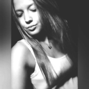
//hey kids ready for some angst(tm) ?
heres a bad end thingy :)
(long post, 15 images)


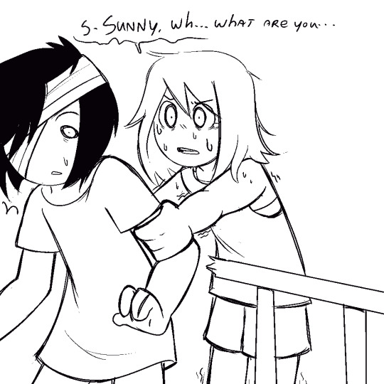
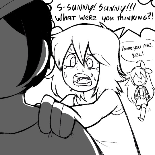


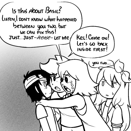


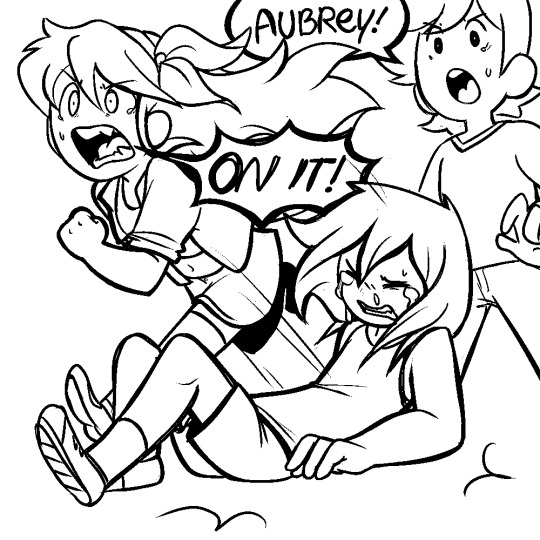

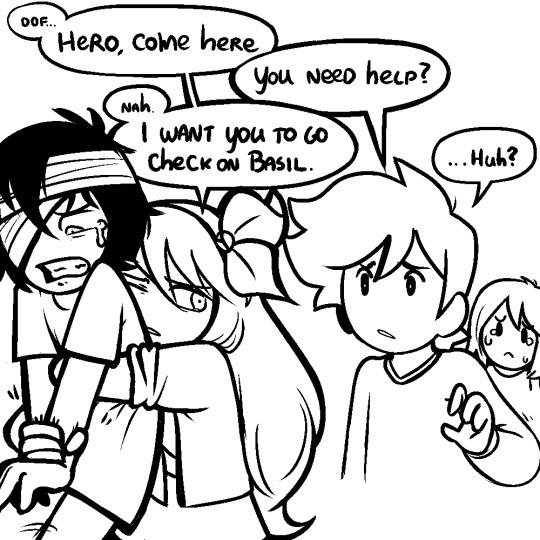

//this is what i have in mind when i say sunny’s emotions are ugly
#omori#omori fanart#omori sunny#omori kel#omori aubrey#tag for art#leggytalks#//can you see linework getting better with progress as i get more invested in each panel KSJLDFHSLKJDFHG#//anyway i dont rly have plans to continue this i kinda just started making it to cope with some bad things#//wasnt sure if i was gonna post bc wasnt sure if i was gonna finish but its an idea i love so i got a bit too much into it fjghbhdjfkgb#//like these are some of the best expressions ive ever drawn pwease look at these sad littol faces#//anyway i need to go turn myself in to the police for making kel cry that much#suicide cw
3K notes
·
View notes
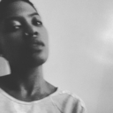
Photo
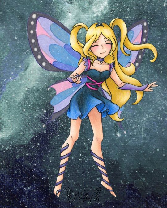
Fairy Enchanting
A bit later than I expected, but here we have the art that I used for the examples on my Commission Sheet!
(Unoriginal title is unoriginal and also a pun based on "very enchanting")
When I started thinking about putting together a commission sheet in the first place (which was something I wanted to do for the new year, as before I was just using a lengthy pricelist), I knew that I wanted to make a piece of art specifically for it and track my progress as I went, so that I would have an example for each stage in the process I take commissions for. And for the art, I more or less wanted to "go all out" since it's supposed to be an example, and I figure the example needs to be as close to top-notch as possible. Admittedly, I probably could've done even more than this, but me being me I procrastinated and ended up having less time to work on this that I initially expected, so...
In deciding what the drawing would be, I also decided to return to my roots a little, and a do fairy as an homage to back when I used to do Winx art all the time. Likewise, as Enchantix to this day is my favorite transformation from the show, I drew heavy inspiration from it, and I'm sure that's so obvious that if you know the show I probably didn't have to point it out to you.
Anyway. I actually didn't start completely from scratch with the sketch; I re-used this pose from a previous sketch I did that never saw a full-finished piece. I liked that other sketch okay, but it didn't feel like a "finish me" project. I did have to alter the feet because the original sketch was made with feet for ballet slippers (bigger heels, more rounded/curved toes, etc.) and much later on in the process I ended up angling the leg on the left more outward, as that felt more natural for the direction I was taking this new sketch in.
In sketching all the bits that make this sketch otherwise unique from the old one, as I mentioned, I was taking heavy inspiration from Enchantix. One of my favorite parts of the transformation has always been the leg-wrap/barefoot sandals, for reasons I can't explain. So those were a must. I also really like how the Enchantix outfits tend to be short dresses that are more form-fitting at the top and more flowy and soft at the bottom. Here, I decided to bring the ribbony look on the leg wraps up into the bodice, and to frame the collar/shoulder area I used a sleeve & choker style similar to what I did for the dress for Ink Dance, which itself was based on a dress I actually own and love to pieces despite never getting a chance to wear it because of how fancy it is. The main difference for both of the drawing versions is that I skipped the lace overlay that connects the sleeves and choker, mostly because both pieces are traditional and drawing lace/mesh traditionally, especially when it's so teeny, is a nightmare I do not want to engage with. And the choker part fits nicely, as in Enchantix each fairy has a necklace (usually a choker) that holds their fairy dust bottle. I'm not sure if this fairy has one or not, but she very well could!
Enchantix usually has long gloves, but I altered these to be shorter and fingerless (more like Magic Winx or Believix gloves) since this fairy is also based partially on myself, and I'd be more likely to wear that kind than the full-length formal gloves. And for the hair, as is maybe obvious, I was primarily inspired by Stella's for her Enchantix, since I've always loved that part of the transformation sequence for her's.
Also, even though it doesn't look that way on my commission sheet, IRL I drew only one wing and left it separate, off to the side, to make positioning and flipping it easier.
Once the sketch was done, I did try inking it traditionally/by hand once, and I just really wasn't happy with how it turned out. And I also realized I had drawn the skirt billowing/ruffling in completely the wrong direction anyway; It was moving to the left when it should've been moving to the right like the hair. So I had to take time out to fix that.
As opposed to wasting more paper trying to ink traditionally after that fiasco, I instead went with what had been my gut instinct anyway; I scanned the sketch in and did the lines in Photoshop.
Well, most of the lines. I was a dumb-dumb and when I did the lines for the wings, 1. it took forever because they're large curves everywhere and 2. I used a slightly bigger brush than for all the other lines, as I had mistakenly thought I was going to be re-sizing them significantly and the lines would be altered to for me when I did that. When I realized that wasn't the case, I did not want to have to redraw most of those curves again and risk not being able to get the right a second time. So I ended up booting a copy of the wings I'd already done into Paint Tool Sai and made use of the linework layers to redo the wings without having to draw the same line fifty times. Then I booted that back into Photoshop and adjusted the wings to be angled/aligned with the rest of the lines as I saw necessary. It was also at this point that I played around with positioning the leg on the left more outward than what it was on the sketch and ended up going with the position you see here.
I could have then gone back and added weight to the lines in some places, but at this stage, I was already thinking that I wanted to print the lines out and use my digital lines to hopefully get cleaner traditional ones, as opposed to just printing the lines off outright. (Mostly because I wanted to use some super thick mixed media paper that I would bet serious money will not go through my printer.) That's what I ended up doing, and I have to say that attempt went a lot more smoothly than me trying to ink from the original sketch. And once I had the initial lines done, then I went back and thickened them in certain places.
And I should probably mention here that the wings were a little tricky to figure out how to handle traditionally, as that's not something I've had to do very often. I ended up using my clear stardust gelly roll when I did the normal inking, and then, later on, I used colored pencils to go back over the outlines before coloring them in.
After doing some tests, I started coloring with markers for the hair and skin, and a little colored pencil for some blush. I tried to get a little more bold with the shading than I usually do, which I'm sure still looks pretty tame compared to most. But I'd rather the shading be too light than too dark.
Originally, I thought I was going to do all or mostly all of the coloring with alcohol markers. (Sidenote: is it just me or does it seem like there’s a lot of alcohol marker related stuff going on in the art world lately??) But then I did some testing with the lines I originally inked and didn’t like, and was reminded why I normally don’t use alcohol markers for gradients like the one on the skirt...frankly, I’m not very good at them...yet. Even though the test went better than expected, I still wasn’t happy with it.
Then I tried a few more tests with watercolor, and that didn’t fare much better. Watercolor would’ve worked if the gradient wasn’t also supposed to be shaded, I think, but trying to shade it without using another supply wasn’t working.
That left me with good ol' tried and true colored pencils. But colored pencils are relatively slow and textured, and I didn't really want that for the skin. The texture would've worked for the hair, but I didn't want to make the time investment for it either. And so I ended up sticking to my mixed media instincts and I used the colored pencil exclusively where I had to (on the dress so I could get the gradient for the skirt right) and then I used alcohol markers everywhere else, shading and all.
With the alcohol marker doing most of the work, then I came back and added additional shading/highlights with the colored pencils as needed to everything except the skin. I added blush, but otherwise, I was quite pleased with how the skin turned out and didn't want to touch it for the risk of ruining it.
The dress is supposed to be black/really dark gray, but I did brighten it up a bit with some of the blues from the skirt gradient as opposed to pulling out specific grays, so it definitely looks/feels more navy in the final product.
Although my relatively dark/saturated color choices for her outfit made figuring out what to then do with the wings more challenging.
I didn't want the wings to be the exact same colors as the rest of the drawing, because then they'd blend in too easily and be too distracting from the rest of the piece. But at the same time, I wanted them to match/look like they belong. (Again, similar to how the wings are in Enchantix)
After some back-and-forth testing and a LOT of color sampling, I decided to color the wings in with alcohol markers in colors that were similar to her clothes but overall lighter/more pastel and outline them and the sections inside the wings again in colored pencil. Most of the colored pencil is slightly darker than the marker colors I picked, but I went with purple for the black/gray rims of the wings because I thought a dark gray or black would be too harsh.
I'd already decided I wanted to do a slightly more complex background digitally, but even with that in mind, the traditional drawing still felt like it was missing one more thing after that. Namely, the wings didn't seem special enough.
I realize that sounds a little weird; I was just talking about how I didn't want the wings to be too distracting, but I think there is a delicate balance to having them be special in the way fairy wings should be while still not overpowering everything else. And I'm not sure I achieved that, but I at least tried to.
Though not a perfect solution, I ended up adding some metallic watercolor on top of the "true" (less purple-y) blue and pink sections on the wings. You can't really tell here on the scan, and what little you can appears to be the wrong color, but in person, both colors now how a lovely pink or blue sheen to them when you move the picture in the light. (The metallic paints, in this case, are very opalescent, so they're almost completely transparent when you see the flat color despite still have a really pretty metallic sheen in the light.)
After that, I felt there wasn't much more I could do traditionally, so I scanned it and moved on to that background.
At this point, I was kinda pressed for time because me being me, I had unintentionally put making my commission sheet off to the last minute. I really wanted to have it finished before the ball dropped on New Years' Eve ("new year, new me" and all that jazz), and I still hadn't finished my example art by sunset time the day of. So I had to keep things moving.
Early on, I'd had the idea to either digitally make a slightly more complex (but not too complex; I wanted to keep at least a little of the sanity I have left) background or perhaps make a special watercolor piece to use as the background. Unfortunately, I just didn't have the time for that anymore if I wanted to have the commission sheet finished by my self-imposed deadline. (And if we're splitting hairs, in theory, I could still go back and change the background if I wanted to, for reasons I'm about to go over, so of all the things to get rush-cut that's really not so bad.)
What I ended up doing instead was taking some of the left side of my Starfall Mountains painting (I was looking for a background-type thing I'd already done/made that would suit this drawing or that I could quickly tailor to make it work, and I'm just as surprised as anyone else that this frustrating tiny painting ended up being the one I liked best of my options) and I blew it up to comfortable cover the background here, flipped it around so the colors would flow a bit better, and used the hue/saturation slider to make it more of teal color for a little more contrast.
But of course, there was still just one more thing missing, even after all that.
After a little tinkering, I decided I didn't like trying to making the wings transparent (I could do it, I just didn't like the way it looked in this case), so I went in and added a touch of sparkles digitally to both tie them more into the piece as a whole and to give them a little more pizzazz.
And finally, blessedly after all of that, the artwork was finished, I was very happy with it, and I could move on to making the actual commission sheet.
I have to say, for as rushed as it was towards the end, I do really like how it turned out. More particularly I like just how blended both digital and traditional art ended up being here. To me, this is the next step beyond what I was able to do for mixing digital and traditional art with my Doodle Moon piece, and if I weren't currently in the middle of a tablet crisis, I'd really want to do more with this concept of going back and forth between the two on one artwork. However because of the tablet situation, the thought of really trying to do that right now kinda fills me with dread, so we're gonna have to wait a little while on that.
I do also really like the anatomy/proportions in this. Which is not something I normally feel comfortable saying.
It's not the best art I've ever made or anything, but looking at it makes me happy. It's good to see it finished and it's good to think of where a lot of the ideas for it came from. (Re: Nostalgia for my life a few years ago)
I'm not sure if I will since it kinda counts but also kinda doesn't(?), but I'm tempted to put this and some of my old Enchantix drawings up on the "Draw This Again" template, just to show how far I've come. I'm still thinking about it, we'll see.
Speaking of "we'll see," I got word that the sketchbooks from the contest I made Designiest Design for back in October are finally in, which means the prize packs should be sent out anytime now! I'm excited to see how the sketchbooks turned out and get my hands on the Powder Pack and see how said powders work! I was admittedly starting to wonder how that was coming along, so that was some good news and a nice surprise I'd really been needing here lately. Rest assured, there will almost definitely be an art piece talking about that stuff once I have it in my hands!
____
Artwork © me, MysticSparkleWings
____
Where to find me & my artwork:
My Website | Commission Info + Prices | Ko-Fi | dA Print Shop | RedBubble | Twitter | Tumblr | Instagram
#fairy#enchanted#enchantix#enchanting#fae#faerie#magical#magical girl#magic#winx#winx club#galaxy#space#mixedmedia#digital art#traditional art#alcohol markers#colored pencil#acrylic#photoshop#photoshopcc
2 notes
·
View notes
Last Seen Blogs
heroes-trash
it's me, i'm the Heroes trash
healthylulu-blog
healthy lulu
maussme
uśmiechnij się. Jutro będzie gorzej :)
insidethoughts22
Mon blog, donc mon univers.
bucketsfa
*ding*