#carol cross
Text

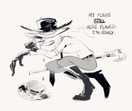
so mad I could've written better dialogue but whatever
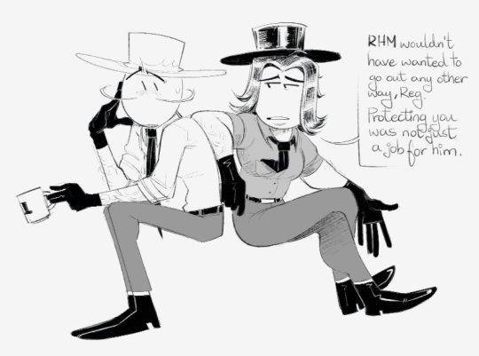
#eyah this is like. if rhm never got brought back....#this is what i sobbed over lawl#im thinking of more but who knows#thsc#the henry stickmin collection#right hand man#reginald copperbottom#rhm#carol cross#scriboozles
160 notes
·
View notes
Text
A couple toppats I wanted to draw
Carol Cross and Burt Curtis!!
#the henry stickmin collection#henry stickmin#toppat clan#fanart#art#carol cross#burt curtis#thsc#thsc fanart
129 notes
·
View notes
Text
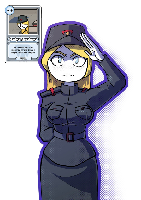


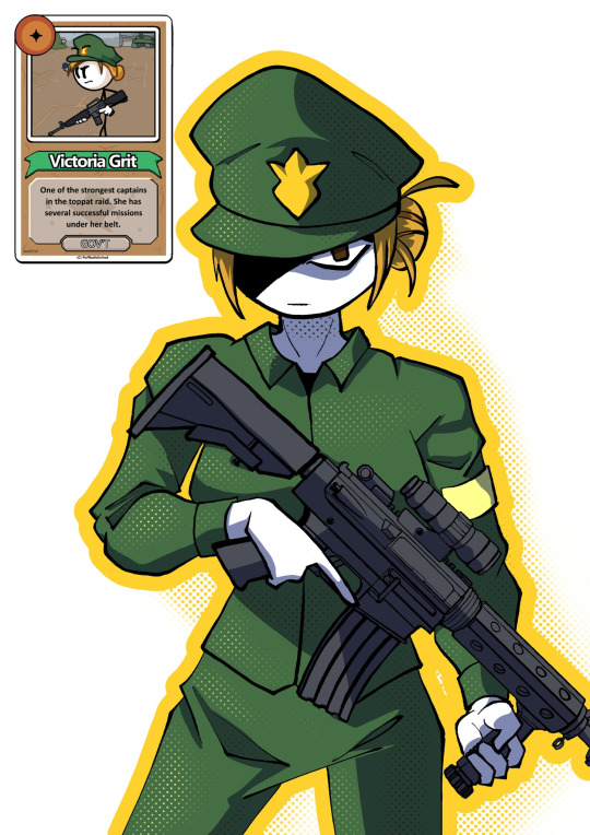
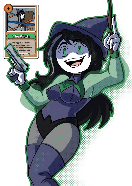

Once I tried to start a challenge - draw all week girls from THSC. My personal fav designs is Whitch and Nadya.
#THSC#the henry stickmin collection#Nadya Merakova#wow Im surprised that its actually a normal Russian name#THSC Gremlin#Matilda Ivy#THSC The Whitch#thsc earrings#Carol Cross#Victoria Grit#kyky’s art#thsc fanart
54 notes
·
View notes
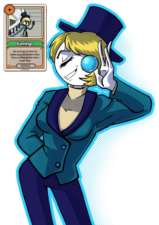
Text
carrings warmup whuuhhhhhh
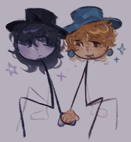
#I'm finally on a break so i can DRAW STUFF 💪🏾💪🏾#my art#thsc#henry stickmin#carol cross#does earrings have a full name??#carrings
66 notes
·
View notes
Text


I made this in the morning
#henry stickmin#thsc#the henry stickmin collection#reginald copperbottom#rhm#right hand man#ellie rose#sven svensson#carol cross#earrings#carrings#WOLOLOart
109 notes
·
View notes
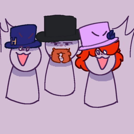
Text
I was rewatching THSC and HAHAHA THERE WAS THIS ONE SCENE THAT ALWAYS MAKES ME LAUGH DAMN IT—
I like how ONLY CAROL, THE DUDE WITH THE TEETH GAP, SVEN, AND MACBETH HAD THEIR GUNS OUT AND THE MAYOR AND THE FANCY MONOCLE GUYS LOOKED SO SHOCKED—
WHAT THE HELL MY HUMOR IS BROKEEEEN XDDD


THE MAYOR LOOKS SO CONFUSED HERE— HAHAHAHA XDDDDD
#thsc#the henry stickmin collection#henry stickmin collection#captured!charles au#sven svensson#thsc mayor#mr. macbeth#carol cross#charles calvin
115 notes
·
View notes
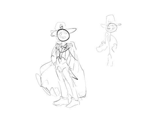
Text
Here are some old art, I never posted
Dhmis human version of my three favorite teachers
And eddsworld! I love matt.


Unused image
Carol cross
I didn't continue because I think something is wrong with the pose

The picnic one supposed to be TCW Ellie, VH Henry, and R Charles (•‿•)
The Triple threat as animal + Rupert
And toppat king Henry

#henry stickmin#charles calvin#ellie rose#the henry stickmin collection#rupert price#toppat henry#dhmis fanart#dhmis colin#dhmis tony#dhmis paige#eddsworld#eddsworld tord#eddsworld tom#eddsworld edd#eddsworld matt#carol cross
33 notes
·
View notes
Text

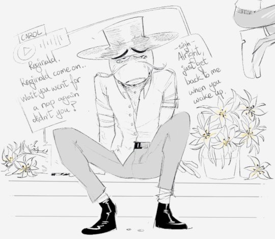
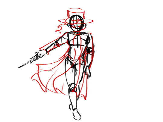
That feeling when you want to give your wonderful husband some PDA but your subordinates are there and also your arch enemies
Geez, proportions and perspective are too hard for my little baby brain. I based this one off of this post here, but I don't think this is my best work. I'm not much good at drawing little chibi marshmallow bois. They remind me vaguely of Connecticut Carl, but less.
#thsc#the henry stickmin collection#reginald copperbottom#right hand man#rhm#copperright#burt curtis#sven svensson#carol cross#henry stickmin#charles calvin#ellie rose#hubert galeforce#stairs are my enemy#probably would have helped if I put things in the background to make the scene more dynamic#but I was not interested in doing that#so I didn;t#feel free to try drawing this with your otp!
31 notes
·
View notes
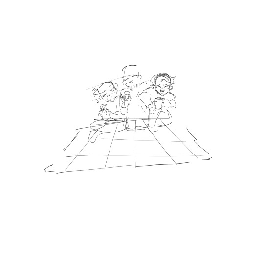
Text
also posting the girlies here <3
#henry stickmin#henry stickmin earrings#carol cross#the henry stickmin collection#thsc#thsc fanart#them#i lobve them
72 notes
·
View notes
Text
Selfie with funny glasses ✨

To be honest, I like to imagine them as friends, but this sketch also fits the tag of their romantic relationship
#art#artists on tumblr#sketch#the henry stickmin collection#the henry sticmin collection fan art#thsc#thsc fanart#thsc earrings#earrings#carol cross#thsc carol cross#carrings
44 notes
·
View notes
Text
I feel better.
41 notes
·
View notes
Text

i want her to be a messed up lesbian
83 notes
·
View notes
Text
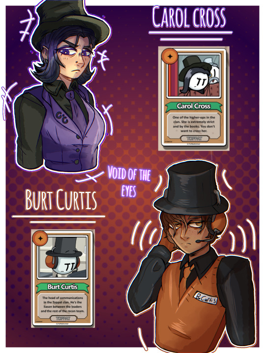
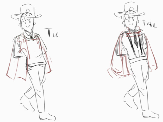
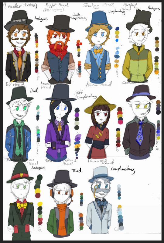
Toppat Clan Elites Colour Palette Redesign (2024) & Colour Theory
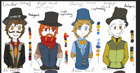
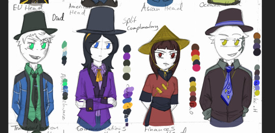


2021 design & colour palette vs. 2024 colour palette & designs.
So, fun story, but my laptop bugged out or something yesterday, because I discovered half-way through I couldn't save ANYTHING, from any app. So these are screenshots of the final image (, that's why the size is small & a bit fuzzy).
Righty'o! I've been brushing up on my colour theory knowledge, wanted to practice, and I found this re-design sheet for the Toppat Elites I drew August last year. So I used that for my recolouring practice (and some minor redesigns).
The colour swashes on top are the old ones, below the new, and I scribbled down which colour palette type I was using for each elite.
Some guys like Macbeth & Poshly didn't really change much, just some slight alterations to the hue or saturations. Others like Ahnoldt and RHM got a complete new colour scheme.
I was watching this video, and learned you're supposed to have a dominate colour in your colour palettes. A colour which should have the most saturated and be used the least throughout the piece, and that way it will work to draw the viewer's eye.
Eg1. Carol Cross's design. The dominate colour in her palette is yellow. I changed the ribbon near her face to yellow (, as that's the focal point), and gave her a yellow headband.
Eg2. RHM. I made his scarf the most saturated colour to draw the viewer's eye. Also, in contrast to the duller blues/orange-brown in his palette, the red really 'pops' out.
Eg.3 Mr Macbeth. While his new palette is VERY close to the original, the new one works better as there is more contrast from the saturation. The old palette all has the SAME saturation (so, intensity of colours). It makes nothing stand out. His new palette uses a brighter red & yellow to create more contrast, and thus a more interesting design. However, the red isn't as saturated as the yellow (and is in a larger quantity), which allows the yellow to work as the dominate colour.
And that's my colour theory waffle for today :)
#thsc#the henry stickmin collection#lost children of the ccc#henry stickmin#digital art#recolour#character design#reginald copperbottom#rhm#carol cross#mr macbeth#ahnoldt schwarz#sven svensson#burt curtis#slice#toppat clan#toppat elites#my art
21 notes
·
View notes
Text
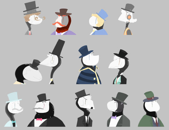
I drew all of the Toppat Elites...
#thsc#the henry stickmin collection#reginald copperbottom#thsc rhm#sven svensson#burt curtis#geoffrey plumb#thomas chestershire#Sledge MacRush#Hanz Spearman#Albert Poshley#Gene Fredrickson#Ahnoldt Schwarz#carol cross#mr. macbeth#stick birds#my drawings
89 notes
·
View notes
Text
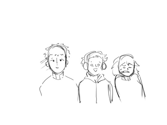
I saw this trend on TikTok and I tried it 😭
#thsc#henry stickmin#the henry stickmin collection#carol cross#earrings#carrings#WOLOLOart#WOLOLOvideo
40 notes
·
View notes
Text
I hear Bells…
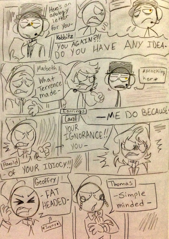


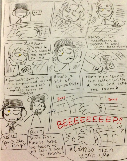
The Music Enforcers and Calypso Bells belongs to @bluetorchsky
#thsc#the henry stickmin collection#henry stickmin collection#captured!charles au#burt curtis#thsc kabbitz#mr. macbeth#earrings#thsc handsome harold#carol cross#thsc geoffrey plump#thomas chestershire#thsc slice#thsc whilhem kraut#thsc accordion#thsc violin#thsc calypso bells
40 notes
·
View notes
Last Seen Blogs
starlightodesta-blog
celestial
qiyan-agula
"Not to me. Not if it's you."
gdinoe
STYLISH HARD ACTION

sickfaerie
➳❥ ~~ ♡
pathetic-in-love
Desequilibrada