#chou kuse ni narisou
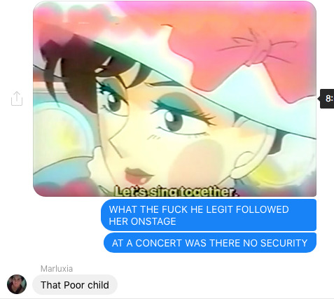
Photo

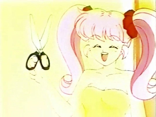
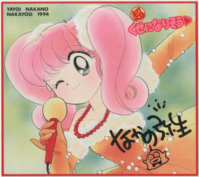
Series: Chou Kuse ni Narisou
Artist: Nakano Yayoi
Publication: Nakayoshi Magazine (02/1994)
Details: Sweetheart Pack
Source: Scanned from personal collection
#chou kuse ni narisou#i'll make a habit of it#shiratori nagisa#nakano yayoi#yayoi nakano#scan: hotwaterandmilk#furoku#nakayoshi#90s manga#shoujo manga#comedy manga#retro manga#vintage manga#classic manga#manga#mangaedit#manga edit#manga scans#kawaii#nakano's art is so cute idk
89 notes
·
View notes
Text
"Third-Love" - Chou Kuse ni Narisou♡ - April 5, 1994
16 notes
·
View notes
Text
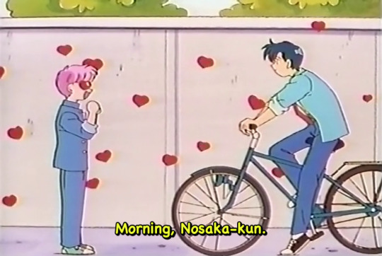
sometimes you learn about media that is on the verge of going into lost media territory with a bomb ass opening and you're baffled by it
Anime is called "超くせになりそう(Chou Kuse ni Narisou)" or "I'll make a habit of it!" that i learned about here.
2 notes
·
View notes
Text
turns out ya girl is actually not half bad at making fanart

7 notes
·
View notes
Text

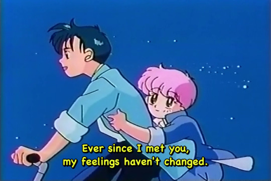
nagisa you have so much gender.......
158 notes
·
View notes
Text
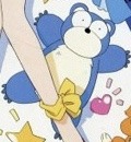
Today’s anime mascot of the day is…!
Kumakichi from Chou Kuse Ni Narisou!
#Kumakichi#anime#anime mascot#anime mascot of the day#anime pet#anime pets#anime mascots#mascot#mascots#Chou kuse ni narisou
2 notes
·
View notes
Photo

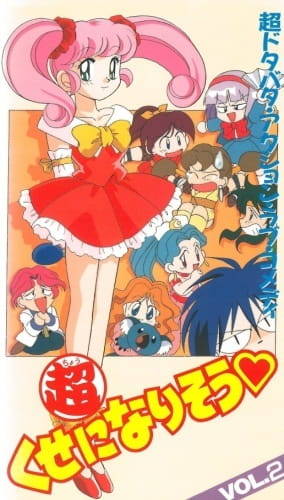
Chou Kuse ni Narisou
Genre : comedy, romance, shojo, school
Аnime series : 39 duration 25 min
#I'll Make a Habit of It#Chou Kuse ni Narisou#anime#retro anime#anime series#anime 90s#anime comedy#anime romance#shojo#anime school
18 notes
·
View notes
Text

Yuri Kuma Arashi
#yuri kuma arashi#yurikuma#yurikuma arashi#placeholder tag#placeholder tag 2#chou kuse ni narisou#(i didn't want to post about yurikuma in the main tag for chou kuse)
25 notes
·
View notes
Photo
chou kuse ni narisou
4 notes
·
View notes
Text
So i watched an ep of this 90s anime Chou Kuse Ni Narisou and I subjected my friends to my confusion watching it


2 notes
·
View notes
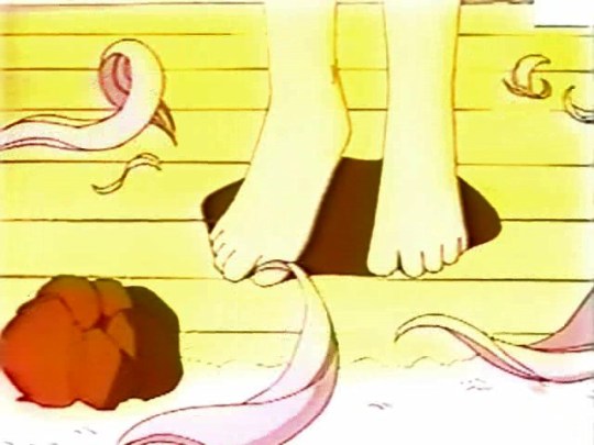
Photo
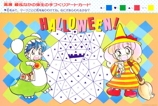

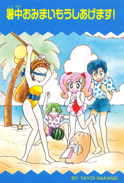
Series: Chou Kuse ni Narisou
Artist: Nakano Yayoi
Publication: Nakayoshi Magazine (10/1994)
Details: Nagisa no Tedzukuri Card
Source: Scanned from personal collection
#chou kuse ni narisou#i'll make a habit of it#shiratori nagisa#noasaka akira#nakano yayoi#yayoi nakano#scan: hotwaterandmilk#furoku#nakayoshi#90s manga#shoujo manga#retro manga#vintage manga#manga scans#halloween#this was of course paired with a kurumi card#but the kurumi one wasn't halloween-y so i'll post it at some other point#tis the season for nagisa being a witch
65 notes
·
View notes
Photo
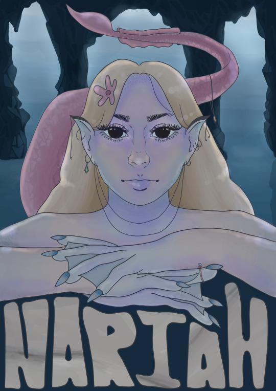
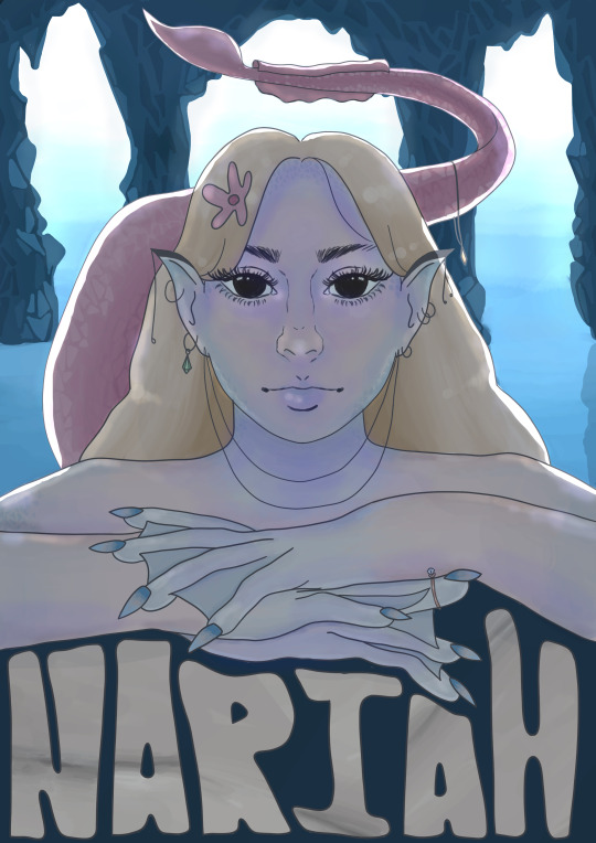
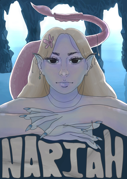
The Final Push 04/06/2021
The first image was what my original final looked like but I thought it looked too flat and I remembered some advice that was given to me which was that the background should be lighter to create a sense of depth and distance. So I lightened the background and added highlights to where the light would hit her and then realised that the highlights weren’t accurate in the second poster final as it makes it seem like the tail is close and directly behind her, meaning her hair on the left wouldn’t have any light hit it. So I re-highlighted her in the third and final version of the poster.
#siren#finals#process#final stretch#illustration#poster#design#photoshop#chou kuse ni narisou#final#paint#digital paint
3 notes
·
View notes
Text
this show is so nonsensical

and so gay

and so cute

i wish it was more well-known so i could just talk and talk and talk to someone about it
#chou kuse ni narisou#anime#shoujo#also this is kinda just experimenting trying to figure out how to tumblr#I only got these all from four episodes
2 notes
·
View notes
Text

"Tuxedo Mask!"
#chou kuse ni narisou#tuxedo mask#sailor moon#the manga and the anime both came out while sailor moon was airing and popular#so this is almost certainly a reference. and a very funny one in my opinion#you know what#her actual answer was much funnier as i commented in my reblog of this
7 notes
·
View notes
Last Seen Blogs
scyphate
👟 Your Kicks Are Our Kicks 👟

macaulaymontgomery
trick after trick.
vampirecrushh
Hello🐘

sereneicons
serene icons

megadubmax
Untitled