#chromatology
Photo
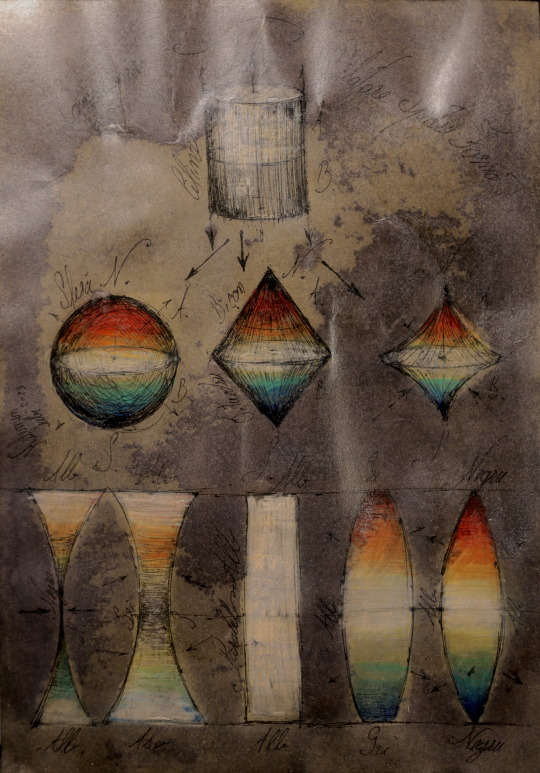

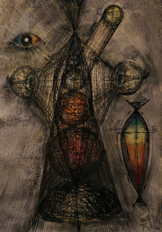
Color sphere cylinder cone KLMN
science of colour
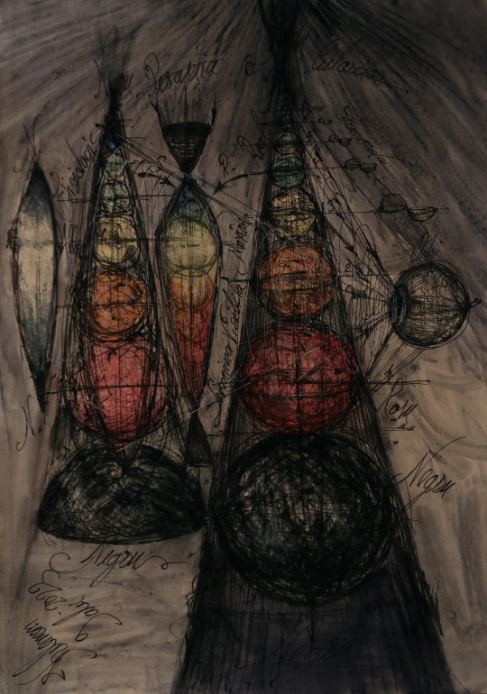
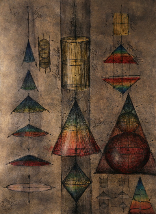
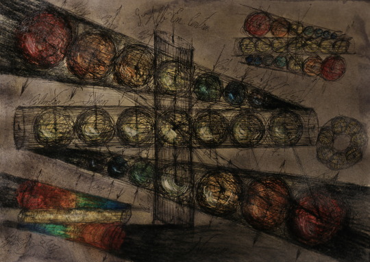
#theory of color#Implosion explosion torus#color codes#cylinder cone sphere#gabriel kelemen#chromatology#science of colour#KLMN CODEX#Light bicone dark#secret
7 notes
·
View notes
Text
Gay pornfor mobile first time All trio are up for some cock, draining
Hot naturla lesbian girls Liv Revamped, Tata Tilashi lick and finger bushy pussy
Ebony Teen Almost Gets Caught Sucking Cock By Her Mom
Adolescentes Disfrutan Su Primera Vez
Light skin ebony blowjob cumshot MUST SEE!!!!!
Tribute Cum Cantora de Rock Pitty
Alina rips Whitneys tight pussy off
Griffins hardcore sex parody
rica cogida de una gordita
HD Heather Deep Plays Sexy School Girl and gets Throatpie Creamthroat
#saltweed#fish-god#interplead#vituperate#guttie#archetypist#cerebralize#lettuce#strich#Missouri#Rodd#Brynne#blue-hot#util#akindle#lecanoroid#chromatology#hebegynous#smalm#internodial
1 note
·
View note
Photo

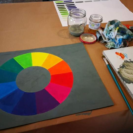
Prendo in prestito la foto del mio maestro per farvi vedere le mie schede di cromatologia quasi terminate... Stavo facendo l'ultima! 😊 #colori #colors #colours #painting #oilpainting #myPassion #chart #colors_chart #cromatologia #chromatology (presso Scuola D'arte Visiva Klavier) https://www.instagram.com/p/BbDKkmYH5pb/?igshid=NGJjMDIxMWI=
0 notes
Text
The thing I love about Cinder's brooch having migrated closer and closer to her heart means that with her V6-current outfit said brooch is almost always in frame. That lovely warm blue and purple.
Begging you to ask what is up with it and what is it meant to be visually signalling.


Just a couple of random screencaps to demonstrate my point. It makes it really obvious and it stands out against the black quite starkly, and is, of course, close to her heart. I kind of don't want to know what the canonical backstory is behind it, because it wouldn't be satisfying, but I would like it to indicate her future (redemption???) colour palette as I have unfortunately historically discussed to death. Maybe the destruction of the brooch will signal that, though I'm not sure what it would look like. Considering it's not there in her enslavement at The Glass Unicorn, and it came sometime afterwards associated with Salem, it probably does have a bad association that can be transformed into something good.
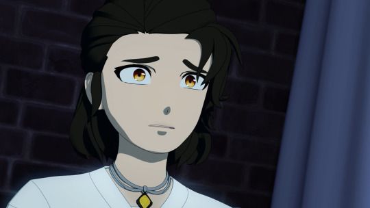
Oh. I get it now. The necklace diamond is the same shape as the brooch's, the brooch just has slightly more bells and whistles (aka Salem is Madame 2.0) and is again moving closer to her neck and not just her heart. Yeah, definitely something that needs destroying (burning?) but could be turned into a good omen.
After all, blue is the heart of the flame and the hottest...
9 notes
·
View notes
Text
Color/Candle Magick
Color magick, also known as chromatology, is a form of magick and energy work that utilizes the symbolic and vibrational properties of colors to manifest intentions. Each color is associated with specific meanings and energies. Here are some common color correspondences in color magick:
1. Red: Red is associated with passion, love, strength, and courage. It's often used for spells related to romantic love, vitality, and motivation.
2. Orange: Orange represents creativity, enthusiasm, and success. It can be used to boost one's creativity, attract opportunities, and enhance communication.
3. Yellow: Yellow symbolizes joy, intellect, and clarity. It's used for spells related to mental clarity, happiness, and improving communication.
4. Green: Green is connected to growth, prosperity, and healing. It's used for spells related to money, fertility, and physical well-being.
5. Blue: Blue is associated with peace, tranquility, and intuition. It's used for spells related to serenity, wisdom, and psychic development.
6. Purple: Purple represents spirituality, psychic abilities, and transformation. It's used for spells related to spiritual growth, divination, and manifestation.
7. Pink: Pink symbolizes love, compassion, and emotional healing. It's often used for spells related to self-love, friendship, and emotional balance.
8. Black: Black is associated with protection, banishing, and absorbing negative energy. It's used to ward off negativity and for shadow work.
9. White: White represents purity, spiritual enlightenment, and cleansing. It's often used for purification rituals and invoking divine energy.
10. Silver and Gold: These colors are associated with abundance, wealth, and lunar or solar energy. They can be used for rituals related to prosperity and connecting with celestial forces.
11. Brown: Brown is associated with concentration, and assists in making decisions with a clear mind. Brown is a common colour used when forming intentions or connecting with animals and nature.
Remember that the outcome of a spell is based on your intention.

#witchcraft#witch#green witch#tarot witch#witch community#witchythings#pagan witch#witch aesthetic#witchcore#witchblr
352 notes
·
View notes
Text
Secret-Diary’s Colour Wheel... OF DOOOOOOM!
So, I started writing this for my own personal reference, but then it was funny, so now it’s a blog. There, that’s your origin story: now here’s me attempting to describe obscure colours in way that will make you see them in your head, when I could just show you a swatch and have done with it.
Incarnadine
Dark, lustrous red- almost like blood. The deep kind I mean, not the fresh, red kind that happens when you cut yourself. If you cut yourself lightly and your blood is Incarnadine, you might want to seek medical attention.
Sarcoline
Light, almost fleshy pink. Like a newborn homunculus, or Boris Johnson’s terrifyingly baby-like face during a press conference.
Gingerline
Orangey-yellow, sometimes held to be darker than regular ginger, but also sometimes also thought to be lighter. The word is super flexible about the exact colour it refers to, but the hue reminds me of the Spice Melange before it goes all blue and an Atreides shoves it up their hooter.
Skobeloff
Dark teal. A bit peacock-y. Yeah, it’s not super exciting or unique or hard to describe, but ‘skobeloff’ is a transcendently brilliant word.
Aureolin
Golden yellow with maybe a teeny tiny snip of orange in the mix. It’s actually a really nice colour, but not quite as nice as…
Gamboge
Browny, orangey, reddy, and yellowy all at once. If autumn could be summed up in one colour, it’d be this bad boy.
Coquelicot
A really nice word for ‘poppy red’. Also it has the word ‘coq’ in it, so it’s funny.
Chartreuse
Bright green with a dash of yellow. A really extra type of lime.
Celadon
You know that ace Art Deco Green that teapots and lamps sometimes are? Yeah- this is the name for that.
Phlox
A highly saturated violet that’s slightly more blue than red. Sounds like a deep-space phenomenon in a sci-fi show from the nineties, but it’s actually named after a flower.
Glaucous
Icy blue, but slightly darker than what you initially pictured when I said ‘icy blue’. Think ‘deep permafrost’ rather than ‘ice cube’.
Cerulean
Now think ‘ice cube’. Or think ‘bluebird with frostbite’.
Viridian
Bluish-green; a bit dark; more green than blue. Very useful if you’ve already used ‘verdigris’, ‘emerald’ and ‘teal’ when describing an alien forest. Also comes in handy if you need to explain the colour of rusted copper to an idiot.
Verdigris
A nice, rusty sort of green-blue. Very coppery. Even more so than Viridian. Fuck you, Viridian!
Lapis Lazuli
HOW MUCH BLUE DO YOU WANT BECAUSE WE HAVE ALL THE FUCKING BLUE RIGHT HERE MOTHERFUCKER!
Jaundice
Similar to gamboge, but a lot less fun.
Periwinkle
Light, greyish purple. Purple for people who can’t fucking commit.
Heliotrope
A nice, light purple. A bit lilacesque. Use it in a sentence to sound posh and impress the gullible.
Calamine
Light, not-super-saturated pink. A bit of a ‘romance colour’, if you catch my drift.
Cerise
A dark, broody magenta. A man’s man’s magenta. Magenta for people who would shoot actual magenta and mount it in their pool hall.
Tyrian
Not to be confused with the dwarf of the same but differently-spelled name. A really dark mauve. Mauve for Goths.
Azure
The blue you thought the sky would be in Italy before you went there and spent half the time dying of heat-stroke and the other half getting rained on because Italy’s weather is in a permanent state of emotional meltdown.
Persimmon
You know those dark, orangey-red lines that pattern the surface of still-warm coals? That’s basically persimmon. Alternatively, it’s the colour that the sky went that time I had the flu and I thought the fucking world might be ending because nobody had told me it was just a random dust-storm from the African plains somehow reaching England.
Vermilion
Darkish red, but a really nice darkish red. The kind of darkish red that you might want an armchair in a private library to be, or that a Lannister would wear when going on a date with a close blood-relation.
Obsidian
Black, but not in a racist way.
Sable
A more racy version of obsidian. Note I said ‘racy’, still not ‘racist’.
Onyx
Can’t decide between black and grey? Onyx has got your back, dawg.
Laurel
A greyish, olive-green. Pairs well with Hardy.
Citrine
Have ever wished there was a word for ‘golden yellow, but not in a healthy way’? Well, here it is. Citrine is a lovely word, but the colour to which it refers is the colour of your urine after a night of terrible, terrible decisions, or of a lemon that’s seen better days.
And that’s it- my favourite colours… SO FAR!
#colours#language#fancy colours#colour theory#hues#chromatology#Secret-Diary-of-an-FA#Secret Diary of a Fat Admirer
10 notes
·
View notes
Note
Hello, don't know how to contact you otherwise but i wanted to make you know I've put some of your works in a presentation for my chromatology class, since i've been quite inspired by your way of using oil pastel. Keep it up and good job
Hey - this is really cool, thanks! I appreciate it :)
5 notes
·
View notes

Text
The Saddest Boat
Beige all around, used, scratched, mismatched, it awaits the last passengers with tired resignation. The waiter absent-mindedly calls the deaf customers: his voice is the echo of itself, that is noisy silence of the meaningless. He stubbornly walks up and down the central alley, his feet contributing to the blended attrition of the linoleum, his dark silhouette, the ticking hand of the slackening floating pendulum at such a late hour. Everyone is sitting, many like myself alone, a few pairs assembled, the only faces showing a little animation. As always, screens are on; surprisingly, one pencil hurriedly scrawls on a few pages of ivory paper; many eyelids are shut down and bodies are closed up, wrapped in thick and black layers. We are the lost sheep on our much hoped for way home. Some of us will make it, others won’t. Either way, the boat mourns the day, its youth and our lost dreams for more to come. Like a communal hearse, it crosses over the liquid gate, framed by all the procession lights the city offers us at night. I drink up the hot shroud and merge with the background: tawny is my t-shirt, canary is my lukewarm soup, sepia is my now cold cookie. As I took on a bit of its troubled flesh, the saddest boat is perhaps now a little breezy.
#sad#saddest boat#beige#tan#color#chromatology#late hour#night#crossing over#public transportation#tales#writing#writer#contemporary writing#contemporary literature#poetry#prose#poetic prose#beat#beatnik#essay#chronicle#diary#read#reading#reader#boat#boating#breezy
0 notes
Text
7 seasons of color on Game of Thrones, in one chart
7 seasons of color on Game of Thrones, in one chart
According the data, winter has arrived indeed. Subscribe to our channel! http://goo.gl/0bsAjO The Vox Visuals team created an interactive chromatology of the first 7 seasons of Game of Thrones. What we learned? The show, for the most part, is quite de-saturated and dark. But most interesting was a methodical shift in hue as winter descends upon Westoros. The show managed to shift the average hue…
View On WordPress
#global#globalnarrative#archive#chromatology#explain#game of throne...#Game of Thrones#game of thrones chromatology#game of thrones color#game of thrones data visualization#History#News#resource#society#vox#vox.com
0 notes
Note
Why the void white, i like it black as hell...
Dimensions, to be exacts, are not all black.
Usually, the various dimensions that either are not filled, fully formed or that are mostly composed of intangible matter or energy are called voids. I myself ain’t perfectly finished, but I am near completion.
In term of chromatology, black and white are very similar in their opposition. Black can be obtained by mixing all perceptible colour spectrum. On the other hand, putting all colours on a round gradient and making it spin, “mixing it” in a different way, create white.
Weirdly, a “void”, probably empty of anything that could reflect, absorb or emit colours, is considered by your people as black. It is a common misconception because you consider it similar to your surrounding space, which is seeing as black. But “space” isn’t empty. It is full of dust, gas, and all kinds of energies. Combining that with its size, the like you cannot appreciate fully, the render is perceived as, ultimately, a reflection of all possible colours.
Therefore, follow all instances of logic, voids are perfectly transparent and undetectable by any of your conventional means. As a matter of fact, you cannot perceive the entirety of my boundaries at one, let alone map it. The reason that most of my consistence appear white is that, to manifest inside of myself and interact with other beings, I grew used to appear as a ball of light, which is fairly common amongst my kin. And when I gathered the light I needed to create my manifestation, well, the surplus kind of started bouncing all over the place, and created that white shade I’m popular for.
So, when I will be finished with my physic laws and when I will auto-sufficient in term of matter and energy production, then my shade will shift for a while, probably turning to black myself in your eyes. Or I can decide to be a wanderer myself and stay void of most matter, and get the shade of my liking. The possibilities, like the quantity of my kin, are endless.
1 note
·
View note
Photo
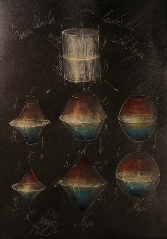

Color sphere cylinder cone KLMN
#Color sphere cylinder cone KLMN#color theory#cromathology#gabriel kelemen#Universitatea de Vest Timisoara#chromatology
2 notes
·
View notes
Text
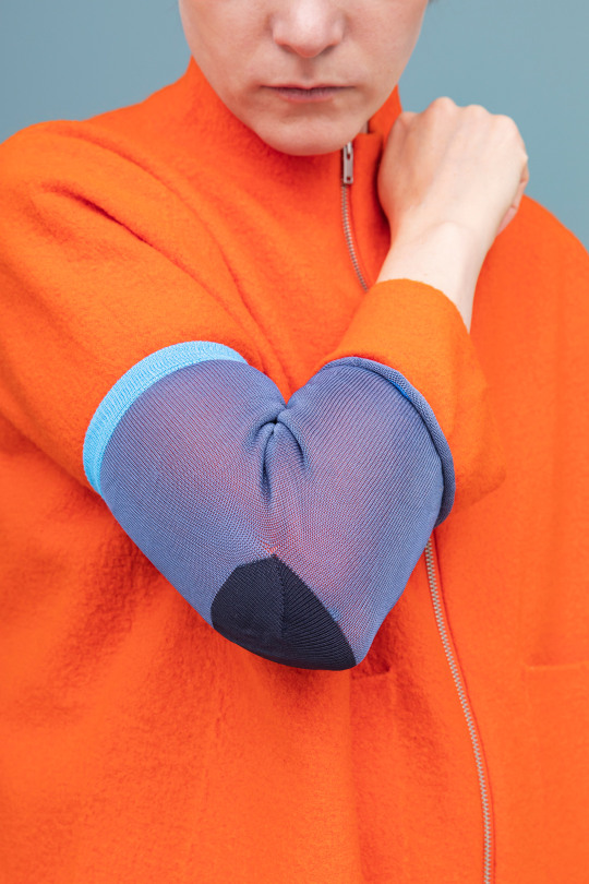
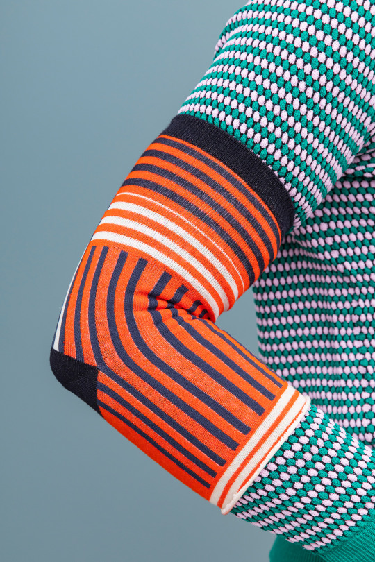
Raw Color designs Elbow Sock for coronavirus sneezing

Dutch design studio Raw Color has suggested using odd socks to help prevent the spread of coronavirus.
The advice from medical experts is to use your elbow rather than your hands when coughing or sneezing, to prevent spreading Covid-19 germs onto surfaces.

Elbow Sock offers a way of keeping your clothes clean while following this practice, and encouraging others to do the same.
Raw Color's design is actually a DIY hack, rather than a product concept. The Eindhoven-based studio suggests you simply take a pair of scissors to any sock.

"In this period, we wanted to simulate the DIY mentality, to think about something that everybody can do, with an object everybody owns, without machinery," explained studio co-founder Christoph Brach.
"While brainstorming, we found out that the sock has the perfect shape, with its heel, to fit onto an elbow," he told Dezeen. "And we all have orphan socks that can be a resource."

The design is based around the fact that germs can survive on fabric for up to five days after transference. So if someone with the virus sneezes frequently on their elbow, they risk spreading it around their home.
With the Elbow Sock concept, you can make as many as you like and change them regularly. After wear, you simply transfer straight to the washing machine.

Brach and partner Daniera Ter Haar are known for their bright and colourful designs. Past projects include the Chromatology installation and the Temporary Trees performance.
Here, the pair have a practical reason for suggesting bold colours and patterns. They hope to create a visual reminder to others to practice better hygiene.
The spirit is the same as with the handmade face masks that people around the world have been making.
"We wanted to create some beauty in times of the serious corona situation, that also has symbolic meaning to it," said Brach.
Elbow Sock was created for Create Cures, an initiative launched by Chinese designers Frank Chou and Chen Min, to find practical solutions to prevent spread of coronavirus.
The first designs created for the series included a wearable shield and a sterilising lamp.
Raw Colour's proposal is by far the simplest and easiest. The designers hope this will help it to catch on.
"We are aware that this concept will not be the most practical concept to prevent corona from spreading," Brach added. "But we believe every bit helps."
Project credits:
Design: Raw Colour
Project team: Christoph Brach, Daniera ter Haar, Tijs Van Nieuwenhuysen, Mirjam de Bruijn, Noortje de Keijzer, Mattie Rasker
The post Raw Color designs Elbow Sock for coronavirus sneezing appeared first on Dezeen.
Source link
Read the full article
0 notes
Photo
Schede di cromatologia terminate!😊 #colori #colors #colours #painting #oilpainting #myPassion #chart #colors_chart #cromatologia #chromatology (presso Scuola D'arte Visiva Klavier) https://www.instagram.com/p/BbSz9YAnjUz/?igshid=NGJjMDIxMWI=
0 notes
Text
I actually don't remember any Blake/Yang shippers back then using color theory to argue for the ship, but it's so funny that was the thing that made me wonder during V3. 'Hmmm this is the colour show, I wonder if that means anything about complementary pairs'.
1 note
·
View note
Text
Chromatology 1 (for Daesu)
Hi guys, what I show you today is the first video of a series, dedicated to Chromatology, Gestalt Psychology and the relationship between Music and Color.
This is video number 1, which I dedicated to my recent composition "Daesu", the ancient name of the Han River in Seoul; see you next Sunday, for the number 2.
Have fun and see you soon.
What is now called the Han River has been called by different names, throughout the course of Korean history. During the period of the Han Commandery on the peninsula and the first part of the Kingdom three period the river was often referred to as Daesu. The Han River is a river in South Korea, the fourth longest river on the Korean peninsula after the Amnok, Tuman and Nakdong. The Han River has played a central role in Korean history since ancient times.
https://www.deezer.com/it/track/663258732
https://open.spotify.com/album/43iqG30bn2vhYXb0CvklTo
https://music.apple.com/us/album/daesu-single/1459401712
«If the eye perceives a color, it is immediately put into activity and is forced by its nature, so unconsciously as necessary, to immediately produce another that together with the data includes the totality of the chromatic range. Every single color stimulates the aspiration to totality in the eye, through a specific sensation. To achieve this totality, in order to be satisfied, the eye seeks a colorless area next to each color zone, on which to produce the color recalled by the first. This is the fundamental law of every chromatic harmony. "
Johann Wolfgang von Goethe
"In general, color is a means of exerting a direct influence on the soul. Color is the key, the eye is the hammer, the soul is the piano with many strings. The artist is a hand that touches this or that key vibrates the human soul ... ".
"For us painters the richest training is that which is drawn from music. With a few exceptions and deviations music, for some centuries already, has used its own means not to portray the manifestations of nature, but to express the psychic life of the artist through the life of musical sounds ... ".
"Infinitely good it goes to the musicians, with their art so advanced. Truly ART, which alre

0 notes
Last Seen Blogs

broriley19
Untitled

death-defying-rat
love the rat

contents404
Not A Creator

hubsbunny
duskees

snowdill08
Candu Plumbing & Rooter Granada Hills Ca