#color:
Photo

Here’s another commission highlight! This time it’s a Base Color piece for Gaku on Twitter!
This piece was so fun ;v; Love me some cute characters celebrating Halloween!
If you’re interested in commissioning me, check out the link below for more information / if they’re currently open!
Commissions Info | Comic Guide | Patreon | Check out my patrons!
61 notes
·
View notes
Photo

PSD COLORING: POISON IN THE WATER. | GET IT HERE.
•• ━━━━━ ••●•• ━━━━━ ••
psd coloring to make things more vibrant & saturated, bright, but without whitewashing. there are folders for the base psd, as well as adjustment folders if it's too bright, or too green/red. as always, you must be knowledgeable with how to work adjustment layers, but this psd does work with different animes/video game medias. adjust the layers as needed! toggle one, two, or all folders if needed, and adjust individual settings as needed.
*. * · CREDIT ME VISIBLY, like in your rules or pinned post.
*. * · DO NOT SHARE THE TEMPLATE WITH ANYONE WHO HASN'T BOUGHT IT. you must buy another copy.
*. * · do not re-sell, re-distribute, use as a base without permission, combine my template with another creator's without our permission, or claim as your own.
*. * · DO NOT TAKE OR USE ELEMENTS FROM MY TEMPLATE FOR DIFFERENT RESOURCES. I HAVE LICENSES TO USE & PROFIT FROM MY ELEMENTS.
*. * · message me on discord if you need any help!
*. * · join my server for server exclusives and early access to wips of what i'm working on!
disclaimer: i do not own the images included in the psd's previews. they belong to the respective media franchises and are only here as previews to display how the psd works.
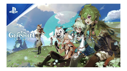
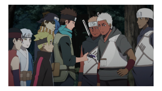
#psd#psd coloring#rp template#naruto rp#genshin impact rp#rp templates#darkstalkers rp#rp resource#rp resources#psds#psd colorings
6 notes
·
View notes
Text
Retro Style Posters | VideoHive 45754950

Files Included Motion Graphics Template Files
Software Version Premiere Pro CC, After Effects CC
Length 0:15
Resolution Resizable
File Size 552MB
Text Placeholders 15
Direct Download
Direct Download is available for Premium Users only
Read the full article
0 notes
Text
Demystifying Screen Readers: Accessible Forms & Best Practices
New Post has been published on https://thedigitalinsider.com/demystifying-screen-readers-accessible-forms-best-practices/
Demystifying Screen Readers: Accessible Forms & Best Practices
This is the 3rd post in a small series we are doing on form accessibility. If you missed the 2nd post, check out Managing User Focus with :focus-visible. In this post we are going to look at using a screen reader when navigating a form, and also some best practices.
What is a Screen Reader?
You may have heard the term “screen reader” as you have been moving around the web. You might even be using a screen reader at this moment to run manual accessibility tests on the experiences you are building. A screen reader is a type of AT or assistive technology.
A screen reader converts digital text into synthesized speech or Braille output, commonly seen with a Braille reader.
In this example, I will be using Mac VO. Mac VO (VoiceOver) is built-in to all Mac devices; iOS, iPadOS, and macOS systems. Depending on the type of device you are running macOS on, opening VO could differ. The Macbook Pro that is running VO I am writing this on doesn’t have the touch bar, so I will be using the shortcut keys according to the hardware.
Spinning Up VO on macOS
If you are using an updated Macbook Pro, the keyboard on your machine will look something like the image below.
You will start by holding down the cmd key and then pressing the Touch ID three times quickly.
If you are on a MBP (MacBook Pro) with a TouchBar, you will use the shortcut cmd+fn+f5 to turn on VO. If you are using a traditional keyboard with your desktop or laptop, the keys should be the same or you will have to toggle VO on in the Accessibility settings.. Once VO is turned on, you will be greeted with this dialog along with a vocalized introduction to VO.
If you click the “Use VoiceOver” button you are well on your way to using VO to test your websites and apps. One thing to keep in mind is that VO is optimized for use with Safari. That being said, make sure when you are running your screen reader test that Safari is the browser you are using. That goes for the iPhone and iPad as well.
There are two main ways you can use VO from the start. The way I personally use it is by navigating to a website and using a combination of the tab, control, option, shift and arrow keys, I can navigate through the experience efficiently with these keys alone.
Another common way to navigate the experience is by using the VoiceOver Rotor. The Rotor is a feature designed to navigate directly to where you want to be in the experience. By using the Rotor, you eliminate having to traverse through the whole site, think of it as a “Choose Your Own Adventure”.
Modifier Keys
Modifier keys are the way you use the different features in VO. The default modifier key or VO is control + option but you can change it to caps lock or choose both options to use interchangeably.
Using the Rotor
In order to use the Rotor you have to use a combination of your modifier key(s) and the letter “U”. For me, my modifier key is caps lock. I press caps lock + U and the Rotor spins up for me. Once the Rotor comes up I can navigate to any part of the experience that I want using the left and right arrows.
youtube
Using the Rotor in VoiceOver
Navigating By Heading Level
Another neat way to navigate the experience is by heading level. If you use the combination of your modifier keys + cmd + H you can traverse the document structure based on heading levels. You can also move back up the document by pressing shift in the sequence like so, modifier keys + shift + cmd + H.
youtube
Using the Heading Level Shortcut with VoiceOver
History & Best Practices
Forms are one of the most powerful native elements we have in HTML. Whether you are searching for something on a page, submitting a form to purchase something or submit a survey. Forms are a cornerstone of the web, and were a catalyst that introduced interactivity to our experiences.
The history of the web form dates back to September 1995 when it was introduced in the HTML 2.0 spec. Some say the good ole days of the web, at least I say that. Stephanie Stimac wrote an awesome article on Smashing Magazine titled, “Standardizing Select And Beyond: The Past, Present And Future Of Native HTML Form Controls”.
The following are 5 best practices to follow when building an accessible form for the web.
Make sure that you are using a form element. Forms are accessible by default and should be used over div’s at all times.
<form> <!-- Form controls are nested here. --> </form>
Be sure to use the for and id attributes on label’s and input’s so that they are linked. This way, if you click/tap the label, focus will shift to the input and you can start typing.
<label for="name">Name:</label> <input type="text" id="name" name="name" required aria-required/>
If a field is required in order for the form to be complete, use the required attribute and the aria-required attribute. These will restrict the form from being submitted. The aria-required attribute explicitly tells the assistive tech that the field is required.
<input type="text" id="name" name="name" required aria-required/>
Use the, :focus, :focus-within and :focus-visible CSS pseudo classes to manage and customize how a user receives focus.
form:focus-within background-color: #cfffcf; input:focus-within border: 10px solid #000000; input:focus-visible, select:focus-visible, textarea:focus-visible outline: 2px solid crimson; border-radius: 3px;
A button is used to invoke an action, like submitting a form. Use it! Don’t create buttons using div’s. A div by definition is a divider. It has no inherent accessibility properties.
Demo
youtube
Navigating a Web Form with VoiceOver
If you want to check out the code, navigate to the VoiceOver Demo GitHub repo. If you want to try out the demo above with your screen reader of choice, check out Navigating a Web Form with VoiceOver.
Screen Reader Software
Below is a list of various types of screen reader software you can use on your given operating system. If a Mac is not your machine of choice, there are options out there for Windows and Linux, as well as for Android devices.
NVDA
NVDA is a screen reader from NV Access. It is currently only supported on PC’s running Microsoft Windows 7 SP1 and later. For more access, check out the NVDA version 2024.1 download page on the NV Access website!
JAWS
“We need a better screen reader”
– Anonymous
If you understood the reference above, you are in good company. According to the JAWS website, this is what it is in a nutshell:
“JAWS, Job Access With Speech, is the world’s most popular screen reader, developed for computer users whose vision loss prevents them from seeing screen content or navigating with a mouse. JAWS provides speech and Braille output for the most popular computer applications on your PC. You will be able to navigate the Internet, write a document, read an email and create presentations from your office, remote desktop, or from home.”
JAWS website
Check out JAWS for yourself and if that solution fits your needs, definitely give it a shot!
Narrator
Narrator is a built-in screen reader solution that ships with WIndows 11. If you choose to use this as your screen reader of choice, the link below is for support documentation on its usage.
Complete guide to Narrator
Orca
Orca is a screen reader that can be used on different Linux distributions running GNOME.
“Orca is a free, open source, flexible, and extensible screen reader that provides access to the graphical desktop via speech and refreshable braille.
Orca works with applications and toolkits that support the Assistive Technology Service Provider Interface (AT-SPI), which is the primary assistive technology infrastructure for Linux and Solaris. Applications and toolkits supporting the AT-SPI include the GNOME Gtk+ toolkit, the Java platform’s Swing toolkit, LibreOffice, Gecko, and WebKitGtk. AT-SPI support for the KDE Qt toolkit is being pursued.”
Orca Website
TalkBack
Google TalkBack is the screen reader that is used on Android devices. For more information on turning it on and using it, check out this article on the Android Accessibility Support Site.
Browser Support
If you are looking for actual browser support for HTML elements and ARIA (Accessible Rich Internet Application) attributes, I suggest caniuse.com for HTML and Accessibility Support for ARIA to get the latest 4-1-1 on browser support. Remember, if the browser doesn’t support the tech, chances are the screen reader won’t either.
DigitalA11Y can help summarize browser and screen reader info with their article, Screen Readers and Browsers! Which is the Best Combination for Accessibility Testing?
Links
https://support.apple.com/guide/voiceover/with-the-voiceover-rotor-mchlp2719/mac
https://www.w3.org/TR/wai-aria/
https://www.w3.org/WAI/standards-guidelines/aria/
https://support.google.com/accessibility/android/answer/6283677?hl=en
https://support.google.com/accessibility/android/answer/6283677?hl=en
#2024#Accessibility#amp#android#apple#applications#apps#aria#Article#Assistive technology#back up#background#Braille#browser#Building#buttons#catalyst#change#classes#code#Color#computer#content#CSS#dates#desktop#devices#dialog#documentation#email
0 notes
Photo
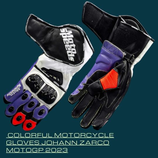
Colorful Motorcycle Gloves Johann Zarco MotoGP 2023
A high profile and perfect matching pair of Johann Zarco Colorful Motorcycle Gloves can be matched with his MotoGP 2023 suit. Made of vivid and shiny material for an attractive appearance with reliable safety & comfort features.
Colorful Motorcycle Gloves Johann Zarco MotoGP 2023
#best motorcycle gloves#ce motorcycle gloves#Colorful Motorcycle Gloves#Johann Zarco gloves#Leather Moto Gloves#Motorcycle gloves#motorcycle racing gloves#new motorcycle gloves#safest motorcycle gloves#simple motorcycle gloves#very easy motorcycle gloves
0 notes
Video
youtube
Music Video: Xikano Syndicate & Zenaloa - La Guerra
Ch-check it! Peep the new music video for the single "La Guerra" from our fam Xikano Syndicate featuring Zenaloa. This is the lead single off their upcoming project Xikano Syndicate Presents: El Sindicato Vol.1 dropping soon via Black Cloud Music. The video was directed by Color-Wash Productions.
#youtube#Xikano Syndicate#hiphop#rap#music videos#west coast#Zenaloa#IE Hiphop#Inland Empire#OC Hiphop#Anaheim#Latino Hiphop#Black Cloud Music#Color-Wash Productions
0 notes

Photo
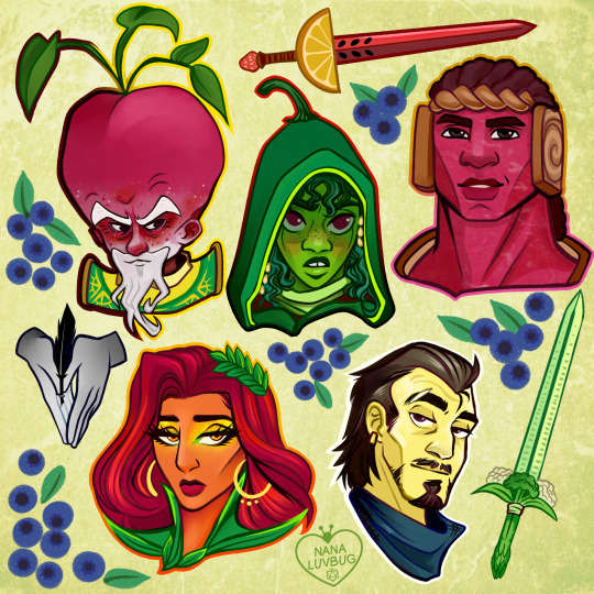
🧀🥪🌶️🥭 The Ravening War portraits 🧀🥪🌶️🥭
patreon * twitch * shop
[ID: a series of digitally illustrated portraits showing - top left to bottom right - Bishop Raphaniel Charlock (an old radish man with a big red head and large white eyebrows & a scraggly beard. he wears green and gold robes with symbols of the bulb and he smirks at the viewer) Karna Solara (a skinny young chili pepper woman with wavy green hair, freckled light green skin with red blooms on her cheeks. she wears a chili pepper hood lined with small pepper seeds and stares cagily ahead) Thane Delissandro Katzon (a muscular young beef man with bright pinkish skin with small skin variations to resemble pastrami and dark burgundy hair. he wears a bread headress with a swirl of rye covering his ears and he looks ahead, optimistic and determined) Queen Amangeaux Epicée du Peche (a bright mango woman with orange skin, big red hair adorned with a green laurel, and sparkling green/gold makeup. she wears large gold hoop earrings and a high leafy collar) and Colin Provolone (a scraggly cheese man with waxy yellow skin and dark slicked back hair and patchy dark facial hair. he wears a muted, ratty blue bandana around his neck and raises a scarred brow at the viewer with a smirk) End ID.)
#trw#the ravening war#dimension 20#acoc#trw fanart#ttrpg#dnd#bishop raphaniel charlock#karna solara#thane delissandro katzon#queen amangeaux epicee du peche#colin provolone
2K notes
·
View notes
Photo
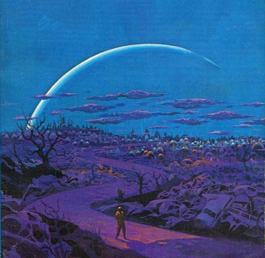
One of my favorites by Paul Lehr, used as a 1971 cover to "Earth Abides," by George R. Stewart. It's also in my upcoming art book!
1K notes
·
View notes
Photo
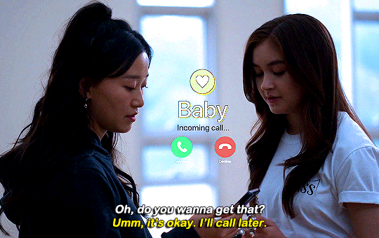
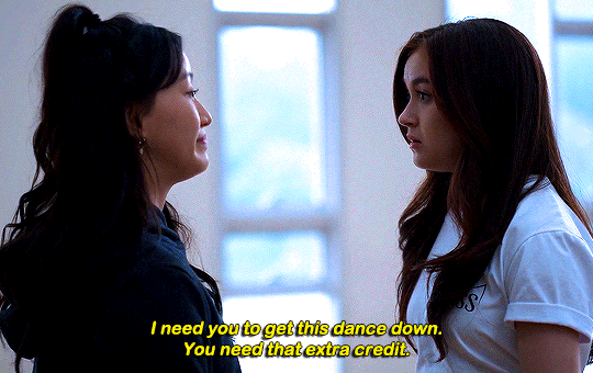
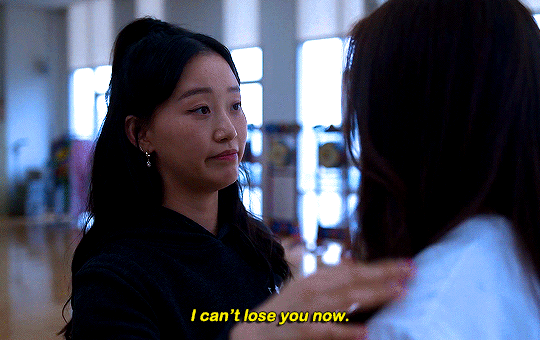

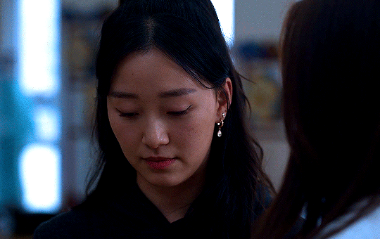
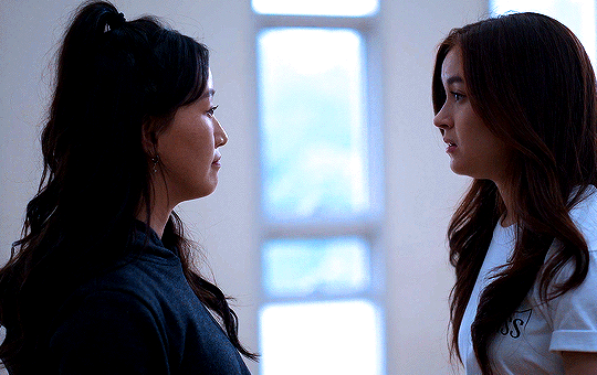
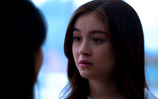


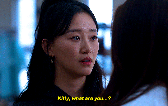
#thistension
XO, KITTY
— 1.09 “SNAFU”
#xokittyedit#tatbilbedit#kdramaedit#netflixedit#wlwedit#xokittydaily#asiancentral#cinemapix#cinematv#filmtvcentral#pocfiction#smallscreensource#teendramaedit#wlwgif#kitty song covey#yuri han#xo kitty#anna cathcart#gia kim#~#inspiration: romantic.#dynamic: ff.
1K notes
·
View notes
Text
(The Sims 4) Estrela Hair
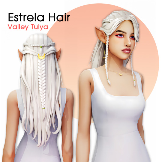

Hair
24 EA Colors
Hat Compatible
55403 polygons
Custom thumbnail
Hair Accessories Overlay
15 Colors Variations
Custom thumbnail
Brow ring category
If you have any issue let me know, enjoy.
T.O.U.
Credits
Download (Patreon - Curseforge)
@maxismatchccworld @sssvitlanz @emilyccfinds
1K notes
·
View notes
Photo
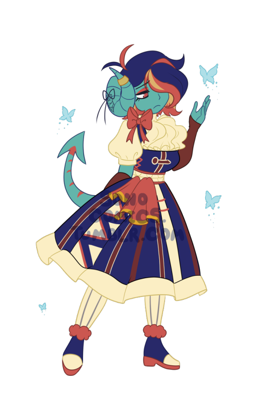
Here’s another commission highlight! This time it’s a siren character for PokEmblem on Twitter!
This character was such a joy to draw! Such a unique look and the palette is [chef’s kiss]
If you’re interested in commissioning me, check out the link below for more information / if they’re currently open!
Commissions Info | Comic Guide | Patreon | Check out my patrons!
62 notes
·
View notes
Photo

PORTO ROCHA
200 notes
·
View notes
Text
Valentines Day | VideoHive 50376369
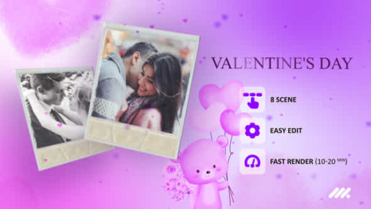
After Effects Version CC
Files Included After Effects Project Files
Length 0:44
Resolution 1920x1080
File Size 56MB
Media Placeholders 12
Text Placeholders 6
Direct Download
Direct Download is available for Premium Users only
Read the full article
0 notes
Text
Managing User Focus with :focus-visible
New Post has been published on https://thedigitalinsider.com/managing-user-focus-with-focus-visible/
Managing User Focus with :focus-visible
This is going to be the 2nd post in a small series we are doing on form accessibility. If you missed the first post, check out Accessible Forms with Pseudo Classes. In this post we are going to look at :focus-visible and how to use it in your web sites!
Focus Touchpoint
Before we move forward with :focus-visible, let’s revisit how :focus works in your CSS. Focus is the visual indicator that an element is being interacted with via keyboard, mouse, trackpad, or assistive technology. Certain elements are naturally interactive, like links, buttons, and form elements. We want to make sure that our users know where they are and the interactions they are making.
Remember don’t do this in your CSS!
:focus outline: 0; /*** OR ***/ :focus outline: none;
When you remove focus, you remove it for EVERYONE! We want to make sure that we are preserving the focus.
If for any reason you do need to remove the focus, make sure there is also fallback :focus styles for your users. That fallback can match your branding colors, but make sure those colors are also accessible. If marketing, design, or branding doesn’t like the default focus ring styles, then it is time to start having conversations and collaborate with them on the best way of adding it back in.
What is focus-visible?
The pseudo class, :focus-visible, is just like our default :focus pseudo class. It gives the user an indicator that something is being focused on the page. The way you write :focus-visible is cut and dry:
:focus-visible /* ... */
When using :focus-visible with a specific element, the syntax looks something like this:
.your-element:focus-visible /*...*/
The great thing about using :focus-visible is you can make your element stand out, bright and bold! No need to worry about it showing if the element is clicked/tapped. If you choose not to implement the class, the default will be the user agent focus ring which to some is undesirable.
Backstory of focus-visible
Before we had the :focus-visible, the user agent styling would apply :focus to most elements on the page; buttons, links, etc. It would apply an outline or “focus ring” to the focusable element. This was deemed to be ugly, most didn’t like the default focus ring the browser provided. As a result of the focus ring being unfavorable to look at, most authors removed it… without a fallback. Remember, when you remove :focus, it decreases usability and makes the experience inaccessible for keyboard users.
In the current state of the web, the browser no longer visibly indicates focus around various elements when they have focus. The browser instead uses varying heuristics to determine when it would help the user, providing a focus ring in return. According to Khan Academy, a heuristic is, “a technique that guides an algorithm to find good choices.”
What this means is that the browser can detect whether or not the user is interacting with the experience from a keyboard, mouse, or trackpad and based on that input type, it adds or removes the focus ring. The example in this post highlights the input interaction.
In the early days of :focus-visible we were using a polyfill to handle the focus ring created by Alice Boxhall and Brian Kardell, Mozilla also came out with their own pseudo class, :moz-focusring, before the official specification. If you want to learn more about the early days of the focus-ring, check out A11y Casts with Rob Dodson.
Focus Importance
There are plenty of reasons why focus is important in your application. For one, like I stated above, we as ambassadors of the web have to make sure we are providing the best, accessible experience we can. We don’t want any of our users guessing where they are while they are navigation through the experience.
One example that always comes to mind is the Two Blind Brothers website. If you go to the website and click/tap (this works on mobile), the closed eye in the bottom left corner, you will see the eye open and a simulation begins. Both the brothers, Bradford and Bryan Manning, were diagnosed at a young age with Stargardt’s Disease. Stargardt’s disease is a form of macular degeneration of the eye. Over time both brothers will be completely blind. Visit the site and click the eye to see how they see.
If you were in their shoes and you had to navigate through a page, you would want to make sure you knew exactly where you were throughout the whole experience. A focus ring gives you that power.
Demo
The demo below shows how :focus-visible works when added to your CSS. The first part of the video shows the experience when navigating through with a mouse the second shows navigating through with just my keyboard. I recorded myself as well to show that I did switch from using my mouse, to my keyboard.
Video showing how the heuristics of the browser works based on input and triggering the focus visible pseudo class.
The browser is predicting what to do with the focus ring based on my input (keyboard/mouse), and then adding a focus ring to those elements. In this case, when I am navigating through this example with the keyboard, everything receives focus. When using the mouse, only the input gets focus and the buttons don’t. If you remove :focus-visible, the browser will apply the default focus ring.
The code below is applying :focus-visible to the focusable elements.
:focus-visible outline-color: black; font-size: 1.2em; font-family: serif; font-weight: bold;
If you want to specify the label or the button to receive :focus-visible just prepend the class with input or button respectively.
button:focus-visible outline-color: black; font-size: 1.2em; font-family: serif; font-weight: bold; /*** OR ***/ input:focus-visible outline-color: black; font-size: 1.2em; font-family: serif; font-weight: bold;
Support
If the browser does not support :focus-visible you can have a fall back in place to handle the interaction. The code below is from the MDN Playground. You can use the @supports at-rule or “feature query” to check support. One thing to keep in mind, the rule should be placed at the top of the code or nested inside another group at-rule.
<button class="button with-fallback" type="button">Button with fallback</button> <button class="button without-fallback" type="button">Button without fallback</button>
.button margin: 10px; border: 2px solid darkgray; border-radius: 4px; .button:focus-visible /* Draw the focus when :focus-visible is supported */ outline: 3px solid deepskyblue; outline-offset: 3px; @supports not selector(:focus-visible) .button.with-fallback:focus /* Fallback for browsers without :focus-visible support */ outline: 3px solid deepskyblue; outline-offset: 3px;
Further Accessibility Concerns
Accessibility concerns to keep in mind when building out your experience:
Make sure the colors you choose for your focus indicator, if at all, are still accessible according to the information documented in the WCAG 2.2 Non-text Contrast (Level AA)
Cognitive overload can cause a user distress. Make sure to keep styles on varying interactive elements consistent
Browser Support
This browser support data is from Caniuse, which has more detail. A number indicates that browser supports the feature at that version and up.
Desktop
Chrome Firefox IE Edge Safari 86 4* No 86 15.4
Mobile / Tablet
Android Chrome Android Firefox Android iOS Safari 123 124 123 15.4
Links
#Accessibility#algorithm#Article#Assistive technology#Branding#browser#Building#buttons#classes#code#collaborate#Color#colors#CSS#data#Design#digitalocean#Disease#eye#focus#form#Forms#how#how to#interaction#it#keyboard#Learn#links#margin
0 notes
Photo


AGUST D : DAECHWITA (大吹打) & HAEGEUM (解禁)
⤷ movie posters | ig ; twt (click for hi-res)
#i'm back and ready to create again :'))#bts#bangtan#yoongi#agust d#suga#userbangtan#usersky#bangtanarmynet#hyunglinenetwork#dailybts#*latest#*posters#*gfx#btsgfx#idk if i wanna do an amygdala one#that one seems too personal to edit for me#so these will do for now
693 notes
·
View notes
Last Seen Blogs

lonewolfmabel
𝓜𝓪𝓫𝓮𝓵'𝓼 𝓛𝓸𝓷𝓮𝔀𝓸𝓵𝓯
feverdreamwonderland
fever dreams

crvmb
sure

kikatouka
certified™ shigaraki simp

itsoktobeadicksometimes
I'm not funny