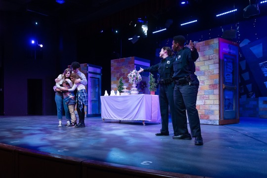
#colorlifepost
Photo


B L A C K W E E K
I wanted to talk about the use of black in animated movies, specifically the difference between Disney and Studio Ghibli movies.
Disney Movies -
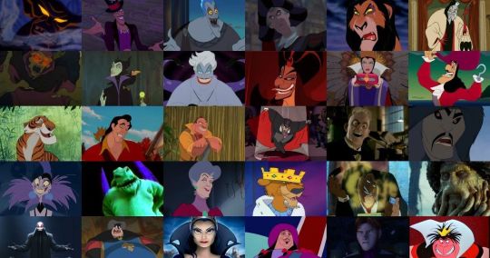
1.) The majority of the time, black is a universal color among villains in Disney movies; its practically a rule. Black is either apart of their costume, hair, or body. Along with this is a rather 2D personality/motivation. These villains are rarely complex and don’t have redeeming traits that make an audience member sympathize with them. Their motives are plain and clear - money, power, youth, etc. Their opposing protagonist never wears black (unless their hair is black, such as a POC or Snow White whose hair is a defining trait). Black is an easy way to convey evil. Dark color = dark aura/essence = evil. This is in no way bashing these movies; I love Disney movies more than most. This use of black is just an easy way to convey an evil character.
Studio Ghibli -
Studio Ghibli movies are applauded for their complex characters and storylines. Their use of the color black is a perfect representation of this.
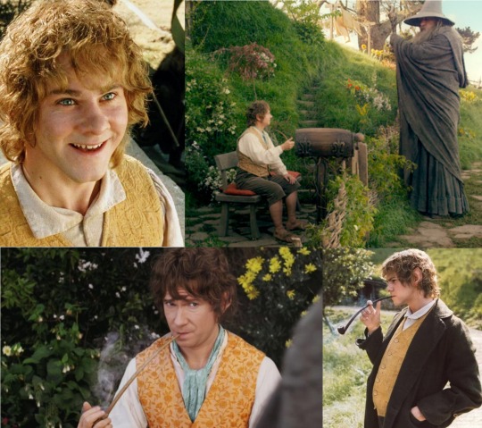
2&3.) Witch of the Waste from Howl’s Moving Castle - In the beginning of the film, this character falls into the typical villain archetype/trope. However, over the course of the movie she loses the bit of youth and health she still had (from her magic). By the end, she is her pure, raw self. At moments, she retains her sense of superiority/ disregard for others, but she has many “cute old lady” moments (mostly in her relationship with the dog Heen). Her black clothes go from conveying her “evilness” to her old age.
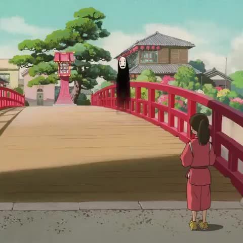
4.) No Face from Spirited Away - Studio Ghibli often uses black as a way to convey mystery and complexity. No Face is a mysterious spirit with mysterious powers (he can shape-shift, create gold, eat pretty much anything, but he never speaks). When first introduced, he is a nuisance and hazard to the bath house (at one point he ate someone). But soon his soft character comes through. He tags along on the protagonist’s journey, keeping her company in lonely and hopeless moments (he also endlessly offers her gold). Growing up I always thought he was somewhat cute, like an old dog with little energy but endless love. His black figure assists in his “mysteriousness.” He doesn’t have a definitive shape and he can disappear in dark spaces. I like this picture specifically because of his contrast with the scenery around him. In class, many students agreed that black is a inconspicuous color. However, in this setting, No Face’s black body clearly sticks out and draws the viewer’s attention.
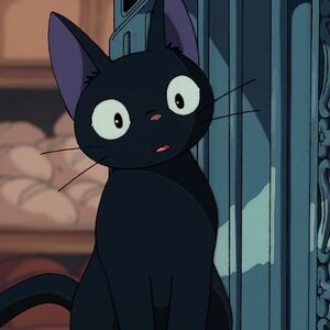
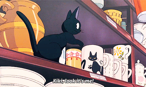
5&6.) Gigi from Kiki’s Delivery Service - Gigi is Kiki’s adorable sidekick. This movie already fights the typical stereotype of an evil witch, showing that witch’s are kind and helpful. Gigi isn’t the typical black cat; he doesn’t bring bad luck and isn’t the pet of an evil villain. He is a hilarious supporting character that brings Kiki’s naivety down to earth through comedic pessimism. Also, the black makes his large eyes and mouth pop, making him a very cute cat :). Ghibli took the traditional mysterious black cat to create an adorable and funny character.
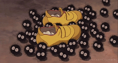
7.) Soot Sprites/Gremlins from My Neighbor Totoro and Spirited Away - Once again, black is used to make a cute and mysterious creature. At first, these sprites surprise and “spook” the main characters in each movie. But as the plot progresses, they become a cute companion. In Spirited Away, the protagonist is scared by the swarm of these eerie bug-like creatures, but they soon prove to be ADORABLE; they carry and keep safe the protagonists shoes and socks, they work really hard carrying coal in the boiler room, they make cute little squeaky noises, and they LOVE sprinkles. I’m sorry, I just love these little guys. In My Neighbor Totoro, the sprites are the protagonists’ first encounter with the mystical woods. They are a precursor for their magical adventure. Naturally, the sisters’ are initially scared by them. The sprites’ black design is similar to that on Gigi; they appear mysterious, but their large white eyes make them very cute :)
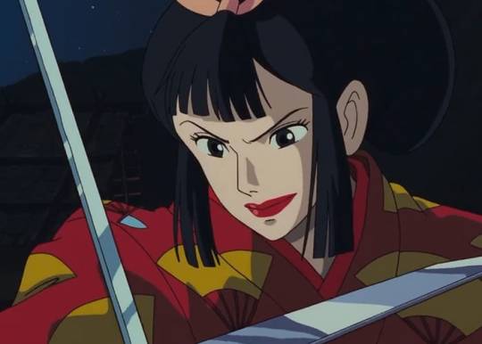
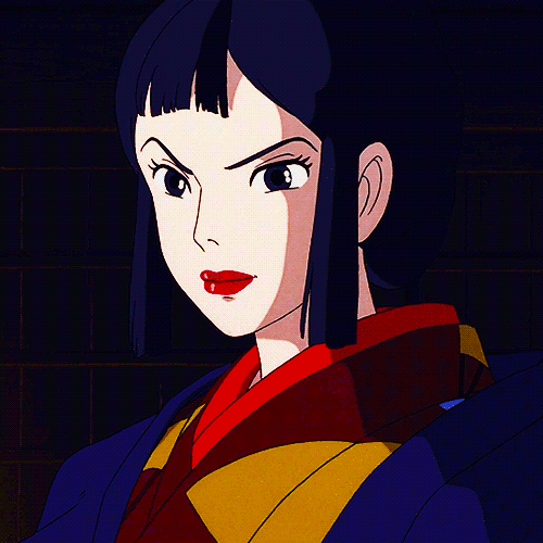
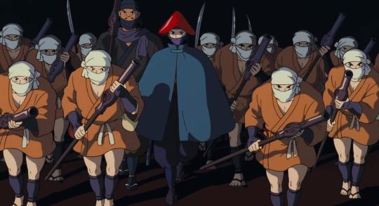
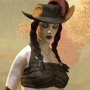
8&9.) Lady Eboshi from Princess Mononoke - Princess Mononoke is famous for character complexity (among many other aspects of the film). Lady Eboshi is initially seen as a villain; she is destroying the forest, angering forest spirits, causing discourse in the land, etc. Her main goal is to kill the Forest Spirit (which is viewed as impossible by most as he is the highest god) to continue mining ore and expanding Iron Town. However, as the protagonist, Ashitaka, meets with and befriends her, she is seen as a kind-hearted and driven woman. She took in, helps, and hired outcast lepers and female brothel workers, giving them a home, family, and honest work. The audience never dislikes her; she has a calm, kind demeanor and is very welcoming to Ashitaka. Her character design is the darkest of all the characters (at least all the human characters). She is the only person with black hair, and her main outfit sticks out among the other towns people. The use of black in her design contrasts her from the other characters (ie, Ashitaka is dressed in soft blues to portray his humble and kind nature). She appears more powerful and mysterious among everyone else (Why does she have these goals? Where did she come from? What motivated her to help people less fortunate? How did she get in such a powerful position? etc.)
10 notes
·
View notes
Text
Life Color Post Week #9
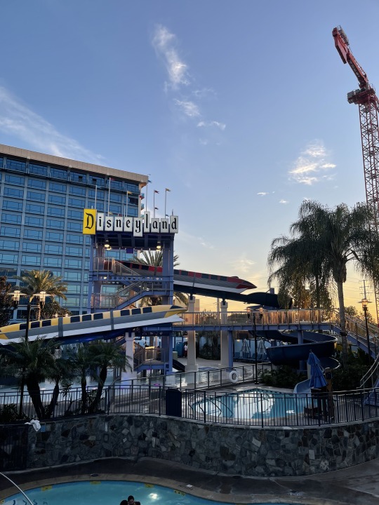
1. This picture was taking outside the Disneyland hotel which is where I stayed durning spring break. I loved how the yellow on the sign matches the yellow in the sky in tone. I feel like all the colors just blend together making me feel call. There also also so many different shades of blue from the water in the pools, the sign, the windows, and the sky.
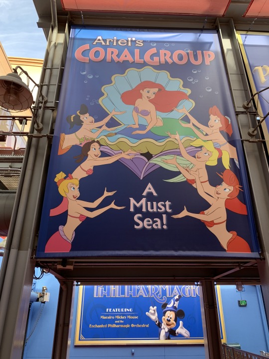
2. This one is I took in Disneyland it was one of the posters hanging up in the park. I love how all over the mermaids are different colors but almost the same tone. I also think the blue background brings out the colors of their mermaid tails.
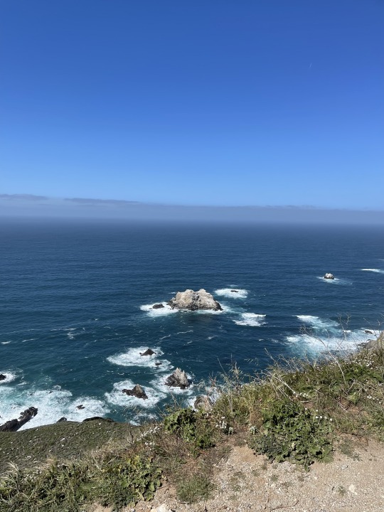
3. I took this in Big Sur where I went to watch my best friend get engaged last weekend! I love how blue the ocean is and how if you look at different parts of it their all different blues. I also think the green compliments the ocean.
0 notes
Text

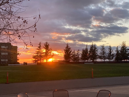
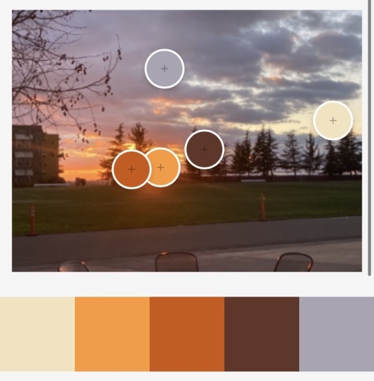
The gorgeous sunset picture taken from my apartment room on 01/12/2022! I love the vivid colors!! Pictures just don’t do it justice!
0 notes
Text


COLOR OF MY CHOICE ~ GOLD
I love the use of the color gold in the Lord of Rings movies. The movie is very intentional in its use of color.
Sauron - The colors surrounding this character are strictly dark. Between his armor and his fortresses, everything is black. However, visions of him (and of him with the Nazgul) are seen in bright gold flames. Also, the Eye of Sauron over Barad Dur has these same bright flames. The "one ring" made by Sauron is much simpler than any of the other rings made by Sauron; the other rings, which were given to elves, dwarves, and men, have intricate designs with gemstones. The one ring (which Sauron kept and all other rings are connected to) is a simple gold band. The inscription, which is only seen when heated by flames, is the same bright gold of the flames that engulf Sauron. Within this context, gold represents Sauron's evil influence that spread like fire.
Status - Gold is also used to signify status. Royalty, such as Theodon and Lord Elrond, are dressed in gold. Ceratin characters or races that are inherently elegant and sophisticated, such as Rivendell elf soldiers, also wear gold.
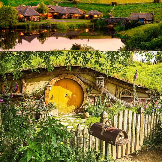
Hobbits - Hobbits, along with their home in the Shire, are meant to represent all that's good in the world. Hobbiton is pretty secluded in Middle Earth and isn't affected by outside evil. This cute, peaceful town is meant to evoke a sense of warm, welcoming nostalgia. One way this is done is through warm, gold lighting (warm fireplaces, outdoor parties at night, etc.). The color gold also shows up in furniture and clothes. For example, Samwise's house has a cute yellow door. Merry Brandybuck and Bilbo Baggins both wear gold vests at the beginning of their adventures. When used here, gold represents the naive perspective of the world held in Hobbiton.
3 notes
·
View notes
Text


~ RED WEEK ~
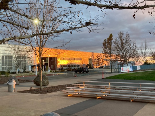
1&2) Of course I had to include a Jessup sunset. Although it’s mostly orange and not red, I still wanted to include their warm colors. As I exited the caf, Eliana and I were B L I N D E D by the sunset. It was perhaps the brightest and most colorful sunset I’ve yet to see at Jessup.
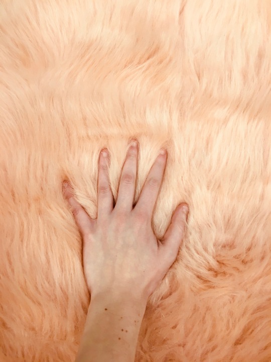
3.) A pink rug was added to the art studio and Eliana made the discovery that it perfectly matched her skin :)
4.) Hannah and I are dawning the only shades of red we own during practicum hours (Talia mentioned in class that my color combination looked like Winnie the Pooh, which I appreciate very much). It’s strange that a color I admire so much barely appears within my closet. It seems i’m not very drawn to red when clothes shopping.
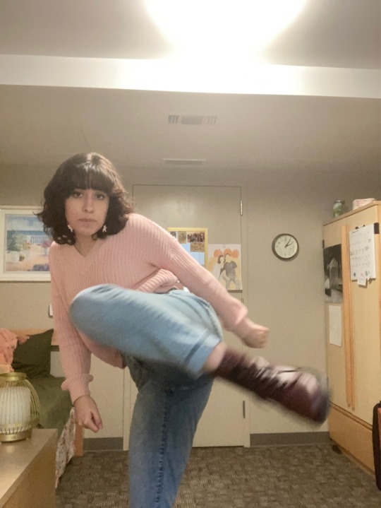
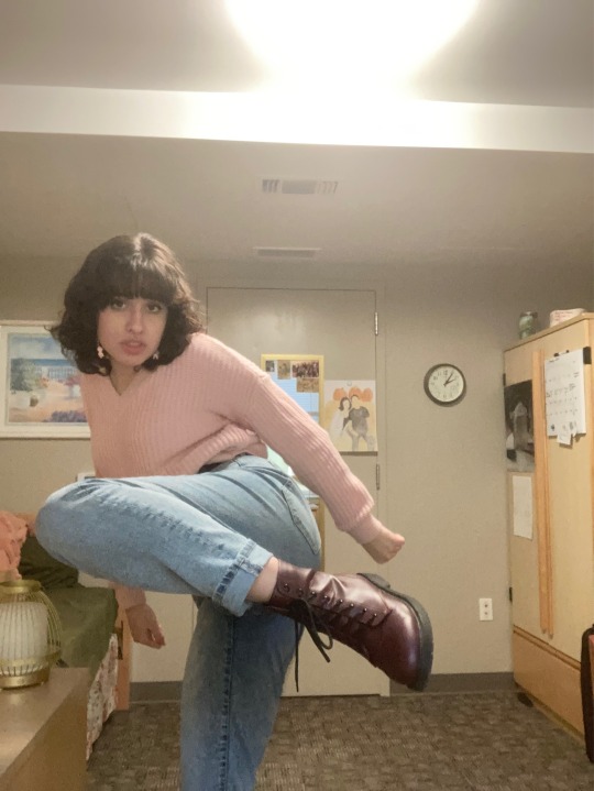
5&6) I’m sporting my pink sweater, burgundy boots, and pink baby earrings. This is perhaps the closest I could get for a red outfit.
3 notes
·
View notes
Text


Life Color Post
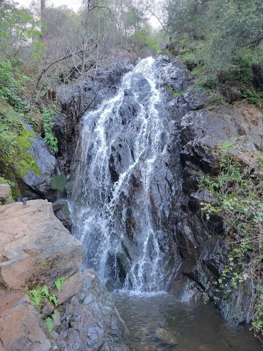
1&2.) My boyfriend and I went on a hike and the trail was beautiful! Since we’re coming out winter, the scenery was very green. I loved just staring at the waterfall and seeing how light interacted with the water.
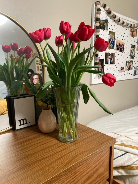
3.)Hannah got some flowers and I thought the color was very pretty. The vibrant pink really contrasts in here earth-toned room.
4.) I was using this art as a reference picture for a drawing and I loved that each frog has entirely different shades and tones of green.
1 note
·
View note
Text


~PURPLE WEEK~
1.) This is a bouquet of flowers my nana gave me for my birthday last year. I love the overpowering warm colors (the vivid oranges, yellows and pinks). The speckles of purple flowers with the green leaves are a nice contrast that balance out the colors.
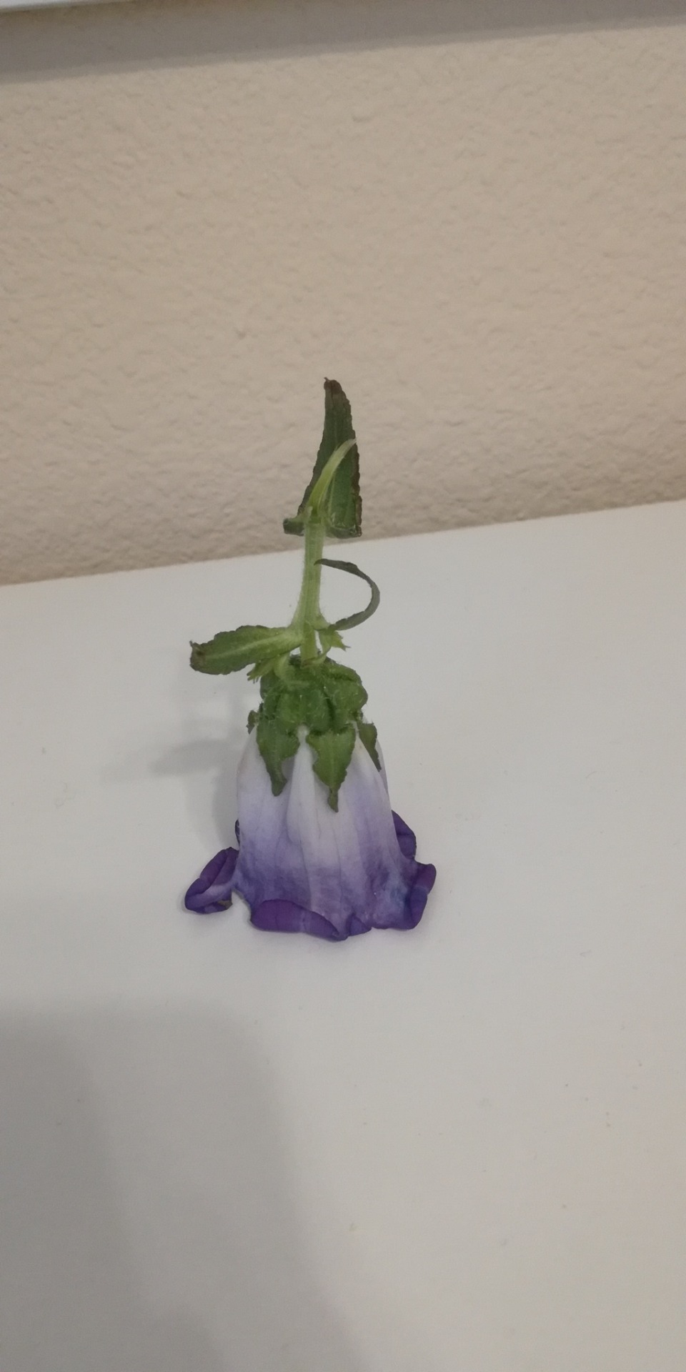
2.) This is a flower i plucked from a bouquet. I fell in love with it to the point that canterbury bell flowers are my favorite flowers now (i thought that it looked like a fairy with a big skirt). I love the gradient from the white base to the rich purple tips of the petals.
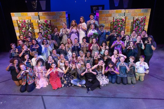
3&4.) These are pictures from my senior musical ‘Freaky Friday.’ The color palette for the show consisted of orange, blue, and most importantly PURPLE. I chose two pictures that showcased its purple lighting and costumes.
5.)This was a pic I took at Jessup’s disco night this past week. The colors were very similar to that of ‘Freaky Friday.’
1 note
·
View note
Text
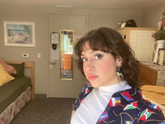
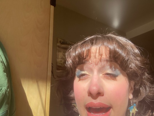


~ BLUE WEEK ~
1&2.) Me wearing one of my dad’s old shirts (one of the only blue shirts I own), blue dinosaur earrings, and blue eyeshadow (which was a little out there for me). I realized I don’t usually wear blue outside of jeans and jewelry. Playing around with blue makeup was definitely fun!
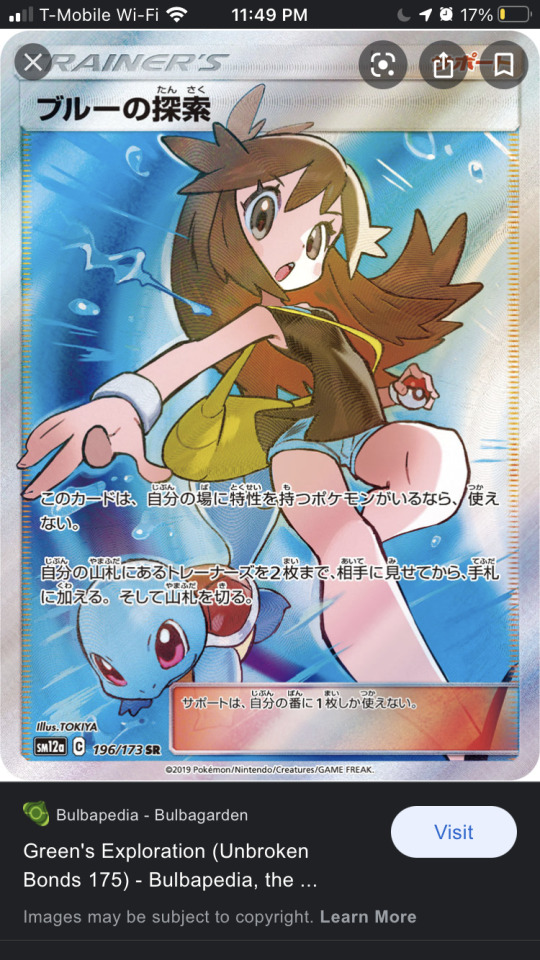
3&4.) For a Valentine’s Day card, I drew my boyfriend and I as tag team pokémon trainers. These were two reference pictures I had in my camera roll. The blue on these cards is matched with a complementary orange. I found these two cards to be very aesthetically pleasing.
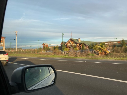
5.) On my way to Rollin’s Lake with a friend, we passed by a Bass Pro Shop. The dusty blue sky behind the heavily green and brown landscape made for a muddy, yet peaceful scene.
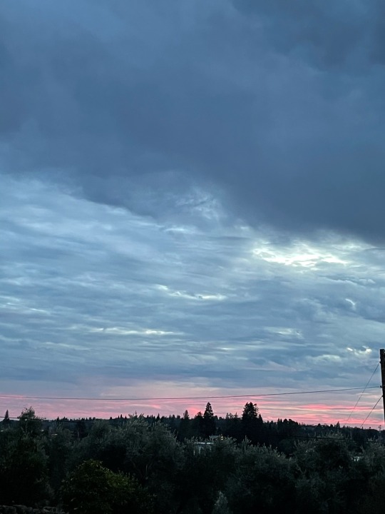
6.) When visiting a friends house, we watched the sunset from her backyard (which overlooked some orchards). The rich blue sky is juxtaposed with the dark landscape of trees and houses. A strip of vibrant pink separated the two as the sun sets.
7,8,&9.) I have too many pictures in my phone of my favorite lizard, the blue tongue skink. Almost every breed of the blue tongue skink has monotone, earth-toned scales. However, his vibrant blue tongue (which he gets his name for) visually pops out. I also included it because lizards are adorable.
1 note
·
View note
Last Seen Blogs

xfvneralmoon
just another poor man praying, waiting for death
little-spn-masterlist-blog
Little Supernatural RP
loukja
Second star to the right...

youcumicumweallcum
Late Night Jerk
hellahellastoned
Hellastoned Adventures