#colour combinations
Text

Early morning sea viewing 🌊🌙🐺
Made using 3-tone colour combination No. 227 from ‘A Dictionary of Color Combinations’ by Sanzo Wada (1883-1967) 🌟 Cerulean Blue, Light Glaucus Blue, and Hermosa Pink. (Prints available here 💫)
#illustration#drawing#colour combos#witch#wolf#colour combinations#color combo#Sanzo Wada#sea view#Pine trees#birds#also there’s a print sale on my web shop at the moment#if you would like to get a print!#this one was really fun to draw#artists on tumblr
72 notes
·
View notes
Text
Dual colour combinations to paint your walls
WALL COLOUR COMBINATIONS
When it comes to decorating a room, one of the most important elements is the colour scheme. Using a wall colour combination for the walls can create a cohesive and visually interesting space. When using a wall colour combination, it's important to consider the undertones of the colours as well as the amount of each colour used in the space. A good rule of thumb is to use the dominant colour on the larger surfaces, such as the walls, and the accent colour on the smaller surfaces, such as trim or accessories.
The most recent trend is to paint the walls of the bedroom in two different colour schemes. An elegant bedroom with walls painted in just two colours adds a subtle visual contrast to the home's overall aesthetic. Not only does the two-tone effect give the bedroom a unique look, but it can also be used to enhance a particular design element.
WALL COLOUR COMBINATION FOR LIVING ROOM
Living room wall colour combination refers to the use of two different colours on the walls of a living room. This approach can create a dynamic and visually interesting space, as well as add depth and dimension to the room. It is important to choose colours that complement each other and work well together to achieve the desired aesthetic. Common wall colour combinations include pairing a neutral colour with a bold accent colour or using two shades of the same colour to create a gradient effect. The choice of colours and the way they are applied can also be used to create different moods and styles in the living room. Overall, a wall colour combination can be a great way to add character and personality to a living room.
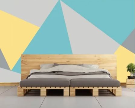
WALL COLOUR COMBINATION FOR BEDROOM
Bedroom wall two-colour combination is a popular decorating technique that involves painting the walls of a bedroom in two different colours. This technique can be used to create a variety of different looks, from bold and dramatic to soft and soothing. Some popular wall colour combinations for bedroom walls include black and white, blue and white, grey and white, and beige and white
One of the benefits of using a wall colour combination in a bedroom is that it can help to create a sense of balance and harmony in the space. This can be especially important in small bedrooms, where a single colour can sometimes feel overwhelming. Additionally, a wall colour combination can be used to create a sense of depth and dimension in a room, which can help to make it feel larger and more open.
WALL COLOUR COMBINATION FOR KIDS ROOM
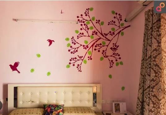
When decorating a kid's room, one of the most important things to consider is the colour scheme. The colours chosen can have a big impact on the overall feel and atmosphere of the room, and can also affect the child's mood and behavior. One popular option for a kid's room is to use a two-color combination on the walls. This can create a visually interesting and dynamic space, and also make the room feel more cohesive and balanced.
WALL COLOUR COMBINATION KITCHEN ROOM
Kitchen wall colour combination refers to the practice of painting or decorating the walls of a kitchen using two different colours. This design technique can be used to create a visually striking and dynamic look in the kitchen, while also highlighting certain areas or features of the room. The two colours used in a kitchen wall two colour combination can be contrasting or complementary and can be used to create different moods or styles in the kitchen. Some popular kitchen wall two colour combinations include white and black, blue and yellow, and red and gray.

WALL COLOUR COMBINATION FOR GUEST BEDROOM
When choosing colours for a guest bedroom, it's important to consider the overall aesthetic of your home and the mood you want to create in the space. Neutral colours such as beige, grey, or white are great options for a calming and soothing atmosphere. Incorporating a two-colour combination on the walls of a guest bedroom can add visual interest and create a comfortable and inviting space for your guests. With a little creativity and some careful planning, you can create a guest bedroom that is both stylish and functional.
AAPKAPAINTER: USING WALL COLOR COMBINATION TO CREATE A DREAM HOUSE!
AapkaPainter is an expert in providing wall colour combinations that can enhance the overall aesthetic of any room. We have a team of experienced and skilled professionals who are well-versed in the latest colour trends and can suggest the perfect wall painting designs to match your preferences and style.
AapkaPainter offers a wide range of colour options, including neutral shades, bold hues, and pastel tones. We can help you create a cohesive colour scheme for your entire home or just one room. We can also assist you in choosing colours that complement your furniture and decor.
0 notes
Text
What are the colour combinations of the website | Ecommerce website

Hey, I'm glad to hear from you once more. Which type of design we can use for the creation of an e-commerce website was covered in the previous article. In response to that query, we may now talk about the website's optimum color combinations for other people. The color scheme on the website reflected your inventiveness.
Different color combinations elicit different emotions. Red is assertive, just as we pretend to use other colors for various variations. Like how blue is reliable and yellow is entertaining. This implies that you may establish the mood for your website by selecting an appealing color scheme that reflects the feelings you want your visitors to have and encourages them to visit it again.
Some distinct tips on how to pick a pleasing color scheme for a website are useful for every e-commerce company to make their website engaging and appealing.

Colours must be elegant:
Nobody wants to spend a lot of time on a bad or dull website because it makes them feel bad about wasting their time. Select the color scheme that will draw customers to your website and keep them there.
Describe business’s viewpoint:
Your website's layout and design might occasionally describe your company, its areas of expertise, and the primary goals of the brand.
Conversation & Interaction:
The color scheme of your website will determine whether or not visitors buy anything. Select the most effective combination to help you connect with customers.

Types of Color Combination:
Cool & Sharpen:
Your customers' eyes will be chilled by cool and sharp colors, which will keep them on the page and entice them to return.
Bold & Bright:
Bold and vibrant colors work best for some specific types of brands when designing a website that attracts a specific demographic of clients.
Professional with fun:
Every firm must be professional, but it also conveys consumer loyalty through pleasure and enjoyment, which highlights many beneficial aspects of the brand.
Thank you for your time, dear reader! Keep checking back to learn more about the E-commerce website from us. Be careful!
Visit to explore more on What are the colour combinations of the website?
Get in touch with us for more!
Contact us on:- +91 987 979 9459 | +1 919 400 9200
Email us at:- [email protected]
0 notes
Text
Traditional Colors of Japan
Book review:
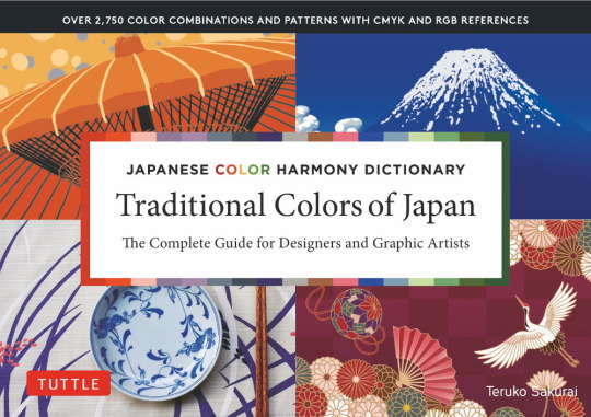
Billed as an easy-to-use colour harmony dictionary, find out how well this handy, compact book lives up to its claim.
There are plenty of images that are instantly evocative of Japan. Festivals, flora, fauna, landscapes, textiles, classical paintings or modern artwork; many of these can conjure not just the country in general but a specific time and place, seasons and memories. This book has chosen exactly a hundred such scenes and rendered them into colour combinations that are both pleasing to the eye and possess strong recall of their originating image.
All colours are provided with CMYK RGB and HTML identifiers. Each colour scheme is presented with some unique elements such as the originating scene or photo and a unique illustration that demonstrates a full set of colours in use. Simpler examples are used to show the combinations that utilise only two or three colours from a given palette. Common to the presentation of each colour scheme are some recurring elements such as sample patterns and sample designs. These constant shapes and patterns allow for comparison from one scheme to another.
At 288 pages, this compact, wide-format book offers a lot of accessible information without itself taking up much space. It is authored by Teruko Sakurai, who sports a host of credentials with an array of color related international and Japanese organisations.
Shelf: 757.3 SAK
Traditional colors of Japan : the complete guide for designers and graphic artists.
by Teruko Sakurai.
Tokyo ; Rutland, Vt. : Tuttle, 2021.
ISBN: 9784805316412
288 pages : colour illustrations ; 16 x 22 cm.
English translation © 2021 by Periplus Editions (HK) Ltd.
Translated into English from the Japanese.
#review#new 2022 10#review 2022 10#jcentral#art#graphic design#visual art#colour#color#signage#digital art#colour combinations#colour theory#sakurai teruko#grap[hic arts#graphic artists
1 note
·
View note
Text

why does a sim never look right
alt version below
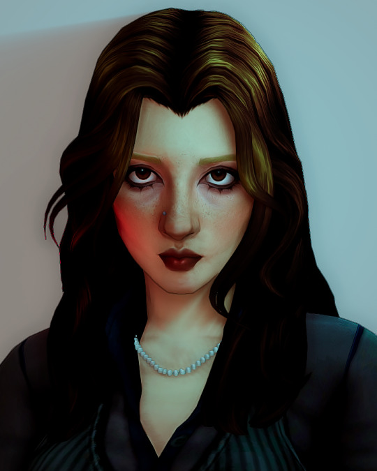
my simself if i was brave enough to bleach my brows and also if i was better at makeup and hair
#also im home!! it was a fun month away but im back and time to reply to messages okok#also this is barely edited! just combining relight and liftgain to replicate a dark room with coloured lights!#ts4#mine#the sims 4
630 notes
·
View notes
Text
Contrasting Colours in Gardens and Containers
Contrasting Colours in Gardens and Containers

View On WordPress
#bloom time#clematis#coleus#colour combinations#containers#contrasting colours#creeping jenny#daylillies#drama#foliage#hydrangea#ligularis#matchy-matchy#purple smoke tree#sweet potato vines#thrillers fillers and spillers
0 notes
Text

4K notes
·
View notes
Text
Try Pale Green This Rainy Season
Apart from just dark green choose some modern House Painting Colour Combinations from the green color family. There are so many greens to choose from, so you can pick a tone that perfectly suits your style –modern, moody olive greens, stylish sage greens, vibrant teals, barely greens, and many many more. But this season paint your room in pale green if you want a scheme that is full of calming, positive vibes. Give any room a bright, welcoming feel with uplifting, mood-boosting evening primrose. Something like a mixture of green and yellow is also a great combination that really will work well together. Ideally, it melts the walls away and reconnects us with nature. So to pay homage to this dreamy versatile hue, we have pulled together color ideas of pale green in different rooms to inspire an easy makeover to get you inspired.
Inspiring patterns for the study area
As pale green inspires clear thinking, it's also a perfect Home Paint Colour for a study area if you have space to add a desk. Improve definition with touches of crisp white and introduce pattern in the form of geometrics and chevrons for a sharp, contemporary finish. Hexagon boxes make a break from traditional shelving and have been papered inside for a decorative effect.
Make an impact with pale green and grey living room
Try to take the Wall Color Combinations scheme one step further than just accessories and decor. Let the joyous tones of pale green sing, when used as an accent shade for muted grey. Paint a feature wall or fire surround to embrace a stronger color with a mid-century modern feel. This living room idea will be a popular choice for invigorating your living spaces.
Tranquilizing tropical bedroom
When you are feeling increasingly stressed, in these busy and chaotic times, you completely need to reduce the visual noise. Our expert suggests using tranquil colors, such as pale green. Pale green is one of those light colors that just doesn't get enough attention. This shade could well be the key to a better night's sleep.
Better look of a clean bathroom
Pale green is an ideal paint color for the bathroom because it can be calming or invigorating, depending on the shade. It can promote a sense of cleanliness without being too clinical. The right shade of light and bright green paired with accessories such as towels in complementary hues can create the atmosphere you want, and they can make a small space feel airy or make a large space cozier.
0 notes
Text
nooo dont give the autistic wolf themed enemies.. hes going to draw his favourite character as one and- ah fuck too late. wolf warrior jay.
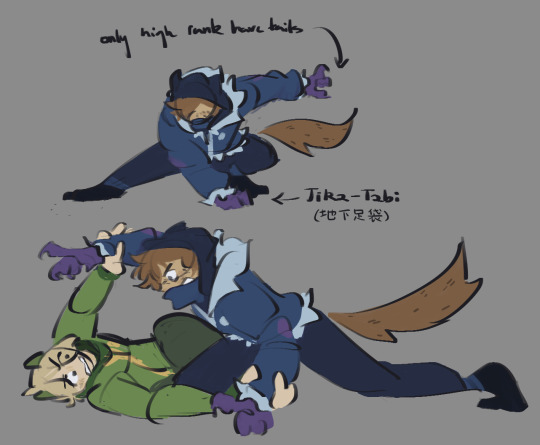
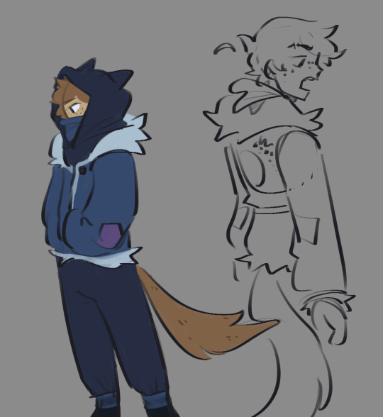


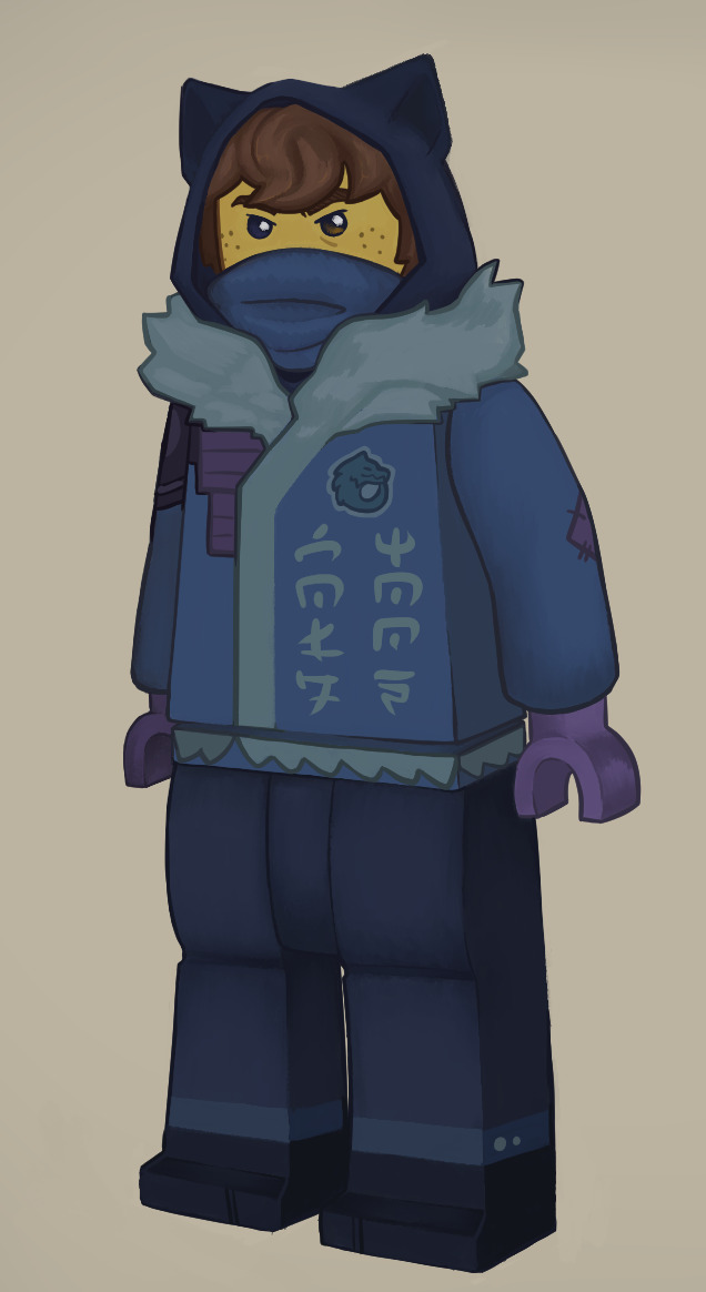
#i have WOLF autism and JAY autism and unfortunately for everyone those are combining on this fine day#jay ninjago#ninjago#ninjago dragons rising#ninjago dragons rising spoilers#jay walker#ninjago jay#lloyd ninjago#sora and cole arent coloured in they dont get tagged thems the rules#ninjago dr spoilers#dragons rising spoilers#ninjago au#wyrm draws#i dont feel like the wolf warriors will be able to turn into.. actual wolves.. but i like drawing werewolves so uhm bare with me#'why did you spend hours rendering him as a biblically accurate lego figure' why dont you shut up#wolf jay
673 notes
·
View notes
Text
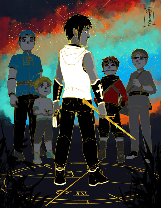
THE WORLD
| Completion | Integration | Accomplishment | Travel |
Everything comes to a close and begins anew. He looks behind him to the past, whilst he moves towards the future, guided by four friends (representing the four fixed points of the zodiac, four compass points, four tarot suits, four seasons and the four corners of the universe). The circles of their halos merge, showing their intertwining journey.
#art#battle priest#tarot#character tarot#hh au#the world#sz#me: last art for the year i should do a tarot since i really dropped the ball on them!!#me: -proceeds to pick one of the cards that has multiple characs and the only one that requires me to figure out multiple colours-#as this card combines all of the characs base tarot colours#IT GOT DONE THO!!! 🎉#HAPPY NEW YEAR SOON!
410 notes
·
View notes
Text

“Every thought is sabotage
What a fool I am
But how long can we keep playing?
Game after game
No losing game after losing game”
#doctorsiren#ace attorney#phoenix wright#beanix#ace attorney fanart#crusher p#tw eyestrain#digital art#my art#procreate#LOOK LOOK LOOK HEHE#the g in propaganda being the Gavinner’s logo#the blood being grape juice#and the cards + chips being the ones he had in his hand during That Game#and the grape juice splattering onto his ace of spades to create that second bloody ace#combining the locket and the poison necklace#and he has the blue nail polish on#just poison all around#the blue flame overtaking his original fire#and then colours of the fire being the colours of the MASON system#so it has (random) binary in it#also him having two aces in his hand. a spade (him) and a diamond (Trucy)#and the rest of his cards being 7s (7yg)#I had fun :3
289 notes
·
View notes
Text
im OBSESSED with the new snapshot holy

LOOK AT ALL THE PRETTY ARMOUR!!

also the textures for the templates are also cool as hell. i know its all purely aesthetic appreciation but boy do i aesthetically appreciate it
#minecraft#deadass have spent over an hour now messing with all the different colour and pattern combinations#my excitement for 1.20 skyrocketed#ALSO THE VEX ARMOUR? ANY CONVEX FANS?
2K notes
·
View notes
Text

day 1 of huevember! wanna try doing that this year, lets see how far i get - its probably all gonna be rough sketches like this one :D i also adjusted the hues a little (mostly made them a bit less neon, just as a personal preference)
#the main goal is to have fun and do some colour experiments#also probably gonna pause the daily doodles for this month! i know i said id combine the two but i think i prefer it this way after all#falsesymmetry#huevember#hermitcraft#my art
413 notes
·
View notes
Text

水色
#vflower#v4 flower#v4flower#vocaloid#vocaloid flower#my art#my designs#ms paint#my favourite colour combination ever#i love drawing flower in huge sweaters
239 notes
·
View notes
Text
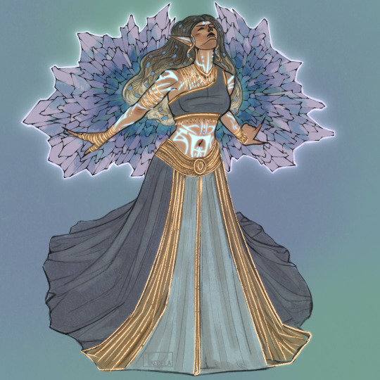
itheliaaa
#tes#tesblr#elder scrolls#the elder scrolls#eso#elder scrolls online#ithelia#daedric prince#tes art#tes fanart#gold road#eso spoilers#does it still count as spoiler if she has already been discussed by the whole fandom? ehh i’ll tag it just to be sure#digital art#tiredelart#this looked cooler in my head lol anyways#i like her design and by that i mean the colour pallet#it’s like the zos design team her KNEW the colours/colour combination i liked#and designed her for me to become obsessed over her (it worked partially)#i also gave her silly elf ears bc you can’t stop me#if tes was real ithelia’d be the daedric prince of instagram i think#next time i draw her it will be insta related mark my words
189 notes
·
View notes
Text

then your engine in the driveway, cutting off
#supernatural#a#dean winchester#john winchester#deanjohn#thank u alula for helping with colours! i kinda combined the green and orange haha#also decided on a closer crop#anidifranconatural
523 notes
·
View notes