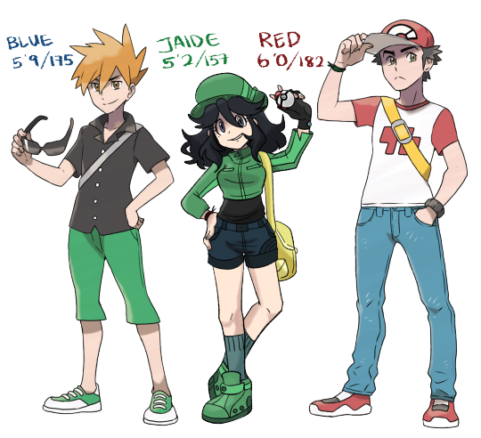
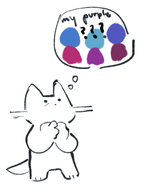
#consistant color pallets
Text
giggles cutely
#i fixed her sprites because i didnt like the old one#and i wanna make a silly masterlist of refs consisting of my attempts to draw her in the canon artstyle (i.e sprites) whehehe#im gonna plug the kid version here soon ueueue#~ art#color pallet trio#im doing jaide stone alsooo
28 notes
·
View notes
Text
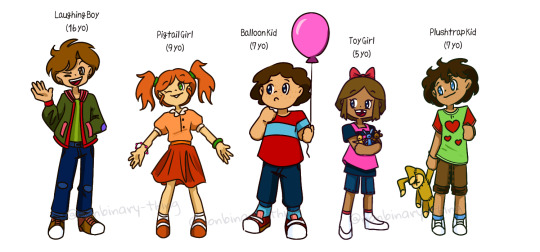
More FNaF kids redrawn!
#I'm pretty sure Scott intended for the Laughing Boy and the Freddy Bully to be the same kid#I mean they have a more consistent color pallet than Michael's sprites#but since I already made my version of the Freddy Bully different I deciced to make these two twins now#bonus I made the kid with the Plushtrap plushie their little sibling as well since they have the same text color as the Laughing Boy#also is it obvious who my favorite of these kids is?#I may be a bit biased when it comes to Pigtail Girl since I was a firm believer in the theory that she was Evan's sister#before Elizabeth was revealed in the story#five nights at freddy's#fnaf#fnaf 4 kids#art
18 notes
·
View notes
Text
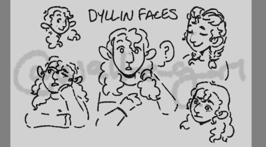
working on an expression sheet for dyl! i like how its coming out so far hehe
#my art#dyllin wright#ate dinnner and watched more murder show#last season is only 13 eps? i think? so itll go fast#so im feeling lots better from earlier#also did some chores and self set repetitive tasks#made those oc color palletes for a chunk of my main ones#anyway i felt bad i feel better we cope we live#oh im not very consistent with her hair thing am i#the middle pouf#ill fix that
3 notes
·
View notes
Text
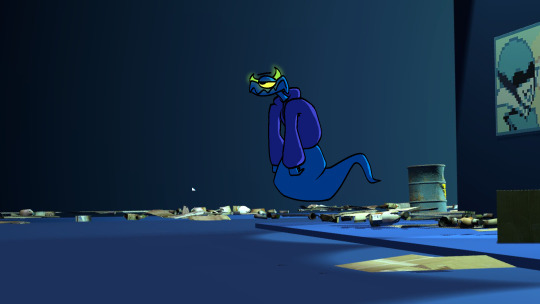
how did he get there.
#deltarune#dark world#oc#i live this guy#also he does stay consistent w the trend of people having different color palletes in the dark world#its a reference to the ms paint default colors#since he was first drawn in ms paint
2 notes
·
View notes
Text
Redesigning transformers hard
#Ramblings#I'm trying to make a Starscream design#and it's even worse cause he shows up in like every continuity#like at least he remains mostly consistent with the biggest outliers being tfa and tfp I think#and even then those are mostly a color pallet thing#this is mostly just cause I want to make him glittery#I blame a the art car parade for this#also would reccomend looking up the art car parade if you like transformers it's a gold mine for redesigns
3 notes
·
View notes
Text
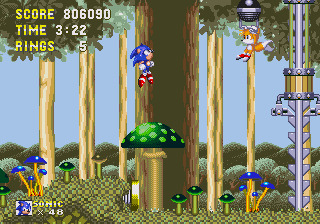
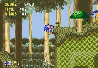

🍄 Mushroom Hill - Webcap Winter ☠️
Fantastic mushrooms cover the once-lush hills deep in Angel Island's interior. The deep winds echo with dying leaves and wood, as the occasional sounds of far-off animal break through the drone.
photo 1 via Sonic Retro
photo 2 via GameFAQs
photo 3 via Sonic Wiki Zone
#Sonic The Hedgehog#Sonic 3&K Soundscapes#Sonic Soundscapes#STH#Soundscapes#the Oops! All Sonics of the screencaps for this one wasn't intentional#the combination of all three sites just don't have any images of Knuckles in the grey & green section of Act 2 fsr#color pallet consistency through sheer Happenstance.
0 notes
Note
20 + 47! :D
20: Your favorite map?
oh jeeze this is kinda of a hard question for me! i like almost all the maps in the game! i really like desert highlands bc of the waterfall and the night sky castle. echovald has gotten my heart as well despite being horrid to map complete. dragonstand, dragonfall were also such cool maps too! gendarran fields also stands out as a vanilla map bc i think that was the first time i hear "logan's journey" one of my favorite songs out of the game.
47: Post first screen you took in game.
im pretty sure this is the first one! i didnt know how to take screens (this was my first pc game in a LONG time) and i think a friend was telling me they liked how bluebell looked, so i took a screen shot!
#oc: bluebell#you can tell this is old bc bluebell still has pink leaves#i changed that around PoF time so she would have a more consistent color pallet#i do miss the pink every now and again tho
1 note
·
View note
Text
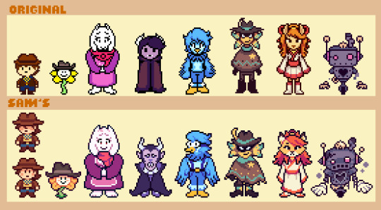
Redesigned/Resprited the Yellow Cast! Details of my thought process below:
But before that, note: This is made out of love and for fun! I am not saying anything about the original artwork here. This is just my take on things.
Differences:
Clover, Flowey, and Toriel: using my usual sprites for humans and themselves. Not much to say here.
Dalv: He's now more monstrous-looking. I don't feel comfortable critiquing Dalv since he was made 7 years ago and the devs were much younger. That said, I feel making him more intimidating and visually striking would help the plot line a bit more and contrast his desire to be a children's book illustrator.
Martlet: She was given Berdly's beak to keep her consistent with Toby/temmie's art style. I wanted to give her a stronger silhouette and shape design. The goggles and suspenders are supposed to evoke an engineer to match her puzzle craftmanship.
Starlo: Not much has changed. Added little details to the boots and poncho.
Ceroba: Again, not much change. I made her face more fox-shaped + made her outfit more accurate to a common kimono. Some minor color changes to limit the pallet as UTDR does.
Axis: Minor pallet changes and emphasized the disrepair and broken feel of him to fit more with the decaying Steamworks.
173 notes
·
View notes
Text

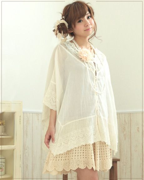
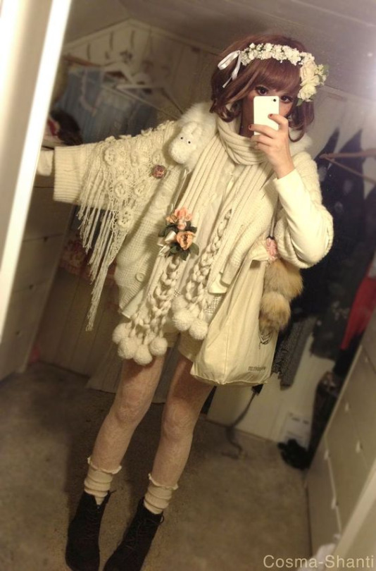
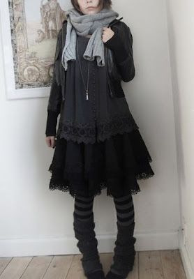
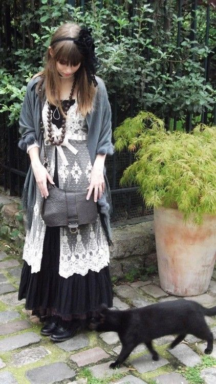
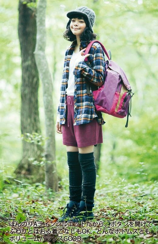
GUIDE TO MORI KEI!! 森系
mori kei is one of the many early 2000s subcultures that originated from the harajuku district inspired by living in the woods.
wearers of this type of clothing are usually referred to as mori girl (森ガール) or mori boy (森ボーイ). basically, forest girl/boy.
this subculture is based on nature and gives off a more elven/fae feel, its main color pallet consisting of earth tones, greens, whites, and other soft colors. plaid is a pattern that occasionally appears in mori kei fits, and sometimes baby blues and pinks will appear for a contrast to an outfit.
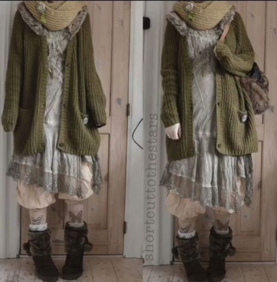
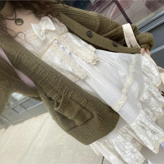

if you want to look for some clothing that would fit with this aesthetic, look for something loose and natural, and pieces that layer well together. such as a large cardigan/sweater vest that goes well with a frilly dress/skirt and leg warmers and tights. pants may also be used for a more masculine look.
"ゆるふわ" is what the loose layers achieve, hiding the curves of the body and therefore the wearer has a "fluffy" appearance. when layering, make sure to begin with the lightest/thinest layer first, and then move on to heavier materials.
lace, light materials, and embroidered clothes are musts, while accessories such as shawls, tights, and scarfs add to the layered effect.
linen, wool, and cotton are fabrics that are often used. fabrics that drape nicely will be your bff when creating a mori kei outfit.

mori kei is actually quite similar to cottagecore, but while cottagecore is focused on a rural life, mori kei is more based on forests and nature itself.
It also expresses a love of the forest, quiet hobbies, reading, drinking tea, herbalism, and a natural lifestyle.
hair and makeup often match with the almost whimsical and natural look of the outfits. makeup is kept relatively basic, with use of colors such as beige, pinks, and golds. minimalistic igari makeup is a nice example.


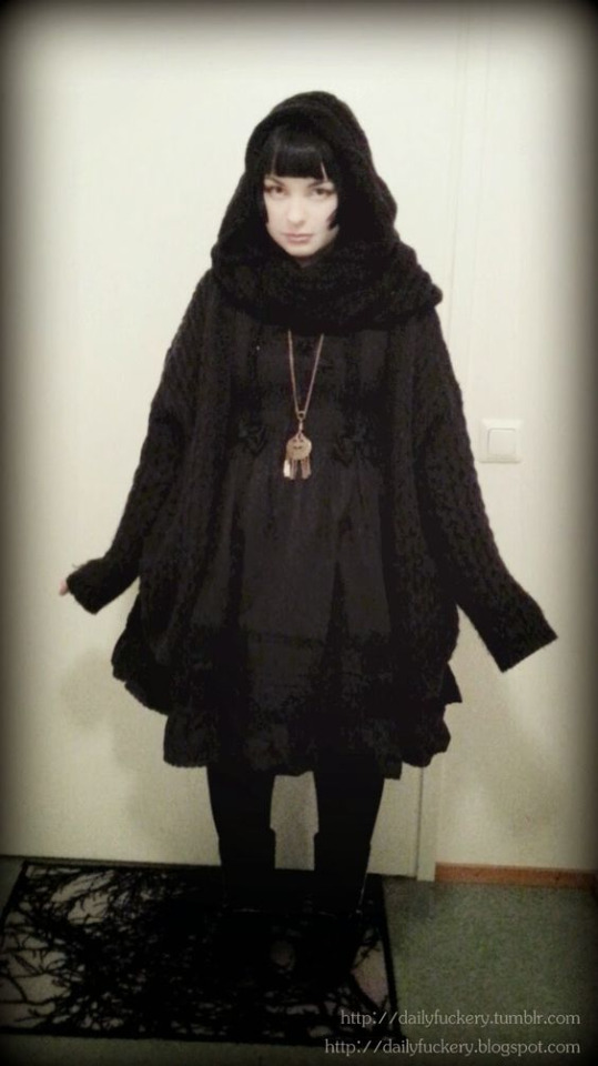
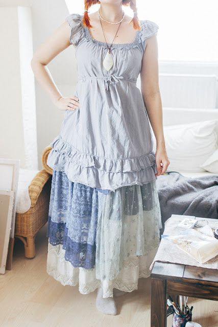
DARK MORI KEI/MORI GOTH
a subcategory of mori kei is mori goth, which uses darker, less saturated colors of the usually light color scheme of mori kei. it still follows the same layering scheme and relaxed silhouette, but as of now it has separated into strega, another subculture.
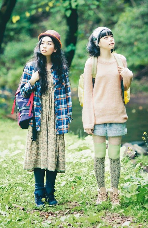
YAMA KEI
a more practical subcategory, usually for fans of the outdoors who love hiking/camping. this includes brighter and more vivid colors while also reverting to more practical clothes.

HAMA KEI
hama kei is a beach-based section, with uses of lighter clothing and less layers, as well as blues and yellows. you'd also see things such as stripes, anchors, and denim to add to the sailor-like outfits


#kogyaliesguides (*/ω\*)!#guidetomorikei#morikei#mori kei#harajuku#harajuku fashion#jfashion#aesthetic#fashion aesthetic#fashion guide#cottagecore#corvidcore#goblincore#outfit#yama kei#hama kei#mori girl#mori boy#mori goth#dark mori#dark mori kei#cottagecore outfit#forest#trees#woods#forest aesthetic#naturecore#forestcore#fashion#alternative
205 notes
·
View notes
Text
new sunny design, im satisfied because my odl sunyn design was already so banger
(istg i nailed sunny on first try like???? her original design is based off of 1920s hollywood stars and flapper dresses, her work attire is also around that era witht eh most notable thing being it jsut overalls.
the three new eggs are all gonna be ocean creachur themed, for sunny she is a combo of mimic octopus (which works great with her vitiligo) and litterally an egg yolk jellyfish im not kidding that exists
the color pallete is actually jsut stolen off my tubbo design because well. 1. she's a shameless mimicker trying to fit in, 2. a lot of her clothes are just cut from tubbo's clothes, my thrift queen.
for the sake of like color consistency, the white shirt fabric from my design principle of the eggs is actually her dress, bow and hat. )
109 notes
·
View notes
Text
Wave 3 Furblets Confirmed!
Thank you SO MUCH to @ssm0770 for finding and sharing a document containing product names, from a French Hasbro website! (archived link)
Wave 2
5010996284495 FURBY FUR FURBLET STAR REE
5010996284471 FURBY FUR FURBLET MER MAY
5010996284457 FURBY FUR FURBLET PAR TAY
5010996284532 FURBY FUR FURBLET DAH TEE
The other two unrevealed Furblets meant to be a part of this wave could be Greenie Meanie and May-May (unless they're going to be different; Idk).
Wave 3
Wave 1 and 2 consist of 6 Furblets, but the document reveals the names of seven other Furblets. SSM0770 mentioned Sno-Way is a seasonal Furblet (the document mentions a pack of two seasonal Furblets, and the existence of a spring Furblet, so Sno-Way could be considered separate from wave 3? Don’t know for sure if Sno-Way is included in that pack). None of the names listed below are mentioned on Entertainment Earth's website for wave 2.
5010996284778 FURBY FUR FURBLET BUB LEE
5010996284754 FURBY FUR FURBLET GROO VEE
5010996284730 FURBY FUR FURBLET TOO KOO
5010996288899 FURBY FUR FURBLET REE MIX
5010996288448 FURBY FUR FURBLET HOO LAH
5010996288424 FURBY FUR FURBLET LOO LAY
Other Furblet listings
5010996291288 FURBY FUR FURBLET SSNL SPRING
5010996291264 FURBY FUR SEASONAL FURBLET 2PK SPR
5010996268747 FURBY FUR FURBLET SNO WAY
More Furby Colors
5010996285874 FURBY FUR FURBY COTTON CANDY
5010996282798 FURBY FUR FURBY AURORA FURBEALIS
SSM0770 is guessing that 'Aurora Furbealis' is the name of the Furby color scheme Coppola Studios leaked last year.
Not completely sure what these are:
5010996273925 FURBY FUR PINEAPPLE POP
5010996259561 FURBY FUR FURBLET CLUBHOUSE
5010996253576 FURBY FUR FURBY FURBLETS AST C
5010996275615 FURBY FUR FURBLETS ASSORTMENT (what Furblets are included?)
5010996279255 FURBY FUR FURBLETS CA
Displays
5010996264770 FURBY FUR FURBLETS AST DISPLAY
5010996240736 FURBY FUR FURBLET FLOOR DISPLAY
5010996240200 FURBY FUR FURBY QUARTER PALLET DISPLAY
5010996235442 FURBY FUR FURBY DISPLAY
5010996202383 FURBY FUR FURBY SUPER QUARTER PALLET
5010996274656 FURBY FUR FURBY HOLIDAY DISPLAY
5010996275059 FURBY FUR FURBY FURBLETS DISPLAY
5010996278654 FURBY FUR FURBY DISPLAY 2
5010996278630 FURBY FUR FURBY DISPLAY 1
5010996279231 FURBY FUR FURBLETS FSDU AST
5010996279927 FURBY FUR FURBLET FSDU DISPLAY
5010996280930 FURBY FUR FURBY AND FURBLETS DISPLAY 2
5010996280916 FURBY FUR FURBY AND FURBLETS DISPLAY 1
5010996280992 FURBY FUR FURBLETS DISPLAY
5010996282811 FURBY FUR FURBLETS FSDU
5010996284297 FURBY FUR FURBLETS SIDEKICK DISPLAY
5010996285638 FURBY FUR FURBY HALF PALLET DISPLAY
5010996285546 FURBY FUR FURBLETS FLOOR DISPLAY
5010996285652 FURBY FUR FURBY HALF PALLET
5010996287618 FURBY FUR FURBY QUARTER PALLET
5010996289209 FURBY FUR FURBLETS PALLET DISPLAY
5010996289490 FURBY FUR FURBLETS PDQ TRAY
5010996289247 FURBY FUR FURBLETS FSDU
5010996289223 FURBY FUR FURBY FSDU
#I apologise if I accidentally included duplicate stuff in the list#if something is omitted you're free to add to the post#furby#safe furby#all furby#furby fandom#furby community#furby 2023#furby furblets
77 notes
·
View notes
Text
NEW AND IMPROVED DESIGNS AND CHARACTER BIOS!
For a while now, I’ve been unhappy with the current designs of the Bugswap cast, so instead of wallowing in my frustration, I decided to finally do something about it. So after a few days, I whipped up the most recent and updated version of the cast — both in designs and in profiles!
Under the readmore, I’ll go into more detail about my design process and what I changed. So if that stuff makes you curious, feel free to read on!
Now with all that soft rebooting out of the way, things should be back up to speed! Thanks for all your patience and support!
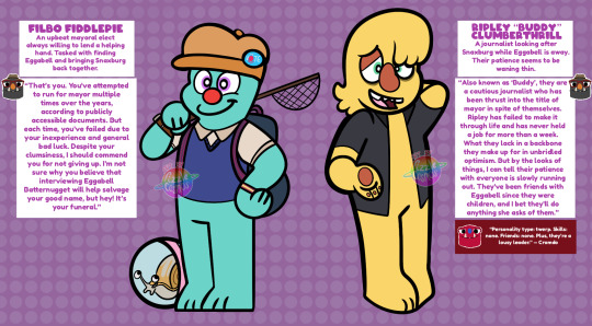
Filbo: I feel like Filbo’s design was too cluttered. So, the most I did was just cut off Filbo’s sleeves. Additionally, I gave Filbo a hat reminiscent of old Newsboy hats. I also shifted his electoral badge to his hat, so it’d mirror the press paper commonly seen on hats on journalist designs.
Ripley: I decided to make Ripley look more like my design for the journalist. I also removed the pattern on their shirt.
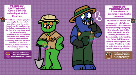
Triffany: I decided to make Triffany wear just one shirt with a ribbon around the neck. It gives her more of a rustic old-fashioned feel.
Wambus: I didn’t change much of Wambus’ design. Yay for Wambus!
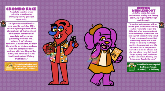
Cromdo: I ditched Cromdo’s previous outfit altogether and gave him a tacky tourist shirt with a pattern similar to his necktie. I felt like the previous outfit didn’t reflect his personality in this AU, so the Hawaiian shirt leans more into the sleaziness of him!
Beffica: Like Wambus, I didn’t change much with Beffica. The most I did was replace her sash with a vest (common in Girl Scout juniors) and simplify the detail on her necklace.
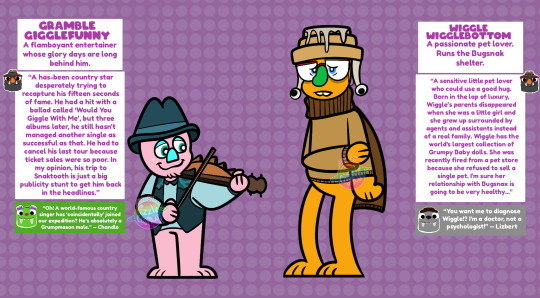
Gramble: I decided to remove the Strabby and bandana to keep his color pallet consistent. Additionally, he now longer plays the banjo and is now a violinist (or rather fiddler).
Wiggle: I made her color pallet consist more of browns because her previous color palette was too clashy. She also has a little Cinnasnail beanie. In terms of backstory, I decided to remove the aspect of her being a child star and made her more of a traditional “lonely rich child” archetype.
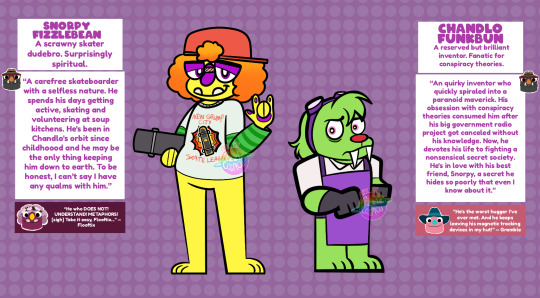
Snorpy: I took Snorpy’s hair down and made it more au natural, mostly so he and Flooftix look more similar. For a while, I was divisive about Snorpy’s outfit, but I figured the “shirt-atop-a-long-sleeves” look fit his skater style. I also gave him a new T-shirt to fit him being a skater more.
Chandlo: I gave Chandlo a new outfit altogether since his previous one didn’t fit him. I gave him an outfit closer to Snorpy’s current outfit, so he resembles something of a blacksmith.
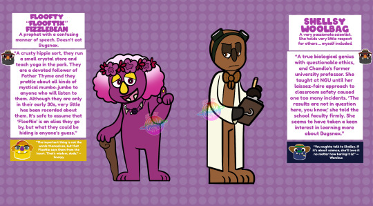
Flooftix: I didn’t change much with Flooftix. I simplified the pattern on their flower crown, and I now gave them a little stick cane to tie back into them being disabled (here, they just have a really bad knee as apprised to self-induced amputation).
Shellsy: I didn’t change Shellsy all too much. She’s pretty tried and true.
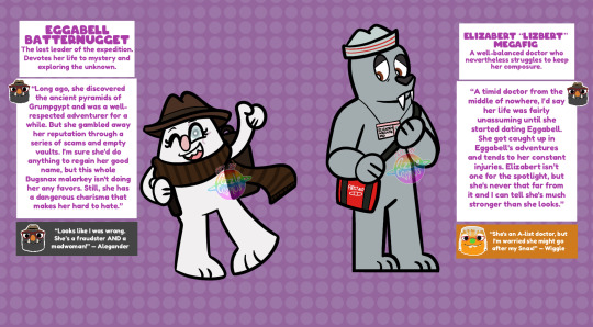
Eggabell: Her new outfit is a mix of both Lizbert’s canon outfit and her previous outfit. I think the dark browns create a nice contrast on her primarily white color palette.
Lizbert: I decided to just give her Eggabell’s canon outfit. Other than that, not much else has changed.
#bugsnax#bugswap au#filbo fiddlepie#Bugsnax Filbo#the journalist#the journalist bugsnax#triffany lottablog#bugsnax triffany#wambus troubleham#bugsnax wambus#cromdo face#bugsnax cromdo#beffica winklesnoot#bugsnax beffica#gramble gigglefunny#bugsnax gramble#wiggle wigglebottom#bugsnax wiggle#snorpy fizzlebean#bugsnax snorpy#chandlo funkbun#bugsnax chandlo#floofty fizzlebean#Bugsnax Floofty#shellsy woolbag#Bugsnax Shelda#eggabell batternugget#bugsnax eggabell#lizbert megafig#my art
119 notes
·
View notes
Text
This Movie Could Be A Reality, You Know?
Prompt 19: Telepathy
Pairing: Syzoth X Fem!Reader
Description: Bored while listening to an argument between your friends, you decide to use your telepathy powers for more naughty things and play a little game on the shy Zaterran sitting across from you...
Warnings: Telepathy, Imaginary Sex, Imaginary P In V, Imaginary Creampie, Implied Masturbation And Sex...
Word Count: 569 😏
Main MasterList: 🖤
Kinktober MasterList: 🖤
Synny's Angels: @lorebite, @mornandil, @queenkhepri, @bihansthot, and @mmeerraa.
⭒⛥⭒⛥⭒⛥⭒⛥⭒⛥⭒⛥⭒⛥⭒⛥⭒⛥⭒⛥⭒⛥⭒⛥⭒⛥⭒⛥⭒⛥⭒⛥⭒⛥⭒⛥⭒
I sat from across the room, eyeing Syzoth as we all discussed the realms' safety, like we all usually did once every month. Though I did care about the safety of others, today I was bored out of my mind. Why? Because the meeting mainly consisted of Johnny and Kung Lao arguing over who would be a better combatant in a situation of war. It was quite frustrating, given we had more important things to discuss.
On the other hand, I had other things on my mind as well. Hence, I was staring at the Zaterran from across the room. He seemed just as bored as I did, staring off at nothing with a deadpan expression on his features. God, he looked so damn adorable! A part of me wondered: if he looked so adorable bored, happy, angry, and sad—what other emotions would make him melt my heart?
That's when a very wrong idea popped into my mind. And when he glanced over in my direction and our eyes locked, I couldn't control myself. I opened up my mind just enough to share it with him. Then I began picturing a scenario—one that involved me, him, and the table we surrounded.
He laid flat on his back across it, while I bounced up and down on top of him—both of us completely naked and connected by the hips. I imagined how hot we would look together, skin colliding with skin as our bodies tangled in a sweaty mess on the oak wood beneath us.
I smirked as the image played in my head like a movie, and Syzoth's lime-colored eyes widened like two dinner plates. I just had to bite back laughter as his face flushed pine green while he moved both hands down to set upon his lap—clearly, he was hiding something.
It was so cute that I just had to keep going. I imagined myself bending forward to lick a long stripe down his broad chest, moaning as the taste of his sweat collided with my pallet. At this, Syzoth shuffled uncomfortably on his stool as he averted his gaze away from mine, clearly hoping the loss of eye contact would knock the image from his head. But he was so wrong.
The sharp and wet sounds of skin slapping against skin and juices mixing to make a delicious cocktail of arousal echoed through our heads, and my sweet little Zaterran didn't know what to do with himself. He seemed so small under my intense gaze, like he was so helpless and didn't know how to handle the heat of the moment.
Finally, I produced the grand finale for him, both of us moaning loudly as we came undone within our minds. Once my little show was over, Syzoth glared at me before vanishing. Then the door swung open, slamming shut with force right after. Everyone stopped mid-conversation and looked around the room and each other in confusion, not understanding what had gone on.
Chuckling lowly to myself, I stood from my seat and casually strolled over to the door before exiting through it. I knew men well, and I knew what Syzoth was doing at this moment. And if it looked even half as good as the little movie I had just played for the two of us, then I definitely would not want to miss it. Perhaps we could even my movie into a reality.
⭒⛥⭒⛥⭒⛥⭒⛥⭒⛥⭒⛥⭒⛥⭒⛥⭒⛥⭒⛥⭒⛥⭒⛥⭒⛥⭒⛥⭒⛥⭒⛥⭒⛥⭒⛥⭒
#mortal kombat 1#mk1#mortal kombat reptile#mk reptile#reptile#reptile x reader#mortal kombat syzoth#mk syzoth#syzoth#syzoth x reader#kinktober 2023#SinnamonsSpicyFics
106 notes
·
View notes
Note
Oh I do have a question about your rain world oc's !!! I've been staring at the colour pallets of your lil guys (for no specific reason) and their lovely and I'm a bit curious about how you pick colours for your oc's? Do you just go by heart or do you think about it for fifty years or?
Hope you don't mind a more non-lore question ^-^!!
YEAHH I LOVE NON LORE QUESTIONS!!!
im afraid i mostly go by heart here, and i will keep changing how they look until i’m finally happy with it (hence why SDA’s clothes keep changing color). and since i’m often too lazy to look at their refs the colors aren’t really consistent - BROS is Blue and purple in my head but the exact shades will vary. TFB is a yellow-green with reddish brown ……Unless….? and so on. I love inconsistency for real
basically… assign them 2-3 colors and keep messing with that forever
#i wish i could think about it for fifty years but its like the world’s simplest game of association mostly#Hehe green. nature. Hehe shades of blue and white. Water and ice. very subtle raindrop motif#ask
32 notes
·
View notes
Text
I LOVE the colors in Nimona, because they show just,,,, uuuuummmm i rewatched it heres an essay (this is my red flag) ignore the format
I really like the way this character is portrayed, because it gives off so much "oooo hes the cocky asshole" vibes before you see more from him, so when you see him it basically subverts your expectations of him just being "the golden boy"
But in this scene hes wearing more muted colors, browns, dark blues; you get the idea. His hair is more ash grey and white than light blond in this scene. It gives the feeling of being more? harmounious? With Ballisters darker color pallete.
Image stuff ill fill in later
Now green is a rare color used sparingly in the film (except for trees and other things) which i personally think was a deliberate choice on the artists

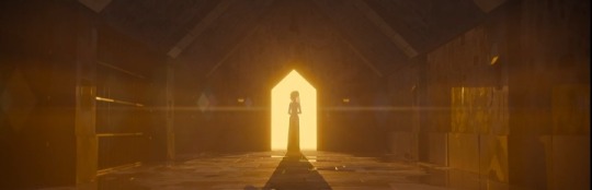
Now, blue and yellow are the only two colors used in this scene, with yellow i think showing a more "heavenly" aura to the scene, contrasting ballisters light blue cell cage, which now seems more lifeless and empty in general.
It also reminds me sort of like belos from the owl house, with the eerie light blue contrasting the warmer colors in the show.
The scene then panders to a rosey-red color, which perfectly matches with Nimonas colors and reckless nature.

The movie changes to a color scheme consisting of mainly white, black, and gray, showing that Ballister is able to hide in the shadows, and camoflauges fairly well.

Nimona, on the other hand is completely out of her element, with her bright pops of pink being a major eye catching feature of most of these scenes.
She sticks out like a sore thumb in the clinical, sterile looking enviroment of the castle, (i have no idea if its a castle) which i think signifies the chaos she brings to the castle

Everything Nimona is near is mainly either one of two colors, red or rosy pink (and basically everything in between). Look at the colored lights for example
(also something to note, theres no green hanging lights which makes me think that the lack of any neon green was intentional)
#ill be posting more of this#i just find the color choices for this movie very interesting#rest of this is going in a reblog#nimona#darn you tumblr and your 10 photo limit#this is like#gonna be the only non afpr thing i post
59 notes
·
View notes
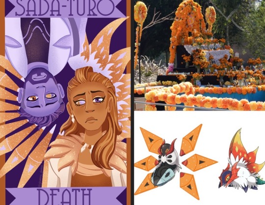
Note
hi there! i’ve seen your pokemon villain tarot pieces and i think they’re really neat, and the colors especially are very striking - how do you choose the color palettes for them?
Thank you so much! I can go into each one since they all had their own inspirations so if you’re interested in knowing more about that then read on!
For starters, I set the limitation that each card has a base pallete of two hues to help with consistency. Lighting, shading, and effects could be different hues, but the base could only be two. I also decided that I wouldn’t use any pure white, black, or achromatic greys as they felt like loopholes in the two hue rule.
Sada and Turo already had a distinct orange and purple theme, so it made sense to lean into that. While trying to think of things to fill up empty space that matched the palette, I thought of how orange marigolds are used to decorate during Dia de los Muertos and that both Sada and Turo had a variant of volcarona, who has orange wings. With that in mind, I decided to decorate the wings in the shape of a flower as a way to tie it back to the death theme.
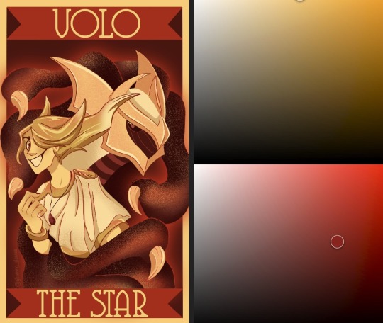
For Volo I decided to use the yellow already present in his design and red as a show of how intense his feelings were at that point, a powerful palette for a powerful trainer. The red also helped tie in giratina who I knew would be an important part of the composition. I wanted this palette to convey a feeling of intensity, way more than any other card.
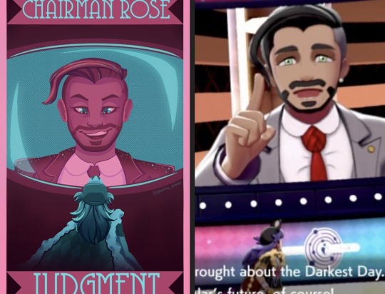
Chairman Rose was tricky, compared to other villains he doesn’t have too strong a signature color. I decided to lean into his name (rose) and do pink with blue to be the screen he’s on in the stadium and Leon’s figure at the bottom. I went with such a non threatening palette to reflect how Rose was not seen as a threat by the player for large part of the game. He leaned into a friendly demeanor and so I felt the palette should reflect that.
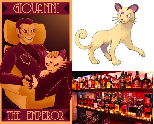
For Giovanni at first I thought to use his signature colors of red and black. However, if I did that it wouldn’t be pure black, but rather a very dark shade of some other color, and I didn’t like how that was looking. I started thinking of things Giovanni reminded me of and one thing was wine, which tends to make me think of bright yellows and deep reds or pinks. I also knew I wanted his persian in the card and personally like the head canon that it’s shiny, so using those yellows and pinks worked really well!
Guzma, Lusamine, N, and Ghetsis each had relations to each other in game and I wanted their cards to reflect that. For N and Ghetsis, that would be by them sharing green and being surrounded by dragons. Ghetsis colors were mostly inspired by his coat and the colors of a shiny hydreigon. For Lusamine and Guzma it was by sharing purple and by having guzma hang by Lusamine’s arm. After that I leaned into the gold in Guzma’s design and a bright blue for an eerie, otherworldly effect of Lusamine.

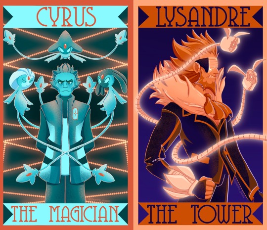
Lysandre and Cyrus got similar palettes for opposite reasons. Lysandre’s signature color is orange while Cyrus’ is cyan. Blue and orange together make for good contrast with being complementary colors. I gave Lysandre dark blues to help make the oranges pop. Meanwhile Cyrus got bright orange to reference the red chain.
Finally, for Jessie, James, Meowth, Maxie, and Archie, I felt their signature colors were so well known that I had to use them. It wouldn’t make sense to use anything other than red and blue for Maxie and Archie. Maybe there’s some leeway with Jessie and James, but for them I figured if I didn’t use one of their colors, then I shouldn’t use either, and why would I do that when purple and pink work so well for them! And they came together nicely on Meowth.
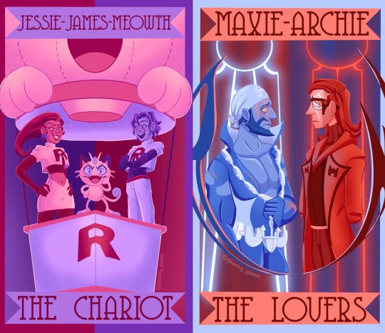
And that’s all of them! I hope that answered your question👍
46 notes
·
View notes
Last Seen Blogs
birdy-or-butterfly
Breath of my life.

mikaylam67
Get Additional Facts Text To Voice
socksjocksandcock
Sexy men, their Socks, and Gear
trashytummiez
Have a bite or two

kiralikbahisitesi
Totobo - RakipBahis ve Totobo Giriş - Üyelik