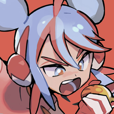
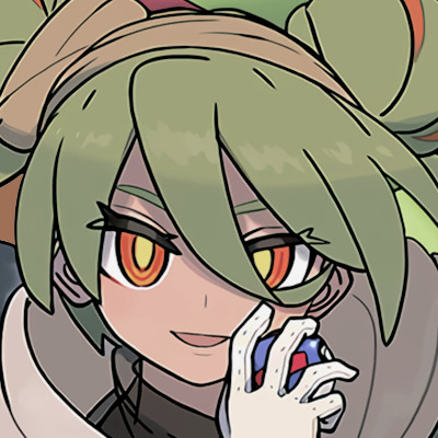
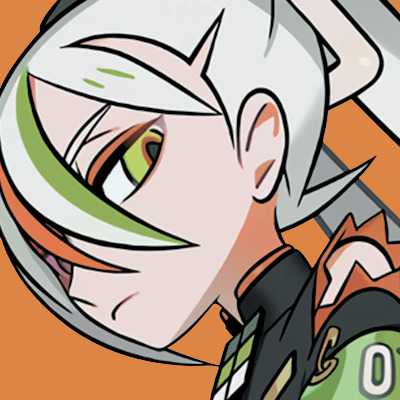
#design icon
Text

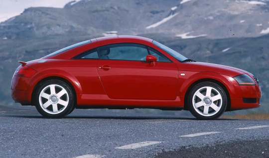
#audi#audi tt#tt#icon#timeless#design icon#car#cars#coupe#history#historic#fast car#classic#luxurycars
30 notes
·
View notes
Text
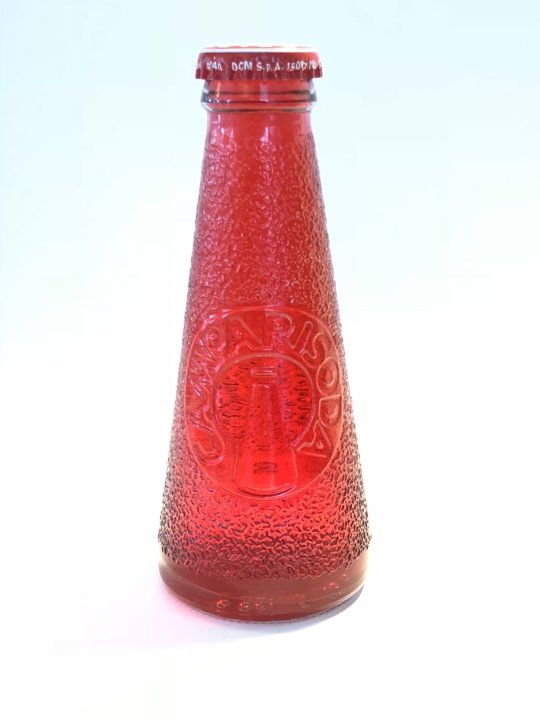
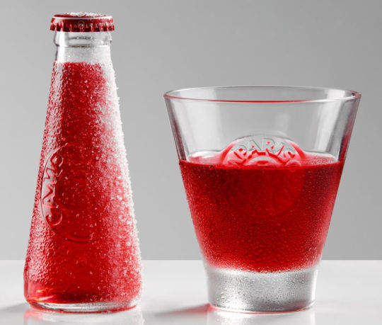
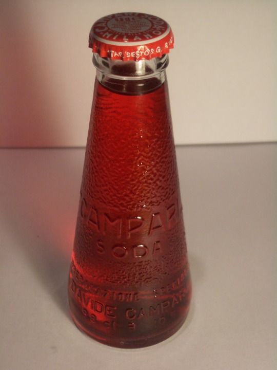
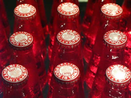
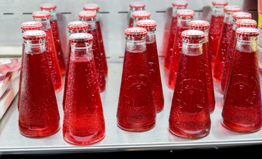
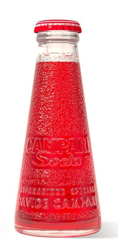
CATCHES ONE'S EYE INSTANTLY AND IS A DESIGN MASTERPIECE IN EVERY WHICH WAY -- THE CAMPARI SODA BOTTLE.
PIC(S) INFO: Spotlight on the eternal design icon that is the conical bottle in which Campari Soda is still sold today. The futurist design was created by painter, sculptor, and graphic artist Fortunato Depero (1892-1960).
A SMALL HISTORY: "After the Bitter Campari and Cordial Campari, respectively ruby red drink and liquor with macerated raspberries in cognac, the company of Milan’s Davide Campari launched on the market in 1932, exactly Campari Soda, or Bitter with the addition of soda. The drink was no longer being served with the siphon, but already mixed in the right doses in comfortable glass bottles in the shape of an inverted cup.
The bottle was ordered to Bordoni glassware in the early thirties and had to be made of frosted glass with two embossed lines at the base with the words “SPECIAL PREPARATION, Davide Campari & C. MILANO”, while in the center field was to appear as "CAMPARI SODA." All these features, combined with the special shade of red and the absence of the label, instead of the typical alcohol on the market, made of Campari Soda a product that broke conventions and, because of its shape and the advertising psychology, opened new sales strategies. Interesting to note that the registration of the name “Campari Soda” in 1932 served to secure the name of the product consists of the words “Campari” and “Soda”, but the three-dimensional mark could not be deposited (shape of the bottles, embossed character of the name) because of the lack of a legal definition.
The success of the new drink is due also to the fact that Campari expanded the scope of the product by installing supplying machines in public places, by inserting a coin, they released bottles. The distributor was completed by a figure conceived and always realized by Depero which reflects the inverted cone reason, the same as the bottle. The Trentino artist had long worked on this figure, elaborating several sketches from the early years of the association with Campari, which began in 1924. It can be assumed therefore that the company had to study the Campari Soda at the end of the twenties and that Depero had been responsible for providing the first plans for an advertising presentation, projects that were later used in the early thirties.
Davide Campari had the merit of being among the first Italian industrialist to notice how advertising could influence in a decisive way the visual perceptual faculties of the consumer. The partnership with Depero did not tie only to the design of the product, indeed. The Rovereto artist produced an enormous amount of sketches, ink, collage of colored papers, plastics for advertising projects, of which only a fraction was then realized. In 1931, demonstrating his commitment also in the publishing field, he published the Numero Unico Futurista Campari, a collection of graphic and poetic creations of advertising, combined with the launch of the Manifesto dell’Arte Pubblicitaria Futurista."
-- FERMO EDITORE (Italian blogspot), "Depero and the Campari Soda bottle: an history lasting 80 years," by Fossella Romito, c. October 2017
Sources: www.fermoeditore.it/en/blog-en/depero-and-the-campari-soda-bottle-an-history-lasting-80-years-2, Pinterest, L'Italo-Americano, Italy On This Day, Briasco Distribuzione, Biber Architects, various, etc...
#Campari Soda Bottle#Campari Apéritif#Fortunato Depero#Italian Futurism#Italian Art#Design Icon#Modern Design#Futurist#Campari Soda#Futurism#Futurist Design#Italian#Italian Cocktails#Italian Futurist#Modern Art#Cocktails#Vintage Style#Italian Drinks#Campari#Italian Apéritif#Italian Design#Apéritif#Soda Bottle#Italy#Modernist Design
2 notes
·
View notes
Text
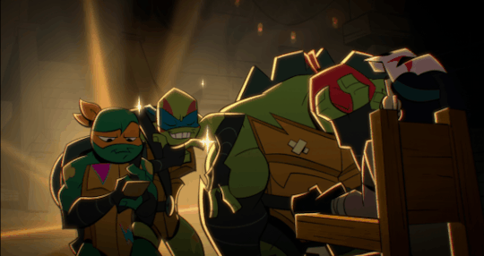
✨The Fashionista✨
Rise Ramblings #234
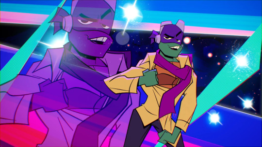
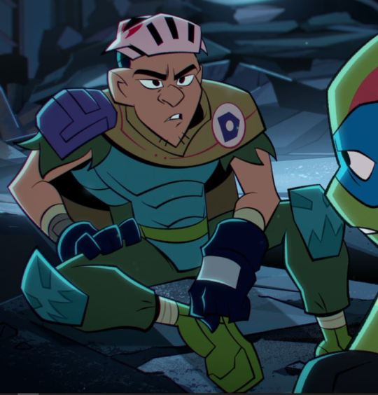
While watching “The Clothes Don’t Make The Turtle,” I noticed something.
I found it interesting that Raph, Mikey, and Leo were content with Raph’s outfit choice until Donnie stated that he wasn’t “in love with it, ya’ know.”
Suddenly, Raph declares “I’m a disaster!” Albeit ridiculously endearing, it was a little strange to see his sudden shift from moderately content to absolute dissatisfaction. Huh…
Then, the disaster twins decide to help him out.
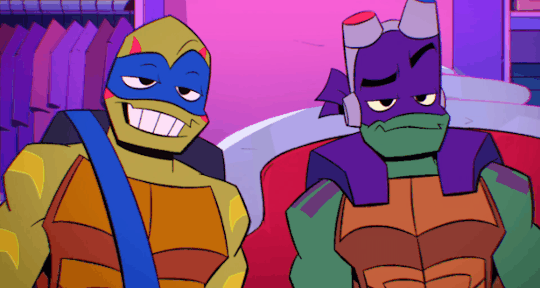
Take a note of their outfit choices.
Raph tries on all of these fits and more.
Donnie’s first choice is a mild “no.” Leo’s choice is a hard “NO.” (Not surprising, lol.) But then, the overwhelming consensus lands on Raph’s fourth outfit, which ended up being Donatello’s other pick for his brother.
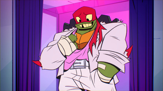
So, in summary, Raph tried on his personal choice for an outfit, of which they rejected. Then, ultimately, Donatello picked out an outfit for his brother, and that pick ended up being perfect. Hmm…
Then I noticed something else. In this episode, we never get a Donnie “curtain reveal” moment, to our disdain. I mean, Raph, Leo, and Mikey got to try on several different outfits in order to get their brothers' opinions before landing on that “perfect outfit, you know the one.” All of his brothers got to shine. Why not DonTron?
Then it hit me.
The try-ons were to get their brothers' opinions and approval. And, for his brothers' choices, he was a major contributor in assisting them in pulling their looks together.
What if, bear with me, Donnie didn’t need the "curtain scene" because he was so confident in his fashion sense that he didn’t need to ask his brothers for help to pick out a great look.
…or they figured out how to break Hypno’s spell before he could get a “curtain reveal.” BUT STILL-
Look at his outfit choices in this episode. Some of his wardrobe changes were off-screen, but all of them were fire.

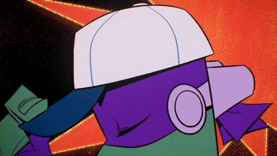
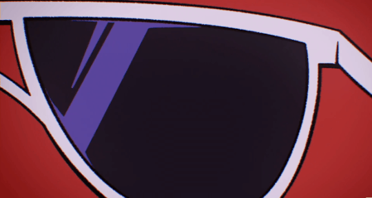
(I added the baseball cap pic because it makes me happy. I wish we'd seen more of that fit.)
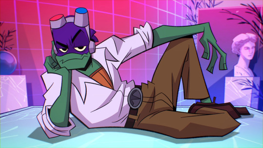
To me, he makes some really smart choices for himself, pushing the envelope of what is expected and taking chances: an open collar with no tie for a “black tie” event, a beanie and spiked wristbands for their “gansta look,” no socks with loafers (a viral fashion trend that actually began in Africa) with old man slacks in his reclined pose. *muah* Chef’s kiss!
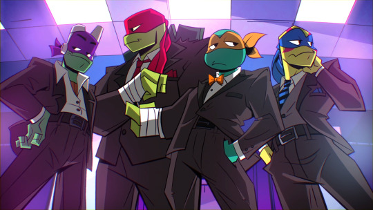
But Don’s fashion sense doesn’t just shine in this episode.
In “Reparin’ the Baron” the boys go to Draxum’s apartment. Leo and Donnie show up in some extra nice “Sunday Dinner” twin drip.
The gold is in the details. Everything Leo is wearing, Donnie rocks its compliment: for Leo’s round collar, Donnie’s is angled, for Leo’s blue shirt, Donnie’s is white, For Leo’s light slacks, Donnie’s are dark. Blah blah blah. It’s so good!
Look at the winter fit in Snow Day.
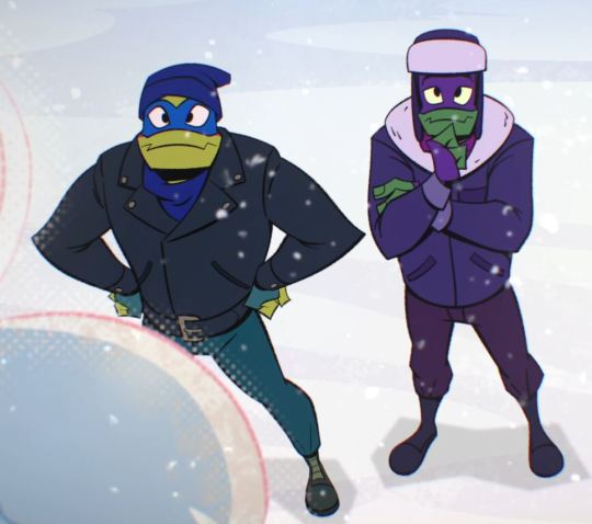
Again, Donnie is Leo’s perfect compliment. As a pair? Fire.
Donnie has “the eye.” I can go on and on with examples, but I’ve said all of that to say this…
In the future, we see that Donatello’s technology had major pull in the resistance. He had drone ships patrolling the skies. He built and designed Leo’s arm, Casey’s chainsaw-hockey stick, and Casey's mask. The list goes on…
But, when Donatello from the past see’s Casey’s clothing from the future, he says this:
We know about the “Genius Built” brand. We’ve seen that logo on all of his tech up to this point. But, here he didn’t just say “Genius Built.” He said, “Genius Built Apparel.”
“Apparel” is not a tech brand. “Apparel” is a fashion brand. Of course, tech is incorporated into the clothing, but still.
This means that past Donatello secured this trademark with plans of creating a fashion brand, comparable to the likes of Gucci, Ralph Lauren, or any other modern clothing brand, as a subsidiary of “Genius Built,” the tech company.
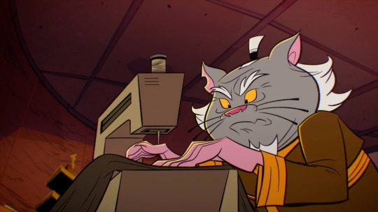
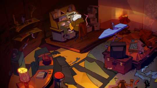
And why not? The evidence has been in front of us this entire time. He has a sharp eye for style, fashion, and trends. It is easily canon that he can sew. Splinter sewed their ninja garbs in “Insane in the Mama Train,” and there is a sewing machine in the house.
They already learned Ninjutsu through basically osmosis, so learning to sew is not too far-fetched.
And here it is, right in front of us, Casey’s entire ensemble, from mask, to weapons, to clothing, was made by Donatello in the middle of the apocalypse under the brand name “Genius Built Apparel.”
And that was just in the bad future. Resources were limited, they didn’t have access to much of anything in that broken world as they were survivors of a devastating Krang invasion. Yet, he created all of this.
However, now that they’ve changed the future, his future as a fashion designer is limitless. Think of what Donatello could produce with unlimited resources, unlimited technology, and unlimited creative freedom.
Tech genius. Clothing designer. Fashionista. Future Genius Built Apparel Owner and CEO. I’m sorry, but I have to call it...
Donatello Hamato of the present, of the bad future, and of the good future is a fashion icon, the likes of which the world has never seen.
○○○○
Update:
I've decided to make this concept into a mini-comic series!
#Tech Genius#Clothing Designer#Fashionista#Future Genius Built Apparel Owner and CEO#Fashion Icon#Donatello Hamato#Donatello Ramblings#starkiss ramblings#rise analysis#rottmnt analysis#character analysis#rise don#rise donnie#rise donatello#rottmnt donatello#donatello#rottmnt#tmnt#teenage mutant ninja turtles#rise of the teenage mutant ninja turtles#rise of the tmnt#tmnt2018#tmnt 2k18#tmnt 2018#save rottmnt#unpause rottmnt#unpause rise of the tmnt#save rise of the tmnt#save rise of the teenage mutant ninja turtles
7K notes
·
View notes
Text


project voltage - hatsune miku icons
#project voltage#hatsune miku#vocaloid#pokemon#vocaloid edit#vocaloid icons#uhh what should i tag this as#mine: all#mine: icons#mine: vocaloid#im going so crazy over those designs i want to edit so much with it#and the concept arts too theres some cute stuff there#might go crazy and post transparents for all of these but i def dont have the time for this lol#anyway. tried to keep the mikus all close to the same side but looking at the icons now. its kinda messy isnt it kjagdkasgdk
5K notes
·
View notes
Text
We're now at 95% with only 3 days left. We would like to take this opportunity to thank the Rowac community for your friendship and support. You haven't pitched in yet? 👉 Preorder at rowac.com
0 notes
Text

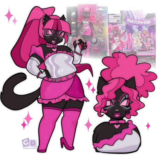
she didn’t come to play
#my art#my art!#art#fan art#my artwork#illustration#venus mcflytrap#monster high dolls#monster high#monster high icons#monster high reboot#monster high redesign#monster high art#monster high gen 3 dolls#g3 monster high#g3 venus#mh venus#monster high g3#character design
4K notes
·
View notes
Text
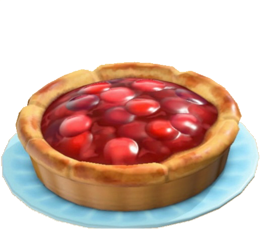
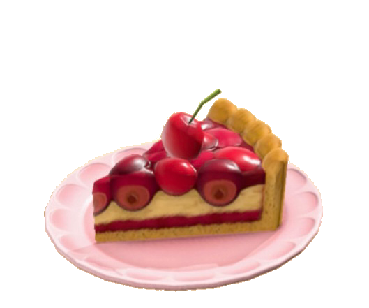
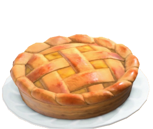

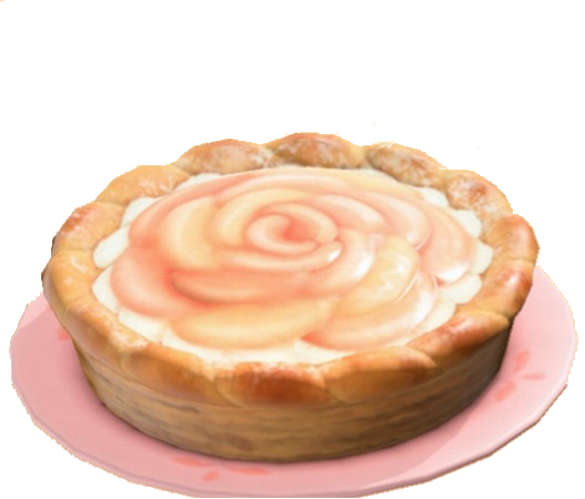
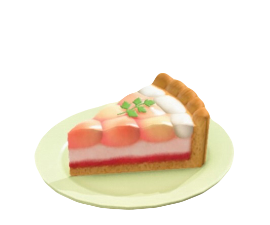
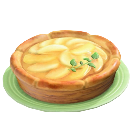
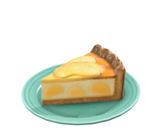
ACNH .png | PIES 🥧
#pies#png#pngs#acnh#animal crossing new horizons#nintendo#gaming#acnh community#acnh screenshots#animal crossing#switch#acnh inspo#acnh island#nintendo switch#icon#icons#sweets#acnh design#khleidis#cherry#apple#pear#peach#pie#mine#my edit
21K notes
·
View notes
Text

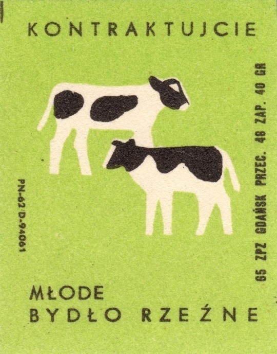

Polish Matchbox Label
#polish#matchbox#cow#horse#horse girl#horseblr#farmcore#farm#green#white#black#graphic art#graphic design#i love these#green icons#green layouts#green aesthetic#green moodboard#light green#green icon#greens#pastel green#green things#matches#soft icons#cute#cute icons#carrd#carrd resources#carrd icons
7K notes
·
View notes
Text
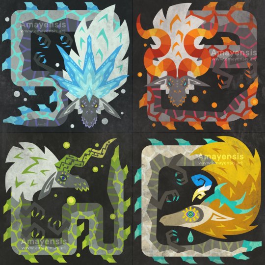
I have recently beaten TotK and couldn't resist the urge to draw Monster Hunter style icons of the dragons. I just love them so much! 🥰
EDIT: I had mirror stickers made with these designs, they're currently on my Ko-Fi shop! 👀
(Be considerate of others, no spoils in the comments!)
#amayensis art#monster hunter#tears of the kingdom#zelda#loz#legend of zelda#breath of the wild#dragon#naydra#dinraal#farosh#light dragon#icon#design#tribal
4K notes
·
View notes
Text
Art by Mike Parisella aka Slime Sunday
1K notes
·
View notes
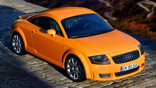
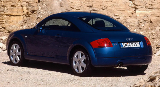
Text

#audi#audi tt#tt#icon#timeless#design icon#car#cars#coupe#history#historic#fast car#classic#luxurycars
21 notes
·
View notes
Text
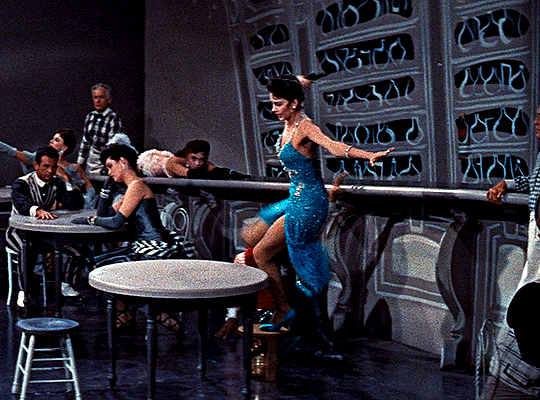


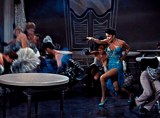
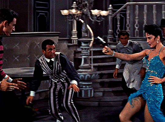
Cyd Charisse as Maria Corvier
Meet Me in Las Vegas (1956) dir. Roy Rowland
#Meet Me in Las Vegas#Cyd Charisse#Roy Rowland#movies#costume design#*#**#filmedit#userrobin#ritahayworrth#uservienna#usergina#userteri#userlenny#userlenie#usertom#mikaeled#guns tw#she's so good in this!! and this scene is so iconic
5K notes
·
View notes
Text
I think more women need to draw themselves like Allie brosh draws herself. Like first woman to do generic stick figure guy but then improve upon that template in every way
#the creatureness of it. its legitimately good character design#might not be the first but surely the most iconic
9K notes
·
View notes
Photo

a city of flowers blooms for you
#tgcf#heaven official's blessing#tian guan ci fu#hua cheng#xie lian#hualian#doods#its been so long since i drew this! this was really fun#their designs are soo iconic and beautiful#portfolio
6K notes
·
View notes
Text
cattyyyyyy cattyyyyy
#my art#illustration#fan art#art#my artwork#my art!#monster high#monster high art#mh catty#catty noir#g3 monster high#monster high redesign#monster high dolls#monster high icons#mh dolls#monster high reboot#character design#character redesign
3K notes
·
View notes
Text
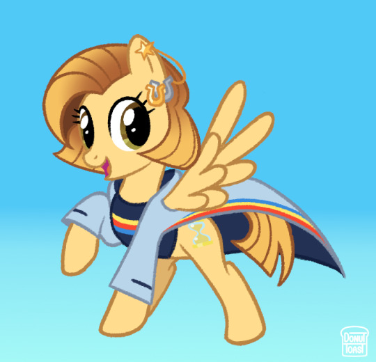
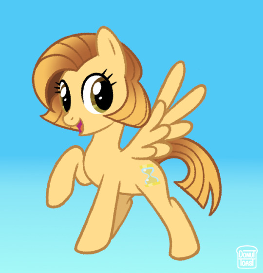
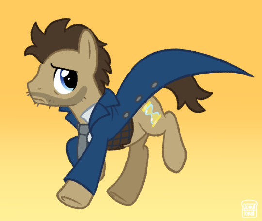
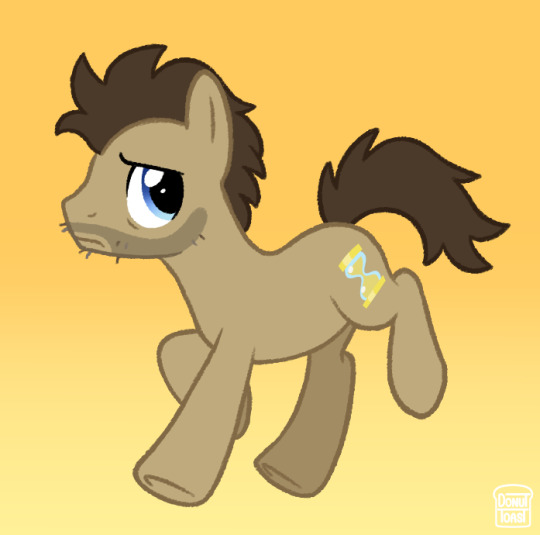
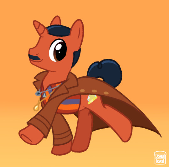
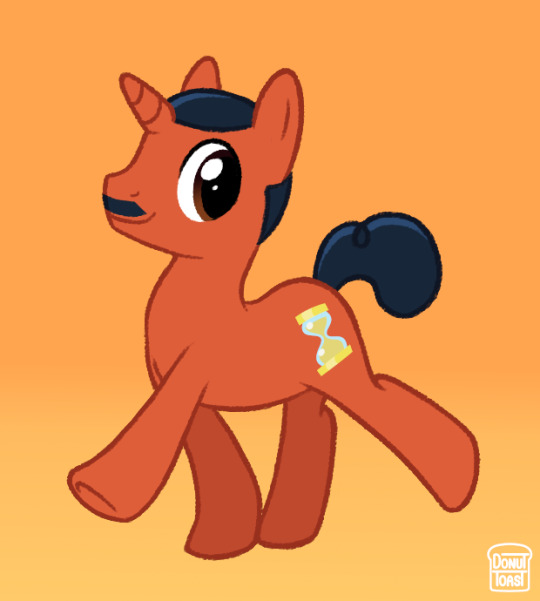
I haven't seen any MLP Doctor AU designs past Capaldi's era and I really think that's such a shame! So here's my take on the 13th, 14th and 15th Doctor :o]
Once again love to ramble about certain design choices!
Since the 13th Doctor wears ear jewellery depicting a golden and silver hand holding each other, I thought it'd be fun to change that into 2 horseshoes instead! I also gave a heavier focus on the more subtle rainbow on her coat because I feel it'd be more fitting for a MLP AU and something that could make the design a bit more balanced. I'd also tried to make her blue at first, but felt yellow actually felt more like the 13th somehow.
I decided to give 14 his iconic Doctor Whooves design, with the only difference being messier hair and some rough facial hair. I was definitely looking at it more with a nostalgia factor, which ultimately fits perfectly with what the 60th anniversary specials ended up being!
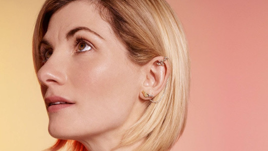
15 was a toughie, I'm not going to lie. A thing about MLP AUs I tend to dislike, is when an artist gives them the same colour as their skin. It tends to look silly with white characters, but I've noticed it's seen (at least USED to be) as less silly when it's with darker skinned characters. So with that in mind I wanted to make 15 the general colour he's themed to have in promotional material (orange and blue) and make it darker! ... but dark orange IS brown. So after some tinkering I decided to base his colour on the more earthy red Ncuti wears in this image.
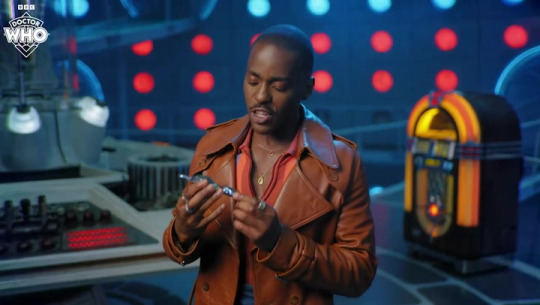
I also decided to tone his hair blue instead of going with black to really hammer in that orange/blue theme 15 has!
Thank you for reading this far! I'm really passionate about this sorta stuff so it really means a lot :oD
#I was so torn between making a genuinely David Looking 14 but I think the doctor whooves design is just too iconic to pass up on#not what i expected to give 100% of my energy today but we roll with it#donutdrawsthings#fanart#doctor who#doctor who fanart#doctor who au#new who#nuwho#nu who#the doctor#mlp fim#mlp g4#mlp art#mlp au#my little pony#mlp fanart#doctor whooves#thirteenth doctor#13th doctor#fourteenth doctor#14th doctor#fifteenth doctor#15th doctor#character design#design#au design#my art#digital art#au art
1K notes
·
View notes
Last Seen Blogs

rockettaxi18
The Journaling of Ogden 240
purityofyoursmile
Purity of your smile.
coffiocake
¯\_ಠ_ಠ_/¯
lawsonwhite
Lawson White