#design research
Text
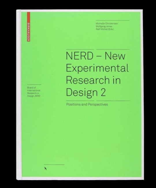
NERD — New Experimental Research in Design 2
Available at Draw Down
Design is inextricably interwoven with all aspects of life and has even produced its own astonishing genre of research. #Design research opens up new perspectives of interdisciplinary empiricism, joining with economics, sociology, #technology, and #philosophy to produce analyses and syntheses that get to the heart of daily life.
The twelve contributions from international authors that comprise this book vividly make this case. They cover the relationship between subject and object, animation, all forms of representation, #designactivism, and many other themes. This book is intended to inspire discussion. Its target reader is anyone seeking to expand their understanding of design, to fundamentally improve their praxis, and to more deeply appreciate life in all of its aspects.
Edited by Michelle Christensen, Wolfgang Jonas, Ralf Michel
Published by Birkhäuser, 2022
Hardcover, 160 pages, 119 b&w images, 6.45 × 9 inches
21 notes
·
View notes
Text
Phillips Wearables / Phillips Electronics / Vision Of The Future / Multimedia / 1996
The namesake of this blog and my social media handles is Phillips Electronics Vision Of The Future(VOTF) concept developed in the mid 90s. Created during a time where corporations were still optimistic that their products value could genuinely improve customers lives and that the dangers of globalism should be approached cautiously came a series of conceptual design products that resemble much of the "smart" technology seen today. Products that were supposed to turn your home into a smart house that could automatically adjust to the users needs(Alexa,Siri?), wearable electronics predating the smartphone by about a decade, electronic screens that contained photo and audio "memories" like some kind of digital postcard. VOTF was an ambitious project that was only made possible by the time it found itself in, a time before the world wide web and apps dumbed down so that three year olds can get addicted to screens now. Vision of The Future could only have been imagined by a people who experienced the world before the flattening of the imagination cause by the world wide web. A time where technology was approached with unbridled optimism and not taken for granted as an extension of our lives, in many ways it was the wild west for these ideas, and although the decades that followed led to some of the most obscene censorship, dismantlement of net neutrality, and unprecedented attacks on personal freedom and privacy seen in the western world, the spirit of VOTF remains as a reminder what was once possible and what what might be possible again.
My blog is dedicated to design research from this period of time and attempts to recapture that flame so it can be reestablished in a new way. Design research for new design practices. Not in a hauntological sense where references are interpreted through the haze of notalgia but as a bulwark against the neverending tide of nihilism and hopelessness that plagues young people today. There is a sense that we are living at the end of history, everything is a remix and nothing original can possibly exist again, but it doesn't need to be this way.
Music is Macquaire Ridge by Boards of Canada a bonus track from the Japanese version of The Campfire Headphase(2005). Boards of Canada are a Scottish-Canadian electronic duo whose music has had a profound effect on the creation of this blog and whose track One Very Important Thought has become a sort of underlying philosophical guide for Vision Of The Future.
4 notes
·
View notes
Text
THE NEW RURAL
BUILDING FASHION COMMUNITIES AT THE EDGE
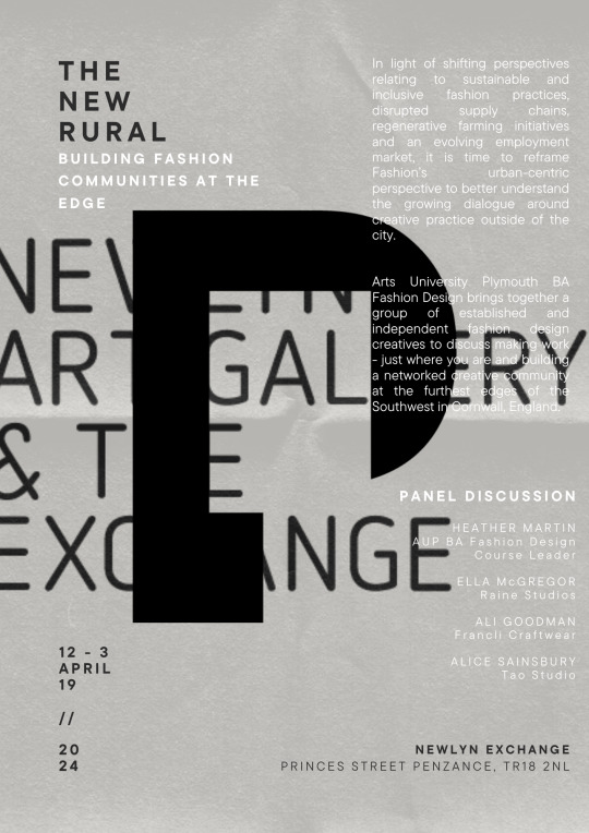
JOIN US // DATE: FRIDAY 19TH APRIL 2024
LOCATION: NEWLYN EXCHANGE
Princes Street Penzance, TR18 2NL
TIME: 12:00 - 15:00
In light of shifting perspectives relating to sustainable and inclusive fashion practices, disrupted supply chains, regenerative farming initiatives and an evolving employment market, it is time to reframe Fashion’s urban-centric perspective to better understand the growing dialogue around creative practice outside of the city.
Arts University Plymouth BA Fashion Design brings together a group of established and independent fashion design creatives to discuss making work - just where you are and building a networked creative community at the furthest edges of the Southwest in Cornwall, England.
AGENDA
12:00 Arrive - Newlyn Exchange, Penzance // The Engine Room
12:15 Welcome & Introduction - Heather Martin, Arts University Plymouth BA Fashion Design Course Leader
12:30 Speaker - Ella McGregor - Raine Studio
13:00 Speaker - Ali Goodman - Francli Craftwear
13:30 Break
13:45 Speaker - Alice Sainsbury - Tao Studio
14:15 Q & A - with speakers
14:30 Networking
15:00 Close
#the new rural#design research#critical making#distributed design#distributed geographies#inclusive design#local manufacturing#local economy#regenerative design
0 notes
Text
HELLO IF YOU LIVE IN AUSTRALIA AND REGULARLY CATCH PUBLIC TRANSPORT I NEED UR HELP
What's this?
This is part of a research assignment regarding the convenience, use, and usability of Australia's public transport system.
Who's it for?
People who live in Australia and catch public transport regularly. It is focused on Urban NSW, but open to other responses from Australia as well.
What will you do with my information?
All responses will be anonymous. No names or emails will be collected. Any personal information will only be used for demographic purposes and will not be shared with the public. Data collected will be used to develop a hypothetical app/interface to address the needs and concerns of public transport users (everything is for educational purposes and will NOT be used for monetary / public gain).
I'm not Australian / I don't use public transport :(
Reblog / share for me! I need around 30 responses for this for a decent sample size :') Or send to someone who does :'))) please :')
There's something wrong with the survey
DM me and I'll fix it ASAP!
if you fill it out i give you kiss mwah <3
#nsw#new south wales#australia#public transport#public transport system#surveys#design research#design survey
0 notes
Text
“…I think it’s our temptation to always gravitate towards technology. And I think technology, one of the things it does, is it likes efficiency. It wants to find the fastest point between A and B. And the thing about human connection is it’s inefficient. And so what technology wants to do is to take the human connection off and out of something because that something can be inefficient.
If you ask people, 'Do you want to meet somebody?' they say, 'no.' It’s our instinct to isolate ourselves, to push people away. But you ask them after they’ve had that connection, 'Are they happy?' And they say, 'I’m so thankful for the people in my life, and one of the most important things about my life are not all the things I have; it’s the relationships I have…'
’I don’t ask people what they want, I look at what they value after we give them things.”
— Brian Chesky on the next phase of Airbnb’s growth
0 notes
Text
UX Design Research, Step 1
When approaching this assignment, I was not too sure what I would begin to write about at first. I wanted to do something involving the city but wanted to make sure I got specific with a certain location.
I eventually landed on doing my research over the Brooklyn Bridge park and promenade. Also called the Brooklyn Heights Promenade, but I want the park to be included in my research as the promenade overlooks the park. I may change that decision as I advance in my research.

The promenade has one of the best views of lower Manhattan in my opinion, and is a great place for people to gather and enjoy each other and the beautiful city. My girlfriend and I only live about a 10 min walk from this area, so we enjoy going down here all the time to talk about whatever or just enjoy the day/view.
In my research, I would like to discover how people use the promenade and what they are looking to get out of this space when they come. I want to learn if people have routines to come here or just stumble upon in during their afternoon strolls.
This space can really help bring the people of Brooklyn and NYC together, and is a great representation of the city. My first initial thoughts are that this space is perfectly design and could use no more upgrades, but we will learn more during my research and try to discover if I think this space could benefit off of any new design.
Below are a couple of links I have found relating to the promenade and park. A lot of the articles are just facts about the park, some are about proposed renovations already in discussion, and some are about opinions of the park. Either way I have started to dive into these articles to better understand how people view this space.
0 notes
Text
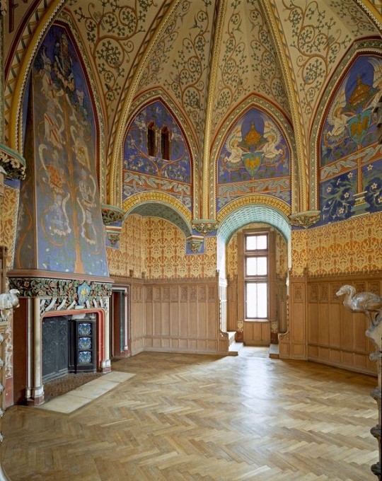
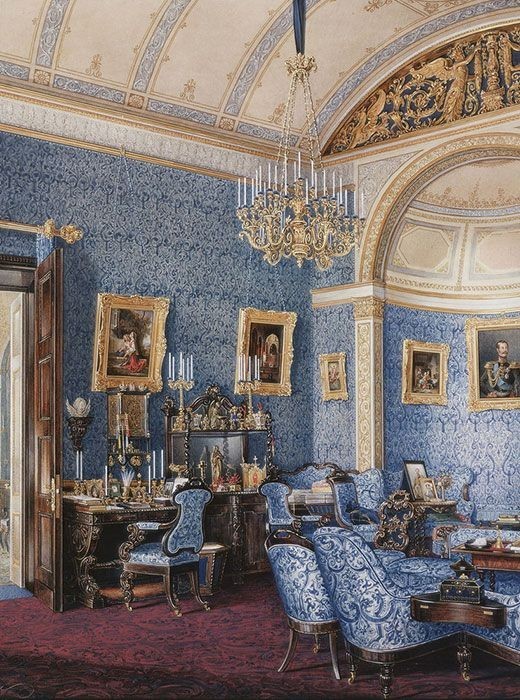
Fantasy Guide to Interiors

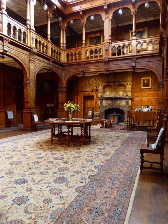
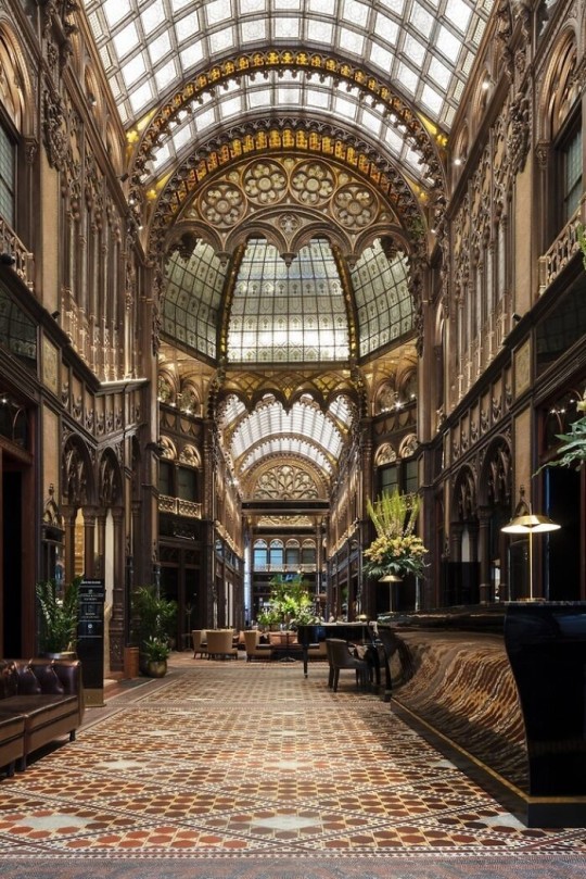
As a followup to the very popular post on architecture, I decided to add onto it by exploring the interior of each movement and the different design techniques and tastes of each era. This post at be helpful for historical fiction, fantasy or just a long read when you're bored.
Interior Design Terms
Reeding and fluting: Fluting is a technique that consists a continuous pattern of concave grooves in a flat surface across a surface. Reeding is it's opposite.
Embossing: stamping, carving or moulding a symbol to make it stand out on a surface.
Paneling: Panels of carved wood or fabric a fixed to a wall in a continuous pattern.
Gilding: the use of gold to highlight features.
Glazed Tile: Ceramic or porcelain tiles coated with liquid coloured glass or enamel.
Column: A column is a pillar of stone or wood built to support a ceiling. We will see more of columns later on.
Bay Window: The Bay Window is a window projecting outward from a building.
Frescos: A design element of painting images upon wet plaster.
Mosaic: Mosaics are a design element that involves using pieces of coloured glass and fitted them together upon the floor or wall to form images.
Mouldings: ornate strips of carved wood along the top of a wall.
Wainscoting: paneling along the lower portion of a wall.
Chinoiserie: A European take on East Asian art. Usually seen in wallpaper.
Clerestory: A series of eye-level windows.
Sconces: A light fixture supported on a wall.
Niche: A sunken area within a wall.
Monochromatic: Focusing on a single colour within a scheme.
Ceiling rose: A moulding fashioned on the ceiling in the shape of a rose usually supporting a light fixture.
Baluster: the vertical bars of a railing.
Façade: front portion of a building
Lintel: Top of a door or window.
Portico: a covered structure over a door supported by columns
Eaves: the part of the roof overhanging from the building
Skirting: border around lower length of a wall
Ancient Greece
Houses were made of either sun-dried clay bricks or stone which were painted when they dried. Ground floors were decorated with coloured stones and tiles called Mosaics. Upper level floors were made from wood. Homes were furnished with tapestries and furniture, and in grand homes statues and grand altars would be found. Furniture was very skillfully crafted in Ancient Greece, much attention was paid to the carving and decoration of such things. Of course, Ancient Greece is ancient so I won't be going through all the movements but I will talk a little about columns.
Doric: Doric is the oldest of the orders and some argue it is the simplest. The columns of this style are set close together, without bases and carved with concave curves called flutes. The capitals (the top of the column) are plain often built with a curve at the base called an echinus and are topped by a square at the apex called an abacus. The entablature is marked by frieze of vertical channels/triglyphs. In between the channels would be detail of carved marble. The Parthenon in Athens is your best example of Doric architecture.
Ionic: The Ionic style was used for smaller buildings and the interiors. The columns had twin volutes, scroll-like designs on its capital. Between these scrolls, there was a carved curve known as an egg and in this style the entablature is much narrower and the frieze is thick with carvings. The example of Ionic Architecture is the Temple to Athena Nike at the Athens Acropolis.
Corinthian: The Corinthian style has some similarities with the Ionic order, the bases, entablature and columns almost the same but the capital is more ornate its base, column, and entablature, but its capital is far more ornate, commonly carved with depictions of acanthus leaves. The style was more slender than the others on this list, used less for bearing weight but more for decoration. Corinthian style can be found along the top levels of the Colosseum in Rome.
Tuscan: The Tuscan order shares much with the Doric order, but the columns are un-fluted and smooth. The entablature is far simpler, formed without triglyphs or guttae. The columns are capped with round capitals.
Composite: This style is mixed. It features the volutes of the Ionic order and the capitals of the Corinthian order. The volutes are larger in these columns and often more ornate. The column's capital is rather plain. for the capital, with no consistent differences to that above or below the capital.
Ancient Rome
Rome is well known for its outward architectural styles. However the Romans did know how to add that rizz to the interior. Ceilings were either vaulted or made from exploded beams that could be painted. The Romans were big into design. Moasics were a common interior sight, the use of little pieces of coloured glass or stone to create a larger image. Frescoes were used to add colour to the home, depicting mythical figures and beasts and also different textures such as stonework or brick. The Romans loved their furniture. Dining tables were low and the Romans ate on couches. Weaving was a popular pastime so there would be tapestries and wall hangings in the house. Rich households could even afford to import fine rugs from across the Empire. Glass was also a feature in Roman interior but windows were usually not paned as large panes were hard to make. Doors were usually treated with panels that were carved or in lain with bronze.
Ancient Egypt
Egypt was one of the first great civilisations, known for its immense and grand structures. Wealthy Egyptians had grand homes. The walls were painted or plastered usually with bright colours and hues. The Egyptians are cool because they mapped out their buildings in such a way to adhere to astrological movements meaning on special days if the calendar the temple or monuments were in the right place always. The columns of Egyptian where thicker, more bulbous and often had capitals shaped like bundles of papyrus reeds. Woven mats and tapestries were popular decor. Motifs from the river such as palms, papyrus and reeds were popular symbols used.
Ancient Africa
African Architecture is a very mixed bag and more structurally different and impressive than Hollywood would have you believe. Far beyond the common depictions of primitive buildings, the African nations were among the giants of their time in architecture, no style quite the same as the last but just as breathtaking.
Rwandan Architecture: The Rwandans commonly built of hardened clay with thatched roofs of dried grass or reeds. Mats of woven reeds carpeted the floors of royal abodes. These residences folded about a large public area known as a karubanda and were often so large that they became almost like a maze, connecting different chambers/huts of all kinds of uses be they residential or for other purposes.
Ashanti Architecture: The Ashanti style can be found in present day Ghana. The style incorporates walls of plaster formed of mud and designed with bright paint and buildings with a courtyard at the heart, not unlike another examples on this post. The Ashanti also formed their buildings of the favourite method of wattle and daub.
Nubian Architecture: Nubia, in modern day Ethiopia, was home to the Nubians who were one of the world's most impressive architects at the beginning of the architecture world and probably would be more talked about if it weren't for the Egyptians building monuments only up the road. The Nubians were famous for building the speos, tall tower-like spires carved of stone. The Nubians used a variety of materials and skills to build, for example wattle and daub and mudbrick. The Kingdom of Kush, the people who took over the Nubian Empire was a fan of Egyptian works even if they didn't like them very much. The Kushites began building pyramid-like structures such at the sight of Gebel Barkal
Japanese Interiors
Japenese interior design rests upon 7 principles. Kanso (簡素)- Simplicity, Fukinsei (不均整)- Asymmetry, Shizen (自然)- Natural, Shibumi (渋味) – Simple beauty, Yugen (幽玄)- subtle grace, Datsuzoku (脱俗) – freedom from habitual behaviour, Seijaku (静寂)- tranquillity.
Common features of Japanese Interior Design:
Shoji walls: these are the screens you think of when you think of the traditional Japanese homes. They are made of wooden frames, rice paper and used to partition
Tatami: Tatami mats are used within Japanese households to blanket the floors. They were made of rice straw and rush straw, laid down to cushion the floor.
Genkan: The Genkan was a sunken space between the front door and the rest of the house. This area is meant to separate the home from the outside and is where shoes are discarded before entering.
Japanese furniture: often lowest, close to the ground. These include tables and chairs but often tanked are replaced by zabuton, large cushions. Furniture is usually carved of wood in a minimalist design.
Nature: As both the Shinto and Buddhist beliefs are great influences upon architecture, there is a strong presence of nature with the architecture. Wood is used for this reason and natural light is prevalent with in the home. The orientation is meant to reflect the best view of the world.
Islamic World Interior
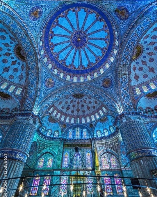
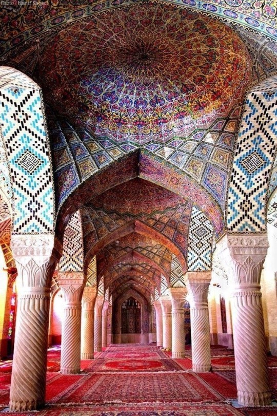
The Islamic world has one of the most beautiful and impressive interior design styles across the world. Colour and detail are absolute staples in the movement. Windows are usually not paned with glass but covered in ornate lattices known as jali. The jali give ventilation, light and privacy to the home. Islamic Interiors are ornate and colourful, using coloured ceramic tiles. The upper parts of walls and ceilings are usually flat decorated with arabesques (foliate ornamentation), while the lower wall areas were usually tiled. Features such as honeycombed ceilings, horseshoe arches, stalactite-fringed arches and stalactite vaults (Muqarnas) are prevalent among many famous Islamic buildings such as the Alhambra and the Blue Mosque.
Byzantine (330/395–1453 A. D)
The Byzantine Empire or Eastern Roman Empire was where eat met west, leading to a melting pot of different interior designs based on early Christian styles and Persian influences. Mosaics are probably what you think of when you think of the Byzantine Empire. Ivory was also a popular feature in the Interiors, with carved ivory or the use of it in inlay. The use of gold as a decorative feature usually by way of repoussé (decorating metals by hammering in the design from the backside of the metal). Fabrics from Persia, heavily embroidered and intricately woven along with silks from afar a field as China, would also be used to upholster furniture or be used as wall hangings. The Byzantines favoured natural light, usually from the use of copolas.
Indian Interiors
India is of course, the font of all intricate designs. India's history is sectioned into many eras but we will focus on a few to give you an idea of prevalent techniques and tastes.
The Gupta Empire (320 – 650 CE): The Gupta era was a time of stone carving. As impressive as the outside of these buildings are, the Interiors are just as amazing. Gupta era buildings featured many details such as ogee (circular or horseshoe arch), gavaksha/chandrashala (the motif centred these arches), ashlar masonry (built of squared stone blocks) with ceilings of plain, flat slabs of stone.
Delhi Sultanate (1206–1526): Another period of beautifully carved stone. The Delhi sultanate had influence from the Islamic world, with heavy uses of mosaics, brackets, intricate mouldings, columns and and hypostyle halls.
Mughal Empire (1526–1857): Stonework was also important on the Mughal Empire. Intricately carved stonework was seen in the pillars, low relief panels depicting nature images and jalis (marble screens). Stonework was also decorated in a stye known as pietra dura/parchin kari with inscriptions and geometric designs using colored stones to create images. Tilework was also popular during this period. Moasic tiles were cut and fitted together to create larger patters while cuerda seca tiles were coloured tiles outlined with black.
Chinese Interiors
Common features of Chinese Interiors
Use of Colours: Colour in Chinese Interior is usually vibrant and bold. Red and Black are are traditional colours, meant to bring luck, happiness, power, knowledge and stability to the household.
Latticework: Lattices are a staple in Chinese interiors most often seen on shutters, screens, doors of cabinets snf even traditional beds.
Lacquer: Multiple coats of lacquer are applied to furniture or cabinets (now walls) and then carved. The skill is called Diaoqi (雕漆).
Decorative Screens: Screens are used to partition off part of a room. They are usually of carved wood, pained with very intricate murals.
Shrines: Spaces were reserved on the home to honour ancestors, usually consisting of an altar where offerings could be made.
Of course, Chinese Interiors are not all the same through the different eras. While some details and techniques were interchangeable through different dynasties, usually a dynasty had a notable style or deviation. These aren't all the dynasties of course but a few interesting examples.
Song Dynasty (960–1279): The Song Dynasty is known for its stonework. Sculpture was an important part of Song Dynasty interior. It was in this period than brick and stone work became the most used material. The Song Dynasty was also known for its very intricate attention to detail, paintings, and used tiles.
Ming Dynasty(1368–1644): Ceilings were adorned with cloisons usually featuring yellow reed work. The floors would be of flagstones usually of deep tones, mostly black. The Ming Dynasty favoured richly coloured silk hangings, tapestries and furnishings. Furniture was usually carved of darker woods, arrayed in a certain way to bring peace to the dwelling.
Han Dynasty (206 BC-220 AD): Interior walls were plastered and painted to show important figures and scenes. Lacquer, though it was discovered earlier, came into greater prominence with better skill in this era.
Tang Dynasty (618–907) : The colour palette is restrained, reserved. But the Tang dynasty is not without it's beauty. Earthenware reached it's peak in this era, many homes would display fine examples as well. The Tang dynasty is famous for its upturned eaves, the ceilings supported by timber columns mounted with metal or stone bases. Glazed tiles were popular in this era, either a fixed to the roof or decorating a screen wall.
Romanesque (6th -11th century/12th)
Romanesque Architecture is a span between the end of Roman Empire to the Gothic style. Taking inspiration from the Roman and Byzantine Empires, the Romanesque period incorporates many of the styles. The most common details are carved floral and foliage symbols with the stonework of the Romanesque buildings. Cable mouldings or twisted rope-like carvings would have framed doorways. As per the name, Romansque Interiors relied heavily on its love and admiration for Rome. The Romanesque style uses geometric shapes as statements using curves, circles snf arches. The colours would be clean and warm, focusing on minimal ornamentation.
Gothic Architecture (12th Century - 16th Century)
The Gothic style is what you think of when you think of old European cathedrals and probably one of the beautiful of the styles on this list and one of most recognisable. The Gothic style is a dramatic, opposing sight and one of the easiest to describe. Decoration in this era became more ornate, stonework began to sport carving and modelling in a way it did not before. The ceilings moved away from barreled vaults to quadripartite and sexpartite vaulting. Columns slimmed as other supportive structures were invented. Intricate stained glass windows began their popularity here. In Gothic structures, everything is very symmetrical and even.
Mediaeval (500 AD to 1500)
Interiors of mediaeval homes are not quite as drab as Hollywood likes to make out. Building materials may be hidden by plaster in rich homes, sometimes even painted. Floors were either dirt strewn with rushes or flagstones in larger homes. Stonework was popular, especially around fireplaces. Grand homes would be decorated with intricate woodwork, carved heraldic beasts and wall hangings of fine fabrics.
Renaissance (late 1300s-1600s)
The Renaissance was a period of great artistry and splendor. The revival of old styles injected symmetry and colour into the homes. Frescoes were back. Painted mouldings adorned the ceilings and walls. Furniture became more ornate, fixed with luxurious upholstery and fine carvings. Caryatids (pillars in the shape of women), grotesques, Roman and Greek images were used to spruce up the place. Floors began to become more intricate, with coloured stone and marble. Modelled stucco, sgraffiti arabesques (made by cutting lines through a layer of plaster or stucco to reveal an underlayer), and fine wall painting were used in brilliant combinations in the early part of the 16th century.
Tudor Interior (1485-1603)
The Tudor period is a starkly unique style within England and very recognisable. Windows were fixed with lattice work, usually casement. Stained glass was also in in this period, usually depicting figures and heraldic beasts. Rooms would be panelled with wood or plastered. Walls would be adorned with tapestries or embroidered hangings. Windows and furniture would be furnished with fine fabrics such as brocade. Floors would typically be of wood, sometimes strewn with rush matting mixed with fresh herbs and flowers to freshen the room.
Baroque (1600 to 1750)
The Baroque period was a time for splendor and for splashing the cash. The interior of a baroque room was usually intricate, usually of a light palette, featuring a very high ceiling heavy with detail. Furniture would choke the room, ornately carved and stitched with very high quality fabrics. The rooms would be full of art not limited to just paintings but also sculptures of marble or bronze, large intricate mirrors, moldings along the walls which may be heavily gilded, chandeliers and detailed paneling.
Victorian (1837-1901)
We think of the interiors of Victorian homes as dowdy and dark but that isn't true. The Victorians favoured tapestries, intricate rugs, decorated wallpaper, exquisitely furniture, and surprisingly, bright colour. Dyes were more widely available to people of all stations and the Victorians did not want for colour. Patterns and details were usually nature inspired, usually floral or vines. Walls could also be painted to mimic a building material such as wood or marble and most likely painted in rich tones. The Victorians were suckers for furniture, preferring them grandly carved with fine fabric usually embroidered or buttoned. And they did not believe in minimalism. If you could fit another piece of furniture in a room, it was going in there. Floors were almost eclusively wood laid with the previously mentioned rugs. But the Victorians did enjoy tiled floors but restricted them to entrances. The Victorians were quite in touch with their green thumbs so expect a lot of flowers and greenery inside. with various elaborately decorated patterned rugs. And remember, the Victorians loved to display as much wealth as they could. Every shelf, cabinet, case and ledge would be chocked full of ornaments and antiques.
Edwardian/The Gilded Age/Belle Epoque (1880s-1914)
This period (I've lumped them together for simplicity) began to move away from the deep tones and ornate patterns of the Victorian period. Colour became more neutral. Nature still had a place in design. Stained glass began to become popular, especially on lampshades and light fixtures. Embossing started to gain popularity and tile work began to expand from the entrance halls to other parts of the house. Furniture began to move away from dark wood, some families favouring breathable woods like wicker. The rooms would be less cluttered.
Art Deco (1920s-1930s)
The 1920s was a time of buzz and change. Gone were the refined tastes of the pre-war era and now the wow factor was in. Walls were smoother, buildings were sharper and more jagged, doorways and windows were decorated with reeding and fluting. Pastels were in, as was the heavy use of black and white, along with gold. Mirrors and glass were in, injecting light into rooms. Gold, silver, steel and chrome were used in furnishings and decor. Geometric shapes were a favourite design choice. Again, high quality and bold fabrics were used such as animal skins or colourful velvet. It was all a rejection of the Art Noveau movement, away from nature focusing on the man made.
Modernism (1930 - 1965)
Modernism came after the Art Deco movement. Fuss and feathers were out the door and now, practicality was in. Materials used are shown as they are, wood is not painted, metal is not coated. Bright colours were acceptable but neutral palettes were favoured. Interiors were open and favoured large windows. Furniture was practical, for use rather than the ornamentation, featuring plain details of any and geometric shapes. Away from Art Deco, everything is straight, linear and streamlined.
#This took forever#I'm very tired#But enjoy#I covered as much as I could find#Fantasy Guide to interiors#interior design#Architecture#writings#writing resources#Writing reference#Writing advice#Writer's research#writing research#Writer's rescources#Writing help#Mediaeval#Renaissance#Chinese Interiors#Japanese Interiors#Indian interiors#writing#writeblr#writing reference#writing advice#writer#spilled words#writers
3K notes
·
View notes
Text

FORMLINE RAPTOOOOOOOOR!!!!!
this design is a birthday gift for my brother!! It's based off one of his fave basketball teams (yes the toronto raptors, no I don't know a damn thing about competitive basketball)
#this design is probably not accurate according to paleontologist standards/research and we are going to make our peace with that#ok? ok.#man i sure hope I don't get sued by the nba :)#paleo art#formline art#indigenous art#telekitnetic art
3K notes
·
View notes
Text


THROWS PJO CHARACTERS AS AN EARLY ‘00S SHOW AT YOU. OKAY TIME TO GO WATCH THE SHOW
#these designs are so silly and not like well researched at all#solely for kicks and giggles#percy jackson#pjo#percy jackon and the olympians#grover underwood#annabeth chase#sage’s art stuff
979 notes
·
View notes
Text
#Industrial Design#Product Development#Software Development#medical device design#Engineering design#Rapid Prototyping#UX UI design#Branding#Design Strategy#Design Research#Marketing#Innovation Consulting
1 note
·
View note
Link
A Material Culture Magazine I curated and wrote as an accompaniment to my final Masters Project; Keramikos
0 notes
Text
VIVA - GLASGOW SCHOOL OF ART // MASTERS OF RESEARCH - DESIGN INNOVATION

A viva voce is a long-established part of the examination process for a research degree. The main focus of the assessment is on the written thesis/dissertation (and other outputs, for a Practice as Research students). However, the viva gives you the opportunity to defend your thesis and is used to inform the examiners’ final assessment decision.
Examiners // Dr Janet McDonnell: Professor of Design Studies at Central Saint Martins College of Art & Design, University of the Arts, London, UK & Dr Brian Dixon: Head of Belfast School of Art
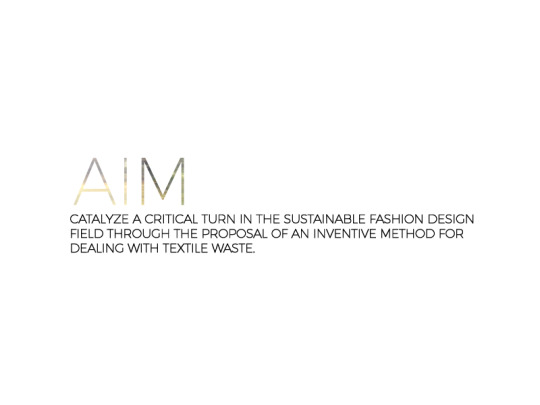
AIM // The intention of this practice based research is to catalyze a critical turn in the sustainable fashion design field through the proposal of an inventive method for dealing with textile waste.
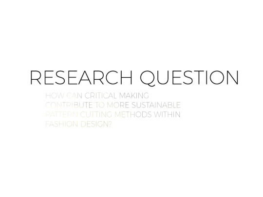
This proposal is realized through critical making and this study puts forward critical making as a method that can contribute to the mobilization of systems change within the fashion industry.
WHY? // Fashion is under scrutiny for its wastefulness – the current fashion system perpetuates continuous consumption driven by speed, change, planned obsolescence, artificial newness and aesthetic trends
The fashion industry is very slow to adopt more sustainable practices. barriers towards implementation for change exist with limited practical, viable and production-minded scalable examples of ways to shift forward within academic research as well as industry.
As design and consumption are inter-related – design can proactively influence and begin to realize this change.
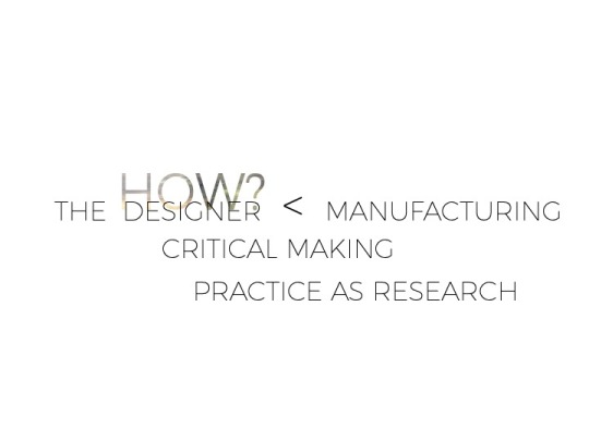


HOW? // Holistically connecting the designer back towards the processes of manufacturing can open up a much-needed critical dialogue between designing and making where generative and constructive design-led insights can begin to unpack the complexities of fashion’s sustainability issues.
MAKING SPACE TAKING TIME // THE STUDIO
The process in which the study is undertaken is through the primacy of the studio process claiming that critical making is a constructive and generative process where visual and embodied links can be made that might otherwise be overlooked or unrealized through language-based approaches.
An investigation of PRACTICE AS RESEARCH is highlighted through an exploratory case study; studio practice, drawings, assemblage and textile studies are used as tools that aid to synthesize, analyze and further develop new ways of thinking about the design making process.
CRITICAL MAKING acts as a means to connect our technologies with our lived experiences offering up social and conceptual critique of the assumptive making processes that we employ.
Matt Malpass (2017) Critical Design in Context

VISUAL ARTS KNOWING
Thinking in a Medium gives structure and physicality to the work in the studio,
Thinking in a Language frames the practice through reflective dialogue and
Thinking in a Context through embodied ways of making situates the practice to become research.
Graeme Sullivan (2009) Art Practice as Research
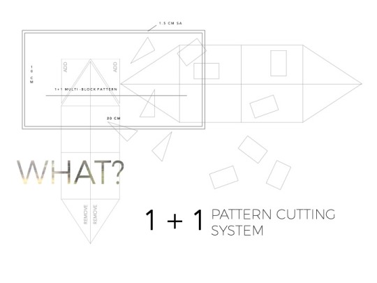
WHAT? // 1 + 1 = A Propositional Pattern Cutting System
1 + 1 is a zero-waste, negative-waste and additive pattern cutting and clothing design system that scales a single block shape into a variety of silhouettes by repeating and assembling that block shape to create the complete garment. The system can be used with regular lengths of new cloth, end rolls of fabric and textile waste materials.
SO WHAT??
Leading the design enquiry with a holistic view puts the waste up front and centre.
This way of designing encourages the designer to gain a deeper understanding of the complexity of the whole process pulling production back into the initial stages of design development.
The designer can be instrumental in determining how waste materials are used in the creation of the design through pattern cutting.
By creating a pattern that works within the constraints of waste material, the designer not only restricts the amount of resources used but also shapes the formation of the silhouette and the resulting outcome.
This process of making and un-making establishes a circular ethos that embodies an approach that places an emphasis on the criticality of message within its aesthetics and incorporates re-formation through a multiplicity of design in its function.
WHAT NOW?
Opening up the 1 + 1 Pattern Cutting System beyond the individual studio practice and extending its processes into a master class framework, a workshop format or through open source access would further promote a deeper engagement to reveal significant insights and critical feedback.
Such collective working sessions would setup a platform to increase the body of knowledge around the 1 + 1 system’s viability, transferability and scalability extending the research within the zero and negative-waste design and sustainable design fields.
The 1 + 1 not only offers an alternative technology for sustainable design but it also explores the process that it took to get there. it is through the critical making process where a multiplicity of re-directive and alternative approaches can be put forward.

I // MRES > 1 + 1 AS A DESIGN RESEARCH OUTPUT
IT // SHARE THE DESIGN & PROTOTYPING PROCESS
WE // BUILD A COLLECTIVE SYSTEM
ITS // CONNECT THE SYSTEM TO A NETWORK
#VIVA#design research#modular design#zero waste pattern cutting#zero waste design#practice based design research#critical making#sustainable fashion design methods
0 notes
Text

just some designs mainly created because I wanted to draw hakama and then it spiral out from there
bald zuko under the cute
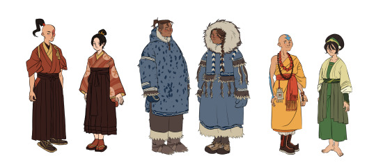
#avatar the last airbender#atla redesigns#atla#atla fanart#atla zuko#atla azula#atla sokka#atla katara#atla aang#avatar aang#toph beifong#my art#I also have some wip designs for summer clothes for most of them and before anyone says anything for the fire nation theyre thai inspired#doing research for this spiraled into reading 3 fairly big books in the span of 2 weeks just cause#i ALSO have adult designs cooking#this was really inspired by all the girls on campus in their hakama a few weeks ago...wahhh so pretty
407 notes
·
View notes

Text
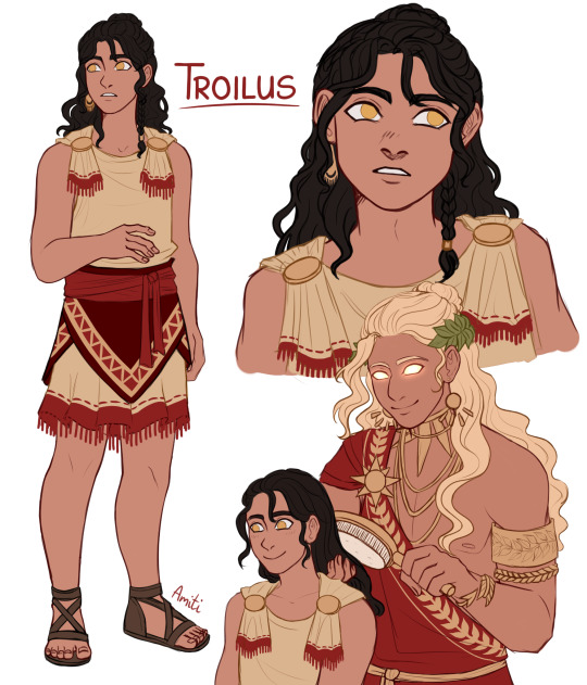
Troilus design! (ft best dad Apollo) He's around 12 years old here.
Researching Troilus' story is not an easy task because unfortunately most of the ancient texts focused on him didn't survive and others only survived in fragments.
This story is brutal even for greek mythology standards so please keep that in mind if you want to continue reading this or do more research on your own.
Something that all of the versions seems to agree on is that he was a Trojan prince, son of queen Hecuba and was killed by Achilles. His father was either Apollo or Priam (Apollo fits more with the context of the story though).
Most of the versions also focus on Troilus' young age and he's often shown to be visibly shorter than Achilles on the vase paintings depicting his death.
The most popular version of the myth (which is also supported by ancient vase paintings) states that Troilus and his sister Polyxena (she's not preset in every version though) went outside of Troy on their horses and while they were at a fountain Achilles ambushed them.
Achilles then chased Troilus who tried to hide inside of Apollo's temple (possibly seeking his father's protection) but Achilles caught up to him and murdered Troilus either inside or in front of the temple and then brutally mutilated his body.
There 2 alternative reasons given for the murder:
1. There was a prophecy which said that if Troilus reached 21 years of age Troy would never fall.
2. Achilles fell in love with Troilus, tried to force himself on him and was enraged when the boy refused his advances. (This version seems to have more surviving evidence)
It could also be that the only reason that Achilles killed Troilus was the fact that he was a Trojan prince and therefore an enemy but this does not seem to fit with the brutality of the act.
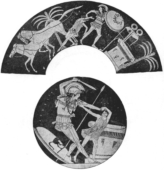

Here are some vase paintings that show Troilus' death at the hands of Achilles
#please correct me if anything in the text is inccorect. Like I said this was hard to research and I don't want to spread any misinformation#Troilus#Apollo#Achilles#trojan war#tagamemnon#greek panteon#greek myths#greek mythology#greek gods#character design#my art#children of apollo
972 notes
·
View notes
Text

Rawiya — her name means “storyteller”. She loves nature and mori kei fashion, and enjoys sunsets! 🌾🐛👒🧸
#my art#art#physically disabled#disabled artist#forearm crutches#SLE#systemic lupus erythematosus#vitiligo#alopecia areata#mori kei#mori kei fashion#character design#original character#babe with a mobility aid#disabled and cute#i hope that the urdu spelling is correct! i kept researching but it kept giving me different spellings!#alt text in image ID
1K notes
·
View notes
Last Seen Blogs

jeniffermatos2
Peace & Love

levyscripts
LevyScript

ctznnyc-blog
Untitled

michaelsartgallery
Michael

rauwlooks
RauwLooks