#displays
Video
414 notes
·
View notes
Text
181 notes
·
View notes
Text
Alcohol Display Shelves Deco for The Sims 2
This is a 4to2 conversion from Somik&Severinka, medium poly. They are 5 different deco display shelves, you can find them in Surface-Shelves section of Buy Mode. 4 colors. I added a slot on the low display.
DOWNLOAD HERE

Here you can find a FUNCTIONAL version.
#sims 2 cc#the sims 2#sims 2 download#ts2#the sims 2 cc#ts2 download#4to2#4to2 conversion#sims 2 decor#surfaces#shelves#display shelves#displays#wine bottle#alcohol
319 notes
·
View notes
Text
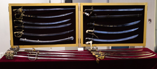
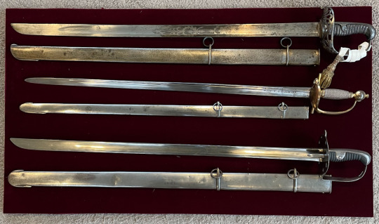
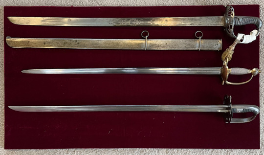
Photos of the sword display I had at last weekends excellent Auckland Blade and Knife show.
Was great to see meet with New Zealand's very talented knife makers showing off their work. Truly inspiring works of art.
For my display I opted to have a selection from the collection that covered a broad range instead of focusing on the one topic.


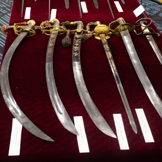
It was also my first use of the new boards I made after the last show. These are on their own stands giving me more table space.
Despite being a bit rough about the edges (remember folks, measure twice, cut once 🤣) they worked well. The next challenge is to improve on how the swords are mounted. Cable ties work great, but they're fiddly to pass through the cloth backing while trying to hold up a sword at the same time.
My thanks to The Auckland Blade Show for organising such a great event and for allowing me to participate. Shows like these are key to showing people just what is available and possible.
#swords#antiques#napoleonic wars#military antiques#british army#sabre#cavalry#Shows#Displays#Walloon Sword#Schiavona#Smallsword#Baskethilt#Spadroon
139 notes
·
View notes
Text

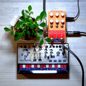
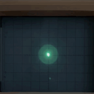


tech stimboard with oscilloscopes in dark green and blue for @junoptics!
📟|📟|📟
📟|📟|📟
📟|📟|📟
#talos stimboards#stimboard#stim#stim gifs#talos gifs#tech stim#technology#oscilloscope#computer parts#electronicos fantasticos#modular synth#crt#wires#screens#displays#irl hands#flash tw#pulsing lights#glow#green#blue#teal#orange#white#instruments#lambda#half life#portal#companion cube
380 notes
·
View notes
Note
Computer q. For otherwise identical monitors, is a 4000:1 contrast ratio noticeably better from 1000:1? I don't mean for fancy art but like if I'm watching a movie, could I see the difference in a dark scene? I looked into oled's, but those are expensive and I think the way I use my stuff would cause burn in.
I hope you don't mind, but I got carried away and answered pretty much every computer monitor question anyone has ever had. And since this turned into a whole thing, I thought I'd share it for everyone to benefit.
For a computer monitor I would say the most important aspect is actually the viewing angle. This is how far off-axis you can look at the monitor before the image degrades.
We sit very close to our displays and at that distance, even a change in height in your chair can affect the image. Move a little bit left or right and a cheap display could completely wash out and look terrible. And if you get a display that is 27" or above, even if you sit dead center, the edges of the screen will appear dark and washed out with a bad viewing angle.
The two best display technologies to get a good viewing angle are IPS (in-plane switching) and OLED. If you are interested in a display without these technologies, be sure it has a decent viewing angle. You can read more about viewing angles here and here.
IPS has very little concern for burn-in, but it is still a concern with OLED. In recent years OLED has greatly improved and image retention and burn-in can be avoided with regular maintenance. Displays will have pixel shift features and noise modes that work out all the pixels evenly. You can run these features every once in a while to prevent burn-in. You can also play special anti-burn-in videos on YouTube (full screen) to exercise the pixels to uniformity.
So if you don't mind the hassle, you can manage an OLED with low risk.
That said, OLED was almost exclusively for TVs and has only recently been introduced for computer displays. The current options are quite large and fairly expensive, as you alluded to. So if you are trying to stay within a budget, it might be best to seek out an IPS display.
Another consideration is resolution. Everyone is obsessed with everything being 4K now. But I think increasing the resolution brings diminishing returns with regard to increased detail you can actually notice. So if you don't mind going with a 1440p monitor (about 2.5K), you can save some money on resolution and get higher quality in more noticeable areas. Personally, I feel 1440p gives you a nice, noticeable bump in detail over 1080p. Whereas going from 1440p to 4K (2160p) is less noticeable unless you have very good vision.
Another benefit to 1440p is that video games are much easier to run on high quality settings with a reasonable GPU. And you can use technologies like super sampling (Nvidia calls this DLSS) to increase the detail you may lose from not going 4K.
The only concern I'd have with not going 4K is if you edit 4K video. It will be difficult to do a pixel level analysis of your footage otherwise. But other than that, you can still watch 4K content on a 1440p monitor and because it is being downsampled, you will still notice a nice bump in detail.
So if you don't have a reason to get a 4K display, I think 1440p is worth considering.
The next concern would be color. Or color gamut. This is how many colors the display can accurately reproduce. If you don't do any art or video color grading, you'll at least want something that does 95 to 100% of sRGB. That is the color space the entire internet uses. And if you are going to be watching HDR movies, you might want a display with a decent percentage of the P3 color space as well. Doesn't need to be 100%, but the higher the better. And for those who do art, a good percentage of Adobe RGB is recommended.
Also, many manufacturers offer displays that come pre-calibrated from the factory. If color accuracy is important, I would seek out one of these displays with a Delta E rating of 3 or less (lower is better).
A newer factor in displays is peak brightness. This is measured in "nits." In standard dynamic range (SDR), video only needed to reach 100 nits. Most HDR content is mastered to reach 1000 nits. In the future, that number will be 4000. And if micro LED technology ever becomes affordable, we may go up to 10,000 nits. But almost everything is around 1000 at the moment, so that is a good number to shoot for.
HOWEVER, because HDR is tone mapped (the brightness of your display is factored in and the content is adjusted accordingly), you can still get some benefits of HDR, even if you cannot do the full 1000 nits.
All monitors can do 100 nits for SDR content. But with more things being displayed in HDR, having more nits will give you a better experience. This does not mean your display will blind you. Usually bright stuff only takes up a small portion of the screen. But having more nits allows highlights to really pop and feel immersive. A lightsaber might actually feel hot and dangerous on a bright enough screen.
Computer displays are often rated as HDR400 or HDR600 or HDR1000 based on their nits. The HDR400 isn't great for HDR content. If you can do 600 or above within your budget, you'll get a better experience. If you are going to watch movies, this may be a feature you prioritize.
I know you mentioned contrast ratio, but I'm afraid that is a little complicated to answer. It can depend on other aspects of the monitor and the viewing environment. So I'll try to give you the info you need to figure out if the display you select will suit your needs.
Manufacturers can use tricks to fudge their contrast ratio in product descriptions, so it is best to go to an independent review website like RTINGS to see what they measured. (They do good TV and monitor reviews too.) You'll see that OLED displays are said to have "infinite" contrast ratio, due to being able to turn off pixels completely. Which means it is probably time to move to a new metric because that gives very little info on the dynamic range of the display (the difference between the darkest and brightest thing it can show).
You definitely want a decent contrast ratio for your display, but this can be subjective. If you have a nice bright screen, your brain may feel the contrast is fantastic, even if the actual darkest black point of the monitor isn't great. If something is really bright, then dark things will *seem* darker by comparison. And if you are viewing in a dark environment, the contrast will look even better. So this is where seeking out a professional reviewer's experience of the monitor can be helpful. One monitor's 4000:1 ratio might be a different experience than another with the same measurement.
Because TVs are generally larger and can have more backlighting zones, they can get decent black levels without OLED. But smaller computer displays have more difficulty in reasonable price ranges. So manage your black level expectations if you go with an affordable IPS display. They can get bright, but they aren't great at blacks like OLED. I'm afraid that is just a limitation of the tech. In fact, getting a brighter display might be preferable to a better contrast ratio. And it will be easier to see if you are in a bright environment.
Most IPS displays are going to be between 1000:1 and 5000:1 and while it does make a difference, if you sit it next to an old plasma or an OLED, you're going to be disappointed. So I would not make contrast ratio a super high priority with IPS, because non-OLED computer displays just aren't going to give you inky blacks. I would say 2000:1 or better is going to give you a decent experience. But, again, I would seek out reviews rather than trust the official product specs when it comes to the quality of the blacks.
And one final consideration you may want to factor in is the refresh rate. This is mostly for gaming. Most displays will give you at least 60 Hz or 60 "refreshes" per second. Gamers tend to like 120 Hz or higher. This won't affect movie watching very much as nearly everything except Gemini Man is 24 fps.
TLDR overview...
Get an IPS or OLED display for a good viewing angle. I personally feel this is the most important feature.
Choose a resolution. 1440p can allow you to increase quality in other areas to maximize your budget. Only get 4K if you have a legit reason or you have fighter pilot vision.
Color gamut or number of colors. Try to get 100% of sRGB for web content, 90% or above of Adobe RGB for art/photography, and 90% or above of P3 for HDR movies and video editing.
If color accuracy is important, look for pre-calibrated displays that have a Delta E of 3 or less. (Lower is better)
HDR brightness. If you want to experience good HDR, you'll want the brightest screen possible (measured in nits). HDR600 or HDR1000 are great. If you don't care about HDR, then don't worry about the rating.
Contrast ratio and black levels. It's going to be meh on pretty much anything but OLED. 2000:1 or better is a good goal to shoot for, but be sure to check independent reviews for the subjective experience of the black levels. Dark viewing environments help too.
Refresh rate. 60 Hz is fine for most things. Gamers prefer 120 Hz or faster. And if you are a competitive gamer, you may want to seek out more info on "variable refresh rate" and "pixel response time."
Pick the variables above that seem most important to you and then seek out a display that does those things decently within your budget.
76 notes
·
View notes
Text

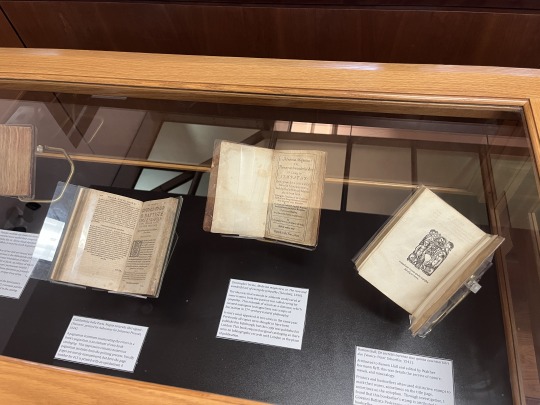


Recently, I was able to put together a small rare book exhibit of new acquisitions and some cataloging quirks!
In this exhibit:
Tabulae medicae seu medicina domestica euporista ac facile parabili experientia at[que] authoritate comprobata medicamenta continens, das ist, Kleine Hauß-Apothek (1673)
Magiae naturalis libri viginti (1644)
Medicina magnetica, or, The rare and wonderful art of curing by sympathy (1656)
De secretis naturae (1542)
Cours de chymie (1679)
Essai sur l'éducation des aveugles, ou Exposé de différens moyens (1786)
Der werth der bestehenden Milchproben für die Milchpolizei (1866)
Each book in this mini-exhibit features something fun or cool (to me) I encountered while cataloging. For instance, the German title was so fun because of the English translation- the milk problem for the milk police? Love it! Magiae Naturalis had so many pagination mistakes, including page 413 written as 143 with an upside down 4. How'd that happen in the printing process?
Putting this together was incredibly fun and a worthwhile professional experience! Hoping to put more exhibits together in the future!
#rare books#book exhibits#special collections#old books#rare book exhibits#displays#16th century#17th century#18th century#19th century#history of science#science history#cataloging#catalogers#libraries#othmeralia
31 notes
·
View notes
Text
youtube
"Successful Artist Alley Table Display Tips for Beginners in 2023! | Artist Alley 101" by Mualcaina
74 notes
·
View notes
Text
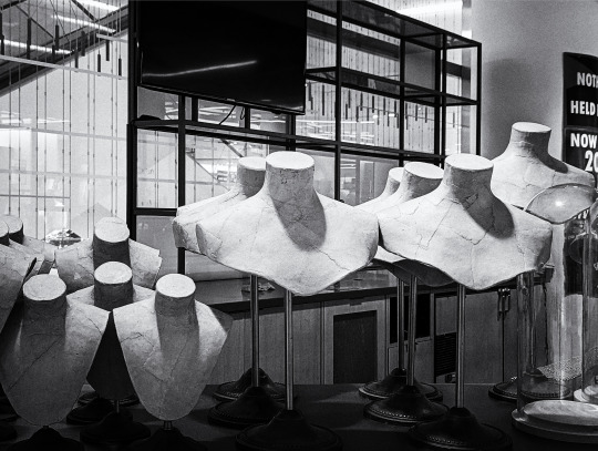
nothing held back
#department store#displays#for sale#nordstrom#vancouver#local#photographers on tumblr#original photography#B&W
48 notes
·
View notes
Text

8 notes
·
View notes
Text

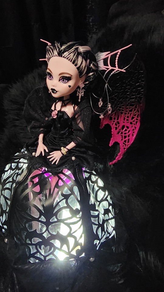

Finally got the illuminated base I've been working on up and running!! I got a water bottle and an insulated cup from Walmart's Halloween 2022 offerings, and both had illuminated bottoms that screwed onto their respective vessels. I didn't want the bottoms at all, but I figured I could use the bases for something eventually, and eventually came Vampire Heart Draculaura!!
I used a dremel with a cutting wheel to cut off the threaded sides of the base, and with the clear plastic saddle stand it works extremely well. I'm afraid I wasn't terrifically delicate or careful with it, as I knew the skirt would hide the flaws, and I hazed up the surface of the base with sandpaper to diffuse the light more, so it looks pretty rough on its own. The lights stay on for about a minute and turn off automatically.
I also realized I had my terrible aquarium souvenir - the microplastics hourglass.
I bought this thing because it's extremely fun to watch, and as soon as I purchased it my brain hit me with "this is just microplastics repackaged as a toy" and now I kind of hate it even though it's still fun to watch. But now she can serve an actual purpose as a heavy, transparent base for La La to sit on and still be lit up!!
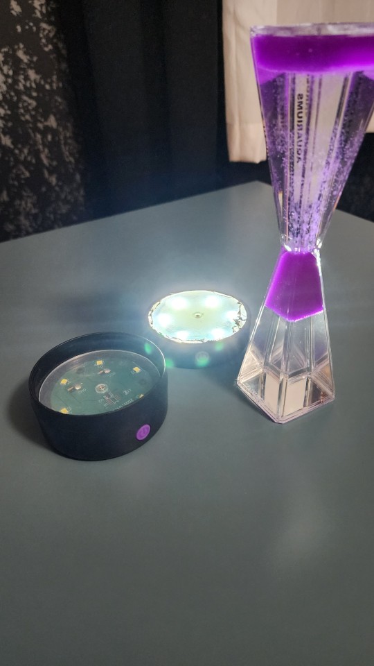

Bonus: it's even the right color though now that I really look at this photo it clashes with the wings so badly oh well I'm gonna paint them anyhow
#monster high#dollblr#doll restyle#dolls#vampire heart draculaura#fashion dolls#skullector#Draculaura#Displays
19 notes
·
View notes
Text
youtube
12+ Best Anime Stores and Cool Places in Shinjuku, Tokyo Japan🇯🇵 + Anime... by Selena is Akane
#figure collecting#stores#shinjuku#japan#recommendations#merch#cafe#cafes#collaborations#official art#displays#natsume yuujinchou#code geass#final fantasy#ff7#kingdom hearts#square enix#spy x family#jojo's bizarre adventure#arcades#neon genesis evangelion#godzilla#tokusatsu#chainsaw man#animate#jujutsu kaisen#shonen jump#crane games#ufo catchers#Youtube
6 notes
·
View notes
Text
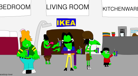
The Gangreen Gang all at Ikea enjoying ice cream sodas and shopping for furniture!
Made by me! (x)
#gangreen gang#ikea#furniture#ice cream sodas#soda floats#ace#snake#big billy#grubber#little arturo#displays#swedish#furniture store#bed#lamps#couch#kitchenware#appliances#acedcop-lover
3 notes
·
View notes
Text
#animeomelette poll#poll#polls#demographic#demographics#tumblr demographic#tumblr demographics#television#display#screen#monitor#televisions#displays#screens#monitors#CRT#CRTs#cathode ray tube#cathode ray tubes#computer display#computer displays#computer screen#computer screens#computer monitor#computer monitors#technology#tv#tvs#analogue television#digital raster graphics
4 notes
·
View notes
Text
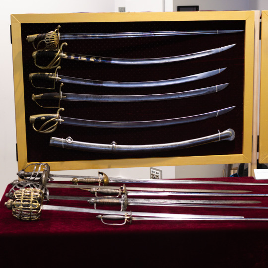
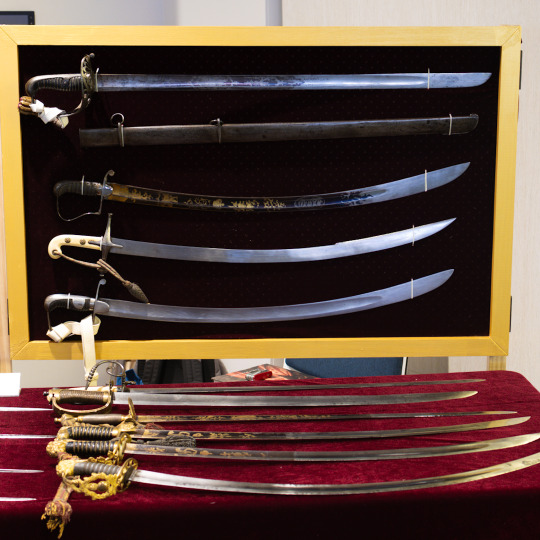
More planning and questions for the coming display. I’ve made two boards that I’ll be mounting the heavy cavalry and light cavalry swords on. But I’m uncertain if I should mount them with or without scabbards.
With their scabbards:
Without:
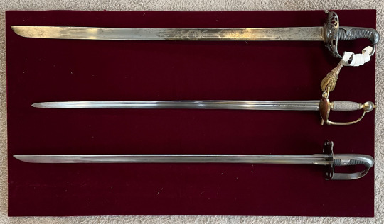
Or a combination:
(The boards aren’t equal length since the light cavalry sabres are shorter and I don’t want to extend past the table too far. Of course, I use the wrong swords on this board for the photos).
95 notes
·
View notes
Text
Coming soon to one of my public displays.
(A couple of days late for “on this date”, but the Post Office delivered it later than anticipated.)
2 notes
·
View notes
Last Seen Blogs

palletofshipping
Gary Oak’s Defense Attorney

taesminty
TaesMinty

southgeorgetowndental-blog
South Georgetown Dental

francismeunier64
2023

djvlvt
Sin título